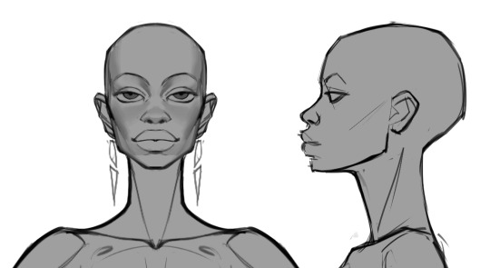
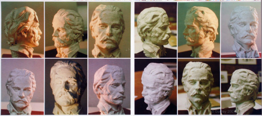
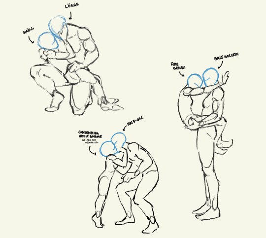
#Design Advice
Text
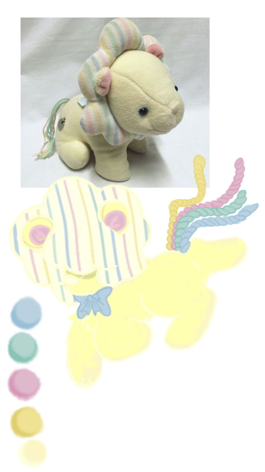
WIP... im not satisfied yet idk... any advice yall?
#clean furry#furry character#furry community#small artist#furry#furry art#oc art#furry adopt#sfw furry#furry sfw#oc advice#design advice
4 notes
·
View notes
Quote
Plan children's clothes with thought. When buying material buy all notions and trimmings so that you can match and contrast with the best results. Put as much thought into the fashion rightness of a child's dress as you would into one for yourself.
This is from Mary Brooks Picken’s Singer Sewing Book from 1953, an era when a large generation who made up the Baby Boom were growing up. It is true that kids can suffer mightily if they feel they look different from their peers, so I was struck by Picken’s urging women to make sure children’s clothing met “fashion rightness.” It also reminded me of the sewing kits for children’s clothing at https://farmhousefabrics.com that put together a pattern, fabric, trims etc, so that you don’t have to guess if the color on your screen will match what you need.
The book owes much to Picken’s earlier sewing books for women’s garments alone, and some of the images are the same as from books from the 1940s, but this edition has section on children’s clothing and sewing for the home which makes sense as domestic life loomed in the 1950s.
#Mary Brooks Picken#singer sewing book#sewing books#1950s fashion#children's clothing#sewing advice#design advice#vintage sewing#vintage sewing books#sewing for children#children's fashion
8 notes
·
View notes
Text
Why does designing fnaf shit have to be so hard😭😭
Literally, all I want to make is a solid william n michael design, but then my brain darts around to every aspect besides them. The main focus of my au isn't even the animatronics, yet my brain insists those should be made first for some reason.
1 note
·
View note
Text
6 Mandir Design Ideas for Your Home
Any Indian home is incomplete without a space for prayer. With over 50 deities in the Godscape, there is no dearth of designs for home mandirs or pooja rooms. Even agnostics and atheists enjoy a tranquil space to focus on the inner self.
In this blog, we’ve narrowed down a number of our best pooja rooms designs. Go ahead and recreate your favourite one or get in touch with a home interior designer in Chennai to help you tweak it to suit your style.
A Display of Faith
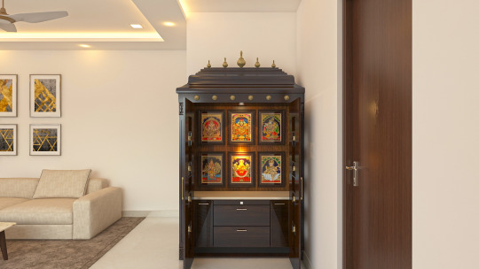
Your home mandir can be as simple as a bespoke display cabinet. For our clients’, we used a combination of a beautiful, laminate finish and white onyx marble to create a serene vibe that perfectly complements the rest of the elegantly furnished open-plan home.
Traditionally Minimal
Your faith is an extension of who you are. Which is why it is especially important to ensure your pooja room design is aligned to your needs. In this case, our clients loved the minimalistic motto of “less is more”. Therefore, we combined a traditional temple aesthetic, and the rules of Vastu Shastra with modular cabinets to create a contemporary space that is rooted in tradition.
Simply Divine
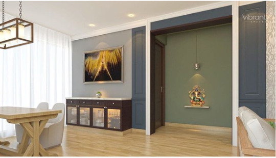
Sometimes it’s best to keep things super simple. A gorgeous idol of your favourite deity, matching wall colours and a bespoke pendant spotlight – that’s all you need to bring serenity to a space.
Niche Is All You Need
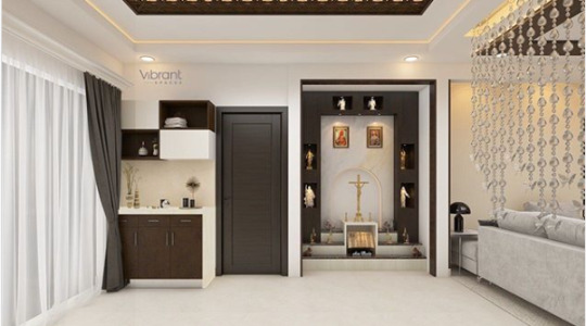
Perhaps it’s divine destiny, but small nooks and niches in your layout are the perfect place for a grand altar. In this nook, we used pristine white tiles along with a sharply contrasting mahogany wood to create a space that is happy, positive and utterly personalised.
Open Home, Open Heart
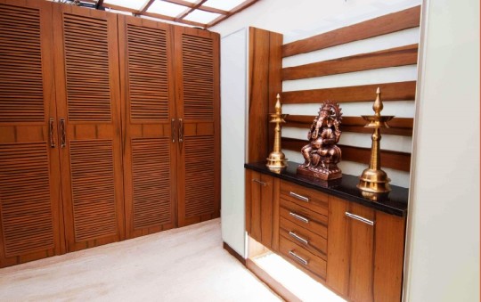
We opened this home with a beautiful skylight to bring in plenty of natural light into the space. Warm sunlight is well-known to improve people’s mood, so you’re bound to be happy contemplating the secrets of the universe. The beautiful rosewood in the cabinets and wardrobe perfectly marries the white marble tiles. It also complements the brass lamps and rose gold Ganesh idol which adds to the serenity.
Beautifully Black
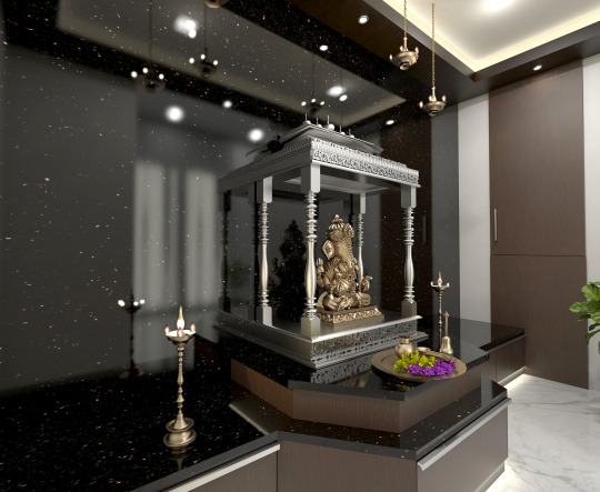
It’s rare to find black in a pooja room, but a metallic finish calls just for that. In contemporary designs for home mandirs, you could enhance the shine and shimmer of your silver and brass idols, lamps and other pooja ornaments when set against a backdrop of black onyx wall and countertops. For this client, we also embedded strip lights within the cabinet and provided plenty of recessed lights for a beautifully lit space.
So, those are our 6 beautiful designs for home mandirs. Didn’t find one that suits your style? Avail a free consultation and talk to our best home interior designers in Chennai.
0 notes
Text


I will design your stationery and brand identity
👇 Visit Our Gig 👇
#begouristore#fiverrbuyer#fiverrseller#fiverrgig#virtual assistant#social marketing#copywriting#marketing#freelance#fiverr#begouri store#Album Cover Design#Book Design#Brand Style Guides#Brochure Design#Business Cards & Stationery#Catalog Design#Design Advice#Develop a Brand Identity#Flyer Design#Infographic Design#Logo Design#Menu Design#Packaging & Label Design#Postcard Design#Poster Design#Social Media Design#T-Shirts & Merchandise
0 notes
Text
Super detailed character profile chart
Character Name:
First Name:
Last Name:
Nickname (if any):
Basic Information:
Age:
Gender:
Date of Birth:
Place of Birth:
Nationality:
Physical Appearance:
Height:
Weight:
Build:
Hair Color:
Eye Color:
Scars or distinguishing marks:
Personality Traits:
Positive Traits:
Negative Traits:
Background and History:
Family Background:
Parents:
Siblings (if any):
Childhood:
Education:
School/College/University:
Major/Area of Study:
Favorite Subjects:
Least Favorite Subjects:
Career/Profession:
Current Occupation:
Previous Jobs (if any):
Career Goals:
Hobbies and Interests:
Hobbies:
Interests:
Relationships:
Marital Status:
Romantic Relationships (if any):
Friendships:
Closest Friends:
Relationship dynamics:
Strengths and Weaknesses:
Strengths:
Weaknesses:
Goals and Ambitions:
Short-term Goals:
Long-term Goals:
Fears and Insecurities:
Common Fears:
Insecurities:
Quirks and Habits:
Quirks:
Habits:
Beliefs and Values:
Religious or Spiritual Beliefs:
Moral Code:
Political Views:
Favorites:
Favorite Foods:
Favorite Books:
Favorite Movies/TV Shows:
Favorite Music:
Favorite Color:
Dislikes:
Disliked Foods:
Disliked Activities:
Pet Peeves:
Miscellaneous:
Talents or Skills:
Secrets (if any):
Motivations:
What drives the character forward?
What are their ultimate aspirations?
Character Arc:
How does the character change or evolve throughout the story?
Feel free to adapt and expand upon this template!
#writing#writing inspiration#writing tips#writers on tumblr#creative writing#teen writer#writers block#story writing#writeblr#characterisation#character design#writing advice#character concept#character sheet
2K notes
·
View notes
Text
Fantasy Guide to Interiors

As a followup to the very popular post on architecture, I decided to add onto it by exploring the interior of each movement and the different design techniques and tastes of each era. This post at be helpful for historical fiction, fantasy or just a long read when you're bored.
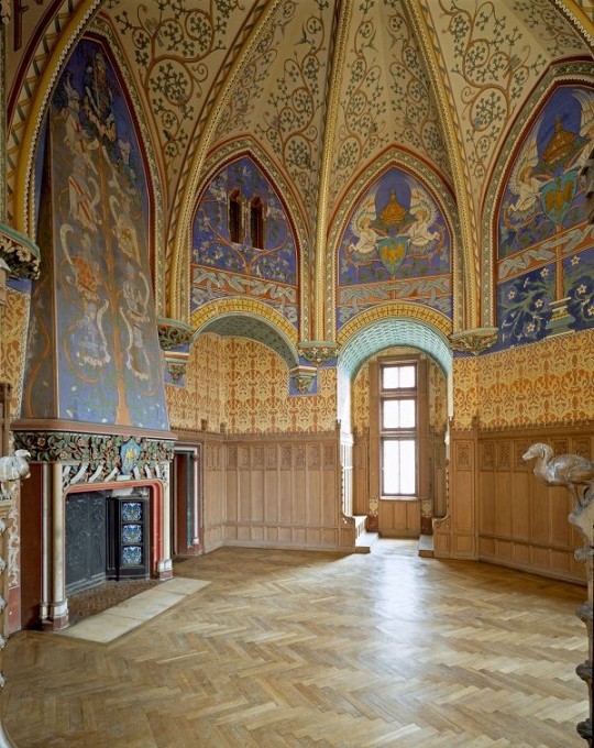
Interior Design Terms
Reeding and fluting: Fluting is a technique that consists a continuous pattern of concave grooves in a flat surface across a surface. Reeding is it's opposite.
Embossing: stamping, carving or moulding a symbol to make it stand out on a surface.
Paneling: Panels of carved wood or fabric a fixed to a wall in a continuous pattern.
Gilding: the use of gold to highlight features.
Glazed Tile: Ceramic or porcelain tiles coated with liquid coloured glass or enamel.
Column: A column is a pillar of stone or wood built to support a ceiling. We will see more of columns later on.
Bay Window: The Bay Window is a window projecting outward from a building.
Frescos: A design element of painting images upon wet plaster.
Mosaic: Mosaics are a design element that involves using pieces of coloured glass and fitted them together upon the floor or wall to form images.
Mouldings: ornate strips of carved wood along the top of a wall.
Wainscoting: paneling along the lower portion of a wall.
Chinoiserie: A European take on East Asian art. Usually seen in wallpaper.
Clerestory: A series of eye-level windows.
Sconces: A light fixture supported on a wall.
Niche: A sunken area within a wall.
Monochromatic: Focusing on a single colour within a scheme.
Ceiling rose: A moulding fashioned on the ceiling in the shape of a rose usually supporting a light fixture.
Baluster: the vertical bars of a railing.
Façade: front portion of a building
Lintel: Top of a door or window.
Portico: a covered structure over a door supported by columns
Eaves: the part of the roof overhanging from the building
Skirting: border around lower length of a wall
Ancient Greece
Houses were made of either sun-dried clay bricks or stone which were painted when they dried. Ground floors were decorated with coloured stones and tiles called Mosaics. Upper level floors were made from wood. Homes were furnished with tapestries and furniture, and in grand homes statues and grand altars would be found. Furniture was very skillfully crafted in Ancient Greece, much attention was paid to the carving and decoration of such things. Of course, Ancient Greece is ancient so I won't be going through all the movements but I will talk a little about columns.
Doric: Doric is the oldest of the orders and some argue it is the simplest. The columns of this style are set close together, without bases and carved with concave curves called flutes. The capitals (the top of the column) are plain often built with a curve at the base called an echinus and are topped by a square at the apex called an abacus. The entablature is marked by frieze of vertical channels/triglyphs. In between the channels would be detail of carved marble. The Parthenon in Athens is your best example of Doric architecture.
Ionic: The Ionic style was used for smaller buildings and the interiors. The columns had twin volutes, scroll-like designs on its capital. Between these scrolls, there was a carved curve known as an egg and in this style the entablature is much narrower and the frieze is thick with carvings. The example of Ionic Architecture is the Temple to Athena Nike at the Athens Acropolis.
Corinthian: The Corinthian style has some similarities with the Ionic order, the bases, entablature and columns almost the same but the capital is more ornate its base, column, and entablature, but its capital is far more ornate, commonly carved with depictions of acanthus leaves. The style was more slender than the others on this list, used less for bearing weight but more for decoration. Corinthian style can be found along the top levels of the Colosseum in Rome.
Tuscan: The Tuscan order shares much with the Doric order, but the columns are un-fluted and smooth. The entablature is far simpler, formed without triglyphs or guttae. The columns are capped with round capitals.
Composite: This style is mixed. It features the volutes of the Ionic order and the capitals of the Corinthian order. The volutes are larger in these columns and often more ornate. The column's capital is rather plain. for the capital, with no consistent differences to that above or below the capital.
Ancient Rome
Rome is well known for its outward architectural styles. However the Romans did know how to add that rizz to the interior. Ceilings were either vaulted or made from exploded beams that could be painted. The Romans were big into design. Moasics were a common interior sight, the use of little pieces of coloured glass or stone to create a larger image. Frescoes were used to add colour to the home, depicting mythical figures and beasts and also different textures such as stonework or brick. The Romans loved their furniture. Dining tables were low and the Romans ate on couches. Weaving was a popular pastime so there would be tapestries and wall hangings in the house. Rich households could even afford to import fine rugs from across the Empire. Glass was also a feature in Roman interior but windows were usually not paned as large panes were hard to make. Doors were usually treated with panels that were carved or in lain with bronze.
Ancient Egypt
Egypt was one of the first great civilisations, known for its immense and grand structures. Wealthy Egyptians had grand homes. The walls were painted or plastered usually with bright colours and hues. The Egyptians are cool because they mapped out their buildings in such a way to adhere to astrological movements meaning on special days if the calendar the temple or monuments were in the right place always. The columns of Egyptian where thicker, more bulbous and often had capitals shaped like bundles of papyrus reeds. Woven mats and tapestries were popular decor. Motifs from the river such as palms, papyrus and reeds were popular symbols used.
Ancient Africa
African Architecture is a very mixed bag and more structurally different and impressive than Hollywood would have you believe. Far beyond the common depictions of primitive buildings, the African nations were among the giants of their time in architecture, no style quite the same as the last but just as breathtaking.
Rwandan Architecture: The Rwandans commonly built of hardened clay with thatched roofs of dried grass or reeds. Mats of woven reeds carpeted the floors of royal abodes. These residences folded about a large public area known as a karubanda and were often so large that they became almost like a maze, connecting different chambers/huts of all kinds of uses be they residential or for other purposes.
Ashanti Architecture: The Ashanti style can be found in present day Ghana. The style incorporates walls of plaster formed of mud and designed with bright paint and buildings with a courtyard at the heart, not unlike another examples on this post. The Ashanti also formed their buildings of the favourite method of wattle and daub.
Nubian Architecture: Nubia, in modern day Ethiopia, was home to the Nubians who were one of the world's most impressive architects at the beginning of the architecture world and probably would be more talked about if it weren't for the Egyptians building monuments only up the road. The Nubians were famous for building the speos, tall tower-like spires carved of stone. The Nubians used a variety of materials and skills to build, for example wattle and daub and mudbrick. The Kingdom of Kush, the people who took over the Nubian Empire was a fan of Egyptian works even if they didn't like them very much. The Kushites began building pyramid-like structures such at the sight of Gebel Barkal
Japanese Interiors
Japenese interior design rests upon 7 principles. Kanso (簡素)- Simplicity, Fukinsei (不均整)- Asymmetry, Shizen (自然)- Natural, Shibumi (渋味) – Simple beauty, Yugen (幽玄)- subtle grace, Datsuzoku (脱俗) – freedom from habitual behaviour, Seijaku (静寂)- tranquillity.
Common features of Japanese Interior Design:
Shoji walls: these are the screens you think of when you think of the traditional Japanese homes. They are made of wooden frames, rice paper and used to partition
Tatami: Tatami mats are used within Japanese households to blanket the floors. They were made of rice straw and rush straw, laid down to cushion the floor.
Genkan: The Genkan was a sunken space between the front door and the rest of the house. This area is meant to separate the home from the outside and is where shoes are discarded before entering.
Japanese furniture: often lowest, close to the ground. These include tables and chairs but often tanked are replaced by zabuton, large cushions. Furniture is usually carved of wood in a minimalist design.
Nature: As both the Shinto and Buddhist beliefs are great influences upon architecture, there is a strong presence of nature with the architecture. Wood is used for this reason and natural light is prevalent with in the home. The orientation is meant to reflect the best view of the world.
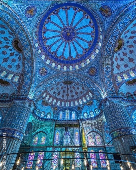
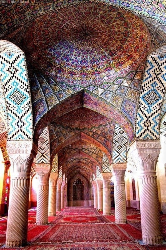
Islamic World Interior
The Islamic world has one of the most beautiful and impressive interior design styles across the world. Colour and detail are absolute staples in the movement. Windows are usually not paned with glass but covered in ornate lattices known as jali. The jali give ventilation, light and privacy to the home. Islamic Interiors are ornate and colourful, using coloured ceramic tiles. The upper parts of walls and ceilings are usually flat decorated with arabesques (foliate ornamentation), while the lower wall areas were usually tiled. Features such as honeycombed ceilings, horseshoe arches, stalactite-fringed arches and stalactite vaults (Muqarnas) are prevalent among many famous Islamic buildings such as the Alhambra and the Blue Mosque.
Byzantine (330/395–1453 A. D)
The Byzantine Empire or Eastern Roman Empire was where eat met west, leading to a melting pot of different interior designs based on early Christian styles and Persian influences. Mosaics are probably what you think of when you think of the Byzantine Empire. Ivory was also a popular feature in the Interiors, with carved ivory or the use of it in inlay. The use of gold as a decorative feature usually by way of repoussé (decorating metals by hammering in the design from the backside of the metal). Fabrics from Persia, heavily embroidered and intricately woven along with silks from afar a field as China, would also be used to upholster furniture or be used as wall hangings. The Byzantines favoured natural light, usually from the use of copolas.
Indian Interiors
India is of course, the font of all intricate designs. India's history is sectioned into many eras but we will focus on a few to give you an idea of prevalent techniques and tastes.
The Gupta Empire (320 – 650 CE): The Gupta era was a time of stone carving. As impressive as the outside of these buildings are, the Interiors are just as amazing. Gupta era buildings featured many details such as ogee (circular or horseshoe arch), gavaksha/chandrashala (the motif centred these arches), ashlar masonry (built of squared stone blocks) with ceilings of plain, flat slabs of stone.
Delhi Sultanate (1206–1526): Another period of beautifully carved stone. The Delhi sultanate had influence from the Islamic world, with heavy uses of mosaics, brackets, intricate mouldings, columns and and hypostyle halls.
Mughal Empire (1526–1857): Stonework was also important on the Mughal Empire. Intricately carved stonework was seen in the pillars, low relief panels depicting nature images and jalis (marble screens). Stonework was also decorated in a stye known as pietra dura/parchin kari with inscriptions and geometric designs using colored stones to create images. Tilework was also popular during this period. Moasic tiles were cut and fitted together to create larger patters while cuerda seca tiles were coloured tiles outlined with black.
Chinese Interiors
Common features of Chinese Interiors
Use of Colours: Colour in Chinese Interior is usually vibrant and bold. Red and Black are are traditional colours, meant to bring luck, happiness, power, knowledge and stability to the household.
Latticework: Lattices are a staple in Chinese interiors most often seen on shutters, screens, doors of cabinets snf even traditional beds.
Lacquer: Multiple coats of lacquer are applied to furniture or cabinets (now walls) and then carved. The skill is called Diaoqi (雕漆).
Decorative Screens: Screens are used to partition off part of a room. They are usually of carved wood, pained with very intricate murals.
Shrines: Spaces were reserved on the home to honour ancestors, usually consisting of an altar where offerings could be made.
Of course, Chinese Interiors are not all the same through the different eras. While some details and techniques were interchangeable through different dynasties, usually a dynasty had a notable style or deviation. These aren't all the dynasties of course but a few interesting examples.
Song Dynasty (960–1279): The Song Dynasty is known for its stonework. Sculpture was an important part of Song Dynasty interior. It was in this period than brick and stone work became the most used material. The Song Dynasty was also known for its very intricate attention to detail, paintings, and used tiles.
Ming Dynasty(1368–1644): Ceilings were adorned with cloisons usually featuring yellow reed work. The floors would be of flagstones usually of deep tones, mostly black. The Ming Dynasty favoured richly coloured silk hangings, tapestries and furnishings. Furniture was usually carved of darker woods, arrayed in a certain way to bring peace to the dwelling.
Han Dynasty (206 BC-220 AD): Interior walls were plastered and painted to show important figures and scenes. Lacquer, though it was discovered earlier, came into greater prominence with better skill in this era.
Tang Dynasty (618–907) : The colour palette is restrained, reserved. But the Tang dynasty is not without it's beauty. Earthenware reached it's peak in this era, many homes would display fine examples as well. The Tang dynasty is famous for its upturned eaves, the ceilings supported by timber columns mounted with metal or stone bases. Glazed tiles were popular in this era, either a fixed to the roof or decorating a screen wall.
Romanesque (6th -11th century/12th)
Romanesque Architecture is a span between the end of Roman Empire to the Gothic style. Taking inspiration from the Roman and Byzantine Empires, the Romanesque period incorporates many of the styles. The most common details are carved floral and foliage symbols with the stonework of the Romanesque buildings. Cable mouldings or twisted rope-like carvings would have framed doorways. As per the name, Romansque Interiors relied heavily on its love and admiration for Rome. The Romanesque style uses geometric shapes as statements using curves, circles snf arches. The colours would be clean and warm, focusing on minimal ornamentation.
Gothic Architecture (12th Century - 16th Century)
The Gothic style is what you think of when you think of old European cathedrals and probably one of the beautiful of the styles on this list and one of most recognisable. The Gothic style is a dramatic, opposing sight and one of the easiest to describe. Decoration in this era became more ornate, stonework began to sport carving and modelling in a way it did not before. The ceilings moved away from barreled vaults to quadripartite and sexpartite vaulting. Columns slimmed as other supportive structures were invented. Intricate stained glass windows began their popularity here. In Gothic structures, everything is very symmetrical and even.
Mediaeval (500 AD to 1500)
Interiors of mediaeval homes are not quite as drab as Hollywood likes to make out. Building materials may be hidden by plaster in rich homes, sometimes even painted. Floors were either dirt strewn with rushes or flagstones in larger homes. Stonework was popular, especially around fireplaces. Grand homes would be decorated with intricate woodwork, carved heraldic beasts and wall hangings of fine fabrics.
Renaissance (late 1300s-1600s)
The Renaissance was a period of great artistry and splendor. The revival of old styles injected symmetry and colour into the homes. Frescoes were back. Painted mouldings adorned the ceilings and walls. Furniture became more ornate, fixed with luxurious upholstery and fine carvings. Caryatids (pillars in the shape of women), grotesques, Roman and Greek images were used to spruce up the place. Floors began to become more intricate, with coloured stone and marble. Modelled stucco, sgraffiti arabesques (made by cutting lines through a layer of plaster or stucco to reveal an underlayer), and fine wall painting were used in brilliant combinations in the early part of the 16th century.
Tudor Interior (1485-1603)
The Tudor period is a starkly unique style within England and very recognisable. Windows were fixed with lattice work, usually casement. Stained glass was also in in this period, usually depicting figures and heraldic beasts. Rooms would be panelled with wood or plastered. Walls would be adorned with tapestries or embroidered hangings. Windows and furniture would be furnished with fine fabrics such as brocade. Floors would typically be of wood, sometimes strewn with rush matting mixed with fresh herbs and flowers to freshen the room.
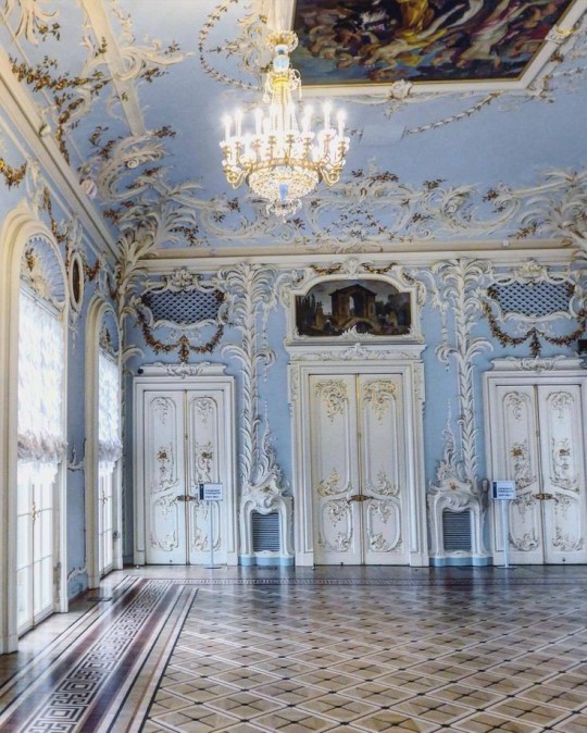
Baroque (1600 to 1750)
The Baroque period was a time for splendor and for splashing the cash. The interior of a baroque room was usually intricate, usually of a light palette, featuring a very high ceiling heavy with detail. Furniture would choke the room, ornately carved and stitched with very high quality fabrics. The rooms would be full of art not limited to just paintings but also sculptures of marble or bronze, large intricate mirrors, moldings along the walls which may be heavily gilded, chandeliers and detailed paneling.
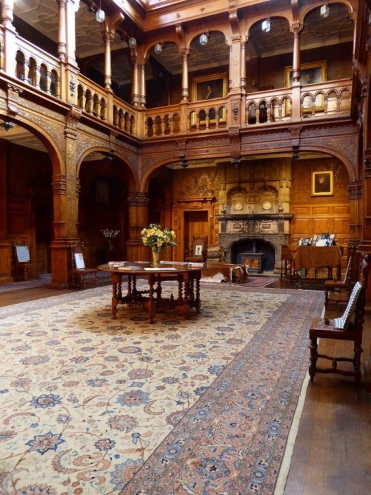
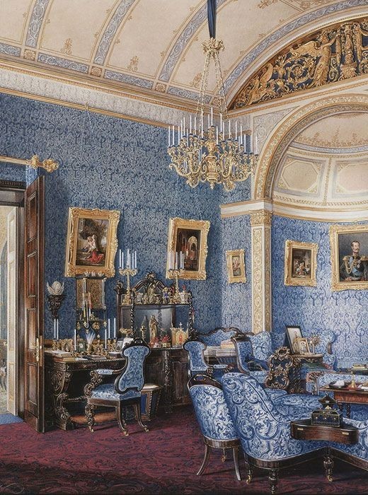
Victorian (1837-1901)
We think of the interiors of Victorian homes as dowdy and dark but that isn't true. The Victorians favoured tapestries, intricate rugs, decorated wallpaper, exquisitely furniture, and surprisingly, bright colour. Dyes were more widely available to people of all stations and the Victorians did not want for colour. Patterns and details were usually nature inspired, usually floral or vines. Walls could also be painted to mimic a building material such as wood or marble and most likely painted in rich tones. The Victorians were suckers for furniture, preferring them grandly carved with fine fabric usually embroidered or buttoned. And they did not believe in minimalism. If you could fit another piece of furniture in a room, it was going in there. Floors were almost eclusively wood laid with the previously mentioned rugs. But the Victorians did enjoy tiled floors but restricted them to entrances. The Victorians were quite in touch with their green thumbs so expect a lot of flowers and greenery inside. with various elaborately decorated patterned rugs. And remember, the Victorians loved to display as much wealth as they could. Every shelf, cabinet, case and ledge would be chocked full of ornaments and antiques.
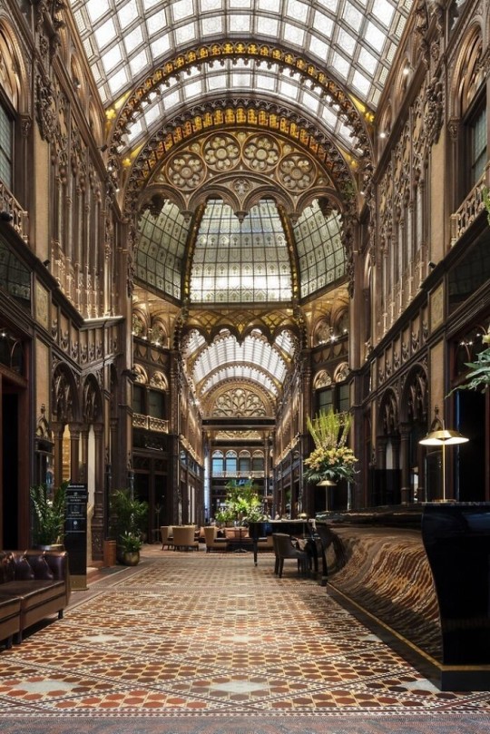
Edwardian/The Gilded Age/Belle Epoque (1880s-1914)
This period (I've lumped them together for simplicity) began to move away from the deep tones and ornate patterns of the Victorian period. Colour became more neutral. Nature still had a place in design. Stained glass began to become popular, especially on lampshades and light fixtures. Embossing started to gain popularity and tile work began to expand from the entrance halls to other parts of the house. Furniture began to move away from dark wood, some families favouring breathable woods like wicker. The rooms would be less cluttered.
Art Deco (1920s-1930s)
The 1920s was a time of buzz and change. Gone were the refined tastes of the pre-war era and now the wow factor was in. Walls were smoother, buildings were sharper and more jagged, doorways and windows were decorated with reeding and fluting. Pastels were in, as was the heavy use of black and white, along with gold. Mirrors and glass were in, injecting light into rooms. Gold, silver, steel and chrome were used in furnishings and decor. Geometric shapes were a favourite design choice. Again, high quality and bold fabrics were used such as animal skins or colourful velvet. It was all a rejection of the Art Noveau movement, away from nature focusing on the man made.
Modernism (1930 - 1965)
Modernism came after the Art Deco movement. Fuss and feathers were out the door and now, practicality was in. Materials used are shown as they are, wood is not painted, metal is not coated. Bright colours were acceptable but neutral palettes were favoured. Interiors were open and favoured large windows. Furniture was practical, for use rather than the ornamentation, featuring plain details of any and geometric shapes. Away from Art Deco, everything is straight, linear and streamlined.
#This took forever#I'm very tired#But enjoy#I covered as much as I could find#Fantasy Guide to interiors#interior design#Architecture#writings#writing resources#Writing reference#Writing advice#Writer's research#writing research#Writer's rescources#Writing help#Mediaeval#Renaissance#Chinese Interiors#Japanese Interiors#Indian interiors#writing#writeblr#writing reference#writing advice#writer#spilled words#writers
3K notes
·
View notes
Text
I need help with a colour scheme
I’m working on a tiefling swashbuckler rogue and Hexblade warlock multiclass, and - this was my friends idea - they used to be a half elf half aasimar that got cursed and turned into a tiefling so I wanted to do a colour scheme to reflect that, like a white and gold but the white doesn’t look right as the skin tone… any advice?
0 notes
Text
the most important ingredients for a male character are
-beautiful, flowing hair
-the saddest most pathetic and downtrodden vibes you've ever seen in your life
hope that helps!
#creative writing#queer writers#writing advice#writing prompts#writing prompt#character dynamics#character design#writing tips#how to write
2K notes
·
View notes
Note
how do you consistently draw the same character without it looking weird or off every different time?? also how do i coordinate faces, i always make the eyes too far apart or too big or too small or make the mouth too close to the nose or chin edge. If you have any advice I'd really appreciate it since it looks like you have your art shit figured out 🙏
Oh man SO so much of it is just practice, and you're not alone! I honestly think everyone struggles with a sort of "generification" of their characters' features the more they draw them, even seasoned professionals. There's a tendency to just sort of average everything out into an unrecognizable mush over time, and it takes a lot of conscious effort to push back against that.
Here are a couple tips and tricks that I've found to be helpful over the years:
Make turnarounds and model sheets. There's a reason animation/game studios do this, and it is because we are all still bad at drawing a consistent face. Despite being gainfully employed. What are we, graphic novelists?? We wish. Anyway it's a great way to familiarize yourself with your character's face from multiple angles, and it gives you a single source of truth to return to anytime you need a refresher:
Gather real-life reference. Anytime I'm designing a character I'm pulling together a ton of reference of actual people who look, to some degree, like the character in my head. It's always a collection of analogues, never just a single person, but it can be a great cheat sheet for understanding how your character might move, emote, etc:
Make a 3D model. I know it seems daunting, but with the advent of programs like Blender and Nomad Sculpt it's becoming remarkably more accessible. Heck, even James Gurney was sculpting maquettes out of clay for Dinotopia back in the day! It doesn't have to be particularly detailed—just a sort of proportionate lump will do—but it's another great way to have dynamic reference that you can rotate and light accordingly:
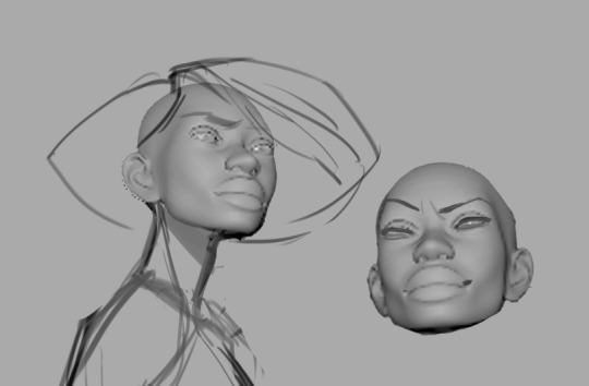
Practice, practice, practice. Make expression sheets for your character! Either right there on the spot, just start drawin' expressions, or you can slowly collect drawings of your character that you like, as you draw them, and compile them all in one place for your own reference. Need to draw your character's head from a weird angle? Maybe you've already drawn it before and you can copy your own homework! Doesn't count as stealing when the call's coming from inside the house 😎
I'd love to pretend there's a magical point where you can just immediately rotate your character's head in your brain like some sort of photorealistic apple in a twitter meme, but a lot of the time it's reference, hard work, and whole lotta repetition. 😐👍🏼
6K notes
·
View notes
Text
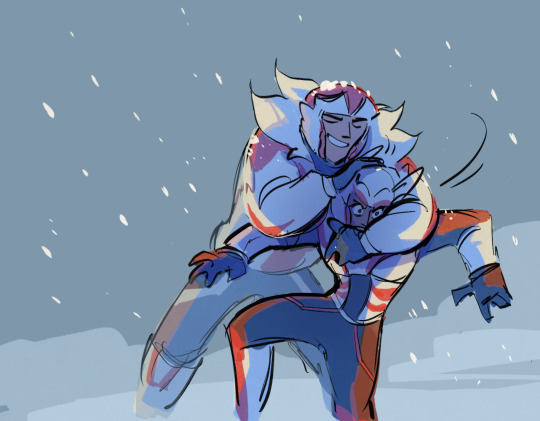
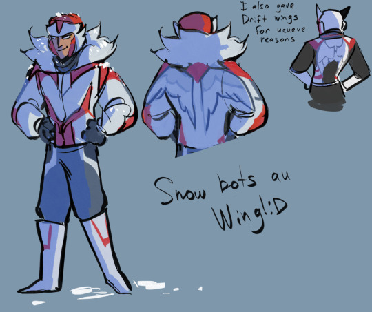

Someone asked me to put Wing in my Snow bots au so there we go>:D I unmurdered him for you haha
#transformers#maccadam#snow bots au#Wing#tf wing#idw wing#drift#tf drift#idw drift#ratchet#idw ratchet#dratchet#Wing being proud sensei#Drift regretting some of his life choices#but only some#okay funny story for those two of you who actually reads my tags#I started thinking of Wings design and planning some sketches about him right#and for some reason my brain started drifting (ba dum tss) in the direction of uhhhhh some kind of wise classic sensei figure?#For a couple of minutes I was like#yeah he should probably be that calm and wise man#You know. A strict and disciplined teacher who never loses his cool and always has some valuable advice for any situation#And then I checked the canon#And quickly remembered how fucking crazy and chaotic Wing is ahaha#He wasn’t even asked to teach Drift he straight up just picked him off the ground like a stray cat#and then brought him home and like..mom can we keep him…and didn’t wait for an answer
748 notes
·
View notes
Text
°•°Habits to Give Your Characters°•°
╭┈◦•◦❥•◦ Constantly crosses legs when sitting
╭┈◦•◦❥•◦ Doodles when zoned out (if there's no paper around they could trace doodles like little hearts on a table or even on the back of their hand)
╭┈◦•◦❥•◦ Crucks knuckles
╭┈◦•◦❥•◦ Braids hair when their bored (or just generally plays with their hair)
╭┈◦•◦❥•◦ Stands way to close to people when talking to them.
╭┈◦•◦❥•◦ Avoids eyecontact when people talk to them.
╭┈◦•◦❥•◦ Clutches on to other's sleeves.
╭┈◦•◦❥•◦ Bites nails when nervous
╭┈◦•◦❥•◦ Raises their eyebrows when interested.
╭┈◦•◦❥•◦ Offers food to others, before taking a bite themselves.
╭┈◦•◦❥•◦ Scratches top of nails (like when you're scratching the coat of nail polish off your nails.)
╭┈◦•◦❥•◦ Whistles to ease nerves.
Follow @paranoia-art for more!
Do message me if you have anymore you would like to add!
#writing#writers of tumblr#writers on tumblr#writing prompt#advice#my writing#writeblr#writers and poets#writerscommunity#writing tips#creative writing#writing help#writing advice#character development#descriptive phrases#ask#plot development#character writing#writing inspiration#oc#worldbuilding#character building#writer problems#chracter arcs#character traits#character habits#writer inspiration#writer stuff#character design#writers block
502 notes
·
View notes
Text
🎨 ~ Color Theory & Design Tutorial ~ 🖌️
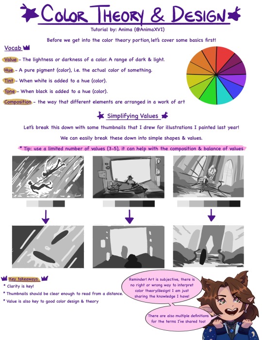
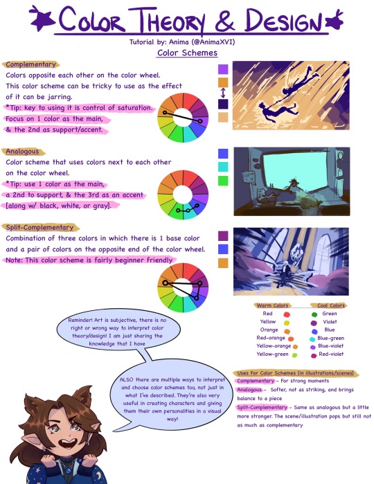
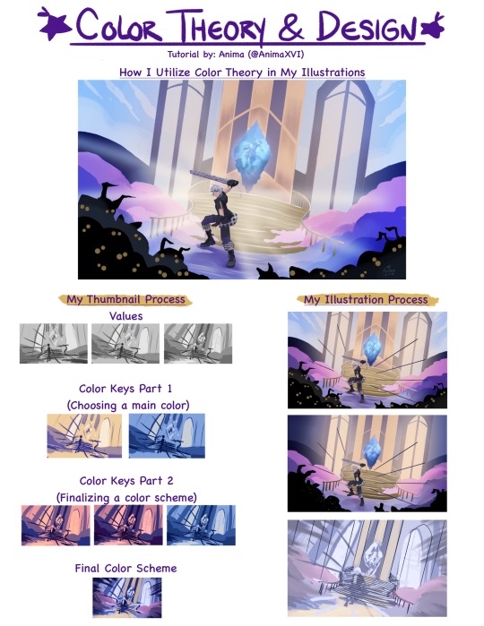
I've been thinking about making tutorials for a while now. So I thought I'd share about a subject I'm really passionate about! I did my best to make this beginner friendly & also as a review sheet 💜
(Please note this is from my own knowledge/experience! There are waaaay more resources, like books & videos, out there that are super helpful and go further in depth of this topic!)
#art tutorial#color theory tutorial#color theory#artists on tumblr#art advice#color scheme#color design
857 notes
·
View notes
Text

Head Advice #1: Everybody’s head is the same size.
Okay, not really, but basically. There’s a reason you don’t have to know your head circumference to find a sunhat. We all have pretty similar head sizes, especially from the visual distance we usually draw characters.
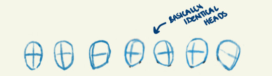
The only exception to this is babies or children under 10. Those guys definitely have smaller heads! (But did you know our skulls are already over 90% their full adult size by the age of 5?)
Different style choices demand different proportions, but in general, it’s good advice to pick a head size, and stick with it!
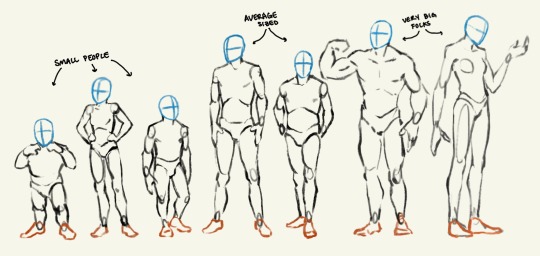
Head Advice #2: You can use head size to indicate a character’s size.
Big characters don’t look like average sized people scaled up. And you can’t just scale down to get a small person!
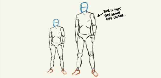
You can make a character look very big and tall or very very small — even if they are standing alone in a vast white nothingness — just by how how they are proportioned! The most important proportion (in my humble opinion) is their head size. Look me in the eyes and tell me you can’t tell which of these characters are big and which are small.
Head Advice #3: Don’t go shrinking anyone’s head.
The most common head sins I see happen when an artist is trying to indicate (body) size difference in a couple, and use their heads to do it. The result is an image that looks something like this:

If you don’t want your lovers to look like they belong in different animated tv shows, don’t go shrinking anyone’s head! Use their bodies (hands and feet and bellies and muscles) to show off their size differences.
Anyway, that’s all. Having fun giving head. I mean doing head. I mean drawing heads.
#art#artists on tumblr#fantasy#character art#digital art#art advice#art resources#art ref#character design#I just haven’t seen anyone explain this#art is a journey#we all start somewhere#dnd characters#‘cause that’s what I draw#long post
7K notes
·
View notes
Text
So I freelance design and writing on the side while on the hunt for a job in my field. Baby designers let me offer some time saving advice
ALWAYS have multiple copies of your work saved at different stages and in different places. Leave yourself a paper trail so you can go back when the client wants changes done to the piece. And believe me they will want changes.
Invest in an external hard drive. I know they can get expensive but it is such a life saver to have all that extra space and to be able to plug it in and have your files when you can't download them off the cloud.
The client I'm working with right now are having me edit and finish their website. Right now we're editing pictures. I think I have at least 5 copies of the same picture on my computer all slightly altered to fit the client's request until we get the look they want.
This is a savior for myself and the client. I won't waste both our times by editing multiple pictures all for me to have to start over or edit one little thing on each one. Then should the client want to go back to a previous look I can pull that right up.
Also you are not gonna be proud of every piece you make. At the end of the day what the client wants is what we make (within reason). Not every piece is portfolio worthy and that's ok. Some clients want ugly pieces and that's what they're paying us for. Take your check and go home. There will be other projects that can make it to your portfolio.
Also also! If you're stuck and need help with something or learning a new skill set on a new program 9 out of 10 someone already has a tutorial about it! You wouldn't believe how many web designers and motion designers will copy and paste code from the internet because that's the exact same one they need.
#graphic design#graphic design advice#freelancing#design advice#baby writers this applies to you too
1 note
·
View note
Last Seen Blogs