#Fonts for Web Accessibility
Text
Learn why font size matters in web accessibility, ensuring readability and usability for all users, especially those with visual impairments.
0 notes
Text
Free accessible font options for disabled people:
• Hyperlexic font for people with low vision, Atkinson hyperlexic: https://brailleinstitute.org/freefont
• Dyslexia-friendly font, open dyslexic: https://opendyslexic.org/
• Dyslexia-friendly font, inconsistent regular: https://danielbrokstad.com/Inconstant-Regular
• Focus Ex for ADHD, font and browser extension: https://focusex-extension.webflow.io/#welcome-a
• Additionally, comic sans is dyslexic friendly!
#chronically couchbound#resources#info#disability#disabled#disabled pride#disability pride#fonts#web accessibility#dyslexic#dyslexic friendly font#comic sans#low vision#blindness#blind#adhd#actually ADHD#neurodiverse#hyperlexic font#neurodivergent#autistic#autism#dyslexia#free fonts#accessibility#accomodation#accommodating disability#adaptive technology#assistive technology#assistive devices
123 notes
·
View notes
Text
I swear, making entire different sets of ASCII/Unicode for text/lettering was a damn mistake.

This shit. Constantly. Gets. Past. Spam. Filters. =_=
#also heard this kinda ascii code shit trips up some tts systems#just use one standard set of codes that you can turn into diff fonts in HTML/CSS dammit all!#because a lot of systems reading the text doesn't RECOGNIZE wtf those codes /mean/#'a' should be recognized as a damn 'a' across the board - istg#not 'a' but it's a little /spicier/#(this rant is something i see gymrat!lo getting on abt OFTEN)#(this standard sucks ass - and iirc it's thanks to how people saw 'oh we're expanding the ascii table for emojis now?')#(and went 'we can make character sets... but FANCY')#(nevermind fucking breaking spam filtering systems and accessibility tools!)#(nevermind that you can ALREADY customize font type and size with a little bit of HTML tinkering)#(nevermind the style sheet your web page is going for or people who have their own local themes or font library)#(nevermind people who want to idk slap a dyslexia // vis-impaired friendly add-on to make the font more readable to THEM)#(HHHHHh- i have a lot of feelings about this)
6 notes
·
View notes
Note
go on twitter if u hate customization that much
No
#I'm fine with customization that doesn't hurt accessibility#i have 20/20 vision and i struggle to read the font size on some people's blogs#pointers for folks doing custom css:#the minimum legible type size on the web is 16px#to accommodate larger monitors 18px is better#and depending on font size you need to adjust the contrast of the text color and background to maintain legibility#10px light gray type on a white background is a NIGHTMARE to read#and yet I've seen so many blogs do it#and increasing the page zoom usually breaks the blog layout because people don't code them to be responsive#people's personal blog designs are the worst part of this site#i primarily use mobile so i never have to experience them
3 notes
·
View notes
Text
i love you about:config -> image.animation_mode -> set value to "none" i love you so so so much
#web accessibility#that flickering fire font makes me want to kill someone#got a migraine before i remembered i could turn it off#fuck a gif#txt
0 notes
Text

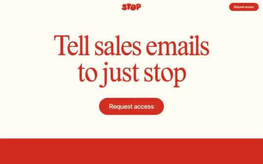
Stop
#Stop#sales#emails#request#access#tool#red#type#typeface#font#Lastik#SF Pro Display#2023#Week 50#website#web design#inspire#inspiration#happywebdesign
1 note
·
View note
Text
#Web Accessibility#Font Sizing#Visual Impairments#WCAG#Screen Readers#Section 508#Disabilities#Accessible Coding#Web Design#Web Accessibility Testing#Web Developers#HTML#EM Unit#Visual Disabilities#Low Vision#Accessible Fonts#Contrast Ratio#Color Blindness
0 notes
Text
Can anyone suggest bolder fonts?
Most operating systems use very thin font rendering. I have trouble reading this.
In Cinnamon Linux, I can specify semibold or bold fonts for menus and some apps.
In Firefox and Thunderbird, I can specify a shadow or blur effect for each letter, which does make things wider, but causes other trouble.
So I'm looking for a set of fonts where the regular version is comfortably wide, and the bold version is noticeably wider.
Must support Roman, Cyrillic, Wulfilan, and Greek alphabets.
0 notes
Text
youtube
How To Choose Accessible Fonts
The fonts known for providing maximum web accessibility are Times New Roman, Verdana, Cabri, Helvetica, and Tahoma. Other slab serif fonts like Arvo Museo Slab and Rockwell are also accessible!
#https://adasitecompliance.com/accessible-fonts/#accessible fonts#web accessibility#how to choose accessible fonts#website accessibility#accessibility solutions#website & digital accessibility solutions#ADA web accessibility solution#accessibility resources#Americans with disabilities Act#digital accessibility#legal compliance experts#ADA site compliance#ADASiteCompliance#adasitecompliance.com#Youtube
0 notes
Text
Advanced Styling Techniques for Typography and Color

View On WordPress
#a1ahsan&039;#Accessibility#ahsan mahmood#aoneahsan#Color Schemes#Color theory#Contrast Ratio#Font Pairing#Serif vs. Sans Serif Fonts#Typography#User Experience (UX)#WCAG Guideline#Web design#zaions
0 notes
Text
#Creating Accessible#Word Document#Comprehensive Checklist#PDF Accessibility#WCAG#Disabilities#Section 508#Screen Readers#Color Contrast#Accessibility guide#Accessibility Checklist#Accessibility Checker#Accessibility Services#Accessibility Design#Fonts Accessible#web accessibility Audit
0 notes
Text
OPEN LETTER TO FANFICTION WRITERS ON ACCESSIBILITY; PLEASE READ.
first of all, thank you for spending your time, seldom acknowledged and definitely deserving of a compensation you are not receiving, to entertain us. i’m speaking on behalf of more than just blind readers, but everyone. you’re sick as hell.
i’ve summoned you to provide some information you may not already know. i know a lot of you like fonts. especially those who cross post their work on wattpad. i admire any and all acts of aestheticism to a degree, and can understand the desire to use them. (blind folk, sorry y’all. momma’s making a point.) 𝔰𝔱𝔲𝔣𝔣 𝔩𝔦𝔨𝔢 𝔱𝔥𝔦𝔰, it’s cute. 𝐬𝐭𝐮𝐟𝐟 𝐥𝐢𝐤𝐞 𝐭𝐡𝐢𝐬 is a little cuter to me, if i had to choose. or maybe 𝓈𝑜𝓂𝑒𝓉𝒽𝒾𝓃𝑔 𝓁𝒾𝓀𝑒 𝓉𝒽𝒾𝓈?
now, sighted folk: if you’re on mobile, i implore you to participate in a little exercise for me. select this text and scroll through all the copy/paste/define/‘search the web’ options until you get to the speak portion. if you need to change a setting for your phone to do so, would you mind? i’d really appreciate it.
please make your phone read aloud part of my post, and be sure to include any bits with those super cute fonts. 𝕚’𝕝𝕝 𝕥𝕒𝕔𝕜 𝕠𝕟𝕖 𝕠𝕟 𝕥𝕙𝕖 𝕖𝕟𝕕 𝕠𝕗 𝕞𝕪 𝕡𝕝𝕖𝕒, 𝕣𝕚𝕘𝕙𝕥 𝕙𝕖𝕣𝕖. 𝕚 𝕙𝕠𝕡𝕖 𝕥𝕙𝕚𝕤 𝕚𝕤 𝕥𝕣𝕒𝕟𝕤𝕝𝕒𝕥𝕚𝕟𝕘 𝕔𝕠𝕣𝕣𝕖𝕔𝕥𝕝𝕪, 𝕚 𝕕𝕠𝕟’𝕥 𝕨𝕒𝕟𝕥 𝕥𝕙𝕖 𝕝𝕖𝕤𝕤𝕠𝕟 𝕥𝕠 𝕓𝕖 𝕤𝕢𝕦𝕒𝕟𝕕𝕖𝕣𝕖𝕕 𝕓𝕪 𝕥𝕪𝕡𝕠𝕤 𝕚 𝕔𝕒𝕟’𝕥 𝕤𝕖𝕖.
whether you participated and discovered it for yourself or you thought this was a crock of shit you’d rather not sniff, i’ll tell you! screen readers cannot dictate words using those fonts. at least, on a majority of devices. not mine, or any of my mutuals elsewhere.
you do not have to change your behavior on my behalf, but please be aware that fonts limit access to your work.
blind readers do exist, i exist, and i am bound by the same feelings of dogged longing that make other sad horny bitches read angsty, smutty, father-wounded nonsense.
thanks for making it this far. i really hope my sincerity is being conveyed, reading makes me so happy and i’m not the only person on this app who relies on accessibility settings more often than not. do with this information what you will, and have the day you deserve!
#matt murdock x reader#thomas shelby x reader#elijah mikaelson x reader#klaus mikaelson x reader#matt murdock smut#fanfic#bucky barnes x reader#din djarin x reader#x reader#gender neutral reader#reader insert#writers on tumblr#ao3 writer#writeblr#female writers#writerscommunity#blindness#visual impairment#accessibility#accessible art#tasm!peter parker x reader#smut#ethan landry#matt murdock#bucky barnes#peter parker#miguel o'hara#foggy nelson#frank castle#good omens
5K notes
·
View notes
Text
Hey friends,
I'm overdue for an optometric check-up and I can tell because I've been getting more and more eyestrain lately.
So my question is this: i've scoured the settings and the help but don't seem to see a way to scale text on the tumblr dashboard? Like I can scale the whole site using chrome but I don't really need the interface to scale just the text.
How do I do this? Do I need to use a third party bookmarklet/extension/tampermonkey script/etc?
1 note
·
View note
Text
some graphic design resources cause im bored and itching to write something but i cant write anything i'm happy with--- anywayssss
unsplash for lots of royalty free pics
heres a cool site to learn how to pair fonts together
heres another site to learn kerning [spacing]
in fact heres a bunch of games to help u get better at graphic design stuff
some free online video editors x x x
color accessibility resources :]
savee.it - like pinterest but for designers!! unfortunately it has a save limit for free users but u should still be able to browse it for inspo i think?
some free fonts
aside from coolors i really love adobe color!! it has color palette generator [triads, monochrome, complementary, etc.], accessibility tools, palettes+gradients extractors, and color palettes inspired by trends within diff industries.
make moodboards online for freeee i miss u polyvore
spline and womp for web based 3d design! + blender of course [go make that donut!]
we all know and love them: photopea [photoshop but free and on a browser?!] and canva [no introduction needed im sure]
upscale the resolution / quality of pics it says anime but it works really well with most stuff like video game screenshots [gets rid of hard edges/pixels]
typography inspo
more color palette generators [already meets accessibility guidelines]
filmgrab - a curation of movie scenes 💕
here's another one but for color palettes from films
more inspo and tutorials
cargo - for web design stuffs
an archive of BRANDING GUIDES
free online zine hosting
milanote - very very useful for organizing creative projects :D kinda like a mix of notion and pinterest ? [its basically notion but more visual]
a collection of free luts
lots of pngs for editing
freepik - lots and lots of free design assets.
flaticon - lots of flat icons / vectors. i haven't used this in a while, but it was free last i checked
in case u need more help pairing fonts go here and here
idk ilu all have fun!!!!
3K notes
·
View notes
Text
A guide to all accessibility-related needs on the indie web!

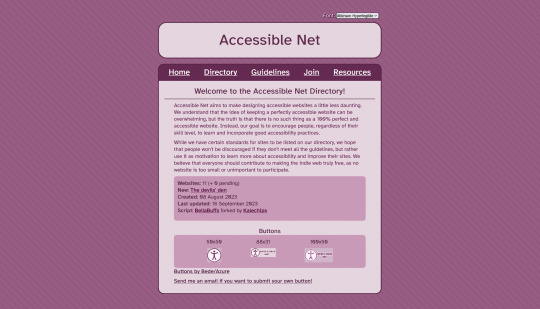
I've been sharing this site around in all sorts of places, but I wanted to post it here, too - the Accessible Net Directory!
The indie web has a problem with accessibility. Namely, it seems like very few creators care to implement it. Which I get! It seems daunting to tackle at first. But also, it makes the indie web really, really difficult to traverse for disabled folks.
The Accessible Net Directory is two-fold in its uses.
1) It provides disabled people a list of safe indie sites
In order for a site to be featured on the directory, it needs to meet basic accessibility guidelines. This includes (but isn't limited to) no autoplay, unlabeled flashing images, low contrast, small / hard-to-read fonts, keyboard inaccessibility or non-described images.
Additional, non-required accessibility options for the directory are encouraged, and listed in a site's description on the directory. (Such as zoom-friendliness and different font options.)
2) It provides webmasters a ton of resources for implementing accessibility
It not only provides a list of steps one can take to make their site more accessible, but also provides the "why" of each step.
For example - one listed guideline for the directory is to use rem/em instead of px units for font sizes. Why? Well, the directory explains, "Users with low vision may need to increase the size of the text in order to be able to read and see better. Therefore it is important to always use scalable units for text."
Then, it goes on to list RESOURCES for changing px to rem/em!!
This site is an absolute treasure trove of resources for making your site accessible, and doing so with ease! I've used the resources listed to make my own site more accessible, and it's made the process seem so much more manageable!
So! If you run a personal site, then give the site a look, learn about accessibility practices, and apply them to your site! An inaccessible web is not a free web!
#neocities#indie web#web revival#old web#webcore#old internet#html#website#resource#guide#directory#accessibility#disability advocacy#azure does a thing
2K notes
·
View notes
Note
Hi, Mr Prokopetz, I'm a big fan. Apologies if you've answered this before, but I was wondering what software you use to create the pdf and epub layouts of your ttrpgs, and whether you'd recommend it to a hobbyist who wants to try putting together something more professional than a gdoc for their own ttrpg?
My workflow is unfortunately not terribly accessible unless you have a fair amount of technical know-how.
In brief, I write all of my games in Notepad++ as HTML documents, taking care to use only the subset of HTML5 tags which are supported by most popular EPUB readers. I then use Calibre (or, more, precisely, the command-line utility that comes with Calibre, though you can get mostly the same results via the GUI) to bundle the HTML document as an EPUB3 file. I typically distribute both the HTML and EPUB versions (the former in a zipfile with all of the fonts and images and such) because web browsers tend to have much better screen-reader support than EPUB apps do.
The PDF, meanwhile, is generated from the same master HTML document using CSS paged media extensions – the layout is all generated automatically based on rules specified in a big, gnarly CSS file, and is never touched by human hands. There are a number of software packages which can do this sort of CSS-driven HTML-to-PDF conversion, some of them free or open source; I use a commercial product called Prince because, to the best of my knowledge, it's the only such software which has out-of-the-box support for PDF/UA semantic tagging (i.e., the stuff you need to do in order to make your PDFs screen-reader friendly), but you have more options if you're willing to tag your PDFs manually. (I am not.)
As for whether I'd recommend doing it this way? Like I said, unless you're a proper gearhead, not really; it's super efficient once you get it all set up – the only version of the game I actually maintain is the master HTML document, and generating updated versions of all the other formats is a one-click affair – but it's really only feasible for me because I already knew how to all that workflow automation stuff for unrelated reasons. I can't imagine teaching yourself all that from scratch just to write elfgames!
348 notes
·
View notes