#Color theory
Text
Free resource for artists and designers!!
I made a website where artists and designers can get color palette inspo from fire hydrants I've 3D scanned all over the US
Some of my favorites:
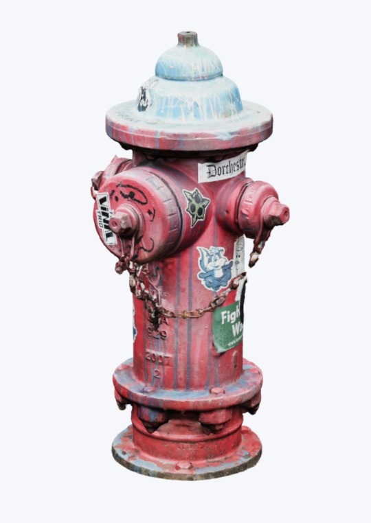

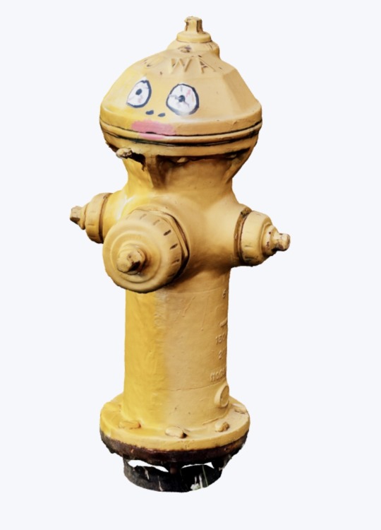
There are about 100 hydrants so far and I'm continuing to add more all the time
Public infrastructure is sexy, baby!!!!!! Pass it on!!
dayroselane.com/hydrants
2K notes
·
View notes
Text
Color Palette Inspiration: The Hydrant Directory
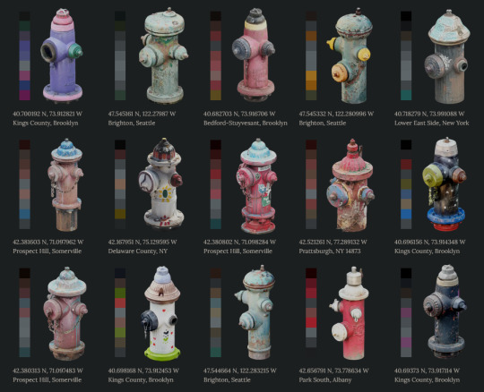
The Hydrant Directory is a free design resource created from public infrastructure. Each hydrant has been processed into color palettes for free use by artists and designers.
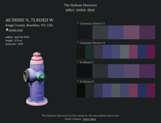
Color palettes are original and are placed in the public domain for use of any kind without attribution ( CC0 no rights reserved ). The hydrants themselves, however, do not belong to me. Use them with discretion and respect.
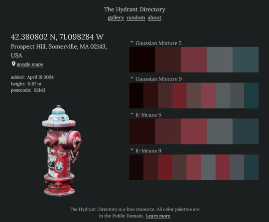
Many of the hydrants featured in the directory have been painted by residents of the neighborhoods they supply. The Hydrant Directory would not be possible without the work of street artists who bring color to our everyday surroundings.
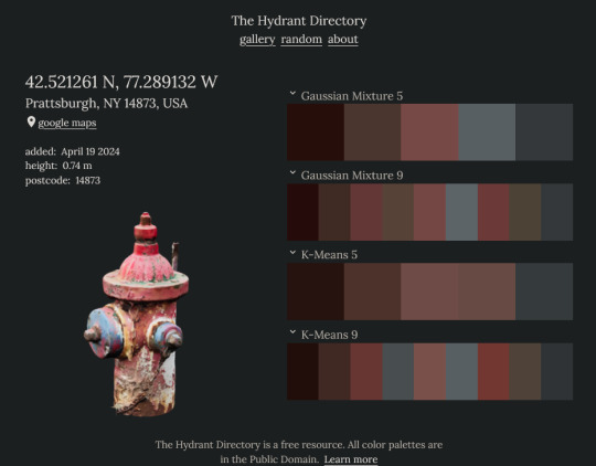
The project began in May 2023 and was first published in March 2024.
652 notes
·
View notes
Text
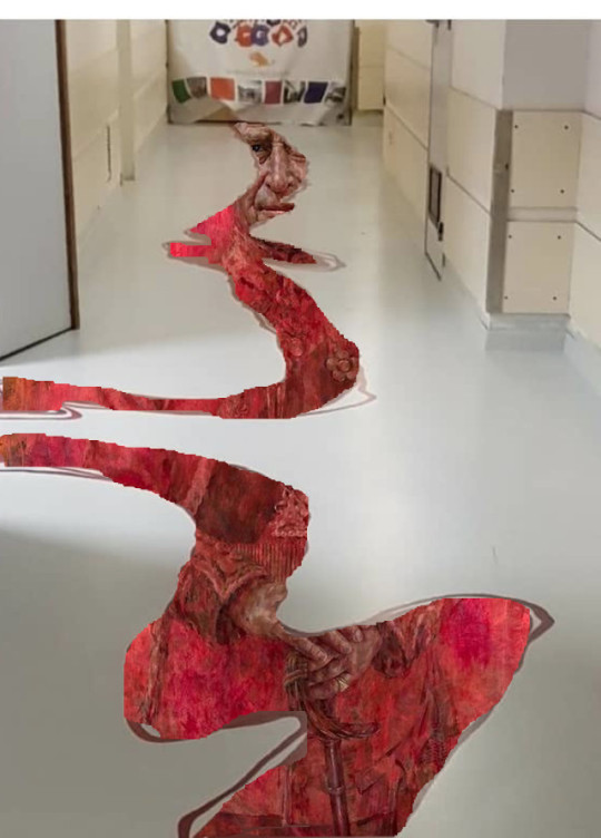
#i had to learn how to use GIMP to make this#turned out better than i had hoped#royal portraits#prince charles#color theory#children's hospital
41 notes
·
View notes
Text
i made a tut on how i do good colors !! i don't know how helpful it is but. whatever
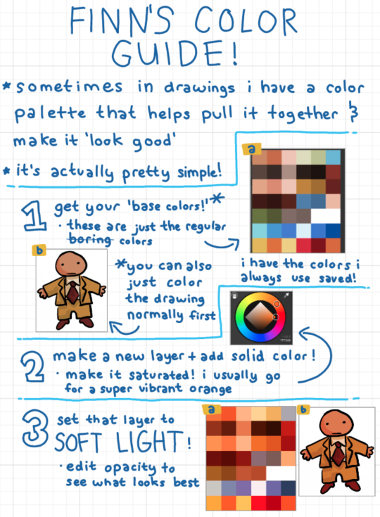
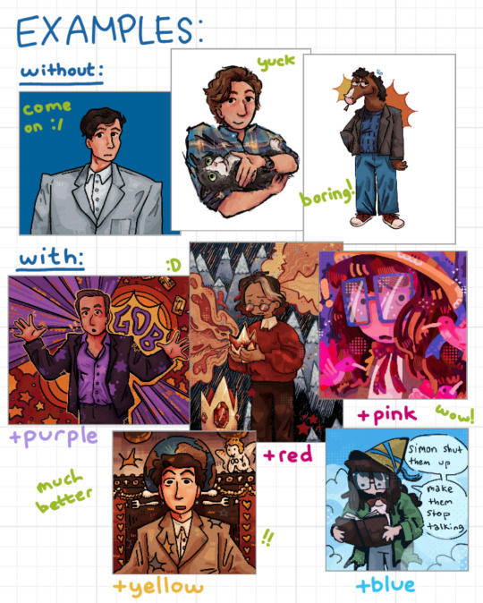
EDIT: i labeled the gob drawing as purple but it's red my bad .i made this VERY quickly
37 notes
·
View notes
Text
youtube
Recreating the Dreamy Digicam Look in Unreal
30 notes
·
View notes
Text
OMG I JUST NOTICED THIS IN EPISODE 2 OF TADC!
ok ok listen. I was editing when I noticed this. so you know how like, there's a set of colors what we can associate with different characters from the amazing digital circus right? like how Jax is purple and faded red, Ragatha has faded blue and red, Kinger is purple and yellow, gangle is red and white, and zooble is hot pink and yellow (witch multicolor elements from their interchangeable parts).
we all know that episode 2 was Pomni-centric, with Pomni struggling to adjust to the circus, but learning that she's not alone, and the other members care about her and all that.
Pomni's colors of association are red and blue, with a bit of yellow. the Primary colors if you will.
now rewatch the second episode of the digital circus and look for the colors. the main area looks kinda yellow. the candy canyon kingdom looks red, and out of bounds looks blue.
ALL OF THE COLORS OF THE AREAS IN EPISODE 2 ARE ONE OF POMNI'S MAIN COLORS!
this just makes me wonder if this was on purpose or not. will the following episodes be color coordinated? will we be able to guess who'll be the center of an episode just based on the aesthetic of the episode alone?
gooseworx you wonderful bastard I have so many questions.
-squeals and then explodes into confetti, gumigoo style-
26 notes
·
View notes
Text
who the fuck told mk about color theory😰😰😰
33 notes
·
View notes
Note
how come the childrens hospital dont got a copy of the prince charles blood portrait hanging on the wall??
While the design department does recognize the warmth and energy of the palette chosen by the artist responsible for Prince Charles' lovely new portrait, a swift, non-hesitant, unanimous decision was made to not display a prominent portrait of a pedophile inside, around, or within an online representation of our local children's hospital. Thank you for the question!!
15 notes
·
View notes
Text

#oh no#i know a lot of audio engineers#it's like a hallucination#dare i say it#because color theory#children's hospital#hotel carpet patterns#color theory#heavy sigh
60K notes
·
View notes
Text
for all the artists out there, here are my favorite resources i use to learn!
Files
The Complete Famous Artist Course
Art Books and Resources
Art, Anatomy, and Color Books
PDF Files of Art Books
Internet Archive
YouTube
My YouTube Playlist of Tutorials
How to Draw Facial Features
Drawing and Art Advice
Drawing Lessons
Art Fundamentals
Anatomy of the Human Body
2D Animation
Perspective Drawing
Websites
Pinterest Board for Poses
Another Pinterest Board for Poses
Pinterest Boards for References
Reference Angle
Figurosity
Sketch Daily
Line of Action
Human Anatomy
Animal Photo References
Humanae - Angélica Dass
Fine Art - Jimmy Nelson
Character Design References
CDR's Twitter Account
iamagco's Twitter Account
taco1704's Twitter Account
takuya_kakikata's Twitter Account
EtheringtonBro's Twitter Account
Drawabox
Color Wheel
Color Palette Cinema
Free Images and Pictures
Free Stock Photos
FILMGRAB
Screen Musings
William Nguyen Light Reference Tool
Animation References - sakugabooru
Animation References - Bodies in Motion
#art#art resources#art books#anatomy#composition#painting#art tips#art help#art tutorial#perspective#color theory#art reference
18K notes
·
View notes
Text
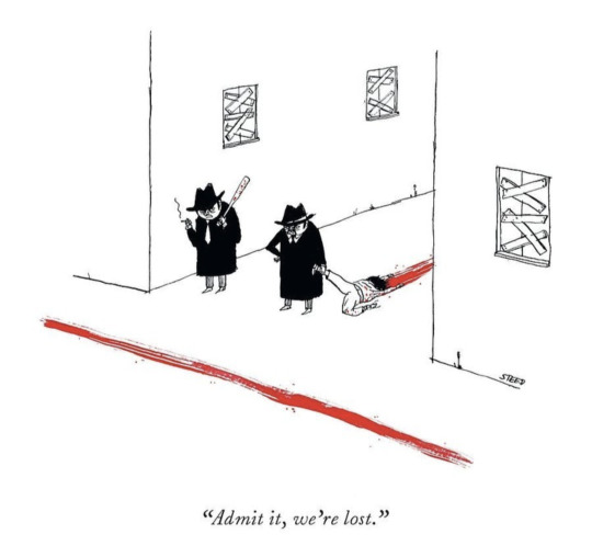
Can't believe the New Yorker is making cartoons about color theory.
16K notes
·
View notes
Text
Color has been disappearing from the world.
A new research group used machine learning to track color changes in common materials and items, below is their findings for all color changes over time, they used 7000+ items from the 1800s to now to determine color changes in the most common items.

Below are the colors of cars by year, notice how the majority of cars are grey, white, or black compared to twenty years ago.

These aren't data points, but they are comparisons between the 'modern' homes of the 70s and 80s compared to the modern homes of today.


Carpets have equally had the same treatment of grey added to them! The most common color of carpet is now grey or beige.


Even locations that used to scream with color for decades have now modernized to becoming boring minimalist (and I love minimalism) personality-less locations.


The world is becoming colorless, why?
source paper
#color#color theory#science#research#machine learning#mine#tweets#not my car I have a bright orange/yellow truck#tweet source removed as fascist tendencies have been pointed out
80K notes
·
View notes
Photo

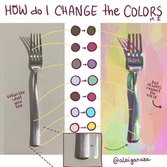
Color Saturation guide by AlaiGanuza
#art#color palette#color saturation#how to create saturated colors#Alai Ganuza#AlaiGanuza#color theory#art tips#coloring tips#color guide
29K notes
·
View notes
Text
Color Like a Classic Comic Book
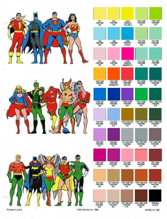
I'm doing some tinkering on Fauxstalgia stuff, and since I believe in sharing resources, here's an RGB PNG version of the official DC pantone guide, with the swatches re-sampled from current pantone standards. This set is from 1982, but should be generally believable for most stuff post-WWII.
The versions floating around online (two of which are under the fold) are scans of prints and are not accurate for color-picking.
Now, these colors would also be altered by the printing process, but for clean, pre-print versions, here's some authenticity.

4K notes
·
View notes
Text
Getting the fountain at the new children's hospital ready for opening day.
36K notes
·
View notes
Last Seen Blogs

heidimarkhamrealtor-blog
Untitled

a383a383dj
趕快來儲值a383-免費a片

b-classique
bliss

35canister
Sharing my journeys and memories on film

greenpapayaartprojects
Green Papaya Art Projects