#this blog in a nutshell
Text
“not to be -“
and then i be
6 notes
·
View notes
Text
Creepy/abstract art and nature photography.... because those go hand-in-hand, you know 🙃
This is a side blog. Main blog here.
0 notes
Text


" 𝑷𝒇𝒇𝒕 , 𝒈𝒆𝒏𝒅𝒆𝒓 .. 𝒂𝒎 𝒊 𝒓𝒊𝒈𝒉𝒕 ? "
0 notes
Text
I'm just... losing my mind over the thought of someone coming from a wealthy or refined background who has had perfect etiquette and decorum drilled into them that they can't drop it even if they tried. Someone who looks and acts so incredibly proper and put together, the type of person who always says sorry or excuse me after coughing or sneezing.... coming undone with a terrible cold or flu. They feel so horribly sick they don't even have the energy to excuse themselves. Their LACK of their otherwise perfect manners is a sign to their friends or partner that something is seriously wrong with them and that they are down BAD.
#snzblr#snzfucker#snz blog#illness kink#snz thoughts#snzario#this is literally my OC in a nutshell#i love torturing this type of character#like being so ill that you lose your otherwise perfectly intact manners#really does something to me#like oh? you feel so bad you can't even excuse yourself? Pathetic.
53 notes
·
View notes
Note
toto was spitting some real facts with his take about how all drivers are just still little boys in the rain trying to please their fathers. interesting that max and george rly don't get along very well because i noticed a lot of similarities in their childhoods and their relationships with their fathers, espically the point about how steve always looks for the replays for mistakes vs jos still sending max feedback
i think about Toto saying that probably every day of my life. and the fact that he just said it casually in an F1 promotional video like it's nothing. god.
if you haven't listened to Toto on Nico's podcast talking about it and you're in the mood for more daddy issues, i really recommend that as well. first of all, super interesting to hear about Toto talk about his own upbringing. and then i loveee when Toto's like, actually Nico i'm not sure you fit my model! and Nico's like, flat out no i do and let me tell you why in detail.
105 notes
·
View notes
Text
they’re a 10 but they prefer fictional characters over real people.
#me in a nutshell#books & libraries#dark academia#dark aesthetic#dead poets society#light acadamia aesthetic#light academia#literature#poetry#quotes#romantic academia#study blog#studyblr#chaotic academia#chaotic academic aesthetic#classical literature#dark academic aesthetic#classic lit quotes#dark academia aesthetic#donna tartt#the secret history#oscar wilde >>#classical paintings#love quotes#cottage core#sylvia plath#the picture of dorian gray#the bell jar#they’re a 10 but#fictional characters
841 notes
·
View notes
Note
hi... don't know if you're the person to ask but do you have any tips for like. edit composition. (????) thar makes no sense . i apologize

i’m probably not the right person but fear not i’ll say some bullshit anyway. obligatory preface but i have never taken a graphic design class in my life so take everything i say with a grain of salt, or several, because idk what the fuck i’m doing
a good thing to keep in mind when editing is your focal point—that is to say, whatever it is you wanted people to be focused on. in most cases it’s probably going to be a character, but you might also have text or something else as your focal point. after you’ve picked your focal point, find ways to emphasize it—people usually do this with stroke (outlines) or with things behind the character like splatters, laces, etc. it should be relatively easy to spot a focal point in most people’s edits, even if they didn’t knowingly pick one. if your edits look janky, you probably ended up with too many things your brain is trying to focus on at once—try simplifying it or making one part pop out more than the other! this also comes into play with text. using my pinned as an example:


(still frames so they’re easier to see) you can see that len and rin are the focal points of this image because they’re outlined and because they’re in front of the text. the text is in the back because i deemed it less important than the characters—i mean, you can read my url without the image anyway.
also, sizing is a pretty big thing in composition. your brain looks at the biggest part of an image first—this is the concept behind newspaper headlines! your brain looks at the big text first, then at the smaller. you can see this reflected in my current header (displayed below, in case i change it at a later date) where “canarysage” is bigger than “resources for editors” because I wanted you to see “canarysage” first

how you align your elements is important to. generally speaking, you’ll want to keep everything pretty centered, but, as with anything, you can break this rule for the sake of creativity. when you’re making things like this directory graphic:
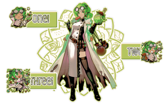
it’s cool to do a zig-zag sort of pattern. when making something like this, it’s probably better to do from left to right—that’s the way english-speakers (and speakers of several other languages) read things so that’s how your brain automatically goes. you should also position whatever you want to be read first near the top—in this case, the part that says “one” is in the top left, because that’s where most people’s eyes will go automatically. you can also see the central art is the focal point because of the outlines and the shapes behind it. the buttons are kept separate because they’re a solid color instead of the pattern used on the background shape—and the text stands out because it’s outlined in black, unlike the rest, and it has a pattern. if you use patterned text, outline it so it’s clearly seen and read.
you can also avoid centering things to make your edit more ‘dynamic’ (idk if that’s the right word) like i did with this header:
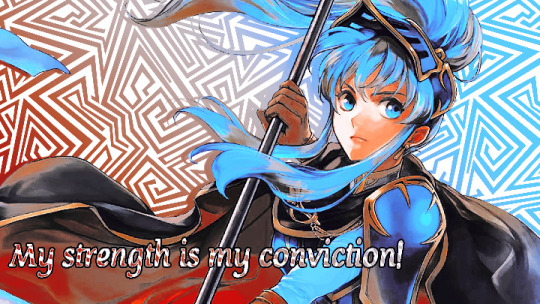
both eirika and the text are off center, which makes it look more interesting. also, they’re aligned differently—eirika is aligned to the right while the text is aligned to the left. this helps it seem less empty and is more fun visually
if you’re doing an edit with an even number of characters (like a ship edit) you’ll want to keep any one character out of the center, as this makes them the focal point and can kind of shunt the other off to the side. unless you’re doing matching graphics, in which case you should keep one centered, so it’s clear which is the “main” one in each piece of the set.
sizing is also important in terms of literally how small or big your edit is. headers tend to be pretty large (tumblr uses a 16:9 ratio, and twitter uses a 3:1) but things like icons or stamps are pretty small. especially with stamps, you’ll want to make your character pretty large in the stamp so they’re more easily seen. tumblr icons show up on your dashboard as 128x128, which is pretty small, so you’ll want to make sure your icon is easily discernible from that size.
also, i dont think this is necessarily a hard and fast rule, but when you’re making icons and you have to crop out a portion of the character’s head—crop out the top of the head, not the chin. i can’t tell you WHY i think this is a rule or even if anyone agrees with me, but it’s something to keep in mind. here’s an example of the two different kinds of cropping:


cropping the chin out just looks goofy, idk
since rentry graphics are just sort of dependent on the user, there’s no real hard and fast rules to composing them. just keep in mind whatever your focal point is and try to keep people’s attention on it, whether by adding random shit or outlining or whatever.
same thing with replycons, really. i like to keep my replycons semi-simple, but if you’re doing a collage-type of replycon, it’s better to keep the collage in the background for the most part, except for one or two focal pieces:

you can see that most of the collage pieces are behind rin except for the flower stickers, which are off to the corner so they don’t detract from her. the stripey-line things help a lot, too, as they lead your eye to the main part of the reply icon even without being centered—the main part being the character, of course
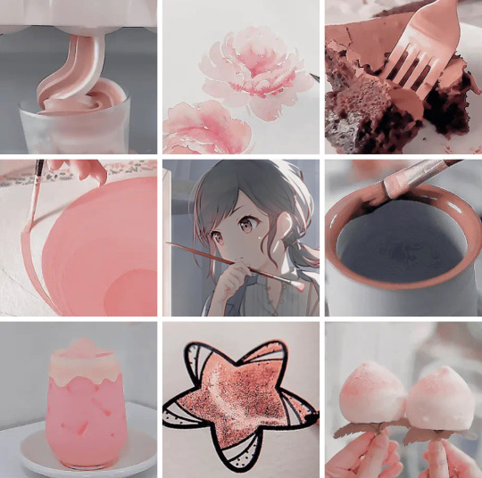
with moodboards or stimboards, it’s best to keep your character in the exact center—unless you have two, in which case keep them both in the middle so they’re easier to see. there’s no hard and fast rules with moodboards, but i like to keep images with similar composition near but not directly beside each other
the top middle and bottom middle of this one are both pretty minimalistic, so i kept them adjacent from but not beside each other. as for the rest of it… well i just kind of did whatever
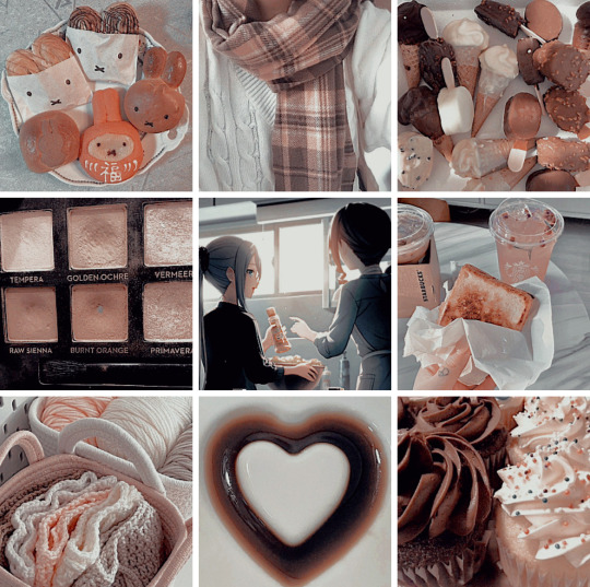
if you’re doing a moodboard or stimboard with two kinds of themes then it’s best to do a checkerboard type of pattern
you can see that here. the pattern is food-art-food-art-ena-art-food-art-food. like a checkerboard, except ena’s in the middle
i’m being so for real i don’t understand composition at all. it’s really best to just do whatever looks best to you personally and see what happens. i hope this is helpful-ish!
yours truly, canarysage
#world’s least helpful editor tries to run a resource blog: canarysage in a nutshell#you can find a lot of resources on composition if you look it up where smarter people explain things better#but i just sort of. do whatever#ʚɞ — tips.
21 notes
·
View notes
Text
man I have been sleeping on season 10 wincest. it is serving so much! Sam is so unbelievably in love with fond of Dean and so concerned for him, you can taste it in every single moment, his number one priority is getting that mark off Dean's arm and just getting his brother back. I'm realizing now how it's a sort of a season 3 parallel, with the looming dread of a terminal condition hanging over Dean, and Sam determined to save him, but this time he's not gonna fail no matter the cost. it's so delicious. and Dean! vacillating between his lowest i'm-a-lost-cause lows and nearly zen-like highs, reflecting on his life and purpose and, for the first time in maybe ever, on his desires, for himself and his future--a future that, however brief, he wants to spend with Sam. he still sees himself as expendable after the blow to his confidence that was the season 9 divorce, but despite the literal fratricide-inducing curse he's under, for most of the season he's more upfront and honest with Sam than ever before, and actually allows himself to lean on him more than in the past.
there's an exquisitely bittersweet mutual dedication but with this disparity between what they each think their futures could/should be, because Dean can't quite believe that Sam needs him as much as he needs Sam. but he's okay with that. which is so tragic because it's not even true; Sam does need him, and he's half out of his mind with worry. he's so eager to be there for Dean, and yet so emotionally alone in his crusade to save him. this is one of my favorite Sams, at his most headstrong and single-minded. and a mature, complex Dean, who's finally being completely honest with himself about a lot of things, but too late--so he thinks--to do anything about it. it's so easy (and painful!) to imagine him finally accepting his true feelings for Sam, but refusing to act on them because what's the use? Sam needs to let him go and that's not gonna help, and besides, no way does Sam feel the same. and Sam, who's maybe always known how he feels about Dean or maybe is just realizing it now, also afraid to start something at such a fragile moment but dying to prove to his brother just how much he loves him. desperate, determined Sam and clear-eyed nihilist Dean; it's a match made in heaven <3
#wincest meta#my meta#spn season 10#huh realizing that this season is a really good rewatch for my current wip#because that ship dynamic--desperate determined/clear-eyed nihilist--is pretty much the whole thing in a nutshell#it really is a match made in heaven to my tastes :)#so glad i wasn't on tumblr when s10 aired but happy to be in my own little bubble blogging about it now#when me and maybe three other people will care lol#wincest#spn
46 notes
·
View notes
Note
wait wait, I can be a good older (younger?) sister!! I've never not been a mom friend.
first of all, congrats to angel anon for getting good dick. That is always a win, especially if you are being treated respectfully!!!
not sure why the school has a no fraternizing policy for lecturers bc I feel like it's not that uncommon, but if you've gone looking for a policy for TAs and not come across it, it's probably fine!! I know multiple TAs who have dated/been with people in and out of their own departments!
obviously, every institution and even national culture is different, but the main thing that matters in terms of job security is power dynamics. it sounds like you hadn't even really crossed paths at work before, which is a good sign, and it would only become an issue to me if either of you had a supervisory role over the other or had any decision-making power when it came to the other person's job. For example, different context but still academia, I know someone who was applying for a role with a uni association and they were seeing someone who would have been on the hiring committee; they disclosed it to the team, and their partner was excluded from making hiring decisions for them. It maybe a little embarrassing, but it all worked out in the end! i also know someone who was assigned a TA that they were dating because they were in upper year undergrad, and the TA was a master's student only two years older than them; they just disclosed a conflict of interest and were moved to a different group.
at the end of the day, get good dick! take a step back if you feel like your relationship is being leveraged in any way against your career! fuck anyone who is judgmental! and live your life!
(also keep lo's asks updated so we know the tea)
omg ru, I adore you so much for this !! angel anon, this one's for you. 👼🏻
#ru let me tell you I'm always the mom friend too!#on my blog I've managed to be more of an older sister which is a welcome change#I never got to replying to your prev ask but it's that infp/infj experience in a nutshell haha. I love us for this <3#lo answers#👼🏻
12 notes
·
View notes
Photo
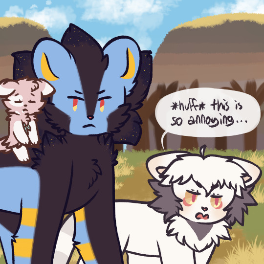
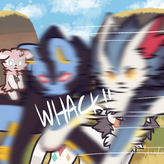

OSJFKGDKFGD--
#ask-indeedee#pokemon ask blog#pokeask blog#luxray#luxio#espurr#shiny espurr#byulluxray#artemisluxio#hawkluxray#misc#TO BE CONTINUED#this is just ask-byul in a nutshell
34 notes
·
View notes
Text
booooooo logic
boooooo limits
boooooo negative thoughts
boooooooo 3D
booooooooo the one random person a month that comes on here just to try to disprove the law for some reason, we're not sure why
#loa tumblr in a nutshell#law of assumption#manifest#manifesting#manifestation#law of manifestation#law of attraction#loa#loa blog#neville goddard#subliminals#the void state#void state
22 notes
·
View notes
Text
Log on. Scream about Zowens. Log off.
18 notes
·
View notes
Text

yeah, exactly
3 notes
·
View notes
Note
Beast!Wirt: “alright Bipper, I’ll hear your favorite song”
Bipper: “Alright hotshot, let me bless you’re ear holes with 10 hours of Rising Shepherd Tone-“
B!Wirt: “that better be the name and not 10 actually hours cause I will beat you.”
#ask#anonymous#incorrect quotes#dipper pines#gf dipper#gravity falls#dipper#bipper#gf bipper#otgw#over the garden wall#beast!wirt#otgw wirt#otgw beast!wirt#pinescone#them in a nutshell lmao#bipper WOULD have some ridiculous long ass song as his fav wouldn’t he?#or if he’s just being a dick and feigning then yeah lmao that also completely works#sorry for being a dead blog I don’t mean it but yeah y’all are free to send stuff in lol
85 notes
·
View notes
Text
HAPPY HALLOWEEN YALL🎃🎃💕
[Senior year took away my energy😭😭]
#Lowkey haven’t been in an art mood as of recent#Work is constantly on my desk and projects keep rearing it's big ass head#i want to focus on projects at my own pace and I keep stressing out thinking I should post something every time an event comes up in TWST#or even a new book/chapter#but I have to realize that I have ZERO deadlines when it comes to my blog#im stressing myself over nothing#I also want to change my art style and try something new#i was afraid first but I really want to continue with this decision#I’ll be gone for a while AGAIN.#but I’ll try to reblog as much as I can from my moots.#so yeah in a nutshell: I’ll post when I feel like posting…YIPPIE!👍#viper update#Just a tiny update#BUT MOSTLY HAPPY HALLOWEEN#happy halloweeeeeeen
7 notes
·
View notes
Text
Team green fans every time someone from their own team both characters and Fandom does something (literally anything) :
Team green when team black once again both characters and Fandom does the exact same thing:
I'm tagging everything very well so if you're team green and you see this and get mad that's on you just filter the tag
#Anyway.....#This is not the right blog for me to be having all this discussion on lol#So fucking annoying seriously#Team green fans is basically grace's fans in a nutshell#house of the dragon#Hotd#anti team green#anti alicent stans#Anti Alicent#pro team black#pro rhaenyra
36 notes
·
View notes
Last Seen Blogs
minihopes
月下情人

hockeymilf
hockeyMILF

gezondheid01
Gezondheid
undxfeatable
Those cute freaks.
the-meme-monarch
THE CASSETTE PLAYER IS TRANS CODED I KNOW THIS