#light edits for saturation bumps here and there but that's it
Text


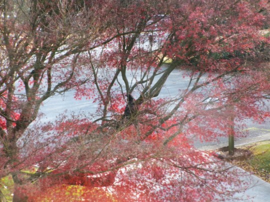
#kodak pixpro#point and shoot#i'm having fun tbh#i'm keeping it#light edits for saturation bumps here and there but that's it#macro mode is shockingly nice#and a real zoom kicks the shit out of the digital zoom on a phone sorry not sorry
8 notes
·
View notes
Text
Okay, need to type this out just so I will stop thinking about it, so stay with me for a "why Buck and Natalia won't last based on the use of the blue and green thing with the two of them"
Okay, so pretty much every couple in the show ever is seen in blue and green at some point. Even random couples in calls.


And they are very careful with patterns, we see Hen and Karen with patterned stuff that's blue and green but since their style is build around patterns it makes sense for them to have that in a way that doesn't for the rest of them.
My point is, it's one piece in a solid color. A shirt or a jacket.

Why is that relevant? Well, while Buck and Natalia are wearing blue and green both in the date at the loft and at the hospital, it's not solid. Buck is fully in blue, yeah, but she's in a black dress with green detailing, that's not even fully green.

And since she never takes her jacket off, you can totally see both of them as the blue character.
And I had left it at that until the other day where I was watching 6x18 on my tv and I noticed something (because i am an insane person who calibrated the colors in my tv because i was bored one day)
Please excuse the terrible job lighting this screenshot, I added the swatch to prove my point but if you want you can take the og down there and brightened it and bump the saturation and you'll see I'm not crazy
But the thing is, I thought she was wearing black and he was wearing grey. Until I realized her cardigan is green. Really dark green but green. And once you brigten the scene up, his jacket is blue, but it's patterned.


And there's also the way the shades don't fully match. Like, when bathena, madney and henren are wearing blue and green, they MATCH.


But for example, Buck and Taylor don't. Like, Karen's green looks way better with the blue of the uniform than Taylor's.


And like, here, his green doesn't look as good as it could look with her blue.
And Buck and Natalia? You can fully miss the way they are wearing blue and green in the scene they get together. Like? Everything is on purpose with the costume department, so this is a choice.
Even more when you realize his jacket is blue and green.

I'm sitting here torn between wanting to give the costume department a standing ovation and checking myself into a psychiatric hospital.
Edit: The way she's wearing blue and green in the loft but Buck is fully blue and she's fully green but he's blue and green in the hospital is what gonna make me go crazy. Like? The symbolism of him ready to be all the way in when she's not and then turning that around once she comes back???????????? Hello????????????????
29 notes
·
View notes
Note
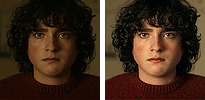
how do you get your traditional art to retain its color once you photograph it?? Everything looks so vibrant and well lit it’s honestly incredible.
I was originally going to have a straight forward answer, but I think this is a good opportunity for me to share how I go about preparing my artworks for social media.
Disclaimer! I'm not an expert in photo manipulation. This is what I learned after doing some research and experimenting.
Capturing the artwork
I have to be transparent though that I do not photograph my work, I scan it! I use a CanoScan LiDE220. I've had it for 6 years. This is why I am able to retain the artwork's texture. However, the result of the scan is very washed out, and is not accurate to the artwork's actual colors. Example below:

The left image is the raw result from the scanner, while the right is an edited version that I have posted. As seen, the left image is washed out. So, to the best of my ability, I change different parameters of the image to get the closest to the real artwork. I use photoshop to edit the image, but it is possible to do it in any photo manipulation software (or you can get a cracked ver-)
Editing the photo
1) Levels

Levels is where you manipulate the values of the image. The left is for your lightest values, and the right is for the darkest values. Moving the left slider alters the lightest values of the image. Moving the middle slider alters your middle values, and same goes for the right slider for the darkest values. I often slide the middle slider to the right to darken the image. I hardly touch the other two. Alternatively, you can use Curves to darken the image, it is a more intricate version of Levels and gives you the most control. I am not super familiar with it, so I cannot talk about it.
2) Hue and Saturation
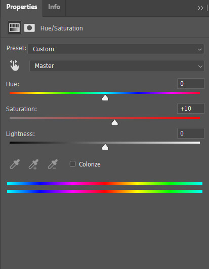
Hue controls the most dominant color of your image. Saturation controls the intensity of the colors in your image. I often bump up the saturation of my images. There are times I also alter lightness just ta bit for sketch sheets, to slightly washout colors (mainly the yellow of the paper)
3) Color Balance
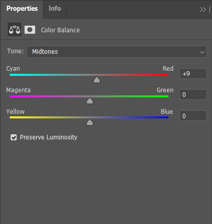
Color balance indicates which of the colors in each slide is more intense globally. Meaning that if you put the slider closer to blue, then all yellow tones will be washed out. Sometimes the Hue and Saturation sliders aren't enough, so I use Color Balance to tweak it a bit.
4) Brightness and Contrast

Brightness refers to how light or dark the piece is overall. Contrast refers to the difference of the lightest and darkest values. I often use this when manipulating sketches, this is to make the inks pop out more.
Other stuff that might be relevant
every piece has it's own set parameters, I eyeball everything lol. I do not have any "set values"
If there is a specific part of the image that needs editing, I "Mask" that part of the image out. Meaning that only a specific part of the image will be altered. Masking does not permanently change the image, so you can easily delete it if needed. Crash course in "Masking": the visibility of the image is set in black and white. The black parts of the mask is hidden, while the white is seen (Image below.) So for example here, only the white parts will be affected by the color balance

as much as my scanner is helpful, it cannot scan large pieces. One of the largest sizes I am able to scan is A4. So, I have only been using that size or smaller. If you want to invest in a scanner, you should consider the sizes of paper you often use. You can also "stitch" the artwork together (i believe photoshop has this, but it might be a hassle. I can't speak about this because I haven't tried it.)
If you are doing paintings on a canvas, you will have to photograph it There is no other way around lol, paintings like those are really photographed. Professional artists either have their own photoshoot set, or they find a place where they can have it photographed.
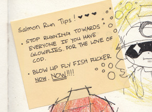
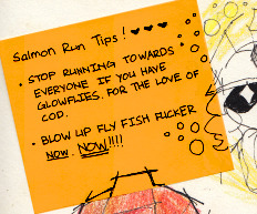
Sticky notes, or paper with luminosity aren't picked up by the scanner. I've been struggling with this one for awhile lmao. Altering it with the aforementioned steps alone don't give the result I want. I use layer modes too. Still currently experimenting. Example is below, original is a neon orange sticky note.
(original scan)
(altered with brightness/contrast, darken layer mode w/ orange, and vibrance)
ANYWAY!!! This is a master post of how I currently go around my works. Very lengthy, but I hope it helps someone!
#art tips#photoshop tutorial#art tutorial#photoshop#art help#image manipulation#traditional art#danee answers#danee talks#anon ask
104 notes
·
View notes
Text
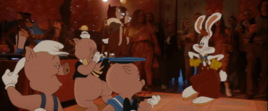
Let’s talk about the Chip n Dale trailer huh
ok so I have obviously a lot of complaints about the Chip n Dale trailer as a veteran Rescue Rangers fan. (aka me and my sister sung the theme song on repeat on the school bus until the other kids made the bus driver make us stop.) But like that’s all obvious stuff, let’s talk about the motherfucking animation in this fucking trailer.
So in this Bonkers script they slapped on Chip n Dale, we’ve got a Roger Rabbit world where toons and humans co-exist and CGI is a metaphor for plastic surgery. ok whatever. But the “““2D””” animation looks like ASS.
Note: when comparing animation, I will not be editing the gifs (no color correction/saturation/etc) so that we can compare them accurately. The only editing done is to occasionally slow down a shot so that the gif doesn’t give me a headache. I will mark slowed clips with a * in front of them so you know. ok thnx
So like. let’s start with the obvious comparison. Roger Rabbit.
Here’s how he looks in the trailer (w/ chip, dale and the three little pigs)*
Here’s how he looks in the movie made in the fucking 80s.
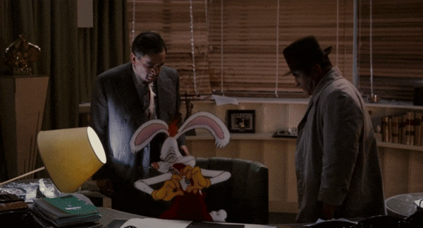
Starting with what should be obvious to any animation student: the lighting. The lighting in the C&D trailer doesn’t hit the animated characters. It’s flashing colors and you could take the opportunity to make it look like Aristocats but they don’t change color at all; maybe a tint here or there at best. The lighting in Roger Rabbit was famously impressive because it was super difficult to pull off with their limited tech at the time.
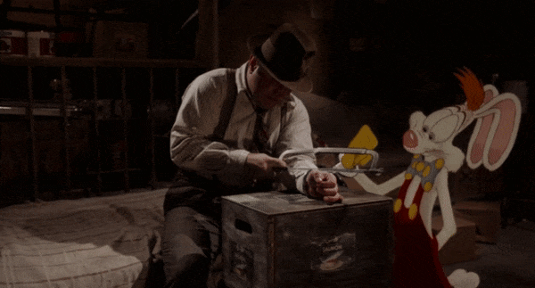
If you’re an animation student you already know this, but for everyone else: the technique “bump the lamp” was named after the following giffed scene in Roger Rabbit where Roger and Valiant are hiding in a storage room and “bump the lamp,” causing it to circle around. This means that the lighting is constantly shifting and changing. At the same time, Roger must interact with shaking handcuffs and stop a shaking box. This was super difficult to pull off but they did it just to show off that they could.
The C&D trailer has no lighting effects which makes it look super tacky and slapped on. Roger doesn’t even look like he’s touching the floor, let alone in the room.
“But Connie,” you may say, “This is a different 2D animation style. This is the ‘2D Shader Style,’ which is just CGI that looks 2D. Roger Rabbit is an unfair comparison.”
You may also say, “oh, Connie, it’s just the trailer, the animation’s not completely finished yet, even the Sonic 2 trailer spots are showing animation upgrades as they go along.”
So. Let’s compare this to. The Tom and Jerry trailer.


They’re both obviously CGI if you pay close attention, and Tom and Jerry has a bit of the same lighting problem on Jerry (the trailer at least, I haven’t seen the full movie). But two things distinguish them:
The lighting is not as bad; it’s not a recurring problem, just in a couple shots I noticed.
Tom and Jerry is expressive. The C&D characters barely emote, don’t really move much. T&J, meanwhile, knew that their main draw was the slapstick, which requires a lot of expressiveness. Their faces go wide, their reactions to getting hit are big. In a lot of the shots they look like they’re there, interacting with the main characters, and you can kinda look past the lighting thing because the interaction looks so good.
Again, though, haven’t seen the full T&J movie, maybe they fixed the lighting, maybe they made it worse, but this is just comparing trailers with the same animation style, right?
And ALSO. ALSO. This 2D shading thing. They didn’t NEED to do 2D Shading! Last year they dropped the new Space Jam with actual good-looking 2D animation.
COMPARE THESE.
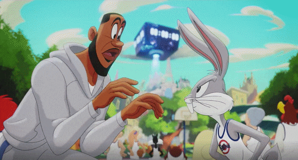
[this third one is *]
Space Jam’s EXPRESSIVE, it’s SHADED, it LOOKS LIKE THE ANIMATORS GAVE A SHIT ABOUT WHAT THEY WERE DOING.
Space Jam 2’s also a good comparison with the plot-- Space Jam was ALWAYS corporate shilling and vaguely meta. Daffy Duck plants a WB logo on his ass and kisses it in the og film. The new one has Foghorn Leghorn in Game of Thrones. It’s always been corporate pandering and they’re not pretending to be anything else and that’s fine, we go to the movie to see funnie rabbit play basketball with pretty animation.
Chip and Dale was NEVER subversive meta commentary, nor was it ever like. Interacting with the IRL world like this. It’s not Roger Rabbit– the tv show they’re ripping on, Rescue Rangers, was originally a tv show for The Rescuers; basically, little rodents solving mysteries and interacting with other animals. It’s simple and I don’t understand how they got “Roger Rabbit Rip” from this.
If they wanted to make a Disney Afternoon reboot movie commenting on changing animation styles, making meta jokes and getting a celebrity cast in... Bonkers was right there. Nobody liked Bonkers but that just means you can’t possibly ruin it and incur widespread wrath. Honestly, you could even make it better and actually get fans in.
But nooooooo we gotta slap it onto C&D because people have wanted a reboot for that and they got excitement in DuckTales so why the fuck not.
also just saying? Not pitching up the voices was a horrible choice. Mulaney and Samberg wouldn’t have been bad choices, they could get good inflection down, but you need to pitch up the voices for Chip and Dale. Even the Alvin & the Chipmunks movies pitched up their celebrity cast, and when you have to say “the Alvin & the Chipmunks movies did this better” you KNOW you fucked up royally.
...oh my god you know what this is. This is an Animaniacs rip. I just realized this as I was about to post. They’re 100% trying to do an Animaniacs movie. “Popular show in the 90s that marked a generation and then got cancelled, and now we’re in a world of humans and toons commentating on the current state of animation.” That sounds like an Animaniacs movie. Was. Was this a script for an Animaniacs movie and then it actually got a (good!) reboot so they ran off and pitched it to Disney? Is that what happened????
This is my new theory I’mma die on this hill.
tl;dr
I am going to turn to the Disney CEOs (Bob Chapek and Bob Iger) and, in the wise words of wayneradiotv,
“I WILL STRANGLE
THAT BALD FUCK
WITHMYOWN ONE HAND”
#chip and dale#chip n dale#chip n dale rescue rangers#chip and dale rescue rangers#who framed roger rabbit#tom and jerry#space jam#space jam 2#space jam a new legacy#animaniacs#mine
1K notes
·
View notes
Text
Coloring Icons from Uncooperative Screencaps
Someone recently asked me how I colored my icons for Superman & Lois, a show that has some pretty severe color grading (usually yellow). Every time they tried to brighten their icons, their subject wound up glowing, completely washed out, or tomato colored. I realized my answers to them might be helpful for other people dealing with screencaps that have strong color grading, so! Here is my guide to how I color the following icons.


I always start by making a 100x100 Photoshop document.

Then I paste my image in and resize it to fit the way I like. (Use CTRL + T to resize your image and hold down shift while scaling to keep the proportions the same.)
Once I have the icon framed how I want it, the very first thing I always do is sharpen the image. When you’re working with something this small, sharpening just makes it pop. I use Smart Sharpen (under Filter > Smart Sharpen) with Amount 500% and Radius 0.2.


You might not see the difference in this above image, but trust me, you’ll notice it on your icon. Once you do this sharpen effect once, you just need to press CTRL + SHIFT + F and Photoshop will automatically apply the most recently used filter for you.
Now on to the actual coloring. All of my coloring is done using the adjustment layers, which are found above the Layers panel. These will add your effects as a separate layer that can be tweaked at any time, as opposed to the Edit menu which makes those changes permanent. (If you don’t see them, go to Window > Adjustments to make them visible.)

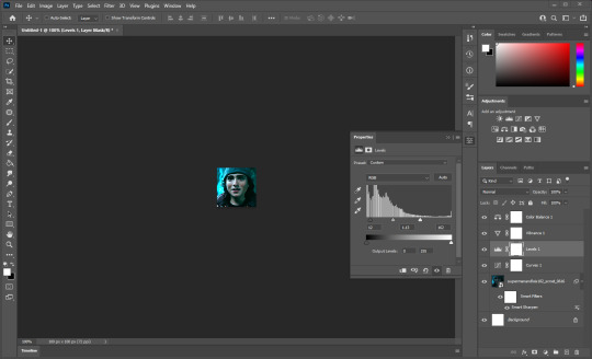
I always start with Levels, which is the icon that looks like a bar graph.

Click that and a new layer will be added above your image. This menu should also open. (Go to Window > Properties if it’s not there.)

You’ll see a histogram, which shows the approximate amounts of lights and darks in your image, with three sliders below it -- one black, one gray, and one white. The black slider adjusts the Black Point of your image, determining that everything darker than a certain value will display as pure black. The white slider similarly adjusts the White Point, making everything brighter a certain value display as pure white. The gray slider adjusts the midpoint between the two, making all the midtones of the image darker or brighter accordingly.
I always start with the black slider and nudge it to the right until the darkest parts of the image are looking nice and dark, but not so dark that the entire image gets lost in shadow. For this particular icon, with his dark hair and black shirt, that’s not very far at all.

Then I adjust the white lever to brighten the image. Because icons are focused on the face, I don’t worry too much about what happens to the background. I simply move the lever to the left until the person’s face is nice and clear without glowing or becoming completely washed out.
Then I bump the gray lever to adjust the rest of the image until it has the amount of contrast I want. For this image I want his face to be a little bit brighter, so I move the gray to the left a little bit.

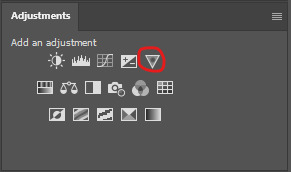
That sets the brightness and contrast of the icon. Now on to Vibrance. I really like my icons to have a lot of color, and to accomplish that, I add a Vibrance layer. Vibrance looks like an upside down triangle in the Adjustments panel.
This will add another new layer above your Levels layer, and will open this window.
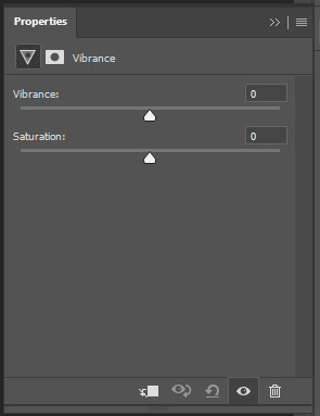
You have two sliders, one for Vibrance and one for Saturation. Saturation is fairly straightforward -- it boosts all of the colors in an image uniformly. Vibrance is a little bit different -- it boosts colors, but a bit more selectively, focusing on cool colors and colors that are more muted.
For almost all of my icons, I set Vibrance to 50 and Saturation to 10. This gives all of the colors a small boost, and the more muted colors a bigger boost.
And for this icon, that’s all it really needs. The colors are neutral enough that adjusting like this didn’t knock things too terribly out of wack. Now let’s try an image that doesn’t play as nicely.
I start the exact same way. Blank 100x100 document, paste in the image, resize, sharpen.

Add Levels. Adjust the Black Point until the darkest parts of the image are pure black without the entire image being dark. Adjust the White Point until the skintones are clear without glowing or being whitewashed. Adjust the midtones until the contrast of the image is where you want it.
Add Vibrance. Set the Vibrance to 50 and Saturation to 10.

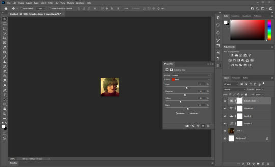
And... yikes, that boy is yellow. Sometimes boosting the contrast and brightness can make people’s skin start to turn funky colors. But we can fix this! It’s time for my best friend, Selective Color. Selective Color looks like a box cut into four triangles.

The Selective Color window looks like this.

Unlike Color Balance, which adjusts the colors of every part of an image all at once, Selective Color lets you target only a specific color range and adjust that. So for this image, I want to only affect reds and yellows in order to make his skintone look more natural.
Note the colors dropdown at the top of the window. It’s set to reds by default, but with this image we want to start with yellows. Switch it to yellows and move the yellow slider to the left to take out some of that color.
That’s already an improvement, but he’s starting to look too red now, also. Move the magenta slider to the left as well to balance that out. Be careful not to go too far, otherwise he’ll have no color left in his face and he’ll start to look ill.

This is much better. His skin is looking a bit too dark, so I’m going to move the black slider to the left a little. This will brighten the yellows of the image and therefore brighten his skintone a little.

That’s looking much better. For some images you may need to adjust the reds as well as the yellows, but this one is good as is.
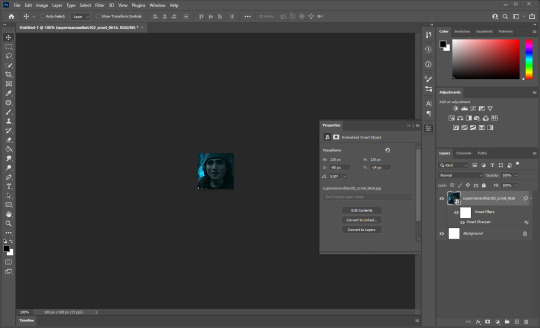
Last but certainly not least, let’s do a really dark scene. I’m gonna start with this base image.
Whenever I see that my starting image is extremely dark, the first thing I do is add a Curves layer, which looks like a wavy line going through a chart.
Curves can do some very powerful things for lighting in an image, but for this, all we really need is the blend mode. At the top of the Layers panel, there’s a dropdown that reads Normal. Open that and select Screen.

This will brighten the entire image without washing it out, as it leaves the darkest parts of the image untouched. It essentially gives a new base to start from, rather than trying to do everything from the dark original image.
Now we can continue coloring just like before. Add Levels and adjust as before. Pro tip: don’t fight too hard to make this as bright as the other icons. Just focus on making sure his face is clear. If the scene is just dark, let the scene be dark.

Add Vibrance and adjust as before.

And now we have a very orange boy. But we can fix this with Selective Color just like before.

And that’s looking pretty good.
And for one last extreme case, let’s do this very dark blue scene.
Again, I start with a Curves layer with a Screen blending mode.

Then Levels and Vibrance.
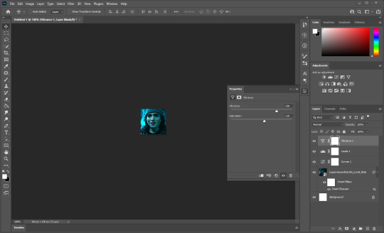
Now, in this particular case, it’s not the skintones that have gone wacky. The entire picture is just blue -- his skin, his clothes, the background, everything. So for this one, I’m not going to use Selective Color. Instead I’m going to use Color Balance, which looks like a scale.
Color Balance will open this window. While Selective Color targets specific color ranges, this will just affect the entire picture at once.
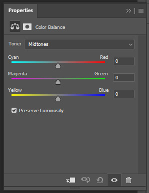
We want this to be less blue, so I’ll nudge the top lever away from cyan and towards red, and the bottom lever away from blue and towards yellow. This will take trial and error, so be patient with it.

Now some green has started to creep in, so I’ll nudge the middle lever away from green and towards magenta.
Now the colors are right, but the image became dark again as a result. So I’ll go back to my original levels layer and nudge the White Point and midtones up a little to compensate.
That’s looking pretty good. You could definitely nitpick more and push this one a lot further with other tools, but for a quick icon from a difficult scene, I think that’s plenty.
And that is how I color my icons! Some scenes are more stubborn than others, and occasionally this isn’t enough and I have to employ some other tools. But for the vast majority of my icons, those are the steps I follow -- Smart Sharpen, Levels, Vibrance, Selective Color. A Curves layer set to screen if the starting image is too dark, Color Balance if the entire scene has an extreme tint to it.
My one last pro tip is that once you set the adjustment layers for one scene, they should work for most of the other caps in that scene. You might have to make minor tweaks here and there, but the basic colors and lighting should stay the same. Just paste in your next image and add it underneath all of your adjustment layers.
I hope this has been helpful!
56 notes
·
View notes
Text
I.I.G.Y.M.H.W.Y.T.I.A.M.M.T.H.M.I.T.W?
COWBOY!BUCKY X READER
♡if I gave you my hand would you take it and make me the happiest man in the world?
Summary: Nat and Wanda take the reader post break up to The Stark Ranch, a beautiful little place in the lush green countryside. God she hated it, she didn't want to be here only wanted him back. With one dip of a black cowboy hat and a deep-voiced greeting, the readers brooding would have to wait.
Part 1 of 3
Warnings: light mentions of past abuse,
WC: 3.8k
A/N: there was a tiktok and it was just cowboy Sebastian Stan and this fucking song!! Here's a thing I can't stop thinking about! I edited this the best I could.
In the long, rich history of bad ideas, this had to be the worst idea anyone has ever had. Here she was, squished in between her best friends in the back of an Uber. An old country song from the 60s played on the radio as the two redheads gushed about the small town they were driving through. The most popular restaurant back in Brooklyn probably had more people inside it than this little country town.
"Are you done brooding?" Wanda complains, her Sokovian accent purely intensified the distaste in her tone.
"All I want is John, back," Y/N mutters bitterly, her jaw clenched, sinking lower into the seat. Both women roll their eyes at her comment.
"You haven't stopped mentioning Walker since we got off the plane. It's been 2 months Y/N," Natasha reminds her, checking her watch that was peaking from her black leather jacket. "Don't forget this is why we're here! A getaway is just what you need."
Has it already been 2 months? It only felt like 2 weeks since he left. His last words still sent a chill down her spine "Did you really expect me not to cheat, Y/N? It's New York, get used to it, babe." Y/N shakes her head, trying to get that man's callous words out of her head. She felt like she was already at the acceptance of the grieving process. She clearly wasn't there.
Natasha suddenly gasps, the Stark Ranch coming into view with its black iron gates, its name the biggest thing on it. Y/N looks in Nat's direction, the 4 story red and yellow inn sat in the middle of a long dirt road and was nuzzled in with the saturated green grass and big trees. Y/N thought it was pretty but she would never admit that to her friends.
"Ladies you have a good time out here! I reckon you'll find our little town quite charmin'!" The older man tells them happily as his car comes to a stop in front of the inn. The girls give him their thanks and get out to take a look at the place.
Nat's hand shielded her eyes from the sun as she looked up the place, a confident smile on her face since she picked out this place in the middle of nowhere. Wanda stood in the middle with her hands in her pockets and a relaxed smile. As for Y/N? she might as well have a dark cloud hanging over her. It smelled like grass and horses, her black ankle boots were covered in dust, and worst of all...Natasha blocked John's number. "Relaxation awaits girls!" Nat cheers as she leads her small pack into the front doors of the inn.
The inside was just a cute as the outside, country-style couches placed in the center with a mahogany coffee table littered in doilies. Guests laughed and chatted behind the french doors in the restaurant beside them. "Welcome to Stark Inn!" The front desk lady greets them, her strawberry blonde hair tied in a bun and a glossy smile on her features.
"You go check-in, I'm staying here," Y/N sighs, plopping down onto one of the floral couches, taking out her phone from her back pocket. Nat and Wanda rolled their eyes, pushing their luggage next to their friend before walking over to check-in.
She checked her phone 5 times, 5 different bell-sounding notifications from 5 different apps. Nothing from her former love, of course, not because he's blocked. The next bell sound didn't come from her phone but the front doors of the inn. The ding was followed by two men laughing loudly, one clapping the other on the back. The Y/H/C girl looks up at the source of the ruckus.
One was blonde, wearing a thin blue flannel shirt and dark jeans. He was cute, had a nice ass, and blue eyes a lady could swim in. The other man was a different story, however. A blush crept up her cheeks as she looked at him. His shoulder-length hair was tied up in a low bun, face nearly hidden by his black velvet cowboy hat. Fuck that man looked good in red flannel.
The said man looked down at her. Oh shit, she'd been caught staring at the two cowboys. Before she could look away the one in red smirked at her and dipped his hat "ma'am," he speaks in greeting, his voice was low and raspy, sending butterflies to her stomach and other regions.
"H-hi," Y/n says shyly, like a schoolgirl whose crush finally talked to her. The man turned away and walked away to walk towards the front desk, mud left behind from their boots which they were quickly scolded for.
"Well while you boys are makin' a mess 'round my inn you can take help these girls up to their room," Pepper, the co-owner huffs "307... the nice one." Pepper waves them off, turning to grab the keys to the room.
Natasha eyed the blonde man up and down, resting her back on the front desk, propping her elbows up behind her. "Hi there cowboy," she speaks to him flirtatiously, her pink lips form a smirk. The man ducks his head and laughs.
"Hi there. I'm Steve."
"Natasha."
Y/N rolled her eyes at the flirting, rising from the couch she went to grab the handle of her bag but was met with cold metal. Her eyes flew up to see the man in the back cowboy hat already grabbed a hold of it "I'm assumin' this is yours?" he chuckled with that honey-like voice. Y/N nods and crossed her arms over her chest, her hand still feeling the chill of his hand.
She followed behind them, taking the red-carpeted stairs. She was behind them enough to stare at the broadness of his shoulders, a small smile appeared on her lips thinking about what it would be like to run her hands down his back. No, she quickly erased the image out of her mind. That thought returned as they climbed the second set of stairs, her Y/E/C traveled down his back and landed on his backside as he climbed. A red rag hung out of his back pocket.
The man turned around as they reached the top, catching her stare at him "I'm Bucky," he tells her, breaking her out of her trance. Bucky was 2 for 2 catching her stare at him. The red in her cheeks matched the vibrant red of the rag her eyes were once fixated on.
"Y/N," she responds simply, her voice quiet.
"It's a pleasure to meet you, miss." His words made her skin tingle, small bumps rising to the surface of her clothed skin. Her green jacket covering all the evidence.
"It's nice to meet you too, Bucky," she ponders over his name for a minute "did your parents name you that?"
Bucky laughed, oh God his laugh was precious "No, uh- my name is actually James. Bucky is just a nickname, I like it better," he explains. Y/N moved from the back to his side as they walked up the final set of stairs.
"Both names are nice," Y/n chuckles, "they suit you." They both looked at each other and instantly smiled, she even unfolded her arms and let them linger at her side. She forgot what it was like to be comfortable after all this time. Walking on eggshells for a man who could set off at any moment was what she grew accustomed to. This was nice, even she had to admit that.
The two girls in front couldn't help but give each other a knowing look, Steve even joined in. "He hasn't dated in years," he whispers to Natasha as they approached the room.
"A shell of a man cheated and dumped her," Wanda tells them in a hushed voice.
They reached the white door with a golden plate '307' written in script numbers. "This is the best room at the inn!" Steve starts to gush, placing the bags on the ground.
"Clear view of the stables, horses walking around all the time," Bucky chimes in, his elbow nudging Y/N the arm. he looked up at him with raised eyebrows but he wasn't looking at her this time. Did he do that on purpose? No. Probably not.
"Well... we'll let you ladies get settled in. Don't hesitate to reach out of you need anything." Steve dipped his hat and started to walk away, clapping his friend on the shoulder, turning him to walk in the same direction.
"See you around, Y/N," Bucky told her before walking away. Her eyes lingered on the tall man as he walked away and even he turned around to catch another glance at her. 3 for 3.
"Did someone catch feelings already?" Natasha laughed as he unlocked the room. Y/N eyebrows furrowed in anger, walking in after her friends, roughly brushing past the sassy redhead.
"All I want is John back. I don't know what the hell that was out there," she defended herself, snarling as she sat in the chair by the large windows, her legs hanging off the ledge.
The women hung their heads and began to unpack "You can have the other bedroom," was all Wanda said before the conversation ended. Y/N felt the guilt rise in her heart. She didn't mean to be so blunt and rude to them, in the back of her mind she knew they knew they were trying. She was trying too.
Time had passed and clothes were hung and folded away in their drawers. Nat sat on her laptop looking for places to eat in town while Wanda checked in with her husband and kids back home. Y/N hadn't left the chair since they arrived. Checking her phone for someone who couldn't talk to her.
"Look at this cute little place in town! It's home cooking they call it. We should go," Nat tells the girl happily.
"I'll call the Uber after I talk to Tommy," Wanda joins in.
"I-I don't want to go," Y/N says, her voice softer than before. She turns his attention to the sables below her, a black horse being led by the man in the black hat. "Bucky," she whispers to herself. She watches him, his lips were moving, obviously talking to the beautiful animal. A smile dared to appear on her face while she watched him, she saw her reflection and she sucked in her lips. Her attention went back to her friends.
"We're not going to let you coop yourself up in this room all night, Y/N." Natasha squints her eyes in judgment, closing her computer with a loud thud.
"And I don't want to make this trip miserable for you guys. I just need to be by myself for a while."
"That's what we're afraid of. It took 2 weeks to get you out of your apartment."
"I'm doing better now!" she shouts, realizing what she did she gulped and sat straight up in the chair, placing her feet on the floor "I'm sorry, Nat. Please just go, have fun and I promise we'll do that spa ay like you wanted tomorrow."
"Fine, but give me your phone," Wanda interjected, holding out her hand while her other one placed her phone in her back pocket. Y/N scrunched her nose and shook her head. Wanda's eyebrows lowered, her hand still stretched out as she walked towards her. She cocked her head, striking fear into the Y/H/C. She hated when Wanda did that.
"How are you going to reach me if something bad happens?"
With the phone now in Wanda's hand, Nat said "We'll call the front desk."
The girls had left, telling Y/N to make her time alone useful. She wanted to sit and wallow in her never-ending sadness. She remembered a time like this at a New York lawyers convention when John left her in the room for hours while he partied downstairs. No, no, she didn't want it to be like this even if it was her choice now.
The stables. She walked over to the window and saw the red building empty from what it looked like. Maybe she could get a glimpse of the horse she saw. Bucky didn't even cross her mind then or was that the reason she wanted to go so badly. No, it had to have been the horse she saw. Keep telling yourself that.
Y/N stayed back a bit longer, giving Nat and Wanda enough time to leave the property. They would never let this go after the stable comment Bucky made. She stepped outside, the sun starting to set and a small chilled breeze brushes past her. Lurking around to make sure no one was there she slowly walked into the stable, the horses not paying her any attention.
There she was, the beautiful black mare standing her her stall, her face poking out of the window. Y/N walked over and let the horse sniff the palm of her hand "You're so pretty, my darling," Y/N beams, rubbing her nose. The horse nickered, making the woman laugh "You like compliments don't you."
"She craves attention!" A voice called out from the other side of the barn. Y/N whipped her head to the side, her heart thumping against her chest. Bucky started making his way over, two silver buckets in his strong arms. The sweat on his face didn't go unnoticed by her, she swallowed hard and took a step back from the horse.
"I-I didn't see a stay-out sign, I'm sorry if I'm not all-" her rambling was cut off by his soft chuckle and the clang of the buckets now on the ground.
" I don't mind, doll. Clementine loves the company." I was hoping you'd show up, he kept that to himself of course. "While you're here, do you want to help me brush her? She gets sad if I don't do it before I leave."
Y/N smiles softly and nods at him, her hands folded in her lap. Bucky eagerly opened the stall and allowed her to enter first. He ran around to empty the feed buckets and placing the buckets on the shelf. He pants as he hands her a brush, his awkward smile earning a thank you.
Bucky stood on one side while she stood on the other, brushing the shiny coat of Celmentines's body. The silence was a comfort and the soft brushing noises were music to their ears. She enjoyed the silence and stolen glances at each other. His steel-blue eyes fixated on his favorite horse, she'd never seen someone look that loving towards someone else.
He breaks the silence "So what brings you guys all the way out to our neck of the woods?"
Was she supposed to be honest? Because 'I'm desperately trying to get over a man who ripped my heart out' doesn't scream approachable. She bit her lip and looked at him from the other side of the horse, their searching eyes meeting.
"Fella did me wrong so my friends decided a getaway was the best medicine," she explained, a watered-down version of what the real devastating truth was.
Bucky nods as he listens to her, slowly making his way to her side, brushing Clementine's hip as a cover. He didn't push it any further, now wasn't the time and he remembered her somber appearance when he first met her in the lobby "Where ya from?" He asks instead
"Brooklyn." His ears perk up, he hadn't thought about that city in so long.
"Brooklyn?" he hums, "how's the city these days?"
"Busy," she responds, looking over at him trying not to act surprised that he moved closer. "You've been?"
"Once or twice." 7 years. He frowned and bit the inside of his cheek. Y/N hums and starts to brush the side of her neck. Clementine whinnies, making the woman jump back. "I-It's ok," Bucky tells her kindly, holding out his hand, "she likes that, let me show you." He takes off his hat and tosses it on top of the hay pile behind them.
His flesh arm placed at on her midback, bringing her closer to the horse. His metal arm covers her hand to guide the brush down Clementine's neck. The sound of her own heart was deafening, he was so close she could pick up everything. The smell of hay and horses mixed in wish musk and was the cedar? It was manly...just like him. The stands of loose hair stuck to his forehead, small grey hairs mixed into his stubble.
Her eyes shifted away from his face onto the sight in front of her, his hand over hers, the gold and black metal shining in the overhead light. She wondered if he could feel her. "Your arm?" she questions barely audibly.
"It was a military accident...I fell," he responded, she couldn't tell if there was sorrow in his voice or he was just accustomed to explaining it all the time.
"It's nice! I hope I didn't offend you," she tried to pull away from the situation she created but his flesh arm held her still. He looks down at her and smiles.
"You didn't. It was a long time ago."
His reassurance got her to relax. They eased into small talk about their lives, she learned that he was born here and always helped the Starks on the ranch when they opened it, leading into a job when he got out of school. He was kind and funny, made her heart constantly skip beats when he said something nice. It made her forget John Walker for a while.
The sun went down, the auto light of the stables turned on. Bucky knew he should've clocked out by now, but this was far better. She was sad, he knew that, but when she relaxed she was surprisingly funny with her quick wit, soft smiles, and her newfound love for his favorite girl Clementine.
"Have you ridden before?" he asks as they finish, taking her brush back.
"No," Y/N laughs as she recalls her childhood, "I saw a boy fall off one at summer camp and I swore I'd never do it. I admire from afar."
Bucky joins in on the laugh while he grabs his hat and dusts off the loose straws of hay on his hat. Y/N bits her lip and pats Clemintine one last time before the pair walked towards the door "Watch your step," he warns, holding his metal hand out for her to take. She looks at him for a moment, feeling like her feet were cement. Her eyes flash from his hand to the softness in his eyes.
"Fucking hell Y/N let's go!" John's hand outreached for her, it was shaking, matching his anger. "I'll fucking leave you here. You know, fuck it. Walk home." That hand turned into a fist... she didn't like that fist.
Hesitantly she takes it, her nervous fingers wrapping around his palm as he guided her over the edge of the stall and onto the main ground of the stable. "Thanks for letting me brush her, it was nice," she smiled, still holding his hand. She wasn't the only one who didn't let go.
"Any time, doll. How long are ya here for?"
"5 days," she responds. Not enough time, he frowned and bit the inside of his cheek.
"Well you can come down any time you'd like, Clem would like the company." I would too.
Y/N finally realized she was holding his hand, her eyes went wide and pulled away suddenly, her nervous chuckle ringing in his ears "I-I should go... thank you again Bucky."
She scurries off towards the inn, their hands still tingling. He'd never been this happy to still have nerves in his arm "God bless Wakanda tech," he praised under his breath, clenching and unclenching the hand.
"Y/N! Wait a minute," he shouts stopping her mid way. She turns and see's him standing there in the overhead light of the stable, like he was waiting for her to get there safely.
"Yeah?" she questions, matching the volume of his voice.
"While you're here you should try Happy's Diner! Best coffee in town!"
"I thought this place did?"
"Don't let Pepper convince you!"
Y/N giggles and nods "I will. Goodnight Buck."
"Goodnight, Y/N!" He watches her leave, making sure she was safely inside, she turned to catch one last glance at him making the brunette smile at her and waving her off.
It would be another hour before Natasha and Wanda returned to the room, finding their friend in the same position in the chair by the window. This time her shoes were dustier than before, black hairs visible on her cream-colored shirt. She stared at the cowboy painting on the wall in front of her like her life depended on it "What did you do all day, Y/N?" Wanda asks, tossing Y/N's phone on the bed.
She expected her to run and grab it, feverishly checking the messages John couldn't send. That reaction never came, she didn't flinch when the phone landed on the bed with a soft thud. Her mind was still a blur, Bucky was kind, he held his hand out for her and got her to the other side of the stall...he waited for her.
"This," Y/N remarks, coming out of her thoughts pointing to the chair she was occupying. The spy in the leather jacket didn't buy it, looking at the differences in her clothing and demeanor.
"Sounds like a bore," Nat sighs, deciding to let it go for a moment.
"How was the restaurant?" Y/N yawns, getting up and walking past them. The two redheads sniffed the air as she passed, it smelled like Y/N had been sleeping in a barn. Well, that was almost true.
"What the hell is that smell?" Wanda grimaced, her nose scrunching at the foul smell. Y/N stopped in her tracks and closed her eyes, she wasn't about to tell them about her time in the stable with Bucky. She brought her shirt up to her nose, fuck, it was her.
"Must be the atmosphere," she laughed it off, "I'm going to bed!" She rushes off before the accusations came and she knew they would come.
The door to the adjoining room slams shut and the girls give each other a knowing look "Twenty bucks says she smuggled Walker in here," Wanda bets.
"Nah, it was the guy with Steve. She blushed way too much to have done nothing about it."
"Fair."
#bucky barnes#bucky barnes x reader#bucky x reader#bucky barnes x you#bucky x you#cowboy!bucky#cowboy!bucky x reader#sebastian stan imagine#winter soldier x reader#bucky barnes au#bucky au
186 notes
·
View notes
Text
Making a Normal Map (from scratch) in GIMP - Part 1 of 2
So you're making a recolor, and when you try it out in the game it has weird outlines for pockets and whatnot. What gives?? The Normal Map (or sometimes the specular)! The bane of us noobie CC creators!
I had a rough time--and much Trial and Error--trying to figure it out so that I don't just have to "Make Blank" for all my CC. This guide gave some helpful pointers (https://sims4studio.com/thread/861/normal-maps-bump-editing-creating), but it left out a bunch of key info. So... here we go!
Side note-- What exactly IS a Normal Map? I don't 100% know. But it's purpose is to create a sort-of 3D effect on your 2D texture. It can help make your recolor look less "drawn on" to the mesh. I don't notice a difference in Sims 4 Studio, but there is a difference when you're in the actual game. When it comes to textures without a Normal Map, I think the grandpa from Derry Girls said it best: "It's just not as nice..."
You will need:
- Your completed Diffuse texture (your recolored .dds file)
- Sims 4 Studio aka S4S
- GIMP (free image editing software)
1.) I'm going to use my current WIP Kim Possible Cheerleader uniform as an example. Open up your .package in S4S. You can skip this step if you still have your Diffuse file laying around, but just to be thorough: Select your Diffuse and Export it.
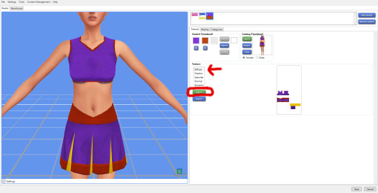
2.) Open your Diffuse file in GIMP (or another Photoshop-type program, but I like GIMP and that's what I'm showing in this tutorial). When the options come up, make sure you de-select "Load Mipmaps". You don't want to load the mipmaps. You'll know you did this right because you'll only have 1 layer, as opposed to like 40.

Note here: if your clothes have a printed design or stripes or something on them, you want to get rid of them. They shouldn't be on the final Normal Map.
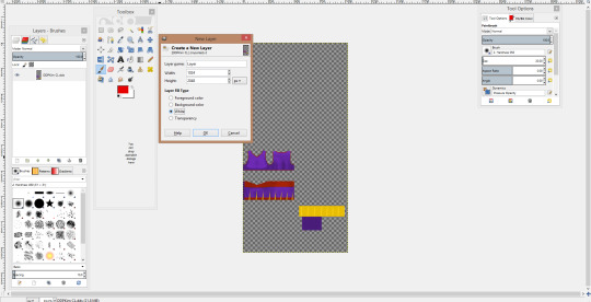
We need to make sure that your .dds has Transparency (an alpha channel). Mine already does, as you can see by that grey checker-pattern in the blank spaces. If yours doesn't OR you aren't sure, make sure you add one. In the Layers panel, click "New Layer". Keep the sizes the same, and select "Transparency". Move this layer to the bottom, then select your first layer and "Merge Down".
2.) We also need to add a "White" layer or else the Normal Map will be all kinds of messed-up. This is the same process as adding an alpha channel, btw. Right-click in the Layers panel, and add a New Layer. Instead of Transparency, we need to select White.
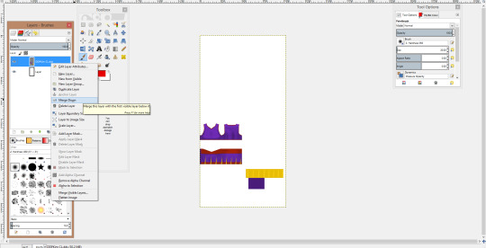
The White layer always gets put to the top for me, so we need to move it lower in the Layer panel.

The White layer will now appear below your Diffuse texture.
3.) I forgot to screenshot this, but we now need to de-saturate your Diffuse layer to make it black-and-white. Making sure that your Diffuse layer is selected in the Layers panel, click Colors>Desaturate... from the options bar at the top. Alternatively, press Alt+C, then Alt+D. I like to choose either "Lightness" or "Average", depending on how much of a contrast my Diffuse has/needs. Pick whichever you think looks better, then hit OK.
A.) If your Diffuse has white parts, skip to 3B! Do NOT follow this part or your Normal Map will be messed up! If yours doesn't have any white, then:
Select your Diffuse layer and "Merge Down" to combine it with the White Layer. Your Diffuse should be black-and-white, unlike mine. Oops! You now should have only 1 image.

From the top bar, we're now going to select Filters > Map > Normalmap... The below should show up:

Make the settings match that image. You should only have to change the Filter to Sobel 3x3, then go ahead and click Ok.
-------------------------------------------------------------------
B.) If you *DID* have white parts, we're going to do things a little differently. Make sure your Diffuse layer is selected, then select Filters > Map > Normalmap... (Alt+R should open the Filters, but I don't know the shortcut for Normalmap.)
Note that I forgot to desaturate when taking my screenshots. YOUR image should be black-and-white.
Make the settings match the follow image. You should only have to change the Filter to Sobel 3x3, then go ahead and click Ok.
Now, select your White Layer from the Layers panel. Repeat the steps to apply Filter > Map > Normalmap to your White Layer.
In the Layers panel, right-click your Diffuse layer and Merge Down. Your two layers are now combined into one.
---------------------------------------------------------------------
4.) Your image should now look something like this:
Mine looks a bit different because I forgot to desaturate, which will have repercussions later. But all blue besides the outline is good.
Continued in Part 2:
#sims 4 studio#Sims CC tutorial#ts4 tutorial#Normal map#bump map#recolor CC#create Normal Map#weird button outline#pocket outline
17 notes
·
View notes
Text
the miserable ones
an: for moose @homoose, aka one of the loveliest, most talented writers with the goldest of hearts
summary: spencer thinks reader’s out to get his book and shenanigans ensue, as fluffy as a disaster morning can be!
pairing: spencer x gn reader
warnings: broken glass, one curse word
word count: 1k
You know better – you really do – but you’re taking what fun you can out of straining the perfect blend of coffee, dancing around, and whipping a towel around like a rhythm gymnast at the most miserable hour. It’s only as the coffee pot smashhhhes across the countertop that you realise you may need to tone it down at 7:30 in the morning.
“Oh no,” you squeak, placing what remains of the coffee pot upright on the counter, using the towel to sweep the broken glass into the rubbish and praying that Spencer’s slumber remains undisturbed for at least a few more minutes. But while there’s no sign of him just yet, the damage is still extensive in another way. You have to splash through puddles of coffee to the sink to wipe down the kitchen – there’s coffee everywhere. All over the countertops, all over the stack of pancakes, all over the – oh no please not that, not after all the times you’ve –
“Good morning, honey,” Spencer rasps as he stumbles into the kitchen. Crap. He rubs at his sleepy eyes with the heel of his hands, lets out a soft grunt after bumping into the table. Your tummy flips at the sight of him: hopelessly endearing, eyes squinting against the light, soon to be even grumpier at the coffee-saturated loss of one of his most treasured books.
“Mmmfg coffee smells good,” he comments, and you’re seriously questioning his profiling skills because he’s yet to notice the crime scene. On autopilot, he opens the cupboard and fishes out his favourite mug. He stifles a yawn in your hair, wrapping those arms around you from behind and resting his head atop yours while your brain silently spirals.
“Can hear you overthinking,” he mumbles, “too early for that.”
“The coffee. It, um, well, I knocked the pot over. And now we have coffee flavoured pancakes?” You scrunch your nose as he picks his head up to survey the damage.
“Sounds delicious,” Spencer smiles easily, unperturbed, taking the towel from you and cleaning up the spillage. He kisses you softly as he passes, wiping down the fridge. “You okay?”
“What – yeah, I’m fine,” you say.
“Your blink rate just increased.”
There’s that familiar twinkle of humour in his eyes and your shoulders sink in relief. Why did you ever think he’d be upset? You sigh, almost forgetting, when he sees the book –
He stills. You wince. A tattered Les Misérables lies, soaked and pitiful, in a pool of coffee.
It’s excruciatingly silent for several minutes. You half expect a funeral march to begin when he takes it in his hands.
“Well you’ve finally won. I bet Fantine got a shock,” he muses, the corners of his lips twitching upwards.
He lets out a snicker, meeting your eyes across the space. You watch with bated breath as he tentatively lifts the sodden front cover with a finger. A trickle of coffee spills off the cover and splashes onto the floor. There’s a beat in which you both stare at the puddle, and then you both lose it.
“I’m sorry! I’m so sorry!” You gasp between laughter. He’s doubled over, forearms resting against the countertop and it’s all he can do to keep himself upright as he laughs.
“Look, here – I can fix it – I can –” you dash over and pat the book uselessly with the towel. Spencer’s crying laughing as he watches, so when you move to wipe his eyes with the damn thing, he throws his head back and cackles.
“It’s not that I don’t appreciate the thought…” Spencer chuckles, then snatches the hopelessly drenched towel from you. “But, love, what’s this going to fix now?”
He tosses it at you playfully. It smacks you in the face and hits the floor with a splat. Those Supervisory Special Agent instincts kick in at the look on your face; his lips tug to the side, he grabs Les Misérables lest you inflict any more damage and then hightails it out of the kitchen.
“Get back here, genius!”
“Leave Les Misérables alone! Haven’t they been through enough?!” He yells, darting around the couch, cradling the book to his chest.
“It was an accident! And Fantine’s drowning in coffee, she needs medical care!” You bat at him with the towel as you scamper through the living room, hallway, bedroom, bathroom, bathroom, bedroom, hallway, living room.
“Medical care from that thing? I know you’re just out to get her! It’s been years of this kind of behaviour!” Spencer shoots the dirtiest look you’ve ever seen at the towel and you lose it all over again, leaning against the living room wall to steady yourself. He’s not wrong. Throughout your relationship, you can’t count the amount of times you’ve damaged or been damaged by that damn book. He leaves it everywhere, after all, and you’ve stepped on it, tripped over it, even kicked it out of bed after Spencer slept with it. His grin lights up the room as he jogs over and places the book on the radiator beside you.
As your laughter peters out, you rest your head on his shoulder.
“You’re really not upset that I finally ruined your book?” You ask, eyebrows furrowed, the pair of you staring down at the book like it’s a baby in a crib.
He kisses your forehead to smooth the crease between your eyebrows and his large hand finds yours. He makes a face when you press the soggy towel into his palm instead and you let out a peal of laughter when he launches it back into the kitchen.
“Of course not. You invented coffee flavoured pancakes! And besides,” Spencer shrugs, cheeks rosy and smile bashful, “no matter what awful thing you do to one of the greatest books of all time…”
You duck your head, sheepish. “I thought you’d forgotten the time I accidentally ripped that page out.”
“It so was not an accident,” he goads and checks his hip with yours.
“It so was,” you mumble, but you can’t meet his eyes and he smirks triumphantly.
“No matter what awful thing, no matter how many stains or lost pages, I’ll always love this copy,” it’s his turn to be sheepish, “because you got it for me.”
You scrunch your nose, looking up at him. “You remember that?”
He looks at you, incredulous, brown eyes shining in sincerity. “I remember that 1253 days ago we met and I threw out my old copy.”
You nuzzle into his neck to hide your smile.
“Why? Was it the wrong edition?” You tease, kissing just under his ear.
Spencer smiles, heart leaping up to his throat – which he knows is impossible, but impossible things happen on the daily and also happen just now, as your teeth graze his ear and you allow him to hold you. His arms wrap around you tighter to tug you into his chest. “No. I just knew I’d never need another. And while this story’s about the miserable ones, ours never will be.”
#mooselovescreators#hoomose#spencer x reader#spencer reid#criminal minds#criminal minds imagine#spencer reid imagine#writings
101 notes
·
View notes
Text
would it be enough?
okay this isn’t edited or anything, but! here’s a little ficlet i started a few months ago and got the inspiration to finish.
title from & inspired by “peace” by tsweezy (that song makes me cry every time bc i feel like i’m never gonna get my happily ever after lol, so i had to give peter his)
word count: 1.6k
warnings: depression, happy ending, borderline personality disorder, domesticity, discussions of mental health issues
It’s dark in the bathroom. The only light is coming in from the frosted window over the bathtub, scattered beams pouring through the glass of the shower. There are two bodies underneath the rainfall showerhead, wrapped up in each other.
The taller of the two men pulls away slightly, reaching for a non-descript bottle of shampoo. He squeezes some into his hand, while his partner pumps a blob of body wash on a loofah. Their actions are like a choreographed dance as the smaller of the two tilts his head into the other’s skilled fingers, his own hand moving to lather at the sculpted chest in front of him.
Peter sighs at the feeling of Tony’s nails scratching at his scalp. He loves moments like this; where it’s just the two of them enjoying each other’s company, forgetting the world outside of the little bubble of peace they’ve created. Running the loofah across the older man’s shoulder and down his bicep, he watches the way the shadows and light drift over the skin. Carefully, he presses the pad of his thumb to the pale, mottled scar tissue covering the center of Tony’s chest where the reactor used to sit, rubbing gentle circles into the skin. It’s smooth to the touch, bare of the greying curls that are smattered from his pecs all the way down to the ‘v’ of his hips.
He loves this body- its strength, the way it makes him feel protected, the things it can do to his own. Looking up into Tony’s eyes, he thinks of how much he loves the man it belongs to. “I love you,” he says softly, puckering his lips as he’s maneuvered so that his head is under the water once more.
“I love you more,” Tony replies automatically. “Close your eyes, Pete.” His hands tilt Peter’s head back and he runs his fingers through the foam saturated curls. Once the front is rinsed, he opens his mouth again, “‘kay you can open now.” He takes his time washing all of the remaining suds out as the younger man continues to run the sudsy netting over his skin.
Next is the apricot scented conditioner that Peter loves. He applies a handful to the dripping auburn locks and rubs the excess into his own salt and pepper hair. Then Tony clocks the way his boyfriend is grinning goofily up at him. It brings a smile to his face as well. “What’s so funny, why’re you smiling at me like that, Pete?”
Peter’s eyes shine as they meet the older man’s. “You’ve got soap on your nose.” He hands Tony the loofah and runs his fingers under the water so that he can reach up to wipe the white foam from the other’s face. “Got it,” he says softly, letting out a quiet sigh as Tony rubs the sudsy loofah over his shoulders.
Moments like this, as peaceful as they are, are nothing if not effervescent. Even as he stands there under the warm spray, Peter can feel the chill settling deep in his bones and beginning to weigh him down. There’s a knot forming in his chest. He takes a deep breath and tries not to focus on it. He takes in the smell of their bath products, the feel of his big toe bumping against the inside of Tony’s foot. He listens to the sounds of their breathing, the water swirling down the drain. If he ignores the feeling it will go away.
It doesn’t quite work, and Tony makes a soft questioning sound in the back of his throat and pulls the shorter man a little closer as he rubs the soapy netting in soft circles over the expanse of his back.
Peter lets his forehead rest on Tony’s collar bone. His chest feels- tight. He takes a slow, shuddering breath and tries to calm himself down. He’s starting to get restless, that weird fizzly feeling thrumming in his muscles. “It won’t always be like this, Tony,” he mutters, self-deprecatingly. His arms wrap around his partner’s waist in an attempt to comfort himself. “I’m...I have bad days. So bad sometimes…” He succumbs to the lump in his throat and lets his voice trail off at the end in an attempt to keep it from breaking. His eyes start to burn. He doesn’t mention that he can almost feel one coming on now-
How did he go from being perfectly happy to feeling like he’s falling apart in the span of a few minutes? It never fails to make him feel ridiculous, how sensitive he is to his own thoughts. If only he could control it, if only he wasn’t so-
Another gentle noise from Tony, who presses a kiss to the shell of his ear. “I know. I love you every day, Peter. Not just when you’re having a good day.”
Peter lets out a frustrated noise, followed by a shaky sigh. “But...you’re so good, Tony. You’re, you’re normal, and… And I- I’m never gonna be that, I won’t ever really, truly know what that’s like.” And he won’t. Because even on the good days, he’s always aware that it won’t last. Just like the current situation. “There are days where all I can manage is sitting in front of the TV, wrapped in a blanket.” His voice breaks, and the tears that had been stinging at his eyes begin to fall in earnest. “I’ll- I’ll go days without showering because I can’t bring myself to get up long enough to take one, and I’ll put it off until I literally can’t stand it anymore because I stink so bad.” A soft sob rips its way up from his lungs, his whole body shaking with the force of it. Fuck-
Tony just rinses him off under the water, eyes full of compassion as he wraps his arms around him. “It’s alright baby, I’m listening. I’m here.”
The young man splutters, gasping as he starts up again, voice quiet. “I’ll split on you, there will be days where I’ll forget how much I love you, forget all the good stuff. Even though I know, Tony I know how much you love me, I do, but there will be days where I’ll swear that you don’t, that you never did.”
He’s not sure why he’s saying all of this. Maybe because they haven’t actually had this conversation. Tony knows about his mental illness, of course, but honestly, Peter had been content to let him do his own research about his condition and what that would mean for them. What he would have to deal with every day for the rest of their lives. He hadn’t wanted the words to come out of his own mouth. He refused to be the catalyst that would force him to watch the love of his life realize that he wasn’t good enough, that he was too reactive, too sensitive. That he was just- too much. In every way.
Too late for that now.
“I know, baby. Peter, I know all of that. I’m not going anywhere. You being borderline didn’t scare me before we got together, and it doesn’t scare me now.”
And something about that rubs Peter the wrong way. He wants to scream. “But it should, Tony! We’re talking about moving in together and you... You shouldn’t have to deal with my- With my crazy.” He cuts himself off and bites at his wobbling lower lip when he notices the way Tony is looking at him. He looks- hurt, almost. “What?”
Tony’s voice is low. “Don’t you ever call yourself crazy. You’re not crazy. You know what you are? You’re my boyfriend. You’re the most generous person I’ve ever met. You give the most amazing snuggles. You’re sensitive and extremely empathetic, and you always know the right thing to say. You’re helpful. You’re expressive, and in touch with your emotions, which can’t be said about most people. You are beautiful Peter, and so is this brain of yours and everything that comes with it. I wouldn’t change you for the world, okay?”
He pauses to press their mouths together and looks down at Peter, who stopped crying during his little speech and is now gazing at him with adoration in his eyes. “And baby, I know we aren’t married yet but I mean it- for better or worse, through sickness and in health. Or, uh,” he trails off, suddenly looking a bit shy. “However it goes. You know what I mean.”
Peter blinks up at him, heart fluttering in his chest. He’s disoriented by the sudden surge of serotonin flooding his system. This is exactly what he means, but- “You- You wanna marry me?” A shaky smile takes over his lips at the thought. Forever with Tony.
Tony chuckles. “Of course I do. Who else is gonna put up with me?” He presses another kiss to Peter’s forehead before dragging him under the water. “Let’s wash this conditioner out, put on some comfy jammies- Ah, yes I know we just woke up- and lay in bed today, hmm? I’ll be big spoon.”
The younger man grins, squeezing his eyes shut as the water cascades down his face. “Sounds like a good deal to me- Hey wait.” He cracks an eye open and squints at Tony. “That wasn’t you proposing, right? Because I think I deserve-”
An affronted noise leaves Tony’s mouth. “You can wash out your own damn conditioner! Who do you take me for? Of course that wasn’t a real proposal- I have standards!”
Peter just laughs as the man’s fingers don’t move from their place in his hair.
That knot is still in his chest but-
The good moments, like this? They’re enough to make everything else worth it.
#starker#tony x peter#peter parker x tony stark#tw mental illness#wooo this one's a doozy#i feel like this is awful but here have it anyway#bloo writes bad things (tm)
53 notes
·
View notes
Note
Have you thought about ever doing a step by step video/tutorial on how you make skins? Or record your process? I'm trying to start doing skins but there's a lot of stuff I don't understand that the site's tutorial doesn't really explain and speed paints aren't exactly great to look for answers, so I was wondering if you would ever do something of the sort, it would be cool
I’m kinda dumb and terribad at video recording but I can totes make a process with some screenies :0 Hopefully the following helps a bit. There is gonna be an assumption of basic knowledge on layers and whatnot just fyi! Perhaps someday I’ll actually record myself making a skin if I don’t get distracted and/or forget lol.
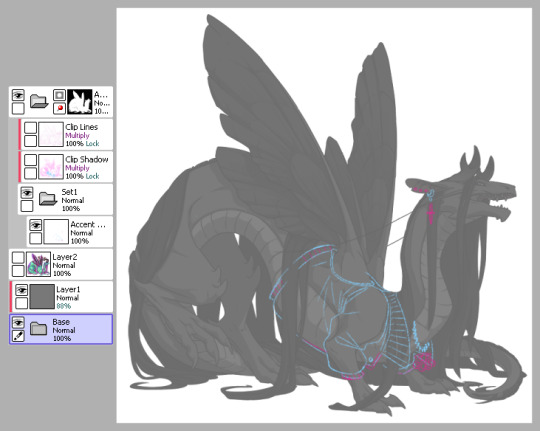
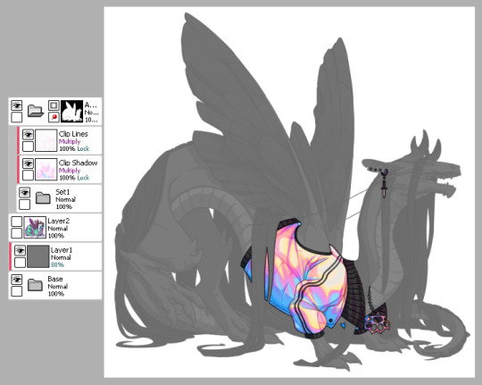
1) This is pretty much how I start my layers. I don’t change much from the default skin file provided by FR other than adding a mask to the skin folder so I don’t draw outside of the lines and then a gray overlay on top of the base just so it’s easier for me to see my sketch. I use bright colors like blue and pink to help me differentiate details. I turn off the clip lines/shadow as I don’t wanna see those atm.
The layer that says “Accent” is where I start my sketch.
If I’m making a skin for a particular dragon, I’ll often have them added in the file (note the hidden layer above the gray box). To do so, I save out a transparent version of the dragon and blow it up to 700px in waifu2x or something. Then I bump it up to 750px so it fits in the skin file. It’ll be a lil blurry but it’s good enough.
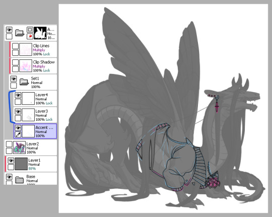
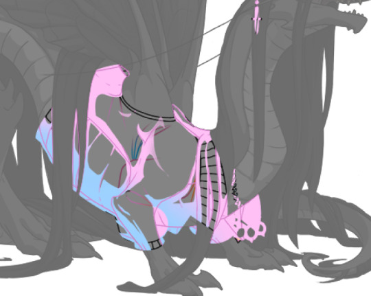
2) Next is line art - I have 2 layers for this skin: one for the jacket and another for the knuckle dusters and chains. Personally I like to close off all gaps in my line art, including drawing on the edges as you can see on the top of the collar by the wings or the gap formed by the hair on the midsection. This is just something I prefer doing as I find it makes my coloring less messy and annoying later on. But you can do it however it’s most comfortable.
At this stage, I’ll also either zoom out to 50% or resize to 50%, whichever works because it’s important to remember that the file size is 750 while the actual size you’ll have to save out will be 350 - details will shrink so make sure what you’re drawing will show up appropriately.
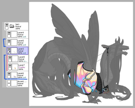
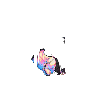
3) Now onto colors. Since I closed the gaps in the line art, I just fill bucket everything. For this skin, I drew the jacket’s colors on one layer because I’m trash and have 1 braincell but you can use as many layers as you need. In this case, the overlay layer was for extra saturation and the layer above that was for the black stripes. Be sure to clip additional color layers onto your base color so you keep things tidy and avoid coloring beyond the lines.
Again don’t forget to resize or zoom out to make sure your skin is looking as it should!
4) Finally I do some recoloring of the line art - in this case mostly the arm of the jacket. I lock the line art layer and go over it with colors darker than the surrounding colors - up to preference here. I don’t usually change the very edges just because I prefer a darker color there personally and my default is black. It’s also totally ok to have darker line art - again up to you.
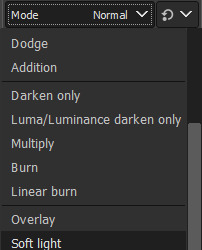
Then I turn on the clip lines/shadow since you have to make sure those show up in the final piece. Clip lines is usually set to normal but I change it to multiply because I feel it turns out better for recoloring. When I recolor, I try to match the colors of the skin while also making sure it’s dark enough to be seen. Same goes for shadows.
*If you ever get a skin rejected, it’ll usually be how visible you make the original shadows and line art. There’s not really a hard rule on what counts as “passing” since it’s up to staff but I try to make it obviously visible without ruining my skin. So here you can still see the belly scales for example, but it’s not so pronounced that it takes away from the jacket. It’s a lil uggo imo but it is what it is.
*Something to note when you color: be careful how dark you make your base colors! Too dark and you won’t be able to see the clip lines/shadow very well in the future. Note how the collar of the jacket is light enough that the shadows and lines beneath are still visible.
This is how my clip lines/shadow layers look on normal mode so you can see what colors I made them. Play around with the values to make sure you achieve some balance between your skin looking good while still showing off the base lines and shadows of the dragon. I used pink and blue here since it matched well with the skin. By default, the lines and shadows are gray and if you don’t recolor those, your skin will end up looking muddy.
*Other than recoloring, do not touch the clip lines/shadows at all. Do not edit them or erase them otherwise that’s a quick ticket to rejection.
5) Finally, turn off everything but your accent folder and save that sucker out and resize to 350px. At this point you can test it on your actual dragon by either pasting the skin onto a pic of the dragon or by using FR Tools. Reminder that you should not use/mention FR Tools on the official site cuz staff doesn’t like it. However on FR Tools you can also test the coverage of your skin when you select “upload skin.” Less than 30% and it’s an accent. Above that and it’s a skin. There’s other ways to test coverage but FR’s gimp tutorial sucks and is outdated and I don’t have photoshop so lol.
*I often go through several iterations of a skin just in case I see weird flaws or missing details. Testing is very important once you finish as major changes to your skin after submission is not a fun process so be sure to get it all squared away the first time.
^ Your final product should look like this: transparent png (32bit) at 350px.
*Now this was the technical side of making skins using the tools at hand. If you have further questions I didn’t cover here, pls do feel free to ask! I’m no expert by any means but I can impart what I’ve learned after making a few.
#tutorial#fr skins and accents#flight rising#Anonymous#long post#sorry if it's a bit wordy#skin making isn't super hard but there's just a lotta rules and things to keep in mind
123 notes
·
View notes
Text
Fake normal mapping on textures and other tricks for MMD
In this tutorial, I’ll show you how to improve textures with a normals-on-texture technique I’ve developed. I’ll focus on game ports, since they need it the most.
Content index:
Introduction
Applying The Technique
Useful Tricks
Credits
1. INTRODUCTION
In 3D, a normal map is a texture mapping technique very useful for adding details to meshes without using more polygons. It’s an “improved” bump map, which simulates bumps and wrinkles on the object’s surface.
Everyone knows MMD doesn’t support native bump or normal mapping, meaning the user only achieves it by using a shader and applying the texture as spa. However, not every shader has normal map support, plus a low-end user can’t have it without heavily (CPU) shading the model.
With that in mind, I developed a lifesaving technique for those with weaker hardwares. Or if you want to simply keep your normals while playing with other shaders.
2. APPLYING THE TECHNIQUE
First of all, we need to spot the normal map in the model’s files. They usually look like this one:

Normally, they’re added to the texture in the 3D software. What we’re going to do here is to add that texture to the base texture. For this, we’ll need a photo editing software. I use GIMP because it’s free, open source and low-end friendly. You can download it here.
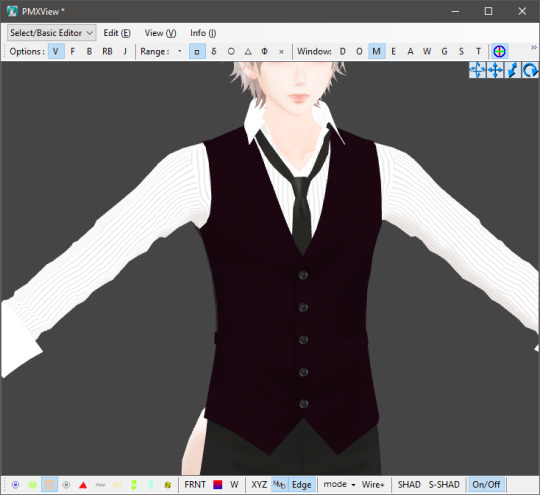
You’ll open the base texture and paste the normal map over it. I’m not going to show them here because they’re from a game. In green, we have the base texture; orange is the normal map.

You’re going to select the normal map layer and decrease its saturation to black and white. It’s a necessary step, we don’t want a colored details messing up the texture.

Next, change normal map’s the layer mode to soft light and you’ll have only the details applied to the base texture.
In practice on a model, the base texture is going to change like that. It gives a lot of detail to the model’s face.


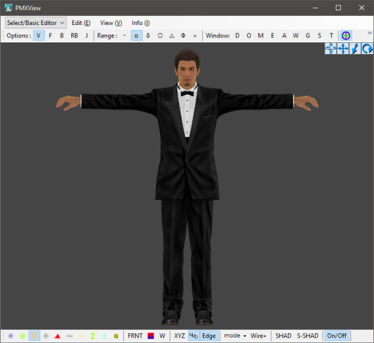
Akiyama-san looks more tired than ever.
This technique is extra useful when dealing with clothes so they don’t look horrible. Kiryu-san’s suit looks much better with the improved texture. You can do that to any part that has a normal map, even hair.

3. USEFUL TRICKS
Another texture trick is adding patterns to clothes, like shirt and suit stripes, maybe leather. Let’s call Akiyama-san back to help us with that. This is the default suit texture with normal maps, but it has no stripes! Odd, right? Because his suit has it in the game!


Hi there, Trakinas face!
His files come with a pattern for his suit. I picked this texture and added it as a sph sub-tex. Now his suit looks much better, although has no other sph. I tried coming up with a gimmick to work around this, but no success. Better leave it to the shader.
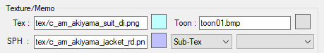


Another example using Kasuga-san’s shirt:


It won’t work all the time though. Also, some patterns will make the part too dark to see anything, so we have to do it the traditional way.
It didn’t work here. The base texture is almost solid black.
So what we do is duplicate the part you want to apply the pattern, add it as a normal texture and change the UV size. It’ll look a little wonky, but that’s the nature of it. You’re always free to try adding it to the texture on GIMP/Photoshop or edit the UV later.

Then make the duplicate part opaque. I usually use 0,3 so it doesn’t interfere a lot. You can keep the sph or not, it’s up to you.

If your game port comes with a texture mapping for shadow and highlights, you can add it to the base texture the same way we did before with the normal maps. I recommend placing the shadow one above the normal.
It helps with shading and creates results closer to the game. Yagami-san looks a lot better with improved textures.

4. CREDITS
Akiyama by lezisell, KS and SEGA
Ichiban by KS and SEGA
Cabaret Kiryu by spooky-majora, KS and SEGA
Lírio by KS
Yagami by Xelandis, KS and SEGA
9 notes
·
View notes
Text
lean on me
↳ finals week was looming and the world only continued to pile on. pushing the limits of the human brain became your new full time job as you tried to cram every piece of information into your head. one late night at the library becomes the straw that breaks the camel’s back and Taehyun comes to the rescue.
➤ slight angst, fluff, college!au
Word Count: 1,881
Requested?: yes
Warnings: self doubt and language!
A/N: I’m sorry if this isn’t reflective of what actual finals week feels like, lmao. I only had one finals week this year and I go to a liberal arts college where finals are “encouraged but not required”. Considering that, I tried my best to channel into my general stress from the week before winter break where all of my profs decided to have huge things due. Anywhooooo- the normal warnings that I didn’t proof read or edit apply here as always!
•:•.•:•.•:•:•:•:•:•:•:•☾☼☽•:•.•:•.•:•:•:•:•:•:•:••:•.
The words on your notebook seemed to be running together more severely the longer you stared at them. You weren’t sure how long you had been trying to absorb the notes from your entire semester of lectures, but you felt as if you had been sitting in the desk chair for about five years. Rolling your shoulders back only relieved some of the tension in your muscles. With a heaving sigh, you made a shaky note in your planner to schedule with your chiropractor at the end of the week.
Finals week was shaping up to kill you. It was Saturday night, but instead of partying or spending the night cuddled up with your boyfriend, you were melting your brain into mush in the library. In a futile attempt to soothe the headache stinging behind your eyes, you pressed the heel of your palm into your forehead. Nothing changed other than the amount of frustration bottled up inside your chest. When you had scheduled at the beginning of the semester, your advisor warned you against taking all of these classes at once. As you added up all the material you needed to review, you could see why she had seemed so spooked for you.
Of course you had kept up all semester, but none of that seemed to matter right now as you were staring at two large presentations, three essays and two 3 hour long exams in the face. So that’s why you were here, occupying an entire table with highlighted notes and annotated textbooks. Truthfully, you had no clue what time it was as you pulled your computer closer to work on your presentation slides. For a class that you took as an elective, Art History has proven to be a complete pain in the ass. Clicking through your partially finished presentation, you suddenly became overwhelmed with the true gravity of the week ahead. All you wanted to do was crawl underneath the table and curl into a ball, but the nagging voice in the back of your mind reminded you that procrastinating would only make this week so much worse.
With a sigh you settled further into your seat and steadied your hands on your laptop keyboard and waited for motivation to strike. Your fingers skimmed over the keys for a few seconds as you typed half a bullet point and deleted it, unhappy with the wording. You glanced over at your notes, searching for a certain statistic that you knew was hiding somewhere in the pages. Where the hell was it? Moving the notebook closer to your face didn’t give you the insight you hoped it would as you continued to struggle. Irritation had you pulling at the roots of your hair as you continued to scan the pages within the chapter you had chosen to report on for your final project.
You whined quietly, knowing that your overtired eyes were keeping you from advancing through the one thing you had for sure wanted to accomplish tonight.
“Fine,” you mumbled, “I guess I can just study for Chemistry.” The sound of your laptop snapping shut resonated through the sparsely populated library and made you cringe. Too lazy to actually pick up the hulking textbook, you simply pulled it toward you and watched the cover glide over the sleek library table. Fatigue was clawing at the back of your eyes, begging for you to succumb and lay down to drool on your much too expensive textbook. You fought off the urge with a quick swig of your iced coffee and a pinch to the fat of your cheek.
You still weren’t sure how long you’d been studying, but you felt as if your brain was about to explode cartoon style all over the wall. Even your favorite vanilla iced coffee had done nothing to increase your awareness, as you found yourself stuck in the perpetual loop of rereading a single paragraph about how to do gram to mole conversions. In the back of your mind, you knew it was time to pack up and go home. It was only now that you heard the insistent humming of the fluorescent lights that dotted the ceiling sporadically. Your left eye twitched. It was time to admit defeat and make the walk back to your apartment.
The night was surprisingly calm, and even in the late hour (early morning?) the air was infused with a comfortable warmth that made you feel a bit more at ease despite the looming tension headache you could feel. With the route memorized and your body set on the soft embrace of your bed, the walk back to your apartment was quick and easy. Once you stepped inside, you noticed lights on in the small kitchen and the low hum of a comedy special on the television. Your heart dropped into your stomach at the sound of hurried footsteps heading toward the front door. Taehyun.
Your boyfriend stood in front of you, mouth open wide and eyes scrunched together in worry. An apology was already on the tip of your tongue before he began to speak.
“Where have you been?” his words were saturated with a level of concern that made your heart crack like an eggshell. “I texted and called you all night! I was so worried, Y/N. Do you even know what time it is?” You noticed that his hair was ruffled and the way that half circles of darkness underlined his usually bright eyes before your brain could even register the weak timbre of his voice.
What you wouldn’t give to melt into your slightly scuffed wooden floors. At the mention of time, you dug into the front pocket of your bookbag until you found the piece of technology you had inadvertently ignored almost all day. In bright, glaring numbers it read 1:34. You winced at the time combined with the bundled up text and call notifications, all from Taehyun.
“I’m so sorry,” your voice dwindled as the full weight of your mistake settled into your chest. The idea of Taehyun sitting around your shared apartment all night, alone and worrying about you, pulled a shaky sob from your chest. You risked a glance his way and soon became helpless to the dam of pent up emotions finally breaking down. “I didn’t,” you sucked in a shuddering breath, “mean to leave you hanging I-I just,” your voice runs dry and sticks in your throat as hot tears continue to streak down your cheeks. Taehyun’s feet, encased in the socks you had gotten him for your anniversary, entered your limited field of view before you felt his arms fastening around your shaking form. His familiar scent only sent you straight into even more upset.
“I was at the library studying all night and I forgot to tell you- god, how could I forget? I’m so sorry, Taehyun, I’ve just been so overwhelmed with all my finals and I was trying not to get distracted so I put my phone away-” Taehyun shushed you, carding through your hair with a careful hand as you cried into his sweater.
“It’s okay, love. I was just worried that you were hurt, I’m not mad about it, I promise. I know you’re overwhelmed with finals,” he gently guided you toward your shared bedroom as you continued to gasp for air through your tears.
“No! I was a bad girlfriend. You deserve to be mad at me! I could have just sent you a text but I was too stupid to even think about that,” you sniffled until you felt like your nose was no longer running. Taehyun tutted in disagreement as he finally sat you down against your plush pillows.
“Do not ever,” he grabbed a tissue and wiped the most obvious tears off of your face, “say that you’re a bad girlfriend. You’re just forgetful sometimes. Focused on one thing at a time. I know that you’re worried about finals, and I didn’t mean to make you feel any worse,” he kept his gaze steady on you even as you felt the urge to look away. You knew he was right. Your stress had been mounting so high that the mere thought of Taehyun being upset with you had overfilled your glass.
Taehyun turned away from you and for a second your breath stilled in your lungs. Was he actually mad? Was he collecting his thoughts before explaining all the scenarios he had worried over while you were gone? In the midst of your worrying, you had missed the way he rifled through your drawers to find you an outfit which he settled gently onto your lap.
“Here,” his voice was impossibly soft, “get changed, you’ve been wearing that since we went for lunch earlier.” Like his words had casted a magic spell, you registered the uncomfortable pinch from the waistband of your jeans and got up to quickly change as he busied himself with pulling down the covers on your bed. He welcomed you into the bed with open arms that you readily crawled into. Admittedly, you still felt a bit like an awful person for not even texting him, but you knew there was nothing more you could say. Taehyun pulled you into his chest, intertwining your hands and wedging them between your bodies.
The position was warm and intimate and helped to soothe the headache still vibrating behind your eyes.
“You’re amazing, you know that, right?” his nose was only inches away from yours, and you couldn’t resist the urge to bump them together. A wide smile sprawled onto his face. “You’re going to do amazing on finals, love. You always do. My smart baby,” a deep blush bloomed across your cheeks. For as long as you’d known and dated Taehyun, he never failed to fluster you with the right words. Taehyun’s eyes crinkled at your reaction.
“You’re my cute baby, too. You know what else I think about you?” His voice was lulling you into a sleep that you quite frankly hadn’t expected to come across so quickly. Lazily, you hummed in place of asking a question.
“I think you’re my baby who deserves to give herself a day off. You can’t run yourself ragged all week, love,” he carefully untangled your hands laying between the two of you to drag his fingers over the sensitive skin of your cheeks. “I hate seeing you so worn out, especially this early in the week. It scares me,” your eyes fluttered back open at the shake in his voice. A new stream of tears snuck out of your eye without you noticing.
“I’m sorry, Taehyun. I promise I’ll take tomorrow off. We can…” your mind blanked into a lovely fuzzy place as fatigue began to drag your eyelids down again. “I dunno, we can deal with that ‘morrow,” you offered weakly. Taehyun’s cool fingertips ghosted over your closed eyes as he hummed in agreement. He pulled you closer to his chest and you took the opportunity to tuck your face into his neck and sigh in content. A firm hand ran down the expanse of your back as all of your stress was carried away by peaceful slumber. No matter how crazy this week got, you knew you had Taehyun to lean on.
#taehyun#txtwritersnetwork#taehyun x reader#taehyun angst#taehyun fluff#taehyun fic#taehyun fanfic#taehyun scenarios#taehyun scenario#taehyun imagine#taehyun imagines#taehyun reaction#taehyun reactions#taehyun au#txt#txt fanfic#txt fic#txt imagine#txt imagines#txt x reader#txt scenario#txt scenarios#txt reaction#txt reactions#txt fluff#txt angst#tomorrow x together#tomorrow x together fluff#tomorrow x together angst#tomorrow x together reaction
176 notes
·
View notes
Text
Blue and Amber in TUA s2

Blue and yellow? Orange? Amber? Whatever you call it, these are the colors we see over and over again in the trailer for s2 of The Umbrella Academy. Now, I don’t really have a great theory on what this means, but I’ve got a few half-ideas that I’ll get to.
Under a read more just because it gets kinda long.
The pics above are screengrabs from the trailer, but in the column on the right, I’ve turned up the saturation so it’s more obvious. Lest you think this is what happens anytime you turn up saturation, here’s some s1 trailer screengrabs given the same treatment.

Season one is much more green in tone. The choice for blue and amber for season two is clearly that - a choice. And that’s not just the result of post-production color editing. It’s baked into all levels of production; in those shots from season two, these turquoise blue and ambery orange colors are very clearly part of the set design.
Part of all of it. Here’s some s2 shots given the saturation treatment where the color is all in the lighting - cool blue with amber accents.

Lest you think I am just cherry-picking, here are some sneakier examples, where the color palette is more muted, but the blue and amber is still very much there.
And yes, this is all one trailer for one show so they are going to want it to look cohesive, but the level of detail they put in on it! These are all screencaps with the saturation turned up:
It’s the colors on the tv diagram. It’s the books and lights in Carmichael’s office, and the fish?man? himself. The wood of the table that the record player is on. Whatever that smudge is behind Lila in her turquoise dress. The depth of the set with Luther and Five, mostly blue-green walls with hits of amber all the way down the hallway, tungsten light on a paper close up, and whatever that cylinder thing is, and an amber towel hanging off a bottom cabinet. Sure, the footage of JFK isn’t something they could pick, but they’ve color graded the black suits to blue and studded the image with bright amber reflections.
Okay so. What does this mean. Anything? It does look really nice, that’s reason enough. But here I go with some half-theories, and @sunriseseance is really the one responsible for this, because we were talking about the costumes. I’ve bumped up the saturation various degrees on these:
So, the fam is mostly in blue and amber. I can’t tell if Allison’s dress in the jail is the same as the one in her house but they both are blue with orange accents. Vanya’s plaid shirt from a still is blue with orange accents. Klaus’ cult wears turquoise with orange flowers. The one that really got us talking is the one of Klaus in the liquor store, in his striped shirt, because check out the amber liquor and glowing blue shelves. This isn’t a great screengrab for it, but the wall behind him is also striped blue and orange.
The other costume choice that really intrigued me is these shirts that Vanya wears in a production still and that Klaus wears to see Reginald in the tiki bar (and yes please do note the orange and blue umbrellas in his drink). These shirts are the inverse of each other - Vanya’s is blue with tan sleeves, and Klaus’ is tan in the torso with blue arms. Much has been made of these two having plenty of parallels in s1, and I certainly feel like that is continuing.
I don’t have a real thesis or a point to make about Klaus and Vanya here, or the fact that Allison is the other person to wear clothing with these color patterns whereas Diego and Luther tend towards solid colors. One more thing, though.

The light - someone’s powers - that we see Allison and Ben confronting comes in a wave. It starts more blue, reaches this greenish-yellowy tone, and then goes blue again. We’ve seen that Klaus’ powers are blue when he manifests Ben in s1, and the color of the center images to me look a lot like the color temperature of Vanya’s powers in that promo still of her in the plaid shirt. Which is sort of the odd one out, because it’s got a green quality to it, doesn’t it? Which, s1 is pretty green and her powers ended the world in that one...
It’s not a full-theory! It’s barely half of a thought. I just couldn’t stop seeing it, so now you have to see it, too. PLEASE if you have thoughts add them on or message me or something, I would LOVE to hear them!
Here’s a couple of REALLY obvious ones to close us out. I didn’t even bring the saturation up fully on these because ooof they are already strong enough. The top two images with the Swedes I especially held back on, because the amber is so strong it starts to get kind of red. Maybe that’s red for danger?
What’s that? Ohhh right yeah, the tiki bar where they meet Reg has also got some orange pushed to red, doesn’t it....
#tua s2 spoilers#tua s2#tua s2 trailer#tua#I spend my time wisely always and not obsessing over weird shit at all#some color analysis could probably help us out here? I don't know if these colors have any particular symbolic meanings#but it's really just All. Over. The. Place.#the blacks are very blue#long post#also like all of the cars are light turquoise??#and discounting Five and Ben because their costumes are just Their Costumes#the only colors we see the sibs wear are blue or orange or white or black#Allison's plaid dress is hard to parse - could be orange#could be more pink. plus she has a purple sweater so she branches out a little bit more and again she does get patterns#that beautiful picture of Raymond and Allison shopping does feature Raymond in a blue-black suit with and orange tie also SO#he's a good guy#the Theory#these thinks are Smart#i'm just so excited that I can't be normal sorry
83 notes
·
View notes
Text
general coloring tutorial
i figured i should share my process for coloring gifs since some people have asked me how i do it! this is fairly simple and mostly me brightening the scene and getting rid of the yellow overtones i hate
im using a gif from i am not okay with this but since this a general edit, you should be able to transfer whatever knowledge you learn here to a different media!
so we’re going from this:

to this:
first things first, after i convert the individual frames to one smart object, i immediately sharpen the gif. idk if it matters when you do it, but i forget way too often if i leave it at the end. i click “smart sharpen” because i like how it looks and thats really the only reason why. these are the settings i usually use
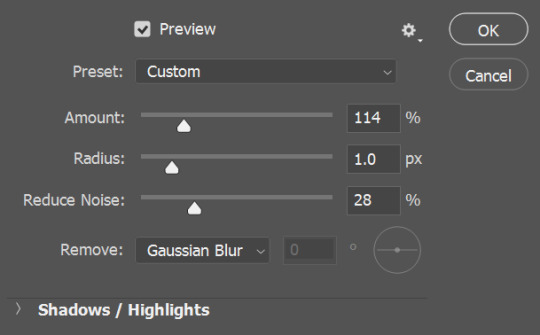
now its time to use adjustment layers!
i generally mess with the exposure adjustment before any of the others. i tend to hover around the same numbers for the media i’m using - so for i am not okay with this i stick around +1 for exposure and 1.5 for gamma correction, but i might do +1 and 1.25 for something else. depends on the lighting and the feel you want to go for! i personally like making really bright gifs, so i crank up the brightness a lot.

next is curves! i used to use the eyedroppers to select the white/black spot but for my recent gifs, i just mess with the general curve to brighten the gif. there’s no exact measurement i do, i just eyeball it to the brightness i want.
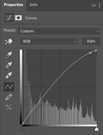
the final brightness adjustment i use is brightness/contrast. for all my gifs i use the 30/20 difference. depending on the feel you might want a 20/10 or a 40/30, but i always choose 30 for brightness and 20 for contrast.

okay! thats how i brighten the gif up! so you have something kind of like this:
this is a nice gif! but i hate how yellow it is, especially with the jacket. i want a more monochrome look, so now its time for hue/saturation adjustments. i click on the hue/saturation adjustment each time i mess with a color so i can easily see which layer is doing what to the gif.
first, i change the saturation of the overall gif, because i want a more “pale” edit. notice how i’m on the “master” channel. this changes the whole saturation! i tend to not mess with the hue or lightness sliders just because i don’t want to change everything to a specific color/shade.

next, i change the yellows in the gif. this mostly changes just the highlights in the hair and the tone of the jacket, which i want to make more brown/neutral. this is another area where i mostly eyeball it, there’s no set number i’m looking for.
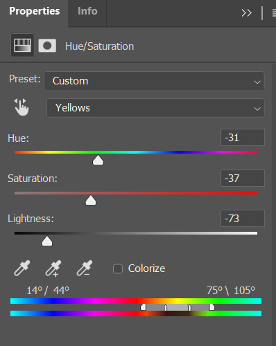
now i want the reds to be more of the standout of the gif, so i bump up the saturation and make it a little darker for a more maroon color.

now i change to selective color. again, i make a new adjustment layer for each color so i can see which layer is doing what.
i always make the blacks blacker. i think it helps with contrast and i like how it looks.

i also want to adjust the shades of red, which is another eyeballing thing.

now, i just want to tweak the reds a little more so i make another hue/saturation layer to make the red pop even more.
and there you have it! the general way i edit any of my gifs!
feel free to message me with any questions or if you need any help!
83 notes
·
View notes
Text
Week 10 - Colour Grading
Introduction
This week was dedicated to colour grading, a topic I am somewhat familiar with as I attempted to colour grade a few weeks back. The lecture was mainly focusing on how colour works and its function in film and in storytelling. A lot of the material is quite familiar to me as I was an art student during high school, so I studied colour theory before. However, it was good to refresh myself, on what colour relationships are available to me and why colour is so important to the style and storytelling of film especially.
Here are some combinations I was not aware of!
Complementary colours are predictably used the most. They're an easy tool for colouring, and something I use a lot in my own work, so it was funny to see just how prevalent it is in colour grading, and film poster (orange and teal is just everywhere).

Also, it was cool to see how colour affected a film overall. This can be seen in the 'colour stories' of films where every colour of a shot is stretched into a single timeline of the film. It is fascinating to see films like The Matrix and Mad Max: Fury Road stripped down to only their colours but still be so identifiable. This showed how colour is so essential to what makes a film unique.


Workshop - Colour Grading in DaVinci
In this workshop, we focused on colour grading in DaVinci, which is something I had not experienced at all. In my experience with Premiere Pro, I had not seen colour grading done in this way. I used to just apply filters such as Light/Contrast and Hue and Saturation. This is quite different and felt similar to how I would affect images in Photoshop. This gave me much more control over the images and colours I wanted. Jason began the workshop by showing us the files of a professional colour grader.
The Process
It was quite a simple task once I got used to the controls and effects of the program. I did a few test grades on the example footage that Jason gave us, but I felt like I kept copying what had already been done so I attempted to colour grade some of my own footage.
I had some footage of my friend's new puppy so I focused on raising the saturation of the puppy as she had some really beautiful colouring on her fur. I tried to also up the contrast of the colours by making her brown fur redder in contrast with the cooler tones of the grass. I tried to keep in mind the RBG levels of the image and raise the saturation so it looked more colourful.

In the screenshot below, you can see I also did some masking as to keep the same warmth from the barkchips in the background. I did this as it felt too cool and I didn't want to lose the warmth of the scene.

Here is the final as well as a comparison video I created:
youtube
youtube
I quite like how it turned out, the shadows and textures in the grass are much more apparent so it gives the footage more clarity (the quality isn't the best). I also like how the colours in the puppy contrast with the background.
I felt that I could do more work with colour grading as not much editing was involved so I did another example. I don't have a screenshot but the process was very similar to the puppy colour grade. In this example, I wanted to contrast the metal structure she's standing against with the softness of the sand. I balanced the image and bumped up the contrast and saturation. I also masked and tracked the building and coloured it to emphasise the blue tones while colouring the back in a stronger yellow/orange tone. I attempted to use complementary colours here to emphasise the separation between the subject and the background. I had hoped the blue also showed her isolation.
Here is the final and another comparison video:
youtube
youtube
In this example, I felt I had more direction in what I was attempting to convey in my colouring. In my puppy exercise, I felt I was just messing around with what I thought looked nice. So it was nice to try to convey an emotion with the second example. I quite like how this turned out, however, I would adjust the blue tone further so that it looked less green. Still, I like what I was able to convey.
Sources
Yaroslav Shuraev - Woman lighting a cigarette outside - https://www.pexels.com/video/a-woman-lighting-a-cigarette-outside-5978992/
1 note
·
View note
Text
basic icon tutorial
the wonderfully talented @macherierps asked if i could do a basic icons tutorial so i’ll be doing a step by step on how i made icons here. tutorial under the cut!
step one: pick your image and load it into photoshop. there are a lot of places to find images, this particular one is a screencap of piper from s2e11 that I got off the wiki gallery (which is a pretty good resource if you don’t want to hunt down caps yourself)
step two: crop the image. i usually go for 200x200 (they’re icons so they can be tiny and this is just the number i’ve always done. i also usually add a little extra headroom bc i personally don’t like it when an icon is like 80% face, but that’s just me
step three: i choose to adjust lighting before i erase the background because i find it easier to erase when everything is a lost more visible. i always start with curves first (don’t ask me why)

for this i’m just bumping up the light and not touching the shadows. then i add levels, and that’s where i brighten the entire shot and then bring down the shadows again
step four: now that the subject is easily off the background, i add a layer ask (using the tiny rectangle with a empty oval button in the bottom right corner of the screen) and i eliminate everything that isn’t the subject

step five: now that our subject is completely removed from their background, i want to color correct (bc good god that shot is yellow). i’m going to work with color balance first, adding cyan, blues and a bit of magenta into the midtones, and then go to the shadows and add cyan, blue, a bit of green)
then, i’m going to open up a hue/saturation on top of this. i always grab the reds and lighten them first, then saturate back to a reasonable color (it’s always best to have icons be a lil bit bright then say, like, gifs, bc these bad boys are tiny). then i take the yellows, like in the shadows on her neck, and i pitch their hue to be ore red tinted like the rest of the skin, and i lighten it to match

step six: once you’re satisfied with how your subject looks, convert all those layers into a smart object. this allows them to all stay the same while remaining editable, but without letting things like color balance or hue/saturation influence the layers you will put underneath it. (you can convert layers into a smart object by selecting all the frames and either right clicking to “convert to smart object or by selecting all the frames and going filter > convert to smart filters)

then, on your smart object, add the “smart sharpen filter” (filter > sharpen > smart sharpen)

these are the settings i use (it might look a little harsh, but icons are so tiny that i really don’t see an issue with it).
step seven: now you get to pick your backgrounds! i found all three of these bad boys on pinterest by typing in “cute pattern wallpaper”

open them into photo shop and crop them into the same dimensions your cropped your subject (for me, that’s 200x200)

step eight: put all of your backgrounds on the same lil workspace as your icon (i just ctrl+c, ctrl+v them on the document, but be sure they don’t have a lil lock on they’re layer or they won’t copy!) so now i have all three backgrounds sitting underneath my subject layer

step nine: i want uniform color throughout the backgrounds and i also want to do multiple different colors, so i’m going to make a new layer (using the square w the + sign in it in the bottom left corner), and then i’m going to paint over it with the brush tool in the color i want.

then i’m taking my painted layer and i’m changing it from “normal” to “color” so it blends on to the layers beneath it.
step ten: it’s at this point that i’m going to save this as a .psd, labeling it “pipericonred” so i can easily sort it (bc i plan on making multiple colors)
step eleven: now i’m going to save it as a .png (which is the actual usable icon form). since i’m currently on the background with stars, i’m going to save it as “pipericonredstars.png”

once that’s saved i go back into photoshop an make the stars layer invisible, making the hearts pattern the new background, which i save as “pipericonredhearts.png”

and again w the floral

and then as a a solid color background (even with the “color” filter on, if there is nothing beneath it, it will display as a “normal” background)
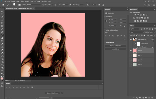
step twelve: to make different colors, change your painted layer to a new color, rinse, and repeat!


bonus round! blush: i don’t even really add these onto my icons but it definitely is trendy so i figure i’d add how i go about adding blush when i choose to do so. first, you want to open back up the smart object that contains your subject.

add a new layer to paint on and select the color blush you want
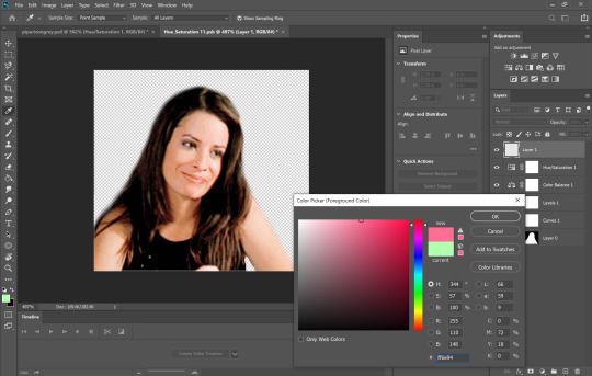
add some lil kawaii scribbles on your subject’s face
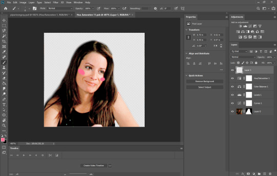
convert that into a smart object and apply a gaussian blur (why this and not a regular blur? i don’t know. just because)


slide the scale until you’re satisfied with the amount that it blends in (you can also change the blend from “normal to “color” or “hue” but i don’t)

then add a layer mask onto your blush and remove it off of the hair / other places blush shouldn’t be)
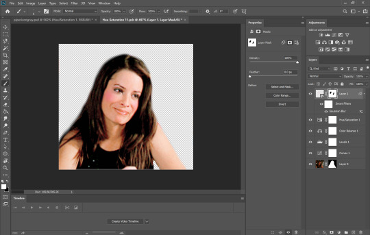
#icons#tutorial#photoshop tutorial#ps tutorial#icon tutorial#charmed#piper halliwell#piperhalliwelledit#ogwork#macherierps
72 notes
·
View notes
Last Seen Blogs
fattyfrenchy
Ur Gainer

for-police-term-partner
Untitled

dmavw1
Data Management and Visualization-Week1
denpawav
Ayy
shimhobum
Caricature Thingz