#completeresources
Text

Not everyone likes using torrents; So here is a copilation of websites for direct downloads of movies, shows and more.
SCNRC (Apps, Books, Games & More)
DownArchive (Apps, Books, Music, Games & More)
PSA.wf
DeeJayPirate
MKVKing (Streaming available)
PelisGratisHD (Spanish, Streaming available)
AvaxHome (Anime, Books & Apps)
WarezForums (Apps, Anime, Books, Music & Games)
DDLValley (Apps, Anime, Books & Music)
RapidMoviez
HDEncode
MegaDDL
SoftArchive (Books, Games & Apps)
TFPDL (Books, Games & Apps)
MovieSeriesTV
PelisHD4k (Spanish)
Sharemania (Music videos, interviews & live performances)
629 notes
·
View notes
Text

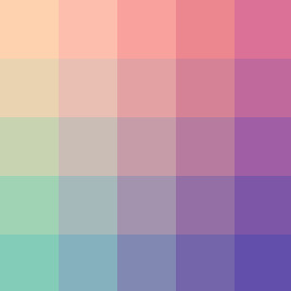
fed1af - db7197 - 83cdb8 - 624eab
#color palette#completeresources#allresources#sibylresources#onlyresources#pixel#gradient#two#red#pink#purple#blue
807 notes
·
View notes
Text

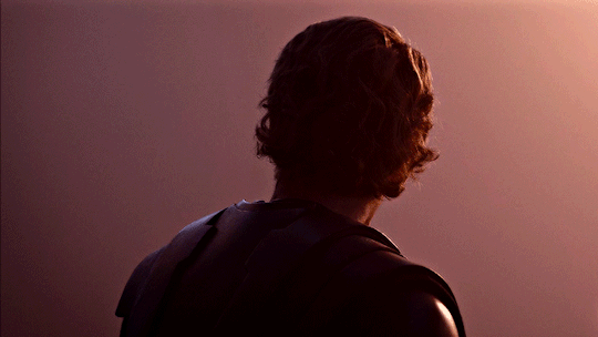


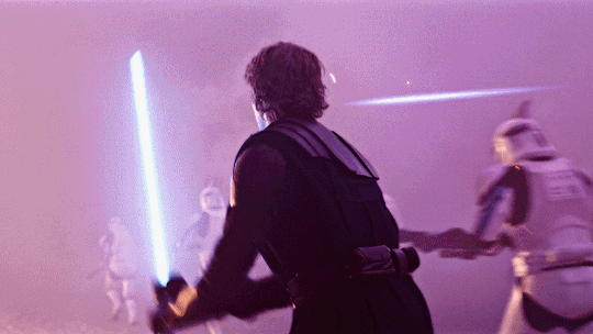
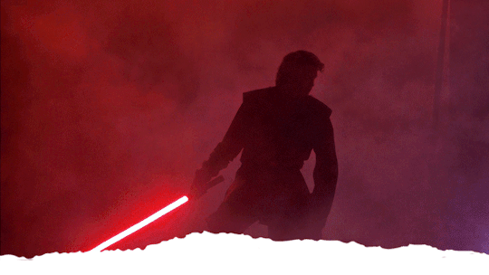
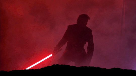
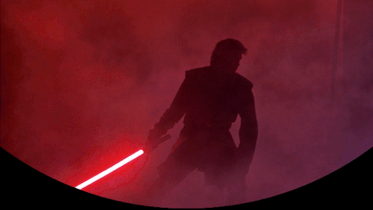
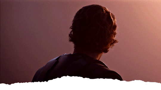
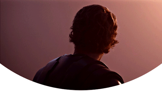
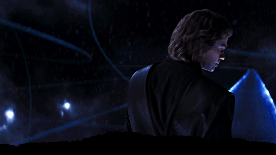
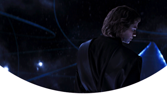
Anakin in Ahsoka 1.05 headers (requested by anon)
- 6 headers (640x360) | 4 different border versions under the cut
- all versions + 2 extra border options here
- please like or reblog if you take one
- credit isn’t required but it’s appreciated
- requests are open for other headers!


#star wars#ahsoka series#anakin skywalker#hayden christensen#swedit#starwarsedit#sw headers#star wars headers#anakin skywalker headers#completeresources#*#headers*#resources#headers#flashing tw
1K notes
·
View notes
Text
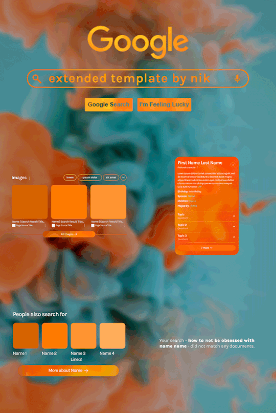
Hi! I've been asked for a tutorial on my new Google layout, originally seen here and here. So, to make it easy, here are FOUR free templates! All I ask is that you give me proper credit in your caption if you use my template or take inspo from my design. Enjoy! :)
Get the NEW Google templates free via ko-fi! (Donations appreciated but not required <3) Includes PSD templates with pre-made layer masks, shapes, and animations, plus tips for the following designs:
– Image search results
– Biography
– Related searches
– Animated "no search results"
Additional resources:
– My original animated Google search overlay tutorial & template
– Karla Google Font (this is the only font used)
– Background via Unsplash

#gif tutorial#completeresources#usershreyu#usernanda#useryoshi#userzaynab#userrobin#usersalty#userhella#alielook#tuserabbie#useraish#userabs#mialook#resource*#gfx*#google*
433 notes
·
View notes
Photo
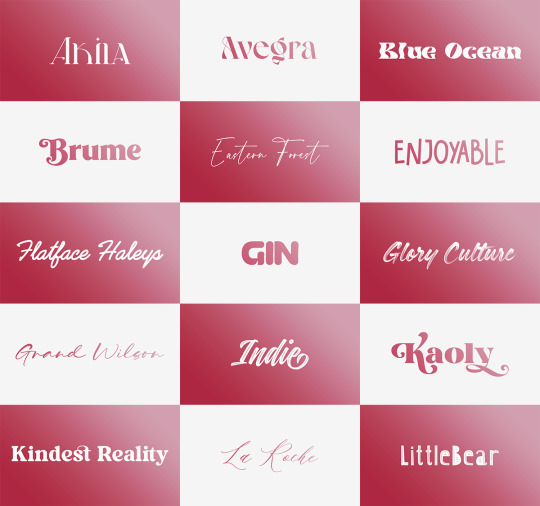


Font Pack 16 by liohnelmessi
Happy belated 2023! This is my long-delayed 16th font pack, which contains 30 high quality fonts that I have collected over the past calendar year. I hope you enjoy! {More fonts}
This pack contains 30 high quality fonts
Like / Reblog if you’re downloading
Download Links: {Dropbox} / {Mediafire}
#font#fonts#completeresources#resourcemarket#allresources#codingcabin#dearindies#tusermelissa#tuserheidi#usernik#folkloreresources#useryoshi#userrobin#userauden#tusercat#usercim#*#*resources
2K notes
·
View notes
Photo


smalllady's gif overlay pack 1 - because i got tired of people saying "just google it bro" (ノಠ益ಠ)ノ彡┻━┻
seriously...google search results for gif overlays are pitiful. so here's some better quality gif overlays! i made these from free resource videos from youtube.
✧ all gifs are 540x540px, 120 frames, and below 10mb
✧ you can either just save these gifs or you can dowload the psds [here]
✧ i don't care if these get reposted everywhere...i just want stuff like this to be more accessible
#smalllady resources#gif overlays#gif textures#itsphotoshop#completeresources#yeahps#chaoticresources#not that it matters anymore.........
1K notes
·
View notes
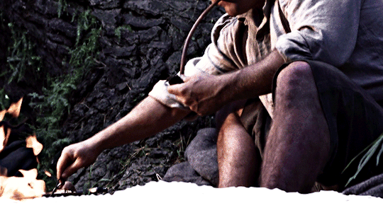
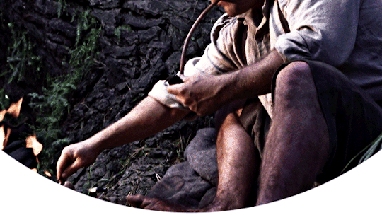
Note
hi i'm sorry to bother you but do you have any tips on giffing dark indoor scenes? yours always look so good!
hi there! not a bother at all :) i can definitely try to explain the steps i usually take under the cut!
this tutorial will assume that you already know the basic steps of gif-making — if you don't, there are lots of great tutorials floating around on this site that can help you out! :)
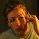
here's the gif i'll work with to explain my steps, the bottom being the original and the top being the coloured/brightened version.
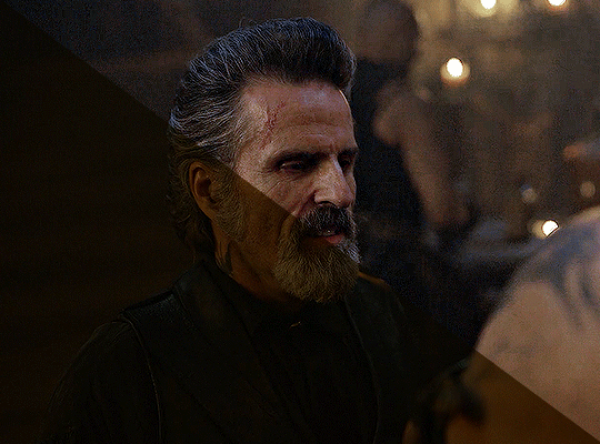
before we start, a general tip i recommend keeping in mind: if you want to brighten a dark scene, you'll want to get your hands on the highest quality download you can find. 1080p is decent, but if your laptop can handle 2160p 4k hdr files* without sounding like it's about to explode, that'll get you even better results!
(*colouring hdr 4k files requires a different set of steps — the scene will appear washed-out on photoshop, so you need to make sure that you don't end up whitewashing anyone if you do choose to work with this type of file.)
since most of my downloads are 1080p, i'll use this type of file in this tutorial.
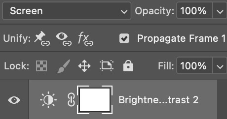
the first step of my gifmaking process with 1080p files is almost always the same no matter what scene i'm giffing. i make a brightness/contrast layer and set the blending mode to screen:
now my gif looks like this:
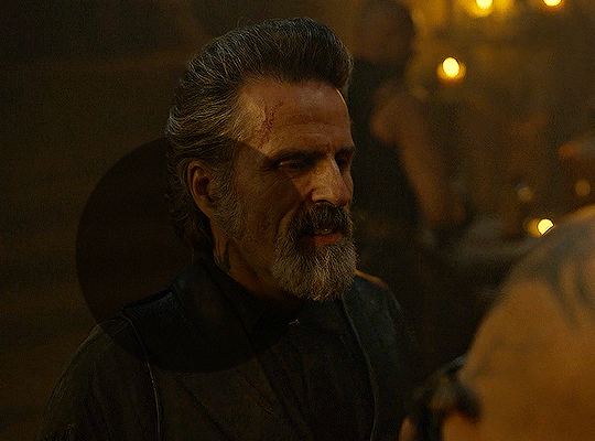
depending on the scene and how washed out it looks after this layer, i'll play around with the opacity. for this gif, i didn't touch the opacity at all. use your best judgement for this, because every scene is different!
i find that dark indoor scenes are usually tinted in yellow or green. one of my first goals is to try to fix the undertone of this scene before focusing on brightening it any further. i go to colour balance for this, and play around with the midtones, shadows, and highlights.
again, every scene is different, so the amount to which you use colour balance will differ, but for this specific scene, my goal was to neutralize the yellow. i focused particularly on the midtones and shadows of the colour balance layer, moving the scales to the opposite of the reds.
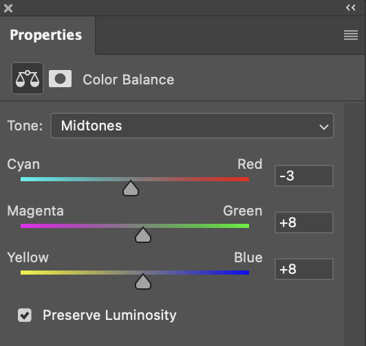
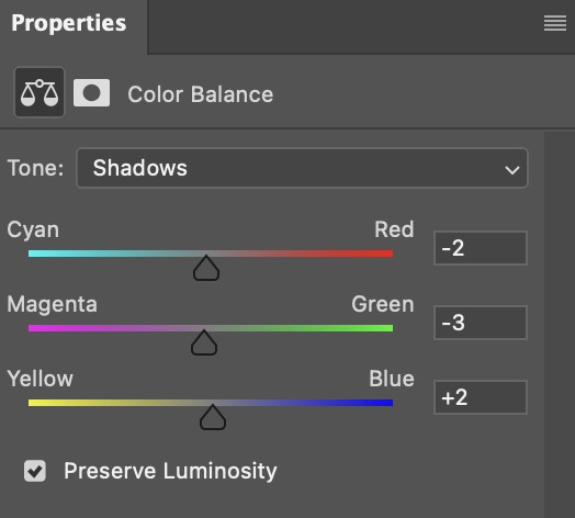
doing so will help with neutralizing the yellow. the only reason i moved the scales towards magenta and blue (therefore making it a bit more red than less) rather than green and yellow in shadows was because i wanted a darker contrast in the blacks. moving them to green and yellow made the overall scene more yellow since there were so many dark spots that shadows affected. (you'll see what i mean when you start experimenting with your own gif — this part of the process really just depends on your preferences!)
our gif might not look that much better yet, but it will soon! our best friend channel mixer is gonna help us out. for an in-depth post about how to use this adjustment layer, i recommend checking out this tutorial.
i'm someone who prefers to make more than one layer for the same adjustment layer for a reason i can't even explain (i just find that it helps me stay more organized). so don't think of this process like i can only use this layer once so i MUST fix it NOW. you can create multiple layers of the same adjustment layer, because every layer on top will affect the ones underneath it.
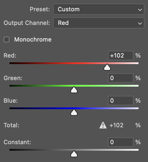
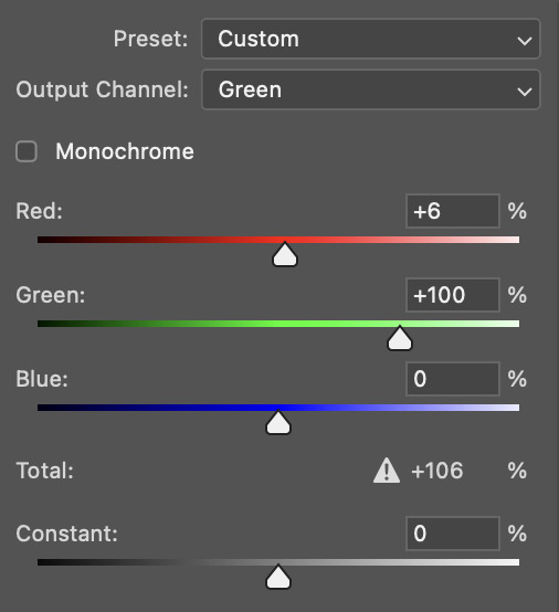
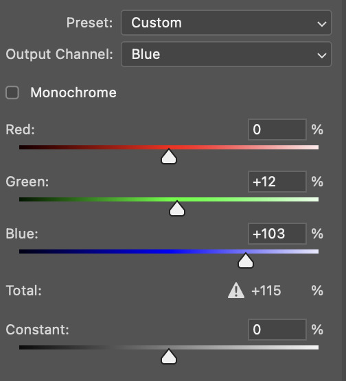
since my priority is getting rid of the yellow tint, i went to the Blue section of the channel mixer and increased it in all of the scales:
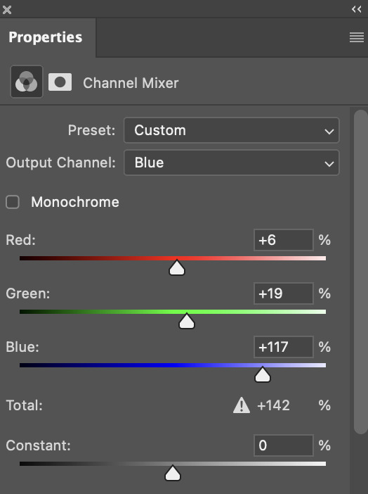
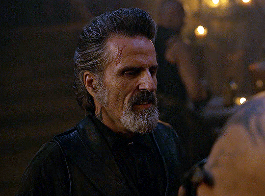
this step alone has helped us out so much, because look at our gif now!
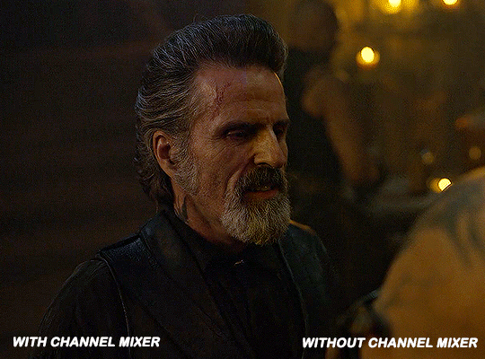
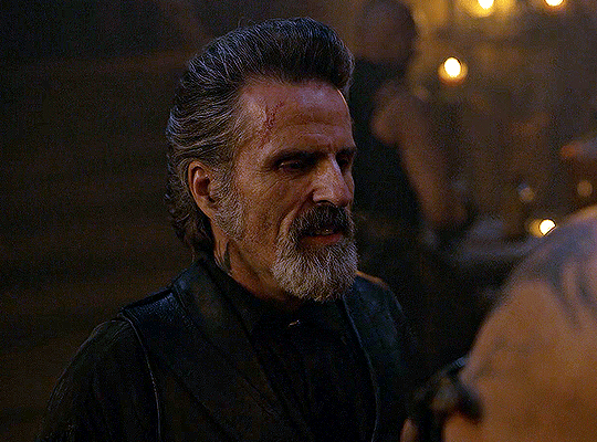
not only does the background look less yellow, but so does izzy's skintone.
now i'm going to focus on trying to brighten the scene even more without destroying the quality. the levels layer can actually help out a lot with this.
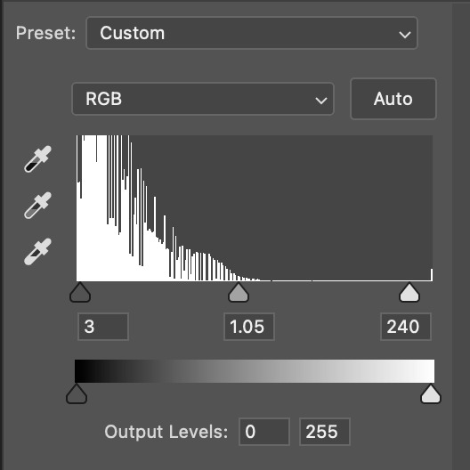
the amount to which i move each toggle differs per scene, and i think experimenting depending on your gif works best for this layer.
side note: i prefer not to use the ink droppers on the side because the contrast in the result usually ends up feeling too strong for my preferences, but if you find that this works better for you, then go for it! basically, the first dropper with the black ink should be clicked before you select the darkest part of the scene that you can find, and vice versa for the third dropper with the white ink — click it, and then select the brightest part of your scene.
curves is the next layer that does fantastic work! unlike the levels layer, i do actually use the ink droppers for this. it's the same concept, with the first dropper being used on the darkest part of the scene, and the third dropper on the brightest.
try to think of curves as something that not only further brightens your scene, but also helps with the colour neutralizing process.
i grab the first dropper, then click the darkest parts of the gif that i can see. depending on the undertone of the blacks that you're clicking on, the tint of your gif might actually change significantly. this is why i prefer to click once, then undo the action if i don't like what it gives me. izzy's leather jacket was the sweet spot for this gif.
when i'm satisfied, i make another curves layer and use the third dropper to click the bright/white parts of the scene. for this gif in particular, the lights in the background were a good fit because they carried a yellow undertone — this meant that my curves layer actually helped to further neutralize the yellows in the scene as a whole!
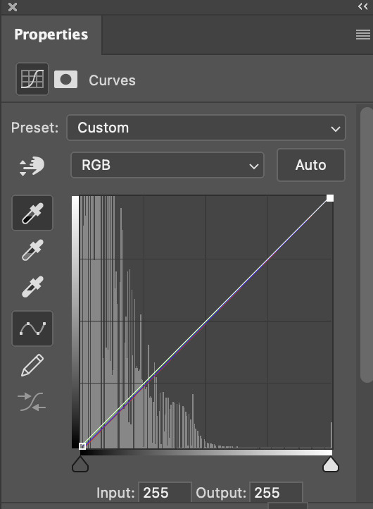
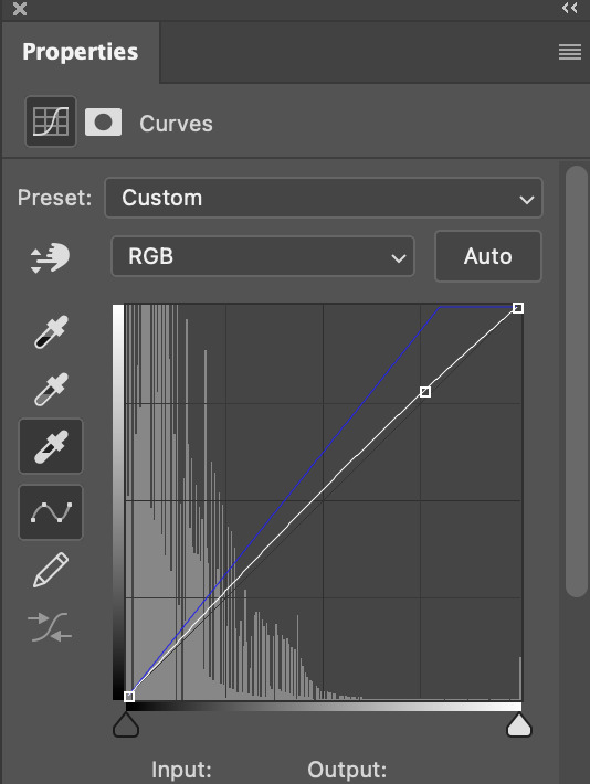
(i manually dragged the curves graph upwards for the third dropper to make it brighter. i don't need to do this if the dropper does this for me automatically, but since the lights were pretty bright, it only changed the tone of the scene and didn't increase the brightness — hence the manual step.)
pat yourself on the back, because this is what our gif looks like now!
this is good, but it's not great — there's still just a bit too much yellow in the scene for my liking (sorry, i'm picky! :P)
i created another channel mixer layer and played with the toggles until i was satisfied:
ta-da! the gif as a whole is much less red/yellow now:
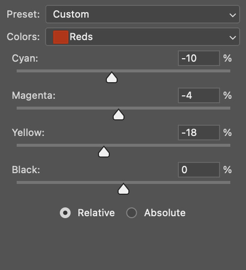
this is when i start fixing the colouring now — namely, his skin tone. selective colour will be your best friend here. i wanted to make his face just a tad brighter and less of a yellow-ish magenta shade, so i focused on the reds and yellows.
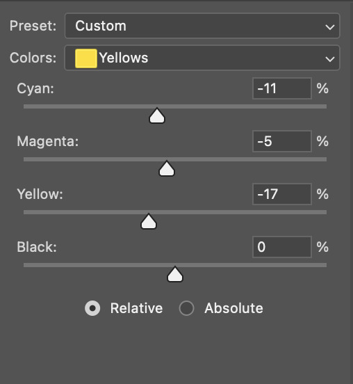
then, out of habit, i created another selective colour layer and took out more of the "yellow" in the whites to make them whiter, and increased the black (just by +1, since the contrast is pretty good enough already).
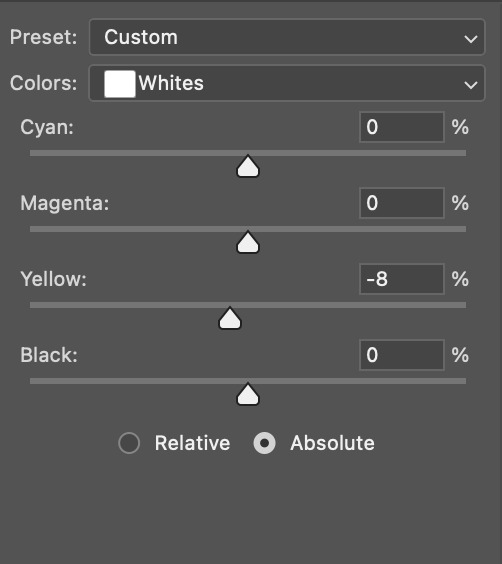
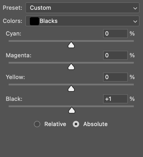
note: i switched to "absolute" for these two colours. basically, relative = less vibrant colour manipulation, and absolute = more vibrant/stronger colour manipulation. i prefer to stick to "relative" for fixing skin-tone since "absolute" can be a bit too strong for that.
our gif looks like this now!

his face looks brighter and much less yellow, so i'm satisfied!
this next step is not mandatory at all — again, i'm just picky and despise yellow-tinted scenes. i personally believe that indoor scenes that are yellow/green tinted make them look more dark than they actually are, so i do my best to get rid of these colours.
i also don't always do this, but for this gif, i just simply went to hue/saturation, selected the yellows from the drop-down menu and decreased its saturation.
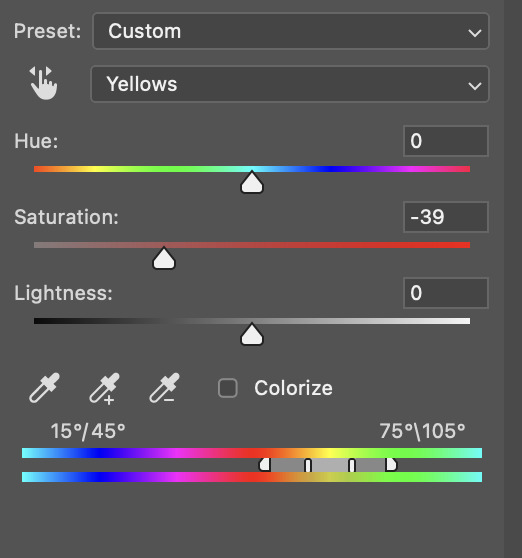
be careful not to do this too much. depending on the quality of your download, this can significantly decrease your gif quality. i tend to worry less about this when i'm working with 2160p files, but again, those files require an entirely different set of steps when it comes to brightening/colouring.
since this was a 1080p file download (and one that was actually less than 1GB, oops, don't do that), i played it safe and decreased it by -39 only.
note: you also want to be cautious of colour-washing skintone when it comes to this step. i find that another selective colour layer can help perfect the skintone in case the yellow drains out of it too much, but skip the hue/saturation step if it's too difficult to work with — better to be safe than sorry.
anyway, this is the final gif!
that's usually what i do when it comes to colouring dark indoor scenes! i hope this tutorial makes sense, and if you have any further questions, don't hesitate to reach out! :)
#tutorial#gif tutorial#resources#completeresources#coloring tutorial#allresources#dailyresources#userraffa#userdean#uservivaldi#alielook#usercats#usermoonchild#usernaureen#userbarrow#userabs#useraish#useralison#userisaiah#*mytutorials#i am so sorry if this is incoherent#it’s so hard to explain things coherently 😫
610 notes
·
View notes
Text
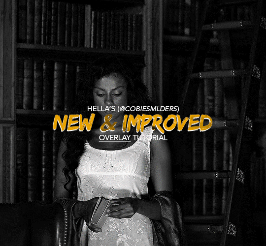
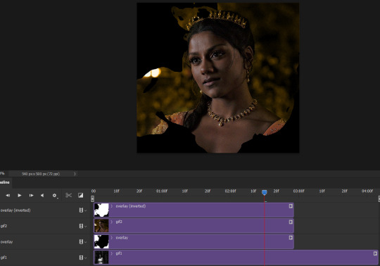
Hello!! A couple years ago I posted this tutorial for making gifs with a moving overlay effect. In the two and a half years since I made that tutorial, I've learned some new tricks for this gif effect but most importantly I've learned how to explain things better.
For that reason, I've created this new and improved tutorial for my overlay gif effect. The basics are the same but it's simpler, I go into more detail, give better explanations, and have more comprehensive instructions.
The easiest way to do this effect with this method is to use smart objects and work in timeline. For this tutorial, I’m assuming you know the basics of giffing like cropping, resizing, colouring, etc. If you need help with this I’d suggest you look at some other tutorials and guides!!
First, we’re going to start off with three things.
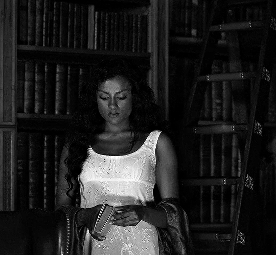
1. A completed gif converted into a smart object that is going to be the base gif. I'm going to call this "gif1". You’ll want this gif to be at least 3 seconds because it needs to last as long as the overlay plus a little bit of extra time in the beginning.
This is the base gif I’ll be using in the example (except I trimmed it so that I could meet the size limit).
2. A second completed gif converted into a smart object that is going to go over the base gif. We’re going to call this "gif2". This gif should be at least 2 seconds but I’ve made it work with shorter. Gif2 needs to be the same dimensions or bigger than gif1.
This is the gif I'll be using in the example (except I trimmed it so that I could meet the size limit).

3. An overlay in video form. These can be found on tumblr and youtube by search for overlay or transition packs. For this example, I'll be using an ink drop overlay I found on youtube.
Step 1: Turning the overlay video into an overlay gif
Most overlays aren’t going to instantly fit the gif effect you’re trying to achieve right away. This is the overlay I got from youtube and as you can see it’s too slow and needs a crop/resize to be usable.

To fix it, I sped the frame rate up, cropped the overlay, and resized the overlay so it fits over my base gif. I also sharpened the overlay (500% amount, 0.3px radius) so that the edges were smooth. This is the new overlay gif and the one I’ll be using for the gif effect.

A tip: I also like to add a brightness/contrast layer to get rid of the grey on the overlay gif. Because we’re working with blending modes to achieve this effect, any parts of the overlay that are grey will be a blended mix of gif1 and gif2. If you think this will look good for your gif effect then don't worry about it!
Another tip: try to get the entire overlay movement to fit into a 2-3 second window. Anything longer than that will likely be cut off when you have to trim your gif to meet the upload size limit and it would suck to only have half of the overlay.
Step 2: Creating the gif effect
Drag a copy of gif2 and a copy of the overlay gif onto the gif1 canvas. I like to use Ctrl+Shift+V so that the layers are pasted in the same position as they were on the previous canvas. MAKE SURE that both overlay layers are in the same position on the canvas. If one of the overlay layers is higher/lower/etc. than the other then the effect won't work properly.
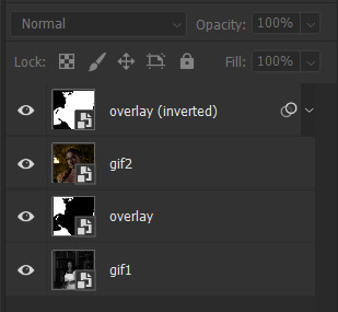
Then, make a second copy of the overlay and invert it (Ctrl+i). These are the layers you should have:

Before you go any further, trim gif2 and both overlay layers so they are all the same length.
Now, we need to rearrange the layers and set blending modes. The top layer should be whichever overlay goes from black to white. This is because when we change the blending modes, the white part of this layer will disappear and look like its being replaced by gif2. In this case, that is the overlay (inverted) layer. Then we want gif2, the other overlay layer, and then gif1.
A tip: this process can be done the other way where the top layer is the overlay that goes from white > black however, you are much more likely to have an error where there is a grey/black line around the overlay effect in your final gif. In order to avoid that, I always use the black > white layer on top.
Next, set the top overlay layer to darken. You should only see the black part from the overlay and gif2 should fill in the white part. Here’s how that looks in my example.
Next, select the top overlay layer and gif2 and convert both layers into one smart object. Your layers tab should look like this now.

Now, set the new layer’s blending mode to lighten and the overlay layer’s blending mode to darken. Once you do this, you should be able to see gif1 as well as the overlay gif.
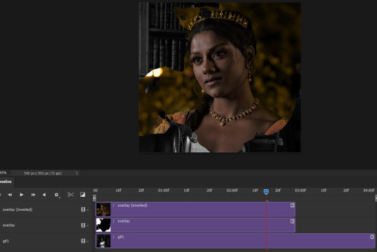
Step 3: Timeline and exporting
At the moment, gif1 is still significantly longer than the overlay gifs. Since this gif is just over 10 mb (which is pretty small for this effect) I’m going to trim about 1/4 of a second off the end of gif1 and then drag the overlay layers so they all end at the same time.

Now you’re free to export the gif! This is the finished effect for the example gif!

A tip: sometimes, when I convert to from timeline to frames, the gif becomes a little longer and slower. It has to do with different frame rates across the videos and photoshop but I'm not smart enough to understand it. If that happens, just set all the frames with the overlay layers to 0.04 speed instead of 0.05.
And we're finished! I hope that was helpful and made sense. If you have any questions feel free to drop them in my inbox or send me a message!! <3
#gif tutorial#allresources#completeresources#dailyresources#chaoticresources#ps tutorial#photoshop tutorial#usertreena#tuserssam#usernik#tuserabbie#tuserace#userk8#usershreyu#uservalentina#useryoshi#userannalise#userrobin#usersalty#uservivaldi
1K notes
·
View notes
Text
⁽ ⠀ ♡ ⠀ ⁾ ⠀ ⠀ strawberry soda ⠀ / ⠀ * ⠀ a youtube template .
download can be found in source link . this is my first template so apologies if it's not the most user-friendly one but i tried keeping everything fairly organised , but please message / send an ask if you're having any issues ! general guidelines apply , feel free to edit it but do not claim it as your own . the only font used was poppins . please do credit if possible <3
likes & reblogs are very appreciated ! this template is free but here is my ko-fi .
note: taking suggestions for other templates , just send me an ask <3
#character psd#character template#template psd#rph#rp resources#dailyresources#completeresources#psd template#free template#*#colouring is fireflies by explosivefeels !!!!
826 notes
·
View notes
Text

FALLING LETTERS ANIMATION tutorial
hello! @kimmomi asked for a tutorial on how i made the letters "fall" in this gifset and so i figured i would make it and post here! this effect isn't hard to achieve but it might get a little tedious if you have a lot of letters.
note: you will need photoshop with a timeline!
STEP ONE: create your base gif! be mindful of number of frames in your gif. the number of frames doesn't really matter here, altho the longer the gif the better the effect. i'd say try to limit it to 60-70 frames, depending on how big your final gif will be.
STEP TWO: make your text the way you want it to look. this effect is basically the last step of your gif making process. (i will be using the typography from my set as an example as i already have that psd saved)
this is what my typography looks like now.

STEP THREE: i would recommend that the word at the bottom be the word that "falls". for me that is forever.
now, you will have to duplicate the "forever" layer and make your non-copy forever invisible.
what you will want to do now is delete all the letters but the first one in the duplicated layer. for me that is f. then you just duplicate the f layer and write your second letter instead of it, in my case o. you will have to do this for all letters. also as you do that make sure to move them a bit away from each other.

now, what helps to align those letters where they start off, is making your non-copy layer to be visible again.

after you've aligned your letters, make the non-copy layer invisible again.
STEP FOUR: so now we come to a bit of a tedious part.
what you will do now is move the playhead (blue timeline arrow) a bit further from the beginning of the gif (this allows for the text to stay still a bit before it starts "falling") and click on the first letter.
next step is to click on the little arrow next to your letter and clicking on the stopwatch next to Transform.

then, you will take the playhead and drag it to the end of the gif where you will start with transforming your letter with Free Transform tool (shortcut ctrl+T on windows). and what you will do is, while in Free Transform mode, drag your letter to the bottom of your gif while also rotating it a bit. when you're happy with your placement of the letter, hit enter. see below gif for how i did it.

you will have to do this for every letter, but make sure to rotate some in the other direction. also make sure that the beginning of the stopwatch mark is the same for every letter.
and that is basically it! after you transform every letter, you can go and save your gif.
this is my final result:

for some extra dramatic look, you can duplicate your initial layer with the whole word on it, drag it above all layers, clear layer style and add a stroke and make sure its FIll is at 0% where you will get the outline text that stays behind.

i hope this was helpful and understandable. if you have any questions, feel free to send me an ask or dm me <33
#usergif#completeresources#allresources#gif tutorial#ps help#userkimchi#uservivaldi#userraffa#tusermona#userelio#usercats#tuserheidi#usershreyu#userhallie#userroza#userdean#userisaiah#thingschanged#tusercasey#usertj#userwwz
517 notes
·
View notes
Photo
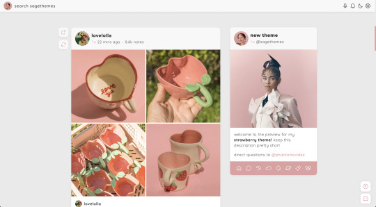
strawberry | theme by sage
get the code: static preview / version 2
a sidebar (left or right) theme with sticky buttons for permalink & reblog
— free through the month of april (2023)!
features (more info below the cut):
toggle: tags on click, music player, updates, right or left sidebar
headerbar includes blog icon/home link & search bar | (optional) music player & updates buttons | day/night & tumblr controls buttons
sidebar includes links for home, ask, archive, & up to 5 extras, an uploadable image, and custom description
customizable: blog title, description, colors, body & title fonts, and font size
responsive design, jumpination, scroll to top, 4 corner options, 3 post margin options, phosphor icons
nothing needs to be changed in the code, everything can be changed in the customize panel!
terms:
reblog if using
do not touch the credit
all terms / faq
credits listed in the code / credits page
please consider supporting me ♡
blog name !! important
make sure you fill out the blog name field, this is what will show on the top of all your original posts. to clarify: your blog name is your blog’s url - for example: phantomcodes
music player
this player uses an image link - see my faq if you have questions
uploading your song:
i recommend using google drive to host your mp3 files - below is a brief explanation for how to do this but you can also see the resources provided here by glenthemes and more links on my credits page
to start you need an mp3 audio file, once you have the one you want go to google drive and click: + New ➞ File upload
select your mp3 audio file and click open
open your newly uploaded audio file in google drive and click the three dots on the top right, then click Share and under General Access change it to Anyone with the link can view
copy the sharing link provided, it will look something like this: https://drive.google.com/file/d/1pBA6KdlLEzoEZPQ6hmaSr9LGLeCQGPxz/view?usp=sharing
go to the following site and paste your sharing url in the first box provided: https://www.joelgrayson.com/drive-download-link-generator
your final product should look something like this: https://docs.google.com/uc?export=download&id=1pBA6KdlLEzoEZPQ6hmaSr9LGLeCQGPxz
make sure the music player is toggled on in the theme, paste your audio link in the Song URL field
sidebar
when your browser width gets too small the sidebar will disappear and a sidebarbutton will appear on the header to toggle it!
#themehunter#theme hunter#code hunter#tumblr theme#tumblr themes#tumblr codes#tumblr resources#completeresources#allresources#userbru#tuserlucie#userbrina#userdre#usernik#useraashna#strawberry#phantom code#phantom theme#responsive theme
2K notes
·
View notes
Photo

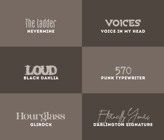
rats / queen for queen / necessary evil / soft / untouchable / not my type / the ladder / voices / LOUD / 570 / hourglass / eternally yours
i do not take ownership of any of these fonts, so there’s no need to credit me — but please reblog this post if you found it helpful at all! :)
#resources#fonts#font packs#font#font pack#gifmakerresource#completeresources#dailyresources#usertj#userangelic#usertiny#userallisyn#userspacey#userridge#userraffa#tuserheidi#mystuff#myfontpacks
380 notes
·
View notes
Photo
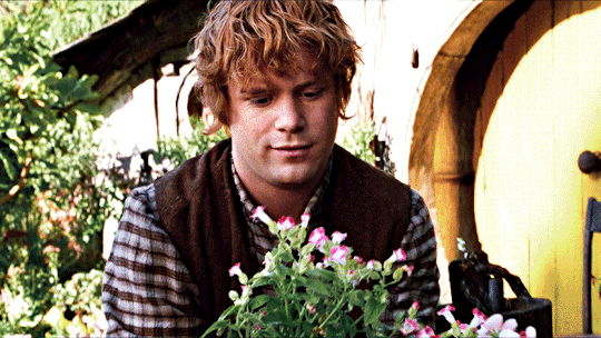
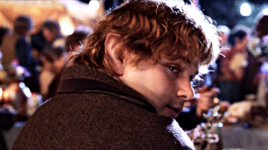

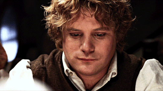
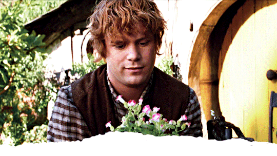
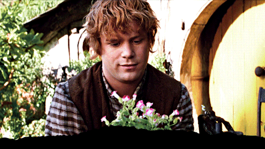
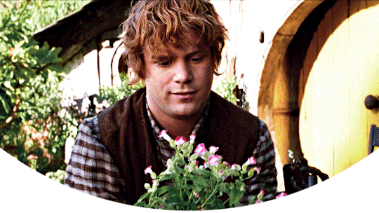
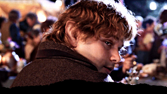
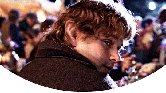
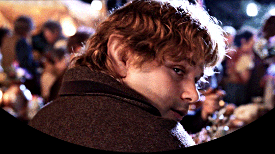
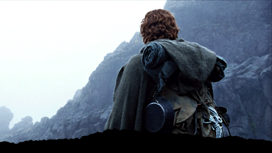
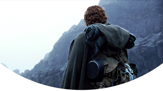
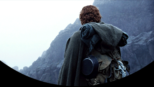
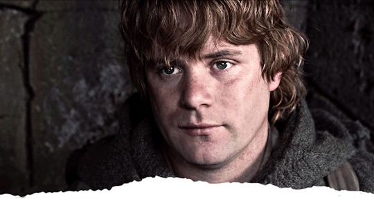
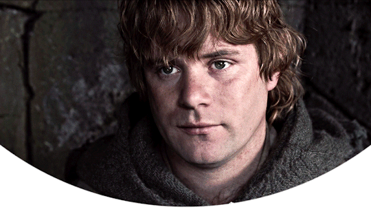
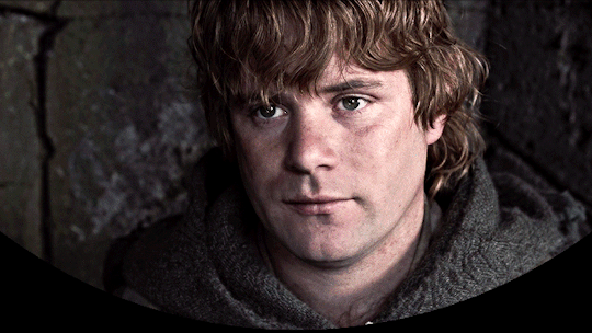
Samwise Gamgee Headers requested by anon
- 6 headers (640x360) | 4 different border versions under the cut
- more lotr headers here
- please like or reblog if you take one
- credit isn’t required but it’s appreciated
- requests are open for other headers!


#lotr#samwise gamgee#lotredit#tolkienedit#completeresources#mobile headers#lotr headers#resources#headers#headers*#*#tolkien headers
1K notes
·
View notes
Text

HOW TO: Make an iPhone Layout
+ Downloadable Template
Hi! I've gotten a few messages asking for a tutorial on my iPhone gifsets — but instead of only doing a tutorial (that would probably be triple the length this one already is), I decided to turn my layout into a template with all the bits and bobs! In the "tutorial" under the cut, I'll share everything you'll need, a free template download, and quickly go over how to use this template. :)
Disclaimer: This template uses Video Timeline and this tutorial assumes you have a basic to intermediate understanding of Photoshop.

PHASE 1: THE ASSETS
1.1 – Download fonts. These are the fonts used for all assets I've included in my template:
– SF Pro or SF Pro Display (Regular, Medium, Bold): Either version works, they look nearly identical. You can download directly from https://developer.apple.com/fonts/ or easily find it via Google
– Bebas Neue: Free on Google Fonts, Adobe Fonts, and dafont
– Times New Roman (Bold): Should be a default font in Photoshop

Make sure to download and install any of the fonts you don't already have before opening my template. That way, once you open the template file, all the settings (font size, weight, spacing, color, opacity, etc.) are as intended.
1.2 – Download my template.
Before you use my template, all I ask is that you don't claim or redistribute it as your own and that you give me proper credit in the caption of your post. Making these iPhone gifsets takes me a longgg time and turning this layout into a template took several hours too.
DOWNLOAD TEMPLATE VIA KO-FI ← This template is completely free to download (just enter $0), but if you feel inclined to tip me, I appreciate you! 💖
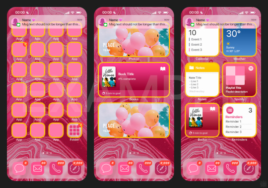
BTW this template also includes some of my frequently used icons!
NOTE: If, for some reason, you open the template and see the pop-up shown below, click "NO" — otherwise, the fonts will be all messed up:
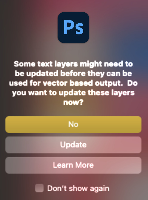
And if you see this triangle with an exclamation point by a text layer, don't double-click it — it'll mess up the font as well:

PHASE 2: THE GIFS
I'm just going to briefly go over gif sizes and my recommendations. Also, keep in mind when grabbing your scenes, you'll want all of these gifs to be the same amount of frames.
2.1 – Background Gif: 540 x 540 px.
I recommend this size so you have a good amount of visibility for the gif behind the iPhone wallpaper. I also recommend making this black and white (or in my case, black and white with a slight blue tint — idk I just like the way it looks) so the wallpaper coloring can stand out.
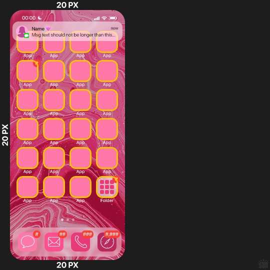
2.2 – Wallpaper Gif: 230 (w) x 500 (h) px.
Keep in mind the very narrow dimensions of the wallpaper! And also keep in mind that you'll have a bunch of apps and widgets covering the image. I try to use wide shots (or layer my clips into looking like wide shots). Also, keep in mind your color scheme for your set and your character's aesthetic! I tend to focus on one or two colors for the wallpaper.
I usually position the wallpaper to the side with 20px bumpers, so there's lots of space to see the background:
2.3 – Large Photo Widget Gif: 201 (w) x 96 (h) px.
2.4 – Small Photo Widget Gif: 94 x 94 px.
PHASE 3: THE TEMPLATE – "IPHONE" FOLDER
In this section, I'll try to quickly walk you through how to use this template and some bits that may require extra instructions. I'll be going through each folder from top to bottom.
3.1 – Status Bar.
Time, Service, and WiFi are pretty self-explanatory. In the Battery folder, you can use the shape tool to adjust the shape layers labeled "Fill (Adjustable Shape!)" to customize the battery level.
3.2 – Message Notification.
Again, these are pretty self-explanatory. I've already masked the circle for the contact photo, so you can simply import any photo and use the transform tool to shrink it down. The circle is 24x24 px. If you don't want to use a photo, there's another folder called Default Initials.
If your message text can't fit the text box, the message should end with ellipses which is how iOS caps off long texts.
3.3 – Blurred Banner (IMPORTANT)
This folder is easy to miss because there's only one placeholder layer in there. On iPhones, the area behind a banner notification and the dock get blurred (including the wallpaper and any apps).
What to do: Make a duplicate of the apps in Row 1 and/or widgets that intersect the message banner, convert them all into one smart object, apply a Gaussian Blur filter (Radius: 3.0 pixels) on the smart object, and move the smart object into this masked folder!
(There's another masked folder in the Wallpaper folder for the dock which I'll go over in that section.)
3.4 – Apps
Turn off the yellow guide if you don't need it to keep things aligned and turn off layers you don't need by clicking the eye icon. Replace the "App" placeholder text with your app name, change the color or gradient of the square to compliment your color scheme, and add your custom app icon overlay!
If you can't find an app icon you need from the ones I provided, flaticon.com is a great resource. Also, if you can only find the filled version of an icon, check out this tutorial for how to make any text or shape into an outline.
Also, each app folder has 4 notification bubble options (1-4 digits). Again, you can toggle these on and off as you need!
3.5 – Big Widgets
I like using these when my wallpaper has A LOT of negative space to fill. I included the Photos and Books widgets in my template, but there are lots of widgets available on iPhones. You can check some of the other ones I've done here, or if you have an iPhone, simply try adding some widgets to your phone!
There are also widgets bigger than these, but they would take up half of the phone screen which is why I don't use them for these edits.
3.6 – Small Widgets
The only thing I'll say about these — because they're pretty straight forward — is there are a lot more weather themes than I included in my template. Also, if you set your character's phone to evening, the weather widget will show a dark background (sometimes with stars), so keep that in mind.
Speaking of, I've included Light Modes and Dark Modes for, I think, every applicable widget.
3.7 – Page Dots
These barely perceptible dots indicate that your character has more pages of apps than shown in your gifset (so if an anon tries to come at you, you can just say "it's on the next page of apps" /j /lh)
3.8 – Dock
Again, the dock has notification bubble options and I've included the default app designs, custom filled designs, and custom outlined designs for iMessage, Phone, Email, and Safari (there's also a FaceTime alternative if that's how your character rolls). These are usually the apps people keep in their Dock, but this is fully customizable too. So, if your character is, like, super obsessed with Candy Crush or something and needs it in thumb's reach — you can put it in the dock.
3.9 – Wallpaper
This whole folder is masked already to a 230x500 px rounded rectangle.
Inside, you'll find another "Blurred Portion" folder for the area behind the message banner notification and the dock.
What to do: Duplicate your gif layer and place it in this folder, remove any sharpening filters, and apply a Gaussian Blur filter (Radius: 3.0 px). Be sure to add any coloring/adjustment layers ABOVE this folder and your original sharpened gif layer.
PHASE 4: EXPORT
We made it!
I hope this template makes it super easy for you to recreate this layout! If you decide to try it out, feel free to tag me with #usernik.
If you notice anything wonky about the template, kindly let me know so I can fix it! And if you have any questions about how to use this template, please don't hesitate to send me a message! I just ask that you try to be specific in your question so I'm able to answer you the best I can!
#gif tutorial#completeresources#userpickles#usersmia#userabs#usertreena#alielook#userkosmos#usershreyu#userzaynab#tuserabbie#useryoshi#usersalty#tuserlucie#usernanda#userelio#userhella#usercats#gfx*#resource*
751 notes
·
View notes
Text

I had to delete my previous bokeh overlay pack because zight died on me and I no longer had the file, so here is a new one.
Please like or reblog if you use
Do not repost
Download
#completeresources#sadresources#onlyresources#usergif#allresources#gifmakerresource#gif overlay#hisources#dailyresources#overlay#*#textures
252 notes
·
View notes
Text
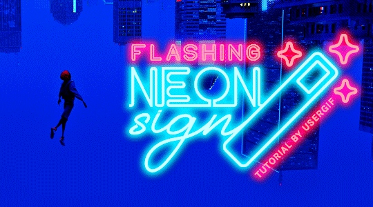
HOW TO: Make Animated Neon Text
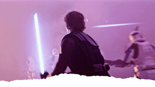
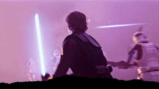
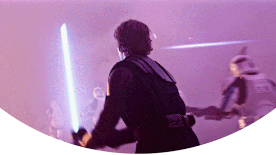
Hi! No one asked for this tutorial, but this is one of my favorite typography effects as of late — so I thought I'd share how I do it. You can see this effect in the first gif of this *NSYNC Celebrity set and the last gif of this Anthony Bridgerton set. Disclaimer: This tutorial assumes you have a basic understanding of gif-making in Photoshop. It's also exclusively in Timeline and uses keyframes for the fading effect seen on the blue text.

PHASE 1: PREP YOUR BASE GIF
1.1 – Choose a dark scene.
This effect looks best contrasted against a dark background. You can definitely do it with a bright background, but just like a neon sign irl, you only turn it on in the dark/at night — so keep that in mind!
1.2 – Determine the length of your clip.
Depending on how much you want your text to flash or fade in, you'll want to make sure you have a scene long enough to also allow the text not to flash — reducing the strain it takes to actually read the text. For reference, my gif is 48 frames.
1.3 – Crop, color, etc. as you would.
New to gif-making? Check out my basic tutorial here!
PHASE 2: FORMAT YOUR TEXT
Before we animate anything, get your text and any vectors laid out and formatted exactly as you want them!
2.1 – Finding neon sign fonts.
It's easy as going to dafont.com and typing "neon" into the search bar!
2.2 – Fonts I used.
Neon Glow by weknow | Neon by Fenotype | Neon Bines by Eknoji Studio
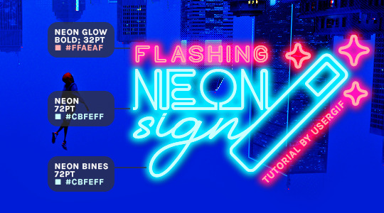
And to not leave my fellow font hoarders hanging, the font for "tutorial by usergif" is Karla (it's a Google font) 🥰
2.3 – Group your text layers. (Conditional)
If you plan on having multiple text layers like I did and you want them to appear connected (like how the last letters of "NEON" and "sign" intersect with the wand icon), I suggest putting the layers into groups according to color (the shortcut to group layers is Command+G). If you don't group your text and just apply the outer glow settings to each individual layer, you'll end up with something like this:
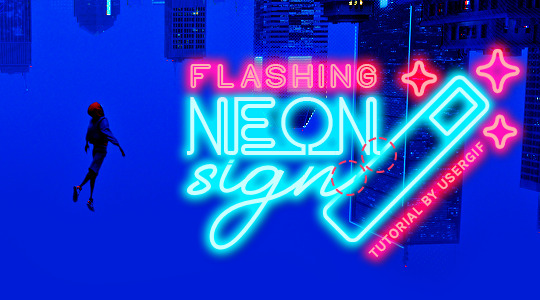
—where you can see the glow overlap with the line, instead of the smooth connection you see in my final example gif. I'm using 2 colors for my text, so I made a group for red and a group for blue.
2.4 – Apply Outer Glow.
Right-click your text layer (or your group if you have several layers) and select "Blending Options" to open the Layer Style menu. Check "Outer Glow" and feel free to play around with the settings until you like the way your text looks!
Your outer glow color should be darker and more vibrant than the color of the text itself. The text should be within the same color family but much brighter and, sometimes, almost white (see Step 2.2 again for my text colors).
Here are the settings for the Red Glow (the glow color is #FF3966) and Blue Glow (#00F0FF):
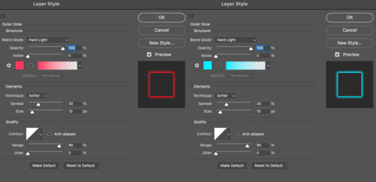
These aren't always my exact settings but they're pretty close to my standard. I always set the blend mode to Hard Light and usually have the opacity at 100%.
For every gif I use this effect on, I like to play around with Spread and Size. Spread will make the glow look denser and "expand the boundaries" (source: Adobe) and Size will diffuse the glow and blow it out so it covers a larger area (Adobe says it "Specifies the radius and size of blur").
2.5 – Duplicate your text layer/groups and remove glow.
We're only going to be animating the glow on our text, and since doing this affects its opacity/visibility, we want to preserve the base text by creating a duplicate.
I just hit the Command+J shortcut to duplicate my groups and delete the Outer Glow effects, making sure that the "No Glow" version is above the "Glow" version:
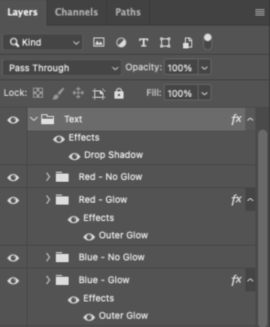
I also put all these groups into one group called "Text" for organization and so I could apply a drop shadow to all the elements for better visibility.
PHASE 3: CREATE THE FLASHING EFFECT
This is for the effect you see on the RED text in my gif!
3.1 – The 0.03-Second Rule
If you've read any of my animation tutorials before, you're probably already familiar with this rule. In my experience (and for reasons I can't explain), Video Timeline pauses every 0.03 seconds (try clicking the forward button a few times, you'll probably find a "duplicate" or paused frame). So, keep all your layers a duration of 0.03-second increments (e.g. 0.06 or 0.09 seconds can also work) and align them on the Timeline at 0.03-second intervals. If you don't follow this rule, you'll get duplicate frames when you export, resulting in a choppy final gif.
3.2 – Trim and arrange your text layers.
Only on the layers/groups WITH the Outer Glow effect, trim them into several segments of varying lengths where the glow will be "on" (visible) and leaving spaces where the glow should be "off."
Typically, I'll have a mixture of 0.06 and 0.03-second text. That's when the glow will be visible. Between each "flash" of visibility, I've got a 0.03-second blank space, baby *pen clicks* and I'll write your name:
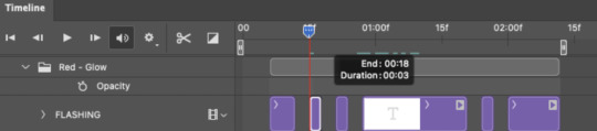
The layers shown above are arranged with a few flashes and two long segments of no flashing. This is the order and duration of each segment shown above (purple = visible segments):
0.06 blank, 0.06 visible, 0.03 blank, 0.03 visible, 0.03 blank, 0.03 visible, 0.03 blank, 0.24 visible (the long bit where "FLASHING" doesn't flash at all), 0.03 blank, 0.03 visible, 0.03 blank, 0.12 visible
(I only did this for the text that says "FLASHING" to give it a glitching effect. The other red text keeps the glow visible starting at the first long segment.)
PHASE 4: CREATE THE FADE-IN EFFECT
This is for the effect you see on the BLUE text in my gif!
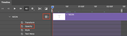
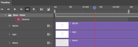
4.1 – Animate using the Opacity Keyframe.
Again, we're only touching the layers/groups WITH the glow effect. If you only have one layer of text, you'll find the Opacity Keyframe by clicking the film reel icon:
If you're working with groups like me, you'll find it in the Timeline panel under the group when it's expanded:
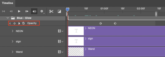
As you can see, I already added my keyframes (lil diamond babies). And luckily, it's super easy to do!
4.2 – Add the ending Keyframe first.
We're starting at the end because our layers/groups are already at 100% opacity. Drag the playhead (the blue arrow attached to the red vertical line) to a spot where you want the glow to be 100% opaque — this is where the glow will be fully "on" or visible. [Again, follow the 0.03-Second Rule. You will get duplicate frames regardless when using keyframes (this will be explained in the note in Phase 5), but abiding to the rule will mitigate the amount of dupes you get.]
Then, click the clock icon by "Opacity" to place a keyframe:
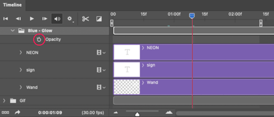
4.3 – Add the starting Keyframe.
Go backward from the ending Keyframe you just placed (I went back 0.12 seconds — but you can play around with the duration of the fade, just keep it a multiple of 0.03):
And drop another keyframe, this time by clicking the diamond icon by "Opacity":
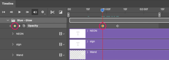
4.4 – Reduce the opacity on the starting Keyframe.
Keeping that keyframe you just placed selected, go to the layers panel and reduce your layer's/group's opacity to 0%:
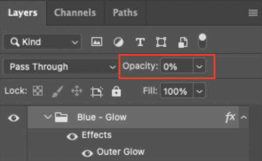
Now, this Outer Glow will slowly fade from 0% to 100% opacity.
And just for a visual aid, here's where my fade-in keyframes are in relation to my flashing segments:
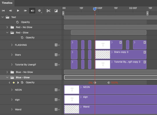
To refresh your mind, the 0% Opacity Keyframe starts when "FLASHING" is visible for 0.24 seconds (the first long segment of visibility).
With these keyframes, you'll get a smooth fade-in à la ✨light switch with a dimmer✨
PHASE 5: EXPORT
Yay, we're finished! Convert from Timeline back to Frames and export your gif!
NOTE: If you only did the flashing effect and followed my 0.03-Second Rule, you shouldn't have any duplicate gifs.
BUT if you included the fade-in effect using keyframes, you WILL have duplicate frames. 'Tis the nature of keyframes. 🤷♀️ I had 4 extra frames where the fade-in starts, which I deleted. So, as always, I recommend checking your frames when you convert from Video Timeline back to Frame Animation — and manually delete any duplicate frames.
Sorry this tutorial is so long 🙈 I over-explain so you're not just mechanically copying steps, but understanding the WHY behind each step! Thanks for bearing with me
If you have specific questions about this tutorial, feel free to send a message to usergif and I'll try my best to help! :)
More USERGIF tutorials • More resources by Nik • USERGIF Resource Directory
#typography#gif tutorial#completeresources#usershreyu#useryoshi#userelio#userzaynab#userives#usertreena#usercim#userrobin#userkosmos#usersalty#userhella#alielook#uservalentina#uservivaldi#*usergif#*tutorial#by nik#flashing gif
735 notes
·
View notes
Last Seen Blogs

alfajer-h
Untitled

nights-of-woodland
sunwooh
amocci
Amanda Mocci
miahinano
Life is a manga!
alienxxweirdo
Ian★