#Tier list
Text
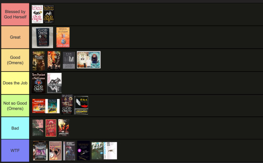
The art director & the Good Omens book cover tier list of doom, part 1
part 1 l part 2
This is going to have to be a multi-part series because there are *checks notes* 64 different covers that I've found so far.
I am your resident Art Director/Good Omens enthusiast,
and welcome to my completely meta-free book cover tier list.
Listen, making a book cover is HARD. I should know. But while we salute these artists for their hard work and time, I think we can all admit that once in a while, the vision is just not on. And on very rare occasions, publishers seemed to have managed to commission the cover art directly from hell...
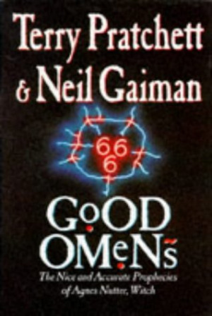
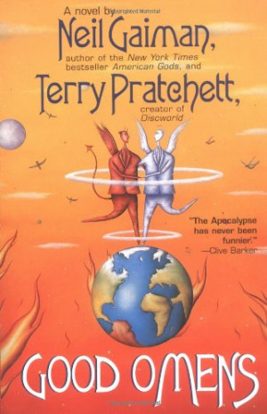
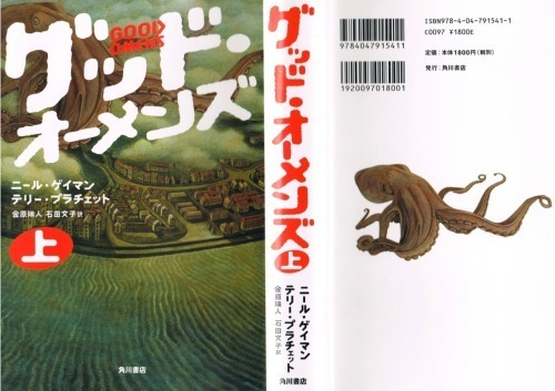
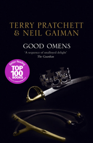
1. The original UK cover
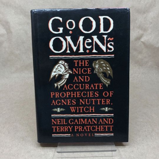
Ahh, the standard by which all shall be judged. We're starting off with a nice & easy cover, with adorable woodcuts of Aziraphale and Crowley flanking a custom Good Omens font! While I have to take a few points off for the terrible kerning of the word "GoOD", the blockprint vibes and general bitchiness of Aziraphale's teeny weeny wittle face, along with the sick colour palette puts the orignial in my good graces.
Tier: Great
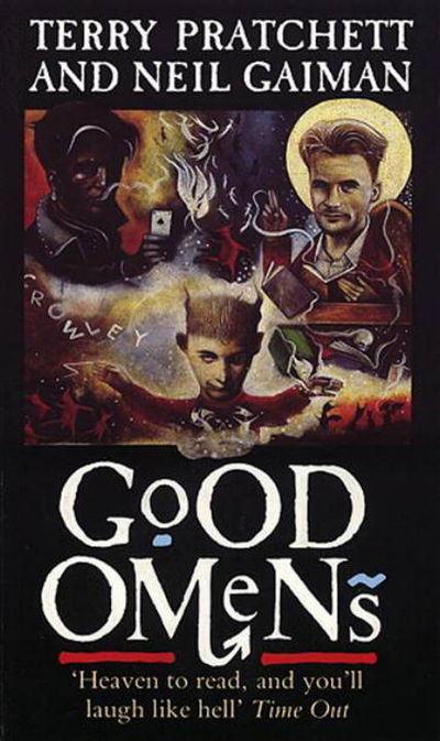
2. The duelling US covers
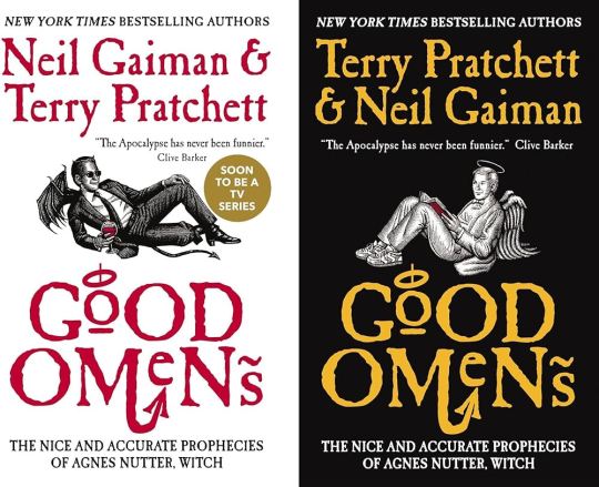
Progress! Hail to the designer who figured out trying to make "GoOD" and "OMeNs" fit the same width was a fool's errand, and even managed to IMPROVE on the original handmade title by adding a little halo and devil's tale to the design. Aziraphale and Crowley are facing each other, while also managing to serve absolute cunt. Aziraphale is wearing EIGHTIES SNEAKERS. Crowley's little snake boots have HEELS. They've managed to keep the woodcut vibes and colour simplicity, while balancing out the full title of the book. Both authors get to trade off on who's name comes first! Dare I say, this is a work of genius. I could dock some points for Crowley's sad bat wings growing out of his right clavicle, but who am I to question greatness.
Tier: Blessed by God Herself
3. The Halo Master Chief(?) cover

How the mighty have fallen... As a Canadian child, I was subjected to maybe the most horrifying ad in existence by the War Amps warning children about machine safety. This cover is the paper embodiment of that ad. I am confused by the purple haze. I am frightened by the seeming ethereal flatness of Adam and Dog. I am strangely aroused by Aziraphale's eyebrows, and intensely saddened by the terrible outline/drop shadow they had to inflict on the type to fit "Pratchett" in that god awful space.
Tier: WTF
4. Germany, Ein Gutes Omen covers
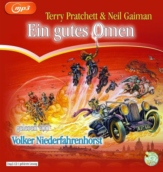
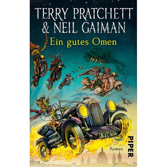
This cover inexplicably exists in two colour ways: red and teal. I put the audiobook cover here so you could experience the full illustration, and also how fucked up it is that they cropped the book version to include three horse-people of the apocalypse, but cut off DEATH on the regular cover. Points must be given for drawing a pretty slick Bentley, but I think we have to take even more points away for turning Crowley into a Ray Charles/Mike Wazowski hybrid. The ducks are nice.
Tier: Not so Good (Omens)
5. Germany, Ein Gutes Omen covers continued
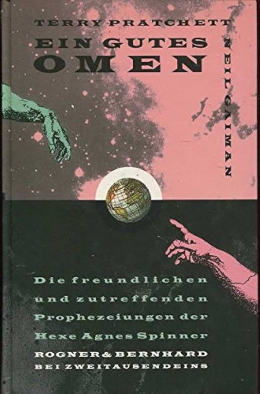
I don't know if the German designer of this cover *knew* that they were using western yeehaw cowboy woodblock letters when they made this cover, but judging by how they spaced the rest of the text at the bottom, THEY DID NOT CARE. And that seems to be a running theme for this one. We get kind of a duality thing going on with the black and pink background, but it just seems like somebody whispered the general themes of Good Omens into a jar, and threw it down a well, and this poor chap came along and picked it up. The baffling choice to align every piece of text on the cover *except* Neil Gaiman's name which is right aligned and rotated 90 degrees (not even real vertical type) will haunt my dreams, I think.
Tier: Bad
6. US, UK The Traffic Jam cover
For the love of Good Omens, WHY. I can think of so many more interesting symbols to put on the cover of this book than the ODEGRA SIGIL TRAFFIC JAM. Props for keeping the good colours and type, but like, I think this cover was secretly designed by @amtrak-official, or someone who just really, really likes public works.
Tier: Does the Job
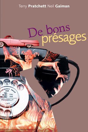
7. France, De bons présages cover
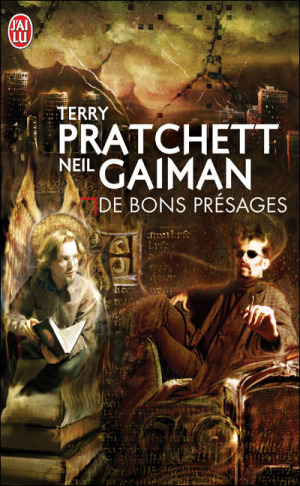
Leave it to France to make sure people know that Aziraphale and Crowley fuck severely. While I can't condone leaving out half the title of the book (and thinking a red carpenter's square counts as decoration), I can begrudgingly acknowledge that Ron Pearlman and Benedict Cumberbatch's love child is excellent Crowley casting. I think I give this a solid dark academia/10.
Tier: Good (Omens)
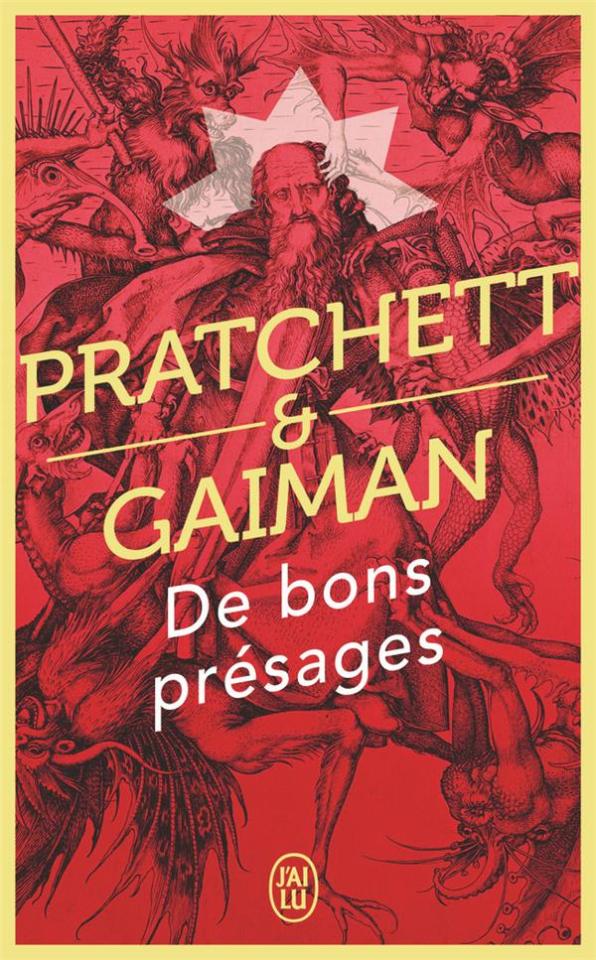
8. France, De bons présages covers continued
Just imagine with me, if you will, the absolutely hilarious reality that this cover posits: Good Omens is exactly the same in every respect, but Crowley drives a pink 1950s convertible. Why do all of the colours on this cover look like they've been pre-digested? Why are the font choices and placement so bafflingly bad. My face is the demon's face holding that car. I feel his pain.
Tier: WTF
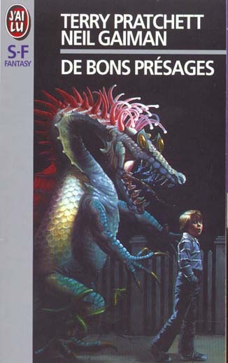
9. France, De bons présages covers continued
Minus points for not managing to write the full title of the book once again. I don't know what it is with the French. They seem pretty set on Good Omens being demonic. While I do appreciate a good Bosch-style demon party, the dude in the middle confounds me. All-caps Museo Sans that isn't even *centred* in the frame is just so lazy. I am le tired.
Tier: Bad
10. France, De bons présages covers continued
Uhh. The font. The font is okay.... I think? Yeah. The font and kerning are. Okay. OHHH GOD I LOOKED DOWN BELOW THE TEXT WHYYYY.
Tier: WTF
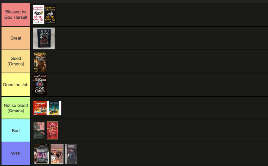
END of round one. I need a nap.
#good omens 2#good omens fandom#good omens#art director talks good omens#tier list#cover art#aziraphale and crowley#aziraphale x crowley#book cover#go s2#gomens#good omens analysis
164 notes
·
View notes
Text
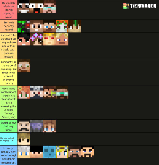
hermit tier list based on how out of character it feels when I read / write them swearing in a fic
this post is about characters and my personal fic preferences: if you feel the need to comment 'ermmm they're adults of course they swear' or 'well I don't think it's ooc', consider not doing that.
#hermitcraft#hermitblr#ben chats shit on the internet#tier list#hermit tier list#idk#i find it more fun to work around the characters speech patterns than just making them swear all the time#i enjoy writing them saying 'oh my goodness' at the most horrific things
96 notes
·
View notes
Text
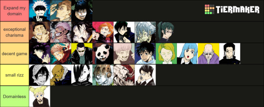
Rizz tier list Made with the help of @enkisart @cryptic-hq
this was made in a discord vc over the course of half an hour. Mei Mei wasn't on the template but she would be between Geto and Nobara
21 notes
·
View notes
Text
Drug Usage Tier List lmao

23 notes
·
View notes
Text
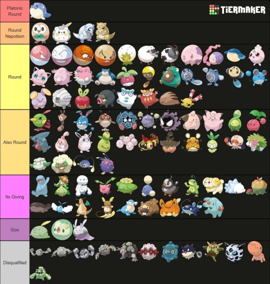

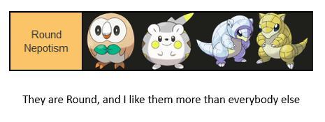

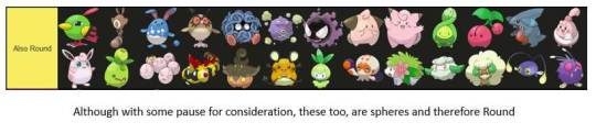
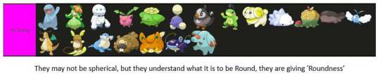
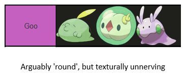
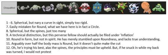
I asked my girlfriend what she considers a Round pokemon to be and she sent me this.
#pokemon#round Pokemon#tier list#spheal#ideal round#round#sandshrew#alolan sandshrew#togedemaru#rowlet#nepotism#girlfriend
29K notes
·
View notes
Text
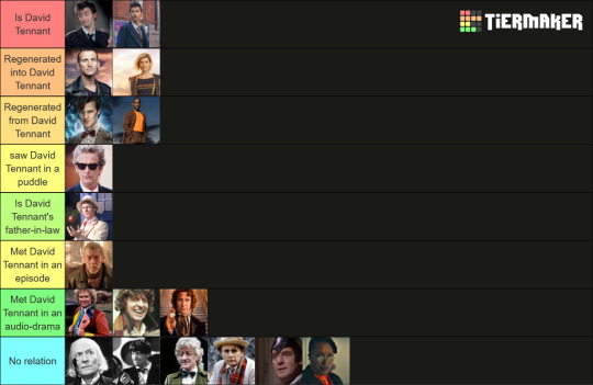
The Doctors ranked based on their proximity to David Tennant
#doctor who#tenth doctor#fourteenth doctor#david tennant#the doctor#tier list#would tag all the other doctors if i weren't lazy#gecko boy
3K notes
·
View notes
Text

FFXIV Endwalker character tier list
#ffxiv#endwalker#6.0#spoilers#6.0 spoilers#tier list#alisaie and alphinaud know half each#different halves
1K notes
·
View notes
Text
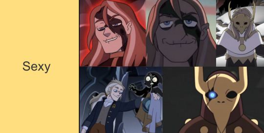
BEHOLD: The Ultimate Internet Sexywoman Tier-List*
So instead of working on my papers I compiled over 160+ female characters ranging from fail girls, tumblr/twitter sexywomen, personnal choices, controversial choices, and debate fuel.
I tried to cover a large range and if so-n-so isn't on here- good news! You can add them manually! Happy-ranking everyone.
(Also note- I use the term 'sexywoman' as a general catch all cause its a lot easier to say than "female character of fandom relevancy due to likeability, infamy, or reputation" )
423 notes
·
View notes
Text
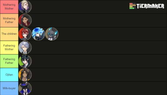
Twst overblotter/potential overblotter parenting vibes chart
#low quality shitpost#tier list#twisted wonderland#dire crowley#riddle rosehearts#leona kingscholar#azul ashengrotto#jamil viper#vil schoenheit#idia shroud#twst grim#malleus draconia
498 notes
·
View notes
Text
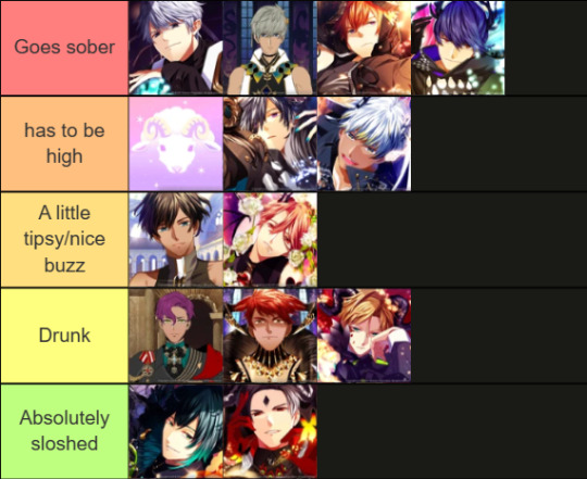
How drunk they would have to be to go to a waffle house
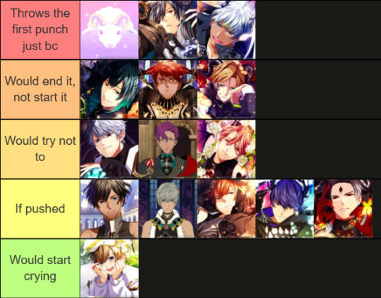
Most likely to get in a fight at Waffle House
Who has the most stuffed animals in their room

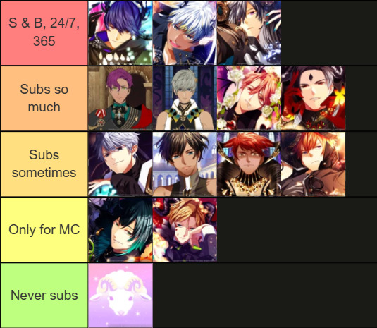
Biggest subs (when I don't lie)
#obey me shitpost#obey me crack#obey me tierlist#tier list#obey me lucifer#obey me mammon#obey me leviathan#obey me levi#obey me satan#obey me asmodeus#obey me asmo#obey me beelzebub#obey me beel#obey me belphegor#obey me belphie#obey me brothers#obey me diavolo#obey me barbatos#obey me solomon#obey me simeon#obey me luke#obey me mephistopheles#obey me mephisto#obey me raphael
319 notes
·
View notes
Text
Superman vs Goku: 20 pages of two grown men playing Tag. Eventually Batman and King Kai convince them to stop.
Superman vs Naruto: 30 pages of the deepest therapy you've ever read. Absolutely beautiful. Words cannot describe the healing.
Superman vs One-Punch Man: Just a bunch of 4-panel comics about the differences between Clark Kent's Midwestern and Saitama's Japanese hospitality. There is at least one section where both go into the same grocery store with the exact same grocery list, while the store is running low on stock.
#superman vs#comics#manga#goku#naruto#one punch man#dragon ball#uzumaki naruto#saitama#dc comics#tier list#superman#man of steel
13K notes
·
View notes
Text
The art director & the Good Omens book cover tier list of doom, part 2
Part 1 l Part 2
I am your resident Art Director/Good Omens enthusiast, and welcome to my completely meta-free book cover tier list. Listen, making a book cover is HARD. I should know. But while we salute these artists for their hard work and time, I think we can all admit that once in a while, the vision is just not on. And on very rare occasions, publishers seemed to have managed to commission the cover art directly from hell... here's where we left off last time:
Onwards and upwards, as they say.
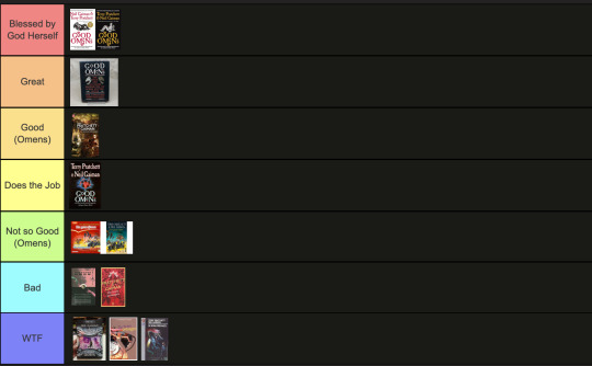
11. International paperbacks, Goda Omen
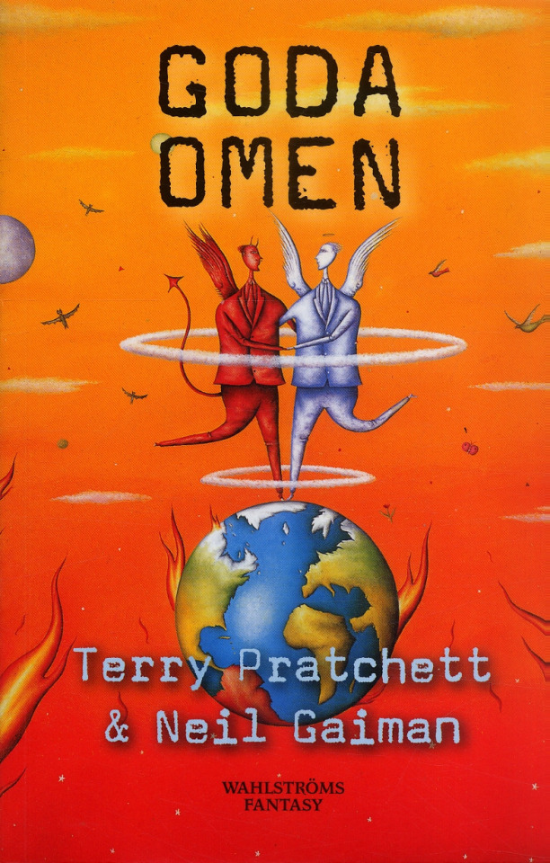
It is inexplicable to me but I LOVE this cover art. It's so sweet and innocent, the colours are contrasty and fun, and the layout leaves enough room for the text. Maybe I would call it slightly inaccurate to have our boys dancing on Greenland while the UK has drowned in a great flood, but hey. It's charming. The international cover gets a thwack with a ruler for trying to fit "creator of Discworld" in between the two wings like that, though.
Tier: Great
12. Italian Cover, Buona Apocalisse à tutti!
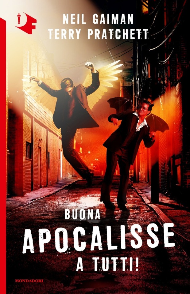
The Italian translation of Good Omens into "Happy Apocalypse to All!" really tickles my funny bone. Unlike this cover which is trying to scrape at it with a dull knife until I'm screaming on the floor. I know demons can only dance badly, but does Crowley *really* have to fracture both ankles while trying? Aziraphale pelvic thrusting his way into heaven is a visual I didn't think I'd ever want. Minus so many points for random murder alley where this is all occurring. At least the designer managed to wrangle the type into one of the best proportional layouts I've seen thus far?
Tier: Bad
13. Italian Cover, Good Omens
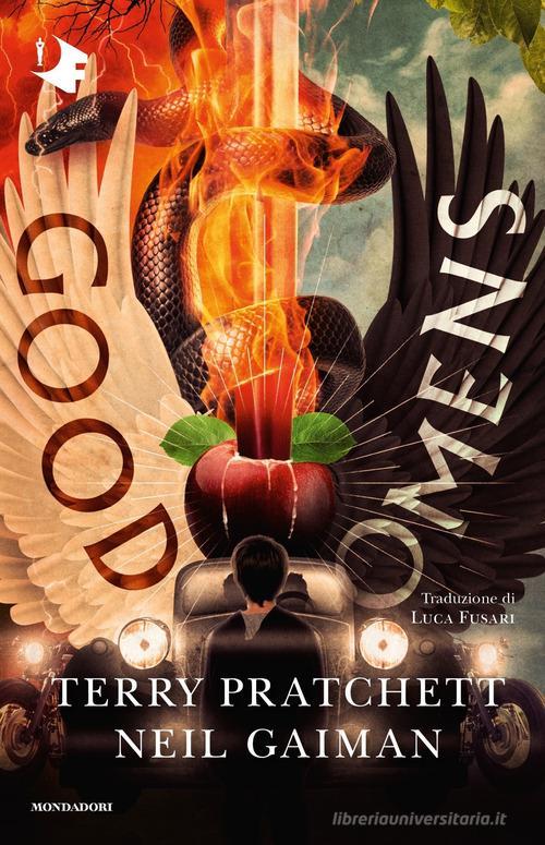
A truly valiant attempt here to rectify a terrifying situation with that earlier Italian version. While this one actually seems much more interesting at a glance, the details kinda get to me. The Bentley's steering being on the wrong side, the word Omens kindasortanotfquite fitting on the black wing, the motorcycles with no drivers... TIMES NEW ROMAN FOR THE AUTHORS NAMES. I don't think it can even be redeemed by the most powerfully rendered Sacred Heart/Cardi B W.A.P. imagery I've ever seen.
Tier: Good (Omens)
14. Japanese cover, Good Omens
Look, this designer GETS IT. Crowley and Aziraphale are a pair, a group of the two of us. Do not separate. It's also the only cover I've seen that uses shades of grey! The woodcut vibes are STRONG AND POWERFUL. The type is well placed! I should love this, except the end result kinda looks like a manual for clinical depression in the workplace? It's ending up higher on the list than it deserves, frankly.
Tier: Good (Omens)
15. Japanese cover, Good Omens
This cover might as well be an Ethereal/Occult firemen's calendar. Someone wanted teens to cut off this cover and tape it to their bedroom wall. I can't even judge the typography or the symbolism because I'm just getting hit with waves of pheromones and angst. I can't even tell if it's good but it's going in the Good pile because I can't look at it anymore...
Tier: Good (Omens)
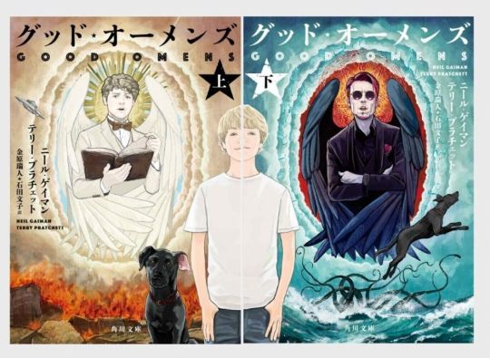
16. Japanese covers, Good Omens

Other people have assured me that this is, in fact, a dual Good omens cover. Alas, I cannot tell. I don't possess compound eyes or even an exoskeleton, and as such lack the ability to decipher these decisions.
Tier: WTF
16. Japanese cover, Good Omens
Holy overlap, Batman! I can’t fault this designer for wanting to reuse the wonderful dual illustrations in a Ying-Yang layout, all the elements are there, but there’s a clinginess to the type and positioning that makes me feel like someone is trying to hurt the letters? Is this designer okay? Do they need a hug?
Tier: Does the Job
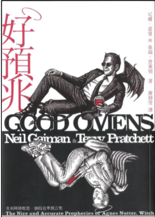
18. Chinese cover, Good Omens
Can I say how charming it is they’ve managed to conserve the halo and devils tale on the Chinese title, as well as the woodcut detailing? However, the simplicity of the cute, contrasting wing design is sadly swallowed by the intense, New-York taxi cab vibes coming off the yellow and checkerboard text block. It could have been so good! Chinese readers: I am mad on your behalf!
Tier: Not so good (Omens)
19. UK 1991 paperback, Good Omens
What are we doing here, people. I think I've stepped into a Jungian analysis of what it feels like to have read Good Omens. It's dreamy yet unsettling. Right yet very wrong. And Ol' "Tiny Hands" Aziraphale up there is really judging me for what they found inside my mind. In less upsetting news, we've kept the improved typography and layout of the authors and book title. All is not lost to the nightmare.
Tier: Not so good (Omens)
20. 50 Shades of Gray rip-off cover, Good Omens
*panic* WHAT ARE WE DOING HERE, PEOPLE...?!
Bonus : the guardian quote is almost as much of a mystery as the cover it’s on.
Tier: WTF
End of round 2.
#good omens 2#art director talks good omens#tier list#good omens#aziraphale and crowley#aziraphale x crowley#crowley and aziraphale#book omens#book cover#go2
27 notes
·
View notes
Text

I have formed emotional relationships with various tiny plastic shapes.
344 notes
·
View notes
Text
Tier ranking Belos based off of how screwed up he is.


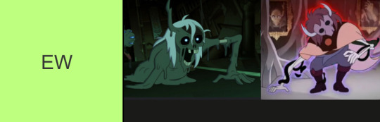

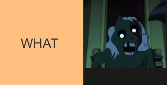
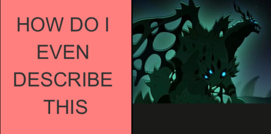
#beware the pipeline#yk it’s bad when he started off as baby and ended as AAAAHHHGH WHAT THW FUCK#I could fix him but whatever’s wrong with him is funnier#can we collectively bring back fanon Philip as a fandom#please#I miss him#giggling at how the majority of the photos are in the sexy tier#the owl house#toh#philip wittebane#emperor belos#owl house#belos#tier list#toh tier list
254 notes
·
View notes
Text

whimpering is a spectrum
@hutchersblg thanks for helping me make this bbg
#whimpering is a spectrum#fr fr#derek is too cocky to whimper#i want peeta to whimper loudly in my ears#futturman whimpers like its his lifeline#josh hutcherson#josh futturman#peeta mellark#mike schmidt#clapton davis#sean anderson#teddy atkins#derek danforth#billy burn 2019#tier list#argue with the wall
293 notes
·
View notes
Text
"Super Mario Land is WEIRD!!" jokes tier list

176 notes
·
View notes
Last Seen Blogs
l0852
,

texassweetie76
Untitled

somik-severinka
Somik&Severinka
promare-chinese-fullversion
普罗米亚完整版本 (2021)-PROMARE 線上看小鴨完整版

starsainzjr
Together or Nothing