#you hold me up
Text
Milestone Monday
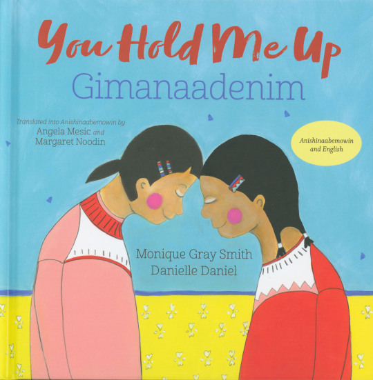
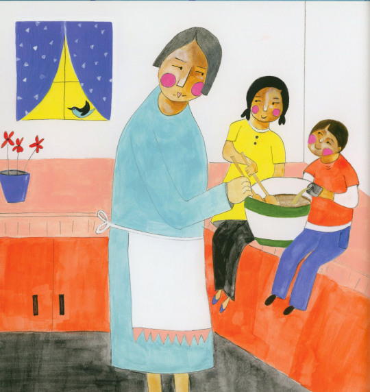

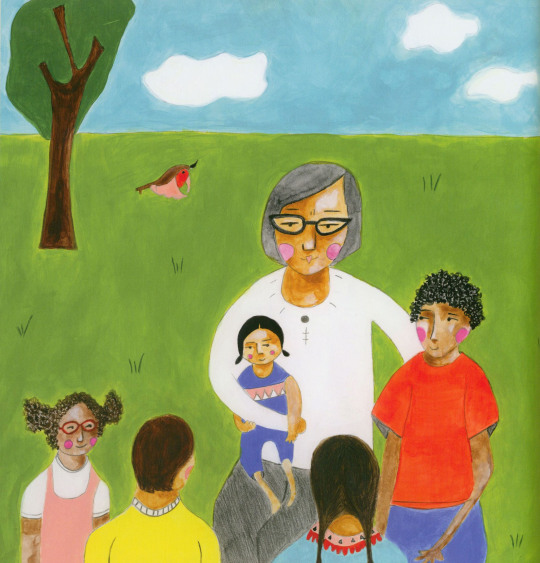
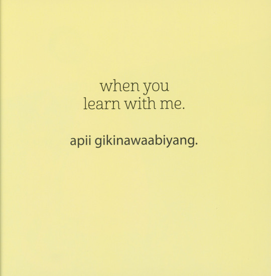
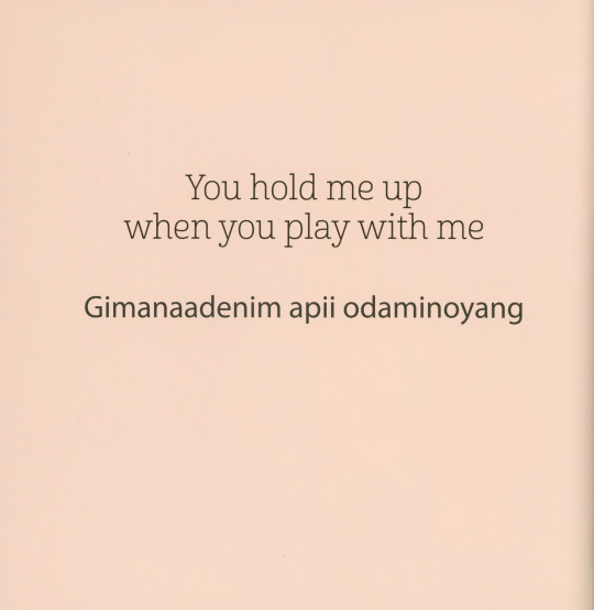
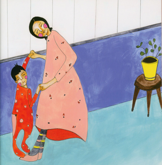
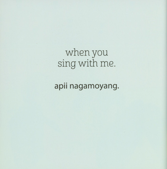
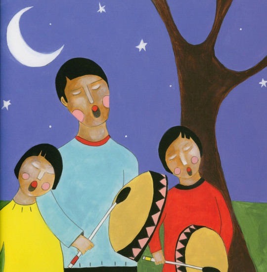

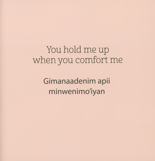

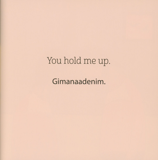
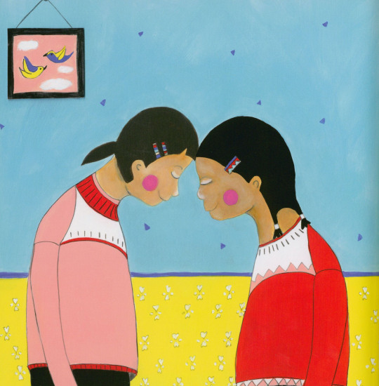
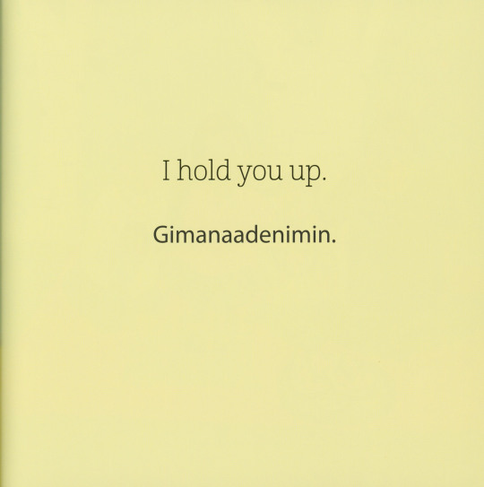


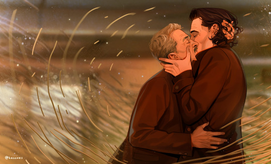
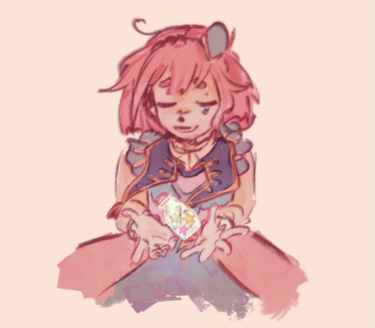
Happy World Kindness Day! Observed annually on November 13th, World Kindness Day encourages us to set aside our differences and focus on recognizing and participating in good deeds and kindness throughout our communities. In recognition of the day, we are sharing You Hold Me Up Gimanaadenim written in English by Cree author Monique Gray Smith with illustrations by Canadian First Nations author and artist Danielle Daniel, and translated to Anishinaabemowin by two UW-Milwaukee-associated Ojibwe-language specialists Angela Mesic and Margaret Noodin.
While You Hold Me Up Gimanaadenim was written to inspire children to show each other love and support, the lessons are applicable at any stage in life. Gray Smith writes that the book was written in the “spirit of Reconciliation”, coupled with Daniel’s vibrant illustrations it successfully demonstrates how to be more empathetic and build loving relationships.
You Hold Me Up was published in English in 2017 and met with many accolades including the 2017 American Indians in Children’s Literature Best Books award and 2018 Global Read Aloud award. It went on to be translated to Anishinaabemowin in 2021. Both versions were published by Orca Book Publishers out of British Columbia who notes that the translation “has been done according to more western conventions used by speakers of Anishinaabemowin. . . and matches the lexicon found in the Ojibwe People’s Dictionary.”

View other Milestone Monday posts.
– Jenna, Special Collections Graduate Intern
#world kindness day#you hold me up#gimanaadenim#monique gray smith#danielle daniel#angela mesic#margaret noodin#anishinaabemowin#orca book publishers
44 notes
·
View notes
Text
It's about who.
#like hozier said:#if someone asked me at the end I'd tell them “put me back in it”#darling I would do it again if I could hold you for a minute#darling I'd go through it again#I would still be surprised I could find you darling#in any life#hozier wrote francesca for lokius#I have unintentional manifestation skills apparently so I had to put them to use before the finale drops#needed lokius nation to get a kiss no matter what#why was the hardest part about this piece drawing the spaghettification#almost gave up on it because of it#loki#loki series#loki season 2#lokius#lokius fanart#loki fanart#loki mobius#mobius loki#loki laufeyson#my art#digital art#fanart#illustration
15K notes
·
View notes
Text

In my mind palace my tav and Astarion are playing the exact same game of 5D chess and they don't realize it yet
#baldur's gate 3#bg3#astarion#bg3 tav#my art#gabby plays bg3#shadowheart#and#lae'zel#are also here#anyway tag ramble time just got the romance scene where you can hug him and on my knees.....this guy.....#astarion: hey i was kinda sleeping with you to save my ass but turns out im feeling real emotions now#matt marja: wtf. me too. this is so embarrassing for both of us we're idiots [tenderly hold hands]#i thought up matt for a campaign we may or may not play last year and deciding to play him in bg3 because i thought it would be funny#to put him against this guy who seemingly has many of his same issues. Best idea i've ever had. the emotional catharsis im experiencing#matt marja
12K notes
·
View notes
Text


peruvian croli brainrot 🇵🇪🦙💥
#good omens#good omens 2#Aziraphale#Crowley#buenos presagios#croli peruano#good omens Perú#PERÚ OMENS#MI PAIS MI PAIS#aneh wont shut up#good omens fanart#aneh draws#this one holds a lot of emotional value to me anfsnn#some of you may know why#specially the ones who follow me on twitter xD
6K notes
·
View notes
Text
lore accurate teen soukoku. the worsties ever
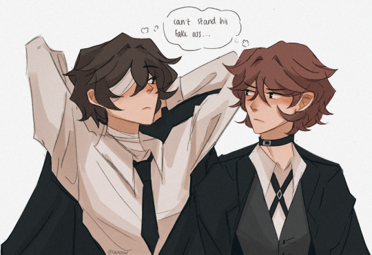
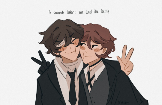
#rewatched fifteen w my bestie bc she finally reached season 3 and i forgot just how insufferable these two idiots are💀#literally calling each other slurs in one scene and then holding hands in the next#what the fuck is wrong with them /gen#anyway this accurately sums up their dynamic to me. toxic besties. gossip gals. teenage girls. whatever that dynamic is called#bungou stray dogs#bungo stray dogs#bsd#dazai osamu#osamu dazai#nakahara chuuya#chuuya nakahara#soukoku#skk#lotus draws#also my friend is literally insane bc she was like “chuuya n dazai are satosugu coded but if like stsg actually had BEEF w each other”#LIKE WHAT😭😭#THE ONLY THING THEY HAVE IN COMMON IS DOOMED BY THE NARRATIVE YAOI#sobbing you guys shouldve seen the face i fucking made at her. i was so disappointed
5K notes
·
View notes
Text
so much happened in this whole episode but i’m still on fig infiltrating ruben’s dream, making it look like the place where his friend was murdered, and then disguising herself as kipperlilly & repeatedly saying different variants of “somebody needs to take the fall for this, and it’s not going to be me. it’s going to be you.” while adaine as the elven oracle shows up next to her. can you imagine waking up from that, the idea of a horrible truth being pinned on you by your friend to save her own skin while the personification of fate and destiny stands there, almost as a promise that this is GOING to happen to you. we don’t even know if this kid is guilty. my god.
#fantasy high#dimension 20#fhjy#fhjy spoilers#fantasy high junior year#fig faeth#ruben hopclap#lucy frostblade#the rat grinders#adaine abernant#kipperlilly copperkettle#watching fig terrorize him like girl!!! we don’t even know if he’s guilty!!!!#this might just be for me but i do not think 5 teenagers willingly brutally killed their friend idk#like there just has to be some other element to it and i am very scared to find out what that was#what if they were put in a position where they felt there was/there was no other choice… like oh my god#my comedy brain is having fun but my ‘this is a teenager’ brain is in such deep distress all the time this season#the rat grinders i trust brennan to not make u cartoonishly evil so i am holding u as gently as i can in my confused shaky hands#also with the devil’s nectar i’ve been wondering why they all seem so well-adjusted & now i’m curious if they’ve been intentionally-#changing their memories in a way so that either the trauma is lesser or they think they aren’t guilty. idk#but it seems like from how gertie was talking she was making it more recently so the well adjustedness from early jy doesn’t quite add up#they could have another source maybe??? idk i’m just low stakes 4 a.m. spitballing here#there’s also the strong possibility that they’re aware of what happened but they weren’t the ones who killed lucy. idk who knows#the way you could probably devil’s nectar yourself into believing it wasn’t your fault someone died… CRAZY IMPLICATIONS!!! CRAZY IDEA!!!#anyways the bad kids & the rat grinders don’t ever have to like each other but i do wonder if at least some of those kids deserve a chance
2K notes
·
View notes
Note
CROWLEY SSR THOUGHTS
there is zero basis for this, but I can't get this thought of my head
I don't know why I decided to draw it this way
#art#twisted wonderland#twisted wonderland spoilers#twisted wonderland episode 7 spoilers#twisted wonderland book 7 spoilers#(these will be relevant in a moment)#this isn't going to happen. but WHAT IF.#anyway i didn't get him (damnit birdman come home) so i had to look up his story#and let me tell you friends my findings were SHOCKING#crowley canonically likes vegetables which means that the crowley is revaan theory = BUSTED#crowley is sailor venus = CONFIRMED#(i know 'whip of love' is a saying but that's where my mind always goes)#DISCLAIMER: this is (mostly) a joke please continue to hold whatever theories and headcanons you want#but look. c'mon. look over here at this whiteboard i've covered in red yarn.#revaan being a picky eater has come up multiple times and there is an entire whole bit about how much he hated jerky and refused to eat it#and now they've made a point of talking about how crowley will eat almost anything and loOoOoves wild game meat especially#it's SO stupid but i can't help but read way too much into it#(this is tumblr if you don't want to see incredibly stupid overanalysis of anime guys then why are you HERE)#and i gotta hold on to something because otherwise whenever malleus and crowley are onscreen together i just keep going 'same hair color...#unless this is like. some kind of deep cover thing.#lilia doesn't recognize him because he saw him eat a green bean once and revaan would NEVER#crowley's secret is safe for another day#(serious hat on: i do think they're probably connected in some way)#(but there's something deeper going on that we're just not clued into yet that will hopefully explain things)#man forget revaan what if crowley whips off his mask and it turns out he was meleanor this whole time#wait hold on meleanor loves jerky. IT ALL FITS...
2K notes
·
View notes
Text
I think 90% of my gripes with how modern anime looks comes down to flat color design/palettes.
Non-cohesive, washed-out color palettes can destroy lineart quality. I see this all the time when comparing an anime's lineart/layout to its colored/post-processed final product and it's heartbreaking. Compare this pre-color vs. final frame from Dungeon Meshi's OP.


So much sharpness and detail and weight gets washed out and flattened by 'meh' color design. I LOVE the flow and thickness and shadows in the fabrics on the left. The white against pastel really brings it out. Check out all the detail in their hair, the highlights in Rin's, the different hues to denote hair color, the blue tint in the clothes' shadows, and how all of that just gets... lost. It works, but it's not particularly good and does a disservice to the line-artist.
I'm using Dungeon Meshi as an example not because it's bad, I'm just especially disappointed because this is Studio Trigger we're talking about. The character animation is fantastic, but the color design is usually much more exciting. We're not seeing Trigger at their full potential, so I'm focusing on them.
Here's a very quick and messy color correct. Not meant to be taken seriously, just to provide comparison to see why colors can feel "washed out." Top is edit, bottom is original.
You can really see how desaturated and "white fluorescent lighting" the original color palettes are.
[Remember: the easiest way to make your colors more lively is to choose a warm or cool tint. From there, you can play around with bringing out complementary colors for a cohesive palette (I warmed Marcille's skintone and hair but made sure to bring out her deep blue clothes). Avoid using too many blend mode layers; hand-picking colors will really help you build your innate color sense and find a color style. Try using saturated colors in unexpected places! If you're coloring a night scene, try using deep blues or greens or magentas. You see these deep colors used all the time in older anime because they couldn't rely on a lightness scale to make colors darker, they had to use darker paints with specific hues. Don't overthink it, simpler is better!]
#not art#dungeon meshi#rant#i'm someone who can get obsessive over colors in my own art#will stare at the screen adjusting hues/saturation for hours#luckily i've gotten faster at color picking#but yeah modern anime's color design is saddening to me. the general trend leans towards white/grey desaturated palettes#simply because they're easier to pick digitally#this is not the colorists fault mind you. the anime industry's problems are also labor problems. artists are severely underpaid#and overworked. colorists literally aren't paid enough to do their best#there isn't a “creative drought” in the anime industry. this trend is widespread across studios purely BECAUSE it's not up to individuals#until work conditions improve anime will unfortunately continue to miss its fullest potential visually#don't even GET ME STARTED ON THE USE OF POST-PROCESSING FILTERS AND LIGHTING IN ANIME THOUGH#SOMEONE HOLD ME BACK. I HATE LENS FLARES I HATE GRADIENT SHADING I HATE CHROMATIC ABBERATION AND BLUR
2K notes
·
View notes
Text
oh right, technically i sell t-shirts
i forgot about that
#holidays are coming up and it would make a terrible gift#that's the main selling point#anyways these exist and can be exchanged for legal tender#the cost is the listed price + the emotional expense of knowing that i am judging u#bc i am. i am judging u#why would u want this. why would u exchange currency for this#there are so many other things you could exchnage currency for instead#a grocery store shrimp platter for instance#with the nauseatingly red cocktail sauce that is SO much better than a t shirt any time#hmm chicken picatta at a local Italian Eatery perchance? i am. a big fan of anything picatta#oh oh i know! 3.6 POUNDS OF FRESH OKRA#FOR THE COST OF THIS FRIVOLOUS T SHIRT U COULD INSTEAD PURCHASE 3.6 POUNDS OF FRESH DELICIOUS OKRA#and then --hold on i have a recipe--and then what u do is#so it is basically sacrilege to suggest this but what u do is u skip the cornmeal entirely#my southern ancestors are shaking a wooden spoon at me right now but LISTEN. u skip. the gotdang. cornmeal#instead: wash chop and soak (for 10 min) the okra in a mixture of 1 egg to tblsp water#then coat in flour#THATS IT JUST FLOUR#No cornmeal. i am betraying my heritage rn but I'm RIGHT#coat in flour sprinkle liberally in S&P and FRY that suck in veg oil high heat#until crispy & brown & u hear your arteries clenching in apprehension#so. so yeah#that's what u should do instead of buying this shirt go fry the shit out of some okra#(but buy local and young & tender if u can bc the grocery store is full of old-and-therefore-super-stiff specimens#pro tip (aka grandma tip): if u can't chop okra smoothly with your normal cutting knife then it's too old and tough.#...i mean u probably CAN still fry the shit out of it I've certainly done that before it's just much less delicious#ANYWAY. anyway ANYWAY. shirt. okra. farmers market. that reminds me of a post i made back when we first started selling these dang shorts#shirts. shorts shorts. oh shit i should make a crop top option.#i. i don't Know How to make a crop top option#HUH . . . i need to lie down now and contemplate the constant and irreconcilable limitations of the human experience good night
16K notes
·
View notes
Text
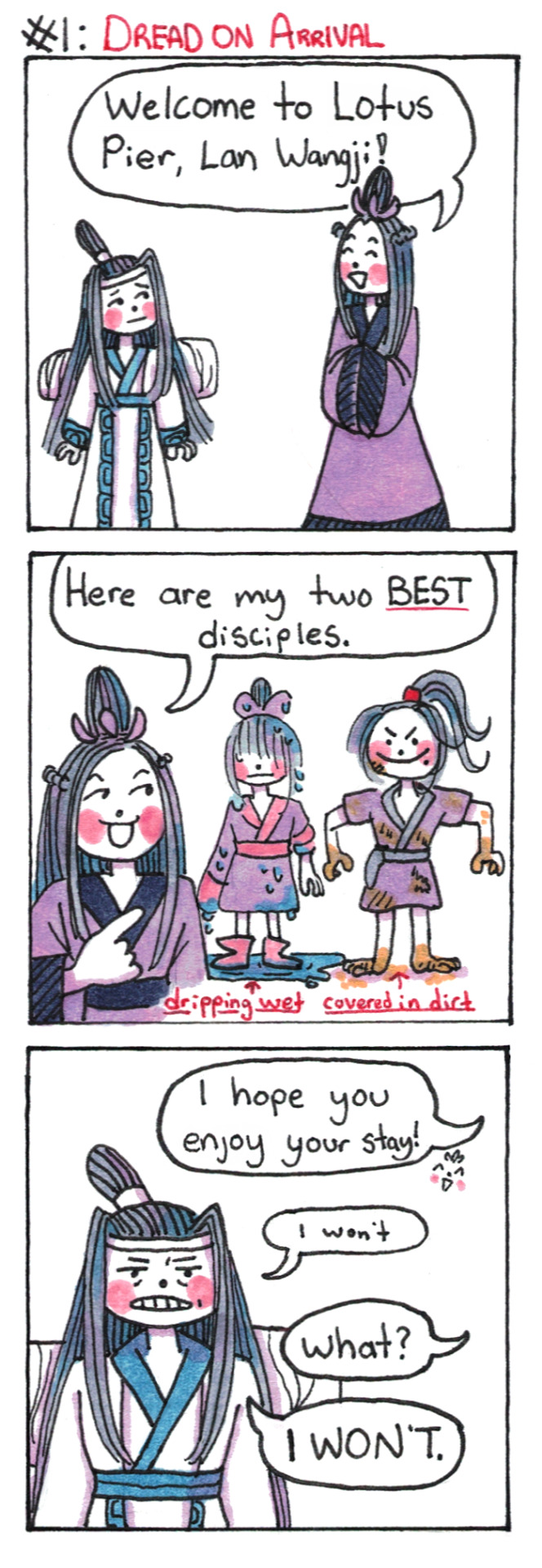
Lan Wangji Goes To Lotus Pier AU: Part 1: Dread on Arrival
(Part 2)
#poorly drawn mdzs#mdzs#lan wangji#jiang fengmian#jiang cheng#wei wuxian#Yungmeng Jiang Training Arc AU#MDZS AU#The AU name for this idea is something I am 100% willing to change if someone has a better one.#There will be at least 2-3 more comics so *please*. Ideas and feedback welcome.#The core idea behind this AU is that LWJ goes to study with the Yunmeng Jiang sect instead of JC and WWX going to Cloud Recess#But why? Well I imagine Lan Xichen set it up to give LWJ a challenge (more social than skill based) and LWJ rose to it (begrudgingly)#Sort of a 'You've mastered so many Lan techniques but Other Sects have styles that are worth learning.' set up.#Lan Qiren agrees mostly on the basis that...well it's LWJ. Yunmeng Jiang is unruly but LWJ is beyond that riff-raff. He'll rise above it.#This is the story of a boy who thrives on routine and rules spending time in a place that is his apparent antithesis.#Also it is so warm there. He is used to it being cold and what do you MEAN just take off some of my layers?#I just want to see him struggle and flail in many situations. And get him in Jiang Purple. Is that so wrong of me?#(Soaking wet JC is part of my 'JC was born to swim; forced to hold a sword' agenda. Do not remove him from the water)#((Politeness notes: JFM would *not* call LWJ 'lan wangji' nor would LWJ be vocally impolite to a sect leader.))
2K notes
·
View notes
Text

#wylan: my dad tried to have me killed. twice. and locked my mother up in an asylum :(#kaz who also has his own grudges agains van eck: YO WANNA HELP ME#kaz: i will systematically destroy your father's life and annihilate everything he holds dear#kaz: you in?#wylan: YOU BET#kaz brekker#wylan van eck#six of crows#grishaverse#six of crows duology#soc memes
1K notes
·
View notes
Text

The Final Flame 🕯️
—
“We’re all just candles in the dark.”
#candela obscura#critical role#critical role fanart#candela obscura fanart#elsie roberts#ashly burch#circle of tide and bone#the circle of tide and bone#critical role art#floweroflaurelin art#candela spoilers#candela obscura spoilers#critical role spoilers#cr spoilers#CAN YOU HEAR ME SOBBING.#I started this painting at the break and got the caption at the end of the episode#I know it’s not huevember but i make the rules haha#I’m working on three comms simultaneously so there’s been less art from me lately! but candela obscura has a hold on my MIND#also for the beast like. mantis orca locust monster? I just made smth up but I dig it!#me 🤝 raj
1K notes
·
View notes
Text
"Oh har har Gotham is terrible to Joker and that's why he acts the way he does," Gotham worships a hot topic furry with the mental stability of a soggy cracker and thinks a 10 year old vigilante is perfectly normal
#like im.sorry but what the fuck possesses dc writers to depict joker as a biproduct of an intolerant community#that he constantly harms and abuses and generally worsens by just standing there#am i supposed to feel sorry for that bitch? i dont#me personally i think it'd be hilarious if they refused to indulge his pariah complex#collectively they all agree to stop reacting to his antics. oh you're gonna blow up the bank?? haha you prankster#you're gonna kidnap someone and hold them hostage? here let me help you! want me to call batman for you?#hey jokie did you see the game! had a nice weekend? like literally fuck this man lmao#batman#bruce wayne#dc comics#dc#text#text post
4K notes
·
View notes
Text


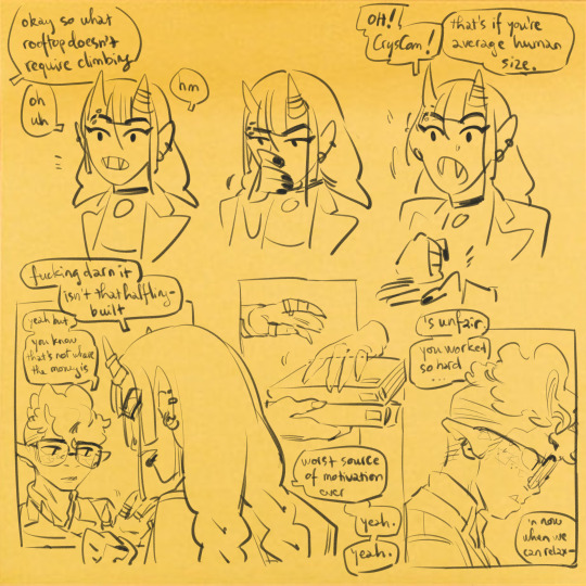


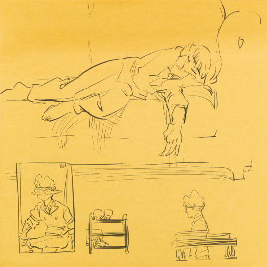
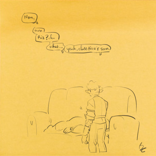
while teen while goblin while aroace while injured while doing your best
#fantasy high junior year#fhjy#riz gukgak#figueroth faeth#sklonda gukgak#dimension 20#this. mmmmhhh this is so. I did Not know how to draw this really.#I am very normal about riz (<- lying)#it's a brennan-dm d20 campaign the bad guy is always capitalism (I am saying this with clenched teeth)#riz out of all of them being aroace fucks with me SO bad. bc its also established that elmsville specifically and probably the#majority of solace is not. made for goblins. and that becomes sklonda being worked to the bone and pok dying on the job#and riz spending all his time trying to keep his friends together. maybe to the point of it being injurous#like. do u get what I mean. its an economy of time it takes your time it eats up your time#not just the gukgaks but everyone you have to spend time to get to live and you don't have a lot of time left in a day#and you have to spend it carefully. you have to prioritize#you're somewhere without an established community and companionship is bought with your time spent working#this place doesn't take care of you. at the end of the day who do you have who'd prioritize you. do you understand me#the evolved aroace loathing where if your friends and family are granted more time nobody would have to choose. we live in a society#holds ur hand we live in a society. idk if Im making any sense#anyway . uhhh riz is my favourite that's my statement thank you for listening. au revoir
739 notes
·
View notes
Text
Just remembered that one picture of Leigh standing next to Cary lmfao
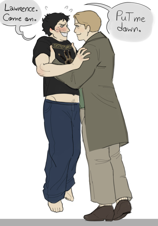
Adam wants to get down for the sake of his dignity, and totally not because being hoisted up kinda freaks him out a little
#in case youre wondering yes this was originally based off that one image of a gigantic woman holding a smaller one against a wall#the copypasted SOAD self titled hand on the shirt is so fucking funny to me please dont pay it any mind#call him kitty the way you can hold him up by the scruff of his neck to stop him from engaging in any shenanigans#genuinely cant tell whether leigh whannell is extremely small or cary elwes is freakishly tall#saw#saw franchise#saw movies#saw fanart#saw lawrence#lawrence gordon#saw adam#adam stanheight#adam faulkner#adam faulkner stanheight#chainshipping#lawrence x adam#adam x lawrence#latenightsundayblues art tag
2K notes
·
View notes
Text
always by your side
#couuugh. whehezze#hold on#project sekai#emu otori#pjsk#prsk#proseka#ok thatsg enough RANK 96 COOOOOGUH WHEEEZE#literlaly cough wheez ei have fucking covid. i wanted to draw something nicer for the event but my hands rlly hrut snd my throat hirts and#i was sticking my head in the freezer in between matches.#omfg i didnt think the end sprint was gonna be so insane i didnt have enough energy. mfers made me spend 700 gems. nene please.#i never wanna open the game agaon.(guy who will open it tomorrow and sunday) 16 MIL POINTS.. pimh was only 9mil. for rank 80smth.#the hatsune miku colorful stage tiering economy is in shambles#'im never doing that again' [will do it again in august]#event was insane. started out ill -> only 1 rate up card -> charger broke -> assignments -> covid on the last day. Be fr#to my beloved sakurako and fixer i wub you. ill try to finish my nice profile but well honk mimimi.#NSIFFLKE. SNIFFLE. WAAAAAAH#this is so lazy but i havent drawn for myself literally in a week. other than doodles i did between matches#actually theyre like little bobblehead emus all over my sketchbooks i should collage them into anpost#idk how people get that subtle gaussian blur on their lines i tried it but it looks so obvious to me here.. maybe bc i used a thick brush..#ok wonderhoy i need to lay down so bad tylenol save me. I ACCIDENTALLY SWALLOWED MY LOZENGE IN THE MIDDLE OF A GAAAAAME
894 notes
·
View notes
Last Seen Blogs

sh1-n0bu
a dreamer’s cafe

makscandles
Maks Candles

unitedbeetroot-blog
UnitedBeetroot
ohwellalissa
AMM
bbq-girll
we have the meats