
uwmspeccoll
Special Collections
Discover the collections you never knew the library had. Expect rare books, nurse romances, fine press editions, comic books, artists books, and the occasional shelfie from the UWM Special Collections staff.
5093 posts
Don't wanna be here? Send us removal request.
Last Seen Blogs

shinigami-naara
Untitled

texwrestlehard
Mama I like boys, boys like me!

hussein-ali-karem
Untitled

nousgoth
Untitled

laurenmetzlerillustration
Lauren Metzler
Text


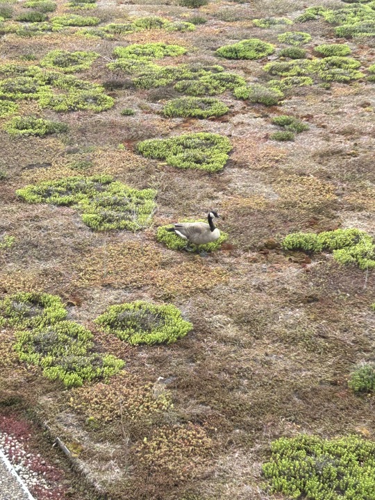


A Goose Family Feathursday
Mildred and Horace Start a Family!!
Every spring for the past few years a mating pair of Canada Geese take up residence on the green roof outside our window for a couple of weeks. We've named them Horace and Mildred, and we did a post about them in 2021. We wondered if they would ever establish a nest in the roof's sedum, but they just hang out for a few weeks and then depart. This year they finally decided that our roof was suitable to start a family and about 20 days ago Mildred set up housekeeping with a downy nest and six eggs near one of the vents on the roof. We are all very excited here in Special Collections, and we maintain daily goose alerts!
Mildred will incubate her brood for about 30 days, rarely leaving the nest. She is a very devoted mother. Horace on the other hand is usually gone during the day, so we rarely see him. Canada Geese are monogamous and mate for life, so we don't think he's cheating on Mildred, but we all thought he would be more present as the male usually hangs about to help guard the nest, but apparently he has other ideas.
We should see some hatchlings in about ten days or so, and we'll bring you an update then. While we are interested in seeing the couple nest on our roof, we also have concerns. There is no water, and the goslings will be susceptible to falling off the roof and becoming prey to raptors and other avian predators, especially the peregrine falcons that raise their own families on the nearby rooves of our campus's tallest buildings. Nature will have its way, but we do hope that Mildred and Horace have strategies for keeping their family safe.
Stay tuned!
View more Feathursday posts.
152 notes
·
View notes
Text


Classic Profiles
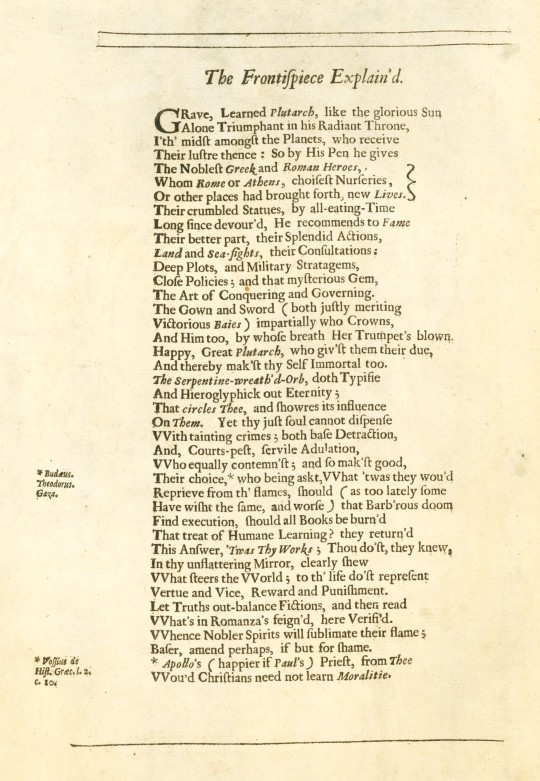
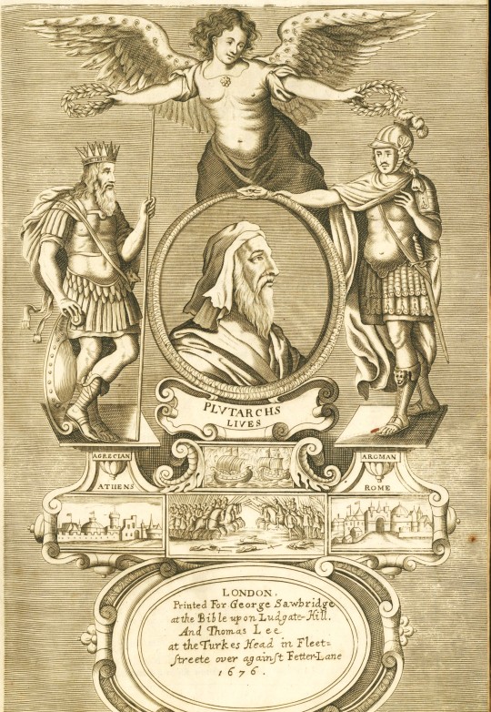
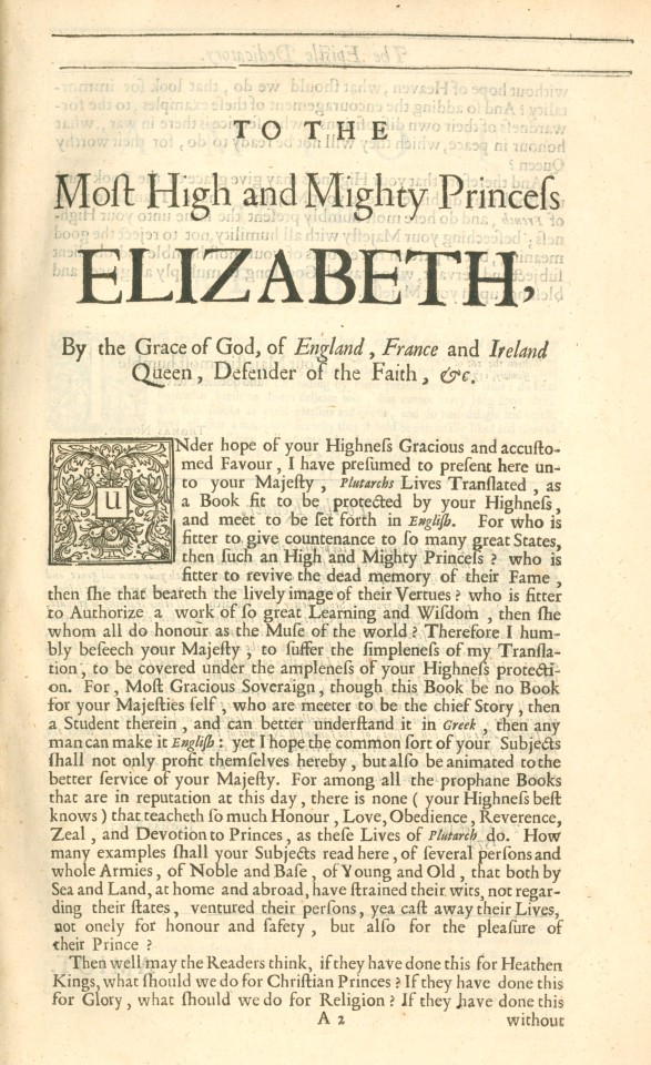
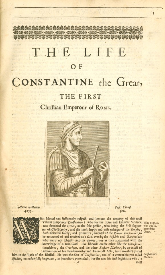
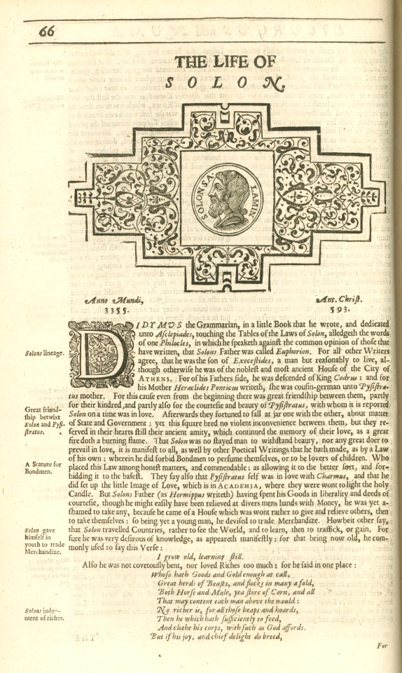
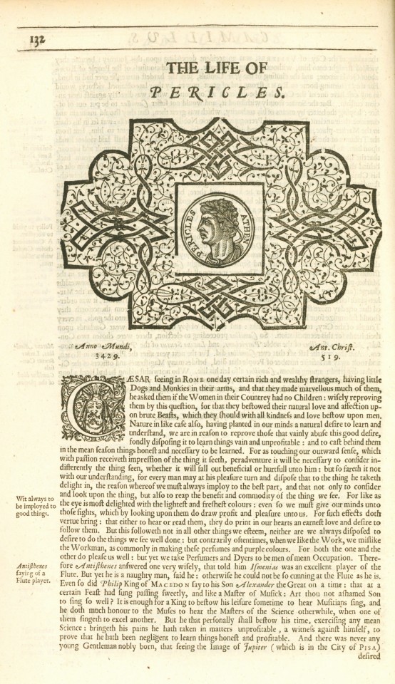
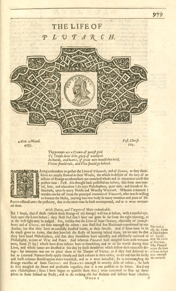
This is a 1676 edition of The Lives of the Noble Grecians and Romans, compared together by the 1st-century BCE Greek philosopher and historian Plutarch of Chaeronea, printed by the printer to the University of Cambridge John Hayes for the bookseller George Sawbridge. Originally written in Greek, Plutarch's Lives appeared in print for the first time as a Latin translation in 1470, and this English translation by Sir Thomas North was first published in 1579 from a French translation by James Amiot (Jacques Amyot). The text is a collection biographies of famous Greeks and Romans, including Alexander the Great, Pericles, Tiberius Gracchus, and Cicero. These figures left an indelible mark on history, their lives and achievements shaping the world as we know it.
Sir Thomas North (1535 – c. 1604) was an English translator and lawyer significantly contributing to English literature. His translation of Plutarch's Lives served as the primary source text for William Shakespeare's Roman plays, a testament to his work's enduring influence. This translation is regarded as one of the earliest examples of exceptional English prose. It was followed by another edition in 1595, which included updated biographies. A third edition of North's Plutarch was published in 1603, including even more translated Parallel Lives and a supplement of other biographies.
Jacques Amyot (1513-1593), a French scholar, writer, and translator, made substantial contributions to the field of translation and literature. His work on the translation of Plutarch's Lives (1559-1565) was instrumental in shaping the literary landscape of his time and laid the foundation for future translations and interpretations of Plutarch's work.
The first edition of this book was dedicated to Queen Elizabeth I. This dedication reflects the book's significance and provides a glimpse into the political and cultural landscape of the time, adding another layer of depth to the reader's understanding. Plutarch’s Lives helped shape the understanding of the classical Greek democracies and oligarchies of the Roman Republic and the role attributed to their founders—among them the legendary Lycurgus of Sparta and the Athenian lawgiver Solon.
-Melissa, Special Collections Classics Intern
View other Classics posts
#classics#greek posts#greece#roman#cambridge#plutarch#ancient greece#roman republic#alexander the great#lycurgus#solon#queen elizabeth i of england#biography#sappho#constantine the great#pericles#Thomas North#James Amiot#Jacques Amyot#John Hayes#university of cambridge
87 notes
·
View notes
Text
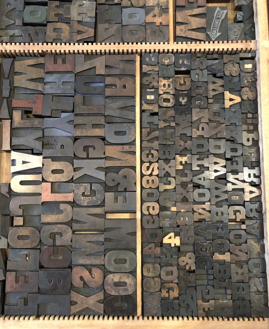


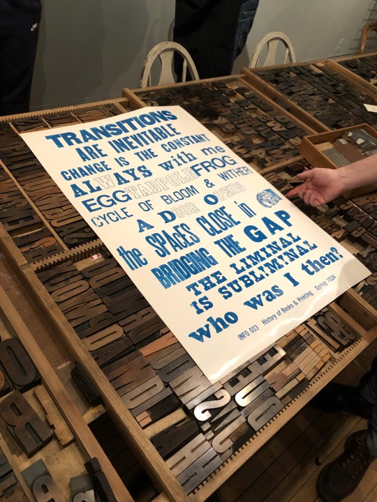

Typography Tuesday
PRINTING WITH WOOD TYPE!
Every semester, when we finally get to the invention of letterpress printing in Europe in my History of Books & Printing course, we all head over to a local print shop to set type and print a collaborative broadside. Last week we did just that and went over to Adam Beadel's Team Nerd Letterpress in the Walker's Point neighborhood of Milwaukee.
Usually, we compose in metal type, as that is what the students just learned about, but Adam recently received a huge influx of foundry type that wasn't set up yet, so we had to use wood type instead. Even though we wouldn't learn about the invention of production wood type for a few weeks, we were game because wood type is the best!
Each student was assigned to come up with a 3-5-word phrase based on the theme of "Transitions." They set their own phrase in wood type, I arranged the phrases into an exquisite corpse poem, we locked up the type on the bed of a poster press, and pulled a proof in blue ink (second to last image). Everyone was satisfied with the results, and with only a couple of adjustments, the students went on a tear, inking up the type in a rainbow of colors (last image), and pulling 15 more prints. Everyone went home exhausted and happy.
There are few things more thrilling than making your own letterpress prints. Thanks Adam!!!
View another letterpress post from a previous book history session.
View other posts on wood type.
View our other Typography Tuesday posts.
-- MAX, Head, Special Collections
#Typography Tuesday#typetuesday#instructions sessions#students#graduate students#Information Studies#INFOST 603#History of Books & Printing#letterpress#letterpress printing#wood type#Adam Beadel#Team Nerd Letterpress#type setting#broadsides#student work#exquisite corpse
73 notes
·
View notes
Text
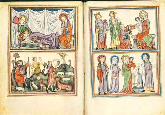
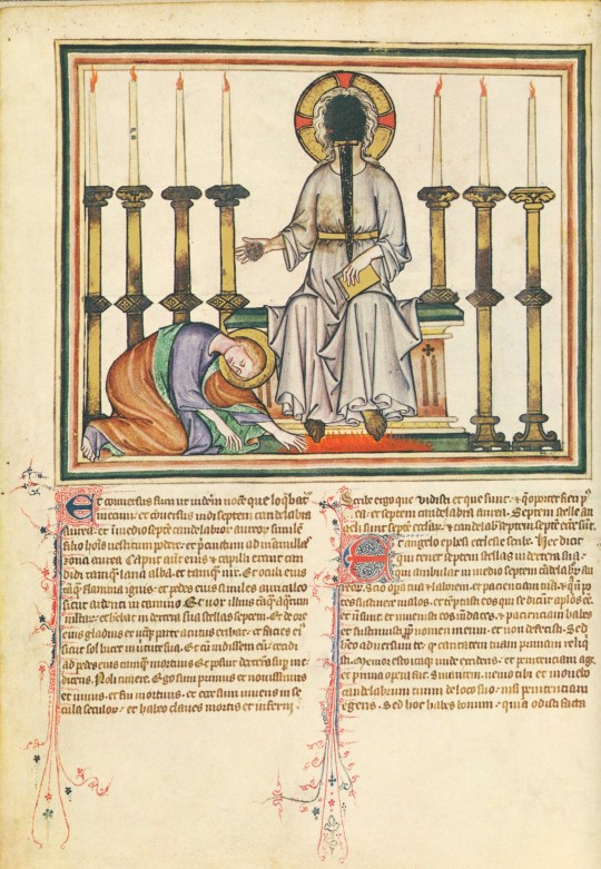


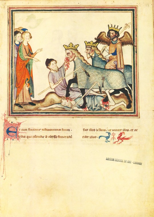
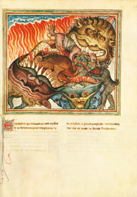

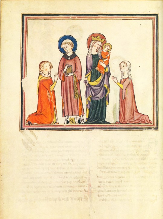
An Apocalyptic Manuscript Monday
This week we present our facsimile of the 14th-century Cloisters Apocalypse, published in 1971 by the Metropolitan Museum of Art in New York. As described in the introduction to the commentary about the manuscript, “[famine], pestilence, strife, and untimely death inspired apocalyptic fantasies and movements in Europe throughout the Middle Ages” (page 9), and this environmental influence led to the popularity of apocalyptic manuscripts like this French Apocalypse. Made in the 1330s for a Norman aristocratic couple, this manuscript has a few interesting details that set it apart from other Apocalypses, especially in relation to two other manuscripts in London (British Library, Add. Ms. 17333) and Paris (Bibliothèque Nationale, ms. Lat. 14410) that share similar formats, styles, and sequences with the Cloisters manuscript.
The first unique detail is the prefatory cycle of the life of Jesus in the introductory folios (1-2 verso). Since the Apocalypse of St. John the Divine (also known as the book of Revelation) was written by a titular St. John, prefatory cycles in Apocalypses usually consist of his life, rather than Christ’s. The other aspect of this manuscript that makes it distinct amongst its sister manuscripts is the addition of a dedication page on folio 38 verso. This page shows a man and woman kneeling in front of a tonsured saint and the Virgin and Child, respectively, representing the people for whom this manuscript was originally made for.
Interestingly, this manuscript also has multiple pages added to the original manuscript. Pasted on the inside front cover are handwritten provenance notes. The manuscript also did not originally include chapters and verses 16:14 through 20:3, and pages with this text were later added to the manuscript after the dedication page.
The materials used to create this manuscript include tempera, gold, silver, and ink on parchment with a later leather binding. If you are interested in seeing this unique Apocalypse manuscript, you can either use our facsimile, visit Gallery 13 of the Metropolitan Museum of Art’s Cloisters where the original is on display, or view their digital presentation of the manuscript.
View other posts on our facsimiles of illuminated manuscripts.
– Sarah S., Special Collections Graduate Intern
#manuscript monday#apocalypse#cloisters apocalypse#the cloisters#met#the metropolitan museum of art#manuscripts#illuminated manuscripts#french manuscripts#book of revelation#Revelation of St. John#facsimiles#manuscript facsimiles#Sarah S.
43 notes
·
View notes
Text


Milestone Monday
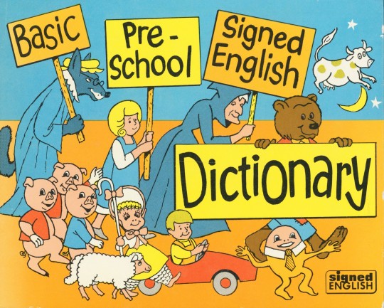
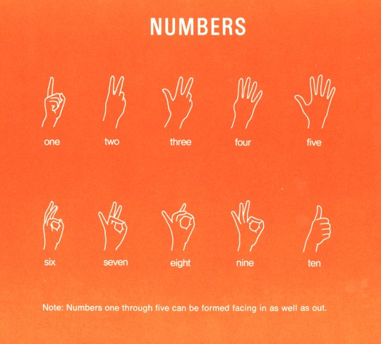
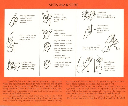
April 15th is National American Sign Language (ASL) Day, observed annually to celebrate the ASL community and its contributions to inclusivity, and to encourage folks to learn the language. Regarded as a natural language, sign language has likely existed for as long as there has been a need to communicate, however, the emergence of ASL is largely credited to Thomas Gallaudet (1787-1851) founder of the American School for the Deaf. Uniting deaf children from the western hemisphere the American School for the Deaf was fertile soil for language contact, developing ASL from French Sign Language, village sign languages, and home sign systems. Today, more than a half-million people throughout the United States use ASL to communicate as their native language.
In recognition of the day, we’re sharing another book from our Historical Curriculum Collection the Basic Pre-School Signed English Dictionary published by Gallaudet College Press in 1973. Signed English features drawn signs with written instructions to represent 975 words most frequently used by and with pre-school children. The editors also include sign markers and the American Manual Alphabet to be used in conjunction with the vocabulary, encouraging a language that is adaptable and offers a more complete English model of communication.
Signed English was edited in part by Harry Bornstein and Karen Saulnier who worked on several signing books for young readers throughout the 70s, 80s, and 90s, and illustrated by Jack Fennell and Ann Silver.
Read other Milestone Monday posts here!
– Jenna, Special Collections Graduate Intern
#milestone monday#national american sign language day#asl#thomas gallaudet#american school for the deaf#basic pre-school signed english dictionary#Gallaudet College Press#Harry Bornstein#Karen Saulnier#Jack Fennell#Ann Silver#historical curriculum collection#children's books
70 notes
·
View notes
Text

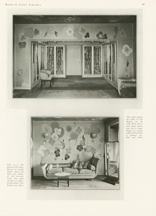
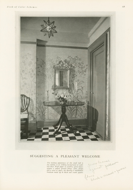
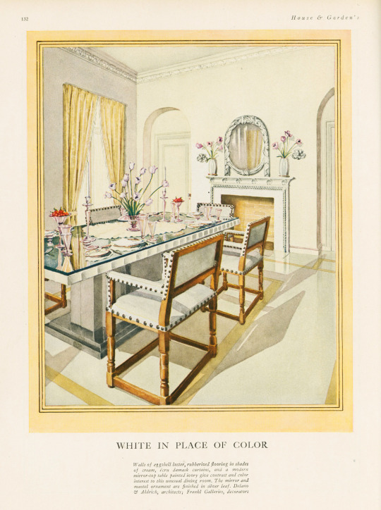

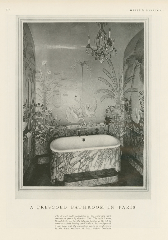
Decorative Plates
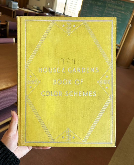
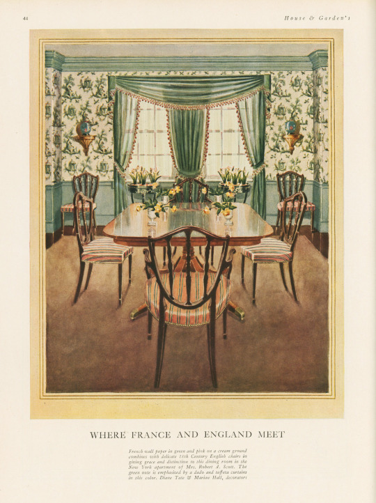
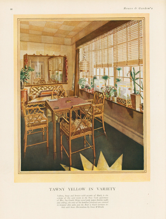
It's been awhile since we last posted something on the theme of the decorative arts, so I'm happy to have found this book—especially because it was mis-shelved in the stacks! This book is House and Garden's Book of Color Schemes, which contains "over two hundred color schemes and three hundred illustrations of halls, living rooms, dining rooms, bed chambers, sun rooms, roofs, garden rooms, kitchens and baths; the characteristic colors of each decorative period; how to select a color scheme, with unusual treatments for painted furniture and floors; a portfolio of crystal rooms and eight pages of unusual interiors in color." It was edited by long-time editor of House & Garden Richardson Wright (1887-1961) and Margaret McElroy, associate editor, and published by Condé Nast Publications, Inc. in 1929.
The book includes a large number of photographs of rooms, however, they are mostly in black and white—an unfortunate thing for a book about color! The promised eight color illustrations of rooms are not all present in our copy, but the five that are still in the book are shown here, alongside some of their black and white compatriots. I especially love the one titled "Tawny Yellow in Variety" that features a shocking amount of leopard print.
If you've read any of the posts I usually write, you know that I love a good binding—this one is a publisher's binding in a chartreuse-y yellow book cloth with art deco-style silver tooling featuring stars and leaves. Somebody took it upon themselves to write the publication date on the cover above the title—how thoughtful!
View more posts featuring Decorative Plates.
-- Alice, Special Collections Department Manager
#Decorative Sunday#Decorative Plates#decorative arts#House and Garden's Book of Color Schemes#color schemes#color#decoration#home decor#interior decorating#Richardson Wright#Margaret McElroy#Conde Nast#Conde Nast Publications#art deco#chartreuse#Publishers' bindings
65 notes
·
View notes
Text


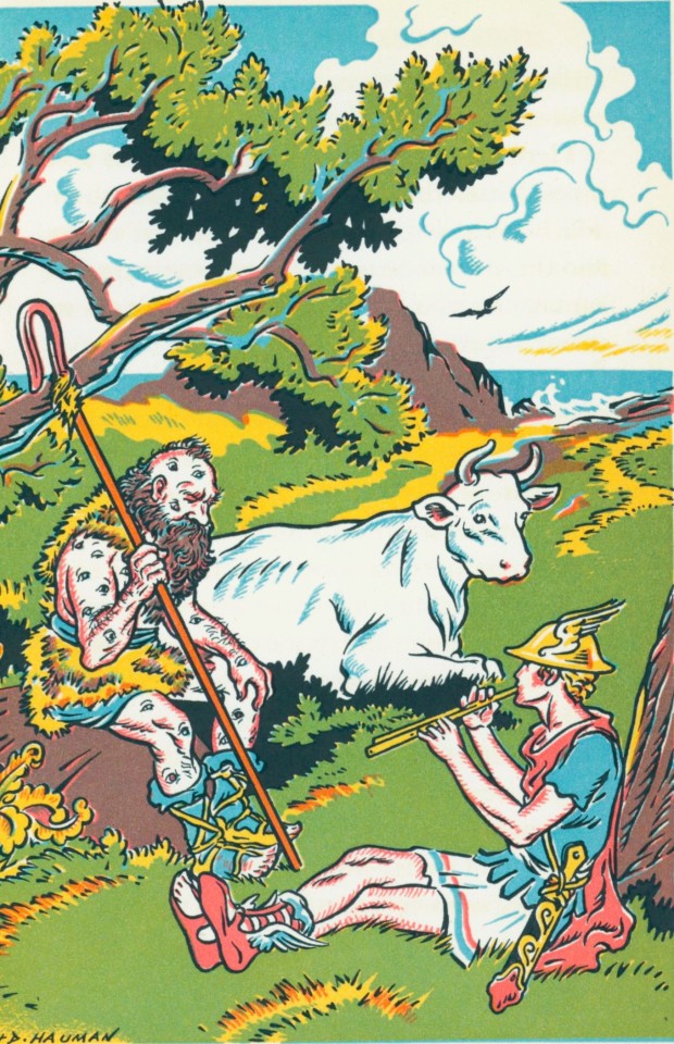
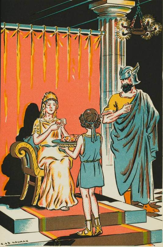


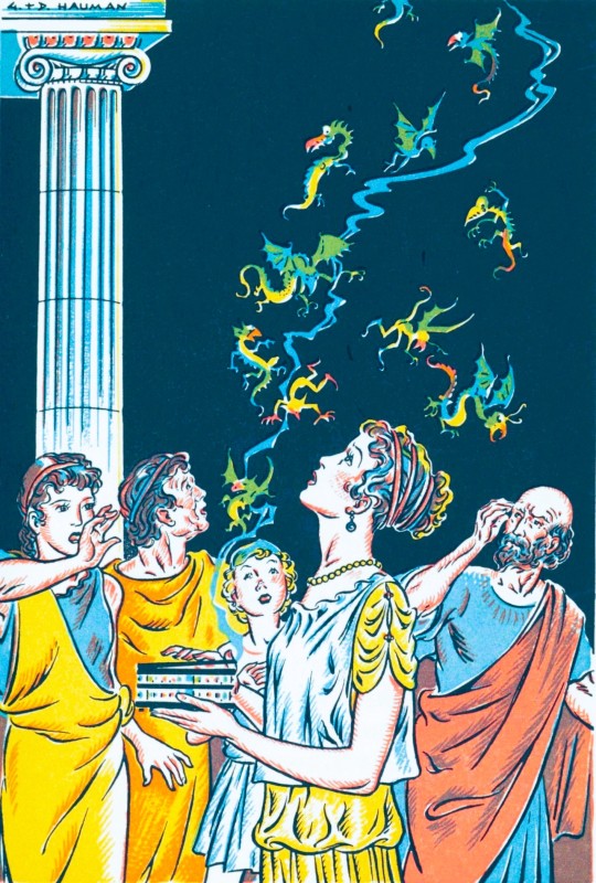
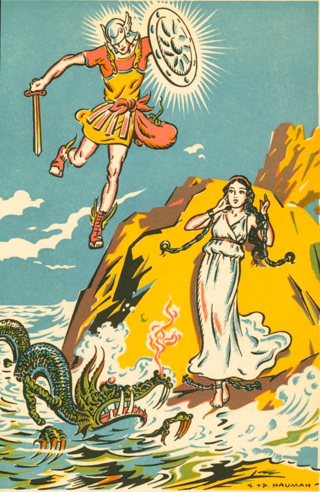
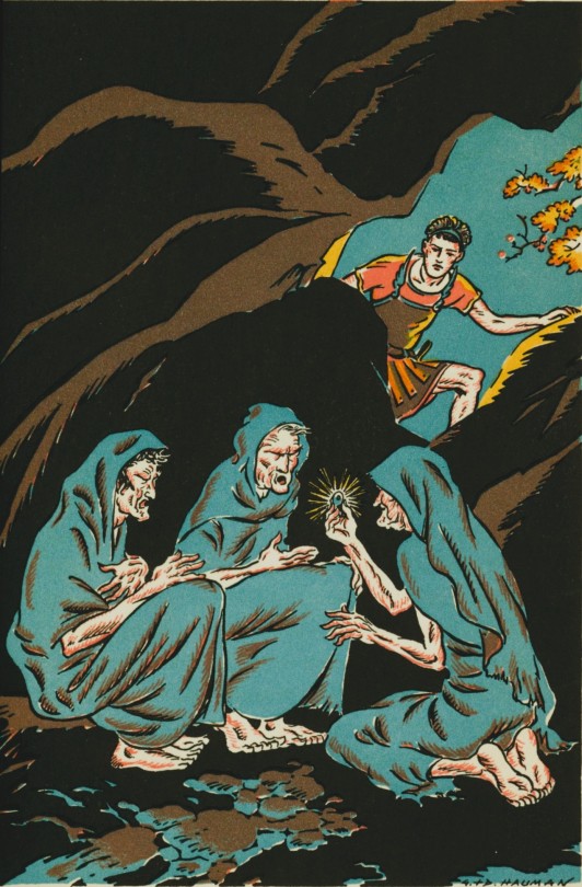

Greek Child's Play
Published in 1945 by Little Brown & Company, Adventures with the Gods by Catharine Sellew and illustrated by George and Doris Hauman is a charming primer created for young children. It contains sixteen stories featuring the heroes of Greek mythology as well as the gods and goddesses of Mount Olympus. The book even includes a handy index of all the characters' names and how to pronounce them. This delightful collection of stories provides an accessible introduction to the fascinating world of Greek mythology, making it an enchanting read for both children and adults.
Catharine Sellew, an American author, has a talent for turning ancient myths and legends into children's stories. Written using simple language and ideas, her stories create an almost fairytale-like experience for readers. It's no surprise that her works are captivating and beloved by many.
George and Doris Hauman were a married couple and American children’s book illustrators. They are perhaps most well-known for illustrating the popular 1954 edition of The Little Engine That Could. The couple decided to collaborate on projects because they had so many customers in common. They also used a joint signature for all of their illustrations.
View other Classics posts.
View our other posts on children's books.
-Melissa, Special Collections Classics Intern
#Classics#greek mythology#greek gods#Adventures with the Gods#Catharine Sellew#George and Doris Hauman#Little Brown & Company#little brown books for young readers#goddesses#illustrations#myths#mythology#children's books#Historical Curriculum Collection
135 notes
·
View notes
Text
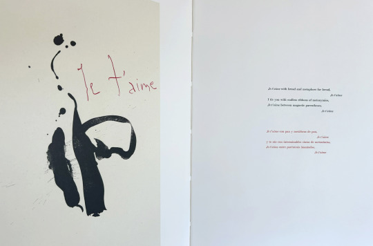
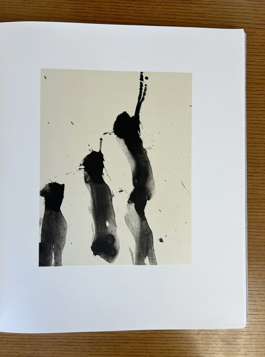
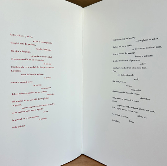
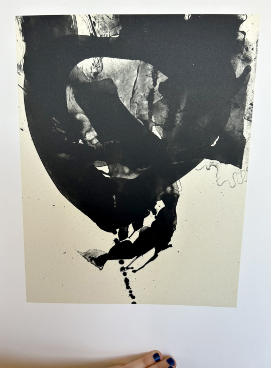
It’s Fine Press Friday!
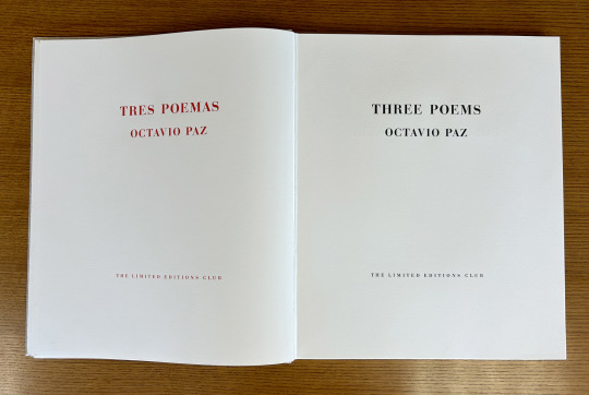
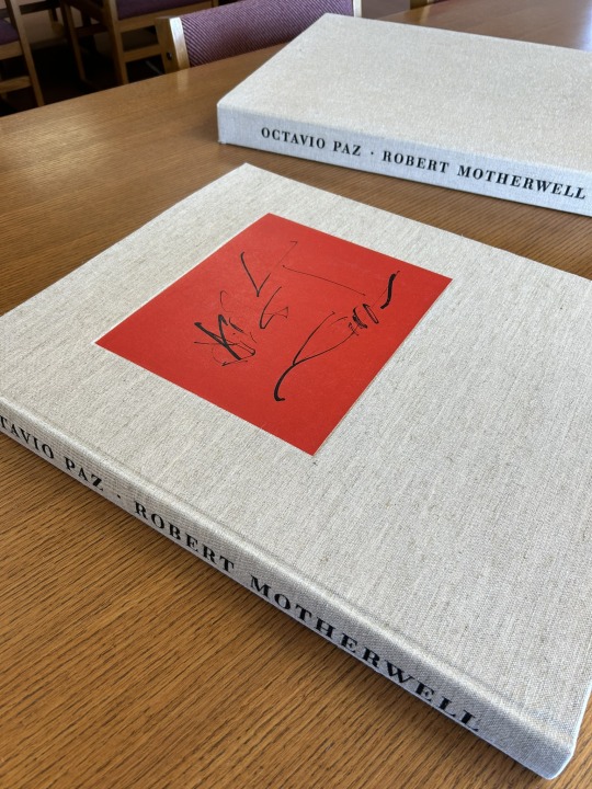
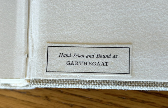
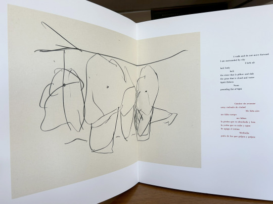
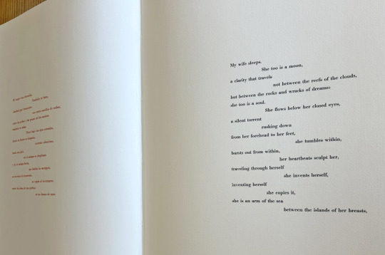
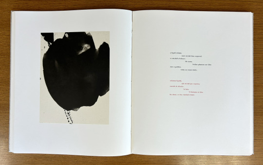
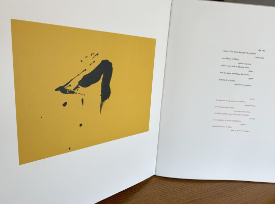
Today we’re taking a look at our 1987 Limited Editions Club release of poet, diplomat, and Nobel laureate Octavio Paz’s (1914–1998) Three Poems. Published as a bilingual Spanish-English edition of selections from The Collected Poems of Octavio Paz, 1957-1987 (translated by Eliot Weinberger, the primary translator of Paz’s work into English), this prodigious publication measures 56 cm and features lithographic illustrations by abstract expressionist painter and printmaker Robert Motherwell (1915-1991). The text was handset at Stamperia Valdonega (Verona, Italy) in Bauer Bodini Bold and Bauer Bodini Bold Italic typefaces, both of which were cast by Fundicíon Tipográfica Neufville (Barcelona, Spain). Lithographs were printed at Trestle Editions on hand-made Japanese papers and text was printed at Wild Carrot Letter Press (Hadley, MA), Stamperia Valdonega, and The Heritage Press on mould made paper from Cartiere Enrico Magnani (Pescia, Italy). It was hand-sewn and bound at the Garthegaat Bindery.
The book was designed by Benjamin Shiff, LEC book designer and son of Sidney Shiff, who had purchased the debt-ridden Limited Editions Club in 1979. Under the leadership of Shiff, a one-time Wall Street broker, the LEC gained a broadened subscription base, increased the quality of their publications, diversified their roster of artists, and returned to profitability.
Though minimal and modern in presentation, the production of this edition plumbed the depths of printing history. The Magnani paper mill was established on the banks of the Pescia river (known for its clear water- a necessity for paper production) in 1404, half a century before Gutenberg’s printing press was first put to commercial use. And the Fundicíon Tipográfica Neufville (operational 1885-1995), also known as Neufville Typefoundry, was the biggest 20th century supplier of the printing industry in Spain. After a number of ownership transfers, the company, alongside Bauersche Gießerei (a German typefoundry, operational 1837-1972), was succeeded by Bauer Types, which would leverage ownership of the rights to many of the original typefaces from both foundries to lead the way from lead type production to digital typography.
--Ana, Special Collections Graduate Intern
View more Limited Editions Club posts
View more lithography posts
View more Cartiere Enrico Magnani posts
View more Stamperia Valdonega posts
#Fine Press Fridays#Fine Press Friday#Limited Editions Club#lithography#Cartiere Enrico Magnani#Stamperia Valdonega#Bauer Types#Magnani paper mill#Bauersche Gießerei#Octavio Paz#Eliot Weinberger#Robert Motherwell#Fundicíon Tipográfica Neufville#Three Poems#Tres Poemas#Wild Carrot Letter Press#Trestle Editions#mould made paper#Garthegaat Bindery#Benjamin Shiff#Ana
22 notes
·
View notes
Text
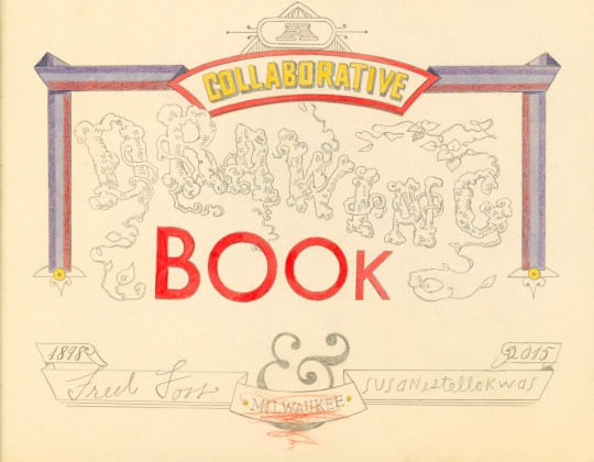


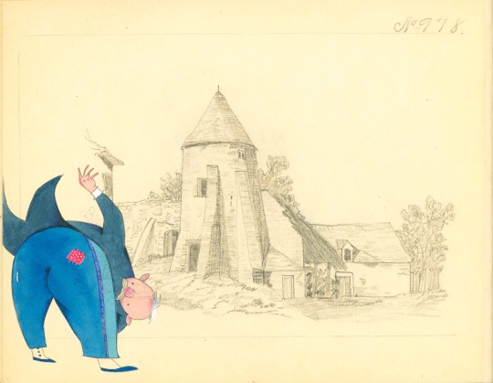
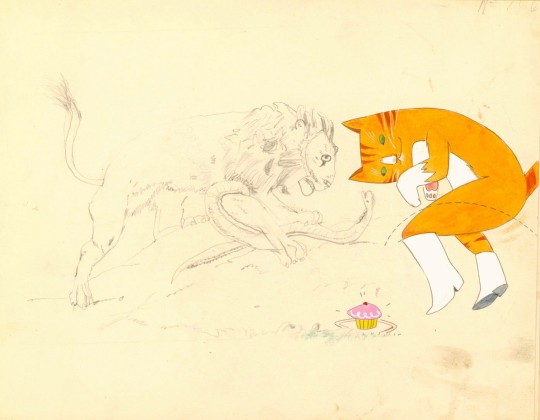

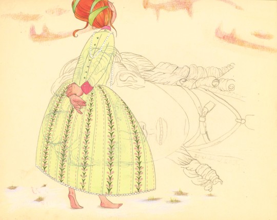


Staff Pick of the Week!
Susan Estelle Kwas is a Milwaukee artist known for her vibrant illustrations and whimsical artist books. Her 2015 publication, A Collaborative Drawing Book is no exception as it invites readers into a visual conversation between Milwaukeean Fred Foss (1898) and Kwas (2015) over one hundred years in the making.
Kwas found Foss’ copy book in an antique shop and was so delighted by his graphite drawings that she decided to pair them with her own. Sometimes tucking characters into Foss’ scenery, other times superimposing them, Kwas’ colored pencil and watercolor contributions are nothing short of charming.
Kwas rebound the book in montage sur onglets form (with pages sewn on stubs to release them from the confines of the gutter) in buffalo leather, preserving the original orientation of each page. The cover decoration was created by blind tooling inset leather strips and is complimented by marbled endpapers.
View other staff picks here.
– Jenna, Special Collections Graduate Intern
#staff pick of the week#susan estelle kwas#a collaborative drawing book#fred foss#blind tooling#montage sur onglets#marbling#drawing#watercolor#Milwaukee aritsts
26 notes
·
View notes
Text


Wood Engraving Wednesday
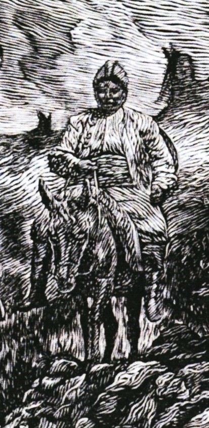
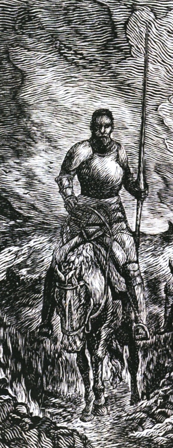
MANUEL VERMEIRE
This 6.5 x 6.2 in. (16.5 x 15.75 cm) wood engraving is by Belgian printmaker Manuel Vermeire (b. 1987) and is one of the prints selected for inclusion in the Fourth Triennial Exhibition 2020-2022 of the American wood engravers society, the Wood Engravers’ Network (WEN). This image is from the catalog for that traveling show.
While Vermeire makes prints in other media, his specialty is wood engraving and much of his work follows a tradition of rendering paintings as wood engravings. We don't know if this print Il Ritorno alla Mancia is from any particular painting, but it could reference any number of paintings, prints, or illustrations depicting this scene from Don Quixote. He notes that his principal influences are Albrecht Dürer, Jacob de Gheyn II, and Timothy Cole. Of his work in wood engraving, Vermeire has said:
I started to make woodcuts and linocuts at the age of 15. Even in those early days, I did see myself developing as a printmaker and eventually honing and perfecting my working technique. When I was around 21, I chanced upon end grain wood as a base engraving option – and I realized that it was easily the most pliable and workable surface for my craft. My debut in this field was very spontaneous and natural.

View other posts with engravings from the WEN Fourth Triennial Exhibition.
View more engravings by members of the Wood Engraver’s Network.
View more posts with wood engravings!
#Wood Engraving Wednesday#wood engravings#wood engravers#Manuel Vermeire#Il Ritorno alla Mancia#The Return to La Mancha#Don Quixote#Wood Engravers' Network#WEN#WEN Fourth Triennial Exhibition#exhibitions#exhibition catalogs#uwm special collections
21 notes
·
View notes
Text


Typography Tuesday
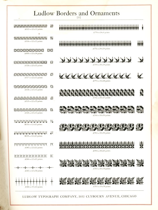
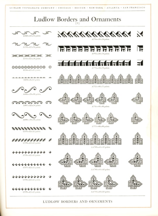
LUDLOW ORNAMENTS
Today we present some Ludlow ornaments and borders from Ludlow Typefaces: A Specimen Book of Matrix Fonts, circa 1940. The Ludlow Typograph Company was founded in 1906 by William I. Ludlow and William A. Reade to manufacture and distribute a typecasting and composing system to compete against Linotype. You can read much more about the Ludlow Typograph and its composing system in our previous post from this specimen book.
View our other Typography Tuesday posts.
#Typography Tuesday#typetuesday#Ludlow Typograph Company#Ludlow ornaments#Ludlow Typefaces: A Specimen Book of Matrix Fonts#type ornaments#Type specimen books#type display books#type specimens#specimen books#20th century type
62 notes
·
View notes
Text
Milestone Monday Eclipse Edition!
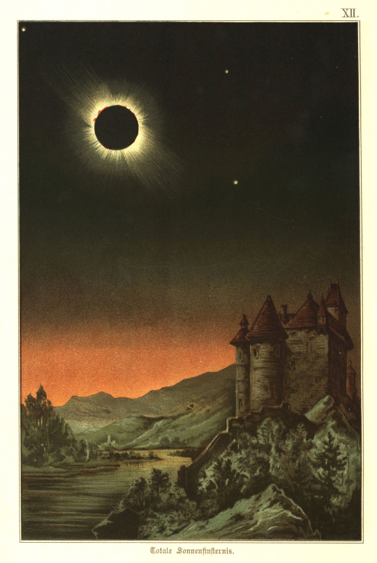
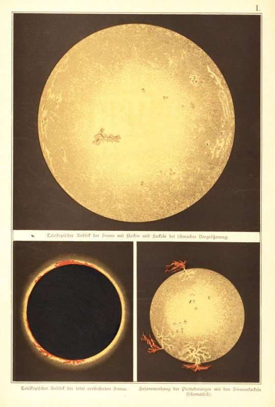
Today’s total solar eclipse will be the last of its kind visible from the contiguous United States until 2044! Even if your location is not on the path of totality and the weather forecast may not cooperate for ideal viewing, you can still expect some uncanny experiences as the moon passes between the sun and earth. The sky will darken like dawn or dusk and may confuse animals’ circadian clocks, temperatures will drop, and during totality viewers may be able to see planets accompanied by a 360-degree sunset.
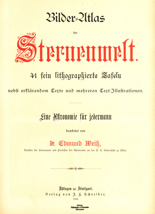
In celebration of the day, we’re sharing chromolithographs from Bilder-Atlas der Sternenwelt by Austrian astronomer Edmund Weiss (1837-1917). This pictorial astronomy atlas was published by J.F. Schreiber in 1888 and contains forty-one celestial chromolithographs, including the two shown here that capture the perfect eeriness and magic of a solar eclipse.
Happy eclipsing and remember to wear protective eclipse glasses while viewing!
Read other Milestone Monday posts here!
– Jenna, Special Collections Graduate Intern
#milestone monday#solar eclipse#eclipse 2024#chromolithograph#bilder-atlas der sternenwelt#edmund wiess#j.f. schreiber
62 notes
·
View notes
Text
Shakespeare Weekend
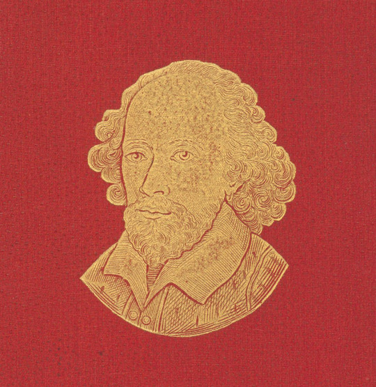
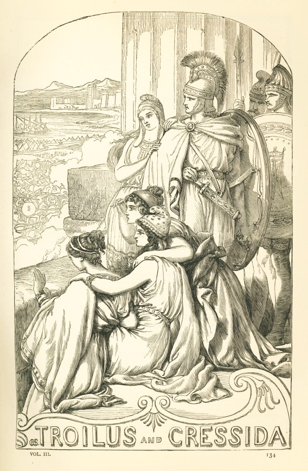
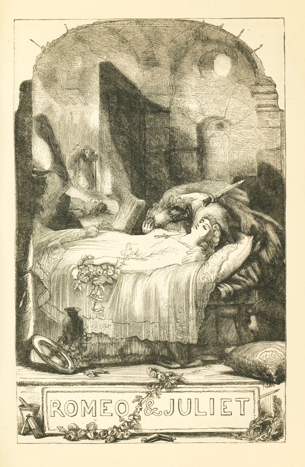
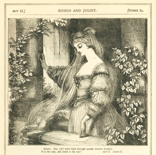
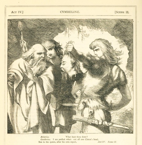

Volume Three of The Plays of Shakespeare published by Cassell, Petter, Galpin & Co. in the mid to late 1860s finishes off the set with a collection of Shakespeare’s tragedies and The Story of Shakespeare’s Life written by editors Charles (1787-1877) and Mary Cowden Clark (1809-1898). Similarly to Cowden Clark’s annotations, The Story of Shakespeare’s Life is written for an audience new to Shakespeare and is a thorough account of his life, heralding him as a “shining example to the whole human brotherhood”.
Englishman Henry Courtney (H.C.) Selous (1803-1890) illustrated all three volumes with his distinctive attention to minute detail and dense landscapes. Following his father’s portrait and miniature painting career, Selous attended the Royal Academy in 1818 where he exhibited his first work Portrait of a Favourite Cat. Twenty-two years later he would switch gears into historical painting and never look back. His illustrations for The Plays of Shakespeare add an emotive visual layer to the plays, benefiting young and novice readers who may not have experienced Shakespeare in a theatre.
The Plays of Shakespeare are a collected edition of the serialization of plays originally published in one of Cassell, Petter, & Galpin’s weekly papers over the course of many years. Met with great success, some seventeen editions have been published. Our early copy is half-bound in red leather with Shakespeare’s portrait embossed in gold on the cover.
View more Shakespeare Weekend posts.
-Jenna, Special Collections Graduate Intern
#shakespeare weekend#william shakespeare#shakespeare#the plays of shakespeare#charles cowden clark#mary cowden clark#h.c. selous#cassell petter galpin & co.#illustration#wood engravings
15 notes
·
View notes
Text
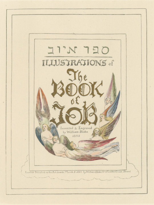


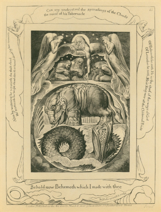
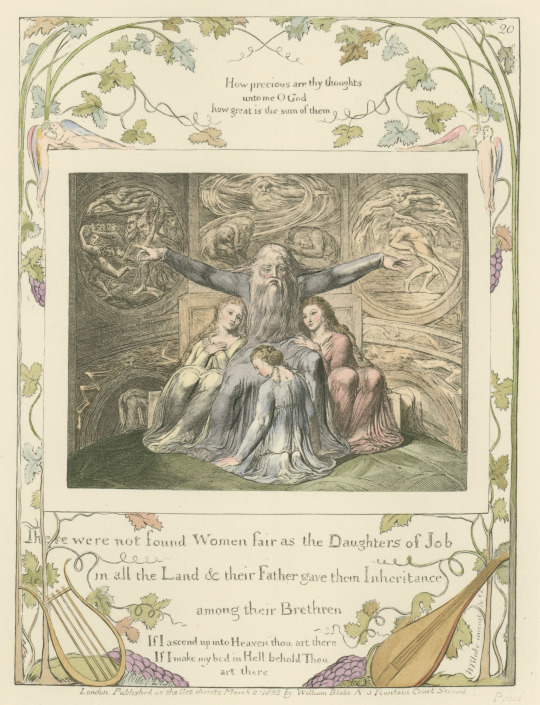
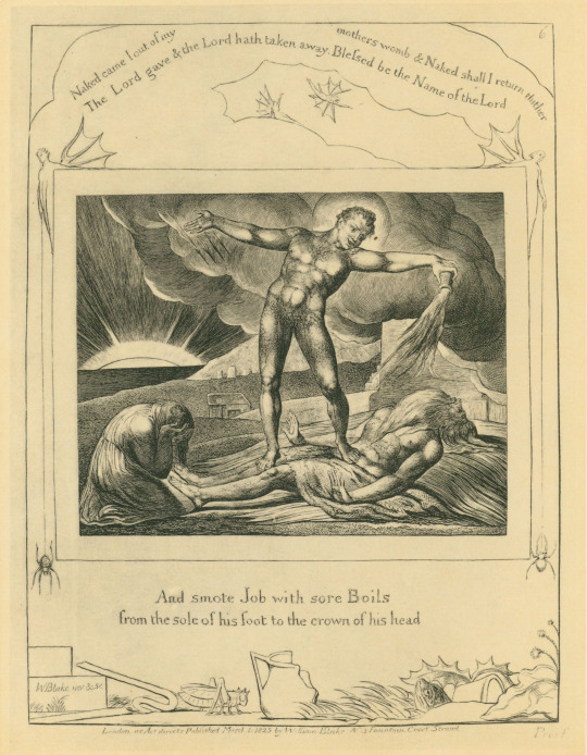


It's Fine Press Friday!
Today we’re taking a closer look at our sister set of editions from Trianon Press: William Blake's Illustrations of the book of Job : the engravings and related material and Colour versions of William Blake's Book of Job designs, both of which were published in 1987 in London by the William Blake Trust.
The former edition includes two volumes of original black and white illustrations and facsimiles, process prints which document the evolution of the final product, and essays. It was edited by David Bindman (b. 1940) and includes plate-by-plate commentary and an introduction by Bo Lindberg (1937-2021), whose Ph.D. thesis on the work was published in 1973.
The latter includes three sets of color plates- The New Zealand set, The Collins set, and the Fitzwilliam plates- all of which were reproduced in facsimile from the original engravings, which were published in 1826. The New Zealand set are finished watercolor drawings, while the Collins and Fitzwilliams sets are hand-colored collotype reproductions (using the pochoir method) of the published engravings. All told the set includes 22 fascicules containing the title page and accompanying texts and 46 plates of illustrations measuring from 40-41 cm., all housed in marbled portfolios nested in leather-bound slipcases.
Can’t get enough of these books? Check out Alice’s Marbled Mondays post on their beautiful bindings. And check out UCSC Library’s digital exhibition Songs of Labor and Transcendence: The Trianon Press Archive for more on the history and legacy of the Trianon Press.
--Ana, Special Collections Graduate Intern
View more Fine Press Fridays posts
View more William Blake posts
View more Trianon Press posts
#Fine Press Fridays#William Blake#Trianon Press#pochoir#collotype#David Bindman#Bo Lindberg#Book of Job#William Blake's Illustrations of the Book of Job#engravings#Ana
34 notes
·
View notes
Text


Wood Engraving Wednesday
ALEXANDER ANDERSON
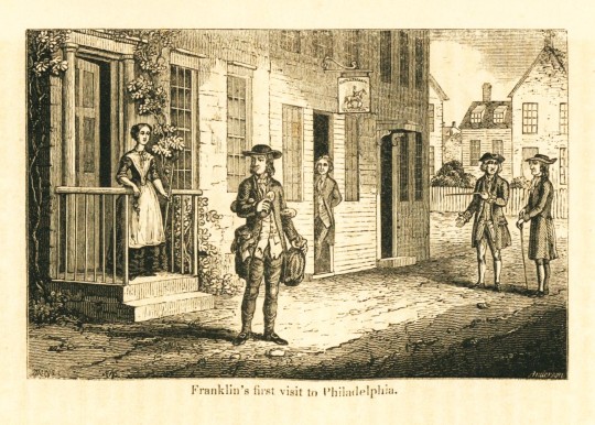
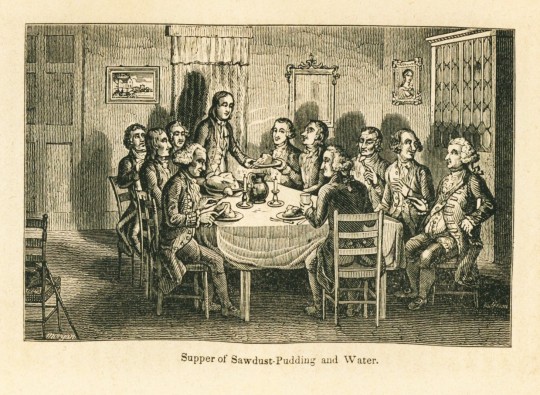
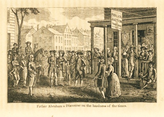
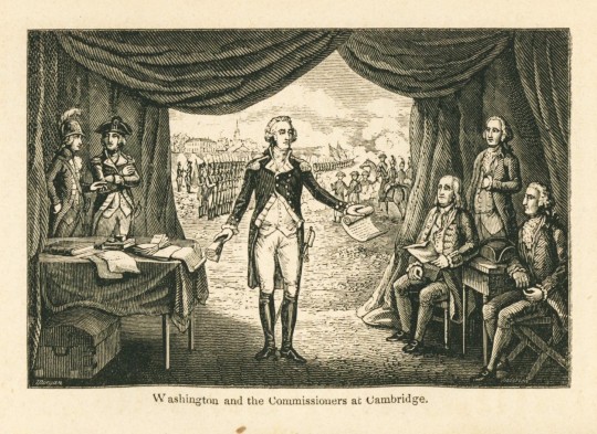
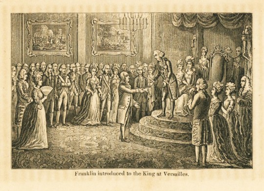
Thomas Bewick (1753-1828) is well-known for popularizing the wood engraving for book illustration in Great Britain and Alexander Anderson (1775-1870) is his American counterpart as one of the earliest of American wood engravers. He trained and worked as a physician and was self-taught as an engraver. By 1820 he committed himself entirely to illustrating books with wood engravings.
Shown here are wood engravings from the 1848 biography The Life of Benjamin Franklin by O. L. Holley, published in New York by educational book publisher George F. Cooledge & Brother. The engraved title page was engraved by Anderson from an illustration by American artist Tompkins Harrison Matteson (1813-1884). The remainder of the illustrations in the book were engraved by Anderson from illustrations by Anderson's student and frequent collaborator William Penn Morgan (active 1811-1872).
View another post with illustrations by Alexander Anderson.
View more posts with wood engravings!
#Wood Engraving Wednesday#wood engravings#wood engravers#Alexander Anderson#The Life of Benjamin Franklin#George F. Cooledge & Brother#O. L. Holley#Tompkins Harrison Matteson#T. H. Matteson#William Penn Morgan#biographies#children's books
21 notes
·
View notes
Text
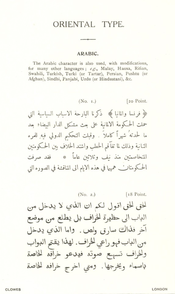
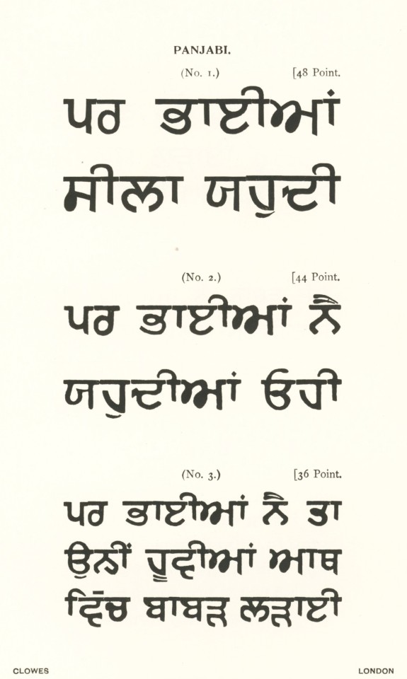
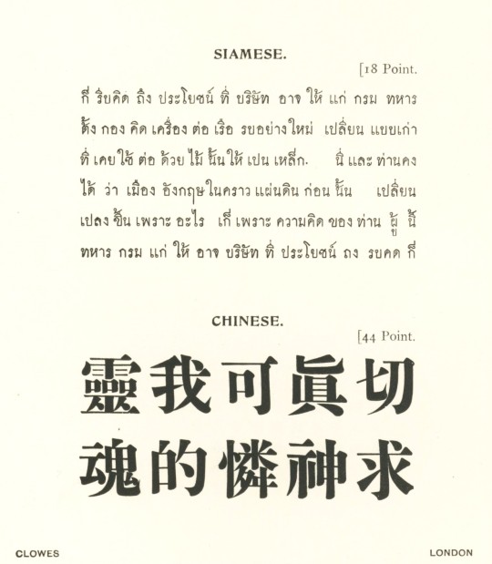

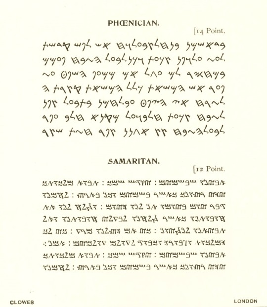

Typography Tuesday
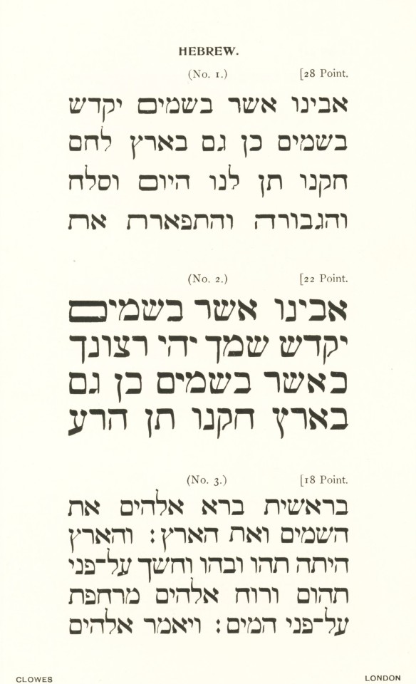
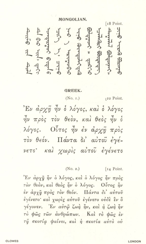
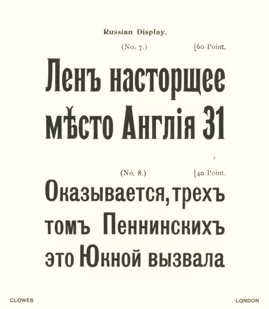
This week we present some more non-Roman type from the 1908 type specimen book Some Specimens of the Roman, Oriental, and Foreign Types Now in Use in the Offices of William Clowes & Sons, Limited, published at the Clowes head office in London. Clowes was founded as a printing company in 1803 by William Clowes in London. By the early 1820s, Clowes became a pioneer in the use of steam-powered printing in England, and by mid-century William Clowes & Sons was one of the largest printing companies in the world, and is still in operation today. This specimen book presents all the fonts in use by the company at the turn of the 20th century.
View another post of non-Roman type from William Clowes & Sons.
View our other Typography Tuesday posts.
#Typography Tuesday#typetuesday#type specimen books#type display books#William Clowes#William Clowes & Sons#William Clowes Ltd.#typefaces#non-Roman typefaces#20th century type
66 notes
·
View notes
Text
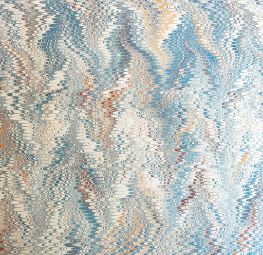
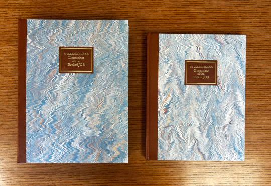


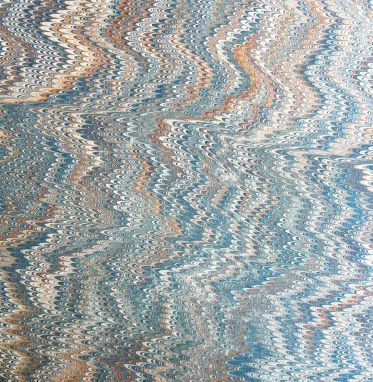

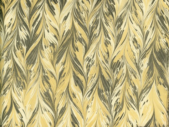
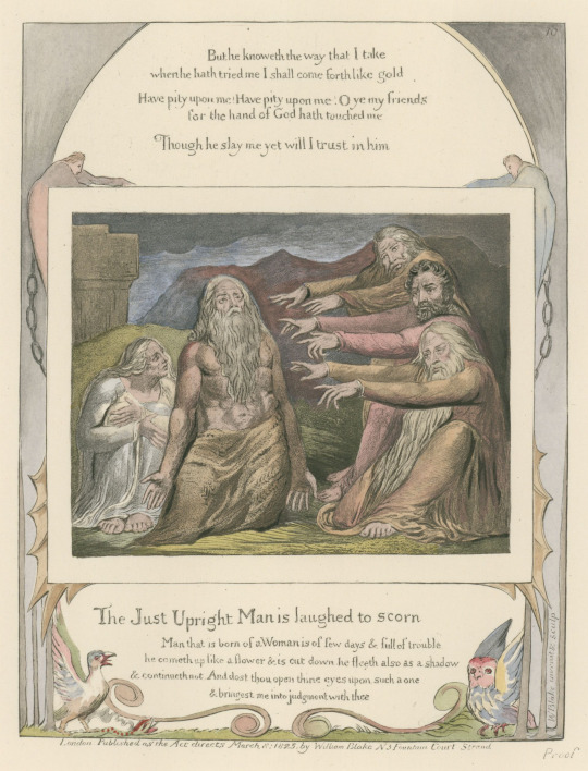
Marbled Monday
We return to Trianon Press's publications of William Blake's works this week, this time taking a look at William Blake's Illustrations of the Book of Job. It is similar to other Trianon Press works we have shared, with a leather and marbled paper half-binding. These two volumes slide into a single slipcase to protect them, which is part of the reason the marbling is in such good shape. These are part of a set with a group of colored plates of Blake's illustrations for the Book of Job that comes in its very own slipcase.
The marbling is a nonpareil pattern, one of the most foundational patterns in marbling. Nonpareil uses usually a stone or Turkish pattern base followed by a gelgit (zigzag) pattern that is ultimately combed to create the small lines or arches seen in the final pattern. This example uses shades of blue and tan to create the pattern.
View more posts about the Trianon Press.
View more Marbled Monday posts.
-- Alice, Special Collections Department Manager
#Marbled Monday#Trianon Press#William Blake#Book of Job#nonpareil pattern#marbling#paper marbling#marbled paper#illustrations#gitgel
37 notes
·
View notes