#line graph
Photo
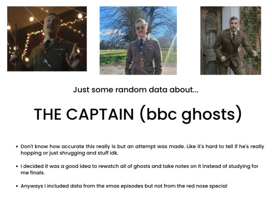
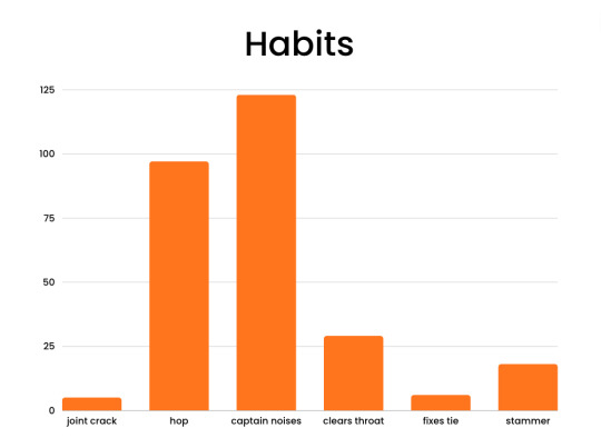
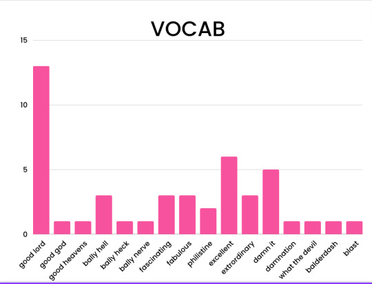

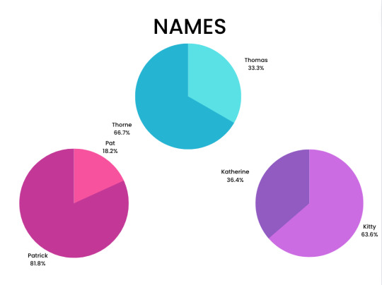
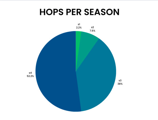
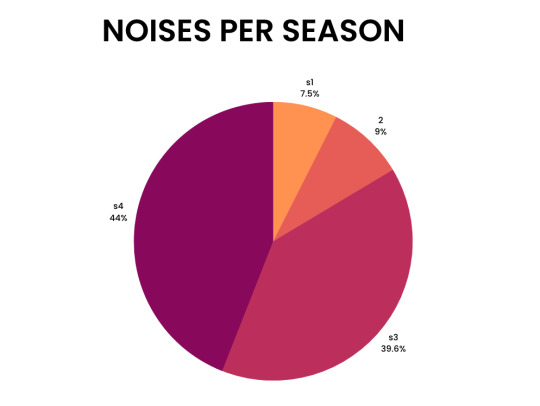
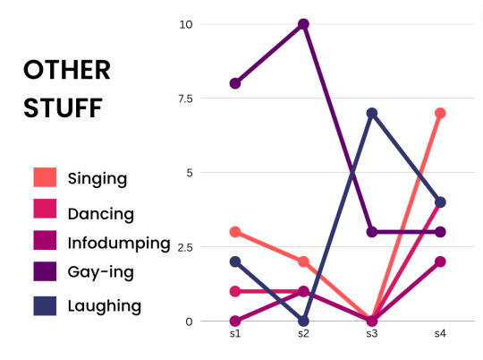
A study into The Captain and all the random stuff he does. Largely inspired by the graphs that @m0ose-idiot made about ghosts insults. I tried my best, but the data is probably not perfect.
#i should be studying#welcome to my ted talk#ghosts#bbc ghosts#the captain#graphs#cap#study#data#gay-ing#pie chart#bar graph#line graph#ben willbond#an attempt was made#random#good lord#fabulous#six idiots
731 notes
·
View notes
Text

L'Ordinateur Individuel (1986)
13 notes
·
View notes
Text
What motivates you to write?

Honestly so many things. Kudos, comments, and the thought that I may eventually be published. But the most accessible motivation I have right now is my Excel spreadsheet. I've tried the tracking apps and add-ons before, but I can't be as consistent as the apps want me to be, so I end up with large sections left blank. With my own spreadsheet, I can delete the void data from days I didn't write anything, leaving us with the line graph above.
I input all the information, and usually work out the blue line values by getting a word count for my entire document, and subtracting the value I last inputted. It's ridiculously simple and I would recommend it to everyone tbh. You can do it by one-shot word count (as I've done here), by single chapter, multi-chapter, series, or any combination really.
Unfortunately, my stats don't have time spent represented in the graphs yet. I'm tempted to include it with my next set of stats though, as I usually redraft and edit my fics a bit before I do anything with them. For example, the count in the middle of about 100 words actually took a good hour or so, but the count is lower because I spent it deleting and rephrasing stuff.
But yeah. My motivation to do anything right now is statistics and graphs, because food, reward, and sleep no longer work :') Does anyone else do this? I feel like it's pretty useful but IDK how widely used this is haha
#statistics#line graph#word progress#word tracker#word count#writeblr#creative writing#writing#writing advice#motivation#fanfic writing
0 notes
Text
I like to imagine that because Jason came to Bruce post-Dick (he was older and had experience being a caretaker) but pre-trauma of losing a son, he got Bruce at his Most Competent Dad form, and so his experience with Bruce as a father (pre-death) is noticeably different from the other kids
#Imagine that Bruce’s competency as a father is in a line graph that goes up and down over time it peaks at Jason and then dips and never#reaches that height again#Jason Todd#dc
66 notes
·
View notes
Text

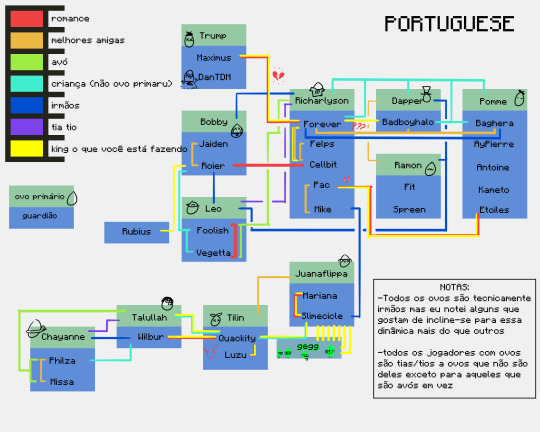


i've mentioned here and there that i made a relationships/dynamic spreadsheet. i have finally put it to use. look on my Works, ye mighty, and despair.
-extra note: i am not omniscient and i cannot watch every stream. i may have missed a sibling declaration or two.
-extra extra note: i currently speak only english and used google translate for the rest. if theres a translation error I'd love to know- i wont be able to go back and fix these, but im always so curious about how accurate google translate can be
extra extra note pt 2: do. do other languages use guardian as in "legal guardian" as in "not a family member but still Primary Caregiver of child" because i am suddenly aware those translations might not be correct. on the other hand tho if google translate decided that the parents are guarding warriors of the eggs im not going to argue
#qsmp#i should have added a ??? line for fit and philza tbh#look at just how beloved forever is <3#his dynamics have dynamics#he and richarlyson are also part of The Issue when compiling a fucking. whatever the hell this si#maybe a chart not a graph it is currently 4 am and im gonna schedule this#anyway i did legitimately consider making one of those classic family tree charts and just sticking richas in the centre so he wouldnt caus#too many lines to overlap but i think this worked out fine#absolutely delighted i thought of the columns it saved my ass#this server is Three Months Old#look at them founding those families#philever stans i see you and im sorry#if i included a heartbreak line then this would have been completely incomprehensible#fun fact to translate the silly 'king what are you doing' i made google translate#'chad what are you doing' instead so there would still be the grammar of a proper noun#but i wouldnt trick it into thinking king is an honourary title#i might not know the grammar of any non-english language but Oh Boy i know there are Traps#or maybe english's traps have just made me paranoid#either way#also. richas was added to bad's family art wall and bad baghs and forever have called each other family enough that#i made the executive decision to just adopt richarlyson out to the other two#richas called bad basically his mom tonight i can do what i want#and baghera gets to be part of that line because. honestly i wasnt thinking about him being Extra Canon Nephew#and i refuse to change it for reasons above re: it is 4 am; they are family#tho the thought of bad having three children separately attributed to him is hilarious.... maybe if i ever remake this ill do that#also note: i do know that foolish and bad had a kid called jimmy However i do not know what a jimmy is#so#scheduled post
92 notes
·
View notes
Text

"Graphical addition of single-valued scalar fields." Dynamic meteorology and hydrography. 1910.
Internet Archive
387 notes
·
View notes
Text
the macdennis renaissance of the four walls promo tour
#can i call it a renaissance when it never truly went away#it's like a little bump in our line graph lol#macdennis charts 📈 on the rise#shut up shannon
51 notes
·
View notes
Text
Human Design: Line + Fame Indications
Line 2 = Natural talents that draws others in; Rising star effect.
Line 4 = Community building skills that captures an audience; Industry plant effect.
Line 6 = Peak externalization that's meant to be broadcasted to the world; Idol effect.
⠀
Want to learn more about Human Design? Click here!
Want to book a session with me? Click here!
#human design#human design system#human design chart#human design analyst#human design lines#body graph#lunarianscripts#ra uru hu#manifestor#manifesting generator#generator#projector#reflector#line 2#line 4#line 6#human design fame indication
22 notes
·
View notes
Text


David Byrne’s hand-drawn maps of the human condition
#on taking notes#aesthetic notes#academia#how to study#study inspiration#studyblr#studyspo#classification#daily journal#graphs#maps#line drawing
8 notes
·
View notes
Text
I kinda hate how dead Half Life/HLVRAI tumblr rp is. :(
Then again I may just not have found those people yet. Wanted to rp Half Life on here, but yeah, couldn't find any active accounts.
Anyway, if you come across this and you'd like to rp Half Life or HLVRAI on discord, you can send me a message, and I'll check you out. :>
As long as you're a pretty decent person who won't ask anything illegal of me, I wouldn't be opposed.
I'm also A-Okay with OC's.
#half life#hlvrai#rp#looking for people to rp with because I can't really find anyone active on here by searching#btw I'm 27 years old because I figure mentioning my age is important#Anyway I'm not expecting anyone to respond to this or even to message me#Also looking for people to rp with because I'm not really having the most fun on Twitter trying to rp with people I'm honestly frustrated#a rant is incoming below#like things were going great for a little while and then people just gradually lost interest in me I guess :(#like even people who I really liked interacting with who seemed to like interacting with me just kind of stopped unless I approach first#even then they may just like my response and respond to someone else#It's to the point where I'm questioning if they even like me or they are just tolerating me#like I'm lucky if I even get one response to something I post in a day so it's not very fun anymore#I want to post that I want to take a break but I know I'll be pissed if everyone and their dog comes out of the woodwork to respond#because it's like “this is why I'm taking a break no one responds unless I have an issue”#it's been ongoing for a couple weeks to the point where I've made a line graph
11 notes
·
View notes
Text
trying to understand costis/kamet family situation post canon makes me feel like the conspiracy guy meme

#moira's pen#moira's pen spoilers#costis#costis ormentiedes#kamet#kamet kingnamer#pheris#pheris mostrus erondites#the queen's thief#i'm still kinda ambivalent about this tbh#i'm all for chaotic queer non monogamous non heteronormative lifestyles#however comma#when you don't explain what those lifestyles are exactly#you're walking a fine line between revolutionary poly rep#and just adding nameless women for nohomo#ambiguity is good when it's queer but ambiguity for ambiguity's sake hmmm#idk about that#actually you know what#funny how we know the names of all the men in this graph and none of the women#we don't know costis' sister but we know dumonius who runs the estate#all the kids we know by name are boys for some reason#really makes you think huh
90 notes
·
View notes
Text
Still waiting for Spotify and YouTube to update their charts later today but Google has already come through with some beautiful data for a certain eclipse themed song we all know and love during the total solar eclipse we had in the USA on Monday, April 8, 2024...
https://trends.google.com/trends/explore?date=now%201-d&geo=US&q=%2Fg%2F1q5jzj36p,%2Fg%2F1q5j2__98,%2Fg%2F11bzvv1522,%2Fm%2F01qdc_p&hl=en
Look at the time of peak searches. And also note the path of searches on the map...

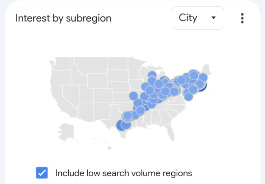
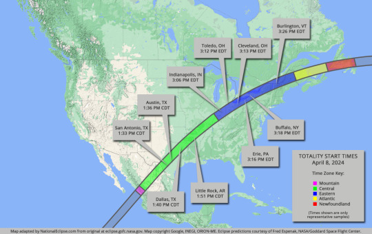
Map - http://www.nationaleclipse.com
So then I decided to compare with a few top eclipse anthem contenders to see who won the battle. Bonnie blew them all away.
Dark Side of the Moon came in #2 in comparison, followed by #3 Black Hole Sun and #4 Here Comes the Sun. None of them really dominated any city on the map over Bonnie.
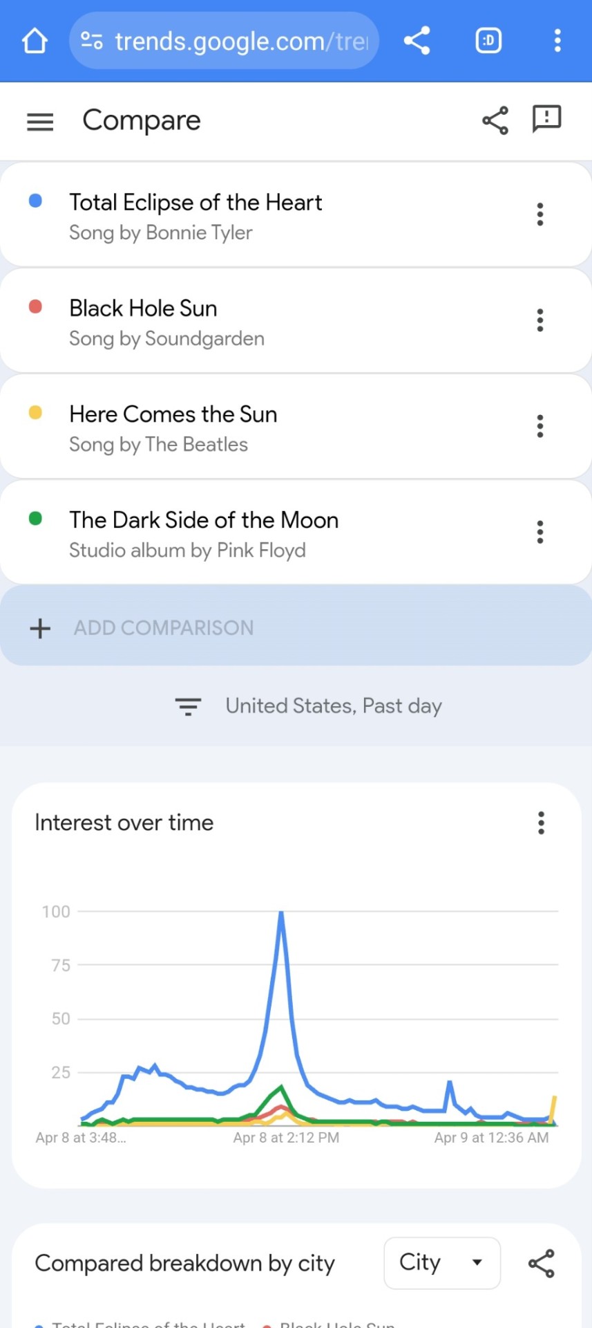
Other potential eclipse anthems I checked that rated lower than the Beatles to the 4 listed above: Sound of Silence by Simon and Garfunkel, Steal My Sunshine by Len, Total Eclipse by Iron Maiden, Dark of the Sun by Tom Petty, Promises in the Dark by Pat Benetar, Dancing in the Dark by Bruce Springsteen, Blinded by the Light cover by Bruce Springsteen (would be #5, this version was also more popular than the Manfred Mann's Earth Band version), Ain't No Sunshine When She's Gone by Bill Withers and the individual song Eclipse by Pink Floyd specifically (the album ranked higher). I'm sure I'm missing some but these were at the top of multiple eclipse themed playlists I consulted.
I'm also not sure exactly how many searches this graph corresponds to yet, but I'm sure we'll get recap articles that might have numbers. From a different Google data product, it looks like over 200k searches were done for Total Eclipse of the Heart on Sunday, April 7th alone, the day before (still less than "how to make eclipse glasses" LOL).
Looking forward to Spotify's data. 🌞

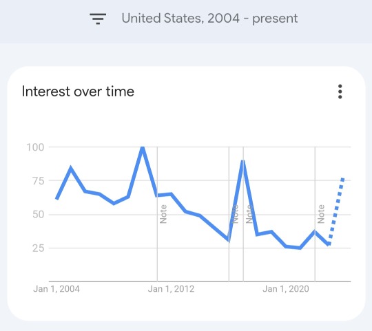
Also fun to look at: comparing searches for this song over time with total US eclipses. Possible spikes due to eclipse interest would be 2012 (annular) and 2017 (total) but the 2023 (annular) barely registered. The other spikes may be due to Bonnie performing it on TV (2005) and the TV show Glee covering it (2010).
I'll look at this more later.
But just for fun too, if you've never seen it, check out the Literal lyrics version for the original music video (it was insane, even for the 80's) https://youtu.be/fsgWUq0fdKk?si=CRXE_Zd86GpZa1yG
#bonnie tyler#total eclipse of the heart#total solar eclipse#total eclipse#eclipse#solar eclipse#eclipse 2024#solar eclipse 2024#data#google#trends#google trends#i love data#data nerd#graphs#line graphs#look at the time searches peaked#look at the path of totality on the map#dark side of the moon#pink floyd#here comes the sun#the beatles#black hole sun#soundgarden#songs about the sun#songs about the eclipse#data analysis#original post#insomnia sucks#Spotify
8 notes
·
View notes
Photo

sprig facing left drawing time again
#my art#Dungeons and Dragons#dnd#dnd oc#shifter#sprig#i keep trying new sketch brushes lately because everything just feels wrong and or uncomfortable#ive been doing this for months now#THIS one i used for this actually was very nice to use though so maybe the torment of not having a sketch/line brush i enjoy is finally over#its from the frenden brush pack its called graph-fight (soft)
53 notes
·
View notes
Text
Data Visualization Basics
Bar chart, pie chart, scatter plot, line chart, area chart; what are you going to use to visualize your data? In this post, I'm going to talk about different types of data visualizations, and when each is well suited for your purposes.
Bar Chart

Bar charts are good for showing basic size comparisons, especially among large numbers of objects. The length of the bar indicates the size of your statistic. As with all types of charts, the length of each bar should correspond mathematically to the data it represents. In other words, good data visualization is not just eyeballed; it's measured.
Pie Chart

Pie charts are good for showing the comparisons of how a certain piece of data breaks down into different groups. You use pie charts when the sum of all the parts adds up to 100%. There are many variations of pie charts out there, including donut charts, which are essentially pies with holes. The danger with pie charts is at a certain point, it's difficult for the human eye to compare the differences in the angles of the pie. They work great for large, obvious comparisons, but not as great for more subtle ones
Scatter Plot

Scatter plots are what you used to do in math class. You have two axes; vertical, and horizontal, and you draw a point where your piece of data appears at both axes. When you draw many points of data, you can achieve a scatter effect, and use it to spot trends. These are effective graphs if you're trying to illustrate a trend among an enormous set of data.
Line Graph

Line graphs are essentially scattered plots with lines connecting the elements. Typically, you use line graphs with set intervals on one of the axes; most often using time on the bottom axis. These are good for illustrating trend data as well. Sometimes line graphs are filled in, and become area charts.
Area Chart

Area charts are diagrams that compare data using geometric shapes or areas, where the surface area, or the real estate of the areas, corresponds to some bit of data. They are useful when comparing the sizes of different things, and in some cases are plotted along a timeline to show the change in size over time. This type of area chart is a bubble chart, where the area of the circles corresponds to the size of the data.
#data visualization#tips#bar chart#line chart#charts#graphs#statistics#research#computer science#math#programming#scatter plot#area chart#pie chart#biotechnology#biotech#science#biology#biochemistry#studyblr#molecularbiology#notes#class notes#students#study notes#study#study motivation#study tips#studygram#studying
261 notes
·
View notes
Text
There... Is a spectrum... Of who enjoys puns and who can't stand them... And I think Kate and Reynie are the respective ends
#I'm not exactly sure where everyone else is#But maybe I'll make a line graph of it someday#Cast your votes now!! /j#the mysterious benedict society#mbs#kate wetherall#reynie muldoon
34 notes
·
View notes
Last Seen Blogs

vxl-male-enhancement4-blog
VXL Male Enhancement

divestudies
divestudies

ryuenjitasukusama-blog
Ryuenji Tasuku

haremask
i was born aflame, i believe.