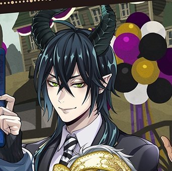
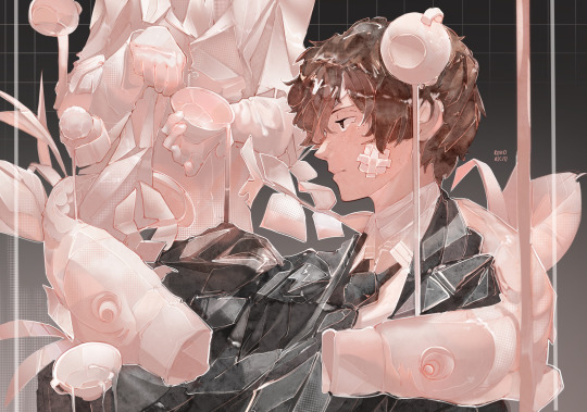
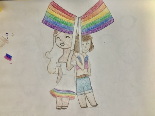
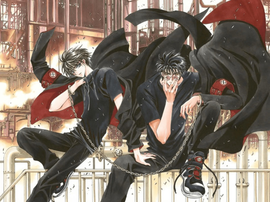
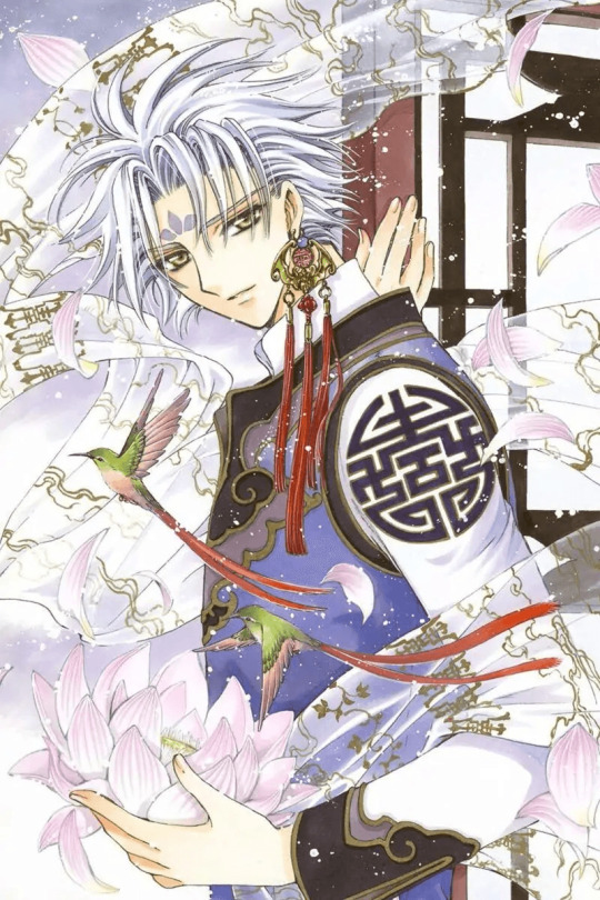
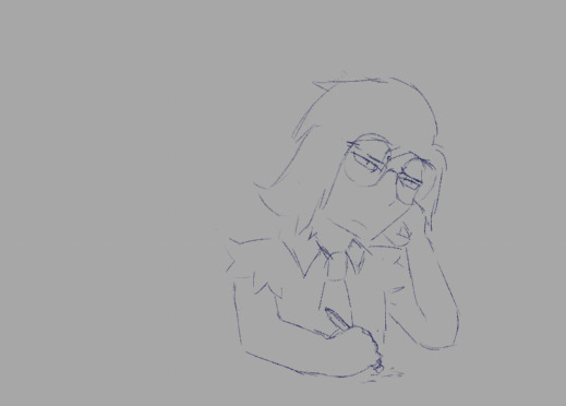
#also: drew something with actual posing and composition.
Text
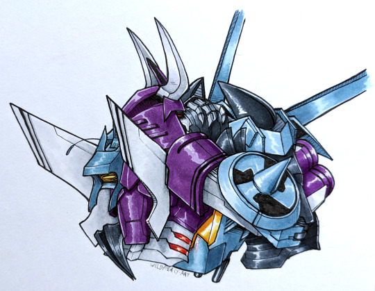
#my art#maccadam#cywhirl#cyclonus#whirl#idw1#mtmte#lost light#traditional art#alcohol markers#whirl accepts affection like one of those stray cats being domesticated with with those gogurt treats#also: drew something with actual posing and composition.#thank fuck we are so back
714 notes
·
View notes
Text
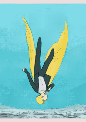
A Canary’s Final Flight
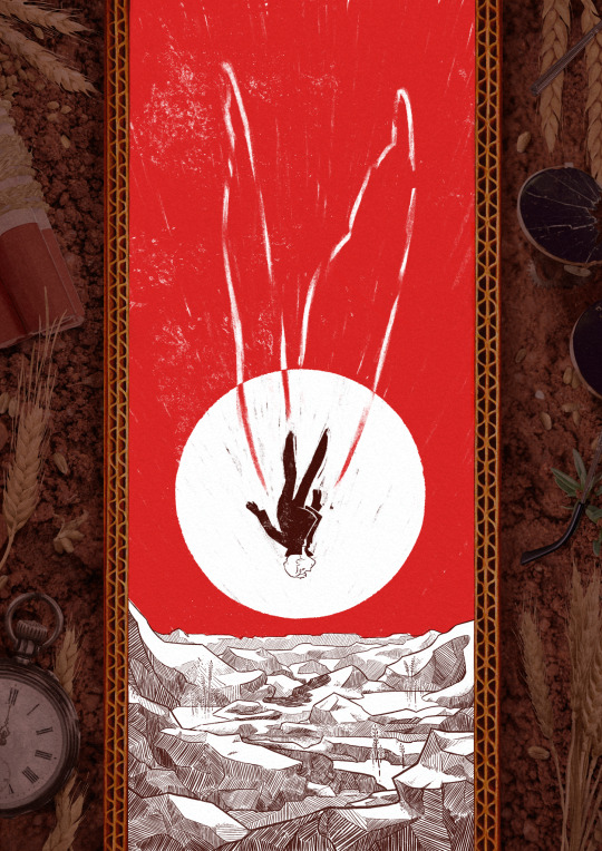
My piece for @trafficzine 4th edition! Get it for free here! 200 pages of excellent art and fics, incredible work from all participants and from the mods especially!! huge shoutout to the mods for real
Process notes under the cut! (I struggled a lot so it's a bit of a novel)
So the entire process was a Ride. I knew when I picked this prompt that I was going to have a hard time, because Jimmy’s final death had been illustrated a billion times over by extremely talented artists. But I had a Vision of the snapshot of the second before the impact, when everything is still but you know what’s about happen. It was very much inspired by the clip of Fog by Jabberwocky, bu the thing is, they have the advantage of all the build up of the fall, and that’s when the trouble started.

This was my first version, and obviously it wasn't working. And I was trying so hard, with so many iterations! Small wings, big wings, no wings, different poses, less backgrounds elements. I'd done compositions were everything seemed peaceful but something is Wrong, but it wasn't working this time.
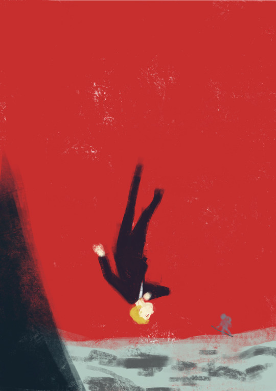
So instead I focused on what rendering I'd like to do - I tried a painterly approach, for that visceral feeling, but it wasn't working either (but hey, I did keep the red sky, so, progress)
At this point I'd been doing back and forths for weeks and I was just as lost as at the start. Now that's my tip for people who make art of any kind, in situations like that, stop thinking about how you can make the best piece possible, and think about you can have fun with it (because when you aren't it's visible). And for that was, 1 - going back to using ink and pen nibs and doing way too detailed inking, and 2- looking at Dave McKean's covers for Sandman (which, funnily enough, was also a reference for my previous trafficzine piece)
And from there I was actually going somewhere! Between the jagged rocks, the red sky, and the increased verticality with the borders, I had hit the vibes I wanted.
I did some experimentation with the border, and even though I really liked the bad boys I drew they were taking too much away from the lonely desolation, so I actually used Red (Unecessary Redstone)'s idea of all of Jimmy's worldy's possessions scattered on the ground post impact, with the idea to make it looks like the central image is his grave being dug.
(and yes for a short amount of time the were supposed to be clock markings on the sun, but there was already enough going with the wings so I scrapped that) (also fun fact the reason why the wings aren't fully material but more ghostly is because my toddler cousin was watching me draw the very first draft and asked why he didn't just use his wings and i went :( so the wings are a metaphor now)
So from there I found a bunch of picture and took some myself, cut and assembled everything together, added shadows in all the appropriate places, and repainted some elements so that everything would look better intergrated (some of the wheats are basically 100% handpainted, the cardboard as well). This took a suprisingly long amount of time, but I was done!
Well I wasn't expecting to have that much to say, but I hope if you're still reading, it was at least interesting!
#trafficzine#limited life#limlife#limlife fanart#jimmy solidarity fanart#solidaritygaming#i forgot all the tags augh#curse of not posting often#mcyt fanart#mcyt#zine illustration#zines#my art
1K notes
·
View notes
Text
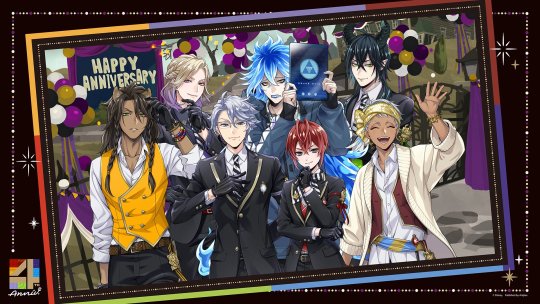
5th Anniversary Diasomnia Crumbs!
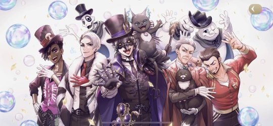
OKAYY FIRST OFF THE GROOVY 😭😭✨💖💞💖💞 CROWLEY AT THE CENTER YAAAAASSS!!!! YANA TOBOSO IS VERY YASASHI NO DE FOR DRAWING HIM AS THE FOCAL POINT WUAIDYOAHKH🗣️🗣️🗣️☝🏻☝🏻✨💖💞💝🙏🏻🙏🏻🙏🏻
Also WITH THE RAMSHACKLE GHOSTS... I was prepared that they might not be included in this groovy but they're here!! 😭💝✨ They're here and happy with all the faculty members!! I'm!!! I LOVE THIS ARTSTYLY BECAUSE IT MAKES EVERYONE LOOKS SO SOFT,,, Goodbye,,, Yuu found family group picture finally happened,,, I can die in peace 😭😭🙏🏻🙏🏻💖💝💞💝💖
ALSO Vargas trying to strike his best pose that highlights his flexed muscles brilliantly DESPITE being at the corner of the group pic is everything, PEAK CHARACTER COMPOSITION, he looks so content that hes not even aware that Trein is just so done at him, he barely even smiled lol 🤣
Faculty teachers are so silly this is everything I've ever wanted 😭💝💖💖💝💖💝
I'd like to remind that in 4th Anniversary, the feast happened as per Crowley's curtesy 🥺 The fact that the catering of the party is focused on meat and Grim is waving a barbecue is a nod to that 😭🙏🏻✨
Also love how Crowleywas in charge of the 4th Anniversary because the 4th year is the last year you'll get while studying in NRC!! So it feels like he's sending us off to an unknown realm or whatever because we're out of candidates to guess who'll be the groovy for 5th Anniversary XD (plspslpslsmeleanoranddawnandbaulcmoncomnonnnkahs)
Not these bunch having a group pic again halfkwhdkhsj Their poses are so in character XD Of course Vil is still flawless even at the back and Malleus has the most normal pose because he's not accustomed to cameras 🥺✨✨
Hopefully I'm wrong, but I really do hope they do an animated pv for 4th Anniversary as well and not just a call back video for the released cards... 😭😭
EYESHADOW FLAWLESS EYELINER ON FLEEK LIP GLOSS STUNNING THAT CLASSIC SMIRK WITH FURROWED EYEBROWS THAT LOOKS LESS LIKE A SMILE AKDHKSHD He is perfection He does no wrong 😭😭💖💝💖
OKAYY NGLL i missed seeing new art of Malleus... I'm so glad he's back 😭😭 and beautiful than ever 😭🙏🏻🙏🏻
I love how they drew his lips here!! ✨✨💞💞
I'm so excited for this to be translated actually 😭😭🙏🏻✨✨ I love more silly stuff from TWST lol
Laughing at this cover though,,, NOT EVERYONE BEING GIVEN TUNA CANS FROM GRIM,,, OMG
Are we finally having the tuna can lore and why its Grim's favourite food this year?? OMGONGDKS😭😭
theyve been highlighting that nowadays... I feel like tuna cans will never be the same once Book7 or 8 even leaks something about Grim 😭😭
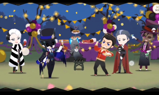
Babes wake up, new diasomnia family photo just dropped ‼️‼️😭😭😭💚💚💚
Lilia is so adorable kahdkhwd Not him holding a can upside down 😭🙏🏻💞💞💞 never stop being silly old man,,, 🥺🥺 💖💖
His :3 is my everything,,, 💞💞🙏🏻🙏🏻💝💝✨✨✨
#twst#twisted wonderland#disney twisted wonderland#twistedwonderland#malleus draconia#lian notes#disney twst#lilia vanrouge#twst malleus#twst silver#twst headcanons#twst wonderland#twst diasomnia#twst sebek#sebek zigvolt#diasomnia#twst jp#twst anniversary#silver vanrouge#twst lilia#malleus#sebek#twst lilia vanrouge#twst announcement#twst card spoilers
420 notes
·
View notes
Text

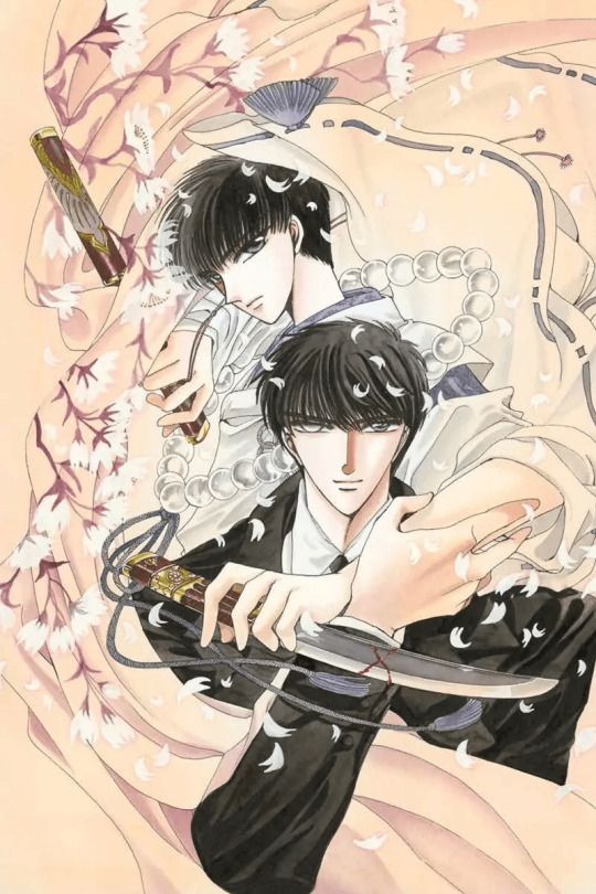
Qi Ye cast poster!!
This had started as a sketch, waaay back as I was still reading Qi Ye. The original is pretty different from this (I considered adding it in the post but I actually don't like it anymore haha), but the plan was already to make this big spread with most of the -more or less- important cast.
I will add here some thoughts about the whole piece, and I guess, Qi Ye itself.
My main goal was probably to express my deep and intense feelings for Qi Ye, its grandness, and its awesome cast-- and along with that, flesh out my mental image of each of them, their personality, their style.
Here is a table with the names, so we know who is whom, and so I can add some details about my perspective on them and their design.

Jing Beiyuan has always come quite naturally. I just go for the "prettiest face" I ever came with in terms of : my own taste, and the features I find the most delicate. I'd argue he's the easiest character to draw for me across both QY and TYK. On this image, he's probably around 16 or 17. I find his expressions to be very fun to work on in general.
Ping An is also quite an easy character to draw, just for how specific Priest is when describing him.
Wu Xi's design is mainly inspired by a discussion with my friend Hanya, who talked about how, in SHL, Wu Xi more resembled a northern shaman than a southern shaman. It made me want to explore the designs and characteristics a bit more, and come up with more colourful fabrics, patterns, and darker skin color. Same goes for Ashinlae and Nuahar, to have them matching Wu Xi's aesthetic.
Ming Hua was included in this just because of the mess the mention of his name caused in the story. The two jealousy tantrums are just so delightful!!
Su Qingluan was made to resemble Jing Beiyuan, of course. What I wanted to reflect in her face was her frustration, mainly.
Ji Xiang and Hua Yue... Well. Nothing particular about their design either, but they had to be there. Of course, of course they had to be there.
Finally, an opportunity to draw Zishu with his fan and henchmen! Not mad that he kinda looks like a villain, here.
Lu Yu!! I drew him with an Ashinlae mask, since he disguises himself as Ashinlae. I included him because he matters a lot in my headcanons about Siji Manor. (it isn't specified, in Qi Ye, whether or not he's actually part of the manor, but I like to consider that he is for various reason that I may detail if I ever make a Siji Manor post)
I'll skip Jiang Xue and Liang Jiuxiao because their designs are steady for me, now.
I hesitated a lot for Helian Pei's pose, but ended up going for this one (looking bored, out of his depth, lost in the distance with his birds around him). I considered showing him with a bird in his hands, but I guess that's not the main vibe I get from him. And then, well, golden, flashy clothing, suited for an emperor.
Helian Zhao had to be in a showy armor, and I hated making it because it's so much work, haha. I took inspiration from an armor in NiF. I'm quite happy with how he came out in terms of both vibe and showiness.
I tried going full out on Helian Qi. Making him the villain that Qi Ye deserved. Dark, showy, elegant and horrible.
Helian Yi is also pretty solid for me, by now.
About the illustration itself, the main challenge was definitely to make a nice colour palette while still differenciating all the characters. I wanted to go with something intense, eerie, that could also complement the main tones I would go for (= red, purple, blue and green). I'm quite happy with how the golden tones, along with the green and reddish lights, make the whole thing come together. I struggled a little bit with the composition at first, but once I got the flow and the main figures down, it just happened quite easily.
Anyway, I'm quite proud of this, and hope it conveys the love and admiration I have for Qi Ye well.
418 notes
·
View notes
Note
Do you happen to have any tips on "filling up negative space with random objects" like you mentioned in the tags of your "product of your environment" WIP post?
The finished piece is absolutely breathtaking and I wondered how you decided on what objects to use and how you positioned them to make the composition work so well, there's something so compelling and dynamic about it that I can't quite put into words!!
Seriously, your art is extremely inspiring and eye-catching, I could analyse and ramble on about each piece for hours hehe
yes ofc! :D one of my favorite things to do with my art fr
so this is how the piece originally started:
and it was just going to be a little sketch that i didnt put much effort into. i drew that little teacup there and was like huh what if i put more around it?? this turned into the idea of putting Mori pouring the cup, etc. etc. and i now knew what kind of message/theme i wanted this piece to take.
the paper koi were a product of trying to make stuff look more dynamic :D since you can bend and twist them, i thought they'd be a good fluid addition that i could manipulate to make the piece feel more full composition-wise and tie in to the horizontal orientiation i wanted to go for.
in terms of how i pick objects, i usually just browse pinterest for random objects that catch my eye LMAO 😭 its kind of a mixture between going for elegance and aesthetic and also just what i can draw in an interesting pose (teacups are not. usually floating and tipping in air, so taking an object and putting it in a situation it wouldn't be usually gives a comp a really striking effect i think)
i also like to keep in mind motion while i draw, and how "fast" i want this scene to be if it were animated or actually moving. cups pour pretty quickly, but i wanted the other objects to look like they were almost floating or moving very slowly, which is why i think i gravitated towards bigger objects like koi fish and plants. it creates this cool juxtaposition that draws the eye in really well as you're trying to make sense of a piece when you're first looking at it!!
maybe im rambling. but, thats how i got the finished composition!

#ask koko#thank you very much for asking!#this was very fun because it forced me to think about subconscious things i think i do while drawing. so i thank you anon <3#dazai#composition#bungou stray dogs
94 notes
·
View notes
Text
_Art Book of Naruto Uzumaki_ Part-3

This appeared on the front cover of the issue of Weekly Shonen Jump in which the serialization of Naruto began. I mainly wanted to establish that this character is a ninja and convey his personality by doing things like putting a leaf on his head, having him make a hand sign, making him look cheerful...but putting all these elements into one picture ended up making it appear jumbled. Also, I used a coloring pen called a COPIC marker here for the first time, and because I wasn't used to it yet, I colored little by little as if I were using a brush. As a result, the coloring came out oneven.
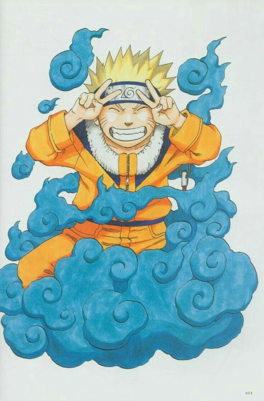
Here's another one I drew for a shonen jump commemorating the second anniversary of the Naruto series. Naruto's making peace signs, but holding up two fingers also represents the number 2, for the second anniversary (laugh). When I was drawing this picture my schedule was so tight that my editor suggested, "Maybe it'd be easier to do a design where Naruto is appearing out of smoke!" As it turned out. It was difficult drawing the right amount of smoke to cover Naruto's body (laugh). I just couldn't decide how much of Naruto should be hidden or visible, or how to show him emerging from the smoke. The bluish color of the smoke was used to make Naruto stand out. I usually use this kind of color scheme so that Naruto's orange outfit will "pop".

In this volume, Tsunade appears along with Jiraya and Orochimaru, and Naruto gets tangled up with them. So I drew those Three Legendary Ninja on the book cover. I put Naruto on the cover became I had to, more than for any other reason (laugh).
I wanted Naruto in some kind of pose, so after some agonizing, I had him make the formal greeting of the yakuza from the movie Jingi. I've seen many of the flims in the Jingi movie series, and I like those kinds of Japanese modes and customs. [ Jingi is a Yakuza series that describes humanity, justice, and moral relationships between a boss and his henchman, or a master and his pupil. ED]

This dragon head actually exists in China.
There's a dragon on top of the roof tiles of the wall of a house or something.
That image was so impressive to me that I wanted to put it on top of a roof, not just a wall.
The top of the roof tiles form the backbone of the dragon, and it connects the dragon's tail and face. Naruto and the other three on the roof are wearing sashes. Naruto's sash ties his sword to his back, and the wind is making all the sashes float on the air.
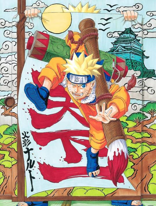
I created this piece based on the catchphrase "Hide your appearance, but don't hide your dream" (the winner of a catchphrase contest held by Weekly Shonen Jump in 2003). Naruto is hidden but his dream is not... I had a really hard time coming up with a composition that would express this idea while sticking to the Naruto style. Boy, this was a handful (laugh). [Naruto's banner reads "Number one under the sun! Hokage Naruto." -Ed.]

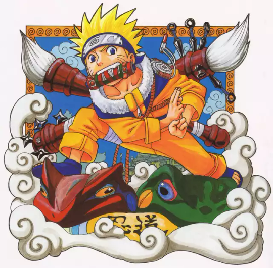
I wanted to draw Naruto's hands creating a sign, so l designed this to emphasize his hands. Also, I wanted to show the sign from the side instead of straight on. I like drawing hands, fingers and toes. But they're difficult...and I can't do them very well. Actually, I could've chosen at the beginning to have Naruto wear boots instead of sandals, but I picked sandals because I really wanted to draw toes. It's a major headache for the animators (laugh).

I actually like drawing animals, too. Partially because of Akira Toriyama-sensei's influence on me, I've always felt that a manga artist has to be good at drawing animals. So I've practiced them since junior high school. In this picture, I paid close attention to balancing the layout of the animals. I also wanted to draw some small object to spice up each animal, such as an apron for the dog, a hat for the tanuki (raccoon dog), a bandage for the monkey and a scroll for the weasel. But actually, the bird doesn't have anything... (laugh).
I spent a lot of time drawing this because it was for the cover of the first volume of Naruto. It took me a week just to do the rough draft and about a day and a half to color it. One reason it took so long to color is that I used gouache (a kind of opaque watercolor paint) I had had since college. I personally like gouache because you can use it to give a lot of depth to the colors. I ended up having to redraw the main lines with a precision pen because the paint covered them up. How's that for double work? (laugh).
14 notes
·
View notes
Text
oh yes before i forget. who wants some rough drafts and scraps from The Comic
so! fun fact!! the prologue was originally only going to be 2 pages long. but then i looked at the composition of the first page and went Damn This Is Fucking Boring and also did NOT have the lead up that i wanted (it was very important to me that this entire fight felt earned since im showing the tail end of a years long conflict)

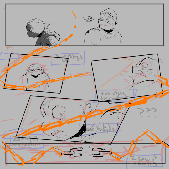
+the original writing for this second page too. interesting to see what survived. there was also going to be something at the top that went something like “mikey’s back. it doesn’t feel like it though/he hasnt said a word.”

very early concept after leo slashes through the bus (which was the first page for this that i drew)
first draft of mikey winding up to punch leo. its funny how here he still has some confidence vs the final where hes fighting for his fucking life LMAO. anyway very weak pose here. this dialogue feels cheap to me now (they both know deep down mikey isnt really going to kill him. i dont need to tell you that. but just for a moment leo (and the reader!) feels that fear of the “what if”, thats the most important part)
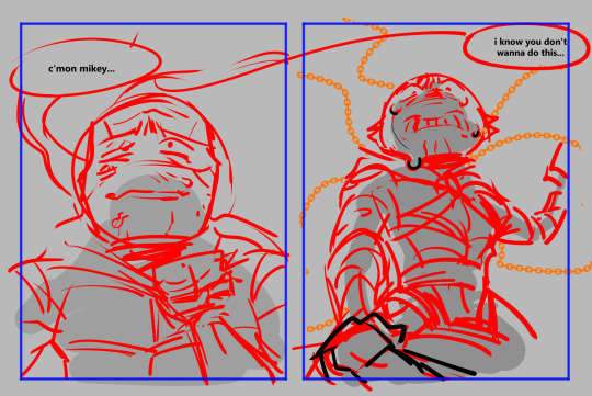
oh page 3.. poor page 3. everything was going so well but i just had too many problems with this argument memory. it felt too much like The Breaking Point when it isnt at all (donnies death is the breaking point). it was meant to show their brotherhood degrading, but i changed it in the final to really emphasize the time

first draft of page 13.. middle panels were way too cramped

first draft of pages 15 + 16
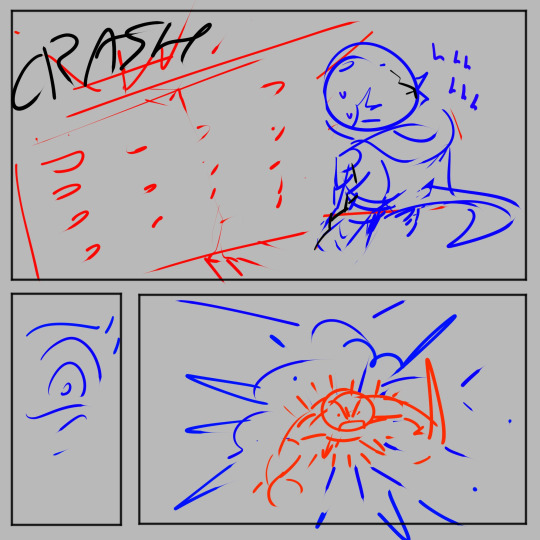
bottom left panel was mikeys eye, iirc i wanted him to be shocked that leo was still going. why, though, i have no idea. of course he would be its leo. also showing mikeys face (specifically his eyes) was something i very deliberately Did Not Do up until the end. because of the tears hes holding back. its not all just blind rage fueling him. theres a hurt and a loneliness and a “i want my big brother back” wish in there too

i still actually like these poses but i think the overall composition came out better in the final page. though i like the flick of mikeys wrist and then BOOM immediate upper hand to show off how unevenly matched they are
i have to end this post off by bringing back a classic

#LONG POST#my art#i like showing off drafts i love tearing back the curtain#VIEW HOW MY COMICS COME TO LIFE BOY
117 notes
·
View notes
Note
Artist wrapped ask game!
5, 10, 24, 28, 30
YES!
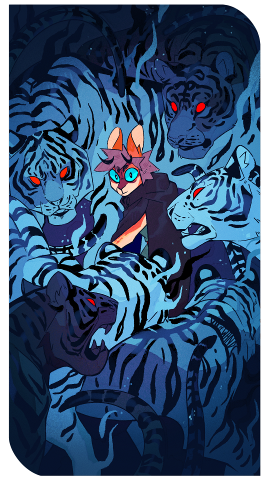
5. What work are you most proud of (regardless of likes/reblogs)?
Oooh that's a tough one! I'm proud of a lot of the things I drew this year, but I think this piece of Juniper with the tigers is my personal favorite. The depth of field and color scheme came out EXACTLY the way I envisioned it.
(con't under the cut)
10. What inspired/motivated you this year?
I struggled with motivation at some points, but really worked on paying attention to what my heart wanted to draw in those stagnant moments. Looking at the work of others was a big inspiration this year - I really want to try more techniques and mediums come 2024, I see so many short form vids of paintings that make me go awooga. I'm also deeply inspired by animation right now, would love to get back into that more seriously as well.
24. What did you listen to while creating this year?
Ohhh ok let's see. Depending on what creative mode I was in...
a) In the early stages of a piece, I usually have on something without words, like lo-fi VGM remixes or movie soundtracks. That provides me background noise (v. important for me, bc my hearing is super sensitive and ambient noises like the fridge humming can really impede my concentration) but still allows me to focus for all the heavy lifting that gets done at the start of a piece (posing, composition, value studies, etc)
b) Once the stuff I really need to Think About is done, I usually move on to listening to podcasts or youtube videos. My big podcasts were Friends at the Table, You're Wrong About, and Shelved by Genre. My big video essayists were Swoop, Hbomberguy, Hannah Alonzo, Izzzyzzz, and Jarvis Johnson. Honorary mention to Dimension 20 which isn't really a podcast or a youtube video but a secret third thing (actual play narrative video series)
c) When I'm just doodling in my sketchbook, I'm usually listening to my OC playlists OR trying to find new music. (Everyone should introduce me to their fav musicians, I wanna broaden my listening!)
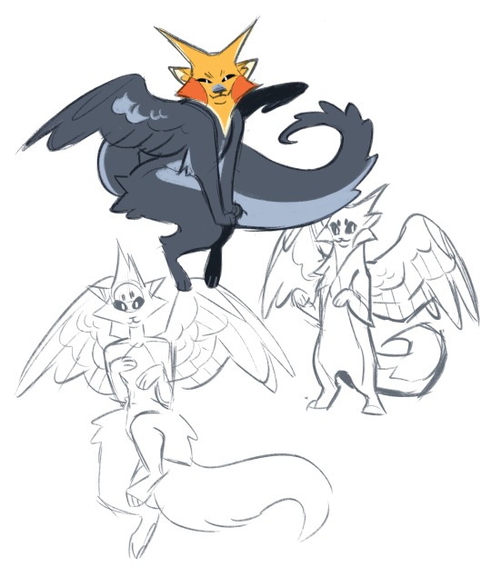
30. Share a fun quick little sketch because why not!
Fellow Strixhaven players DNI, but here's a concept for my Sorlock's pact familiar (base form of a tressym) taking on a new form come the fourth year of magic school:
6 notes
·
View notes
Text

finished this year's pride redraw woop woop!
mostly the things i wanted to improve on this year were everything general polish because i think i nailed the composition last time. I was also doing an artstyle transition last year and I didn't shade it properly, so i fixed that lmao.
another thing is that i made em look more excited, and made the posing a lot more dynamic- the previous felt very flat, like there wasn't a lot of interesting rotation of faces.
oh and i actually drew tara's hair correctly this time. and i actually drew the flags correctly. and i actually added a background
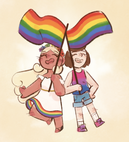
this one was the transition to digital, so a lot got changed. i made the composition and silhouette SO much better, and the colors got to be more accurate. the faces are super ugly tho
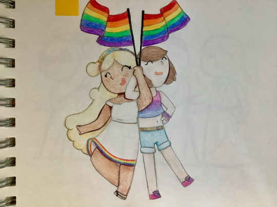
you can tell there was improvement here but it kind of looks worse than the previous one 💀 like at least that was cute
i don't know why i thought it was a good idea to have them, like, entangled in each other
objectively this one is pretty bad but honestly? it's super cute
also, i like it for sentimental reasons obviously lol
it's the first time i ever drew these two, and they're now my main ocs, so
next year i hope to spend less time on it because my new coloring style takes FOREVER OH MY GOD and also change the colors a little because something about them feels off to me
#art#redraw#digital art#pride#pride art#pride month 2023#original characters#lesbian#bisexual#queer#queer art#ocs
11 notes
·
View notes
Text
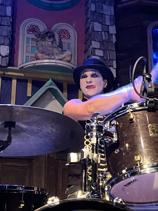
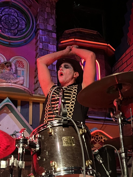
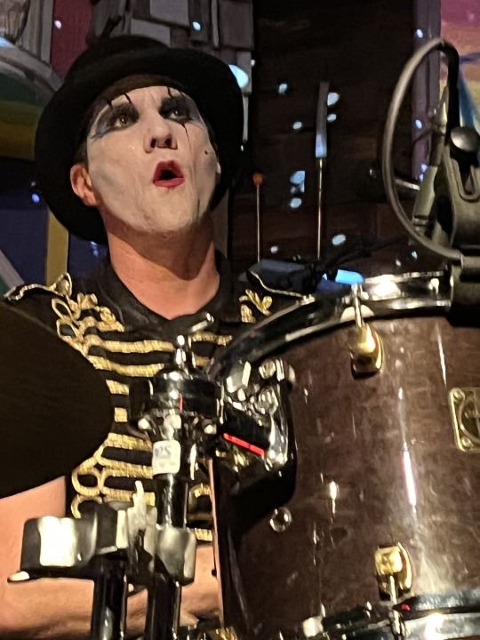
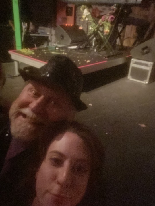
Meow Wolf, Santa Fe, NM, 5/27/23
During the day we visited Meow Wolf’s permanent installation House of Eternal Return. I had actually been there for the Grand Opening in 2016 and it was fun to clock the differences. The overall concept and esthetic was the same but a lot of the details were different. One major difference was live actors wandering through the installation in character. Overall a fascinating experience, especially for fans of disorientation and sensory overload. Highly recommended.
Before the doors opened the staff provided a bucket of sidewalk chalk. When we asked what the ground rules were we were told, “Don’t draw on the walls, and we have kids here, so don’t draw anything obscene.” It was almost like they knew about the last time we had sidewalk chalk at an Amanda show. I drew a heart with a lyric from Mrs. O; Nikki drew me!
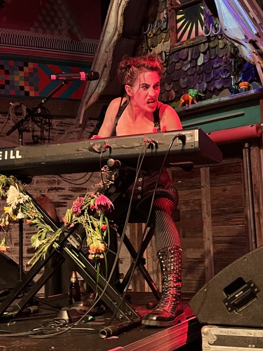
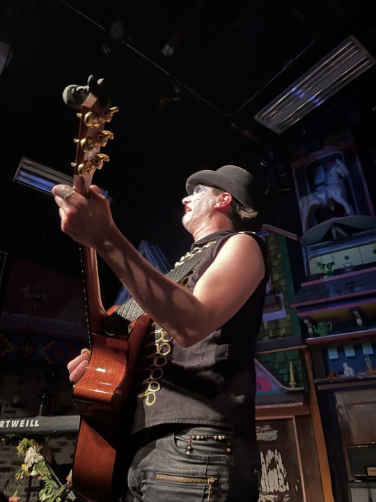
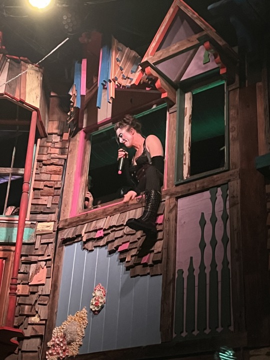
This was the second of three Dresden Dolls shows at Meow Wolf and overall the energy level was higher than Friday night. While there were more shenanigans between songs the performance was smoother overall. There really is nothing better than the Dresden Dolls hitting on all cylinders.
Annotated Set List:
Good Day - (featuring Brian on guitar, initially) The traditional opener.
Sex Changes
Gravity
My Alcoholic Friends
Welcome to the Internet - (Bo Burnham cover) Tonight’s millennial target was none other than my friend Nikki! When she told Amanda that she was 28 Amanda responded, “Ah! The perfect millennial!” After the song Amanda told Nikki, “You should take a selfie with Tom!” and proceeded to pose for the background of the shot. Unfortunately there was some performance anxiety and the selfie did not turn out quite perfect (no judgement; I suck at selfies). But it’s the thought that counts.
Bad Habit
Mrs. O
Your Whole Life Is a Lie (In Case You Didn’t Know We Are Here to Inform You) - This impromptu composition by Amanda was basically a meditation on the role of art and the need for slow, sad songs. Brian countered that sad songs could also be fast, head-banging rockers. Sensing that the soul of the next Dresden Dolls album was at stake I started vigorously pointing at Brian and nodding. “I hear you, Tom,” Amanda said, so there’s hope.
There then followed … tragic jazz hands (don’t ask).
Missed Me
Amsterdam - Amanda returned to the balcony to dangle out the window for this one. She crowd sourced a beverage but then scolded the fan who handed her something that was not quite beer. Beggars can’t be choosers, my Dear.
Astronaut
Amanda talked about going to see a lecture on fundamental physics at the Lensic Performing Arts Center, a venue that the Pixies have also played. She said there was something comforting about being able to learn about physics and see the Pixies in the same place (albeit not at the same time).
Whakenewha (pronounced Fuckin-A-Fa) - When the song ended the crowd was amazingly quiet, causing Brian to comment, “It’s like a library in here.” Which prompted Amanda to muse about the World’s Saddest Library.
Eye of the Tiger - (Survivor cover) A brief interlude by Brian to lighten the mood. Amanda said that’s what will be playing when you escape the World’s Saddest Library.
Mandy Goes to Med School - seasoned with just a pinch of “Careless Whisper.”
During tonight’s merch commercial Amanda divulged that there were 100 people who bought tickets to Friday’s show but didn’t show up, which seems mind boggling to me (the venue only holds about 500).
War Pigs - (Black Sabbath cover)
Coin-Operated Boy / Never Tear Us Apart Mashup - once again the INXS cover (complete with kazoo solo) took over, during which Brian tried to blow bubbles with very limited success.
Half Jack
——
Girl Anachronism - Tonight’s rendition went off without a hitch. A real mic drop moment.
Photo Gallery:
Inter-dimensional selfie in the House of Eternal Return! Photo by Deanna Aliano #NoFilter

Sidewalk art!


Is that an elephant?

In addition to being the most talented drummer on the planet Brian Viglione is also the most expressive.

The *ahem* perfect millennial selfie by the perfect millennial. Photo by Nikki Stein (don’t blame me!).
Beware, children: if you don’t behave Amanda Palmer is going to eat you!

AMSTERDAM!!

Wait … how many arms does Amanda have??

The Dresden Dolls, ladies and gentlemen!

4 notes
·
View notes
Text
X/1999 Volume 6 Illustration Comments

2000 Monthly Asuka August Issue. Title Page Illustration
This one was actually drawn on hotel stationery, which happened a lot with the X illustrations. Hotels provide very good paper, you see [laughs]. I can't use the sheets for very large pieces though. I shaded out the background and added sepia around the edges to make it look like an old photograph. The main outlines were drawn with a PIGMA Graphic pen using brown ink. The wings on Kamui's back are a tattoo. I hid his butt a little with the other ones [laughs].
1994 Monthly Asuka March Issue. Cover Illustration
Paper: BB Kent
Lines: PIGMA Graphic ink pen
Color: Dr. Ph. Martin's Color Ink
Here Subaru is wearing traditional ceremonial clothes, which he hardly ever wears in the manga. The blade in his hand is one he's had in his possession for a very long time and which he uses whenever he wears the ceremonial robes. I wrote "X" on the blade in blood.
1993 X Calendar Illustration
Paper: BB Kent
Lines: Holbein Color Ink (Special Black)
Color: Dr. Ph. Martin's Color Ink
Back then many people asked me, "Is this Hokuto? Or Subaru?" The answer to that question will become clear sooner or later (laughs].
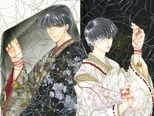
2000 Monthly Asuka November Issue, Title Page Illustration
There were never plans for this illustration to be used in separate halves, but I still wanted to draw something that could be split in two, and that's how I ended up with this composition. The colors and poses used for Subaru and Seishiro are inverses of each other. The two are hound together by a single red thread, but that thread is also meant to echo the spider web. I drew a spider web pattern on the kimono as well. It's an image of the hunter and the hunted. Obviously, Seishiro has the upper hand (laughs).
2002 Monthly Asuka April Issue. Title Page Illustration
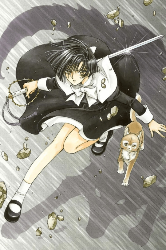
This illustration is meant to look like a colorized panel from the actual manga, so I used screen-tones for the background. The white area of the uniform and the hilt of the sword were done with color ink. The gold areas are in color ink too, but the eyes, shadow, and hair were drawn with Copic markers. As you can see. Yuzuriha's shadow is a large Inuki.
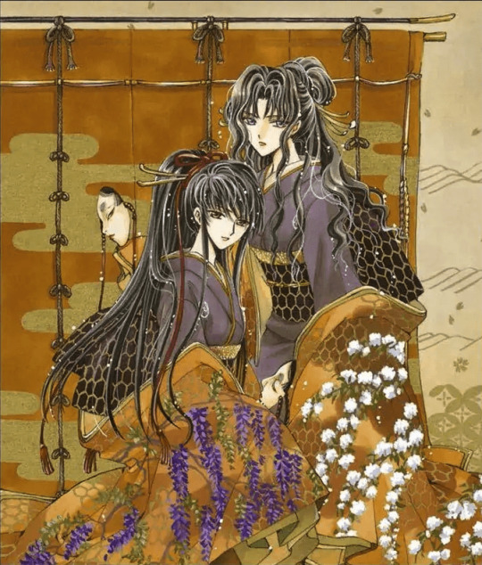
2001 March, Volume 16. Cover Illustration
A back cover illustration from one of the X manga volumes. The title on the front cover was printed in a gold-brown ink. The Magami family seems to have I a cursed fate flowing in their blood. This isn't a horror movie story, but it's definitely something like "It's all because of the bloodlines [laughs]. But then again, the Sakurazukamori aren't that better off either. In this illustration, at first glance they appear to be two sisters who are close to one another, but there's also a dark and ominous atmosphere that exists between them. Part of the kimonos patterns were done with acrylic gouache. and the gold areas were done in poster color.
2000 Monthly Asuka August issue, Title Page Illustration
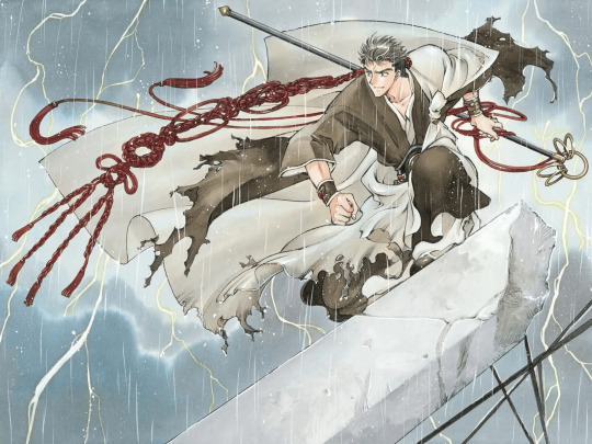
I was aiming for a "Fake Kung-fu Action Movie" type of illustration [laughs). Sorata's pose looks like it belongs in a fighting manga, and he's wearing something that looks like a champion fighter's belt too laughs]. I used a present someone sent to us as a visual reference for drawing the braided cord. Thank you very much; it was a big help. The background and character lines were done mainly with color ink, but I also used some modeling paste for the rubble.
1999 Monthly Asuka August and September Issues, Cover illustrations
This is an illustration I drew with the intention of splitting it in half down the middle. The background is meant to look like a factory or plant of some sort. Compositions like this lose their sense of unity unless an element from each half is included in the other half, so I had Kamui reach his hand over and place it on Fuma's knee. They're also joined together by a handcuff.
2003 Monthly Asuka February Issue. Title Page Illustration
Since this was for a February issue of Monthly Asuka, I used snow in the image. You may be surprised to know that Kusanagi actually appears in quite a lot of illustrations with snow. Since
he works for the Self-Defense Force, I had him wear a military-style coat. But the composition was rather bland with only that, and I wanted to add something else. Then I saw Hideroshi Nakata, the soccer player. wearing an extremely long scarf on TV. So that's why Kusanagi's wearing a long scarf too [laughs)
2005 X 0 (ZERO) Art Book. Exclusive illustration for New Edition
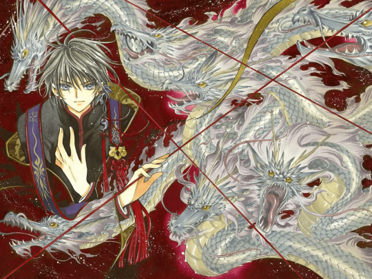
This illustration was created for the new edition of the XO art book. Ohkata (Ageha) had given me orders to differentiate the covers of the two art books by making one look Japanese and the other look Western, and to use a dark red color for one and a dark blue for the other. So I had Kamui wear a kimono. like clothes and made the small objects around him look Japanese as well. The dragons, which go with both the background and the pattern on the kimono also have a Japanese air.
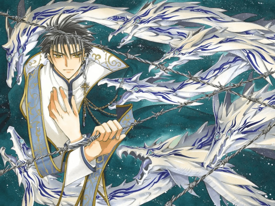
2005 X ∞ (INFINITY) Artbook. Exclusive Illustration for New Edition
This illustration of Fuma is meant to be a counterpart to the one of Kamui in the new edition of XO. It was created to have a more Western atmosphere. He's wearing something that looks like a clerical garment, and the dragons have a Western fantasy look to them too. Since the background is blue, I made the dragons look like aquatic animals, with smooth skin, pale hues, and fin-like wings. The whole idea of drawing seven dragons in each of the new illustrations may have been a little too ambitious since it took me a really long time to complete this.
2002 Monthly Asuka August Issue, Title Page Illustration
Nataku is smiling in this illustration because I drew it after the death scene in the main story and wanted something to cheer me up. An image of the gates of heaven opening onto the land of bliss. or something like that. A sad figure who died a long time ago when young but who was then forced to keep living by unnatural means, now finally freed... Nataku was based off a character designed for a vídeo game that had a quasi-Chinese setting but was never made, so Chinese-looking clothes are a default for him
4 notes
·
View notes
Text
continuing HAND & EYE - course trip to Margate HAHSBJAHAHF
YES we did indeed go to margate for a day to help with our visual diaries - i guess a change of scenery (very out of london) would be pretty nice to include in the visual diary… yes it was a nice time 💗

THIS is my visual diary entry from the time i went to margate!! againe, with a focus on transport i drew a bunch of coaches (and made them look like bugs for some reason; the mirrors look like antennae!)
in the panels on the left (drawn with my student id again ofc😁) i drew a few scenes i did actually see there, such as a bunch of rock candy, some scenery and where margate might be (???) on the map!
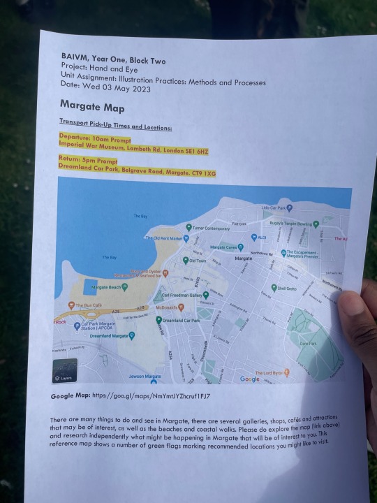
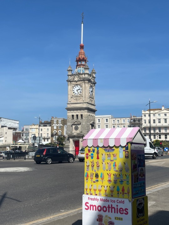

in margate (with my buddy öz!!) we started the day by kind of becoming familiar with the beachside, trainstation and getting something to eat (the trainstation had some fire sandwiches🙏🏾)
during this time we also discussed what sites we wanted to visit out of the ones recommended, and did our visual diary entries; just some quick observational stuff - i added onto mine later in london


after a little exploring (getting lost a bit😁) the first site we visited was the Carl Freedman Gallery for it's limited time To Be Held exhibit.
so erm. this exhibit made me a little bit emotional HAHA... i dont think i had any expectations for it, but what was inside was sort of an exploration of bonds and intimacy between people, culture and the artists own identities, from a black perspective.
the two pieces above were some of my favourites:
left; my brother used to tell me "Scary Spice is the gorgeous one" by Mabintou Madjie - i was very drawn to the colours and composition of this painting when i first saw it; the warmth of the pink is just so..... man💔 and the way the children are posed really feels like something directly out of a family photograph... just looking at this made me feel nostalgic. the title of the piece also reminded me of a similar discussion me and my sister had about the Spice Girls when i was small. Scary Spice is our favourite too.
right; My Body & My Labour by Mario Moore - okay so this one was not as emotionally loaded for me🤣, but i was super captivated by the detailing on the model's skin and on his jacket. these are the types of paintings which you think are photos until you look closer. honestly so amazing...
the third piece that i was especially moved by in this exhibit was the roughly 8 minute long spoken word/performance piece by julianknxx - Black Room. this piece explored the connection between brutalism and black bodies, and i found it to be super thought provoking. from the themes of brutalist architecture acting as the blocks that so many of the countries black people are living in, and how this connects to our treatment throughout history up until today.

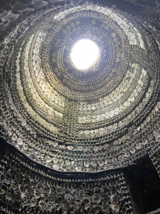


the next site to visit was the Margate Grotto!! a literal capsule back in time to like.... way back like WAY back. the grotto itself being a channel of underground tunnels ornately decorated in millions of seashells!! no one knows how the tunnels were made or why they were decorated like this but it was very beautiful to see something so intricate and well preserved something very ethereal down there i think !! 🫶🏾
to sum it up, margate was rlly nice and i felt like this was a super cool way to provide inspiration for our visual diaries.
2 notes
·
View notes
Note
YOU WENT TO ART SCHOOL? I thought you were self taught damn. Impart some wisdom on us sire
i have a whopping semester and a half at LUCAD under my belt yeah but in all fairness i spent the entire time holed up in my dorm room playing warframe and having mental breakdowns instead of actually paying much attention or doing my assignments. it’s really not all it’s cracked up to be tbh, there’s no secret ~insider knowledge~ that you get at art school TM and nowhere else. the only thing i retained was a few very basic composition tips (avoid tangents, pay attention to where the eye is drawn, utilize color and light to guide the viewer through the piece). the only thing i regret was not sticking around long enough to do any life drawing courses because my human anatomy is still pretty wonky. most of the stuff i learned i could’ve looked up online for free and probably would’ve understood better that way. it’s whatever, really.
you wanna know my wisdom? use references whenever you might need them, tracing isn’t evil and can help figure out where the moving parts go on complicated objects (just don’t outright trace other peoples art and claim it ofc, but tracing a stock photo for a pose or something is not punishable by death) and get sillay with it. play with mediums and styles and methods. don’t focus on making ‘good’ art, just have fun with it. once you figure out what works for you it’ll start to fall into place. draw with as loose a hand as you’re comfortable with (i ahve tremors so i get how it’s hard, but try to move with your shoulder and elbow as opposed to putting all your tension on your wrist) and stretch often. take breaks and come back to pieces with fresh eyes when you’re starting to get frustrated. don’t be afraid to ask for critique or advice. play with color and light and shadow. allow yourself to take inspiration from artists you admire, be it style or technique. let yourself make mistakes and don’t strive for perfection. don’t be afraid to take shortcuts that make your life easier (i spent years manually coloring everything i drew because i felt like the full tool and mask layers were ‘cheating’ somehow. it literally does not matter. do whatever you want). make bad art. make silly art. doodle in the margins of notes and the backs of receipts. art is subjective and you can do whatever you want forever
also, don’t feel like you NEED go to art school to be an artist. i was only there for a semester and a half *on scholarship* before i realized i had no desire to get a degree and it still took me like five years to pay that shit off. you’re in no way obligated to drown yourself in debt for a piece of paper. also, acting like someone suddenly becomes an authority on art just because they went to art school is weird lol. schooling has no bearing on skill because skill is subjective and art is whatever you make of it. be free
5 notes
·
View notes
Text
I love looking back at old art of mine. I tried do hard to make it just right and took an obnoxiously long time for every drawing. However, I'm much happier with my art now, with a simpler style and more opportunity for me to actually enjoy it rather than staring at it for so long that I hate it by the time I'm done. (aka art rant time, since I can do that here!!)
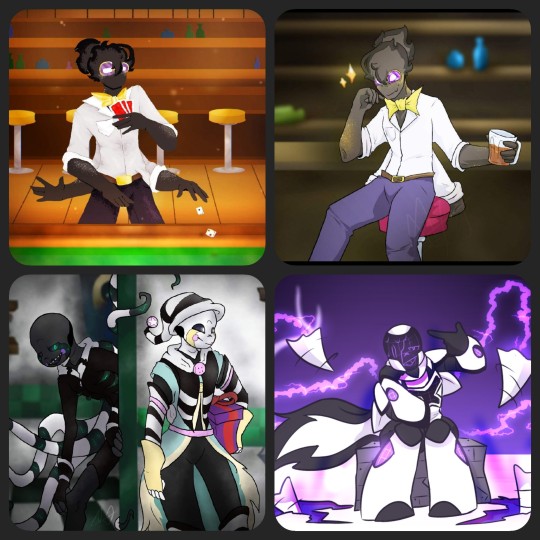
These four drawings are from within a span of at least two years. To explain, the top two are drawings of Catacombtale!Grillby (or Chance). The one on the left was my first version (an entry to a contest to draw Grillbys), the one on the right I redrew later on. The bottom left is something I drew for a crossover contest last year sometime, involving Dream and Nightmare (Jokublog). Lastly, bottom right is another contest drawing for the concept of an X-Tale oc (I used Ec-4o.Nightmare).
The first drawing of Chance is easily a good example of an attempt to make the drawing look fun and inviting. I've got a decently fund pose, the colors are warm, and there's a simple background. However, I did this Lineless. Why? I don't know, but I don't like it. Plain and simple, this is my least favorite of the drawings pictured because I took so long to meticulously shade and color and it still wasn't worth it. Served it's purpose for the time, but that's it.
The second one of Chance is overall better. I used cooler colors, and by now I kinda understood how to put deoth into backgrounds. The style I used for him is fine too. Here, I hate the posing. His composition in comparison to everything else makes him look like he's about to fall off his stool. His second set of arms look stupid too, since I recall I either forgot them or didn't want to draw more hands, so I just folded them unnaturally. Better, but not my favorite.
The Fnaf/UTAU crossover drawing is my favorite in concept. It's not the best drawing style, not the worst. I'd redo the designs slightly if given the chance. However, the composition and background I'd keep almost identical. I really liked how the background came out for this one (minus the doorway) because I started to paint my backgrounds around this time. The character poses, I like Night's more, but Dream's is good enough for it's purpose. The execution of using two characters with brand new designs works well enough here, but as I said, I took too much time with minimal effort for this to be too good. (Also completely skipped shading in favor of darker colored gaussian blur.)
The bottom right, X-Night, is my favorite of these specific four. The body proportions are clearly more rounded and small, the style of lineart and colors are very simple and bold, and most of the real charm cones from the lighting and after affects rather than meticulous shading or complex backgrounds. There were still things I'd change if given the chance, but this is a perfect example of my mindset at the time too. The other three drawings here were fun, but I drew them with other people's expectations in mind. For this piece? I drew what I wanted to, since it was my (relatively speaking) design and my art. I'm not as active or social on the app I drew these for anymore. So, I'm much less inclined to please the overlords that might've gotten it more popular had I drawn it in a more realistic or engaging style.
Don't get me wrong, I loved being on that site and drawing so much. I like all of the pieces I posted on too. However, this is a good chance to reflect on what exactly I've been doing all this time in the UT Fandom and how it helped me improve my art over the course of just barely 3 or 4 years.
More looks back on this, a continuation, will be coming soon. This is gonna be a long rant I'll probably revisit often just to catalog ideas for redraws, as well as notes for myself. (Not all of it is degrading, because I plan my next one to be about what things I have enjoyed drawing and why, followed by a completely redraw-cebtric post!
4 notes
·
View notes
Text
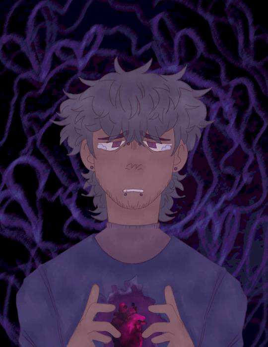
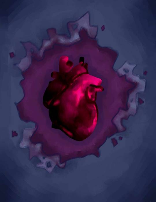
First panel, Digital piece
This first panel was tricky, as it was trying to figure out all the colours I wanted to start with as I knew I wanted to phase from cool colours to warm, but figuring out how to go about that was difficult.
This panel really did a great job in channelling the emotion that this character is feeling. It works well in starting off these series of illustrations as it really sets the mood.
I wanted the viewer to really understand how upset he was, the mix of blue and black in the background showing how drowned he is in his own thoughts. The colours all mix together so well and the pinks used for the heart really make it stand out, clear that it's the centerpiece.
The shading in this piece was created by using a clipping layer, I used a dark purple and shaded gradually using lighter shades of the colour, once happy with it, I lower the opacity which made the purple look like darker shades of the colour under it.
I'm really happy with how this turned out, it was a great starting point and I really don't think there is anything I’d change about it.
Second panel, Digital piece
This was used as both the second panel and the first. I really wanted to make this look bold and eye catching.
The shading was done the same way as the first, but I focused on having it look like it was surrounded by darkness to really show that it was damaged, broken.
Shading the actual heart was hard, I needed to make it look dark but stick with that pink look. I struggled balancing the colours in a way that made the piece look good, but in the end I think i finally landed on something I was proud of.
I really like this panel as a I feel like it shows that this person is extremely vulnerable, like at any moment they colour crack.
I think this illustration is perfect for the second shot as it adds a deeper layer of understanding to the characters emotions.
I have nothing that I would change about this illustration.
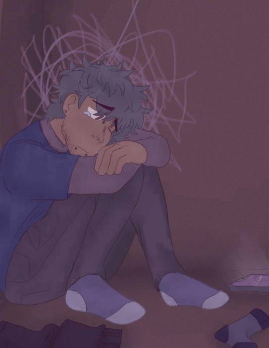
Third panel, Digital piece
This is my favourite illustration with in the project, it really works well with the whole thing, it shows that these thoughts and feelings are really all the own of the character as symbolised by the cloud of scribbles surrounding the characters mind.
The colour finally starts to shift in this image to a lighter one as we see the figure receive a message, this colour change shows a hopefulness that its some kind of message from the person they're with.
This panel also gives us a small further look into this characters mental state as we see old clothes on the floor, showing a disregard for hygiene, hinting to mild depression.
We also see a change of facial expression from the figure showing a hopeful glance up, eyes still watery yet appearing calmer.
This sample really could sum up the whole story in one shot and i'm happy with how well i managed to get that to work.
I wouldn't change a thing about this illustration as I feel it ties in perfectly with the them.
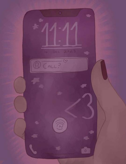
Forth panel, Digital piece
Although I wish I’d gone with a better pose for this piece in which we could see the character looking at the message, i still really like what this illustration shows.
It gives a look into what the figure is seeing just because of a very simple message that made their worries about being hated or unloved, vanish.
It shows how much this has cheered him up compared to before.
This illustration also really gave me a nice way to transition into the warmer colours without suddenly changing the background.
I'm pleased with this panel as it does fit in really well with the rest of the illustrations, yet if I were to recreate it, I would like to try a more interesting composition.

Fifth panel, Digital piece
The last illustration, this is where we see the character relaxed, content. It shows us how small his worries were and yet how it massively affected his feelings.
In order to show that this character is slowly breaking out of these habits of being consumed by his feelings, I drew in flowers, and their stems wrapping around his heart as if they were giving a comforting hug to the figure, reassuring him and helping him calm down after everything he was feeling.
The colour in the background is now a warm pinkish orange, further presenting how much that message has comforted the figure.
I feel this last panel is a nice way to end the illustrations finishing off a short simple story in a satisfying way.
If I were to change one thing though I would want to change the pose in which we can see him on the phone with the person, further reassuring him that he's loved and appreciated.
0 notes
Text

I hate this banner so much i hate this banner so much. Ive been trying to draw it since november of last year and each time i get so frustrated with it that i just draw something completely different instead. Banner 3 was the first to get finished then banner 1 and finally this one. Fuck this banner. His proportions arent right the composition is boring and theres literally less definition in the background than the first one. More than half of the fucking thing is just black. Even the logo colors look bad and the only reason im settling for this is because i physically cant make anything else. Ive Tried. Under the cut if you want but honestly just keep scrolling. Live a life without seeing this, it'll be better.
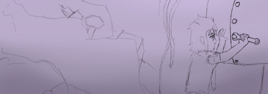
This was the first draft and even though it's more interesting in general, i hate the proportions/ posing. There's times where I draw from reference and it looks like their arm is breaking but That's How It Looks In Real Life. The only solution is to fake it so it looks right, or just scrap the pose (which i did)
Third attempt. He has a very square head yet I always draw it as a circle in the comic. It makes it difficult when I have to draw what he Actually looks like. Pose is boring, hands are nonexistent, face sucks. Now i'm just being mean to him.
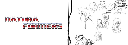
Speaking of, I got Really Upset trying to get it right for the last time. The pose with his arms crossed is what I was going for, but I got sidetracked and realized my feelings of despair could translate onto Doc, so I embraced the moment and drew him being sad and also me being sad.
Ultimately the finished banner was the second attempt. I abandoned it before but I was tired of throwing myself at the wall. I settled for mediocrity so I can do better things later, which sucks but I think that's art.
#naturaformers#not tagging this one as transformers because there arent any transformers in this image#technically thats soundwaves leg in the foreground but i dont think soundwave tag followers would be pleased with me for that stretch.
1 note
·
View note
Last Seen Blogs
paranomum
paranomum

thestickerguide-blog
Custome Printed Packaging Tape

jay-7767
Untitled
tsurunel
Travelling through Space
yngkd
Aliens Are Real.