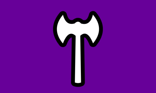
#same symbolism but more original design
Photo

I watched the new Puss in Boots movie and liked the same character everyone else liked

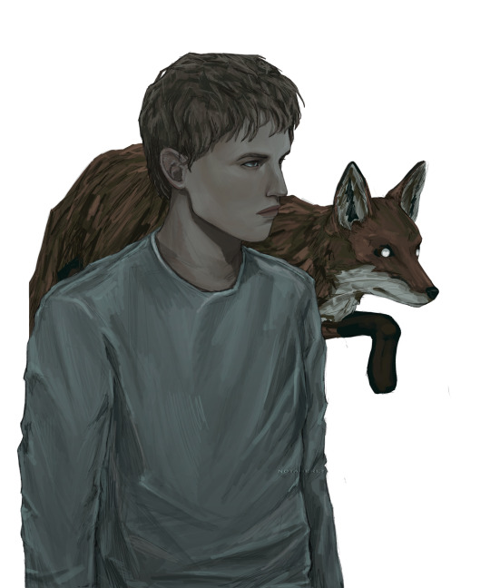
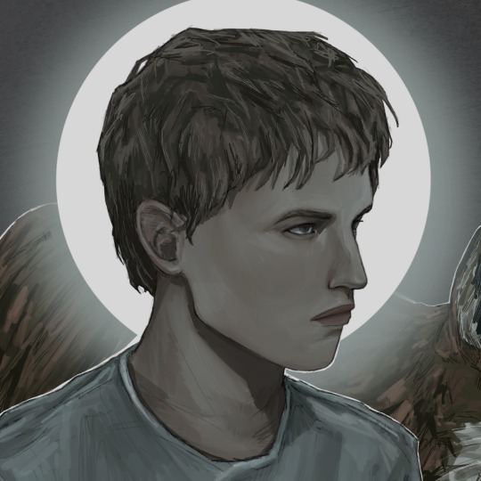
#during the scene like midway through where hes chasing him through the woods I heard a guy in the theater say 'this guy is cool'#he was right that guy was cool#hes also borzoi shaped#also love the weapons they gave this guy#the two sickles instead of the traditional grim reaper scythe#same symbolism but more original design#art#colored pencil#fan art#puss in boots#puss in boots the last wish#death#wolf
2K notes
·
View notes
Text

do you know what a knave is?; an unprincipled man, rogue.
nigel’s
white void of doom and sketch

details

#aaaand here’s alex#why the FUCK is eddie so hard to draw?!?!#you guys are just going to have to excuse the fact that it really doesn’t look much like him#this turned out a little bit better than i expected but it did indeed take three different references to get the desired result#4 hours and 23 minutes#somebody get these hoes better haircuts#the original plan was to have him looking upwards more dramatically but we’re gonna start small when it comes to alex#this is only like my third time drawing eddie but now i want to draw alex again and the voices won’t let me sleep#this one looks very odd. there’s a couple of obvious things i can see now that i would change if i could do this over again but eh.#i’ll worry about that later#ANIMAL SYMBOLISM#i used the same skeleton design for the background with this one as well#like minds#murderous intent#like minds 2006#alex forbes#art#fanart#drawing#digital art#alex forbes fanart#artist of tumblr#eddie redmayne#like minds fanart#i think now it’s time for me to draw them together but what should they be doing??
43 notes
·
View notes
Text
huh, the amount of people who perceived themes other than eugenics and transhumanism in regards to evolution in phyrexia is very interesting to me
#just. Huh!#i get the aesthetic appeal dont get me wrong the entire design for phyrexia is very cool#but considering the core philosophies behind the creation of original phyrexia and how that bleeds into new phyrexia#the amount of people i see who go to great lengths to kind of. twist it into a leftist or trans symbol is fascinating#when at its core its based upon an ideology that seeks to ''perfect'' perceived ''flaws'' like being transgender#but at the same time transhumanism and the idea of changing your body to something optimal is also heavily significant#thematically when it comes to trans stories. especially when considering the perception of so many people that transitioning is somehow#a mutilation of the human body that turns someone into a monster (wrong). so i can see why other trans people#would identify with phyrexia in that vein. being seen as monsters for undergoing such a procedure#for me phyrexia and the procedure behind phyresis has always come off more as an allegory#for medical procedures done to ''perfect/fix'' the unwilling. forced reassignment for intersex people or lobotomization of the disabled#sterilization of the “undesireable”.#esp with yawgmoths (self proclaimed eugenicist though his writer was kinda confused abt what eugenics actually is)#malpractice and violence upon the masses and views on race and the reverence that phyrexia (his creations of course) hold for hi#*him#and the facets of that worship which continued to exist into new phyrexia
2 notes
·
View notes
Text


i love the labrys lesbian flag BUT heard that some don’t like it when people who arent jewish use the black triangle on flags so i decided to make some alternatives. plus this one was made by a lesbian unlike the original labrys flag! couldnt decide which was best so i made a few different versions... if anyone has suggestions lmk. any lesbian is free to use these, idc i dont own the concept of the labrys flag
#yes the hex code is 660099 bc im a child. what of it#lesbian#labrys lesbian#lgbt#labrys flag#lgbt flags#also while the original labrys flag uses different clipart for some reason more recent labrys flag edits use the same like#labrys cartoon drawing that ordine nuovo uses? which. dont do that maube#maybe*#the labrys has good symbolism so obviously im not going to dump it as a symbol entirely#but hmmmmm same exact design???#replacing the triangle with circles or squares has problems too so dont suggest that lol#the outline of the labrys isnt a vector bc i was lazy so i might convert those laterrrrr if the fuzziness/jaggedness gets distracting#i hate hate hate working with vectors though
9 notes
·
View notes
Text
as a bi person, the bisexual flag brings me infinite joy and always puts a smile on my face, however as a person who has a Passion for Graphic Design, that undersaturated shade of purple infuriates me when it's used digitally
like, on an actual flag - which was its original purpose - it looks great!

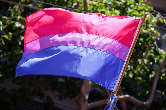
those look fine! lovely, even! with the semi-transparent fabric, the way it catches the sunlight, it looks beautiful!
but now look at how it looks digitally

the pink and blue are so vibrant compared to the sad, lonely lavender!
and let's look at this statement from Michael Page, the creator of the bi flag:

(sidenote: he created this flag in 1998, so if his takes on bisexuality is different from yours, it's okay to notice that! a lot has changed since the 90s when it comes to lived experiences and the way we describe them. but, it's also important to respect his thoughts about this and the way he presented them, even if today, we'd probably not say that bi people "blend unnoticeably into both the gay/lesbian and straight communities.")
so in pantone colors, the pink is 226 C, the blue is 286 C, and the purple of the flag is 258 C.
but...here's the deal
Michael talks here about how the key to understanding the symbolism is to know that the purple blends into both the pink and blue. and on a physical flag, I think you can see that!
but digitally, it absolutely does not blend. it clashes badly, and looks oddly separate from the other two colors.
which got me wondering...what purple do you get if you actually blend 226 C and 286 C?
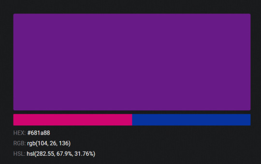
oh! oh, my god.

look at that! look at how nicely it fits between those colors!
look at it next to the original color scheme! look at how much more vibrant the purple is!
and friends. this is just blending through rgb! you get even more purple variations when you use other color spaces!
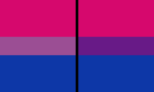
let's compare all of them:


(top: original, lab. middle: lrgb, lch. bottom: rgb, hsl)
look at all of the different purple options you can get just by combining these two colors!
if you want almost too-vibrant saturation, you can go hsl, if you want something more relaxed that's closer to the original, you can go lab or lrgb. and if you want to split the difference, lch is bright and violet, while rgb is there with its saturated but darker purple.
anyway, I guess I don't really have a point here? this isn't so much an informational post as it is Me Getting Weird About Colors, but I think it is a useful lesson about how colors look very different on screens compared to how they look on objects in real life.
and sometimes, I think it's okay to compensate for that.
out of all of these, this is my favorite bi flag:

it's the one where the colors were blended in lab color space. for me, the lighter, softer purple is close enough to the original bi flag purple, while also feeling like a smoother blend of the blue and pink
but that's just me! and it might not even look the same to you, since every screen is different, because technology is a nightmare!
anyway, thank you for coming with me on this colorful journey! I will now retreat back to inkscape and make pained sounds about inkstitch gradients until something tangible pulls me back into reality
#bi#bisexual#bisexuality#bi flag#bisexual flag#sbs rambles#graphic design is my passion#id in alt text#but#the ids are probably deeply unhelpful for the different variations of flags#in the alt text of the six flags all grouped together#I just put what method the purples were blended with#and then tried to describe them more in the paragraph below#but this is an inherently visual post#so if you're reading it with a screen reader I am sorry :(
19K notes
·
View notes
Text
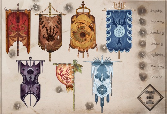
Tribe Banner concept art:
Folks seemed to enjoy my WOF WIPS, so here’s more concept art for y’all! My favorite thing about WOF is the potential for world building. I thought it’d be cool to see a tribe emblem represented on a banner/flag of sorts:
Read below for some of the thought process / headcannons behind the design choices: 👇
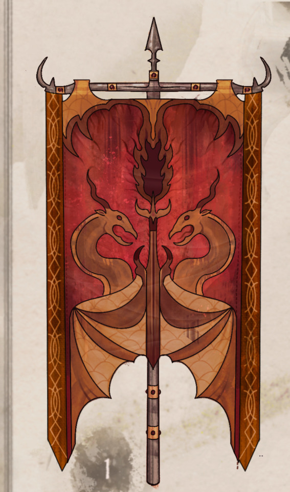
Skywing Banner:
Skywings pride themselves on 3 things; treasure, fire, & their enormous, soaring wingspan which steals the sky.
As such, portrayed on the banner, the fabric (often made with dyed cow or goat leathers) resembles draped dragon wings. Two Skywings embrace a goblet, which is spewing golden fire.
The banner is often held aloft with iron or gold poles, signifying to other tribes their wealth and pride.
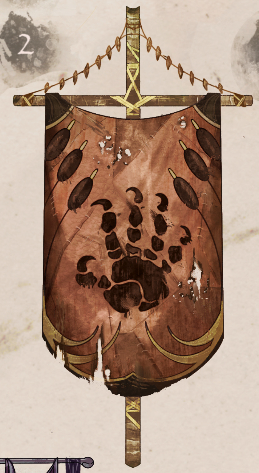
Mudwing banner:
These banners are fashioned with leather hides from cow or crocodile skin, held aloft with bamboo, and painted with a Talon-print & Reed crest.
The talonprint symbolizes community and the strength of Mudwing sibling bonds. The reed border unifies all Mudwings regardless of their relationship to home; the swamp. Bigwings are often seen carrying these into battle, signifing their status and making it easier for a sib to locate them in the flurry of a fight.
Sandwing Banner:
Sandwing flags are made with camel skins and dyed cactus leather.
A crest shows a Sandwing coiled around a beaming sun, a reminder that despite the revered 3 moons, Sandwings are born to thrive in sunlight.
The fabric is cut in a way to mimic the swooping dunes of Sandwing territory. And the poles of the flags are equally intricate, with scorpion tails and golden ropes which frame the banner.
These flags make prominent appearances in parades, festivals, and markets, and even miniature version are often displayed in homes or as tapestries/carpets.
Seawing banner:
These banners are often seen displayed in royal quarters or councils, or above land to mark territory.
A nautilus shell crest on front echoes the swirl-pattern associated with royal Seawings: The banner’s borders resemble waves and a dragon swimming beneath their surface.
These are crafted with rich materials, strung with seashells, pearls, silver dollars, and deep oceanic color fabric. There is severe penalty for Seawings found plucking treasure from the banners, as they are a direct symbol of royalty.
Nightwing Banner:
These banners emphasize the Nightwings’ relationship to the moon, their source of power and praise. The material, a contrast of white stitching against purple velvet showcases moonlight and night, black scales against stars, magic and mystery.
They are seen decorated with 3 moons at the top and a centered dragon reaching up into the night sky.
These banners were often used during the war as secret code by spies to deliver to other tribes. Prophecy scrolls often came attached, delivering cryptic messages or secrets in the night. These banners all helped add to the secrecy of the Dragonet Prophecy, and kept tribes on their toes around Nightwings.
Rainwing banner:
Rainwing banners are not used for battle purposes like other tribes, most are mere decoration, location indicators, and have no unified design.
However, It is said back when Rainwings left the rainforest to trade pre-war, this particular banner design was often raised above Rainwing merchant tables, and showcases the coiled tail of a Rainwing with leaves, vines, and other sights from the rainforest adorning a bamboo pole. Bright color combinations accentuated the flag to entice curious customers.
Now, only one tattered version of the original Rainwing banner remains, displayed proudly in Queen Glory’s quarters, a reminder that building the Rainwings’ community is their most important goal.
Icewing Banner:
These banners reflect the same standards Icewings hold themselves to.
Like a visual of the rankings themselves, each banner is cut perfectly from an Icewing’s trained, serrated claws to resemble icicles, and crafted with fine blue stitching.
Flags are often held aloft with perfectly polished narwhal horn or bone, and can be inlaid with sapphires or diamond.
Icewing soldiers are often gifted these during ceremonies, and perform training exercises with the flags to test their stance/attentiveness. The crest showcases the swift sharpness of ice through a flying dragon, and a snowflake toward the bottom reminding Icewings that even minuscule snowflakes, small things, should be perfect in form.
#wings of fire#wof#rainwing#sandwing#icewing#mudwing#skywing#nightwing#nightwing wof#seawing#dragon art#dragon#art#concept art#bookart#wof fanart#wings of fire art#book fanart#books#illustration#dragon drawing#wof art
2K notes
·
View notes
Text
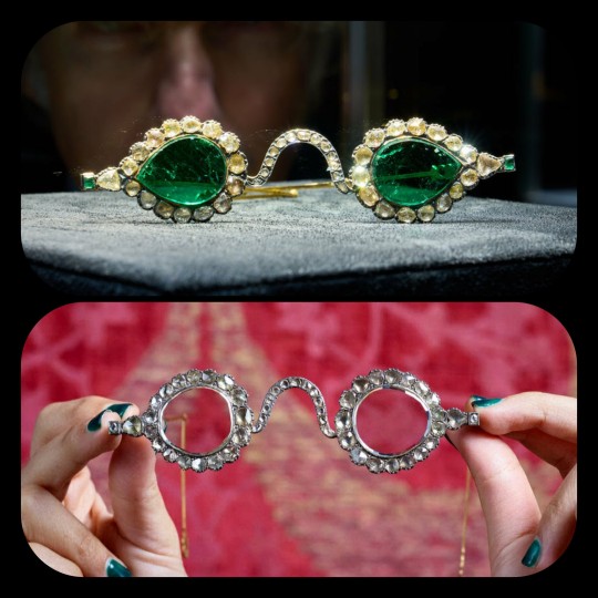
Emerald Spectacles from India, c. 1620-1660 CE: the lenses of these spectacles were cut from a single 300-carat emerald, and it was believed that they possessed mystical properties
These eyeglasses are also known by the name "Astaneh-e ferdaws," meaning "Gate of Paradise," based on the symbolic associations between the color green and the concept of spiritual salvation/Paradise. That symbolism (which is rooted in Islamic tradition) was especially popular in Mughal-era India, where the spectacles were made.
The lenses were crafted from two thin slices of the same emerald. Together, the lenses have a combined weight of about 27 carats, but given the precision, size, and shape of each lens, experts believe that the original emerald likely weighed in excess of 300 carats (more than sixty grams) before it was cleaved down in order to produce the lenses. The emerald was sourced from a mine in Muzo, Colombia, and it was then transported across the Atlantic by Spanish or Portuguese merchants.
Each lens is encircled by a series of rose-cut diamonds, which run along an ornate frame made of gold and silver. The diamond-studded frame was added in the 1890s, when the original prince-nez design was fitted with more modern frames.
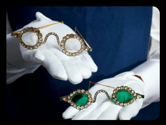
The emerald eyeglasses have long been paired with a second set of spectacles, and they were almost certainly commissioned by the same patron. This second pair is known as "Halqeh-e nur," or the "Halo of Light."
The Halo of Light features lenses that were made from slices of diamond. The diamond lenses were cleaved from a single stone, just like the emerald lenses, with the diamond itself being sourced from a mine in Southern India. It's estimated that the original, uncut diamond would have weighed about 200-300 carats, which would make it one of the largest uncut diamonds ever found.
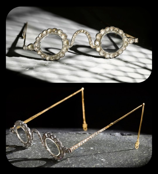
The lenses are so clear and so smoothly cut that it sometimes looks like they're not even there.
Both sets of spectacles date back to the mid-1600s, and it's generally believed that they were commissioned by a Mughal emperor or prince. The identity of that person is still a bit of a mystery, but it has been widely speculated that the patron was Shah Jahan -- the Mughal ruler who famously commissioned the Taj Mahal after the death of his wife, Mumtaz Mahal. Shah Jahan did rule as the Mughal emperor from about 1628 to 1658.
The emerald and diamond lenses may have been chosen for symbolic, sentimental, and/or cultural reasons, or they may have been chosen simply because they're pretty and extravagant; the original meaning and purpose behind the design is still unclear. Experts do believe that the eyeglasses were designed to be worn by someone, though.
At times, it was believed that the spectacles had spiritual properties, like the ability to promote healing, to ward off evil, to impart wisdom, and to bring the wearer closer to enlightenment. Those beliefs are largely based on the spiritual significance that emeralds and diamonds can have within certain Indic and Islamic traditions -- emeralds may be viewed as an emblem of Paradise, salvation, healing, cleansing, and eternal life, while diamonds are similarly associated with enlightenment, wisdom, celestial light, and mysticism.
The Gate of Paradise and the Halo of Light were both kept in the collections of a wealthy Indian family until 1980, when they were sold to private collectors, and they were then put up for auction once again in 2021. They were most recently valued at about $2 million to $3.4 million per pair.
Sources & More Info:
Sotheby's: Mughal Spectacles
Architectural Digest of India: At Sotheby's auction, Mughal-era eyeglasses made of diamond and emerald create a stir
Only Natural Diamonds: Auspicious Sight & the Halqeh-e Nur Spectacles
The Royal Society Publishing: Cleaving the Halqeh-Ye Nur Diamonds
Gemological Institution of America: Two Antique Mughal Spectacles with Gemstone Lenses
Manuscript: From Satan's Crown to the Holy Grail: emeralds in myth, magic, and history
CNN: The $3.5 million Spectacles Said to Ward off Evil
BBC: Rare Mughal Era Spectacles to be Auctioned by Sotheby's
#history#archaeology#artifact#mughal#india#17th century#art#emerald#diamond#glasses#indian lore#islam#religion#mysticism#indian history#anthropology#spirituality#fashion
4K notes
·
View notes
Text
Sexism in TOS: Worst Offender, or Progressive in Retrospect in Comparison?
I see a lot of folks claim that TOS was the most sexist of the Star Trek shows by a landslide -- and while I agree that it definitely suffered from the sexism of the times, I also have other perspectives to share to give some food for thought.
I am of course not insinuating that TOS isn't sexist -- it is, but I have to ask folks to consider the breadth and depth of Berman's sexism in his run and ask yourself: Was Gene Roddenberry genuinely more sexist in his storytelling and delivery than Rick Berman?
I'm not telling you to feel one way or the other, but all I ask is that you hear me out and consider some perspectives and make your own balanced assessments. Nobody is obligated to share my opinion, but it means a lot just to have folks hear it and see their thoughts on the subject. So here is what I was originally responding to:
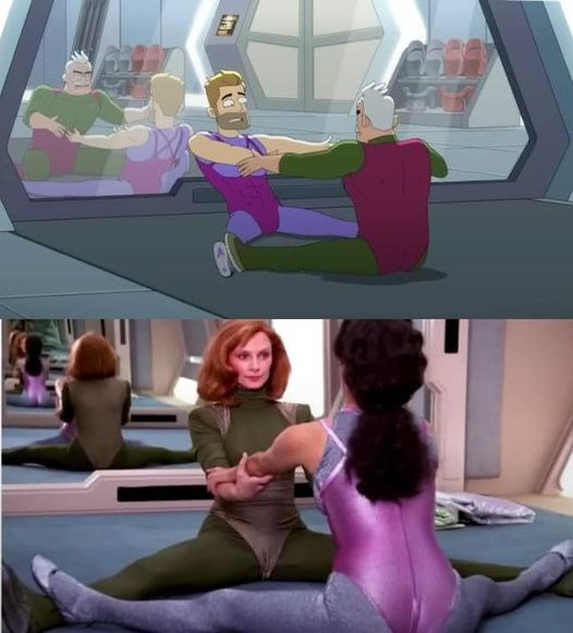
Someone's response to this photo:
"Devil's advocate. This was a part of the popular form of cardio during the production time of TNG. Yes, it was heavily sexualised by men, but so is literally every other way women work out. Men have been caught taking pictures of women while trying to do dead lifts, running on tracks and working on sled machines. They post them online to share too. The fact is, there is no way a woman can be shown working out without it going there. And yeah,t hat includes the combat forms of workout they do in Star Trek. Just look at how Dax dresses when she spars with Worf. Yes, they're dating, but still, same goes when 7 does and any other female.
Aerobics routines like this were made dirty and cringy. This was what women wore then by and large. This is how the workout was done. We make it cringy."
My response to them:
"I respect your take, but I disagree on a few fronts.
The miniskirt was chosen by the TOS female cast, not the male cast, specifically requested by Grace LW and affirmed by Nichelle and Majel who would go on to vehemently defend the miniskirt over the years as comfortable and embraced by them.
Grace said it was comfortable and seen as a symbol of female sexual empowerment during the 60s and thought it would be a progressive garment (and turns out that it was, as it was later adapted and worn by male crew as a skant on TNG) -- FYI those were designed by a gay man and Gene approved them.
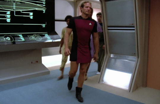
This was also supposed to be Spock's TMP outfit:
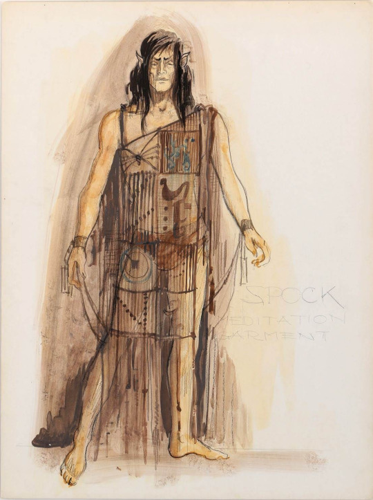
Literally lingerie.
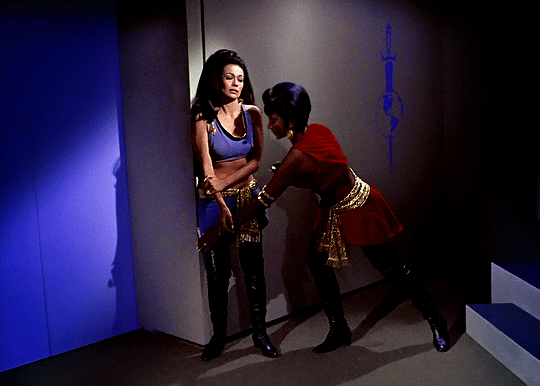
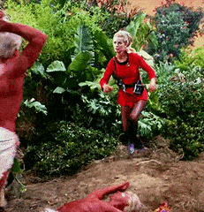
We saw both Uhura (who saves Kirk in from Marlena Mirror Mirror) and Yeoman Landon (the first to initiate combat with a classic Kirk-esque kick to help the Captain being attacked in The Apple) carry out their combat training in their Starfleet uniforms without ever being made to change into any ridiculous workout gear.

In fact, I'd argue Jim Kirk was sexualized even more than the ladies of the week on the show and I saw his naked body more than anyone else's on a fairly regular basis. He wore red yoga tights while topless in Charlie X while the women wore full length gymnastic suits that covered their entire body. If anything, it went out of its way to avoid sexualizing women practicing fitness in those scenes and instead focused on Kirk.
Gene confessed that he asked to have Shatner filmed in suggestive/provocative ways to "give something to the ladies", so he -- as he said -- liked to "film him walking away" or have him conveniently busting out of his shirts in just about every episode as it were, because Shatner apparently had great assets. LOL
Gene made an effort to at least sexualize both if he was going to sexualize one, and he carried that attitude forward in wanting the m/m and f/f scenes in the background on Risa for TNG. He also insisted that the men and women wear skimpy outfits on THAT TNG planet. You know the one. LOL I mean the dudes even had on less than the women:
Gene also gave permission to K/S shippers to have their conventions back in the 70s when he was asked for permission. Gene and Nimoy felt with all the skimpy outfits they had the ladies wear, why not let the ladies and gay men have their fun, too? It's how we ended up with moments like this:
Yes, those are two people dressed up as Kirk and Spock's penises doing interpretive dance. Gene didn't give two damns. LOL
In my eyes, that was a very progressive take on Gene's part for the 60s. It was actually PARAMOUNT STUDIOS who had the big problem with K/S stories and vehemently tried to shut them down. Gene literally hired slash authors on his payroll and even had several slash stories/writers published in his official Star Trek books (The New Voyages & The New Voyages II).
I feel I saw Uhura and women in TOS engaged in more physical combat/altercations defending themselves that Troi or Bev were shown holding their own.
In fact, Kirk used to get furious when someone would "dress up" his female crew members without their consent (Trelane episode, Shore Leave episode) because like his male crew members, he wanted them to be treated professionally and to also have his male crew act professionally.
Berman brought some of his own personal biases into Star Trek that in some ways regressed it. While TOS had blatant sexism and was called on it time and again, that show was made in the 60s -- a solid 21 years before TNG. We as a modern audience understood why some of it was cringe/sexist due to the time period -- look at any other media coming out in the 60s and Star Trek was miles ahead of what other shows were doing.
Compare that to Berman who was churning sexist stuff out when women like Starbuck and Scully were simultaneously on screen on other programs airing, and we had already had Sigourney Weaver and other strong women in Holywood playing respectful roles.
In my eyes, there was no need of the sexism seen in TNG but especially VOY and ENT. There was no excuse for it when other shows were writing women far better and a number of those weren't even set in the future like Trek was, making it age even faster due to having those dated perspectives frequently highlighted.
In the Center Seat documentary as well as "The Fifty Year Mission" book you will find cast members, writers and other studio alumni who attest to this. Some discussions from "The Fifty Year Mission":
"First, Berman was supposed to have been a real sleaze ball . . . According to Terry Farrel, he would go on constantly about how her breasts weren't big enough, how she should do something about it, and how his secretary was a good example to follow as she had huge breasts. She even had to have fittings to get larger bras, and that was all done at his behest.
Later Berman and Braga developed a name for Jeri Ryan's character prior Seven of Nine. They originally called the character "perineum" which if you look it up it is the area between the anus and the scrotum. Later they floated the name "6 of 9". I mean, what does it tell you about where these two were coming from in the development of this character if they had names like that put forward in all seriousness for her?"
Gene Roddenberry also had some of his own more progressive ideas for TNG cut or watered down by Berman. Roddenberry agreed TNG should have homosexual relationships and representation at a con in the 80s and insisted on it in a meeting with his writers -- something Berman later would not honor. Gene wanted the AIDS episode, showing m/m and f/f in the Riza scenes -- these were some of Roddenberry's requests to include in TNG that Berman later stonewalled.
Berman's era was sadly dated by his own misogynist bias, IMO, to the point that it can somewhat hurt the shows he worked on through his cringe egoism and blatant disrespect toward his female cast.
There is a reason why Gene could keep female actresses working with him and Berman had a revolving door of women that he couldn't seem to keep working for him -- he was abhorrent to women, on and off set. Gene wasn't perfect at all, he had a lot of issues himself -- but Berman was a whole other level. Just look at what he did to poor Jolene Blalock, Marina Sirtis and his toxic commenting on her body weight which exacerbated her struggles with eating disorders, or how he treated and talked to Terry Farrell.
Anyway, just some food for thought. I'm not saying anyone is wrong regarding a take like that, but there are a variety of ways to look at this. Gene Roddenberry isn't a saint by any means, but it definitely bothers me how folks will tote the Berman era as if it were the lesser of two evils or the more progressive depiction of women when I felt there were far more concerning portrayals of women in his era with far less justification.
(P.S: I don't event want to go near the sheer amount of "creepy old dude/villain preys on innocent/naïve/scared young woman or little girl" stories there were in Berman's era, either. But that's a whole other can of worms I can write about in a part 2.)
#star trek#star trek tos#star trek tng#star trek voy#star trek ent#star trek ds9 was the one show that went above and beyond#1shirt2shirtredshirtdeadshirt#oc#octrekmeta#octrek#gene roddenberry#rick berman#brannon braga#kirk#spock#uhura#rand#nichelle nichols#majel barrett#grace lee whitney#tos#tng#voy#ent#marina sirtis#jolene blalock#terry farrell
3K notes
·
View notes
Note
Please share your thoughts on the other 5 cutie marks, I'd love to hear!
Hi everypony! I got like 20 asks for the Dogwarts cutie mark lore so I'm here to speak my truth!
Before we start, I would like to write a quick reminder that a pony's cutie mark is not always their "special talent", but can also represent who they are, their personalities, and a possible destiny. Different cutie marks have different meanings and interpretations, but they're not just about representing what you're good at.
That being said, let's start with the cutie mark design I'm proudest of!
Ren's Cutie Mark
Ren's cutie mark is of a sunrise and looks pretty simple at first glance but there was a lot of thought that went into this one.
First of all, I bet you're wondering why a sunrise? Well, in the show, it is pretty typical for unicorns with great magical abilities to have one relating to space (examples being Twilight Sparkle, Sunset Shimmer, Starlight Glimmer, and Sunburst). And I figured since I wanted Ren to fall into a similar position of potentially becoming an alicorn, I gave him a cutie mark following the same trend. And I chose a sunrise to reflect the way Ren seems to glow when he enters a room. The way he carries himself is very warm and bright it just catches your eye in a similar way the sun would.
Also, Ren wears sunglasses. So a sun-themed cutie mark seemed appropriate.
Additionally, there are a couple of smaller details I want to point out too. Like the sun rays, if you look at them for a moment you'll see they're shaped like little crowns! I of course had to put a crown in thanks to how much Ren likes to play royalty, so I snuck it in there. And then the red spots underneath could both be interpreted as the sun reflected over water or blood. (But of course, this is a kid show AU so there wouldn't be any blood in Ren's destiny, just a fun reference to the red king and his whole thing about blood dyeing the snow red)
Martyn's Cutie Mark

I explained this one in an earlier ask but I thought I'd explain it again here for anyone who didn't see it!
Martyn's cutie mark is of a chopped log and a small stick.
This one is mostly a play on the name "Littlewood" but has other meanings too. As a character, Martyn tends to travel and explore quite a bit. In the Life Series specifically, he is usually the last one to find a permanent base and even then doesn't spend a lot of time in one place. Always on the move. Additionally, he's more of a wild card compared to other characters, always trying to be as unpredictable as possible.
The smaller detail here is the little swirl on top of the log is the same as the one on his Minecraft skin's shirt.
BigB's Cutie Mark
Cookies! Cookies! Cookies! BigB's cutie mark is of 3 cookies where one is trying to eat the others. There are also a few sprinkles there made to look like action lines.
We all know BigB loves cookies so of course I had to give him a cutie mark with cookies in it. For this one, I decided to follow the cutie mark trend of "symbol/item important to the pony duplicated 3 times" (examples being Fluttershy, Applejack, Rarity, Pinkie Pie) but I added a bit more creativity to it with the top on trying to eat the others to represent just how tasty they are 😋
Additionally, rather than the first cookie trying to eat the others, you could interpret it as opening its mouth to talk. Because BigB can not keep a secret to save his life! In Double Life when he started "secret soulmates" with Grian, he didn't last a day without opening his mouth. He told Ren about it immediately because he felt bad for keeping things from him.
Also worth quickly mentioning: People pointed out in my original post that they don't think BigB would be the element of honesty because of his behaviour in Secret Life. But that's just Secret Life. I think Secret Life to BigB was like that episode of My Little Pony where Discord makes the main 6 act the opposite of their true element. BigB was just going through a weird phase of telling very obvious lies because a book told him to.
Skizz's Cutie Mark
Skizz's cutie mark is of a lightning bolt from a couple storm clouds hitting the ground.
I think this is the cutie mark with the least thought put into it, unfortunately. There was still though just not as much as the others. The big thing I thought was fun was I made the lightning bolt shaped like an "S" to stand for Skizzleman. But other than that, this cutie mark sort of has the same meaning as Rainbow Dash's cutie mark. Quick like lightning, loud, bold, dangerous, and powerful.
Impulse's Cutie Mark
Impulse's cutie mark is of a lit-up lightbulb.
I absolutely crowded this cutie mark with the letter i. If you look closely, there are 6 of them. Impulse's design also has an i-shaped pattern on the belly if you look closely enough. But that's more of a fun easter egg and doesn't exactly reflect Impulse as a character.
There are a couple of reasons I chose a lightbulb for Impulse, the first and probably most obvious is that he's a redstone guy! He's a technical guy who likes to work smarter, not harder. So I figured the My Little Pony equivalent would be a light bulb/electricity. The second reason for the lightbulb is that it's usually used as a visual representation when characters have that "eureka!" moment in cartoons. When someone has a brilliant idea a little lightbulb turns on above their head. So since Impulse is the ideas guy, I figured a lightbulb would work for his cutie mark.
Etho's Cutie Mark
Etho's cutie mark is of a snowflake with a missing branch.
I promise there is more to this cutie mark than just "Canada is cold" even if that's part of the reason I wanted to give him a winter-themed cutie mark. While it is fun to make a nod to Etho being Canadian, I thought a winter-themed cutie mark would be fun to represent how he sometimes presents himself. Cold and a bit mysterious. I think deep down once you get to know him, those attributes melt away, but for people who have never met him, he may be intimidating that way.
I'll be honest, I don't watch a lot of Etho content, but I do have a few friends who identify as Etho girlies so I did my research. I was told in his Minecraft Let's Play World, that he has a snowflake build somewhere. I believe they said it was an iron golem farm? (Please correct me if I'm wrong) but I thought that was perfect for the cutie mark. And if you're wondering why there's a branch missing, it's because one of my friends said he was incapable of finishing builds sometimes so I thought that would be fun to include.
-=+=-
Alright. Rant over. To celebrate, here are a few pony doodles so I can put this post in my art tag.
#cherri.speaks#cherri.draws#trafficblr#my little pony au#renthedog#inthelittlewood#bigbst4tz2#skizzleman#impulsesv#ethoslab#Third Life x MLP#mclp
614 notes
·
View notes
Text
hazbin hotel redesigns wooooooooo
okay so. i'm gonna discuss my thoughts about them n shit, putting under a readmore bc it's gonna get long and rambley. sorry in advance for the shit formatting, i'm on mobile </3
just some general shit about how i would rewrite it. i think the premise of redeeming sinners is entertaining but is executed horribly. i also am a fan of the "heaven isn't great either" idea but again, executed horribly. i'd make the hierarchy of angels more accurate because it's cool as hell and i have autism about it. the characters from hell would swear still (albeit not as much), but the angels would outright refuse to swear or make vulgar jokes ever. this would be partially to further the gap between heaven and hell and make the differences more stark.
hell would also be more like dante's inferno (again because i think its cool). the ars goetia would get a full redesign and would be more prevalent in demonic society.
now for the characters!
---
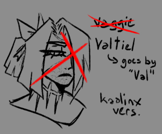
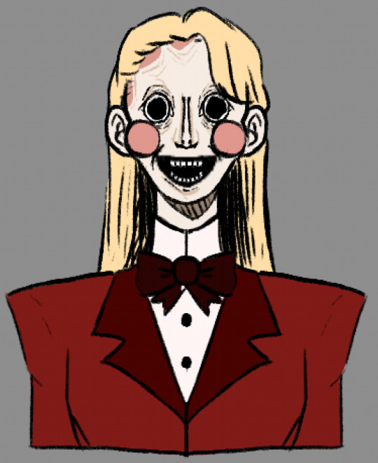
VAGGIE VALTIEL:
starting off with vaggie, or Valtiel as i've renamed her because let's be honest her original name sucks. Valtiel (Val for short) was an aspiring power angel who wanted to be an exorcist. she looked up to lute and thought the idea of killing demons was really cool and badass. however when she actually was on the field for the first time she discovered how awful this actually was. she tried to help a few demons but lute figured it out and felled her right then and there. the rest of her story is relatively the same. personality wise she's more stoic and less prone to all-out aggression. she still get angry, sure, but it's in a quieter and more menacing way. you DO NOT want to fuck with Valtiel.
CHARLIE:
next up is charlie! i had two ideas for her. the first one (unsettling drawing) has her as a mannequin/doll type demon. lucifer and/or lilith was unable to conceive and as such they built a kid from scratch. she's overall similar to og charlie personality wise, very kind and cheerful despite her unsettling appearance. she struggles with empathy sometimes but really does mean well. her motive for rehabilitating sinners is so they get to see their family again. being able to see heaven from where they are in hell must make them sad, so she wants to help make them happy again!
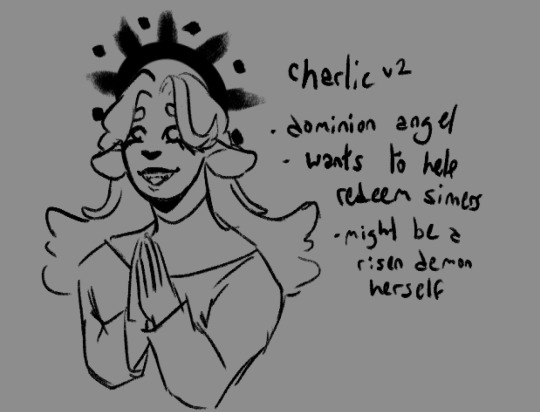
the second idea for charlie has her as an angel. specifically i casted her as a dominion angel due to their reputation as holy judges. she was once a demon but has been rehabilitated and has risen into angelhood! she now wants to help her former kin do the same and redeem themselves in heaven's gaze. again, similar cheery personality, but a bit more prudish in this rendition
tangent time!
as a side tangent, valtiel and charlie would have a different relationship in this rewrite. their relationship felt shoehorned in in the original show, like it was just there for the hell of it. we didn't see much development between them and it just felt kinda bland. so in my rewrite, charlie and valtiel are amiable exes. they tried dating when valtiel first fell (when charlie was still a demon in the charlie-angel version) but realized their feelings for each other were much more platonic than romantic. they ended things off on good terms, deciding they were much better as friends. they are still besties to this day! later charlie ends up with emily (or 'ellie' as i plan to rename her)
back to the characters
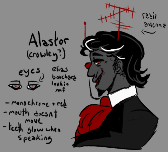
Alastor:
note: i made alastor mixed-race, which could be seen as bad by some due to vivzie saying he's black. however, as many have pointed out, he has no ethnic features whatsoever and i honestly wouldn't be surprised if she said that just to get away with using voodoo symbols (a closed religion) in his imagery/design. like viv, i am incredibly white and have little to no knowledge of voodoo, and even if i did i would not use it for something like this anyways due to the stigma the religion already has and (again) it being a closed practice. as such i removed it from his concept altogether, but made him mixed race (white passing) because.. why not i guess, i forgor my actual reasoning
with that being said...
alastor is by far my favorite of the redesigns and i'm honestly tempted to turn him into a legally distinct oc. i imagine he's somewhat reserved, along the lines of norman bates albeit a bit more extroverted. during his life he was a serial killer with a day job as a radio announcer. he took pleasure in reporting about his own murders on the radio, but that is eventually what got him caught (ie accidentally letting slip info that wasn't released to the public). as a result he was sentenced to death. upon arriving in hell, he quickly rose through the ranks to borderline overlord status and is a feared presence by demons and sinners alike. why is he bothering to assist in the hotel project? who knows... his motives are a mystery, like the rest of what he does
(he isn't actually alastair crowley i just thought the naming convention was ironic. however he may have also dabbled with satanic magic in lifetime..)
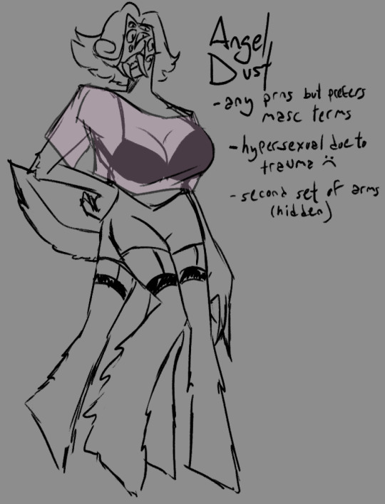
Angel Dust:
TW: brief discussion of SA
this is definitely my second favorite redesign. i loooove insect themes and wanted to do more than just Extra Arms, so he now has fucked up legs and a lot of eyes too! story-wise, angel used to be a criminal mastermind, hated by both the mafia and the feds. he was a gentleman thief, arranging massive heists under the cover of night while also partaking in the occasional drag show. he ended up a cocaine addict later in life, which caused his work to become sloppier. eventually he was killed in a heist gone wrong, specifically shot by the police.
i'm not gonna go too in-depth on the SA part of his story, but he is hypersexual due to being assaulted in both his life and afterlife. it would be something he'd be working on in the rewrite. his reason for coming to the hotel in the first place may have even been for help with this trauma. underneath his sultry exterior is a broken guy who really just needs someone to care about him for who he really is and not for what his body can do.
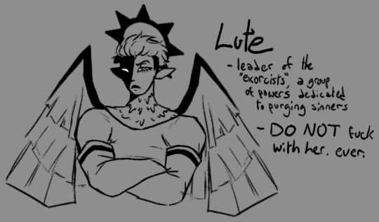
LUTE:
so lute and adam are some of the characters i have the most gripes about. the biggest one being why viv chose adam as the leader of the exorcists in the first place. if she wants a biblical figure tied to demon killing, Archangel Michael is RIGHT THERE, aka the one destined to kill satan during the events of Revelations. if she wants the first human to die, that would be Abel, not Adam. and i kinda doubt abel would want to do the stuff that HH!adam has been doing. if she wants an angel related to torture, Dumah is her guy! an angel that rules over wicked souls and tortures sinners every day except sabbath. so many better options...
with that out of the way, Lute is still the lieutenant of the exorcist, who are a specially chosen group of powers sent to purge hell once a year. think navy seals. she's pretty much the same as in the show, albeit more muscular and visually different from other exorcists (seriously why do they all look exactly the same?????) she's a very repressed lesbian who hasn't had time to work on that due to her duties
i also redesigned the exorcist uniform/armor because those LED purge masks are fugly as hell and their clothes don't even look remotely like armor.
Adam + Final Thoughts
i did start a redesign of adam but got bored of it. regardless, i think he'd be the head of C.H.E.R.U.B. instead of the exorcists. he doesn't want his children to make the same mistakes he and eve did, so together they started C.H.E.R.U.B. to help lost souls stay out of hell
final thoughts uhhhh i'm tired. show sucks, it had so much potential but viv ruined it by being a shitty writer and an even shittier person. the designs are fine i guess but they all look exactly the same and are in desperate need of variety. the humor is dogshit, saying dick and balls and penis over and over and over again doesn't make it any funnier than the first three times you made that joke. anyways that's it, i hope you liked my inane ramblings. gonna go vanish for another forty years or so, adios
#am i gonna do more? idk. we'll see#oh boy sorry about the seventy million tags#i eat bees#artist#oc artist#artists on tumblr#artist on tumblr#hazbin hotel#hazbin critical#hazbin redesign#hazbin rewrite#hazbin hotel critical#hazbin hotel criticism#hazbin hotel critique#hazbin hotel redesign#hazbin hotel rewrite#hazbin hotel vaggie#hazbin vaggie#hazbin hotel charlie#hazbin charlie#hazbin hotel alastor#hazbin alastor#hazbin hotel angel dust#hazbin angel dust#hazbin hotel lute#hazbin lute#hazbin art#hazbin hotel art
743 notes
·
View notes
Text


old dancestors designs things mentioned on the last ask post. they were on my twitter and arreee from about 11 months ago or something. designed them to be more like how the original ancestors were stylized like silhouettes
and whatever the fuck this is from around the same time. represented in a less symbolic manner??
2K notes
·
View notes
Text
How they choose an engagement ring for you
Short little headcanons (scenarios?) about how the boys go about picking the perfect engagement ring for you.
Features: Diluc, Kaeya, Childe, Zhongli, Ayato, Itto, Kaveh, and Alhaitham. Reader's gender isn't mentioned, but Ayato's part implies fem!reader.
🦉Diluc – The more time Diluc spent with you, his lover, the more sure he was that you are the one. He knows he wants to spend he rest of his life with you, and so he decides to ask you to marry him. But first, he must find the perfect engagement ring to convey his sincere feelings for you. The Ragnvindr family is of noble origins, and Diluc is no stranger to expensive and beautiful jewelry. He decides to have your ring custom-made to ensure it encompasses all your favorite design elements. Diluc wants it to appeal to your tastes as much as possible because he wants you to like it, and he’s more than willing to spend extra mora to achieve this. The engagement ring will look beautiful and feature a garnet as the centerpiece—specially requested by Diluc. Garnet symbolizes unconditional love and protection for one’s partner, and Diluc swears to love you unconditionally and keep you safe for as long as he lives, even if he doesn’t say it aloud. He takes a more traditional approach in asking you to marry him, first wining and dining you before taking you out to a scenic place. He’ll get down on one knee and show you the ring, finally asking the question. It will be one of the few moments in his life where he will bare his heart to you and leave himself vulnerable.
🦚Kaeya – He never thought he’d find someone he’d want to marry, but here he is, browsing through Marjorie’s selection of engagement rings out of drunken impulse. He imagines how each ring would look on your hand, taking into account whether you would like the style and color because he knows your preferences down to a science. Kaeya tells himself this isn’t that serious, it’s just a fun little ‘what-if’, but he sees the perfect ring he knows will look stunning on your hand, and the same drunken impulse makes him buy it. Kaeya considers returning the ring when he sobers up the following day, but something stops him. He keeps telling himself he’ll do it later, but that later never comes. Days turn to weeks, and week into months, and that ring still sits in its box in his pocket. He’s joked about marrying you plenty of times before as a form of flirting, but asking the real thing feels impossible to Kaeya. It’s not until you find the ring by pure accident and piece things together yourself that the impossible turns to reality. Kaeya will play it cool and try to make light of the situation, but internally he will be a nervous wreck. If you accept, he’ll be over the moon, but if you reject him, he’ll be crushed.
🐋Childe – Nothing is too expensive for Childe to afford, especially if it’s a gift for you. While picking out an engagement ring for you, he will focus more on the look and style of the accessory rather than the price. His main concern is finding something he thinks you will like and will look good on you; he’s literally not concerned about the price at all. Childe buys you a ring with a large gemstone in your favorite color and an engraving on the band about his undying love for you. The Harbinger loves spoiling you by giving you gifts since it’s one of his love languages, and to him, nothing speaks louder than an engagement ring of the highest quality money can afford. Plus, an extravagant and expensive-looking ring will clearly indicate to other men that you are taken and provided for. It’s both a show of love and a means to stake his claim. He’ll wine and dine you before posing the question and pulling out the ring. Childe will be visibly excited because he really wants to take your relationship to the next stage—he knows he wants a future with you, and he hopes you do too.
🔶Zhongli – Another man that’s not concerned about the price when purchasing you the ring (Hu Tao will chew him out for putting the bill on Wangsheng Funeral Parlor’s tab again). Zhongli has a very discerning eye when it comes to minerals and craftsmanship. He carefully appraises every ring on display, studying the quality of the metal in the band, the cut and polish of the gemstone, and the skillfulness of the craftsmanship. He will easily spot any flaws in the ring’s design or any fakes that a sneaky merchant might try to sell, so rest assured that you will receive a ring made of only top quality materials. He takes his time in selecting the perfect ring. His love for you is pure and true, and he wants the ring to reflect that. Anything less than the best won’t convey his feelings for you properly, or so he thinks. He’ll take you out for dinner first and then on a nice stroll around Liyue Harbor before asking the question and pulling out the ring, being very charming and polite as he does. He’s very calm about the whole thing, but will hide his disappointment if you say no.
🧋Ayato – After the passing of his parents, Ayato kept their wedding and engagement rings as a memento of sorts. The rings symbolized the loving bond between his parents, and he wanted to remember that. When Ayato developed a deep, intimate bond of his own with you, the thought of marrying you crossed his mind. He knew he could easily afford a high-quality, expensive engagement ring since he was the head of the Kamisato Clan, but he ended up choosing to give you his mother’s engagement ring. The passion and love that his father harbored when giving the ring to his mother are the same feelings Ayato feels towards you. In his mind, this engagement ring is the perfect physical representation of those feelings, and also a good way to welcome you into the Kamisato family. He would be slightly nervous about asking you to marry him, but he would hide his nervousness well. He truly wants to form a family with you, but he’s aware being the spouse to the Kamisato Clan head will come with it’s fair share of responsibilities, and he will understand if you choose to reject him. But if you accept, then Ayato hopes to use his parents’ old wedding rings during your marriage ceremony too.
🐂Itto – It is well known that Itto barely has a single mora to his name. The man can barely afford to buy food much less an engagement ring. Itto thought about giving you a cheap imitation of one, or crafting one out of flowers because it’s the thought that counts, right? But after some thought, he decides that no, he wants to get you a proper ring to show you how serious he is about wanting to marry you. With his mind made up, Itto will work hard to earn money by taking on various odd jobs. He can’t hold down a single job for long, but for the sake of your ring, he tries. It takes the oni a long time to scrounge up the necessary money because he will turn down any help from his gang members. He wants to obtain the ring through his own effort and nobody else’s. Itto won’t be able to afford a fancy ring with the money he saves up, so expect it to look simple but tasteful (thank Shinobu later for helping Itto choose a nice ring for you and avoid getting scammed). His proposal will be public and flashy, but he’d be really nervous about asking you to marry him, even dropping the ring and almost losing it because of his nerves, but rest assured you will receive it.
🍷Kaveh – The architect is very picky when it comes to choosing you gifts, more so this time since it’s an engagement ring to you from him. Kaveh went to a local jeweler to look at their selection of engagement rings, but he wasn’t satisfied with anything they had. This ring’s jewel is the wrong size, that ring’s metal is the wrong shade, and this one’s design isn’t pretty enough for your likeness. Disappointed, Kaveh decides that he will make you the perfect engagement ring himself. He takes weeks to design it, filling his sketchbooks with sketches of potential designs and crossing off failed attempts before he finally settles on one he thinks will look perfect on your hand. When the time comes to craft it, Kaveh buys only the best quality materials, taking on more commissions to be able to afford them. He works on the ring in his spare time, being careful to ensure every aspect of it looks as perfect as his artistic skills will allow. Once its finally finished, Kaveh feels proud of himself, confident that his ring will be one of the most beautiful pieces of jewelry you will ever see—and it honestly is. Even so, he’s still nervous about actually popping the question and giving it to you. When he finally works up the courage, he will take you out on a super romantic date that’s been planned down to every detail. The only unpredictable part about it will be your response to his proposal.
🎧Alhaitham – He’s not exactly frugal when it comes to buying things he likes or thinks are necessary, but he won’t buy you a super expensive engagement ring. In fact, he will get you a simple silver ring with minimal decoration. Haitham prioritizes function over fashion. He doesn’t see a point in giving you an extravagant and flashy ring that would probably hinder you in your daily activities when a simple ring will serve the exact same purpose and be less bothersome. But just because it doesn’t look extravagant doesn’t mean it’s cheap. Oh no, Haitham makes sure the metal is the real deal and made by a professional craftsman. He understands this would be a big step in your relationship, and he wants the ring to convey the seriousness of his feelings for you. The Scribe also won’t make a fanfare out of gifting it to you, he will simply pose the question during a calm and private moment between the two of you. He won’t show any nervousness or excitement on his face, and will be very understanding if you refuse but a part of him does hope you will agree. Haitham seldom likes to spend his time in the company of others, so for him to want you to be a permanent part of his life speaks volumes to how much he loves you. Not having you be a part of his life would certainly leave a mark on him.
#genshin impact x reader#genshin x reader#kaveh x reader#alhaitham x reader#childe x reader#diluc x reader#diluc ragnvindr x reader#kaeya x reader#kaeya alberich x reader#zhongli x reader#tartaglia x reader#ayato x reader#kamisato ayato x reader#itto x reader#arataki itto x reader
1K notes
·
View notes
Text
October 5 2023
I changed things up because it's got Frontiers Final Horizons Spoilers. I know the updates been out for like 2 months now but I'm being really cautious.
Super Sonic was really fun to play in the base game, having the auto combo thing on and just seeing so much bombastic energy and over the top moves being thrown at giant titans was so much fun.
I did however, not read the instructions where they tell you to hold the parry, I thought it was a perfect timing thing like a normal parry. So fighting Giganto and Wyvern for the first time was a nightmare for me until I actually read the instructions. =v='
For the design, I didn't change much, Super Sonic is really cool. I basically just changed the green parts of his shoes to red to reflect his new eye color.
Super Sonic² was so cool! The casual backhand slap, the sass, the move where he basically does the idw move, the finger point when he gets back in the game!
The only issue I had is that I didn't understand at all how to fight the final boss. I didn't 100% complete the map so I didn't get the hints. (I am still stuck on the stupid ball hoop map puzzle thing, I swear there is no way to do it) So unfortunately, I had to look up a guide. That kinda dampened the experience, but there was no way I was fighting Supreme over again, getting to the same glitch because I killed him too fast, and then fail the final boss fight again because I didn't know I was supposed to press r2.
I made his quills seem like they are turning into flames at the tips, I made his torso kinda have a sun symbol on it, I made his secondary fur white and his base fur/ quills bright yellow to kinda give it more sun imagery. His arm patterns are a little more detailed, his gloves have kinda formed into the body, making the cuffs look like they're on fire too. His socks turned into bandages and blue rings floating on him with the soles of his shoes kinda smoking on the back. It was a lot of fun interpreting this design differently, giving it a more ancient vibe with a modern twist. The original design is still really cool too!
Cyber Super Sonic... one of the coolest forms in my opinion and yet we see him for less than a minute in only a cutscene. I'm not complaining, the cutscene was so cool! Me and my sibling were star struck when we saw it!
I love the Fleetway elements! The sharp teeth, the crazy eyes, the chaotic behavior that almost made it seem like if Cyber Super Sonic wasn't being literally shot out to his enemy, he'd not be able to tell between friend or foe! God, it was so cool!! Even if it was just limited to a cutscene where you can barely see the entire design in a single image!
I did actually have a static version of this image too, but I'm not including it because it gave me eye strain, and I don't want to hurt you.
For the form I actually decreased the amount of polygons on Sonic. If you look, he's more angular & simplistic and his legs and arms are rectangles! I thought it'd help give him more of a Cyber Computer vibe. I used the blue static and made it kinda an accent color so you can see where things are. I don't really know why, but I also made some parts of him detached? The inside parts have the white spirals that Cyber Super Sonic's eyes were.
The update was a lot of fun to play when it came out, even if it was EXTREMELY challenging for a casual player like myself. Almost made me quit a few times and a couple guides were begrudgingly looked up. Playing as Tails and Amy were definitely the highlights of the update for me though. I hope it was as much fun for you as it was for me. :)
#sonic the hedgehog#sonic fanart#sonic frontiers: the final horizon#sonic frontiers#super sonic#super sonic 2#cyber super sonic#The backhand slap was probably the coolest thing Super Sonic has done in a while. In my opinion.
709 notes
·
View notes
Text
The Submas Designs are a lot more clever than you thought.
First lets look at the Submas overall design. We know that the original design was intended to make the Subway Bosses look like clowns and kind of creepy (that backfired); hence the comically large shoes and exaggerated expressions. Let’s start to break down each part of the design.
To begin, The Submas extreme expressions are a possible reference to the symbol of theatre; the mask of Tragedy and the Mask of Comedy. The mask of tragedy is commonly portrayed frowning ( not necessarily cry) on a black base mask while the mask of Comedy is portrayed smiling on a white base masks. Sometimes these masks are gold or split black and white color. The masks together represent the two extremes of the human psyche. Definitely the contrast we see between Emmet's smile and Ingo’s frown.
Next up, the coats. These are obviously designed to look like train tracks. The vertical grey lines representing the rails, the red brown the tie (the wood connecting the rails), and the buttons are the spikes that secure the track. You can see the pattern best on the back of the Submas coat. Looking at it you could laugh and say “I guess that makes the Subway boss themselves the train”, and you know what? You’re right.
This brings us to the most interesting part of their design, the color and pose. Yes, there is an explanation to the silly pose too. It’s so silly that we can just brush this whole design off as being another funny Pokemon character design; but unfortunately it’s actually thought out.
The Submas themselves are the New York Subway. Or at least they are the personified version of it. Let’s look at the colors again. Black and White. Very fitting for a game literally called Pokemon Black and White. That alone brings us to some interesting comparisons with the game themes and pokemon.
Kudari or (Emmet in the English version) wears all white. He values routine and rules and is ultimately pretty point blank. We can easily make that conclusion that Emmet represents Reshiram and truth. If we break down his name we see that in Japanese it means something along the lines of “down train” or moving away/going down hill. The different translations usually mean the same, except the name “Emmet” is a bit out of place. A lot of people say the Submas names in English are most likely to be puns of “Ingoing and Emitting”. But my crazy self did more digging and found that Emmet means “truth” specifically universal truth. This name goes back to old German, Irish, and even Hebrew. All looping back to Reshiram and themes of the game. (On a funny side note, Emmet is also the Cornish word for ant; so Emmet having a Durant is really funny. )
Next up is Nobori or Ingo who wears a black coat and appears frowning. Despite that , his is very encouraging and excited about moving forward. This makes sense since the name Nobori in Japanese more or less means to move up/forward ( specifically up a mountain). That’s why a lot of people believe that the poor man was eebie deebied for the pun because Warden Ingo works on Mt. Coronet. In English, Ingo is thought to be a shortened version of “Ingoing” which also aligns with not only the Japanese name but the character’s reoccurring theme of progress, moving forward, and ideals. In this sense Ingo very much represents Zekrom and ideals.
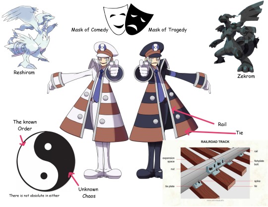
Truth and ideals, Reshiram and Zekrom, Tragedy and comedy, white and Black. All very good interpretations and symbolism for two funny train men. I would be satisfied with just knowing that, but no; the Submas are also a funny gijinka of the New York Subway. This is the part the has me laughing at how simple it is and yet we just easily accepted that they were just a bit strange.
Take a look at this. This is a Zebra Board.
Yep, it’s black and white. And do you know what? This MTA sign only appears in the New York subway. What does it do? These are used by conductors to indicate safety and that the train has lined up in the station. Every time the subway comes into the station, the conductor has to physically point at this board/bar to indicate that it is safe for the doors to open. The action is called "point and call" or "point and acknowledge". This practice is used in a few other train/subway stations (such as Japan), but the black and white board is New York specific. The pose of the submas suddenly makes a lot of sense.
Other Important notes observations.

The Submas face represents the front of the train. So their eyes are the lights (hence Ingos glowing eyes in PLA), their side burns are cow catchers ( see graphic), and the Medalion on the hat is round like a train number plate. Another interesting thing is that the Submas use airline Captain Pilot hats like Japanese train conductors use. The only part of their outfit that confuses me is the arm bands. This is more of a police uniform element and not a train conductor thing.
so to conclude, the Submas are basically a reference to in game themes, Reshiram/Zekrom, Trains, and literally the New York subway
I am not an expert. These are just my observations. I could be completely wrong. Take and add what you would like to. If you have more to add about the design, feel free to reblog that info. I would also like to see your interpretation.
#submas#ingo#emmet#subway boss ingo#subway boss emmet#kudari#nobori#warden ingo#pokemon submas#this took too long and I can't look at it anymore please ignore the spelling errors#ill come back and fine tune this later#but this is the basic info#I still have more to say about them though i will leave it for another day
1K notes
·
View notes
Text
I'm SO excited for Castlevania Nocturne season 2 because not only did they bring back my fucking favorite character but they gave him the design from the games and I think it's going to mean so much for the next season !!!!
I get that people were fine with the old design, but this time, Alucard will be completely different from the original Castlevania. When we met him, he was basicaly an angry teenager who had just experienced his mother's gruesome death and his father's descent into madness. He was totally unstable, still searching for himself and his place in the world. I'm guessing that around 200 years passed between the two shows, and we're not meeting the same Alucard, this is literaly another version of him, a version who's grown, more sure of himself, who fully lives up to his legend. It's no wonder Richter calls him a myth : Alucard has become the warrior/hunter of evil he was born to be and this new design symbolizes the difference. I mean, his very existence is the living proof that love resists everything, even vampirism. He's so calm and composed when fighting because he is who was meant to be, finally. This is so exciting AAAAAAAAH

1K notes
·
View notes
Text
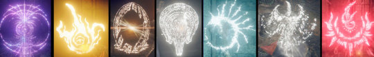
Elden Ring Sigils and Color Theory

Elden Ring magic sigils sorted by color. Long post about their lore, meanings of certain colors and what it can reveal about the story of Elden Ring under the cut.
In this post, I will be going over why it is important to have a good understanding of color and meanings associated with color in the context of lore. In a game, color is used by developers for more than just drawing the world, it’s about creating visual language, a bridge between writers and players. There are countless articles about usage of colors in videogames, but in this post I will try to reverse-engineer the process and find out the meaning behind visual symbolism and combine it with game’s equivalent of heraldic symbols - magic sigils.
In Elden Ring magic sigils have been used to represent origin of sorceries and power sources of incantations, usually they give us hints what kind of deity is worshipped by people or who created the spell. They are an invaluable source of information on history on the Lands Between. I’ve been already playing with idea of color sorting when I did the same thing with remembrances, but sigils revealed even more secrets about story and lore. How about origin of life on the Lands Between? Origin of the outer gods? But let’s not rush.

The first category, Blue Sorcery as I called it, already shows how color sorting method is supported by the game itself. With a help of descriptions we can place the sigils in the chronological order and track the change in design over the course of story such as replacement of flowing weapon in the sigil of Eternal Cities to Carian sword. Their sigils are incredibly similar to each other, solidifying connection between Nox and Carian royal family; both factions are associated with silver, sorcery, artifical life, moons and stars.
This talisman represents the lost black moon. The moon of Nokstella was the guide of countless stars (Memory Stone)
The young astrologer gazed at the night sky as she walked. She had always chased the stars every step of her journey. Then she met the full moon—and, in time, the astrologer became a queen (Stargaizer Heirloom)
Moons played a central role in Nox and Carian culture, the circle is a base shape for both crests, however, while Raya Lucaria sigil shares similar elements with Eternal Cities and Carian emblems (glintstone sorcerers are the descendants of astrologers, a fact that the Carians remain aware of, - Preceptor's Long Gown), this part was drastically redused in size and moved on top; the central place is taken by the star and framed by a pair of cuckoos. The hue of sigil is also significantly different from cold blue tones of Nox and Carians emblems, the warm greenish tint is close to the color of primeval current spells, which were banished once Rennala became rector of the Academy.
These scholars, who sought to master Carian sorcery, instead learned to see the moon as equal to the stars. This robe, in the hue of the full moon, signifies their heresy (Lazuli Robe)
(Cuckoo Greatshield) Boasting high magic damage negation, this shield is used to hunt down mages. "Our enemy is none other than Caria itself."
So far I’m not going to delve deeper in the roots of the conflict between Carian royal family and Academy of Raya Lucaria, it’s a mere demonstration of a method and how it works. But in next paragraphs I will use it as evidence for a few theories about worldbuilding.
(thanks for clarification about Malenia’s Crest, I rewatched fight on youtube and, yes, it’s a normal Raya Lucaria sigil)

Golden incantations is the biggest group on the list, in a way I can say that history of the Lands Between is a history of gold. Here we can see a symbolical depiction of the Erdtree, the central piece of the game both in a metaphorical and literal sense; we can track how portrayl of the Erdtree changed during Marika’s age until it was replaced altogether by the abstract emblem of the Golden Order Fundamentalism. I have a lot of to say about this group and currently working on post with a more detailed investigation, so far I will touch only basics: such as origin of life gold.
Gold in Elden Ring is more than than shine metal or a color, it’s prima materia of the Greater Will, a force of unknown origin (it’s never called 神 god or an 外なる神 outer god anywhere in EN or JP script and before jumping to conclusion wait until I’m going to observe confirmed outer gods) which is responsible for the creation of Elden Ring. From the description of Elden Stars, the most ancient incantation in this category, and Elden Remembrance we can figure out keywords associated with the Greater Will:
It is said that long ago, the Greater Will sent a golden star bearing a beast into the Lands Between, which would later become the Elden Ring/It was the vassal beast of the Greater Will and living incarnation of the concept of Order (I’d like to point that it’s “Order”, not “The Golden Order”).
(I believe we still can see remnants of the golden star in a form of meteorite ore in Divine Towers and Sealed Tunnel near Erdtree)
In other words, the Greater Will is about gold, Order and everything Elden. However, a common mistake is to tie the Greater Will to the Golden Order, despite the name the latter is not representative of it, even more so... original gold from the golden star wasn’t yellow.
From dialogue with Sellen we can learn that stars are containing amber, but golden stars are kind of special:
Golden amber contains the remnants of ancient life, and houses its vitality (Sellen)
And Hyetta’s speech supports futher that the Greater Will is responsible for creation of life in one way or another:
…すべては、大きなひとつから、分かたれた 分かたれ、産まれ、心を持った
けれどそれは、大いなる意志の過ちだった だから、戻さなくてはならない
All that there was divided from the One Great. Divided, born and given heart. But it was a mistake of the Greater Will (Hyetta)
So, Miyazaki pretty much unitied theories about meteorites being consensually considered to be involved in the origin of life and primordial soup:
Meteorites could have been responsible for delivering the basis of life's genetic code. Analyses of three meteorites suggest that nucleobases, the crucial components of DNA, could have formed in space and then fallen to Earth to provide the raw material for the origin of life itself
For nearly nine decades, science's favorite explanation for the origin of life has been the “primordial soup”. This is the idea that life began from a series of chemical reactions in a warm pond on Earth's surface, triggered by an external energy source such as lightning strike or ultraviolet (UV) ligh
Now if we check descriptions of Crucible Aspects and Crucible Knights items we can find out that original gold had rent tint.
Holds the power of the crucible of life, the primordial form of the Erdtree. Strengthens Aspects of the Crucible incantations (Crucible aspects incantations)
This sword is imbued with an ancient holy essence. Its red tint exemplifies the nature of primordial gold, said to be close in nature to life itself (Ordovis Greatsword, the name itself is a reference to Ordovician Period, part of the Paleozoic era, a rich variety of marine life flourished in the vast seas and the first primitive plants began to appear on land)
Ancient Erdtree/Crucible emblem is slightly reddish too, however, the modern gold is more pure and yellow, the gold of the Golden Order. The sigil changed the color too and lost the root part just like the Elden Ring itself if we compare modern depiction with Farum Azula mural:
The Golden Order was created by confining Destined Death. Thus, this new Order will be one of Death restored
But a gold is a gold, even though it’s different, but as Turtle Pope said heresy is not native to this world and everything can be cojoined:
The worship of the ancient dragons does not conflict with belief in the Erdtree. After all, this seal, and lighting itself, are both imbued with gold
Yes, the Greater Will governs everything what is golden.
And yet, the young Miquella abandoned fundamentalism, for it could do nothing to treat Malenia's accursed rot. This was the beginning of unalloyed gold
I can already hear the raise of pitchforks from certain kind of Miquella fans, so let’s talk about outer gods and what exactly they are.
With a surprising exception of emblem from the Scepter of the All-Knowing (Gideon, I have a few questions for you) all sigils in Red Group are assigned to the deities: outer/ancient god of Rot, outer god Formless Mother, Rykard’s immortal serpent and Fell God, who is bit tricky, it’s ambitious if 古い火の悪神 “ancient” is applied to the god or fire. The only confirmed outer gods, who didn’t made it here is an outer god of Deathbirds and Frienzied Flame. Considering theory that removal of the Destined Death from Elden Ring drained color from the god-slaying Black Flame and eclipsed sun of outer god of Deathbirds, I can suggest that original color of their sigils was red too.
Long story short: sigil of the outer gods and other unwelcomed deities are represented by red color and they are all related to the death, Formless Mother is about bleed, fell flame is burning, rot is decay, etc.
However, as stated in the description of Ordovis Greatsword, primordial gold of the Crucible had a red tint that was lost when Marika estabilished Golden Order by sealing away red Rune of Death; and this knowledge eventually leads to conclusion that...
Outer gods aren’t aliens. What a surprise.
They are natural powers that were screwed by the removal of Destined Death, when they got outed from the Golden Order. They are red tint of the primordial gold.
Once the concept of Death was banished from the Lands Between the elements and effects linked to it - death, decay, combustion, bleed became outer to the newly estabilished Order. There is a clear thematic difference between celestial Greater Will, who isn’t even presented on the Lands Between, and actual outer gods, who can be sealed or banished, more over there are no outer god of water, sunshine or happiness, they are all linked to the side-effects of death. When death was excluded from the Order, they were affected as well.
The thing is that gold in Elden Ring is a magical substance and changes the tint depends on the currently running Order, which is shown in the endings when Golden Tree (黄金樹 that’s how Erdtree is called in JP) acquires different hue. It’s another overlooked element of visual storytelling.
This Golden Order is something that the Elden Ring may have once represented, but not directly. It’s more about how you apply those rules and how you enforce them on the physical world and what effects they have on it, - Miyazaki in interview to gamesradar
(Golden Order isn’t direct representation of the Greater Will/Elden Ring as it was said by Miyazaki himself, it’s only one temporary set of rules)

Elden Ring consists of runes and even newly discovered mending runes (concepts) can be added to the system (regression is the pull of meaning; that all things yearn eternally to converge) ot removed and the gold will respond to it by changing the color and reshaping reality according to the Order (causality is the pull between meanings; it is the connections that form the relationships of all things). Elden Ring - Rune of Death = yellow gold and banishment of ancient gods, who were associated with death, Elden Ring+mending rune of a choice=see example aboive.
For futher evidence that gold changes metaphysical properties and in the current state (Golden Order) preserves things from not only from dying, but decomposing too, I want to bring a few descriptions:
Fresh beast blood, glinting with gold. Material used for crafting items. Found by hunting carnivorous beasts.This glimmering blood never rots or decays ( Beast Blood)
Someone's excrement. It has a golden tinge. Material used for crafting items. Gold-tinged excrement is a highly stable substance; it doesn't dry out, nor does it lose its customary warmth or scent. For better or for worse, it remains as it is (Golden Dung; I can’t believe I’m using description of literal sh/t to prove my point)
However, from what we know only Rune of Death was sealed, and while outer gods’ influence was seriously weakened, it still existed. This is why Miquella abandoned Golden Order and was working on development of his own gold, even more pure and untainted, before he got mohgged:
Unalloyed Gold Needle: An intricately crafted needle of unalloyed gold. A ritual implement crafted to ward away the meddling of outer gods, it is thought capable of forestalling the incurable rotting sickness.
Now let me clarify: community’s favorite boogieman “influence of the evil alien outer gods/the Greater Will” isn’t a thing in a sense that there is a group of invaders from the outer space trying to enslave the Lands Between. Even thought 外なる神 is used in Japanese media culture for lovecraftian beings, we should remember that history is fabricated by the Golden Order in Marika’s favor; "outer gods” are alien to the current Order”. Same goes for the influence of the Greater Will, it was never about mind-control or whatever was projected onto it, the influence of the Greater Will is simply how Order and gold are changing course of the nature.
Last thing I want to add is that influence of the outer gods isn’t always about destructive powers (Order of Rot is about decay and rebirth), but I’ll leave it for a dedicated post.
In Mixed Group I put sigils with unique or unknown colors.
In my first draft Dragon Communion was placed in the Red Group for the intense hue of sigil, but upon futher research I decided to move it here. The power of Dragon Communion incantations doesn’t stem from any patron god or the assigned star (unless I missed something); they are scaling from arcane, an inner force of the caster.
Violet is an interesting choice for Gravity sigil because this color, albeit with the less intence hue, is used for sleep status and associated items.
I like how yellow color of Frenzied Flame is similar to the gold of the Greater Will, carrying the theme of duality, yet the shape of the sigil is distorted and assymetrical. In fact, designs of the ancient sigils usually is far less complex than intricate shapes of newer ones (with a few exceptions). Just to be clear, even though influence of the Flame of Frenzy can be cleared by Miquella’s needle, the game never calls it an outer god. It’s a matter of semantics, but I guess that unlike crew from the Red Group it was never booted from the Order since Chaos and Order can’t naturally coexist, but there are a lot ot of to speculate about, considering drastic changes in Frenzied Flame quest and lore.
Golden star in the centre of Bestial sigil reminds of Cinquedea dagger (Short sword given to high ranking clergymen of Farum Azula. The design celebrates a beast's five fingers, symbolic of the intelligence once granted upon their kind), which shows beast’s arm holding golden slab.
So, Death spells. I believe that both Black Flame incantations and Death Sorcery of Deathbird outer god were affected by confining of Destined Death.
The black flame could once slay gods. But when Maliketh sealed Destined Death, the true power of the black flame was lost
Storied sword and treasure of Castle Sol that depicts an eclipsed sun drained of color.The eclipsed sun, drained of color, is the protective star of soulless demigods. It aids the mausoleum knights by keeping Destined Death at bay. Mausoleum Knight Armor: The wing-shaped ornaments on its back evoke the Deathbird
And, as I’ve been already pointing in a different post, death of Godwyn brought back forgotten death sorcery that almost ceased from existance during age of immortality, but was rediscovered
Death in the Lands Between is incredibly complex subject and deserves a series of posts, even though I believe there should be DLC because so far all lore related to it seems to be incomprehensible.

Unmarkered sorceries don’t have background sigil, but they all share something in common. They originated from the Mountaintops of Giants:
Zamor Ice Storm: Ice sorcery of the Town of Zamor.Strike the ground with the staff to create a freezing tornado. Charging enhances potency. Cloaked in icy tempests, the knights of Zamor have challenged the Fire Giants since ancient times.
Briars of Sin : An aberrant sorcery, discovered along with red glintstone by those exiled to the north for their crimes.The Academy reviles this sorcery, which draws its power from faith
Founding Rain of Stars: The eldest primeval sorcery, said to have been discovered by an ancient astrologer. A sorcery of legendary status.The glimpse of the primeval current that the astrologer saw became real, and the stars' amber rained down on this land. Sword of Night and Flame: Astrologers, who preceded the sorcerers, established themselves in mountaintops that nearly touched the sky, and considered the Fire Giants their neighbors.
Another interesting details to consider is that they are all in some ways are unwelcomed or straight up heretical. It reminds me of relationships between Golden Order and remnanats of the Crucible. Aberrant sorcery is a mark of sin, primeval current was banished and cold sorcery is veiled in occult mystery:
The snowy crone taught the young Ranni to fear the dark moon as she imparted her cold sorcery.
I guess Ranni’s secret mentor is called snowy crone for a reason.
That’s being said, everything I wrote is a subject to change as DLC may reveal more details or I will reconsider some parts under futher research. But overall I think it was an interesting experiment.
読んでくれてありがと
#elden ring#ranni#miquella#elden beast#elden ring lore#lore theories#outer gods#elden ring sigils#ask opened again for 1-2 days#I have a lot of ideas about silver#malenia#hyetta is underrated#it's frampt/kaathe is all over again#elden ring - unique fantasy take on evolution#paleontology#heraldy#physics#colors#western fandom: we know exactly one holy book and view everything through the chr/stianity lenses#yet another day of me hating translation of root resine
5K notes
·
View notes
Last Seen Blogs
e-nid
Say It Again, Darling.

akhtarmorse13
The Blogging of Hopkins 425

everyspit
Spitting Alphas
atlawritingprompts
Avatar: The Last Airbender Writing Prompts
lcattay
One Word After Another...