#yellow and red colour scheme—check
Text
ATLA X One Punch Man crossover where pre-iceberg, ponytail!Zuko sees saitama punch smth and produce a shockwave so air-distorting he’s immediately like, “the avatar” with this squint on his face.
Then the camera cuts from their serious expressions to saitama’s deadpan, “eh?”
#cue saitama#confused as all hell after being isekaid into a world with badger-moles and squirrel-monkeys or wtvr#futiley trying to convince this random angry teenager that he’s not some avatar.#if i had art skills i would so draw this#somebody else pls do it lol#one punch man#atla#saitama#zuko#avatar the last airbender#opm#i meannn#yellow and red colour scheme—check#bald—check#air-bending skills—check#‘this is clearly an air nomad!!’—zuko
4 notes
·
View notes
Text
If I were to make another Beads (also known as Chandelier) quilt, what should my colour scheme be? (You can see samples of the pattern if you check my “beads by jordan fabrics” tag)
I do wanna make another one, but I am tired of picking colours lmao
You can add pastels, brights, or darks in comments or notes if you want.
If there is a tie, I will incorporate both 😁
(am i trying to use up some of my stash?
yes.
do i have all these options in the right amounts in my stash?
…. of course i do.)
21 notes
·
View notes
Text
Hey! Recently I got the opportunity to do some work for shipwrecked, namely, character portraits for their D&D oneshot! I was lucky enough to do two characters, a little warforged named E.A.P, and the Mayor of a quaint town, Theopold Bergemire.
This is the link to Part 1:
youtube
I certainly had much more of a design process for E.A.P, due to the nature of warforged. Typically, warforged are sentient robots, made from wood, metal, stone and greenery. With that in mind, and with the information given about him, here's what I started with:

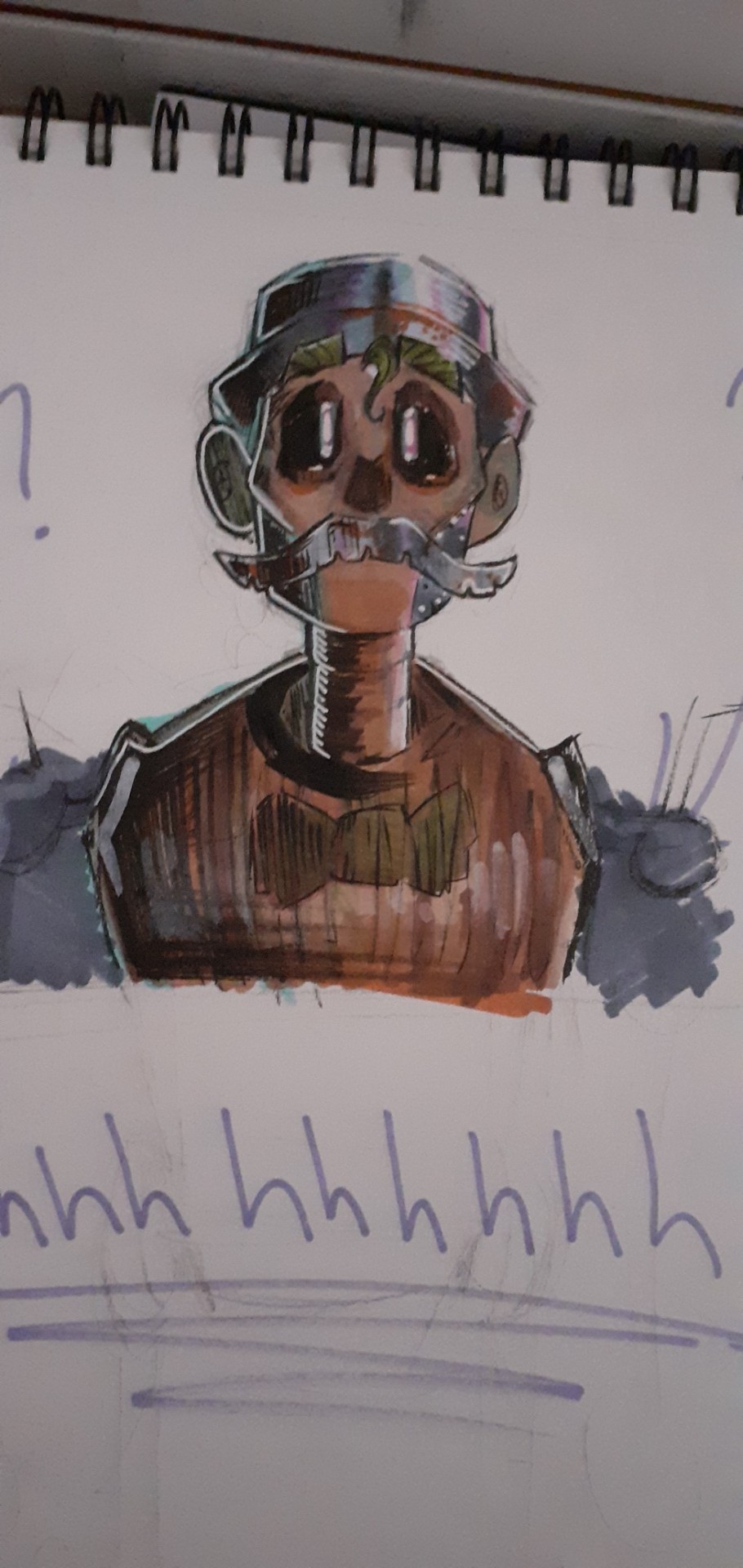
He was specified to have a metallic moustache and bowler hat, and I was given creative license with the rest, so with that in mind, I definitely wanted to keep his two defining features, well, defining. So, his face is made out of wood, with sort of metallic sideburny bits. Keeping with the nature colour scheme but adding a level of magic and supernatural life to him, I decided his eyes would be a bright, sort of lime green, settled in seemingly empty sockets.
His shoulders were difficult for me, I had no idea if I wanted them to be wood, metal ball sockets, or rocks. Eventually, I settled on mossy boulders, mainly because I figured they'd look the coolest!
And with a couple of tweaks from the sketches, I present: E.A.P

Secondly, I did the mayor, Theoplod Bergemire. There was less of a design/thought process behind him, and I just sort of went straight in with the final product. I definitely wanted his colours to be warmer, reds and purples are associated with royalty, and the idea of him being an ageing man had me thinking of someone with a sort of flushed face. A nicer Vernon dursely, maybe. Funnily enough, for his waistcoat I drew inspiration from a minecraft skin used by a Mayor character in an SMP I used to watch, and the pinks and yellows work well together, bringing out the warmth in his features, and the contrasting blue of his eyes.
Theopold:

Stern but soft, Theopold is definitely one of the better ageing men I've drawn.
Thank you for reading this far! And remember, go and check out the video linked at the top of the post.
#art#character design#artists on tumblr#shipwrecked comedy#shipwrecked plays d&d#dungeons and dragons#character art#Youtube
61 notes
·
View notes
Text
This blog is a 18+ space, Minors, do not engage. If you are under the age of 18 you are not welcome here. Please heed these warnings and the warnings put in place on each individual fic and chapter. Your reading and consumption of my work is your responsibility but I will endeavour to mitigate any discomfort for you, the reader, as possible. Once again, this is a 18+ space and minors should not interact.
Specific Warnings: None here reallly, some canon-typical violence, reader is a brat(but we all knew that right?), Grogu and Reader are menaces from the first second they meet, swearing, alcohol consumption, addiction reference(mild).
Summary: You're about to give up on your elaborate scheme, when a bounty hunter of unparalleled skill picks up your contract. The game is afoot.
Please consider checking out my ko-fi or patreon if you want to support me.
Thank you @reaperofmen for beta'ing this for me!!
[Bonus set after the series] Masterlist | Next Chapter ->
Tatooine
You reach the spaceport on Kamino a whole planetary cycle before the Wookiee bounty hunter Stiaarl if your calculations are right, and they often are. You spot her starfighter immediately and whistle low to yourself as you take in the beautiful craft. The Jedi interceptor sits pretty, polished Durasteel glinting in the bright artificial lighting of the hangar bay.
“Kriffer wasn’t joking when she said it was a beauty, shame about that monstrosity.”
You eye the modified cargo storage that’s been crudely welded between the landing gear. It’s like a low hanging belly, only just clearing the floor of the hangar. You shake your head morbidly at the idea of being stuffed in there if Stiaarl had caught you. You leap up onto the bright yellow fuselage with ease, making you way to the cockpit.
The bronze coloured Astromech docked in the front right side of the ship beeps at you in alarm, clearly noticing their master isn’t present as you override the cockpit locking mechanisms with your modified code scrambler. The Astromech’s ranting gets more frantic as it feels you shutting it out of the ship controls.
“Sorry buddy, you can either assist me, or I can leave you here to wait for your master.” You say, tilting your head to the side with an apologetic smile on your face.
The droid beeps and boops at you a few more times before making the hydraulic whine universally understood to be their way of sighing. The droid settles down and you nod, glad to have the support, flying without an Astromech would have been less than ideal.
“Once we get to our next location, you’re free to go your own way, I’ll be ditching this as soon as I land.”
You say as you start up the ship, pre-flight checks second nature as a message comes up on the center console.
R4: Stiaarl is a cruel master. Happy to help.
You smirk to yourself and shake your head as you finish your final preparations, the ship hovering off the ground as the landing gear folds up with a heavy clunk underneath you. You attach the gold headset, hailing the local tower to request approval for take-off.
“Hey, R4? Could you check something for me? Who was the original owner of this ship?”
You ask, wanting to see if what Stiaarl claimed about this ship was accurate. The go-ahead comes over your earpiece and you take the ship up into the stormy night sky. It takes no time at all to locate the hyperspace ring waiting in orbit around the planet through the guidance systems. You set autopilot for the dock just as a message pops up from R4 and laugh aloud at the result of the ownership search.
“Son of a Bantha wasn’t lying after all.”
You chuckle to yourself, keying in the co-ordinates for Tatooine. The irony not lost on you in the slightest.
The center console displays two words in bright red letters.
Anakin Skywalker.
~*~
You sit in a booth at the back of the cantina, keeping your head down as you bring up your data slate and look at the bounty on your head, scrolling through the current assigned pucks. Stiaarl was the highest ranked by far and even she hadn’t been remotely challenging to evade. You pull up the cancellation form, filling out the verifications that you – as the issuer of the contract – are still alive, mumbling some phrases in Basic into the camera to provide proof of life.
It takes you ten minutes but eventually you get to the big red cancel button on the holographic screen. You’re hovering over it nervously as a priority notification cuts across the screen.
Bounty Accepted: tap for details.
Your mouth ticks up at the corner but you don’t get your hopes up. You doubt there’s anyone remotely capable out there at this point, your ego is nothing but inflated seeing as you’ve bested some of the most feared bounty hunters in the galaxy.
You close the form, bookmarking it for later so you can go back and cancel it the moment you’ve entertained what will undoubtably be another dud. You swipe up, bringing up the bounty hunter’s profile and your breath catches in your throat.
No way?
The blue-white hologram of a Mandalorian helmet flickers in front of you as the name swirls around the shimmering bust.
“Mando.”
You swipe through his previous conquests, noting some of the credit totals and wanted levels in awe. You accept the bounty request without a second thought. You consider cancelling the other hunters’ contracts and setting this as exclusive to Mando, but then it dawns on you, that running from multiple lesser hunters as well could make this much more interesting.
You up the bounty by another five thousand credits and send Mando a note to say you’ve received intel of the quarry being on Tatooine. You kick back, feet up on the cantina table as you lace your fingers behind your head, a smug grin on your face.
This is where the fun begins.
~*~
You get back to hangar 3-6 just as the binary suns are setting on the dust bowl of a planet. You enter through the back, and you’re surprised to see R4 still loitering around as you settle into the bunk you’re renting from Peli.
“Hey there little guy, surprised you haven’t taken off by now.”
Your wrist-comm beeps and the holo-reader displays the translation from Droid Binary to Basic.
Nowhere to go, no-one here likes droids.
“Sorry pal, maybe I can take you to some of the other hangars or spaceports and advocate for you?”
R4 beeps excitedly, the high-pitched whine near-painful as you wince down at him.
“Yeah, yeah, don’t get your hopes up, but don’t worry, no Jawas.”
A low shuddering whistle comes from the Astromech, and you can only imagine the horrors of being a droid on a Land Crawler.
You pat the little droid on the head affectionately before getting changed into something a little less conspicuous. You’d picked up some local robes to change into, and some heavy-duty boots. You replace your tattered and worn cloth mask with a colourful headscarf, wrapping the coarse material around in a practiced set of movements. It covers your hair and mouth, leaving just the curve of your nose, your eyes, and expanse of your forehead on display.
Once satisfied, you head out into the mess area Peli keeps for lodgers and you drop a handful of credits into the honesty box before prepping something large and hearty enough from Peli’s pantry to feed a full bunkhouse. You’re busy chopping vegetables as you hear a large ship rumble overhead, you turn over your shoulder to see it docking in 3-5. You shrug and turn back to your veggies as you turn up the radio, Tusken hip hop playing over the tired speakers.
As you’re settling the lid on the large pot, you’re met with the hiss of a blast door open and shut. Then you hear something you could have never predicted in Peli’s place.
The cooing of a baby. You turn to see Peli, her wild brown frizz smeared with grease and Maker knows what else, and the small, green skinned, pointy eared kid in her arms. Bright eyes shine up at you as the kid stills.
“Hey there squirt, wanna say hi to my favourite lodger?” Peli’s shrill tone is somewhat muted as she talks to the kid in her arms.
You feel a tingle at the base of your skull as the kid reaches out to you with his mind. You almost feel the little claws scraping against your consciousness, a question, probing but wordless between you.
“Hey there kiddo, what’s your name?” You ask the little guy with a smile as you wipe off your hands in your robes.
“Little thing doesn’t seem to speak yet but look how sweet he is!”
You’ve never seen Peli so soft, and you certainly never saw her as a maternal type, but then you definitely couldn’t deny the little guy’s a charmer, just by the way he reaches out to you with grabby hands.
Peli hands him over to you and immediately your consciousnesses connect. You smile down at him as you try and respond but your Force sensitivity is mid at best. But the kid smiles and giggles at your attempt as he babbles away at you.
You cradle him against your hip with one arm as you head back to the stew, Peli mutters something about the nerf herder docked in 3-5 not wanting to use droids so she had to take on the work herself before scurrying off.
You stir and taste the creamy concoction, adding in some seasoning here and there, topping up the liquid when it starts to thicken a little more than you’d like. All the while you chat away to the kid, explaining your elaborate plan to him, thinking nothing of it as he listens intently.
The clink of metal-on-metal interrupts your one-sided conversation and turn to greet the newcomer. Your blood runs cold as you take in the tall, Beskar-clad bounty hunter before you.
“You have something of mine.” The Mandalorian speaks and you don’t know what you had expected, but the low rumble through a modulator makes your tongue feel too big for your mouth. Your lips part as you try to decide whether you’re aroused, terrified, or a little bit of both.
“The kid?”
The bounty hunter nods and you smile under your face covering tilting your head to the side as you do, knowing he can see only fractionally more of your face than you can of his.
“I was just about to move on anyway,” You say with a fake chuckle, trying to let the tension leave your shoulders. You can already feel him sizing you up, and you know it wouldn’t take him long to figure out you were very out of place here, “Just letting the soup cool before I can take my cut.”
“You make the soup?”
“Uh-huh, kid loves it, so make sure you take some with you on your travels.”
You hold the kid out to the silver-clad giant in front of you, it takes every atom of your self-control to stop yourself from vibrating with excitement. You can already taste the thrill of the chase on your tongue.
“Thanks…?”
“Call me Jaina,” You extend your free hand to shake but the Mandalorian just tilts his helmet down to look at your outstretched palm, “And you?”
“Mando is fine.”
His tone is clipped, even through the modulator, but you understand. The small amount you know about the Mandalorian people informs you that secrecy is often valued amongst different creeds.
“Ok then Mando, I’ll be in my bunk.”
You say as you ladle a few servings of soup out into your worn, scuffed up, food-safe storage pods. You juggle them in your arms as you wink at the kid, now safely in Mando’s armoured clutches. The kid gurgles happily at you as he waves his little claws at you. You leave without further comment but there’s a ghost of a word, or a phrase? On your mind.
Grogu.
~*~
Din watches you leave; his helmet overlay only confirming his suspicions. You’re his quarry. Your body type and Basic accent matching his intel. But he’d already run into another job before sizing you up. He’s nothing but a man of his word. You’d have to wait.
The kid stirs in his arms, and he looks down at his charge.
“What?”
The kid huffs, rolling his large, dark eyes before pointing towards the direction in which you left.
“Don’t get attached kid.”
~*~
It’s been three days and finally Peli has given up the effort to find you a ship. You’d taken the credits instead, but worst of all, Mando hadn’t been seen in Mos Eisley for days. So, you’re drowning your sorrows in some hard liquor at the prospect of being let down once again.
You pull up your data slate and find the bounty cancellation draft, fingers burning at the remorse flowing through you. Your finger hovers over the cancel option as you resign yourself to the lesser addictions of the galaxy. Prostitution, Spice, Sabacc, Pazzak, betting on Fathier races.
You throw the data slate down in frustration as you neck an empty shot. You groan as you watch a single droplet slide down your glass into your eager mouth.
You waltz over to the bar, enthusiasm dimmed as you hand over another bunch of credits for a second bottle.
“I can bring you in warm, or I can bring you in cold.”
The firm press of a blaster barrel against your spine has you grinning like a Lothcat. You’re sober enough that you know you’ve got a fighting chance.
“Took you long enough.”
“Had another job I needed to take care of, you were lower priority.”
You shift your feet, a small but important re-distribution of your weight as you try and bait the Mandalorian into getting closer. You reach slowly for the taser concealed in your belt, but the Mandalorian clocks your movements.
“No funny business.”
He growls as you’re pinned to the bar, a large, gloved hand wrapped around your neck. You feel the press of his body against yours, cool Beskar against your back as the air is knocked from your lungs.
“I’m impressed,” You let out a short huff, your smile only widening at his rough treatment of you, “You’re the first one to so much as get within spitting distance.”
“Flattery won’t get you anywhere.”
“Oh, I know.”
You smirk as you hear him reach for binders. He thinks he has you, he’s being complacent, the moment the barrel of his blaster falls from your body you act.
“I hope you and the kiddo like the soup, tin-can.”
You bark as you kick off the bar, pitching the pair of you backwards, the crack of Beskar hitting sandstone loud in your ear as you collide with a table. Your headscarf falls down, revealing your face as you fish out the modified sonic charge from your robes.
“Dank Farrik!” Mando roars as he flips you over, his knees either side of your hips as he reaches for your arms. But you squirm out of his grasp before he can lock his broad hands around your wrists. If you weren’t so pre-occupied by jabbing the charge into the side of his neck, just below his helmet, you’d notice the growing wetness pooling at your core at being manhandled by the larger man.
“See you around, Mando.”
You release the dead-man switch on the charge and watch as Mando seizes up, a feral growl pulses through the modulator as you heave his immobilised body off you. You’d feel a little guilty at how his body rocks and convulses under the charge if you weren’t crowing with triumph.
You throw the bartender a small pouch of credits for the damage before making a beeline back to Peli’s hangar.
~*~
By the time Din could move again, night had descended on Tatooine. He swears under his breath as he sees you’ve stolen his speeder bike, he breaks into a fast jog, hoping that there would be evidence enough to track you by. The lack of tracking fob for this job makes it harder to follow your movements, but for some reason it only spurs him on to prove to himself, to you, that he can do this.
“Where’d she go?”
Mando barks as he scoops Grogu out of Peli’s arms, the kid is uncharacteristically chipper as he squirms in Din’s arms.
“Spaceport would be my guess, couldn’t get her a ship in time.”
Peli chases after Mando, worry on her face as he’s angrier than when the rookie bounty hunter threatened her and the kid just the other night.
“She’s long gone by now Mando, no use chasing through the streets for her.”
The Mandalorian stops dead in his tracks, Peli collides into his back, and she swears in Jawaese as she feels her nose crunch painfully.
“You’re right, thanks for looking after the kid.” Mando turns and nods curtly at Peli before striding up the ramp of the crest, blood boiling under his cool-as-Hoth façade.
He straps the kid in, rubbing his thumb and forefinger over the soft skin of his left ear. The kid gurgles happily and touches Mando’s wrist with both his tiny little hands.
Friend.
It’s the first time a word has been planted in his head like this and it makes him smile despite it all. He somehow knows in his gut that the kid isn’t talking – or thinking? – about him as a friend, more that he’s trying to tell Din he likes you.
“I told you, don’t get attached to her kid.”
Grogu huffs and activates the blast shielding of his pod, clearly determined to sulk for the next few hours.
Din gets the crest into orbit, his gloved fingers of his right-hand drumming on his thigh, the left cradling his chin as he tries to decide the next course of action. The low beeping of an incoming transmission startles him and he furrows his brow beneath his helmet, the sender is himself?
He narrows his eyes, cocking his head to the side as he opens it up.
“Hey Mando!”
The blue-grey hologram shows you, kid in hand as you both wave at the recorder. He ignores the way the sultry purr of your voice twists something in his stomach as he pays attention to your gloating.
“I bet you’re guessing where I’m heading next? Well, let’s just say I’m sick of deserts and hot weather, and It’ll be a warm day on Hoth before I go anywhere near snow.”
Din cocks his head, bringing up star maps as he quickly filters out desert planets like Jakku and Geonosis. Then he filters out the colder ones. He almost questions why you’re giving him clues, especially when there’s no fob out for you. Then he realises that you want him to chase you, no other bounty hunter has come close to capturing you, and here he is, having almost cuffed and bagged you within a few cycles. He smiles to himself at the challenge.
“Oh, and I don’t have any kind of environment suit, things give me a nasty rash on my rear end,” You prattle on and Mando can’t help but smile at your brazen attitude, “So there you have it Mando, catch me if you can.”
The recording starts on a loop and Mando hears the kid stirring behind him at the sound of your voice, the blast shield coming down as he watches the hologram with wide eyes.
“Don’t worry, we’ll see her again.”
Mando thanks the Maker that his face is obscured, otherwise the kid would see the grin on his face, and all his talk of not getting attached would be tainted by the knowledge that – like most parents – he isn’t very good at taking his own advice.
After the third replay Mando has narrowed it down to Eadu, Kashyyyk, Sorgan, or Endor. The first three are close together but Endor is the furthest out of the way, so he sets a course for Eadu. Worst case scenario, he picks up a few jobs on the way, and shows the kid around the galaxy a little more. He readies the Crest for the jump into Hyperspace and kicks back, indulgently watching your recording one last time.
He smirks to himself at the final line of your message before turning it off and heading to his bunk. He can’t stop replaying it in his head as he strips down to his flight suit. His helmet rests nearby and as his head hits the pillow your voice invades his mind once more.
Catch me if you can.
[Bonus set after the series] Masterlist | Next Chapter ->
Please consider checking out my ko-fi or patreon if you want to support me.
Join my Tag List Here:
@pr0ximamidnight @ktheunready @harriedandharassed @survivingandenduring @wannab-urs @neverwheremoonchild @noisynightmarepoetry @casa-boiardi @xoxabs88xox @guelyury @its-nebuleuse @deadly-femme-bimbo @covetyou
@christinamadsen @mirandablue1 @clawdee @youandmeand5bucks-blog @hiddenbabynyc @stevie75 @star017 @vabeachazn @darkheartgatita @patti7dc @pastelnap @beskarandblasters @jksprincess10 @beefrobeefcal @anoverwhelmingdin @pedroshotwifey @bitchwitch1981 @dameron-grant-spector @livingdeadmaria @cantbenameds-blog @nashja
#pedro pascal#pedro pascal characters#the mandalorian#mando#mando x reader#din djarin#din dijarin x reader#din x reader#Din x you#The mandalorian x reader#the mandalorian x you#din djarin x you#din djarin x female reader#din Djarin smut#din djarin fanfiction#I can bring you in warm or I can bring you in cold#ao3 fanfic#Murder daddy kinktober#Vi writes#fic writing#din djarin x reader#Theywhowriteandknowthings#pedro pascal fanfic#masterlist#eventual smut#eventual romance#enemies to lovers#enemies to friends to lovers
36 notes
·
View notes
Photo
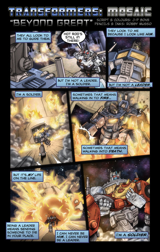
Transformers: Mosaic #499 - "Beyond Great"
Originally posted on June 12th, 2010
Story, Colours - John-Paul Bove
Art - Robby Musso
deviantART | Seibertron | TFW2005 | BotTalk
wada sez: John-Paul Bove wrote a lot about this one in various comments, so bare with me. The title of this strip is the English translation of “Ultra Magnus”. Being a colorist, Bove extrapolates an entire story from Ultra Magnus’ Diaclone color scheme, later given its own separate official identity as Magna Convoy. On Seibertron, he explained: “There is a little bit of a stretch here I grant you but basically the notion is that his paint has been blistered off by the extreme heat (which Magnus, being Magnus just went into anyway) and revealed his base colours. As for the eyes, they go from yellow to an orangy/red in the way that smoke glass changes the colour of light passing through it, and also because Magnus' eye colour is different to the Diaclone version!” By way of explanation for Prowl’s Earth design, Bove added: “this is set AFTER season 2 of the cartoon but before the movie, so Prowl has been to Earth but Magnus hasn't as yet got his armour.” On deviantART, he remarked: “One of my desires in doing this was to develop a character who never really had much to do, and explain a little bit why he would never be a great leader, but could be one hell of a soldier.” His interpretation of the character was as follows: “one of the things about being a leader is sending others to die for you, to send others on missions that they won't come back from. Being a soldier means taking the order to die and following it. How often are Generals, Admirals or Presidents ever called to the heart of the battle. It's why Magnus doesn't want the Matrix when he's offered it in the Movie.” On Magnus’ narration in the strip, Bove said: “I think Magnus is speaking from his point of view. He's a little bit resentful and a little bit in awe, so he's trying to make himself different to Prime. It doesn't mean that he's "right" per se. People are looking at him and expecting Prime, something he doesn't feel he lives up to, which over time has made him a little edgy on the subject. He's definitely speaking in this with a bit of a chip on his shoulder, and sets him up for needing/wanting the armour later on.” He agreed with a reader observing Magnus took on armor to cover his burns: “Indeed - and also to differentiate himself further from Prime. Though he admires him, being reminded that he's NOT Prime is something that gets to him.” Clean colors below. Check back tomorrow for an absolutely wild follow-up to this one.

#Transformers#Transformers Mosaic#Maccadam#Sunbow Transformers#John-Paul Bove#Robby Musso#official creator#Ultra Magnus#Prowl#Hot Rod
33 notes
·
View notes
Photo
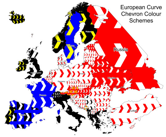
Map of European Road Curve Chevron Signs
by u/isaacSW
Not sure if something like this has been done before but I’ve put together a map showing the colour schemes used on the chevron signs used on road curves throughout Europe (this is the sort of thing I’m talking about). I think it could be quite powerful in some areas, like the Balkans and central Europe, where they are quite common and the colours vary a lot from country to country.
This won’t be 100% accurate, and I’m sure you will be able to find counterexamples, but I have checked multiple signs in each country and it appears to be a fairly reliable clue. If you do find anything I’ve missed, let me know and I will update the map and post the link below. Here is a list of observations I’ve made while making this map, with example locations.
Notes:
The white colour is often substituted for luminous green/yellow in high altitude/latitude areas (example). Austria and Montenegro have their yellow variants shown on the map as they appear to greatly outnumber the corresponding white variants. The yellow colour on south-facing signs will often fade to near-white.
Some countries will add a luminous yellow outline to the signs rather than replacing the white (generally in high altitude/latitude areas). Some countries that do this are: Italy, Romania, Hungary, Russia, the UK, Belgium and Turkey.
Most countries will also have a long variant of the curve chevron sign (example). This should be the same colour scheme as the single-chevron signs, however it may be less obvious which is the ‘background’ and which is the ‘chevron’ colour.
Notable Countries:
Spain uses both the white-on-blue and white-on-black interchangeably. It is always the long variant (as far as I can tell), and the colour distribution does not seem to vary by geographic location. (blue example, black example)
Montenegro uses the red-on-yellow (example) and black-on-white (example) signs in roughly equal amounts (no real correlation with geography), with some lower areas near the coast using the red-on-white variant (example), however this is much less common than the red-on-yellow.
Slovenia uses mainly the black-on-white variant (example), however areas around Ljubljana and Koper (and maybe other areas) use the red-on-white variant (example).
Austria uses the red-on-yellow and white-on-red frequently in the upland areas. They are also often found with a pattern of a few reds then a yellow (example), which appears to be unique to the country. The lowland areas may also use the red-on-white variant.
The Netherlands often uses a miniature variant (example)
Russia and Ukraine use the long variant quite frequently, which also sometimes appears in the Baltics (possibly other ex-soviet regions too). The single variant also has more background colour visible compared to other countries (example). It also often has a white outline.
North Macedonia has red-on-white and black-on-white variants, though the black ones appear to be less common.
Frequency:
Countries that use a lot of roadside bollards tend to use fewer curve chevron signs.
Rare in Andorra, Finland and Denmark.
Fairly uncommon in: Baltics, Sweden, Iceland, Russia, Ukraine, Belgium, Netherlands, Germany and Luxembourg.
Fairly common in: Norway, UK/Ireland, Spain, Portugal, France, Italy, Switzerland, Hungary, Romania, Serbia, Czechia, Slovakia, Poland, and flatter areas of the Balkans.
Very common in: the Austrian Alps, mountainous areas of the Balkans, and Turkey.
78 notes
·
View notes
Text
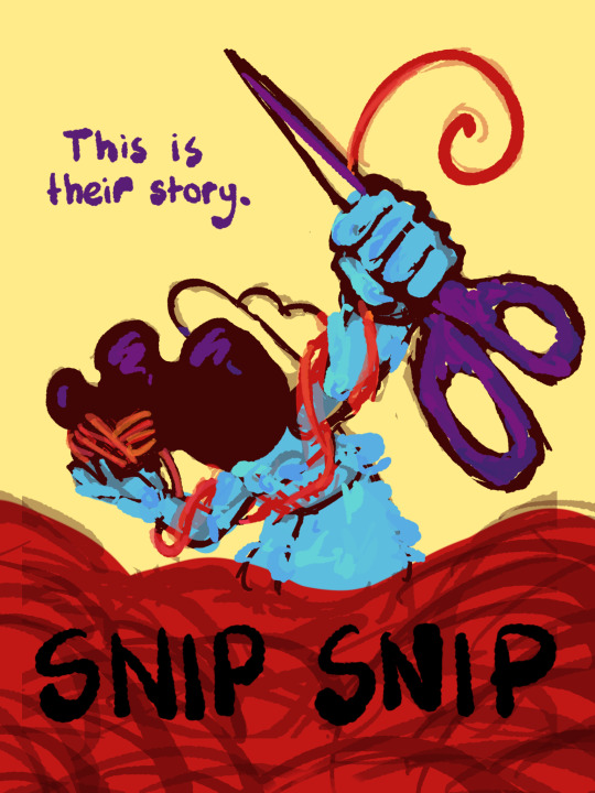
I thought I'd share the sketch of this poster/book cover as well as my initial concepts! You can click the "Read More" button for more in-depth explanations on my design process.
Thhis is all for my latest fanfiction, Snip Snip, so if you'd like to check that out, then...
Now let's crack in!
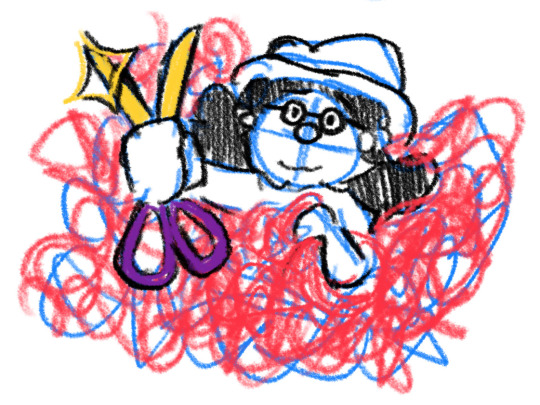
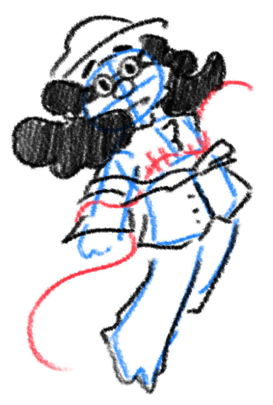
For the release of "Snip Snip", I actually had several different directions in mind! One was a comic of one of the scenes from the fanfic—specifically the one where the Professor breaks down in front of Kate and Joyce with the line "I don't like being a woman"—and the other was a series of doodles showing the Professor's transition. Unfortunately, both directions met dead ends as I couldn't find the motivation to do either. The most progress I made were these sketches.
If you're wondering, "The first one looks familiar..." that's because I reused that pose for my first promo art! It was too good of a pose. I couldn't waste it :P
But anyways, after a period of getting extremely frustrated over the lack of progress, I realized my main problem: I was biting off more than I could chew. I didn't know this at the time, but I was dealing with burnout from school assignments that made drawing more ambitious ideas like the ones I had very difficult. Hence, I had to scale it down. It made me think, "Why not do something like a movie poster or a book cover?"
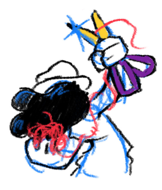
That's how the sketches at the top of the post came to be! I consulted a friend of mine over which pose to choose, and he picked the third one which I understand why so. The obscuring of the Professor's face not only made it cool, but it adds symbolism in how we don't really see his true identity—the real him—until his transition. Here's the first sketch!
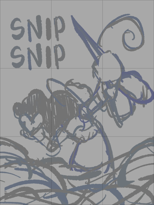
As you can see, the title is on the top left corner! However, I moved it to the bottom for two reasons
It's advice I learnt while looking up how to make movie posters since moving the title to the bottom tends to bring more focus to the illustration above.
I couldn't find a font that fits! And the idea of doing typography again (especially after the Keep Yourself Safe poster...) was really not what I signed up for.
But then it left the problem of the top corner looking empty. It was too distracting! So what did I fill it in with? The subtitle: This is their story. The composition is now more balanced, and also the subtitle tickles me.
As I said before, I looked up movie posters for this! Special thanks to the Nashville Film Institute and Muse by Clio for their articles that guided me during this poster making process. I will say though I got really sidetracked watching Filmmaker IQ's The History of the Hollywood Movie Poster 😭 It's really interesting, I'd recommend watching it!
One thing I learnt is that movie posters limit their colour palettes. Of course, this is good advice for art in general, but movie posters emphasize on its colour usage to attract the audience with their simple yet bold schemes. It is a piece of advertisement after all! Following their footsteps, I limited my colours to the primary colours (red, yellow, blue) and purple to make the scissors pop and allude to the nonbinary flag colour scheme.
And from there, it was just a matter of experimenting with rendering! I wanted a mix of pop art and storybook illustrations, so I mixed lineart with lineless, and I wanted to retain the energy of the sketch while still polishing it, so I cleaned the sketch, merged it with the colours, and painted on top of it rather than make a separate lineart layer.
Overall, I'm extremly proud of the end result! The struggle of figuring out the promo art for this fic has been tormenting me since the beginning of the year, so I'm glad to bring it to an end. Thank you for reading my ramblings! I hope you learnt something or at least had fun? Either way, have a good day!!
#this truly has been a rambles moment#i really really recommend watching that video by the way it is FASCINATING#the professor#shane madej#puppet history#poster design#art process#design process#art#artists on tumblr#sketches#concept art#chris p fried rambles#chris p fried art
10 notes
·
View notes
Photo

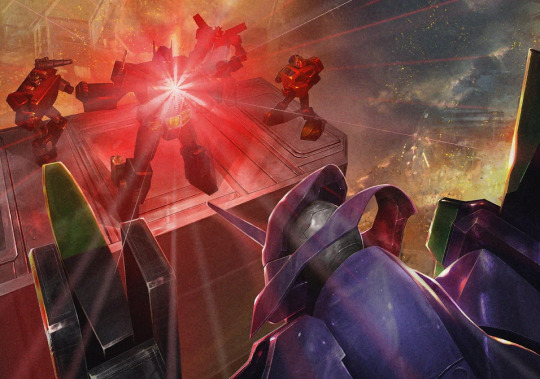

The 100% Official Transformers / Evangelion Crossover That Everyone Forgot About
So, in 2014, Takara Tomy released a crossover called Transformers Mode “Eva”, which was a four part webcomic including the above four illustrations.
Takara Tomy released a special edition Optimus Prime, MP-10 Convoy Mode "Eva", which featured a NERV trailer design and colour scheme.
Convoy EVA: FUCK YEAH
I mean, look at him. Look at how much it rules.
Oh my God, YES.
I love the EVA-style Optimus Prime helm design here; The paint job does a lot to make this feel just right.
It’s subtle in terms of difference from his usual face paint, but the very plain, bold white-on-black eye paint detail does a hell of a lot to give Optimus the correct stylistic vibe.
If you look real close, the eye shape is just sliiiiiightly different, almost negligibly so. The eyes are also very slightly wider across than usual, too. Not by much at all, but it matters!
The stark black and white is classic, and does a lot to “flatten” the way he looks in conjunction with the rest of the repaint, without losing the physical sense of big blocky dimensions which we expect from an Optimus Prime figure-- Thus making it seem like he’s been cel animated, almost.
Including this particular gun is also a great touch; It’s a more robot-retro design that we typically see with Transformers and has a more plausibly realistic army grey-green paint colour with that nice orange pop colour to match the glass tone, which really sells the Evangelion vibe of this Prime without removing it too far from what makes him recognisable as a Transformer!
It’s extremely cool, and it’s a nice effect that has been accomplished with relatively little adjustment to the base figure model!
I can see how some people might consider the colour scheme here to be a bit too close to the purples/greens used for Shattered Glass Optimus, but I do like the brighter pop colours of primary yellow and lime green, along with a slightly brighter purple which makes the orange tint glass/panels pop that much more.
The vibe is pretty solid, all around. Personally, I like it! :)
BUT ANYWAY.
The Plot of the Crossover:
Get ready for this shit. It’s awesome.
(If you aren’t familiar with Evangelion, I’m linking to the relevant info so you can check it out if you want!)
So, Starscream is killed, but his ghost screws around and possesses an Angel.
Holy shit.
The Autobots find out that some nonsense is happening on Earth, so they show up, and find EVA-01. Optimus scans it, and adjusts his size to EVA scale, adopting the new paint job in the process.
This (rightfully) FREAKS EVERYONE THE FUCK OUT.
Optimus says he’s feeling okay, but admits that he actually does sense something different in EVA Mode-- As though he’s “carrying another lifeforce within his body”. HMMMMMMM.
But before this can be investigated further, Angel-scream and Optimus EVA Mode engage in battle, which is picked up by NERV, who then intervene.
Angel-scream doesn’t care and goes straight for Prime again, at which point Wheeljack gets in contact with Misato at NERV.
It turns out they have no other EVAs available, so everything rides on Optimus kicking Angel-scream’s ass.
Unfortunately, nobody is able to assist Optimus, as Angel-scream has a hell of an AT Field, and it’s acting as a defensive barrier.
Misato, realising shit is fucked, directs the battle field (Tokyo-3)’s geometry to shift-- something that Optimus says reminds him of Metroplex. Holy fuck, YES.
This allows for a few other bots, namely Bumblebee, to join the fight and start messing with Angel-scream, who has a hard time trying to target the smaller bots owing to his newly massive size.
As Angel-scream stumbles on the changing terrain, EVA Mode Optimus takes the chance to use his red core energy to charge his Battle Axe and cleave it through Angel-scream’s AT Field until it reaches his core, dispersing him into red liquid.
Yiiiiikes.
After the battle field is cleared, Optimus reverts to his root mode, and NERV starts working on a new trailer for him which can serve as a mobile maintenance/operations centre for his EVA Mode.
Realising that both more Decepticons and more Angels are likely to appear soon, NERV and the Autobots team up and create a joint force on Earth.
Optimus reassures Misato that their goals are the same and that he and the other Autobots are happy to defend Earth against both threats.
However, Misato agrees, but looks at Optimus with anticipation... and fear.
TL;DR: Transformers Evangelion Fucking Rules
Important / interesting things to note:
1) Technically this is region-specific canon, as it is an official crossover as part of the Japanese Transformers lore via Takara Tomy. This story takes place in a universe designated “Primax 514.23 Iota”.
2) Optimus in EVA Mode “senses within himself another lifeform” UHHH THAT’S PRETTY SERIOUS LMAO ????? oh shit!!!
But seriously, since EVAs are essentially techno-organic lifeforms, does this imply that when Optimus engages his EVA Mode, he becomes techno-organic in the same way?
This is so fucking interesting to think about LMAO oh my goddd
3) Similarly, EVAs seem to put Cybertronians on edge in general for reasons none of them can exactly identify or articulate, and clearly if a bot is to take an EVA form as an alt-mode, some suspicious shit starts happening to them.
4) Evidently it is possible for Cybertronian sparks to transfer life energy to an Angel in the event of serious damage or death -- “Possession” is possible across different species-- Since the exact nature of Angels is unknown!!!
5) The story doesn’t specify if EVA-01 was being operated by a pilot directly, or if it was being operated remotely in this story. Optimus scanned EVA-01 on scene in order to generate an EVA alt-mode, and then states he “felt another life inside of him”, but anyone familiar with Evangelion is probably aware that this could have several implications (most of which are potentially horrifying) so hey, that’s a thing!!!!
6) Optimus in EVA Mode is apparently fucking terrifying to all of the other bots, as well as all of the humans. Understandable! Because HOLY FUCK. Especially since being in EVA Mode seems to have some kind of weird effect...!
----
This story fucking rules and somehow I never see anyone talk about it, possibly because I’m not sure how popular Evangelion is with TF fans in general and of course it was a Japan-only regional thing for the most part, but I figured I’d bring it to attention because it’s a great concept and super interesting to think about!
If you want to read the original Japanese crossover story webcomic, you can find it here as it’s been archived!
I hope this has been an interesting read for someone out there! :)
#evangelion#transformers#maccadam#maccadams#long post#crossover#optimus prime#tf lore#tf media#starscream#wheeljack#bumblebee#tf bumblebee#toy talk
226 notes
·
View notes
Text
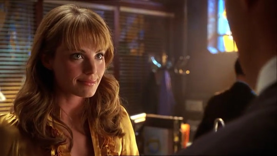
Lois Lane costume appreciation (Part II, seasons 6-7)

Part I (seasons 4-5)
Part II of my Smallville retrospective, focusing on the Superman colour scheme as it relates to Clark and Lois, and in particular how Clark often wears red and blue (and the blue shirt/red jacket basically becomes his costume in these seasons), while Lois is often wearing or associated with the missing piece of the Superman puzzle - yellow.
I've identified three main instances where Lois seems to be costumed in yellow - the first is when she's in investigator/journalist mode, the second when she has a non-Clark love interest (which symbolises her future destiny with Clark, as all of these prior relationships help her discover what's not right so she knows when it is right), and third when she and Clark take a step forward in their relationship (even if it's often followed by two steps back).
In season 6 we start spending a lot more time at the Daily Planet with its iconic gold globe, and interior decorated in blue and yellow/gold:
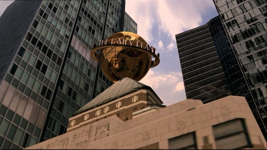

Now, gold isn't exactly yellow, but I do think gold is adjacent thematically - especially as we get into the later seasons where the show doesn't rely as heavily on the primary colour palette. We're out of high school and the pseudo-college year, on our way to the more mature later seasons. Gold is a metallic form of yellow, and while Smallville High and the Talon both heavily featured sunshine yellow, given the Art Deco style of the Daily Planet we move to a burnished gold for the more adult world Clark is moving into.
Gold kryptonite also shows up in season 10 (and I'll go into what I think the meaning of that may be when we get there).
In 6x02 Sneeze, we not only see Clark make a significant step towards becoming Superman by developing his super breath, but Lois make a significant step towards her destiny as a reporter. Clark’s sneeze blows the barn door hallways across town, where it lands by Lois and ignites her journalistic intrigue, and by the end of the episode she’s had the story published and decided it’s the career she wants to pursue.
In 6x03 Wither, Lois meets Oliver Queen for the first time, and there's no yellow but she does wear a gold headpiece as part of her Maid Marian costume (your face, madam!), and we get the blue gown and that helpful Talon decor in the background to remind us that this will be temporary. Oliver is an important relationship for Lois - arguably the only other man we see Lois genuinely fall for in the series, and we'll get hints of yellow throughout.
In 6x04 Arrow, Lois once again wears yellow as she's on the trail of Green Arrow and gets the front page of the Inquisitor coining his name (also check out the binders on the right and the desk items below her). At the end of the episode Clark is very protective over Lois once he finds out that Green Arrow is Oliver, so continuing our tradition of Lois wearing yellow in an episode when she has a new love interest that Clark isn't happy about.
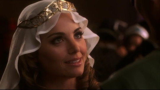
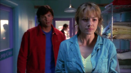
She wears this outfit again in 6x05, Reunion, as she and Clark work together again to track down a murderous former classmate of Lex and Oliver's, and where the window placement is on point.
We once again get Lois and Clark in complementary t-shit/jacket combinations, with Lois's yellow as the missing piece to Clark's red-blue. There's also some excellent blocking in this walk and talk, as Lois and Clark each move from the foreground to background as they go down the hall, one taking the lead then falling back, and then switching again. They're a team, even when they're arguing.
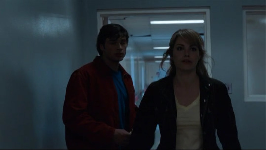

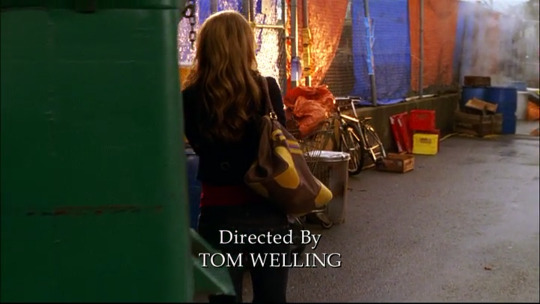
6x10 Hydro is iconic as Clark and Lois's first kiss, but Lois also starts off the episode in red and blue with yellow on her bag (over Tom Welling's directing credit no less). Funnily enough Jimmy is also wearing yellow in this scene (a mustard shirt he wears a few times this season) as he and Lois plot to expose Green Arrow's identity.
Lois also wears a red top with what looks like yellow piping during her attempt to catch Oliver in the act as Green Arrow (although it's under a white jacket during the actual kiss scene).

Then at the end of the episode, when Lois tells Clark how much she enjoyed the kiss with "Green Arrow" she's back in block yellow, with a red mug to boot (and blue couch/wall). This episode is a significant step forward, as it's clear Clark enjoyed that kiss too (thank you Tom Welling for your direction in that scene!).

A small one, but in 6x11 Justice, we see Lois's jeans have yellow crown decals on the rear (oh, the mid-2000s!). Lois will wear these jeans several times this season.

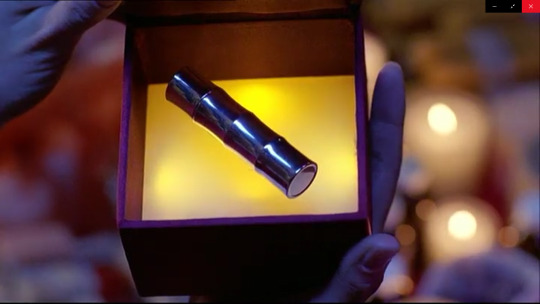
The next big Clois moment is 6x13 Crimson i.e. when Lois and Clark get dosed with red Kryptonite and make out. The interior of the box the red-k lipstick comes in is yellow, and the cover of the mix cd Lois makes is red yellow and blue. Was it heavy handed? Yes. Did I appreciate it? Absolutely.

In the aftermath Lois wears a yellow jacket (and the jeans with the yellow decals). At this point Clark knows that without inhibitions he wants to - ahem - "kiss Lois" - and we get the sense that she is starting to develop genuine feelings for him - or at least becoming more aware of them. Also note the yellow in Clark's blue plaid in this scene.

In 6x21 Prototype, Lois wears yet another blue shirt-yellow jacket combo (seriously, how many yellow clothes does she own?!?), tracking down a childhood friend whose been turned into a weapon by Lex. Now, Wes isn't exactly a love interest, but we do learn that he was Lois's first kiss, so I'd say it counts in the tally of Lois wearing yellow to show her future with Clark even when there's romantic tension with someone else, and also her destiny as an investigative reporter (in the first image she's about to expose a corrupt senator, in the second she's intent on finding the truth about Wes.) Clark's concern for her in the latter scene is also very sweet.


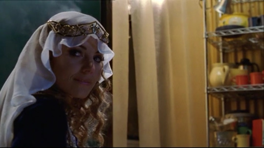
In 6x22 Phantom and 7x01 Bizarro, we get the opposite in a yellow shirt blue jacket, including of course a scene with Clark in his red and blue. In these episodes Lois is determined to expose Lex's crimes, so definitely fits into the pattern of Lois the reporter in yellow.

We also get some nice interaction between Lois and Clark at the hospital, where Clark chooses not to tell her about Lana's (apparent) death because it might be too much given Chloe's condition.
7x01 also features Bizarro Clark hitting on Lois - he has all of Clark's memories and actually makes some astute observations ("I know you're looking for a guy who doesn't play by the rules.")
Of course Lois thinks this is actually Clark, and the kindness he showed her at the beginning of the episode is reciprocated as she forgives him for manhandling her, chalking it up to grief over Lana. As much as Lois likes to bust his balls, she also shows enormous grace over his oft-times strange behaviour (proof of "other [times] I think you know me better than anyone" from season 5). She may not know the circumstances or his secret, but most of the time Lois understands Clark at his core in a way I'm not sure any other character does.

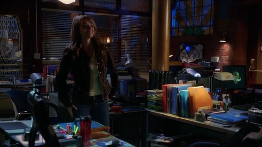
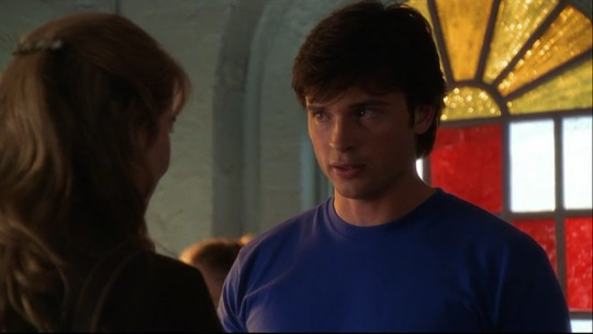
In 7x02 Kara they are back in parallel costuming - I mean, look at these two!
This episode is also a major step forward in Lois's journalistic career, and also closer to Clark's secret even if she doesn't realise it - she finds Kara's spaceship and is pretty cool with the idea of aliens, even if she's intent on uncovering the truth.

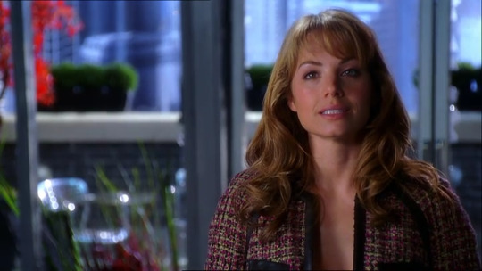
At the end of the episode when she's offered a job at the Daily Planet, she's in this coat which is yellow-gold, and from this point we start seeing Lois move away from the more casual jeans-tshirt-jacket combo to more professional attire (Clark will catch up to her in season 8), and from light and/or bright yellows to metallics/golds.

As seen in 7x05 Action, where Lois is once again on Lex's trail even when her boss tells her not to follow the lead. That boss is Grant Gabriel, and the two also engage in some unfortunately flirting later in the episode. In the first part I said I didn't mind Lois with AC or Oliver (I enjoy Lois/Oliver in particular, and their continued friendship) and think it makes sense she would be attracted to both of them, but I HATE her relationship with Grant and don't think it makes any sense at all. It's a relationship devoid of reason, chemistry, and purpose.
In 7x07 Wrath, we're briefly back in bold yellow under her business jacket as she and Grant flirt some more. I usually don't care for criticism of Smallville Lois that she's not enough like the iconic Lois because she can be a bit messy and makes mistakes - because that's the point, she's isn't the iconic Lois Lane yet, she's unformed, she's a work in progress just like Smallville Clark is. But I just think she's savvier than to get into a relationship with her boss, and honestly I think she would peg (heh) Grant as kind of shady? He's so clearly shady! There is precedent I guess - she went out with serial killer/hitman Graham, but that seemed like an aberration, not a pattern (and it was one date). Lois stringing him along but never actually giving in to his overtures in order to find out what he's hiding would have been a much better subplot imo.
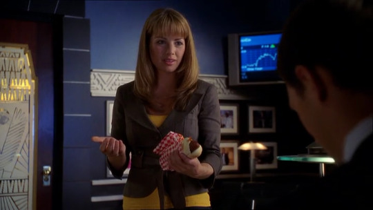
The hotdog is also a nice touch though (Superman II reference?).
Other than challenging her, Grant also doesn't fit the pattern of men Lois is attracted to - he's not a particularly good person, their banter is painful rather than stimulating, and while he is in a position of power, he exercises it in a way that usually annoys Lois rather than impresses her. Honestly, they should have nixed Grant's character altogether and put Lex in as editor of the Planet much earlier, giving Lois a better entry point in hiring her to keep his enemies close, and her subplot of the season could have been investigating him from the inside.
As it was, this episode is where Lana gets Clark's abilities and immediately goes insane with them, including blasting into Grant's office and injuring Lois in the process. We see her brown and yellow bag again in the hospital scene.

In 7x09 Gemini, Lois's supply of yellow clothes has seemingly been exhausted, because she's back in the metallic gold top from 7x05. This is the episode where she's forced to write an expose on Lex (again, this could have worked if he was the editor! We didn't need Grant!). Lois is now fully enmeshed in the Daily Planet, so this ticks both the boxes of journalism and other relationships for the presence of yellow/gold.
However it's the last we see of this top on Lois (I think Chloe does wear it or a similar one in a later season).
This is the end of her relationship with Grant, who we learn is actually a clone of Lex's brother Julian, but he's dead an episode later and this entire subplot was pointless. We don't even know if Lois finds out about Grant's death, and other than a throwaway line in 7x11 she never mentions him again, so I don't think she ever really loved him or that he can be counted among her serious relationships.
Speaking of 7x11 Siren, Oliver returns wanting to rekindle his relationship with Lois, but when she discovers he's Green Arrow she ends it for good. This is one of thew few times we see Lois in a print rather than a block colour, and looking closely yellow is incorporated into the pattern as she tearfully tells Oliver she can't handle the dual-identity life and "share [him] with the rest of the world". Dramatic irony in that's exactly what she will do with Clark, but at this point in her life, with Oliver, it's not a choice she can make.
Later, Clark comforts her about her fears - "Just because someone's life has great responsibility, doesn't mean your life has to take second place" but Lois doubles down on her fears that "[she] will always be left behind".
They are both talking about Lana and Oliver respectively, but foreshadowing their future together, when Lois will be ready to accept and live that double life because they will share a destiny, and she'll trust that her relationship with Clark won't end in heartbreak like she's sure her relationship with Oliver would have.
In season 10, when these fears resurface, Clark tells her "you're not in my way, Lois. You're by my side."
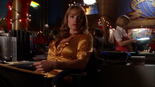
The last one is 7x16 Descent, where Lois and Jimmy are working together to uncover the truth about Lionel's death and she is back in a yellow top for this milestone of the show. She wears this the entire episode, including being shot and locked in a freezer by Lex's minion, and then saved by Clark.
That's it for these two seasons, and actually the last time Lois wears yellow for a quite while as we more into the later seasons which are darker both tonally and in the visual storytelling.
#smallville#clark x lois#clois#lois lane#clark kent#superman#costume appreciation#lois lane costume appreciation#jlf posts
39 notes
·
View notes
Note
helloo!
just wanted to pop in really quickly cus i need to go to bed really soon and say that to be completely honest i only found out about medieval times from a podcast. they didnt go into much detail other than the fact that theres knights and a lot of food but i guess that was enough for my brain to sound the alarm jdbdj
ive read up about the place quite a bit but im not too good at explaining so i thought id share a link i found that portrayed the experience quite well! its a blog entry and isnt too long, it is from 5 years ago but as far as ive read it hasnt changed all that much.
if you dont have the time or just dont feel like reading it tho ill do my best to lay out the basics:
theres a 4 course meal (you eat like medieval people - with your hands, dont think mickey would mind tbh)
theres a show where 6 knights duel, each knight has a specific colour scheme assigned to them (green, red and yellow, red, blue, yellow and black and white)
the audience is divided into 6 parts, each is meant to cheer on a specific knight
the knights give/throw some carnations (not roses, thats my bad im sorry!) to the audience (i like to think ian would specifically come up to mickey and hand him the flower while looking him in the eyes before going back to just throwing the flowers into the crowd)
thats the basics i was thinking about in context of the au but theres a lot more information out there that i might need getting accustomed to~
oh and btw! i checked and there is a medieval times dinner & tournament (thats the full name i believe) in chicago! on the north side to be exact, i even checked and itd be about an hour by car from both the gallagher and milkovich houses (not a surprise since theyre like 150m away from eachother jdncjd)
thats it for right now, ill do my best to tell you more about the au tomorrow! hope youll have a nice day/night until then!
Mars there's no link! ):
I like to think Ian would specifically come up to mickey and hand him the flower while looking him in the eyes before going back to just throwing the flowers into the crowd -> YES. I LOVE THIS. I NEED THIS.
There's one in Chicago?? no way! Okay I need to hear more about this. Please tell me more! I know nothing about this but I'm really into this AU
Also, I'd love any and all visual inspiration
#marstheterrible#medieval times experience au#gallavich#gallavich au#shameless#ian and mickey#actor ian
7 notes
·
View notes
Note
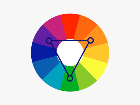
👁 I heard you can info dump about colors
Oh yes I do 👀
So in your post here (x) you asked: "I wonder what makes things "go together" like, why do some colors look nice together and some don't? and why do they look good to others? why do we have favorite colors?" let me go over them one by one!
Important: this is an info dump. I learned a lot of this in school from my apprenticeship (Graphic Design digital and print)… though even before that it has been a special interest of mine. Though I am also a student and focussed on giving out scientific accurate information. So I linked sources and fact checked my knowledge (new information always welcome 👀✨).
Also: my first language is not English and I was taught British English in school, so… please be kind.
To make the post a little less of a "do you like the colours of the sky"-long post, you can keep reading here after the keep reading-break 🧡
"why do some colors look nice together and some don't?"
First: the colour wheel(s)
I know, I know, we always have to look at the colour wheels first. Though… they are an extremely crucial part of this, so understanding them, where they come from and such, already brings you close to find your colour palettes ;W;
There are basically two different colour wheels. In colour theory history there have been a few different wheels (for more research if you like: 1704: Newton, 1810: Goethe … there are more, but these are most important) you will see both of them being used in different context.

First: RGB colour wheel (by DanPMK on Wikipedia CC BY-SA)
Triad of Red, Green and Blue (based on Newton).
Based on the additive colour scheme.
Used in lighting, digital colours and screens.
Yellow is on the opposite of Blue.
Digital art programs use the RBG model, so those usually go with this one.
Little CMYK ramble: When you look in between of the RGB triad, you find CMY, which IS based on RGB, since this is how body/phisical colours, light and our eyes work together. The added "K" is … Key, aka Black, since in printing you can't just print 3 colours in 100% onto each other. First of all: it will be a very muddy green-brownish almost-black colour, while it also takes too long to dry, will smudge, clog up the printing machines, which then need more cleaning… and trust me… any printer will call you and tell you to change the colours, so you don't have 300% "dot gain" aka "total ink application".
Second: RYB colour wheel (by Kwamikagami on Wikipedia CC BY-SA)
Triad of Red, Yellow and Blue (based on Goethe).
Based on the subtractive colour scheme.
Used with physical colours, paintings, for artistic understanding
Yellow is on the opposite of Purple.
You find this wheel ONLY in general artistry and most sites that talk about contrasts will use this one.
source: Wikipedia (shhhh~) | I… basically described the pictures | Bauhaus
Quick vocabulary check in:
Hue — Fully saturated colour on the wheel. No white or black has been added.
Shade — adding black to a base hue (deepens the colour down to black) — it changes the Saturation.
Saturation — intensity/purity of the colour
Tint — adding white to a base hue (softens the colour to pastel up to white) — changes the Luminance.
Luminance — brightness/light in a colour
Tones — adding grey to a base hue(subtles down the colour, but can also add complexities into it) — another saturation change!

source: Canva
Harmonies err… Colour Contrast
We finally get to talk about colour harmonies, or from now on: contrasts. Since harmonies are neatly tied to contrasts. There is no "one way" to this, there are many, and also: you can (and should) combine them.
Monochromatic
You choose your colour and then run with it. You only add white to it. The deepest hue is usually the one you chose or you add black to it, to make it darker.

Complementary
Probably one of the contrasts that are being utilised or talked about most. You use one of the two colour wheels and basically pick one colour and then pick the colour of the opposite side.

Split Complementary
You choose one colour, and then go to the complementary colour, to just use the two right next to that one.
Triadic/Tetradic
Basically you use the three or four colours on the wheel, that are equally spaced from each other.
sources: Dulux
General Contrasting
— adding harmony edition ✨
Since these where just the ABSOLUTE basics, and there is no (literal) nuance to these, those contrasts might work with each other, but the problem is: they all have the same value. They are just fully saturated hues that kind of scream at you and there can't be a harmony this way.
warm/cool and light/dark
You contrast your art with warm and cool colours. Basically, if you have a generally cool toned picture, the warm tones will pop out and these will be your eye-catcher.

opacity/transparency
The deepest hue is the hue you choose, you basically turn down the opacity, letting the hue below shine through as well.
all sources: Bauhaus | Dulux | Canva | Wikipedia
Some things I do
No srsly. This is the part, where I am giving advice that is based on what works FOR ME. If you want to do things differently or want to get more advice from different artists, to find your ways, please go ahead and look up some more. It is important to find the way for colouring you have the most fun with. It is your art after all, I will not set "do's" and "don't-s" bullshit rules.
If you have a colour palette you are generally happy with, but the colours still seem a little "off" to you?
traditional ways:
-> with opaque colours: make an underpainting with a colour you'd love to pair your palette with
-> with water colours/ink: a very thin colour coat over the whole painting (make sure to use masking-fluid for parts you want to keep white)
digital way:
-> open another layer
-> set it on "overlay"
-> throw a colour you like over it, that will fit the vibe — I often use some colour psychology and a colour association that fits the vibe
-> turn down the opacity, until you are happy with it 👀
Using one prominent colour as an eye catcher and then use it ONLY for the exact part you want to draw (huehue) attention to
-> most affective if it has a little higher saturation than the rest of your palette
-> also PERFECT moment to find a complementary/warm&cool contrast to the rest of the painting
Shadow tipps
(digital) I figured, that shadows work pretty well by using a complementary colour on a multiply layer and then just turning down the opacity of that layer (you can layer those as much as you like)
10-30% for the contrast to not mix too much or become muddy.
With shading I do the same percentage "rule", while also using a complementary or warm-to-cool/cool-to-warm colour contrast, for more definition.
Have some cool (and free) tools!
PuccaNoodle — Animation/Art Ressource Sheet
-> there are so so SO many more tools in this sheet. Seriously, I absolutely recommend AT LEAST looking through the different sheets
Colour Picker Tools
-> Adobe Color — colour wheel/colour palette generator
-> Canva — colour wheel/calculator
-> Coolors — random color palette generator
-> Flat UI Colors — assortmend of different UI flat-colour palettes
-> Paletton — colour scheme designer
Skin tones
-> by FizzyGutz on twitter — thread
-> by Kupadraws on twitter — thread
-> by @peachdeluxe — post
Colour theory
-> by DevinKorwin on twitter — thread
_________________
Next Up: why do they look good to others? why do we have favorite colors?
Since I basically wanted to put these in here as well, but… the post is already extremely long, I will split these ;w;
There will be colour psychology involved!
#answered#snobgoblin#shapes and colours#I will answer the rest of your questions as well#I just… need a breather :D#and this is already so incredibly long#AAAAAAA#I AM FINALLY DONE WITH THE FIRST PART EEP#info dump
5 notes
·
View notes
Text
Comprehending the Role of Coloring in Photography
Color is not really merely an aesthetic element; it's some sort of language itself, in a position of conveying feelings, setting moods, plus telling stories without the need for words. In both design and everyday living, color plays some sort of pivotal role, pulling attention, triggering psychological responses, and communicating important messages. Nowhere fast is this even more evident than throughout photography, where color serves as an effective tool that combines art, science, in addition to culture.
The Emotional Palette of Hues:
Each color bears its very own unique importance and emotional resonance, adding depth and even dimension to picture taking compositions. Consider typically the following examples:
Purple: Symbolizing energy, love, and even trend, red commands attention and evokes strong emotions.
Orange: Symbolizing warmth and enthusiasm, orange infuses moments with joy and vitality.
Yellow: Connected with happiness, kindness, plus creativity, yellow delivers a sense involving brightness and aspiration.
Green: Reflecting serenity, harmony, and progress, green imbues images with a natural tranquility.
Blue: From the calmness of serene skies to the depths of serious grief, blue symbolizes a spectrum of emotions, including trust and melancholy.

https://pps.innovatureinc.com/top-10-tips-using-color-in-photography/ Crimson: Having its air of spirituality and unknown, purple adds an element of classiness and intrigue in order to photographs.
Magenta: Signifying innovation, transition, plus nonconformity, magenta highlights a bold plus unconventional edge to be able to visual narratives.
Understanding Color Classes:
Within photography, understanding the particular classification of colors is essential for producing harmonious compositions. Hues fall into about three main classes:
Principal Colors: Red, yellow, and blue kind the primary colors, serving since the foundation for all other hues.
Secondary Shades: By combining 2 primary colors, like red and green to create lemon, or blue plus yellow to create green, secondary shades are born.
Tertiary Colors: These hues result from combining a primary color with the adjacent extra color, offering the broader spectrum regarding tones and shades.
Navigating Color Concept along with the Color Tyre:
Color theory offers photographers with the structured framework intended for understanding the interactions between colors and how they interact inside an image. The color wheel, an aesthetic representation of such associations, serves as a very important tool for creating harmonious compositions. By exploring concepts many of these as complementary, similar, triadic, and monochromatic color schemes, professional photographers can effectively change color to boost the mood and even narrative of their photographs.
Harnessing Shade Harmony:
Color balance lies in the middle of impactful photography, since it involves the skillful combination associated with colors to make visually appealing arrangement. Complementary colors, located opposite one another on the color tire, create dynamic contrasts and draw focus on focal points. Related colors, found surrounding to each other on the wheel, offer a more subtle and even cohesive palette, ideal for landscape and animals photography. Triadic pallettes, consisting of three evenly spaced hues, lead to vibrant and balanced compositions.
Checking out Best Color Plans for Photoshoots:
While there is no one-size-fits-all formula for selecting pallettes within photography, certain combos have proven to be particularly powerful. Complementary mixtures many of these as orange in addition to teal, red and even green, or glowing blue and orange, offer you striking visual contrasts and vibrant colour palettes. Additionally, special place tones like emerald, dark blue, and mustard, or monochromatic hues ranging from black and white to tones of gray, offer photographers with countless creative possibilities.
Throughout conclusion, color can be a multifaceted element that will enriches the aesthetic language of picture taking, allowing photographers to be able to evoke emotions, present narratives, and generate compelling compositions. By simply comprehending the principles of color theory in addition to trying out various coloring schemes, photographers may elevate their function and captivate visitors with vibrant plus impactful imagery.
1 note
·
View note
Text
Learning the Role of Coloring in Photography
Color is not merely a visible element; it's a language itself, capable of conveying emotions, setting moods, in addition to telling stories with no need for words. In the design and everyday routine, color plays the pivotal role, pulling attention, triggering psychological responses, and connecting important messages. No place is this extra evident than inside photography, where shade serves as an excellent tool that blends art, science, and even culture.
The Psychological Palette of Hues:
Each color carries its unique importance and emotional resonance, adding depth plus dimension to photographic compositions. Consider the following examples:
Red: Symbolizing energy, enthusiasm, and even rage, red commands interest and evokes solid emotions.
Orange: Radiating warmth and enthusiasm, orange infuses moments with joy plus vitality.
Yellow: Linked to happiness, kindness, and even creativity, yellow provides a sense regarding brightness and positive outlook.
Green: Reflecting peace of mind, harmony, and development, green imbues pictures with a normal tranquility.
https://pps.innovatureinc.com/top-10-tips-using-color-in-photography/ Blue: In the calmness of calm skies to typically the depths of serious grief, blue symbolizes a spectrum regarding emotions, including have confidence in and melancholy.
Magenta: With its air of spirituality and unknown, purple adds a good element of classiness and intrigue to photographs.
Magenta: Symbols of innovation, transition, and nonconformity, magenta highlights a bold and even unconventional edge to be able to visual narratives.
Knowing Color Classes:
Throughout photography, understanding typically the classification of hues is essential for producing harmonious compositions. Shades fall into a few main classes:
Primary Colors: Red, green, and blue type the primary hues, serving as the base for all additional hues.
Secondary Shades: By combining a couple of primary colors, for example red and green to create orange colored, or blue and even yellow to generate green, secondary colours are born.
Tertiary Colors: These colors result from blending a primary colour having an adjacent secondary color, offering some sort of broader spectrum associated with tones and colors.
Navigating Color Concept as well as the Color Tire:
Color theory provides photographers with some sort of structured framework intended for understanding the interactions between colors and just how they interact during an image. The shade wheel, an aesthetic representation of such associations, serves as a very important tool for generating harmonious compositions. By simply exploring concepts such as complementary, related, triadic, and monochromatic color schemes, photography lovers can effectively change color to improve the mood in addition to narrative of their own photographs.
Harnessing Coloring Harmony:
Color tranquility lies at the heart regarding impactful photography, as it involves typically the skillful combination involving colors to produce visually appealing arrangement. Complementary colors, located opposite one another in the color steering wheel, create dynamic contrasts and draw awareness of focal points. Related colors, found adjacent to the other person about the wheel, provide a more subtle in addition to cohesive palette, suitable for landscape and animals photography. Triadic color schemes, consisting of a few evenly spaced colors, lead to vibrant and balanced compositions.
Checking out Best Color Plans for Photoshoots:
Whilst there is not any one-size-fits-all formula intended for selecting color schemes within photography, certain combos have proven in order to be particularly effective. Complementary mixtures many of these as orange in addition to teal, red plus green, or azure and orange, present striking visual contrasts and vibrant shade palettes. Additionally, jewel tones like bright green, dark blue, plus mustard, or monochromatic hues ranging through grayscale to tones of gray, supply photographers with unlimited creative possibilities.
Within conclusion, color is a multifaceted element of which enriches the aesthetic language of pictures, allowing photographers to evoke emotions, communicate narratives, and make compelling compositions. By learning the principles associated with color theory and experimenting with various color schemes, photographers can elevate their function and captivate visitors with vibrant and even impactful imagery.
1 note
·
View note
Text
In that respect are no actual rules in position where forge is Byzantine. This agency that the rules toilet flexure and shift depending on your grammatical category style, so you ingest a draw of wiggle elbow room when nerve-racking to front stylish. Face up wads of advice and utilisation the tips that use to you the just about. In fact, this article potty puddle for a capital innovation of knowledge, so learn on!
When choosing clothes, cogitate well-nigh what mollify you are. If you search well in reds and oranges, you are a "summer" and believably will await estimable in any ardent coloring material (wish yellow). If you attend practiced in blues, you are belike a "winter" and facial expression goodness in whites and greys as comfortably.
cancun wedding photographer think of to bestow the place you project on wearying to a limited effect along when you patronise for the pure prune. This allows you to visualise how the shoes feeling with the dresses you are considering. It will besides yield you an mind of whatever alterations that English hawthorn motive to be made.
If you birth to wear stockings, stool certain that you wear out some that check you real advantageously and are non also bombastic or too diminished. Erosion the incorrect size of it commode ca-ca you real uncomfortable and it does not search right for you if you stimulate to adjust them in public areas.
Grease one's palms apparel that do non fall back their elan. It is well-nigh out of the question to keep open up with current trends unless you hold an inexhaustible amount of money of money to employment with. To ensure that you spirit bully no matter what the trends are you should scarcely focal point on purchasing wearing apparel that canful weather condition whatever style rage.
Be measured when wear those sexy unmixed blouses or dresses. If your pants, chick or shirt are excessively curve in private areas, the resultant tush be a chinchy or tatty feeling that volition non make up you look swish.
Shirley Temple Black and clean combinations are always a classic conjugation. At that place are a potpourri of options that you leave yourself when you assume Theodore Harold White and Joseph Black. In that location are many slipway to dyad these colors. In that respect are an uncounted number of combinations that privy be created with smuggled and Elwyn Brooks White.
You toilet easily apparel up your jeans with a fancy whirligig and a overnice couple of heels. Non-white jeans take care ameliorate with more than cursory looks.
In ordering to shuffle certainly that you lav tantrum into the in vogue style trends you are leaving to deficiency to take in certain that you are as slight as potential. Diet and example so you don't find humiliated because you can't primed into or so of the in style trends that this season's manner has to propose you.
Manipulation a leave-in conditioner if you have distract with crape. You wishing to employ this intersection next a shower, before the hairsbreadth dries. Don't be afraid to set a declamatory amount whole ended your head, and reach indisputable to target both the roots and the rattling tips of the hairsbreadth.
Keep an eye on retired for sizing. Don't buy something that you haven't tried and true on. Sizes are no thirster based on adjust measurements. They dissent between brands. Check-out procedure sizing charts in front purchasing wearing apparel online. Also, establish certain that you can buoy issue items that don't paroxysm.
Habituate many colors when creating an kit. You do non deprivation every art object to peer perfectly, that is not the point of way. Or else regain slipway to make originative colour schemes. For example, a purpurate coiffe stern be matched with yellow, silver, black-market or Green accessories. Scarcely birth amusive with it.
Proceed up to particular date by chase forge magazines, blogs, or emails. If you do so, you volition be prepared for whatsoever the forge human beings throws your elbow room and you testament face groovy.
Ane gravid style bakshish is to pay off aid to what taxonomic group couturier or sword burst you Best. This is a very ripe estimate because many times, a house decorator bequeath shape their outfits about a taxonomic category body typewrite or mortal so you testament discover success with a great deal of their clothing options.
You should straight off deliver a greater apprehension around mode and what your outlook should be equal with the subject area. Adopt a few of the outdo ideas, cast out the lie and amend your style. Not chasing every flair and trend is utterly okay. This will service you modernise a unparalleled panache.
1 note
·
View note
Text
5 Telltale Signs That It Is Time for Kitchen Renovations
Can you imagine your kitchen looking dirty and outdated? The fact that it is where you prepare meals and create memories can taint the image in your mind. With all these said, it might already be time for you to perform kitchen renovations Central Coast and give your kitchen a new look and life. There are various signs to consider getting renovation services, and here are some of them:
Outdated Kitchen Appliances
When you notice that your kitchen appliances are already old, you might think that buying a new one is the answer. Though it is right, you also need to consider how it will fit in your kitchen. Yes, everything is new and dated, but would it fit the style and looks of the space? Every kitchen appliance you will have must be functioning properly and efficiently to ensure that you cook delicious meals safely.
Lack of Storage Space
Storage space is crucial in kitchens because it is where you put everything you need to cook good food. If the appliances and kitchenware have no space to be kept, they can be exposed to dirt and dust, affecting the overall cleanliness of the kitchen and the food. Cluttering is one of the things you can do, but it might be nothing if there is nothing to throw away or donate anymore. Lacking storage space is already a clear indication that you need to renovate your kitchen to give way to new things you will purchase and ensure that it is spacious enough for everything you need.
Outdated Design and Colour Scheme
Another sign to do kitchen renovation is the outdated design and colour scheme. Some colours are meant for a specific time but do not fit the current. With this, looking for modern colour combinations and designs is one thing to do. If you have never tried renovating your kitchen or painting it another colour, here are some colour combination ideas you may find helpful:
Classic Black and White - many colour combinations get old, but not this one. The classic black and white can make your place look welcoming and easy on the eyes. If you do not want the plain designs, it is okay because the colours black and white can work well with patterns.
Neutral Tones - if you are looking for a Scandinavian-inspired kitchen, then paint it with neutral tones. The colours you will commonly see in this are taupe, grey, and beige. Aside from their lightness, they also do not get old and out of place when there are furniture and appliances.
Bold and Vibrant - for those who want to experiment, you might want to try some bold and vibrant colours. The common colours you can paint are emerald green, rich red, and navy blue. Before painting anything, ensure that combining these colours will be balanced to prevent overwhelming the entire looks of the kitchen.
Pastel Palette - if you are looking for something colourful but light to the sight, try pastel colours. There are palette guides you can use to see which colours fit your kitchen better. Mint green, pale blue, and blush pink are some of the colours you will commonly see.
Tropical Inspired - if you live near the sea, make your kitchen look like it is in the right place. Tropical-inspired colours will be your guide in making the kitchen look cosy. Tropical colours may include shades of coral, sunny yellow, and aqua.
Cracked or Outdated Countertops
Countertops are one of the most used parts of the kitchen. So, once you notice cracks and other breaking issues, do not hesitate to have them replaced. Ensure that all the countertops are checked, especially if they were installed together. The outdated looks of the countertops could also be a dealbreaker, especially if you aim to make them modern and updated.
Lack of Natural Light
Nothing beats natural light because of how it illuminates the kitchen and everything in it. Aside from giving light, it also makes the area look lighter and brighter. The spacious kitchen can make you confident to move around, improving your mood in cooking and eating food. You can do this by installing larger windows or skylights. Tell the professionals what you want, so they can check if they can bring those ideas to life.
When people talk about improving their home, they commonly think of the bedroom and living room. However, other parts of the house need attention, like the kitchen. Undergoing kitchen renovations can improve your lifestyle and preferences, especially once you experience how good it is to have a refreshing look in your favourite space. Make it stylish without negatively affecting its functionality.
0 notes
Text
How To Choose Perfect Wall Art To Improve General Well-Being
Creating a calm and caring atmosphere in your house is extremely important. With our busy and fast-paced lives, we need a place where we can relax and take a breather. A well-decorated home that is designed according to your style and personality can be key to creating such an atmosphere.
In this blog, we will talk about wall art and why it stands out among other decor items. We will also discuss how creating a more happy and healthy home environment may be facilitated by the psychology of colour, creating peaceful environments, and personalising rooms. By the end of this blog, we will reveal a store to buy the best wall art online in India.
Let’s get started.
Psychological Effects of Different Colours and Themes
It's important to know how colours and themes affect a room when choosing wall art for your living area. Colours have the power to evoke certain feelings and establish a mood in a space. For example, tranquil greens and blues are well-known for their calming qualities, which makes them great options for leisure areas and bedrooms. However, bright colours like red and yellow can give a vivid touch to communal spaces like the living room.
If you are looking for calming wall art, you can check out the Blue Mountains with Trees, and if you are interested in brightly coloured abstract wall art, Abstract Red by Paras Parmar can be ideal for you.
When selecting wall art, think about the topics that you connect with. The themes you choose can have a significant impact on the atmosphere of your home, whether they are modern paintings, landscapes with a natural theme, or inspirational sayings. Make sure that the themes you have picked complement one another and fit in with the general design of your area for a visually appealing and coherent effect.
Creating a Relaxing Ambience
A serene atmosphere in your house will promote general well-being among family members. One effective tool for accomplishing this is wall art. Think about choosing artwork that depicts peaceful settings like beautiful forests, valleys, vistas of the ocean, or minimalist abstract art with soothing colour schemes. Ghaat #2 by Mukesh Mandal can become the best wall painting for your living room.
To enhance the relaxing effects, place wall art thoughtfully in areas where you want to unwind. For example, a calming abstract painting in your meditation room or a serene landscape above your bed can make a big difference in the general tranquil atmosphere of your house.
Making Harmonious and Stylish Displays
A thoughtfully chosen art piece has the ability to completely change a space, bringing about a visually beautiful and harmonic flow. When placing your art piece, take into account the dimensions and design of the room. A well-proportioned arrangement can add an air of organisation and aesthetic appeal to a space.
Try a variety of arrangements, combining and contrasting different shapes and sizes to produce visual interest. Symmetrical layouts are more modern and minimalistic, yet asymmetrical ones can inject some originality and creativity.
Conclusion
The introduction of wall art in your house will surely help create a space that boosts positivity and well-being. Finding good art depends on your definition of beauty. It will be different for everyone. We hope our explanation of the psychology of colour, styling displays, and creating serene environments will help you find the best wall art for your house.
If you are looking to buy wall art to improve the visual appeal of your house, you must check out Satguru’s. They are one of the best places to buy wall art online in India. Along with wall art, you can also buy God idols, vases, candle holders, and other home decor items. Visit their website to learn more about their products.
0 notes
Last Seen Blogs

traiga247
Trại Gà 247

bapdreamers
Imagination
conspiracy-ash
ash

artezancee
Artizancee

ffa-squidge0003
Little Feedee