#love the desaturated color palette
Text

A stunning production still from Macbeth at the Donmar Warehouse.
#david tennant#soft scottish hipster gigolo#cush jumbo#macbeth#donmar warehouse#i love this so much#he looks like a vampire#something timeless and eerie#love the desaturated color palette#beauty in grey#god he is gorgeous here#far too much attractiveness in one person#the power this man exudes on stage#i hope i'll be able to see him in the theatre for real someday#<3
191 notes
·
View notes
Text
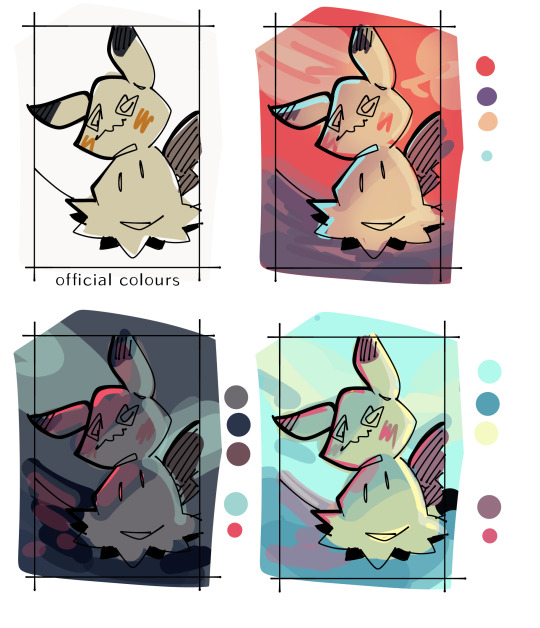
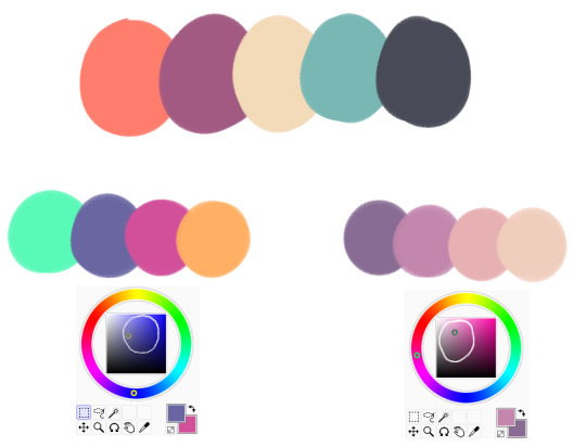
why do baby otohan’s colors look like fuckign TOOTHPASTE in this version 😭😭😭
#first version was a red-orange to vaguely green yellow analogous palette then i messed with the clothes a little and now i am failing at#color theory. help. this split complementary teal(ish) color and orange(ish) and pink(ish) is NOT working out#i do like my og colors so I’ll recolor this clothing version with that palette. but make otohan’s skin more saturated lol#i always desaturate skin so much 😭 it looks okay after rendering but OOF. light skin especially fucks me up WHY IS IT SO HARD TO DRAW#but yeah back to the original point I’m definitely gonna try out a bunch of different color palettes#i like the new clothes. i was definitely NOT an outdoorsy kid so idk what I’m doing here but#for the purposes of giving her a pointy stick I hc otohan to be that. i love the outdoorsy toothpaste baby. that’s a normal sentence to say#about otohan thull who is not depicted to be ANY of those things canonically. can you imagine if she was though. toothpaste killed 3 of bh#while screaming and crying and flailing around as babies do. can you imagine#… can y’all tell it’s INCREDIBLY late lmao?#wait i think i have a “late night art rambling” tag one sec#anyways that’s that for tonight’s late night art ramblings lol#<- THERE IT IS!#art ramblings
25 notes
·
View notes
Text
I want to hug the new tardis interior. I want to lie down on the floor in there. I bet it’s the perfect temperature (I know Donna said it’s cold but I like it cold). Looking up at the lights while they’re moving and blinking would be a healing experience for me I think.
#the color palette is so soft#like yeah it was blue and orange and green and purple but they were slightly desaturated and it was so soothing to the eye idk#I think it would just feel Nice in there#I love the clunkyness of the console; and how it’s slightly off-white#it’s all light and empty but it’s not in a sleek modern way; it’s still so cozy to me. it’s magic idk how they did that.#doctor who#dw 60th#the star beast#tardis
10 notes
·
View notes
Text
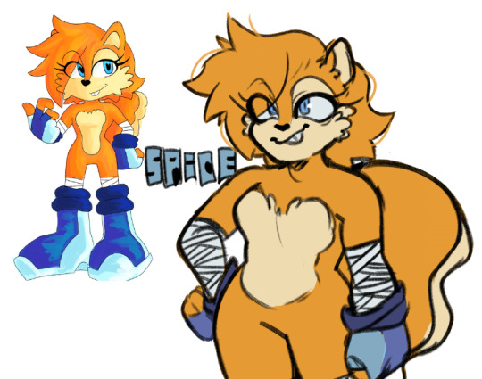
hello i was raised from the dead to doodle this pls enjoy @chaoxfix
#yes i still love sonic#i ghost ao3 tags LMAO#been busy with school#femme in stem things yk#and also splatoon 3#splatoon is an old love what can i say#but trying to get back into fanart and pushing my style!#ANYWAYS love chaoxfix always forever#and i love sally#this design is so cute#i just. i had too#will always love pretty designs of pretty girls!#sonic the hedgehog#sally acorn#sonic fanart#also desaturated the palette out of habit i am scared of fun colors
51 notes
·
View notes
Text
I think 90% of my gripes with how modern anime looks comes down to flat color design/palettes.
Non-cohesive, washed-out color palettes can destroy lineart quality. I see this all the time when comparing an anime's lineart/layout to its colored/post-processed final product and it's heartbreaking. Compare this pre-color vs. final frame from Dungeon Meshi's OP.


So much sharpness and detail and weight gets washed out and flattened by 'meh' color design. I LOVE the flow and thickness and shadows in the fabrics on the left. The white against pastel really brings it out. Check out all the detail in their hair, the highlights in Rin's, the different hues to denote hair color, the blue tint in the clothes' shadows, and how all of that just gets... lost. It works, but it's not particularly good and does a disservice to the line-artist.
I'm using Dungeon Meshi as an example not because it's bad, I'm just especially disappointed because this is Studio Trigger we're talking about. The character animation is fantastic, but the color design is usually much more exciting. We're not seeing Trigger at their full potential, so I'm focusing on them.
Here's a very quick and messy color correct. Not meant to be taken seriously, just to provide comparison to see why colors can feel "washed out." Top is edit, bottom is original.
You can really see how desaturated and "white fluorescent lighting" the original color palettes are.
[Remember: the easiest way to make your colors more lively is to choose a warm or cool tint. From there, you can play around with bringing out complementary colors for a cohesive palette (I warmed Marcille's skintone and hair but made sure to bring out her deep blue clothes). Avoid using too many blend mode layers; hand-picking colors will really help you build your innate color sense and find a color style. Try using saturated colors in unexpected places! If you're coloring a night scene, try using deep blues or greens or magentas. You see these deep colors used all the time in older anime because they couldn't rely on a lightness scale to make colors darker, they had to use darker paints with specific hues. Don't overthink it, simpler is better!]
#not art#dungeon meshi#rant#i'm someone who can get obsessive over colors in my own art#will stare at the screen adjusting hues/saturation for hours#luckily i've gotten faster at color picking#but yeah modern anime's color design is saddening to me. the general trend leans towards white/grey desaturated palettes#simply because they're easier to pick digitally#this is not the colorists fault mind you. the anime industry's problems are also labor problems. artists are severely underpaid#and overworked. colorists literally aren't paid enough to do their best#there isn't a “creative drought” in the anime industry. this trend is widespread across studios purely BECAUSE it's not up to individuals#until work conditions improve anime will unfortunately continue to miss its fullest potential visually#don't even GET ME STARTED ON THE USE OF POST-PROCESSING FILTERS AND LIGHTING IN ANIME THOUGH#SOMEONE HOLD ME BACK. I HATE LENS FLARES I HATE GRADIENT SHADING I HATE CHROMATIC ABBERATION AND BLUR
2K notes
·
View notes
Text
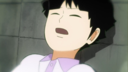
while combing through mob psycho to find clips for my amv i am making, i noticed a small difference in the way ritsu and mob remember what happened after the highschool bullies attacked them.
when we see mobs flashback, the story is a bit scattered, flashing through mostly static moments loosely pieced together from his hazy memory. the high schooler's faces are hard to make out. the color palette is very washed out, with the core colors being white and desaturated blues, with the red being the most vibrant color, because the key part of his memory is the blood.
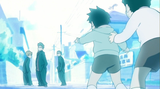

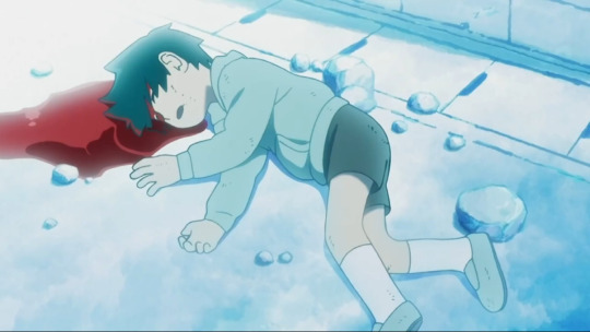

[ID: Mob Psycho 100 screencaps showing flashbacks to Mob and Ritsu's childhood accident. The first four are Mob's POV, and they're colored in a glowy blue and white, with Ritsu's blood the darkest and only other spot of color in the scene. We see Mob trying to stop Ritsu from yelling at older kids, Ritsu lying on the ground with a pool of blood seeping from under his head, and Mob looking lost with blood on his cheek. End ID]
in contrast, ritsu has a very clear telling of what happened. the moments are not as static, he remembers what color shirts they were wearing that day, he knows what caused mob to black out, for ???% to wake. the color palette is much more saturated.
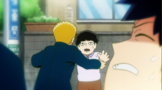

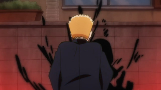
[ID: The next four are Ritsu's POV, and they're slightly hazy but in full color. We see Ritsu and Mob struggling while the older kids grapple them, followed by Mob hitting his head against a wall. Ritsu shouts with distress, and black energy and red light suddenly flares up from behind where the bully shoved Mob into the wall. End ID]
i think the contrast is very interesting, especially since both retelling of events happen in the same episode (season 1 episode 5 i believe, where teru is trying to fight mob). one of them has an extremely poor memory, mob can really only infer what happened, he even asks ritsu what he did when he was knocked unconscious. and while ritsu claims that he doesn't remember much of it, his mind is basically plagued from this memory, as much as he would probably like to forget. he thinks about this any time mob is faced with stress.
i don't think this was a very groundbreaking discovery, i just love moments like this where i can see how hard people worked on this show and the amount of detail they put in,... they could have very easily just repeated the same flashbacks from mob and add some more contextual shots from ritsus perspective but they chose to make that distinction.... so awesome.
816 notes
·
View notes
Note
Coli!! Hi hi good morning!! Do you have any Headcanons for Ruggie?? Like, when you draw him do you have anything you always include or leave out? Just curious hehe I love your art!! Have a nice day <3 <3 <3
Hi Dede! Thanks for the ask🥺😭💗
I will comment on what I would like to do differently when I draw him cause for me you write him PERFECT and I wouldn't change anything! This guy is precious and needs love to know he isn't inferior to anyone! 😭💗
⚠️ My headcanons (design) Ruggie Bucchi:
So, aren't that many changes, it's just simple, the way I usually imagine him 🥺👉👈
🍩 Skin: Ruggie has more melanin, I personally love Ruggie with any skin tone but forgive me Yana but it's hard to resist painting his skin like that.

I mean, I think it goes much better with his color palette. Personally, I would paint with this palette for him in my fanart and content forever.
I want to eternally thank whoever had the idea of giving more melanin to his plush 🥺💗
I don't know if it's my laptop screen that's old, but it looks a little desaturated, but I'll adjust over time.
🍩 Blonde lashes: I still need to practice more cause I love the idea that Ruggie would have some blonde lashes, not gold and flashy but brown light 🥺
🍩 Freckles: Excessive on the nose/cheeks, ends of the arms, and a lot on the back…IT'S CANON IN MY HEAD, YANA YOU FAILED ME, HOW YOU DARE?? HOW CAN YOU NOT GIVE HIM FRECKLES?😭
🍩 Body hair: Well, he's a guy who's growing, he's about to turn 18, there's no chance no have body hair. Besides, I believe that beastmen have more body hair than humans, so for Ruggie I imagine golden hair but if it gets wet it turns a little brown, on the arms and legs 😔👉👈
🍩 Eye pupil: I know that's normal but I like to think that his pupil becomes ''thin'' (how in English is this?) when he feels threatened or annoyed by something and dilates when he sees something that interests/likes him.
🍩 Teeth: Bigger and thicker than Leona and Jack. Please, spotted hyenas have a bone-breaking bite and tear thick skins too. Ruggie canonically said he can easily eat steak with bones…Oh gosh if he likes bite who he lov- STOP NICOLI SHHHH
🍩 Hair: A little rough and messy with some split ends, I don't think he cares much about any special shampoo or conditioner, taking care of his hair. Besides, I think he occasionally cuts it with scissors on his own. I know I could leave it wavy or curly but thinking that rough bristles remind me of hyenas' fur makes me so 🥺
🍩 Body: We know that Ruggie's thin cause his condition but I believe that his legs and arms are ''strong'' of cause the acrobatic way in which he moves, both day to day, running and practicing at the Club. I don't mean bulging muscles but you realize that given his activities and abilities it makes sense!!! 😔
🍩 About the piercing: it was a detail I wanted to add but I don't know if I always imagine him with that or not 🤡👌
Forgive my grammar and English mistakes!
These are my humble headcanons for Ruggie's design, if anyone thinks differently this is just fun for everyone, y'all have the right to imagine how they want.
And I would like to say one more thing, about other details that I can only talk about better with more drawings, such as excess hair with spots above his tail (I love this detail too).
So there will always be changes for everything!
Thank you again for your ask Dede, you're a wonderful writer that I admire so much and love your works! 🥺😭💗💗💗

#my headcanons for Ruggie bucchi#personal#twst ruggie#ruggie bucchi#twst savanaclaw#twst fanart#twst#twisted wonderland#disney twisted wonderland#savanaclaw#my art
656 notes
·
View notes
Note
Hello! Your art has relly nice, soft colors and I wanted to ask how you choose your color palettes if you don't mind.
well it's 4 AM so my thoughts maybe a bit jumbled and I'm totally ass with explaining but anyways- I learned colour by copying other artists and looking at a ton of photography... especially photography! There's a lot to learn about colour from all sorts of places be it people's clothing, small useless trinkets or insects
just be on a lookout most of art is just observational skills anyways
for pieces I actually care about I like doing colour thumbnails before doing anything like so- usually picking 2-3(sometimes more) main colours
my goal is to try and frame the main focus and thats typically done using a very contrasting accent colour, be it a complimentary one, a bright neon one to contrast with pastel or a desaturated colour etc.
In general- I use a ton of compliementary and triad palettes
on a related note, I actually consider the shading and lighting colours to be a significant important part of a pieces colour palette, since to me every single colour effects the piece
sometimes you will see me shade and light using existing colours around a piece, which ends up in weird sorta "unconventional" art decisions like using the colour blue to light yellow and sooo on- since I love experimenting with colour usage
and well it gives out cool results!
really just have fun with colour and don't be afraid to be clumsy and insane with it like me :)
#aecholapis#i use a ton of red blue and yellow jeeeesus fuckihn christ#primary colour fucking sweep i guess#long post#art tutorial
316 notes
·
View notes
Note
Hi!
I'm pretty new to art and trying to learn color to... weird results. I really love the way you use color in your art, it's like, the prettiest thing ever!! Could you make a tutorial or explain how you do it?
hello!
aw thank youu <3
I can't make a full tutorial right now but the gist of color palettes is finding colors that work together, most colors can work together if you find the right hue, I usually just wing these but it's basically about keeping an eye on the color saturation/brightness and make sure it's in range of the other colors
in a color palette usually you'll want to stick to 4-6 colors (loosely speaking) when it comes to entirely different colors, if you have many similar hues sometimes it can be better to just make it one (for example if you have several small details in a picture that don't necessarily need to be of different colors, u can just use colors already present in the palette for them)
and then there's colors u can use for shading! once you have your base color you use the slider on the color wheel to pick an adjacent shade and then pick a lighter or darker color within range and there u have it
there's just so many possible combinations also like desaturated colors + bright colors, the whole neon colors scale.. color theory stuff like complementary colors, anyway I hope this helps a little!
1K notes
·
View notes
Text
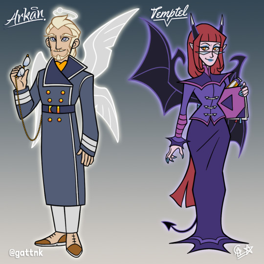
Arkan and Temptel embody everything a guardian should be.
Here they are, everyone's favorite teachers! Hands down the most iconic and beloved adults in both the comic and series, and with good reason: this pair is perfectly balanced in terms of design and personality, so I had to do them justice with my redesigns. I'm super proud of how they came out :D
My first step was comparing the comic designs to their show counterparts. The biggest difference for Arkan was his age: he was visibly older in the series, and I'd argue this decision was made so his character design would reflect his wisdom and authority better, and I'd focus on reflecting this notion. Meanwhile, Temptel saw little to no change, and I couldn't agree more with this decision made by the show staff: don't fix what ain't broke!
Teaching is all about theory and practice: knowing the rules and testing them out. I wanted Arkan to embody theory, and in turn Temptel would represent practice; it aligns with the role of angels and devils perfectly (who in turn represent "thinking slow" VS "thinking fast", respectively). As such, I decided Arkan would look more austere and grounded compared to Temptel's impeccably chaotic fashion.
Arkan's new outfit is based on pilot uniforms to evoke authority and discipline. The trench coat, foulard ascot and Oxford dress shoes override the military coding and turn it into classy and elegant. The reading glasses convey he's prepared to observe and learn. I wanted to convey experience, wisdom and authority without incurring on the old mentor trope. In character design, there's many ways of relying the same message!
"Spooky chic" came back with a vengeance! I love me some "spooky chic", which is definitely a staple of devil fashion at this point. I synthetized the shapes and details as much as I could for the sake of serialization: if this character had to be drawn over and over again in a comic or cartoon, a simpler but iconic design would make a big difference on the long run. I know I'd be grateful ;P
Arkan's color palette is a more desaturated version of Raf's, sans the red. I added warm brown tones and a bright orange (same color as Temptel's eyes!) to contrast all the blueish grey. I chose to make his cardigan a very muted color so it would complement the lighter tones much better.
Temptel's colors are a mix of her two palettes: her skin, hair and physical features take after the comic, while her wings, horns and dress are more purple like in the show. Her silver jewelry is a callback to Sulfus as well. Lastly, Temptel's makeup is the same blue as Arkan's eyes, but with the saturation value cranked up to the max.
Random tidbits that went into the design process: despite being younger than his show version, I wanted to keep Arkan's hair color light to complement Temptel's more saturated and darker colors. While I don't think he counts as an accurate representation of real albinism/achromia, I definitely coded him that way. As for Temptel, I thought sneaking in a little treat for her was appropriate, since she's the type of teacher who mixes work with fun: it's also a nod to her sweet tooth in the comics.
I believe this will be my last redesign duo this year since I want to focus on commissions and the holidays, but I'll definitely continue working on the rest of the Golden School staff.
As always, here's my shameless self-promotion of my AF fic I'll Fly With You, aaand there we go! Wish me luck and let's see what the future brings :D
107 notes
·
View notes
Note
HELLO I am deeply n irrevocably in love w ur art I was just wondering if you have any colouring/choosing colour palettes tips ? Hearthands
thank you sm!! i really adore color theory its like a mean wife to me. the way shes my everything but she never collaborates. anyway i made a little diagram. kindly note this is just how i taught myself color theory:
im not fond of pre-choosing a color palette mainly because im not sure where to place the colors, so in my head i determine what colors i want and shift them to match the background. this is usually why you can see most of my sketches having a tan bg - id rather have some color to affect my palettes rather than a plain white. its also easier on the eyes
to summarize: "i want an orange against this purple background" 1) pick an orange 2) shift it a little towards purple on the color wheel (this would put it in the red area) 3) is it too bright? darken it 4) is it eyestrainy? desaturate&darken it 5) still looks out of place? shift it more towards purple. heres the process in effect:
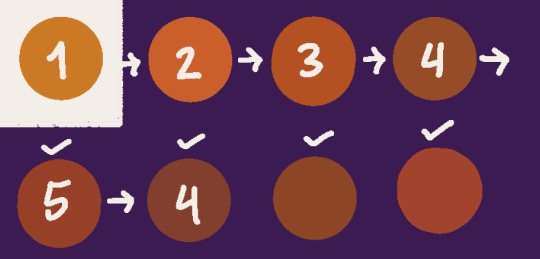
so much trial and error. i also use csps hue + color filters to shortcut this very often
#sometimes i will take art i like & play around with the eyedropper tool! so i can see how the colors affect each other relatively#dudele#tutorial#talking back
71 notes
·
View notes
Text
Ashley.
Analog. Lomochrome Color92 film, rated at 200 ASA. I like this film. If you pay attention to the color palette, and use reds and blues to your advantage it looks great. Skin tones tend to desaturate without an enough exposure/light. The grain is heavy and it curls like crazy. Hey I love film so it's nice to have options.
PH: (Me) Kevin Stenhouse
54 notes
·
View notes
Text
Dungeon Meshi Anime Review, Season 2, Episode 19 review
Izutsumi arrives! And Marcille has a nightmare.
This is an interesting episode but I know my spouse and I had desperately hoped that they would re-organize things somehow. Marcille's plot in this feels painfully tacked on and unrelated to Izutsumi's introduction, and the concept of the nightmare is so good, it could have easily been expanded to be an entire episode on its own. I wish they'd done that. They could have paired Izu's intro with the ice golem story to have one all-Izutsumi episode and then one all-Marcille episode... alas.
Those are changes I would have LIKED to see, but here's some changes I didn't like:
(MAJOR MANGA AND ANIME SPOILERS BELOW THE CUT!!!)
Trigger removed Laios' mother's only speaking line in the manga. It would have taken SO LITTLE to have someone read this single sentence, and removing it, in my opinion, has a negative impact on the story as a whole.
It SOUNDS like a generic thing when she asks Laios "When will you give us grandchildren?" But this is actually really important. Laios is afraid of being forced to make a family and participate in society. This is unusual because he's a man, most men in a historic time period of this don't really care about such things, but Laios is so afraid of it, it's a recurring nightmare!
This is also why he acted so weird seeing a loving father/baby scene in the magic paintings chapter. He hated seeing a father talk about how much they love their baby.
Laios is named after a story about murdering your children before they can hurt you. Like an Oedipus Complex supposedly means that a son wants to have sex with his mother, a Laios Complex means a man wants to kill his sons. Kui did not pick this name and then have Laios repeatedly be uncomfortable with children, marriage and fatherhood for no reason.
Obviously Trigger didn't make any of these connections and so they didn't think it was necessary for Laios' mom to speak this line out loud, but I vehemently disagree.
This is similar to my beef with them removing Yarn Floke's only dialog in the story and removing her from the scene with the Island Governor. That moment told us that Mr. and Mrs. Floke were equal partners, and now anime watchers assume she's just his wife who doesn't do anything. That sucks.
The addition of paintings of Marcille's father in the nightmare. Woof. I really don't care for this, if they wanted to do it i would have preferred it if they'd obscured the paintings somehow so it wasn't obvious that Marcille's father wasn't an elf.
I think this makes the later reveal of her half-elf status WAY less surprising.
Also, in the manga, the complete silence around her father created a strong subtext that Marcille's mother was her only parent that mattered. They could still accomplish this but I think it won't be as shocking.
People reading the manga probably thought "her dad was an elf and he died young and that traumatized her" (this is what Laios assumes I'm sure)
People watching the anime will think "her dad was a tall-man and his natural death of old age is what traumatized her" which is true, but they aren't supposed to actually know that yet...
Overall the episode was good aside from these issues. I liked that the nightmare sequence was in black and white, and the transition to color at the end was spectacular and very impactful... But part of me wishes they had done something else to differentiate the nightmare state from the normal animation. The black and white was good, but almost too subtle because the DM palette is already so desaturated.
26 notes
·
View notes
Text
On Colors, The Void Sea, And My Gripes With Rubicon
(or: i have decided to make a post detailing one of my pettiest gripes with downpour, because there is nothing stopping me from doing so. enjoy)
so. the void sea. we all know it, we've all seen it. lore, themes, motifs, etc etc. the meaning of it all has been discussed countless times by those more qualified than I, so today, i will take a somewhat different focus.
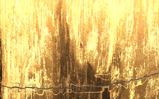
The Void Sea (and the associated Echoes) have a very distinct color palette of black and gold.


[images taken from the Rain World Wiki]


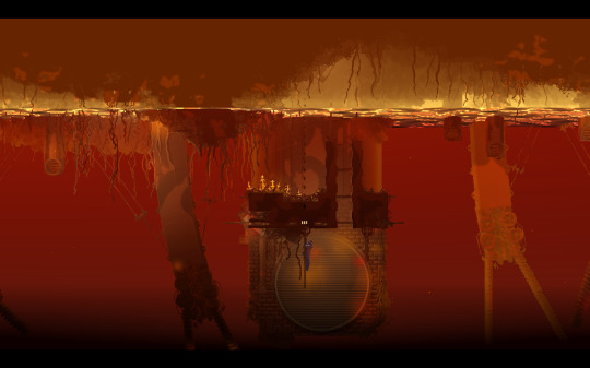
[images by me]
the pale gold is a stark contrast to the dark, almost blue-black* (*in the Void Sea, the black is actually tinted gold-to-red, but it's so dark you can hardly tell). It fades from almost white to a pale yellow to a golden orange, and then to a dark purplish tone before fading, again, into nothing. or, at the top of the void sea, it stops at golden orange, fading out into a golden brown.
It is bright without being oversaturated--it is distinctive, eye-catching, and very fitting for what it is.
And then Rubicon comes along and throws all of that out the goddamn window.


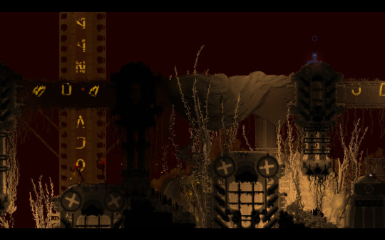
[images by me]
the red.... doesn't work. it's too bright, too saturated. it doesn't even look bad, necessarily (although i do find--especially in rooms like the last image--that it looks a bit off when combined with a very dark desaturated foreground and the void light effect [i'm not sure what it's actually called]), but it's not... it's not the void palette. it doesn't look like what the void sea should look like. i mean, just look at rubicon's "void fluid":

[image by me]
it's bright piss yellow with bright red-orange undertones--nothing like the pale gold of base-game void fluid. it's too saturated, too reddish. it's not how the void sea is depicted anywhere else.
...dare i say (and this just speculation on my end), rubicon's bright red palette specifically resembles the common pop culture image of christian hell. considering the region's acronym being hr, for 'hell region', i doubt this is pure coincidence.
i don't think i need to say this, but rain world is, crucially, not a christian game. to lean so heavily into popular culture's image of christianity's hell (which, tbf, i have my own issues with, but yk yk) is, if nothing else, perhaps the most boring direction Rubicon could have been taken in.
(tangentially, i also believe rubicon should've felt like more of a fever dream overall, but that is not the point of this post.)
when i see rubicon, i don't think void sea, i think minecraft nether. this is, imo, a poor design choice.
now, i love downpour. i love saint. i even love rubicon, as much as i have my gripes with it. this is not meant to insinuate anything about downpour's devs, etc etc etc. this is all just a discussion of some particular details i would've done differently, were i in charge of designing this region. if you disagree, that's fine! i'm just some guy making long posts about slug game, not like... an expert, or anything.
29 notes
·
View notes
Text
Desert duo horses

I didn’t LOVE the designs i did a few years ago and i literally have the ability to redraw and redesign anything i want so i did :3 i liked these colors more since they’re not so desaturated but i still love natural palettes (I’ll learn to use unnatural colors eventually ^_^”)
I’m a bit on the fence about the names since i do like their normal screen names but i wanted to think of smth fun for em!
Scar’s magic is still green and as much as i love pesky bird colors for Grian, i like to draw him in his sweater so the red in red would clash too much ╮( ̄▽ ̄"")╭
#talk to me about ponies! would love to hear personal headcanons#life series members or hermits!#grian#goodtimeswithscar#mlp hermitcraft#hermitcraft au#mlp au#hermitblr#trafficblr#dox doodles
38 notes
·
View notes
Note
is therre a reason a lot of your art is so desaturated? i imagine you have an evil twin called uh peasant-flesh who only uses the most vibrant, eye-burning colors possible
HAHA omg I only just saw this I LOVE peasant-flesh and their gaudy designs - and honestly a few reasons! Just kinda found myself enjoying desaturated palettes more and are I learnt more about colour theory and developed my knowledge of digital art. My earlier digital pieces have a lot more saturation!
This one is from 2018? WHOAH
but also keeping the colours really desaturated makes it VERY easy to draw attention when I DO use saturation- this is kinda the premise behind the entire colour design of last sprout, with the bright blues and reds being significant to characters and gameplay!
But yeah, cool question :3 thank u for asking!
25 notes
·
View notes
Last Seen Blogs
crisosike-blog
Cris Osike
wickedwarte
Kes.
my-spring-sun
SHOOT ME
paigeliebl
Live Your Own Life

kkidingg
Aadhar Card Number to Get LPG Subsidy