#sometimes i will take art i like & play around with the eyedropper tool! so i can see how the colors affect each other relatively
Note
HELLO I am deeply n irrevocably in love w ur art I was just wondering if you have any colouring/choosing colour palettes tips ? Hearthands
thank you sm!! i really adore color theory its like a mean wife to me. the way shes my everything but she never collaborates. anyway i made a little diagram. kindly note this is just how i taught myself color theory:
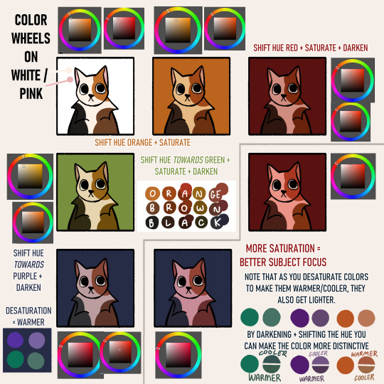
im not fond of pre-choosing a color palette mainly because im not sure where to place the colors, so in my head i determine what colors i want and shift them to match the background. this is usually why you can see most of my sketches having a tan bg - id rather have some color to affect my palettes rather than a plain white. its also easier on the eyes
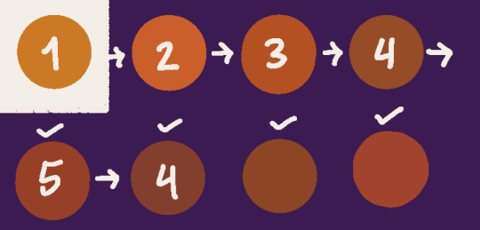
to summarize: "i want an orange against this purple background" 1) pick an orange 2) shift it a little towards purple on the color wheel (this would put it in the red area) 3) is it too bright? darken it 4) is it eyestrainy? desaturate&darken it 5) still looks out of place? shift it more towards purple. heres the process in effect:
so much trial and error. i also use csps hue + color filters to shortcut this very often
#sometimes i will take art i like & play around with the eyedropper tool! so i can see how the colors affect each other relatively#dudele#tutorial#talking back
71 notes
·
View notes
Text
S-Support Wallpapers: Style 2
You can download the Photoshop file for this style here! All the layers, effects, and backgrounds are already ready for you to use and play around with. I would assume you know the basics of how to navigate the program, but I’ll try to take it slow if you’re still new to Photoshop.
NOTE: I made this using Photoshop CS6! It should still open with the other versions (??), but you might have to adjust when following the tutorial.

Style 2, Type A

Ah yes. Everyone’s most favorite because of how cute and romantic it looks. But it’s the most troublesome to edit XD Prepare your artistic skills because you’ll need it for Type A!
To start off, you’ll need the portrait art and the special attack art of your characters for this wallpaper style. To place your files into Photoshop, go to File>Place>then find where your images are> Place.
Put the portrait artworks into the “Original 1″ group folder, and the attack art into “Original 2″ group folder. I would recommend duplicating those folders before you do anything with them in case you mess up and need to restart.
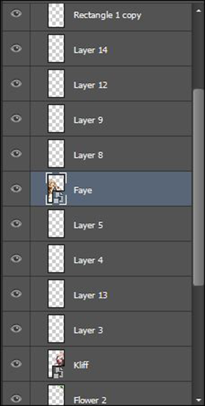
We’ll be working with the portraits first for Type A, so let’s go to the “Original 1″ group folder. Place your character images in between the layers named “Rectangle 1 copy” and “Flower 2″.

Select both character images and resize them together (CTRL+T). It’s easier if you resize them together because they’ll look even that way. It’ll look a bit off if one head is bigger than the other. My preference is to put the characters either knee-up or thigh-up. Sometimes I go waist-up, but I don’t zoom in any closer than that because they’ll take up a lot of space in the wallpaper. It’s always good to have a little bit of space.
Don’t worry about the height of the characters. Using the arrow keys, you can nudge the image up and down after you’re satisfied with the size. No one will know that one character’s feet passes the other.
For deciding on which character goes in front of who, it depends on how they’re posed. Be mindful if they’re carrying weapons too. If they are carrying weapons, you can flip the character image (Go to Edit>Transform>Flip Horizontal), or you can edit it out, as seen with my Laslow/Peri wallpaper above. I had to remove Peri’s lance because it was both blocking Laslow and because it doesn’t match the romantic vibe. But more on how to do that later in the tutorial.
Now that you got your characters positioned how you want, it’s time to do the facial edits! If you’re using original characters that came from Heroes, then you won’t have to worry too much about facial edits, since they already have some. You can combine different facial expressions to make a new one. I’ll also explain how to do this a later in the tutorial.
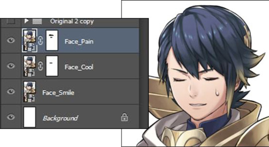
To start the editing, make a bunch of new layers above the characters images, like so. For a minimum, start with 3. You can always add more if you need. And don’t worry about how many to make. At the end, you’ll merge them so there won’t be a clutter.
You’ll make use of the Eyedropper tool (I), the Brush tool (B), and the Eraser tool (E) a lot for this process.
Don’t worry about what kind of brush to use. No need to be fancy and download brushes. I just use the default round brush that Photoshop has. How you set your brush settings will depend on you and the style of your character’s artist. Be sure to keep using the Eyedropper tool from the artist’s original art, and change brush settings when necessary.
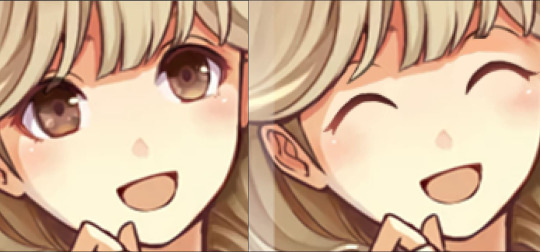
Before you even start drawing, have an expression in mind. I want Faye to look like ^v^. So to do this, I have to cover up her art with her skin color first. Use the layer directly above the character image layer for the skin cover-up (this would be layer 8 for Faye, and layer 3 for Kliff). Using those three tools above, this is how I cleaned up Faye’s face.

If your artist uses a blending style of painting, you can either change the hardness of your brush to 0%, or use the Blur or Smudge tool to blend. Keep in mind that I’m only using the default round brush. If you already have a brush that can do the job, then go ahead and use it.
After the cover-up layer looks good, use the layers above that one to draw in your expression. Make sure to deeply analyze the artist’s style beforehand in order to copy it. Small details like outlines, shading style, and use of shapes really make a difference. Turn the skin layer on and off if need be in order to see the original art below and copy it. And don’t forget to zoom out once in a while to see how your drawing looks from afar!
I can’t tell you how exactly to do this, I’m afraid. So good luck to you on this step. Take all the time you need to draw your expression. Try not to worry about making it exactly authentic!
Here’s how my expression turned out.
And after that, just add the blushies! Yeah, Faye is already blushing, but you gotta exaggerate! For the extra cute effect! For this part, I make sure to put the settings for both the Brush tool and the Eraser tool at 0% hardness, and make the sizes of those tools big.
To start off, brush a huge streak of a red or pink color down on the cheek area. Then using the eraser with very soft edges, erase around the edges of that streak to get the look that you want. I do not recommend pressing and holding down as you erase! Use single clicks! That way you have more control over how the blush looks. You can even lower the opacity of the blush layer to not have it be so prominent on the face.
Erase the blush areas that go past the cheek, like in the hair. You can change the eraser hardness back to 100% for this. If the blush is on the ears, that’s fine. It’s natural for the ears to also get red when someone blushes.

Select all the layers you made for your character and press CTRL+E to merge them. BUT ONLY DO THIS WHEN YOU’RE SURE YOU’RE SATISFIED WITH THE LOOK!
And now Faye’s done! Her change was pretty simple. Just closing her eyes and adding more blush. But what if there’s more to edit? Like changing the eyebrows (there’s a lot of scowling Heroes out there), or changing where the character is looking? Or what about their mouth!? Well, I’ll go over a bit of that with Kliff.
Start similarly to how I made Faye. Make the skin cover-up layer, and then draw what you need to. For eyebrow changes and for the mouth, you just draw on it. You don’t have to make a big change with the mouth. Just erase bits of the corners, and then draw an extension of the mouth to make the character smile, or smirk, depending on their personality. You’d have to draw a completely new mouth if you wanna give them a huge smile. Keep the artist’s art style in mind if you’re going to do that.

For changing where a character is looking, you’d need to use the Clone Stamp Tool (S), in addition to the previous three tools we’ve been using. And you’d have to rasterize the image of your character before you can use the Clone Stamp tool on it. To do this, select the layer your character image is on, right click, and then click on “Rasterize Layer”. Now you can use the Clone Stamp tool on it.
Cover up the irises on a layer. It can be the same one you used for the skin cover-up layer, or use a new one. Now that you rasterized the image, you can draw on that image now, so make sure that you don’t do that!
Once you’re done covering up the irises, go back to the character image and select that layer. Then use the Clone Stamp tool. To start cloning, hold down Alt. Your mouse will change into a circle with a cross in the middle. As you’re holding down Alt, click on where you want the cloning to start; in this case, it is the iris. Pick either one.
And then go select an unused layer. Click anywhere on the canvas to put down the clone of the eye. The Clone Stamp tool will work like a brush tool, duplicating the character image.
This is how mine looks. I even named my layers to help make sense for you (hopefully you can read it?).

And yes, my new eye is not where it’s supposed to be. You can move around the layer after taking out the bits that are not the iris. Don’t worry if the iris no longer fits the sclera. Either erase, or make a new layer and draw the missing pieces. Now do this again for the other eye.
And ta-dah! Now add the blushies, and you’re done.

Like in my last tutorial, you can add the Exposure adjustment the character images using the clipping mask in order to make the character look more cohesive. I did this for Kliff, but left Faye alone.
Lastly, the background. “Layer 2″ is the gradient layer for the background color. Select the Gradient tool (G), For the first color, find the very first layer of this file named “Clair”. There, you’ll find Clair (lol XD). I like to use her hair color for the first color. The second color is your choice, and then move the location of that second color to 50%. Then just play around with the gradient until you’re satisfied with how it flows. Make sure the yellow is on top. Or not, you don’t have to use Clair’s hair.
And you’re done with Type A!
Now going back to what I said before. How do you take out a weapon?
There’s a safer way to erase something, and that’s using the layer mask. I used this tool to take out Peri’s lance, and also for other things.
Look at the bottom of the layers panel. Find the icon of a white rectangle with a hole on it. Select the layer you want to start erasing, and then click on that icon.

Your selected layer should look like in the image above after you click on the layer mask icon. To “erase”, make sure you’re using the color black as you’re brushing away what you don’t want, and use the color white if you want to bring something back.
If you want to have the characters look like they’re intertwining instead of just putting one in front of the other, duplicate the characters, and then use the layer mask on the top version of that character. As seen in the picture above, there’s another Laslow layer below the Peri layer. This is how I made parts of Laslow and Peri go in front of the other, without having to cover the other completely.
If you want to do this, it is best to make the facial edits first, and then use the layer mask.
And lastly, how do you combine facial expressions of a Heroes OC to make a new expression?
First, find all the expressions you want to combine, and place them in the layers. Once you have what you want, select all of the expressions and resize them together. It’s important to resize them together. If you move them, you also move them together. Order the expressions based on the parts of the face you need. When you have the size that you want, use the layer mask on all of the images except the bottom expression. Then just “erase” the parts of the above layers to show parts from the layers below. This might take a bit to understand how to do.
Here’s an example of Alfonse from a request.

Add the blushies, and you have an awkward and embarrassed boy.
Style 2, Type B

Thankfully this one doesn’t take much explaining to do. Goodness, Type A had a lot to be explained oof.
Put the character images in between the layer named “Swirl 2 copy” and the hue/saturation adjustment layer. Then resize and arrange the characters how you want. Unlike Style 1, Type B from the last tutorial, I prefer to have the characters face the same way for this one. With all the special effects flying around, it’s really easy to make Type B look chaotic, but it’s our job to make it not look chaotic.

I like to add a Drop Shadow effect on the characters to make them pop a bit more from the background. To do this, double click on the layer, and a pop-up should appear. Select the “Drop Shadow” at the very bottom. Edit however you like. I prefer to keep all the settings the same except the color. I would change it to something other than black. And then add the Exposure adjustment if need be. Make sure you clip the adjustment layer to the character layer, or else it would affect everything below that.
Once you’re done, select the layer named “Layer 1″, and then create a gradient that you want on that layer. The base I made has 3 colors, but you can also use more or less than that. Don��t forget to play around with the layer modes to see which version can best create the look that you want.
And that’s how you make Style 2! This was a very long tutorial, and great job for sticking to the end! I hope that tutorial was understandable? I understand if you got lost though... Type A was a doozy. My ask box and DMs are always open if you have any questions.

32 notes
·
View notes
Text
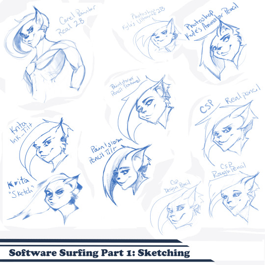
Artist’s Software Surfing P1 - Sketching
SSSo recently, after finishing (an admittedly long-overdue) a piece, I decided to download a trial of the new Corel Painter 2019. I hadn’t used Painter since my old DeviantArt days (circa 2005) and wanted to see how it felt with more digital art-veteran hands. Loaded it up, started sketching my default doodle-muse and wow, that “Real 2B” pencil feels great. I loved it so much, and wondered why.
That’s the story that is spawning this weird personal series of Software Surfing. I wanted to write little notes to future-me on how it felt using my favorite sketching tools in each program I have, and after the sixth one I thought it might be a good idea to check out inking, colouring, painting, etc. and writing those down as well.
So I’m writing this series for myself, but making it available in case anyone else can benefit as well. Thanks for sticking with the intro, let’s get into it.
Artist’s Software Surfing P1 - Sketching
Artist’s Software Surfing P2 - Inking
Artist’s Software Surfing P3 - Colouring
Artist’s Software Surfing P4 - Painting
There are many ways to sketch, but this is specifically the classic “pencil” or “drawing” form using the tools with the program’s default settings.
As an introduction, this is my doodle-muse, Cloey. She was my first original character, and though I don’t usually share my anthro art on here (I know that’s not everyone’s thing) I do have a separate blog for that stuff that you can find here if you’re so inclined. If you’re familiar with Artgerm (and you should be), she’s basically my Pepper.
Corel Painter’s “Real 2B”:
The one that started it all. The pencil just GLIDES, and I’ve always loved when you can tilt a pencil tool and it will shade just like tilting a real-life pencil. The only thing I want from a program now is to be able to bind touch to blenders so I can use my finger to smudge-blend the scribbling. (I tried drawing that fist so many times /fume)
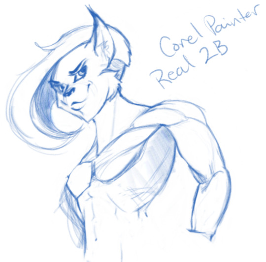
Likes: Tilt functionality, line width variance, stroke speed, eraser
Dislikes: Rebinding Rotate Canvas tool was a pain. I like Shift+Space, and that key combo is reflected in the shortcut panel, but it just continued to pan. Never worked for me, and rotating or flipping the page quickly is crucial for my sketching process. Also sometimes if I quickly resize the eraser and mash it down to use, it won’t detect any input.
Photoshop, Kyle Webster’s “2B” & “Animator Pencil”:
**Disclaimer** Firstly, I’ve used Photoshop for over 15 years now, and it’s a great digital art tool, but for drawing and painting I find it’s sorely lacking. It’s slow, expensive, and unintuitive. That being said, there are some things this program does exclusive to others so I’m still clinging to it (desperately) and while I would definitely recommend something else for budding digital artists, I have to supplement my misgivings by purchasing additional plugins and tools, such as the famed Kyle T Webster’s Ultimate Megapack for Photoshop (
which is now complementary with Photoshop CC, damnit
). Unless otherwise noted, all the brushes I use in Photoshop will be from that pack. **End Disclaimer**
Following off the heels of Corel, I remembered messing around with another “2B” (which btw is my personal favorite traditional pencil to sketch with) in Kyle Webster’s Drawing Box in Photoshop. It felt a bit similar, but with no tilt functionality and it really lacked the chunky-thickness (a scientific term) I enjoyed with Painter’s pencil. I switched to my favorite (and the favorite of MANY digital artists btw) his “Animator’s Pencil”. So chunky, but the ability to shade lightly... It’s really a fun brush to use for sketching digitally. Still one of my absolute favorites.

Animator Pencil Likes: Line width variance, texture fills in and scales perfectly
Dislikes: It’s a photoshop exclusive, a program that for some reason you can’t bind shortcuts to whatever you please, takes forever to load, and WAY too often suffers input lag while drawing. Also no tilt shading, :’( aw
Paintstorm’s “Textured Pencil” & “Pencil Tilt”
As a bit of an aside, I love Paintstorm, Paintstorm is what got me back into digital drawing and painting after doing 3D and game design for 7 years. I bought it for the very low price of entry (2 licenses for $30) and was impressed by its ability to customize literally anything in the program. You can create your own tool/brush boxes, bind any shortcut to any key combination, and every single brush tool adjustment comes with the most customization control of any program I’ve come across since Photoshop set the bar way back in the day. Out of the box a lot of the basic brushes have that old OpenCanvas or PaintTool Sai feel, but more recently they’ve added some very textured default brushes you can play around with. It’s also hands-down the FASTEST program I’ve ever worked in. I highly recommend giving it a try, it’s great for learning and experimentation. I grew a lot working in Paintstorm.

The Textured Pencil is a fun sketching brush, you can get as think or thick as you’d want and it keeps a clean outline. The Pencil Tilt really blew my mind the first time I used it. YOU CAN SHADE! It was the first time I had ever seen a program do that. The tilt has a great texture, fantastic control, and gets just as dark as you’d need. I’d recommend using them both, the Textured Pencil for a cleaner sketch, and the Pencil Tilt for something more expressive or loose.
Krita’s Ink-Tilt & “Sketch”:
I’ll be honest, I have almost no experience in Krita despite having downloaded and given it a try back in 2014. It was a hell of a time to figure out how to rebind my usual shortcuts (flip horz, rotate canvas). I couldn’t even rebind colour grab/eyedropper. Yikes. I opened up the “Sketching” brush box and there were only two options, made worse as one was a sketch pen... That lacked the flexibility of ballpoint.
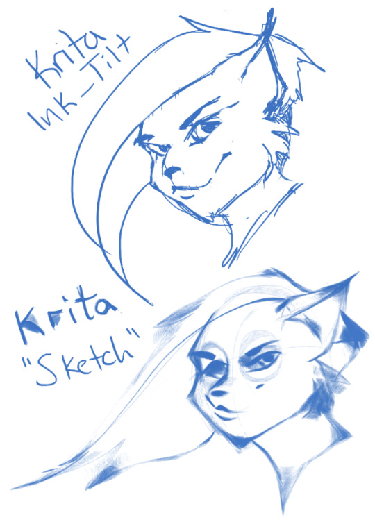
First I grabbed the pencil dubbed “Sketch” and was bewildered why the size of the circle was so large compared to the mark it made. Very confusing. Feeling intimidated, I abandoned it immediately to try out the “ink_tilt” (which by the way there’s no tilt functionality??) and hated it. I reluctantly went back to the pencil and just started trying to make marks. Wow. It’s weird, but surprisingly fun. You have to be willing to relinquish a LOT of control, but the shapes the brush makes while moving and tilting during a stroke can yield some really interesting and suggestive shapes. I would say great for early concepting or making something really loose and expressive. Fun to play with, but not really practical.
Clip Studio Paint’s Real Pencil & Rough Pencil
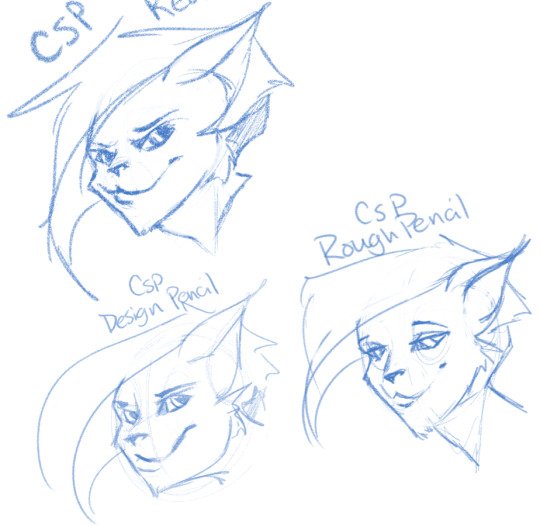
I’ve been wholly immersed in CSP since I purchased the program back in late 2016. It goes on sale often, so you can pick up a nice fully featured program for ~$35. I’d had my eye on it for a while and still really want to get into self-publishing comics, so I picked it up, bought a couple of brush packs for it (it’s pretty lacking in default painting tools) and I’ve been illustrating in it ever since. The brush creation isn’t as fun as Paintstorm, but brushes are quite customizable. I usually like to use the “Rough Pencil” if I want just a little texture and line variance, or the “Darker Pencil” for something cleaner. Trying to be different, I just jotted out a couple heads in ones I don’t normally use, the Real Pencil and Design Pencil. The Real Pencil has a lot of texture, but for some reason in CSP the textures don’t seem to scale with the brush, so I tend to avoid using it in most cases. I hate the design pencil, I just could never get dark enough. I guess that’s probably the point, though.
Well, that definitely wraps this digest up. I feel refreshed after trying out a lot of new digital sketching brushes. I was really reminded of how much I enjoyed drawing in Paintstorm. I hope someone other than me found this useful or otherwise inspiring! Sometimes, especially if you’re stuck in some art blockage, it’s a good idea to try something new, and for me digitally that’s hopping programs and trying new brushes.
I’m thinking about doing inks, colours, and painting at some point. Let me know if anyone’s interested in those! I’m planning on doing some for myself eventually, but I might expedite a post if anyone is interested. o/ Take it easy, y’all.
Artist’s Software Surfing P1 - Sketching
Artist’s Software Surfing P2 - Inking
Artist’s Software Surfing P3 - Colouring
Artist’s Software Surfing P4 - Painting
6 notes
·
View notes
Last Seen Blogs

nextinline-if
Next in Line - A Royal Interactive Fiction

marshalllange52
The Journaling of Perkins 601

bmobailey
Bailey

unpopularwriter25
Writing For Fun
alunasky-blog
Alunasky