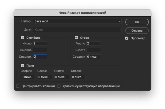
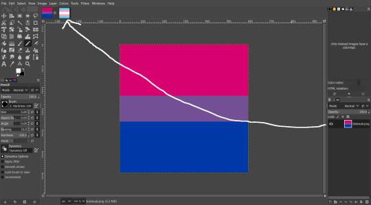
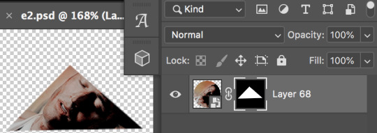
#but how will i fit them into a 540x540??
Text

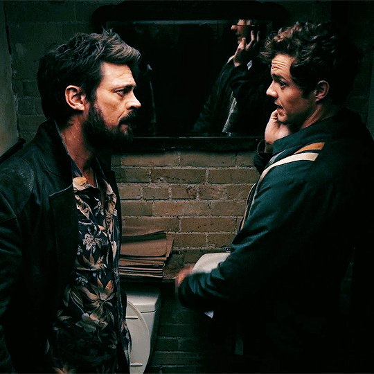
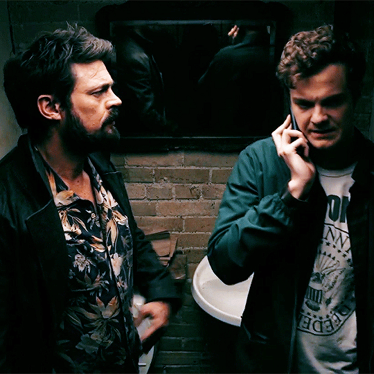

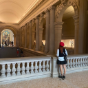
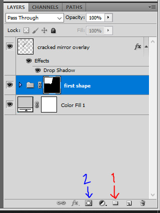
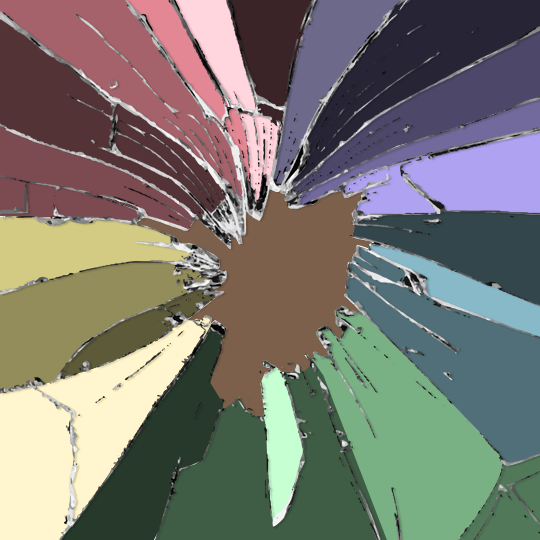
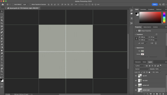
First time in a bathroom stall, definitely not the last.
Butcher & Hughie | The Boys S01E01
#i should make one of all the times they're in bathrooms together (so many instances oh my god you two)#hughie campbell#jack quaid#billy butcher#karl urban#the boys#cara gifs#like honestly#with other characters it's like#but how will i fit them into a 540x540??#but not these two#always so goddamn close#i'm losing my mind#just touching each other casually#RIGHT AWAY#this is like their second meeting#also that thumbs up is SO just jack quaid jesuschrist
310 notes
·
View notes
Text
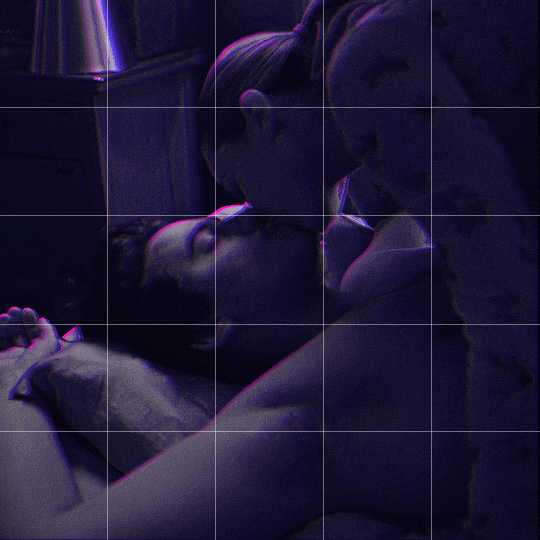
Someone asked me how I created the fade transition in this gifset which I’ll try to explain in the most comprehensive way that I can. If you've never done something like this before, I suggest reading through the full tutorial before attempting it so you know what you'll need to plan for.
To follow, you should have:
basic knowledge of how to make gifs in photoshop
some familiarity with the concept of how keyframes work
patience
Difficulty level: Moderate/advanced
Prep + overview
First and foremost, make the two gifs you'll be using. Both will need to have about the same amount of frames.
For ref the gif in my example is 540x540.
I recommend around 60-70 frames max total for a big gif, which can be pushing it if both are in color, then I would aim for 50-60. My gif has a total of 74 frames which I finessed using lossy and this will be explained in Part 4.
⚠️ IMPORTANT: when overlaying two or more gifs and when using key frames, you MUST set your frame delay to 0.03 fps for each gif, which can be changed to 0.05 fps or anything else that you want after converting the combined canvas back into frames. But both gifs have to be set to 0.03 before you convert them to timeline to avoid duplicated frames that don't match up, resulting in an unpleasantly choppy finish.
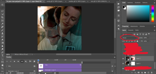
Part 1: Getting Started
Drag one of your gifs onto the other so they're both on the same canvas.
The gif that your canvas is fading FROM (Gif 1) should be on top of the gif it is fading INTO (Gif 2).
And here's a visual of the order in which your layers should appear by the end of this tutorial, so you know what you're working toward achieving:

Part 2: Creating the grid
Go to: View > Guides > New guide layout
I chose 5 columns and 5 rows to get the result of 25 squares.
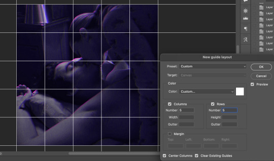
The more rows and columns you choose, the more work you'll have to do, and the faster your squares will have to fade out so keep that in mind. I wouldn't recommend any more than 25 squares for this type of transition.

To save time, duplicate the line you've created 3 more times, or as many times as needed (key shortcut: CMD +J) and move each one to align with the guides both horizontally and vertically. You won't need to recreate the lines on the edges of the canvas, only the ones that will show.
After you complete this step, you will no longer need the guides so you can go back in and clear them.

Follow the same duplicating process for the squares with the rectangle tool using the lines you've created.
Align the squares inside the grid lines. The squares should not overlap the lines but fit precisely inside them.
This might take a few tries for each because although to the eye, the squares look all exactly the same size, you'll notice that if you try to use the same duplicated square for every single one without alterations, many of them will be a few pixels off and you'll have to transform the paths to fit.
To do this go to edit > transform path and hold down the command key with the control key as you move one edge to fill the space.
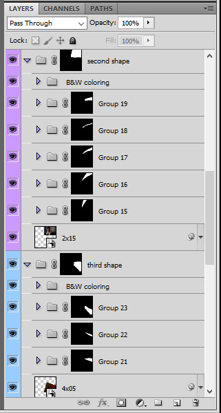
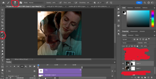
Once you're done, put all the squares in their separate group, which needs to be sandwiched between Gif 1 and Gif 2.

Right click Gif 1 and choose "create clipping mask" from the drop down to mask it to the squares group. This step is super important.
After this point, I also took the opacity of the line groups down to about 40% so the lines wouldn't be so bold. Doing this revealed some squares that needed fixing so even if you aren't going dim the lines, I recommend clicking off the visibility of the lines for a moment to make sure everything is covered properly.

Part 3A: Prep For Key framing
I wanted my squares to fade out in a random-like fashion and if you want the same effect, you will have to decide which squares you want to fade out first, or reversely, which parts of Gif 2 you want to be revealed first.
In order to see what's going on underneath, I made Gif 1 invisible and turned down the opacity of the squares group.

If you want text underneath to be revealed when the squares fade away, I would add that now, and place the text group above Gif 2, but under the squares group.

Make a mental note that where your text is placed and the order in which it will be revealed is also something you will have to plan for.
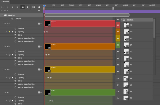
With the move tool, click on the first square you want to fade out. Every time you click on a square, it will reveal itself in your layers.
I chose A3 to be the first square to fade and I'm gonna move this one to the very top of all the other square layers.
So if I click on D2 next, that layer would need to be moved under the A3 layer and so on. You'll go back and forth between doing this and adding key frames to each one. As you go along, it's crucial that you put them in order from top to bottom and highly suggested that you rename the layers (numerically for example) which will make it easier to see where you've left off as your dragging the layers into place.

Part 3B: Adding the Keyframes
This is where we enter the gates of hell things become tedious.
Open up the squares group in the timeline panel so you can see all the clips.
Here is my example of the general pattern that's followed and its corresponding layers of what you want to achieve when you're finished:
So let’s try it!
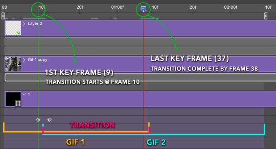
Expand the control time magnification all the way to the right so you can see every frame per second.

As shown in Part 3A, select your first chosen square.
Where you place the time-indicator on the panel will indicate the placement of the keyframe. Click on the clock next to opacity to place your first keyframe.

Move the time-indicator over 3 frames and place the next key frame.

Things to consider before moving forward:
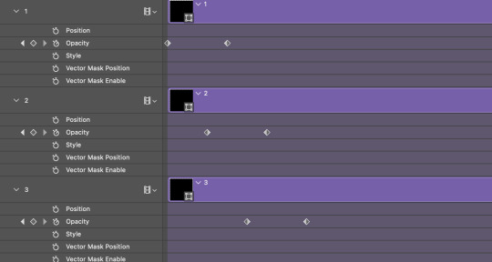
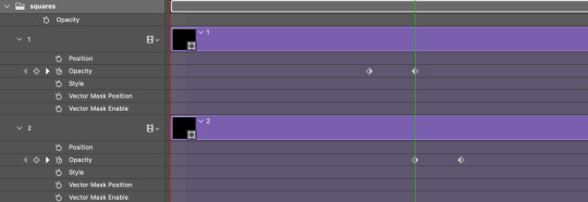
Where you place your very first keyframe will be detrimental. If you're using a lot of squares like I did, you may have to start the transition sooner than preferred.
If you're doing 25 squares, the key frames will have to be more condensed which means more overlapping because more frames are required to finish the transition, verses if you're only using a 9-squared grid. See Part 4 for more detailed examples of this.
The opacity will remain at 100% for every initial key frame, and the second one will be at 0%.
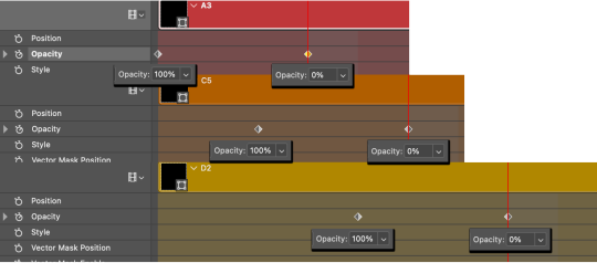
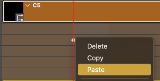
Instead of creating two keyframes like this and changing the opacities for every single clip, you can copy the keyframes and paste them onto the other clips by click-dragging your mouse over both of them and they'll both turn yellow. Then right click one of the keyframes and hit copy.
Now drop down to your next clip, move your time-indicator if necessary to the spot where the first keyframe will start and click the clock to create one. Then right click it and hit "paste".

Tip: When you have both keyframes selected, you can also move them side to side by click-dragging one of them while both are highlighted.
Your full repetitive process in steps will go as follows:
click on square of choice on the canvas
drag that square layer to the top under the last renamed
in timeline panel: drop down to next clip, move time-indicator tick to your chosen spot for the next keyframe
create new keyframe
right click new keyframe & paste copied keyframes
repeat until you've done this with every square in the group
Now you can change the opacity of your squares layer group back to 100% and turn on the visibility of Gif 1. Then hit play to see the magic happen.
PART 4: Finished examples
Example 1
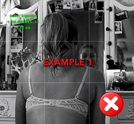
the transition starts too soon
Cause: initial keyframe was placed at frame 0
the squares fade away too quickly
Cause: overlapping keyframes, seen below.
(this may be the ideal way to go with more squares, but for only 9, it's too fast)
Example 2
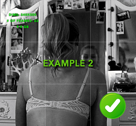
more frame time for first gif
transition wraps up at a good point
Cause: in this instance, the first keyframe was placed 9 frames in, and the keyframes are not overlapping. The sequential pair starts where the last pair ended, creating a slower fade of each square.
Part 5: Final Tips and Saving
You can dl my save action here which will convert everything back into frames, change the frame rate to 0.05 and open the export window so you can see the size of the gif immediately.
If it's over 10gb, one way to finesse this is by use of lossy. By definition, lossy “compresses by removing background data” and therefore quality can be lost when pushed too far. But for most gifs, I have not noticed a deterioration in quality at all when saving with lossy until you start getting into 15-20 or higher, then it will start eating away at your gif so keep it minimal.

If you've done this and your gif is losing a noticeable amount of quality and you still haven’t gotten it below 10gb, you will have no choice but to start deleting frames.
When it comes to transitions like this one, sometimes you can't spare a single frame and if this is the case, you will have to return to the timeline state in your history and condense the key frames to fade out quicker so you can shorten the gif. You should always save a history point before converting so you have a bookmark to go back to in case this happens.
That's pretty much it, free to shoot me an ask on here or on @jugheadjones with any questions.
#gif tutorial#photoshop tutorial#transition tutorial#grid tutorial#usergif#ps help#tutorials#tutorials*#requested
219 notes
·
View notes
Note
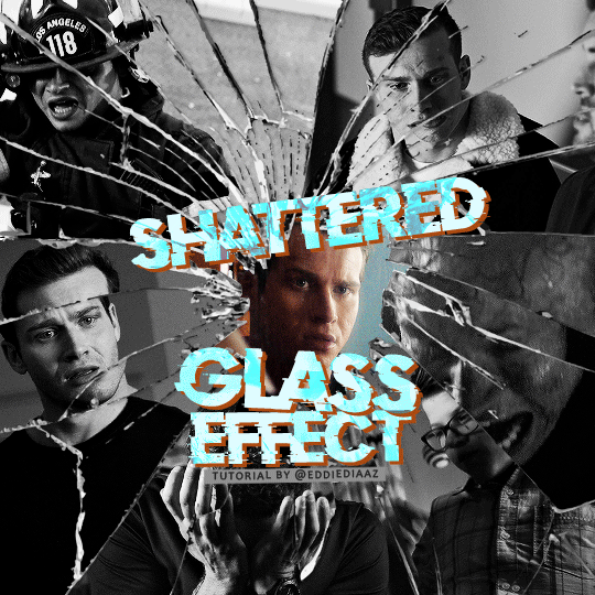
alie! I absolutely adore this mirrorball x buck set that you made last year! (/post/701462848238403584/) (also I can't believe it's been a year, like seriously what is time?) I was wondering how you did the shattered glass effect in the first gif? in particular how you made the black and white gifs appear distorted within the glass if that makes sense? thank you!!!
ahhh thank you so much renee! literally what is time lol, this gifset is still one of my faves that i made. the shattered glass effect is mostly just a lot of layer masks to be honest hahaha. i'm so glad i still have the psd, so here's how i did it under the cut~
(this tutorial assumes you know how to put multiple gifs in the same canvas and are familiar with layer groups and masks)
I. PREPARATION
first things first, create an empty canvas of your desired size. mine was 540x540 px.
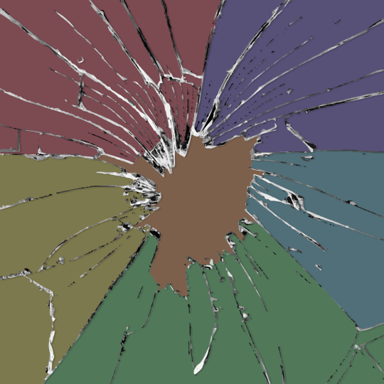
then, you need to find a cracked glass texture. if i remember correctly i simply googled something like "broken glass png", "cracked glass png", because i wanted something already transparent.
(a texture that's something like black lines over a white background definitely works too, you'll just have to put that layer's blending mode to darken or multiply.)
here's the png i used (and a download link for best quality):
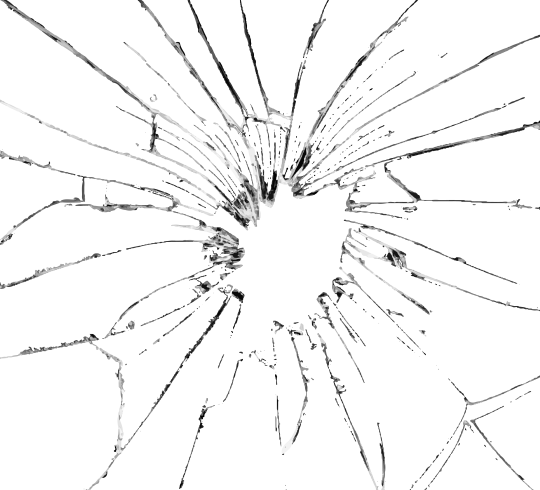
and after positioning it into my canvas.

II. CREATING MAIN SECTIONS FOR GIFS
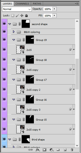
so basically when i did is i sectioned parts of the texture for each gif that i wanted to put. following the texture's lines, i zoomed in and carefuly drew a first shape along the lines with the polygon tool. you can also put a color fill layer behind the cracked glass layer so it's easier to see, like i did.
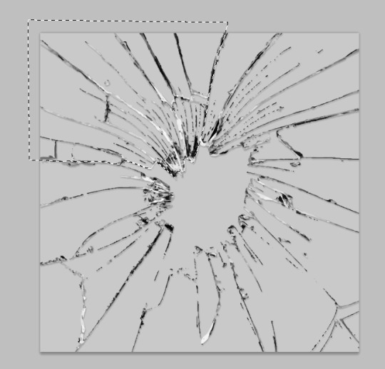
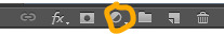
once you have your shape selected, click on the folder icon (1), then on the layer mask icon (2). it should give you a nice masked group to put gifs in hehe
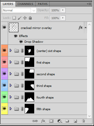
then i repeated the process until i had all of my desired shapes. i've put some color layers so it's easier to see, but here are my 6 main shapes and how my layer groups look like so far:
III. GIFFING TIME
after screencaping and making all 6 gifs required for each section, you need to put all of them in the same canvas. i simply put one smart object gif layer in each group created earlier. then, i resized and rotated each gif to fit its group (by hitting ctrl + T while selecting the gif layer), as you can see with the gif labeled 6x02 in the layers preview. for the coloring, i went simple with black and white for most of them.
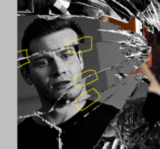
once i have all six gifs sharpened, colored, and placed in each shape group, the gif looks like this. the broken glass texture does most of the work to be honest:


obviously the center gif doesn't have any kind of effect, it's just colored as usual, so i'm not gonna go over it. it's just one gif layer in a masked group.
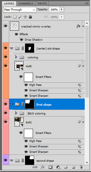
IV. SUBSECTIONS FOR DISRTORTED EFFECT
okay so for the distorted effect it's even more layer masks! basically i created more smaller sections within each main shapes already, still following the cracked glass texture's lines with the polygon tool and put them in individual masked groups like i did in the second step. here's how i ended up dividing each main sections:
yep, each color here is a different masked group, for example the 2nd and 3rd shape sections:
for each main shape section, you want to duplicate your gif layer the same amount of times as you have subsections within that shape. so if the main shape has 5 smaller subsections, i want 5 layers of that same gif. just make sure to not change its duration or position yet, and make sure the coloring layers/group stays on top of the groups in its shape section. then, simply put one gif layer duplicate in each group. example of my layers for the second shape so far:
then just repeat this until all subsections have its own gif layer.
V. DISTORTED EFFECT
this is the best part! and it's really easy. basically you want to slightly move each subsection by a few pixels, so they're in a slightly different position than the ones next to it.
to do so, select one of the gif layers and with the arrows on your keyboard, move it left or right, and even up or down if it looks good. i do this for all duplicated gif layers, making sure it looks like they're all slightly offset. focus on the cracked glass overlay's lines while nudging the gif layers, it's easy to see how the shapes break when you move them. for example here:
this is really just all trial and error, you just need to move each subsection gif layer by a few pixels with the keyboard arrows until it looks good to you.
here's my result once i've done this for all (23!!) subsections:
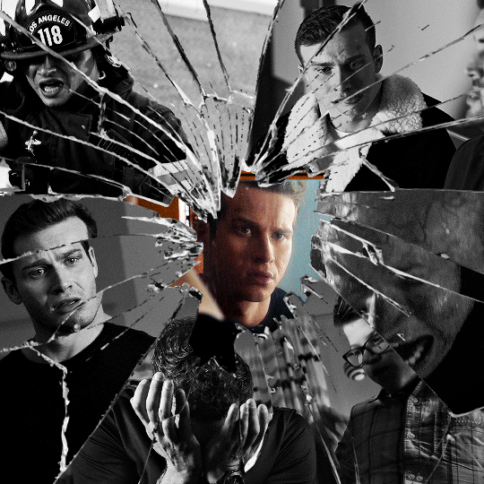
VI. FINAL TOUCHES
i don't think i did much else to this before typography besides adding a bit of contrast overall and a thin drop shadow to the cracked layer texture on top of everything. if you have a transparent png this definitely helps to give a bit more dimension to the effect. so here's the final result:
i hope that was clear enough hehe :D
#alie replies#tutorial#photoshop#resource#*ps help#completeresrouces#allresources#userhella#userabs#userkarolina#userdena#tuserheidi#usercats#userrainbow#userbunneis#usersmia#tuserabbie#usertreena#usernik#swearphil
370 notes
·
View notes
Text
gif tutorial
@bakedbakermom requested a tutorial on how i made the gifs in this set, so i've put together a little walkthrough of the process for this gif under the cut!
(disclaimer: this tutorial assumes that you already have basic photoshop/giffing knowledge - i.e. how to make and colour gifs using correction layers, how to use things like layer masks, etc. if you don't, i recommend these tutorials, they're very comprehensive)
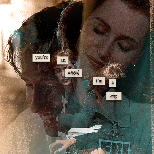
alright! so as stated before, i'm not going to go in-depth here on the basics of gifmaking. for this one in particular, i blended three gifs, but we'll get into the third one later.
(i should also mention that blending gifs as i did here is usually easier if you have scenes with shadowed/dark areas like the ones above, so to keep that in mind when picking your scenes! i also find it easier to use scenes where there isn't a whole ton of movement going on- again, not a requirement but it's easier to plan and position gifs if the characters aren't moving across the whole canvas)
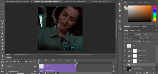
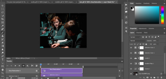
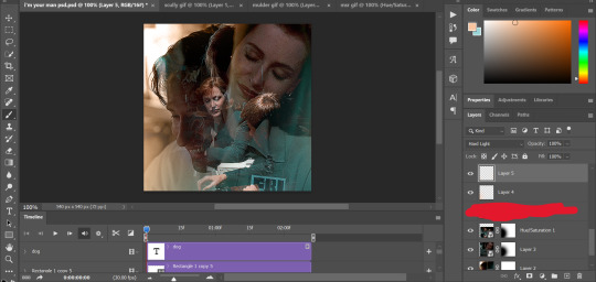
first, i started by making the base gifs of mulder and scully in "paper hearts". both are cropped to 540x540 px, and the same length (around 50 frames). i did some standard sharpening, brightening, and adding contrast (my usual process is curves, a b/w gradient map set to "soft light" at around 20% opacity, and messing with the levels a bit) before using selective colour and hue/saturation layers to highlight the teal and peach colours in the gif. sometimes this is enough colouring on its own, depending on the gif and the look you're going for, but in my case i wanted to add more.
so, on top of my colouring, i used a combination of layers set to "colour" and "hard light" to paint over the background of my gifs in teal and peach. on mulder's gif i also used a gradient fill layer in the two colours set to "colour" and used a layer mask to erase anywhere i didn't want the colour to be. the opacity levels for all of these layers again just depends on how vibrant you want your colours, i just mess with that on a gif-to-gif basis.
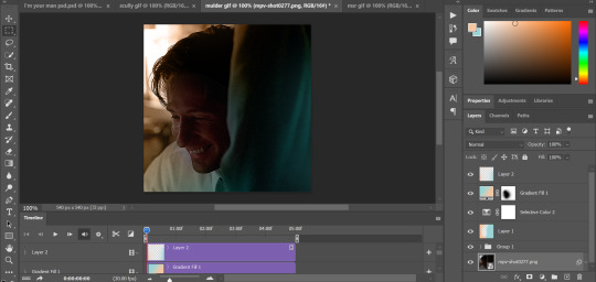
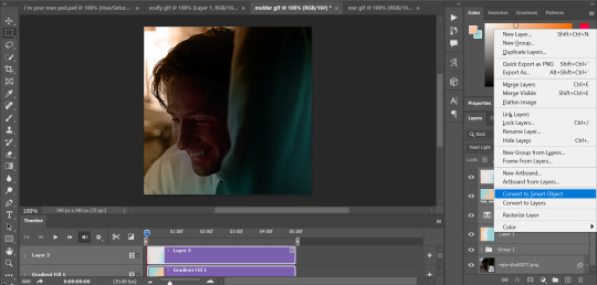
so we have our two gifs, cropped and coloured to fit the palette we want. next, i converted each coloured gif into a smart object, by selecting all my layers, right clicking, and hitting "convert to smart object."
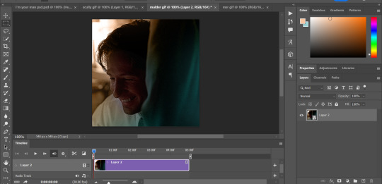
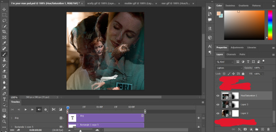
once that's done, you should be able to click and drag one of the gifs onto the other gif's canvas, so that it's sitting on top. then change the blending mode of the top gif- most people use lighten or screen, this again depends on the look you want and the gifs you're using. for this one, i used screen. it'll probably look something like this:
at this point you can move your gifs around and position them as you like. for mine, i just moved scully a little off to the right, as you can see. in order to get rid of the part that's covering mulder's face, i added a layer mask to the scully gif and used a large, soft brush set to black to erase it.
(another note: i didn't need to do it here, but if you want to move/erase parts of your bottom gif, add a layer of solid black underneath both gifs.)
usually i would stop blending here, but for this set i decided to add a third gif, so i made and coloured the gif of mulder and scully holding hands, using the same methods as the first two. this one was cropped to 540x405 px to make it fit better on the canvas, since i knew i only wanted it to cover the bottom part.
i converted it to a smart object and dragged it onto the same canvas as the other two gifs. this time i used "lighten" as my blending mode, positioned it in the bottom right corner, and again used a layer mask to brush away the parts i didn't want.
on top of all three gifs, i then used layers set to "normal" and "hard light" to brush some extra colour onto the gif. this part i also just play around with on a gif-to-gif basis, but for this set i mostly used a combo of colour, hard light, and normal layers at varying opacities until i got the look i was going for. i generally just like to use big soft brushes to add colour around the edges, as i did here.
now, i have a bunch of texture/grain pngs saved on my laptop that i like to add to gifs for some extra flair, so i opened one of those and cropped it down to 540x540px. i then added a gradient map to give it that peach colour. (any textured png/jpg should work fine for this, as long as you have your gradient map set to black and white/your accent colour)
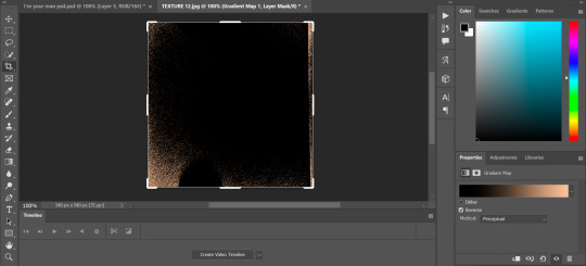
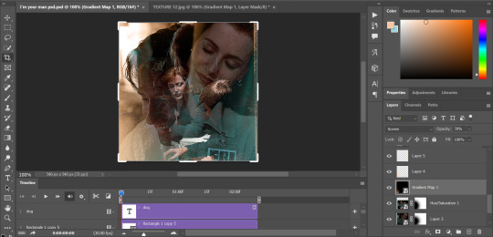
like i did with my gifs, i converted the texture + gradient map to a smart object and dragged it onto the shared canvas. i set the blending mode to "screen", with the opacity at 70%. i like to put these textures underneath the extra colouring i've done on the gif, as seen here. i don't always do this, but i feel like it sometimes helps the texture blend into the finished gif. you can also use a layer mask if needed to erase any unwanted parts of the texture.
now for the text!
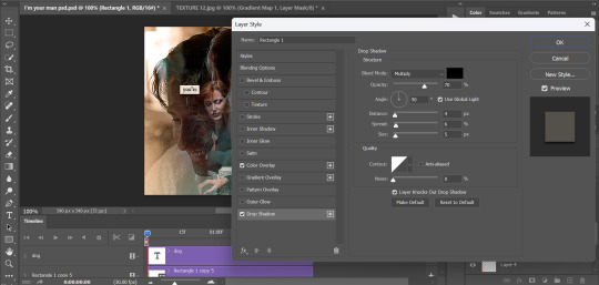
for these gifs i used the font "IM FELL DW Pica" in both regular and italic, in black, at 16px. i didn't do anything fancy with the text itself besides adding a drop shadow in the blending options (right click on the text layer and hit "blending options).
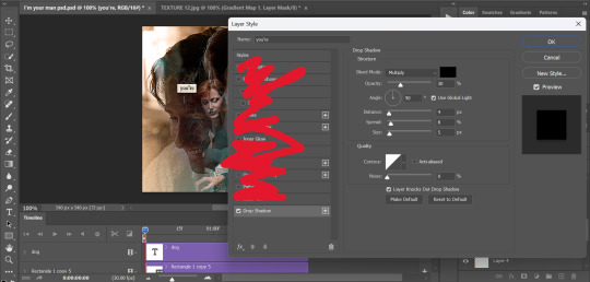
then, underneath the text layer (i was working one word at a time) i used the rectangle tool to draw a small rectangle around the text- i wasn't too picky about the size or evenness since i was going for a collaged look. i set the colour of the rectangle to a light cream colour, and added a drop shadow in the blending options.
then i just selected both the text and rectangle and duplicated them using ctrl+j, changing the text for each word and adjusting the size of the rectangles as needed. once i had all of the words on my canvas, i just moved them around until i found a positioning i liked. again, since i was going for a purposefully scrapbooked look, i didn't overthink this part.
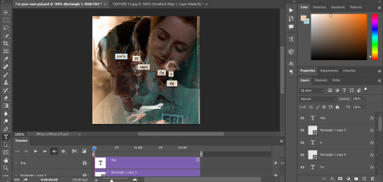
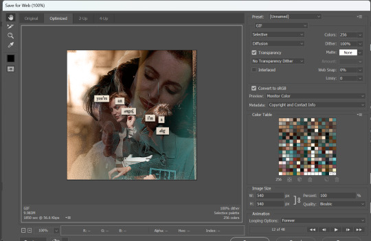
i exported my gif the way i usually do, with these settings:
and that's it! i used pretty much the same process for all the gifs in this set, give or take. hopefully this little walkthrough made sense, but i know i'm not always the best at explaining my process, so if anything needs clarifying feel free to shoot me an ask or dm!
69 notes
·
View notes
Text
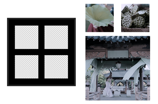
here's my quick tutorial for making layouts in photoshop! i'll be going over how to make this 4-panel square one!
↳ requires basic knowledge of photoshop
「 step 1: making your file 」
make a new file, 540 x whatever height you want (just make sure it fits within tumblr’s image size guidelines), and make sure the background is set to transparent. for this specific layout, i want the overall shape to be square, so my dimensions are 540x540!

「 step 2: mapping out 」
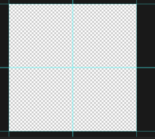
the best way to make sure your layouts are even and spaced equally is using guides! go to view > guides > new guide layout. the color of your guides doesn’t matter at all (i just like green so mine are green lol), and you can have as many columns and rows as you want. since this is going to be a 2x2 layout, i’ll have 2 columns and 2 rows. the general rule of thumb for gutter is 4px.

once your guides pop up, select the rectangle tool by pressing U on your keyboard. make sure shape is selected from the drop-down menu at the top (right by the home button in the top left), and make sure that you have snapping on (view > snap).
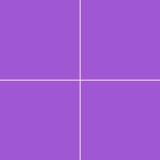
using the rectangle tool, trace out your layout panels! as long as you have snapping on, your path should naturally snap to the guidelines, making it a LOT easier to do this! when you’re done making your rectangles, you can turn off guides by going to view > guides > clear guides (i usually keep them on until i’m done adding in my gifs but this is up to you). i always name each shape layer after where it is in the grid to not get confused.

「 step 3: adding gifs 」
some quick things before i go over actually adding in your gifs:
1. make each of your gifs in their own individual files. you’ll be adding them into the main one later.
2. your gifs have to be the same length — you can cut them down to length in their own individual files or later in the main one. either way is fine, totally up to you!
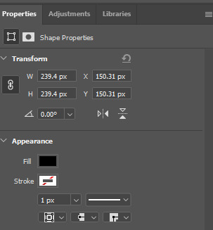
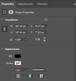
now you have your layout set up, you can make and add your gifs! in order to make sure that they fit into the panels, check the dimensions of each shape you’ve created by selecting the layer and looking in the properties tab. my panels are each 268x268.

i’ll actually be making each of my gifs 270x270, just to make sure that i don’t have any weird gaps or anything (i’ll talk about how i’ll be getting rid of the 2 extra pixels on each side later).
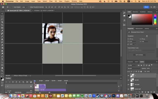
once you have your gifs done, you can duplicate them into the main one. convert your gif and anything else (coloring etc) into a smart object (right click > convert to smart object), and then right click it and select “duplicate layer”. make sure the document you’re duplicating to is the one with your layout in it.
layers automatically duplicate aligned into the top left corner. since this is where my first panel is, i can just leave my gif there, but for the other ones, drag your gifs into place using transform and your mouse (once again making sure that snapping is on).
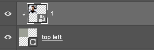
now to get rid of those extra pixels. this step also makes sure your gif is perfectly in line with the shape you’ve outlined the layout with. make sure your gif is right above the shape layer in the layers tab, and then right click and select “create clipping mask”. this makes sure your gif doesn’t go outside the limits of your guidelines. this is what it should look like in the layers tab:
「 step 4: exporting 」
exporting a layout gif is pretty much like exporting any other gif, but you do need to check your matte settings before saving. the wrong ones can make what should be the transparent dividers solid, which can throw off the look of your gifs. make sure matte is set to “none”, and then save as normal!

here's my finished gif:
happy giffing!
feel free to send me an ask/message me w any questions!
#gif tutorial#gif tutorials#allresources#completeresources#userchibi#userpjo#uservivaldi#userraffa#userbess#usermorgan#tuserheidi#userrobin#userkosmos#usershreyu#userzaynab#userisaiah#thingschanged#rogerhealey#*mine
216 notes
·
View notes
Text
How to create custom photoset/gifset templates from scratch in photoshop
Hey all! I’ve seen many tutorials about how to use pre-made templates, but I never seen an actual tutorial on what to do if you want to create your own templates in case everything you find doesn’t fit your needs, here is one of the cases in which it can be used (no offense to the people that made these kind of tutorials, that simply means that I’m blind lol). I hope it’ll be useful and feel free to write me if you have any questions. Let’s get started!

Pick your scenes. That’s simple. Just decide how many gifs you want to include in your template and pick your favorite scenes.
Create a new document. In my case, I created 540x540 document.
Time to create the grid. That’ll probably sound dumb af (and it is dumb af 💀), but I never made grid gifs before bc I always thought that it's like.. manually measuring the gaps between each gif, then figuring out what size you actually want the gifs to be, making a new layer, filling it with a shape of the required size (and man am I bad at math), blah-blah-blah.. guess what? WRONG! All you have to do is go to view > new grid layout and you’ll see this window:
Here you can enter your number of rows, columns, and gutter (the number of space between each gif in pixels). Margin can evenly divide your whole document, we’ll get to that later. For this tutorial, I’ll keep things simple. I made my basic 4 gifs layout, gutter between each gif is set to 3 px for both rows and columns. After I click ok, my canvas looks like this
Pretty neat for a couple of clicks right? Now, let’s insert some gifs. Before doing that, go to view and make sure overall snapping and snapping to guides, grids, layers and document bounds is check bc we’ll need that. Now take your regular selection tool, and drag it across one part of the document until it snaps to the guides we created

Here's my finished template (i just duplicated the same layer 3 more times and positioned it accordingly)
the actual size of the gifs doesn't really matter because we'll use clipping mask and resize them to fit our shapes better
How to use "Margin" section
That section is useful when you already have something in your template, and want to fill the left off space. For example:
I made this

But it's completely empty on the right side, so i go to view > new grid layout, and here's what i do

it adds a divider between gifs that are ready so i don't have to measure anything again and guessing how far or close these new gifs should be to/from each other. If i want, i can also change the top, bottom or left number to split this part of the document in half and add another gif. So i end up having 7 gifs on my canvas in total.
New guide from shape function
This function tries to follow whatever shapes you have on your canvas and create new guides according to those shapes (not very good with complex shapes tho, usually you'll end up with many guides chaoticly placed all over your document, so it's all trial and error). Here's another example of custom layout i made (still epirimenting with these).
And that's it folks! That was pretty short huh. Feel free to write me any questions of ypu have them and happy creating :)
#ps help#photoshop tutorial#usergif#completeresources#userlarri#usermorgan#allresources#userdanni#evansyhelp
506 notes
·
View notes
Note
https://www.tumblr.com/cerxei/724969506862235648/wandavision-for-mcuchallenge
^^^ How'd you do this amazing gifset? Especially the circle gifs, how'd you do them, please?
Hi! Thanks for asking ^_^
I have never made a tutorial before, so this is sort of my first try, if you have any more questions or need any more clarification please feel free to ask!
This tutorial requires basic PS and gif-making knowledge, but again if you would like more help please let me know, I am happy to help where I can!
I started with a 540x540 white background and then used the ellipse tool to make the circles. You can make these whatever size and shape you want, but if you would like to do them the same way I did I included screenshots for you to do the same!
The size of the large center circle + the drop shadow settings:
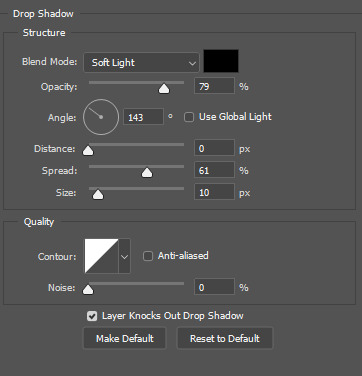
Note: I only used the drop shadow on the center circle, but you can use it on them all if you want. It is just personal preference!
This is the settings for the smaller circles:
I centered the center circle first and then placed the others around it and it was sorta trial and error until they sorta snapped into place and formed the shape I needed lol, so you should have this after you place all of your circles:
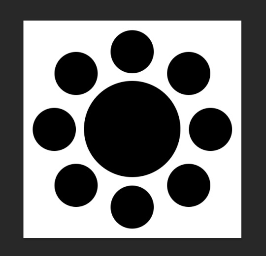
Note: you cannot see the drop shadow effect here despite it being on because there is no background image on the white.
So, for the background gif, I just made one that was 540x540 with the basic sharpening settings you can find in any gif tutorial on Tumblr ever lol, I don't do anything special there.
IMPORTANT! I found that making the gifs, coloring and sharpening it, exporting the gif, and then opening the gif was the best way to transfer it into this because otherwise the frames were all off and the size of the gif was too large to post on here.
After doing that, I dragged the background gif and just placed it behind the circles and you are done with that part.
For the center gif, I made it 300x300 and then did everything I said in the "important" section above about exporting it, opening it again, and then dragging it to the layout file. With the center gif being 300x300 you can see it is larger than the actual circle, I did this one purpose so I could just drag the corners and resize. You want to make all of your gifs a little bigger than the circles, or else you will have these odd lines of your square gif inside of the circle, which... when making circle gifs is not something you want lol. So, always size it up a bit more and just drag the corner until it fits in the circle and is placed how you want it!
To get the gif "inside" of the circle you press alt and hover between the gif and the circle you want it to be inside of and they like snap together, I don't know the actual term for this lol, but basically like this:

I followed the same steps for the smaller gifs and made those gifs 150x150.
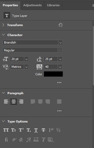
For the font I used "Brandish Regular" in all caps and I honestly don't know if this is just pre-installed in Photoshop or if I got it from somewhere lol. Here are my font settings and the gradient/stroke settings!
I just changed the color gradient to match the gif of the background, I think?
I really hope this was helpful, lol. Please let me know if you have any questions and I would love to see if anyone makes gifs with this layout I made! :D
1 note
·
View note
Note
i wanted to ask does making a gif 540x540 actually make it higher quality or is 400x400 still fine? and what do you use for your own gifs?
the height isn't as important but the width definitely is when it comes to posting here on tumblr dot hell.
posts here are 540px wide so for the best look making your gifs that size is recommended, anything smaller will stretch and lose quality. anything bigger won't necessarily look bad, but 540px gifs are already hard to fit into the file size limit (i can't imagine being able to make something bigger that's under 10mb that isn't like... two frames.. not speaking from experience or anything)
regardless, if we're talking about gifs that'll be stacked on top of each other (so just one gif per line) i don't recommend making it anything less than 500px wide, at the very least, and that's only because tumblr posts used to be 500px wide and some people kept their gifs that size after it changed (these people also use xkit's old dash function, but i don't so i don't even know if it still exists/works, also in general i think most people have moved to using 540px and the others are in the minority nowadays and what that means is that they won't see those gifs the same way you do, because they'll be viewing them on the current tumblr posts size), so 400x400 is a no for me personally
now all that being said you can make your gifs smaller as well. for example, if you plan on having two columns (so two gifs per line) then your gifs can be 268px wide (if i remember correctly) and they shouldn't lose any of their quality
personally, i've started simply making all gifs 540px wide, even if i end up having them side by side, because i'm indecisive and this way i don't have to choose until the moment i'm about to post them
honestly, your biggest concern when it comes to quality should be the source material. if you're making your gifs from a low quality video then nothing that you do after will matter much because the quality was already poor from the start.
(little p.s. while the height doesn't matter AS much, there are still limits. i think 540px wide gifs/single gifs per line can only be 800-something pixels high before they lose quality. have you ever seen one or those super long comics all posted as one image? how impossibly blurry and hard to read they are? that's what i mean. i've personally never reached 700 pixels when it comes to height so i don't recall the specific size limitations, but again the bigger you make your gif, the harder it is it'll be less than 10mb so people tend to stay well within those limits)
1 note
·
View note
Note
Hi there! I LOVE your edits, they’re so pretty 💕
Can you please tell me how you make them (what apps or resources you use)? I want to make some edits of my own but I’m not sure how.
Hi anon! 💙
I only use Photoshop CC to edit my pictures and make my gifs. I look for royalty free stock photos to edit. My favorite sites are Pexels, Pixabay, Unsplash, Canva. They offer free stock photos you can edit (you need to create an account to download, but then you're good!). I never use Google or Pinterest to look for pics because those sites contain copyrighted material. If I want to make a gif, I go on Youtube to download scene packs of the thing I want to gif (you have to search for "name of the show/movie/character/ship scene pack" on YT and use a free program called ClipGrab to download the video).
I'll try to explain as quick and simple as possible, and I hope it's clear. I may make a tutorial because the process of making edits sometimes depends on how complex you want your edit to be. The first thing I do is think about the theme of the picspam. When I want to create a picspam about a character, I usually search for images that remind me of them. For eg. if I want to make a picspam about a bookish character, I find stock images of books, or a person reading, etc. After I found some pictures that satisfy me and decide how many panels I want my edit to be (since I need at least a pic for panel if I want to make the simplest edit), I can start my work on Photoshop or on any other editing program. Canva is a good alternative too.
The first thing I do on Photoshop is create a new document with a transparent background. For an edit like this one, I usually create a 400x600 pixel document because it's easier to manage and it's good quality. If I want to make a rectangular edit where the base is larger than the height I make the base 540px and the height varies according to how big I want my panel to be. On this edit, for eg, both panels are 540x540. It's just a matter of proportions. To make things easier, you can create as much as many new documents as the number of panels you want your post/edit to be (I usually create 4-6).
After I created the new document, I just open my pictures and resize them in order for them to fit the empty document I created. When the size of each pic I want to use is good for me, I drag each one on an empty document and edit each one singularly. To make the simplest edit, I use the text tool and the font Arial in all caps and bold and write the name of the character and the book series at the bottom or I write a quote or anything I want. If the picture is dark or needs to be adjusted, I edit the curves or color correction so that it's better looking or I just download .psd coloring files and drag them so the pics are automatically colored (you can find plenty on tumblr or DeviantArt by searching for "coloring psd"). Then, when I'm satisfied with it all, I save each picture as a single picture and then I upload the set on tumblr as it pleases me... and that's it.
I don't know if it helps but right now I don't have the time for a detailed tutorial with screencaps. I'll try to make one if you're interested :)
0 notes
Text
(You can find the set that this gif belongs to here 💙)
From planning to posting, share your process for making creative content!
To continue supporting content makers, this tag game is meant to show the entire process of making creative content: this can be for any creation.
RULES: When your work is tagged, show the process of its creation from planning to posting, then tag 5 people with a specific link to one of their creative works you’d like to see the process of. Use the tag #showyourprocess so we can find yours
I was tagged by @aheartfullofjolllly. thank you so much Pat! it was really fun to reflect about my own process 💗 You can find her post here and @lan-xichens' post that started it all here :)
Also thank you @huigusu 🥰 (who tagged me for my nie brothers set) I'll get to that one in a few days!
Now Pat gave me two sets to chose from to show my process, so obviously I chose the more complicated one :P
I only work in Photoshop CC 2018. I know that there are programs out there for easier cutting and sharpening but I have only just figured out how to do that in PS and I am too lazy to figure out any other programs right now xD
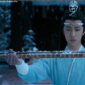
1. Idea and Planning
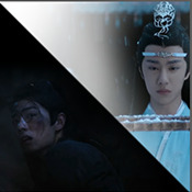
This set, like most of my sets with lyrics started with me reading the poem, clutching my heart and going "oh shit this fits my favourite characters!!". The idea actually started with me thinking that the first stanza of the poem would go really well with wwx during the burial mounds arc. Then I realized that the last stanza fits lwj better than him and from there came the idea to contrast the both of them next to each other. This is when I realized I wanted to do a dark-light contrast set, though I did not know that I would go with red and blue at that time. My idea in the beginning was just to do a black and white set
I was really impressed by how Pat said that she plans her sets around exact timestamps. Because I don't do that at all ^^ I just get ideas for which scenes would fit (in this case the wwx burial mounds scenes and lwj's kneeling and punishments scene) and then I watch the scenes to narrow them down.
Back when I made this set, I still used a screenrecorder (AceThinker Screen Grabber Pro to be precise. They have a test version that allows you to record up to 3 minutes) and recorded the scenes I needed from Netflix. This worked well enough but now I have the entire show saved on an external drive and it makes a world of difference when it comes to gif sharpness
Now, in this case I had to repeat this step once because when I was almost finished, I realized that I wanted a gif for the lwj corner but let's pretend I didn't do that and that's the way this gif was always going to look because otherwise this post will be way too long ^^
2. Creation
Short disclaimer: The creation process for this gifset was anything but linear. Multiple effects I used here were things I had never tried before. I just had a vague idea and tried to realize it through trial and error. So whenever I say "then I did xyz", it is implied that I ultimately went back to that step several times and changed stuff ^^
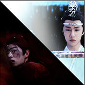
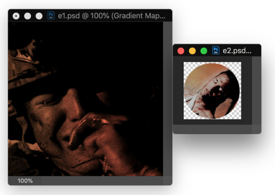
I started with the Wei Wuxian part of the gif. I usually use a frame rate of 0,06 (with some variation depending on gif length and size). I work in timeline so I converted all the layers to a smart layer. Then I resized the gif into a square, leaving big chunks of the gif empty (as can be seen below.) I flipped the gif horizontally, so he is looking inwards. This was simple because I felt it fitted the composition better. Then I imported the Lan Wangji part of the gif, again with a frame rate of 0,06. (Image 2)
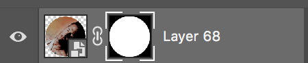
After that I created a layer for masking in a separate PS document by rotating a square until it was point down (is that a rhombus?). I sized it to match my gif (540x540 pxl) and copied it over. (Image 3) a bit of masking magic and ta da! There's the basic layout (Image 4)
I put a layer of solid black behind wwx to get rid of the transparent bits (Image 5) and then started adding more white and black to both sides by adding solid whit and black layers that i put masks on and changed the opacity as i needed (Image 6)
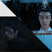
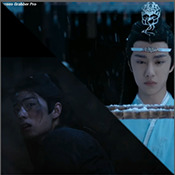
("reading" direction: from the upper left to the lower right corner)
Then I fiddled with the colours a bit. The first thing I always do is using the curves layer to get more contrast. Then I use the colour balance tool and the selective colouring tool to get rid of that cql-typical cyan tint after that it's just trying to have it look "natural" while the colours still fit the overall scheme. This was difficult here because wei Wuxian’s side of the gif was very dark and when i turned up the saturation to see which colour dominated it was a very weird mixture of multiple colours. That's when i decided that I'd just go with red on his side, since lwj's side was already so blue and those to look great as contrasts.
After that just came a lot of fiddling with selective colour layers and brightness and contrast unti I has happy. There really wasn't much to it ^^. (Image 1)
After that I added the text. I knew I wanted the two lines to for a square of some kind. So I tried different fonds until I arrived at the one below. The two lines are in seperate layers so I could move them around and change the spacing between the letters until I was happy with the layout. I also changed the layer mode for the text to "difference" (is that what it's called in english? my PS is set to german sorry ^^), keeping their colour white. (Image 2)
I originally hadn't planned adding anything else but I felt like the gifs (plural because I switched between the gifs of this set) was still kind of empty and lacking, so I added the tear down the middle (a tutorial for that is either coming up later or already posted. I recently got an ask for this :)) (Image 3)
It still felt empty after that, so I tried different overlays. Okay no, first I wasted a lot of time on different free image sides but then I tried out different ones until I chose the one you can see in the finished gif. I liked that one because a) I felt the round shape was a nice contrast to all the straight lines already there and b) because once I applied a black and white filter to it and switched the layer setting to "difference" (again, i hope this is the correct translation) it looked a bit like a moon. (Gif at the top)
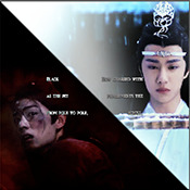
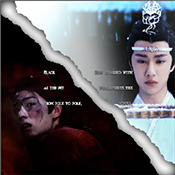
("reading" direction: from left to right)
And that's it! :)
Although in general, these gifs took so much fiddling! I went back and forth between them a lot and sometimes almost redid the entire thing because I had no idea what I was doing in the beginning and by the time I noticed an error, the only way to fix it was ti redo everything. So yeah, this set definitely is the the one that took me the longest out of all the ones I've posted so far.
3. Posting
I save all my gifs to my drafts first to see what they look like put together and to check if they look any different on mobile. Usually i do this several times and change stuff until I'm happd enough with it to hit post. Once i am happy enough, i can't hold back. Doesn't matter if it's at a time when nobody is online, i hit post 😅
And that's it!
Tagging:
@lanwuxiann for this gifset (I adore it so much. I've looked at it and read it severat times since you posted it and the poem just kills me every time!)
@suibianjie for this gifset (The combination of static images and gifs in your gifs is always absolutely perfect! This one is only my favourite of yours because the light coming from behind wwx is just so pretty!!! ^^)
@sweetlittlevampire for this piece (It was soooo hard to pick a piece of yours because I have so many favourites! But this one is just so out if this world, I want to know how you worked that magic :D)
@wei-gege for this set (sparkling shijie! 😭 that set is so incredibly beautiful! I love how you matched the colour of the overlay with her dress!)
@purplexedhuman for this set (your gifs are always incredible! I chise this one because it showcases both your colouring skills and some really intricate effects)
If any of you have already been tagged or don't have the time or energy for this, obviously no pressure to do this at all! 🥰
(btw, I originally tried to place the actual text of this under a "read more" cut but somehow it always messed with the order of the images, so this ended up as a rather long post. sorry!)
39 notes
·
View notes
Note
Not a request but got any advice for making pride flag icons/edits ect?
I’m new to icons but I wanna make them reqularly! I have a hard time lining up multiple flags. Among other stuff I wish I knew how to do. I’m sure you got some great tips from all your experience with using so many flags on a single edit!
(Ps seeing those on mogai hcs made me feel more confident having a long identity and using more than two flags for my icon. I’ve even learned a lot from there! Thank you!)
i’m so glad my blogs have helped you out, and hopefully my advice is helpful as well!!
a mistake that a lot of people make when starting out making pride icons (i did this too when i started) is trying to arrange the flags by hand. this almost always results in unevenly split flags, unless you get lucky or go very slowly. it’s actually easiest to do a bit of math! i have a flagmaking tutorial here, which uses a somewhat similar method.
i make my icons 600x600 pixels (and size down from there when necessary), so these examples will reflect that, but you can modify the numbers to fit your own sizing! i’ll just do a basic two-flag icon and then give the numbers for more flags. i’ll also teach you how to use the controls for gimp, so if you prefer another software you may have some different tool names, but it likely won’t be too difficult to figure out what corresponds.
tutorial is under the cut so people don’t have to scroll through the whole thing!
so i have two flags, bi and trans, open in gimp:
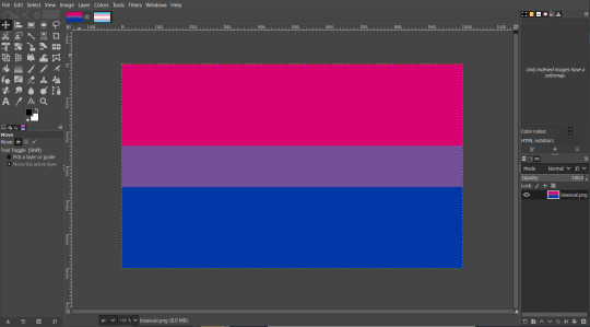
i’ve taken them both from the pride-flags deviantart, so they’re 5000x3000 pixels. i know that my icon will be 600x600, so the first thing i do is resize them by clicking ‘image’ > ‘scale image’ to get this menu:
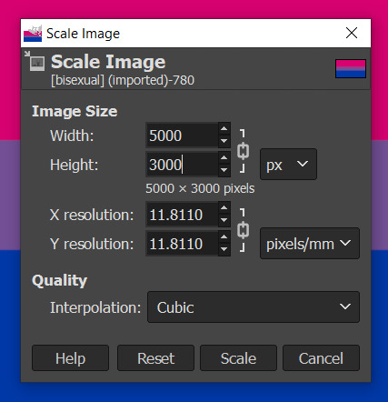
clicking the chain symbol to ‘unlock’ it (when it’s ‘locked’, the numbers scale to match the original image, so if you want to change the width and height independently, you have to ‘unlock’):

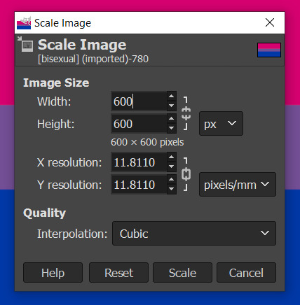
and then entering ‘600′ into both fields:
now that they’re both the same size, i’ll put both flags into one image. you do this by clicking and holding one flag in the layers menu:
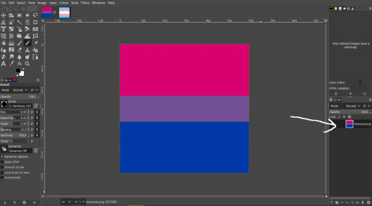
dragging it onto the other image on the top bar:
it should switch your view to the other image, and you can drag the layer on top of it and let go, which will add it as a new layer:
now, you’ve got two flags on a 600x600 base - for an even split, divide 600 by 2 to get 300. there’s a few ways to resize your flags from here, but i’ll give you my personal favorite.
right-click on the layer you’re resizing in the layers menu (can’t get a screenshot of what the menu actually looks like because of how snipping tool functions lol) and click ‘layer boundary size’ to bring up this menu:
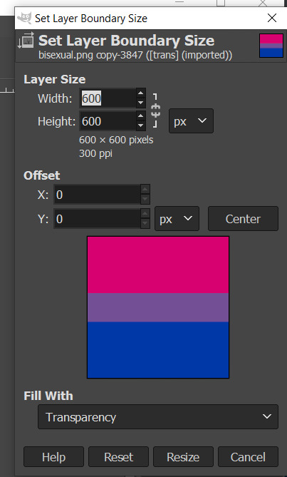
the sizes are automatically unlocked, so all you have to do is change the width to 300:

and hit ‘resize’, which gives you this:

boom, perfectly even split!
if you were doing this with three flags (600/3 = 200, so each is 200 pixels wide), you’d resize the top flag to 200 and the middle flag to 400. so here are some basic sizes:
2 flags: 300, 600
3: 200, 400, 600
4: 150, 300, 450, 600
5: 120, 240, 360, 480, 600
6: 100, 200, 300, 400, 500, 600
8: 75, 150, 225, 300, 375, 450, 525, 600
10; 60, 120, 180, 240, 300, 360, 420, 480, 540, 600
and so on!
as for numbers that don’t go evenly into 600, i scale down my base image and work from there. for example:
7 flags, 560x560: 80, 160, 240, 320, 400, 480, 560
9 flags, 540x540: 60, 120, 180, 240, 300, 360, 420, 480, 540
it can definitely get a bit tedious if you aren’t great at mental math or are working with a weird number of flags, but it’s so much easier than trying to eyeball it!
102 notes
·
View notes
Text
#ShowYourProcess
From planning to posting, share your process for making creative content!
To continue supporting content makers, this tag game is meant to show the entire process of making creative content: this can be for any creation.
RULES — When your work is tagged, show the process of its creation from planning to posting, then tag 5 people with a specific link to one of their creative works you’d like to see the process of. Use the tag #showyourprocess so we can find yours!
Thank you for the tag Mimi @yiling-recesses ~ it was so fascinating to see how you plan and organise everything and then the editing process as well! ♥
I was tagged to show my process for my Episode 17 Post which somehow got relatively popular, in comparison to the rest at least, so I’m glad to share the behind the scenes of that post in particular. This is going to be a long ride so buckle up friends. ∑(O_O;)
1. Planning
First of all I have to rewatch the whole entire episode before I can even start on anything. So I usually sit down with pen and paper in hand and ready to pause at any given moment that sparks interest. In case there is a quote that sounds fancy enough to represent the episode I write it down, or when I see a scene or just a certain shot that catches my eyes I screenrecord that certain scene and save it in a folder for that specific episode. Over time I accumulate scenes here and there so I already form a rough idea in my head which scenes would look good together or would make sense together. Sadly this also sometimes leads me to have very few scenes because nothing really inspired me, or I end up with only one quote that I wasn’t even too sure about, but I just make the best out of it.
So I basically let the episode itself be the whole drive and inspiration for my edit but I also try to not give away too much in terms of spoilers. So if you were to see it with the knowledge of what’s going on it’s supposed to be hitting a nerve, evoke a memory, or at least make sense, especially given in combination with the quote, but if you were to see this set without the knowledge of what’s happening I’d still like it to be interesting enough without giving away too much of the story. Do I even make sense, mayhaps.
This is usually what I end up with in my folder, sometimes I have about 20 scenes, sometimes 3, so for episode 17 this was a decent amount to work with! [Also please don’t ask why I name the clips like that, they made sense to me in that moment and it works somehow. And yes Wen Qing is the queen and there is nothing to stop her (メ` ロ ´) ]
Now it’s time to look through the scenes again that I clipped out and begin with the actual gif making. I use Avisynth to rezise all the gifs to either the smaller squares, the “full” square or sometimes the longer rectangle - honestly I usually do these very much based on what I think would look good in my head and just decide based on that, so sometimes I end up making the same gif again just in a different size because I felt it was lacking impact or ended up looking better in another set. Sometimes I end up not using gifs I made at all ┐( ˘_˘ )┌
2. Creating
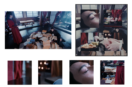
Now that I have this huge mess of endless gifs and pretty scenes that would work as a background loaded in my Photoshop I start to assemble. Given the fact that I always use the same 540x540 format at least the step of building a base is uncomplicated.
The first part of the set I made was the lotus lake scene. The moments that were catching my eyes the most were mainly the close ups of the actual plant. Detailed close ups make my heart go boom boom. So I figured they would pair well with a scene where all three of the siblings were in screen to convey this mood of like ‘happy yunmeng trio being silly in lotus pier yay’, especially given the fact that it’s a fond memory of Wei Wuxian in this oh so painful episode.
So I have the base grid I always work with, the gif of our three beloved plus the two lotus close ups. From here on it’s just very trial and error where the still pictures fit best over the gif and I just tweak around for so long until it looks good. Once I am done with the positioning of everything I slap my watermark on it and my default colouring for these sets. Of course the default coloring action I made never works the way I want it to so I end up messing around with it for half an eternity to make all the different colours work together and look coherent which sometimes leads me to colour one single part individually and adding more filters to the background and what not. This is how it looked like in this particular edit ~

For the other two edits I basically repeated the same process just slightly adjusted to whichever format I use [this is already way longer than needed]. When I make the edits with four gifs in the middle I always have to shorten the gifs beforehand so they have the same amount of frames in order to make the whole thing work to begin with. Usually gifs with the same colour palette or same theme work well together so in this case the food and hands stood out to me [hands always do, always]. So I found the perfect set of gifs to work with that and just added a scene of Wei Wuxian in the background as he fell asleep studying the scripts and Wen Qing came to bring him food, since this is a big part of the episode.
Of course we slap on all the fancy stuff on top afterward and tadaa - it’s a gifset.
At last I had the scene of Wen Qing turning her head slightly and I knew from the beginning that I needed to have that scene as a “full” gif as I was just struck with love. I had so many different things I put on top like frames and flowers or tried to put the gif in a certain shape - whatever, it just looked kinda bad - until I found this dragon png and finally had an epiphany. I must confess i didn’t mask out the dragon perfectly to fit behind her but I reached a point of desperation as my creativity of the day left me behind struggling.

3. Posting
Once I am done with all three edits, sometimes only two depending on the amount of clips I saved, I arrange them in Tumblr and check how they look best. This thing alone can take me forever unless I have a set that has a coherent background throughout all of the individual edits so I don’t need to worry about in what order to arrange them. But once I finally decided on that I go back to my notes of quotes and try to decide which one works best in regard to the criteria I mentioned above. In this set the angsty Jiang Cheng had the honor.
For finishing touches I add the link to my other episode sets and all the tags to keep things organized and usually ramble a bit about the process or my feelings. That’s what tags are for, right?
Oof so yeah, that’s it. This turned out way longer than anticipated and I already edited this down...whoops.
I would like to tag:
@huigusu - for this painful beauty
@leonzhng - with this incredible masterpiece
@mylastbraincql - because this post makes me feel things
@fengqing - words can’t even describe
@lan-xichens - this set made me cry
No pressure at all to do this if you do not want to or have already done one before! ♥
29 notes
·
View notes
Note
Hi, I was hoping you might be able to point me in the right direction? I want to learn how to do gifs in different shapes? E.G a normal 540px gif with another gif that's smaller that's a circle? Or 3 gifs that are triangles? I see some that are split down the middle too? (hopefully i'm making sense here lol)
hi, yeah for sure!! I’ll def try my best to help!!
so the basic idea for all of those examples is having two gifs that have the same amount of frames, set to the same frame delay. I’ll use the eddie set i posted yesterday as an example!!
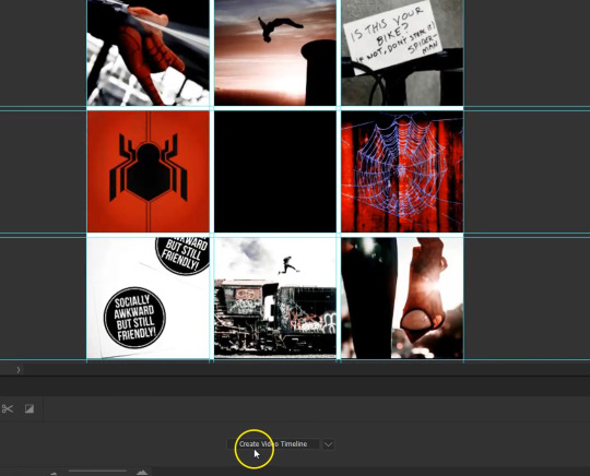
so here I have the base 540x540 gif with 52 frames set to .05s and the smaller circle gif which also has 52 frames at .05s, and to make it easier to work with i converted both into a smart object after they’d been cropped and colored. (to do this select all the frames of the gif and click the three horizontal lines on the right side of the timeline window and choose convert to video timeline, then select all of your layers and go to layer > smart objects > convert to smart object)
to get the second gif cropped into a circle, i first cropped it down to a 200x200 square and then using the elliptical marquee tool set to a fixed 1:1 ratio selected the area i wanted and then created a layer mask which is this button

so it’ll look something like this
and then it’s super easy!!
you just drag the circle smart object over to the big square gif and position it where you’d like! because they have the same number of frames set to the same delay, the timing should be good to go!
it’s pretty much the same concept for the other examples, but instead of cropping into a circle you can crop into a triangle by using the pen tool to select the area you want, something like this with three anchor points (bad example bc i’m working off the circle psd i had saved lmfao but you get the idea)

and for gifs split down the middle, you’d wanna make two gifs with a width of 270 (half of 540) and then whatever height you want, then convert them into smart objects and place them on the same canvas
but yeah, tldr; i think the important thing here is just making sure you have the same amount of frames set to the same delay then converting them to smart objects and from there you can crop the gifs into different shapes and just drag them onto the same canvas. i think the tricky part is just figuring out what dimensions will fit/look best on the base gif.
i hope this helped some!!! and please feel free to send another message or dm if anything here is confusing and i’d be happy to help!!!
#i hope this makes any sense at all i'm so sorry in advance for my rambling lmfao#Anonymous#answered#tutorial
13 notes
·
View notes
Photo

okay so i've gotten a request for a tutorial for this edit of nico di angelo, and i'll try to do my best to explain this in an easy way.
first off, you'll need photoshop installed, it probably doesnt matter which you have, but i have the cs6. also it is preferrable that you know the basics of photoshop as well (cropping, how to use the brush tool, how to apply a layer mask and an adjustment layer etc). tutorial under the cut!
here are the links to the extra stuff you’ll need: stuff to use
disclaimer: the psds are NOT mine. they are from @/allscallie and @/agallerrie
i also wanna say that i probably spend hours searching for images on pinterest before settling on anything or before i get inspiration. so this tutorial may seem quick and easy but it really is a *process* sfkdsfk, and i spend several hours on every edit i make.
okay so, to the actual editing:
first i crop it to 540 x 540. i probably could have had other dimensions as well, but these were the ones i ended up with.
i probably tried out a lot of different textures before settling on the ones i did, but again, these were the ones i ended up with and thought fit the edit and nico's character.
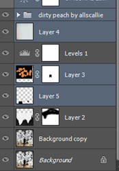
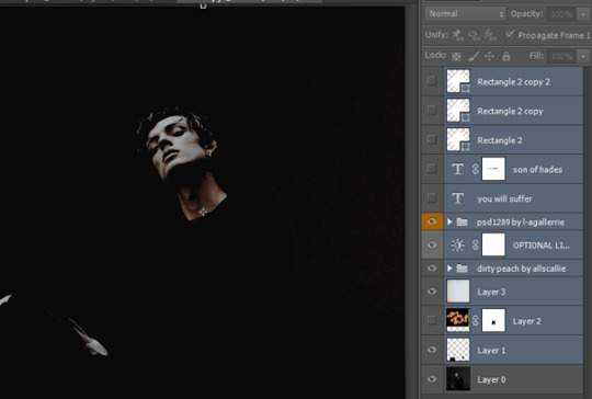
i put on the psds i've chosen, dirty peach on the bottom and caramelo on top of that.

below the psds i add texture 1, put it on multiply and add a layer mask.

select the layer mask, choose black coloring and brush over the top of the texture, so that the sharp edge dissappears.
i didn’t like that the floor in the picture showed, so i added a new layer and painted black over it. it’s not necessary too detailed with the black, we will add a level adjustment layer next!
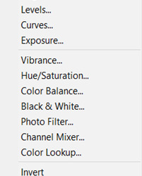
to add a level adjustment layer you go to this:
and use these settings for it:

i felt that i wanted some more color in the edit, and tried to find a texture i felt fit. i ended up with texture 2. add this to the edit, and put it below the levels layer. where we put the previous texture on multiply, we’re gonna put this texture on lighten and place it in this area:

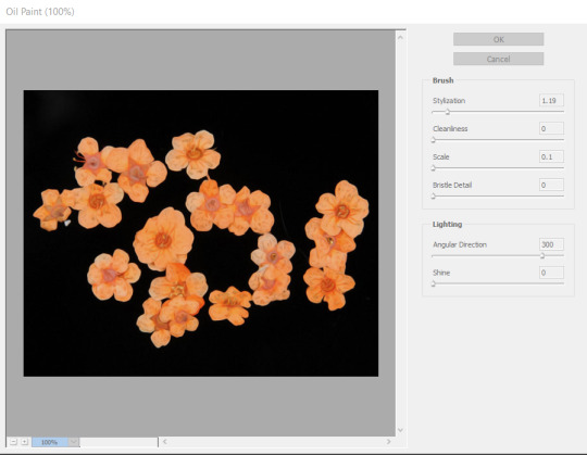
ive also added a filter to it as you can see. this is the oil paint filter that you find here:
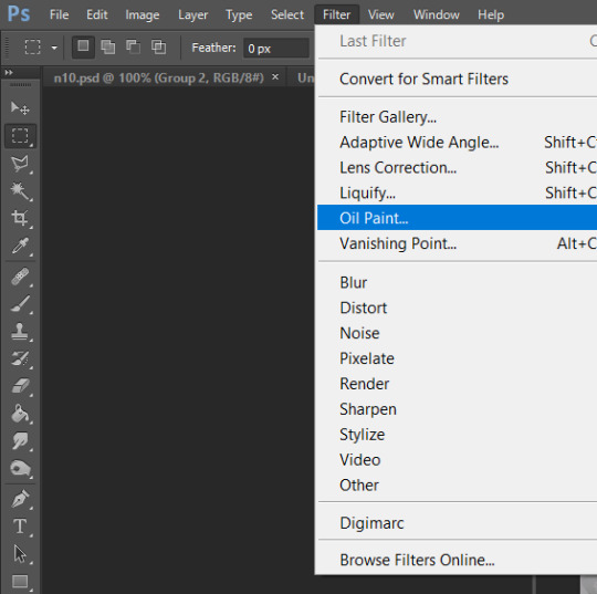
the exact settings for it i dont remember but it probably was something like this:
i dont want the flowers to go above the guy in the picture, so i put a layer mask on the layer, and use the brush tool to paint black over the shape of him.
so now the edit looks like this:
im a BIG fan of the next texture we’re gonna use, texture 3. i use this very often in my edits. this we’re gonna put above the levels layer, and put it to color burn. make sure its the ‘light’ part of the texture thats in the edit, and not the ‘red-ish’ part.
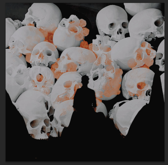
i also wanted to see how it would look if the edit looked more smooth, so i wanted to test the oil paint-filter on our ‘main’-picture, the bottom one with the skulls. so i duplicate that layer, and use the same settings as the flower layer on this duplicated layer. then set the duplicated layer’s opacity to 49%.
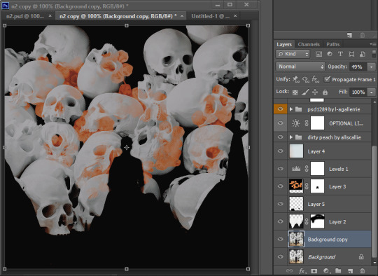
it’s not a huge difference from how it was, but the road to success is in the details, isn’t that what they say?
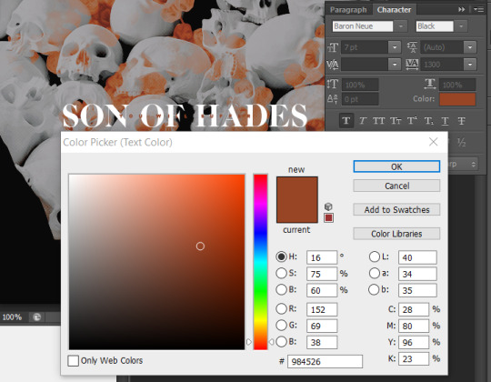
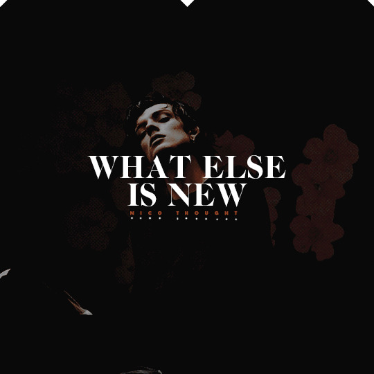
now to the fun part or the difficult part, the texttttt. i scoured goodreads for quotes to use, but knew i wanted to have ‘son of hades’ in the edit, and tried to find a fitting quote. i ended up with “you will suffer, son of hades” “what else is new”.
these are the settings i used for the “son of hades” text:

to get it in the middle of the picture, press ctrl + a, go to layer > align layers to selection > vertical centers and layer > align layers to selection > horizontal centers.
now i want to have the “you will suffer” text above “son of hades”. these are the settings i used for that:
i place this one in the middle of the picture as well, in the same way as the previous.
now i want the text to be more visible, so i put a black rectangle behind the text:
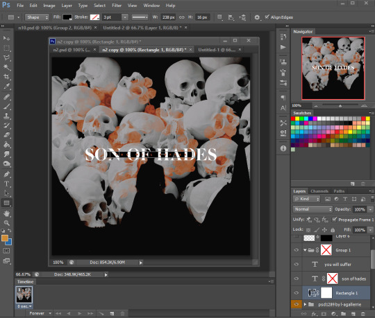
place this in the middle as well.
i want it to look like the rectangle moves through the big letters, so i put a layer mask on the ‘son of hades’ layer, and use the brush tool to paint over the parts of the letters i want to be behind the rectangle. i also move the ‘you will suffer’ text layer below the ‘son of hades’ layer.
then i select these three layers (hold ctrl and click on each), and place them in a group (ctrl + g). put a layer mask on the group and paint over the part of the ‘F’ that is on top of the head to make it look like it goes behind it. and then the text is done!
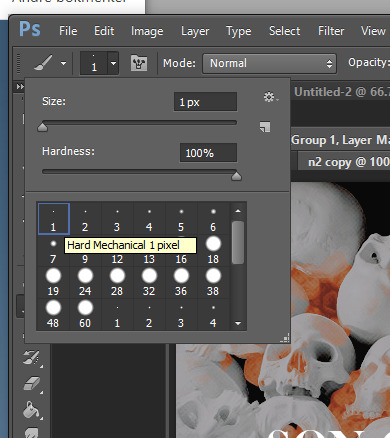
i wanted to do something extra for the edit, so decided to paint some dots as well. add a new layer, select the brush tool, color to white (#ffffff) and set the size to 1px.
i decided to make nico a crown and also added three dots at each ‘S’

the last thing we’re gonna do for this edit is add three rectangles on the bottom of the edit.

rotate it 45 degrees, and place one in each corner and one in the middle bottom. and now the first pic is done!! woho!!!
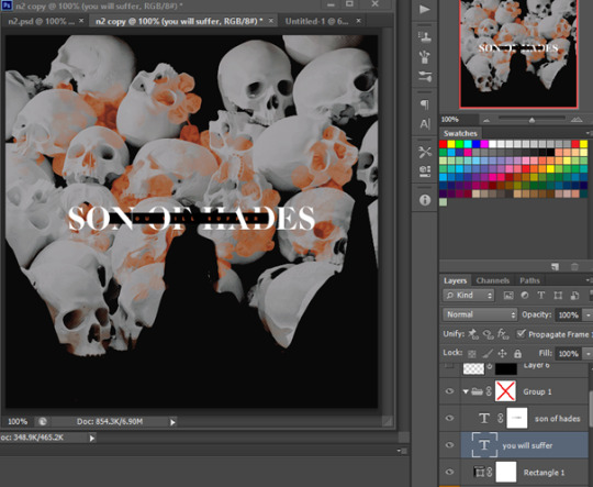
now we’re gonna move on to the next part of the edit. open the second picture.
crop it to 540x540 as the first picture.
this part takes a little less work, because we already have a lot of what we’re gonna use. Select these layers from the previous picture.

and drag them over in the picture you just opened. click the eye on each layer to make them invisible for now, but keep the psd layers, ‘layer 1’ and ‘layer 3’ visible.
First we will work on the flower layer. Make this visible as well and put it on opacity 20%. On the layer mask paint over the face with a black brush as well.
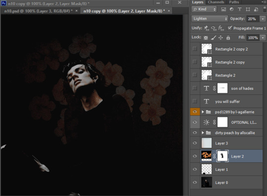
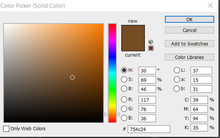
I want a little different color in the edit, to match the first one better, so i add a color fill adjustment layer:
Put the layer to soft light, and above ‘layer 3’. Now it’s almost only the text left and the extra details!
make the ‘son of hades’ layer visible and delete the layer mask. Change the text to “what else is new”, with a break after “else”. Make sure it has these settings.
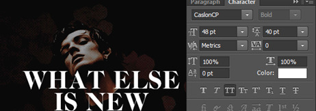
Then make the “you will suffer” layer visible and write nico thought. Place it right below “is new” and with these settings:

Make the three white rectangles visible again and place them at the top this time, instead of at the bottom.
Only one thing left!! Add a new layer, choose the brush tool, white color and size 1px and paint a dot under each letter of “nico thought” and tadaaaaaa!!!! We. Are. Finished.
IMPORTANT: this tutorial is meant as a help to understand how you can make creations, not as a means to copy others’ style. so please dont copy this edit, but take inspiration from it and i also hope you learned something new!!
#editing tips#tutorial#photoshop tutorial#edit tutorial#my tutorials#god this took time#every time i make a tutorial i curse myself for it afterwards because damn its HARD#also i hope this post works???? its been glitching rip
119 notes
·
View notes
Note
How do you make your gifs so hd? I tried sharpening them for a tutorial (you select everything then convert it to video timeline, convert to smart filter, then sharpen it, then convert it back frames) and when I post to tumblr it still looks shitty? Also I do it after adding the psd coloring but I feel like it wouldn’t really make much of a difference if I did it before?
1. What are your gifs dimensions? Tumblr’s dashboard has a 540px width so your gifs should be 540px width. Otherwise, your gifs may shrink (if too big) or stretch (if too small) to fit the dashboard.
The following are my gifs dimensions (width x height):
540x540 px - 1 per row
540x275 px - 1 per row
268x335 px - 2 per row
268x150 px - 2 per row
180x225 px - 3 per row
Height can be adjusted according to your preferences.
2. I’m not sure why you convert back to frames? After Convert for Smart Filters, apply the following filters. These are my settings:
Filter > Sharpen > Smart Sharpen

Filter > Blur > Surface Blur

~~~
I hope these help! If you have further question, feel free to send another ask.
31 notes
·
View notes
Text
Single Image Moodboard w/ Gif tutorial
Okay so in order to make a moodboard with a gif you’ll need:
A gif
Photoshop
Basic photoshop knowledge
Moodboard template (I made my own, but you can download them!!)
Pictures to fill up the moodboard
So, I’ll show you how I did this moodboard under the cut:
First, your moodboard template MUST be 540px wide otherwise Tumblr will destroy the quality. If you’re doing a square moodboard, just set up the template to 540x540 px and you’re good.
Step 1: Have your gif open in another tab. I suggest already having made your gif so you don’t have to worry about mixing your gif coloring with your moodboard coloring but that’s just how I did it
Step 2: Go to the tab with your moodboard. Have all of your moodboard assembled within the template. Pictures, coloring, sizing, all that. Then pull up the timeline and click “create video timeline” and then convert to frame animation


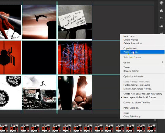
Step 3: Duplicate your frames so you have as many frames for your moodboard as you do your gif. So, my gif is 24 frames so I’m going to make 24 duplicated frames with my moodboard
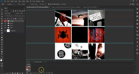

Step 4: Select all frames for your moodboard
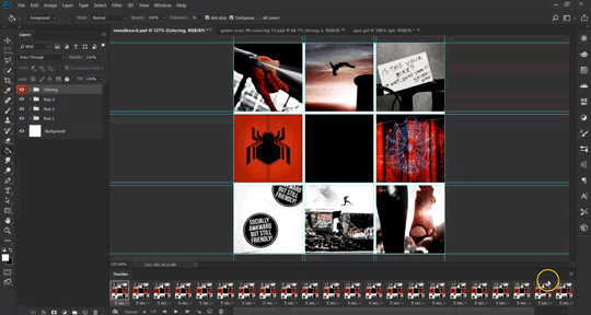

Step 5: Go to the tab with your gif. Put all of your lays for your gif into 1 group. You can do that by selecting the first frame, holding shift, and then clicking the last layer. Rename the group under “gif” or whatever your heart desires

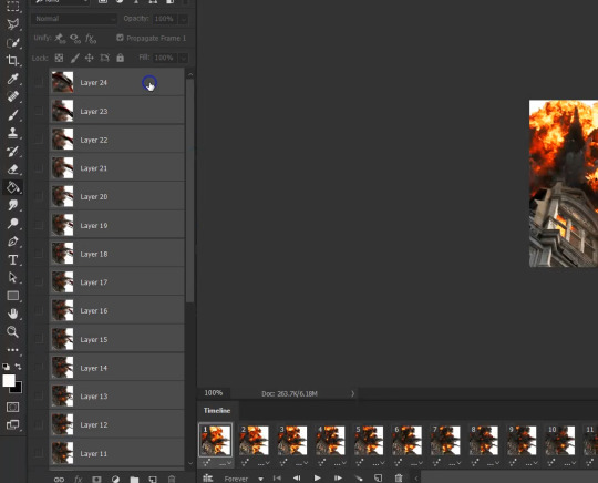

Step 6: Select all frames and copy them


Step 7: Go to your moodboard and click the 3 lines at the far right of your timeline and click “paste frames” then “paste frames over selection”


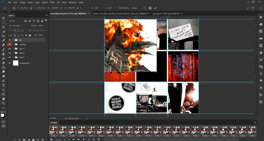
Step 8: Make sure all frames are selected and select your gif group that you just pasted and go to edit > free transform.


Step 9: Move your gif to the section you want it and then transform it to fit where you want it. My gif is already square so I just need to adjust it to fit between my blue guidelines
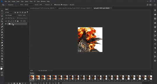
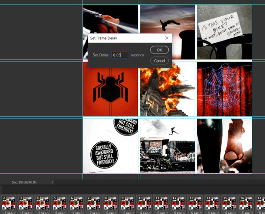
Step 10: Select all frames and adjust the speed of your frames (this is solely for your gif, it won’t do anything to the other images.)


Step 11: Export and you’re done!! Here are my settings:
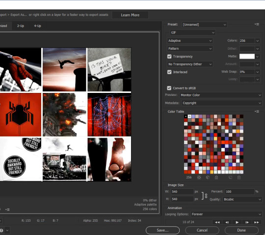
95 notes
·
View notes
Last Seen Blogs