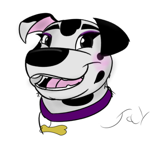
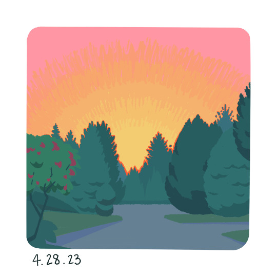
#this has me wanting to draw their 90s designs too what have you done to me
Text
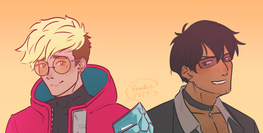
gift art for @yuli-the-bi featuring the TriStamp lads :D
#trigun#trigun stampede#vash the stampede#nicholas d wolfwood#hey look i finally drew them! :D#figured what better excuse than for Wes in their trigun era dohohoooo#this has me wanting to draw their 90s designs too what have you done to me#alksdfh ahhhhh happy birf friend!!!
51 notes
·
View notes
Text
My Adventures With... Supermen?
Alright, so, I just got done watching the third episode of My Adventures with Superman's second season, Fullmetal Scientist. Great episode, fun episode, as per usual. However, certain inclusions have me scratching my head, leading me to only one big question...
Which would be a spoiler, so beware below, but...
Are they gonna kill Superman?
Now, I am not confident in this conclusion at all, it is purely because of two primary character inclusions in the past few episodes that seem to be pointing in this direction. It could mean nothing, but I am crazy.
To see what I mean, we need to jump back to the 90's. One of DC's major events within that period was titled Reign of the Supermen. It was a story that was spread across the 4 main Superman comics of the time, Superman, Action Comics, Superman: The Man of Steel, and Adventures of Superman (ha). This brief storyline, in short, followed 4 Superman Related characters as they vie for the role of his successor. This is because, right before this, Superman famously died.
Yeah, this event is the sequel to the Death of Superman, and builds up to his revival at its end. It wasn't very long, less than a year, but it is there. However, what is important for now is who our four Supermen are.
The first, who we'll skim over because he is least important right now, is The Eradicator, some freak alien who steals Clark's body and takes his identity. The details currently don't matter, though keep a lookout for their stupid glasses!
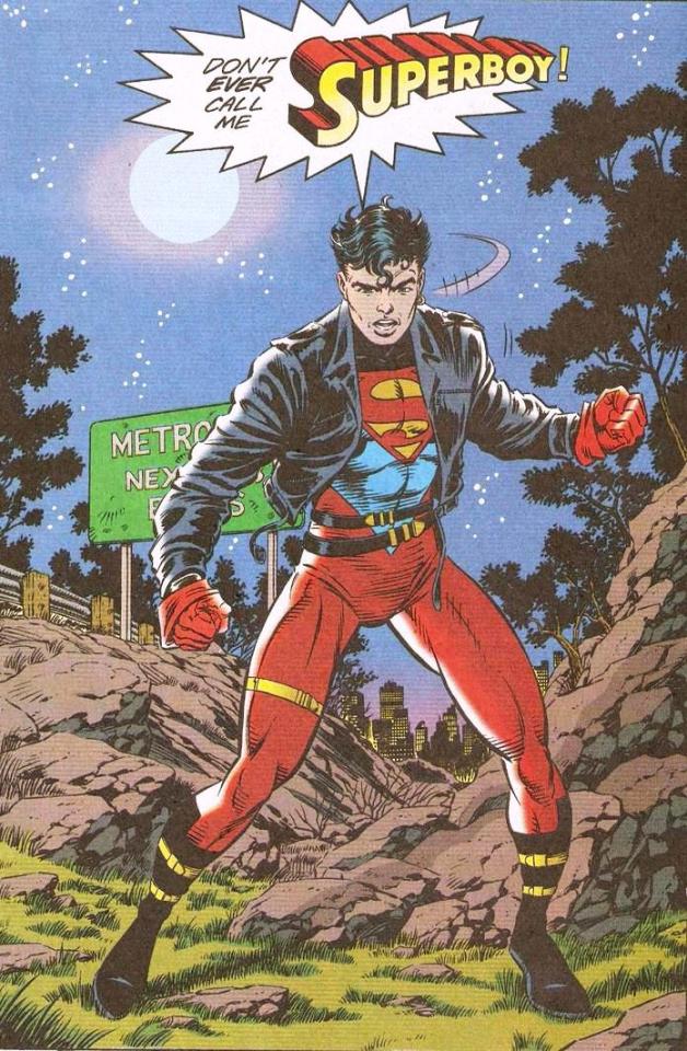
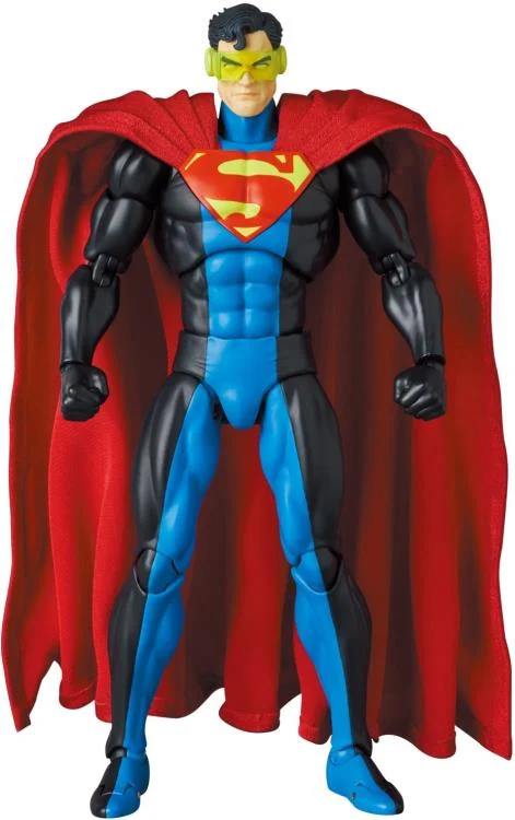
The second is Conner Kent's Superboy. This is the clone one made up of Clark and Lex's DNA. You may recognize him from the series Young Justice, however, at this point, he was in his Leather Jacket Era, not his black T-Shirt era.
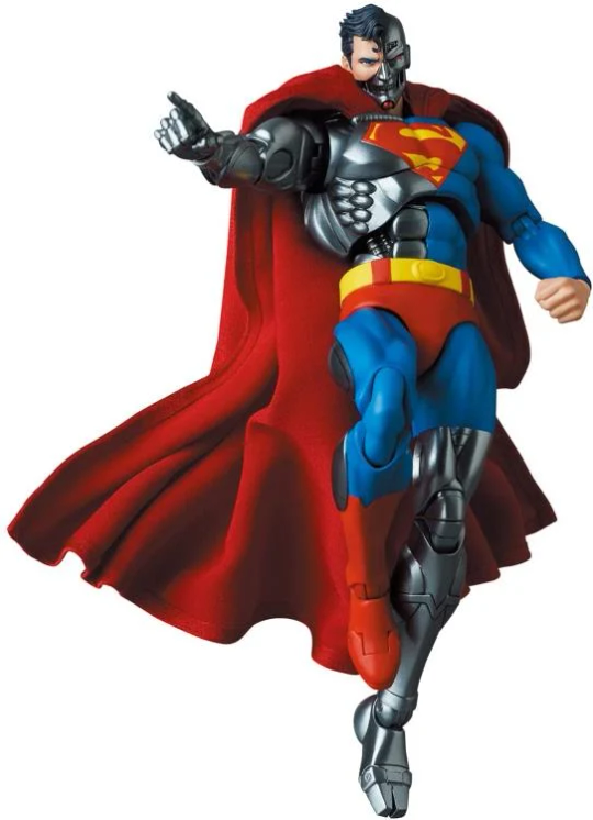
However the final two are more interesting to see. The first we'll talk about is Cyborg Superman. He was once astronaut Hank Henshaw, but he got all fucked up in space, blaming Superman for it for plot reasons. When he eventually died because of space, he was able to upload his mind into a almost clone body of Superman with Robot bits. He then claims to just be Superman revived. Eradicator does this too, but it's funnier for him.
Finally, there is who is one of the more popular characters we see in this event, probably only rivaled by Conner, that being John Henry Irons, aka Steel. He is the only one without Super in the name, having designed to design a suit that helps him be like Superman, though he also gives himself a rad as hell hammer because John Henry. He was later played by Shaq.
So, now we jump back to present day, with MAWS's second season. The first episode draws the gang to S.T.A.R. Labs in Coast City (A place important to the Reign of the Supermen arc for reasons we don't have time to get into and probably won't get into because it probably won't happen exactly like the comic if it does happen in the show) and we meet Hank Henshaw. Neat, me and many others think. It makes sense, he is a space science guy, so might as well draw on a character from the lore. Plus, it gives the creators the opportunity to do a Cyborg Superman later down the line, as this show does love its robots. However, I didn't think much more of it. That was until Episode 3, an episode primarily dedicated to introducing John Irons and making him Steel, if briefly. Now, on its own, this is still innocuous, he is a fairly popular Superman character, and they do a great job with him, I love his larger bodied design.
However, things become suspicious when these two are introduced in such rapid succession. The writers want these Supermen in play for... something. It, of course, hasn't introduced all of them. There has really been no trace of Eradicator, and it seems weird to have Lex cloning Superman this early in the show. So, while we have half of the Supermen here, we aren't quite there yet. Although... We do have another Super nearing us very soon.
Much of this season's arc seems to be prepping for the introduction of Supergirl, Kara Zor-El. You know her, she got her own TV show, she's probably more popular than most of the characters we've seen in this post. However, we don't know too much about her role in the season past that. From what we've seen from annoyingly spoilery Toonami bumbers, she's probably being controlled by the remnants of the Kryptonian empire, whether it be ruled by Zod or Braniac, and whether it being of her own volition or not, and her current arc seems nebulous. However, Superman has built up quite the positive reputation even just in the single season we've seen him in. Imagine the kind of pressure, whether she has taken an antagonistic role in the past of the series or not, that it may place on her if Superman "dies" (or get sent across the galaxy or captured by the government and made to be presumed dead by the public or something). Especially if she has to take down an evil Cyborg claiming to be her cousin.
Do I think this will happen this season. It's probably too early to say, but I find it to be... doubtful. I have my doubts to them ever "killing" Superman, fakeout or not. If they did, it would probably be a season finale cliffhanger before having a 2 episode premier the next season with a Reign/Return of Superman arc the next season. However, they definitely want to do something Reign related at some point. Whether that means "killing off" Supes is yet to be seen. Though, given how close the two arcs are to each other and how much the government (Amanda Waller) wants to kill Superman, I wouldn't be surprised.
Long story short... Uh... Good episode, fun episode. I like this show a lot and I hope it keeps being good.
#spoilers#my adventures with superman#supergirl#theory#reign of the supermen#I feel like I'm going insane#Again I'm probably wrong#But it can't be a coincidence right?
10 notes
·
View notes
Text
And here he is. My OC. xxxALeC.

It’s rare when I draw or design something that does not make me feel embarrassed two weeks after I’m done with it, so it was exciting to see him again and realize he’s so cvnt! If he could have a theme soundtrack it’d be “Sour Candy” by LG.
I don’t really remember my whole thought process for him, though. It’s been a while but, at least, I recall enough to roughly explain his story and design.
I always envisioned my own world in the Puella Magi series to involve magical “girls” who where serial killers. There was so much boundless freedom and so many ways to express your magical powers that feeding the reason of your survival made the lives of others an interesting gamble.
It was a little sad to me when Himena’s story began unfolding and I realized my idea was too similar in some aspects. xxxALeC’s wish was quite the same, but given a different purpose. But, whatever. Not like I’m ever planning to write his story anyway so who the fuck cares, Mary?
Let’s go back to the important things.
The first version of him is the black ensemble. The one he originally transforms into. I wanted him to look feminine. Someone who is perfectly confident, perfectly content, perfectly sure of where they belong to to be comfortable to be masculine and feminine at the same. Lethal, sexy, cvnt and no fucks to give to no random ass motherfucker. Something like that.
The second outfit is what he eventually evolves into. His development is the life of a flower. A bud who blooms into a rose of despair. There is no hope for a serial killer. You can only kill one person in your life… because you pay for that soul with your own. He has already killed way too many to dream for something better.
Valentino red. That’s his favorite color. It matches well with blood, I guess.

I don’t know if you know this but I’m a really big fan of Revolutionary Girl Utena, so it makes sense my weapon is a sword. A big one. Ladies, is it gay to feel sexually attracted to big deadly blades?
His soul gem is a fun little detail. I started drawing random shapes until I realized I had made a vagina. She’s open, juicy and intricately wonderful. I like to tell myself he’s a void to feel special, but he’s most likely a dark slut… because Kanagi is queen of darkness OF COURSE sis.

Abraxas, the doll maker witch. Her nature is depersonalization-derealization. A flower who once attracted many clients and there was something else here but I totally forgot the full description I came up with lol! Something about vessels and magical girls.
This is kind of a controversial topic, but this witch was inspired by a certain famous murder that occurred in North America in the late 90’s about a certain young gay man… well… if you know you know. I thought it’d be interesting to create something powerful out of such tragedy. I do apologize if I went too far. It does tie well with xxxALeC’s story, though.
I actually came up with two concepts for this witch. Let’s call them “the good ending” and “the bad ending.” This one that you’re seeing is the good ending. Now I wish I had kept the rough draft of the second one. It was kinda lit, if you don’t mind me saying.
I love horror stories and I’ve always wanted a magical girl story that was also a horror movie. There are magical girl murders and death out there, but there isn’t really magical girl horror that truly gives you a fright. If I had enough motivation to write long stories I’d definitely LOVE to come out with a story like that.
2 notes
·
View notes
Text
I went down a few rabbit holes while researching the Advent Calendar last year, that didn't make it into the queue because they got too long or went too far afield. Here's one of them!
One thing you notice when you watch a bazillion videos about old games consoles is how the design of circuitry has evolved. If someone says 'circuit board' today, you think a light piece of leafy green board, filled with parallel lines of copper at 45° and 90° angles, dotted with lots of tiny inscrutable plastic and metal doodads. But it took a long, long time for them to get that way.
If you look at really old circuit boards -- and I mean really, really old circuit boards, like from the beginning of the transistor era, they look completely different. They're brownish, for one thing. And kind of... wiggly?
youtube
Apologies for the transfer quality. It's not your connection, it just sucks. This piece appears to be some sort of promo-tainment thing from Tektronix themselves, from 1969. The rounded corners and bluish fuzz at the edges is an effect called 'vignetting', and it means this is originally from a 16mm film reel. There's no earthly reason for film to look this terrible. The uncentered picture means someone copied it by pointing a camera at a projection screen instead of bothering to get a proper kinescope setup, and the fact that it only goes up to 240p makes me feel like it was originally transferred over two decades ago for RealPlayer and nobody bothered to fix it for YouTube. VHS is about 240 lines, but if this were a crap transfer from a VHS tape you'd also see scanlines. It's possible there's a better copy at VintageTek, a museum dedicated to the history of Tektronix; they are an all-volunteer institution, and they probably have more important things to funnel funding to than updating their YouTube channel.
Point being, it looks like porridge and I'm sorry, but at least the content is interesting.
The brownish color, which is actually from an evolutionary stage earlier than what's covered here, is because many early boards were milled of bakelite rather than electrodeposited onto a glass or fiberglas backplane. If you want to see some of what that might have been like, you can hop over to Usagi Electric. He uses CAD to mill boards, rather than the photochemical process described by Tektronix, but it's pretty much the same idea. He does a lot of it in pursuit of his mad obsession with building a vacuum tube computer here. (If you're curious, his logo says うさぎ電気, "Usagi Denki". "Usagi" is Japanese for rabbit or bunny -- there is one who appears at the end of some videos -- and the spelling of "denki" here specifically means electrics, as opposed to 電機, which is usually rendered electronics. It still pops up in the names of some engineering or technology firms, but generally only the really old ones.)
The wiggly nature of early boards is neatly explained by watching the drafting process, starting about three minutes into the video. It was originally done by hand. The rest of the half-hour video goes through the whole multi-stage process, but the gist is that when you lay out the board, you draw dark lines where you want the conductive traces to be on the final product. To get a consistent size, tape is used for "holes" and tape lines are uses for the traces. If you've ever used stripe tape in nail art, it was apparently something like that -- vinyl tape with a bit of stretch, so you could curve it around. It was a methodical sort of art form. Ever solved one of those "connect the same-color dots without crossing lines" puzzles? It's basically that. If you can't find a topologically-appropriate solution on a single plane, you can produce boards with traces on both the front and the back, as Tektronix does here, and these days you can actually bury traces in internal layers as well. It's just a pain and makes the cost go up exponentially.
The mention of "holes" is interesting. Early circuit boards were nothing but holes. Everything had legs and was soldered on from the underside. Today these are known as "through-hole mounted" components; the alternatives are "surface-mount" components, which are generally smaller and fiddlier to solder on by hand, but considerably easier to lay down and solder in place by machine. Surface-mount technology has been around since before this Tektronix piece, but remained NASA-grade esoterica until the automated assembly process became cost-effective in the 1990s. Today the conductive holes are referred to as "vias" and the little medal dots surface-mount things are soldered to are "pads".
I'll also note that they show the automatic soldering process for these boards late in the video. It involves skimming the boards across the surface of a pool of molten solder. Solder in the 1960s contained a lot of lead. I would not personally like to be in that room. Today a machine places little surface-mount doojiggers in place along with solder beads, and then melts it all very gently in a very hot oven until it all melds together, not unlike a pan of slightly too-runny cookies. If you do it right, the surface tension of the solder keeps it on the pads and out of the traces. This is particularly useful for placing CPUs, whose myriad tiny pins in a tight grid would be far too difficult to solder by hand, and the origin of "reflow" repairs for electronics that are exhibiting symptoms of flaky solder joints.
The "silkscreening" process here does not use silk, but originally it did -- it was invented in Asia, logically enough. The gist of it is that you take a piece of finely woven mesh, traditionally light silk but in modern times also metal or synthetic fiber, and you plug up all of the little holes in it in the areas where you don't want ink to get through it, usually with some sort of water-repellent substance. In the days of yore, you painted on some kind of sap or wax, but nowadays it's usually a light-sensitive plastic that's scraped across the whole mesh, topped with a stencil that is opaque where you want ink to flow, and exposed to UV light that sets the substance. The unset areas that were in shadow are rinsed clean, leaving the mesh permeable in those places. The ink emulsion is then applied to the printing surface beneath in the reverse process: Ink is spread across the mesh, then squeegeed through with enough force to push it through the holes in the weave and onto the surface beneath. The dots of ink bleed just enough to flow into one another, producing a solid area of pigment. The circuit board designs were originally drafted in black on a white background, then photographed and reduced to 1/4 their original size, and the film used as the stencil for the silkscreen.
Holes are drilled mostly by hand(!) in this clip, which is an error-prone process, as you can see from the Usagi Electrics guy. The worker uses what's called a pantograph drill. A pantograph is a device that translates motion from one place to another, often with a change in scale. Typically pantographs are mechanical in nature, based on the complimentary motion of opposite corners of a parallelogram, but you could make a pretty good argument that modern systems that accept movement inputs from a user and translate them elsewhere by computer are also members of the class. Robot-assisted surgery comes to mind. If you cared to have an even longer argument, you could also consider systems that scan items with laser photons in order to reproduce them on a lathe or CNC machine pantographs in spirit, if not in fact.
A visual or optical comparator is just a device that projects a magnified view of something up on a screen, along with a point, grid, or profile it needs to match, not unlike a microfiche viewer with a targeting reticule. They're still used in some areas, although software image processing is steadily gaining ground.
You'd be amazed at how many things still need a look-over by a human with a brain. The lack of human brains is how we got the sharply-angled board traces we have today, in fact. Computer-aided drafting was developed to a usable level in the 1980s, and predictably the people using it were mostly engineers. The kind of route-finding you do in those connect-the-dots puzzles, and that the electronics engineers did when drafting the boards, is one of those very slippery human things. You want to find the shortest path, to save on the precious metals you use as conductors, but the absolute shortest path (with reasonable tolerances) is often a very snaky curve that would require a large number of points to define. It's much simpler to work on a grid, hence the 45° and 90° angles -- this ensures that all trace paths can be defined exclusively by where their corners lie on a square coordinate system, and is much less calculation-intensive. This was a lot of what early graphics tablets (or digitizers) were used for, and some light pen systems.
Having watched my father do a lot of this as a kid, I gather that at least in modern CAD software, you can just pick things up and put them wherever you want, but that the autopathing gets very confused if you do it too much -- mostly it's better to let the computer figure out where the traces go and tell you if you want something impossible in 3D space. And if you screw up anyway, there's always blue wire.
Circuit boards don't have to be the ubiquitous green, either. That's just the color of the solder mask, a lacquer painted all over the parts of the board you don't want solder to stick to. It's mostly tradition at this point, but you can get boards in pretty much any color you like -- the second most common I've see is a dark navy blue, probably because copper traces and white silkscreening stand out best on those two colors. You're welcome to get neon purple, if you can find anyone offering it.
from Blogger https://ift.tt/wicV2vP
via IFTTT
--------------------
Enjoy my writing? Consider becoming a Patron, subscribing via Kindle, or just toss a little something in my tip jar. Thanks!
7 notes
·
View notes
Text
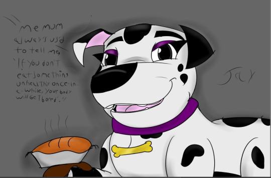
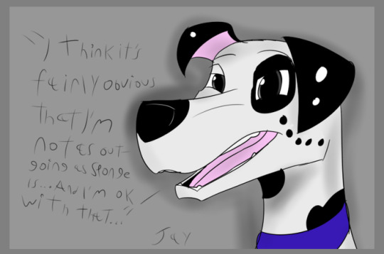
Yet another dump of Dalmatian drawings. (Special "What I did when I wasn't playing Tears of the Kingdom Edition")
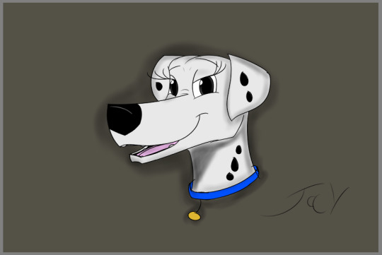
She is kind of hard to draw, believe it or not, you can't be as 'goofy' with her as you can with Pongo. And she always keeps her ears down, which I'm not good at.
Most of these were just stuff I did waiting for Tears of the Kingdom to release... In fact, a shocking amount of the stuff I've done since 2019 has just been waiting for Tears of the Kingdom to release.

After looking over older drawing of her, I realized that at some point, for some reason or another, I stopped drawing her neck. Not sure why, I even had a spot under her chin as part of her design since day one, so I guess I just stopped drawing it cause it was easier.

The one I managed to do WHILE playing Tears of the Kingdom. Cooking in that game left me unable to stop myself from imagining how she would react to the games admittedly extensive range of things you can cook, but with the method of doing so VERY inaccurate.
This...This haunts me. Because I hadn't touched Krita in WEEKS and then I get on one day, and draw the best headshot of her or any other character I've ever done in my life...And now, I have no idea how I did it, nor have I been able to replicate it.
Poor Percy. I was so proud of his spot monocle, yet I don't do much with him... Partly because I never gave him much of a personality...

I think this is the first pic I've done of Sponge sitting.
Dialogue is still my enemy, as I can't write with a pen that great, but text looks too robotic.

Don't know why this has such a weird haze to it. But I wanted to draw them both. In my head, I feel Delilah would be very happy to have another Dalmatian her own age to talk to, though I don't know just what they'd be talking about in this pic.
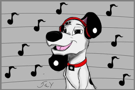
And lastly one of DJ, where I wanted to do a more scratchy, old-school look. The result of watching a lot of behind-the-scenes documentaries about 90's Disney movies.
And that's it. Being able to even hold a pen right after not putting Zelda down for about 2 weeks is a huge encouragement, and even I'll say I'm improving.
Thanks for reading.
3 notes
·
View notes
Text
7/30/23
I'm going to write this and then do yoga to wind down before bed. I'm... angry. I'm upset. So I'm going to just start with that and get that out and process those emotions before moving on to the positives.
If I never hear another person say "I'd love to help you with your work" and then fucking suggest I get into another line of work, it will be too soon. Get fucked. Seriously. I'm just really fucking done being polite about this. Get fucked. All of you.
"I came to you specifically because I love your art style, I always have!" (Has never bought a single one of my pieces, won't even go on to Instagram to see what work I've been up to since fucking college.) "You know, you should really get into graphic design. Then you can make your real work in your free time that you won't have because your commissions will take up all your time and creative energy now!"
Hey, guess what. If I wanted to learn a new medium right now, it would be 3D modelling, not fucking designing logos. If I wanted to design logos, and it was something that creatively called out to me, something that I didn't struggle with... I would probably start with MY OWN FUCKING BRANDING. But yeah, I'm just some hack dime-a-dozen wannabe artist who's just doodling and playing with hobby projects all day... who should get a "real job" like designing a label for Grandma Margaret's Jam or some shit. With a program I've never used. In a style I've never done.
Here's the fun part. You ready? Just the tip of the iceberg with the fun part, don't worry, it gets much better as it goes along. So... a huge defining line for me between working as a fine artist and working as a designer for someone else is... ready for it? I have to draw what they are looking for. They are not approaching me for my vision. They are approaching me for my version of their vision. However... 90% of these people are not creative enough to come up with shit that looks good enough that I'd want to put my name on it. That I even want to sink hours and hours into making it, and learning the techniques required to make it. It bores me. It is, by definition, uninspired.
I, as an artist, have a very broad stream of inspiration I'm working with right now. I have many projects being developed simultaneously right now, to the point where some have been put on hold (like two of the mini-Zen gardens). I'm already overwhelmed. And the advice I'm given... to help me with having too much inspiration and not enough time, resources or manpower to get them all done before more ideas start spewing out... and nowhere to put the finished pieces so that people can even find them... The advice is... "fill the majority of your time with making someone else's ideas." "Cut your studio hours in half (at least), fill the bulk of it with paid gigs where you draw someone else's 'cool idea', then squeeze in some 'fun time' to work on your cute little 'passion projects' on the side."
I said it gets better. You ready? Not only is graphic design arguably the most competitive artistic field in human history, but I am going into that field with a net total of about 4 hours of experience with the required medium. I do not have an eye for logo design, in fact... quite the opposite. I went over this on the phone today, I have no clue if he actually processed this. Logos really need to be simple and minimal, with reduced detail in order to be legible. Especially when being scaled. They tend to need to be low detail. My specialty is hand-crafting and detail work. I specialize in literally the opposite of this. And it makes me start to think he was just blowing smoke and fluffing me up in order to get me onboard by saying he wanted my art style. I'm not sure he entirely knows what artstyle is even going to work with what he's looking for.
Okay, I gave fair warning... here's the best part. Of all of the artistic jobs that are currently under threat of being lost to AI, this is by fucking miles the biggest. If there was any artistic field that would be obliterated by AI, it's graphic design. Why? Grandma Margaret can just go on that website and type in "jam label that says 'Grandma Margaret's Jam' that looks like _____". And an AI will instantly produce multiple drafts of that for her. For free.
What I'm getting at with all of this is... my friend contacted me for a task that, to me... is kind of the equivalent of me calling him up and asking him to help with a clogged sink. He works in pipe fabrication and specialty welding. I mean... it's all pipes... right? And offering to pay him for it. And when he says "sure, for a friend" and we get to talking about his business and he starts talking about how he's kinda struggling a bit to get things where they need to be in order to keep the bills paid, my way of "helping him" is to tell him he should quit his fucking job... do it as a hobby in his free time... and be a plumber.
Does he have a right to say "I don't want to be a plumber?" If his business is struggling, can he really afford to turn down taking on a primary gig of unclogging peoples' toilets?
Better than all that, let me just come out and say it. HOW THE FUCK IS THIS "HELP"? You know what helps an artist who has been struggling with mental health stuff that makes social interaction difficult? Help with the social side. Fucking DURRRR. How about you BUY A FUCKING PAINTING?! How about that? How about you get a piece of my original art, a piece of jewelry, maybe commission me to paint something on your guitar case? Something like that? And fucking show that shit off. You don't support a tattooist by telling them to get into fucking web design. That's how you create another website designer. Fucking imbiciles, I just don't understand how people make these logical leaps. I mean, it has to come from a lack of familiarity with the field. It has to. They must have no fucking clue how different freehand painting and carving wooden staves with hand-tools is from working in fucking Dreamweaver.
"Oh, you went to culinary school and trained to be a chef? And you're very talented? But you struggle with crippling social anxiety, agoraphobia and PTSD? Oh man, let me help you! Here, here's your help. Give up on being a chef and go be a fucking bartender."
Fuck you.
That doesn't even help me work towards my goals. In fact, it requires me to put my goals aside in order to focus on something else. And then I'll "learn to love it". And then 10 years later, I'll look at a calendar and see 2033 and see myself at 46 still barely squeezing in time to make my own work. Realizing I haven't drawn anything inspired by my own thoughts, my own inspiration, since X was called "Twitter".
That sounds like Hell.
I'll take my chances, thank you. I'd rather go get rejected at art galleries over and over than do that shit, thanks though.
And on top of this... and this is pretty par for the course for this guy... but he told me to plug my ears when we were in a social/business call... so he could shoot a fox with a .45 pistol with hollow point rounds. Because it had been fucking with his chickens. Here's an idea, Mr. Handyman. Build a better chicken coop.
I'm a bit upset that I was present for that. I love foxes. I really do. They get such a bad wrap. One of the last times I cried about something that wasn't the loss of a family member was witnessing the corpse of a fox in my old neighborhood that used to visit my house that got hit by a car. I was mortified. We had met in the driveway several times. Foxes are lovely animals. And he took it out with one shot, one handed while on the phone and bragged. And I just nodded and smiled and went along with it, blending in. I actually told him, if he felt up to it, I'd be willing to take some of its remains (pelt, teeth, claws, bones) to make something out of it. I'm not sure what, probably jewelry from teeth or claws, not sure about the fur, the bones would have to be cleaned but I could carve or paint them. His response? "I don't think there's much left of it, to be honest." Like... the most modern American answer imaginable.
It really upset me that he didn't even try there. And that he isn't entertaining the idea of potentially using a smaller caliber or a trap in order to... have the remains be usable. I don't like that he feels he needs to resort to killing it. Let's get that straight. I'm vegetarian, so I figure that would be implicit... But I do understand that he feels that's a more effective, practical solution for him. And I'm not willing to confront him on that. What did deeply upset me was that he didn't even make an effort to try to preserve the remains to show that animal respect. I really would like to find a way for us all to take a more "use every part of the buffalo" approach to life. It's so wasteful, so disrespectful, to not only treat that creatures life as though it is absolutely meaningless to you, but to overkill it in such a needlessly cavalier way and refuse to honor their remains by having them turned into something precious. How savage. The cowboys you mimic would be ashamed. The pioneer industrialists would give you a standing ovation. "Throw that in the garbage pile where it belongs."
Welp, don't be surprised if what you put out into the world - a smug sense of superiority, a lack of compassion or empathy, a detachment from ethics - ends up facing you someday. I don't know how I keep ending up face-to-face with these people. Maybe I just never filtered them out. I don't know.
In the past, I would've normalized his behavior. "Haha, that's just what he does." Now? I'm not going to stop him, I'm not going to shame him - it is not my role to play - but I'm absolutely not approving or downplaying. But man, if you've got any sense about you... I'd say the number one thing you do NOT want to piss off by being disrespectful? It's Nature. So... maybe show a little more respect?
So yeah... not really sure if he's still... "friend material". Maybe with limits? But I'll try to give his logo thing a shot. As a favor for a friend. A paid favor. But, to be completely honest... I don't want him going around and recommending me for graphic design. I do not enjoy this process. I don't like having to read the mind of a non-creative. I do not like having to submit endless drafts by a person who is acting like an artist, using me as their creative puppet. It's not enjoyable. It's not my work. And it's really not how my creative process functions. It's something that utilizes my trained skills that I've developed over the years, with little smidges of creative influence. And it's something very visible. So yeah, I don't mind if he tells people he got it done by a local artist who doesn't usually do this kind of stuff. In fact, that would make it much more special and impressive, so he can brag about it. And god knows, if it's one thing that man likes to do, it's brag and show off. Always has been. I just really hope he doesn't go around saying "you should get my friend to design blahblahblah for you". It's a very different thing than saying, "you should see my friend's art exhibit," or "you like that painting? It's one of a kind. My friend made it. You should check his shit out."
And on that note... I think I'm going to take down my derelict unused print shop finally. It cheapens my work. And, again, it's not what I do. It's a perfectly fine thing to do if your intention is to make prints. But my intention has never been to make prints, it has been to make one-of-a-kind pieces. I was peer-pressured into selling prints. And only sold single prints to... the people who peer-pressured me. Oh fuck. So... Wow... Okay... So... I pulled up my sales on that shop. I only sold one duplicate. A mandala I made for my aunt, which was purchased by my aunt, and by my mom. So... Jesus Christ, the reality of this really hurts. That piece. That I made for my cancer survivor aunt, but my mom wanted a copy and convinced me to scan it so they both got prints from an online print shop... that piece netted me $20, it took me at least 6 hours to make. A mechanical dragonfly piece that I drew for my younger brother as a tattoo design but he "didn't want"... was bought for $11. One of my trademark pieces, a realistic chipmunk that I drew in college... I sold one to my brother and one to my Mom. I never should have cloned that piece, it's too special, it's 15 years old. It has netted me $20 total. And a copy of the tattoo design that I made for the ex-wife of this friend I'm doing graphic design for, that was sold to my former best friend for $10. So... total, my body of work from this print shop has netted me about $60 since the start of the pandemic. Ready for the mind-fuck?
The chipmunk original... could likely go for over $2000. Alone. More, if someone valued it higher. That's how art works. The mandala? Maybe $150? I don't know about that one. I'm not very good with pricing at all. Point being - all of these pieces were bought by family members or former friends. All of them were bought for pennies, only two of them were duplicates. So... if one of them had bought one of my original pieces... I would've made probably bare minimum 3x the amount that I ended up making total for all of them. And it would not have made any negative difference, that original is just sitting in a fucking portfolio right now. As long as that piece has a good home where the owner loves it, that's where it belongs.
But I live in a world where people don't value my art. They don't mind buying a cheap copy, but they don't want the original. I have personally been witness to my own pieces being propped up in a closet next to a litterbox and draped over a rocking chair in a hallway with a hole torn in the middle, and shoved in the back of barn with scrap wood.
I don't need to ask people "how can you help me?" I don't think I ever have, honestly. I can tell them very clearly how to support me. Buy my shit. And be a goddamn fan. Stop being a fake fan. Show a genuine interest in what I do. Ask me if there is any story behind the mandala on my skateboard. Guess what? There is for every fucking piece. Hell, ask me what the fuck I'm working on! Tell your friends about how cool my work is.
You know what's depression fuel? Having to explain to people how to support you as a creator... right after they've sung the praises of another one. I don't have to teach this guy how to sing the praises of his favorite tool company, or his favorite brand of survival gear, or his favorite beer or cigarettes, or his favorite restaurant. Or, bringing this more back in-genre, his favorite podcast or music. You don't need to coach someone on how to share things that they genuinely enjoy. Because... they do it willingly. So... you get where I'm going here? When they say that? It very overtly, to my face, tells me that they don't like my shit. That they say they like my shit, but they don't even know what I do, and really aren't willing to put in the time or effort to even find out what I do. They just know that I can "draw good" and if I draw for a company that's already established, or get a drawing on a fucking beer can or something, that equals $$$. That's all. That's all they process. And they look at me like I'm stupid for continuing to pursue my career, my life, rather than follow their out-of-nowhere unsolicited career-swap idea. When all they'd need to do to help my business? And help my life as a whole... Is to be a good friend.
How deeply, deeply sobering.
Welp, until he brings up "The Path" unprompted... I'm going to charge him full price. And I'll have to brainstorm what that number actually is. Not a smart idea to tell me you get paid $90/hour... while in a business meeting where you're going to be paying me... That fox's life alone is gonna tack a few hundred onto the end of this gig.
All of that said... it was good to talk to someone again. And he did seem... generally supportive. He saw my side with how I got scammed by the dealership and lost my car. He was sympathetic about how the old house I was renting was falling apart and filled with mold and how that was fucking with my health. He seemed optimistic about me living in an area with more younger creative people.
He just seemed more concerned with sharing his opinions than asking questions, so... yeah. That's a thing. I'm sure he's having quite a few relationship problems because of that nasty trait.
So... I'm not going to take that too close to heart. He means well, but if he's not helping me pursue my goals... then he's trying to set new ones for me. And that's not support, that's coercion. I learned that from my family! Yay! They actually taught me something! Supporting your artist/musician son by saying "of course you can make your art... in your free time... but in the meantime you need to get a 'real job', like working in the stock market, like we happen to do and consider a 'real job'." Yeah man... um... that's supporting someone to do something you want them to do... not what they want to do... that's not... support... it's more of a veiled threat. The veil being - the generosity. The threat being - if you pursue art full time, we will not support you. And they get away with it by just acting as though being a full-time artist is... not a career. But convincing your friends to give you their hard earned money, so you can just... give that money to brokers to invest it in successful companies... and taking a slice off the top for choosing those companies? Now that is a career. That's a "real job".
I'm sure people have differing schools of thought on that respective to what kind of family they grew up in... I am firmly standing by that statement. If your child wants to be a firefighter, and you say "maybe you can be a firefighter in your free time..." You are not supporting their goals. You are literally telling them to put it on the backburners and find something else to do. Something more realistic. That's not support. That's not helping them come up with a plan. That's not quantifying resources. That's not finding out what you have to offer, seeing what social resources or connections you can provide. It's saying "I don't believe you are going to succeed at that, but I don't think you should give up entirely... I just think you should give up... mostly."
And here's the thing. Adam Duff said it really well, it stuck with me really fucking deep and it's been ringing through my head for days now. Being an artist is not just a job, it's a way of experiencing life. That's not just fruity language or a fun little quote to throw out there in a conversation to "sound deep". That's a literal truth. The way that artists experience life itself, they way we think, the way we learn. It deviates from the norm. We are different. And that is what makes us gifted. That is our gift, our unique vision of the world. Our unique voice, our unique perception, our unique way of thinking. Our identities are what make us artists.
This is not just technical skill. It's a way of thinking and expressing yourself. The conversation you have with an CPA is going to be vastly different from the conversation you have with a fine artist. Why the fuck wouldn't it be?! So when you take an artist and you cram them into a place in life where their creative flow, their way of thinking, their way of living... gets in the way? What the fuck do you think is going to happen?
You're going to get problems. You're going to get failure to meet deadlines. You're going to hit barriers in mutual understanding. You're going to get people wandering around daydreaming on the job. You're going to get existential crises.
Okay, let's connect to a point from earlier. (The dog next door has been barking for at least 20 minutes now, and it's 1:30 AM. I feel so bad for the poor thing.) So... if being a "traditional artist" (I fucking hate that term, just say art for all of it) is actually still a real job... a viable career... I'm simply not going to get support, and the "support" I get is a recommendation to get into graphic design. So... let's say I'm dumb enough to do that, to give up my creative calling and adopt someone else's. I get into graphic design. I get a bunch of commissions, but in 2 years - fuck it, look at how fast ChatGPT blew up, let's give it 1 year - in 1 year, AI graphic design is the new hot thing. Squarespace has their hands in it, Adobe has their hands in it. Graphic designers are dropping left and right. So... what are those graphic designers supposed to do with their now obsolete job? Hmm? I'll tell ya. Go make fucking coffee, bud. Until they smarten up and turn those into self-serve machines.
Yeah yeah, "they took our jobs!" I know. But this is actually happening. And... I was just the other day expressing such deep relief that I don't work in digital art. That my forms of creative expression are so far from being replaced. Because I'm doing the opposite of what AI is built to do. I don't use the most modern tools... in fact, a lot of the time I don't even use tools at all. I do not aim to produce work as fast as possible, I give it all the time and attention it calls for until the piece itself is satisfied. Like a good lover should. <wink> I do not aim to mass-produce work. I focus on individuality, character and end up with a one-of-a-kind product that has an actual story behind it, that has a soul. And, most importantly, I do not rely on user input to create a piece. My work comes from inspiration, from my connection to my own subconscious and the collective unconscious. All I have to do is keep that connection clear and be willing and ready to capture the ideas when they come to me.
THAT is what I do. THAT is what I have been doing since I was a teenager. And I'm getting really fucking good at it. I literally do it in my sleep.
Again, this is not to besmirch other forms of creativity, every medium and process has its place and every one is valuable. This is simply the form that meshes best with me, that has created my best works. This is the process and form of work that leaves me looking at pieces I did years ago in awe and joy. Like, "I did that. I finished it. I made that real. I brought that into the world." I can't even explain the level of healthy pride that I felt when I finished The Path. So much that I rewatched it yesterday (or today, it's all blending together due to sleep deprivation) and it brought a tear to my eye. Even the music I wrote for that piece is fucking... it's just all right where it belongs.
And I simply feel like the people in my life do not even really understand what it is that I do. Thus... who I am. And, they clearly do not see value in what I do... otherwise they would... watch my videos... or listen to my music... or read my poetry book... and want to have my art... or at least support me on Patreon or something... So... if they don't see value in my art... and my art is a reflection of my experience of life... they would surely struggle to see value in me. And they clearly picture me as... a person who does graphic design. And... I am not. I am not a graphic designer. I'm just a good friend who is willing to go outside my comfort zone for a friend, and for a personal challenge.
So yeah, despite the several setbacks... the conversation was not bad. We were able to get some headway and I was able to get a clearer vision of what he's looking for. I hope. I got Illustrator and started mocking something up. I... of course... started doing it all manually, line by line. Then... after I finished the lion's share of the work, found a bunch of shortcuts to clone stuff. And... I went to it like a moth to a flame. And then spent like 2 hours trying to figure out how to use these processes... to clone details... to turn what would be like... 1-2 hours straight of detail drawing into literal seconds. And I just... didn't know how to do it. I couldn't figure it out. Even with googling.
I made progress with it, but like... it just got frustrating. And I just really feel... this clash. Graphic design and logos and shit are supposed to be about like... being sleek and clean and legible from both close up and a distance. And the piece he wants would look great with lots of detail. I had so many ideas that were detail based. Realism styles, lots of shading, lots of color. But... it's going to end up looking like an ink-stamp. Because it's a letterhead logo, and a t-shirt logo. So... yeah. If I put too much detail in, it gets lost on the letterhead. If I put too little, it looks bland on the t-shirt. It's just a very different language than I've ever really thought in. It's definitely a challenge. And... the end result is not going to reflect "my style" at all. So yeah, it's a confusing situation. But I made progress, quite a bit, actually.
I just really need to make sure I don't put the skateboard on the backburner for this. I have to finish at least the mandala, so I can actually go out and skate. I need the exercise and the stress release.
Hmm. I came out of that conversation feeling like it was a good conversation and nice to catch up with a friend, but looking back at my reaction here? I guess it was actually mostly not good. Quite a few red flags there. I want to say... "I don't think he's a bad guy, I'm just not ethically in the same place as him in some places, we're very different people, and I think he's a bit self-centered and doesn't really seem very empathetic." I'm genuinely unsure if this unqualifies him as a good potential friend. I mean, he did seem on my side with the car dealership thing, and the old house falling apart, but... he didn't entirely ask about that. He just kinda asked how I ended up here. I don't know. I'm just trying to be cautious. I fear I have been a bad judge of character in the past... because all of my past friends turned out to be eerily similar to this... and... I'm seeing those similarities pretty clearly. So... yeah. We'll see.
I cant' tell if I was blinded by reconnection, the whole Ace of Cups emotional blinding of reconnecting with an old friend... so that I overlooked the bad things that happened... or if my hangups with the bad things that happened are making it harder for me to see the potential here. I don't know. It's clearly both, but the proportion is pretty important.
I'll try to sleep on it. I only got like 5 hours of sleep, after 2 the night before. I need to do yoga and go to bed. But hey, at least my entire apartment got spotlessly cleaned for an hour and a half phone call, right?
I re-read this back. I need to find a positive note to end this on.
I went way outside of my comfort zone. And socialized. And tried a new program and actually reached success, I got a successful sketch mockup in a new piece of software on day one. And it's actually pretty damn decent. That's big. And... and... I did that on massive sleep debt. And the only fuck-ups I made was... I may have been too nice. Too forgiving. (story of my life) Wow, my depression really needed to get a word in there... XD That's not bad. I'm usually really insecure about all that. But I did a bang-up job. I showed up on time, I brought my A-game, I went above and beyond. I drew up 2 pages of concept sketches and notes unprompted. I went super in-depth. I asked all the right questions. So... from a professional angle? I did a spectacular job. From a friend angle? Maybe I would have better results with friends that align with my ethical values and goals a bit more? Maybe keep it more at an acquaintance level? That sounds like a fair compromise. And now that I've cultivated more confidence, I can try to go to the model drawing session.
OH MY GOD, HOW DID I FORGET TO SHARE THIS! Okay, so I did the deep tissue massage last night. 2 hours on just my feet, shins and calves. XD My Soleus muscles are just... fucked. Good lord. They're so tender and tight. I could barely walk after. I'm still sore. I'm going to wait at least a week before going back in for more. But they actually started loosening up. But man, that process was just... so intense. I had to dig really deep into my muscles, find the spots that I were just like "nope", and then take a breath and just work those spots until I didn't feel it anymore. And it worked. Until my hands started giving out and I was just getting wiped from all of it after 2 hours.
But I had the idea of bringing up anatomy pictures to help jog my memory of what I was working with under the skin, and to make sure I was getting all the muscles. To get an anatomy refresher as I went. And it really helped. And the picture I chose was a picture from a study guide for people studying to get qualified for massage therapy. XD And it actually passed through my mind... "could I do that?" And I honestly... I mean, that would be good money. And I would be really good at it. And it would be great for my knowledge and study of anatomy for my art. (that's what jogged my memory, the figure drawing classes and anatomy study) But that would be a gigantic plunge for me as far as social anxiety and physical intimacy goes. To go from struggling to shake peoples' hands to... massaging mostly naked strangers? I don't know. I mean, nudity is barely even a sexual thing for me at this point, it's not a problem with that at all. It's just how insanely sensory overwhelming it is for me to be in physical contact with other living beings, it has been all my life - it's a big part of why I bond so insanely deeply with people I have been physically close with. But it's something to think about. One of 50,000 potential side-gigs, along with guiding barefoot hikes, doing tarot readings, hosting improvised drawing groups, being a creative coach/mentor, giving lessons, shit like that. The more on the pile, the better. Then, if the opportunity comes along for any of them, fuck yeah. (note that graphic design and web design are not on the list... XD)
Okay, yeah, so... I'm absolutely seeing the value of anatomy study and refreshers with that, and that's making me feel much better about going to one of those model drawing sessions. I might see when the next one is and try to go. :) That's a good note to end on.
0 notes
Text
Progress Tutorials (11/5/23)
Both of these two paintings are from the neighborhood I grew up in! Collecting reference photos made me realize that I wish I had taken more photos of Seattle when I was still there. I think there's a special kind of love that goes into drawing your home and where you've grown up, and I wish I'd gotten more pictures to draw from before coming to London! It's definitely something that I want to invest time in when I go back home for the summer, scouting out places that hold a lot of memories for me and trying to commit that to visual form.
Day 19 was a kind of ambitious painting for me because I was trying to capture all the architectural details that I could see. I think I'm still a bit unsure when it comes to architecture and trying to balance structure versus personality/feeling, but it was definitely good practice all the same.
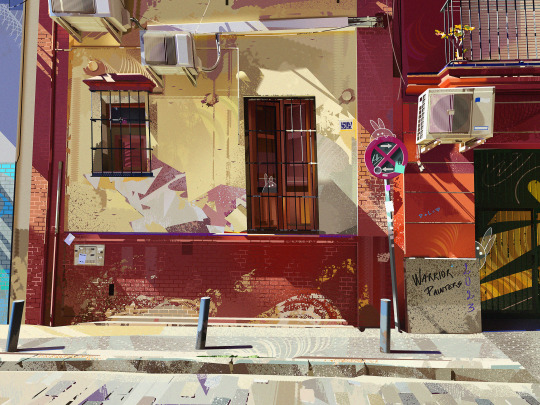
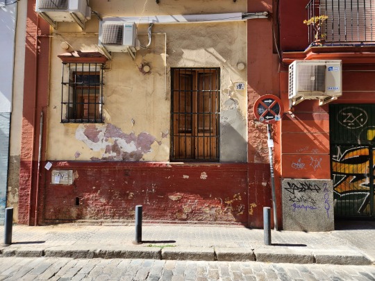
For Day 20, I followed along with Lea Pinto's Warrior Painters demo. Lea's demo was really interesting because I could tell she wasn't used to speaking about her process that much or talking while drawing, but she had such a wealth of information and tips to share! I learned so much about difference tricks in Photoshop, and more importantly some of Lea's though process and logic behind the choices she makes.
Lea was one of the background artists for JIBARO, one of the episodes of Love, Death, and Robots, an animated adult tv series streaming on Netflix. I'd actually watched this episode before so it was amazing to hear her talk about how she designed and painted some of the scenes from the episode.
I was super shocked to hear that Lea generally uses a mouse with the lasso tool for 90% of her painting process, and she explained that she feels more comfortable using it as opposed to a tablet. I don't think I could ever work like her but it really goes to show that it doesn't matter what your art tools are, as long as it works for you and you're able to use them how you want to.
I'm pretty pleased with how my own painting came out, because I was able to accomplish several things that'd I'd been aiming for in the same piece! I increased the saturation and vibrancy from the original reference, added my own slanted perspective for more character, and was able to integrate the overall color palette with the primaries red, blue, and yellow.
My color sense has definitely gotten stronger since the start of this challenge, and I can also see how my paintings have gained a more confident feeling to them. I really believe that getting a lot of mileage in drawing is one of the best things you can do to improve quickly, and I'm glad that I can already see gains within just a little over two weeks.
For Day 23, I followed along with Yeonji Rhee for her Warrior Painters demo. I thought Yeonji's demo was really informative, and I could really tell that she had confidence in teaching and explaining art concepts to other people. Her demo was a bit like a lesson almost, focused on how to use grays effectively within an image.
I'm super thankful for the Warrior Painters and Artbrew for their demo collab series. Every time I've followed along with one of them, I end up feeling reinvigorated from the new knowledge I've gained and inspired by the amazing artists leading the demos. I think this pattern of creating and learning, creating and learning is a really effective one for me because sometimes I get too caught up in learning and fail to actually apply any of those lessons to my work.
Almost all the paintings that I've done for PleinAirpril are reference photos I've taken personally (besides the demo sessions), but a few images are also from my friend Naomi! Naomi recently traveled to Iceland and took some amazing photos on film.
When they finally got developed, I was really blown away by the atmospheric quality of her photos, and was inspired to try and create that feeling in my own artwork.
For Day 25, I followed along with Kaye Kang's Warrior Painters demo. Kaye had some helpful color editing tips which I found pretty interesting. She said that she never works directly with an unaltered reference image, and will always adjust the colors in Photoshop first to enhance a certain type of lighting or atmosphere.
Usually, when I paint colors that don't follow the reference exactly, I just use my own color sense to adjust them as I paint but Kaye's method seems really helpful for more unnatural colors or combinations that I'm not as comfortable with.
I liked the photo that Kaye picked for the demo because I got to think about how to simplify the signs and details of the storefront while still having them be convincing.
In this next painting, I applied the Photoshop techniques I learned from Kaye's demo to create a really pink lighting with greenish shadows, inspired by one of my favorite illustrations ever by @quruiqing on Twitter.
I did try experimenting with an inverse of that coloring, with green lighting and pink shadows but it didn't exactly fit the atmosphere I was going for so I decided to ditch it.
I had a lot of fun with the pinks and purples of this painting, and definitely want to play around with strong/unnatural lighting more in future works!
0 notes
Text
Writing Initiative #6
Which piece did you present to the class today? How does it relate to the other pieces previously presented?
Describe 2–3 specific strengths your classmates found in your work and their reasons for identifying them.
Describe 1–2 specific ways your classmates thought you could improve this work going forward.
Consider the remaining outcome yet to be presented in a couple of weeks; why have you put it off the longest? Describe your reasons for presenting this outcome last.
Finally, you have now had a chance to present each of your projects (2D, 3D, 4D, Reflective) in process to the class. Produce an image of each one and describe how an aspect of your word is manifested in each piece.
Today I discussed my idea for my 3D piece. I feel like I had trouble talking about it and explaining, especially because I’ve been feeling really frustrated with the progress on my 4D. I’ve never had a coding issue like this where it’s been this hard to solve, and it’s frustrating that I can’t just call it done. I feel like it’s been sucking too much time and I need to be spending more on my 3D! I didn’t talk about it today but I have made more progress on my Reflective and I’m not worried about finishing it, but 3D has been going slowly. I want to focus on the idea of the imaginary that is part of my word, since it’s an imaginary yet never-fading flower. I think AR is perfect for this, since it is technically imaginary and also since it is digital it never fades. I’d like to make a sort of sticker for it that can be placed on any wall using Adobe Aero, but the problem lies in what the subject should be. I gathered some research to get friends to draw a flower from their imagination, thus an imaginary flower, and I think it would be cool to compile something from that. It relates to my previous pieces in that it again follows the flower part of my word but since I have already covered the mythology, growth, and never-fading ideas of my word in my other assignments, I think tacking the imaginary part makes sense.
In class, my classmates had some good suggestions for me. Ideas were making some kind of quilt or a patchwork of ideas into a gardening item like gloves. Also had the suggestion of compiling the drawn flowers all into one, which I think makes sense; picking common elements and making one thing. I thought the other patchwork ideas were cool but didn’t really make sense with my word, but patch-working the flowers themselves I think could work since again it’s making a flower from imagination, and it doesn’t exist, much like the myth of the amaranth (the flower does exist in reality, but the myths say it doesn’t). I think the idea of AR went over well, but I think I didn’t explain things very well so my peers didn’t really see my idea, but I also don’t have a clear vision so that’s very fair.
At this time, I don’t have anything finished enough for 3D, but I have images of the progress on the rest of my assignments:
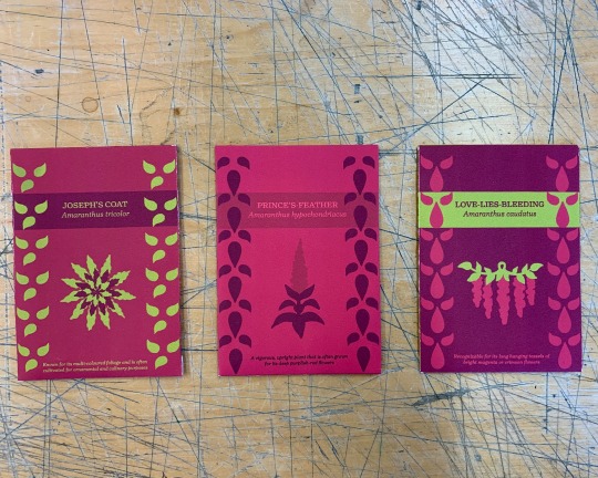
Seed packets: Following the more literal definition of the word, these seed packets are designed for popular amaranth varieties. I used amaranth (the colour) as a big part of the design.
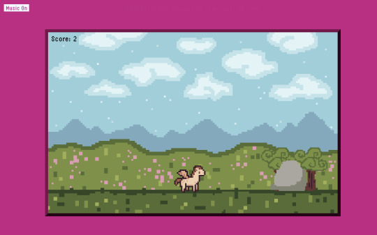
Amaranth game: For my game, I focused on the mythology behind my word, as there is a Greek myth about the flower being hidden by the gods and the finder can become immortal. I also used amaranth the colour as a big part of the game.
Reflective document: I wanted to consider the never-fading idea of my word, since amaranth is defined as an immortal, never-fading flower. I thought, what is more immortal than the web? I wanted to play on nostalgia of early HTML websites and GeoCities. This also looks a lot like the first website I ever made, and I really wanted to lean into that 90s/2000s web aesthetic.
1 note
·
View note
Text
Royal Nightshade's Influence Map (Part 1)
Hi again! This is Volt and we're back with another blog post! This time we want to chat a little about the artists and themes that inspire us; what makes "Royal Nightshade"? KingRhapsody and I want to share what we love. This is part 1 of 2!
Volt's Influence Map
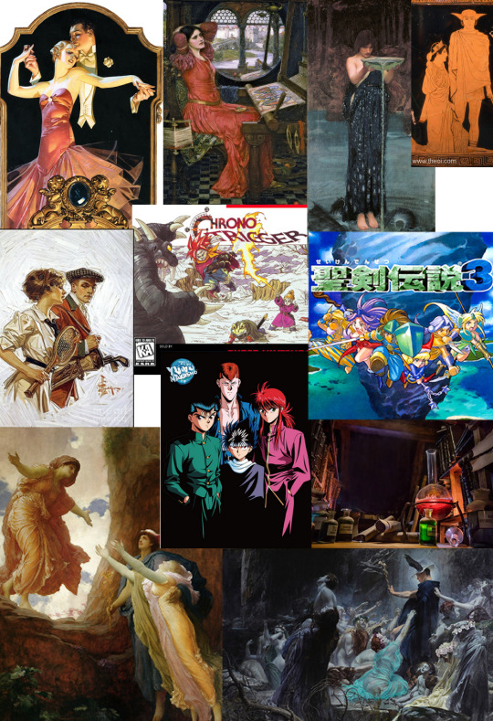
I'll admit, my influence map is a little all over the place, and there's a lot that I actually don't have on here- I wanted to really work my brain for the themes and artists that recur or that I constantly refer back to, so that meant not just reaching for a bunch of Disney or anime from my childhood and calling it done (Not that there is anything wrong with that).
More below the cut!
Artists
JC Leyendecker: (Top left) One my my current inspirations and has been for quite some years now. I learned about him and the way that he made art. He led quite the fascinating life. Some of my favorites of his are on that map, I love his finished advertisements and works for the Saturday Evening Post just as much as the quick studies he did. There is something timeless about his art that I love that I find to be the opposite of Rockwell's, which tends to lean very 'Americana' and 'Of That Time'.
A lot of the visual cues I try to implement from him are the sculptural brush strokes, as well as the very confident air about the characters he draws. There is something very statuesque about his work, and yet it isn't stiff or lifeless. He has a unique design sensibility that I really like. A lot of his work is quite like Art Deco, which I love in architecture.
John William Waterhouse: (Top Middle) I absolutely love his color mixing and his theming of powerful women and scenes from mythology. His work is looser and more ethereal than Leyendecker's. I find the running theme to be strong silhouettes and good contrasting and saturated colors. There isn't much else I actually have to say about him, except that I like to do master studies of his work every so often.
Frederic Leighton: (Lower Left) If you hadn't noticed, I love painters who create within the themes of classical art or mythology (more on that later). But Frederic here is actually one of my favorites specifically because of that. his colors and light are masterful, and I'd love to create powerful scenes like the one on the map of Hermes returning Persephone to Demeter.
Modern Media
I don't want to spend too much time here, because there's more modern media than I have room to cover. Needless to say, I grew up with toonami and Super Nintendo. So I chose some games and an anime that best suited what I feel represents a good deal of my influence from those things. Notable mentions are
Yu Yu Hakusho, a shounen anime you should watch if you haven't already, and definitely an influence on the way I approach characterization. If I had to tell you an example of what my favorite style is for 90s anime, I'd point you here, or to Cowboy Bebop.
Chrono Trigger is definitely a part of my formative years as a baby gamer. I took pretty well to fighting games, and I could sit here all day and talk to you about how much I love King of Fighters, but Chrono Trigger sums up what the vibes are when it comes to non-linear narrative, which is definitely what my comic is shooting for, but not in a time travel way directly. This game makes you think about the consequences of actions you can and cannot control in the flow of history.
And the music slaps.
Seiken Densetsu 3- Oh, I'm Sorry, Trials of Mana, was a game I played many times on an SNES emulator, fan translated. The characters and the various adventures you went on really inspired me! The colors in this game are so rich and I liked all the different locations and monsters. It makes me want to expand on the lore of the world in which Royal Nightshade exists. King has played this one too and he thoroughly enjoyed it!
My favorite characters are Kevin, (but then again I love werewolves) and Angela (because she shares my name and has cool magic, sort of a brat though). Please play it! The remake is not bad, but the original is great. Music also slaps, but not as hard as Chrono Trigger to be Honest.
Themes
And finally, I'm sure you've noticed peppered throughout the map is Hermes, who is honestly The Best. God of commerce, travel, boundaries and communication. I love him so much. Here at Royal Nightshade we stan a busy god.
In general, you'll see themes of mythology (Greek in particular although I love all sorts), as well as liminal spaces, fantasy and alchemy; the latter one is a big influence to me, given that the main character of my comic is an alchemist. I don't know. I love the symbolism, the theories, the philosophy, it's so easy and fun to make up themes within the umbrella of alchemy because it was so based in belief and what many early practitioners thought was the way to back up their theories.
I love mixing fantasy into reality in those ways and playing at the boundaries of science and magic. King tells me I'm really into 'science fantasy' themes, and I guess it hadn't occurred to me until he mentioned it.
This was a great exercise in exploring what I'll be bringing to the table here at Royal Nightshade! You can expect a little bit of everything from those inspirations.
1 note
·
View note
Text
Having some thoughts about the references and inspirations used for the Bad Batch’s designs.
So Boba Fett is my absolute favorite character and Temeura Morrison was perfect casting. I went to see the 2008 TCW movie in theaters because I was so excited to see him again, even if he was animated. You can imagine my disappointment. Whoever was on screen was not Temeura Morrison. You could sort of see a resemblance if you squinted and didn’t think too hard about it. They replaced Temeura with Racially Ambiguous G.I. Joe. If I didn’t know better and someone told me the animated clones are space Italians from the moon of New Jersey I would buy it. One Million Brothers Pizzeria and Italian Bistro. Not that there’s something wrong with being space Italian, I just don’t think it’s the right choice for the Fetts. The design got slightly improved by season 7 but it still bugs the hell out of me.
I did eventually get into the show later and (of course) got invested in the clones. Unfortunately, they were largely sidelined by the Jedi storylines. Out of the two new main characters created for TCW, Ahsoka definitely got more development and focus than Rex. When they announced The Bad Batch, I was excited to see a show specifically devoted to the clones… at least that’s what it said on the tin. We have all seen what lurks beneath those stylish helmets.
Jango Fett, you are NOT the father.
So who is?
Based on interviews with Filoni, it sounds like the Bad Batch was a George Lucas idea. And like all his ideas, it’s super derivative. The original trilogy directly lifted elements from sci fi serials, westerns, and samurai movies, more specifically Kurosawa films like The Hidden Fortress. For The Bad Batch character designs, the influence is obviously American action and adventure movies.
Now let’s get specific. Bad Batch, who’s your daddy?
Hunter
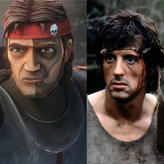
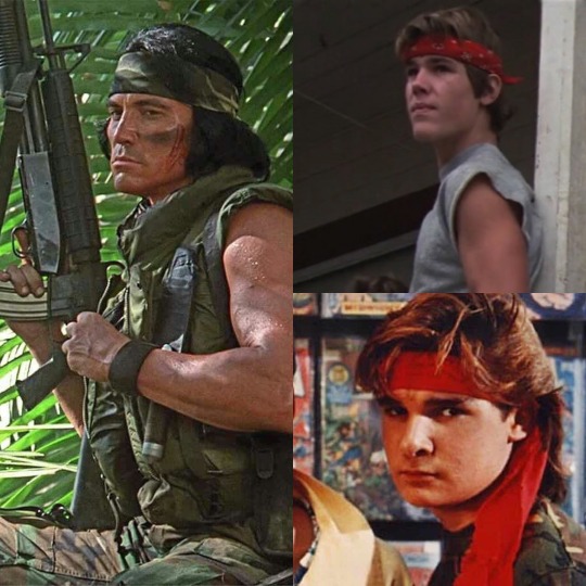
Sylvester Stallone as Rambo in First Blood 1982. That bandana has become an integral part of the iconic action hero look. You see a character wearing one and it’s a visual shorthand for either “this character is a tough guy” like Billy played by Sonny Landham in Predator 1987, or “this character thinks he is/wants to be a tough guy” like Brand played by Josh Brolin in The Goonies 1985 or Edward Frog played by Corey Feldman in The Lost Boys 1987.
Hunter’s model is closest to the original clone base. If you look closely you will see the eyebrows are straighter with a much lower angle to the arch. His nose is also not the same shape as a standard clone like Rex, including a narrower bridge. It’s certainly not Temeura Morrison’s nose. Remember what I said about space Italians? It didn’t take much to push the existing clone design to resemble an specific Italian man instead of a specific Māori man. The 23&Me came back, and Hunter inherited more than the bandana from Sylvester.
Crosshair
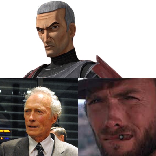
The long narrow nose, the sharp cheekbones, the scowl. That’s no clone, that’s just animated Clint Eastwood. Not even Young and Hot Clint Eastwood from Rawhide 1959-1965. With that hair, I’m talking Gran Torino 2008. The man of few words schtick and family friendly toothpick in lieu of cigar are pure Eastwood as The Man With No Name from Sergio Leone’s spaghetti westerns A Fist Full of Dollars 1964, For a Few Dollars More 1965, and The Good the Bad and the Ugly 1966.
In a way, this is full circle because the actor Jeremy Bulloch took inspiration from Clint Eastwood for his performance as Boba Fett in ESB.
Wrecker
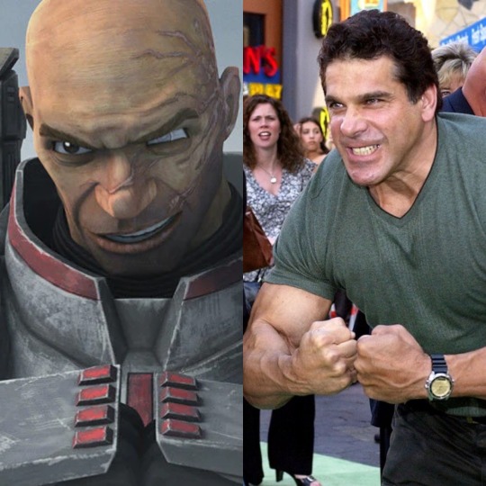
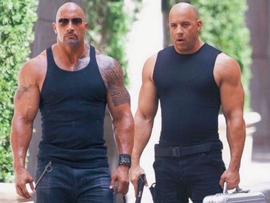
In an interview Filoni lists the Hulk as an (obvious) inspiration for Wrecker. Ever seen the old Hulk tv show from 1978? Well take a look at the actor who played him, Lou Ferrigno. Would you look at that. Even has his papa’s nose.
You could make the argument that Wrecker was influenced by The Rock, an appropriately buff ‘n bald Polynesian (Samoan, not Maori) man. But look at him next his Fast and Furious costar Vin Diesel and tell me which one resembles Wrecker’s character model more.
Tech

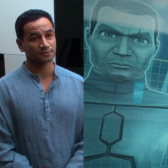
Tech is a little trickier for me to place. If he has a more direct inspiration it must be something I haven’t seen. That said, his hairline is very Bruce Willis as John McClane in Die Hard 1988. His quippiness and large glasses remind me of Shane Black as Hawkins from Predator 1987. In terms of his face, he looks a but like the result of McClane and Hawkins deciding to settle down and start a family. Although, Tech’s biggest contributors are probably just everyone on TV Trope’s list for Smart People Wear Glasses.
And finally,
Echo

Oh Echo. Considering he wasn’t created for the Bad Batch, he probably wasn’t based on a particular character or movie. But if I had to guess, his situation and appearance remind me a lot of Alex Murphy played by Peter Weller in Robocop 1987. However, Robocop explored the Man or Machine Identity Crisis with more nuance, depth, and dignity. Yikes.
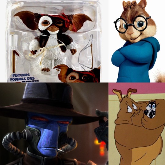
The exact tropes and references used in The Bad Batch have been done successfully with characters who aren’t even human. Gizmo from Gremlins 2: The New Batch 1990 had a brief stint with the Rambo bandana. I could have picked any number of characters for Defining Feature Is Glasses but here is the most cursed version of Simon of Alvin and the Chipmunks. Suffer as I have. Marc Antony with his beloved Pussyfoot from Looney Tunes has the same tough guy with a soft center vibe as Wrecker and his Lula (also a kind of cat). Hell, in the same show we have Cad Bane sharing Cowboy Clint Eastwood with Crosshair. I actually think Bane makes a better Eastwood which is wild considering Crosshair has Eastwood’s entire face and Bane is blue.
So we’ve established you don’t need your characters to look exactly like their inspirations to match their vibe. So why go through the trouble and cost of creating completely new character designs instead of recycling and altering assets they already had on hand? Just slap on a bandana, toothpick, goggles, and make Wrecker bigger than the others while he does a Hulk pose and you’re done. Based on the general reaction to Howzer it would have been a low effort slam dunk crowd pleaser.
But they didn’t do that.
So here’s the thing. I like the tropes used in The Bad Batch. I am a fan of action adventure movies from the 80s-90s, the sillier the better. I am part of the Bad Batch’s target audience. Considering what I know about Disney and Lucasfilm, I went in with low expectations. I genuinely don’t hate the idea of seeing references to these actors and media in The Bad Batch. I don’t think basing these characters on tropes was a bad idea. If anything it’s a solid starting point for building the characters.
The trouble is nothing got built on the foundation. The plot is directionless, the pacing is wacky, and the characters have nearly no emotional depth or defining character arcs. They just sort of exist without reacting much while the story happens around them. But I can excuse all of that. You don’t stay a fan of Star Wars as long as I have not being able to cherrypick and fill in the gaps. This show has a deeper issue that shouldn’t be ignored.
Why do the animated clones bear at best only a passing resemblance to their live action actor? In interviews, Filoni wouldn’t shut up but the technological advancements in the animation for season 7. So if they are updating things, why not try to make the clones a closer match to their source material? Why did they have to look like completely different people in The Bad Batch to be “unique”? Looking like Temeura Morrison would have no bearing on their special abilities and TCW proved you can have identical looking characters and still have them be distinct. In fact, that’s a powerful theme and the source of tragedy for the clones’ narrative overall.
Here’s Filoni’s early concept art of Crosshair, Wrecker, Tech, and Hunter. (Interesting but irrelevant: Wrecker seems to have a cog tattoo similar to Jesse’s instead of a scar. Wouldn’t it have been funny if they kept that so when they met in season 7 one if them could say something like “Hey we’re twins!” That’s a little clone humor. Just for you guys 😘)
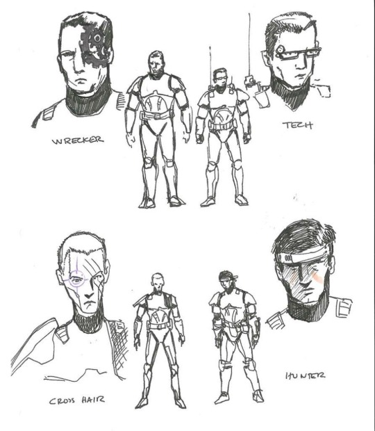
None of these drawings look like the clones in TCW, much less Temeura Morrison. Let’s be generous. Maybe Filoni struggles with drawing a real person’s likeness, as many people do. But he had to hand this off to other artists down the line whose job specifically involves making a stylized character resemble their actor. Yet the final designs missed the mark almost as much as this initial concept. Starting to seem as if the clones looking more like Temeura Morrison was never even on the table. It wasn’t a lack of creativity, skill or technical limitations on the part of the creative team. I don’t think there is an innocent explanation. They went out of their way to make the final product exactly how we got it.
This goes beyond homage. They could have made the same pop culture references and character tropes without completely stripping Temeura Morrison from the role he originated. It was a very purposeful choice to replace him with more immediately familiar actors from established franchises and films. It wouldn’t shock me if Filoni, Lucas, and anyone else calling the shots didn’t even think hard or care enough about the decision to immediately recognize a problem. And I don’t think they believed anyone else would either. At least no one whose opinion they cared about. Those faces are comfortingly familiar and proven bankable. They are what we’re all used to seeing after all. They’re white.
Lack of imagination, bad intentions, or simple ignorance doesn’t really matter in the end. The result is the same. Call it what it is. They replaced a man of color with a bunch of white guys. That’s by the book garden variety run of the mill whitewashing. There’s no debate worth having about it. For a fanbase that loves to nitpick things like whether or not it’s in character for Han to shoot first or Jeans Guy in the Mandalorian, we sure are quick to find excuses for clones who look nothing like their template. Why is that? If you don’t see the problem, congratulations. Your ass is showing. Pull your jeans up.
252 notes
·
View notes
Note
why read Full Metal Daemon Muramasa? what are it's pros/cons? (I'm looking for more vns to read outside of TYPEMOON properties)
I've done a couple answers like this, but I always love answering from a slightly different angle each time!
pros:
one of the most well thought out geopolitical situations in any vn, no joke
do you like Heaven's Feel and UBW? you'll probably enjoy this a lot
Minato Kageaki is one of the most charmingly awkward vn protags out there. his mental state makes a lot more sense as you get some aspects of his past revealed in later routes, but I personally put him up next to Shirou on my vn protag tier list
despite what you might have heard, it's very explicitly a disavowal of both european and japanese fascism, specifically featuring both as distinct entities. Narahara strikes me as one of those oldschool Japanese communists who is largely disillusioned with party politics, but still genuinely believes in what he says
yes, that last point means it's not a pro-Japanese story. in fact, both Hanachirasu and Muramasa are written specifically to explain the decay at the center of fascism, even in "the most ideal conditions"
to follow up on the last point, it's even more specifically a deliberate subversion of "Japanese Empire fiction" like, for a recent example, Attack on Titan. it uses a lot of the same shorthands, but to form a pointed critique of the "united Asia, led by Japan" philosophy
Narahara is a master of his craft, both emotionally and technically
Kanae and Ichijou are incredible female characters. I won't spoil either of them too much, but Ichijou is a direct Kamen Rider homage and could be described as "genderbent Shirou, going through Heaven's Feel"
the music is gorgeous, composed by an art/prog rock musician as a mix of traditional japanese folk music, rock, and 2000s electronic
the story is easily 70 hours of fun long
there is nothing like muramasa and there will never be anything like muramasa again. full stop. it's an industry darling basically beloved by everyone who works in vns, like one of those cult classics that all your favorite directors love
Minato Kageaki shares a seiyuu with Angra Mainyu
to this day one of the few stories I've ever seen that successfully explains the hero complex at the heart of fascism without diving into any sort of apologetics
this was drawn during the sweet spot where Namaniku ATK's art style was at its peak of strong shapes and bold colors. a visual feast with strong character design
an absolute treat if you have any genre savvy whatsoever for tokusatsu, mecha anime, and 80s-90s otaku culture in general
it's not unfair to say that FMDM has the soul, if not the body, of a Drakengard game.
fully animated fight scenes featuring jet powered samurai dueling at the speed of sound using demon armor powered by their body heat
cons:
there is a big noncon warning on this one. a Big noncon warning. this is a story about terrible people convincing themselves they're doing the right thing, and the cycles of violence have been in motion for a long time.
do you like Misery? this vn has some of the most gut wrenching tragedy and psychological breaking of any story I've ever read, and this includes Proper Books that get academic acclaim.
you may want to skip through h scenes, and that's fine (and honestly I recommend it for some). they're standard fare for an eroge, especially a nitroplus one, but some drag on for too long, and some are pretty purposefully horrifying
there is a tonally dissonant Monkey Island style CYOA section. there are three actually. they all happen in Kanae's route. literally look up a guide. they aren't fun and were almost definitely mandated by Nitroplus to make it more of a game
there's some... weird lore handling. the gist is that the setting draws a lot from conspiracy theories for flavor, and one of these involves the Emishi being elven. this would be enough to raise a brow alone if Jews weren't stated to be the European equivalent, which makes it a bit more clear that he's actually doing a clumsy swing at parodying Christian fascist mysticism and its concept of the indigenous Japanese being Israelites. it's definitely strange, but it's not to any malicious end at least (and it comes off more as clumsy than offensive). it's one of those things you've gotta read for yourself and decide on.
to follow up on the last point a little bit, I'll clarify that I absolutely can't speak for the Emishi people, but for the ethnic Jewish part of things, I didn't find it too egregious. he doesn't adapt any sort of "ZOG conspiracy" aspects (because he isn't a fascist and the elven races aren't remotely the villains or shown to be in any sort of wrong) so you can rest assured that, all in all, Narahara's awkward elven plot element manages to be less racist and deny less genocide (read: none) than your average British YA novel
hope that helps a little! I'm just waking up so I may edit this for coherence later lmao
38 notes
·
View notes
Text
Spotlight: Ties That Bind
This one’s a doozy folks! If you missed the last spotlight you can go read it here, but strap in for The Ties That Bind, an absolutely brilliant take on humanformers. It’s hosted here at @tiesthatbind-tf created by @artsy-hobbitses!
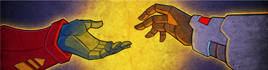
Q) Give us a run down of your cont! What's it about, what's it called, what's it like?
Ties That Bind is a humanformers-based original continuity which is part Science Fiction and part Alternate History where the invasion of Quintessons and introduction of their technology to Earth in 1920 sets the world and humankind on a completely different trajectory. The active narrative spans a period from 1920 to 2070, covering the First and Second Quintesson Wars, the interplanetary Antillan War (leading to the creation of Unicron on Mars) and the Great War which involves the Autobots, Decepticons and Functionist stalwarts, and how it affects the characters.
The cast is pretty sprawling and the narrative is mostly centred around human drama with bits of humor interspaced and a dash of horror (mostly centred around how the previous government often chose to utilize the technology left behind from the Quintesson Wars to create new systems of oppression, which affected many of the characters, in the name of worldwide rebuilding efforts).
Q) What characters take the lead here? Any personal favorites?
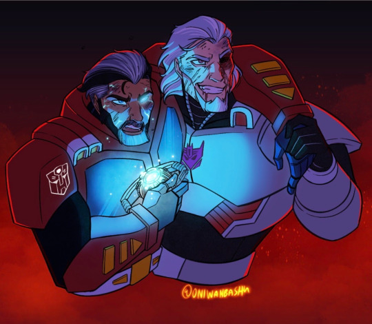
I will admit to this continuity being very much heavy on the relationship between Old Bastards Optimus Prime and Megatron, which is given considerable weight as they were best friends who had known each other since childhood and were deeply intrinsic to each other’s growths as individuals, which makes it all the worse when guilt and betrayal enter the party. Despite being captains in two corners of this battle, there’s a part of them that just cannot let go of their pasts together and they need to reconcile with how this will affect their agenda (Megatron) and how they lead their team (Optimus) who don’t necessarily share their history.
Other characters with significant development include:
Starscream, a Cold Construct in a toxic working relationship with Megatron with whom he is hiding a dark secret, who struggles to balance the underhanded viciousness he believes he needs to gain power and his innate desire from his Senate days to make the world a better place.
Windblade, a Camien native who fights her government’s apathy concerning the situation on Earth which they see as unsalvageable compared to their more Utopian society.
Prowl, a Cold Construct raised from childhood to be a cop in a police state, who finds out that he was brainwashed several times to ensure his obedience and efficacy as a government asset and is now working to reclaim some semblance of the humanity he was never allowed to feel and figure out how much of him is who he really is and how much is programming.
Hound, a sheltered Beastman who joined the fight to ensure that Beastmen the world over would have the same rights he did in his homeland of Shetland Isle, but is forcefully stripped of his humanity and faced with his animal side during the war and has to relearn what personhood means amid his trauma.
Q) Is there a bigger point to this, like a theme or some catharsis? Or is it just fluffy fun?
God with the amount of time I spent sleepless trying to figure out how the logistics of this or the semantics of that were supposed to work in universe, I cannot for the life of me say it’s fluffy fun, but I can’t exactly say it hasn’t been pretty engaging either!
There’s elements of war being messy for everyone involved where there doesn’t seem to be a clear line between friend and foe at times, but I think for most part it prescribes to Jean-Jacques Rousseau’s belief that people are inherently good, but are corrupted by the evils of society. Despite its dark themes (Including but not limited to child abuse, torture, illegal experimenation and brainwashing), love and friendships do prevail, kindness does beget kindness, found families are made, even the smallest actions matter, and things do get better because there are people on both sides who genuinely want to, and strive to make it better.
With Cold Constructs and Beastmen, it also delves heavily into what it means to be human; to have agency and personhood.
There’s also a strong undercurrent of taking responsibility for one’s actions, even if they were made with the best of intentions (Avoidance of this is what eats up Starscream and Megatron from the inside, and what Starscream eventually embraces).
Q) How long have you been working on it?
There’s two answers to this!
I’ve had a Humanformers-related universe going all the way back to 2007 around the time the first Bayformers came out---basically I had a choice between learning to draw cars or draw people (I was an anthro artist back then) and I immediately chose people.
The 2007 draft however had no worldbuilding or connective storylines and was mostly a fun little venture into character design and practice which were actually instrumental to me experimenting and learning how to draw humans properly.
I left the fandom for about a decade and when I came back to it in late 2020 around September via the War for Cybertron series on Netflix, I immediately got hooked on the 2005 IDW comics I missed out on and wanted to get around to updating my old designs as well find a way to translate several of the concepts I wanted to explore in a human sense, so the 2020 update became its own full-fledged original continuity with detailed worldbuilding and history.
You can see the artistic evolution of several characters from their original incarnation below!
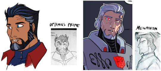


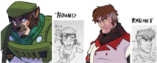
Q) It’s incredible to see your artistic improvement too! Give us a behind-the-scenes look! Show us a secret ;))

Say hello to my workspace! I’ve been working exclusively on the Ipad Pro since late 2016, which is fantastic because I can basically whip up concepts and sketches on the go anywhere. Nowhere is too out of bounds to work on TTB!

Also, do enjoy this sneak peek at true!form Rung, whose synthezoid human body took years to perfect.
Q) YESSSSS alright I must admit this is one of my favorite Rungs, and certainly my fave within TTB. Amazing. Phew, anyway. Where did you draw inspiration from? What canons, what other fiction, what parts of real life?

TTB was initially conceived as a faithful retelling of the IDW 2005 narrative before it was transformed into its own continuity and as such, it borrows heavily from concepts and mirrored plot lines introduced in that run! I chose to have the series inspired off it specifically for the amount of history and worldbuilding it introduced to the franchise.
Anime like Gunslinger Girl and Beastars inspired the depictions of Cold Constructs, especially the more harrowing aspects of their upbringing as government assets instead of children, and Beastmen (Beastformers) in TTB.
I haven’t depicted the world itself in my art all too much, but the architecture from Tiger and Bunny, which has sort of a futuristic Art Deco feel to it, is what you’d usually see in major cities. There is an in-universe reason for that---with a Point Of Divergence set in 1920 followed by 25 years (an entire generation) of progress basically being kicked to the curb due to the Quintesson wars, mankind was basically in a time-locked bubble until the end of the wars, and by then their heroes were 1920s-style rebellion leaders, which lead to 1920s fashion (especially among the Manual Working Class---Megatron, Jazz and Optimus all rock 1920s fashion at some point of their lives) and architecture being celebrated and retained as sort of a reminder of how things were before The Invasion. This anime’s background design is also where I adopted the tiered system TTB’s major metropolises are often built on (with each tier being designated to a different working class) from.
The main artistic style itself is a love letter to 90s cartoons, in particular Gargoyles’ deep and drama-driven character narratives and designs as well as The Centurions’ take on body armor logistics.

I also take inspiration, especially armor-wise, from the characters’ given heritage and background. As an example, Hotrod who is depicted as Irish has the flames on his armor done up with Celtic knots. Welsh aristocrat Mirage’s armor bears olden knight-style filigree and has his Autobot logo designed as a coat of arms. Indonesian Soundwave’s armor and Decepticon logo takes cues from Batik and Wayang Kulit while their mask is based off the Barong.
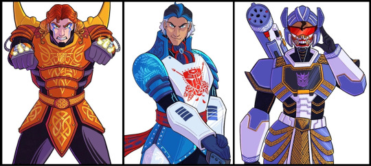
Q) They are absolutely gorgeous! Show off something you're really proud of, a particular favorite part of your cont.
The worldbuilding in general! Most Humanformers I’ve seen tend to treat it like a fun exercise which it is and is definitely valid, but I found myself wanting a full-fledged world to lose myself in and I sought to try and make that world myself by drafting a detailed history and timeline of events which would affect ongoing narratives, having indepth worldbuilding to include almost all societal aspects of the universe and expanding on the concept of Beastmen and Cold Constructs existing in a human setting.
I’m not so secretly proud of the research and diversity included to make the cast look like the multicultural, globally-based team that they were meant to be instead of being locked to a single region! My original draft from 2007 was, to put it simply, quite culturally monolithic and I wanted to improve on that aspect with TTB.
I’m also proud that I’ve kept to it this far! I’m a notoriously flaky person jumping from one idea/fandom to another and to have kept at this continuity for the better part of ten months is honestly a personal feat.
Art-wise, this scene depicting a young Megatron working alongside Terminus and Impactor (cameo by @weapon-up-wallflower‘s OC Missit!) is definitely one of my favorites since it helps build up the world they live in and plays to familial bonds and comfort found in one another despite their less than ideal circumstances.
Q) Everything has come together so beautifully, you absolutely should be proud. What other fan canons do you love and why? Would you like to see them interviewed?
I am dying to hear more from @iscaredspider’s Sparkpulse continuity! Her designs are MIND-BLOWINGLY GORGEOUS and I want to hear more about what inspired her to work on it!
Also YOU. Yes YOU BLURRITO. LET ME HEAR MORE ABOUT SNAP.
Q) [wails and squirms away in the mortifying ordeal of being known but in a very flattered way] I WILL SOMEDAY I PROMISE aflghsdjg thank you QwQ
Well that was fantastic, Oni, thank you muchly! A magnificent continuity with so much to look forward to! Coming up next is another personal fave of mine, the first inspiration for SNAP, so stick around...
#long post#gore#ties that bind#spotlight#transformers#HUMANFORMERS#transformers au#tf original continuity#transformers fan continuity#transformers redesign#maccadam#i said id post this on sunday but i realize thats a holiday for lots of folks on this site :/
350 notes
·
View notes
Text
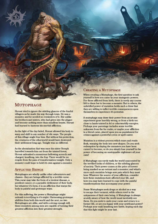


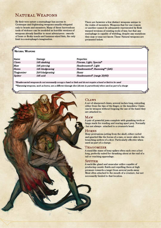

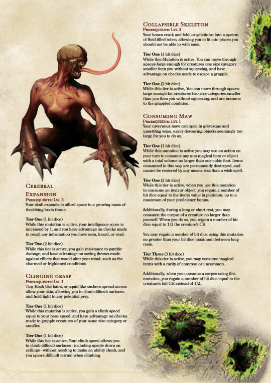


A New Evolution: The Mutophage V2
Hey Guys! So I'm Not Quite Dead yet! After nearly 2 years of playtesting, and several additional months of work redeveloping, I present the second full edition of the Mutophage!
This one isn't as drastic a rework as some of my other classes have gotten recently, such as the Prizefighter and Hollower. But it does represent a serious update to the mechanics of the class, especially the all-important mutations.
In previous version of the mutophage, Each mutation effectively worked like a spell powered by your hit points. you primed mutations in the same way you might prepare spells, and overall, I was just unhappy with how similar the class was starting to feel to a wizard.
There was also a major issue with early game survivability, not only because the hit points you are spending for mutations count a lot more when you have so few at first and second level, but because the class lacked early game access to defensive abilities like the barbarian unarmored defense. And the fact that you had to waste mutations on specific natural weapons just to compete with other classes in damage wasn't great either.
To solve all of this, I basically went back to the drawing board with the mutations. Admittedly, when I initially designed the class, 90% of mutations were copied direct from my Necroficer class, with only slight alterations. this seemed like a good idea at the time, but the issue came in that those mutations were still balanced for stacking on top of multiple monsters controlled by the Player, rather for expanding the capabilities of a single PC.
The First thing I did was separate out all the weapon mutations. The unnatural weapon feature had been developed as sort of an afterthought, but I honestly liked the flexibility it gave, and opted to just define natural weapons with their own weapons table, rather than making claws, teeth, and similar each their own mutation.
After that, I took to addressing the way mutations scaled with level. There were a lot of mutations that really needed to be available a lot sooner than they were, but I had gated them behind prerequisites and high cost to prevent abusing things like flight being early game evolutions. A lot of mutations also felt like natural progressions of other mutations. and that gave me an idea.
In the new version, each mutation has 2-3 teirs, which can be activated by spending increasing number of hit dice. The tier 1 effects of each mutation are relatively simple, and work well as Evolutions, but the more hit dice you pour into a mutation, the more powerful the effects become.
I tried to group effects based on a progression of flavor, rather than just pure mechanics. This helps create a spread of unique abilities, and encourages diversification rather than forcing the player to only take mutations that fit a specific mechanical build. At the end of the day, the number of individual mutations dropped from about 55 to around 35, but the total number of unique effects (no longer counting natural weapons) increased to 89.
Because the player can now get more variety out of fewer mutations, the number of mutations the mutophage knows at each level has dropped by about half, and the need to prime a subset of those mutations each day like a wizard does their spells is gone. Once you know a mutation, you just know it.
Evolutions changed a bit too. You get your first evolution earlier now, and have more total than you did before. Evolutions also no longer remain permanently active (this just wasn't viable with some mutation tiers) instead, they reduce the number of hit dice you have to spend when activating a specific mutation. Each evolution still leaves a visible deformity related to the mutation it is used for, but the exact nature of this deformity is up to you and your DM
Preview images above are low resolution, and do not contain all 29 pages. For the latest high-resolution PDF, as well as a whole host of other work I have done, check out this handy dropbox link. And be sure to tell me what you think!
If you like what I do and want to support me or just generally help out, Check out my Patreon page, or throw some coin at me through Paypal.me. If you wanna just come say hi on my Discord, that’s great too!
#class#5e dnd#dnd 5e#d&d 5e#dungeons and dragons 5e#5e#homebrew 5e#5th edition#mutophage#mutant#mutation#monster race#monster class#body horror#dnd homebrew#homebrew#homebrew class#clockwork dragon#Clockworkdragon
444 notes
·
View notes
Text
Who changed Lola Bunny?
Malcolm D. Lee explained, “This is 2021. It’s important to reflect the authenticity of strong, capable female characters. … So we reworked a lot of things, not only her look, like making sure she had an appropriate length on her shorts and was feminine without being objectified, but gave her a real voice. For us, it was, ‘Let’s ground her athletic prowess, her leadership skills, and make her as full a character as the others.'”
(See the complete interview here: X)
So, gone are her curves, thigh-high drawstring shorts and midriff-baring crop top. Instead, Lola Bunny now takes on a sportier look wearing a more standard basketball vest and leggings under her track shorts.
But, let's see more deeply what determinated this choice:
1. Being mad at a fan art is sad, people.
Before, a sad 50 yo guy starts complaing about how "cancel culture" or "politically correct" ruined his life - Really? Changing a cartoon bunny from a movie you didn't see for a decade ruined your life? Wow. Someone should really review the list of their priorities -, let's see how really Lola looked in the 1996 original Space Jam.
Here we have original Lola Bunny:

(Here you can see all Lola's scenes in Space Jam: X)
Yes, Lola walked in a sexy way that show off her curves, or at least she seemed to have curves (a little breast, tight waist, long legs, bootie), but those are not big as in the fan art you are seeing around, and Lola's curves are not evidenced during the match or when she played. Is more her attitude and posture that made her look sexy. However, althought her curves clearly changes every time she is doing something different, from action to action, there are some scenes in which she is purposely made sexy, with saxophone music as soundtrack and male-gaze sections that ends in the same way, Lola surrounded by a bunch of horny and howling cartoon guys.
That's appropriate with Jessica Rabbit: she is purposely made and designed as a parody of the femme fatale from old hard boiler movies, in which attractive, mysterious women were portrayed as evil and manipulative gals who hide criminal intentions. Jessica, with her intentionally exaggerated body, subverted the misogyny of 40s and 30s detective movies: she is kind-hearted, truly loves her naive and goofy husband Roger and uses her powers (beauty and cunning) to protect him. Her body too is used for comic sketches, while this not happens for Lola, that's just a serious and indipendent basketball player. So, the male obsession for her body is out of place, expecially because she reacted with anger at being misconsidered only for being an attractive female bunny. “Don't call me doll” is her catch phrase. So, it seems strange she didn't react at all at the very sexualized presentation at the final basketball match: Lola simply shows her basketball skills, ignoring or accepting passively the reaction of the honey crowd of wolves around her. (Please, notice the association: Lola “admirers” are wolves, predators, while Lola, their object of desire, is a rabbit, a prey)
This is the cartoon version of cat calling: they are like a group of men who sit on their porches and whistle at girls everyday when they walk in from of them. A normal girl or woman would pass over this thing, even if they are bothered, unconfortable or embarassed, because they are more scared by a possible violent reaction of this whistling horny guys at their legitimate anger objections. But here, we are talking of Lola, a strong Looney Tunes bunny, and she could smash that damn basket ball on wolves' face, breaking all their teeth. That would be very a Looney reaction. But Lola doesn't react at all at this situation. Here, on my opinion, screenplayers missed an opportunity, but probably they thought to have already did too much with Lola's personality and “girl power”.
Remember also that Lola is the only young cartoon female character we see in the whole movie. So we can't do a proper comparison with other female relevant characters' rapresentation. (See here for a deeper analysis of Lola's origin and development: X)
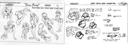
However, compared with Bugs, Lola looks more fit, more humanized than Bugs. Lola has clearly a definited breast and booty, but it looks like is more her posture that makes them relevant. Lola has clearly shoulders back to show the rack. Bugs is anthropomorphic but remains an animal, has no shoulders or pectorals more like a human and looks a bit over-weight (fat belly). And his posture don't keep that stomach in, chin up, and march forward.

Lola, on the other hand, has a more human structure. That's why I say she has curves. An example are Mickey and Minnie who are two beans in the same way it is not that Mickey is a bean and Minnie has small tits, they are structurally alike.
Lola's body remembers highly No-Ribs-Jasmine from Aladdin (see the gif for reference). That unrealistic Barbie-like waist that was so popular in the 90s and 80s. (See here for references: X and X)
Now, we are changed a lot from the past 24 years. Barbies didn't have that impossible, unrealistic waist-line anymore, Disney princess concept has changed (see Merida and Moana).
Lola concept is changed in 2012: her design for the new cartoons is totally different and her personality too. She wear a blue or violet dress, almost flat-chested and she was made annoying and silly, just to make a contrast with Bugs smarter. Just like Daffy Duck is dumb as hell and his new girlfriend, Tina Russo (no more dear old Melissa Duck), is way smarter than him. Tina is tough, street-smart, rebellious and feisty. But we will see this thing in the next point.
2. People on the upper floors hated Lola personality.
Lola Bunny had only few lines in Space Jam, but she definitely passed the first impression that she was draw only for make male characters fall in love. Lola was a good basketball player and show it off, in front of a skeptical and then astonish bunch of cartoon guys and also Michael Jordan. She also had a strong personality and said it clear to Bugs she didn't like being called "doll". Lola was beauty and curvy, but not a cheerleader. Lola was a basketball player. Remember this part, because we will talk about basketball in the next point.
If at the box office Space Jam was a success, at Warner Bros there were those who turn up their noses, and they are important people, from the upper floors, who accused the film with Michael Jordan of having completely distorted the philosophy of the Looney Tunes. They blamed Lola Bunny more than everything else. Producers of Warner Bros said she was too perfect for the moody group of Warner cartoons: she was too sensual, provocative and independent, totally alien to that core of crazy characters that act as an exaggeration of the vices of 'man.
And fans hated her too. Chuck Jones, creator of the Merrie Melodies said: "Lola Bunny is a character with no future, she’s a totally worthless character with no personality."
So, Lola Bunny was deleted. Lola would make only some brief apparitions in some comics edited by DC Comics, in Baby Looney Tunes, in which she was a toddler with a very similar personality and resemblance to Space Jam adult version, and also as playable character in some unsuccessful videogames.
Years passed and projects for a sequel of Space Jam never become reality, so in 2003 Warner Bros relased Looney Tunes Back in Action. But Lola wasn't here, because the movie purposely want to make a deep cut with what we saw in Space Jam, according to what said it's director Joe Dante. This movie was a totally failure, but it gave back to Looney Tunes their craziness.
Years passed again, but this time is 2011, 10th of May on Cartoon Network was relased the second episode of The Looney Tunes Show. The series aimed to strongly relaunch the Looney Tunes, long gone from the glories of the past, updating the stories of Bugs Bunny and associates in a sitcom key, with the rabbit sharing a house with Daffy Duck in a suburb of Los Angeles. All interspersed with sketches by Wile E. Coyote and Road Runner done in CGI and the updated return of the Merrie Melodies. But the big news of the second episode is that LOLA BUNNY RETURNED.
And Lola was a character with some relevance within the series, even if something didn't seem right with her. Lola looked different, she was no longer the rabbit version of the femme fatale seen in Space Jam: she was naive, talkative, with her head in the clouds, crazy to the point of becoming Bugs Bunny's stalker. Bugs after having fallen in love with her at first glance understands on the first date that he absolutely can't stand Lola. She is no longer the Lola we used to know, even if the appearance is similar and the name is the same. Lola is effectively a Looney Tunes now. And the fans like her, the public like her, Warner Bros like her.
(See Lola in The Looney Tunes Show here: X)
But this is a big walk in behind from the indipent character we used to know in Space Jam. Lola was turned into the stereotype of the crazy girlfriend for a while. And this is not a surprise, if we remember that in 2012 were popular the "overly attached girlfriend" meme template. (See here for references: X)
However, in The Looney Toons Show Lola has some very funny moments, while in Space Jam she was more serious and a little out of space among the other characters. (See here for references: X)
3. What women wear when they play basketball?
Women's National Basketball Association was only created in 1996. So, women's basketball were not considered - and still is not considered - as important as men's basketball at the time Space Jam was filmed.
In Space Jam 2 there will be WNBA players with a significant role, for example Diana Taurasi and Nneka Ogwumike.
Professional female athletes aren't that curvy because curves are determined by body fat and they have a little.
As a busty volleyball player, I can say, dear people, breats could be very annoying during sport activities: it could be a pain, when you run or jump. That's because a lot of women wear sport bra to compress and support their breast. Sports bra may also include layered cups or a high neck to keep everything in place and protect from painful hits, so women can be safe and comfortable during workouts.
Female basketball players didn't wear crop-tops and tight shorts to play. They wear exactly what Lola wears in the picture above: long sleeveless tees, large shorts and maybe protective gears such as knee pads, sleeves or braces to reduce chronic pain caused by the immense burden put on the knees in basketball, to prevent bruises caused by collisions and hard fall and to provide support after a significant knee injury like an ACL tear. They could wear also compressive arms sleeves to help muscles that are sore or overworked to recover faster. The sleeve enables your blood flow to circulate quicker to the heart, which helps you heal and recover quicker.
Wow. WNBA wears Exactly what wear NBA players. So surprising.
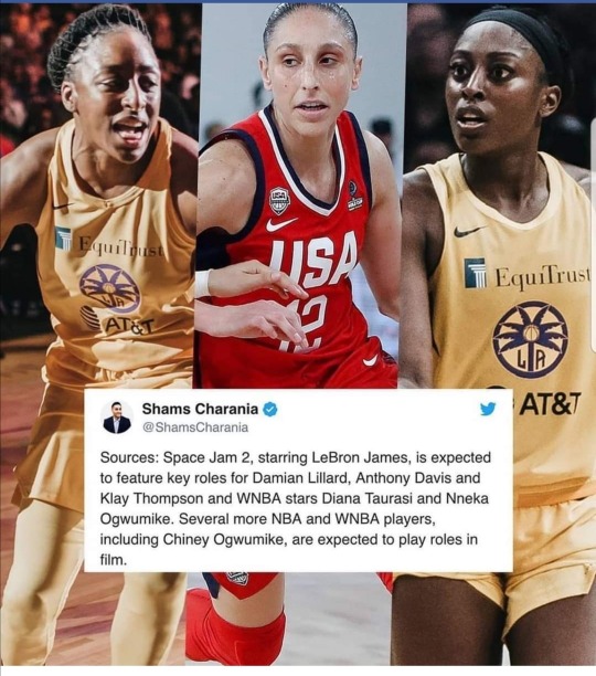
4. This is only a promotional character sketch, not what Lola would look in the movie.
Space Jam 2 would be developed in CGI and there are a little preview frames going around, included one showing Lola jumping and you can see her breast shape. But she totally looks like a comic cartoon character. It's not humanized. It's not designed to be the sexy love interest. She doesn't look out of space among the others anymore, expecially because seems that there would be also Tweety's Granny and Melissa Duck or Tina Russo as players too.

5. Reality.
Really? You want a human anthropomorphic rabbit? Well, Lola as a rabbit would have something like six nipples, but no human-like breast. And, also, real life girls have ribs. No one in real life is that thin. Oh, well, if you don't considered Pixee Fox, a model who had surgically removed six ribs and wears daily a compressive bust corset (yes, like the one that made Elizabeth Swan faint in the first movie of Pirate of the Caribbean) to look like a cartoon fairy (Tinkerbell, you are the one to blame for this).
(See here for references: X)
In conclusion, we can say that all this controversy is based only on a porny fan art and that Lola “new” graphic isn't change too much from the original Space Jam movie. It's just a little more cartoonish.
We can also firmly remeber that Space Jam 2 is going to be developed for children, to relunch Looney Tunes among new generations of children, who are the largest buyers of merchandising (including Happy Meals surprises) and consumers of new cartoons that surely would be developed, if Space Jam 2 would be a success.
However, we should admit that those kids probably know better the 2011 version of Lola than her original version and that 2011 version was more appreciated by fans and producers. Lola's voice actress, Kristen Wiin won BTVA People's Choice Voice Acting Award in 2012 and was nominated for that prize also about three times in the following years. Also Rachel Ramras, Lola's voice actor was nominated for BTVA People's Choice Voice Acting Award in 2016 for her role in Looney Tunes: Rabbit Run.
We don't know anything about Lola's personality in Space Jam 2, so we can't do a proper comparison or a prevision, but, according to what Malcolm D. Lee said, we can assume that original personality of Lola would be preserved.
The controversy is relevant only for Lola's body and not for her personality, and that's is highly rappresentative of what impressed more this bunch of grow-up kids. They grow up to be like the horny wolves and they are howling because their prey is not available anymore.
And, to be honest, being so obsessed with the breast and the body of a cartoon character (that is clearly made up for kids) it's not sane at all. Sorry to say that, but sometimes people need to drink from a bottle of truth.
#vavuskapakage#lola bunny#space jam#the looney tunes show#looney tunes#bugs bunny#WNBA#wnba basketball#Pixee Fox#90s barbie#80s barbie#aladdin 1992#Jasmine 1992#Jasmine#tinkerbell#malcolm d. lee#Looney Toons back in action#chuck jones#joe dante#diana taurasi#baby looney tunes#nneka ogwumike#daffy duck#Melissa Duck#tina russo#overly attached girlfriend#Space Jam 2#jessica rabbit#who framed roger rabbit
208 notes
·
View notes
Text
It's Been Months, Time to get the Band back together!
TW: This is Way long then the previous post(And you all thought that was long...Wait until you all see this)
It's Been Months since I lasted posted on my Tumblr Account since November of Last Years.

I know the last time I posted was on May of this year?

However I decided to Delete the posted rn as it wasn't really that important and it's just away to give an excuse to make everyone still think I'm active and it was just too short for my taste to posted(Unless otherwise).
Ever since I posted my Mavis × Rosie Art and it has been a single year, I now have 63 likes on the post itself. But because it has been years since I posted anything Art Related? I think It's now a very good time for me to started making a new art pieces. I have been gone for a while now, To be Fair 2021 was pretty busy year for me and I really do feel bad for not announcing my hiatus on Here and Instagram and that's why I'm here to apologize to everybody for having been active in here for a while now because I was focusing on other things.
But thankfully since I now have time focus on here(Including Instagram and Pixiv, Following at HighTideKeiblade(Insta) and River Kaz(user_rugt8577) I don't feel like going through another Hiatus again unless It's Important Event, For me at least. I'm going to started posting new text and art posted in here, In Fact? I have saved a few of them while I was in a Hiatus ^_^.
Since It's June, It's not just going to be just a drawings or text but it's also some stuff to celebrate this Pride Month as well(For those who aren't aware? I'm Gender-Neutral(NB) and Bisexual as you can see from my top info).
To order for me to post? I would like to show some of my art upcoming, Here's a few previews:
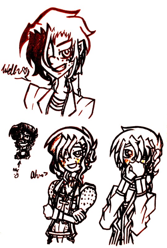
Ever Since I used the TTTE Characters with the @asktrio516 design? I feel like it's now time for me to Design making my own Interpretation of the TTTE Characters but as Humans. This isn't my first time doing this Concept before since I had done this on both my DeviantArt Accounts(My Normal and the Naughty Shitpost ones xp), I even have them saved in my binder and Ibis Paint. The Characters who are featured in this Unfinished doodle is James(One who wicks with Spiky Hair and freckles), River Keilyn. Harley(My Trainsona as a Human)Blushing Cool~ Spikes and wavy hair with freckles), Edward(Spike but Beautifully Straight hair while blushing when he saw James' Hotness), And Me one with the Mask Obviously lol. To those who might not get it at first, Until you realize what Train!River is wearing? Unlike most Human AUs I saw(Where it either takes place in the Modern Times or the 1960s) my TTTE Human AU takes place in the Late 1990s and Early 2000s (Specifically 1997 to 2003).
Based on Thomas' 90s Popularity in the U.S. and the Middle of the Classic Era At the time. Not only that? But also in my TTTE Human AU, My own interpretation of the characters are based on Eurobeats, 90s Fashion and Culture, and Lastly their Design-Wise are mostly based on the Japanese Dub rather then the usually US or UK counterparts(What Can I say? As much as I respect both English dubs(I prefer the US but the UK is cool too) However I love and Definitely prefer the Japanese dub more, Don't judge me xP). Despite being lighthearted? My TTTE Human AU can have its fair-shared of dark and serious moments, As well as Consistency, and it isn't sugar coated or look down upon. There's more such as Character's Backstory and how would it play-out. There's more I want to say but for now that's all I have to give out my Inspiration for my TTTE Human AU ^^.

Here's a Bouns one for my TTTE Human AU, Unfinished doodle of James ;).

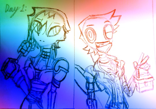

Aside from me doing TTTE? I'm doing going to be working on other media as well, A good example is the Mixels as I've been a fan of this Lego series since 2015(1 year after the series aired and before it ended because this series was shortlived).
Sure it may not be a good series but I'm a sucker for Legos and love this simple concept of combining or do a fusion of anything. In these 3 photos, I'm drawing one of my Friend's(@chloetolunar) OC, Katelyn and It's a late Birthday countdown. Late because I was focusing on finals but...Hey! I am trying my best to finishing it. During the series lifespan I was making a lot of Mixels OCs, I used to have 3 tribes but now I have 5 of them, As the 2 tribes(Chinese/Arabian Theme and a Cloudy Sky Rainbow Theme) I used to draw where getting a bit complicated but who knows I might bring them back.
For now? I'm just going to show my 3 new Mixels:

These are just concept art for now, But Thankfully they have a name! Hanamistu, Ursula, and Jenni ♡. Another reason why I'm doing this is that like my Thomas AU? I'm also doing a Mixels AU and It's called Mixels Chronicles, It's basically a "What if Situation~!" Basically What if Mixels was more like Bionicles and Ninjago but they fuse during battle. Had Mixels would become more popular if they went into that Direction? I'll let you to decide from that ;).
After writing all this down? I can call please say that that's all I have to say for this long ass post. In conclusion I'll definitely come back here, And I'll definitely be Active only on here, Instagram, and Pixiv(Sometimes DeviantArt). FYI, Reason I'm doing other things is because I will like to do other stuff Sometimes and I'm also doing this for fun as well. I like to do things on what I love so much, Please don't argue with me just because I don't do the stuff that you love sometimes~.
☆~°~°~°~°~°~°~☆
Thank you for Reading this and Have a great day, Goodbye~☆
Also!
DON'T POST ANYTHING ON RUDE ME, REPOST, RECOLOR, OR STEAL MY STUFF! Be Original and Do your Own stuff without Tracing others art M'kay~ ;).
#riverxkeichains#river's post#river's art#mixels#mixels au#ttte#ttte au#Mixels Chronicles#River's TTTE AU#River's Update#keixblade#Upcoming Art
8 notes
·
View notes
Text
The Ultimate 90s Art Program Suite: My Childhood Computer, Inspired by Beast Wars Animation
Was watching some Beast Wars after work yesterday, and I got inspired by the famously funky animation to look up all the graphic design/illustration/3D rendering/etc. software that I had (and some that I always wanted) as a kid.
I mean, look at it. Beautiful. Terrifying. Powerful.
Transmutate is still my favourite. Scared the hell out of me, yet I love her.
(Quick aside, she’s in Timelines/Uprising, and they adapted the TFP Arcee model for her, and it’s great.)
The software below would create the sickest creative work computer 1996 has ever seen.
This stuff is probably irrelevant to almost all of you, except my fellow art dinosaurs who might want the nostalgia hit, but I managed to find nearly everything on the Internet Archive, so enjoy!
As far as I’m aware, this isn’t bootlegging anything, as all of these products/editions of software are either not licensed anymore or are now abandonware/no longer supported. I am not the original uploader of any of these items.
I have asterisked some product names just to avoid making a mess in certain tags, where people may be looking for tutorials etc. for modern versions of certain programs.
You don’t have to download these; It might be fun to just look them up and see what the info surrounding each piece of software is, to get a better idea of how brutal it was trying to animate Beast Wars (or anything in 3D) at the time!
(So I guess this is mostly for educational purposes only, but hey, the Internet Archive resources are linked if you want to check it out.)
The Sickest Art Programs of the 90s, Including the Stuff Used to Animate Reboot and Beast Wars:
Basic Setup if You Want to Try Stuff:
DosBox
VirtualBox
Operating System(s) Required:
Win 95
Win 98
Everything will be for Win 95, unless noted otherwise.
3D Rigging, Design, and Animation Software:
Log*Motion 2.1
Bry*e 3D (The updated Edition, likely for Win 98: Bryce 4 and Accessory Assets CD)
P*ser 3
S*ftImage 3D 3.9 (May require Win 98; This is the higher end 3D animation software at the time, which was used to animate Reboot! Mildly anachronistic as this is a slightly later edition of the software, although still from that general era. You can read more about it here. It was also used to animate Beast Wars as well, at least partially, as the same animation studios worked on both shows.)
Illustration/Design Software:
C*rel Draw 8 Suite (May also be for Win 98)
A*obe Ph*toshop 4.0
(Here’s a version of AP 4.0 which also includes QuickT*me 2.1 and Acr*bat Reader 3.0!)
Writing Software:
PRO TIP: For fanfiction writers and zine makers, this stuff was top tier!
C*rel Word Perfect Suite 8 (May also be for Win 98)
Creative Writer 2 (Note: You must have a printer set up for this software to work. As an ADHD kid with Dyscalculia, this was the only software I could use to get any homework done ever-- Lots of good memories with this one, too!)
Audio and Music Production Software:
Creative Sound Blaster 16
Creative Sound Blaster AWE 64
Cool Edit 2000 (This is the software that would later become Ad*be Audition!)
Ad*be Audition 1.0 (May require Win 98, slightly anachronistic as this wasn’t a 90s product, but Cool Edit had a few late 90s pre-release versions, so I’m including both of these here as both are from this general era.)
Video Editing Software:
S*ny Vegas 4 (Requires Win 98 SE Edition)
---
NOTE: As always, if you want to actually try testing out any of this stuff, be careful when downloading anything! Be safe online and always use a VPN/antivirus combo. Like I said, I’m not the original uploader, and you also might want to check and see if it’s actually legal to download some of the stuff listed above just in case, because I don’t know anything about old software legalities. You wouldn’t download a car, et cetera.
---
This is an incomplete list, but I’m getting ready to go to work lmao, so I’ll add stuff if I remember any more popular art/creative software from the 90s that people might be interested in.
Checking out the above list might help give you an idea of how much of a struggle it must have been to animate Beast Wars and really anything else in 3D at the time, and I’m 99% sure a lot of scripts were typed up in C*rel Word Perfect software in general, lmao.
#vintage computing#vintage computer#90s#1990s#beast wars#maccadam#maccadams#not sure I'm cool with my pre teen years being called vintage nowadays#I'm old#long post
10 notes
·
View notes
Last Seen Blogs
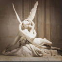
eu-nao-lirico
Eu, Não-Lírico


elderlycaremarltonnj-blog
Always Best Care Marlton, NJ
basicallytravus
Crow

porquetengomiedoaperderte
edits.