#I’m finally working on how to learn photoshop!
Text

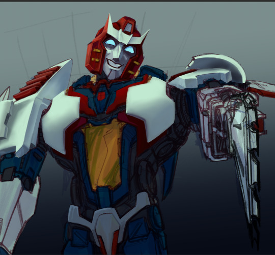
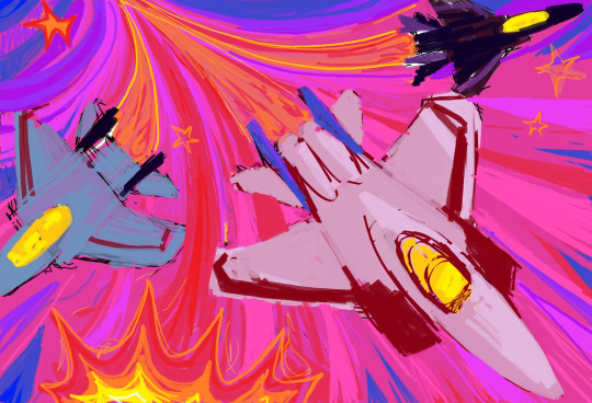
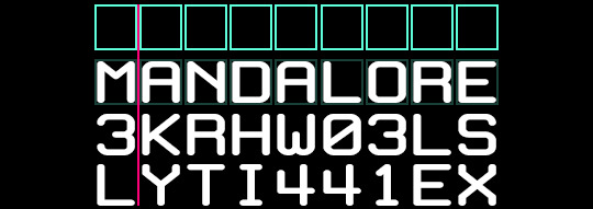
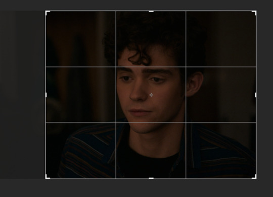
the Dog Star✨
#sirius black#harry potter#marauders#sirius orion black#sirius black fanart#marauders fanart#Harry Potter fanart#I’m finally working on how to learn photoshop!#redid the one I did of this before#thank u cat for inspiring me to actually finish since I started right after we chatted abt art <3#hp fanart#my art#a break from our aesthetic content for some fanart hahaha
174 notes
·
View notes
Text
A bunch o' WIPs and progress pictures from some of the bigger things I’m currently working on :)
I’m already 12 hours into this over ambitious Pharma painting and I don’t even think I’m halfway done. I started this in late October and I’m taking a bit of a break from it to learn how to paint metal and just get back in the groove of painting things.
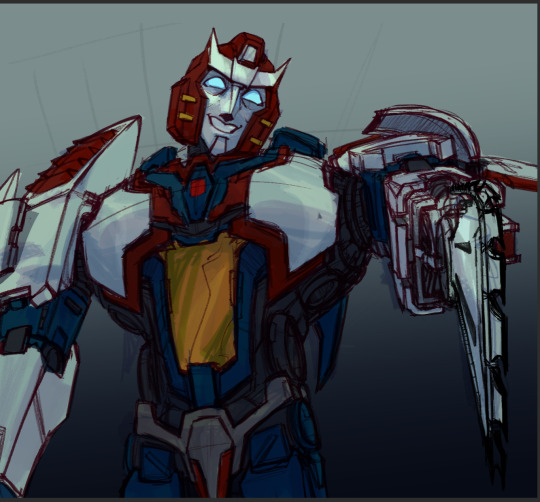
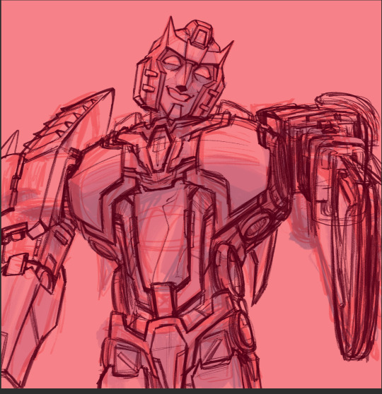
MS paint seeker thing I started in the time period where i lost access to photoshop and before i got clip studio (August lol). So far, this has been so FUN to work on and experiment with funky bright colors
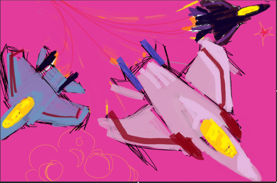

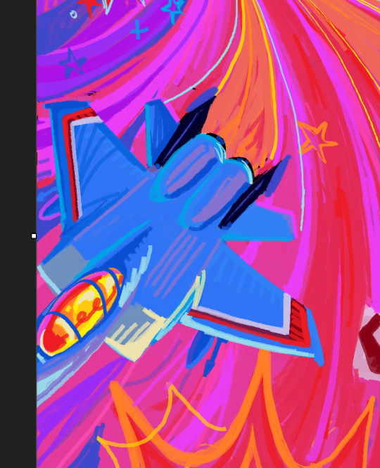
And finally, Stormmyyyyy I started a few days ago but he is the saddest guy in the world rn
#transformers#art wips#corndogyyy art#my art#tf idw#pharma#idw pharma#tf pharma#brainstorm#starscream#thundercracker#skywarp#idw brainstorm#work in progress#THANK YOU MS PAINT FOR ADDING LAYERS#you still have to save as an image so you cant save the layers when you reopen whatever you work on but its still a bit better#also i think digitally painting and traditionally painting and mspaint and making simple doodles has rewired my brain to do everything on#like one layer cuz im using a bit more layers now and it feels weird ehfkjsfhkjdfhkdf#i feel like ive lost my braincells and a bit more marbles ever since i started working on that pharma painting.#he put the pain in painting#I HAD TO RESKETCH HIM SO MUCH AND THAT CHAINSAW........i. i dont know anymore......so much grief and pain#why did i decide to do this?? i dont know but i feel like my 5 years of art training has prepared me for this moment. to paint pharma#also i feel like im still definitely learning how to do digital art in a more efficient way or i just need to get used to using a digital#program to make art but maybe its like the 3 month art block and high school burn out talking and im trying to just draw more in general.#i feel like i forgot how to do a lot of things and im forcing myself to restudy stuff and get used to just doodling all the time again :)#also i have a little somethin somethin about whirl i'll post soon :}#man i just realized they are all jets. big jet posting hours at 2 am lets goooo
320 notes
·
View notes
Photo

HOW TO: Shuffle Text Effect
A long while back someone asked me for a tutorial on the text effects in this set and this set, and a friend recently asked me how I did my url change gif. So, I’m finally doing a tutorial! Disclaimer: This tutorial assumes you have a basic understanding of gif-making in Photoshop. I’ll be demonstrating this effect using Video Timeline, but it’s definitely possible to replicate in Frame Animation!
If you just want to learn about the shuffle step, skip to Phase 3!
PHASE 1: PREPARE YOUR BASE GIF
1.1 – Choosing your frames.
The number of frames you use will depend on the number of characters in your final text. This is so you can have a decent amount of time at the end of your gif where the text isn’t shuffling!
The way I do this effect, each “shuffle” lasts 2 frames (0.03 seconds in Timeline). A good rule of thumb is to follow this equation:
Minimum Total Number of Frames = 10 + ((Character Count - 1) x 2) + 20
10 = # of frames with shuffling text at the beginning of the gif before you start revealing letters
Character Count = # of characters in the final text (minus 1 because the final letter will not shuffle & multiplied by 2 since each shuffle lasts 2 frames)
20 = minimum # of additional frames at the end of the gif, without shuffling text. 20 frames or more so the word is static long enough to be readable.
For reference, the final text in this example will say ‘MANDALORE.’ My character count is 9. So the minimum total number of frames I would need is 46.
But I chose to have a lot more end frames with static text. My final gif in this example is a total of 70 frames (26 shuffling, 44 static). If you’re more visual, here are what my final frames look like broken down:

1.2 – Crop, color, etc. as you would.
If you’re new to gif-making, I have a basic tutorial here!
PHASE 2: ARRANGE YOUR TEXT
Before we get into shuffling, lay out all your text exactly how you want it to appear at the end of the shuffle.
2.1 – Choose a fixed-width font.
You can do this effect with any font, but if you want to do less work and get the smoothest animation, I recommend using a fixed-width font (aka a font where each character is the exact same width no matter what). This will ensure the random letters/numbers you use at the beginning of the shuffle are centered with the final text. Notice how even narrow characters like ‘I’ and ‘1’ stay centered with MANDALORE:
The font I used in this tutorial is called White Rabbit (although I squished it down so it’d be shorter and more square). For my Star Wars gifs, I typically use Aurebesh for the shuffle and Conthrax for the final text (also on dafont), which are not fixed-width fonts.
If you want to use a mixed-width font, I would recommend arranging the letters individually so they line up as close as possible.
2.2 – Arrange the text as you want it to appear after the shuffle.
Do your typography as if you were doing any other gif. Here’s how I arranged mine:

2.3 – Optional Text Settings
I typically do this effect for Star Wars gifs, so I like to set my text’s blending mode to Exclusion and apply a Gradient Overlay so it looks futuristic. Here are my settings for this gif:

I also like how this effect looks with a semi-transparent black background (60% opacity set to Multiply) and a glowing outer frame, so that’s typically what I do. On the frame, I use the same Exclusion and Gradient Overlay settings as my text and add Outer Glow:

You can let your text stand alone or add any other embellishments you want!
PHASE 3: SHUFFLE THE TEXT
3.1 – Break up your text Timeline into segments.
Disclaimer: In step 1.1, I talked about these numbers in terms of Frames — where everything was doubled. Now we’re in Timeline, so we don’t have to multiply anything.
Count how many characters are in your final word. In this gif, I want ‘MANDALORE’ to shuffle — that’s 9 letters. I’m going to add 5 to that for a total of 14 segments. 13 of those segments will shuffle and the final segment will show the static final text.
Use the scissors tool to clip the Timeline at every 0.03 second. This duration will ensure we don’t get any duplicate frames.
Before Segments:
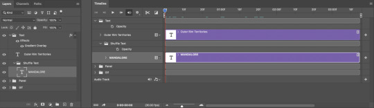
After Segments:

Now I have thirteen 0.03-second clips and one long clip.
3.2 – Input random characters into the new broken up text segments.
It’s time to take out your aggression on this set and KEYSMASH. Replace the text in the first 13 segments with random letters or numbers. Make sure they all have the same character count though! Since my final text is 9 characters, all of my random combinations will also be 9 characters.

3.3 – Reveal one letter per segment.
Starting with the 6th segment, reveal one letter from your final text. You can either reveal the letters from left to right, like I did to ‘SHUFFLE’ in the preview gif, or reveal them completely randomly like I did in the examples I linked at the beginning and how I’m doing it in my final example (I prefer the way this looks!). The boxes are the “revealed” letters:
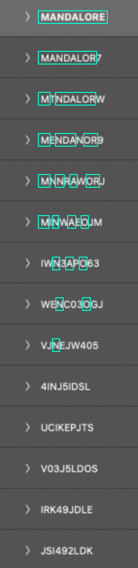
Note: Look at the 5th from the bottom, 4INJ5IDSL. Normally, I wouldn’t have a letter in the randomized text match the first letter I’m going to reveal (4INJ5IDSL, N is the first letter I reveal). Tbh, normally, I’m not even using English letters in the shuffle lol. It’s not a big deal, but it’s something to look out for if you notice your shuffle effect doesn’t move the way you want. In this case, it didn’t affect my final gif so I left it alone. But if it was affecting my gif, I’d just go and change that N to another letter or number.
3.4 – Finish with the full text.
Your final segment should be the complete static text and it should be visible for a good chunk of your gif so people can read what it’s supposed to say.
If you look back at my other screenshots, you’ll see that the full ‘MANDALORE’ clip takes up more than half of the gif’s entire duration.
PHASE 4: EXPORT
That’s it!! Convert from Timeline back to Frames, export your gif, and here it is:

SHARING TIP: If you send links to your gifs to a Discord server or have followers who turn off auto-playing gifs, here’s how to make sure your gif preview shows the final word and not some random jumbled up text: re-arrange your frames so the last frame is first. Everything will still be in the same order, but anywhere your gif is paused, the final word will be displayed!
If you have specific questions about this tutorial, my ask box is open <3
#gif tutorial#completeresources#tuserssam#usershreyu#useryoshi#userelio#userannalise#userzaynab#userives#usermarsy#usertreena#usercim#userrobin#userkosmos#usersalty#usermills#userhella#alielook#resource*#gfx*#i hope my overexplaining nature didn't make this confusing#bc it's actually super easy and quick to do!
388 notes
·
View notes
Note
I know you are tired of being reminded of the whole mess that’s been going on. I had no idea what was going on until foxyanon told me cause I asked. The shock that went through me when I was reading ems post. I was decent friends with bel and interacted a lot with her. Had no idea how vile those bloggers are, just damn right disgusting and rude. But I told em as well that I have nothing to do with what’s her face. I’m always here for you! This fandom needs some serious work done and rethinking. I’m screaming the biggest f you to her! I love your content even though I don’t say anything much. You’re wonderful and deserve better! 💗💗
Thank you for reaching out, and treating me like a human being. It is more than I currently deserve. I will place the rest of my response beneath a cut, as it will be quite long and I'd like to give people the option to scroll past, as they are doubtless tired of all of this, and rightly so.
Yes, the behaviour of that group is despicable, but I cannot downplay the gravity of my own in that.
I had a longstanding block with two users (I am not going to use their online nicknames, I do not deserve to), arcielee and sylasthegrim, I said disgusting things about both of them - the screenshots of my messages regarding them both on the post you have doubtless all seen are real (so is the final screenshot where I mention an anon I had received telling me to die in my sleep, the rest of the screenshots in that post have been falsified, doctored or snipped heavily out of context to make them appear hateful - the doctoring has been confirmed by two individuals well versed in Photoshop)
I hold my hands up and apologise to both those people, and the people that have seen those messages and been harmed by them. They are inexcusable, indefensible and were guided by a false belief that those two people were being hateful in turn about me, and actively going out of their way to harm and spite me. I am unsure what Bel thought she had to gain by exacerbating the animosity between me and Em and those two women, regardless, we should have done the mature thing and reached out directly to them. I will say, that I have never once sent anonymous hatred to either person. The extent of my vitriol was confined to that group chat.
Bel also used slurs in the group chat (I would like to point out that myself, Em and Fae did not). I won't repeat what these were. I do not want those ugly words on my page. They made me uncomfortable and I called her out any time she used one in particular, but she always laughed off my discomfort and carried on anyway. She is mixed race, I am white, in my mind it is not my place as a white person to tell an ethnic minority what is racism and what isn't. There are enough white voices shouting down others in online spaces. I know better now. I should not let my own discomfort silence me. I will call out hatred, bigotry and discrimination in every instance that I see it. My past inaction is embarrassing, it's offensive and I am devastated by the hurt I have caused to others. I am so deeply sorry.
I didn't speak up for a long time, because I have seen what these people are like when they have a grudge against someone. It's frightening, I was a coward. Yet despite staying silent on all of it, I have been doxxed just the same. I suppose perhaps that's karmic retribution?
I appreciate that people have felt my response has been lacking, however, I was out of the country, away from home, from the 14th until the 22nd, with only my phone at my disposal and with the expectation from my husband that I would enjoy the vacation we were on, and not be online dealing with all of this.
I would like the opportunity to atone for my behaviour, to make amends. Currently, I feel I am not going to be given the opportunity to do that, and understandably so. Emotions are high, people are raw from what they have learned and they do not feel comfortable being around me.
Seeing the screenshots of the people in their group passing around my personal photos and saying incredibly vile things about my appearance triggered a lapse with the eating disorder that I am in active recovery for. I then had another a few days later. I need to take some time away to get myself well, as the fear and anxiety of all of this is taking its toll. I also need the space to deal with the legal action I will be exploring with regards to Chris having doxxed me. I am not running away. I simply need to get myself into a space where I am stable enough to handle all of this, be accountable, and take responsibility without my own emotions diminishing other people's.
I know people hate me right now, but it pales in comparison to how much I hate myself. I am so very sorry for allowing this to happen.
33 notes
·
View notes
Text

Hi so I’ve had a couple of anons asking me how I make my gifs (some specifically hsmtmts gifs lol) so I’ve decided to write up a tutorial of the basics of how I make my gifs. I’m going to try and make it as detailed and clear as possible - but I have been pretty busy with uni and stuff so if I miss anything or anything isn’t clear just lmk and I will do my best to clarify. I’m going to try and include any resources or other tutorials which may be useful as I go along. This is going to be quite long and detailed so tutorial follows under the cut. For some basic steps I know of good tutorials for - I will link tutorials rather than re-explaining :)
Before we begin with the tutorial part bear with me there are a couple of screencaps which I took out of sequence because I forgot to take them at the step I did it - and the final gif colouring result looks kind of different from the rest of the screencaps because when I was adding the gif to the gifset I was making it for I decided it needed to be brighter because the s3 scene was much brighter than the s2 gif I made for this tutorial (none of this really matters, just explaining the slight discrepancy in some of the caps).
1. SOFTWARE
To make all of my gifs I use Photoshop CS5 (this is the version I use). Any version of Photoshop should work with the methods in this tutorial and you can find a masterlist of cracked photoshops here
2. FINDING HQ VIDEO
When making gifs I always use 1080p video - but not all 1080p is created equally. Generally remux files and larger file sizes will produce better quality screencaps so this is what I search for when giffing. I know a lot of gifmakers who swear by using 4k, but personally I find 4k is more trouble than its worth in my opinion (screencaps always come out weird on my computer - like with a full on green tint, and they take forever to download). For HSMTMS in particular I like to use the release labelled 1080p SALT.
In terms of finding videos, this is a good guide on downloading.
3. SCREENCAPPING
I use mpv player to take screencaps for my gifs. This is a tutorial on how to use and install mpv. When taking your screencaps make sure you have continuous screencaps and no frames are skipped or duplicated. These missing/extra frames will make your gif look choppy and the animation won’t be smooth.
After finishing my screencaps I put them all in folders and move the folders to my desktop (but it can be anywhere you easily can access the folder) to import into Photoshop.
4. IMPORTING SCREENCAPS TO PHOTOSHOP
Open Photoshop. Open the Menu path "File > Scripts > Load Multiple DICOM files” and select the folder where the screencaps for your gif are.
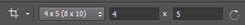
5. CROPPING AND RESIZING GIFS
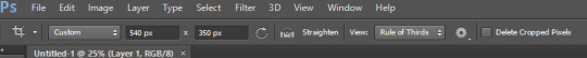
Click the ‘Crop’ button on Photoshop (the little button shown in the screenshot below). Typically I like to use a preset so that all the gifs in the set I make are the same size. For this set I used the 4x5 crop preset because that is what I typically use.
Position the crop where you want the gif (typically I like the character in the center).
Then push enter (or the tick next to the crop buttons) to confirm your crop.
Use the keyboard shortcut Ctrl + Alt + I to resize your image. This will bring up a little pop up like this:

Resize your gif accordingly based on the width. It is important to use the correct dimensions for the size of the gif you wish to make. These are summarized in the below image.

When you change the width to the correct size (e.g. in this case 540px) the height will automatically change as well.

Click Ok to resize.
6. ANIMATING YOUR GIF + SHARPENING
There are quite a lot of steps to turning your frames into a timeline animation. They are covered in detail in this amazing gif tutorial (which is the main one which helped me learn to gif).
It would be useful to have a read of how the process works, but to speed things up for myself I use a Photoshop action (shared here) I made that does all these steps for me plus my sharpening😊 (Here is a tutorial explaining how to create & install Photoshop actions)
I just highlight the word animate click the play sign and it does all the tedious steps in a couple of seconds. Note it is important to keep the reverse frames one unticked as shown in the screencap otherwise your gifs will move backwards

After that runs through we have our gif in timeline mode sharpened and ready to colour :)

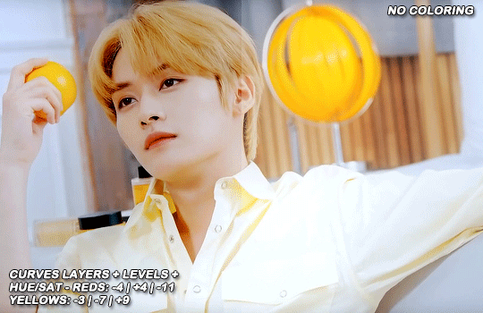
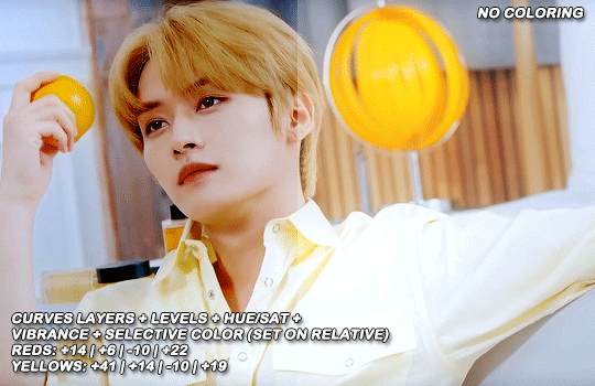
7. BASIC COLOURING TECHNIQUE
My basic colouring process is very simple and honestly it may shock some people but I primarily colour my basic scene gifs using only the curves and vibrance adjustment layers. There a few reasons for this – 1) The curves tool is a powerful tool and you can do a lot with it 2) Less adjustment layers = better quality gifs 3) This works for me and it is what I find easy. Essentially, I like to keep things simple where ever possible.
First I add a curves layer by clicking on the highlighted adjustment layer
This gives you a menu that looks like this:
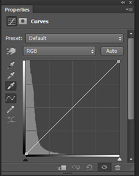
The great thing about Curves is that Photoshop will do a lot of the work for us if we use the eyedropper tools.
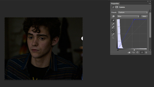
First I click the white eye dropper – then I pick a white point on the gif and see how it goes. This can take a few times to get right and often I will try a few times to see which I like best.
For this gif I selected the white light in the background but it looks a little green to me

After I have selected my white point I will usually do the same thing except with picking a black point of the gifs. I don’t always pick a dark point it kind of depends on how much I like what Curves has done with the white point and if I think the gif needs more contrast.
For this gif I picked a black point of the area behind Ricky. This is what the gif looks like now with the dark point chosen:
This looks a little better to me than just the white point – but the screencap still looks kind of yellowy and dark to me. So what I do now is I go into each colour channel for the curve and manually adjust it to my liking.
Since this gif is yellow I start in the blue channel and add more blue. I do this by changing the drop down menu on the curves screen from RGB to blue. This gives me something like this to work with:
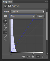
Essentially I adjust the amount of blue in the gif by sliding the white arrow down the bottom up or down to add more or less blue to the gif. For this gif I am going to slide white arrow at the bottom to the left to make the gif more blue (i.e. neutralise yellow). If I think I have added too much blue I slide it back to the right to add yellow back in.
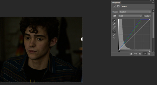
This is what I adjusted it to and it already looks a lot better
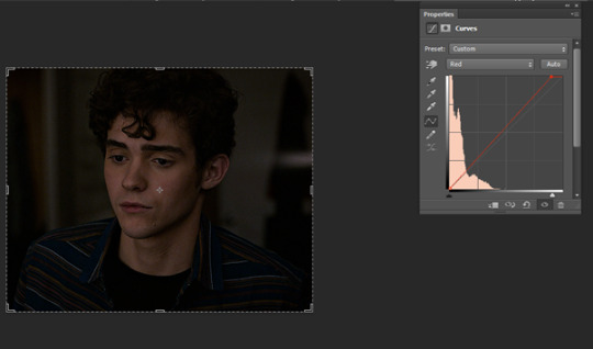
I am actually pretty happy with the overall colouring of this for the moment and I don’t think I need to go into the red and green curves. But I will briefly explain what they do/how they work by showing what some adjustments to these curves looks like.
Red curve – here is our starting point
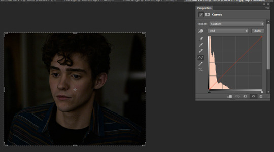
Dragging the curve to the left will introduce more red into the image

Dragging it back to the right will take out red (the gif will become more cyan)
Green curves: this is our starting point

Dragging the green curve to the left will add more green to the image
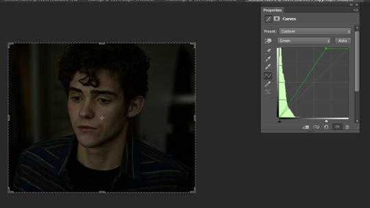
Dragging it to the right will take green out (adding pink/magenta)

So after I am happy I have coloured the image in curves If I want the gif to be a little brighter I go back to the main RBG Curves screen and drag the white arrow a little up to the left to add some additional brightness
After colouring with Curves I add in a Vibrance layer (highlighted adjustment layer)

Typically I set the vibrance somewhere between 50 and 60.

This is what the gif looks like now:
At this point I also have another quick look at the gif and see if I think I need to go back into curves and tweak the colouring a bit and add a bit of extra brightness. When I add in the Vibrance I find it easier to see if there is any underylying colours I want to go back and neutralise/adjust in my curves layer again.
This is what I end up with after making my adjustments post vibrance layer:

Another step I do sometimes is grabbing the black slider on curves and dragging it just a little bit to the right to add some depth and contrast to the gif. As s2 of hsmtmts is really dark I didn’t do it for this gif because I don’t think it needs it. But I will show an example of what this might look like:

This is basically it for my basic colouring. Of course there are a lot of different steps to making my colourful gifsets, but this is just a basic tutorial for the way I gif standard scenes so I will move on to subtitling gifs.
8. CAPTIONS
My go to subtitle font is Arial Rounded MT Bold. I have Faux Italic and Faux Bold Selected for this. I like bigger font sizes because I have bad eyesight so usually I will opt between 20 – 24 pt font size

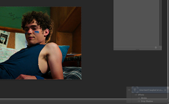
I click the T button to add text then I type out my caption.
Obviously we don’t want our text here so I align it to the bottom and centre of the gif I do this by first selecting the move tool then going ctrl + a (this selects our gif as the boundary for our alignment). You will know this is done based on the border that comes around the gif (also please ignore that drop shadow and outline settings have already been applied here lol – I added this in because I forgot to screen cap/ explain this part initially)
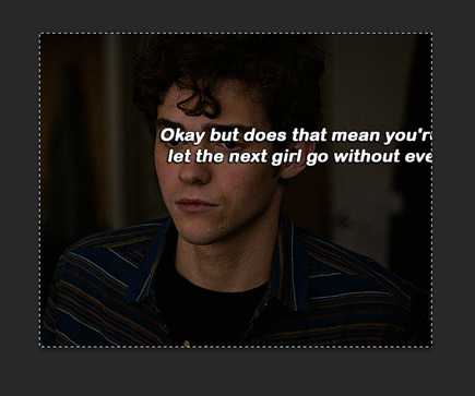
Then I align my text using the following menu buttons:
Next I Ctrl +D to remove the selection (you need to do this to be able to nudge your text up for the next step). This is the result of the alignment:
Now I nudge the caption up by selecting the text layer and pushing ctrl + shift + up
This is the result:

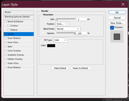
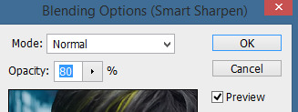
This looks ok, but I always add an outline and dropshadow to make the text more readable. To do this I go into the blending options for the text layer. You can do this by right clicking the layer and selecting blending options or by double clicking the layer (but not on the text).
First I add Stroke with these settings
Then I add Drop Shadow with these settings:

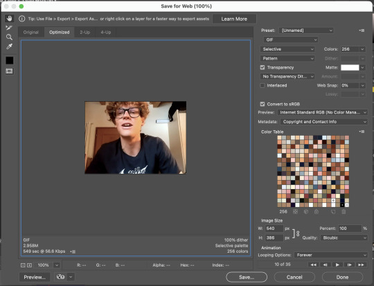
9. SAVING GIFS
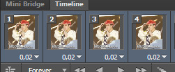
To save your file use the keyboard shortcut Ctrl + Alt + Shift + S to open the save for web settings. You will get a screen like this. The settings shown in this screen are my typical save settings (except it should say ‘Forever’ on looping options)
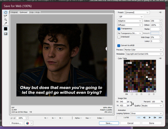
However, Tumblr’s gif limit is 10mb so the size of this gif is too big to upload (it is nearly 12 mb) so we have to go back in the timeline to shorten the gif a bit so we can upload it to tumblr.
I do this by dragging the red preview thingy (idk what else to call it) around till I find a point where I feel the gif has a natural end. Then I grab the timeline bar thingy (idk what it’s called but the silver gray bar at the end of the gif) to the red bar to shorten the gif.


Now press Ctrl + Alt + Shift + S again to save your gif and make sure you set the Looping Option to ‘Forever’. Sometimes I have to shorten the gif a few times to get it under 10mb - but luckily I got it first go this time :)
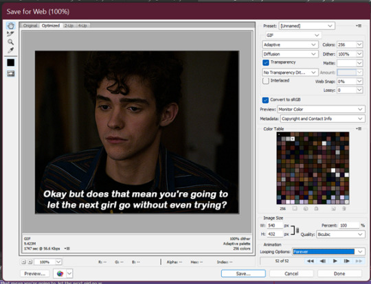
Now your gif is saved but there is still one step left to do. Photoshop has a glitch where it automatically sets gif speed to 0.7 after saving from the timeline function – we don’t want that! The gifs look very slow and are not very smooth.
So what we do is we open the gif that we just saved and this will open in the frame format. All we have to do is select all frames and set the gif speed to 0.5 – I also have this in my action so I go back to the actions and highlight the line that says ‘set frame speed’ and play the action through

Then we just save the gif again as we just did 😊
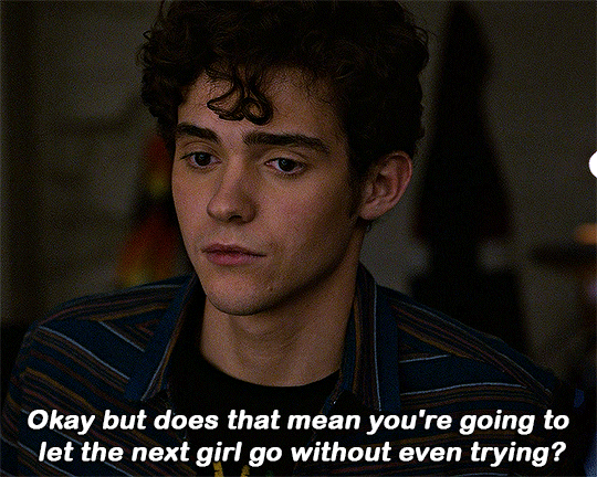
This is the end result:
and what the gif looks like without any colouring or text:

One other helpful tip:
If you are giffing from the same scene you can do your colouring and text manually as per the tutorial on the first gif for the set and then drag what you did across to the second (after cropping, resizing and animating it). All you need to do is drag the colouring outside to a different window then highlight your adjustment layers + text and drag them to the new canvas off of the gif (If you drag it on top of the gif it will place it where you put it. Make sure to go off the canvas to so it will keep you positioning/alignment of the text you made 😊)
Basically - you drag the text, curves, vibrance (and any other layers you need) to the gray area of your photoshop document and your colouring will be applied and your text will be placed in the same position as your source doc.
Ok so that is my super basic gif tutorial - if anyone has any questions feel free to ask!
#hsmtmtsedit#*mine#request#gif tutorial#resources#ps help#photoshop tutorial#usergif#allresources#yeahps#completeresources#resourcemarket#dailyresources#userelsbeth#usersavana#useraurore#userrobin#usersole#uservalentina#tuserheidi#okkk so this is kind of a weird choice of gif for the tutorial but I just followed my process as I made a gif request this morning#plus I do feel like its a really ugly screenshot so shows the results of the colouring quite well#but anyway i hope this helps someone
1K notes
·
View notes
Text
Hello everyone!
First off, I would like to thank all of you for your continued support! I usually publish short updates on my personal Twitter (or should I say X now?), but I thought it would also be fun to make long posts sharing my experiences and thoughts about the development of the game.
So, I decided to start a new series of articles talking about random things about the development of the game, like some kind of journal! I don’t use Tumblr lately, since I reach more people with Twitter, but Tumblr is perfect for long posts like this!
I hope you will enjoy this content!
🌙🚂 Let’s start with a recap! 🚂🌙
I’m currently working on a remake of my second game, Midnight Train. The remake is titled Midnight Train: New Moon, and is being developed using RPG Maker MV.
Originally, I only intended to add new content to the original game, like new endings and an epilogue, but I ended up changing the engine and remaking everything from scratch. Thanks to all the feedback I received from the original release, I'm currently working hard to make the game more enjoyable for everyone!
Since it's a remake, it has a lot of new features that weren't present in the original: new graphics, alternate endings, improved gameplay, partial voice acting, many new cutscenes and events… and much more! But let’s talk about the new features in more detail in another post~
🌙🚂 Progress 🚂🌙
Since this is the first blog in this series, I think I should talk about one of the things most people are curious about! “How’s the progress of the remake”?
Before answering that question, I'll explain how I divide the work. Basically, I focus on each chapter in linear order. These would be the main steps:
◆First step: Working on the artwork
◆Second step: Mapping in Photoshop
◆Third step: Eventing all the maps in RPG Maker and testing
◆Final step: English translation
After I finish all these steps, I start working on the next chapter, using the same steps!
Creating the maps is the most time consuming step because I also design and plan new mechanics, puzzles and new cutscenes, so it takes me a lot of time to finish them. Thankfully, once the maps are finished, I'm quite fast with the eventing, since everything is already planned!
Well…! Let’s answer the question now! “How’s the progress of the remake”?
I’m currently working on the maps of Chapter 2, which means Chapter 1 is fully completed, including the english translation! I’m almost finished with the maps of Chapter 2, so I hope I can start eventing soon ~
🌙🚂 Expected release 🚂🌙
This is one of the questions I usually receive, so I also wanted to talk about it: “When will the game be released?”
The answer is… I don’t know!
I’m working really hard, but it’s impossible to predict when I will finish all the work. For now, I can only offer updates about the development!
Which leads to another question: “Why is it taking so long to develop the remake? Shouldn’t it be faster than developing the original game?”
Honestly, that's what I also thought! But the reality is that the remake is taking twice the amount of effort that required the original. Or even more. Why does it require more effort? I think it will be easier to understand with this picture:
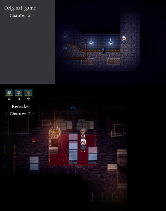
This is the comparison between two maps. Even though they look quite different, it’s actually meant to be the same map in-game. This map is basically a hallway that connects two maps, the purpose has not changed, but the map itself is different.
In the remake, I’m trying to create maps that are more interesting to explore, while trying to retain the charm and purpose of the original. This means I also added new events for the new environments, including new puzzles! There are a lot of new things to discover, and you can also learn new things about the characters.
However, the main inconvenience is that I can’t reuse anything from the old version. I must create everything from scratch, including:
◆Creating new dialogues when you interact with the new elements.
◆Adding new visual effects.
◆Creating new events that match the aesthetic of each map.
◆Adding new sound effects (voice acting and terrain sounds)
◆Adjusting old cutscenes to the new environment.
◆Creating new puzzles, depending on the map.
◆And more! The list is long!
So, in the end, working on this remake is like working on a new game. A more detailed, polished and professional new game.
🌙🚂 About the developer 🚂🌙
I usually don’t post much about myself, since I’m quite shy! But I also wanted to talk about myself a bit more~
As you may already know, I’m Lydia, the creator of Aria’s Story and Midnight Train! I’m often told by my friends that it’s weird to use your real name on the internet, but I like using my name haha
I also use the name LydiaBluebell on social media. Why Bluebell? Because it’s a flower that means humility, constancy, gratitude and everlasting love, which I think summarizes perfectly my journey with game development 💙 Thanks to everyone that supports me, you have my gratitude and everlasting love!
🌙🚂 Final thoughts 🚂🌙
Oh…! I think I already wrote too much in this post! If you’re still reading this, thank you! I hope it wasn’t too boring…! Next time, I’d like to talk about more specific things!
If you’re curious about anything in particular about my creative process, don’t hesitate to ask a question and I’ll try to cover it in the next post!
See you all next time!
65 notes
·
View notes
Text
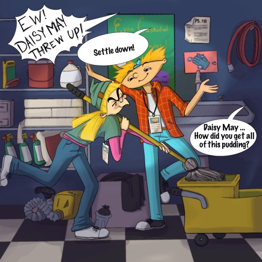
The Patakis Week Day 2!
I’m honestly so proud of this one, I just finished it today so I can post it in time. (I really don’t wanna fall behind like Inktober ☠️)
Following the prompts, here is the scenario:
Arnold and Helga are volunteering at PS 118 for their summer program that is essentially just a glorified baby sitting gig, which is why they’re letting high schoolers do it in the first place. We all know why Helga took the job, and it has nothing to do with kids. So when a young student in her cluster, Daisy May*, becomes overly attached, Helga exploits Daisy’s love of pudding. Arnold has been watching Helga too, and notices that she’s up to her old tricks. “You can’t just sit the kid in a corner with a pudding cup, how is she going to learn?”
“That’s how Bob did it and I turned out fine”
“Okay Helga, just be big enough to clean the mess”
*Fun fact: Daisy May is the name of the love interest in Lil Abner, where Arnold’s pet pig gets his namesake. Daisy May pursues the main character even though he shows no interest. It’s a Helga-ception.(credit to my bf for that)
One thing that I LOVE about Helga is her tenacity to break the rules (law😝) for the sake of her personal mission. Since it’s just a blurb for a picture, I didn’t get too detailed with the plot but I’d like to think that Helga was getting up to something Football related 😏
I wanted her face to look frustrated for being caught out, but also totally elated that Arnold was paying attention to her 😍
@opthepatakis
————————
Since I’m using my Tumblr as more of an “art diary”, I’d like to include some more info behind what went into this piece:
Much like Inktober, I’m using this challenge to learn more about Procreate, experiment with brushes and figure out what’s “right” for me.
To be frank, it has been a mildly frustrating experience internally because I already know that my weakness is color. Digital painting and traditional are just not the same, they don’t work the same (to me anyway). The interface of Procreate is so different from Photoshop too, finding and remembering to use tools isn’t a simple transition, either. It makes me self conscious of my art, even though I’ve gone to art school, and it throws me off to have to stop and Google stuff. But! I think with this piece, I’m FINALLY in a good groove of how I want my art to look and how to get there.
TLDR; I cry bc the lesson I refuse to learn is that you never stop learning 🙃
PS - skipping Patakis Week Day 3 to put the amount of effort and time that I want to put into Day 4’s prompt, however, I’ll still post something fun! 💜
#shortaki#procreate#thepatakisweek#commissions open#fanart#fan art#nicktoons#nickelodeon#hey arnold#hey arnold!#helga pataki#the patakis week#90s#90s cartoons#cartoon#romcom#school#fan fic#teen#comic art
22 notes
·
View notes
Note
I’m sorry if this is bothersome, but I am interested in learning how to make GIFs. Could you possibly nudge me in the right direction on how to do so? And, again, I’m sorry if this is an annoying ask, I’m just genuinely curious.
hello sweet friend! this isn't an annoying ask at all! i'm so happy you reached out and i'm more than happy to share some resources + tips that helped me start on my own gif making journey!
lots of info + babbling below the cut!
first, THIS is the initial tutorial i used to get started. you will need Photoshop (or an equivalent, though i will admit i'm not familiar with the other applications) and a computer - and that's pretty much it! i know it can seem overwhelming at first because it's so much information but i promise this tutorial has absolutely everything you'll need and is laid out in a really straightforward way!
second, if you're planning on using the video import method as opposed to screencapping, like i do, you'll need video files. i don't know how to use websites like MEGA or any other file downloader so i got all my videos from THIS youtube channel (which i feel most everyone in the gallavich fandom is already familiar with, lmao) - but the quality is still really really good! 1080p should be all you need. you can either download an application to your computer that converts the files via URL or you can use a website (THIS one is really good) OR you can do what i do sometimes when i realize i'm missing a scene (because some videos that are age restricted [see: dock scene] often won't be convertible via applications and websites) which is screen record on your computer or phone and then plop the file wherever you need it - whatever works best for you!
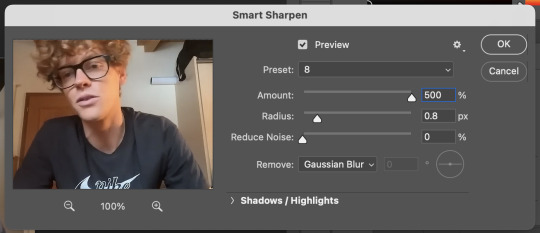
third, when it comes to adjustments, coloring, editing, etc. it's going to take a lot of trial and error but you WILL get there! my favorite adjustments are: curves, levels, hue/saturation, color balance, selective color, vibrance, and sometimes black & white. my favorite filters are the smart sharpen feature and noise.
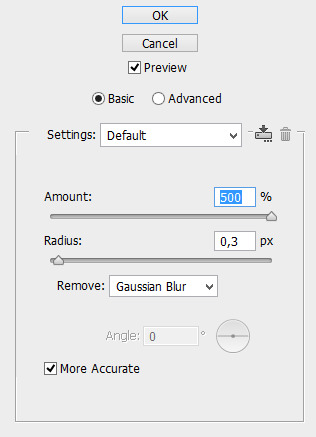
for SMART SHARPEN my settings are:
amount: 500%, radius: 0.4px, reduce noise: 10%, remove: gaussian blur
THEN a second adjustment using:
amount: 10%, radius: 10px, reduce noise: 10%, remove: gaussian blur
then for NOISE i usually add 4% noise, uniform, monochromatic! admittedly i just recently started using this filter but i think i've found my sweet spot! feel free to play around with this one. for example, black & white with high level noise gives old movie vibes - experiment, experiment, experiment!
HERE is a link to the BBC coder for colored text for captions
HERE is a link to a website where you can get a ton of free PNG files for overlays and funky edits - just make sure you put "PNG" after your search terms!
i also have a bunch of bookmarked links to various gif maker's resource pages that have been helpful to me in the past - if you'd like them please just DM me and i can send you some links!
finally, do you know about the Shameless Creator's Network? we're a network of digital creators for shameless; all characters, all seasons, all experience levels! if you're on Discord, we have a server where we have channels dedicated to just this: learning, growing, inspiring! HERE is an invite link and HERE is our blog!
otherwise, if you have any other questions or need help along the way, PLEASE don't hesitate to reach out to me via asks or DM - i am MORE than happy to help! i love seeing people learn a new craft and if i can assist at all with that then i absolutely will!
#i hope this is helpful!#please please please don't hesitate to reach out if you need anything else!#putting this under#*macygifs#in case anyone is going through my tag and wants to learn to make them too#macy babbles#redwiccanrobin
36 notes
·
View notes
Text
Finally home!! Pants off, bra off….absolute freedom! 🥳
Overall it went well and it was great seeing people again and being able to yell at them in person rather than through messaging.
But there was one thing that irked me. I’m not saying I stewed on it all day but I want to make one quick vent about it. Why do people, and by people I mean mostly women, make such a big deal about women not wearing makeup?
90% of the time, I wear zero makeup. I only put it on for special occasions and it’s for myself because I want to. I used to be really into it and I do own tons of it, but it sits in a drawer collecting dust most of the time. When I got really sick in 2018, it was the last thing on my mind & ever since then it seems more like a chore especially when it comes time to washing it all off. Eye makeup especially mascara bothers me as it just feels heavy and makes me super tired. I just prefer to keep a good skin care routine and stay hydrated instead.
With that said, I have never worn makeup to work. Why should I? I’m a senior analyst for a government agency working behind the scenes sitting behind multiple monitors all day long. I’m not there to impress anyone with looks - I’m there to solely use my brain. Yet without fail, a member of senior leadership (mostly women) always takes the time to find me and say I look tired or ask if I feel okay. Maybe I do look worn down, but usually it’s because I’m just naturally pale. However, once I’m at a company event, and I do wear makeup, I get the nonstop “omg your makeup looks so great!! You look healthy. You should wear it more often.”
It sounds like a compliment but I assure you it is not taken that way on the receiving end. I’m more than aware I probably look like a squishy potato most days but I like it and feel comfortable. The backhanded compliments of telling me to wear makeup more often is you not appreciating my squishy potato-ness and projecting your beauty ideals on me. It doesn’t hurt anymore because I’m so used to it but I also recognized looking around today, out of everyone that was there, I was the only one completely 100% without makeup.
I think that is a testament to society and its norms. Women since young childhood are engrained that you need to wear it in order to be (appearance wise) acceptable and beautiful. There’s tons of makeup kits and toys that young girls can play with and don’t get me wrong, it is super cute seeing them try as toddlers. But it also sets a bad tone that in order to be pretty, you need to wear it. I see more girls in elementary school wearing it more and more at my nieces school. It’s not medically necessary, it doesn’t cure anything - it just creates one more thing for women to nitpick about themselves and others over. We see it in magazines nonetheless all the photoshop on top of it removing “imperfections.” I agree that makeup did make me feel more confident at one time. Hell, I still love how it makes my eyes pop more but once I stopped wearing it, I learned that confidence comes more from within. I still get hit on, I still get flirted with, I still am told I’m pretty without anything on my face.
If it helps someone with their confidence, by all means apply away! For many, it’s an art form of self expression and that’s awesome!! But can we also not shame women for not wearing it?! It’s the same with high heels. Not every woman enjoys it. Women are the hardest about this on other women because again, it’s been engrained in us from young kids that we need to wear it. It’s already impossible being a woman so let’s not add one more thing to the long list and support each other instead. Stop the backhanded compliments!! Let me be a beautiful potato!! 🥔 ✨
8 notes
·
View notes
Note
your gifs are so nice! would you be willing to share your sharpening? and if it's not too much trouble do a quick rundown of your coloring process?
hi anon! it's no trouble at all, if it helps i'm happy to share <3
first i'd like to say that the size and speed of your gifs is key for the sharpen to look good! an incorrectly sized gif will look wonky on desktop (mobile is not very noticeable but desktop is where your gifs can potentially look bad if you size incorrectly) and same for slow-ish gifs, the slower your gif is the more the imperfections show so a correct speed hides the ugly parts lol
these are the standard tumblr photoset sizes

now with that out of the way i'm going to put everything under the cut bc it's probs going to be very long lol if you have any questions after reading all of this, do not hesitate to come back and i'll try to explain better!
okay! first i’d like to point out that i use an older photoshop, simply bc i like how they work lol i work on photoshop cs6 so to enable the same options i’m going to show you here you’ll have to have enabled the legacy option in the smart sharpen filters.
my sharpen varies depending on my source material tbh here are some examples:
source material: music videos
i actually use mvs downloaded from vimeo but these take longer to be up bc the directors don't usually upload at the same time the video is coming out unlike youtube mv, so if i'm working with something from youtube i like to get the biggest format available, so 4k and if it's not available then 1080p will do
i like to do big gifs for mvs so thats 540px width, these are my crop settings (putting it like that i don’t have to manually resize to 540px after cropping bc it’s going to be already the correct size)
and my sharpen for these is this

and then i lower the opacity of it to 75/80%, double clicking here

this is the result:


and my gif speed for mvs in particular is this

looks very crispy and ready to color away!
source material: stage videos in .ts format
for stages i like to work with .ts files since they are very high quality recordings of the stages and generally the gifs come out nicer. for stages that are from youtube the next part of this will probs help but this part will be focused on .ts files.
i get my files from kpop24hrs which is invite only right now and invites are a bitch to get a hold of but if you have access it’ll make your life so easy when giffing stages, there’s also twitter to look up files! for stray kids the fastest .ts uploader on twitter is @/STEii_e but if you look up the date + stray kids + .ts the tweets will show! anyway, back to the important thing
for .ts files i work with AviSynth! my computer hates vapoursynth so i use it’s older sibling lol it does the work just fine for what i use it imo bc i usually end up sharpening on photoshop. if you’d like an avisynth tutorial, this is what i used to learn about it and if you’d like to try vapoursynth there’s tons of tutorials from tumblr if you google, the most complete one is from user realstraykids
i modified my avisynth processor for it to have a denoiser (which is a feature from vapoursynth) to have my gifs look a little more smooth but that effect can also be achieved using topaz tbh
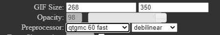
these are the output settings i get on the resizer

like i said i modified some things to have a denoiser so it won’t look like this on a regular avisynth
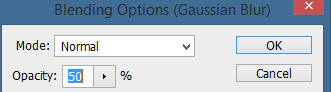
using debilinear usually makes my gif already look a bit sharp, so if i see it’s good i don’t use a sharpen, if i see it need a little push i’ll use a smart sharpen of 500% radius and 0.3px amount, and i’ll use a gaussian blur filter set to 0,3 and i lower it’s opacity to 75/80%


results:

and my gif speed for .ts stages
now it’s all ready to color!
final source material: your regular youtube/twitter/vlive video
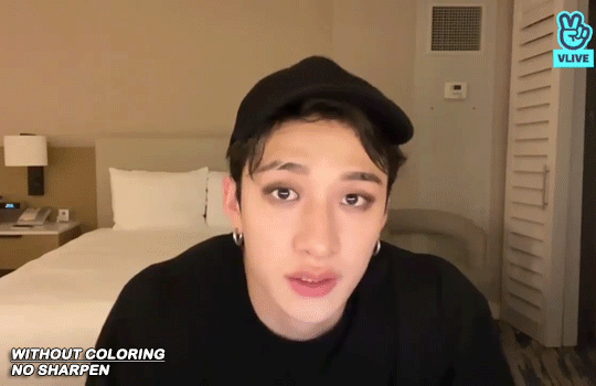
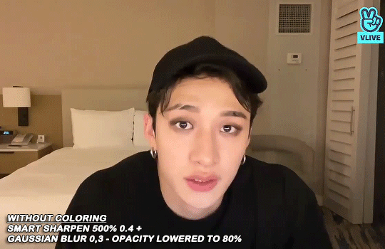
anyone that ever worked with a lq-ish video know how they just look ugly no matter how your try to sharpen, specially vlives and now channie’s rooms on youtube (*shaking fist in the air* damn you 720p videos!!) so i found a way to make them look decent, in this case i oversharpen using a 500% 0.4px smart shapen and then i slap a gaussian blur of 0,3 (lowered to 50% opacity) on top of it to smooth things out, more often than not it works very well but some videos are just plain bad (looking at you twitter) so this will work if you tweak the gaussian blur to your liking. i also recommend to work with small gifs if your video is not 1080p bc they’ll look better, but if you like pain like me and love big gifs this is what i do:


my results:


and my gif speed for these kind of videos

that’s about it for my sharpen tricks!
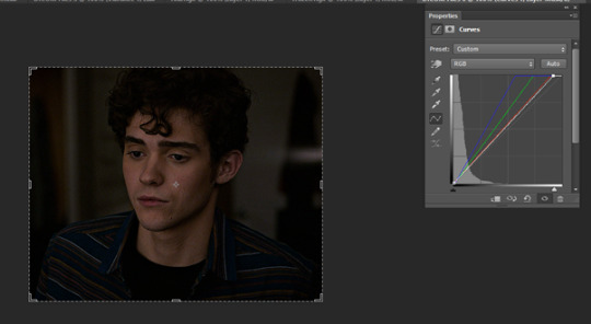
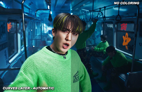
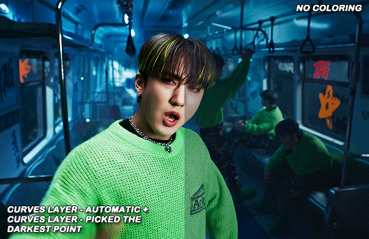
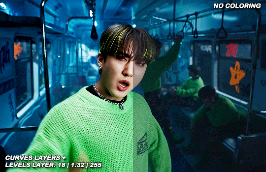
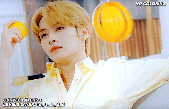
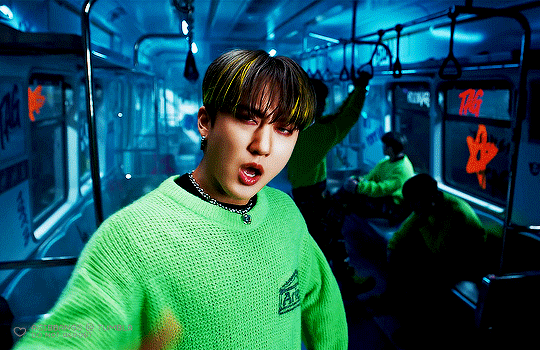
for coloring i like to do vibrant gifs, i adapted my latest method from this and this, and another tutorial that i can’t find rn, but for my base what i do is two curves layers, a levels layer to bring up darks, then i do a hue/sat to fix up colors, then i do vibrance and finally i selective color to fix things up. i’m going to show you on this binnie and minho gifs
first we use a curves layer and we set it on automatic (no worries if it gets too bright, we’ll be fixing as we go)

now we do a second curves layer, for this one we’ll use the black color picker from the curves layer and pick the darkest point on our gif

now we fix the darks and we bring some brightness with a levels layer
now we do a hue/saturation layer, here i fix up the reds and yellows, sometimes i skip it if the gif already looks good after the first 3 layers if that’s the case i go directly to the next step which is vibrance, in this case i only did minho in this step bc i felt like binnie’s was okay after the first 3 layers
now it’s the vibrance layer, for making the colors pop out more
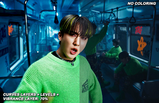

and now the final layer: selective color! here we fix again red and yellows

that was my base coloring! sometimes i put in a gradient map in between the curves layers and the levels but only sometimes. after this if i want to mess around with colors i mostly go with another hue/sat layer or just use selective color, hue/sat is great for color manipulation. anyway, this is the finished result and my saving settings!


that was really long lmao, i hope it helps somehow? like i said if anything isn’t clear pls come back and we’ll go around it again <3
109 notes
·
View notes
Note
omg how did you land your job? it sounds like something i’d like to do bc i can do anything on time from my house but i’m not reliable to show up everyday because of my symptoms :((
i’m so happy you found something that works for u 💗
thank you!! <3 tbh it was a super slow and gradual process - im a copywriter/digital marketer btw but basically a few years ago i started building a freelance copywriting portfolio as a side job and kind of developing my digital media, content management/design + photoshop skills (all using free online resources, guides and writing articles literally just writing copy in google docs) and then finally after a few months i got a job interning at a digital marketing agency (i think it was at the start of 2022), worked there for months until the contract ended and then started sending my copy out to random freelance agencies that were hiring on for copywriter positions on indeed and got a bunch of freelance work to tide me over while i interviewed for full-time positions, got rejected 8392392 billion times and just did freelance + TA jobs (im qualified in childcare nd that was my main gig before this) until i finally found a place that was willing to take me on after 3 interviews in mar 2023.....i think putting literally any skills you have on your resume and honestly just totally overselling yourself and your abilities is the way to go lol like obviously dont say you have a PHD if you dont but i thought for a long time i could only put education-based skills and certificates on there until i started branching out into the world of freelance and just saying fuck it.....very hard and long process and ultimately i still got lucky that this current company chose to take me on but yeah it was a lot of curating my abilities outside the conventional path. if you can volunteer anywhere doing admin or website management that would look great on your resume as well like truly. also if you have any sort of careers advice services in your area plzzzzzz utilise them as they helped me a lot with learning how to market myself and making my CV more attractive and all that crap. wishing you luck and sending a massive hug <3
22 notes
·
View notes
Photo
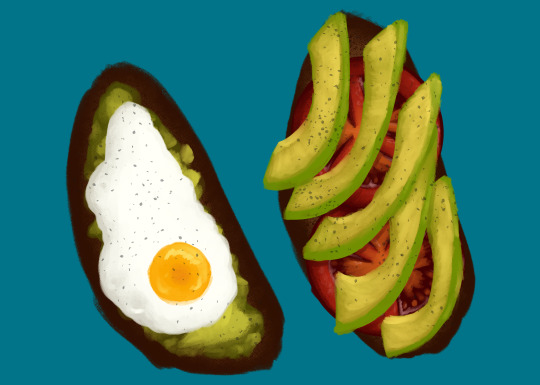
Eggtober 12
Avocado Toast (Featuring Tomato and, of course, Fried Egg.)
Clip Studio Paint, Gouache Brush, Dry Gouache Brush, Airbrush (for the barely visible bread texture) and Freckle Pen (for the pepper.) 20 colors, 1 hour 30 minutes.
Took a little longer on this one because I spent an inordinate amount of time lovingly rendering the tomato that I knew no one was going to get to see in the final product. (Don’t worry, I saved it to another layer since @quezify said last time that he appreciated the peek behind the curtain.)
This was another request by a friend. I must say, I wake up every day excited to choose an egg from the many options I have available and just... have fun putting it down on (digital) paper. I’ve got some yammering about that, but since I’m already going to post a “behind the scenes” under the cut, I’ll shove the musings down there too.
As always, big thanks to the Egg Master Supreme, @quezify for organizing this. It’s wonderful to see so many people getting into art again or branching out and drawing eggs for the first time, all because one zany dude said to Tumblr “You know what? Let’s paint eggs for a month.” And enough of us said “Hell yeah” that I get to see so many different styles and mediums. Loving every moment of it!
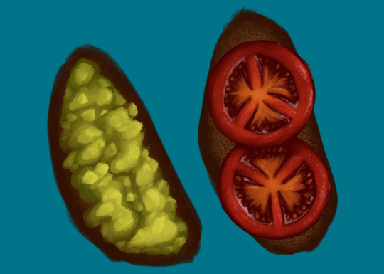
(Art first, because LOOK AT THOSE TOMATOES! I love how they came out, I want to shove them in my mouth! AAAH!)
Now for the rambling musings.
I’m starting to get really comfortable with the gouache brush, a tool which I previously never used, and I’m also getting more comfortable with art in general. My usual process from childhood, when I did much more art, was to slap down pencil work on real life sheets of paper, line it in pen or photograph/scan it and upload it to my computer to line with the pen tool, and then just do everything with pen for bright, solid colors. Most of my other techniques were one off flukes, like the fire I did in my icon’s background.
And my newer process, as an adult who just started learning Clip Studio Paint, was fairly similar. (I just started with CSP recently because it came free with my newest tablet and my old standard, Photoshop Elements [I dunno the version, 7 maybe?], was too old and would resize on my new rig so all the buttons were SO GODDAMN SMALL it was a pain to use.) The only difference is that, as an adult who’s home more often than not, I skipped the paper. Sketch, linework with the pen tool, then color under the line art with pen. Or, for a certain other project, I color under the line art with the watercolor brush.
I’ve always wanted to try gouache because I’ve seen it worked with IRL and it’s got such pretty results! Opaque like acrylics and oils but flows like watercolor. I suppose it never occurred to me to look for it in the toolset. The last time I even used brushes meant to represent real media before CSP was when Corel Painter was a thing and I had it with my very first drawing tablet. And even then I didn’t use it often. I mostly used the watercolors because that was my favored medium IRL. But I quickly started to prefer Photoshop Elements which also came with my first tablet. And slowly I stopped using anything resembling traditional mediums. But I figured, hey, Eggtober is already a time for me to learn some new tricks and get some practice in, watercolor will look too translucent and it has a paper texture to it that I’m not sure I want. Let’s see if this thing has Gouache. And it did. And now it’s my favorite brush. The way it blends naturally, the ease of pressure controls so the opacity is easy to alter stroke by stroke. It feels like laying down real paints. Once I got used to how it behaved it just... clicked.
So yeah, now that I know how to work with it and now that I had the brain explosion necessary to figure out my new process of laying down the darkest colors first and working my way up, it was all too easy to go “Oh. I like laying down these colors. And instead of trying to predict where I’m going to put the avocado, I’m just going to draw the full tomatoes for fun and practice and then figure out the avocado slice placement.” And then I spent roughly 45 minutes just... adding detail to tomatoes. Because it was a genuine joy and I was smiling the whole time and I could just look at those juicy tomatoes forever.
So yeah, I know I say it every time, but I for real owe quezify everything for giving me a reason to pick up a new tool and learn and just have fun with it. Kicking my depression’s ass, my ADHD’s ass, my artblock’s ass, and my (lack of) motivation’s ass, all with the power of “Egg fun, draw egg.”
#Eggtober 2022#Eggtober 12#Fried Egg#Avocado Toast#Tomatoes#my art#I'm just having so much fun with art#For these last 12 days I've fallen into a world where depression doesn't exist and COVID isn't floating around outside#For the last 12 days I've lived in a magical world that's just egg#no bad things#no sadness#just egg#I love Eggtober
60 notes
·
View notes
Note
🦋 - hi! If u can't recall, I was the anon who asked you about gifmaking before.
I know some of the raw videos of jannik/tennis in general may or may not have good video resolution. But your end-result of your gifs are usually sharpened but not that grainy either. How do you usually adjust your gifs' adjustments when it comes to low quality videos? Bcs your gifset tends to be in 540px wide, so it makes me wonder as well how you retain/enhance the quality of the gifs. I hope I delivered my question well 😂
i remember u omg hiiii! now i may have gone a little overboard on details here under the cut but i suppose you’ll appreciate it anyway haha
disclaimer, for a lot of these settings, i can’t remember where i first found them but i had seen them used in gif tutorials when i was just learning how to make them. i’ve basically stuck with these ever since!
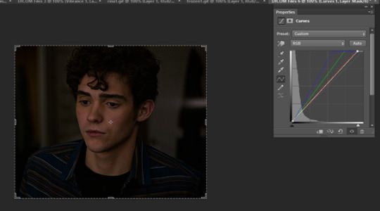
so join me as i go through the process of making this jannik gif (exclusive content, never before seen on my blog, etc etc):

okay so first of all, ofc as much as possible i try to get the best quality version even if the video itself is bad. like, if it’s on streaming i would screen record but otherwise i try to download the original file. it makes the end result much better imo
i generally go for 540px width bc i read somewhere that that’s the ideal size for tumblr gifs. if the cropped video is smaller than that or needs to be portrait oriented, i would usually just put two gifs side by side (like in this gifset) bc it’s better than trying to resize it bigger
but when a source video is around 720p, i can generally work with it! so here’s a sample that i trimmed from a fairly low quality jannik video from youtube. he's presumably on webcam here, which explains the bluriness
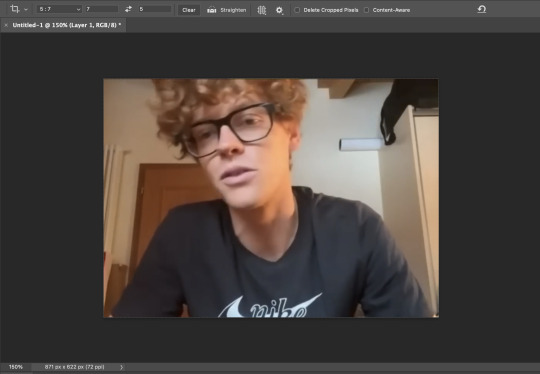
i loaded it in using video frames as layers. this pic shows it already cropped on my photoshop, with a frame delay set to 0.08 (my personal default, which i realized after everything was saved was still too fast for my liking but oh well i’m not redoing it):
as you can see on the bottom left corner, it still has a width slightly over 540px. so then i can proceed with the next step: resizing. what i do is go to the image tab and select image resizing, which brings up this window:
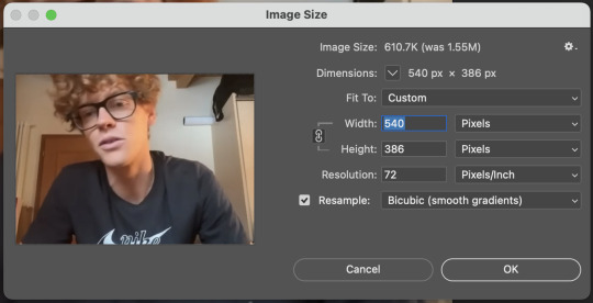
i change only the width to what i want (in this case 540px) and i use bicubic (smooth gradients) resampling
when that’s done, i convert to video timeline on the timeline window. then i select all the layers on the layers window and convert into smart object
now we can move on to sharpening! under the filter tab, i select sharpen and then smart sharpen. that gets this window to open up:
my presets have the amount at 500%, reduce noise at 0%, and remove gaussian blur. as for the radius, that depends on the video. by default i have it set to 0.5px, but i change it as needed. in this case, since it’s a close-up of jannik’s face, i feel comfortable using 0.8px (my highest setting). usually, if the video is shot from afar, i use something lower like 0.3px or 0.4px. i tend to find that oversharpening some really blurry videos makes them look worse, so i prefer to keep it looking a bit blurry if i really have to. thankfully, in our case right now jannik looks fine with high sharpening!
then i adjust the color and lighting as i wish. i would say that creating more contrast between the black and white levels of the gif helps it to appear sharper! though personally, i just like having more vibrant and contrast-y gifs so yeah
the final important thing happens when i save it. here are my settings in the save for web window:
i set max colors to 256, color reduction to selective, and dither to pattern. the last bit there is what i think is most important for keeping my gifs looking non-grainy! i looooove pattern dither, and i find that the other settings do make my gifs look more grainy so i never use them
and that’s it!! this is the process i use for all my gifs tbh, the main thing i play with for low quality ones is cropping and resizing + the smart sharpening radius
hope this helps 🫶
#theres also smth abt MB sizes and whether or not tumblr will compress a gif further based on that which probably affects the quality too#but i didnt rly. pay attention to it LMAO sometimes u just cant make certain gifs any smaller yknow#asks#anon#*#*gifs#<- sorta????
5 notes
·
View notes
Text
So after Tumblr finally allowed me to post my recent santhony gifset, I want to take a moment to give myself a short pat on the shoulder here and celebrate my gif-making process^^
I always wanted to learn how to make gifs, but I just never had the patience nor a good program to work with. A bit more than a year ago, I saw a post mentioning photopea as a great alternative to photoshop – and as I always wanted to create gifs, I decided to look up some tutorials on how to make gifs with photopea. My first attempts weren’t that great, but I’m glad that I still chose to share most of my gifs - because now I can look back at them and see the process I made, plus I still received a lot of love on my older gifs.
At the same time, I started watching Bridgerton – and as I became obsessed with that show, I used it to practice my gifmaking skills.
Recently, I saw someone like a gifset I made of that scene where Anthony asks Siena to go to the ball with him. When I first started creating gifs, I often made several gifsets in one day and then just scheduled them – which meant that by the time I opened photopea again, I basically forgot how everything worked lol. But the past months I’ve made gifs more regularly and as I felt that I’ve definitely improved, I thought I could redo that santhony gifset again.
So here’s the same shot from my first attempt a year ago, and below my most recent gif.

I really love how smooth the new one looks. I’ve never been a fan of grainy gifs, but I often had to use a noise-filter to make the quality appear somewhat better. I’m glad I found a way to make them look less pixelated but not super grainy either.
Also adore the difference in coloring. The second one looks way richer and warmer. I’m not sure whether I even colored the first gif tbh. I was super careful with coloring and lighting in the beginning, because I didn’t want the gifs to look too saturated. And making them too bright usually just showed how awful the quality was lol
So yeah, I’m really happy with the process I made. Also, I feel like learning to create gifs made me appreciate gif-makers more. I mean, I was always impressed by it, but I also always assumed that once they learned how to do it, it must be quite easy – now I know that every gifset is its own struggle lmao
So that’s also a good reminder to always show support to your favorite gifmakers (and gifmakers in general, of course). And if anyone read all that and also always wanted to make gifs: just give it a shot and keep practicing. I’m so glad I gave this a try – not only because I always wanted to, but also because this is just so much fun :D
#at this point i just want to gif *everything*#i know my 15-year-old self would be so happy i can make gifs now :D
5 notes
·
View notes
Text
pedro boys as high school teachers (modern au)
boys included: javi p, pero, jack, frankie, din, javi g, dieter, oberyn, marcus p, marcus m
word count: 1161
summary: there are just my thoughts on what high school subjects some of the pedro boys would teach, modern au
a/n: decided to reread the agm universe by @forever-rogue & it gave me an idea so here we are. i’m sorry if the formatting is jank, i’ve been posting from mobile for like two months now. also i know the ms. frizzle gif isn’t quite relevant enough but you can fight me

javier peña — javi is peak history teacher material. his students are juniors & seniors because he doesn’t have the patience for lower class bullshit. his philosophy is that students take his class seriously or not at all. took up coaching girls basketball one year because the last coach quit on short notice & admin begged him to take the spot; the year he coached was the first time in 30 years that their team went to state. became best friends with pero through their respective subjects & will have drinks together on weekends. doesn’t give grades that end with nines & will bump them up a point (69 to 70, 89 to 90, etc.) to not be a dick.
pero — geography. scares students stiff but does have a soft spot for those who put effort into his class. offers bonus points on tests for those who go to the local ren fair, and students are surprised to see their teacher wearing full garb & fighting in duels. his classroom is across from javi p’s & they watch each other’s classes when needed. they have the same lunch & conference, so when there’s nothing to do they like to talk shit about anything and everything. they gossip like old women & playfully bicker like old men. pero is often called “the gordon ramsay of teachers” & framed a photoshopped picture of their faces on the other’s body sent to him by a student.
jack daniels — football coach & ffa. he has and will continue to drive things to work that aren’t regular vehicles (tractors, horses, golf carts, even a donkey once). freshmen are surprised to see that he actually does own a highway legal means of transportation. all the ffa animals are kept in a separate barn on his ranch not even three miles from the school & will let students ride in the bed of his truck or on his trailer on the way there & back for class (parents do sign permission slips for it). lets students control the aux cord on these trips as long as it doesn’t have curse words, but the way to his heart is if someone plays reba. hosts the yearly chili cookoff to support the ffa, and it’s always a hit. he buys a stetson for each class that the students sign at the end of the school year & hangs them all up around the ffa barn.
frankie morales — softball coach that also teaches algebra 1 & 2. he has such a math brain & is super lenient when it comes to the students that have a harder time grasping the subject. very passionate about coaching & does not tolerate any bullying within the team, on the field or off it. wants to set a coaching standard for when his daughter starts playing; he wants her to know how a coach should treat their team early on. she comes to after school practices & all the girls love her to bits. frankie lets her in the dugout during games to motivate them. offers snacks for kids who come to tutorials because he knows they are hungry by the end of the day no matter when they had lunch, and that full bellies equal full attention.
din djarin — chemistry & physics. is very intimidating until it’s a couple months into the year & his students are finally comfortable asking him personal questions. they accidentally see a picture of him and his son on his computer’s desktop one day & just like that, he’s no longer piss-your-pants intimidating. he can be stern when he needs to be, but overall would rather not. he makes these two difficult subjects much easier to learn & will have so many cool lab demonstrations (some are mythbusters level) that occasionally border on dangerous. gets along with coworkers by not getting involved in drama & doing his job, doesn't have time for the bs.
javier gutierrez — this man definitely has a flair for the dramatic & would be an amazing theater director, albeit a bit dreamy. would recruit the art teacher from across the hall that he knew had acting experience to help in one production & suddenly, they’re co-directors. students favored him highly whether they took theater or not; something about him just oozed kindness & compassion, and the kids trusted him. insists the students either call him mr. g or javi, he feels that the standard honorifics are too stifling. him & dieter will buy their students fast food after days spent making set pieces & rehearsals in the auditorium. the queer kids feel hella safe with him & actually have a kinda-joke ship going with him and dieter that neither men are upset over.
dieter bravo — art teacher turned surprise theater co-director. always shows up looking like a hot mess because that’s just who he is. very lax and chill with students but will be the first to call out bullshit if it walks thru his door. drinks several coffees a day & despite the vast number of almost-pajamas he wears, some doubt whether he even sleeps at all. is the one who reigns in his counterpart when things go awry. recruits his best students to help make set pieces for theater & bribes them with free food bc he knows the way to win kids over. plays it off when students talk about the (b)romance between him & javi g but is actually pretty flattered.
oberyn martell — this is the english teacher that the lgbt+ kids flock to immediately. between him & javi g, they have an even split of the school’s queer kids idolizing them. also coaches the cross country team where usually two (or more) of his daughters participate yearly. is able to separate coaching from his fatherly duties so he doesn’t turn into a coachzilla (he’s heard about the dads who go batshit when coaching their kids in sports & loathes them). will team w javi on assignments with historical emphasis (mostly essays and book reports) & will allow students to write one essay that covers both assignments to keep from overworking the kids. is considered a jack of all trades when it comes to different subjects, and is highly recommended when another subject has a sub & cannot teach the lesson properly.
marcus pike — is the most patient & not-confrontational teacher ever. he’s the one that doesn’t get angry, he just gets disappointed & that’s actually much worse. started the school’s photography club as a volunteer & was eventually able to get the funding to make it a class, so they hired him to teach it. his students find out he plays bass in a cover band & they flip their shit abt wanting to see him perform. during the nature photography lessons, he brings his dog to work to be the model. jack gets wind of it & encourages him to use the ffa animals too, and uses the student-taken photos on the school website.
marcus moreno — not a teacher but is head of the pta. he chaperones field trips & school dances, and fights the school board to get better resources for the whole district. (i just love him okay?)
#javier gutierrez#javier peña#pero tovar#oberyn martell#jack daniels#frankie morales#marcus pike#marcus moreno#dieter bravo#din djarin#modern au#pedro pascal character imagine#pedro pascal character headcanons#javier peña headcanon#javier gutierrez headcanon#oberyn martell headcanon#marcus pike headcanon#frankie morales headcanon#pero tovar headcanon
125 notes
·
View notes
Text
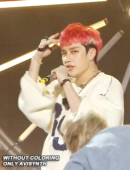
Final Post - Onwards!
Art has always been an escape for me. My teen years were marred by events that at the time I thought I wouldn’t survive. Art class became a second home for me. As the years pass by, I grow more interested in the technical, functional aspects of art. How it shapes a space. The way it creates a memory. When it persuades. When it misses the mark. I’m now more interested in visualizing ideas, in communicating what words can’t do alone. I am less of a vessel, self-contained with my work, and more of a windpipe, acting as a channel — a way through. I feel like I’ve grown a lot over this year, both internally and with my work. I owe it to this class and all the ones before it for instilling in me a steady stream of hope that art persists. I tried and failed and tried again. I found new ways of working. I discovered methods to avoid. I felt sometimes my sanity was slipping. I bit off more than I could chew and rearranged it into something I could be proud of. There is still good in the world, and brushes to be washed.
I hope in 2024 to do more hand lettering. I want to really dig deep into typography. And to learn photoshop too. Actually learn it — not just saying that I will.
3 notes
·
View notes
Last Seen Blogs

leatherswear
Leathers Wear

janvichoudhary
Untitled
bluezest
From The Window Seat
leatherswear
Leathers Wear
christinesutanto
typrist