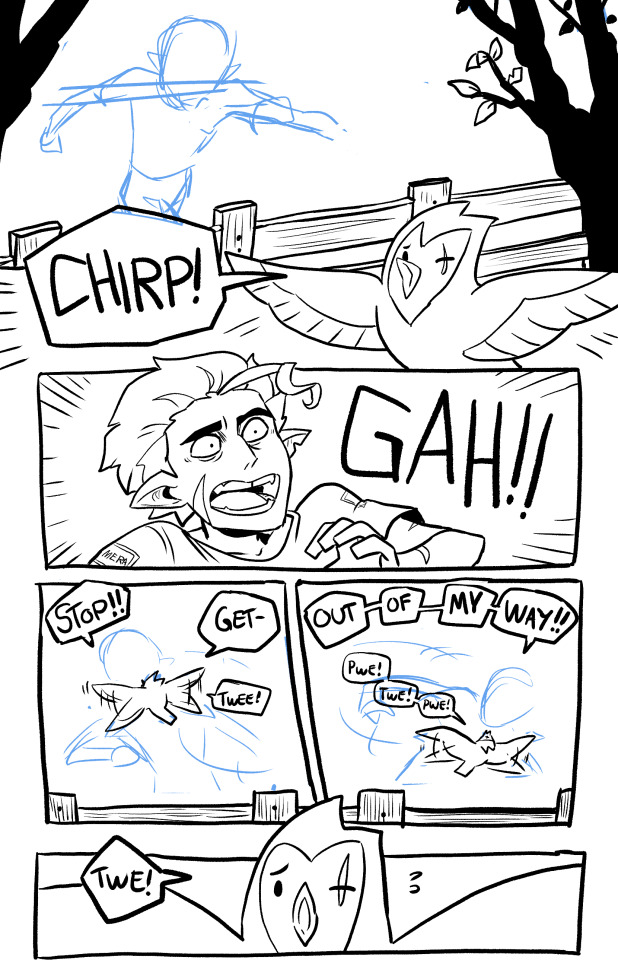
#Having read this webcomic
Text
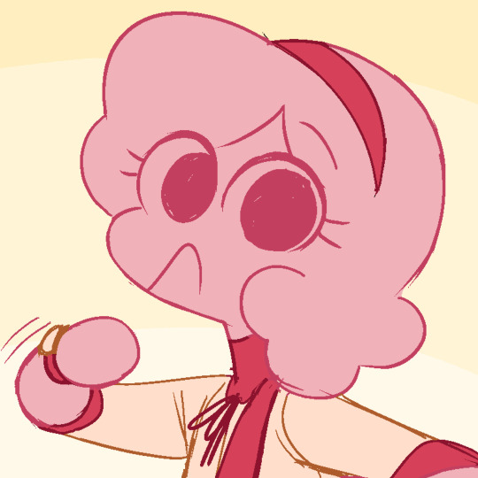
Happy pride from Adam and Steve, my t4t gay vampire and werewolf!!!

They're from my webcomic. It's good. I'm not biased. It's funny and gentle and they time travel to a new location every full moon, where there's a new little mystery to solve!
#pride month#lgbt pride#pride#steve is trans and bisexual#adam is nonbinary and gay#(they use they/he pronouns)#and they are IN LOVE!!!!!!!!!!!!!!!!!!!!!!!!!!!!!!!!!!!!!!#RAAAAAAAAAAAAAAAA#I kind of gave up on trying to come up with a composition like I did last year#it just wasn't clicking#like I said the adhd is hitting HAHAHAHAHAH#my brain is truly empty#HOWEVER!!!!!!#I've been getting more done!#just.. not.. anything I have to like... think about.......#lol#anyways#adam and steve#time and time again#ttawebcomic#webtoon#webtoon originals#webcomic#the background is just art I've done#where are we going?#somewhere gay!!!#If you're one of those people who wants to see people being fucked up then don't read my comic HAHAHAA#I mean they do some fucked up things. that's true.#but they character develop and now theyre just cute and nice...#idk...
775 notes
·
View notes
Text
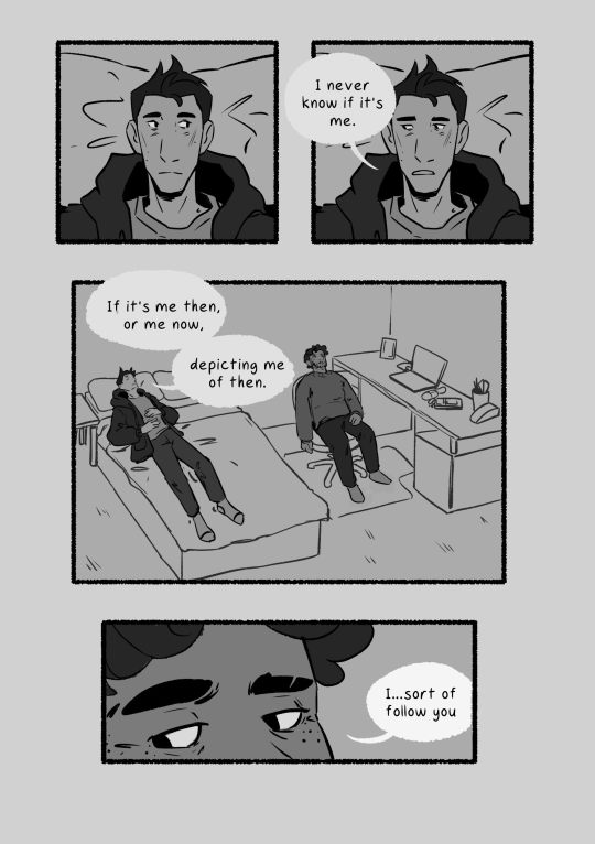
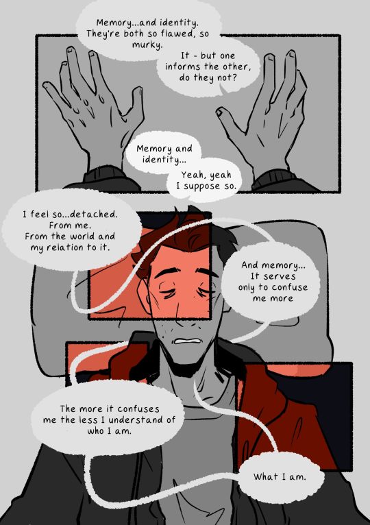
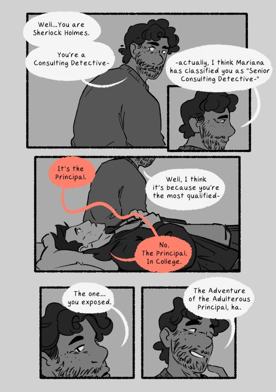
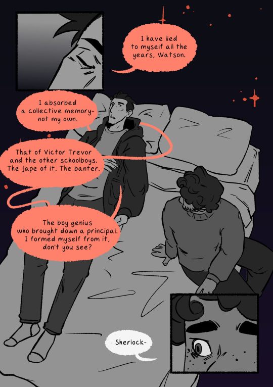
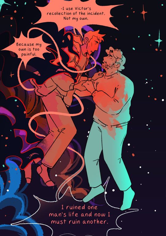
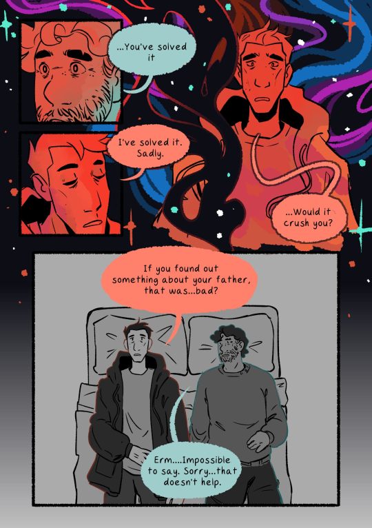
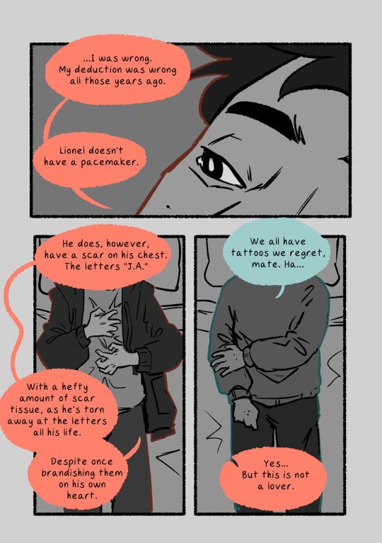
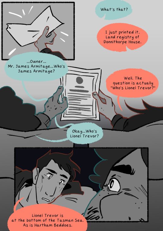
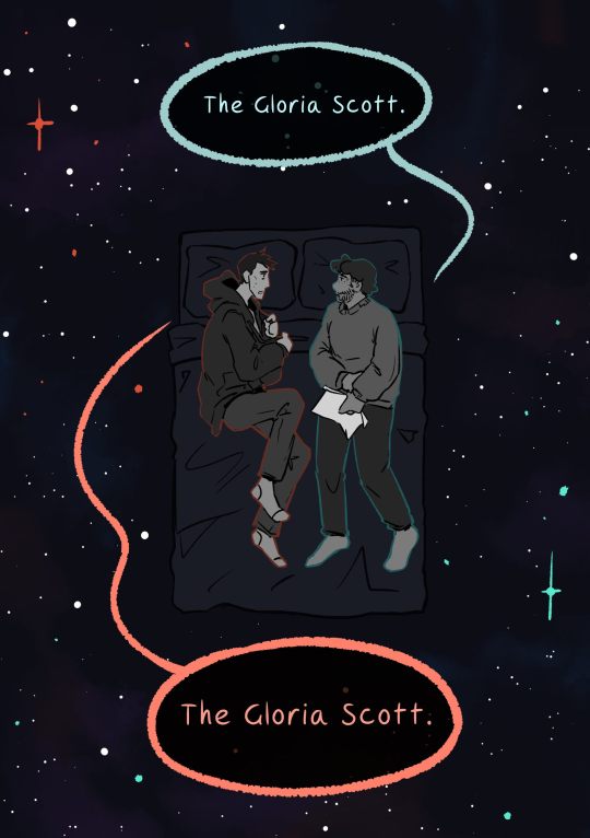
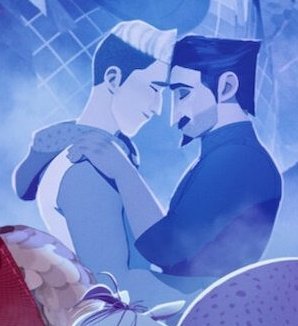
THE GLORIA SCOTT - part 2, and a follow up to my comic for the first half of this scene! thanks sm to @crashingmeteorz for allowing me to source validation for my whimsical cosmic approach to this moment <3
#sherlock & co#sherlock and co#i had such a distinct and vivid image for this scene in my mind when i first considered drawing it#but i was worried people might find it. too weird?? but . i dont want to draw 13 pages of two men lying on a bed#so heres my heavy visual metaphor for the ways in which i think john and sherlock are trying to connect with each other in this scene#i hope it makes sense!#i have so many feelings about this scene i cant put it into words so it had to be a comic instead#another note i was already working on this when joff's floorplan released and i didnt want to reshuffle the entire composition to conform#wouldnt have worked#but future comics will take the canon floorplan into account#uhmm#oh yeah also wanted to mention: i took inspiration from Space Boy the webcomic. so. read that if u vibe with this kind of storytelling#another thing: sleep well by electric president - tracks 4 5 and 6#patsart
612 notes
·
View notes
Text
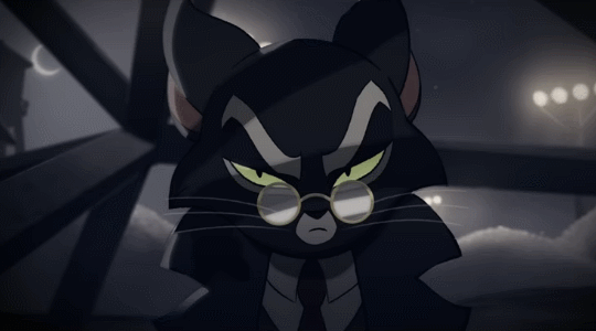
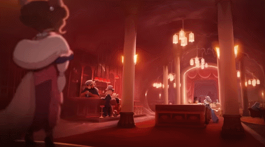

Lackadaisy Enrichment
#in our enclosures!!#video linked as source; which i'm glad to see already has a million views and is trending. That's Right#lackadaisy#WHICH i have been reading since at least '07 when i was thirteen my god b/c this animation is based on the ongoing webcomic#like does its influence show up Directly in some Discrete way i can point to in my art? not very easily probably. And Yet.#the inspiration....i wasn't able to be Regularly Only for at least another year / art done Nonprofessionally Online was novel to me#like wow ppl can make & post fanart of w/e they love huh....didn't know webcomics were a thing & i never really read that many since but.#good god the quality of Lackadaisy at its onset is like this is superb?? this person putting in all their talent and effort???#and Then you get years & years more art and i don't even know what superlatives to throw out abt its quality as it evolves. obsessed w/it..#if i see a new lackadaisy comic page i Will be acting out. obviously this animation is a delight & also stunning. and fascinating to also#juxtapose as a Translation / Interpretation of the comic in a different medium & standalone snippet of Story#and that we're not even quite there in the comic timeline; Taking Notes abt character info we get distilledly here....genuinely love like#take it back to '07 i'm like oh boy can't wait for the dream team to assemble. then a decade later when it did? Oh Boy. that is payoff lol#namely hooray for stitches and mudbug at the field office for every passing gangster. killing one marigold associate but not the other#which seems like a promising start to shootouts w/the other dream team triumvirate. i adore that in canon so far mordecai freckle & rocky#have met but only over a nice brunch. re: all intentions anyways. anyways i'm like Gifs Must Be Made while i'm also so riled afresh abt the#comic that i've been sooo hype for for over fifteen yrs now babeyyy Deservedly. i've done a couple of rereads & ought to do another....#For Interest it'd probably take a few sittings to catch up from the start but there is much to be engaged over....this ongoing story that's#historical fiction prohibition bootlegging cats with plenty of focus on characters & several Mysteries. which i'm better at parsing now lol#like one of the more recent rereads like Oh Of Course x (probably) accidentally killed his y & z took the fall & that's a binding secret...#Not [oh of course] abt the circumstances surrounding a's death & how b & c were involved. nor the ''what's marigold's damage'' mystery#which is great. love to not know things. love that we can readily follow all the emergent drama everyone's wading in nowadays. hell yeah#anyways admire my organized approach to gifs here. four shots each Expressions Atmosphere Action Groupshots#sure might've muddled through gifmaking for this anyways but fr being a huge lackadaisy comic enjoyer for now most of my life helps#and its very Overall Inspiration like. just really getting the [you can really just draw stuff out here] going. fr the art's detail & skill#and that enrichment like i'm gonna have a great time following this. And I Have#you don't expect a crowdfunded indie animation in the mix back then but hell yeah fellas#SIGH ok removing a 4th gif that's broken / not displayed despite reuploading then entirely remaking it. if it's a bug i'll try again later
4K notes
·
View notes
Text
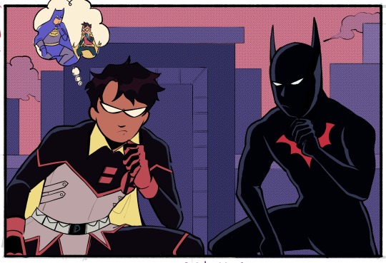
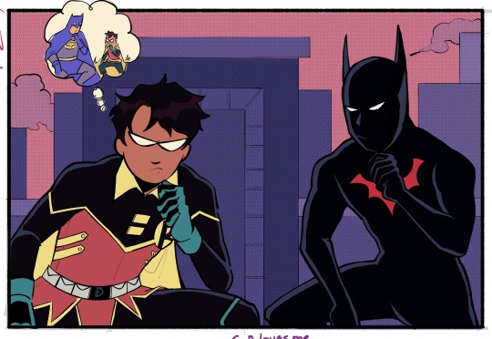
I've been binging Batman Beyond recently (Terry ily so much) and thought about how- bc of the JLU twist which I think isn't even canon to the comics BB verse but shhh bare with me- he'd technically be Damian's half brother??? Which is just so ridiculously soap opera to me. I need them to interact in a silly time travel adventure so bad you don't even understand (ID in alt)
#dc comics#damian wayne#terry mcginnis#batman beyond#batman and robin#mine#also feat the mild damian uniform redesign i like playing around with. it's fun i like her. i love u classic robin colours#the backstory for this image in my mind is that Terry knows of Damian/has maybe met him#in the future (whether we're going w the rebirth ''damian rejoins the league'' angle that i. don't love conceptually but can't judge-#-bc i haven't read. or if we go w/ some other potential future route for damian) and Terry is like. experiencing whiplash at meeting him-#-as robin. like you are 5 feet tall why r u so bossy. where is your dad good god. this is why i don't have a robin (?this is pre matt-robin)#but Terry's in an unfamiliar time trying not to cause a paradox so he puts aside his indignitude(?) at being bossed around by a kid#just long enough to make sure nothing goes horrifically wrong. hence this image takes place#<- i could've been a lot more eloquent explaining this but it's very late and i should've been asleep ages ago#anyway. absolutely crazy to me that Damian has had multiple flavours of secret brother plots and terry is a potential addition. rip damian#(also in my ideal future damian took up the nightwing mantle (EVERYONE READ NIGHTWING MUST DIE!!!) before retiring(#idk what his future career is. lowkey hes a webcomic artist in my brain but that's so horrendously self indulgent i can't condone it#also i decided to try my hands at lineart again. evil. how are you so stiff looking and difficult to do. waughh#anyway if things look weird. no they don't
584 notes
·
View notes
Text
why Aurora's art is genius
It's break for me, and I've been meaning to sit down and read the Aurora webcomic (https://comicaurora.com/, @comicaurora on Tumblr) for quite a bit. So I did that over the last few days.
And… y'know. I can't actually say "I should've read this earlier," because otherwise I would've been up at 2:30-3am when I had responsibilities in the morning and I couldn't have properly enjoyed it, but. Holy shit guys THIS COMIC.
I intended to just do a generalized "hello this is all the things I love about this story," and I wrote a paragraph or two about art style. …and then another. And another. And I realized I needed to actually reference things so I would stop being too vague. I was reading the comic on my tablet or phone, because I wanted to stay curled up in my chair, but I type at a big monitor and so I saw more details… aaaaaand it turned into its own giant-ass post.
SO. Enjoy a few thousand words of me nerding out about this insanely cool art style and how fucking gorgeous this comic is? (There are screenshots, I promise it isn't just a wall of text.) In my defense, I just spent two semesters in graphic design classes focusing on the Adobe Suite, so… I get to be a nerd about pretty things…???
All positive feedback btw! No downers here. <3
---
I cannot emphasize enough how much I love the beautiful, simple stylistic method of drawing characters and figures. It is absolutely stunning and effortless and utterly graceful—it is so hard to capture the sheer beauty and fluidity of the human form in such a fashion. Even a simple outline of a character feels dynamic! It's gorgeous!
Though I do have a love-hate relationship with this, because my artistic side looks at that lovely simplicity, goes "I CAN DO THAT!" and then I sit down and go to the paper and realize that no, in fact, I cannot do that yet, because that simplicity is born of a hell of a lot of practice and understanding of bodies and actually is really hard to do. It's a very developed style that only looks simple because the artist knows what they're doing. The human body is hard to pull off, and this comic does so beautifully and makes it look effortless.
Also: line weight line weight line weight. It's especially important in simplified shapes and figures like this, and hoo boy is it used excellently. It's especially apparent the newer the pages get—I love watching that improvement over time—but with simpler figures and lines, you get nice light lines to emphasize both smaller details, like in the draping of clothing and the curls of hair—which, hello, yes—and thicker lines to emphasize bigger and more important details and silhouettes. It's the sort of thing that's essential to most illustrations, but I wanted to make a note of it because it's so vital to this art style.
THE USE OF LAYER BLENDING MODES OH MY GODS. (...uhhh, apologies to the people who don't know what that means, it's a digital art program thing? This article explains it for beginners.)
Bear with me, I just finished my second Photoshop course, I spent months and months working on projects with this shit so I see the genius use of Screen and/or its siblings (of which there are many—if I say "Screen" here, assume I mean the entire umbrella of Screen blending modes and possibly Overlay) and go nuts, but seriously it's so clever and also fucking gorgeous:
Firstly: the use of screened-on sound effect words over an action? A "CRACK" written over a branch and then put on Screen in glowy green so that it's subtle enough that it doesn't disrupt the visual flow, but still sticks out enough to make itself heard? Little "scritches" that are transparent where they're laid on without outlines to emphasize the sound without disrupting the underlying image? FUCK YES. I haven't seen this done literally anywhere else—granted, I haven't read a massive amount of comics, but I've read enough—and it is so clever and I adore it. Examples:


Secondly: The beautiful lighting effects. The curling leaves, all the magic, the various glowing eyes, the fog, the way it's all so vividly colored but doesn't burn your eyeballs out—a balance that's way harder to achieve than you'd think—and the soft glows around them, eeeee it's so pretty so pretty SO PRETTY. Not sure if some of these are Outer/Inner Glow/Shadow layer effects or if it's entirely hand-drawn, but major kudos either way; I can see the beautiful use of blending modes and I SALUTE YOUR GENIUS.
I keep looking at some of this stuff and go "is that a layer effect or is it done by hand?" Because you can make some similar things with the Satin layer effect in Photoshop (I don't know if other programs have this? I'm gonna have to find out since I won't have access to PS for much longer ;-;) that resembles some of the swirly inner bits on some of the lit effects, but I'm not sure if it is that or not. Or you could mask over textures? There's... many ways to do it.
If done by hand: oh my gods the patience, how. If done with layer effects: really clever work that knows how to stop said effects from looking wonky, because ugh those things get temperamental. If done with a layer of texture that's been masked over: very, very good masking work. No matter the method, pretty shimmers and swirly bits inside the bigger pretty swirls!
Next: The way color contrast is used! I will never be over the glowy green-on-black Primordial Life vibes when Alinua gets dropped into that… unconscious space?? with Life, for example, and the sharp contrast of vines and crack and branches and leaves against pitch black is just visually stunning. The way the roots sink into the ground and the three-dimensional sensation of it is particularly badass here:

Friggin. How does this imply depth like that. HOW. IT'S SO FREAKING COOL.
A huge point here is also color language and use! Everybody has their own particular shade, generally matching their eyes, magic, and personality, and I adore how this is used to make it clear who's talking or who's doing an action. That was especially apparent to me with Dainix and Falst in the caves—their colors are both fairly warm, but quite distinct, and I love how this clarifies who's doing what in panels with a lot of action from both of them. There is a particular bit that stuck out to me, so I dug up the panels (see this page and the following one https://comicaurora.com/aurora/1-20-30/):

(Gods it looks even prettier now that I put it against a plain background. Also, appreciation to Falst for managing a bridal-carry midair, damn.)
The way that their colors MERGE here! And the immense attention to detail in doing so—Dainix is higher up than Falst is in the first panel, so Dainix's orange fades into Falst's orange at the base. The next panel has gold up top and orange on bottom; we can't really tell in that panel where each of them are, but that's carried over to the next panel—

—where we now see that Falst's position is raised above Dainix's due to the way he's carrying him. (Points for continuity!) And, of course, we see the little "huffs" flowing from orange to yellow over their heads (where Dainix's head is higher than Falst's) to merge the sound of their breathing, which is absurdly clever because it emphasizes to the viewer how we hear two sets of huffing overlaying each other, not one. Absolutely brilliant.
(A few other notes of appreciation to that panel: beautiful glows around them, the sparks, the jagged silhouette of the spider legs, the lovely colors that have no right to make the area around a spider corpse that pretty, the excellent texturing on the cave walls plus perspective, the way Falst's movements imply Dainix's hefty weight, the natural posing of the characters, their on-point expressions that convey exactly how fuckin terrifying everything is right now, the slight glows to their eyes, and also they're just handsome boys <3)
Next up: Rain!!!! So well done! It's subtle enough that it never ever disrupts the impact of the focal point, but evident enough you can tell! And more importantly: THE MIST OFF THE CHARACTERS. Rain does this irl, it has that little vapor that comes off you and makes that little misty effect that plays with lighting, it's so cool-looking and here it's used to such pretty effect!
One of the panel captions says something about it blurring out all the injuries on the characters but like THAT AIN'T TOO BIG OF A PROBLEM when it gets across the environmental vibes, and also that'd be how it would look in real life too so like… outside viewer's angle is the same as the characters', mostly? my point is: that's the environment!!! that's the vibes, that's the feel! It gets it across and it does so in the most pretty way possible!
And another thing re: rain, the use of it to establish perspective, particularly in panels like this—

—where we can tell we're looking down at Tynan due to the perspective on the rain and where it's pointing. Excellent. (Also, kudos for looking down and emphasizing how Tynan's losing his advantage—lovely use of visual storytelling.)
Additionally, the misting here:

We see it most heavily in the leftmost panel, where it's quite foggy as you would expect in a rainstorm, especially in an environment with a lot of heat, but it's also lightly powdered on in the following two panels and tends to follow light sources, which makes complete sense given how light bounces off particles in the air.
A major point of strength in these too is a thorough understanding of lighting, like rim lighting, the various hues and shades, and an intricate understanding of how light bounces off surfaces even when they're in shadow (we'll see a faint glow in spots where characters are half in shadow, but that's how it would work in real life, because of how light bounces around).
Bringing some of these points together: the fluidity of the lines in magic, and the way simple glowing lines are used to emphasize motion and the magic itself, is deeply clever. I'm basically pulling at random from panels and there's definitely even better examples, but here's one (see this page https://comicaurora.com/aurora/1-16-33/):

First panel, listed in numbers because these build on each other:
The tension of the lines in Tess's magic here. This works on a couple levels: first, the way she's holding her fists, as if she's pulling a rope taut.
The way there's one primary line, emphasizing the rope feeling, accompanied by smaller ones.
The additional lines starbursting around her hands, to indicate the energy crackling in her hands and how she's doing a good bit more than just holding it. (That combined with the fists suggests some tension to the magic, too.) Also the variations in brightness, a feature you'll find in actual lightning. :D Additional kudos for how the lightning sparks and breaks off the metal of the sword.
A handful of miscellaneous notes on the second panel:
The reflection of the flames in Erin's typically dark blue eyes (which bears a remarkable resemblance to Dainix, incidentally—almost a thematic sort of parallel given Erin's using the same magic Dainix specializes in?)
The flowing of fabric in the wind and associated variation in the lineart
The way Erin's tattoos interact with the fire he's pulling to his hand
The way the rain overlays some of the fainter areas of fire (attention! to! detail! hell yeah!)
I could go on. I won't because this is a lot of writing already.
Third panel gets paragraphs, not bullets:
Erin's giant-ass "FWOOM" of fire there, and the way the outline of the word is puffy-edged and gradated to feel almost three-dimensional, plus once again using Screen or a variation on it so that the stars show up in the background. All this against that stunning plume of fire, which ripples and sparks so gorgeously, and the ending "om" of the onomatopoeia is emphasized incredibly brightly against that, adding to the punch of it and making the plume feel even brighter.
Also, once again, rain helping establish perspective, especially in how it's very angular in the left side of the panel and then slowly becomes more like a point to the right to indicate it's falling directly down on the viewer. Add in the bright, beautiful glow effects, fainter but no less important black lines beneath them to emphasize the sky and smoke and the like, and the stunningly beautiful lighting and gradated glows surrounding Erin plus the lightning jagging up at him from below, and you get one hell of an impactful panel right there. (And there is definitely more in there I could break down, this is just a lot already.)
And in general: The colors in this? Incredible. The blues and purples and oranges and golds compliment so well, and it's all so rich.
Like, seriously, just throughout the whole comic, the use of gradients, blending modes, color balance and hues, all the things, all the things, it makes for the most beautiful effects and glows and such a rich environment. There's a very distinct style to this comic in its simplified backgrounds (which I recognize are done partly because it's way easier and also backgrounds are so time-consuming dear gods but lemme say this) and vivid, smoothly drawn characters; the simplicity lets them come to the front and gives room for those beautiful, richly saturated focal points, letting the stylized designs of the magic and characters shine. The use of distinct silhouettes is insanely good. Honestly, complex backgrounds might run the risk of making everything too visually busy in this case. It's just, augh, so GORGEOUS.
Another bit, take a look at this page (https://comicaurora.com/aurora/1-15-28/):

It's not quite as evident here as it is in the next page, but this one does some other fun things so I'm grabbing it. Points:
Once again, using different colors to represent different character actions. The "WHAM" of Kendal hitting the ground is caused by Dainix's force, so it's orange (and kudos for doubling the word over to add a shake effect). But we see blue layered underneath, which could be an environmental choice, but might also be because it's Kendal, whose color is blue.
And speaking off, take a look at the right-most panel on top, where Kendal grabs the spear: his motion is, again, illustrated in bright blue, versus the atmospheric screened-on orange lines that point toward him around the whole panel (I'm sure these have a name, I think they might be more of a manga thing though and the only experience I have in manga is reading a bit of Fullmetal Alchemist). Those lines emphasize the weight of the spear being shoved at him, and their color tells us Dainix is responsible for it.
One of my all-time favorite effects in this comic is the way cracks manifest across Dainix's body to represent when he starts to lose control; it is utterly gorgeous and wonderfully thematic. These are more evident in the page before and after this one, but you get a decent idea here. I love the way they glow softly, the way the fire juuuust flickers through at the start and then becomes more evident over time, and the cracks feel so realistic, like his skin is made of pottery. Additional points for how fire begins to creep into his hair.
A small detail that's generally consistent across the comic, but which I want to make note of here because you can see it pretty well: Kendal's eyes glow about the same as the jewel in his sword, mirroring his connection to said sword and calling back to how the jewel became Vash's eye temporarily and thus was once Kendal's eye. You can always see this connection (though there might be some spots where this also changes in a symbolic manner; I went through it quickly on the first time around, so I'll pay more attention when I inevitably reread this), where Kendal's always got that little shine of blue in his eyes the same as the jewel. It's a beautiful visual parallel that encourages the reader to subconsciously link them together, especially since the lines used to illustrate character movements typically mirror their eye color. It's an extension of Kendal.
Did I mention how ABSOLUTELY BEAUTIFUL the colors in this are?
Also, the mythological/legend-type scenes are illustrated in familiar style often used for that type of story, a simple and heavily symbolic two-dimensional cave-painting-like look. They are absolutely beautiful on many levels, employing simple, lovely gradients, slightly rougher and thicker lineart that is nonetheless smoothly beautiful, and working with clear silhouettes (a major strength of this art style, but also a strength in the comic overall). But in particular, I wanted to call attention to a particular thing (see this page https://comicaurora.com/aurora/1-12-4/):

The flowing symbolic lineart surrounding each character. This is actually quite consistent across characters—see also Life's typical lines and how they curl:

What's particularly interesting here is how these symbols are often similar, but not the same. Vash's lines are always smooth, clean curls, often playing off each other and echoing one another like ripples in a pond. You'd think they'd look too similar to Life's—but they don't. Life's curl like vines, and they remain connected; where one curve might echo another but exist entirely detached from each other in Vash's, Life's lines still remain wound together, because vines are continuous and don't float around. :P
Tahraim's are less continuous, often breaking up with significantly smaller bits and pieces floating around like—of course—sparks, and come to sharper points. These are also constants: we see the vines repeated over and over in Alinua's dreams of Life, and the echoing ripples of Vash are consistent wherever we encounter him. Kendal's dream of the ghost citizens of the city of Vash in the last few chapters is filled with these rippling, echoing patterns, to beautiful effect (https://comicaurora.com/aurora/1-20-14/):

They ripple and spiral, often in long, sinuous curves, with smooth elegance. It reminds me a great deal of images of space and sine waves and the like. This establishes a definite feel to these different characters and their magic. And the thing is, that's not something that had to be done—the colors are good at emphasizing who's who. But it was done, and it adds a whole other dimension to the story. Whenever you're in a deity's domain, you know whose it is no matter the color.
Regarding that shape language, I wanted to make another note, too—Vash is sometimes described as chaotic and doing what he likes, which is interesting to me, because smooth, elegant curves and the color blue aren't generally associated with chaos. So while Vash might behave like that on the surface, I'm guessing he's got a lot more going on underneath; he's probably much more intentional in his actions than you'd think at a glance, and he is certainly quite caring with his city. The other thing is that this suits Kendal perfectly. He's a paragon character; he is kind, virtuous, and self-sacrificing, and often we see him aiming to calm others and keep them safe. Blue is such a good color for him. There is… probably more to this, but I'm not deep enough in yet to say.
And here's the thing: I'm only scratching the surface. There is so much more here I'm not covering (color palettes! outfits! character design! environment! the deities! so much more!) and a lot more I can't cover, because I don't have the experience; this is me as a hobbyist artist who happened to take a couple design classes because I wanted to. The art style to this comic is so clever and creative and beautiful, though, I just had to go off about it. <3
...brownie points for getting all the way down here? Have a cookie.
#aurora comic#aurora webcomic#comicaurora#art analysis#...I hope those are the right tags???#new fandom new tagging practices to learn ig#much thanks for something to read while I try to rest my wrists. carpal tunnel BAD. (ignore that I wrote this I've got braces ok it's fine)#anyway! I HAVE. MANY MORE THOUGHTS. ON THE STORY ITSELF. THIS LOVELY STORY#also a collection of reactions to a chunk of the comic before I hit the point where I was too busy reading to write anything down#idk how to format those tho#...yeet them into one post...???#eh I usually don't go off this much these days but this seems like a smaller tight-knit fandom so... might as well help build it?#and I have a little more time thanks to break so#oh yes also shoutout to my insanely awesome professor for teaching me all the technical stuff from this he is LOVELY#made an incredibly complex program into something comprehensible <3#synapse talks
752 notes
·
View notes
Text
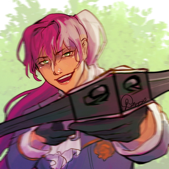
P-Penelope Eckart | Death is the Only Ending for the Villainess
"Then, call them."
"…Pardon me?"
"What do you think will be faster?
You calling the soldiers or me shooting the moving target?"
#my art#fanart#alphabetic characters#fanart of a manwha#ch. 66#doev spoilers#only read the manwha/webcomic of it not rly the novel#fanart of a light novel#death is the only ending for a villainess#death is the only ending for the villainess#death is the only ending for the villain#villains are destined to die#dam which article is right aaaaa#penelope eckhart#when you can't beat yourself up so u draw second povs of ur fav characters to do it for u 😂🙈#wanted to draw her about to shoot with the pretty crossbow#from badass o'saa to badass penelope#BALANCE AS IT SHOULD BE#i have 10 letters left aaaaaa
403 notes
·
View notes
Text
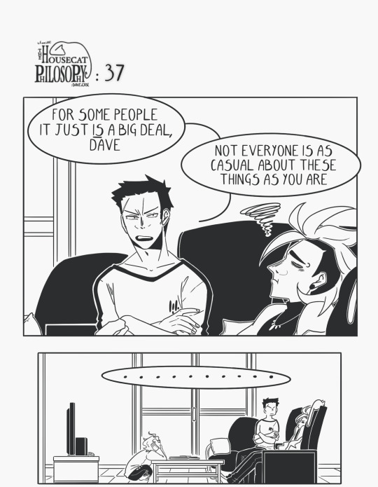

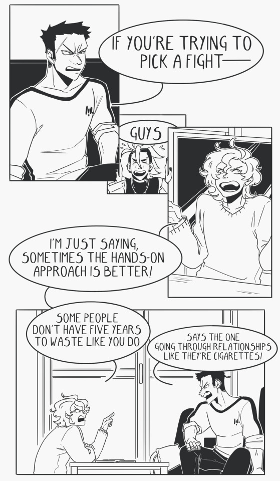

The Housecat Philosophy - Ep 37
Ep 00 || < Prev || Next >
Read the next four episodes on Patreon || support me on ko-fi~✨
#the housecat philosophy#artists on tumblr#original comic#webcomic#original art#my sketches#ah i love writing sal and lu in the same place#can't wait to get deeper into them they have probably the most ridiculous relationship i've ever made up#anyway as a psa#i was actually hoping to post this one with an announcement that the comic was finally on webtoon but!!#the process of prepping it for the site is turning out to be surprisingly long ????#apparently my meant to be read top to bottom comic is too meant to be read top to bottom for the read top to bottom site#i've drawn panels that were nearly too long for the max length allowed by the site hahaha........#wow cropping strip 38 is gonna be a nightmare#ANYWAY just to let you all know im working on it#who would have thought letting 37 strips pile up would mean having 37x the work to do not me that's for sure#i absolutely did not call this upon myself in no way whatsoever
430 notes
·
View notes
Text
People always say “Thorin could never retire in the Shire because he has to be King” — and I think the funniest way to handle that plotline would be for Bilbo to convince Thorin to eliminate the monarchy.
Bilbo has lived all his life in the Shire, where they elect their main leaders in a democratic system. Thorin is the first king he ever meets. Bilbo would initially think monarchy was very storybook-like and fantastical, like the things he’s read about in tales from distant lands…..but he would quickly find the reality of monarchy underwhelming, baffling, and annoying. Thorin/ Thranduil/Bard would make Bilbo decide that all monarchies are terrible. Being a king makes you self-important, haughty, greedy, and warlike. Kings are too powerful and use that power to fight over utter nonsense. They’ve got no one to keep their stubbornness in check. He would come to decide that the Shire really did have it right by holding elections.
I’m imagining a scene where Thorin dramatically confesses “I suffer under the burden of my duties; heavy is the head that bears a crown” and Bilbo flatly responds “don’t be king, then. >:/Elect someone else. If your people don’t want you then they won’t choose you! Im very tired of this whole affair and I wish I were back in the Shire, where folk are more reasonable >:(“
Thorin is enchanted by the strange foreign Hobbit custom of “elected leaders.” He has never considered this as a possibility. Overwhelmed by the Hobbit’s wisdom after the Battle of the Five Armies, Thorin converts his kingdom into a democratic republic and retires from public life.
This causes a domino effect. Other kingdoms across Middle Earth are inspired by Erebor’s example, and band together to reject their monarchical systems. Revolutions ensue.
Thorin’s consort “Bilbo Baggins,” known only as “the dwarf-king’s advisor who first set off this wave of revolutions,” becomes one of the most controversial and reviled people in all of Middle Earth. Bilbo becomes a figure of mythic proportions, loved by the democratic republicans and despised by the royalists, each of which invents their own wild legends.
To the democratic republicans “The Great Baggins” is glorified as a great warrior sent from Valinor to restore the long-forgotten wisdom borne out of The West— he snaps his fingers and with a poof of smoke he washes away all the old corrupt systems of the world, just as the Valar washed away Numenor.
But to the royalists, “The Mad Baggins” is a scheming shadowy monster who crawled up from the deep places of the world to burn the very foundations of Middle Earth to the ground; he’s a monster more powerful and terrible than a dragon or a balrog, who threatened Thorin into submission and brought the world into chaos. he snaps his fingers and monarchies collapse in a puff of smoke.
Meanwhile elderly Bilbo grumpily putters around the Shire with Thorin, mostly oblivious to all of this.
#and that’s my reshirement au. like comment and subscribe#read my webcomic adaptation of the hobbit *dabs*#lotr#the hobbit#Bagginshield#lord of the rings#I would write this fic but I’m already making high effort hobbit fanfic#don’t know if I have the energy for another one XD
974 notes
·
View notes
Text
idk who needs to hear this but if you're a writer looking for a webcomic artist and the best offer you can come up with is a 50/50 split "after gaining revenue", then that's literally asking for free work just with extra steps.
like first of all (and i'm sure people are gonna fight me on this) writing a webcomic and drawing a webcomic is not a 50/50 split, a scene that took you a half hour to write will take them hours to draw so it's literally more like 30/70
but also even IF your comic gains revenue, it's still not gonna pay for that labor, there are comic projects out there that have been going on for upwards of 10 years and beyond who are still maybe only making like $30/month on their patreon... and you only wanna pay them $15 of that?
please just consider writing a novel or short stories, or doing tabletop campaigns, or pitching scripts to comic publishers, or learning to draw yourself (even if you're bad at it! webcomics are allowed to grow and evolve in their art!), or doing RP, or doing anything that will get your ideas and stories out there without being at the expense of a whole ass other human being doing the brunt of the labor for free
no matter how dedicated you are to an idea or how convinced you are that it's truly a unique one that's worth working on, none of that will pay for the labor and time and efforts of people who you're asking to work for free to make your dream a reality. They have their own dreams that they're working on too.
#sorry i know this is very curt but i see this all the time#pls just be aware of what you're asking for if you're looking for a webcomic artist#i know you prolly really like reading webcomics but there's so much that goes into them that a lot of ppl don't realize#you're asking a LOT for someone to just love your own idea enough to work on it for free#sorry but most of us already have our own babies that we love and care for#self post#rant post#artist tips#writer tips#writing tips#hot take
427 notes
·
View notes
Text
Hey guys. I made a whole new webcomic. It has characters and a story and everything. You should totally go read it!!!!! Go read it right now!!!!!!!!!!!!!!!!!!!!
#screams into the aether#motley#my art#never in my life have i ever been so terrified to post something#this whole comic is my life blood. you should read it#i have a lot planned for it#webtoon#comic#webcomic#aaaa i feel like such a shill adding so many different tags. but thats how you play the game ig
497 notes
·
View notes
Text

made a weird dog
#oc#monochrome#me when there's a creature that exists between two states and watches beyond more than that:#its cool with this for the record its having a lot of fun#based super loosely off the concept of coyote from gunnerkrigg court. friend of mine wanted me to read it and i. dont like it that much but#i wanted to give it a shot bc i hate all the other webcomics they like ;-; unfortunately i still dont like it that much. it is badly writte#like materially. the reason i dislike it is because it is not well written and unlike them i came up in an era where i could read stories#like that in webcomic format that were well written#a couple ideas bit me though. as you can see#dog#sort of a fox? i guess?#also obviously goes without saying but Extremely Derivative Obviously Not My Own Original Ideas]
104 notes
·
View notes
Text
I’m kind of amazed by just how well Princess Tutu’s male lead swap works. I think it’s in part because the relationship between Duck and Fakir is built up and important within the first arc. Fakir never existed as an extension of Mytho but as a character central to the emotional conflict of the series, so it never feels like Fakir comes out of nowhere in the second arc
#I started reading a webcomic recently that had a ML swap and it didn’t really work very well#and it just made me think how well done Princess tutu does it#and we don’t even get an confirmation on Duck having romantic feelings for Fakir - it’s open enough to be platonic or romantic#princess tutu#fakir#fakiru
107 notes
·
View notes
Text


Almost 10 years later and we still FEASTIN.

I remember when this page dropped on Tuesday, July 16, 2013, and Blackenloin/Goldenheart/Goldheart/w/e shippers all collectively lost our minds. Yes, Ballister and Ambrosius are very shippable from the get-go (their hand placement on p.13, Ambrosius on p.21 to Ballister "Are you trying to make me jealous" and his otherwise flirty dialogue, Ambrosius holding Ballister's hand at the bar on p.102, plus little hints and things by Nate on Nate's tumblr), but p.126 was an outright confirmation that it wasn't just angsty and close platonic stuff (with very clingy Ambrosius) that's fun to ship but not exactly canon in the text itself (like you can read it as "oh these two had something" from the get-go but it's not exactly explicit up until this point, and it's a different experience reading the completed comic all in one go versus reading it page by page over the course of a couple years as pages release). The Director's wording, Ambrosius' little blush. Ahh, these beans.
So excited to see the movieeeee
#Nimona movie#Nimona film#Ambrosius Goldenloin#Ballister Blackheart#Ballister Boldheart#they're so soft#ready for them to break my heart again and hopefully put it back together#Nimona webcomic#ND Stevenson#we'll always have gay dads AU too#blackenloin#blackloin#goldheart#goldenheart#even people coming to the comic after it ended in September 2014 were like wow why are you people surprised#my guy it's not the same reading the completed thing#obviously ships can be made from even less than this#and people would have shipped them regardless of any overt canon stuff#this was a big deal#and I love how overt it is FROM THE GET-GO now in the movie#Nimona spoilers#also we weren't surprised we were happy to be fed#like oh the boys getting more overt references to being a couple???#yes????#and it just kept going from there#and the rest is history
297 notes
·
View notes
Note
i would really like it if you perhaps drew the scene from chapter 9 of the golden brother where hunter tries to run away in the backyard, its my favorite. (i beg of thee) (you dont have to if you dont want to/are too busy tho!)
This ask has been in my inbox for awhile and I don't have the time to finish it atm, but I will eventually (maybe) But have it in it's unfinished stage:

You like angst, don't you anon?
∠( ᐛ 」∠)_ <-[says this asshole who wrote it]
#ask#asks#toh#toh hunter#the golden brother#tgb ask#tgb prompt#hahaha#oh if you people knew me#if you people read my webcomic you'd never survive the angst I have planned for it hahaha#in all my writing in all stories I'm like: pshpshpsh here's all this cute fluff. you like fluff dont you. yes you doooo heheheh SIKE#If my stories start out angsty they end in fluff#if they start fluffy they have angst following#in my opinion fluff tastes better after angst but so does angst after fluff. Y'know what the best combo is? fluff-angst-fluff. Heheheh#*rubs hands together* HEHEHEHEH#the owl house#the owl house comic#hunter noceda#the golden guard#toh flapjack#flapjack
228 notes
·
View notes
Text
Real talk, every time (every time!!) someone sends me a sweet ask about my books and what they thought of them, I get a sale. Even the most basic "I liked it!" ask makes a material difference to me and I am incredibly grateful. I know somebody who took the time to recommend it to a bunch of their friends and now i have the stats to prove word of mouth works. I'm really thankfully not in a position where I rely on art sales to survive but I'm still super grateful (I paid my car insurance with inprnt money last year for example) and things would be a lot worse without it. Yay thanks 🧡🧡
#and because in my heart i have the lurker's soul you should never feel pressured to talk to me either. i love lurkers#countless times I've read an entire webcomic or indie novel that changed my life. all while lurking and never interacting#i don't think it's bad form it's just how the vast majority of the world operates.. Lurking Is Fine
65 notes
·
View notes
Text
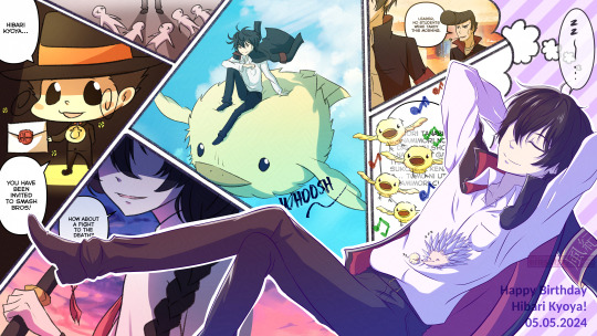
Happy Birthday King! 👑✨ May you have the sweetest and most entertaining dreams 🐥💜
Random Notes:
I think he would be so happy if he gets invited to Super Smash Bros lmao He's gonna have so much fun with his opponents.
I'm still amazed at how him being Disciplinary Committee Leader is so win-win for him. He loves his peace and quiet, so he'd be satisfied when no commotion happens for the day. But then he also loves fighting, so he'd gladly bite to death any fodder who does cause any commotion/does any crowding (it lowkey still does annoy him but still-- hahaha). It's reverse "damned if you do, damned if you don't"!
That panel with multiple Hibirds is them being able to sing the Namimori Middle School anthem in full, rather than only the first part. I remember reading somewhere that he had this problem where Hibird can't sing the full song skdjfbjhsvf
The panel with Kana - tried thinking of a dream that would give him the doki dokis. A death battle invitation would do the trick and a nice change of pace from the usual of hunting Kana down for sport. My monkeybrain.exe went oonga boonga after this thought. Wow, i love it when my fave khr canon chara and my fave khr oc beat the shit out of each other 🥰🥰🥰 So wholesome!
The one with the huge flying Hibird is based on this keychain LMAO
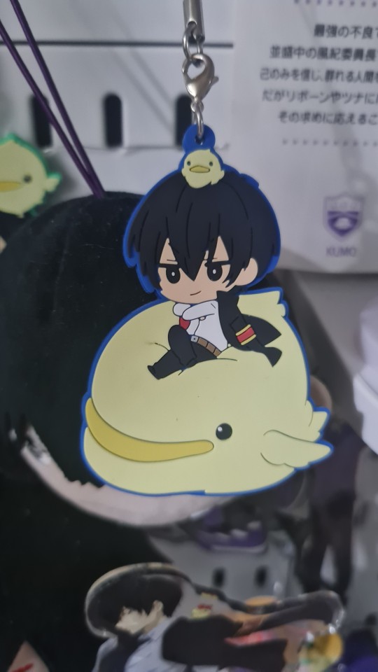
#khr#katekyo hitman reborn#hibari kyoya#khr reborn#kusakabe tetsuya#khre#khr oc#oc#ninomiya kanako#einart#i was gonna yap it all in the tags but then i realized#it's gonna be so long so i just put it under “keep reading” so it'll be easier to type and format for me lol#this piece is also me experimenting with how i want my webcomic colors to look like#i was planning on just finishing this wip comic i had b4 with him getting bamboozled but then#it's his bday so i held back LOL and i'll just save that one for another time#and start a new drawing#(i just realized i have a lot of wip comics with him on it)#(thats how u know who the favorite boy is hahaha)
71 notes
·
View notes
Last Seen Blogs

annefishermadison
Untitled

ladylunasblurbs
~lady luna~

pubberrbup
ξ(ദ്ദി ˉ͈̀꒳ˉ͈́ )3
belly-nook
•[Belly Nook]•
dbh-readerinserts
Positive vibes