#which IS what i want for my art and how i generally think art should be
Text
holy shit I did NOT realize how popular my "I will remove my teeth, for I want to remain kind despite my anger" quote is. I just googled it for fun to see what would come up, a bunch of people are quoting it not knowing who its from, an artist called Kuma made an album titled that, so bizzare
#also people are misatributing the quote to kuma and the first google result for the quote attributes it to them#which is kind of upsetting but not a huge deal whatever#its cool it seems to have entered culture like that#i get very mixed feelings about those instances where something I made got WAY more popular than i expected and#people are reposting it or using it without attributing it to me#i both feel bad when stuff isnt credited to me but also good that my art has expanded beyond my reach#its out of my control kind of and other people have it now#which IS what i want for my art and how i generally think art should be#but it is also obviously causes some anxiety to lose control and really full ownership of something that is yours#i think also there is anxiety about something of mine being taken by someone bigger than me#since they can just claim it as their own and most people will know them as the origin#not talking specifically about this quote btw just any of my work#ive definetly been thinking about that hbomberguy vid lol#i hope any of this made sense im a little high rn
739 notes
·
View notes
Text

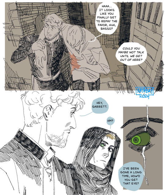
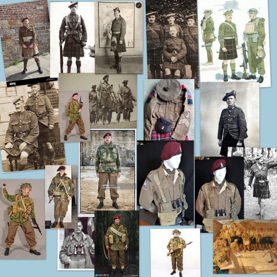
original thief series basso & garrett :)
ngl, it's about quality over quantity for me. an npc can have a total of three minutes of screen time, but if they have a cool name, they can live rent free in my head and I'll spend several hours trying to decipher drawable features from a blurry screenshot of pixels
there is a vague hint of a story here, and that's because every time I try to play thi4f, I get incredibly frustrated with how Not Fun the game play is. like, is the story good? well. but it has a PLAGUE. that should've given it instant 'I'll replay this once a year' status in my heart, but the game play sucks so bad that I've never finished it. I can't believe Not Fun gameplay beat out my obsession with narrative plagues.
anyway, the idea is basically if the original era had a game with a plague centric narrative and some other stuff I liked out of thi4f thrown into a narrative blender, with a heavy dash of horror thrown in because some parts of the thief games were scarier to me than entire dedicated horror genre games.
⭐ places I’m at! bsky / pixiv / pillowfort /cohost / cara.app
#if i had a laptop and the skillset i would attempt a story mod because the thief modders who create whole mission stories#are GENIUS and also somewhat terrifying. love them! xoxox#anyway im actually kind of obsessed with parts of thi4f but its also like. not at that sweet spot of almost good enough to be fun#to talk about. which. for the record. has not stopped me from talking about it at length to people#the city itself actually fucking fascinates me. its almost alive and im SO mad that not a single part of that game is actually terrifying#it should be gnarlier and instead it feels a bit like it doesn't quite want to be trapped in the story it has to tell?#but between the level that has the bodies on the meathooks#and the scene with the bodies hanging from the rafters or whatever that was and garrett living in a clock tower#because the game is very much ALMOST about changing times and authoritarian violence and capitalism#(like. by virtue of how the story sort of spins out i think it misses it's mark on a lot of stuff here#in the sense that i dont feel like it actually wants to tell that story. it wants to. go in a different direction. or at least walk on top#of those themes instead of through it)#ANYWAY between all of those things. it does kind of live in my head rent free. they did create a compelling setting#SHAME THEY DIDNT WANT TO ACTUALLY EAT ANY OF IT#unrelated but i would've given thi4f a 10/10 if they kept garrett's fucking nail polish from the concept art. cowards. unforgivable#thief the dark project#i still have no idea how to tag the game series as a whole RIP#sorry for the dedicated dark project fans. if you know what the general series tag is. please let me know#garrett thief#basso thief
282 notes
·
View notes
Text
examining a seemingly normal image only to slowly realize the clear signs of AI generated art.... i know what you are... you cannot hide your true nature from me... go back where you came from... out of my sight with haste, wretched and vile husk
#BEGONE!!! *wizard beam blast leaving a black smoking crater in the middle of the tumblr dashboard*#I think another downside to everyone doing everything on phone apps on shitty tiny screens nowadays is the inability to really see details#of an image and thus its easier to share BLATANTLY fake things like.. even 'good' ai art has pretty obvious tells at this point#but especially MOST of it is not even 'good' and will have details that are clearly off or lines that dont make sense/uneven (like the imag#of a house interior and in the corner there's a cabinet and it has handles as if it has doors that open but there#are no actual doors visible. or both handles are slightly different shapes. So much stuff that looks 'normal' at first glance#but then you can clearly tell it's just added details with no intention or thought behind it. a pattern that starts and then just abruptly#doesn't go anywhere. etc. etc. )#the same thing with how YEARS ago when I followed more fashion type blogs on tumblr and 'colored hair' was a cool ''''New Thing''' instead#of being the norm now basically. and people would share photos of like ombre hair designs and stuff that were CLEARLY photoshop like#you could LITERally see the coloring outside of the lines. blurs of color that extend past the hair line to the rest of the image#or etc. But people would just share them regardless and comment like 'omg i wish I could do this to my hair!' or 'hair goallzzzz!! i#wonder what salon they went to !!' which would make me want to scream and correct them everytime ( i did not lol)#hhhhhhggh... literally view the image on anything close to a full sized screen and You Will SEe#I don't know why it's such a pet peeve of mine. I think just as always I'm obsessed with the reality and truth of things. most of the thing#that annoy me most about people are situations in which people are misinterpreting/misunderstanding how something works or having a misconc#eption about somehting thats easily provable as false or etc. etc. Even if it's harmless for some random woman on facebook to believe that#this AI generated image of a cat shaped coffee machine is actually a real product she could buy somewhere ... I still urgently#wish I could be like 'IT IS ALL AN ILLUSION. YOU SEE???? ITS NOT REALL!!!!! AAAAA' hjhjnj#Like those AI shoes that went around for a while with 1000000s of comments like 'omg LOVE these where can i get them!?' and it's like YOU#CANT!!! YOU CANT GET THEM!!! THEY DONT EXIST!!! THE EYELETS DONT EVEN LINE UP THE SHOES DONT EVEN#MATCH THE PATTERNS ARE GIBBERISH!! HOW CAN YOU NOT SEE THEY ARE NOT REAL!??!!' *sobbing in the rain like in some drama movie*#Sorry I'm a pedantic hater who loves truth and accuracy of interpretation and collecting information lol#I think moreso the lacking of context? Like for example I find the enneagram interesting but I nearly ALWAYS preface any talking about it#with ''and I know this is not scientifically accurate it's just an interesting system humans invented to classify ourselve and our traits#and I find it sociologically fascinating the same way I find religion fascinating'. If someone presented personality typing information wit#out that sort of context or was purporting that enneagram types are like 100% solid scientific truth and people should be classified by the#unquestionaingly in daily life or something then.. yeah fuck that. If these images had like disclaimers BIG in the image description somewh#re like 'this is not a real thing it's just an AI generated image I made up' then fine. I still largely disagree with the ethics behind AI#art but at least it's informed. It's the fact that people just post images w/o context or beleive a falsehood about it.. then its aAAAAAA
10 notes
·
View notes
Text
⛵
#I also keep seeing modern au aubrey-maturin art#that makes me wish I could draw and thereby contribute#unfortunately I can't even *write* modern aus generally. but I like transferring character dynamics from place to place in my brain#and I feel like I could do a university AU very nicely if I could do AUs at all#because I have had rowers in my class with as far as I could tell jack's exact personality#(unfortunately it has to be a US university AU because (a) that's what I know and (b) afaik nobody else does randomly assigned roommates)#(and I cannot pass up the opportunity for randomly assigned roommates.#OR RATHER#for 'you seem more or less human - quick let's request each other so we don't have to go into potluck'#I think that works best)#(but maybe they are both international students anyway. that works fine. & therefore extremely alarmed by potluck [can't say they're wrong]#sophie is a sorority girl. english major I think. and I can see her so clearly#(she's the part I want to draw)#she's not that into the high-octane social schedule her sorority expects her to have#but her pushy mother was a member and it is Unthinkable that sophie should not be#and a lot of the other girls are sweet :) so it's fine :) she says#feel like she has roommate issues (unlike her original self she is able to live away from mrs williams so this makes up for that)#so she's always over in jack and stephen's room. people who know her tangentially sometimes gossip about which one she's actually dating#(at that particular moment it is actually neither of them she's just hanging out with stephen)#diana freed from the shackles of 19th century womanhood creates even more and weirder drama than in canon#idk I just want to see the plot of post captain played out over text message#don't ask me HOW idk HOW i just want it#stephen is a biology major/pre-med obvs. if he can survive organic chemistry#jack is some kind of engineering major. I think he'd enjoy that with the math. diana has changed her major 7 times#(I don't know whether to put jack in rotc. I don't think it Actually actually fits - he's in the navy in canon because he's in the navy#not bc he's Inevitably Military In All Worlds. he would not want to do that if he didn't get to sail#but at the same time I find it hard to picture him not belonging to Discipline somehow.#it's more than a disinterested passion for cleanliness that drives him to wash stephen's mug for him that has had coffee and ramen in it#(and NOT in that order)#in the bathroom sink
7 notes
·
View notes
Text
there's a certain quality the harmonies of like... early to mid 2000s alt rock has. which i am obsessed with... like i wanna do that. i NEED to figure out how to write harmonies that sound like that
#ari opinion hour#i sort of understand it but not necessarily well enough to do it on command#i think i sort of achieved the sound of it with my blaseball winter exchange song i did for snow but specifically only in the very last bit#like only with the 'im not alive anymore' part#(which sidenote i wish id had the second half faster + w more drive but its not like that was like a full recording which i could do)#i think i just need my music to have more teeth in general cause it scratches an itch that i think i must have developed due to some aspect#of music school. its probably my dissatisfaction with the attitudes in the classical world#<- which understand i say that in the same way that like my jazz prof does. the classical world doesnt have enough teeth nor enough#understanding of the way in which music is like. another art. and art needs to be able to have teeth and use elements normally regarded as#''undesirable'' on purpose because art is there to make you feel emotions and not just the positive ones and not just sadness or anger in#terms of the negative ones#art is there to make u feel ALL extant emotions and that includes boredom disgust fear jealousy pity cowardice apathy overwhelmedness etc#also the classical world i find often forgets what the word ''play'' means#i am of the opinion that perfection is a waste of time if i wanted perfect i'd ask a computer to do it for me. i want real#anyway. i forgot what this post was even about lol point is i need to figure out how to write harmonies that have that soaring quality that#like. you can hear it in like helena by mcr and wake me up by evanescence and stuff. and frankly most of the songs on three cheers for swee#revenge which i am listening to now for the first time. i need to learn more about this stuff maybe ill listen to the evanescence album tha#song is from next.#or something i should really be working on my essay but theres no way i wont have it done in time which is good i think i just mostly have#to worry about sources and stuff but even that should be relatively easy i think
3 notes
·
View notes
Text
it feels kind of weird being an artist that mainly draws animal people n anthros & that being the main kind of thing people usually come to my page for, but not being able to relate to like most of the furry community in general (specifically when it comes to art + kind of characters i draw)
#this isn't supposed to be anything negative abt furries i just feel like my characters do Not really fit the category of “furry”#or at least when you think abt what a furry “Should” look like by the community or every1 else#folks tend to find my anthro art first and like those more than anything. but find that most of my art which is just my ocs mind you#isn't just your generic furry Art bc my ocs are either very humanoid or flat faced lil guys & disappointing ppl scares me lol#i feel like they're in a weird limbo between “too humanoid-looking to be anthro” and “too many animal traits to be humanoid”#but maybe that's just me idk how to really word this correctly?#i have a few reasons why i don't rly call myself a “furry artist” or my ocs “furry” & this is one of those reasons#but i'm not getting into those other reasons cause. yeah lmao???#yadda yadda my art + ocs are too niche to belong in the community but it's not like i ever called myself part of it anyway & don't want to#wolfe.txt#vent-ish post this got a bit long here sorry o_o
24 notes
·
View notes
Text
in school next week i have to imitate an art style like an ism of my choice and paint something but ihavent decied yet maybe you guys should help me choose
#i dont know how to paint so itll probably turn out bad......... but if i just pick what ism i want first maybe i can go from there?#my mentor suggested i do something fandom-y which is a fun idea i also kinda wanna do something creepy#but maybe i should do someethng easy and do like. generic clouds or something LMAO#ive never painted before not for real at least...... its hard to pick i like futurism and impressionism a lot maybe i can combine them?#its hard. i saw some other students projects and it makes me feel a lot better seeing t hat they werent. like. 'good'#obviously thats not a term that means fucking anything when it comes to art but it makes me feel a little more confident#of course i have bad performance anxiety so if i dont do Amazingly on the ffirst try ill die but........ still#i needa think of something Auuuuuuu
5 notes
·
View notes
Text
Okay it's 4am so this is gonna be kinda sappy or whatever but So Much of what I read involves romance (and I read,,, So Much in general) that I've kinda become desensitized? to it? or something? Idk I've gotten really used to it and I can appreciate it in writing from like a narrative standpoint or whatever, but then occasionally I'll come across a story about an aromantic/aroace character and I just have one of those "oh" moments, y'know? where I'm reminded that I can be happy too. I could have the kind of meaningful relationships these characters have and I don't have to force myself into a romantic relationship to have that. Like, that's genuinely an option and it's so good. Cuz, like, I knew that, but until you see an example of it and you can kindof picture yourself like that more clearly you don't really know it.
#In fiction in particular the character being aromantic really drives home the point of having really strong and close friendships (separate#from queerplatonic relationships) cuz like you *know* that its distinctly platonic. They're aromantic so there's a guarantee that it's not#being written that way to lead into romance or have romantic undertones that just aren't explicitly stated or expanded on. Which is very#good and comfortable for me. There's also just the whole 'this character is Like Me' thing which is nice.#ghostprince posts#idk I was doing art earlier involving the aroace flag and thinking about moving up my next doctor's appointment to talk about top surgery#and just generally being kinda introspective. And now it's 4am and I'm reading a fanfic about an aromantic character and his friends during#valentines day and how they're showing affection all-the-same with no expectations or strings attached#and like 'oooo cringe fanfiction' or whatever but something I've been tryna work on is acknowledging that my interests are genuine and#aren't something I need to be embarrassed about and I should allow myself to be expressive about what brings me joy or something.#Mostly this involves explaining Minecraft mechanics and the OBS Studio settings menu to my dad. But it's progress. I dont think I can go#about it in the same way as my brother but I'd like to start working towards being a more genuine and happy person if I can? I've still got#all of ths mental illness and physical ailments and everything so my efforts may not work out if I can even work up the energy to try#but I'm atleast starting to *want* to try being me and being happy for once. Idk I just think that'd be nice.#I also want to buy a custom-made cowboy hat.#DNRB#not a vent but still a personal post so no reblogging please
12 notes
·
View notes
Text
.
#sometimes when im drawing stuff i get such a clear picture of what im going to do#and then it turns out just like that too#which should be great!#but instead i just feel like i'm copying something i've seen before#sigh..#well i haven't found it anywhere so i guess i'll post the drawing anyway#it's just.. i don't usually like how my drawings turn out when i dont use references#because im just not that creative when it comes to composition and poses#if i dont see it first#idk i've been feeling bad about art and in general lately#art fight has been very fun but it's also a bit stressful#i think in the future i will only draw for ppl i know its more fun that way#i dont mind if ppl dont get revenge#but i do at least want a reply so i know they've seen it and that i've gotten their character right
2 notes
·
View notes
Text

constant conversations
#flowers arts#i cant tag everyone. but do understand this is not BOB alters this is BOB Daydream world. which is also a bad description#basically hwne you're (checks watch) 2 billion and 6 years waiting is pretty normal for you#“fake” conversations to pass the time (BOB voice) which are only ok if you know they're fake (he doesnt like to mix up this stuff morally)#(he doesnt like it Generally as it hinders productivity generally (which he is very productive surely))#anyway the introduction of steve definitely challenges him on this. difficult to tell which people are real or if this is affecting him at#all. the answer? “Uhhhhhhhhhhhhhhhhhhhhhhhhhhhhhhhhhhhhhh”#i dont think he finds one#another truth is that i wanted to use my stickfigure designs for something. some of them seemed applicable :3#and theres a PAUL. this is his new job. i dont know what to do with his design. its hard. hes BOB kind of#(these arent their original colors) SHOULD he be green like the circle or white like the paper. I dont know..#(they all somewhat represent things. i was going to add a cloudcat becuase that one maybe wasnt so healthy. But i didnt know how to add it)#(so there is a little one. not really associated with milda but just hiding there.)#Also i am tagging them. Fuck you#milda#sticky#abstain#cerberus#<- Thats not how you spell that apparently. OH well#fred#PAUL#pierson#i figured i should maybe explain things more. just a teensy
1 note
·
View note
Text
I have been on a Willy Wonkified journey today and I need y'all to come with me
It started so innocently. Scrolling Google News I come across this article on Ars Technica:
At first glance I thought what happened was parents saw AI-generated images of an event their kids were at and became concerned, then realized it was fake. The reality? Oh so much better.
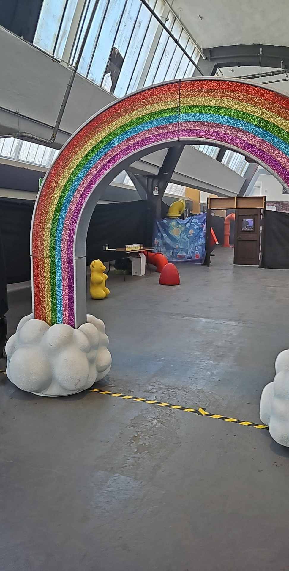
On Saturday, event organizers shut down a Glasgow-based "Willy's Chocolate Experience" after customers complained that the unofficial Wonka-inspired event, which took place in a sparsely decorated venue, did not match the lush AI-generated images listed on its official website.... According to Sky News, police were called to the event, and "advice was given."
Thing is, the people who paid to go were obviously not expecting exactly this:
But I can see how they'd be a bit pissed upon arriving to this:

It gets worse.
"Tempest, how could it possibly--"
source of this video that also includes this charming description:
Made up a villain called The Unknown — 'an evil chocolate maker who lives in the walls'
There is already a meme.
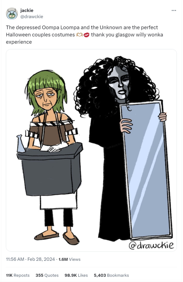
Oh yes, the Wish.com Oompa Loompa:
Who has already done an interview!
As bad (and hilarious) as this all is, I got curious about the company that put on this event. Did they somehow overreach? Did the actors they hired back out at the last minute? (Or after they saw the script...) Oddly enough, it doesn't seem so!
Given what I found when poking around I'm legit surprised there was an event at all. Cuz this outfit seems to be 100% a scam.
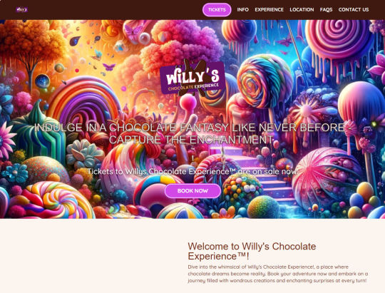
The website for this specific event is here and it has many AI generated images on it, as stated. I don't think anyone who bought tickets looked very closely at these images, otherwise they might have been concerned about how much Catgacating their children would be exposed to.
Yes, Catgacating. You know, CATgacating!
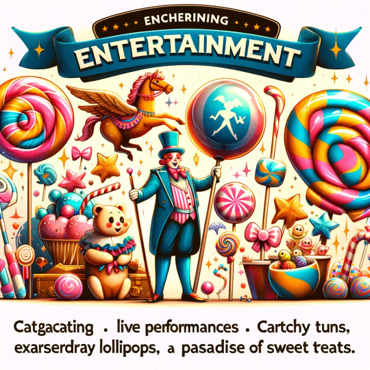
I personally don't think anyone should serve exarserdray flavored lollipops in public spaces given how many people are allergic to it. And the sweet teats might not have been age appropriate.
Though the Twilight Tunnel looks pretty cool:

I'm not sure that Dim Tight Twdrding is safe. I've also been warned that Vivue Sounds are in that weird frequency range that makes you poop your pants upon hearing them.
Yes, Virginia, these folks used an AI image generator for everything on the website and used Chat GPT for some of the text! From the FAQ:
Q: I cannot go on the available days. Will you have more dates in the future?
A: Should there be capacity when you arrive, then you will be able to enter without any problems. In the event that this is not the case, we may ask you to wait a bit.
Fear not, for this question is asked again a few lines down and the answer makes more sense.
Curious about the events company behind this disaster, I took myself over to the homepage of House of Illuminati and I was not disappointed.
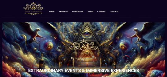
I would 100% trust these people to plan my wedding.
This abomination of a website is a badly edited WordPress blog filled with AI art and just enough blog posts to make the casual viewer think that it's a legit business for about 0.0004 seconds.
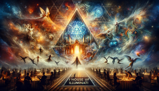
Their attention to detail is stunning, from how they left up the default first post every WP blog gets to how they didn't bother changing the name on several images, thus revealing where they came from. Like this one:

With the lovely and compact filename "DALL·E-2024-01-30-09.50.54-Imagine-a-scene-where-fantasy-and-reality-merge-seamlessly.-In-the-foreground-a-grand-interactive-gala-is-taking-place-filled-with-elegant-guests-i.png"
"Concept.png" came from the same AI generator that gets text almost, but not quiiiiiite right:
There are a suspicious number of .webp images in the uploads, which makes me think they either stole them from other sites where AI "art" was uploaded or they didn't want to pay for the hi-res versions of some and just grabbed the preview image.
The real fun came when I noticed this filename: Before-and-After-Eventologists-Transformation-Edgbaston-Cricket-Ground-1024x1024-1.jpg and decided to do a Google image search. Friends, you will be shocked to hear that the image in question, found on this post touting how they can transform a boring warehouse into a fun event space, was stolen from this actual event planner.
Even better, this weirdly grainy image?

From a post that claims to be about the preparations for a "Willy Wonka" experience (we'll get to this in a minute), is not only NOT an actual image of anyone preparing anything for Illuminati's event, it is stolen from a YouTube thumbnail that's been chopped to remove the name of the company that actually made this. Here's the video.
If you actually read the blog posts they're all copypasta or some AI generated crap. To the point where this seems like not a real business at all. There's very specific business information at the bottom, but nothing else seems real.
As I said, I'm kinda surprised they put on an event at all. This has, "And then they ran off with all our money!" written all over it. I'm perplexed.
And also wondering when the copyright lawyers are gonna start calling, because...
This post explicitly says they're putting together a "Willy Wonka’s Chocolate Factory Experience" complete with golden tickets.
Somewhere along the line someone must have wised up, because the actual event was called "Willys Chocolate Experience" (note the lack of apostrophe) and the script they handed to the actors about 10 minutes before they were supposed to "perform" was about a "Willy McDuff" and his chocolate factory.
As I was going through this madness with friends in a chat, one pointed out that it took very little prompting to get the free Chat GPT to spit out an event description and such very similar to all this while avoiding copyrighted phrases. But he couldn't figure out where the McDuff came from since it wasn't the type of thing GPT would usually spit out...
Until he altered the prompt to include it would be happening in Glasgow, Scotland.
You cannot make this stuff up.
But truly, honestly, I do not even understand why they didn't take the money and run. Clearly this was all set up to be a scam. A lazy, AI generated scam.
Everything from the website to the event images to the copy to the "script" to the names of things was either stolen or AI generated (aka stolen). Hell, I'd be looking for some poor Japanese visitor wandering the streets of Glasgow, confused, after being jacked for his mascot costume.
HE LIVES IN THE WALLS, Y'ALL.
#long post#Willy Wonka#Wonka#Willy Wonka Experience#Willy Wonka Experience disaster#Willy's Chocolate Experience#Willys Chocolate Experience#THE UNKNOWN#Wish.com Oompa Loompa#House of Illuminati#AI#ai generated
8K notes
·
View notes
Text
NEW YEAR, NEW ME
( A collab with thee lovely lele @bloombabydoll )


If you want to reinvent and rebrand yourself, or just continue to make positive improvements in 2024, the first thing is to evaluate your current year.
EVALUATION
Reflect on how things went for you. Was there continuous growth? Were there many difficult times? Did you discover anything major about yourself and so on. Try to summarise your year in (a) paragraph(s) at least.
Oversee your goals. Which ones you didn’t, did achieve, difficult ones, easy ones and the impacts it had on your life.
Compare your dream girl then and now. Is your visualisation of your life currently different to the one you have now and why?
List any major losses or successes you’ve had in your life, and how they have helped you or why it matters to you.
This evaluation can be as detailed or simple as you like, but as long as you have a decent outline of your year.
PREPARING & PLANNING
To prepare for 2024, you want to know what you want life to be like in 2024. Something realistic to a point, but still is a growth journey.
Think of something that you can associate with 2024. This can be a word, a symbol, art, a song, a book, a movie, a place, or even just all of these things. When you think about your goals and your journey, this is your theme. This is something that should relate to your goals or your dream girl somehow.
For me, I chose a word and a song. My word is growth because, for me, 2023 was a year for just being able to shed my old self which I did achieve however I just felt there wasn’t much growth as an actual person and not just in my environment.
For my song, it is Mayflowers by Proleters and Taskrok. This song is the epitome of what I would imagine, is the most polished mindset. I would say perfect, but having a perfect mindset is near impossible. I want to have a mindset glow up because I’ve just been hard on myself lately which has caused my confidence to plummet.
Before we get into the fun part of the preparation stage, we have to do some organisation in our life. I want you to take a look at your daily lifestyle and your habits, and be completely unashamed about this.
Then categorise these habits into two sections; Leave and Leap. Leave habits are habits that you are leaving behind in 2023, leap habits are habits that are leaping into 2024 with you.
Any habits that are self-destructive, addictive or generally harmful are leave habits. Beneficial habits and self-building are leaping with you into the new year.
I want you to do the same for people in your life, all environments (school, work, online etc) and anything else you believe needs to be sorted out.
This works better if you can reason with yourself why it is a leaping or leaving habit, but don’t try to convince yourself a bad habit is good or vice versa.
Now, I want you to document an honest paragraph about who you are right now. List your bad and good habits, your strengths and weaknesses and your behaviours. This one requires a bit more detail.
Then, write a paragraph about who you will be in 2024, your dream girl. List her habits, lifestyle, behaviours, mindset, strengths and anything else extra. I’ll explain later but do not include materialistic desires in this your dream girl. Once again, this one also requires details.
Stemming from those paragraphs, I want you to create specific and achievable goals. SMART goals are best, but I want to introduce you to how I set goals.
I divide my year into quarters. For each 3 months, I have 3-5 goals for those months. Usually, it’s one from each area of my life. Then, I break down these goals.
Questions and How They Help
Why do I want to do this goal - For motivation and commitment.
How it’ll benefit me - For the sake of improvement.
How can I involve myself in this goal - To achieve your goal.
I prefer this method because it is a lot simpler for me, as I am just a young girl and my bigger goals are more in the future in which I’ll utilise SMART goals.
To create good goals; Make sure they align with your current values and life principles first. Try to avoid creating goals that you have just taken from the internet. Those goals just aren’t it and you most likely won’t follow through with it.
Be specific. Don’t say you want to eat more healthily, instead say you want to include (a certain group of veggies/fruits) in your diet and reduce the intake of ( food/drink).
E.g using eating healthy example
I want to eat healthy -> I want to start including foods that boost my immunity system and support my skin while reducing those that have the opposite effect.
Then break down those quarterly goals into monthly, weekly and daily goals. Make these habits that you can establish in your lifestyle and have a way in which you can refer back to your progress.
EXAMPLE GOAL BREAKDOWN
Quarterly Goal - Read 6 books.
Monthly Goal - Finish 2 books.
Weekly Goal - Be or near half way of one book.
Daily Goal - 20 minutes of reading per day.
AREAS TO SET GOALS IN YOUR LIFE
Academics
Spiritual
Fitness/sport
Health and wellbeing
Mental health
Personal life
Relationships
Hobbies and recreation
Now for the best part- vision boards! Collect all of your favourite images that embody your quarters or the whole year, then put them in one place where you can see them regularly!
Some ideas are a scrapbook, Pinterest boards, mood boards, playlists etc.
Choose your theme; It can be your healthy girl era, your academic come back or whatever you want. You can have more than two btw.
Use quotes! Then actually say them in your daily life as a way to shift your mindset to reflect said quote.
Include inspirational people. It doesn't even have to be a millionaire or a very well established person, it could be your friends or someone on the internet.
Be imaginative. Your vision board doesn't have to realistic in my opinion, as the whole point of it to me is that viewing it daily and considering it to be part of your life one day allows for you to open up to those opportunities.
Materialistic Wants
I feel obligated to make this a separate section. This section is practically tangible objects that you want.
However, when choosing this said object that you want, mindfully think about why you want that thing specifically.
It doesn’t have to be meaningful, but as long as each thing on that list has got a purpose to you, and will serve you, I think it’s all good!
Conclusion
If you want, you can definitely start implementing habits before January. However, I believe that as long as you go into 2024 at least knowing who you want to be and shedding away any limiting beliefs, you’ll be fine.
Make sure to incorporate some self care rituals into your daily life as well✨
To end this, I hope everyone has a very merry Christmas! And that 2024 they will achieve to close that gap with their current selves and their dream girl selves! 💖🙏
#that girl lifestyle#becoming her#becoming that girl#that girl#green juice girl#clean girl#pink pilates princess#pink pilates girl#pink pill#wonyoungism#new year#new me#reinvent yourself#im rebranding#resetting#self worth#self help#self reflection#self growth#self love#self care#self improvement#self development#inner peace#inner work#self reflecting
3K notes
·
View notes
Text
My Favorite Cheap Art Trick: Gradient Maps and Blending Modes
i get questions on occasion regarding my coloring process, so i thought i would do a bit of a write up on my "secret technique." i don't think it really is that much of a secret, but i hope it can be helpful to someone. to that end:

this is one of my favorite tags ive ever gotten on my art. i think of it often. the pieces in question are all monochrome - sort of.

the left version is the final version, the right version is technically the original. in the final version, to me, the blues are pretty stark, while the greens and magentas are less so. there is some color theory thing going on here that i dont have a good cerebral understanding of and i wont pretend otherwise. i think i watched a youtube video on it once but it went in one ear and out the other. i just pick whatever colors look nicest based on whatever vibe im going for.

this one is more subtle, i think. can you tell the difference? there's nothing wrong with 100% greyscale art, but i like the depth that adding just a hint of color can bring.
i'll note that the examples i'll be using in this post all began as purely greyscale, but this is a process i use for just about every piece of art i make, including the full color ones. i'll use the recent mithrun art i made to demonstrate. additionally, i use clip studio paint, but the general concept should be transferable to other art programs.


for fun let's just start with Making The Picture. i've been thinking of making this writeup for a while and had it in mind while drawing this piece. beyond that, i didn't really have much of a plan for this outside of "mithrun looks down and hair goes woosh." i also really like all of the vertical lines in the canary uniform so i wanted to include those too but like. gone a little hog wild. that is the extent of my "concept." i do not remember why i had the thought of integrating a shattered mirror type of theme. i think i wanted to distract a bit from the awkward pose and cover it up some LOL but anyway. this lack of planning or thought will come into play later.
note 1: the textured marker brush i specifically use is the "bordered light marker" from daub. it is one of my favorite brushes in the history of forever and the daub mega brush pack is one of the best purchases ive ever made. highly recommend!!!
note 2: "what do you mean by exclusion and difference?" they are layer blending modes and not important to the overall lesson of this post but for transparency i wanted to say how i got these "effects." anyway!
with the background figured out, this is the point at which i generally merge all of my layers, duplicate said merged layer, and Then i begin experimenting with gradient maps. what are gradient maps?
the basic gist is that gradient maps replace the colors of an image based on their value.

so, with this particular gradient map, black will be replaced with that orangey red tone, white will be replaced with the seafoamy green tone, etc. this particular gradient map i'm using as an example is very bright and saturated, but the colors can be literally anything.

these two sets are the ones i use most. they can be downloaded for free here and here if you have csp. there are many gradient map sets out there. and you can make your own!
you can apply a gradient map directly onto a specific layer in csp by going to edit>tonal correction>gradient map. to apply one indirectly, you can use a correction layer through layer>new correction layer>gradient map. honestly, correction layers are probably the better way to go, because you can adjust your gradient map whenever you want after creating the layer, whereas if you directly apply a gradient map to a layer thats like. it. it's done. if you want to make changes to the applied gradient map, you have to undo it and then reapply it. i don't use correction layers because i am old and stuck in my ways, but it's good to know what your options are.

this is what a correction layer looks like. it sits on top and applies the gradient map to the layers underneath it, so you can also change the layers beneath however and whenever you want. you can adjust the gradient map by double clicking the layer. there are also correction layers for tone curves, brightness/contrast, etc. many such useful things in this program.
let's see how mithrun looks when we apply that first gradient map we looked at.

gadzooks. apologies for eyestrain. we have turned mithrun into a neon hellscape, which might work for some pieces, but not this one. we can fix that by changing the layer blending mode, aka this laundry list of words:

some of them are self explanatory, like darken and lighten, while some of them i genuinely don't understand how they are meant to work and couldn't explain them to you, even if i do use them. i'm sure someone out there has written out an explanation for each and every one of them, but i've learned primarily by clicking on them to see what they do.
for the topic of this post, the blending mode of interest is soft light. so let's take hotline miamithrun and change the layer blending mode to soft light.

here it is at 100% opacity. this is the point at which i'd like to explain why i like using textured brushes so much - it makes it very easy to get subtle color variation when i use this Secret Technique. look at the striation in the upper right background! so tasty. however, to me, these colors are still a bit "much." so let's lower the opacity.

i think thats a lot nicer to look at, personally, but i dont really like these colors together. how about we try some other ones?

i like both of these a lot more. the palettes give the piece different vibes, at which point i have to ask myself: What Are The Vibes, Actually? well, to be honest i didn't really have a great answer because again, i didn't plan this out very much at all. however. i knew in my heart that there was too much color contrast going on and it was detracting from the two other contrasts in here: the light and dark values and the sharp and soft shapes. i wanted mithrun's head to be the main focal point. for a different illustration, colors like this might work great, but this is not that hypothetical illustration, so let's bring the opacity down again.

yippee!! that's getting closer to what my heart wants. for fun, let's see what this looks like if we change the blending mode to color.

i do like how these look but in the end they do not align with my heart. oh well. fun to experiment with though! good to keep in mind for a different piece, maybe! i often change blending modes just to see what happens, and sometimes it works, sometimes it doesn't. i very much cannot stress enough that much of my artistic process is clicking buttons i only sort of understand. for fun.
i ended up choosing the gradient map on the right because i liked that it was close to the actual canary uniform colors (sorta). it's at an even lower opacity though because there was Still too much color for my dear heart.

the actual process for this looks like me setting my merged layer to soft light at around 20% opacity and then clicking every single gradient map in my collection and seeing which one Works. sometimes i will do this multiple times and have multiple soft light and/or color layers combined.
typically at this point i merge everything again and do minor contrast adjustments using tone curves, which is another tool i find very fun to play around with. then for this piece in particular i did some finishing touches and decided that the white border was distracting so i cropped it. and then it's done!!! yay!!!!!
this process is a very simple and "fast" way to add more depth and visual interest to a piece without being overbearing. well, it's fast if you aren't indecisive like me, or if you are better at planning.

let's do another comparison. personally i feel that the hint of color on the left version makes mithrun look just a bit more unwell (this is a positive thing) and it makes the contrast on his arm a lot more pleasing to look at. someone who understands color theory better than i do might have more to say on the specifics, but that's honestly all i got.

just dont look at my layers too hard. ok?
1K notes
·
View notes
Note
I’m not trying to attack you, but do you know that proshipper means someone who supports and romanticizes pedophilia, incest, and abuse? Your reblog on that post seems to read that you think antis just hate on people for having ships they don’t like. But it’s completely different than that. Just looking on the proshipper side of Tumblr and the internet and you can see people happily shipping children and adults and making nsfw content of such things.
i appreciate that you're not being outright hostile, but i have to say, that on its own put you above basically every anti i've interacted with.
i understand where antis are coming from, i really do. there are a lot of things on the internet that make me deeply uncomfortable, including the minor/adult ships that you mention. i don't want to anything to do with those kinds of ships and i would be happiest if i never saw them again. which is why i'm proship.
nine times out of ten, if i see that kind of ship brought up on my dash, it's because i was following an anti without realizing it, and they brought it up unprompted and untagged, to talk about how bad it is that they exist. they are the ones putting that kind of content in front of my face and making it harder to avoid.
the thing about people who ship those ships is that they're generally very aware that not everyone wants to see that kind of content, and so they tag it. they make sideblogs to talk about it. they don't go out of their way to shove it in people's faces. that means i, and everyone else who doesn't like it, can avoid it.
what antis want is for it to not exist at all. they want the tags to be purged and blocked, and for anyone who uses those tags to have their accounts deleted. and sure, that might get rid of some of it, but do you know what would happen to the rest? it would stop being tagged. people who don't want to see it wouldn't have the tools to avoid it. this isn't just a hypothetical, that's what's happened any time a fan space has tried to do that.
that's not even getting into the rabbit hole of what should be banned and what shouldn't. obviously any content that depicts real children or real life abuse shouldn't exist and shouldn't be allowed to be posted, but basically any platform that people use already enforces those policies, and there's not much of a slippery slope to go down there. if it involves real living breathing people being abused, it's bad. end of discussion.
but the same can't be said for fiction. ask ten antis for a specific list of all the content that should be banned, and you'll get ten different answers. what about kink? what about roleplay? what about horror and murder and anything that involves fictional characters being graphically tortured? what about people using art to process terrible things that have happened to them? what about art that uses dark themes as a horror element? if you just want to ban anything questionable to anyone, that's the line of thinking that gets any mention of lgbt existence banned. and again, this isn't just a hypothetical, this has happened before, and that's generally where it leads.
i know, from personal experience, that antis do, in fact, send harassment to people just for shipping things they don't like. i've gotten accused of absolutely vile shit for shipping two fictional characters who were both consenting adults. i've seen ship wars turn into moral battlegrounds, over ships that an average person wouldn't bat an eye at.
the thing about "romanticization" is a whole other can of worms. the anti logic goes like this: if someone sees something (even if it's very obviously fictional) in a positive light enough times, they will start thinking it's okay in real life, and go on to hurt real people. the problem with that is that it's just. blatantly untrue.
if it were true every horror movie fan would be a serial killer, every person that studies dark media would be an unhinged psychopath, and everyone who is into ddlg would be a pedophile. but they're not. they just aren't. people have directed movies just as fucked up as the darkest shit on ao3, and are still capable of being normal human beings who know right from wrong in real life.
even if someone is that impressionable, scrubbing away the existence of every piece of questionable content isn't going to solve their problem, because they're still going to be vulnerable to con men, scams, and cultists. the only thing that would actually materially help someone like that is developing their own morals and critical thinking.
children are also more impressionable, and there's a lot of content that's not suitable for them, but that doesn't mean that content shouldn't exist. it just means that they should stick to spaces designed for them (which most social media sites, tumblr included, are not) or, if they're old enough to be responsible for their experience online, they, or a trusted adult in their lives, should block and filter out things that they aren't comfortable with.
which is what everyone on the internet should be doing. it's what i do, and it's made the internet a much more pleasant place to be. and it's why i sometimes worry for antis mental health, especially teenagers, because they're being told it's right and moral to seek out content that makes them uncomfortable and to engage with the people making it. and that's just. really bad. it's not good for the creators that they're harassing obviously, but it's also really bad for them! it's not healthy to seek out things that make you feel bad, and it's a terrible internet safety lesson to teach minors that it's okay for them to seek out and engage with people making adult content.
individual harassment and crusading is never going to succeed at removing dark content from the internet. it just isn't. at best you might get a small percentage of people who create that content to stop sharing it, at worst you're just going to make people stop tagging it, and either way, you're exposing yourself to things that make you feel bad, when you don't have to.
if you want to materially change the type of content you see, you can. the block button is your friend, use it liberally. same with content filtering and tag blocking.
#oops this got really long#cd.ask#proship#disk horse#tw pedophila mention#uhhh what to tag#tw shipping discourse#this doesn't even get into the antis that i've seen proudly professing that they care more about fictional characters than real people#because i don't know how to explain to someone that real humans matter more than cartoon characters#or how to avoid content on platforms other than tumblr bc frankly thats a lot of the reason i don't use them#i don't trust an algorithm#also im turning anon off after posting this so if you want to send me hate you cant be a coward about it#also be prepared to get blocked and ignored#the only reason i answered this person is bc they weren't being hostile
15K notes
·
View notes
Text
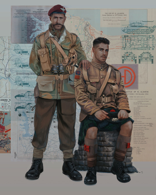
Ok! I've finally decided to put together a (somewhat) comprehensive tutorial on my latest art~
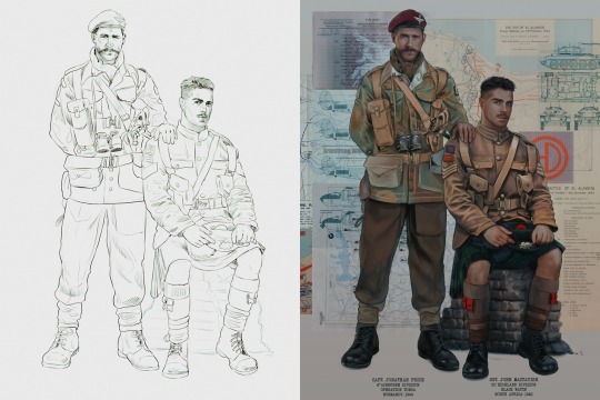
Please enjoy this little step-by-step 💁♀️
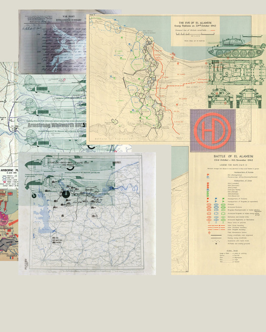
First things first--references!
Now I'm not saying you have to go overboard, but I always find that this is a crucial starting point in any art piece I intend on making. Especially if you're a detail freak like me and want to make it as realistic as possible 🙃
As such, your web browser should look like this at any given point:

Since this is a historical piece, it means hours upon hours of meaningless research just to see what color the socks are, but...again. that isn't, strictly, necessary 😅
Once I've compiled all my lovely ref pics, I usually dump them into a big-ass collage ⬇️
(I will end up not using half of these, alas :'D)
Another reference search for background material, and getting to showcase our models of choice for this occasion~
When picking a reference for an actor or model, the main thing I keep in mind (besides prettiness 🤭) is lighting and orientation. Because I already kinda know what pose I'm gonna go with for this piece, I can look for specific angles that might fit the criteria. I should mention that I am a reference hound, and my current COD actor ref folder looks like this:
Also keep in mind, if you're using a ref that you need to flip, make sure you adjust accordingly. This especially applies to clothing, as certain things like pants zippers and belt buckles can be quite specific ☝️
Now that we've spent countless hours googling, it's time to start with a rough sketch:
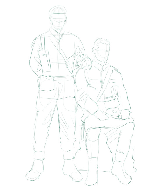
It doesn't have to be pretty, folks, just a basic guideline of where you want the figures to be.
The next step is to define it more, and I know this looks like that 'how to draw an owl' meme, but I promise--getting from the loose sketch above to below is not that difficult.
Things to keep in mind are--don't go too in-depth with the details, because things are still subject to change at this point. In terms of making a suitable anatomically-correct sketch, I would suggest lots of studying. This doesn't even have to be things like figure drawing, I genuinely look at people around me for inspiration all the time. Familiarize yourself with the human form, and things like weight, proportions, posing will seem a little more feasible.
It's also important at this stage to consider your composition. Remember to flip the canvas frequently to make sure you're not leaning to one side too often. I'm sure something can be said for the spiral fibonacci stuff, which I don't really try to do on purpose, but I think keeping things like symmetry and balance in mind is a good start ✌️
Next step is just blocking in the figures. Standard. No fuss 👍
Now onto the background!
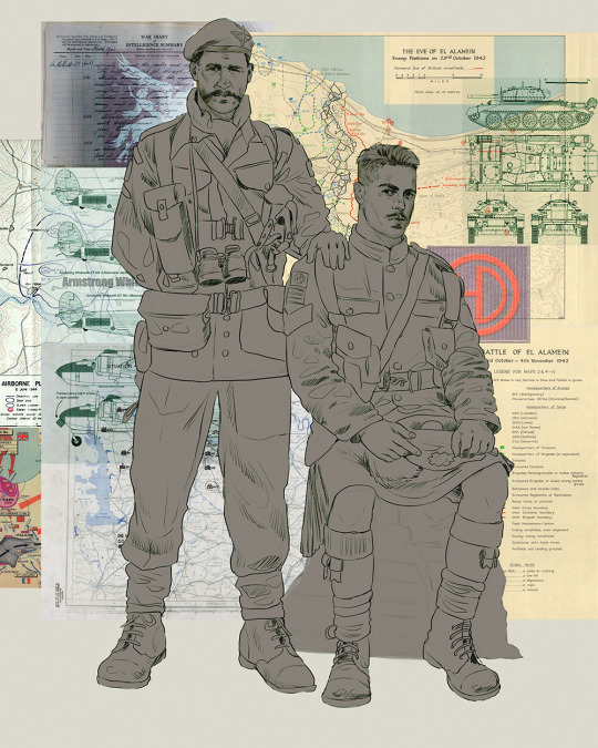
It's frankly hilarious how many people thought I was *hand-drawing* these maps and stuff 😂😂 I cannot even begin to comprehend how insanely difficult that would be. So yeah, we're just taking the lazy copy and paste way out 🤙
I almost always prepare my backgrounds first, and this is mostly to get a general color scheme off the bat. For collage work, it's really just a matter of trial and error, sticking this here, slapping this there, etc. I like to futz around with different overlay options until I've found a nice arrangement. Advice for this is just--go nuts 🤷♀️
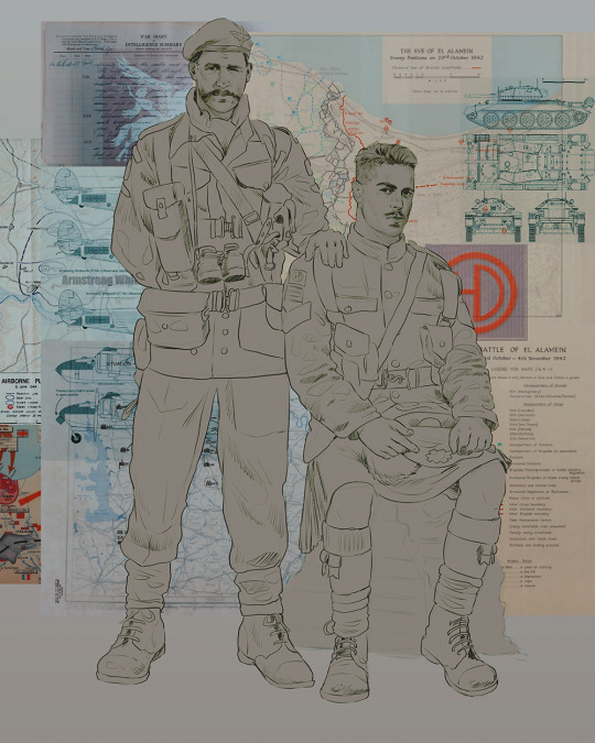
Next, I add a few color adjustments. I tend to make at least 2 colors pop in an art piece, and low and behold, they usually tend to be red and blue ❤️💙There's something about warm/cool vibes, idk man..
Now we move on to coloring the figures. This is just a basic block and fill, not really defining any of the details yet.
Next, we add some cursory values. Sloppy airbrush works fine, it'll look better soon I promise 🙏
And now--rendering!
I know a lot of beginner artists are intimidated by rendering, and I can totally understand why. It's just one of those things you have to commit to 💪
I've decided to show a brief process of rendering our dear Johnny's face here:
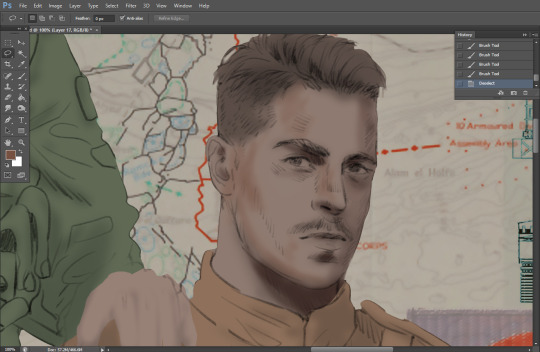
Starting off, I usually rely on the trusty airbrush just to get some color values going. Note--I've kept my sketch layer on top, but feel free to turn it on and off as you work, so as to not be too bound to the sketch. For now, it's just a guideline.
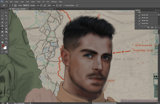
This next stage may look like a huge jump, but it's really just adding more to the foundation. I try to think of it like putting on make-up in a way~ Adding contours, accentuating highlights. This is also where I start adding in more saturation, especially around areas such as ears, nose and lips. Still a bit fuzzy at this point, but that's why we keep adding to it 💪
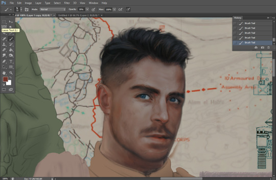
A boy has appeared! See--now I've removed most of the line layer, and it holds up on its own. I'll admit that in order to achieve this realistic style, you'll need lots and lots of practice and skill, which shouldn't be discouraging! Just motivate yourself with the prospect of getting to look at pretty men for countless hours 🙆♀️
I'll probably do a more in-depth explanation about rendering at some point, but let's keep this rolling~
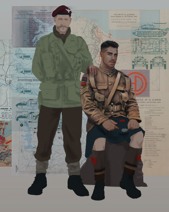
Moving forward is just a process of adding to the figures bit by bit. I do lean towards filling in each section from top to bottom, but you can feel free to pop around to certain parts that appeal to you more. I almost always do the faces first though, because if they end up sucking, I feel less guilty about scrapping it 😂 But no--I think he's pretty enough to proceed 😚
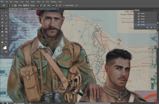
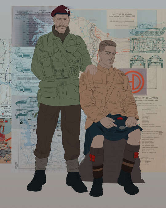
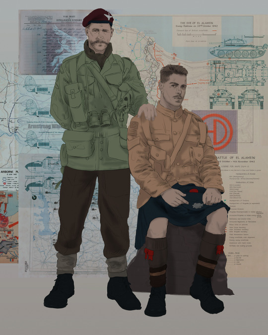
They're coming together now 🙆♀️ Another helpful tip--make sure you reuse color. By that, I mean--try to incorporate various colors throughout your piece, using the eyedropper tool to keep a consistent palette. I try to put in bits of red and blue where I can
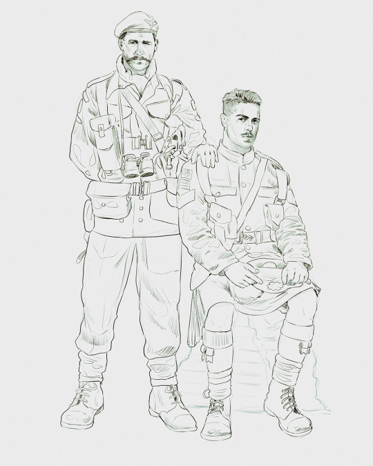
Here they are fully rendered! Notice I've made a few subtle changes from the sketch, like adjusting the belt buckles because I made a mistake 😬 Hence why you shouldn't put too much stock in your initial sketch~
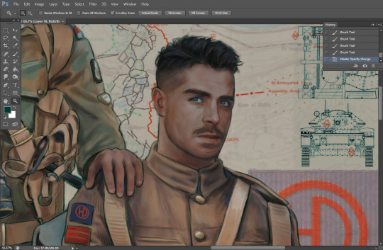
The next step is more of a stylistic choice, but I usually go over everything with an outline, typically in a bright color like green. Occasionally, I can just use my initial line layer, but for this, I've made a brand new, cleaner line 👍
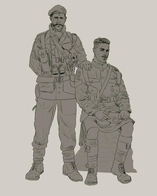
And the final step is adjusting the color and adding some text:
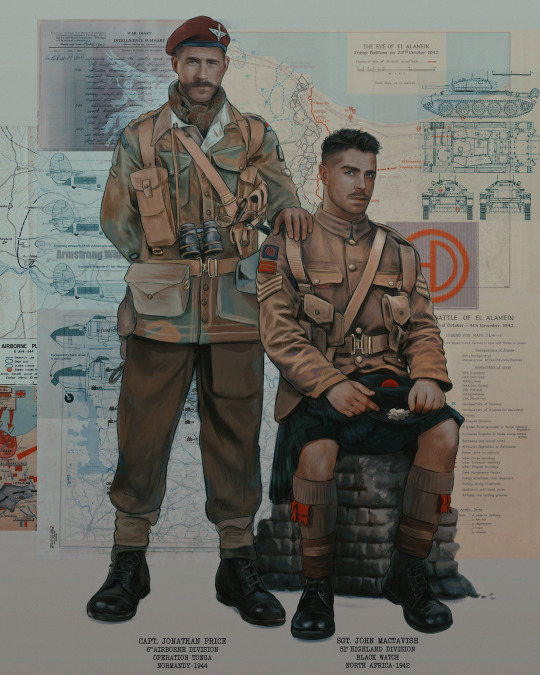
Tada!! It's done!
All in all, this took me the better part of a week, but I have a lot of free time, so yeah ✌️
I hope you appreciated that little walkthrough~ I know people have been asking me how I do my art, but the truth is--I usually have no clue how to explain myself 😅 So have this half-assed tutorial~
As a bonus, here is a cute (cursed) image of Johnny without his mustache:
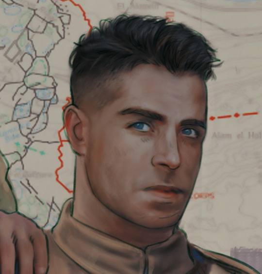
A baby, a literal infant child !!! who put this wee bairn on the front lines ??! 😭
Anyway! peace out ✌️
#tutorial#my art#art tutorial#since people have been asking#I remembered to save my process from this latest work~#enjoy 🙆♀️
1K notes
·
View notes
Text
not tw*tter artists already skinnyfying g3 dr*culaura. can i have one character that has my body type without ppl looking at them and immediately going “eh not good enough” and making them skinny as fuck
#its been like 2 weeks!#paperheart.txt#seriously it does not. make me feel good about myself.#like you can claim its your art style all you want but if you can only draw thin ppl with 0 body fat anywhere... you should question why.#im not gonna say like its harder for me to find characters like me than fat ppl. for sure.#but like. its pretty hard for me to find characters with such an exact replication of my body type. im kinda stout.#and i have very thick thighs and legs. and a very soft body in general. like i have a slight hourglass but im pretty soft#most characters that are thick like me have a very exaggerated hourglass and pretty hard edges. theyre not like. slightly chubby like i am.#and i finally see one who was my favorite character for ages that i related to the most which is fucking !!!!!!!! good lord!!!!!!!!#and ppl see her body type and are like 'ok well im gonna do what i want anyway'#like. i know this isnt targeting ME specifically. but dont you think thats gonna make ppl with that body type#feel like ppl dont want to see ppl who look like them. because thats how it makes me feel.#ask 2 tag
1 note
·
View note
Last Seen Blogs