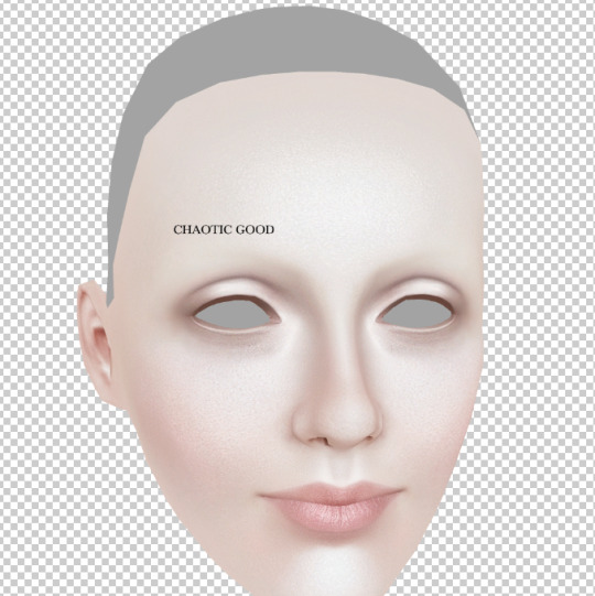
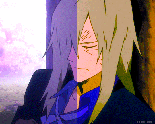
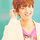
#wanted to experiment with some color correction techniques
Text
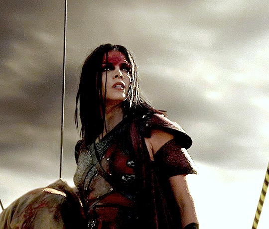
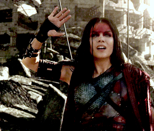
blodreina
» pandora's box
#The 100#Blodreina#Marie Avgeropoulos#the100edit#wanted to experiment with some color correction techniques#and this was the result#I think it turned out amazing
52 notes
·
View notes
Text
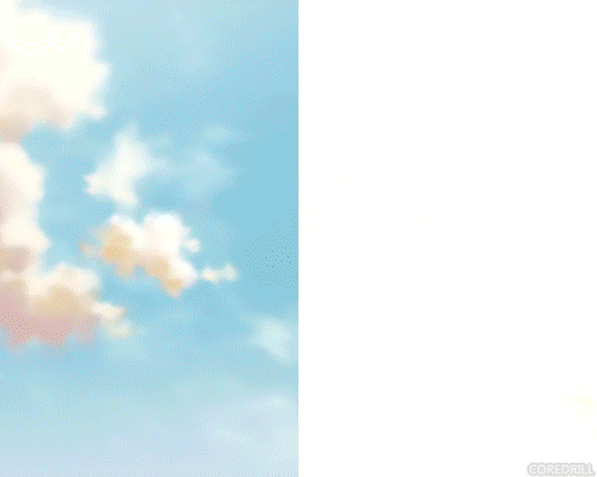
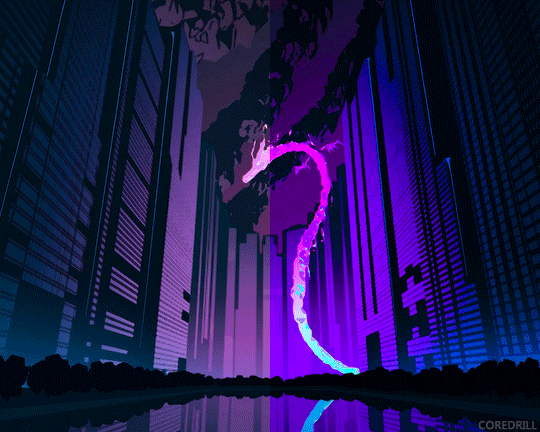
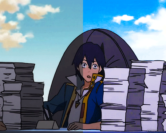
My Favorite Cheap Art Trick: Gradient Maps and Blending Modes
i get questions on occasion regarding my coloring process, so i thought i would do a bit of a write up on my "secret technique." i don't think it really is that much of a secret, but i hope it can be helpful to someone. to that end:

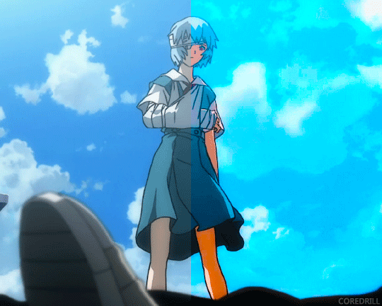
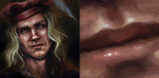
this is one of my favorite tags ive ever gotten on my art. i think of it often. the pieces in question are all monochrome - sort of.

the left version is the final version, the right version is technically the original. in the final version, to me, the blues are pretty stark, while the greens and magentas are less so. there is some color theory thing going on here that i dont have a good cerebral understanding of and i wont pretend otherwise. i think i watched a youtube video on it once but it went in one ear and out the other. i just pick whatever colors look nicest based on whatever vibe im going for.

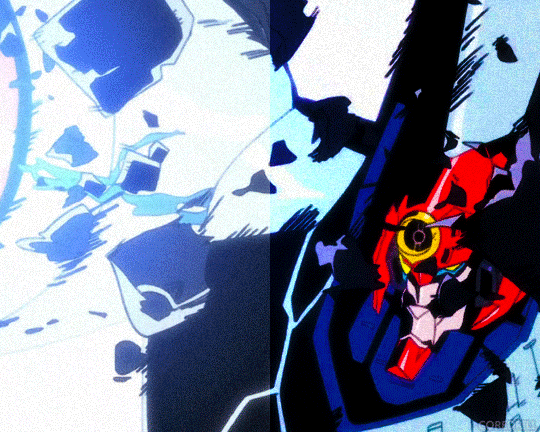
this one is more subtle, i think. can you tell the difference? there's nothing wrong with 100% greyscale art, but i like the depth that adding just a hint of color can bring.
i'll note that the examples i'll be using in this post all began as purely greyscale, but this is a process i use for just about every piece of art i make, including the full color ones. i'll use the recent mithrun art i made to demonstrate. additionally, i use clip studio paint, but the general concept should be transferable to other art programs.


for fun let's just start with Making The Picture. i've been thinking of making this writeup for a while and had it in mind while drawing this piece. beyond that, i didn't really have much of a plan for this outside of "mithrun looks down and hair goes woosh." i also really like all of the vertical lines in the canary uniform so i wanted to include those too but like. gone a little hog wild. that is the extent of my "concept." i do not remember why i had the thought of integrating a shattered mirror type of theme. i think i wanted to distract a bit from the awkward pose and cover it up some LOL but anyway. this lack of planning or thought will come into play later.
note 1: the textured marker brush i specifically use is the "bordered light marker" from daub. it is one of my favorite brushes in the history of forever and the daub mega brush pack is one of the best purchases ive ever made. highly recommend!!!
note 2: "what do you mean by exclusion and difference?" they are layer blending modes and not important to the overall lesson of this post but for transparency i wanted to say how i got these "effects." anyway!
with the background figured out, this is the point at which i generally merge all of my layers, duplicate said merged layer, and Then i begin experimenting with gradient maps. what are gradient maps?
the basic gist is that gradient maps replace the colors of an image based on their value.

so, with this particular gradient map, black will be replaced with that orangey red tone, white will be replaced with the seafoamy green tone, etc. this particular gradient map i'm using as an example is very bright and saturated, but the colors can be literally anything.

these two sets are the ones i use most. they can be downloaded for free here and here if you have csp. there are many gradient map sets out there. and you can make your own!
you can apply a gradient map directly onto a specific layer in csp by going to edit>tonal correction>gradient map. to apply one indirectly, you can use a correction layer through layer>new correction layer>gradient map. honestly, correction layers are probably the better way to go, because you can adjust your gradient map whenever you want after creating the layer, whereas if you directly apply a gradient map to a layer thats like. it. it's done. if you want to make changes to the applied gradient map, you have to undo it and then reapply it. i don't use correction layers because i am old and stuck in my ways, but it's good to know what your options are.

this is what a correction layer looks like. it sits on top and applies the gradient map to the layers underneath it, so you can also change the layers beneath however and whenever you want. you can adjust the gradient map by double clicking the layer. there are also correction layers for tone curves, brightness/contrast, etc. many such useful things in this program.
let's see how mithrun looks when we apply that first gradient map we looked at.

gadzooks. apologies for eyestrain. we have turned mithrun into a neon hellscape, which might work for some pieces, but not this one. we can fix that by changing the layer blending mode, aka this laundry list of words:

some of them are self explanatory, like darken and lighten, while some of them i genuinely don't understand how they are meant to work and couldn't explain them to you, even if i do use them. i'm sure someone out there has written out an explanation for each and every one of them, but i've learned primarily by clicking on them to see what they do.
for the topic of this post, the blending mode of interest is soft light. so let's take hotline miamithrun and change the layer blending mode to soft light.

here it is at 100% opacity. this is the point at which i'd like to explain why i like using textured brushes so much - it makes it very easy to get subtle color variation when i use this Secret Technique. look at the striation in the upper right background! so tasty. however, to me, these colors are still a bit "much." so let's lower the opacity.

i think thats a lot nicer to look at, personally, but i dont really like these colors together. how about we try some other ones?

i like both of these a lot more. the palettes give the piece different vibes, at which point i have to ask myself: What Are The Vibes, Actually? well, to be honest i didn't really have a great answer because again, i didn't plan this out very much at all. however. i knew in my heart that there was too much color contrast going on and it was detracting from the two other contrasts in here: the light and dark values and the sharp and soft shapes. i wanted mithrun's head to be the main focal point. for a different illustration, colors like this might work great, but this is not that hypothetical illustration, so let's bring the opacity down again.

yippee!! that's getting closer to what my heart wants. for fun, let's see what this looks like if we change the blending mode to color.

i do like how these look but in the end they do not align with my heart. oh well. fun to experiment with though! good to keep in mind for a different piece, maybe! i often change blending modes just to see what happens, and sometimes it works, sometimes it doesn't. i very much cannot stress enough that much of my artistic process is clicking buttons i only sort of understand. for fun.
i ended up choosing the gradient map on the right because i liked that it was close to the actual canary uniform colors (sorta). it's at an even lower opacity though because there was Still too much color for my dear heart.

the actual process for this looks like me setting my merged layer to soft light at around 20% opacity and then clicking every single gradient map in my collection and seeing which one Works. sometimes i will do this multiple times and have multiple soft light and/or color layers combined.
typically at this point i merge everything again and do minor contrast adjustments using tone curves, which is another tool i find very fun to play around with. then for this piece in particular i did some finishing touches and decided that the white border was distracting so i cropped it. and then it's done!!! yay!!!!!
this process is a very simple and "fast" way to add more depth and visual interest to a piece without being overbearing. well, it's fast if you aren't indecisive like me, or if you are better at planning.

let's do another comparison. personally i feel that the hint of color on the left version makes mithrun look just a bit more unwell (this is a positive thing) and it makes the contrast on his arm a lot more pleasing to look at. someone who understands color theory better than i do might have more to say on the specifics, but that's honestly all i got.

just dont look at my layers too hard. ok?
2K notes
·
View notes
Note
Hello Lailoken! how can someone who's 'new to all this' tell if the entities they’re contacting in visions, dreams or any other 'otherworldly journey' are, indeed, fae to be trusted, or if it's just 'tricksters' and they’re being intentionally misled, or meant for harm? Are there any signs? what's your experience with discerning spirits' intentions? (divination aside, I feel any divination done by myself to try to unravel this would be 'tainted' or come untrue, but do correct me if I'm wrong! I also don’t want to depend on other people’s skills on divination to be able to do this safely...)
This is honestly a rather dense subject, but I will do my best to respond to some points you brought up here.
Firstly, here are some tips to keep in mind when attempting this kind of work:
— Learn to identify when and how you are experiencing legitimate numinous communications to begin with. Once you feel confident that you're dealing with real contact, then you can begin to work on parsing out what feels hinky and what feels trustworthy. Working on meditation, dream recall, divination, and other such techniques can do a lot to help you strengthen these skills.
— Use/develop wards that can be put in place when attempting to interact with spirits. Someone could write a whole monograph just on warding techniques, but suffice it to say that you're going to want to be proficient in warding before attempting to work with most spirits. At the least, I think it's important to have wards in place against physical harm, psychological contamination, and deception, as these are the main things one generally has to worry about if interacting with a dangerous spirit. Learning to employ these wards when divining is also an important part of how you learn to trust more in divination for looking into this sort of matter.
— Keep close track of your interactions and suspected interactions with spirits. Doing this helps to give a more "fleshed out" sense of the Wight in question, by allowing you to look over the record of their behavior. This also helps with identifying any possible lies or inconsistencies put forward by the spirit.
— Set clear boundaries with any spirits, and be wary of wights who disregard or consistently push those boundaries. Sometimes, spirits can help push us to grow and evolve, even if it's not always comfortable. But just like mundane relationships, numinous relationships that demonstrate a consistent pattern of forceful and/or manipulative behavior are troubling.
There are also certain red flags I think are worth watching out for when attenpting to work with spirits:
— Have caution if a spirit always seems to say exactly what you want to hear. Having a good relationship with your Spirit Kith is a wonderful thing, but I tend to be untrusting of a spirit who consistently reflects back exactly what I'm hoping to see—particularly if said spirit is always clamoring for my attentions.
— Beware of consistently confusing or contradictory communications. Spirits can be coy or even downright confusing, but that isn't a red flag in and of itself. After all, numinous wights experience the world very differently from us, and their attempts to communicate can become "jumbled" when passing through the lens of our conscious understanding. Whats more, they sometimes speak in riddles for their own reasons. But if a spirit tells outright lies, or if they seem to pull you every which way based on cold whims, that's something worth being concerned over.
— Be on guard if a spirit starts out by acting very gentle and affable with you, but becomes progressively controlling and aggressive over time. Abusive humans have a tendency to show their true colors gradually as a way to draw in and then trap potential victims, and this same tactic is often seen with spirits as well.
— Suspicion is in order if you tend to become fatigued, dizzy, and/or confused when/after interacting with a spirit. To be fair, these experiences can be a normal part of spirit work, in general, for many people—especially if you're new to it. But if it's pervasive or extreme, or if you start to also experience pain, then it's usually worth being wary. The same goes for other troubling physical symptomology, but these are the most common symptoms I've come across.
— Something isn't right if bad things frequently happen in relation to the spirit. If you've been having terrible nightmares ever since the spirit came into your life, that's concerning. If you or your loved ones always seem to become sick or injured when you do something to displease the spirit, then that's worrisome. If you've been experiencing continual hardships or traumas since the arrival of a spirit, that's alarming. Especially when these things somehow funnel back into you giving the spirit more attention and energy (asking them for solace and protection, for instance.)
66 notes
·
View notes
Note
Hey! I’ve been following you for a while and I really love your art, it’s absolutely stunning and I love the way you paint and capture anatomy. I know this is a bit of a broad question but I was wondering if you had any tips on getting better at painting digitally and studying anatomy, maybe more specifically blending, colour picking, and structuring anatomy in a way that looks somewhat realistic?
Thanks and I'm glad you enjoy my work long enough to be following me for this long!
I definitely love drawing a naked body that's for sure haha. In terms of tips for getting better there's a few things I can mention but it's going to fall broadly in the general answer of "study", because this is the most sure fire way to be able to understand what it is you're trying to emulate in your art.
There are different ways to study, and they teach something slightly different. For example, doing studies from life (live drawing classes) help me understand movement in a way studying from a photograph cant, simply because you're seeing the same model in different poses in real time, you can see how the fat and muscle moves around as they shift to different positions. So they're not technically moving the whole time, but you're still seeing some movement there, and understanding what sticks to what while it rotates and bends.
Studying from photographs can help give you time to do some real deep dives and investigate where different bones/muscles sit while someone is in a particular position. There's also the opportunity for understanding how shadows may be formed by the body as typically photographers are more conscious of how the subject may be lit than what may be available in a live drawing class. Beware though, as more things are photoshopped than you realise, not all photos represent reality. Especially glam and fashion photos. It doesn't mean its bad to want to have these effects on your work but just be conscious they might not always be anatomy accurate if that's what you're striving for. I sometimes make a conscious decision to go against what is anatomically correct for a certain effect myself.
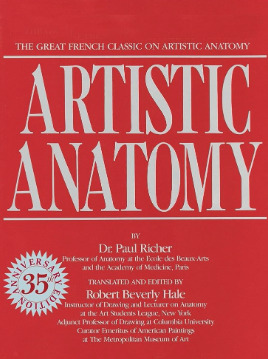
A book I have been recommending for years for anatomy is Dr. Paul RIcher's "Artistic Anatomy". It's great for understanding muscle structure intimately - it's designed specifically for artists, but with the idea of trying to stylise the diagrams as little as possible for the sake of understanding the human form. There's a lot of great info and detail in here, but beware, there is not a lot of variety in body structure (at least not in the edition I have which is missing female anatomy I think already so I'm not sure what else I don't have in here). So you'll be able to understand function a lot from here but you wont be able to learn a lot about fatter body types sadly.
Colour picking is probably the most difficult for me to explain easily, as I have spent a long time winging it, then studying it, then being really experimental with it. I could write a lot a lot about this but to spare making this post any longer I'll refer to another fun book just for getting started on some frequent and common terms called "Color and Light" by James Gurney.
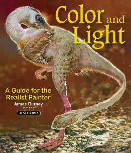
I also love that he uses like, dinosaurs for everything in here lol. It's a great starting point that can give you some go to ideas that you can then experiment from there. It's not very authoritarian (or at least that's what I feel), and doesn't push anything forward as a hard and fast rule, just showing what affects some colour combinations might instil in someone.
As a whole, I've gotten better at painting digitally by studying traditional painting techniques. They theories are basically transferrable one to one with some few exceptions. I tend to blend my colours by simply using a soft round brush in Photoshop with a low opacity. Much the same way I would with a real canvas, with a large round brush and diluted colour.
I hope this answers your questions in some way. I tried to be not too specific only because this answer would be at least another 30k words lol because this is something i think a lot about! I love technique! If I ever stream again, feel free to pop in and ask more questions where I might be able to show some stuff in real time! Not sure when that will happen though!
Also the way i do stuff isn't a "correct" way either. I like painting from imagination so this is how I make that work. Some people like to only work with references for every piece, and that is a completely legit way to create stunning art as well.
Good luck!
61 notes
·
View notes
Note
I have so many thoughts about creep! bf gojo. Mainly bc he probably didn't get a lot of normal interactions as a kid, either he was being praised for being 'the chosen one' or left completely to his own devices. and so his sense of decency and normalcy are skewed so far off. He does what he wants and can't see the reason why that would be seen negatively, he loves you and he's clingy
n e way, creep! bf gojo steals your underwear 100%
-🦅
oh god….you really know your way to get to me, don’t you………..bc yes. yes, you are so correct . oh my god. i’ve talked about this before here and there but yes. i think satoru was very neglected growing up despite being born as a boy with a spark incomparable to any other, a special boy. the first descendant in the gojo clan in 400 years to inherit both limitless & six eyes.
and i think, even when he was little, a lot of people feared him bc of that. and naturally, the care and affection people usually show to a child provoked by the internal need to protect such a small being, that very sense to love and shield what needs to be loved and shielded, dulled before the eyes of fear. this, and the envy of prying eyes and all who wanted him gone before he fully blossomed into something bigger, sow the seeds of loneliness in him. he was an outcast, and not because he was looked down on but because he was looked up on, too much at that.
i don’t think he was ever truly loved, even by his parents actually. maybe they loved him to some extent. but not because he was their blood and a beloved symbol of their love. what made their chest swell was rather pride than love. and they were not proud of him, they were proud of themselves for bringing such a special boy to existence.
i don’t believe he was ever genuinely looked after and cared for. what people around him looked after was the shell of a boy that carried the innate techniques derived from the gojo clan. nobody knew what his favorite color was, what his favorite food was, what he loved doing outside of training sessions. i don’t think he knew himself tbf bc it’s hard to shape your own understanding of the world and what’s precious while growing up when you’ve never witnessed it with your own eyes, when no one has ever shown it to you what it means to love and favor something. bc children take inspiration from those around them. and i don’t think he had anyone around him to look up to and be inspired from.
i remember reading a post connecting the lack of presence in the sense of support and source of inspiration in satoru’s life to how it affected the way he carries himself later in life in the sense of, let’s say, fashion. i don’t remember the url of the op i am so sorry but god damn, they were so right. bc if you look closely you will notice that most characters in jjk have their own style, a specific physical trait unique only to them, whether a hairstyle or a fashion sense or whatever. but saotur? except for the blindfold, he’s got nothing. right? and the blindfold he wears is not for the sake of being eccentric or unique, it’s not for the sake of creating a trademark on his end. it once again comes down to his technique.
so yea for someone like satoru, who’s never had a normal human connection in his life before, love is very likely to border with obsession. and like, i don’t think he is completely unaware of the feeling “love” but it’s one thing to know of it through books, movies or whatsoever and another to live and actually experience it firsthand. so when he loves, it’s raw, it’s inexperienced, it’s limitless (hehe see what i did there). there is no moral compass, there is no stop sign for him—he’s going to be weird. he’s going to cross certain boundaries. he’s going to disregard your personal space. but it’s not because he’s an actual sick freak just for the sake of it, it’s because he loves you with all the pent up loneliness in him and now that he’s tasted love and knows how good it feels, he doesn’t want to lose it.
p.s.: yes, he’s a pathological panty stealer
17 notes
·
View notes
Text
in art there is an inherent tension between nature and nurture. is the conflict between those simple executions that are known to work, that stimulate base parts of our sensorioum and brain and thus of massive appeal, easy to grasp and enjoy; against things that are dense in technique, and concept, for which one has to develop a language, a technical understanding and a taste, hermetic and not easy to grasp at once.
i think most of the public expects most art to fall on the first cathegory to some degree or another. a painting should look "pretty", whatever pretty means, a song should be "catchy", food should be "tasty", a joke should be "funny", a movie should be "entertaining". either way, the point is that art should "feel good" or rather it should "click" in a quick sensory way. that when you watch a movie its quality should be as immediatly appreciable as when you eat a good meal. and when they hear experts try to explain more advanced pieces they are expecting to hear an explination that makes it so that those advnaced pieces stimulate those simple buttons that more simple stuff so easily satisfies. but of course they never get that, instead they get a bunch of theory that does nothing to make the art any closer in a purely sensorial way.
the idea that in order to appreciate something one has to first develop an understanding or appreciation of it feels counter intuitive, it feels like enjoying art with extra steps, you have to force yourself to extract joy out of something (which is not a pleasant experience, there is always that frustration of the excercise not feeling genuine, not feeling true and emotionally potent, it feels like an affectation) in order to extract the joy and entertainment that one could get much easier from something more direct and simple.
for some people having fun listenting to a catchy jingle made with the classic 4 chords or eating a nice chocolate cake feels more "natural" than listening to prog rock or reading infinite jest. its almost teleological. our tongues were Made to enjoy sugar, that is how things are meant to be because that is how nature designed us. in a sense the studying of art techniques is basically the analisis and compilation of the formulas that work, of the buttons that one has to press to stimulate the human animal in the correct way. we know how the pentatonic scale works, on almost a biological level, we have color theory, we have composition, we understand the three act structure.
so one might ask, why even bother with the weirder stuff, the stuff that is hard to appreciate? the stuff that we kind of have to shape ourselves into enjoying? its artificial, its purely a social construct. is not real, humans were not made for this.
well, the truth is, humans are much more versatile than that, and whilst we are all born with some basic buttons that anyone can push to satisfy, it is also in our nature the capacity to develop more buttons, more complex and intricate. buttons that start to crave for layers, for nuance, for the weird and ecclectic and unique. people DO develop a taste for special, particular old wines that were cultivated in such and such a way, people DO get a lot of meaning from the works of john cage, people DO have fun reading ulysses and these things are not necesarily an affectation. and this is a process that will happen on its own the more we are exposed to more and more art.
i do want to clarify, i dont believe in teleological arguments or appeals to nature. even if that last paragraph wasnt the case, that wouldnt change anything for me, but still, it is the case and i think its worth being said.
now, a lot of people see the developing of their taste as a challenge or an obligation, which can make it an imposition and rob the enjoyment out of it. god knows i forced myself to watch some movies simply because i thought they were the kinds of movies i was supposed to like if i wanted to consider myself a cinephile. i dont think this is a good approach, experiment and push yourself out of your comfort zone, yes, that is how you discover new things. but dont force yourself to stay there if its just not doing it for you. i came to terms with the fact i will probably never understand pollock no matter how many of his paintings i see or how much i study on the subject. but i have come to discover i do like donna tart's the goldfinch quite a lot.
and this doesnt go just for the higher forms of art, try those "trashy" things that come from spaces that are not your scene at all. i was convinced i was never going to be able to enjoy cumbia or trap or bachata and yet i kept my ears open and ended up finding songs in all of those genres that i cant stop listenting to. there are so many buttons inside of you and you dont know what is going to press of of them by surprise one of these days.
11 notes
·
View notes
Note
Hello!! Your Copia doll is coming along beautifully! The paint is so realistic. Like his bottom lip has texture I have no idea how you do it! Your project got me really curious about doll work myself!! 🫣 but I have no idea where to begin. I have a few questions to start out with-
1. Could you summarize the overall process? What are the general steps from start to finish?
2. What general materials do you need?
3. What paint do you use? What brushes/applicators do you use? How did you achieve those softer/blended contour lines, like in skin tone? If that makes sense. I see some others’ projects that you can clearly see paint lines or the texture of the paint they used, but your Copia almost looks airbrushed!! :0
4. How does putting in the hair work?
5. Where do you buy your base doll? And as far as the reveal in the ~bonus picture~, did he come anatomically correct or was that something you had to add? 👀
6. Where do you recommend buying supplies?
Thank you in advance! 🙏 and happy customizing!
Long Post Incoming💀💀💀💀💀
Thanks for all the fantastic questions! Whether you work on playline vinyl dolls like Monster High or Resin Ball Jointed Dolls, the process is the same. The only difference between them is that with the vinyl dolls you are painting the eyes on yourself. Resin Popia has inset glass and resin eyes.
My tag #Resin Popia BTS has all my Behind the Scenes stuff and progress photos.
All the questions answered below the cut!
1. Could you summarize the overall process? What are the general steps from start to finish?
I will be uploading some vids soon. Try this one first tho.
When you do a faceup, it is a collaboration between you and the sculptor. The sculpture does most of the work. You are bringing the deep parts of the sculpture deeper and the forward parts more forward.
Basically this:
photograph and disassemble doll
wash doll pieces with dawn dish soap and warm water. dry all parts I want to paint.
three coats of Mister Super Clear UV Cut (MSC) sealant on each piece, with a 20 min dry time between coats.
deep freckle/blood vessel texture (optional) with red, blue,brown waterey gouache, spray MSC
dark reddish pink chalk pastel pigments in the deep creases/crevices, areas of blood flow. Correct work with kneaded eraser.
after every layer of pigment that I like, I do another spray of MSC.
lighter pinks or tans (based on skin tone references) on things I want to bring forward (brows, nose tip, cheekbones), another pass in the deep areas, new color on the lips. spray seal
Detail with fine lines under eyes, line texture on lips, wrinkles, lower eyelashes. Check references and experiment. A touch of green in the deepest part of the skull on either side of the nose. You know, where you get sinus headaches.
Pray to Satan and cry as I add eyebrows and hair details with gouache. I start by mapping the brows out with dark chalk pastel then do hairstroke lines with gouache. Personally I am super heavy -handed with my brushes, I need to work on that.
When happy, 2 final coats of MSC
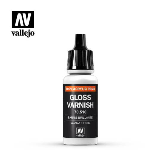
Add Vallejo gloss varnish to water lines of eyes and lips.
2. What general materials do you need?
FYI I have been in this hobby for about 7 years. I have only had to replace Mister Super Clear cans and respirator cartidges in that time. Everything else I have used for nearly a decade. And also used them for other projects!
#1 item you need: a proper serious respirator. You will be at risk of inhaling toxic chemicals when you work with sealants or do any sort of dry sanding. Please please please invest in this item.

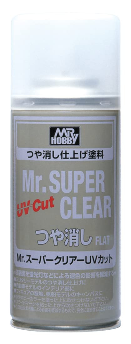
Mr. Super Clear UV Cut sealant spray. This gives the resin or vinyl a toothy surface to apply pastel pigments, watercolor pencil, and gouache paint on. The techniques will not work without this surface.
The sealant also behaves like skin, which is made up of several layers of matte cells So the pigment you apply to the resin is suspended in layers just like real skin.
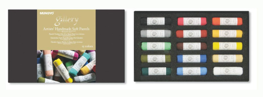
Chalk Pastels I like the mungyo hand-rolled chalk pastel just because when you use a razor to scrape off some pigment it crushes up and mixes better. But any chalk pastel will do. The Xanthi video I will link later has a great idea of just buying a few chalks at a time, because to be honest I don't use all of my chalk.
Small nylon brushes.
A fan brush
A tooth brush (for skin texturing/freckles)
Crappy dollar store makeup brushes (for pigment powders)
Kneaded Erasers
White cloth gloves
ceramic dish for a palette
Some people use watercolor pencils, but I never got the hang of them. I prefer just using brushes. Everyone has their own thing they do.
Paint recs in Next Question
3. What paint do you use? What brushes/applicators do you use? How did you achieve those softer/blended contour lines, like in skin tone?
Goache paint dries flat and matte. It's basically opaque watercolor. I use a damp q-tip to remove it if I make a mistake.
Winsor-Newton is great. I am pleasantly surprised by Arteza's gouache. I have used the same gouache tubes for seven years. You put like a raindrop sized bit on a ceramic dish, that's it. And you can reconstitute gouache endlessly with just a little water.
The trick is to never EVER EVER use true black. nothing is true black unless it's makeup. I use gouache paint on Resin Popia's eye makeup but then soften it with black pastel powder to make it richer.
If you use true black it looks like mud or holes. Dark purples, browns, and greens.
Also don't be afraid to be a bit louder with the colors, the sealant mutes them a lot. Just work slowly and take breaks.
4. How does putting in the hair work?
For resin dolls, you need to make a wig. They are a PITA to make, but it's possible! Check out Mozekyto for how to make wigs. (I'll have more recommended videos further down this post.) Vinyl playline dolls you can reroot, but some people prefer wigs.
5. Where do you buy your base doll? And as far as the reveal in the ~bonus picture~, did he come anatomically correct or was that something you had to add? 👀
The same techniques can use used on vinyl dolls like Rainbow High, Monster High etc. You can get them at goodwill, big box stores, and on ebay. Lots of people sell old toy dolls.
Resin Ball Jointed Dolls are a lot more expensive, so I have spent several years slowly building up my collection. I love vinyl and resin dolls equally.
I bought my base doll from Alice Collections acbjd.com they are a vendor of many resin dolls. I absolutely love Resinsoul.
My favorite doll companies (find them on Alice Collections!) are IslandDoll, Resinsoul, Dollmore, MyouDoll, DollLeaves, 5StarDoll.
Resin Popia is MSD "Mini Super Dollfie" size aka 40cm-52cm. He's 52 cm. SD (Super Dollfie) is around 60-65cm.
I have owned dolls that were considered "prestige artist dolls" in the past, but I always end up selling them because they are so precious I'm afraid to ruin them so they just become dollar signs to me instead of something I love. I'd say $300 would get you a gorgeous resin doll and some clothes for them. Saving up for a doll you really really love is worth it in the end. People also sell used dolls on Instagram. Just please make sure to check the COAs.....
Important Note: I am a Pro-Artist legit BJD collector. AliExpress, Etsy, and Ebay have bootleg dolls that yes, are significantly cheaper, but that is because they steal from the artists that did 99% of the work (and spent tons of their own money) to develop the doll's appearance and engineering. If one cares about supporting artists they should consider the ramifications of purchasing these recasts and propagating the bootleggers. (Especially since a large part of the artist BJD community is from Russia and Ukraine, who have been lately hard hit by war and YET are still making beautiful art for the world to enjoy) I am not pro-bullying though, I am Pro-Education so if anyone wants to have a private, frank conversation about recasts in the BJD hobby feel free to message me.
One silly thing that happened once was I purchased a legit IslandDoll Bru (IslandDoll is always on sale TBH) that was actually cheaper than its recast on ebay. There are a lot of sales during Chinese holidays (11/11, Lunar New Year, Fall Festival) and you usually get a lot of extras like free eyes, beautiful carrying cases, incredible boxes, etc. Resinsoul, the "cheap" BJD company often gives you a gorgeous carrying case for your doll.
Ok enough with the disclaimers now onto doll d!cks haha
Resin dolls are usually realistic when it comes to parts. Realistic in the fact that they add something there...something simple but it's there. Resin Popia has option parts made of silicone that are actually from an action figure company called TB League. Look up "TB League Option Parts" on Ebay. The figures are 1/6 scale making the parts scary and massive at 1/6 scale but funnily enough they make sense at 1/4 scale.
IDK why i got em, I just wanted to have some fun with this doll.
6. Where do you recommend buying supplies?
If you can get to a local hobbyshop that sells models (like miniatures and wargaming figures) please support them first! As vital spaces for geek culture they need all of our support. You can get tiny brushes, Model Paints and sometimes even the sealant from them. Just call ahead they can work something out for you!
Chalk Pastels, Gouache paints I get from art supply stores and as a last resort, Amazon. I use these supplies in other art projects and you will quickly get addicted to gouache painting, i'm sure of it!
Great Videos/Resources
Xanthi's Minimalist Supply List
Xanthi's Male Realistic Faceup (I watch this one so much)
Youtube Channels I like: Enchanterium, Dollymotion, Dollightful, Lomi's Playground, Xanthi
This Book is Great: How to Rock at BJD Faceups
I am answering your additional questions in the comments if you have any! I am @anamelessfool
#bjd copia#toy customization#dollblr#doll customization#bjd tutorial#bjd faceup#q&a#legit bjd#resin popia bts
35 notes
·
View notes
Note
Hi! I've been a follower for awhile of you and Sara as I play TS3!
I started becoming a creator and learning to Convert 4to3 items in my game which has been so fun for me.
I tend to love a certain style that I can't find in most cc creators so I want to make my own eyes, skins, skin details/ tattoos etc. to make my sims.
To keep it short is there any tutorials you learned from on how to make skin and eyes and tattoos? Any tips you could give to help out someone who is trying to learn themselves and start a simblr?
Hello!! That is definitely why Sara and I started making stuff, it makes your sims feel more like your own characters when you can add the personalized touches yourself. Sara and I have been skin blending for a long time (around since 2016 I wanna say) and we're mostly self taught, I don't remember a lot of people wanting to share their skin blending techniques back in the day. The most I can do is to link you to here and browse through their tutorials they have shared. The other basic tips I can share is that Sara and I use the 3D mode in photoshop for all of our skins, you'll need to get .dae files to open in photoshop which you can find here, find a base skin, doesn't have to be terribly detailed just so you know where the eyelids, nose, and mouth should go as well as the ears. Make sure you make a new layer before pasting whatever details you want to add otherwise when you merge it down on the 3D side it'll go onto whichever layer you were on (then you gotta completely redo it and it's a pain in the ass). ALSO! You can use liquify to move stuff around better in the 3d mode, I use multiply when placing stuff first so I can line it up where it needs to go. I've also seen some skins where people haven't matched the scalp correctly or there's a line where the body and the head meet, my trade secret is to use the eyedrop tool and grab the color on the face dds then just paste it completely in the scalp and on the body I use a soft brush and drag it over the very top of the neck on the body dds. As for eyes and tattoos, eyes are definitely like making makeup in the regard that you can make them recolorable and they go in the makeup category so if you have any experience with that it's not too hard, just make sure if they're not recolorable to set the color in TSRW to white so they show up properly in game. Tattoos I always add directly to my sims skins, accessory tattoos look awful in game, they glare under the light and they're blurry, easier to just add them to the skin, for the body you can just paste them on in 2D but for face tats I recommend using the 3D mode instead because of warping, black tattoo with a white background I tend most of the time to set the layer to multiply and it looks fine.
For examples of tattoos warping:
You want the tattoo to be here so if we place it like so in the 2D mode it looks fine right?
Wrong because it is going to look like this in game

So instead paste it in 3D mode like so and then merge it down
It'll look like this in the 2D mode but it's fine! It'll look correct in game!

I was kinda spit balling but I hope this helps even a tiny tiny bit!
20 notes
·
View notes
Note
hey i was wondering if i could get advice on being able to use less layers / combine them more often ? ^_^ because ive noticed that alot of my fav artists seem to do this, like do a sketch color under it then color over it, i tend to over use layers ALOT by duplicating layers before i make a change somewhere just in case i want to go back and the undo button isnt enough, does this make sense ? :3c
Hi! I don't know if I have any super superr useful advice but I'd say this:
if you are familiar w the technique, I'd say try it! Maybe combine your method with merging layers? You can copy them before you merge and if you feel like you'd wanna go back, go to those copied layers. You can always pick and choose what works for you and what doesn't. Just like, mess around with it and make some smaller drawings to try things out with less layers and see if it's fun or not.
I use this method personally and I say it comes a lot from having had more experience traditionally painting before digital painting. When you make a mistake while painting traditionally, you can just go over it with more paint. Same goes for digital, and there are a lot of ways in general you can tweak stuff digitally (warp tools, color correction/replacement, gradient maps, list goes on...) While ctrl+z does help, it can be kind of paralyzing when it comes to decision making bc you'll always have that desire to just spam it. Sometimes you just gotta roll with the stroke made and you can go back and fix it later.
You don't HAVE to use this method! I've got lots of other artist friends close to me that use A TON of layers to great effect. I think that there's definitely no shame in using them and while it can be cool to flex that you use less, it's not really a competition at the end of the day. The viewer can't really guess how many layers you've used majority of the time.
if you want any more specific advice on this though, you can feel free to msg me or shoot me more asks off anon ^^
26 notes
·
View notes
Text

SHOW YOUR COLORING
thank you as always for the tag @casualavocados!!! ily!!!
i've done this a few times now (1, 2, 3) and i don't think too much has changed in my process since then - i still LOVE me some blues and magentas, and i still give the vibrance and selective color tools a run for their money!! i have started experimenting a bit with channel mixer, but i honestly mostly just end up using color balance for whatever i am trying to correct with it, haha. i do have a few funky colorings in here, like the first gif where i was able to remove the background and the sixth gif, which i was aiming to make as cyan as possible... as i mostly just like experimenting and trying to challenge myself with different techniques!!
here are the original posts for each gif: nia • lio • simon's not posted yet :( but he will be soon!! • canti • viral • rei • gurren lagann
as always, i tag anyone who wants to give this a go!! <33333
#tag games#casualavocados#thank you again for the tag alskjfsdhldkj i love putting these together!!!#t.edit#a: ttgl#ttgl: tv#ttgl: films#ch: simon jiha#ch: nia teppelin#ch: viral teppelin#a: promare#promare: film#a: flcl#a: neon gelatin#nge: rebuild#ch: rei ayanami
14 notes
·
View notes
Text
The guys do Black MC’s hair
& what hairstyle they would most likely pick for you! (gender neutral ofc)
i hc Diavolo, Simeon & Mammon as black btw
also if some of the wording is kinda wacko, it’s because i was whitewashed as a kid and im still getting over antiblack words & rhetoric today. So please tell me in the comments if anything is off, I will correct right away!
Lucifer
You have to catch him at his least busy, or else he won't do it at all. You don't even have to show him how to do it, since he's the one who would do Mammon's hair all the time growing up. Stay away if you're tenderheaded! He will show no mercy to get your hair done in time. He tries not to be rough but his hands have been too used to dealing with Mammon's hair so as an instinct he treats your hair the same way.
His go to hairstyle for you: Would rather to give you Wash N' Gos since they're easy to do and he loves seeing your hair texture.
Mammon
"Huh? You want me to do it? I can't even do my hair sometimes!" only knows how to do wash & go's, maybe a fade on some days. He usually lets his makeup artists or Asmo do his hair for special occasions.
His go-to hairstyle for you: Twist outs (He loves opening your hair out for you and running his hands through your hair)
Levi
Was really concerned about messing up your hair , but after showing him videos about your hair & him practicing on his wigs for a bit, he gets really interested. "Y-you're saying I can do whatever with your h-hair?! U-Uh...This is huge amount of responsibility...!"
His go-to hairstyle for you: He loves adding accessories, especially colorful beads in your hair (especially beads that are his color - teal). Butterfly locs he loves the most!! He would also make your hair look like his favorite anime characters most likely.
Satan
Had done some research and read some books on it before, but haven't really gotten to actually try it out. Plus, he's seen how tenderheaded Mammon is. He'll gladly do your hair for you. He's really gentle and wouldn't be as rough like Lucifer is. He makes sure you have a lot of breaks, lets you stretch, gives you sips of your drink, have your favorite show or favorite song playing. He wants to make sure you're the most comfortable during the whole process. Will also massage your hair while washing that you almost go to sleep!
His go to hairstyle: Goddess crown braids, or any retro hairstyle (think 50’s looks), He might even form cat ears to your afro if you want
Asmo
He's been waiting for this one!! You two quickly go to the local demon hair store to get the highest quality moisturizers, shampoos, gels, everything. He even buys that expensive detangler comb that's been all the rage lately. He would love to do some installs, box braids, anything!! Let him do it. He's used to doing Mammon's hair sometimes and some of his succubus's friends' hair as well.
His go to hairstyle: Any hairstyle involving finishing touches like edges. Asmo loves doing that final stroke (lol) with the brush to show off your maximum beauty.
Beel
If you want crumbs in your hair, sure! But depending on how much hair you have, be prepared he's going to get hungry A LOT. Take breaks. Your hair's gonna take a whole day. But don't worry, Beel likes taking this time for you. Also, he might eat your hair products if they smell a little too good (he’s done this with some of Asmo’s perfumes before).
His go to hairstyle: I feel like he would like two-strand twists the most (not like that's my current hairstyle or anything) cause they're simple to do for his big hands.
Belphie
Usual lazy butt Belphie; he didn't want to do it at first and groaned that you should just go to Asmo. Instead, you take this as a bonding experience and send him a bunch of braiding videos through his DDD. One video catches his attention- locs!
His go to hairstyle: He practices his locing techniques and he gets so good he can do it in his sleep! He'll even detox your hair too- leaving you in the detox basket while he naps and then retwists for you!
Diavolo
Not the best at hair (Barbatos does it for him) but is willing to learn!! It piques his interest so much he funds a black hair business in the devildom. Next thing you know, all the succubi wanna look like you (-_-) looks like the next lesson is cultural appropriation now.
His go to hairstyle: Likes fun & simple hairstyles like Afro bubble ponytail and Space buns
Barbatos
You don't even have to ask, once he sees you walking towards him with a comb & spray, he knows. He's a total pro with the flat iron (cause of Diavolo) but is able to do every hairstyle in the book. Wash day is total heaven, he'll professionally massage your temples that have you feeling it down to your toes.
His go to hairstyle: Doesn’t really have one! He does like doing hairstyles that would take longer because he gets more time with you <3
Simeon
Being the sweet angel he is, he would happily do it for you! He loves doing unique hairstyles the most - because those are the ones he can spend the most time with you. Another pro with the flat iron, but loves doing simple looks with a unique edge.
His go to hairstyle: Half braided half natural looks, fade undercuts, tries to braid hearts in your hair, etc.
Solomon
Instead of actually doing your hair, does African threading instead. He tells you he went to Africa a long time ago and saw the technique multiple times. He's even had his own experience of doing it on an acquaintance's child one time.
His go to hairstyle: He opts the most for out-of-face convenience hairstyles like Bantu knots (plus he can see your face more this way <3)
Masterlist
#obey me headcanons#obey me x reader#obey me black mc#black mc#obey me gender neutral oc#obey me poc reader#obey me black reader#obey me lucifer#obey me mammon#obey me levi#obey me fluff#obey me x gender neutral#obey me satan#obey me diavolo#obey me belphegor#obey me asmodeus#obey me asmo#obey me simeon#obey me solomon#obey me lucifer x reader#obey me mammon x reader#obey me simeon x reader#obey me diavolo x reader#obey me asmo x reader#theres so many obey me tags im typing all this crap out#obey me satan x reader#obey me solomon x reader
174 notes
·
View notes
Text
Product Photography: what it is and how to choose the most suitable one?

In the world of e-commerce, where the visual reigns supreme, product photography emerges as a pivotal factor in driving sales and establishing a brand's identity. It's the art of presenting your products in their best light – quite literally – to entice and engage potential customers. In this blog post, we will delve into what product photography entails and provide insights into choosing the most suitable approach for your specific needs.
Understanding Product Photography
Professional photography is more than just taking snapshots of your merchandise; it's an art form that requires a keen eye for detail, mastery of lighting, and a deep understanding of your product and target audience. The goal is to showcase your product in a way that not only accurately represents its features but also evokes emotions and desires in your potential customers.
Good product photography goes beyond a simple representation of the item. It tells a story, creates an experience, and communicates the essence of your brand. Whether you're selling clothing, gadgets, food, or any other product, the images you use significantly impact how customers perceive your offerings.
Choosing the Most Suitable Approach
Selecting the right approach to product photography can greatly influence your brand's success. Here are some key factors to consider when making this decision:
In-House vs. Professional Photographer:
In-House: If you have a limited budget, you might consider taking product photos in-house. This involves setting up a basic photography area with appropriate lighting and a quality camera. It gives you control over the process and the ability to make quick adjustments. However, it requires some skill and knowledge about lighting and photography techniques.
Professional Photographer: Hiring a professional product photographer brings expertise and a refined touch to your images. They have experience in capturing products in the best possible way, ensuring optimal lighting, composition, and post-processing. This option is particularly beneficial for complex or high-value products where every detail matters.
Lifestyle vs. Product-Centric:
Lifestyle Photography: This approach involves placing your products in real-life scenarios, demonstrating how they are used in context. For example, if you're selling outdoor adventure gear, your products could be showcased in the midst of a camping trip. Lifestyle photography adds a relatable dimension and allows customers to visualize how the product fits into their lives.
Product-Centric Photography: This style emphasizes the product itself, usually against a neutral background. It's commonly used for e-commerce platforms where a consistent and distraction-free presentation is essential. Product-centric photography is perfect for showcasing intricate details, textures, and features of the product.
White Background vs. Custom Background:
White Background: The classic white background is a staple for e-commerce. It ensures your product is the center of attention and eliminates distractions. This approach works well for a wide range of products and maintains a clean and professional look.
Custom Background: If you want to infuse more personality into your images, custom backgrounds can be a great choice. They help create a specific atmosphere or enhance the product's story. However, be cautious that the background doesn't overshadow the product itself.
Consistency:
Maintaining a consistent style across your product images is crucial for brand identity. Consistency builds trust and makes your website or catalog feel cohesive. Whether you choose in-house or professional photography, ensure that your images have a unified look in terms of lighting, composition, and post-processing.
Editing and Post-Processing:
No matter the approach you choose, some level of post-processing is typically required. This can include color correction, retouching, and background removal. Balancing the editing process is essential – you want your products to look their best without appearing overly manipulated or unrealistic.
In conclusion, product photography is an indispensable element of your brand's visual strategy. It's the bridge between your products and your customers, conveying quality, value, and emotion. When deciding on the most suitable approach, consider your budget, the nature of your products, and the story you want to tell. Whether you opt for in-house photography or collaborate with a professional, remember that the goal is to create images that not only sell products but also leave a lasting impression in the minds of your audience.
#Fashion Photography#fashion model photography#editorial fashion photography#Travel Photography#pre wedding Photography#night romantic pre wedding photography#pre wedding photography poses#best poses for pre wedding photography#outdoor pre wedding photography#pre wedding couple photography#wedding Photography#wedding photography bride poses indian#indian wedding photography#wedding photography poses#food photography#indian food photography#food photography ideas#interiors architecture Photography#kids-maternity Photography#portfolio Photography
2 notes
·
View notes
Text
Some Amazing Things You Never Knew About White Background in Photoshop
When it comes to image editing, Adobe Photoshop is the go-to software for professionals and enthusiasts alike. One of the most commonly used techniques in Photoshop is creating a white background for images. While it may seem like a straightforward task, there are some amazing things you might not know about working with white backgrounds in Photoshop. In this blog, we will explore some lesser-known tips and tricks that will take your white background editing skills to the next level.
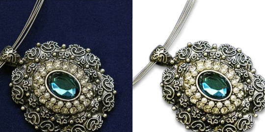
Achieving Pure White
Creating a pure white background can be a challenge, especially when the original image has variations in lighting or colors. Instead of using the eraser tool or the magic wand tool, try this technique: duplicate your image layer, desaturate it completely, and then increase the brightness and contrast until you achieve a pure white background. This method ensures that the original image remains intact while giving you full control over the background.
Removing Shadows
Sometimes, photographs captured with natural lighting may have unwanted shadows on the background. To remove these shadows effectively, create a new layer beneath the original image layer and fill it with white. Then, change the blending mode of the original image layer to "Multiply." This will darken the shadows while preserving the rest of the image. Adjust the opacity of the shadow layer until you achieve the desired result.
Adding Depth with Gradient
A white background doesn't have to be flat and boring. To add depth and visual interest, create a new layer and apply a gradient from white to a light gray shade. Change the blending mode of this layer to "Overlay" or "Soft Light." By adjusting the opacity and position of the gradient, you can create a subtle gradient effect that gives your image a three-dimensional appearance.
Clipping Masks for Precision
When working with complex images that have intricate details or fine edges, using the eraser tool can lead to jagged edges and a messy result. Instead, use a clipping mask to remove the background precisely. Duplicate your original image layer and create a new layer beneath it, filling it with white. Then, right-click on the duplicate layer and select "Create Clipping Mask." This will confine the visibility of the duplicate layer to the shape of the original image, providing a clean and precise white background.
Removing Color Casts
Sometimes, photographs may have unwanted color casts on the white background due to lighting conditions or reflections. To correct this, select the white background using any selection tool and create a new adjustment layer for levels or curves. In the adjustment layer properties, click on the eyedropper tool and sample an area that should be pure white. Photoshop will automatically adjust the levels or curves to neutralize the color cast and make the white background appear cleaner.
Conclusion
Working with white backgrounds in Photoshop opens up a world of possibilities for image editing. Whether you want to achieve a pure white background, remove shadows, add depth, or remove color casts, these lesser-known techniques will help you achieve stunning results. By mastering these tips and tricks, you'll be able to create professional-looking images with clean and polished white backgrounds. So, go ahead and experiment with these techniques to take your Photoshop skills to new heights!
2 notes
·
View notes
Note
hi! i have a question/advice request about making fanart, i’ve been following you for quite some time, and i REALLY love your digital art, from the style to the way you work your colors, really everything about it is so wonderful and amazing.
I’ve been doing fanart for 3 years now, and i have a somewhat similar style to yours, the thing is, i spend a lot of time finishing a small part of the painting, like, A LOT of time, to the point where it becomes boring and discouraging and i end up abandoning the piece altogether.
My question is, is this normal? i know the more practice you get the better you become, but sometimes it feels like i’m stuck just painting a nose for a week, and i feel like i can’t get the result that i want unless i spend an astronomical amount of time on it. i’m asking you specifically because you were my main inspiration to start and make my own fanart, whenever i see one of your fanart pieces i get inspired to start a painting, and then it takes a long time and i stop, and the cycle repeats. So i would really appreciate any advice or tips <3
Firstly I thank you very, very much for your appreciation for my art. I've said this already, but hearing I'm inspiring someone else to be creative is one of the best things I can get as an artist! So thank you, this is super lovely and it's an honor to read messages like yours!
-
Before I talk more, I'd like to remind you there's no "normal" when it comes to art. Some will take hours to paint something, others days, or weeks. That depends a lot on your style, your skills, if you know or don't know what exactly you want for that painting, and even on the quality of the references you're using sometimes. We'd need to see what exactly you're struggling with, it's hard to give an advice when I don't know you nor your work. So everything I'll say here will come from my personal experience with my own style, and what I learned when I felt something like you're describing to me, ok? I hope it helps! And you can come back and ask me to talk more about about specific themes if you'd like!
-
1. You can make little studies before starting the actual painting! Thumbnail studies. Sometimes we spend a lot of time fixing mistakes we made in the beginning; sometimes the direction of the light isn't great, sometimes the angle you chose isn't the best. You can prevent that by studying that composition as a first step.
2. You need image references. You don't need to follow them exactly as they are, but you should have references to remind you what the volumes of a face look like depending on where your light source is, or how skin texture and colors look like under sunlight. Using referentes is extremely important when working with realism, because most of the sensation of realism comes from the way you build volumes/light and shadows and not from the details nor the blending.
3. You need to find out what painting process fits you. My process right now is totally based on classical oil painting techniques: getting the proportions right when I'm sketching, getting the general volumes right with light and shadows, with a neutral color, and only then adding more colors and working on textures and smaller volumes and details. A step-by-step process can help you to focus on what you want from each one of those steps, one by one, and correct mistakes earlier.
4. Don't try finishing one part before going to another! Always zoom out at the beginning and work on your painting as a whole, and when detailing try going from one part to another. That'll prevent you to get bored early and it helps giving your painting a more homogenic feeling.
5. Painting in a style that demands you to blend everything and add skin texture, body hair, fabric texture... That can be exhausting. Remember you should take breaks from painting, but also from that painting specifically. You can have more than one WIP at the same time and switch between then. That helps a lot, because you'll be solving different problems on each painting and you'll always come back with fresh eyes and new ideais to incorporate into your works.
6. Remember there are many different art styles we can call "realistic", and also that we can work in many of different ways to build that visual sensation. There's no need to blend everything! A good tip is finding a nice brush that leaves a beautiful texture behind, something you won't feel the need to erase later. You can also work with larger canvas sizes and save your work in smaller scales, in a way those brush textures won't really show up that much.
7. You can play with different art styles! I do that a lot and it helps me to keep interest in the styles I work with the most. It's nice to think differently sometimes; to find a different kind of challenge. It's refreshing! There are also moments it's important for us to ask ourselves what exactly we love about and want from what we're creating. If you feel you're questioning everything too much, or that you just can't get satisfaction from your process anymore, allow yourself to venture finding new references, experimenting with completely new styles and techniques. Finding out what you want with your art is almost a journey of self-discovery. I myself am questioning the importance of over detailing and blending right now, something I held onto for years, and I'm definitely making a style transition. If that's your case, it's completely normal and healthy! Embrace it, allow yourself to do what you really feel like doing, or to just go crazy and make the most random art ever until you find yourself in your art again.
8. You're doing great. ❤
15 notes
·
View notes
Text
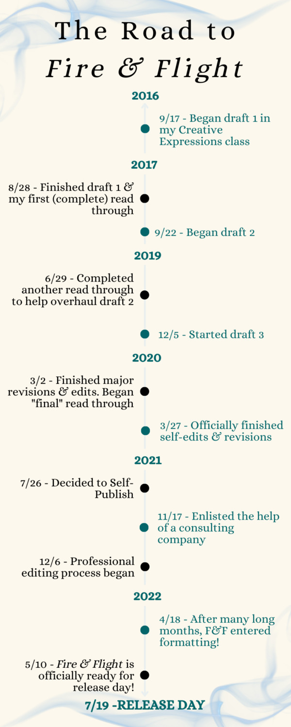
It’s been a long road to bringing Fire & Flight, the first book in my epic fantasy trilogy, the Heirs of Tenebris, to this point. While I’m super excited about Fire & Flight’s release day on July 19th, I’ve not only been humbled by this process but also overwhelmed by the outpouring of support from my friends and family. As we’re only a couple weeks away from the big day, I wanted to take a look back on the process I went through to write Fire and Flight. I hope that my experience—and the time it took—can encourage others in their writing, no matter how long it may take for your writing to come to life! Without further ado, this what my road to Fire & Flight looked like:
My young adult fantasy novel was born on the spot. I mean that literally, because my Creative Expressions teacher had me write a paragraph à la “stream of conscious,” and the first thing that came to my fingers as I typed, was the haphazard awakening of the girl who would become my protagonist, Nyla. I didn’t have a name yet either. There was only a girl with silver hair and lilac-colored eyes, and a forest.
Rolling with this first paragraph and developing the kingdom that would be called Tenebris, Fire and Flight slowly grew into the novel it is today. It would take years and many revisions to get here, but as the narrative of the Heirs of Tenebris grew, so did my dreams.
During the summer of 2017, I pushed hard to finish my first draft before the next school year. My Creative Expressions teacher showed a great interest in helping me through the editing process, and I can almost guarantee that some of my best pieces of writing advice were stolen from him. I not only finished draft one in August of 2017, but also my first complete read-through. That’s a feeling I’ll never forget, but it was also overwhelming! By the time I was done, all 49,359 words were bleeding in pink corrections (red pens are pretty scarce on my desk!), and my head was spinning.
What happened next? How was I supposed to edit this, especially when there were parts I knew were rushed or needed to be ironed out?
I decided to wait out the summer and shelved Fire & Flight until the school year had started again.In September 2017, my teacher and I were getting ready for the long haul. With both of us working on our respective novels, I learned what’s probably the hardest but most helpful editing tip of all time: rewrite or retype your entire first draft. As you create draft two, you revise and expand what’s already written in draft two, making it better than it was before. Drafts are meant to be an evolution, and so I found myself using draft one more as the outline for what draft two could be because I never did outline Fire & Flight. In doing so, my second draft became everything that draft one wasn’t. My story started to blossom, and I couldn’t wait to see it bloom.
2018 was a hard year to map for me, as it’s drowned in revisions and obsessive periodic read-throughs to make sure I was on track with the goals I’d set. Through this revision process, I realized not only had my style of writing changed throughout draft one as I grew as a writer and learned more techniques, but the perspective had changed too! Frustrated and disenchanted, I pretty much abandoned the progress I’d made and began what I’m going to call draft two-and-a-half.
By June 2019, I’d completed a major overhaul as well as my last check-point read-through of draft two-and-a-half so I could finish it by the end of the summer (spoiler: I didn’t finish by the end of that summer), and move onto the next stage.
When November of 2019 rolled around, I finally had my draft three, and my novel was nearly perfect. I still had some details I wanted to iron out and things that could be tweaked just a little more, but I couldn’t be prouder of how far Fire & Flight had come. From its measly 50,000 words to 127,625 words, all I had left to do was one “final” read-through to fix any remaining issues in early March of 2020.
I deemed Fire & Flight as “officially” finished on March 27th at 128,307 words.
It was around this time that I began looking at the different publishing options and the industry as a whole. While I’d researched literary agents and sent a few queries out, my heart wasn’t entirely in the process. The more I learned and the more I researched, the less compelled I was to pursue traditional publishing. Taking a bit of a break from Fire & Flight and the whole process, I opted to regroup and come up with a plan. It was then that I decided to self-publish Fire & Flight.
There were many reasons I decided to take Fire & Flight’s fate in my own hands, but I won’t get into that here, but know that I couldn’t be happier with this decision and am proud of the lengths I’ve traveled to bring my novel to this point!
From its short-circuited beginnings, Fire & Flight has grown so much from the novel I was writing between classes and in my free time, but I’ve also grown too. It’s been a long road for both of us—novel and author alike—and I can’t thank everyone enough for their overwhelming support throughout this journey. I can’t wait to share Fire and Flight with everyone this summer, or that this is the year I got to hold my book in my hands. And for all my fellow writers out there, I truly hope my experience reminds you that no matter how long it takes to tell your stories, it is never too long! Whatever your process and the time it may take, it’s just the perfect amount of time for it to come to life😉
#writeblr#writer life#writing process#indie author#my writing#behind the scenes of my writing#somebody pinch me#i still can't believe this is real that my book is a book now and release day is like two weeks away
21 notes
·
View notes
Text
photo editing
Photo editing has become an essential part of modern photography. In today's digital age, editing has allowed photographers to take their images to the next level by enhancing their visual appeal and aesthetic. With the advancement of technology, photo editing has become more accessible and user-friendly than ever before, with a wide range of software and tools available to help you achieve your desired result.
In this blog, we will discuss the basics of photo editing and provide some tips and tricks to help you improve your editing skills.
Firstly, it's important to understand that photo editing is not about altering the reality of the image but enhancing the visual appeal. The goal is to make the image look better, more captivating, and aesthetically pleasing while still maintaining the authenticity of the original photograph. This means that you should avoid over-editing your images, as it can make them look unnatural and unappealing.
The first step in photo editing is selecting the right software or tool. Some popular options include Adobe Photoshop, Lightroom, GIMP, and Canva. These programs offer a wide range of features, from basic adjustments such as brightness and contrast to advanced techniques like color grading and retouching. It's important to choose a tool that suits your needs and experience level.
Once you have selected your editing software, the next step is to import your images and make basic adjustments. These include adjusting the brightness, contrast, and saturation levels, which can dramatically improve the overall look of your image. You can also crop your images to remove any unwanted elements or to emphasize the main subject.
Another useful tool in photo editing is the use of filters. Filters can add a unique look to your images and can help you achieve a specific mood or tone. However, it's important to use filters sparingly and avoid using them as a crutch. Overusing filters can make your images look generic and unoriginal.
One of the most popular advanced techniques in photo editing is retouching. This involves removing blemishes, smoothing out skin, and correcting any imperfections in the image. However, it's important to be subtle when retouching, as overdoing it can make the image look unnatural and fake.
Color grading is another advanced technique that can make your images stand out. Color grading involves adjusting the color and tone of your image to achieve a specific look or mood. This can be done by adjusting the hue, saturation, and brightness levels of specific colors in the image.
Finally, it's important to save your edited images in the right format. JPEG is the most common format used for web and social media images, while PNG is better suited for images with transparent backgrounds. TIFF is the preferred format for print images, as it preserves the highest quality and resolution.
In conclusion, photo editing is a powerful tool that can enhance the visual appeal of your images and help you achieve your desired result. Whether you're a professional photographer or a hobbyist, learning the basics of photo editing can help take your images to the next level. Remember to keep it simple, avoid over-editing, and be subtle with your techniques. With practice and patience, you'll be able to create stunning images that will capture the attention of your audience.
Do you want edit any type of photo contact me : https://www.fiverr.com/share/V80BKB
2 notes
·
View notes
Last Seen Blogs
ravenclaw-nerd-girl
Wit Beyond Measure Is Man's Greatest Treasure
baekhyunanon-blog
HIATUS.
foldingfittedsheets
Folding Fitted Sheets
ayyemaecy2416
Ayyemaecy2416
ayyemaecy2416
Ayyemaecy2416