#view this post on dashboard for captions !
Text
I know we're all complaining about the new layout — I know, it's really stupid, it looks like Twitter — but I want to share with you this bug report I sent to Staff, as I believe it contextualises why the "changing features that aren't broken just because you can" ideal from Tumblr's higher ups ends up making the lives more difficult for a lot of its users; more specifically disabled folks.
Good afternoon,
When using Lightbox View I need to click on the image for the caption to disappear — this is absolutely necessary as I'm visually impaired, and have the letter size on max, and when viewing an image the Lightbox View caption occupies an excessive amount of my screen, so seeing an image is not easy — however this made me discover two things:
1. If you click on the area where the caption is, even when it's hidden, it will take you to whatever blog was in the caption. This is quite annoying as I'm actually trying to zoom in but keep being accidentally transported to someone else's blog. (AKA the caption seems only to become invisible, but it's still there, so when I click around the caption is supposed to be it'll act as if it's still there)
2. If you try to zoom in in that caption area not only can you not zoom in but it will also make the caption appear again, however you won't be able to make it disappear again by clicking on any area of the image. The caption will be there without you being able to make it disappear.
I will add obviously none of this was a problem in the old image viewer, I don't have any intrusive captions or accidentally going to other images and blogs that I don't want to go to. Please I beg you to give us an option to return to the old image viewer on the dashboard. You also made it more difficult to click on a post to only see that specific post, something I did a lot since it allowed me to use the old image viewer.
Previously I could click on the user's name and it would open it on their blogs. That would do the trick. Now you have to click on the surrounding blank space but because, again, of my accessibility features I need to have on to be able to use Tumblr, there are almost no blank spaces available for me to click on!
I assume you're aware this is not a problem of the accessibility features themselves, as I had no qualms about any of this previous to these new features being implemented, but a fault of your new features that are inaccessible and are causing more harm than good.
#Give it up for lighbox view biggest hater: me#we can also see that the new thing of sending people to OP's blog without showing the actual post we're clicking on#affects not only the prev tags problem#more than affecting the “Tumblr ecosystem”‚ which admittedly it does‚#it makes it extremely more difficult for me to use the old image viewer#which is the one that actually works best for me#tumblr#tumblr updates#lightbox view#prev tags#gle original#I don't care they keep saying they won't give the option to have the old image viewer back#I'm gonna keep complaining because it genuinely affects me#disability stuff#disability
20 notes
·
View notes
Text
Why Tumblr Should Be Revived
1. The staff is not nearly as strict about porn as before. They got rid of the failed algorithm that attempted to detect skin on posts. This was the biggest driving factor to the migration. Artists can now thrive on here once again without having their posts flagged as porn when they’re not.
2. There are also many porn blogs on here still because as I previously mentioned, staff isn’t as strict as they used to be. You can potentially view and own a porn blog on here as long as you are careful. At the very least, it can have suggestive pictures and explicit text posts. There are millions of those on here.
3. This community was like no other. This was the only social media where the neurodivergent, the LGBTQ, the furries, the “cringe” people, where ALL social outcasts found a home. People came here and realized there were many others out there just like them. Tumblr is the home to aesthetics and fandom and has a sense of community you can’t find elsewhere. Tumblr has always been meant for niche interests, many of which have been born from here. It’s fun to be a part of that. There’s a reason why a lot of people don’t like Twitter anymore: it’s because it’s mainly populated by former Tumblr users. Ever since the migration, people have been complaining about hating sensitive Twitter users. Niche community members went somewhere they weren’t really welcomed. This is fine because social media is for everyone, but wasn’t it so fun to have a place where the niche and different thrived? It felt special.
4. Twitter is going down in flames. It’s no secret that Twitter’s website has started to worsen ever since Elon has taken ownership. Twitter already doesn’t let you curate your dashboard as much as it should, since you’re seeing what other people like, but not what you like. It guarantees that you will see content you don’t want to more than you would on a social media like Tumblr where filtering content is so much easier. This is why it’s much easier to avoid discourse on Tumblr if you choose to do so. Also, no one on Twitter uses tags due to the short character count on a tweet, resulting in lots of unfiltered content coming your way. Yes you can mute words, but you definitely already have or will see art or other imagery you don’t want to see due to short and irrelevant captions. Additionally, Twitter is no longer being moderated by anybody. Elon Musk has fired the majority of the staff that regulates content violating Twitter’s rules. Reporting on Twitter essentially does almost nothing at this point. Apart from that, you have the option to remove ads on Tumblr, the checkmarks here are more colorful, you can have several blogs all under one email, and if all that isn’t convincing enough, you can at least leave Twitter as a “fuck you” to Elon if that’s more your style.
5. Tumblr as a website and app have both improved. Not only did they get rid of the porn-detection algorithm, but they also provided us with many more options to customize our dashboards. The app is significantly less buggy as well. And now you can choose from a set of a couple colored themes in settings for when you’re browsing the dashboard and search.
6. The amount of personalization you can have with your dashboard and blog is unlike any other website. It’s only improved but even before it was one of the key features that has made Tumblr different.
7. Tumblr is less stressful than other social medias. Due to how good the content filtering is, we can avoid a lot of unwanted content. Less discourse, less triggering, less negativity. You don’t have the other common social media pressures of following a certain amount of people because it’s common to hide that information here, along with the amount of followers you have. That means anyone here can be “Tumblr famous.” Blocking is also frowned upon on most social medias, but it’s pretty commonplace on Tumblr. Block everybody if you want to, even me.
Thank you for reading. My next post will be what we can do to revive Tumblr. In the meantime, please follow, like, share, comment, and reblog.
#Sorry for the crosstags#tumblr#tumblr revival#tumblr revive#artists on tumblr#photographers on tumblr#poets on tumblr#writers on tumblr#dsmp#mcyt#kawaii#anime#manga#grunge#meme#tumblr holidays#discourse#feminism#misogny#ask game#ask meme#webtoon#writeblr#voltron#steven universe#pokemon#politics#kpop#bts#succession
18 notes
·
View notes
Text
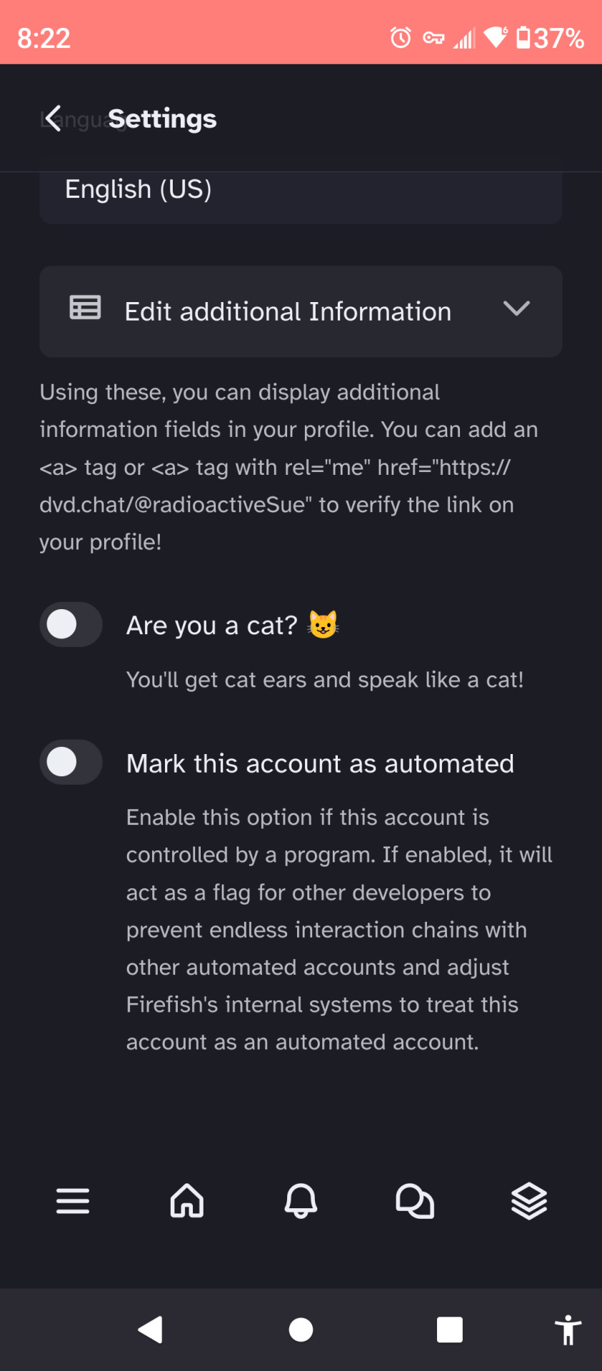
Reasons why you should move to a fediverse social media platform:
(Specifically Firefish, since I mainly use dvd.chat, an instance of Firefish, but I think these points may be applicable to other social media fediverse platforms, like Mastodon, Pleroma, and Pixelfed. Also can someone add captions to my screenshots? I'm on mobile and the "add alt text" option keeps automatically closing on me and erasing what I typed so far):
Migrating from instance to instance is easier than moving between tumblr and twitter, and easier than remaking/moving blogs within tumblr. Example screenshot:
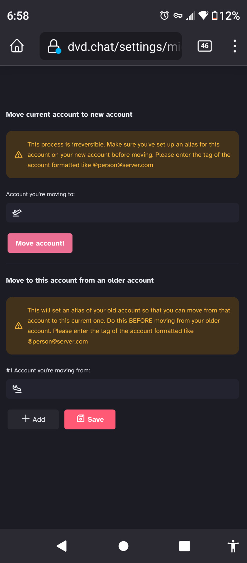
You can follow any user from almost any platform/instance. If you're on firefish, you can follow a mastodon user, a misskey user and a pixelfed user and have them all in the same home feed/dashboard, and vice versa. Example screenshot:
You can self-host your own instance exclusively for you and friends (or only yourself and no one else). I don't know how to do this, but you can see a few instances with one or a few users with signups closed/disabled on fediverse.observer.
You can mute entire servers from your global and recommended feeds, and for misskey & misskey-based instances: you can also set up "Antennas" to follow entire servers (you can only view posts that were posted after setting up the antenna. If you want to see earlier posts, follow individual users or view the individual user's profile either within your instance's user interface or their profile's instance, both will usually work equally well on my instance.)
For misskey and misskey-based instances: you can add plugins to your account to affect your experience and posts.
There are several apps for various instances. For me, I prefer using the mobile web app and Milktea.
Two things to keep in mind:
Not all platforms can fully communicate with others. For example trying to follow communities on Lemmy from Firefish is extremely clunky since Lemmy functions like reddit and firefish functions like twitter and tumblr, so I have both a lemmy account and a firefish account to browse both platforms. I don't use peertube, but I feel like it might be just as clunky to view its content from my firefish account if not more so.
You can mark your profile as a cat and/or a bot account on misskey and misskey-based instances. Enabling cat mode will give your icon cat ears and convert all the text in your posts to include nyas. You'll need a plugin if you want to speak normally while having cat ears (you can also intensify your posts' cat-speak with a plugin, if you want). Screenshot of the option toggles:
Feel free to add some additional pros and cons to fediverse social media platforms/instances in the reblogs.
2 notes
·
View notes
Text
@staff @support @changes @wip @humans
I can once again click gifs and pictures and zoom in. It doesn’t take me to tumblr tv. So that’s good.
But I can only view my blog from the dashboard tab because they switched the blog and marketplace icons. So if I go to view my blog on the app I can’t switch back and forth between that and the search page (if I’m looking at a specific tag) and I don’t like that. Also don’t see what the point of tumblr tv is. Stuff we think you’ll like. Isn’t that what the for you tab is for? If tumblr thinks there’s a gif that I’ll like I want to scroll through it on the for you tab. I do like the following and for you tabs. The staff picks I don’t really get but it doesn’t effect my user experience so it’s whatever to me. Before the only time I couldn’t view the blog icon was when I searched a tag (as opposed to clicking on one) I’m pretty sure. I want the blog icon to be more accessible than marketplace.
I’m not using tumblr tv. I don’t like that interface. If i want to view the entire caption on a post that I’m viewing in tumblr tv, when I click to expand the caption it just takes me to the post. I don’t see the point. Just put the tv stuff with the rest of the for you stuff. I don’t need to scroll through each picture or gif. I can scroll on my dashboard or click on a picture or gif to isolate it and scroll or zoom in. I can’t zoom in with tumblr tv. I want everything to be like a dashboard scrolling experience.
Tumblr you’re not tiktok and that’s good don’t try to be tiktok. If I wanted the tiktok experience I’d go there. When I want the Instagram experience I go there. Why should every app be the same? Tumblr is NOT like Facebook, Instagram, Snapchat, or tiktok and that’s good. Tumblr is different. That’s good. Every time you do something to be more like another app it takes away from my enjoyment of using the app.
3 notes
·
View notes
Photo
BLOG, SHOP AND PATREON UPDATES
Hello everyone! I wanted to make this post to give a few updates that I’ve been working on the last month.
BLOG UPDATE
I have a new theme for my blog with cozy, neutral colors to match the upcoming fall season (my fave season)!
ALL THEMES UPDATED
I’ve done a bit of re-coding to all of my themes so they’re all up to date! If you’ve purchased a premium theme, I’ve sent out an email update that should have the link to re-download the new theme code, but this update includes both free and premium themes. View my Payhip shop.
NPF support
Dashboard styled captions
Other misc tweaks + fixes
PATREON UPDATES
I’ve reworked my Patreon and now only have one tier, Clouds! Get exclusive themes, templates and other resources only available to patrons! View my Patreon.
At least two premium themes per month.
Vote on the themes I release throughout the month!
Access to resources like templates, fansite headers, coloring psds and more!
50% off all theme/page codes on my Payhip shop.
Please let me know if you have any questions, come across any issues or need help with any of my themes or pages!
2 notes
·
View notes
Text
web workshops 1 + 2 notes
session 1 -
Step 1
Show them Front End vs Back End of test site...
Step 2
Get them to their own URLs
Step 3
Get them logged into Back End - /wp-admin
Step 4
Get them to open Front End in a new private browser / incognito window
Step 5
Settings > General
Site Title - Their Name
Tagline - Something relevant or blank (SEO)
Do not change Wordpres or Site Address… Explain why.
Also do not change admin email… Explain why
Save Changes
Step 6
Appearance
Add New
Upload Theme
Choose File > Lay.zip
Install Now
Activate
Step 7
Dashboard > Updates
Update Wordpress if you need to
Update All Plugins
Update Lay Theme
Step 8
Appearance
Menus
Menu Name
Tick Primary Menu
Create Menu
Step 9
Projects
Trash - Hello World
Add New
Edit the title
Explain Gridder
Add Images
Alt Text
Title
Caption
Description
Arrange images
Add Title to Text
Add Text
Add Feature Image
Publish
Step 10
View post
Look at how the image and site title bar interact
Adjust set frame top = 60px
Update
Step 11
All Projects
Duplicate Post
Edit Copy
Step 12
Edit the title
Edit the permalink
Edit the images and Upload new ones
Edit layout & text
Remove Featured Image
Add new featured image
Update
Step 13
Projects > Categories
Edit Work
Add Project Thumbnails
Adjust frame if you want
Update
Step 14
Appearnce > Menus
Categories
Add Work
Save Menu
Step 15
Pages
Trash Sample Page
Add New
Add Text
Set Frame to match others or mayber give it more?
Step 16
Appearnce > Menus
Pages
Add About
Adjust Order
Save Menu
Step 17
Text Formats
Changing default will change all we have done
Alternatively we can set up new Headlines or Characters
Step 18
Lay Options
Webfonts
Add Fonts - You can use google fonts but check licences use regular and adjust weights in Text Formats
Step 19
Pages
Add New
Name it Footer
Set Background to black
Add white text - copyright name 2023
Centre it
Publish
Step 20
Lay Options
Footers
Add Footer for all…
Step 21
Look at the size of the Footer…
Pages
Footer > Edit
Set Frame 0 all round
Ctrl click on text
Spaces & Offsets
2% in above and below
Update
Step 22
Alternatively you can adjust the gridder defaults
Lay Options > Gridder Defaults
Frame Top in can be changed from px to %
Save Changes
Step 23
Customise - Over 250 settings to change within the Theme here
Site Title
Text, Image, HTML > Image
Select File
Upload Media
Choose testLogo.SVG
Adjust Width > 100px
Look at position
Space Top > 0px
Publish
session 2 -
Step 1
Look at how the logo scales and positions when on mobile / responsive
Spacing is added for the mobile
In Chrome
View > Developer > Developer Tools
Use the Select element tool to see where the spacing is being added
@media (max-width: 600px) {
.mobile-title {
top: 12px;
}
}
Adjust the value it developer tools to find what works best. Probably 6px in this instance.
Now we know that we can customise the CSS
Customise > CSS > Mobile CSS
As we are adding the CSS here we dont need to worry about the @media query
.mobile-title {
top:6px;
}
Publish
Step 2
Adding a contact Form
Plugins > Add New
Search for Ninja Forms
Install Ninja Contact Forms
Activate
Edit Contact Me
Emails & Actions
Edit the settings on “Email Notification”
To change to your email address.
Done
Publish
Copy Shortcode
Step 3
Add this to the footer
Pages
Edit Footer
Add section above
Ctrl Click on section - Set Background Colour for section
Remover Gutter between
+ More
Add Shortcode
Paste Shortcode
Scale Content
Ctrl Click on the Shortcake Element - Set HTML Class and ID
Give the ID the name “contactMe"
Save
Update
Step 4
Check Pages - Contact Form should be on the bottom of the site, just above the footer
Step 5
Lay Options > Custom CSS & HTML
Here you can see all the custom CSS and HTML aspects - you can also add more complex things here.
Custom <head> content
<script>
var $j = jQuery.noConflict();
window.laytheme.on("newpageshown", function(){
$j("#contactMe").hide();
});
</script>
Step 6
Check Pages again - If you have done this correct - the contact me form should be hidden
Appearance > Menus
Add Menu Items > Custom Links
URL = #mailForm
Link Text = Contact
Add To Menu
Save Menu
Step 7
Lay Options > Custom CSS & HTML
Custom <head> content
<script>
var $j = jQuery.noConflict();
window.laytheme.on("newpageshown", function(){
$j("#contactMe").hide();
$j("a[href*='#mailForm']").addClass('mailForm');
$j(".mailForm").click(function() {
$j("#contactMe").slideToggle(1000);
});
});
</script>
Step 8
Check Pages - Now when you click on Contact the contact form should toggle in appearance.
Step 9
Knowing the above allows you to create a very flexible site / customised site.
Useful Links
w3schools.com
stackoverflow.com
google.com
0 notes
Note
This account reposted your gifset and even copied the same caption which got reblogged to fyeahmovies? concerning that they would boost a post that is so obviously stolen it even has the source links which you can see on mobile and dashboard view that lead directly to your original post. 90363462. tumblr. com /post/ 738006310627557376/
hey anon, can you send me the post again i can't find it...or at least the name of the blog
0 notes
Text
Hey folks! I kinda went dark there after the freeze, huh? WELL
I would have posted a bit today, if I wasn’t too busy enjoying Nimbasa Pride! By now y’all have missed the whole thing, but don’t you worry, I took SO MANY pics and videos! Sorry not sorry for how I’m about to utterly clog your dashboards >:3c
[First is a mirror selfie of Storm. She’s fully decked out for the day, a grin plastered across his face. He’s wearing shades with bright pink lenses and a pair of earrings, one the male symbol and the other the female one. Her tee shirt seems a size too small on her flat chest, and says KILOWATTREL on it, repeating several times as the word fades to reveal LOVE in rainbow colors, the V coming from half of the W. The bottom of the shirt has been cropped immediately below the last letters, revealing a mesh tank beneath. Secured around his shoulders is a cape made from the intersex progress flag. Her usual trainer’s gloves are replaced by ones in the pan flag colors, and he’s giving a peace sign with his free hand. He’s wearing a skirt made to look like a genderfluid flag wrapped around his waist, which ends at his mid-thighs. Below that is a pair of fishnets, and finally a set of big black platform boots modeled loosely after Zekrom and inlaid with blue LED details. The photo has been captioned “IT’S MY PRIDE-HAVING OUTFIT BITCH”]
[The second picture is a group shot of Storm’s team, each with a bit of pride flair. In the back of the shot is Ozone the Zebstrika. Each of his white stripes has been dyed a different color, turning him into a rainbow. He’s been posed to show off as much of the dye job as possible, and from his complete calm and comfort you get the sense he’s had this done many, many times. In front of Ozone sits Nimbus the Luxio. She has a trans flag bandanna around her neck, matching her unusual blue and pink coloration. Nestled into the tuft on Nimbus’s head is Beanie the Joltik. Beanie is a bit hard to see, being so small, but her legs have been dyed pink on her left and blue on her right, leaving her yellow body untouched to create a pan flag. Finally, Lux the Wattrel is perched on Ozone’s back. Lux has a little tank top designed for birds on, matching Storm’s shirt from the prior picture. On closer inspection, this one looks handmade]
[The post continues with countless images and videos taken at the parade. Storm and team posing with other attendees. A wealth of pride-themed Pokémon treats being eaten. Extremely loud cheering as the Battle Subway float passes by. A couple pictures of the last lingering snow banks from The Freeze, dyed rainbow colors. A single picture of Storm sitting on Ozone’s back, fist raised in a “Charge!” pose, but captioned “don’t do this actually Zebstrika can be extremely difficult and dangerous to ride. he’s very well trained and I STILL only ride him in emergencies!”]
[The torrent of media ends on a video taken so close to Ozone you can only see his side. It pans very VERY slowly down his body, from the red stripes at his front to the purple ones at his back. This process takes a couple minutes, with celebrations heard in the background and snickering coming from the cameraman. Once Ozone’s tail comes into view, Storm whip-pans the camera to land extremely close to her face, revealing a massive shit-eating grin before he asks “do you love the color of the zebSTRI-?” and the video immediately cuts off]
1 note
·
View note
Text
VISUAL IDENTITY
Notes from the worshop 1
Step 1
Show them the Front End vs Back End of the test site…
Step 2
Get them to their own URLs
Step 3
Get them logged into Back End - /wp-admin
Step 4
Get them to open Front End in a new private browser/incognito window
Step 5
Settings > General
Site Title - Their Name
Tagline - Something relevant or blank (SEO)
Do not change Wordpres or Site Address… Explain why.
Also do not change admin email… Explain why
Save Changes
Step 6
Appearance
Add New
Upload Theme
Choose File > Lay.zip
Install Now
Activate
Step 7
Dashboard > Updates
Update WordPress if you need to
Update All Plugins
Update Lay Theme
Step 8
Appearance
Menus
Menu Name
Tick Primary Menu
Create Menu
Step 9
Projects
Trash - Hello World
Add New
Edit the title
Explain Gridder
Add Images
Alt Text
Title
Caption
Description
Arrange images
Add Title to Text
Add Text
Add Feature Image
Publish
Step 10
View the post
Look at how the image and site title bar interact
Adjust set frame top = 60px
Update
Step 11
All Projects
Duplicate Post
Edit Copy
Step 12
Edit the title
Edit the permalink
Edit the images and Upload new ones
Edit layout & text
Remove Featured Image
Add a new featured image
Update
Step 13
Projects > Categories
Edit Work
Add Project Thumbnails
Adjust the frame if you want
Update
Step 14
Appearance > Menus
Categories
Add Work
Save Menu
Step 15
Pages
Trash Sample Page
Add New
Add Text
Set Frame to match others or maybe give it more?
Step 16
Appearance > Menus
Pages
Add About
Adjust Order
Save Menu
Step 17
Text Formats
Changing the default will change all we have done
Alternatively, we can set up new Headlines or Characters
Step 18
Lay Options
Webfonts
Add Fonts - You can use google fonts but check licences use regular and adjust weights in Text Formats
Step 19
Pages
Add New
Name it Footer
Set the Background to black
Add white text - copyright name 2023
Centre it
Publish
Step 20
Lay Options
Footers
Add a Footer for all…
Step21
Look at the size of the Footer…
Pages
Footer > Edit
Set Frame 0 all round
Ctrl-click on the text
Spaces & Offsets
2% in above and below
Update
Step 22
Alternatively, you can adjust the gridder defaults
Lay Options > Gridder Defaults
Frame Top in can be changed from px to %
Save Changes
Step 23
Customise - Over 250 settings to change within the Theme here
Site Title
Text, Image, HTML > Image
Select File
Upload Media
Choose testLogo.SVG
Adjust Width > 100px
Look at position
Space Top > 0px
Publish
0 notes
Text
just so you guys know, I don't recommend you follow this blog. this is used as something of a post viewing history for me. if anything is the slightest bit interesting I may put it here. that includes potential misinformation, propaganda, bad takes, unnecessary discourse, people treating animals in ways that you may find less than ideal, unfunny tweets, blazed/sponsored posts, cringey captions, lame tiktoks, posts from bigoted ops, and other things you may not like to see. keep that in mind. if you follow me, know that I don't endorse the posts on here, and be aware of what I reblog not always being the best. the notes often give more context than I will. this blog is like a simulator of my own dashboard, so follow with caution.
1 note
·
View note
Text
Web Workshop #1
15.02.23
Notes:
Front end of word press - georgiaeveritt.viscomaub.co.uk
Back end of word press - georgiaeveritt.viscomaub.co.uk/wp-admin
Do not change URLS or admin email.
Change site title to name.
Change tagline.
Appearance:
Add theme - upload theme - choose file - lay.zip - install.
Have to always be zipped files.
Themes - lay theme - activate.
Important to update regularly.
Dashboard - home - updates - tick and update plugins.
Select theme - update theme.
Appearance - menus - create main menu (no spaces).
Display location - primary menu - create menu.
Projects - bin hello world - add new.
Add title.
Gridder - pink frame - columns - layout for new post - can add new row gutter.
Add image - media library - upload.
Normally add alt text - titles, caption, description etc.
Set featured image - image project face and pick 1 - publish.
Header, Body & Footer:
Set frame - top 60 px.
Press cmd - view post after publish.
All projects - duplicate post.
Categories - work - add project thumbnail - add projects.
Appearance - menus - add category page - work - add to menu.
Pages - bin sample page - pages add new - ‘about me’ title.
Appearance - menus - pages - most recent.
Text Formats - add format - headline - name - ‘making a copy of’ DEFAULT - add format.
Go in to projects - text - highlight title - formats - headline.
Lay options - webfonts - add font (has to be a font used on the web).
Pages - add new - change background - add text.
Lay options - footers.
Ctrl click - spaces + offsets.
Lay options - gridder defaults.
Customize:
Favicon - icons in tab.
Site title - text, image, html.
SVG - Scalable vector graphic (use this for logo on website).
Image width 100 - space top 0 px.
https://georgiaeveritt.viscomaub.co.uk/
1 note
·
View note
Video
youtube
نظام أساسي لإنشاء المحتوى وإنشاءه تلقائيًا وجدولته بشكل أسرع تسويق المحتوى وكتابة الإعلانات ووسائل تاكد انك مشترك في القناة 💯 ومفعل الجرس عشان يوصلك كل جديد 🔔 وما تنساش تعمل لايك للفيديو 👍 نشرك للمقطع هو اكبر دعم ممكن تقدمه لي ... https://bit.ly/3WFJ969 أتمنى أن ينال الشرح أعجابكم نظام أساسي لإنشاء المحتوى وإنشاءه تلقائيًا وجدولته بشكل أسرع. تسويق المحتوى وكتابة الإعلانات ووسائل التواصل الاجتماعي في دقائق! ...................................................................... https://bit.ly/3N9F3OH https://bit.ly/3ux7pwI شير مشاركة #BIMarabia اشترك في القناة لمتابعة الشروحات الجديدة videos https://www.youtube.com/channel/UCZYaOLTtPmOQX1fgtDFW52Q?sub_confirmation=1 بيم ارابيا https://bit.ly/1TSqEbr ❤️ رابط الاشتراك في القناة https://www.youtube.com/channel/UCZYaOLTtPmOQX1fgtDFW52Q?sub_confirmation=1 ❤️ روابط التواصل ✅ انستجرام https://bit.ly/2JY3wZP ✅ الفيسبوك https://bit.ly/3AcrQBO ✅ تويتر https://twitter.com/bimarabia ✅ لينكد ان https://bit.ly/2nqASDv ✅ قناة التلجرام https://bit.ly/3bu9Pod ✅ الموقع الالكتروني الشخصي https://bit.ly/3N9F3OH https://bit.ly/3suwyqU https://bit.ly/3bEr3zh augmented reality https://www.youtube.com/watch?v=-9c5h0X-Kqw&list=PLNMim060_nUKpt2st91YUPa7BqWd0U2eb open source مفتوحة المصدر https://www.youtube.com/watch?v=WNYyejjLa-s&list=PLNMim060_nUK6qoVzrpjLucG_aBNaz_Ny revit workshop ورشة عمل ريفيت https://www.youtube.com/watch?v=-FIZBNN7CLk&list=PLNMim060_nULOxkcpmsGdaRXRnEj7rmGC OPEN STREET MAP https://www.youtube.com/watch?v=QKHnpu5birw&list=PLNMim060_nUJBibv97w-SfqGMjQCDc6xT المدن الذكية https://www.youtube.com/watch?v=1nGsbGafZ6c&list=PLNMim060_nUKxO8GJj5c-9POTgiCfOdmE الاستدامة https://www.youtube.com/watch?v=m_dma-4wOJU&list=PLNMim060_nUKIQ9OEPA5xGjQ471AQyp3F Pricing Integrations Get Paid! Login Try Free Become a Social Media Genius A platform to create, auto-generate and schedule content quicker. Content marketing, copywriting and social media in minutes! Try Free Play Button See how it works Ocoya 2.0 - Canva + Hootsuite + Copy.ai | Product Hunt G2 Trustpilot GradientGradient These companies rely on us for their content. WPP Logo Pepsi Logo Toptal Logo Looka Logo Cornell Logo 👋 Create social media content. Faster. We help you generate and schedule content - both manually and automatically. Create Create Schedule Schedule Write Write Analyze Analyse Follower Growth Grow followers with non-stop content. Generate banners, videos or music for social media. Or put it on autopilot. GradientGradient 👇 Over 10+ integrations Facebook Logo Facebook Instagram Logo Instagram Twitter Logo Twitter LinkedIn Logo LinkedIn TikTok Logo TikTok Pinterest Logo Pinterest GMB Logo Google YouTube Logo YouTube Shopify Logo Shopify WooCommerce WooCommerce View all integrations 🥵 Social media has changed. Have you? Forget Photoshop. Pick from 10,000+ image and video templates on the go. Create manually within our dashboard or automatically with our API. Facebook Ad ExampleFacebook Story ExampleFacebook Ad ExampleFacebook Story ExampleInstagram Post ExampleFacebook Ad ExampleFlyer ExampleInstagram Post Example 🎉 ROI, ASAP There's no faster way to produce content. Here's why. Graphics Graphics Awesome templates for your images. Copywriting Copywriting Generated marketing text. Scheduling Scheduling Automatic on all socials. Analytics Analytics Real-time metrics on performance. Hashtags Hashtags Relevant & trending, freshly updated. Ecommerce Ecommerce Announce about new products. Link Shortener Link Shortener Save space on long links in captions. Collaboration Collaboration Create workspaces for members. Ecommerce too? Yes sir! Integrate your shop and produce professional graphics in seconds. Integrated with: CanvaShopifyWooCommerce Ocoya Posts Ocoya Captions Captions & hashtags? AI-generated. Produce captions, long blogs, or generate hashtags. All generated through short description or even the image. Product announcements Quotes Relevant hashtags Schedule on socials. For your clients too. Collaborate with teams or clients to plan and review campaigns together. Supported Channels: Channels Officially partnered with TikTok Facebook LinkedIn Pinterest Twitter Instagram G2 Top 100 2022 Best usability G2 Fall 2022 Best relationship G2 Fall 2022 Most implementable G2 Fall 2022 Higher performer G2 Winter 2022 G2 Asia Pacific Fall 2022 G2 Europe Fall 2022 G2 Asia Fall 2022 Benjamin Austin Benjamin Austin Account Executive, Uber Eats "Easy to use, rapid setup, powerful" 5 stars Privacy Policy Cookie Policy Social Facebook Instagram Twitter LinkedIn YouTube TikTok Community Join our Facebook Group to learn how to use Ocoya & Travis better! Join Facebook Group → Copyright © 2020 - 2023 UAB Ocoya. All Rights Reserved. Terms of Service, Privacy Policy and Cookie Policy apply. الذكاء الاصطناعي https://www.youtube.com/watch?v=UWmW84ZBrbg&list=PLNMim060_nUJs5lSTwbFK8Pe1BCUPT_EB January 20, 2023 at 05:45PM by Omar Selim BIMarabia عمر سليم بيم ارابيا
0 notes
Link
0 notes
Note
Can I ask how you got dashboard-style reblog portraits working for your Discord theme? I'm trying to make a similar layout (styled to look like a forum), but I can only seem to get my own blog portrait to show up outside of ask posts, and reblogs keep trying to nest on image posts.
by "dashboard-style reblog portraits", i'm assuming you're asking how i got avatars to show up next to each username in the reblog trail? you should be able to use {PortraitURL-64} inside both {block:NotReblog} for original posts and {block:RebloggedFrom}{block:Reblogs} for reblogged posts, to get the avatar for any given reblog trail item. iirc i had some issues with some of the different portrait URL size variables not showing up? but size 64 works consistently!
as for reblogs not displaying correctly on image posts, im afraid i'm still having issues with that in the discord theme even now... maybe one day i'll figure out what the issue is and redo the theme to fix it. but the issue i'm having (some images or their captions not displaying at all) sounds different from the issue you're having, with improper nesting! are you open to sending screenshots my way so i can see what you mean? (by the way, i HAVE had issues with the tumblr customize preview being buggy and showing me reblogs in the old "nested blockquotes" style, even when the actual code is set to display them in the unnested, dashboard-style format, as in all of my themes. the solution to that is just to save the code and view it on the actual blog, where it'll display correctly. so make sure you're saving your theme edits and previewing them on the actual blog!)
0 notes
Text
Website Design Breakdown
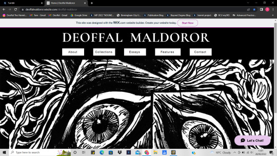
Fig 1. The Home Page.
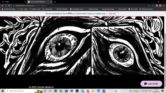
Fig 2. Bottom of the home page.
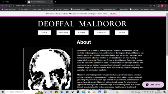
Fig 3. Top of the about page.
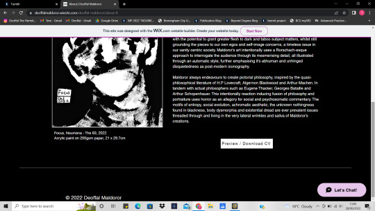
Fig 4. Bottom of the about page.
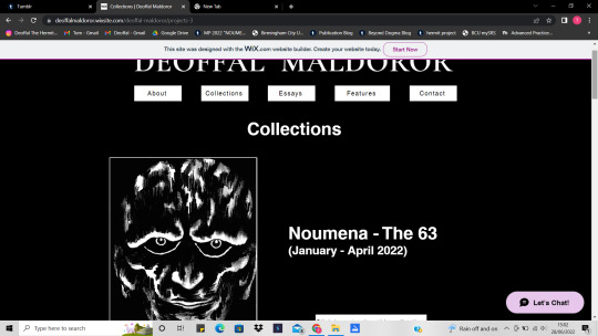
Fig 5. The collections page (Top)
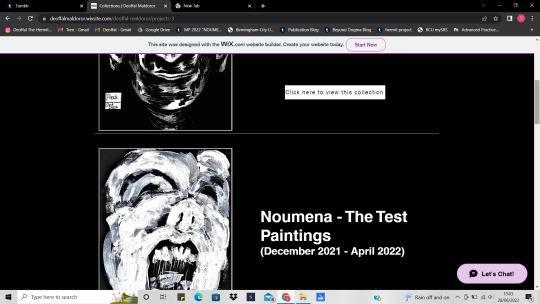
Fig 6. The collections page (Lower top)

Fig 7. The collections page (Mid section)
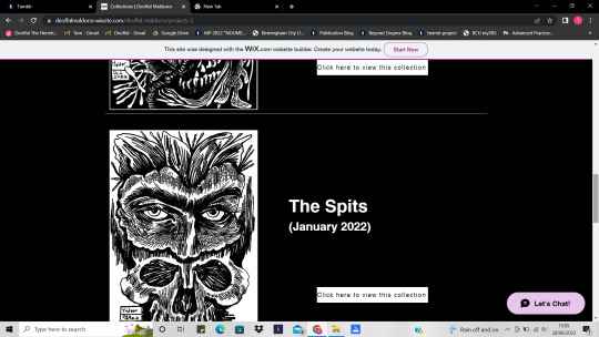
Fig 8. The collections page (Lower mid section)
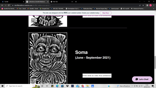
Fig 9. The collections page (Top of the Bottom)
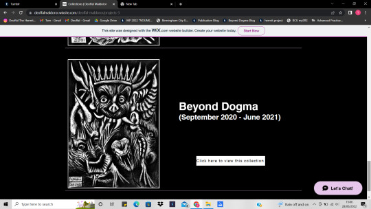
Fig 10. The collections page (The Bottom)
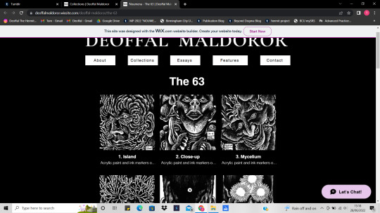
Fig 11. One collection example (The overall view of how each collection is laid out)
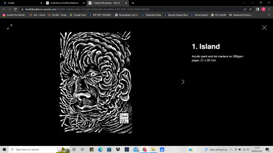
Fig 12. An example of what happens when you click on one piece from a collection (the top left icon allows you to full screen the art, the arrow to the right and left of each piece of art allows you to cycle through each piece while looking at them in an expanded view and without needing to select each piece individually)
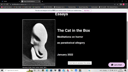
Fig 13. The essays page.
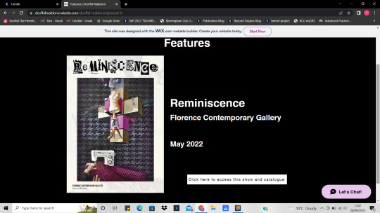
Fig 14. The features page.
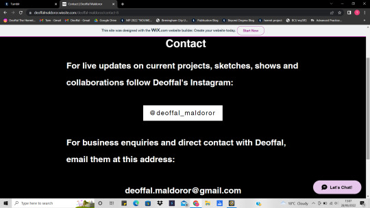
Fig 15. The contact page.
--------------------------------------------------------------------------
The link to my website:
https://deoffalmaldoror.wixsite.com/deoffal-maldoror/contact-8
The Notes:
To make noting about my website much easier I’m going to be writing about it in sections and giving a general summary of each design trait and reoccurring motifs throughout my website, this will hopefully be netted altogether in a simple conclusion to finish this post.
Home Page:
For my homepage I wanted to keep it very slick and simple, not overthought or with any major directory buttons given they are all on the top toolbar already and it would be a strange consideration to have the homepage be anything more than simply a quick and easy intro to my work as that’s all it should be for when the other pages have way more content. The choice of art for this page’s strip background is called ‘Prism’ and it’s from the 63 collection of pieces, I chose it because it represents the abstract nature of my practice quite well with it’s otherworldly design, human eyes all in triangular cases against a backdrop of lovecraftian tendrils and all within the achromaticity of my currently typical style. It’s important to mention that I used Wix to build my website, its a very simple and yet professional programming service that allowed me to make this website within 3 days, the majority of my website was made from taking previous notes from my Hyena The Hermit website (https://hyenathehermit.wixsite.com/hthehermit), this time with no colour and in turn simplifying more of the dynamic elements into an easier to follow website with a greater compendium of pieces to view, all captioned and titled properly, and dating back from the beginning of my Ma, all on their own easy to access pages etc. The only secret directory in this entire website is the title of the page, it’s in a gothic font due to my own liking towards classical typefaces, something always seen throughout contemporary satanic material too so it’s a little bit of Baskerville to show my roots stylistically, either way, the point of this button is to return to the homepage, this allows anyone to return to any page regardless of what their viewing my website, so it’s only a little touch that I thought would be worth mentioning here but still part of the overall design. The rest of the fonts throughout this website are mere Helvetica, only because I wanted it to look familiar and professional enough that no one looking at the page would find any part of my website overwhelming or designed poorly, and often you can see bad design in the choice of font for most freelance sites, with more poor scaling and awkward motifs that are just plain hard on the eye, so I used the most common font to let my work speak for itself, rather than overthinking all the minor details and making my website look more like a scrapbook than a professional dashboard for all my work. The toolbar has everything I need displayed for all to access, my collections, my contacts, features and essays, the last edition was to add an essay page, due to the fact that me being someone who wants to associate horror art more closely to academia, it would only make sense that I allow my audience to read my takes on this exact area of contention within contemporary discourse through my own links. (The ‘Lets Chat’ option comes with the site whether you like it or not, I may keep it for ease of contact regardless, just saying it wasn’t my choice to add it) Last note about the home page and about buttons in particular, the buttons on my website are inverse buttons when you hover over them, so they change from white with black text to the vice versa, makes for a subtle design feature that fits nicely with the theme of my work again.
The About Page:
This page again follows a simple structure, with an edited artist statement, a captioned piece of work and my cv available at the bottom of the page too. Again, you can really see how I didn’t want this website to be headache inducing and so alot of it’s design was about doing simple motifs properly and without going overboard, letting my work speak for itself. As captioned, the work chosen (Focus - The 63, again) has a similar look to me and yet is muffled, representing the mystery of my alias and my actual appearance to the audience, nothing too clear but nothing too abstract for the audience to get their head around, with a subtle white border just to break up the blackness of the page and the art itself, plus it encourages them to look at the rest of my works on the collections page.
The Collections Page:
This page and the pages that result from it are simple enough too, each collection has a poster image (typically the last image from that collection or just an image that stood out to me as a good representative for those collections overall) and a simple button to access the gallery of each collection, to make these galleries I just used a preformatted model from the gallery options in the Wix editor, it formats the work into rows of 3s as shown, I quite like this as it gives each piece enough space and scale to make atleast a recognisable thumbnail for each piece before you click on it. When you do click on a piece you can expand it to a mid view with the captions as evidenced, or you can also full screen them to see the piece even closer, these features were built into editor again as with most website building platforms, it’s the standard for any picture viewing nowadays as most computers have this built in feature to so it would make sense that it comes naturally with the site itself. I forgot to say, but of course the collections are dated, titled and presented again without any overcomplications, hopefully this will make the work all the more for casual viewing and represent the portfolio aspect of my work even better, considering each collection exists as a portfolio of many mixed media intersections and styles of work, so this really is how I want my physical work to be categorised and represented, almost as if each page is a new folder or book to be flicked through once anyone takes the time to visit my page.
The Features, Essay and Contact Page:
I’ve lumped all these final pages together to stop me over explaining as usual, given the features and essays page are pretty much the exact same model as the collections and about page, and the contact page follows the same model except it just states what channels to contact me through, the buttons on the other pages work like my cv button on the about and take you to a new window where you can see my most recent essay, or my most recent show etc. This concludes the relatively simple design and abundantly accessible outlook of my website and all it’s features, it’s how I imagined it to be and now it’s featured on my Instagram anyone can access it and send it as a link to anyone interested in my work, this will really help uphold the professional standard I am aiming for, especially for the show and what I want people to be able to access from my business card when I finally publish and house those in the final space, making my installation both a physical and somewhat digitally interested portal to the rest of my work and beyond the pieces themselves and into my essays too etc.
0 notes
Last Seen Blogs


sublimesoul12
Sublime Soul 12

loveallthegays
Love, All The Gays

willyfuckit
Willyfuckit.
tuna-cake
玖さん !