#timeless graphics
Text
Down the block, there's an antique shop and something in my head said, "Stop," so I walked in....


Speak Now (Taylor's Version) lyrics: vintage collection - Track 22/22
@taylorswift @taylornation
#taylor swift#swifties#speak now tv#speak now taylor’s version#vintage lyrics collection#speak now tv lyrics vintage collection#vswiftedits#tscreators#tswiftedits#glitter#lyrics#wallpaper#lockscreen#photoshop#graphic design#Taylor's Version#networkthirteen#fan art#timeless tv#timeless
29 notes
·
View notes
Text


Happy birthday, Massimo Vignelli!
The Max 365 by NAVA makes the perfect calendar to mark any important occasion. But especially Massimo Vignelli’s birthday. And rumor has it he adored how the number 23 looked on it. So it is also perfect to mark his birthday in 2023!
The design of this calendar was based on the Heller calendar for NAVA which featured the same typography for the numerals but also showed the day of the week, the month and the year. By stripping all of that away, the calendar becomes perpetual and timeless.
The Max 365 has been in production since 1976!
#Vignelli#design#archives#design archives#design history#modernism#graphic design#Timeless#Calendars#1970s#happy new year#happy birthday#NAVA
53 notes
·
View notes
Text

Timeless follows the adventures of an unusual trio — a history professor, Jaime Lannister, a scientist, Podrick Payne, and a soldier, Brienne Tarth — as they attempt to stop Catelyn Tully, a time-traveling criminal, from changing the course of history.
#jaime x brienne#leftovers from jb week#timeless au#jaime lannister#brienne of tarth#graphic#gotedit#time travel#time machine#effulgentgirl#I really had to think who the flynn in this verse could be
58 notes
·
View notes
Text
Gambit and Rogue moments X-Men The Animated Series
youtube
#gambit ♡ rogue#true timeless love story#Youtube#Spotify#x men 1992#flirtationship#best couple#heartfelt#marvel#x men#x men the animated series#bitter sweet memories#love of a lifetime#broken hearted#remy lebeau#xmen#comic books#graphic novel#raging cajun#star crossed lovers#anna marie lebeau#gambit and rogue#rogue/remyweek2022
2 notes
·
View notes
Text

Puffy Tupac 2024 remix by Technodrome1
#tupac#3d#fluffy#hiphop#west coast#red#gang#m#music#art#technodrome1#illustration#classic graphic#timeless
4 notes
·
View notes
Text

This charming and delightful retro vintage seamless design features classic elements and unique features that take you back in time. The aged and distressed texture adds a touch of nostalgia and gives it a timeless appeal. Use this seamless pattern as a background or texture for your vintage-themed design projects or simply enjoy it as a visual treat! It's perfect for anyone who appreciates classic and unique designs that never go out of style.
#retro#vintage#design#seamless#pattern#nostalgia#classic#unique#timeless#aged#distressed#art#artist#digitalart#graphics#texture#illustration#aesthetic#nostalgic#throwback#oldstyle#vintagelover
3 notes
·
View notes
Text
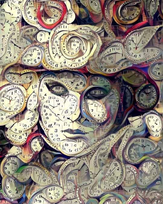
Move with the hands of time, and let the rhythm of the universe will guide you🕰🪐
#art#digital art#graphic design#international#artist#custom#earth#trippy#artgallery#masquerade#italy#special#new#clock#clockwork#time#timeless#meditation#high art#trippyart
12 notes
·
View notes
Note
yes, that's exactly the difference! and particularly in the talks about quality--it was really strange to hear people talk about the quality standard being so low when i personally grew up in the junior section with really well-written and designed books that still hold up upon rereads. of course there are books that don't appeal to me at my age now: i read a book recently by an author i used to love and it was almost as if i could physically see the difference between my life experience and the intended demographic, but at the same time there are still a lot of books i read back then that are still fully capable of taking my breath away.
i know at thirteen would not have picked a book with this cover up from the library without the prior knowledge that this was sophie and fitz!!! because i was a child with Taste^tm and almost always judged books by their covers (which, tbh, i still do! is that saying actually meant to apply to books too because if so, the entire graphic design industry says a collective ouch). especially when so much of what i read was from artists like Kazu Kibuishi haha, there was a lot of criteria i remember having! so i was absolutely disappointed when i saw the graphic novel cover reveal and it was just like any of the ones that you'd see on the side of the shelves at the end of the week when all of the older kids had taken all the interesting books, and then you ended reading the entire Geronimo Stilton series in like half a year (there was a borrow limit) instead.
to backtrack a bit though, from an artist's standpoint i don't think it's terrible! i don't think it's badly designed or maliciously designed--i think it's the job i probably would have done if i were hired to do something like that without any prior knowledge of the series. i don't even know what's in the first issue to make sense of what scene they "should" have illustrated for the cover, so it was kind of just like.... well that's a thing. that happened. and i talked to my friends about it privately instead of posting because in what way would it be productive to complain publicly about how mediocre a book cover is, but then people started bringing up the children's media arguments again and it was just so frustrating to me. i'm sure they didn't mean to belittle children's media, but it was just like... i am struggling to articulate but just a why are you here, in the children's media playpen, saying "yeah these plastic toy guns mass-bought from dollar tree suck but it's okay the toys don't have to be manufactured with great quality because the kids won't care!" like to some degree yes but there are also i didn't spend my days searching for the best quality my little pony toys for nothing? if that makes sense.
(2/2) i am concluding that long thing with um. i have just eaten a piece of the most truly awful mango i have ever had. is this what the mango haters mean when they say they don't like it. this tastes like coconut
(and also thank you for adding your tags to my post! i am glad you did because i hope it helped people look at it with a more attentive eye and didn't let them take my words at Face Value. and my brain is now melting from all of that writing haha but yes, as much as there is a huge difference between the majority of us and the age of the intended audience, kids also deserve quality things and that was what i was trying to get at! + hope you are doing well and that you have a lovely day)
----
Thanks! I'm doing alright and hope you're having a lovely time as well. You articulated yourself very well in this, so I don't want to detract from that with a long response. But you make several great points, and I agree that I don't think I would've picked up this book as a kid without already being invested in keeper. Which isn't meant to criticize or be rude to those behind it, just acknowledgement that the cover is what draws you in to a book, and that doesn't have the elements I look for or typically find appealing--or in this case what I found appealing at that age, as my tastes have changed.
Based on what I know, I do think the scene they chose is an appropriate one and makes a lot of sense! It's the huge transition in Sophie's life, leaping to this new world where "magic" is real and there's so much fantasy and otherworldly yet mundane things to discover. It completely flips her world upside down, but that's not really reflected in the image itself. It's just two tweens smiling with a burst of light; I think that could've been represented better, but I don't have the technical skill or knowledge to do a truly thorough and meaningful critique.
But getting to your overall point: children deserve good media, you're right. I don't think anyone here (at least that I saw) was truly trying to make that argument, but there can be a fine line that takes some awareness that you walk in these kinds of conversations. The distinction between not liking it because it's not for you, and not liking it because it's lower quality regardless of it's for you is an important one--I don't know if I've worded that well, but I hope you get my meaning.
I think something like this may also remind many of us of the trends we seen in books overall recently: the booktok book. The appeal to tropes and popularity instead of creativity and care taken with the medium. More generic and impersonal designs, which one could argue the cover is. So perhaps the cover isn't bad, but in it we can see evidence of a wider trend and how it could continue, and that's bad.
There's a lot of ways to look at this and things that can be considered. At the end of the day, children deserve good media and that cover doesn't seem fully representative of the story---in my opinion, but I don't have much familiarity with graphic novels so take it with a grain of salt. And your welcome, I hope my additions help as well! I feel like I've inevitably forgotten something or left something unsaid because of the length, but if anyone thinks I've missed something or wants to continue this conversation further, my ask box is open! (just please be respectful, I'm a real actual person)
also oh shit just remembered there's two mangoes in the kitchen i sure hope they haven't gone bad because i totally forgot about them
#kotlc#kotlc graphic novel#kotlc discourse#<- in case#quil's queries#soryasongsaa#long post#i wonder what it is about some books that make them feel timeless#like you mentioned at the beginning of the ask#some things you can reread. some you can't#is it taste?#i could probably reread the pegasus series for eternity. but divergent? meh#what qualities make younger books last the test of time#that's not really relevant to the overall ask I'm just curious about it now
5 notes
·
View notes
Text
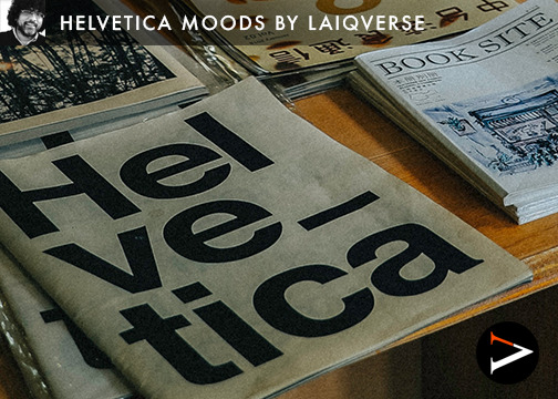
Helvetica and its 10 Moods
Exploring the Versatility of a Timeless Typeface
Helvetica is a typeface that has transcended the world of typography to become an icon in its own right. Originally created in 1957 by Swiss typeface designer Max Miedinger, Helvetica has become one of the most recognizable and widely-used fonts in the world. Its clean, modern lines have made it a popular choice for designers and businesses alike,…
View On WordPress
#aesthetics.#bold#Branding#classic#clean#Design#elegant#friendly#geometric#Graphic design#Helvetica#laiq ahmed qureshi#LaiqQureshi#laiqverse#Marketing#minimal#modern#moods#playful#timeless#typeface#typography#versatility#visual identity
2 notes
·
View notes
Text

The iconic LIFE magazine, now mostly an online only entity, was established in 1883. In 1936, publisher Henry Luce, the owner of Time Inc., purchased the company for $92,000, transforming its focus to visual storytelling. Its popularity exceeded all expectations, with circulation peaking at over 13.5 million copies per week during its heyday.
The cover of the 26 April 1937 edition, featuring Torkel Korling's photograph of a white leghorn rooster with a beautifully detailed cockscomb, is particularly memorable for its absence of the signature red and white 'LIFE' masthead.
Luce had tasked Al Zingaro, a layout artist working the nightshift, to create a cover showcasing Korling's rooster photo. Zingaro quickly obliged but something wasn't right. Luce felt the masthead and cockscomb clashed. As the clock ticked past midnight, and despite Zingaro's redrafts, they couldn't agree on the LIFE logo's placement.
Zingaro recalled the pivotal moment: 'I said, “Mr. Luce, we are at an impasse.” He was silent for all of 30 seconds then the thunderclap! “Let us omit the logo entirely. This fine photo must not be tampered with,” he said. “We’ll put LIFE in the red banner below in small type."'
Luce's resolve to temporarily demote his fledgling magazine's branding, driven by his concern for preserving the artistic integrity of a photograph of a rooster, is truly admirable. By removing the masthead, the cover gains a timeless quality and aesthetic durability that allows it to resonate both in the 1930s and nearly a century later in the 2020s.
#LIFE#magazine#magazine cover#design#graphic design#artistic integrity#photography#logo#logo design#masthead#life magazine#visual storytelling#no logo#layout#aesthetic layouts#graphics#header#1930s#1937#timeless#timelessness
0 notes
Text
Modern Bedroom DC Metro

Bedroom - large modern master carpeted and beige floor bedroom idea with gray walls and no fireplace
#bedroom#ethan allen furniture#neutral graphic patterned fabric#oversized crystal whitney chandelier#timeless/romantic design#upholstered bed
0 notes
Text
Compulsory Question 2
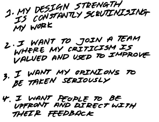
My vision statement comes from a place of good intentions and not that of a strong Ego. As mentioned, I do not possess the ability to imagine. Therefore, I always feel lacking whenever I create because I am held back from what I want to do and lack the imagination. I always feel I perform best when I am able to give my input and collaborate with others to create something spectacular.
I always had a profound respect for people who have the confidence to give out structured feedback despite it not being something anyone who had spent time to create something would like to hear. Giving feedback is not as simple as naming things you like or dislike. Whenever friends come for feedback, I abstain from giving them lip-service even though it is comfortable. When someone deliberately asks for feedback, they are asking for guidance.
What’s interesting is that the answer can only stem from the creator themselves. After all, it is not your work nor are you being credited for it. One must learn to ask the right questions and challenge their thought process to really help them solidify what they wish to achieve with their designs, and to be decisive with their rationale. This in a way gives them confidence because they were able to surmise a conclusion from your prompts.Done right, it empowers not only them, but oneself as well.
When we are able to ask quality questions and challenge peoples’ ideas, it would make decision-making internally easier in application to personal designs as well. Everybody has their inner critic within themselves be it in the form of a differentiating voice in their heads or based on intuition. Majority of people whom I talked to agree that one’s inner critic is often harsh and unapologetic. But why does that have to be the case? If we were self aware and fine tuned this ability, I believe that we could hone an impressive skill that would set us apart from restless individuals who design things half heartedly and in turn would make people want to work with us more.
“I would say that an understanding of man's intrinsic needs, and of the necessity to search for a climate in which those needs could be realised, is fundamental to the education of the designer.”
― Paul Rand
A work that resonates is Paul Rand’s IBM Logo.

The IBM logo especially showcases numeral design principles. He shared that it is important to ensure logos are treated with the same respect one’s company wishes to be looked upon. In this example, The design he created for IBM is successful in showcasing movement and progress, the horizontal lines representing speed and dynamism. This aligns with the technological achievements associated with IBM.
(461 Words)
IBM Logo : https://www.ibm.com/brand/experience-guides/developer/brand/logo/
#design principles#paul rand#graphic design#self awareness#discipline#timeless design#school project#cts#lasalle
0 notes
Link
How does this make you feel? Share with us!
#graphicdesign#digital#graphic#design#batik#gothic#fire#flames#abstract#ornamental#orange#brown#fashion#interior#space#dark#trendy#punk#timeless#occult#wild
0 notes
Text
Modern Bedroom DC Metro

Bedroom - large modern master carpeted and beige floor bedroom idea with gray walls and no fireplace
#bedroom#ethan allen furniture#neutral graphic patterned fabric#oversized crystal whitney chandelier#timeless/romantic design#upholstered bed
0 notes
Text
Modern Bedroom DC Metro

Bedroom - large modern master carpeted and beige floor bedroom idea with gray walls and no fireplace
#bedroom#ethan allen furniture#neutral graphic patterned fabric#oversized crystal whitney chandelier#timeless/romantic design#upholstered bed
0 notes
Text
Modern Bedroom DC Metro

Bedroom - large modern master carpeted and beige floor bedroom idea with gray walls and no fireplace
#bedroom#ethan allen furniture#neutral graphic patterned fabric#oversized crystal whitney chandelier#timeless/romantic design#upholstered bed
0 notes
Last Seen Blogs

thevirus-19
TheVirus_19

edibrad13
JUST A WEE MINUTE.

etokitt
kitt2506

thehoodsimmer
Thehoodsimmer

whumpopology
Placeholder