#idk how that fandom tags stuff??
Text


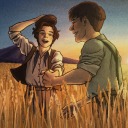
I've been busy with hw stuff which is why I don't have anything real to post so I hope you like ghostbusters
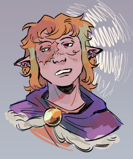
#what if ghostbusters was a cartoon#haha damn thats craaaazy#i totally fucked up this assignment#my professor is gonna kill me very cool very epic#i know what to do next time now#which is#shocking#more shots#ghostbusters#idk how that fandom tags stuff??#egon#seymour#stanley#vekman#???#idk how to spell#here catch#this is for you#im a fake fan and forgot their proton packs half the time soz#and before u ask no this is not all of it#my art
24 notes
·
View notes
Text
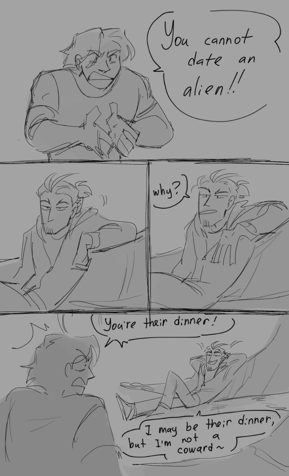
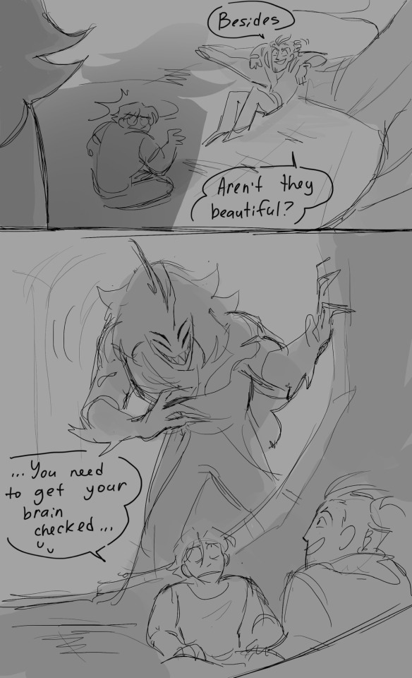
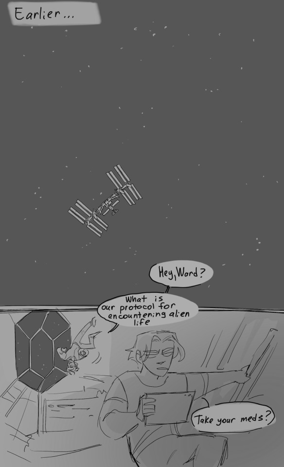

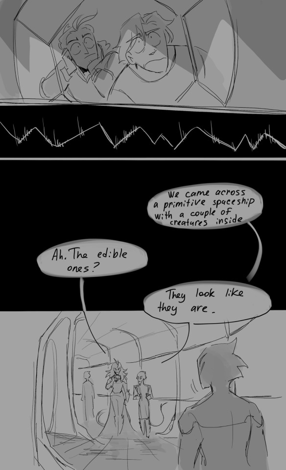
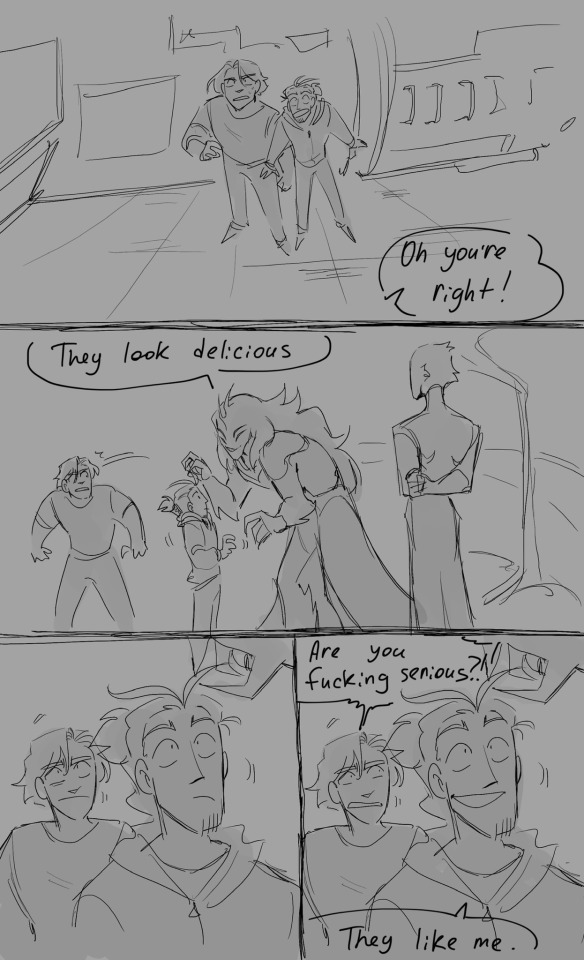
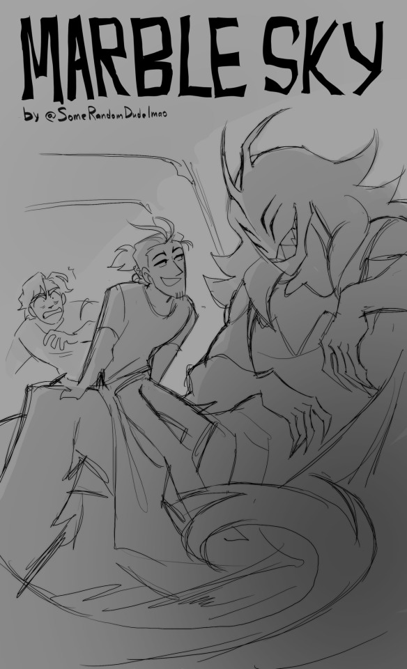
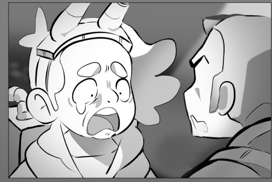
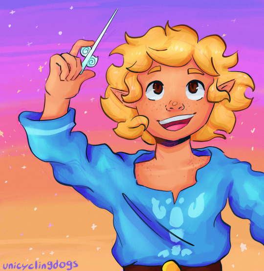
Let me show you one of my original concepts :>
Because. Why not haha👍
Characters refs Masterpost
Next
#ah wait how do I even tag non fandom stuff?#uh#marble sky#marble sky comic#or something?#art#comics#what else#aliens#lol#Idk what to put in the tags so#what are your thoughts on this thing?#I tried to post this on other website but it didn’t really gain much audience lol people was just looking and then silently leaving#I wonder if Tumblr is diffent#Tumblr seems to like aliens much more that Twitter haha
8K notes
·
View notes
Text
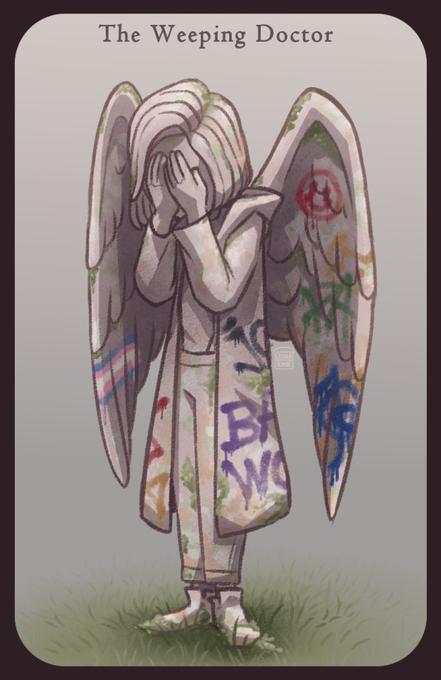
I just finished the Flux storyline and it makes me so upset they introduced this cool idea to us and then IMMEDIATELY took it away again the next episode!! The Doctor turning into a weeping angel would have been such a cool plot point!!
#LIKE ARE YOU KIDDING MEEEE#you could have so much fun with that#like how long is the doctor willing to go hungry to save humanity#how much would it hurt her if Yaz couldn't stand her starving herself and offering up someone else OR EVEN HERSELF#The SHAME the GUILT#not even the TARDIS wanting anything to do with her#jodie whittaker#13th doctor#doctor who#doctor who fanart#dw art#dw fanart#the flux#the timeless child#weeping angels#weeping angel#the weeping doctor#weepingangel!doctor#man idk how fandom people tag stuff#weeping angel doctor#fanart#the doctor#doctor who flux#weeping angel 13#donutdrawsthings#bad wolf#angel#digital art#artists on tumblr#doctor who series 13
537 notes
·
View notes
Text
why Aurora's art is genius
It's break for me, and I've been meaning to sit down and read the Aurora webcomic (https://comicaurora.com/, @comicaurora on Tumblr) for quite a bit. So I did that over the last few days.
And… y'know. I can't actually say "I should've read this earlier," because otherwise I would've been up at 2:30-3am when I had responsibilities in the morning and I couldn't have properly enjoyed it, but. Holy shit guys THIS COMIC.
I intended to just do a generalized "hello this is all the things I love about this story," and I wrote a paragraph or two about art style. …and then another. And another. And I realized I needed to actually reference things so I would stop being too vague. I was reading the comic on my tablet or phone, because I wanted to stay curled up in my chair, but I type at a big monitor and so I saw more details… aaaaaand it turned into its own giant-ass post.
SO. Enjoy a few thousand words of me nerding out about this insanely cool art style and how fucking gorgeous this comic is? (There are screenshots, I promise it isn't just a wall of text.) In my defense, I just spent two semesters in graphic design classes focusing on the Adobe Suite, so… I get to be a nerd about pretty things…???
All positive feedback btw! No downers here. <3
---
I cannot emphasize enough how much I love the beautiful, simple stylistic method of drawing characters and figures. It is absolutely stunning and effortless and utterly graceful—it is so hard to capture the sheer beauty and fluidity of the human form in such a fashion. Even a simple outline of a character feels dynamic! It's gorgeous!
Though I do have a love-hate relationship with this, because my artistic side looks at that lovely simplicity, goes "I CAN DO THAT!" and then I sit down and go to the paper and realize that no, in fact, I cannot do that yet, because that simplicity is born of a hell of a lot of practice and understanding of bodies and actually is really hard to do. It's a very developed style that only looks simple because the artist knows what they're doing. The human body is hard to pull off, and this comic does so beautifully and makes it look effortless.
Also: line weight line weight line weight. It's especially important in simplified shapes and figures like this, and hoo boy is it used excellently. It's especially apparent the newer the pages get—I love watching that improvement over time—but with simpler figures and lines, you get nice light lines to emphasize both smaller details, like in the draping of clothing and the curls of hair—which, hello, yes—and thicker lines to emphasize bigger and more important details and silhouettes. It's the sort of thing that's essential to most illustrations, but I wanted to make a note of it because it's so vital to this art style.
THE USE OF LAYER BLENDING MODES OH MY GODS. (...uhhh, apologies to the people who don't know what that means, it's a digital art program thing? This article explains it for beginners.)
Bear with me, I just finished my second Photoshop course, I spent months and months working on projects with this shit so I see the genius use of Screen and/or its siblings (of which there are many—if I say "Screen" here, assume I mean the entire umbrella of Screen blending modes and possibly Overlay) and go nuts, but seriously it's so clever and also fucking gorgeous:
Firstly: the use of screened-on sound effect words over an action? A "CRACK" written over a branch and then put on Screen in glowy green so that it's subtle enough that it doesn't disrupt the visual flow, but still sticks out enough to make itself heard? Little "scritches" that are transparent where they're laid on without outlines to emphasize the sound without disrupting the underlying image? FUCK YES. I haven't seen this done literally anywhere else—granted, I haven't read a massive amount of comics, but I've read enough—and it is so clever and I adore it. Examples:


Secondly: The beautiful lighting effects. The curling leaves, all the magic, the various glowing eyes, the fog, the way it's all so vividly colored but doesn't burn your eyeballs out—a balance that's way harder to achieve than you'd think—and the soft glows around them, eeeee it's so pretty so pretty SO PRETTY. Not sure if some of these are Outer/Inner Glow/Shadow layer effects or if it's entirely hand-drawn, but major kudos either way; I can see the beautiful use of blending modes and I SALUTE YOUR GENIUS.
I keep looking at some of this stuff and go "is that a layer effect or is it done by hand?" Because you can make some similar things with the Satin layer effect in Photoshop (I don't know if other programs have this? I'm gonna have to find out since I won't have access to PS for much longer ;-;) that resembles some of the swirly inner bits on some of the lit effects, but I'm not sure if it is that or not. Or you could mask over textures? There's... many ways to do it.
If done by hand: oh my gods the patience, how. If done with layer effects: really clever work that knows how to stop said effects from looking wonky, because ugh those things get temperamental. If done with a layer of texture that's been masked over: very, very good masking work. No matter the method, pretty shimmers and swirly bits inside the bigger pretty swirls!
Next: The way color contrast is used! I will never be over the glowy green-on-black Primordial Life vibes when Alinua gets dropped into that… unconscious space?? with Life, for example, and the sharp contrast of vines and crack and branches and leaves against pitch black is just visually stunning. The way the roots sink into the ground and the three-dimensional sensation of it is particularly badass here:

Friggin. How does this imply depth like that. HOW. IT'S SO FREAKING COOL.
A huge point here is also color language and use! Everybody has their own particular shade, generally matching their eyes, magic, and personality, and I adore how this is used to make it clear who's talking or who's doing an action. That was especially apparent to me with Dainix and Falst in the caves—their colors are both fairly warm, but quite distinct, and I love how this clarifies who's doing what in panels with a lot of action from both of them. There is a particular bit that stuck out to me, so I dug up the panels (see this page and the following one https://comicaurora.com/aurora/1-20-30/):

(Gods it looks even prettier now that I put it against a plain background. Also, appreciation to Falst for managing a bridal-carry midair, damn.)
The way that their colors MERGE here! And the immense attention to detail in doing so—Dainix is higher up than Falst is in the first panel, so Dainix's orange fades into Falst's orange at the base. The next panel has gold up top and orange on bottom; we can't really tell in that panel where each of them are, but that's carried over to the next panel—

—where we now see that Falst's position is raised above Dainix's due to the way he's carrying him. (Points for continuity!) And, of course, we see the little "huffs" flowing from orange to yellow over their heads (where Dainix's head is higher than Falst's) to merge the sound of their breathing, which is absurdly clever because it emphasizes to the viewer how we hear two sets of huffing overlaying each other, not one. Absolutely brilliant.
(A few other notes of appreciation to that panel: beautiful glows around them, the sparks, the jagged silhouette of the spider legs, the lovely colors that have no right to make the area around a spider corpse that pretty, the excellent texturing on the cave walls plus perspective, the way Falst's movements imply Dainix's hefty weight, the natural posing of the characters, their on-point expressions that convey exactly how fuckin terrifying everything is right now, the slight glows to their eyes, and also they're just handsome boys <3)
Next up: Rain!!!! So well done! It's subtle enough that it never ever disrupts the impact of the focal point, but evident enough you can tell! And more importantly: THE MIST OFF THE CHARACTERS. Rain does this irl, it has that little vapor that comes off you and makes that little misty effect that plays with lighting, it's so cool-looking and here it's used to such pretty effect!
One of the panel captions says something about it blurring out all the injuries on the characters but like THAT AIN'T TOO BIG OF A PROBLEM when it gets across the environmental vibes, and also that'd be how it would look in real life too so like… outside viewer's angle is the same as the characters', mostly? my point is: that's the environment!!! that's the vibes, that's the feel! It gets it across and it does so in the most pretty way possible!
And another thing re: rain, the use of it to establish perspective, particularly in panels like this—

—where we can tell we're looking down at Tynan due to the perspective on the rain and where it's pointing. Excellent. (Also, kudos for looking down and emphasizing how Tynan's losing his advantage—lovely use of visual storytelling.)
Additionally, the misting here:

We see it most heavily in the leftmost panel, where it's quite foggy as you would expect in a rainstorm, especially in an environment with a lot of heat, but it's also lightly powdered on in the following two panels and tends to follow light sources, which makes complete sense given how light bounces off particles in the air.
A major point of strength in these too is a thorough understanding of lighting, like rim lighting, the various hues and shades, and an intricate understanding of how light bounces off surfaces even when they're in shadow (we'll see a faint glow in spots where characters are half in shadow, but that's how it would work in real life, because of how light bounces around).
Bringing some of these points together: the fluidity of the lines in magic, and the way simple glowing lines are used to emphasize motion and the magic itself, is deeply clever. I'm basically pulling at random from panels and there's definitely even better examples, but here's one (see this page https://comicaurora.com/aurora/1-16-33/):

First panel, listed in numbers because these build on each other:
The tension of the lines in Tess's magic here. This works on a couple levels: first, the way she's holding her fists, as if she's pulling a rope taut.
The way there's one primary line, emphasizing the rope feeling, accompanied by smaller ones.
The additional lines starbursting around her hands, to indicate the energy crackling in her hands and how she's doing a good bit more than just holding it. (That combined with the fists suggests some tension to the magic, too.) Also the variations in brightness, a feature you'll find in actual lightning. :D Additional kudos for how the lightning sparks and breaks off the metal of the sword.
A handful of miscellaneous notes on the second panel:
The reflection of the flames in Erin's typically dark blue eyes (which bears a remarkable resemblance to Dainix, incidentally—almost a thematic sort of parallel given Erin's using the same magic Dainix specializes in?)
The flowing of fabric in the wind and associated variation in the lineart
The way Erin's tattoos interact with the fire he's pulling to his hand
The way the rain overlays some of the fainter areas of fire (attention! to! detail! hell yeah!)
I could go on. I won't because this is a lot of writing already.
Third panel gets paragraphs, not bullets:
Erin's giant-ass "FWOOM" of fire there, and the way the outline of the word is puffy-edged and gradated to feel almost three-dimensional, plus once again using Screen or a variation on it so that the stars show up in the background. All this against that stunning plume of fire, which ripples and sparks so gorgeously, and the ending "om" of the onomatopoeia is emphasized incredibly brightly against that, adding to the punch of it and making the plume feel even brighter.
Also, once again, rain helping establish perspective, especially in how it's very angular in the left side of the panel and then slowly becomes more like a point to the right to indicate it's falling directly down on the viewer. Add in the bright, beautiful glow effects, fainter but no less important black lines beneath them to emphasize the sky and smoke and the like, and the stunningly beautiful lighting and gradated glows surrounding Erin plus the lightning jagging up at him from below, and you get one hell of an impactful panel right there. (And there is definitely more in there I could break down, this is just a lot already.)
And in general: The colors in this? Incredible. The blues and purples and oranges and golds compliment so well, and it's all so rich.
Like, seriously, just throughout the whole comic, the use of gradients, blending modes, color balance and hues, all the things, all the things, it makes for the most beautiful effects and glows and such a rich environment. There's a very distinct style to this comic in its simplified backgrounds (which I recognize are done partly because it's way easier and also backgrounds are so time-consuming dear gods but lemme say this) and vivid, smoothly drawn characters; the simplicity lets them come to the front and gives room for those beautiful, richly saturated focal points, letting the stylized designs of the magic and characters shine. The use of distinct silhouettes is insanely good. Honestly, complex backgrounds might run the risk of making everything too visually busy in this case. It's just, augh, so GORGEOUS.
Another bit, take a look at this page (https://comicaurora.com/aurora/1-15-28/):

It's not quite as evident here as it is in the next page, but this one does some other fun things so I'm grabbing it. Points:
Once again, using different colors to represent different character actions. The "WHAM" of Kendal hitting the ground is caused by Dainix's force, so it's orange (and kudos for doubling the word over to add a shake effect). But we see blue layered underneath, which could be an environmental choice, but might also be because it's Kendal, whose color is blue.
And speaking off, take a look at the right-most panel on top, where Kendal grabs the spear: his motion is, again, illustrated in bright blue, versus the atmospheric screened-on orange lines that point toward him around the whole panel (I'm sure these have a name, I think they might be more of a manga thing though and the only experience I have in manga is reading a bit of Fullmetal Alchemist). Those lines emphasize the weight of the spear being shoved at him, and their color tells us Dainix is responsible for it.
One of my all-time favorite effects in this comic is the way cracks manifest across Dainix's body to represent when he starts to lose control; it is utterly gorgeous and wonderfully thematic. These are more evident in the page before and after this one, but you get a decent idea here. I love the way they glow softly, the way the fire juuuust flickers through at the start and then becomes more evident over time, and the cracks feel so realistic, like his skin is made of pottery. Additional points for how fire begins to creep into his hair.
A small detail that's generally consistent across the comic, but which I want to make note of here because you can see it pretty well: Kendal's eyes glow about the same as the jewel in his sword, mirroring his connection to said sword and calling back to how the jewel became Vash's eye temporarily and thus was once Kendal's eye. You can always see this connection (though there might be some spots where this also changes in a symbolic manner; I went through it quickly on the first time around, so I'll pay more attention when I inevitably reread this), where Kendal's always got that little shine of blue in his eyes the same as the jewel. It's a beautiful visual parallel that encourages the reader to subconsciously link them together, especially since the lines used to illustrate character movements typically mirror their eye color. It's an extension of Kendal.
Did I mention how ABSOLUTELY BEAUTIFUL the colors in this are?
Also, the mythological/legend-type scenes are illustrated in familiar style often used for that type of story, a simple and heavily symbolic two-dimensional cave-painting-like look. They are absolutely beautiful on many levels, employing simple, lovely gradients, slightly rougher and thicker lineart that is nonetheless smoothly beautiful, and working with clear silhouettes (a major strength of this art style, but also a strength in the comic overall). But in particular, I wanted to call attention to a particular thing (see this page https://comicaurora.com/aurora/1-12-4/):

The flowing symbolic lineart surrounding each character. This is actually quite consistent across characters—see also Life's typical lines and how they curl:

What's particularly interesting here is how these symbols are often similar, but not the same. Vash's lines are always smooth, clean curls, often playing off each other and echoing one another like ripples in a pond. You'd think they'd look too similar to Life's—but they don't. Life's curl like vines, and they remain connected; where one curve might echo another but exist entirely detached from each other in Vash's, Life's lines still remain wound together, because vines are continuous and don't float around. :P
Tahraim's are less continuous, often breaking up with significantly smaller bits and pieces floating around like—of course—sparks, and come to sharper points. These are also constants: we see the vines repeated over and over in Alinua's dreams of Life, and the echoing ripples of Vash are consistent wherever we encounter him. Kendal's dream of the ghost citizens of the city of Vash in the last few chapters is filled with these rippling, echoing patterns, to beautiful effect (https://comicaurora.com/aurora/1-20-14/):

They ripple and spiral, often in long, sinuous curves, with smooth elegance. It reminds me a great deal of images of space and sine waves and the like. This establishes a definite feel to these different characters and their magic. And the thing is, that's not something that had to be done—the colors are good at emphasizing who's who. But it was done, and it adds a whole other dimension to the story. Whenever you're in a deity's domain, you know whose it is no matter the color.
Regarding that shape language, I wanted to make another note, too—Vash is sometimes described as chaotic and doing what he likes, which is interesting to me, because smooth, elegant curves and the color blue aren't generally associated with chaos. So while Vash might behave like that on the surface, I'm guessing he's got a lot more going on underneath; he's probably much more intentional in his actions than you'd think at a glance, and he is certainly quite caring with his city. The other thing is that this suits Kendal perfectly. He's a paragon character; he is kind, virtuous, and self-sacrificing, and often we see him aiming to calm others and keep them safe. Blue is such a good color for him. There is… probably more to this, but I'm not deep enough in yet to say.
And here's the thing: I'm only scratching the surface. There is so much more here I'm not covering (color palettes! outfits! character design! environment! the deities! so much more!) and a lot more I can't cover, because I don't have the experience; this is me as a hobbyist artist who happened to take a couple design classes because I wanted to. The art style to this comic is so clever and creative and beautiful, though, I just had to go off about it. <3
...brownie points for getting all the way down here? Have a cookie.
#aurora comic#aurora webcomic#comicaurora#art analysis#...I hope those are the right tags???#new fandom new tagging practices to learn ig#much thanks for something to read while I try to rest my wrists. carpal tunnel BAD. (ignore that I wrote this I've got braces ok it's fine)#anyway! I HAVE. MANY MORE THOUGHTS. ON THE STORY ITSELF. THIS LOVELY STORY#also a collection of reactions to a chunk of the comic before I hit the point where I was too busy reading to write anything down#idk how to format those tho#...yeet them into one post...???#eh I usually don't go off this much these days but this seems like a smaller tight-knit fandom so... might as well help build it?#and I have a little more time thanks to break so#oh yes also shoutout to my insanely awesome professor for teaching me all the technical stuff from this he is LOVELY#made an incredibly complex program into something comprehensible <3#synapse talks
743 notes
·
View notes
Text


buncha headshot commissions :o)
#my art#sage doodles#comm#commissions#commission#digital art#doodle#sketch#art#idk how to tag non fandom stuff
187 notes
·
View notes
Text

practicing drawing hands since i cant fistfight ai in a dark alley
818 notes
·
View notes
Text

I made this side blog on a whim specifically to post this picture. My main blog is primarily focused on one fandom (and I like it that way :3) so I made this side blog for anything else :)
KAITOOOOO KAITO MY BABYGIRL I LOVE YOUUUUUU
Pretend this was posted on his birthday since I’m a couple days late.
#kaito vocaloid#kaito#kaito shion#vocaloid#vocal synth#vocaloid kaito#idk how to tag vocaloid stuff…#I’m new to engaging with the fandom…#even though I’ve been into vocaloid since I’ve been 8…#so scary….#hiieee hello…#ボ—カロイド#カイト
84 notes
·
View notes
Text
wind!!!!
this wasn’t supposed to be a redraw, but it’s very similar to an older drawing I did, so I’ll put it under the cut so you can see the difference :)

and this drawing isn’t even a full year old yet; i drew it last november‼️ i really think i improved a lot this year and yeah 👍
#linked universe#lu fanart#lu wind#art improvement#uni art :)#it’s been a minute since i posted art here whoops#this blog was this close 🤏 to becoming a multi fandom blog but i decided against it since i figured most ppl are here for zelda#and yeah ik my house my rules but idk I felt bad posting non Lu stuff#so now im more active on a sideblog anf ive been neglecting this blog#whoops#anyways all that aside LOOK AT HIW MUCH I IMPROVED#ITS CRAZY#I like how the main thing that stayed the same was me adding a million stars to the background#also im still on my brown eyed wind agenda#dude one time i drew him with brown eyes someone commented that he canonically has green eyes so now im only drawing them brown sorry#like wow! don’t care! like HIS EYES ARE BLACK DOTS IN THE GAMES LET ME HAVE THIS#…wow yeah that comment got to me#literally I keep thinking about it and every time it bugs me 😭#man ive missed venting in the tags#ok ok I should stop this is a lot a tags even for me
132 notes
·
View notes
Text
I can’t define what Pyrrha Dve has going on gender-wise but it feels like it’s equal and opposite to what Link Legendofzelda has going on send tweet
#like i know the joke it that link is transmasc and transfemme and a cis man and a cis woman all at the same time#and i feel like pyrrha is the exact opposite?#like if you asked if pyrrha was a trans woman i’d be like ‘no that’s not quite right’#and same if you asked if she was a trans man#or if she was nonbinary#but if you asked if she was cis I would say ‘absolutely tf not’#pyrrha dve#ntn#nona the ninth#the locked tomb#tlt#legend of zelda#link loz#loz link#botw#idk how to tag zelda stuff i’m not in that fandom
99 notes
·
View notes
Text
hey guys am i allowed to say on main that i dont like metadad . am i gonna get beaten up for saying this.
guys i think we all took the term found family too literally and now everythings flattened into a boring nuclear family. guys can we stop. hello . is anybody there
#text#it was kinda charming at first but it feels like everytime i try to look at the mk tag its always the same shit . guys. guys.#we can do so much more w/ their dynamics than just dad and son ugh its so . ughhh.#every since i realized i was like . really really aroace. ive started to grow a bit of a distaste for shipping culture#this is relavant i swear. iwanna talk about metadede#like ok in fandoms right. theres often#the enforcement of specific roles onto characters for a simplified understanding of them for memes and drawing ideas#we want gay rep but we dont quite have it canonically so we make our queer headcanons seem more legit#by giving a char a same sex partner. ok easy we did it. gay people are real now#and we get awesome art and its wonderful bc people are wonderful#but its like . the relationships themselves feel flat a lot of the times.#metadede never seems to be about dedede. its about mk having a boyfriend. bc we need him to date someone.#and im not like . mad at anyone about this. i participated in it back in the day. but like.#ok so. gay hcs are the most popular in most fandom things bc its easy; hot; and sweet#but things like aro or ace hcs? its just. they. how can you depict that in a single framed drawing of a char?so theres none at all.#its not even that i actively hc chars aroace its jsut this is my world view; how i default to reading chars#maybe this rant in the tags is unrelated after all.#but idk. ive got lots of thoughts about things.#anyways as ceo of meta knigth im right about everything#i can talk more about metadad stuff specifically if people want
140 notes
·
View notes
Text
Heya kids. Are you ready for yet another Fairy Tail fandom event???
The goal of Platonic Week will be to highlight and feature—you guessed it—platonic relationships within the series. Anything from family, friendship, adoptive/found family, teams, brotps, qpp/qprs, etc. Ships and romance have their own spaces, and the idea of Platonic Week is to focus on all of the other meaningful relationships fill up the series, whether its an established relationship or one you just really want to see, canon-style or alternate universe.
Please fill out this interest check if you are, ya know, interested!
Reblogs are very much appreciated
@ftguildevents
#fairy tail#fairy tail events#fandom events#ft platonic week#fairy tail platonic week#ft platonic week 2024#friendship#family#found family#uhhhhhhhh idk how to tag this#come come we have gen/platonic friendly stuff#all of it
53 notes
·
View notes
Text
Requested by @khlara
(I’m really sorry about the giant delay! Hope you like it 🙏🏻❤️)
Aziraphale had never been to Crowley’s flat that much. He could list that one night after the “Almost-geddon” and just a few other times before that. But that was all. They were used to spend more time in the bookshop.
Still, he was certain his plants were greener then. And there weren’t so many empty bottles on the floor. The smell of alcohol had already impregnated the air.
- Crowley? - Aziraphale called. For Heaven’s sake, this place is a mess, he thought.
- I’m here - The angel found him lying on the floor, surrounded by more empty bottles.
His sunglasses were a bit crooked on his face, so Aziraphale could see his eyes were shut. He probably didn’t recognize Aziraphale’s voice. And was way too drunk to ask what a stranger might be doing in his flat.
- Hey! - Crowley protested when he took his sunglasses.
The look of pure shock on his face when he realized Aziraphale was standing there was heartbreaking. Suddenly, it was like they were replaying their last meeting on their heads. At the same time.
- Ang… - Crowley stood up and recomposed himself. - Sorry. Supreme Archangel.
- Crowley… - Aziraphale started, and then stopped himself. It wouldn’t help at all. - I need to talk to you.
He handed Crowley his sunglasses.
- Take your time - He put them back -, Archangel Aziraphale.
- Can we not do this, please?
- Do what? - Crowley opened his arms. - Talk? That’s what you wanted to do, right?
- This is not how I imagined it - Aziraphale murmured.
- What?
- I need your help, Crowley.
Pause. An awkward silence.
- Oh… - said Crowley, at last. - So that’s why you’re here.
- Crowley… - Aziraphale started.
- You need my help? - He confirmed. - My help?
- That’s what I’m saying.
- My help? - Crowley continued. - After you left me? After you chose to leave me?
- It’s not what it seems… - Aziraphale tried.
- And for what? Heaven. Of all things - He lowered his head. - You know, after everything… I thought you had changed. For once, I thought you finally saw Heaven as it is. But I was wrong. Like always.
- I had to go back.
- No, of course - said Crowley, sarcastically. - You’re the good guys and Heaven is so ineffably wonderful. Why stay on Earth when you can enjoy the holy loneliness up there?
- Crowley, I need you - said Aziraphale. - I can’t do this without you. We’re a team, remember?
He reached for Crowley, in an attempt to make the demon look at him. But he flinched.
- No, Aziraphale. Not anymore.
He had barely looked at Aziraphale during the whole conversation. Now Crowley had decided it was better to turn his back to him. That almost made Aziraphale lose his hope.
- They’re planning the second coming.
Crowley hesitated. That seemed to truly scare him for a while.
- Good - He said. - It was about time they found a way to destroy this place once and for all.
That made Aziraphale’s knees weaken. Crowley didn’t mean it. Did he?
- I know that’s not what you want. You love Earth just as much as I do.
- Not much then - Crowley spat. - Since you chose to leave us for the greater good.
- Listen to me - Aziraphale stopped right in front of him, making him look away. - I have a plan. I know how to stop it. But I can’t do this alone.
Crowley kept looking at everything that wasn’t Aziraphale.
- If you’re going to say no you could at least do it while looking at me.
- I can’t.
- Why not?
- Your eyes…
His eyes. The eyes that used to be blue, but that he now knew were a sickening shade of purple. Gabriel’s eyes. The thing that marked him as Supreme Archangel.
- Oh, Crowley… - said Aziraphale, lowering his head. - I’m sorry.
He began walking towards the door. There was nothing he could do. But Crowley stopped him, grabbing his wrist. Aziraphale slowly looked at him.
- I forgive you - said Crowley.
He took off his sunglasses and placed them on Aziraphale’s face.
- There. Much better - He managed to put a sad smile on his face. - They look good on you.
- So… - Aziraphale was afraid he could suddenly say the wrong thing and ruin everything. - Are you helping me?
- Yeah… - said Crowley, putting on another pair of sunglasses. - Someone has to put an end to this madness. And it won’t be either of our sides.
- Crowley, we don’t have a side - said Aziraphale, extending his hand to him. - We are on our own side.
That made Crowley smile. A true smile. The one he hasn’t been able to show since the angel left him.
- So I guess we have a world to save.
- One more time - completed Aziraphale, his hand still between them.
- One more time - echoed Crowley, taking Aziraphale’s hand. - Together.
And together they went. To save the world once again. For the last time.
#idk how to tag this#half cute half heartbreaking?#guess I’ll leave it on sad stuff and cute stuff#good omens#good omens fandom#ineffable fandom#crowley#aziracrow#ineffable husbands#aziraphale#good omens s2#good omens season 2#ineffable divorce#asks and requests#cute omens#ineffable heartbreak
50 notes
·
View notes
Text
El cómic original de @darth-sonny: Aquí !!
¡¡ Quería hacer un doblaje de cómic en español de unos de mis cómic favoritos !! ¡¡ Los Leos arománticas y asexuales son los mejores Leos !!
#rise of the tmnt#tira cómica#cómics#mini cómic#traduccion al español#rise of tmnt#rottmnt#perdón#para mi español me ayuda un traductor en línea#no estoy listo para escribir español solo :')#El lado español de este fandom#ayuda por favor#rottmnt fan comic#comic dub#gods help me#idk how to tag stuff for the Spanish speakers of the fandom#:')
74 notes
·
View notes
Text
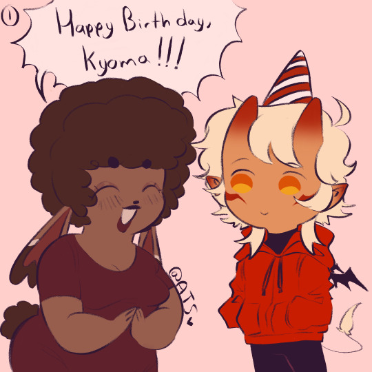
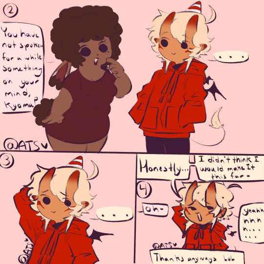
First post here YAYYY💖💖‼️‼️‼️ anywaysss Happy birthday to my
HAPPY BIRTHDAY TO MY SILLY DILLY GILLY BESTIE WESTIE OF ALL TIME‼️‼️‼️‼️‼️‼️‼️ 💖💖💖💖💖💖💖💖💖💖💖💖 😍😍😍😍😍😍😍😍😍😍😍✨✨✨✨✨✨✨✨✨��✨✨✨✨✨✨✨✨✨✨✨✨✨✨✨✨✨✨✨✨✨✨✨✨✨✨✨✨✨✨✨✨✨✨✨✨✨✨✨✨ @kyomaakuma7
In all seriousness, I’m absolutely blessed to have Kyo in my life. He’s so funny and sweet<3 whenever I’m with bro, it’s a never ending funfest and I could never imagine my life without my bestie in my life <3. We started off a lil rocky, but it’s ok because in our battles, we blossomed a strong and healthy friendship that in my eyes, will never end <3 thank you for being there for me on my lowest moments, and making my life better broo‼️‼️ happy (late) birthday
#first post#digital art#oc interaction#oc stuff#my art#not my oc#my oc art#fandom#fandom oc#idk how to tag this#birthday#fanart
61 notes
·
View notes
Text
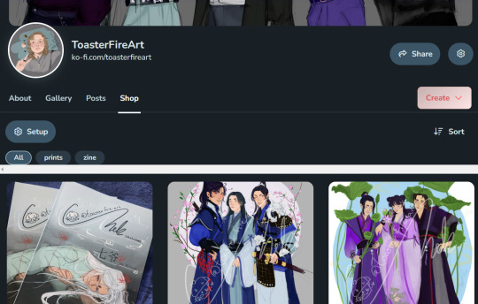
Hi everyone! I've actually gotten around to creating a ko-fi and a little shop! The link is in my bio, and here if you want to support me and my dearest of hobbies, or if you want to physically own a print mayhaps a sticker. Although if I'm being totally honest I have no idea what I'm doing so it's all in the works still! bare with me...
All I have up right now is a few prints, and my Qiye zine IS UP but as a preorder because I want to be positive about how I'm getting it all done and how many people are nterested in it but! It's coming. It might be avaliable digitally before it's avaiable physically, and if you're interested in that please let me know and I'll make a digital version.
Thank you to everyone I have met along the way it still baffles me that I have any sort of an audience and people that are interested enough in my art to stick arond I love seeing familiar faces in tags and such but I don't want to be that guy that messages back going I LOVE SEEING YOU HERE but I mean it! Thank you! It means the world to me and makes my day!
#THANK YOU#AAAAAAAA#my art#toasterfireart#although I might also make an etsy I have no idea#uuuuh how do i tag this#danmei#danmei fanart#of the fandoms that I have stuff up for so far#qi ye#tyk#tgcf#mdzs#erha#i feel like little lad going: spare change#i am so scared idk what i'm doing bare with me
32 notes
·
View notes
Text
Man,,,I’m so tired
#there’s always something going on somewhere in this community that I need to care about#Some problematic person or friend groups who hate each other#Characters you’re allowed or not allowed to draw#You have to like vore one of two hyper specific ways and if you go outside of that then YOU’RE the problematic one#Each part of the community keeps splitting off smaller and smaller and they all hate each other it feels like#Main fandoms hate you for existing and OCs get headcannoned beyond recognition#Idk how to tag this I’m just having a moment#I don’t even want to be in the ‘vore community’ I just want to post stuff#And not fear for my life if I post something slightly out of the norm#Like I like fatal and reformation and I like slightly spicier stuff between couples and I like familial and teens being goofy and#It just feels impossible to exist like that idk#Might delete later tbh#I’m just tired of all the rules and the feuds and the fighting#vent post
29 notes
·
View notes
Last Seen Blogs
b0rusxmi
Sumxir
dynamics-of-an-asteroid
The Fall
workinprogress91
JustAnotherDemonPhan
eloisantunes
Estrela Solitária