#I did randomized color palettes for them too
Text
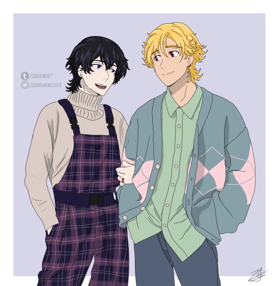
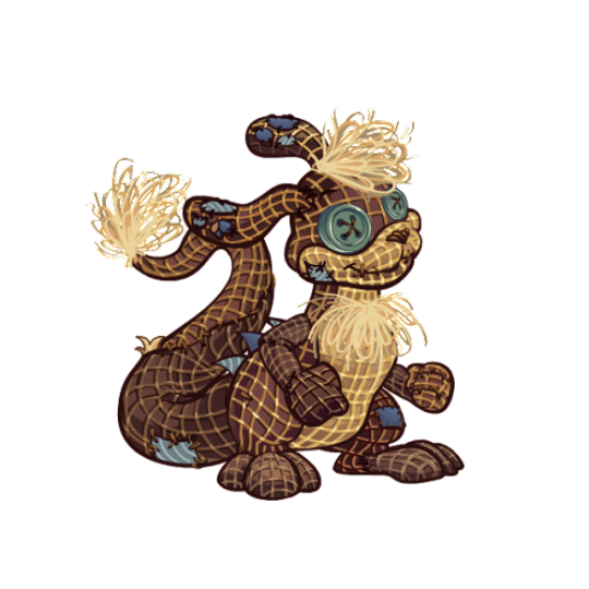
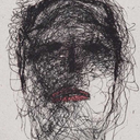
More Clothing Practice ft. Kazurei ❤️💙
Happy Buddy Daddies Friday!
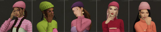
#I did randomized color palettes for them too#because why not#also Rei smiling and talking more after they adopt miri and get married is very important to me#the most fashionable daddies at daycare#they’re on their way to pick miri up from school here#kazuki loves listening to him talk#he infodumps about the things he likes and Kaz just watches and listens like 😍#anyway happy buddy daddies Friday!#I want to keep practice clothing so if anyone has any ideas lmk#preferably like everyday/normal formal wear#also every time I draw them I add more and more piercings#maybe one day I’ll make like a piercing/tattoo hc post#kazurei#buddy daddies#buddy daddies fanart#my art#reikazu#kazurei fanart#reikazu fanart#zsart
213 notes
·
View notes
Text
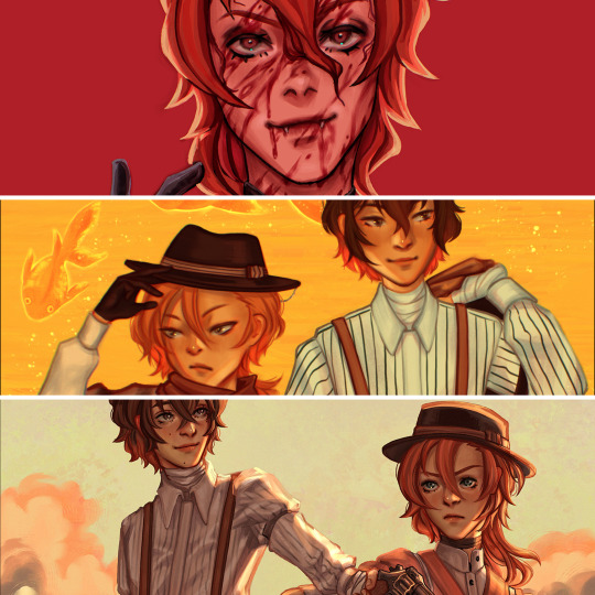

always wanted to arrange my artworks in a gradient and since I started drawing again over a year ago, I was finally able to put this together 🫶
#did an edit like that for an old fandom with official manga art and it’s kind of breathtaking that I actually managed to make a rainbow#edit with my own art?!? everything is 2023 art except the fall skk artwork but it matched yellowish green well enough lol#you can tell which kinds of color palettes I prefer but I really want to use more warm color palettes & maybe try more desaturated palettes#some other goals: drawing more women and environment focused artworks#(but who knows how much time I’ll have this year)#bsd#bsd fanart#my art#I did start a few non-bsd related artworks but didn’t have enough patience to finish them#that’s why it’s mainly skk too… the obsession hits different… I have other non-skk pieces I like too but the color palettes were hard to#fit into this edit…#my only non bsd related artworks where some concept pieces for uni#so strange to see the random mix of styles for this past year but also nice to see little consistencies#long post
116 notes
·
View notes
Text
These two sets of besties have the exact same vibes and that's why they're both so hilarious & perfect
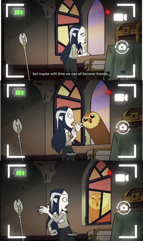


I love them, your honor, my beloved set of absurdly-unexpected-wholesome-ride-or-die-besties-for-life.
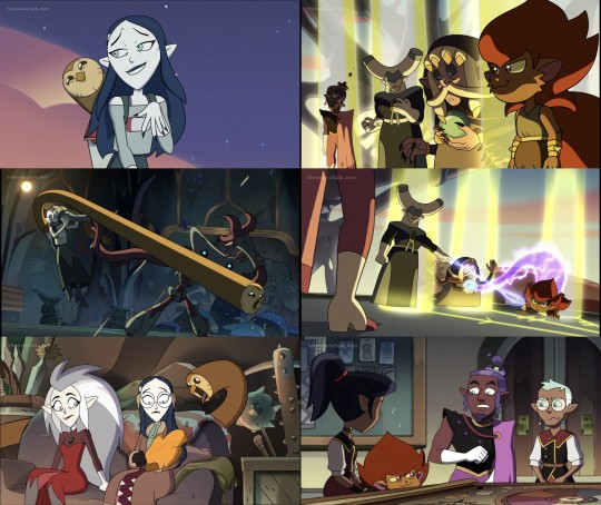
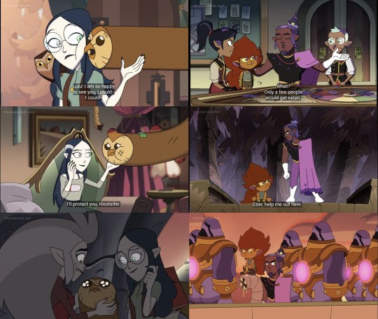
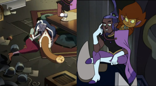
#toh#toh spoilers#lilith clawthorne#toh hooty#toh darius#toh eberwolf#toh eber#theyre both total opposites ride or die besties. they both have a witch & a demon duo. l&h have an unconventional means of travel#to d&e's unconventional means of communication. matching disguises that one time. demon rides the witch's shoulders#l&d were classmates once h&e have similar color palettes. THEY BOTH UNEXPECTED & HILARIOUS & WHOLESOME & I LOVE THEM#hooty & eber both gross lilith & darius out. lilith & darius both make hooty & eber panic when l&d are FUCKING PISSED. qpp besties#toh meta#toh lilith#i tried to put them in chronological order but it wasnt possible & made d&e's set WAY too disorganized so. random order for parallels it is#last set especially is so important to me 💖#the owl house#screenshots#did i include a shot of each duo for every ep they interact in? yes yes i did#tc posts#hi if case it wasnt obvious this is NOT A SHIP POST. lilith is canonically aroace & darius & eber canonically have a family relationship
943 notes
·
View notes
Text

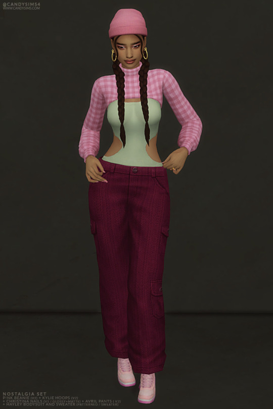
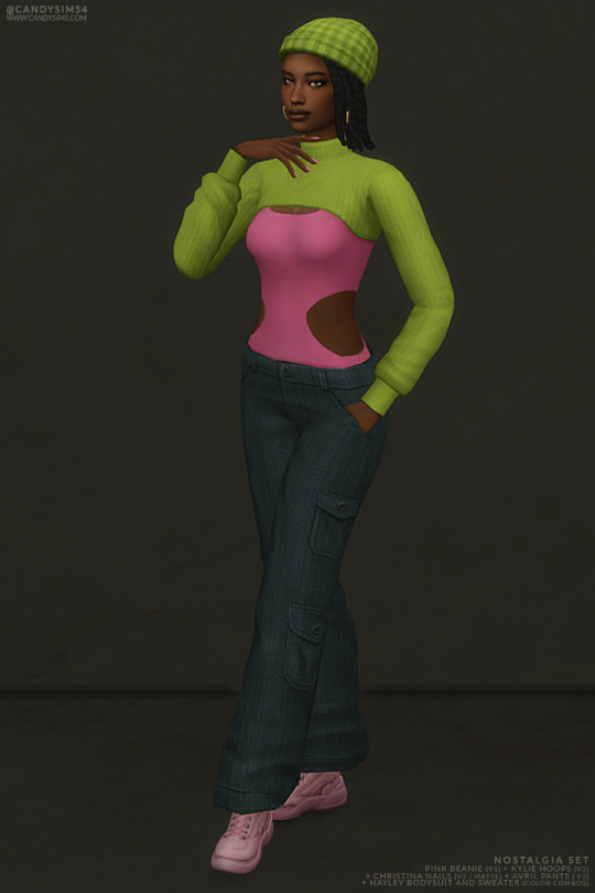

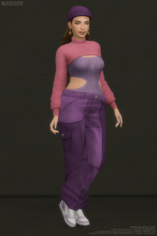

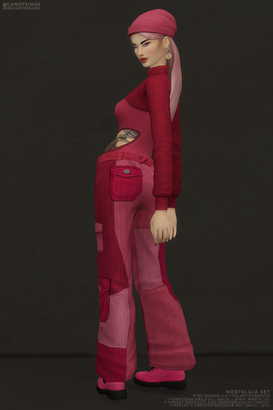


NOSTALGIA SET
I'm super happy to share my last release of this month with you. It's a set of six brand-new items for CAS: two earrings, one beanie, one nails, one mini-cropped sweater with a bodysuit combo, and one pair of pants.
AS IT’S TOO MUCH TEXT, I’LL LEAVE THE DESCRIPTION OF EACH ITEM PLUS THE CREATOR’S NOTES BELOW THE CUT.

ALL ITEMS ARE:
TEEN TO ELDER
BASE GAME COMPATIBLE
MADE FOR FEMALE FRAME
DISALLOWED FOR RANDOM
THUMBNAILS (HOSTED IN IMGUR)
MY SITE (NO AD.FLY): KYLIE HOOPS (TWO VERSIONS) | HILARY EARRINGS | P!NK BEANIE | CHRISTINA NAILS (TWO VERSIONS) | HAYLEY SWEATER AND BODYSUIT | AVRIL PANTS (TWO VERSIONS)
Free release on 19th September 2023
PATREON EARLY ACCESS + MERGED OPTIONS
TERMS OF USE | SEND YOUR FEEDBACK | REPORT AN ISSUE
Thanks to all the cc creators that I used in the pic. And thanks to @maxismatchccworld, @simblrcollective, @s4library, @wewantmods, and everybody who reblog this post!
If you’re a cc finds and want to be tagged when I post, please, let me know. You can send me an ask or in DM.
With your help, more people can know about my work! 💖 Love you all, XOXO <;33
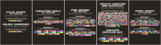
DESCRIPTION OF EACH ITEM:
KYLIE HOOPS (TWO VERSIONS)
Same colors and description for both versions.
928 POLYGONS
10 SWATCH COLORS
- All plain colors
YOU WILL FIND IN ACCESSORIES/EARRINGS
HILARY EARRINGS
928 POLYGONS
10 SWATCH COLORS
- All plain colors
YOU WILL FIND IN ACCESSORIES/EARRINGS
P!NK BEANIE (TWO VERSIONS)
Same description for both versions.
2.780 POLYGONS
YOU WILL FIND IN HATS/BRIMLESS
VERSION 1:
100 SWATCH COLORS
- 50 color combinations
- 50 patterned
VERSION 2:
55 SWATCH COLORS
- All plain colors
CHRISTINA NAILS (TWO VERSIONS)
Same description for both versions.
660 POLYGONS
YOU WILL FIND IN ACCESSORIES/FINGERNAILS
VERSION 1:
44 SWATCH COLORS
- All color combinations
VERSION 2:
55 SWATCH COLORS
- All plain colors
HAYLEY SWEATER AND BODYSUIT
3.696 POLYGONS
190 SWATCH COLORS
- 85 color combinations
- 25 patterned (bodysuit)
- 85 patterned (sweater)
YOU WILL FIND IN TOP/SWEATER OR/AND TANK TOP
AVRIL PANTS (TWO VERSIONS)
Same description for both versions.
1.346 POLYGONS
YOU WILL FIND IN BOTTOM/JEANS
VERSION 1:
79 SWATCH COLORS
- 44 single/plain colors
- 35 color combinations
VERSION 2:
44 SWATCH COLORS
- All plain colors
CREATOR'S NOTES:
Let's start with the accessories of this set. There are two sets of earrings; "Hilary Earrings," one with small hoops and a coin as a pendant, and "Kylie Hoops," two hoops, one smaller than the other. Kylie comes in two versions; the difference is that the bigger hoop is smaller in the second version.
Both items are gorgeous and so easy to style; I'm loving them.
"P!nk Beanie" is a simple beanie but still beautiful and stands out in the outfit. It comes in two different versions with plenty of swatches to choose from.
The main difference between the two versions is the tag on the back of the beanie; version one has, and the two haven't.
Plus, they have different color palettes.
And last but not least, "Christina Nails," a new set of nails with two different versions.
Version 1 is a cute french tip, but with a little twist - they're colorful! And just for fun, I did the same nails with plain colors without the french tip (Version 2), just because of this new medium/small shape I did for this new nail design.
Now the clothes, "Hayley Sweater and Bodysuit," is very cute, but also edgy. I liked this bodysuit design; I'm considering remaking it as a new item. I'll have to draw the top part and a new mesh; it's no big deal. What do you guys think about this idea?
It comes in various swatch options. I added as many as possible, but since it was already 190 and the end of the month, I figured I should probably stop, or I'd never finish it! As 190 swatches weren't enough (hahaha), I did a recolor acc for recolor the sweater in 55 plain colors.
"Avril Pants" is an oversized cargo jeans that come in two versions - one with patches and one without. In both versions, they look very edgy and beautiful.
The patches are available in two styles: one with just one color in different shades (like light to dark red) and the other with varying combos of color (like red+pink+blue).
All these items are inspired by the Y2K fashion but with my personal style mixed into it, too. I love the nostalgia of the 2000s, and it's been a huge inspiration for me when creating outfits and CC in the past. Still, as it's more trendy and I like it, I decided to do my first outfit for this set based on the fashion trend from the 2000s. I am anxious to design the following outfit for this set; I want to do a Nostalgia Set, a huge and complete set encompassing the most fashion eras possible.
And as always, all these items have been made to be worn together or separately - whatever you decide! I hope you like these items and enjoy playing with them. XOXO <33
#s4cc#ts4cc#s4mm#s4female#ts4mm#s4 cc#ts4 custom content#s4 custom content#maxis match#sims 4 cc#s4acc#ts4acc#ts4 accessories#s4 accesories#s4 acc#ts4 acc#s4 nails#s4nails#ts4nails#ts4 nails#s4clothes#ts4clothes#s4 clothes#ts4 clothes#s4 earring#ts4 earring#s4mmcc
931 notes
·
View notes
Note
How the heck do you get Ashton to actually look like a rock? Signed, a fanartist who has tried every brush under the sun but still cannot nail it the way you brilliantly have.
ahhh thank you so much for the kind words!
Answer (sort of)- Ash's palette was hugely up in the air for a really long time. I kept pitching random bits of color at Taliesin, but his write up did not have any specific coloring in it from the get-go. And because I knew they were made of rock, I trended towards something to the left or right of grey (his working/code name had the word grey in it, as well, which def influenced me).


This went on for a while, until one day Tal did his Tal thing and just sent me plans for the finished Ashton. He painted over one of my sketches with the colors he wanted, included refs of some textures. The textures for the skin included nephrite and serpentine (nephrite is one form of jade, serpentine is a whole other thing.)
The serpentine reference had these really bold lines running through it, and I was worried I wouldn't be able to replicate them, so i just... dropped the texture into the sketch. I think I was just checking to see if it was gonna make them unreadable, but it actually looked pretty great. I painted over it a bit to work out where the lines should fall and how to get them to bend around the figure. And then when I was doing the final render, I made a brush that made the fucky line effect. There's one key element to the brush that I will show you-

The shape of the brush is just a random splatter shape, but the angle, size, and roundness change in response to pen pressure, so that as you draw, you can increase the size with added pressure, and some lovely, 3-D helix shapes will start appearing as you go.


From there it's easy- Make an extreme dark and an extreme light in your little texture space, then paint over in variations of green to push things deeper into Ash's "skin" while maintaining a slight transparency.
Here's some other little tips-
- Before you add intense, lined texture, start with a textured base. This can be anything. Once I used a picture of the amazon rainforest with heavy color correction. Sometimes I use sponge brushes. Have fun with it.
- Try to make the larger textures support the underlying figure. My go-to is large, lazy spirals that shimmy up and down their limbs.
- Don't fight the lighting too much. To increase readability, try to use elements of higher or rougher texture to frame the features, while keeping the immediate area of their eyes, for example, less busy.
Good luck, and thanks for the ask!
519 notes
·
View notes
Text
Random facts that may amuse you about the river episode of hilda

To be handed a script and then be like ' ok now lead your team to do the visuals' its like ,a wild experience so I want to share some of the weird things my brain latched onto ..
For the door sequence, My pitch to our location and color designers was based off of a blacklight, under water themed mini-putt course I used to love when I was a kid. Just goes to show you can really pull inspiration from anywhere haha. I dont think anyone expected me to go that buck wild with it but I'm glad everyone was on board.
anyway.. I lovingly called it Eugene's ' Putt Putt cave of doom ' . I wanted the doors to look kind of flat, like stage props !
The mini putt is STILL THERE BTW . look at this video. GOSH I MISS IT SO MUCH.
youtube
Anyway - It works great too because it allowed everyone to have the cooler blacklight palettes, where you can see Eugenes -true- colors. I wanted him to be duller outside of the water on purpose. Cuz hes just a lil old timey guy. A " slightly deranged Stan Laurel " , which was what i had in my pitch notes to the design team.
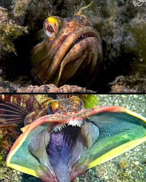
Heres another silly fact but we based part of the serpent off of the sarcastic fringehead cuz..look at it . its just like -AHHHHHHHHHH. It just waves its mouth infront of other fish and it looks scary but it doesnt DO ANYTHING. ( I think, biologists can correct me)

Also just in general I was vibing with the old..creatures on a map . Like. Of course we're going to give this serpent hooves. OF COURSE THIS SEA SERPENT NEEDS HOOVES. So the designers did a few rounds based off of way older illustrations.

The choice of shadow puppets was done to give Eugene an 'old timey' flavor. I really wanted him to feel more vaudeville and tap dancey - so the shadow puppets were to give him a..more modest intro.
The adventures of prince achmed was an inspiration, because how old school animation can you get ! And it really backed up the use of bold colors. I wanted to save his BIGGEST performance to the end, also shout out to @castletoons who boarded this episode AND nailed the song sequence WITHOUT EVEN HAVING THE FINAL SONG?! It fit perfectly. It was fate.

oh , and if you felt a particular beetle juicey tone to this whole episode? You're not wrong ! While it wasnt on my mind when I was first working on visual concepts, our storyboard supervisor Jeff Bittle showed me this intro from the second season of the animated show. Everything zipping at the camera on this endless void ride was the perfect chaotic energy that really helped bring in that sinister tone.
youtube
UH SO YEAH I mean I could go on about some of the thought processes behind choices and stuff and honestly I dont want to get into the weeds with opening up a pandoras box on behind the scenes of hilda or whatever. But I thought this episode was a fun example to kind of share a bit of
The entire team ran with this weird chaotic energy and I appreciate them so much for it. I'll always love this strange lil episode.
#hilda season 3 spoilers#hilda spoilers#hilda the series#director talk#sometimes you dont know what to do and then you remember mini putt and it all comes together
246 notes
·
View notes
Text
Someone has to say it : they knew what they were doing with Sora being so transcoded.
You can't just write all of these transcoded scenes in 2023 by "accident" – especially in a show putting random pride flags in the background to be "allies but we won't take too much risks". Intentional coding really feels like something they would do.
We have a character with pink hair who wears fake cat ears (we all remember the trans girls being obsessed with cat ears era, right ?), changed her name for one being meaningful to her, then ran away from an oppressive government and her unsupportive parents to join a found family. Also, her charadesign's color palette is pink, white and blue.
Not to mention the transcoded as heck scenes :
"Who's Ana ??? Her name is Sora !"
"That's my birth name."
"Oh... Well now I feel dumb-"
(Not the exact quote since I watch the show in french, but you get it)
The way Arin just immediately accepted she had a birth name different from her actual name ??? Just like someone who knows you're trans but didn't know what your deadname was ??? Like. Usually in shows, you would expect a big "you lied to me by using a fake name all these years" drama but here, he just couldn't care less. If this isn't Arin being an ally, then what is it ???
People knowing her from when she lived at Imperium calling her "Ana" just to annoy her ??? But even after learning her birth name, none of her friends ever called her "Ana" ???
The scene in part 2 with her parents and all ??? Hello ???
Her admitting she was still influenced by the fact she felt like disappointing her parents ? Then facing them but they didn't change. They were still thinking Imperium was right and all of the bad things they did just weren't true. Tried to convince her to go back after being horrible with her when she needed their support the most, and insisted on calling her "Ana". So she told them one last time her name was "Sora" then left ???
The whole moral being basically "be who you are" ?????
ALL OF THE SCENES. Her whole arc just feels like transcoding. I refuse to believe this wasn't on purpose.
Edit : feels like they're using a not canonically trans character to normalize trans experiences and I'm here for it
#ninjago#lego ninjago#ninjago dragons rising#lego ninjago dragons rising#dragons rising#dragons rising spoilers#ninjago sora#sora ninjago#trans coded#trans coding#trans headcanon#queer coding
234 notes
·
View notes
Text
Hey it’s been a bit! The Mammon episode finally came out, so here’s my review!
Pros:
- The sign language scene was cute. Kinda weird that a kid was seeing a show that was clearly for adults but I love me some representation so it gets a pass.
- Despite Blitz not really needing to be in this episode, I thank god he had little screen time and more time was dedicated to Fizz.
- The fish ladies (despite having wonky color palettes that made them EXTREMELY hard to look at) were cute.
Cons:
- Mammon is so flat and uninteresting but I don’t know what I expected from a creator who always hypes her characters up that always end up being one of the three go-to personalities she picks for her male characters. In Mammon’s case he’s just a loud mouth cursing bum so way to ruin another Deadly Sin and make them boring af, moving on.
- I don’t like how Mammon and Fizz’s relationship are similar of Val and Angel’s, Viv keeps recycling stories, characters and plot lines ect, it makes Angel’s story for Hazbin really predictable/underwhelming and not exciting to look forward too especially since we already have the “mafia bad daddy” aspect to him too that they pulled for Moxxie. I guess the idea of Mammon being a controlling ruler is fine on paper but not much is done with it, Fizz just quits in the end like it was easy with zero consequences so what was all that build up for.
- Fizz himself once again feels REALLY out of character, he’s just too soft compared to how he was introduced in season 1. He’s constantly nervous in this episode and insecure, as well as walking on eggshells, and even in Oops he wasn’t THIS sensitive. I’m all for characters struggling and being kicked down but it has to make sense and not feel forced, and once again it feels like Viv is trying way to hard to make the characters she once introduced as snarky assholes to uwu innocent babies. I refuse to believe Fizz was actually INTIMIDATED by this random geeky imp who insulted him, as well as the fish ladies whom he was weirdly nice and welcoming to. It’s also weird seeing how uncomfortable/nervous he was around his fans when I thought the whole point was that he LOVED praise and loved being famous, at least that was season 1 Fizz. Now he feels retconned. Seeing him say “I just need this gig” is weird too, the explanation to why he went through all of this makes no sense, Fizz still has Ozzie and is famous in the Lust ring, and I understand Mammon is his idle but to go through all that abuse for so long for something that could have been so easily avoided feels forced to fit the plot, but it also makes Fizz look dumb.
- There’s confusing lore stuff regarding Mammon and Ozzie, and it makes me realize that Viv should have picked ONE storyline aka ONE Seven Deadly sin to go with Fizz’s story because this is getting mixed up. Fizz acts like if he looses this completion, he looses everything, which confused the heck out of me because no he wouldn’t have? First of all, Ozzie is a fucking powerful sin, how would you loose him? Second, from what we know from season 1, Fizz is a jester who performs at Ozzie’s club. It was Ozzie who built the sex robots across the rings of hell, NOT Mammon, and in season 2 we see that Fizz is under Ozzie’s care and lives in his house. Yet for some weird reason Mammon also represents Fizz and uses him for profit, but it’s not really explained in a way that makes sense, like Love’s art had said in her Fizz redesign video, Fizz’s job is really confusing on what exactly he does. Having both Ozzie and Mammon represent him overcomplicates things and the show did a poor job at explaining how this goes.
- Once again Viv dumps trauma and struggle onto her characters without building it up first. When did Fizz ever give off the impression that he was being controlled or abused, or even that he was so insecure and constantly walked on eggshells to be perfect. In Oops he was happy to be in the spotlight and happy to get the attention, he bragged to Blitz about how successful he was. He seemed happy to perform for Mammon and talked of him highly, and now you’re pulling an Angel Dust situation where he’s expected to be perfect 24/7 and it gets to him emotionally, while also being someone who’s physically and mentally abused. Yet another season 2 episode that wasn’t planned, same as how Millie wanting to feel important wasn’t planned, same as how Stolas seeing Blitz as genuine love wasn’t planned. Different episode, same issues.
- I’m so done with the Hell lore bro, this place officially has no rules and demons can just do anything without consequences. There’s no class system, there’s no rankings, there’s no power dynamics, screw anything that Viv says. There was no fucking reason why Ozzie and Fizz’s relationship needed to be a secret. There was no reason showing Ozzie threatening his workers to not tell anyone about his love life if he was just going to admit it to EVERYONE THE NEXT EPISODE IN FRONT OF ANOTHER SIN ARE YOU FUCKING KIDDING ME— what was the POINT. What is the point of Stolas and Blitz’s conflict. What is the point of Stella being classist. What is the point of these class systems and rules if you can just announce that you technically broke a hell rule and no one gives a fuck and you get off scott free. Mammon telling Ozzie “you’ll regret that” like a cartoon villain doesn’t do anything either. What is he ganna do? Tell Lucifer, the character that canonically won’t appear in HB because the sins won’t appear in HH? If Lucifer rules over the sinners, who the fuck is in charge for the rest of Hell. Where’s the authority? And Mammon is just ganna come back for another episode to give the gang trouble cause lord knows we don’t have enough fucking villains already.
- It feels weird that Ozzie would just sit back while someone whom he knows is a piece of shit is treating his loved one badly. I get he was concerned but you’d think one of the seven deadly sins would have more power and authority.
- I was expecting some big gross bug-like thing to appear when Mammon was transforming into his final form, only for it to the exact same design but with small extra eyes and a spider lower half that isn’t even visible in most shots….GOD VIV.
Watching this episode also made me remind myself that this is supposed to be Hell. Seeing Fizz feel better and stand up for himself was sweet but these soft lessons and morals don’t belong in a show like this, and it’s extra aggravating regarding Viv’s double standard, how she can just pick and choose which characters she wants to be evil and which characters are saints. Overall not anywhere near the worst episode of season 2, but I am officially done with Helluva Boss so-
#vivziepop critical#spindlehorse critical#helluva boss critical#helluva boss critique#helluva boss criticism#helluva critical#anti vivziepop#helluva boss
326 notes
·
View notes
Note
I love your animatronic toy OC guys so much, they have so much personality to them and their colours are really good (especially umbra)
Thank you! The funny thing about Umbra's design was that while I was developing it about two years ago and had some colors in mind, I described in text what I already came up with to an image generator for fun (shitty unconvincing old kind, vs now where it looks like shit but in a somewhat more convincing way) and it produced something so silly that I made her design better than what I would've settled with out of spite.
More details of my process and anti-AI ranting below the cut, so the examples given won't show up on search results. Google Images is getting polluted too much with slop to begin with.
Let's begin.
In 2022 I was drafting up Umbra's design with mostly concrete details. At this time image generators were newer and much less convincing, and I was a bit less aware of just how unethical they were, so I fed one a text description of what I had drafted for her design out of curiosity. Something along the lines of, "doll of an anthropomorphic owl librarian in glasses, blazer/suit jacket, skirt, corset, high heels, sitting on a bookshelf" and probably a few more terms. Really specific, lengthy prompt.
I try to be open-minded and give new things a shot, but the results were Not Great. Ideally, I'd want to not share the AI pictures at all on-principle, but I feel like it's useful, transparent, and necessary to show them. Both as a means of not hiding anything, but also just to appreciate where the design is at in spite of it.
Outside of this particular collage of Weird Owls, no other pictures on this blog are AI-generated. AI Image Generation is harmful, and I am against its usage.
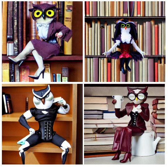
But hey, two of the generated pictures look close, right? The top left is the closest, and bottom right is second.
That's because they started out worse, and I had to actually erase chunks of them and have the generator fill in the blanks to get anything remotely close to what I wanted. Misshapen limbs, unrecognizable anatomy, fever-dream clothing details, etc. They didn't even have a corset or proper legs until I slapped the generator in the face enough times to make it produce them. I was just using it to photobash, which was such an annoying process, I just went "this is dumb" and stopped. They're literally posed like that because I kept erasing and regnerating their limbs until they looked vaguely in-character. It literally only looks passable thanks to STRANGLING it with human input.
Before I used the image generator, I already drafted her to be night-themed with yellow eyes and something like purple, dark blue, or sky-blue as her main color; the generator making one owl yellow-eyed and purple was a happy coincidence, and the only thing the generative AI "came up with" that I didn't already have in mind or included in the prompt was the light blue shirt, which I did adapt into her cyan shirt and stockings/socks as well. That was a good call. You get One Point, Mr. AI.
...Which still meant that at its absolute best, it was a largely redundant step in the creative process if its contribution was worse than what a randomized palette generator or character creator could come up with.
That's already putting the ethics of it aside, like carbon emissions, data pollution, using artists' and photographers' work without credit or permission, the incentive to plagiarize, flooding sites like deviantart with slop, Willy Wonka Shit, etc etc etc. When people say "you can use AI as a tool though", this ordeal was enough to convince me that it's more trouble than its worth, even in its most ethical usage. I feel gross for having even tried. I wish I knew what sources went into the creation of those Weird Owls. It'd be better for research if the right people could be credited.
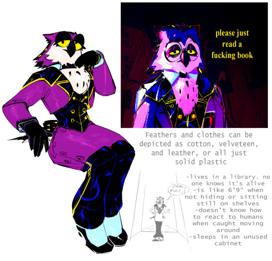
Nothing else on this blog is AI-generated or ever will be. The art below is purely my own (2022 vs a few weeks ago)):
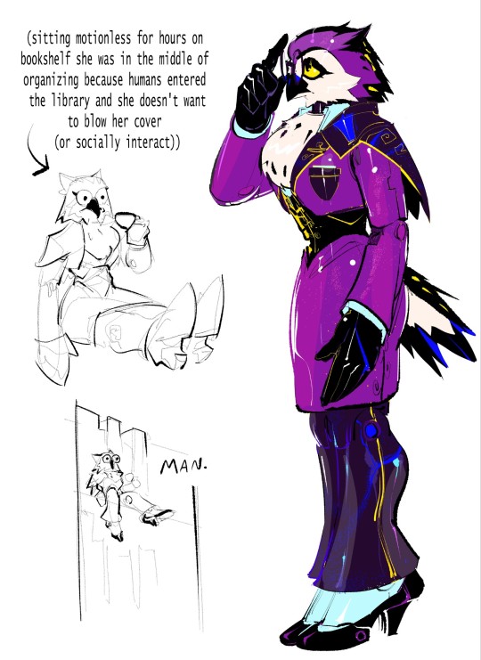

Actually drawing Umbra and solidifying her design was far more rewarding than having an image generator vaguely approximate my own ideas. I wanted her to look really special, so I used a black cape and pants, gold highlights and buttons, and blue undertones to make something more distinct. Also, neck floof. Very important. I wanted the head in particular to look distinct and original, going with bold black streaks to really help her look distinguished.
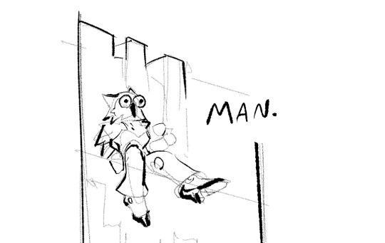
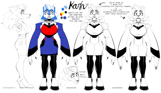
I also have certain inevitable Hydroisms for Fancy characters like her; most apparent in these designs for Chasey and Kaita from even longer ago, which were more of an influence than anything else. (Old art of mine from like 2021, Kaita ref looks wonky but Chasey still holds up nicely):
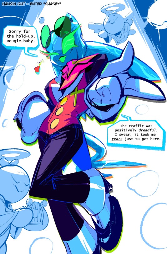
Most of Umbra's other design elements were already commonly used with established ocs like Kaita, like her shape language, corset, skirt, heels, etc. It was my previous work with Chasey that inspired the use of gold buttons and highlights.
Umbra is also now a bluer shade of purple partly to distance the current design from that ordeal. All things considered, I'll probably make her more indigo next time. I already wanted her to have a wide color range from the get-go (Featured below is, again, purely my art from 2022:)
I may use a different colored shirt and stockings in the future. I like to think she has many different shirts and clothes based on the different stages of the night sky, from dusk to dawn, and the painting I made in the top right there was an exploration of her range in different lighting.
All in all, it's frustrating. I'm proud of her design, but explaining all of this is annoying, because it's technically all relevant to showing how her colors were picked and how the design was made. I still technically have AI to """Thank""", in the way you thank a bad experience for encouraging you to make things better out of spite.
110 notes
·
View notes
Text
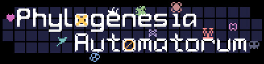

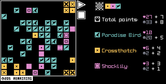
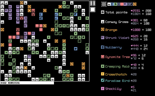
Phylogenesia Automatorum is out!! A roguelite / incremental / life simulation hybrid
Download it here!
Over the past couple of weeks I've been working on my entry for the New Years Incremental Game Jam 2024, and I finally submitted it late last night.
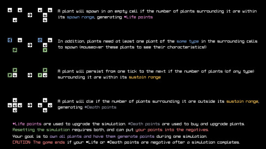
It's a silly little game where you tend to your garden of digital plants, hoping to generate enough Life and Death points when they spawn/die respectively, in order to buy more plants, mutate their characteristics, and expand the field in which they live.
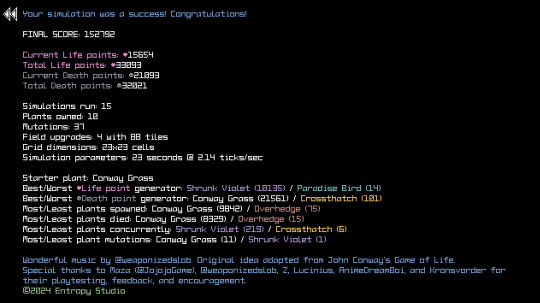
Mutations and field properties will directly (and indirectly) change the plants' behavior on both a local and global level, with some very interesting and unexpected results. Numbers going up isn't always better either too, as, if you upgrade their stats too much, you might make a superplant that chokes the life out of the rest of your simulation and other plants!!
(Oh, and my friend did the music for this game, and it's awesome - each plant as their own instrument/track and they layer on top of each other as you buy more!)
It's a roguelite in the sense that each run you will be choosing between random upgrades, plants, and field tiles with various effects between simulation runs in order to try and maximize your point gains and stay ahead of the reset cost. It's not totally balanced (as it was whipped up in 2 weeks), but with a bit of knowledge and juuuust a hint of luck, you can make almost any run pop off! The goal is to buy all 10 plants and have them all produce points within a single run (representing a diverse garden or something, rather than a monocrop).
As I mentioned previously, it's based heavily on Conway's Game of Life, as I am a huge sucker for incrementals with hypnotizing visuals that change and evolve as you interact with the various systems at play. I took this idea, added a bunch of plants that are variations on the standard ruleset, and went from there.
You might also notice that I used some assets from Stellar Terminus, namely, the 3 sound effects, fonts, color palette, and, retro computer theming. I swear I can do other styles, just, er, not in 2 weeks when I already had quite an ambitious idea!
Over the coming days I'll post some more about the development of it, how I implemented certain systems, and a post mortem. You can probably imagine how datastructures-heavy this game was. In the end I had 1 object that ran the entire simulation, 1 that displayed the breakdown of how each plant was doing, and like 20+ objects for UI...
For now though? I'd love for you to try it out, play a few runs, and hear your thoughts on it!!
#gamedev#videogame#gamemaker#devblog#programming#indiedev#cellular automata#incremental#pixel art#roguelite#simulation#life sim
73 notes
·
View notes
Text
Bestiaryposting Results: Raggfong
This week's beast was the Raggfong, much to the dismay of everyone who is sick of birds. Again, sorry, there are a bunch... and the random distribution put a clump of them in December/January, so it's going to get worse before it gets better. If it helps, imagine it's some kind of ritual to empower the birds currently eating the Gävle goat. Or maybe a "Twelve Days of Christmas" sort of thing -- we've already had the partridge.
Also again please forgive me if I fail to string sentences together properly -- still sick. Covid, actually, turns out. The brain fog is difficult; almost forgot I was supposed to do this today.
Anyway, here is the link to the entry that our artists are working from:
(Why did I redact the Greek and Latin names for the coot? I'm not making any effort to hide its identity... baffling choice on the part of Past Me.)
And if you have no idea what this is about, you should take a look at https://maniculum.tumblr.com/bestiaryposting for an explanation and previous entries.
As usual, art will appear in roughly chronological order under the cut.

@elodieunderglass (link to post here) responded days before anyone else with this image, which successfully conveys a lot of emotion in my opinion. Those are some very communicative facial expressions on the birds. I particularly like the coot, and how it's positioned to shield the chick from the sun. The real gem here, however, is the text of the post linked above, which I would describe as a prose poem about the bird depicted. I'm genuinely a bit blown away by it -- go click the link and read it for yourself.
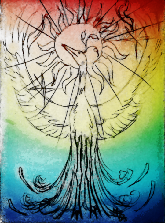
@embervoices (link to post here) has got some kind of effect going on here that I don't know enough about art to describe, but I like the way it looks. Her post mentions the phoenix connection, which I think comes through pretty clearly in the design and pose. The linked post explains some design decisions, including which real-world birds were the inspiration for this one.

@silverhart-makes-art (link to post here) helpfully specifies that this Raggfong is resting on a bed of sea kale. The design of this bird is very good, I think, conveying a certain gravity one does not always associate with seabirds. I also like the effect created by the background; it kind of looks like it's the cover for something, you know? The linked post explains the various birds from which the artist borrowed features and why, and also discusses the evocative nature of the entry this is based on -- I'm glad people are enjoying that aspect.
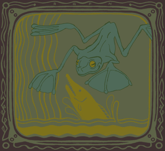
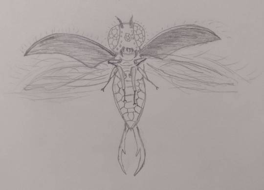
@rautavaara (link to post here) has made the executive decision that this bird is actually a frog, and the drawing is frankly too pretty for me to have any kind of problem with that. Look at that border. And the wonderful color palette. Also there's a flying frog, which is very cool.

@cheapsweets (link to post here) notes an emerging theme in these entries that birds (except coots) are jerks. I honestly can't remember how consistent that theme is across all the birds... I know there are some the author likes, but there are also definitely going to be additional Birds That Are Jerks in future. I like the crown-like crest on the Raggfong, and I'm impressed by the dedication involved in doing all those little body feathers with a fountain pen. Also, if you look closely, you'll see that one of those chicks the adult Raggfong is carrying has been shown staring off in the same direction as its parent, while the other has its head turned and its eyes closed, meaning we can expect it to join the coots off to the right... and there's already a young Raggfong there, too. The linked post contains a detailed explanation of design decisions, which you should go check out. (Also, thanks again for providing alt text.)
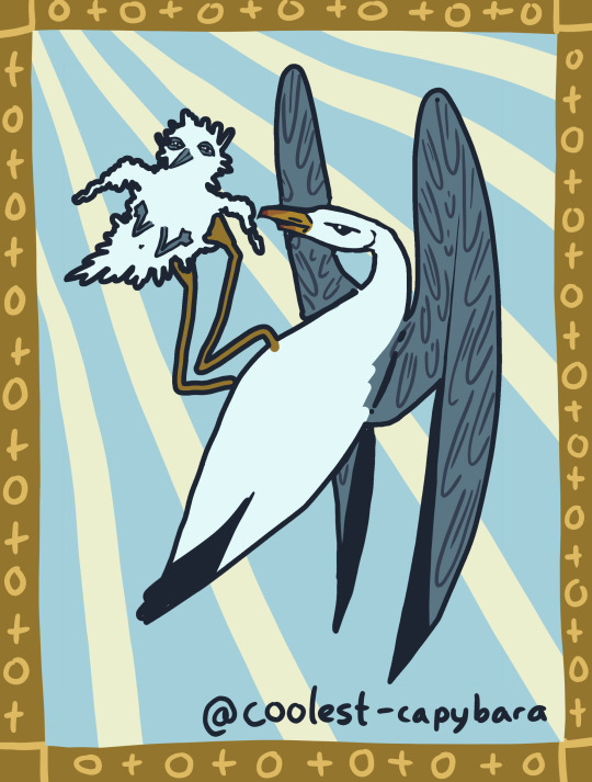
@coolest-capybara (link to post here) has employed her usual medieval stylization to depict a Raggfong inspired by an albatross (on the grounds that they are a seabird with "judgy" eyes... you know, I can see it). I am absolutely delighted by the scrungliness of the chick being shown here, which does indeed have the "muppet made from dryer lint" quality of a real albatross chick. They have also included a series of pictures that show the whole life cycle, which I've decided (after substantial back-and-forth) to not copy over here as there's a certain color-of-the-sky quality there, but which I strongly encourage you to click on the link and look at for yourself. I particularly like that the coot in the "life cycle" picture appears to have a couple Ilyechams in her flock in addition to the new Raggfong.
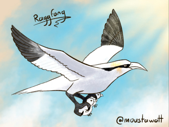
@moustawott (link to post here) describes their Raggfong as a gannet mixed with an eagle, and it looks pretty majestic, honestly. The background really enhances that effect, and I think it makes a much more entertaining contrast with the two little chicks being carried below. There's a certain severity to the design that I think is fitting.

@pomrania (link to post here) has ditched the whole "coot" thing for a more direct interpretation of the Raggfong's "common counterpart", which they deem the "Ritchfong". I kind of like the idea of two related species of bird that the human observer has interpreted to have class divisions. The crest on the Raggfong is also a very appropriate touch, I think. The linked post contains additional detail on design decisions, and links to some process images, so go check that out.
@treesurface (link to post here) has decided that the Raggfong should actually be a sort of insect that people mistake for a bird, which I think is quite clever. They explain their reasoning for that a bit more in the linked post, along with some other notes on design and execution that I think are worth reading. I really like the concept that the "unmoving wings" are elytra, and the kind of glittering quality that they suggest here. (I also appreciate that they provide their own alt text.)
@karthara (link to post here) has drawn a Raggfong in several scenarios to express the behavior described in the entry. I really like the overall design here, with the feathery tufts on its head. Also charming is that one flying up near the sun -- it looks so happy to be on fire. The linked post explains the design decisions and the real-world birds from which karthara has taken inspiration. They also mention they included the coot chicks after looking them up and seeing how colorful they are, so I did a quick google and found this great headline:

(Tl:dr coot parents show preference for more colorful chicks, so the later the chick hatches, the more colorful it is, allowing it to compete with its larger, older siblings for food and attention.)
And finally, the Aberdeen Bestiary depiction:
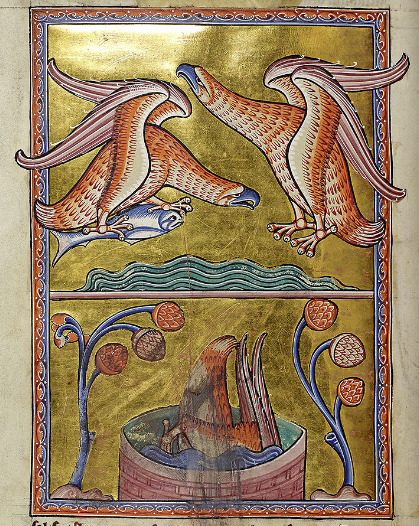
The one diving into the basin just looks so goofy to me, sorry. Anyway, as I'm sure everyone has guessed, this is the eagle.
Yeah. I know. The whole "fiery rebirth" thing sounds like it should be the phoenix, but this bestiary has an entry for "Phoenix" and it's not this one.
Regular listeners to the Maniculum Podcast may recall this particular eagle behavior coming up before, in the quiz-show episode we did for the second part of "Sidrak & Bokkus". I still don't really know where this idea comes from, but there you go. Eagles.
I feel like there's some kind of comment that could be made over the lack of compassion shown by the medieval eagle here and, you know...
... but I can't quite formulate it, so you'll have to write your own.
Anyway, see y'all next week for our next beaſt.
75 notes
·
View notes
Note
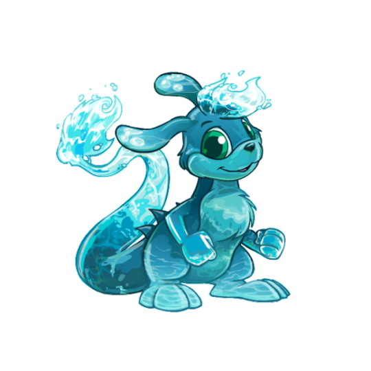
Neopet review: the Zafara! Last in the alphabet of neopets, but certainly not last on how cool they are!
I always enjoy a good abstract creature that's still a believable animal, so unsurprisingly, I like Zafaras a lot. They've got a really unique body shape amongst Neopets that's vaguely like a kangaroo, but that's where the similarities stop. I really like the feathery structure to their tails, their long ears, and that random set of spines they have along their back.
Visually, my only nitpick is that I'm not a big fan of the base color's palettes—most PB colors fix this, but the base colors have a weird mix of beige, pink, blue and black going on with their accents and none of it goes together. I feel like the back spines should've been black along with the nose, or the spots should've been beige instead or black, etc etc.
I'd argue Zafaras mostly benefited from customization as their old art was getting very dated by the time the conversion happened, and they likely would've received a redraw even if customization didn't become a thing. Plus a lot of the updates look really good, such as the tail tip shape being improved, fluff being added to the chest so they don't have a weird shape jutting out there, the feet being lengthened, etc. The only downgrade are the fists, and that's just a standard thing for customization.

My only other minor nitpick is that old Zafara eyes were almost pitch black and it gave them what I can best describe as a sopping wet meow meow vibe that gets lost nowadays. Even when they had color in their eyes, it was more of a crescent shape and overall cuter. Granted, though, the new eyes are more in line with other Neopets, so I get the change.
Favorite Colours:
Christmas: While most Christmas pets are just the standard reds and greens, the Christmas Zafara goes in a completely different direction by being an angel with a very pretty white and yellow color palette and a nice get of wings. It's super simple but very pretty. I also like how they fixed the color balancing that I mentioned above by changing the ear spots to yellow and making the tail tip match. (I do kind of wish the nose were black or something, but that's an extreme nitpick.)

Maraquan: I am 100% cheating by including this one because I usually try to stick to only pet colors you can obtain in the present day, but with UC styles becoming a thing I'm hopeful we'll be getting the old design back one day.
Because yeah, I absolutely love the pre-customization design; making it a sort of sea horse/leafy seadragon cross works perfectly with the Zafara's body shape, the pose is lively, and I love the bright pink fin accents to contrast with the teal body striping.
(The converted is... okay, but the concept was completely lost by changing the pose, the striping was reduced too much, and the body has this bizzaro lumpy shape instead of being a smooth curve like it should be.)
Water: Technically speaking this isn't too fancy, but I just think they did such a nice job with this one. There's so much gorgeous detail in the shading along the head and tail splashes, and the artist really did a good job at capturing that watery look. The choice to make the head tuft and tail splashes in the first place was a great choice, and I especially love how the ear spots are water bubbles. Super pretty all around.
BONUS: I really like burlap pets and think it's an underrated color, so I figured I should give the burlap Zafara a shoutout for being one of the best burlaps out there. The colors are kept muted, the uncanny valley vibe is present, the way they handled the fur tufts looks great, and I like the various slate blue patches on the body, which match with the back spines, spots, and eyes.
40 notes
·
View notes
Note
how did you design the iterator haloes? any specific method or was it just kind of random?
i wanna design haloes for my ocs too but i don't really know how to start
Posting late cuz my brain wants to ٩(ᐛ)و
Making an iterator halo isn’t as difficult as it seems once you map things out. A lot of my ideas for extra details come from my characters designs, personalities, and key themes.
Let’s use Stars halo as an example as hers is clearer than the others:
Stars halo consists of eyes and a few star themes, reflecting to her design which is covered in eyes and a night sky theme. The color of said halo is also based on her color palette.
To put it forward:
If you want to make it something more symbolic and close to their character, base the halo of some of their core themes, or patterns that fit them the most.
My iterators halos are also based on actual references of angel halos as well, especially my new iterators halo.
Imma put this post here cuz I’m loving it to death! Angel halos

Essence’s halo is not only based on the clock/timer, but the dying halo as mentioned in the linked post (just thought it would be pretty cool to include based on their lore)
Other than that, I’d say try to map things out first, pick key themes, and include it.
Sorry if this is long! You unlocked the talking creative side of my brain XD
#weepingask#rain world iterator#rain world fanart#rw fanart#rw iterator oc#angel halo#concept sketch#concept design#art tips
53 notes
·
View notes
Text
Warning! Biohazard!
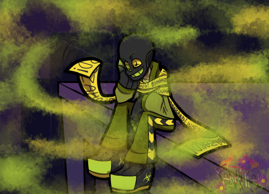
Pestilence!Sans in InvertedVerse!
Hello! I'm here to talk about pestilence, he's so cool :D
Alright now, i didn't do a reference sheet bc 1- they're getting boring to me, 2- there's not much changes to show, all i did was reduce his color palette, buuut if the creator don't like my decision i'll do the og colors.
Intruduction:
Alright, it looks like not that many people know him, so you can learn more about him here. But i can give you a summary, but you'll still lose some details.
I don't plan on getting too deep into his backstory in InvertedVerse bc he's just a side character so i don't see any need on doing so. But maybe i change my mind in the future, my mind is a mystery box...
He's a parasite-like being that feeds off the magic of other beings. He is an out-code Sans.
His role is the sickness and he has this passive that slowly makes people sick around him, it's something related to his death from infections and diseases.
Inside InvertedVerse:
Alright now, Pesti is on the Darkside, Nightmare's side, why? That's actually a short story, idk if should say it now, but he does have a important role, so important even that i'm afraid to spoil everything, like, help.
His host ain't Zoo!sans anymore, Zootale is finally in peace from Pestilence, bc Nightmare took him off there for.. uhmmm, a mutual share of favors.
I'm not sure who his new host is, it can't be Nightmare, neither anyone from the darkside, but i have no idea. Maybe because the place he's in now has so many people he just picked up someone random... like... like Anx (it's not a offense to him)! I'm a genious.
He's a side character as i said, he's more of a comic relief than a serious guy with a whole badass arc or somethin', but he's a jester not a clown.
Hobbies:
He often spies the residents one of them the Undercop detectives, the detectives have some murder mystery going on, it's quite interesting to watch bc it doesn't happen often, oh yeah that's a big side plot for Invertedverse btw and it's through Pestilence that the audience finds out about it, maybe he even helps finding who's the murderer, who knows?
Also tries to make some "friends" to keep himself entertained until the day of depression happens... (just made out the name)
Sometimes he get into non-physical fights just for fun (idk if that's accurate), one of the fights he picked up was with Wine, the Sans from Fellswap Gold, Pestilence can pierce his skin like a needle and see what's inside, not all of it, but most of it, Wine despises Pestilence.
I have this headcanon that everywhere he goes he touches things to contaminate them like doorknobs, chairs or anything in public places that people often put their hands on, specially bathrooms. Idk i just think it's funny.
Anyway he's a funny little guy doing some funny little things with his funny little "friends" and funny little tricks and puns.
Pestilence (c) @hoshi-tsubasa
Hi, you said you wanted to read 👋😳
#invertedverse#undertale au#utmv#art#utmv au#ut au#sans undertale#undertale sans#au sans#sans au#sans#Pestilence#Pestilence sans#Pestilence!sans#InvertedPestilence#undertale alternative multiverse#undertale alternative universe#undertale alternate universe#au undertale#undertale au fanart#bad sans gang#bad sanses#undertale au artwork#undertale au art#ut au art#ut au artwork
28 notes
·
View notes
Text
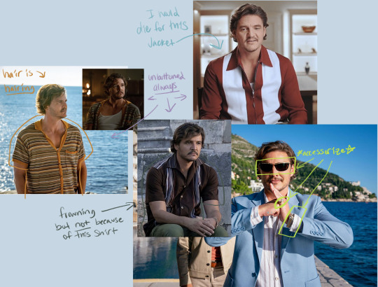
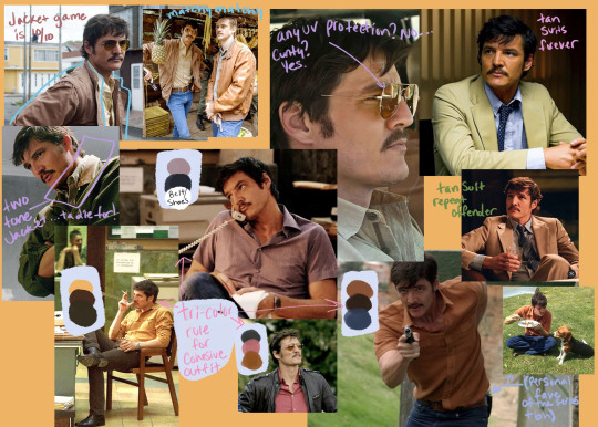
✨rating pedro pascal characters based on nothing but costuming (non-exhaustive)✨
considerations:
*real housewives voice* thats my OPINION!!! also subject to change upon reflection, just going off my current feelings.
not really discussing whether the costuming is good or bad for character, context, or source material but just how much I like them if that makes sense.
some of these costume designers knocked it out of the park but would I be a little grumpy if I went on a date and they showed up in a walmart denim button up and ripped their $300+ jacket to shreds? Yes. Was that costume absolutely perfect for Joel? Yes again.
Mostly discussing costuming in context modern/21st century settings. The Mandalorian+GOT+ etc. in part two?
Minimal discussion on hair+cosmetics, only really when it applies to the whole look
Javier Gutierrez: The Unbearable Weight of Massive Talent
Rating: 10/10
Crew:
Paco Delgado: Costume Designer see also: John Wick: Chapter 4, Death on the Nile, Jungle Cruise, Cats (2019), Split, Les Misérables 2012 (and many more he’s booked and busy)
full cast and crew
Comments:
They did not have to go so crazy on these outfits!!!
Why does one of my favorite looks apparently not even appear in the movie!?
every look is so *chefs kiss*
I feel like mustard yellow is such a good color on him.
Like call up those people on tik tok who make nonsensical categories like “strong winter” “ambivalent fall” and find out why mustard yellow always works.
The palette is a cute mix of like warm bricky colors like red, brown, mustard yellow mixed with baby blue and eggshell white. its actually perfect.
What really makes him stand out is the fact he accessorizes.
Lots of men don't accessorize because they don’t think its important - they couldn’t be more wrong.
It’s one of the many injustices of the world that a man’s outfit looks 10x better by adding one necklace or in this case- pinky ring.
Do I like the sunglasses? No. But I like that they are there.
Obligatory hair mention: The hair looks great. With longer hair becomes more responsibility, ie sometimes the part is a little too deep making the front pieces have a combover look. This is only when its messy though so that may have been the point?
If I included every outfit I liked it would just be a slideshow of the whole movie so I picked my favorites
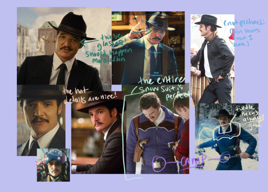
Javier Peña: Narcos
Rating: 10/10
Crew:
Bina Daigler: Costume Designer (season 1) see also: Dumplin’, Tár, Mulan (2020), 1899
María Estela Fernánde: Costume Designer (season 2-3) see also: Narcos: Mexico, Queen of the South, Hell (El Infierno)
Mayra de Abreu: Wardrobe Supervisor (season 1) key costumer for (season 2-3) see also: Narcos: Mexico, The Head of Joaquín Murrieta (La Cabeza de Joaquín Murrieta)
full cast and crew
Comments:
Can you tell I like 70s inspos?
Its unique but true to someone who grew up in RGV and now on his own
ie good luck getting him out of boots. you can’t do it
When he dresses up in s1+2, damn i love a tan suit!
Its very formulaic, but not to the extent that it looks like he bought 7 colors of the exact same shirt. He’s pretty much always wearing a short sleeve button up and fitted jeans. which makes the times he isn’t stand out
ie the tan suit. what can i say i am an american who is up to date on politics i always defend a tan suit when i see one
also occasionally breaks out this like tan vest situation?
I think it’s a good balance between like clearly not being inspired by like their “current day” but not so 70s that it would be odd. It’s kinda timeless.
He tends to follow one of my outfits rules: max 3 colors
Rules are meant to be broken obvi
But I do feel like as a general rule of thumb and since he doesn’t wear a ton of patterns, wearing more than three colors starts to make an outfit look random and not put together
For Javi, this usually means
color 1: *shirt color*
color 2: pants (pretty much just blue or black, he does throw in some brown pants)
color 3: brown (pretty exclusively wears brown belts/shoes)
Short note on hair/grooming: I love how season 1 has some more length in the back and generally has a shaggy sort of look? By season 3 his hair is more cropped probably bc of his new role.
Something about the extra length in the back makes him look young- not in the sense of like actual age but maybe looking more hopeful or green, even when dressed up
Also every so often you can see when they mess up the stick on sideburns. It tickles me.
He’s a menace to society. And he knows it
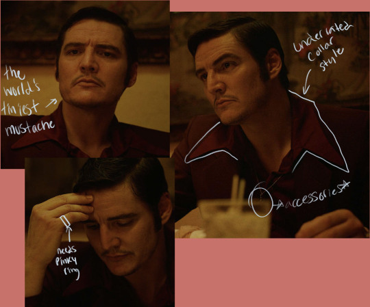
Pietro Alvarez: If Beale Street Could Talk
Rating: 8/10
Crew:
Caroline Eselin (Caroline Eselin-Schaefer): Costume Designer see also: Moonlight (2016), Father of the Bride, Troop Zero, The Underground Railroad
full cast and crew
Comments:
We don’t see much and what we see! Is so good
This deep deep red is very nice and I like that is a monochromatic look (I don’t think we see his pants in the movie but collecting pics for this I saw the pants are the same color)
It also has my favorite type of collar- that extra pointy extra long collar.
And he *drum rolls* accessorized! Its only a necklace but the choice to have it OVER the shirt, over an already perfectly monochrome outfit makes it pop
The things that bring it a little down for me is, well, there is only one scene to work with so it feels wrong to rank higher than projects with multiple outfits, and the grooming
The mustache didn’t have to be so thin.
Hair wise I don’t understand why we always have to exaggerate the side burns to achieve the “deep sideburn” look.
I feel like we could still make the hair look “of the time” by taking some of the weight from the sides and leaving it up top and working with his natural side burns (even if that means making them darker, just not necessarily longer)
Even though I get the hair of the time was very um... spherical
side note: everyone in this movie is dressed spectacularly. I am appreciating through the tears in my eyes
Jack Daniels: Kingsman: Golden Circle
Rating: 7/10
Crew:
Arianne Phillips: Costume Designer See Also: Don’t Worry Darling, Once Upon a Time in Hollywood, Nocturnal Animals, Kingsman: The Secret Service
Full cast and crew
Comments:
Have I watched in full? Maybe a few years ago? I remember the first one quite clearly bc the water filling up the bedroom scene YIKES!
The snowsuit is so good. It’s functional, it’s sassy. It has one of my favorite western top details I don’t know the name of but the little patch details on the front of the shoulders.
Who’s idea was it for the belt buckle to be a FLASK!!! thats gold
I love a color SCHEME!!!
brown leather deserves love
The rain boots- a practical choice in the middle of like the least practical movie ever? Leave him in cowboy boots you cowards
Like oh the grounds might get muddy he needs rain boots. His belt buckle was a flask guys be real
Marcus Pike: The Mentalist
Rating: 5/10
Crew:
Amanda Friedland: Costumer Designer See also: 13 Reasons Why, House of 1000 Corpses, Terminator: the Sarah Connor Chronicles, Fight Club, Clueless,
Scott O’Leary: Costume Designer See Also: The Rookie, Lucifer, Supergirl, 21 Jumpstreet
full cast and crew
Comments:
Have I watched in full? No. I caught a few episodes it was when it was airing but I don’t think i could tell you a single plot line
(there is a LOT of FBI Department of Pseudo Psychology shows ok)
I do remember in one of his early eps they use the murder house from Nightcrawlers.
*Abby Lee voice* you didn’t stick out to me
Very government employee of you to wear ill fitting suits
Not to be irrational but v-neck t shirts don’t rub me the right way.
This is a completely personal ick that I don’t expect anyone else to agree with.
I just ~~ just do a crew neck you know?
Maybe WHY I don’t like it is because its very 2010-2014.
Which, in Marcus’ defense, just makes v-neck t-shirts something of the time
Does nothing crazy with his suits, but nothing that makes me cover my eyes either

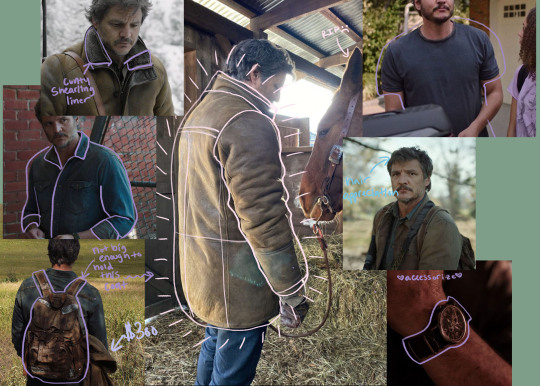
Joel Miller: The Last of Us
Rating: 6/10
Crew:
Cynthia Anne Summers: Costume Designer See also: Swan Song, The Babysitters Club, Snowpiercer, A Series of Unfortunate Events (2018), Apollo 18
Full cast and crew
Comments:
Joel we get it you are nOT like other girls
It makes sense for who he is.
And who he is is someone who is not thinking about how much cunt he is going to serve with his outfit that day.
unFORTUNATELY.
His pants ARE suspiciously fitted. Not so utilitarian when it comes to pants are you Joel?
But! I love the big coat. Could live in the big coat. The big coat deserves an award
The best part of the big coat is the main defense against the simplicity of Joel’s outfits are “oh it’s the apocalypse” or “oh he’s not thinking about that”
Really? bc this is a SHEARLING lined coat. Do you know how quickly those fluffy shearling/sherpa etc. liners start to look like shit? if its a real shearling lining (the one he uses is real) you need to avoid getting it wet and store in dry areas.
I am not even talking about price here! Because I have already explained why I think its not that weird to have people wearing expensive clothes 20 years into the apocalypse.
Its the utility of having a shearling lined coat when you don’t have a closet full of DampRids
No way he had it in Boston since they only travel with regular sized backpacks. He saw it, liked it, wanted it, got it.
He got that coat for the cunt of it all, you can’t convince me otherwise.
Thank you so much for coming on this ride with me it was a fun exercise to look at just the clothes and not my feelings toward the character/movie/show.
Who should I do next time? I have plenty of more thoughts hehe
~Tags for amiges who wanted to see this post!~
@fuckyeahpedropascal @simpingcowboy
#tlou#pedro pascal#Joel miller#javier gutierrez#javier peña#Marcus pike#the last of us#the mentalist#narcos#the unbearable weight of massive talent#pietro alvarez#kingsman golden circle
100 notes
·
View notes
Text
posso ancora aspettare
pairing: robin buckley x gn!reader
synopsis: in which there’s no happily ever after, because she loves someone else.
word count: 2.1k
a/n: ok this is awkward um not me showing up like weeks later after my last fic haha 🧍🏻♀️also tumblr was being a little bitch and shadowbanned tf out of me so if you saw me posting then deleting this multiple times no you didn’t 🫣
════ ⋆★⋆ ════
“Oh.”
The word came out of your mouth like a squeak, a meek sound disguised as a happy surprise at the news Robin had just delivered. Though it wasn’t a surprise, to you nor to Steve—the only other person who knew Robin. You just thought you had more time.
“I can’t believe it. She said yes! Vickie agreed to go on a date with me.”
You were too shellshocked to even notice whatever facial expression Steve was making that prompted Robin’s excitement to cease.
“What?”
“I don’t know, Robin. She just came out of a relationship.
“So what?” Her tone grew annoyed.
“I’m just saying,” Steve leaned against the counter, his mouth hung open in search of the right words to say, “you gotta be careful, you know? She just broke up with her boyfriend, and this could be . . . a distraction.”
You looked up at Steve nervously, scrunching your eyebrows hoping he’d change his mind and apologize. He only looked back with a nonchalant shrug.
“Screw you, Harrington.” Robin mumbled, and walked away, towards the back of the store.
“Why would you say that?” You sighed.
“Am I wrong though?”
“No, but you didn’t have to rain on her parade like that.”
It was an asshole move, but you knew he was only trying to protect you. Only weeks ago had Steve tried all his might to tease Robin about Vickie, giving her lists upon lists as to why Vickie definitely likes girls too. You never meant to tell your truth, but you could never lie to Steve; he’d become like a big brother. And so on a random Tuesday night, in tears and with your head in your hands, you did.
“Please don’t do that again.” You pleaded, and hated the pitiful look he gave you following a short sigh.
Robin was reorganizing the closet with angry huffs when you peeked through the door quietly.
“Steve didn’t mean that, Robbie.”
“I don’t know what he means.” She slammed the stack in her hand down with a thud. “He’s being an ass because Heidi dumped him again, and he’s jealous. I mean, a week ago, he was bugging me to ask Vickie out, and I only did because he was bothering me so much. And now he wants to be all wary of her. Pisses me off.”
You didn’t know what to say. Frankly, you didn’t want her to go on that date either, but you couldn’t stand in the way of your best friend’s happiness, not when she’s been working up the courage to seize it for so long. Even if it destroyed yours.
“Hey, forget it, alright? Steve says stupid shit sometimes.” You tapped her shoulder with a small smile. “When’s your date? Come over before, and I’ll help you prepare.”
A smile quickly spread across her lips, as she pulled you into a tight hug. You chuckled, and ruffled her hair.
“Thank you, Y/N. I don’t know what I’d do without you,” Robin said, “you’re my best friend, and my number one, you know? I love you.”
“Of course I know.” You rolled your eyes, grinning.
“C’mon, say it back.” She whined, pulling your hand.
“No, it’s cheesy.”
“Say it baaaack.”
“Luh you tuh.” You mumbled, causing the girl to laugh, and bring her leg up to kick your behind teasingly.
You couldn’t bring yourself to repeat it properly, because to you it’s not the same, and it would be wrong to say it.
Falling for Robin was easy. As easy as it was to draw breath, to dip your fingers and watch them the disturb the still of the water at Lover’s Lake, to open your eyes and let the world paint a colorful palette in front of you.
You didn’t know whether crushes were easy to overcome (from observing Steve through his quest to find a girl you thought it was), but this wasn’t a sporadic infatuation. This was another feeling, another sensation entirely. It was all you’ve ever known since freshman year, when you saw her for the first time doodling in Gerhardt’s second period. Robin was you’ve ever known.
Robin, Robin, Robin.
But now, she liked someone else, again. Not you.
Never you.
You barely had time to think about that these days. Yet again, something from the Upside Down was terrorizing your home, and yet again, it was up to you and your friends to defend it.
Spending time with Robin during it all reminded you that you were still one of the most important people to her, and that you’d be content just being her friend—being in her presence was enough. But you were reminded of how much it hurt seeing her pine over someone else, and most of all, how much it hurt seeing her heartbroken. Stupid Vickie didn’t know what she was missing out on.
“Guess it wasn’t a date after all.” Robin mumbled before pushing past you and Steve, escaping the sight of her crush at the other end of the store aisle kissing, who seemed to have been the boyfriend.
There was a vile part inside of you that was glad Robin saw them together.
You had just finished a batch of spears, clumsily duct-taped together from pipe cut-out sections and kitchen knives. You couldn’t believe this was your life now; making weapons to fight inter-dimensional demon lords. Spring break in Hawkins, just wack.
You looked over to see Robin sitting by Steve making molotovs. He caught your gaze, quietly gesturing towards the girl before standing up to leave.
“Hey.” You took his seat.
“Hey.” There was a smile on her lips, but it was small and strained.
“You alright?”
"I don't know," Robin said, looking down at the incendiary device. "Nancy's got a plan, so I guess we'll be as best prepared as we can be. All that matters is that we keep everyone safe."
"Robs," you shook your head, "I asked how you are doing." You took her hand tentatively, and she didn't pull away. They were warm and slender, and they fitted perfectly intertwined with your own. You felt her eyes on you, as you continued stroking the back of her hand with your other hand.
"I just have this terrible, terrible feeling that this isn't going to work out for us this time."
Your best friend lowered her head, lips pressed tightly, and you hated seeing how much all this broke her spirit. Robin Buckley, the most positive and ready-to-problem-solve, was hunched over defeated at the thought of going up against the telepathic demon lord.
“Hey. Hey, look at me.” You let your hand pull back her hair from her face, your chest tightening seeing her glossy eyes. “We’re gonna be okay. We can’t die yet. We still gotta go to Europe, remember? Watch the sun go down in Champs de Mars, eat ice cream as we walk along the port in Monaco, right?”
This elicited a short laugh from the girl. She sniffled and wiped her nose with the back of her hand. “We don’t even have money for that yet.”
“Then we gotta go make some.” You smiled, encouragingly. “After we fight Vecna . . . slash Henry, slash One, whatever.”
“Okay, dingus.” She said, putting a hand up to your face, and pinching your cheek lightly. “You win.”
Her eyes, blue like the sky, found a home in yours. You wondered how a pair of eyes could feel so much like home, and how easy it was to fall in love with them. You didn’t need to ask anyone—certainly not Vickie—you knew what that was like yourself. You loved Robin so much, and you didn’t know what you were going to do if she left your side.
You settled for a kiss on her cheek, and a firm hug, choking back a confession when an overwhelming sense of love enveloped you, as you did her.
You were to go to Eddie and Dustin to distract the Demobats so that everyone else can go on with their plan. With much persistence from Robin, saying that it was where you’d be most safe, you watched with a worried frown as Robin slung her backpack over her shoulder.
You couldn’t tear your eyes away from her; she looked so good, so brave, even though you knew her hands were shaking.
“Be careful, okay?” You said, trying not to let your weakness show.
“You first.” Robin smiled, and you brought her into your arms to hold her tight before you said anything you'd regret.
Robin sighed and squeezed you back with the same affection, as you placed a firm kiss on her cheek. She prayed for your safety, so that she could clutch onto you afterward, tell you all about how the date with Vickie made her realize that they were too similar for her to like her bandmate in any sort of romantic way, that she had been burying her feelings for you out of respect for your friendship, and that she would regret it for the rest of her life if she didn't say anything now.
The thought of you consumed her, so that even while her body moved through the woods behind Steve and Nancy, her mind was with you, watching you with Eddie and Dustin, wanting to fend off whatever posed a threat to you. She imagined your pursed lips, anxious, wandering eyes waiting for the strike to come, then she'd imagine you wounded, and get the coldest sense of dread running down her spine.
"Hey," Steve stood back when he saw her steps slow down, "Robin, you alright?"
"I think I'm in love with Y/N." She said, and there was no hesitation in her voice.
Steve only sighed, wishing his best friend would have realized sooner. It would have spared both you and her a lot of time.
“Let’s finish this, and then you can go ask them out, alright?”
With a heavy heart and desperate longing, Robin kept marching until she reached the vine-infested mansion in which Vecna resided.
They went along with their plan, yet by the end of it, Vecna’s body was nowhere to be found after he fell out of the window, shattering the glass in the most dramatic of fashions. The vines that broke off from his body were still moving like forgotten maggots on the floor. The fight was not over, but they have won for now.
Robin was the first to run back to the trailer park in the Upside Down, hoping to catch you. She was fantasizing about how she was going to tell you everything that she’s been feeling, that she didn’t even notice at first that you were nowhere to be found. Dustin was sat on the dirt with his little head in his hands, sobbing.
“I’m sorry.” Eddie approached her cautiously, and she saw the worst.
════ ⋆★⋆ ════
Steve has had to make several food runs the past two days, so much so that his wallet had been depleted (not that it ever was full in the first place), and the boy begrudgingly drove back home to the other end of town to get some more cash. Lucas was a bit more willing to eat. Seeing him munch on a sandwich halfheartedly as his eyes glued on Max’s lifeless body roused the dormant fatherly sentiments in Steve that only ever get to strong for these reckless yet brave teenagers he’s been babysitting.
He dreaded going into the room next to Max’s, because he hated seeing both of his best friends in such distress, one of them stuck in a limbo of life and death and the other mulling over it as if she had already lost them.
“Hey,” he said, “got you some jelly donuts.”
At the silence from the girl, and the incessant beeping of the machine—the only indication that you were still alive—Steve set the food down on the nightstand next to Robin.
“Hey, you gotta eat something, alright?” Uncharacteristically calm and quiet, he murmured and placed a hand on her shoulder. “After that, go home and get a quick change of clothes. I’ll be here.”
“No.” She shook her head quietly, her hands never leaving yours; it was cold and limp.
“Robin—“
“I have to wait,” She said. “I have to be here when Y/N wakes up to tell them that I love them.”
Your face was eerily serene, like stuck in a deep sleep that you couldn’t wake up from. The doctors were puzzled by what kind of animal bites that plagued your sides which caused you to go into septic shock and, subsequently, your current comatose state. You might wake up tomorrow, next week, or—they feared at worst—never at all.
“I’ve waited for so long,” Robin brought your hand up to kiss it, “I can still wait.”
533 notes
·
View notes
Last Seen Blogs

west-coast-gent2
West-Coast-Gent2
r0ttinginmyr00m
‧₊˚ jess ౨ৎ˚₊
flatlineheart
They Call Me Xoxy
driftwoodmfb
Driftwood
kfannayoo-blog
yehet