#things like that. getting each character featured a specific font. trying to find things they would realistically share w each other
Text
The Old Guard
This post comes to you courtesy of the generous support of one of my Patreon patrons, who wanted to know what I thought of The Old Guard. This post contains some spoilers for both the movie and the comics.
So, a few days after it came out, my wife and I watched The Old Guard on Netflix. Tumblr had said a bunch of good things about it, and both of us basically cut our fannish teeth on Highlander fandom so we already had an automatic buy-in for a story about immortals. I knew it was based on a comic by Greg Rucka, but I had not, at the time, read the comic, although I am now reading it in order to write this post.
The premise of the film is as follows: a four-person team of immortals (Andy, Joe, Nicky, and Booker) makes a living hiring themselves out as mercenaries, fighting for causes that they believe are right. They are successful at this basically because their grasp of tactics appears to be (1) die, followed by (2) come back to life and (3) murder your attackers who are no longer paying attention to you because they think you're dead. Honestly, at this point, you wouldn't really need to be very good at the actual fighting part, I would think, but the film establishes that all of them are -- especially Charlize Theron as Andy -- because presumably it wants you to watch action sequences of everyone being badass, which they are. So, yeah. They take all the good-guy mercenary jobs that no one else can do because it would kill them, which is not a problem for them!
Anyway! The group's routine is interrupted by two major events: the discovery of Nile Freeman, a new immortal, who is a Marine serving in Afghanistan who survives getting murdered; and also the fact that one of their employers, Copley (played by Chiwetel Eijofor, whom you may remember as Mordo in Doctor Strange) has sold them out to the movie's Actual Villain, a Big Pharma CEO named Merrick (played by the guy who played Dudley in the Harry Potter series), who has (as far as I can tell) been given instructions to play this role just like he's Martin Shkreli, who is interested in finding the secret of their immortality, and whom you can tell is evil because he has his name in giant letters on the side of his building.
ME: Look, it's the villain! I've found the villain!
MY WIFE: Other than Tony Stark, who actually puts their names on buildings like that except villains? It's just villains, right?
ME: Uh. The president? The president definitely does that.
(We make horrified faces at each other.)
Because we are Extremely Pedantic, we also spent a lot of time picking at how the characters' names and language abilities match up to their stated background. They all know a lot of languages, as you might expect, and the movie was determined to get through them without subtitles, which is an interesting choice but also kind of left some linguistic plot holes.
For example, Joe and Nicky claim to have met each other in the Crusades, with Nicky as (presumably) a Crusader and Joe as (presumably) a Muslim occupant of the area, although the movie doesn't specify this; Wikipedia gives Joe's name as Yusuf Al-Kaysani, which would at least fit that. Nicky is clearly Italian (as is Luca Marinelli, the actor who portrays him) and when he speaks Italian to the rest of the group we see that he definitely speaks modern Italian as spoken in Rome... which is absolutely, definitely not the language he grew up speaking, given that, among other things, Wiki lists the character's full name as Nicolò di Genova. I don't know if the writer of the screenplay (who I see now is also Greg Rucka) didn't know how much Italian dialects had changed in the last thousand years, if he thought that was good enough to be a nod to the character, or if there's some kind of backstory that didn't make it in where every so often Nicky decides to learn a modern dialect and keep his hand in, and also decides that that's the language he wants to use among his friends who would presumably understand several different dialects.
Also, the reveal that Andy's real name was in fact "Andromache of Scythia" was indeed badass but was slightly undercut by my wife yelling BUT THE SCYTHIANS DIDN'T SPEAK GREEK at the television.
Additionally, I feel like the movie could perhaps have been aware of the ways it chose to label on-screen locations, in which the countries were spelled out in large fonts with the cities above them. Places like LONDON, ENGLAND got their entire names spelled out, as did small French villages whose names I can no longer remember, but I guess AFGHANISTAN and MOROCCO and SOUTH SUDAN have zero cities, huh? However, the end of the movie did take place in PARIS which I guess unlike London is its own country now.
So the actual plot features the group of immortals trying to explain this whole immortality thing to Nile while being on the run from the people who are trying to turn them into Big Pharma, who wants to capture them and exploit the secret of their immortality. This is where it falls down a little for me, because the worldbuilding... gets a little shaky. They dream about each other when they're apart. Okay. Why? Sometimes they just stop being immortal and lose the capacity to heal and are dead in their next battle. Why? Why do they even exist? I just... wanted more answers than the movie gave me, and the pacing where I kept expecting there to be explanations wasn't there. There were a couple of scenes where Nile sat there in silence contemplating the fact that she would outlive her loved ones and my brain kept trying to insert Queen's "Who Wants to Live Forever?" Granted, the Highlander canon explanation for immortality is deeply, deeply weird, but at least it tried. No, I can't believe I'm defending Highlander II either.
The characters, too, could have been more fleshed out. The bulk of the character development is given to Andy and Nile, and I'm not complaining about that -- they were great -- but Joe and Nicky and Booker only got maybe a few lines each. They would have felt so much more real if they'd just had a little bit more to them. Also I didn't understand Copley's arc at all, but saying more about that would be spoilery. I do like that they have definitely set themselves up for a sequel.
But even with what we got, there's a lot to love about the characters. If you're here for canonically queer characters, you will enjoy Nicky and Joe, who have been in a relationship for probably about a thousand years. They are minor characters as far as the overall plot goes, but what they do have is lovely, and there is a romantic declaration between them at one point that is absolutely beautiful and possibly the most fervent love declaration I can remember seeing in a movie since maybe... ever. If you also like your queerness more subtextual, though Andy is never portrayed as explicitly queer, her past friendship with a fellow immortal Quynh was shown as very intense, as is the role she takes here mentoring Nile into the world of immortality. Also she has a double-bladed axe (yes, we kept yelling BRING ME MY MAN-KILLING AXE at the television) and as we all know, the double-bladed labrys has in modern times become a symbol for lesbians. So there's that.
In addition to the characters of color who play important roles here -- Nile was my personal favorite, but there's also Joe and Copley and (in flashback) Quynh -- there's a lot of diversity behind the cameras as well, or so the internet informs me. The director (Gina Prince-Bythewood) is the first Black woman to direct a superhero movie, and the same is true of her editor (Terilyn Shropshire). And, furthermore, apparently 85% of the post-production crew were women. They didn't have to do that, and yet they did. It was nice.
I don't watch a whole lot of action movies these days because I usually find R-rated violence too... violent, but I found myself really liking almost all of the action sequences here. None of them felt gratuitous, and a lot of them really focused on the physicality of the immortals fighting in a way I liked, because I feel like people are probably going to fight differently if they know they can survive every single hit, and I think the movie portrayed that in a way that a lot of superhero comics and movies don't. My favorite fight scene is definitely the one between Nile and Andy at the beginning, when Andy has trapped her on a plane and it's extremely close-quarters fighting and also extremely brutal. They don't stop basically until Nile breaks enough bones that she can't get up anymore, because until then she's going to keep trying, which is both kind of horrifying and a great character note. And they didn't film it like it was a Sexy Catfight! It was so good.
Also, the soundtrack is really good, and I've found myself streaming it on Spotify all week. I didn't know any of the songs in the movie, but there's a lot of hip-hop and -- okay, I don't even know if this is a genre? -- specifically a lot of hip-hop with an electronic/industrial sort of beat, which I thought was really great and livened up the fight scenes even more; "Going Down Fighting" did a really good job getting me in the mood for the final confrontation with the villain, and... yeah, it's all good. Someone made a playlist on Spotify that will come up if you search for it.
So, yeah. It's on Netflix. It's not without flaws (mostly, explaining how the hell immortality works, and a couple of pacing issues), but it's a really satisfying superhero movie.
That's the movie. Onto the comic, which I am just now starting to read as I write these words. Whee!
So The Old Guard: Opening Fire is a 2017 five-issue Image Comics series written by Greg Rucka, with art by Leandro Fernández, and there's also a 2019 sequel, The Old Guard: Force Multiplied, by the same creative team, also with five issues. I have not actually read any of Rucka's work before now because he is mostly famous for his DC work, but I have heard good things about it, especially his Wonder Woman run.
Anyway. The art is very stylized, with a minimal color palette, and it's very pretty but I honestly found it hard to parse sometimes. Many of the characters have very weird noses. Yes, noses. It's basically mostly in Andy's and Nile's POVs, like the movie, and as far I can tell Andy is explicitly queer, because unless I am entirely misreading this panel in issue #1, here she is in bed with a woman in one panel. Whee. Also there are some nice epigraphs at the beginning of each issue.
Okay, so, the plot here is basically the plot of the movie. There is still no explanation of why immortality exists. But even so, there are some fun character moments that didn't make it into the movie -- for example, Andy saying smartphones are too hard to use and she liked the old ones better, only for the rest of her team to say that she couldn't use those either. I think you get a better sense of Andy's world-weariness in the comic. There are also other, now-dead Immortals mentioned, like Noriko, who "went overboard off the Horn." Quynh is not one of them; Quynh basically is Noriko, which is because they cast a Vietnamese actress who asked if her character could be Vietnamese too, which seems perfectly reasonable to me. But anyway, in the comics, she's Noriko. Weirdly, Andy's full name, as she tells Nile when they meet, is Andronika ("man-victory") rather than Andromache ("man-battle," in case you were wondering); I think the movie made a better choice because Ἀνδρονίκα has exactly two attestations in the Lexicon of Greek Personal Names, whereas Ἀνδρομάχη has all that shiny name recognition of being shared by the wife of Hector and also the queen of the Amazons and will ping viewers as a Greek name, and therefore ancient, even if it can't be the name she was born with. (There are five for "Andronike" and four more for "Andromacha" so they actually have about the same number of total attestations, as far as I can tell, when you consider the alpha/eta alternation in how various Greek dialects mark feminine nouns.)
(Yes, you totally wanted a review by someone who looks up character names in the LGPN. Don't lie.)
Plotwise, Andy gets all of the initial exposition in for Nile before they get to the safehouse, which Copley has already gotten to before they get back, so Booker is bleeding on the floor and Nile doesn't get to meet Joe or Nicky at this time, and I am also glad they changed that for the movie. But, don't worry, Joe and Nicky's romantic declaration is still in here. We also get Andy pondering the last time she was in love, with a human who grew old.
Oh, and we get Andy's age: 6,732. And by issue #5 her name has changed to Andromache, because what even is continuity? I guess Andromache is her name now.
So Nile finally meets Joe and Nicky when she rescues them and also, uh, that plot point where Andy might die? Totally not a thing here. Nope. And no "surprise! even more immortals!" end-credits moments either.
Basically, I feel like every change they made to the script for the movie really strengthened the story, and even though I thought the movie could have used more character moments, it's way better than how the characters are separated for even longer in the comic. Nile rescuing the team means a lot more when she has met them before, you know?
So Force Multiplied starts us off with Andy, Joe, Nicky, and Nile, because Booker is still on time-out. They are in the middle of a car chase, and Booker's off getting himself kidnapped by someone who wants to know where the others are. The villain of the piece turns out to be Noriko, who is still alive, whom Booker had never had a chance to meet and apparently had never heard of. So, basically, a lot like the Quynh plot that the movie is teasing.
Overall it's a little less action-filled than the first one, which had multiple splash pages of nothing but violence; this one is a little more character-driven and explores the relationship, such as it is, between Andy and Noriko, as well as Nile coming to terms with her immortality, as well as with what everyone else has done over the years. It does have a bunch of violence at the end, though.
I don't want to spoil the ending, but I definitely wasn't expecting where that was heading. There's apparently going to be a third volume, and I am looking forward to it, whenever it exists.
(Although, now that I think about it, the ending is a lot like a fan-favorite moment of Highlander: The Series, but I think if I said which episode you would know exactly what the ending was.)
So, yeah! The Old Guard! I can't say as I feel particularly fannish about it -- there's nothing that makes me yearn to fill in the gaps in canon -- but the movie was really good and you should see it. And you should read the comics if you're into that.
56 notes
·
View notes
Text
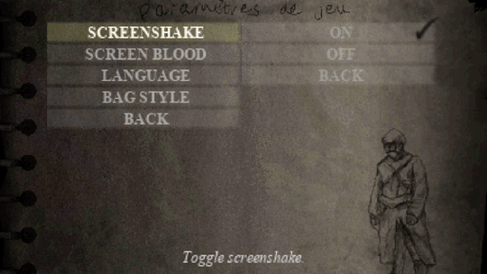
The big Conscript accessibility + options update!
Hello everyone, hope you are all doing well. I’ve been hard at work getting a new demo revision ready for mid-October.
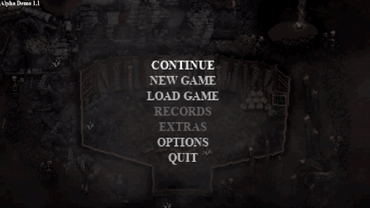
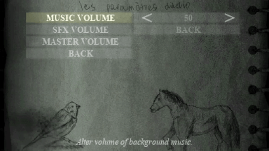
MAIN MENU
Here’s a look at the initial main menu for Conscript. I find it quite atmospheric and have found myself just keeping it on in the background while I work. The last menu for the previous demo was quite rushed so I’m happy with how this one has turned out.
ACCESSIBILITY
Recently, the topic of accessibility has been on my mind. As a developer it’s easy to find yourself resisting against a player’s ability to alter your “vision” of the game. I can understand this sentiment - as I’m somebody who holds my project VERY close to my heart. This topic was inspired by a conversation on the Conscript Discord where I was asked how accessible the game would be. My immediate internal reaction to any questions relating to adding a new unplanned feature is generally “isn’t my damn Trello board already big enough??”
After some reflection and research however, this is a silly way to look at things. Yes, any new feature takes hours or even days to implement - but that doesn’t mean it’s not worth doing. For example, as a developer I end up putting in many extra days and weeks trying to get the game on different online storefronts or even other consoles, all in hopes of trying to expose the game to more people but I would never question this time as anything but time well spent.
Accessibility is the same thing really. There are extra hours of work I can put in to ensure that MORE people can be exposed to the game and enjoy it. So that’s what I’ve been doing, even if it has meant putting extra work hours in every day for the past few weeks.
PAUSE
First, you can now visit the options menu at any time without having to go through the inventory. A tiny change, but it was requested quite a few times.
VISUAL OPTIONS
Something I wanted to solve was text readability. There are now a variety of settings to adjust different properties of the text in-game.
You can now choose between HD and pixelated fonts. Even though low-res pixel font is coherent with the general art style, it is not the most legible typeface to read. Now you can have the option to “HD-ify” the font, which makes for greater readability.

For those with dyslexia who may have trouble discerning between serif style characters, you can now opt for a simple sans-serif font style. This can also be toggled between HD or pixelated.
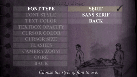
Text colour can also be changed between white, yellow, green, red or blue.

This is applied to all standard text throughout the game!
And finally, the background opacity of the standard textbox can be customised from 0 to 100. If you are struggling to discern between the text and background it may be easier to have this on 100 so the text stands more.
I feel like all these extra little options will solve the text readability issue for the majority of players. Any colour specific elements will also have non-colour related visual indicators. They are small changes but hopefully go a long way for some.
There are also some extra little visual accessibility options for those who may have trouble focusing on certain elements of the game’s artstyle. You can now zoom the camera in up close to our protagonist, and also alter cursor, crosshair and interaction icon properties such as size and colour. HUD opacity can also be lowered, but it is set to 100 by default.

The screen blood that appears when you take damage can also be turned off now, as can any bright flashes in the game for those who are photosensitive or epileptic. For those who don’t enjoy screenshake, that can be turned off too.
It hasn’t been implemented yet, but I am working on having brightness and contrast settings too in the future. Even though the game won’t feature much voice acting, I am going to work on having subtitles available not just for voices but also for any kind of hard-to-read environmental text.
AUDIO OPTIONS
Nothing too fancy, but you can now adjust SFX, music and master volume all independently. This required a rework of the audio system so it was actually quite challenging, but happy to have it completed and working.
BLOOD TOGGLE
Blood and gore effects can now be toned down substantially, although it will be left on by default. The reason I decided to include this is because there may be some who are more interested in exploring the history of Conscript without the intense and bloody combat . In my opinion, Conscript is equal parts a history game and a survival horror game, so there will be cross pollination between those two demographics. Most of you will probably leave this on but it’s nice to have it there anyway.

DIFFICULTY MODES
During the Kickstarter campaign, we reached the stretch goal for two difficulty modes but I am going to include some extra ones in the final game. There will now be six difficulty modes in total.
Training (Assist Mode)
This mode will feature checkpoints, increased health capacity and player damage will be increased.
Recruit / Soldier / Veteran
These three will be the standard easy/normal/hard sort of thing from every other game in existence. Enemy damage and item quantity variables will be the main differences between these modes.
War Hero
This will feature more “realistic” elements from modes like Resident Evil Remake’s “Real Survival” difficulty. Item boxes will be unlinked from each other and limited saves will be mandatory. It will contain the same gameplay modifiers as Veteran mode.
Grognard (French for “old soldier”)
This ultimate challenge will include all the features of War Hero mode but with PERMADEATH. Yep, you heard right.

LIMITED SAVE TOGGLE
Limited saving has always been controversial. The reason I opted for this old-school survival horror mechanic is because it introduces a risk/reward style of gameplay where players generally try and squeeze in one extra “task” before the next save, leading to extra hard decisions being made during gameplay. Understandably, not everyone wants to deal with this though. Despite this being the intended way to play, it will an optional toggle at the start of any Conscript playthrough. Note that on the very hardest difficulties it will be mandatory however.
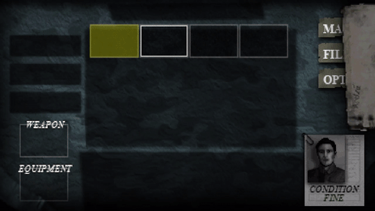
Here’s a look at the game parameter screen before you start a new save:
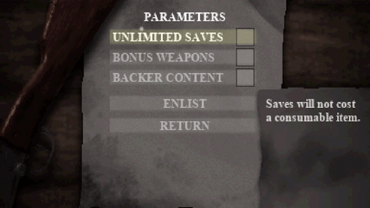
You will also have the ability to toggle off Kickstarter backer easter eggs if you so wish.
CONTROL SETTINGS
Any action that requires you to hold a button - such as aiming and running - can now be toggled with one button press instead.
Also, I’m going to implement both a quick melee and quick heal feature so that you don’t have to go into the inventory just to break some barrels or use a healing item.
You can also turn off mouse support to play the game with a keyboard only.

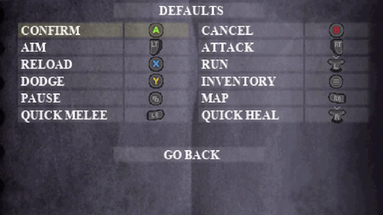
CONTROLLER REMAPPING
Full control remapping is now available for both keyboard and gamepad control schemes. This was a complicated and time consuming thing for me to implement but I’m glad to finally have it available.
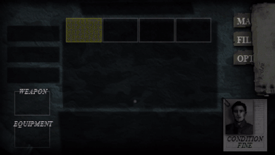
Hang on a second… did the inventory just change?
BAG STYLES
By far the biggest feature in Conscript history....
This was a fun little extra I decided to make when I was testing out the flexibility of the new options menu. Admittedly it has nothing to do with accessibility, but it is related to the options menu! You can now change the colour of the inventory background. You will be spending a lot of time there so I figured it would be cool to give some small level of customization... there may even be some extra unlockable styles in the full game! Any ideas for patterns or designs?
So that’s what I’ve been working on the past two weeks! What do you think? I know menu heavy things aren't exactly the most marketable features, but I felt it was important to share. Are there any other reasonably in-scope accessibility options you all would like to see?
20 notes
·
View notes
Text
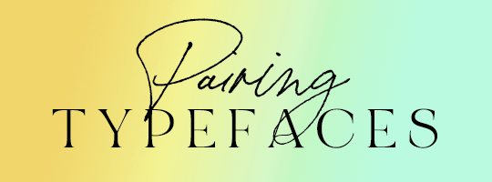
Guidelines for Pairing Typefaces
A while ago I made a post about how to choose the right font. But what if you wanna use more than one font? How do you pick two that go nicely together? How do you keep things from getting too chaotic?
Let’s find out!
1. First of All: Moderation in All Things
If you’re going to use more than one typeface, it’s usually best to stick with just two. Maybe three. It’s certainly possible to pull off more than that, but it’s the sort of thing you probably ought to reserve for typography-centric designs, and not so much graphic edits where the typography is only a small portion of the design.
But, you know. Don’t let me tell you what to do.
2. Create Hierarchy
Good design is all about contrast, y’all. You need to have a focal point, you need to lead the eyes through the composition. I like to have 2-3 ‘tiers’ to a design: What to I want the viewer to look at first? What do I want them to look at second? What do I want them to notice last?
When you’re pairing typefaces, the intent should be to establish some kind of visual hierarchy, and not just... to create variety for the hell of it. That being said, of the two or more typefaces you’re using, take a minute to decide which is at the top of the hierarchy, and which is at the bottom. The higher in the hierarchy, the larger the font size should be, and/or the heavier the weight should be.
Didone serifs and ‘display’ (script, brush, blackletter, etc) typefaces tend to necessitate larger font sizes-- they become hard to read otherwise. So if you’re going to use these kinds of fonts, odds are they’re going to be your ~leading typeface, sitting at the top of your hierarchy. You’ll want to accompany these typefaces with more conservative ones that will be easy on the eyes at smaller sizes. Combining two or more Didone, script, and/or display typefaces will rarely produce a nice result because they’ll compete with each other-- the hierarchy won’t be clear.
Here’s a basic example of how to create hierarchy:
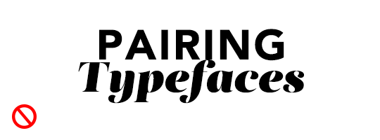
When the word “Pairing” is large and bold, there’s no clear hierarchy. Your eyes aren’t quite sure where to go first. The two ‘masses’ just kinda get interpreted as one giant mass.
But make “Pairing” smaller and use a lighter weight of the same font, and now we have two separate masses that balance each other out. The composition can breathe a little. Our eyes can now recognize one mass as more important than the other on focus on that one first: “Typefaces”
It might seem a little counter-intuitive to not emphasize the first word-- after all, that’s the one people should technically be reading first. But the word “pairing” on its own isn’t very... interesting. At least, not without context. What about “pairing?” What are we pairing? The topic of this post is typography, so in this case it makes more sense to draw the viewer’s attention to “Typefaces” first. Viewer’s brains will still read it as “Pairing Typefaces”.
3. Understand Makes a ‘Good’ Font Pairing
So... you don’t want to grab just any two typefaces. You want contrast, but the right kind of contrast.
Differences to look for include weight, stroke width contrast, and type classifications. A Serif and a Sans Serif will (usually) compliment each other nicely, whereas pairing two Serifs or two Sans Serifs can be very tricky. Similarly, if you’re using a funky display typeface, you’ll want to balance it out by pairing it with something more conservative.
Similarities to look for include x-height and character width/proportions. If these metrics are too different from one typeface to the next, they’ll probably clash rather than compliment each other.
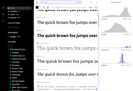
Once again, I’ll shamelessly plug FontBase Premium’s Super Search feature because I can literally just search all of my fonts by these metrics:
4. Look for Robust Type Families
One of the reasons I lean toward tried-and-true classic typefaces, is that they tend to have the most robust families.
When in doubt, look for a type family that has a wide range of weights and widths. You can pair the light/hairline weights of a typeface with its bold/black weights to create contrast-- without having to scour your font library for things that may or may not work.
In addition to different weights, some typefaces even have different sub-families. For example, Thesis TheSans has a ~sibling in Thesis TheSerif. Likewise, Roboto, a sans serif, also has a slab serif version.
These different fonts, being from the same family, will have the same x-heights and proportions, and will therefore be effortlessly beautiful together!
5. Two Examples

The above image cycles through a few possible font combinations for Futura Heavy. The pink overlay represents Futura Book.
The simplest option is of course, to just use another weight of the same font: Futura Book.
Corporate and Roboto have much taller x-heights than Futura, so they’re the least desirable of the options shown. (For Corporate, the x-height doesn’t actually move, but the cap height drops considerably)
Akzidenz Grotesk and Baskerville have very similar x-heights compared to Futura, and would probably be the best of the options shown.
Univers, Minion, and Lato are all ‘passable’ options though. You don’t need to find an exact match for it to be a good pairing, and sometimes a typeface that isn’t an exact match will look better than one that is!
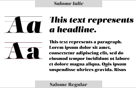
And here we have some possible pairings for the Didone Serif, Salome. Again, the pink overlay represents Salome Regular
Didones and display typefaces lose their details at small font sizes and become hard to read. So we really can’t pair this typeface with another version of itself.
Bodoni is another Didone, and while it’s certainly more legible than Salome at smaller sizes, they’re too similar and clash with each other. It also has a much smaller x-height.
Baskerville has about the same x-height proportionately, but its cap height overall is noticeably higher than Salome. It’s a passable match, but the larger height makes it compete with the heading a bit, so we can definitely do better.
Georgia is a near perfect match for Salome’s cap and x-heights. Of the above serif options, this is the most desirable.
Optima and Avenir are perfect matches for Salome’s cap and x-heights. Avenir’s consistent stroke widths provide more of a counterbalance to Salome’s intense contrasts than Optima does- but both pair nicely, and which of the two you might use depends on the aesthetic you’re looking for.
Neutra Text and Helvetica are less ideal options. Neutra Text has a much smaller x-height that would actually make it a better match for Bodoni, while Helvetica’s x-height is too high.
At the end of the day though, it’s an art, not a science. I wouldn’t expect you to sift through dozens of fonts, looking for one with the exact same x-height every time you make a graphic (I sure as hell don’t). But when you’re looking for a second (or third) font to use, take a minute to try a few different options and really consider whether or not your first go-to is really the best fit. If you don’t like how something looks, try to figure out why. Odds are, the font just has the wrong proportions.
6. When In Doubt, Look for Help
A quick search for ‘font pairings’ will return all kinds of lists of favorite combinations and advice, but more specifically:
While looking at a font specimen on Google Fonts, it will list the 5 other Google fonts it’s most frequently paired with.
FontJoy will randomly (but intelligently!) give you three Google Font choices that should work nicely together, based on their metrics. If you like one of the fonts, but not the others, click the little lock icon next to it and hit the ‘generate’ button again for more options.
If you already have your heart set on one font in particular, a search for “[typeface name] font pairings” will often yield some results as well-- provided the font in question isn’t too niche.
#tutorial#typography#this has been in my drafts all week#i hope it's not confusing???#or too boring???#oh well
784 notes
·
View notes
Text
Web Design Trends 2020 – Top 12 You Need to Follow
Can’t believe it, but it is true. The web has turned 31 years old now! And we have seen varieties of websites surfacing on it (coming & going) – from bland HTML ones to flash media websites to AI-centric automated websites (the chatbots one?). We have come a really long way. Transitioning websites according to the latest web design trends has become a lifeblood for every digital business (literally everyone). Because these new web design trends each year are created or approved by your internet users or more specifically, your would-be customers only. And in this fiercely competitive market, you can’t fail to dissatisfy your “future customers”, would you? Just like previous years, this year too, we have some mind-blowing web design trends 2020 prowling around, making a huge impact on the website’s growth in terms of customer engagement, brand value & revenue creation.

12 Amazing Web Design Trends 2020 You Shouldn’t Skip
It may sound weird but – “Website design is like a joke, if you have to explain it harder, it won’t make any sense”. Similar to a joke, your websites need to be effortless at the first look, self-explanatory in the second scroll, and convincing to explore & take a further step (like your joke would, to make them laugh) at the third look.
Without much waiting, let’s get into the 12 amazing web design trends 2020. They are effortless to follow, self-explanatory to look at, and convincing for visitors to enter the sales funnel.
1. Bold & Vibrant Colors Are In… More Than Ever
This year, we are seeing bold, bright, flashy colors taking the forward leap. The full bold colored websites with undertones of contrasting and less vibrant colors around the edges of images & texts will be big this year. The designers today are focusing on creating a web design that creates an equal experience for everyone. A color scheme with little contrast of a different color that people even with special abilities can feel and enjoy.

2. Web Design Trends 2020 Make Chatbots More Obvious & Much Powerful
This year, chatbots will be mainstream and much more efficient at reaching visitors’ quey (all thanks to evolving AI & machine learning). The chatbots will be much more customized than ever. Also, they will appear as if there are real business reps behind the screen. Moreover, they will be in more loud & popping colors. They will reach faster & better at users’ silly to crucial queries with a personable face (maybe of business rep, cartoon character, or some mascot for the brand).

Chatbots are of different types, the ones with choice based questions, the humorous ones, etc. Additionally, you can choose to script the chatbots per your brand’s conviction & image in the market by partnering with any professional company for web design.
3. Motion UI – Graphics Will Not Be Just Still
Motion UI is another soaring trend, from which websites can’t keep hands-off. The graphics with slight to full swing animation can add a volume to your simple & static website. This year, websites will be all about winning the users’ hearts with animated graphics at the micro-interactions of the website.
Mobile UI can be added in a mobile screen picture as a moving mobile screen, or on a clothing eCommerce website, where the model gives a 360 turn in product pictures to give buyers an interactive & appealing look. You can experiment with Motion UI anywhere on the website from top to bottom. However, animation should be approachable and should be neither too fast nor too slow – to make sense to website visitors.
4. Web Design Trends 2020 in Color Palettes
Every year, there is a new color that dominates the web design trends. According to Web Design Company experts, yellow was the main color for 2018 trends, blue for 2019 trends, and this year, it is said to be the cool & breezy color “mint”.

Apart from just mint or any particular colored websites, we are seeing designers taking the websites to a whole new level with gradients – that has hues of a different color. It is best for businesses that can’t point fingers at just one solid color scheme. The gradient fluid will give more depth to the viewers in the first look.
Another color trend will be based on your brand theme, type, and target customers’ behavior or thinking pattern.

Like:
For information & other backgrounds – Colors like soft grey, teal or blue will be a great match to make the content part more readable for users.
For CTAs and buttons – Colors as warm and flashy like red, green, orange will be much triggering to click on those buttons.
If you are unsure of what color scheme to follow, your company for web design can help to find the best color palette to splash over your website type.
5. Fonts in Web Design Trends 2020 Are Bold and Edgy
San-serif and serif font are the two popular fonts. They will see a continued use this year too with outlined or more dark colors to make them stand out. The bold and broad fonts in landing page headings or subsection headings will steal the users’ attention in a thunder.
The fonts in the website’s banner or header will either have solid colors or some still or moving illustrations to make a lively connection with the visitors. The fonts will stand out on the surface of either light grey or other soft colors or extra edge pop-up colors.

Also, note. You have to decide the typeface & font type based on your brand’s notion, the company’s overall goal, and your audience’s behavior pattern.
Ask your web design company to choose a font and typeface that’s easy for readers to read as readability also counts big in the enhanced UX. Avoid adding complex and cursive fonts as it might confuse the readers and compel them to move out from the site instantly.
6. Minimalism Still Looks Full
Minimalism is a classic and never-getting-old design concept. A minimalistic design means fewer web elements, content, as well as more white spaces, and limited typography. Consequently, it gives the user room to think and explore the website much better.
This year too, the trend of minimalistic design is shifting from previous trends and despite being less, it will be more to the visitors.
You have to pull in minimalism with a lot of care. Make sure the design is understandable and has basic things that a user expects over your website. Keep the images, animation, content limited but in a way that readers are still able to connect the dots to satiate their queries & fall into the sales funnel.
7. Videos Are Dominating in Web Design Trends 2020
Videos are the timeless & most classic thing to add to modern web design trends. Try having a combination of text, visuals, and audio-video content. It creates a balance and caters equally to both the “patient” and “on-the-go” readers.

Readers who don’t have much time & are looking for information on the instant, for them, videos portraying the brand message, animation, or small collage of photos can create a long impact on their choice to stay and explore that website.
A general user loves a website that can showcase its content or offer – in other than just a boring wall of text. Companies today are exploring video-based content and are integrating such videos over their interfaces to serve on-the-go aesthetics.
You can add videos about anything, like product description, use, tutorial, step by step guide, social messages, and brand story. Likewise, you can even integrate your Youtube videos to look like a very well-established brand.
8. More Interactive Micro-interactions Are in Focus
Micro-interactions are the small actions or interactions throughout the website that grab the eyeballs of readers. Additionally, they attract visitors to different sections or elements of the website. Think of the red icons displaying the number of friend requests on Facebook. Or, remember a beep sound on refreshing the Twitter page. All these small icons before any text are all sorts of purposefully-done micro-interactions.

This trend is clamoring this year too. Actually, it is the best way to transfer the information or message to the audience with a more appealing UI. You can decide any type of micro-interaction at different sections of your website. Yet, you have to ensure they are creative, not overdone, gives a subtle overall UI look.
9. Increased Attention to UX and UI – Hand in Hand Web Design Trends 2020
The modern web design trends are showing support to UX (website functionality) and UI (website’s creative interface), congruently. This year, websites with smooth functionality along with impeccable UI are in more limelight. The web design company is focusing on creating a website that gives glitch-free and completely smooth user experience, with:
Less cluttering elements – more of white space for breathing
Navigable, easy to read and SEO-optimized content
The fast loading speed of the website
Balance of rich multimedia as visuals, infographics, videos, 3d illustrations & more

And to keep the user experience in great momentum, designers are focussing on creating more edgy and intuitive interfaces to maximize the UX of visitors with:
Transcribing the videos
Adding caption of the image
Making voice-supportive interfaces
Having balanced UX motion & other animations
Easy to skim content framework
Removing cluttering elements or features that are not necessary
Mobile responsive interface (more than 50% of internet traffic comes from mobile devices)
10. Web Design Trends 2020 Include Illustrations Tailored to Tell a Brand Story & Beliefs
Modern websites have a range of multimedia from visuals to illustrations to stock photos to icons. They appear on the website not just to bring more colors or visual appeal to readers. In fact, they are used for a much bigger purpose.
And that bigger purpose is to weave an exceptional brand identity. So, you can achieve it by telling a brand story, beliefs, use cases, or thought- process from the core level.

If you see NPO websites, you will notice how such websites are surfaced on top of positive deeds & optimism, such websites’ pictures deliver an out loud message (about helping the marginalized communities) for visitors.
You can have a splash of real photographs or have vector collections. Additionally, you can try street-art inspired graphics, icons, or illustrations that truly encapsulate your brand’s identity and visions. Ask your web design company to weave you some high-quality images or visuals. The latter should correlate with your brand and have a purpose to convey to the readers.
11. Large Elements Are “In” in Web Design Trends 2020
This year’s theme is all about going for bold, big, and users’ screen size elements to deliver a fuller look. This year, the contact forms for businesses too will have a broad appearance.
The contact forms are for picking a product inquiry, signing up for a service, service analysis, and much more. Users generally ditch the contact forms due to their limited size. This year, we will see websites going for full-length lead forms. They will be visible enough for users to fill in, without ditching them in one-go.
To make the forms appear less tedious or boring, you can add micro-interactions around as. For instance, try showing procedures to fill the form, some additional words to inspire people to fill up, if it is a lengthy form, divide that into different sections & give interactive scrolling buttons at the bottom.
12. Luminous, Fluorescent 3D Artworks Are Calling in For Great Attention
3D images and artwork have been there around the block for quite a long now. But this year, we are seeing the luminous, fluorescent, or neon-colored 3D visuals taking an edge more than ever.
The neon colors visuals or illustrations in the 3D effect on top of the minimal and basic template are grabbing the users’ attention much widely.
3D artworks are more prime this year to give the website more intense interaction with users and neon colors to give that lively & energetic look to the website layout. Together they combine to give an edge or personality to any UI.
P.S. While going for this trend, ask your company for web design to use the collection of neon colors in cohesion & moderation and scatter them around the overall UI. Too many concentrated neons can create a dizzy or noisy look. Surface these artworks on primary & subtle colors like white, grey, or light blue to make that artwork highlighted promptly.
Final Takeaway on 12 Modern Web Design Trends 2020
Each year new design trends come and go. If you fail to follow them, your scope for winning impactful brand identity and sales may be long gone with that obsolete trend too. Netizens love exploring a website that steps out from its comfort axis and has something spontaneous to offer (according to changing trends). They longer like a website that was made long years back and hasn’t changed anything to participate more actively in its audiences’ concerns & beliefs.
We just chalked 12 amazing web design trends 2020 that your website too needs to address – to be counted as a genuine and evolving brand – that your target audience expects you to be.
Are you determined not to put your audience’s interest down? Follow the above and many other stunning web design latest practices. Also, you can also for the help of a professional web designing company.
1 note
·
View note
Note
Hello! I was hoping you could help me, I’ve seen a few zines do tarot cards as an add or just projects only featuring tarot cards. Do you know or have any resources that could help me produce a deck one day?
I’ve done a tarot deck once, but it was the first project I ever ran and wasn’t particularly well-organized. I can say that I personally had a good printing experience with MPC! Their cards were good quality and the boxes we ordered were awesome. Many tarot decks usually include a guidebook, either as a PDF or physical booklet, that explains the meaning behind each card and perhaps the artist’s thought process while they were making it, so the deck is accessible to experienced tarot readers and folks who’d just like to appreciate the card art.
Here are a couple tips based on my experience:
Personally I think it’s kind of a crazy idea to have an entire deck of cards as an add-on, unless you’re only doing the major arcana. If you’ve got plans for a full deck, stick to doing that and don’t try to also manage a zine at the same time. Even if you’ve got a large mod team, it doesn’t strike me as a good idea.A good rule of thumb is to make sure you have your card border designed before any of your artists begin work on their cards. This way, everyone can arrange their compositions in order to better complement the border, and nothing will look odd with the border slapped on top of it.Also, make sure everybody’s working on the same dimensions and is aware of DPI/PPI!!Personally I believe it’s a good idea to have a wide variety of art styles for a big project like this – if you do a full deck you need around 78 people if each person only does 1 card – but YMMV.Keep your potential customer base well in mind too – tarot decks are more expensive to produce and ship than regular booklet zines, since they weigh more, so if you’re looking to do one for a really small fandom or niche thing, I either wouldn’t, would only do major arcana, or would produce it as a PDF only for people to purchase and then print their own deck with if they’d like to.Make sure you understand tarot to some degree. I had to do some research ahead of time because I decided to provide all my artists with card and character assignments instead of giving them free reign so that we’d have a nice balance of characters throughout. So if that’s a concern for you, make sure you read up on the themes of each card so you can choose something appropriate for each one!Find a graphic designer to do the border and card back art, as well as the art for any packaging/boxing you might decide to do. Get that stuff squared away early too so you aren’t scrambling for it after everyone’s finished their card art. With the backing and border, choose something that’s neutral in color so it’ll mesh well with all the different art – white, black, gold, silver, etc. Make sure the border doesn’t obscure too much. You can either have a different border for each suit or go with the same one for every card. Your card back can be symmetrical (so that when you use them you can’t tell if the card is upright or reversed until you flip it) or not.Make sure that the font you choose for the card names is either free for commercial use or that you purchase the license to it!!!
But uhh yeah that’s just what I can think of off the top of my head. If you have more specific or targeted questions, please get in touch with the mods of an ongoing/recent tarot project and ask for their advice! I did this like 2 or 3 years ago, so my advice is mostly generic and not all that useful.
Thanks for asking!
– Mod Star 🌟
19 notes
·
View notes
Text
A Peek into the Indie Writer World – Part IV: A Walk Through the Process
If you’re thinking of going indie, or have already decided to, you may find yourself wondering what steps you need to take. This is a look at the process, focusing on hard copy books and e-books.
The short version, in bullet format for those with very little time:
Write your story
Identify your output product(s)
Copy edit your story
Purchase and/or assign ISBNs
Request PCN (hard copy print only)
Format the story
Create front matter for printed work
Cover art and design
Publish
Market
The longer version with more details below the cut.
Write Your Story
There are many different ways to write. Use whatever process works for you (drawn out, under tight deadline, or anything in between). Revise and edit your draft to ensure you have the best possible version you can. Many people like to use critique groups or beta readers, other people don’t. The key is that your content (poetry, short stories, novella, or novel) is the highest quality you can make it.
Identify Your Products and Process
You can start looking at the various products and printers out there while you’re still in the writing stage. As your story gets closer to being ready to print, you’ll want to have some decisions on your starting point, at least. Will it be an e-book with print to follow? Or do you just want to start with the e-book and see how it goes? Your plans will influence some of your next steps.
Copy Edit Your Story
Most people think of this as proofreading, finding and fixing typos, spelling mistakes, and grammatical errors. In this case, it also includes ensuring your soon to be published book has a consistent style.
Style is a set of rules that provide a uniform look to a document. This includes things like use of font, font attributes (bold, italic, underline), implementation of flexible or optional grammar (such as the Oxford/serial comma), and the presentation of specialized terms. Most fiction publishers have a house style built off Chicago or AP style, both of which have handy manuals. It ultimately doesn’t matter what style you go with, as long as you are consistent.
In the editing world, style often includes formatting elements, but for the indie writer, some of that formatting will vary depending on the product or products you’re producing.
Things to Watch For
Consistent spelling for names of people and places
Consistent terminology for magic or world-specific details (eg: does the world use shape-shifter, shape shifter, or shapeshifter?)
Use of numbers (phone, age, height, distance) are generally spelled out in fiction
Consistent units of measure (unless there’s a good reason for it, you don’t want to randomly switch between metric and imperial)
If attention to detail and copy editing aren’t your strong suits, copy editing is something you should plan to hire out. You can also just hire someone for the pieces you need done. If you have a handle on your house style, but want someone else to proofread, that’s totally a thing that people do.
Purchase or Assign ISBN
If you’re printing with a company that offers a free International Standard Book Number (ISBN), and you’ve chosen to go that route, you can skip the purchasing step. I personally prefer to have full control of all my ISBNs, allowing me to take them with me if I switch printers or distributors.
Buy your ISBN in advance via Bowker. You will need one ISBN for each product you are producing. A trade paperback needs a different ISBN than a hardcover or audio book. There’s often a discount to purchase multiple ISBNs at one time.
Once you have any needed ISBNs for this project, you’ll need to link the number to a book title, and provide some information on the book and edition (publisher, summary, cover etc). This is a good time to perfect your back-cover blurb or teaser. You can come back and update much of the ISBN information later if you don’t have all the elements at the time you’re doing this.
Request a Preassigned Control Number (print copies only)
If you’re based in the US, you’ll want your book registered with the Library of Congress as this increases the likelihood that it will get into libraries. It also provides some added copyright protection.
You will use the Preassigned Control Number (PCN) process, which takes 10-15 business days. Start this far enough before you plan to complete the publication process, to ensure you have your Library of Congress Control Number (LCCN) before you go to print. If you have trouble navigating the Library of Congress’ website for questions (and you probably will, it’s not as clear as it could be), you may want to explore the PCN Manual.
To complete the process of registering, you will need to send a hard copy of the printed book to the Library of Congress.
Format the Story
Formatting your work can fit in with style, especially after you’ve gone through the indie process and have a handle on what you want and need. Many writers will create their draft in the most complicated format they are planning on producing, just so this piece is well underway (and less frustrating later). Once the book is ready for publication, they’ll make copies to reformat for other products.
At this point you need to know how you plan to publish and what company you’ll be using, as different publishers have different formatting requirements. Be sure you read the requirements before you put in a bunch of work changing your novel into a font you won’t be able to use.
Features you need to make formatting decisions on include:
Page size (determined by the product you are creating)
Margins (leave room for the gutter – the inside margin where the binding is)
Chapter heading font, size, and position
Indent (fiction usually indents first line of a paragraph)
Line spacing (look at similarly sized books to choose number of lines per page)
Section breaks (asterism or section sign are both good choices)
A Note on Paragraph Styles
If you’re not already using paragraph styles in your word processor, you need to start now. Styles designate font, size, and text attributes, as well as features like line spacing and indents. When used properly, styles ensure consistency and a professional looking end product. They also make it much easier to reformat the entire document if you need different features for a different product, or if you suddenly need a different font for your text body.
If you are creating an e-book, you must designate title and heading 1 styles at the very least, as these are used for navigation. Failure to designate these will often result in your book not meeting requirements for distribution.
Accessibility
Do not use extra returns and the space-bar to place text where you want it on the page. This makes your digital end product inaccessible to people with adaptive reading equipment. Screen readers will read every one of those spare characters, and no one wants to hear “asterisk, asterisk, asterisk, asterisk…” as they wait for the next section. Instead, use your styles to put chapter headings where you want them, and use hard returns (ctrl+enter) to separate chapters.
Front Matter
This is the content that comes between the front cover and the first page of the story regardless of whether it is a print or e-book. The professional standard includes:
Copyright page (including the year of publication, ISBN, and LCCN)
Table of contents (this will be automatically generated for e-books)
Title page (should be on the right page for print editions)
Optional content includes:
Acknowledgements
Dedication
Book Cover
This is your primary advertiser for your book, whether it’s print, e-book, audio book, or a serial. You will use this image everywhere to pitch your work. We’ve all been told to not judge a book by its cover, and we all do it anyway, so expect that this is something that must be done right.
Consider your cover a visual extension of the story. It needs to be appealing while giving your reader clues on what to expect. If your zombie apocalypse story has a cover that feels like a Christian devotional, it won’t appeal to some of your readers and you’ll have gone against the expectations of others. You absolutely do not want your book to look like you spewed clip art at the page, a common new indie writer mistake. A generic cover does you no good either.
It’s okay if you don’t have the skills to create a stunning cover for your book; hiring someone to do this for you may be your best bet. It’s worth paying to get a cover that helps readers decide to pick your story. There are a lot of great artists out there, so look around and find someone whose style is a good fit and who you can afford. That said, don’t whine about prices. Artists deserve to be paid what they’re worth.
Publish
The steps at this stage will vary depending on the company or program you decide to go through.
For most print on demand printers, expect to have to buy a proof before the book becomes available to the public.
Market
This stage will vary depending on your comfort level and opportunities. In general, you should be marketing yourself as a writer at any opportunity. This means participating at conventions, doing readings, and posting announcements on your social media and website. Be careful to avoid giving your friends a constant hard sell on Facebook, though. No one enjoys that. Your social media needs to be somewhat active and should include content not specifically related to a recent book release. Posting teaser chapters can be a great try-before-you-buy option.
While this looks like a lot of steps to take, they are spread out over the course of your process of bringing your story to publication, and many are not that onerous. Most print on demand companies have paid services to help with some of these steps, if they seem too great for you to overcome on your own.
⁂
For the first article in this series, check out Part I. Or if you just missed the previous article, check out Part III. To see the next one, check out Part V.
For more articles on writing, check out my Reflections From the Sol section.
3 notes
·
View notes
Text
January 20th-January 26th, 2020 CTP Archive
The archive for the Comic Tea Party week long chat that occurred from January 20th, 2020 to January 26th, 2020. The chat focused on Free Sailing Villains by Grace Kaluba.

Featured Comment:
Chat:
Comic Tea Party
COMIC TEA PARTY- WEEK LONG BOOK CLUB START!
Hello and welcome everyone to Comic Tea Party’s Week Long Book Club~! This week we’ll be focusing on Free Sailing Villains by Grace Kaluba~! (https://freesailingvillains.tumblr.com/)
You are free to read and comment about the comic all week at your own pace, so stop on by whenever it suits your schedule! Remember, though, that while we allow constructive criticism, our focus is to have fun and appreciate the comic. Below you will find four questions to get you started on the discussion. However, a new question will be posted and pinned everyday (between 12:01AM and 6AM PDT), so keep checking back for more! You have until January 26th to tell us all your wonderful thoughts! With that established, let’s get going on the reading and the chatting!
QUESTION 1. What has been your favorite scene in the comic so far? What specifically did you like about it?
QUESTION 2. What is your personal opinion on the comic’s opening regarding the three points of good living? Do you feel they’re accurate to real life? Regardless, what sort of expectations do they set up for you regarding the comic?
Eightfish
boy that serif font is a challenge. And I haven't seen a webcomic where clicking on the page zooms it in before- kept clicking on the page instead of the 'next' button out of habit. 2) The three points were be true to yourself, don't care about others, and don't get trapped by others' expectations, right? I think they set up the character's personality. Don't know if I'd call them "selfishly indulgent" though- to me that phrase would be more fitting to something like "take what you want when you want"
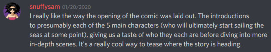
snuffysam
I really like the way the opening of the comic was laid out. The introductions to presumably each of the 5 main characters (who will ultimately start sailing the seas at some point), giving us a taste of who they each are before diving into more in-depth scenes. It's a really cool way to tease where the story is heading.
Comic Tea Party
QUESTION 3. At the moment, who is your favorite character? What about that character earns them this favor?
QUESTION 4. From the introduction, which character’s personal plight did you connect with the most and why? As the story goes on, how do you think said character might come to address their external and internal struggles?
Comic Tea Party
QUESTION 5. What has been your favorite illustration in the comic so far? What specifically about it do you like?
QUESTION 6. What do you think Zaila’s backstory is, and how did Zaila get into a career of piracy? How do you think Zaila and Kelly might meet some of the other members of the cast, and will everyone manage to get along?
RebelVampire
1) My favorite scene was probably the scene with Adelaide where she sasses her future husband. It was pretty funny but also tense since even just looking at her mother you knew that sass wasn't going to go unpunished or unmentioned. So there was a good mix of feelings going on that I enjoyed. 2) I feel like these points kind of set up the tone of the comic. We're dealing with themes of being trapped and freedom, so you know you're in for both drama and...maybe anti-heroes is the best word here. And I think it was a good opening to kind of set that mood up for what to expect from the character's and their position on life. As for accuracy to real life though, yes and no. I think it would depend on the person and how they define good living. So for some an accurate philosophy, for others, not so much.
3) My favorite character is definitely Adelaide. I enjoy her spunk but also her situation. Social pressure is a hell of a thing, so in some ways I feel she's got the worst end of the stick compared to a lot of the other characters. I also feel like her situation is perhaps the most complex because of that, since if she just dumped the marriage, there's a lot of people who'd be effected by that decision. But also, sass. 4) Once again, I probably also connected with Adelaide's plight the most - if only because I feel she's the most down to earth right now. Like I can't see becoming a secret vigilante at least, so that extra grounding for Adelaide's makes me empathize more. As for Adelaide's struggles, I think she's gonna try to go through with it, but then bail and basically fall into a state of apathy and rebellion as she tries to find out who she is and what she wants for herself in her life, not what is good for her mom.
RebelVampire
5) My favorite illustration is probably this whole page https://freesailingvillains.tumblr.com/post/160057299547 I love the various angles used in a lot of the shots, plus some of the details. Like I love the touch of that Pirate Beware sign, cause it really adds some ominous foreshadowing to the scene. 6) Honestly, for once, I don't even have a ballpark theory for this in terms of backstory. However, as for meeting, I kind of feel like it's gonna be a just in the wrong place at the wrong time sort of thing. And everyone is gonna flee together, team up naturally, and then just make their teamwork a permanent thing.
snuffysam
Yeah, I agree about empathizing with Adelaide the most so far. Like I think Mika is super cool, but Adelaide's situation just feels super real with being essentially forced into this marriage by social pressure. And she's also a really fun and witty character. I feel like there's going to be some situation that leads the group together, but I'm not sure what. All chasing some specific thing? A recruitment ad?
Comic Tea Party
QUESTION 7. Which characters do you enjoy seeing interact the most? What about their dynamic interests you?
QUESTION 8. What do you think happened to Adelaide in the past that her mother brought up? Do you think Adelaide will go with her political-oriented marriage, or will the pressure become too much that she escapes? What will the consequences be regardless?
RebelVampire
@snuffysam I personally think it's gonna be a situation of them all chasing something specific. Though a recruitment ad would be pretty fun. XD
7) I've enjoyed seeing Adelaide and her mom interact the most. Adelaide's mom is just filled with venom, and every moment of their interaction just hurts to watch. Plus, I really want to know what Adelaide's mom knows that we the audience don't, so I like that kind of mystery in their relationship. 8) I get the impression that maybe in the past Adelaide had maybe tried to commit suicide? At least that's the impression I got and I could kind of see why it'd work as manipulation. I definitely think Adelaide is gonna escape her marriage though before it happens. She's already thrown so much sass, I can't picture her saying any vows while keeping a straight face. And I'm sure when this happens, Adelaide will flee cause I doubt the powers that be in her life will just say "Okay" to this.
Comic Tea Party
QUESTION 9. What sorts of art or story details have you noticed in the way the comic is crafted that you think deserves attention?
QUESTION 10. How do you think Mika became involved in vigilantism with Thandie, and why do they both so ardently pursue it? What do you think will happen to their vigilante “careers” now that they’ve involved themselves in something dangerous like the artefact?
RebelVampire
9) I like how the backgrounds/foregrounds in this comic are used. Like there's a lot of things that characterize the setting (like the hospital), add foreshadowing (like the pirate poster), or add atmosphere (like the décor in Adelaide's scene with her mom. It's really great to see a comic that uses the background as more than just a background but as a means to enhance the settings presence. 10) I feel like Mika might be kind of an adrenaline junkie perhaps. Or at least someone who just feels ill-suited to regular sorts of jobs that people get. I'm not sure I feel there's a more complex reason than that at the moment. I kind of feel their vigilante careers are gonna be put on hold. Not because it becomes too dangerous, but because Mika and Thandie will see that there are better ways to help than just regular ol' vigilantism.
Comic Tea Party
QUESTION 11. What do you think are this particular comic’s strengths? What do you think makes this comic unique? Please elaborate.
QUESTION 12. What exactly do you think the artefact Mika and Thandie found is? Why is it so important that it was worth putting bombs in subordinates’ necks and torturing an old woman? Also, what do you think will happen now regarding it?
snuffysam
Yeah I'm fairly certain Mika and Thandie will move from vigilantism to piracy at some point, the question is why and how? Perhaps they just join up with the free-sailors as a cover to investigate this artifact? As for what the artifact is - I get the feeling the artifact itself isn't super important on its own, but it's a clue to something bigger. Like, the artifact somehow contains a map, leading to... either untold riches or some kind of weapon?
Comic Tea Party
QUESTION 13. What are you most looking forward to seeing in regards to the comic?
QUESTION 14. Any final words of encouragement for the comic?
RebelVampire
11) I think the comic's strength is the character writing based on the premise and themes. These characters are just extremely well suited to the adventure lifestyle, while all additionally playing into the theme of freedom the comic as well as the theme of being true to yourself. And since the characters match those themes so nicely, there's a really great compliment that makes each one stronger. 12) I'm not quite sure what the artefact is, though I assume it could probably destroy the world or something. At the very least, it's gotta be uber powerful. As for what will happen now, well, the artefact is definitely gonna get taken imo cause I think everyone will underestimate how much the mysterious villain wants it. And everyone will chase after it for their own reasons.
13) I am just looking forward to seeing more Adelaide in general and seeing where her storyline goes. ;v; 14) I hope to see the comic continue as it does seem like its gonna explore some really fantastic themes that I do enjoy seeing explored. Especially in terms of being true to yourself, cause that shit is hard.
aeons
Thank you so much for the feedback! It's greatly appreciated and made me more motivated to work on the comic. I will take everything that is said into account
Also thanks for reading just in general!
Comic Tea Party
COMIC TEA PARTY- WEEK LONG BOOK CLUB END!
Thank you everyone so much for reading and chatting about Free Sailing Villains this week! Please also give a special thank you to Grace Kaluba for volunteering the comic and creating it! If you liked Free Sailing Villains, make sure to continue to support it via some of the links below!
Read and Comment: https://freesailingvillains.tumblr.com/
Grace’s Patreon: https://www.patreon.com/graceofaeons
Grace’s Twitter: https://twitter.com/graceofaeons
#ctparchive#comics#webcomics#indie comics#comic chat#comic discussion#book club#bookclub#webcomic bookclub#webcomic book club#comic tea party#ctp#free sailing villains#grace kaluba
1 note
·
View note
Text
Making Character Profiles - A Juicy Guide
Sometimes it’s best to keep a fact file about your characters so that you are always working on-model. This is a good idea if you’re going to be drawing your characters or having others draw them for you, but also as a writer. Nothing is more frustrating than realising you got something wrong about your own character in your prose or script piece! It’s especially important for those who work in visual mediums like film, comics or other sequential arts.
I’ve been making character fact files and profiles since I was old enough to write wish-fulfilling Ben 10 fan-fiction on scraps of lined paper. I’ve learned a lot over the years about how to put together the most cohesive files for long-term use, and I’m simply going to share a few tips and basics on how to improve and streamline your fact files! I hope this can be helpful for someone, in the very least - whether you’re creating a fan character purely as a creative exercise, or a major character for your latest project.
Under the cut is a fairly detailed explanation on a few vital things to keep in mind while recording information about your characters.
Firstly, tailor your profile to its purpose.
Are you making something visual or will it just be a text? If you’r going to be drawing or live-action casting your character it may be a good idea to include drawings. You’ll need to make sure you’ve got a thorough understanding of their visual look. This is important to include as reference - character profiles are most useful to yourself, so it makes sense to keep written and visual reference together just to streamline your work process.
Will your character be appearing a lot? You might not want to include a whole lot of information on a character who will only play a minor role. Of course, your main cast will need much more information recorded. It’s a good idea to keep the amount of recorded information in parallel with how much they will appear in your work. This can obviously be adjusted or changed according to the story but as a starting point it may help.
What is the nature of your fiction? If your fictional setting is particularly unique you will need to make sure all universe-related info is included. If you’re working with sci-fi or fantasy for example, there may be a particular faction they belong to or they may belong to a fictional race. Of course, if all your characters are human and from earth these are details that won’t be needed, but the nature of your fiction should play a hand in how much you include. If your story is centred around a war or conflict it may be necessary to note which side they’re on. If it’s closely focused on an emotional arc it might be important to include things like personality alignment and psychological hang-ups. Make sure you’re working to suit your genre or mood.
Question Your Tools
Depending on what kind of writer you are, you may construct your profiles very differently to someone else.
Whatever you find easiest and most efficient to use should be what you always use. Your chosen tools should serve you more than they serve anybody else. Use whatever type of word processor, notebook or writing utensils you prefer when it comes to recording information. Choose a font that you find comfortable to read - most people prefer rounded fonts like comic sans or typewriter fonts, as their eyes can process the characters a little bit faster. If writing by hand, be mindful of your handwriting so that you’re presenting the information in a way that reads very efficiently. For some, whether or not they use cursive can make a big difference based on whether or not they prefer to read cursive. You might even choose to write some things in all-caps or in different colours.
Even your writing utensil can make a difference - does your pen give bold, easy to read characters? Is your font the right size, digitally or on paper, to present the information effectively? Take some time to adjust your formatting so that your character profile will be easy on the eyes for you personally, and will serve as the kind of reference you are most comfortable with.
Ask yourself, is this necessary?
You’ll naturally start by writing out their name, age and other really simple information. Now it’s time to ask yourself what you actually need and what you don’t.
You wouldn’t want to over clutter your profile and make it difficult to refer to. It’s very important that your profile is easy to use as reference. Each time you’re including a statistic or feature ask yourself if it’s necessary. Do you need to include the character’s height to show clear differences when making visuals? Do you need to mention who their family is or will their family not appear in the story? Do you need to mention specifics about their physical appearance or will we not see their face?
Everything you include should be somehow necessary or functional. Whether this is just to aid the visual aspects or to enhance the story’s plot, ask yourself if it’s needed before you include it. Whether or not things are needed will vary based on what you’ll use the profile for, which is why this is the optimal step to take after defining purpose. You will need to create boundaries for yourself based on how much you think would be too much, and how much you actually need.
Precision and Concision.
Not only will you need to ask yourself what information to record, but also in how much detail.
Will you record measurements in metric or imperial? Will you need to include the character’s entire date of birth or just their age? Is there a more concise way to record the same information to make it easier to read and find?
It might be tempting to either rush through the profile and keep things relatively minimal, or to get very stuck in and fill in all fields in a lot of detail. However, both of these can limit the function of your profile. A very bare-bones profile might not contain enough and you may forget to include a detail that’s vital to the story. On the other hand, a profile that’s extremely detailed can become very lengthy and hard to navigate. Both of these problems could slow down your writing process as finding key traits of your character is harder.
It’s usually a good idea to include detail in some fields but not in others, and to write things in an easy to read note format. Including sub-headings in bold font, using lists and brackets, and even using coloured highlighting can help keep your character profile precise and to-the-point. Be mindful while constructing the profile, and trim down wordier phrases into things that are easy to quickly spot and utilise. Try to get as much information as you can into your profile in as few words as you are comfortable with using.
Serve your profile’s function efficiently by trying to store just the right amount of information and formatting it in whatever user-friendly way that you prefer.
Put it somewhere that serves you.
Where you put your character profiles is an equally important thing to think about, because it will depend on your work flow.
Some artists prefer to keep accounts on sites like DeviantArt and ToyHouse, where they store and share information on their characters easily. This can be extremely useful for the creator who frequently collaborates - if you commission artworks and writing about your characters often it may be a good idea to create a page like this. You could even build yourself a website with a free hosting service, create an online document via something like google documents or create a password-protected tumblr page. This will depend on how private you want the information to be. Some sites, like World Anvil for example, exist specifically to store information on your fictional universe. This is recommended for those who will be building anything expansive.
If you’re working on your project especially privately, you might never need to use the internet to store these things. Maybe creating a folder on your computer to store all the image and/or text files will serve you nicely enough. Maybe a physical notebook will work for you, if you prefer analogue work over digital. This is a good idea if you are nervous about information being lost or stolen.
Make sure you are thoughtful in where you store your character information - maintaining your particular work flow can be vital for creatives depending on how motivation works for their particular brain.
For more informative posts, inspiration and ideas to help you improve as a writer, follow this blog! I post as often as I can and also take requests for specific advice. I am funded by your donations, so any support is appreciated!
#writing advice#character profiles#learn to write#beginner writer#creative writing#young writer#juicespo#writespo#article#how to write#becoming a writer#writer resources
19 notes
·
View notes
Photo
The Novel Writing Process (Indie Publishing Route)
1.) Research the Market
Before you begin, figure out what genre you would like to write in. Horror? Fantasy? Mystery? Romance? Comedy? There are tons of genres, sub-genres, and mixed genres to choose from.
When you have a genre chosen, start reading. Reading is crucial to becoming a good writer. Read what’s hot in your genre right now, study the tropes people like and dislike, and what traits make characters interesting.
By no means am I saying be a copycat. Don’t just write a book about evil spirits rising from an old Native American burial ground because of Pet Semetary’s success and expect fans of horror to enjoy your series. Be original, but take away from your research the “feel” of the books you read. It’s not specifically about what happened in the book, but ask yourself why those events left you craving more and turning the page.
2.) Pre-writing
Depending on who you ask, pre-writing has a specific set of steps and clear paradigms for what is and is not part of this stage. And, as with many steps in the writing process, it is all up to interpretation. To me, pre-writing begins before you jot down a single word. It begins with a spark of inspiration, and is comprised of all the brainstorming, character creation, plot notes, and every other idea you have for your book before you really get down to starting on chapter 1 (or wherever you do begin writing your book; personally, I prefer the ending or somewhere in the middle).
3.) Outlining
There are two main schools of thought when it comes to writing: those who fly by the seat of their pants — aptly nicknamed “Pantsers” — and those who sit down and plot out the entire book in shorthand before they begin — the “Plotters”. I myself am an avid fan of plotting, because I find it greatly decreases the instances of writer’s block, but feel free to skip this step if you’d rather just wing it.
When plotting, simply take the ideas you came up with in the pre-writing stage and organize them from A-Z in your story. This could be a series of bullet points, a death-by-PowerPoint storyboard, or you can shorthand your entire story, then flesh out the details when you go back over it. There are also specific flows to the plot to consider. Find an organizational method that works for you, and ask yourself these questions: Who is the protagonist? Who, or what, is the antagonist? Why does the protagonist want to stop them? What allies do they meet, and what challenges do they face along the way?
For an awesome reference guide, research a concept known as “The Hero’s Journey”.
4.) The First Draft
Now the fun part. Write. Just write. Don’t stop to edit, even if you have a mess of misspellings, punctuation errors, and sentences that come across like a drunk toddler hijacked your keyboard/pen. Just get the words onto the page. Pour your bleeding heart and soul out, have a blast doing it, and understand one simple thing:
The first draft sucks.
The first draft is a heaping pile of manure that should never see the light of day. The first draft would crack mirrors if they had eyes to see it. If you dare to try to publish a first draft, as I have seen impatient indie authors online do, you will invoke my wrath, and I will find you, and I will beat you with a frozen swordfish.
Once you have finished pumping a wordgasm into your Google Docs, Word, Scrivener, or whatever writing program file, sit back, relax, finish your coffee/tea/booze, and cry.
Because now comes the part every writer just loves… So. @&$%ing. Much.
5.) The Self-Edit
“Psh, wait, what? I don’t need to edit my novel. The publishing house will do that for me, or I’ll just hire someone to do it.”
You hear that?
That’s the sound of my swordfish, fresh out of the big ass freezer I purchased just to contain it. And it’s ready for a beat down.
If you were to send a first draft to a publisher, you would be laughed at and rejected immediately. If you’re going the indie route, and an editor you hire needs to spend an enormous amount of time rifling through endless errors, you’ll be digging yourself a massive hole of debt trying to pay them for all that extra work.
Trust me: edit the book to the best of your abilities, and your wallet or publisher will thank you for it later. I would also recommend getting the help of friends and family, if available. These people, reading over your book in the first draft stage (and you better buy them a coffee or something), are what are known as “alpha readers”. We’ll go into depth on the types of readers who help in the editing phase in another post.
There are multiple types of edits to do:
Developmental edit
Read over your story and take note of what makes sense or not, what weak areas could be strengthened, and weed out any continuity errors you find. Just focus on the plot and big scenes. Best to get help with this one in the form of beta readers (see next step).
Copy edit
Go word-by-word checking for typos and spelling errors along with correcting grammar, language, and syntax errors. Also, at this point, deal with any punctuation issues you see.
Line edit
Focus on the finer aspects of language. Read over each sentence to asses their flow and whether or not they get the idea across. Try to tighten them up and avoid run-on sentences.
Sensitivity edit
A sensitivity edit it highly recommended when writing about other cultures, minorities, LGBTQ+ characters, and social issues you may not be familiar with. You don’t want readers getting pissed and blasting you for being homophobic, misogynistic, racist, and/or ignorant. This may be difficult to do on your own, so I recommend a fresh set of eyes from a friend or family member to help you, particularly if they happen to be a part of the group you are writing about.
Proofread
This is the final edit. Read through your manuscript one last time to check for any spelling mistakes, grammatical issues, continuity errors, or other glaring problems.
6.) Get Beta Readers
A beta reader is someone who reads your manuscript and gives feedback before it is ready to be published. What defines a beta reader vs. an alpha reader is actually kind of blurry. Personally, I believe beta readers should come after you have done some thorough self-edits. When you get feedback from your betas, apply it to your book, and continue with another round of self-edits.
Whatever you do, get the beta reader feedback BEFORE the professional edit. Obviously, you don’t want to add the feedback into your book after the edits, then have to pay someone to re-edit those parts of the book.
7.) Get a Critique Partner
Got any writer friends? Good. Ask them if they would help you in the self-edit process by reading through your book and giving feedback as a fellow writer, not as a reader. Think of a critique partner as a beta reader who is reading from the author’s perspective. They can have a world of information and writing tips you hadn’t even considered during the first draft.
8.) The Professional Edit
“B-but I already did my own edits!”
Yes! Good job! Here’s a cookie. Chew on it while you send your book off to people who are vastly more experienced than you.
There’s no skipping this step, even if you’re on a tight budget. Your book needs a professional edit in the form of all the edits you just did. Without it, readers will be able to tell it’s an unfinished book, and you’ll come across as an amateur.
I’m not going to lie, if you’re going the indie publishing route, it’s expensive. Get good at saving money from your day job. Some editors charge per hour, some per page, and some per word. A common fee is $0.01 - 0.03 per word. Doesn’t sound intimidating at first glance, but if you’ve just finished 50k words for NaNoWriMo, or you’ve got the next great 120k word urban fantasy that’ll blow the Mortal Instruments out of the water…well, you do the math.
Just, please, for the love of all that is holy, don’t hire some shady “super experienced” all-purpose editor off of Fiverr because you want to save a buck, then wind up getting half-assed work back and need to find a real editor to fix it. Cough… Not that I’d know anyone who did that. <_<
9.) The Book Cover
“Don’t judge a book by it’s cover” is a phrase only to be applied as a metaphor to say “don’t judge people based on their appearance.”
In the book world, we DEFINITELY judge books by their covers.
If you do absolutely no other form of advertising, make sure you have a damn good book cover. The cover is going to count for about 80% of your advertising. You might have a book that’s going to change peoples’ lives and make you a household name along with a buttload of money. But if the cover sucks, no one is going to buy it except for a few family members and friends.
Make sure you research what book cover styles are popular in your genre so it stands out to readers as something they might enjoy. For example: most urban fantasy YA novels feature a model of the main character in the middle, and they might be holding some sort of weapon; the background is neat, perhaps a city scape or a mystical forest; the font of the title and name are custom-made and might have a swirling, curved, or twisted shape to them.
10.) Formatting
This is often a package deal with book cover designers. Get your book formatted for readability on whatever platform you’ll be publishing it to.
11.) Get an ISBN
Submit your book for an ISBN. Easy peasy. Now, if you’re just going to publish on Amazon, they do have their own free ISBN, but if you want to publish to other sources like Kobo and iBooks, you’ll need to get your own.
12.) Publication
This is it. The moment you’ve been waiting for. Once you’ve got your book all together in an awesome package, find which platform you want to publish your book to — Amazon, iBooks, Kobo, Blurb, Lulu, Smashwords, etc... — and follow their guidelines for setting up an account, giving them your tax info, and uploading your files.
Congratulations! You’ve just published a book. Is it your first one? Then revel in the fact that you are now officially an author. Go out and celebrate with a steak night and a beer (or whatever is appealing according to your diet), then get back to work.
13.) Extras
Not mentioned in this process are things like building your author platform, marketing, advertising, getting deals with bookstores and libraries, and setting up book tours. These don’t have a set place in the writing process. When it comes to marketing and building your author platform, those are things you need to do even before you begin writing your book, all throughout the process, and long after it’s all finished. Things like planning when to officially launch your book, and whether or not pre-orders will be available, are important considerations as well.
Every writer has their own process. This has been my personal experience with the indie writing and publishing process. Comment down below if there is anything you would add to help aspiring, brand new, and veteran authors achieve their writing goals. Thanks for reading!
#writer#writing#advice#bibliophile#process#tips#writeblr#publishing#selfpublishing#indie#indiepublishing#amazon#kindle#kobo#ibooks#ebooks#smashwords#lulu#books#reading
5 notes
·
View notes
Text
Masterlist of Demegawa-chan’s Special Prompts
A compiled list of everyone’s prompts from the exchange – thank you for letting us post them, and we hope you guys enjoy them! Prompts are organized by their submitter, so be sure to give credit if you use one.
niatsuki
Near and Light kissing
Mikami and Light in the rain sharing an umbrella
Misa in a suit
Domestic Mikalight
Matsuda confronting Near on the theory he brings up at the end of the manga
Nate and Light having an obtuse argument, but with romantic undertones
toygowther
Light wearing a crop top, high waisted jeans and fishnets, and a choker.
L having a nice day out in the park eating ice cream with Maki and Near
Musical!Light smiling
Misa in a cute gothic dress doing a finger heart
L and Light wearing Misa Misa merch at one of her concerts.
AU in which Light is actually a woman. The fic would follow how Misa reacts to it and if she would still want to be her girlfriend.
Role swap au. Light as Misa and Misa as Light.
Light and Misa meeting a different way and actually forming a healthy relationship.
spaceblue
L, Naomi & B shenanigans
Naomi, Wedy and Lidner as Charlie's angels (or L's angels?)
Wammy kids as Pokemon trainers
Matt gets the rest of the Wammy kids to play Smash with him
Naomi and L after the end of LABB, after he says his name is Rue Ryuzaki
Drama!L and drama!Raye Penber bickering
hazblogs
your take on A's gender and sexuality, bonus points if they're not a cis man and straight
Mello and sun imagery
Beyond Birthday and his eyes
Near with Hanahaki disease (pick who it's about if you want a specific ship)
Mello and witchcraft, if possible in the canon universe
Naomi interacting with Beyond (au or canon), if possible talking about L or the Wammy kids
L/Light being soulmates, in canon or in an AU
how Matt started smoking (I am comfortable with heavy drug themes)
polyphenols
L learning to garden, paint, cook, do taxes, care for an animal, or pay for a parking ticket for the first time
All the times L has cursed Right In Front Of The Task Force (poor Soichiro)
L alone, dressed for the cold, in a cathedral during midnight hours, gazing at the altar in silent contemplation
Aiber and Wedy at an evening gala on a mission
L and Alessandro Juliani warmly shaking hands
Young Naomi in a darkened room with red string and case clippings everywhere
What chain of events led to Quillsh Wammy deciding to adopt L and care for him?
Matsuda cant swim and he’s knocked into a body of water on a case, one of the task force has to go after him
The conversation that happened between L and Rem before he walked out onto that rooftop
L traveling somewhere exotic for a case, meets celebrity of your choice and becomes unlikely friends, takes down crime circle together
Naomi and L interact side by side as partners during a seperate case
paralllaxes
16 year old Gevanni (normal day or family banter)
Naomi in modern clothing
the SPK in one of those cheesy family pictures.
Naomi thinking about LABB while in Japan
SPK found family stuff / domesticity
Naomi being with the SPK (with or without Raye is the author's choice)
kiranatrix
Light and L in emo/goth clothes or in an emo band
Light in a crown on a throne
Ryuk doing something funny or playing a prank while invisible
L and Light on a road trip
Misa painting Rem’s looooong nails or giving her a makeover
Death Note characters as birds!
Sayu gets a grumpy parrot and Light doesn’t realize it can talk until after he hears it repeat some Kira plan thing, so he has to adopt it to keep it from spilling on him
L and Light talk about something important that happened to them in their childhood
L has to deal with growing amount of Light’s products in their shared shower and tries some out of curiosity with disasterous results
Light accidentally eats the last piece of cake in Kira HQ and L can’t deal at 4am
Lawlight Apocalypse AU of any variety
Beyond breaks out of prison after LABB, where does he go?
47gaslamps
The task force with portentous umbrellas
Halle, symbolically framed between Near and Mello
Naomi kicking Light's butt after he attempts to use force
Matsuda gives Yamamoto a welcome-aboard to the former Task Force /
AU where the drawer IS forced open
Misa has to shield Light from the paparazzi
translightyagami
Light and L in a crowded apartment, obviously lived in, playing piano next to each other
Light sewing something like his father's suit jacket or a shirt Mikami tore
Indulgent ask for my cryptid AU L and Light sitting in a graveyard having a nice time
Light having a smoke before he has to go tell his parents he's moving in with Misa
Light and Sayu having a difficult conversation where they're both saying they're gay without out loud saying it
Near goes to a Lego building event and meets a nice boy who isn't a Wammy kid
almostsane-things
Wammy's kid(s) of your choice sitting on the roof, watching the sky
Beyond Birthday and Candy Guro
DN characters in a rock band, maybe the shinigami are their mascots
Draw a less appreciated character but try something new with your style/medium. (i.e. use different brushes, incorporate a traditional art/craft like painting or cross-stitch, make a collage piece, go abstract, etc)
L in prison
Misa and Sayu becoming friends/ hanging out
The legend of Kira, how has the story of Kira changed over time in universe? Do people believe it was something supernatural, a government conspiracy, a group of vigilantes, or perhaps it's faded to nothing but a cautionary tale for misbehaving kids
A DN character enjoys that thing you really like/ find interesting to learn about, and shares that interest with someone else. (i.e. Matt plays your favorite video game with someone, Linda teaches someone about gardening, etc)
weneedtotalkaboutdeathnote
A hot double date with BBxDemegawa and LxHiguchi
B meeting L (any context is fine).
Naomi and Raye getting coffee together, having a nice time.
L can see ghosts, but he chooses to ignore them. This becomes increasingly had to do when B’s spirit shows up during the Kira investigation.
An Au where L defeated Kira, grew older, and basically disappeared. Older Mello (mid 20sish, now a detective) follows a lead that takes him to the washed up L.
Non serial killer, "Unprivate Detective" Beyond Birthday works on a case with Naomi Misora.
pensulliwen
Misa making Valentine’s Day chocolate, perhaps while daydreaming about a fantastically unlikely result of giving them to Light.
Rem holding Misa as they fly over the city.
Meme redraws featuring Misa, Light, and L. Just go crazy. Any ridiculous meme image, shove these dorks in there instead.
Misa convincing Rem to take her flying, the feelings they both experience in the air together.
Misa and Mogi on a shopping “date” in which the unlikely pair manage to work together surprisingly well.
Light considers eliminating Misa from the equation many times, but there’s always something that stops him. Explore how he views her and the dissonance between how he views her versus how he views himself, as well as the reasoning for keeping her around longer than intended.
izaori
Demegawa in a hot tub but instead of water its money
Mello playing soccer with the other kids (like Matt for example).
Matsuda playing cookie clicker, because he's obsessed.
Young Demegawa when he first got his job, maybe a few months into the job.
Sayu studying for her big exam coming up so she goes to big bro Light for help.
Ryuk discovers sour green apples rather than just the red ones. Maybe Sidoh discovers dark chocolate/white chocolate at the same time.
mikami
High school age Mikami in a high school uniform.
MikaLight out on a date
anything L/Higuchi
A Sakura TV Documentary about the Kiras.
MikaLight office romance, non-Kira AU.
Write me a fic about Demegawa. Can definitely be comedy, but please take the character somewhat seriously.
ghostoftasslehoff
L and Light playing piano together.
L with a kitty
Sayu and ‘Ryuzaki’ meeting, and hitting it off
Matsuda recieving a present or something from a ‘secret admirer’
A day in the life of Matsuda (away from the task force)
L and B’s first meeting (can be shippy or not, whichever my Shinigami prefers)
L tries to engage in punnery with the task force, but only one person engages (preference for Light, but surprise me!)
Sayu’s (or Sachiko’s) thoughts on Light’s new secretive actions as Kira becomes more and more active
tzigi
(All canon-compliant)
L gets first suspicions about a string of heart attacks which may be a new murder case for him
Light’s first day at To-Oh after L’s death
Light’s first day of work at the NPA
Near tries to pick up L’s investigation
Why did Near go back to L’s original font for the “L” logo between chapter 108 and the C-Kira oneshot?
A non-Lawlight rendering of the first evening of Light being chained to L after everyone else has already gone to sleep (preferably in keeping with the One Day one-shot)
Light begging Ryuk for his life
Light’s funeral
catfishmaster
The main characters (plus B) as DND characters
Older Near (like 25-30) with a bunch of cats he keeps for company
Roger bonding with Near after the Kira case.
Beyond Birthday faked his death in 2004 and now lives alone as a poor and pretty miserable theatre actor with a fake name. Oh, and also it's a Kira wins au.
Years after the Kira case has concluded, L takes on Near as an apprentice.
Matt takes Near on a tour of an afterlife-like world they both wound up in. It's more like a dreamscape than anything else but it serves as an afterlife.
10 notes
·
View notes
Text
The Care and Keeping of Your Writeblr | Pt. 1 - Getting Started
Hello all, and welcome to my guide of possibly-useful, possibly-not advice for creating and maintaining your own writing blog and connecting with the online writing community.
I'm in no way an expert, nor am I the best, most popular writeblr out there. Not all the advice I post will work for or even appeal to everybody, but I'd like to share what I've observed and found useful in my own time running this writeblr sideblog.
This installment will be covering the basics of GETTING STARTED.
So you've decided you want to start a writeblr. Good for you! The writeblr community is a great place for motivation, inspiration, sharing ideas, getting feedback, collecting resources, and just having good old fashioned fun with other writers. It can be intimidating to try and enter into an established community, and it's okay to be nervous. But with few exceptions, this is a very friendly place.
Choosing your URL:
This is the first thing you're going to be asked to do when starting a new blog, whether it be a main blog or a sideblog. You'll want to put a fair amount of thought into this as it can influence the amount of traffic on your blog and changing it later can confuse your followers. This is the simplest, most straightforward piece of advice anyone can give you - put something about writing in your URL. It doesn't have to be some variant of 'writing' if you don't want it to, but consider different ideas related to the craft. Images of typewriters, pens, ink, etc. all bring writing instantly to mind. Also consider your genre. You could use an offshoot of that such as "name-does-scifi."
If you're making a sideblog, consider whether you want your writeblr url to be similar to your main URL. (That's what I did.) Remember that likes, follows, and comments will all show up as coming from your main blog's URL. It may help other writeblrs make the connection between the two, especially in your early days. This is of course just a matter of personal preference. Food for thought.
An effective URL will make it easier for others to find and connect with you!
Writing a Title and Description/Bio:
Once you've fired up that shiny new URL, you'll find a lovely white void awaiting you, yearning for all those lovely words you've got inside your head. First and foremost, you'll see big block letters that probably say 'Untitled' at the top of the page, right under the header image. Again, I suggest putting something about writing in your blog title. This is the first thing someone sees when they open your blog, and again it lets them know if it's likely to have the kind of content they're after. This isn't mandatory by any means - you do you - but it may help you gain traffic in the beginning. Some writers, like myself, simply use their URL as the title, others use the title of their WIP, and others put any phrase that strikes their fancy.
Under the title, there's a space for a description. Use this space to introduce yourself, your WIP (if you want) and your blog. It can be as vague, specific, serious, humorous, long, or minimalist as you like. Browse some other writeblrs to get an idea for what appeals to you. Remember you are under no obligation to share any personal information including name, age, or location. Your privacy is yours to protect in whatever ways you see fit.
As far as content goes, here are some things you may want to mention in your description depending on the kinds of posts you plan on sharing.
genres (young/new adult, adult, children's, fantasy, sci-fi, mystery, etc.)
original works or fanfiction?
are you open to participation in tag games?
WIP titles
writing tips, humor, encouragement
liveblogging your writing process/journey
guides, resources, and references
will you be posting much original content or mostly reblogs?
links to other accounts/pages (hyperlinks are supported)
If your writeblr is a sideblog, consider listing your main URL in the bio and your writeblr URL in the bio of your main. Many people like to follow back, but since they were notified of likes, follows, and comments via your main URL, they may not put two and two together without some assistance.
Makin' it Pretty:
It's what's on the inside that counts, that much is true. But we can't help but be attracted to polished looking blogs. Don't worry about being fancy right away (or ever)! Just think about making your blog look well cared for. How? Choose an avatar/profile picture, a header, colors and fonts, and a theme. (Also note that lacking all of the above, including title and bio, can make your blog look suspicious to cautious users.)
The mobile/in-dash version of your blog and your in-browser blog can be customized separately, but your avatar, title and description will appear in both. The mobile version will look much the same as everyone else's, with variations in font, colors, and pictures. Fonts and colors can be selected from the settings/edit appearance menu. You'll want to upload a jpeg for the avatar (which can be square or round) and header (which you can reposition). It doesn't matter much what these pictures are - just have them in mind so you can get them in right away!
The easiest way to make your in-browser blog look nice is to select a theme. There are several free ones available with an array of different features so you can get the most bang for your zero bucks. Many are color and font customizable as well and support links, pages, and widgets. If you install pages for your characters, your WIP, or whatever you want one for, people will be seeing those through the in-browser version of your blog. Themes make it easy for them to navigate! (Click on the paint palette icon to change your theme.)
Writeblr Lingo:
Writers are pretty much a subculture, and we speak our own jargon. Here on Tumblr, there are also extra terms you may want to be familiar with as you get started. Here's a basic glossary for your reference. (Some may seem obvious, but I make no assumptions.)
Writeblr: Write + Tumblr = writeblr; a Tumblr account focused on writing
OC: original character
WIP: work-in-progress
Ref: reference
Sci-Fi: science fiction
YA: young adult; a genre typically considered well-suited for an audience of ages 13-18 and/or centered around protagonists of ages 13-18
NA: new adult; a genre considered geared toward an audience of 18-30 and/or centered around protagonists of this age range (note that this is a fairly new genre and the associated age range is somewhat variable); often associated with transitions from young adulthood to 'real' adulthood in terms of lifestyle, personality, etc.
Mutuals: people who are following each other; ie you follow them AND they follow you
Tag(ging) Game: a game passed around via tagging other writers in the post; played in the text body; most have the name and how to play within the text body
Tagging: typing the @ symbol followed by the account's URL; typing @ will pull up a menu of suggested URLs that display the blogs' avatars and will update as you type
Bookblr: a close cousin of writeblr; this blog type focuses on reading published books and often includes reviews and recommendations
Rec: recommendation
Comments? Suggestions? Corrections? Additions? Let me know what you thought about this guide and if you have any ideas for future installments, which are coming soon. Happy writing, everybody.
#writeblr#writing#writeblr community#starting a writeblr#guide#tips for beginners#writers on tumblr#care and keeping of your writeblr#getting started#mischiefiswritten#new writeblrs#cak
100 notes
·
View notes
Text
Talks Machina Highlights - WonderCon 2018 Panel
This week’s episode is the Talks Machina Live panel from WonderCon 2018, with guests Travis Willingham, Marisha Ray, Taliesin Jaffe, Sam Riegel, Liam O’Brien, Laura Bailey, and Matt Mercer!
This episode (and this recap) contains spoilers for the first campaign.
Meanwhile, back on the TM set, Max is keeping busy...

Gif and fanart of the week are awarded before the panel! An attempt at information-gathering and a steamy romance novel cover are featured. Congratulations to the winners!
Brian: “Look under your seats, everybody. If anyone finds Sam, let us know.”
Biggest adjustment in the new campaign?
Travis: Starting from scratch and not knowing how everyone else would react to their characters. Even 11 episodes in, only a tiny percentage of their backstories have been revealed. Sam hopes the fans are cool with the slow burn.
Matt slips into McCree voice. Brian: “That’s all you get. If you ask a high noon question, you’ll get a water bottle thrown at your fucking face.”
Brian, on Taliesin’s careful planning: “Yeah, Taliesin started working on this character when he was 12 years old.” Travis: “You mean when he was 1,200 years old...”
Marisha: “We’re all frickin’ liars right now.” Laura: “Not all of us.”
Travis: “I have not told a lie yet.” Everyone else: doubt.
Matt points out how weird it is that the Trickery Domain cleric has been the most up-front and honest thus far.
Sam had no idea Mollymauk had the Charm Person ability and wasn’t expecting to reveal that much of his motivations so early. Sam: “We all have to spill the beans at some point, so why not by magical means?”
Sam wonders why Jester hasn’t been using Zone of Truth constantly. Laura, bitterly: “I’ve gotta save my spells for healing.” Also Laura, positively exuding bitterness: “I’m not bitter.”
Molly was so startled by Pumat because he’d never encountered anything like this before. “Taste is so rare in this world, and you come across it, and you’re like, ‘You’re delightful!’”
Brian asks if Pumat is “the new Gilmore” and the cast does not take it well. Taliesin: “You’re not my real dad!” Sam: “But yes.”
Laura and Liam realize they accidentally wore very similar outfits, in true twinnie fashion.
Laura is about to reveal Jester’s age, then thinks better of it. “But if I say it now, I can’t change it later...”
Matt pre-prepared about five smutty novel titles (including the infamous Tusk Love). “I was like, that should be plenty...”
Liam mentions that he and Sam don’t know each other’s character backstories at all. Caleb and Nott broke out of a podunk jail together and wound up just sort of sticking together and eventually running scams to get cash. Sam: “And make sweet, sweet love every night. ...that’s Liam and Sam. Not the characters.”
Fjord’s both trying to trip Molly up by making him redo the praying-over-his-swords ritual and kind of hoping to figure out what’s up with his own sword in the process. “I was hoping it would turn into a waterpark.”
If they had Frumpkin as a familiar IRL, what animal would they have him be? Travis instantly goes for an otter. Marisha wants a wolf. Taliesin wants a big bird of some sort. Sam wants an octopus, since he knows it’s possible. Laura wants a raccoon, unless red pandas have opposable thumbs. Laura: “But pandas are stupid...” Brian, taking his life into his hands: “Oh yeah, because Trinket was a genius.”
Favorite part of making a new character? Travis: the ability to do absolutely anything you want, change it, make it anything you want to be. It’s what sucked him in at the start of the first campaign.
If she could play a D&D monster, Laura would want to be a succubus. Travis: “No, what kind of villain would you want to be?” Laura: “You have to drive home with me.”
Laura put together a loose backstory for Jester before the Kinda Funny oneshots and picked the Traveler as her deity then, but she and Matt wound up adapting him to the current campaign when they transferred Jester over. The Traveler’s not the deity from D&D canon.
Taliesin’s advice on playing a gunslinger character: “Don’t be cautious. Wait, what level are you going to be at?” “Level 3.” “Okay, no, be cautious.”
Marisha is enjoying getting to just punch things instead of dealing with so much magic.
Taliesin hates that he has to take notes again now that he’s no longer sitting next to Marisha.
Sam sings some of his D&D Beyond jingle again!
Liam: “Maybe campaign 2 will just be the D&D equivalent of Cheers and we’ll never leave the Leaky Tap.” Matt: “We’ll see how long that tavern lasts...”
Laura’s stricken look every time Matt hints at having to plan for the possibility of player character death is priceless and also relatable.
Travis talks about how much more responsibility there is now that he’s not playing INT 6. He’s still working based on instinct, but now he’s tapping into his creative side this time around.
Matt loves the side of DMing that is creating something for his friends and watching them get immersed in it. “It’s one of my favorite forms of gifting that exists out there.”
On dealing with unruly players as a DM: communication outside the game is key, as is knowing when to bring up that this might not be the game they’re looking for.
Brian asks about who everyone would cast as Senokir (his favorite character from last game) in a movie. Matt: “Willem Dafoe.”
Sam: “A pile of dirty diapers could be Caleb.” Liam: “...what changes?”
On minimizing paper-shuffling as a DM: Matt organizes his notes with bullet points and bold font, notecards taped to the back of the screen, etc. Liam: “I snuck a look at Matt’s notes recently, and it’s just the word ‘Pumat’ over and over.”
Caleb’s main focus going to Chastity’s Nook (Caleb’s focus; Liam was mostly just wanting to troll Matt) was swap-meet searching for magical stuff. Laura wonders if Caleb was just thinking about porn when he was staring into the fire. Liam: “Tusks...”
After episode 68, Taliesin came up with the idea for this carnival barker character telling a “monster story about Percy, who had just died. I thought that would really fuck them up. They’re going to hate him immediately.” Marisha: “Vox Machina didn’t have a history of dealing with new people well. Sorry, Sam.”
Travis on lifting at the gym and playing a tabletop RPG on the internet: “I’m my best me when I’m working out or staying active or pushing myself physically, but it lends itself to D&D specifically, because I love the physical imagination of melee combat and things like that. I think people can be as many things as they want to be.”
Matt points out that lower-level D&D has a lot of action on the players’ parts as they putter around, whereas higher-level D&D starts getting into reaction to major events that have been unfolding without their knowledge.
Liam: “The part of Caleb that I can say is I was curious about making a character who is his own worst enemy.”
Matt talks about juggling the desire to bring back old guest players while at the same time wanting to bring on the new guests they’ve been trying to schedule since last campaign.
823 notes
·
View notes
Text
August 2018 Devlog
This month I worked on a lot of UI and stat storing stuff. So it was a kinda rough month!
JARPUG needs a sturdy foundation of numbers and stats to play well, and it needs plenty of UI, too! But I'll try to share that schedule space with something that's a bit more fun to work on in the future, because ouch.
Battle UI improvements!
I wanted a more hand-drawn style for the battle UI. That meant making a font out of my own handwriting, making hand-drawn nine-part button art, and implementing a wobbly line renderer!
Wobbly lines are implemented by scrolling through rows of a blurred noise texture and perturbing vertices accordingly. The blur serves as a baked interpolation between frame_ and_ adjacent vertices!
I ended up using Calligraphr to make separate fonts for text display and JARPUG's very own icons font for stats and stuff.
The UI for picking battle skills is now about stances first, as all skills are specific to the character's stance, any way. I hope for this to make that connection more obvious for the player, and it also serves as a spot to highlight the stat bonuses provided by each stance. I was nervous about having stats change based on stance as it could be restrictive. I've decided it's worth the depth to try. It might work well with the right character/stance designs!
The battle menu also now stays within a maximum range from the player, so they can always read and poke that menu's buttons in VR. Players still need to pan the camera to target enemies if they're far from them, but can now stay focused on targets instead of physically scooting back and forth between menus.

I also implemented a battle initiative "next up" UI. This was a great way to find annoying bugs in my actual battle initiative logic. I spent a lot of time fixing those.
I made a little headshot system for taking photos of each character at the start of battle. It was a fun solution to the problem. I also plan to differentiate similar enemies with glamorous decor in the future. Then those headshots will make for a clearer UI!
RPG STUFF! Separating stats and skill code from characters
In the initial prototype, character skills and stats were separate classes from the actual character, of course! But skills and stats were still manually entered into the character, and JARPUG needs them to live in their own database that can be updated when players level up, progress in skill trees, and change their equipment.
So there's now a separate "CharacterData" class for storing stats, skills, and eventually equipment. That'll be punted around as needed to get characters ready for battle, populate menus with the correct stats, etc.
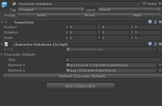
I plan to make this serializeable to json like much of the rest of JARPUG's stuff, for save files and future mod-ability. I've kept their contents simple and numeric for that. Right now it's just a pile of ScriptableObject assets I edit in Unity to define the default stats for each character.
I also updated stats to support any number of modifiers applied to them by character stances, skills, and equipment. And while I haven't yet designed the leveling system, it'll also be much easier to level-up and save stats now that they live in their own database.
I feel good about the decisions and systems I've made, but I've really slowed down in the last couple weeks. It’s tough for me to put in a lot of continuous time on design work. My schedule makes that physically difficult and that long design work feels more like staring into space than work. I move on to other things.
That’s dumb and bad.
When code design is hamstrung by game design
I can often get away with prototyping my way through the design of things I’m unsure of in game dev; especially in something more actiony and less numbers-based! But these are early days and this is the backbone of JARPUG’s logic and design. If I don’t design this, there’s not much else to do.
Design paralysis is at its worst when features require interlocked systems to operate properly. And there are many systems that hunger for crunchy algorithmic design in a JRPG. Stats, damage, leveling, skill trees, equipment, and all that other magic RPG sauce. That's a lot of decisions that all interact with each other in fun ways.
From a design standpoint it's also a lot of systems that could depend on each other in ways that make them difficult to change. Assuming I'll make some bad design decisions is my usual approach. I make all of these different systems relatively modular. Then I can change parts of my design later if it's not fun.
While throwing away things that don't work is great, a discarded implementation still takes a lot of time and effort. One of the nice parts of working alone is that other people aren't waiting on my design work. I can use this modularity to delay the implementation of huge scary tasks, like skill trees, until I've got time to make a good design.
And then I’ll sit down for those long hours and stare at the page, the scribble, the scratch, until it’s done.
5 notes
·
View notes
Text
There should be a chatting app/social network only for a persons internal system. (And other software/app ideas for DID/osdd/multiple systems and software that already does work for us)
Wouldn’t it be great if there was some kind of app or program that allowed alters to talk to each other, where they could all have their own profiles, avatars, usernames, and status updates and dms? It would be so useful to have something like that . Especially when it comes to communicating with alters you might not have a lot of co-consciousness with and for having everything being documented with memory being such a big issue for us.
I’m trying to learn basic programming, ( java, and ms visual basic ) to try to make something like this. I was even messing around with autotype in word (well actually openoffice) thinking I could have shortcuts for alters with an avatar and their name and could easily insert themselves whenever they wanted to talk. But I’m not sure how I can make it to where they can also save their own font/size/color profies for themselves and it’s pretty complicated. Maybe I could learn more about how macros work and that would be easier than coding a whole program?
After a lot of researching I was able to find an old project on github that had a local “chat room simulator” an it was very interesting but also very simple. I tried looking at the code hoping I could learn something from it but my knowledge in coding is still very novice.
And mostly the apps we could find that had to do with “chat simulator” were apps that were for making “fake text conversations”. The best we could find was one called “whatsfake” and it’s main problem is that it’s difficult to switch between people quickly so it’s easy for an alter to lose their train of thought by the time they get to select themselves from the conversation, (as obviously the app wasn’t created for this idea or for long conversations). “texting chat story maker” is really good if you are only looking for a chatting app for 2 alters as it’s incredibly functional and you only have to click your name on the top to take turns typing.
I wrote to a few of these apps sending in feature requests like easier switching between characters, or adding more people to the conversation, although I don’t expect much to hear back but it can’t hurt to try!
None of those apps have the full functionality I would want but maybe they are good starting points in learning the programming I would need. I decomplied the “fakechatstory” app to see if I could learn to decipher it eventually and write something smilar that allows for more people to type in a conversation easily.
-------------
I also have a lot of ideas for things that could go together in a software suite that would be helpful to systems with DID. There needs to be a lot more apps and resources specifically created for us and our unique needs. If anyone has any ideas or examples of apps or programs that already exist specifically for DID/Osdd systems or aren’t for that but you really like to use for yourselves we would be really interested in hearing about it.
Another idea we had was like a wikipedia situation where alters who like to take notes and keep track of the others could have a place to more easily organize them and link around to other pages when necessary. Maybe even a place to write about specific events that have happened in their life that were significant to them. And of course others in the system could edit and help just like real wikipedia and the site/program would be entirely private and password protected ideally. Maybe this wikipedia can also be connected to the chat profiles idea so alters who want to edit can select themselves before they do etc.
A more lighthearted idea would be a coloring/drawing app especially made for littles in a system. Where you could have multiple coloring pages up at once (and maybe it ties into the same profile/avatar system as the other idea) where they can each save their favorite pages and color palletes, and they could all color roughly at the same time. (even the bigger parts could join in if they want) I know it’s a big problem in our system that several littles will want to color the same page and won’t be able to agree on which colors to make things so it would be cool just to have duplicates side by side.
Another idea would be to have a visual system mapping software (again tied into the profiles already created in the other ideas) It would make it easier to make a system graph if you don’t like drawing it out on paper. You could just add a new alter profile whenever and just click on one you already have to add it to the map. It would also have other visual aids maybe like having a different color highlight around their picture for certain alter jobs (persecutor, protector, manager etc) And different types of lines (dashed, straight, double) to make connections between alters.
I would also want some kind of character creator like the sims where you can create the world and the people in it, but they would be more like dolls you could drag and pose around in the scenes you created (like recreating your inner world for example). It would just be simply for visualizing so it wouldn’t have to have all of the other extra things the games do so it would take up less space on the computer, less resources, load faster etc.
----------
Some apps our system like to use regularly that help us even though they weren’t made specifically for DID:
Antistress
It’s an app with several little toys that our littles love to play with if they come out in a situation like in public where they are stressed but aren’t able to go home to play with their own toys and it really helps to calm them down and help the system to feel more grounded and safe. They are basically fidget toys (there is even a fidget spinner in it!)
Character
There’s an app on the Ipad just called “character” and we aren’t able to find it on the app store again lately. It’s an app that is useful for writers to organize their “characters” and give them names, traits, and even have a picture of them. We found it a few years ago and were using it to organize our alters all in one place.
Notepad++
It’s a notepad software that is mostly meant for programming and coding which we downloaded originally so we could practice and try to learn coding for ourselves. But then we realized how useful the tabbed feature is for several parts wanting to do different things at the same time. Although other writer softwares do this we like how simple and fast N++ is to open.
Avatar creators of course. There are so many different ones that can be found online and in apps. :)
Please share if you can think of any!
-------------
Overall I would love to see more programs, stories, apps, and games specifically for a system sort of audience. For example “Dear Little Ones” which is a fantastic book addressed to littles.
Even for things that may seem “insignificant”. I know our whole lives we’ve been taught to think that we don’t deserve better or that we just have to “tough it out” and that our needs are trivial. But I really think that each and every one of our individual needs are important and I think it would be so important if more was being done to address those needs to make our lives just that little bit earlier. If anyone wants to steal any of my ideas feel absolutely free to do whatever you like with them. My only request is that you share the finished product with me if you do and maybe give me a little credit ;P.
And if anyone's interested maybe we could try to collab sometime? Or possibly make some sort of facebook group for DID artists, coders, and creators in general, who want to get together to try to make life easier and better for systems like us! And maybe we can try writing to developers and creators and letting them know that we exist, and expressing interest in features that could be added to software that we use everyday that would accommodate us like they do for any other accessibility issue that people might have.
#dissociative identity disorder#actuallydissociative#Multiplicity#multiple personality disorder#did#osdd#osdd1b#alters
5 notes
·
View notes
Text
Writing Platforms and Apps
Disclaimer: Alright, I know this isn’t strictly sci-fi or fantasy-themed, BUT. Too bad, this goes out for everyone who writes, ever.
So, writing is hard. Full stop. Writing is difficult, and irritating, and oftentimes downright infuriating- and as much as we writers adore it, we could all use some help, right?
Enter some tools of the trade- writing platforms and apps! Every writers uses something to write- be it the traditional methods of pens and notebooks to brainstorm, regular MS Word programs, online writing websites, or fancy programs like Scrivener for plotting- and all of them have their merits and downfalls. There are a ton of platforms upon which one can write. There’s no way I could get through all of them in one sitting, let afford some of the fancier ones out there (curse you, fundamental necessities!), but for this post I wanted to discuss the 4 programs that I use (and have been using for more than a year) and think are especially helpful not only for writing anything, but for...wait for it...NaNoWriMo endeavors! Woooh, it’s time for Camp NaNo!!
Ahem.
So, let’s begin!
First up to bat is...Writeometer!!
This one here is an app available for free- yes, FREE, one of my favorite words right there- that is designed specifically for helping you track your writing progress. You can enter as many projects as you like, decide on your word count goals and your preferred deadline to reach that goal (perfect for NaNo!), and it will calculate how many words per day you’ll need to write- and, bonus, you can set subtle reminders to pop up at certain times to tell you it’s time to write. Even more bonuses- this app has tons of other features that are fun to use, including a writing log to record how you’re doing, graphs to show your progress, a list of stats pertaining to each project (for instance, your averages per day/week/month, your writing streaks, your best writing days, etc), a nifty little toolbox with a dictionary/thesaurus/word of the day/random words generator, AND a writing sprints timer that rewards you guavas each time you write for 25 minutes. Fun fact, guavas can be virtually exchanged on the app for prizes you set- mine include things like, “3 guavas to eat a cookie!” and “10 guavas to bang head onto desk while yelling!”. Great stuff!
Next up- another app I use very often is JotterPad!

This one is very simple- while Writeometer was meant to deal with the nitty gritty statistics and tracking of writing, JotterPad is just a clean, simple mobile platform for writing. Nothing more, nothing less. You can create new documents and folders, and organize them any which way you desire- which, in my anxious writer brain, is wonderful- and if you want, add your Google Drive to it for backup so nothing is ever lost. Each folder and document is automatically made with different font colors, which I think is a nice touch, and every document has options for a viewing mode (closer spacing, no keyboard, cleaner look) and an edit mode (allows you to write, shows spelling errors, wider spacing for easier typing). Also in each doc is a dictionary and thesaurus option, a dark screen option for writing at night or sensitivity to light, and a short collection of stats for the doc (word count, character count, reading time, etc). This is all in just the basic app- there is a pro version that brings in other cool features like different writing fonts and document formats, but it costs money and I’ve never had any need for it.
Onto the third program I like to use- myWriteClub!

This one I just discovered a little while ago, courtesy of a fellow NaNo buddy, but I love it. The site is still in beta, so feel free to jump on the early bandwagon! This is a website, not an app (although here’s hoping they make an app for it...), but it’s 100% free and only requires an email address to make an account. The whole site is oriented towards writing sprints, and they make it fun- for NaNo and Camp NaNo, you can make a private sprint that only people with the link can join up on, and for anyone else there’s a global sprint going 24/7. What are these “sprints”, you might ask? Writing sprints last 25 minutes, and start every half hour- and on this site, you can watch your friends word count meter fill up in real time. Don’t worry- nobody can see your writing, only your word count. It makes NaNo writing sprints wayyyy easier, trust me. I’d recommend setting up a Dropbox account for all your writing on the site to be automatically uploaded to- there’s only one window you can write it, and there’s no saving documents on site- which I find is actually good, because there’s no getting lost.
Now, last and certainly not least- my FAVORITE writing site, 4thewords!
Okay, I’ll try to restrain myself here. I’ve been using 4thewords for over a year now, and I ADORE it. That being said, I will mention that this is also a fairly new site, still working out some of the bugs and getting updated all the time- I’ve never had a problem, but I wanted to mention it. This site is geared towards making writing fun, which it accomplishes by turning it into a game- a game with adorable monsters. Basically, you have a little avatar (whom you can edit and outfit as you please) and a map of different places you can unlock as you progress- each location has different monsters, which you can “fight” by writing a certain amount of words in a specific amount of minutes. For instance, to defeat the Wignow you must write 250 words in 30 minutes. To defeat the Pester, 500 words in 50 minutes; the Mawt, 1,400 words in 210 minutes. 4thewords is set up like an actual game- for each monster defeated, you get little prizes that you can trade in at the marketplace, and you can boost your fighting prowess by making or buying armor and weapons. There are also different missions you can run- namely things like, “defeat 20 of XXX monster”, after which you get a bigger prize.
I mean, look at this little monster. LOOK AT IT.
Even better things! I know, I know, I’ll wrap it up quick- 4thewords runs lots of different events, including Love Week (for Valentine’s Day), Tico Week (for Costa Rica Independence Day), Winter Wonderland (for Christmas and winter holidays), annnnnd...NaNoWriMo!!! Each event has special missions and monsters to fight, and has special prizes. There’s one going on right now, actually, for Camp NaNo, and an even bigger one in November for the main event. Also, 4thewords has a Read section where you can post your writing, if so desired- and every year so far, there’s been a writing contest with real prizes for people who post their writing projects. Not to mention, I’ve spoken with the creator themselves when I changed my account email, and they were so, so polite and accommodating. The only downfall to this site is that yes, it costs $4USD a month to subscribe- but, with everything it’s got going on, from active forums to incredible graphics (the ART, you guys, holy sh*t) and an lengthy, intricate ongoing storyline, I’m okay with the cost and I think it makes sense. Plus, bonus- there’s a month long free trial upon making an account, so if you’re not sure about it, you can try it out for free!
Alright, I know that was a lot of info all at once. I want to say right here, right now that I have not at all been asked to review on these sites or make a post about them in any way- this post is purely my opinions, with no coercion or bribing or whatever else. This is just me, ranting- I mean, sharing- some of the writing platforms that I, personally, find fun and helpful for me in hopes that someone else finds it useful.
And hey, if you’ve ever used one of these platforms, tell me your thoughts! Or even better, send me your favorite apps and/or programs- maybe I’ll make a compilation post of them, who knows. Questions about them? Hit me up.
(Bonus: LOOK AT THIS LITTLE STINKER, I CAN’T EVEN FUNCTION)

Okay, I’m done, I’m done.
#camp nano#camp nano april 2018#writing#writing blog#4thewords#jotterpad#writeometer#mywriteclub#not even joking guys i adore 4thewords an ungodly amount#writing help#nanowrimo#happy easter all my easter-celebrating friends!
14 notes
·
View notes
Text
Public Records Reveal Backstory of NSA’s Children’s Coloring Book
In January 2016, I wrote a saga about my attempts to learn more about the National Security Agency’s “Cryptokids Fun Book,” a website and coloring book that features cartoon characters like Crypto Cat, Decipher Dog, and their various spook animal friends, who exist to teach kids about cryptography and working at the NSA. At the time, the NSA told me that it would take at least four years for it to respond to my Freedom of Information Act request about how it got made.
In the years since, a handful of people have asked what ever came of the FOIA request—it is now five years later, after all. In something of a FOIA miracle, the NSA took “just” two years and a few months to process and return my FOIA, though it did redact lots of the things I asked for and did not include a budget for the Cryptokids series. I got a response in October 2017, but unfortunately missed it until a staffer at the Electronic Frontier Foundation emailed me this week and asked what happened to the FOIA. I checked my files and, to my surprise, saw that I had indeed gotten a response. Muckrock’s JPat Brown has also written several times about his own saga trying to procure documents related to CryptoKids; he has been able to get several documents I wasn’t able to, and I got several documents he didn’t. This story is based on documents from both FOIA requests.
The agency says that the program was paid for by the National Cryptographic Museum (which I went to in 2013 for one of my first articles for Motherboard), which it says is not technically a part of the NSA and is thus not subject to FOIA responses from the NSA.
The documents reveal that the CryptoKids were originally conceived of by the NSA’s “Corporate Communications Strategy Group,” according to an unclassified presentation that said the project was designed to be launched on November 1, 2005 in order to beef up the NSA’s “Kids” section, which was largely ignore during a 2004 website redesign. The strategy document reveals that, unfortunately, the CryptoKids are indeed “fictional.”
“In the interest of time, the redesign team focused most of its attention on the Agency’s missions and core messages, but did produce a modest Kids’ Page in conjunction with the launch,” the strategy document says of the 2004 redesign. “Since that time, the team has worked with personnel throughout the Agency to develop seven fictional characters to represent each of the Agency’s main missions and major skill communities.”
The “objectives” of the program state that the NSA hoped to “inspire future generations of code makers and codebreakers,” “provide students with information on the NSA/CSS’ educational programs and future employment opportunities,” and to “provide students with a high-tech and interesting resource for researching America’s rich cryptological heritage and learning about NSA.” The document also shows that NSA employees with children who had attended previous NSA events were the first to be introduced to the CryptoKids. Information about the CryptoKids was disseminated internally over the course of a week, with one animal introduced per day, beginning with Crypto Cat and culminating in what were likely highly-anticipated reveals of T. Top turtle and Rosetta Stone (a fox, “Rosie” for short).
The program overview also reveals that the NSA had a pretty extensive press rollout plan that included many Maryland and Washington, D.C.-based local and national publications, as well as a series of kids’ publications including Boy’s Life, Nickelodeon, J-14, Sports Illustrated for Kids, Teen People, Cosmo Girl, and Highlights. The document stated that it would provide interviews to media interviews with the (again, fictional) characters “as requested.”

In 2010, five years after the release of the original CryptoKids release, the NSA invented some new characters, called Cy and Cindi, the “Cyber Twins,” who are cat-like creatures that the NSA claims “love everything ‘cyber.’” The documents provided by the NSA about the Cyber Twins are more specific than the creation documents for the earlier crew and show both the levels of approval were needed and some at least a little internal strife among NSA employees about What Their Deal would be.
“Both are world travelers, taking turns accompanying their Dad (a computer scientist for the U.S. Army) on his business trips around the world,” the NSA publicly proclaims. The twins’ mom, meanwhile, “is an engineer for the U.S. government.” The FOIA documents are true in a way; Cy and Cindi’s parents do indeed work for the U.S. government, but Cy and Cindi are not real. They were fabricated by the NSA’s Messaging and Public Affairs division (an office called “DN”) and were subject to various rounds of approval by public relations professionals, redacted NSA higher ups, lawyers, and classification review professionals. The person asking for permission to release these cats into the wild proclaimed in an email that a software program used to share classified information within the agency was a “stupid tool” after a failed document attachment attempt in which the cats’ coloring book pages and description were labeled “FOR OFFICIAL USE ONLY.”
“In coordination for cyber security awareness month, DN has developed new Crypto Kids to go on nsa.gov,” a “corporate communications” professional within the agency wrote in a 2010 email. “Please review the bios and graphics as soon as possible.” The email claims that a redacted NSA “chief” had approved the cats’ design, and that “corp comms has also reviewed and finds it consistently with Agency messaging and approved for posting to nsa.gov.”
A classification review written in comic sans font by someone at the agency determined that the Crypto Twins had been “reviewed for classification and public dissemination” and decided that the cats had been “UNCLASSIFIED” and “APPROVED FOR PUBLIC RELEASE.” The person doing the review had estimated that the classification review process might take up to 25 days but ultimately—and perhaps hastily—made a “FINAL DETERMINATION” in less than two hours.
An NSA lawyer had some sort of problem with the level of detail in the twins' bio, which was redacted in the documents. The flack working on the case explained in response that she was only sending through an introductory bio and that the twins would "have more in-depth back stories once we have time to develop."
"Well, that is MUCH better!," the lawyer responded. "Thank you! We have no other concerns."
Public Records Reveal Backstory of NSA’s Children’s Coloring Book syndicated from https://triviaqaweb.wordpress.com/feed/
0 notes
Last Seen Blogs

manifestdensity
Untitled
sometimesmaddie
Sometimes Maddie

santowashere
OATS AND WATER!!!!

matsvanlooy-blog1
Vítejte v mém pražském dobrodružství

bahisleronvin-blog
onvin.net,onvin bahis sitesi,onvin bahis yapmak