#pure hate
Text

#fairycore#not my edit#fairy#fairies#fairy grunge#girlblog#girlblogger#girlblogging#female hysteria#coquette#coquettecore#pinkcore#dollette#dollette aesthetic#coquette aesthetic#doelette#borderline#borderline personality disorder#bpd#pure hate#femcel
3K notes
·
View notes
Text

246 notes
·
View notes
Text
9 notes
·
View notes
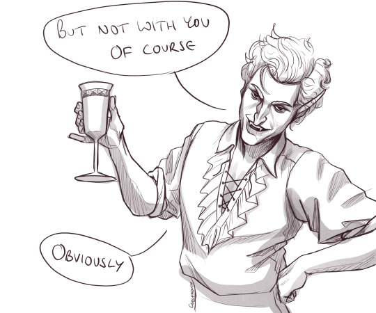
Text
•°WHEN UR MADE OF PURE HATE.°• {Me In Real Life!} [FT. My Friends] ♤Wallpaper Poster♤
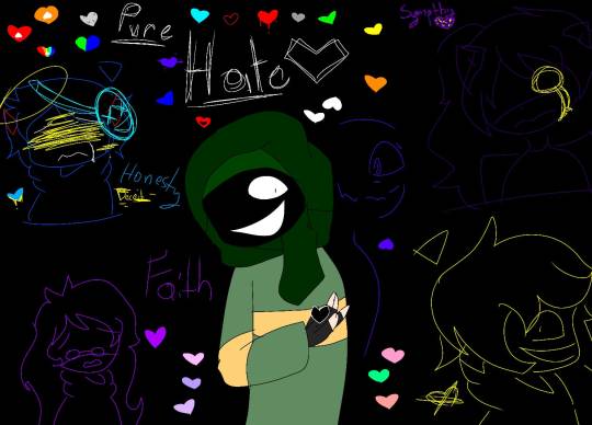
#art#ocs#au#my art#lore#artwork#fandom#my au#friends#irl#in real life#in real life me#me irl#me#pure hate#soul
2 notes
·
View notes
Text


in in this mini lesson we had to use colors pencils and boy oh boy have i not hated something this much in a while. we where meant to be learning different ways to hatch but all i learned was that i deeply in the core of my soul hate drawing with a colors pencils. it really just highlights all of my flaws in such a glaring way. maybe in the future ill come back and try my hand at a colors pencils drawing and feel pleased but as it stands this is somehow the worse one i have done yet.
#pokemon#pokemon art academy#art#nintendo 3ds#vidoe games#hatching#pencil drawing#terrible#pure hate#eevee#snivy#fletchling
2 notes
·
View notes
Text
why is my life defined by good days and bad months
2 notes
·
View notes
Text
it's because i wouldn't let you kill the bounty hunter isn't it
#he's so mean 2 me#bg3#baldurs gate 3#astarion#bg3 tav#these files were titled 'asstarion' on my computer#that'll show him#managed to redress my finger so i can draw#but seeing as this is my first time drawing asstarion i'm not gonna go full lineart and colour#it was fun though he's got a great face#hate drawing his hair though#sorry you don't want to fuck me astarion#sorry you don't have good taste 😤#also i gave my tav pure black eyes and now every time he frowns it looks like he's got these big puppydog eyes i love him so much
7K notes
·
View notes
Text
nothing like making an 80 page single spaced rewrite because you hate a show
#idk if i should put the show but i am anyways#i hate that i finished it with 80 pages#pure hate#miraculous ladybug#rambles#ramblings
1 note
·
View note
Text

The Price of Treason
type: full-length
band: Dark Fury
genre: black metal
release date: 1 January 2009
country: Poland
youtube
#black metal#metal#underground music#NSBM#polish black metal#metalhead#NS black metal#hate#pure hate#true black metal#music#Youtube
1 note
·
View note
Text
the amount of completely inaccurate and borderline offensive versions of holocaust history ive seen lately, mostly for the repulsive purpose of defending western civilization, makes me feel like physically sick sometimes lmao. i can not believe i just saw someone say that unlike other genocides there were no economic incentives for the holocaust. im going to fucking scream. i hate to be this way but please if you never fucking studied this just shut the fuck up. cause its really obvious a lot of you guys havent. jsyk i think maybe around 15% or less of property and assets stolen from jews was ever returned
#its obviously not that simple that it was purely economic of course but to ignore this in favor of viewing it as this crazy irrational evil#that they were just doing it for the hell of it… i fucking hate you#mine
5K notes
·
View notes
Text
Hello new UNDERTALE Au
https://sites.google.com/view/pure-hate/inicio
1 note
·
View note
Text
I love Tumblr because nothing matters here truly. There are no influencers. Having followers doesn’t mean anything. It’s just a site where people post their sporadic thoughts and rb pretty pictures. Anyone who thinks any of this matters is woefully missing the point
#I joined tumblr for the aesthetics and now I’m here bc it’s the most low pressure social media to be on#Instagram is ppl’s highlight reel but Tumblr is where u see their pure thoughts unobstructed and I adore that#It’s very nice to have people to relate to and is def the main appeal to me but I don’t think there’s much more to it than that genuinely#Monetization on tumblr isn’t a thing and probably won’t be so it feels stupid to put more stake than necessary in it. Like you’re in the#Trenches over tumblr of all things. Embarrassing#I know chronically online people exist bc I have seen them in my or somebody else’s inbox but imagine waking up at 70 one day and the#Realization hitting u like a freight time that u wasted all ur time thinking tumblr. TUMBLR. This dying website. Has enough weight for u to#be sending anon hate or reviewing ppl’s blogs like they’re some kind of product. Brother this is licherally tumblr#I choose to laugh at this behavior than take it seriously bc absolutely no one is driving me crazy on my OWN blog. On tumblr dot com.#I refuse#I will do whatever I want forever etc
2K notes
·
View notes
Text
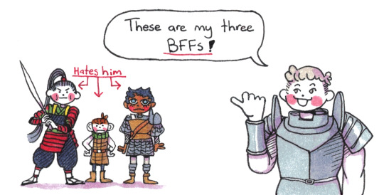
Laios's three Boy Best Friends. And yes, they hate him.
#dungeon meshi#laios touden#toshiro nakamoto#chilchuck tims#kabru#BF in this context could be boyfriend or best friend. The line is so blurry.#Chilchuck less so but whatever is going on between Shuro and Laios & Kabru and Laios is giving strong:#“dude if you were a girl I'd date the hell out of you”. And from the genderswap extra's that sentiment is canon for BOTH.#This was made prior to the translation of the Laios & Kabru & Shuro restaurant date comic and honestly I am just feeling vindicated.#I don't even know what to call this dynamic other than a situationship. There is so much going on between all of them.#Even on a purely platonic reading - the miscommunication and male yearning for friendship hurt so bad.#When we got the Big Hug scene in the epilogue arc I was whooping and hollering! Pure catharsis moment!#I also don't like hugs very much so I really felt it went Shuro ('hates being touched') went in for the bear hug.#Do not get me started on the agony of 'always lying' Kabru telling the truth (I just wanted to be friends)#and 'always believes' Laios thinking it's another lie and brushing him off.#I am once again supporting dungeon meshi day by posting art. Please watch dungeon meshi.#obligatory edit because I’m tired: YES. Chilchuck cares for Laios and him admitting it was a huge part of his arc#YES he is more just fed up with him that actually hating him.#I needed a third guy to be canonically done with his ass for the THREE WEED SMOKING GIRLFRIENDS reference
2K notes
·
View notes
Text
I think 90% of my gripes with how modern anime looks comes down to flat color design/palettes.
Non-cohesive, washed-out color palettes can destroy lineart quality. I see this all the time when comparing an anime's lineart/layout to its colored/post-processed final product and it's heartbreaking. Compare this pre-color vs. final frame from Dungeon Meshi's OP.


So much sharpness and detail and weight gets washed out and flattened by 'meh' color design. I LOVE the flow and thickness and shadows in the fabrics on the left. The white against pastel really brings it out. Check out all the detail in their hair, the highlights in Rin's, the different hues to denote hair color, the blue tint in the clothes' shadows, and how all of that just gets... lost. It works, but it's not particularly good and does a disservice to the line-artist.
I'm using Dungeon Meshi as an example not because it's bad, I'm just especially disappointed because this is Studio Trigger we're talking about. The character animation is fantastic, but the color design is usually much more exciting. We're not seeing Trigger at their full potential, so I'm focusing on them.
Here's a very quick and messy color correct. Not meant to be taken seriously, just to provide comparison to see why colors can feel "washed out." Top is edit, bottom is original.
You can really see how desaturated and "white fluorescent lighting" the original color palettes are.
[Remember: the easiest way to make your colors more lively is to choose a warm or cool tint. From there, you can play around with bringing out complementary colors for a cohesive palette (I warmed Marcille's skintone and hair but made sure to bring out her deep blue clothes). Avoid using too many blend mode layers; hand-picking colors will really help you build your innate color sense and find a color style. Try using saturated colors in unexpected places! If you're coloring a night scene, try using deep blues or greens or magentas. You see these deep colors used all the time in older anime because they couldn't rely on a lightness scale to make colors darker, they had to use darker paints with specific hues. Don't overthink it, simpler is better!]
#not art#dungeon meshi#rant#i'm someone who can get obsessive over colors in my own art#will stare at the screen adjusting hues/saturation for hours#luckily i've gotten faster at color picking#but yeah modern anime's color design is saddening to me. the general trend leans towards white/grey desaturated palettes#simply because they're easier to pick digitally#this is not the colorists fault mind you. the anime industry's problems are also labor problems. artists are severely underpaid#and overworked. colorists literally aren't paid enough to do their best#there isn't a “creative drought” in the anime industry. this trend is widespread across studios purely BECAUSE it's not up to individuals#until work conditions improve anime will unfortunately continue to miss its fullest potential visually#don't even GET ME STARTED ON THE USE OF POST-PROCESSING FILTERS AND LIGHTING IN ANIME THOUGH#SOMEONE HOLD ME BACK. I HATE LENS FLARES I HATE GRADIENT SHADING I HATE CHROMATIC ABBERATION AND BLUR
2K notes
·
View notes
Text
STOP SAYING I'M PRETTY OR STRONG OR RESILIENT
ITS NOT TRUE
YOU DON'T HAVE THE SLIGHTEST CLUE WHAT I REALLY LOOK LIKE
0 notes
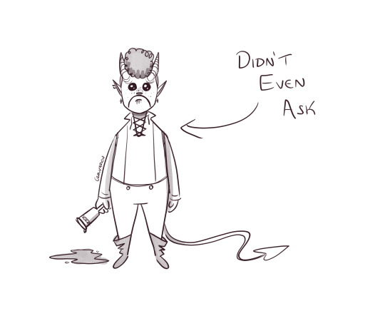
Text

pure vessel my beloved
#i hate it when i do my best sketches on some shitty lined paper and not in my sketchbook#hollow knight#fanart#the hollow knight#hollow knight fanart#pure vessel#hk#thk#hk fanart
2K notes
·
View notes
Last Seen Blogs
chrisnaustin
I wish...

toxixuniverse
Wonder who this Bitch be

moderngerman
Ludwig
writer-penguin
nuz

asspinkie
yo yo yo