#pink colour pallet with blue accents
Text
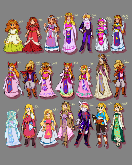
First attempt trying to draw all of them :)
#some of the designs are a little improvised#yeah the proportions are not consistent but like it’s fine#hey it’s hard to translate wind waker into the same style as games like tp#that’s why tetra’s head is so big okay#totk coming full circle with the green#also totk joining her ancestors with the funny rectangle cloth with triforces on it#the formula for each Zelda is just:#long hair most likely blond (not always) with two little bits in front of her ears#crown made up on either straight or curled spikes with a gem that’s red most of the time#longer ears than link#pink colour pallet with blue accents#darker pink top and lighter pink skirt#long fabric in the middle usually it’s blue and it has the triforce and bird on it#gold belt#gloves or cuffs#gold armour/jewellery around neck area#and blue eyes#botw broke like most of these conventions#her eyes are GREEN#anyways#love her a lot#loz#the legend of zelda#loz Zelda#fanart#digital art#art#it’s 3am#loz design
46 notes
·
View notes
Note
How do you pick out colour pallets for your characters? (Specifically the Mane 6 human designs) they're so good!!
I'll stick to the Mane 6 so far.
I paired everyone up first so I can design their colors as duos: Rainbow Dash + Fluttershy, Rarity + AJ, Pinkie + Twilight.
Rainbow and Fluttershy are noisy vs. quiet (visually).
Rainbow Dash obviously needs to be super colorful, but I couldn't go total blow-out rainbow with her, which isn't the goal of the design challenge. To stick to the era, I gave her scarf tie and pants colorful but natural dyed-thread colors: teal, orange, pink, green, and red. The vest, on the other hand, was given the bright primary colors of her rainbow-lightning-bolt cutie mark (the diamond patterns are meant to look like a bolt or explosion). Each character gets an accent color too for shadows, and I gave Rainbow a deep purple to make her skintone pop as much as possible.
Fluttershy's the opposite. I designed her palette to be duochromatic: just rose pink and yellow, with a hint of mint green. All her colors are very desaturated as well, though the yellow clothes help her stand out. Unlike Rainbow, any ornaments in dress come in small places, like lace edges, small butterfly patterns, bows, and earrings, as I feel Fluttershy would still enjoy accessorizing.
Rarity and AJ are cold vs. hot (visually, again).
Rarity's given very artificial, unnatural colors to give an impression of wealth and status. I decided to go with a deep blue rather than purple so she doesn't get mixed with Twilight's palette. I also kept her mostly monochromatic to give the sense of neatness and grace. Her palette is simple enough: pink skin, blue clothes, teal accents. Variations come in the clothing itself: patterns, accessories, fur linings, buttons, etc.
AJ, on the other hand, is given very earthy, warm tones. I actually referenced Minecraft terracotta blocks when designing her.
I made green her primary color since no other character carries it. The red and green's meant to make her look a bit like an apple. Weird note, but I'm really proud of the dark teal in her jeans. It looks great against the orange of her chaps. AJ's palette was surprisingly hard to pin down, as I was afraid the yellow/orange skin-tone, hat, and hair would muddy her face. Had to fiddle with it a lot to get it where I want (oftentimes, the green would make her look like a park ranger), but throwing in a blue shadow accent really helped pull everything together.
Haven't gotten to the last two yet, but Pinkie's is definitely going to be crazy and bright. Here's a sneak peak of it, actually:

Thanks for the ask! I really like talking about my design process.
159 notes
·
View notes
Note
color psychology is part of the reason in replaced the orange with pink and leaving it to the accents even though orange and pink are both warm and inviting colors pink is also love hope and optimism things Brin really embodies.
the blue has a calm and securing effect and also ties back to the ocean blue has a sense of stability
although green is often tied to jealous and envy it also means growth peace rest and also security
spoilers I guess but Brin wears pink and seafoam and blue for the accents for her Date fit, it still keeps the tropical vibe but is much more toned down and subdued while still keeping the bright attention grabbing floral prints
this fic has a color pallet that's for sure
YESSS
I ADORE colour theory and language, especially since saturation can impact the language for the colour as well.
Honestly, all fics should have colour palettes
4 notes
·
View notes
Photo
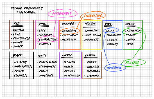
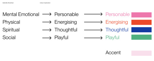
Colour Exploration:
Following on from the concepts of Hauora discussed in the previous post - I used these concepts to drive my colour selection through looking at colour physcology.
I identified in my colour research that the colours of Pink, Orange, Blue and Green would be best representative of the four pillars of Hauora as well as the tone of voice I have prescribed for the project.
I swatched a variety of colours falling into these categories and settled on a final four colour pallete as seen in the final image.
I have also chosen a baby pink as the accent or contrasting colour to all of the swatches.
0 notes
Text
Art Deco Home Décor and Design Ideas
Opulent and elegant Art Deco is a style that has endured through the years since it’s birth in the 1920s. Adaptable to both modern and traditional interiors it’s not hard to see why it’s still such a sought after look. Inspired by worldly influences like Egyptian and Aztec architecture, Art Deco puts emphasis on the splendorous and the exotic. And with designers still creating in this flavourful fashion, it’s easy to find beautiful Art Deco pieces to fill your rooms with. So today we’re going to share all our Art Deco interior design ideas and secrets that will help spice up your home!
1. Contrast and Colour
When designing Art Deco décors, putting together a colour pallet will help immensely in the search for the right combinations for your furniture and finishes. Art Deco is all about creating contrast, so mixing pale colours with deep hues is essential.
Think bold blacks, deep blues and earthy brown for the darker shades. These can then be juxtaposed beside pale gold, rich creams and sandy beiges. And if you want to add a spark more energy to your colour scheme try embellishing with powder pinks, silvery blues, turquoise hues and luxurious greens. All these fabulous colours will really glam up an Art Deco interior.
2. Art Deco Wallpaper is all about luxury so the materials you choose to deck out your home with are crucial to giving this look its glamour. Think heavy velvets, textured fabrics and for sofas and bedding. On geometric wallpaper and chrome are also key ingredients you’ll want to include when cooking up an Art Deco look. So try bringing these classics in with subtle additions like switches and sockets.
Or go bolder with large chrome or brass lights and mirrors. Especially Peel and Stick Wallpaper and glass drop down pendent and wall lights. These work perfectly the bedroom above bedside tables or as reading lights in living areas.
Dark lacquered wood is anther great material to make use of. Especially as Art Deco is also known for it’s black accents, lacquered details will add ample more character, texture and extravagance than a lick of black paint ever could.
Glass is another big part of Art Deco design, especially when it’s matched with chrome or brass. Coffee tables and grand art deco pendant lights are the perfect way to bring this look into your living rooms and bedrooms.
3. Pepper in Pattern
Art Deco has a lot of iconic patterns associated with it. From the lasting sun burst design to geometric, stepped and zigzag arrays. These angular and straight edges define the Art Deco era and are a great way to quickly add that deco flare to your home.
For a harsher more masculine Art Deco vibe try adding in these accents with more solid finishes like mirrors, coffee tables and lighting. However if you want a softer finish go for patterned textile additions such as sofas, pillows, rugs, wallpapers, curtains or bedding.
Furthermore if you’re looking for art deco kitchen ideas or bathroom inspiration don’t forget about tiles! Indulging in some colorful or geometric shaped tiles will make the spaces both unique and instantly deco. Marble for the kitchen worktops and bathroom sinks will also give you an extravagant finish that Art Deco is so famous for. So get decorative and don’t hold back on stepped, geometric patterns!
So now Removable Wallpaper ’re all set to layer on the Art Deco! From a little to a lot, you can really choose how to introduce Art Deco to your interiors. The options are endless, whether you want a paired back look or if you want to go all out and fully embrace the Art Deco lifestyle.
So time to strike out and embrace the Gatsby grandeur! And with Gold Geometric Wallpaper lasting, it’s hard to say no to just a few of these classic touches. After all, even after a hundred years Art Deco is still in! Forever ensuring our homes continue to exude exotic sophistication!
#geometric wallpaper#art deco wallpaper#gold wallpaper#removable wallpaper#tapete#art deco#nursery wallpaper#vintage wallpaper#peel stick wallpaper#office decor#modern decor#wallapaper#wallstickers
1 note
·
View note
Note
honestly i find it kind of weird that weiss and blakes colors have shifted from white and black to blue and purple. i get that its character development but like. usually color coded characters stay as their color. and the show is named rwby. ruby weiss blake yang. red white black yellow. now the cool pattern is broken. welcome to vol 9 of rbpy.
I will always say this; blue and purple on Weiss and Blake is never the issue, it’s just that, like you said, the colours are overpowering the colours that are meant to be representing our characters. We wouldn’t expect Ruby to move to green, or Yang to orange, and rightfully point out when their designs don’t match their set colour palletes.
Which is what makes a good character. Even when their design changes, their colour stays the same so you know it’s them. Weiss with pale blue to accent her white works, because that’s what you use with white to make it stand out. But the show uses blues that are way too dark and way too saturated like royal blue or the grey blue.
Blake with purple worked because it accented the yellow of her eyes, and added that bit of colour to stop her from being too monochromatic. The purple of her tights helped stop the black boots from blending in with her black tights, whereas everywhere else was black, white and silver. Now, the show is using the wrong shade of purple, using it too much, and made it way too light.
The purple on Beacon Blake was blue tinted and dark, just enough to add to the design, but the purple now is way too pink and, combined with the white, just overpowers the black.
You have to know what you’re doing when you’re designing characters who’s colour is white or black, and unfortunately, RWBY really doesn’t know what it’s doing.
21 notes
·
View notes
Photo
Michael Guilderson, the main character of the third Peri book (one of, at least).
Favourite Food - Apricots, though plums are a close second. Michael likes stone fruit in general, and even dried apricots are enough to delight him as a treat.
Favourite Season - Summer! Loves the warm weather and watching the gardens flourish. Growing up in Vertos with exceptionally mild winters and scorching summers has left him with a particular aversion to the cold, making Winter his least favourite season.
Favourite Colour - Pastel pink when young, Aether blue as an adult. Michael tends to wear a pastel pallet in general, lots of bright but gentle colours; this is also a common trend in Vertosan religious clothing.
Fun Vertosan trivia! In Vertos it is common to wear many layers of light fabrics. There is a cultural taboo around showing skin, generally only the face, hands and ankles are considered appropriate. There is no connection between gender presentation and clothing, though there is a strong connection between the type of clothing you wear and your role within Vertosan society.
(For instance, the only factions in Vertos that wear pants are associated with physical activity. Soldiers, Paladins, riders, farmers, builders, etc. Generally the only group that wears them all the time are Paladins, as it is considered a sign that someone is currently working to be wearing them - robes are preferred over pants for polite company.)
Pastels are common in the Religious caste as well as scholars, teachers and medical professionals. Deeply coloured dyes are generally associated with Paladins, soldiers and social servant positions. Merchants, workers and artisans tend to wear bright colours, and frequently feature embroidery. Children and students wear white, often with an accent sash indicating the role of their family or their intended career path.
While there is obviously no penalty for breaking these conventions, it is uncommon to due so. A notable exception being that metal armor and charmed leather are reserved for those associated with House D’Argent, as they are a limited resource - therefore carrying a penalty for possession if unaffiliated.
Michael, as part for the Religious caste, wears pastels. They are considered an artisan as well, thus he tends to accent with bright colours. The mix and matching of so many colours as he does, however, is just a quirk of his and not actually the norm.
He/Him, They/Them.
5 notes
·
View notes
Text
Why Are We (Best) Friends?
Warnings: Excessive swearing, alcoholism, mentions of drugs, drug use, suggestive humour, implied sexual content (no smut), some gore descriptions. Generally, Remus stuff.
Taglist: @blogging-time @veraisnotfine @littlestr @jessibbb @ibroken-butterflyi @hi-its-tutty @idkanameatall
Let me know do you want to be added or removed from the taglist! Updates every Wednesday/Thursday. Don’t worry I’m posting the second half of this chapter later today cause it’s too long all in one part and Tumblr doesn’t seem to like it when I post stuff too close together. So have the fun with the fluffy part!
Chapter Three 1/2: Duck
Loosen Up
May 26th, 2017.
Tiny little sips did Patton take, swishing the liquid around before swallowing each drop. Cautious. Procrastinating. Remus rolled his eyes.
“Why are you so embarrassed? I’ve seen you so drunk that if you weren’t a figment of imagination, the police could have been outlining your dead body in chalk the next morning. You don’t have anything to be shy about,” he said. Patton glared at him. “That’s exactly what’s so embarrassing!” He shrieked. “It’s bad enough knowing that happened! I don’t want a repeat!”
“That’s the whole point of this, Pat. I’m here so you don’t get completely pissed like that again. And if you do, I’ll stop you from being stupid.”
…
“I’m always stupid,” Patton mumbled into his next sip. Albeit, it was a slightly bigger sip. Remus would have argued with Patton, but he hadn’t planned a heart to heart and felt rather unprepared. At least he knew Patton had already drunk enough to not think too hard about what he was saying. Baby steps.
Turned out the snowball effect settled in soon after that. The more Patton drank the less he thought to regulate himself so he drank more. Remus discovered that night that Patton became efficiently, drunkenly relaxed at five cans of… whatever collection of concoctions Patton had mixed up.
“Wait Wait Wait Wait Wait! If I’m a figment of Thomas’s imagination, but you’re Thomas’s imagination, does that mean you could, like, make me,” Patton made a charade of what would have resembled an explosion if he still had his fine motor skills intact, “poof? If you wanted?”
Patton had had six cans and was on his seventh.
Remus blinked at him. There was some semblance of sense in that thinking, and Remus did love a good “what if?” question. “I don’t know...” he said. “Why don’t you try?!” Patton exclaimed, bouncing in his seat. Remus for a split second thought of how adorable Patton’s excitement was—
“Hell no!” He snapped. Patton whined. Sulking, he flopped back down in his chair like a voodoo doll that had just been angrily launched into a wall. “You’re s’posed to be fun!” Patton chugged the rest of his can and didn’t bother to put it down. Instead, it just toppled and rolled out of his lax grasp.
“If it worked then you wouldn’t exist anymore!”
“So?”
Remus also discovered that Patton’s attitude was just as bad as Virgil’s. At least Remus knew his limits now for future reference.
“Well if you stopped existing you wouldn’t know if it worked or not because you wouldn’t exist,” Remus reasoned, and he wanted to scrub his tongue with soapy sandpaper.
“...What if we tried it on Roman?”
“Damn you, that’s tempting.”
Multimedia
August 30th, 2017.
“Heya Remus—” Out of all the anarchy encapsulated in the room, Patton instantly fixated on the razor. The blade devilishly glinted. Patton glared at the offending mustache slayer.
“Don’t you dare.”
“Patton! I was just—“
“Leave the moustache alone!” Patton pounced, lunging for the shaver, and Remus shrieked a very manly shriek. Plumes of white flew free from Remus’s fringe in the kerfuffle. “Your mustache is special and perfect just the way it is!” Patton said. Wrestling the razor from Remus’s grip, which on further inspection was definitely for shaving your legs and not facial hair, and confiscated it.
“I know!”
What?
“That’s why I need it for my self portrait!”
What?
What looked like very grainy flour caught in Remus’s fringe made it appear silver, enhancing the pearly whites that split his lips into a beaming grin. Patton swore his teeth looked slightly pointier than usual. Each syllable rolled around Remus’s tongue exaggeratedly long before he spat it out. And the crazed look in his eyes looked especially crazed, circled in red like a big mistake.
Oh, he’s high.
Wait, what?
Hooking an arm around Patton’s, a stark gentlemanly contrast to Remus’s distinctly wild hair, bloodshot eyes and suddenly apparent absence of a three piece suit, and yanked Patton to stand before his work in progress.
“I’d ask what you think, but it’s not quite finished,” he said, giddy.
Paint was splattered all across the canvas.
And across the floor, and the walls, and the ceiling, and after spending five minutes in the room Patton somehow had some too. (Remus was always more of a catcher than a thrower. Terrible aim.) Focusing on an individual area, it looked like a nonsensical mess. There were handprints, globs of textured brush strokes, and scratch marks. Acrylic and watercolour paints with salt adding texture. Swatches of silk, sprinkles of glitter. The only orderly aspect of the piece was the fact it stuck strictly to a dominantly green colour pallet with accents of blue. Even so, there were hints of pinks, yellows, and purple. Tasteful hints, mind you. Oh, there’s some red, too—
“Is that blood?”
“A happy little accident involving a blunt pallet knife. That’s all.”
As a whole, though, when you stepped back it clearly was Remus’s self portrait. Amongst all the chaos, his outline was clear and confident. Insane smile and all. (Except for his moustache, which seemed to be the final missing piece.)
Patton looked closer. Woven in were more intricate details. Passages from Alice In Wonderland and Little Shop Of Horrors (“You love her madly, don’t you, shmuck” was one he picked out)— other books, musicals, and movies Patton couldn’t name— fit seamlessly into the collage. Everything was written in different, swirly fonts or magazine clippings.
Then he looked even closer. Patton squinted.
“Is that fucking dick glitter?”
“Green and blue duochrome dick glitter!”
It was the most accurate self portrait Patton had ever seen (or ever would). A massacre of common sense. It was his internal tumultuous frenzy in a visual medium. A celebration of self love in a uniquely Remus way.
“I’d frame that and put it on the fridge,” Patton said genuinely. Remus preened. “It’s… exceptional, really.”
But did Remus really have to sacrifice his adorable face caterpillar for it?
“I can’t wait to add the finishing touches!”
“Are you really going to put your own moustache on it?”
Remus burst into rambling only a select few could comprehend. Sentences clumsily overlapped each other as Remus spilled the direct translation of his thought process. And within that mess, the words were crushed like a Pepsi can (Yes, Remus could taste the difference between Coke and Pepsi. Yes, he purposefully drinks only Pepsi), squishing the vowels out of existence. In Patton’s case, though, he was able to translate the garbled soup of consonants roughly to, “One does not simply soil the sacred authenticity of multimedia!”
“Can’t you just...” Patton shrugged. “I don’t know— use some fake fur or something instead?” He argued.
“Ugh,” Remus grunted, “That sounds like something Roman would do. His art is so flat and boring! Always so play it safe, never experiments,” He ranted passionately, throwing his arms in all directions. “And there’s never enough glitter!” He scoffed. Pent up energy drove him in stomping circles. “Too much glitter makes it look childish,” he said, tone swinging into a mock impression. “There’s no such thing as too much glitter! I don’t care if it gets everywhere. I’d happily leave glitter stuck in my teeth rather than some stupid, diet of the week salad! And Roman wants to claim he’s the gayer one?! Huh, bullshit.”
Patton checked if his ears hadn’t conked out. They screeched like microphone feedback. (His ears and Remus.)
“Roman’s such a bitch— I fucking hate him so goddamn fucking much, the cunt.” Remus thrust his hand into the nearest paint can, and readied the colourful grenade.
Patton grabbed his wrist, hastily. Globs of acrylic paint slipped from his fist, reuniting with a green puddle soaked into the carpet.
“Uh-um,” Patton cut in, improvising a distraction, “Why don’t we have a drink and watch, uh... ah, um— Ratatouille?” Fizzing with nerves, Patton cracked a hopeful smile. One Remus couldn’t help mimicking. “A drink of water!” Patton quickly corrected, “and Ratatouille.”
(“Giggle water?”
“Emu, no.”)
“I love that movie!” Remus said, clapping his hands. More green sprayed them in Remus’s brazen excitement.
It worked. Patton breathed a quick sigh of relief.
Beaming, he cupped Patton’s face in his cold, sticky, stained hands. “You always have such good ideas!” Remus gushed. That was a rare, rare compliment. Patton's face blazed. For a second he was sure the paint would evaporate from his skin.
No, his wine red complexion was hidden.
Green handprints drying on his cheeks, Patton watched the movie with Remus just like that. After, Remus finished the painting properly. Instant grief followed shaving his moustache. But when he grew it back, he was ultimately happy with the results.
Next Chapter:
#WAW(B)F?#sander sides#thomas sanders#ts sander sides#sanders sides#patton sanders#ts patton#remus sanders#ts remus#intruality#moduke
24 notes
·
View notes
Text
Isolation update.
Day 71 of Isolation on Tracy Island.
“Hey, Grandma, you OK?” I asked as I walked into the kitchen, finding her slumped at the table, her chin propped up on her hand, miserably swiping through pages on her tablet.
“Yes,” she sighed.
“That didn’t sound convincing,” I said gently, sitting down opposite her. “What’s wrong?”
“Oh, it’s nothing, not really. I’m just getting a little tired of all of this lockdown business.”
“I think we all are,” I sighed in agreement.
“I know I should be grateful that we have such a nice place to spend it, but I just want a chance to see more than these four walls, to go out somewhere with the family, maybe for dinner, you know? Somewhere nice where I don’t have to cook and can relax a bit.”
I didn't mention that it would be nice for all of us if she didn't feel the need to cook.
“I know, I just need to stop complaining and get on with it,” she huffed, clearly annoyed with herself as she got up to fetch another cup of coffee.
"Don't be silly, you're allowed to have a little moan now and then, it makes you human. The boys have been complaining non stop since this started. We're all restless and moody."
"There are people a lot worse off than us," she sniffed. "We aren't struggling, we live on a paradise island that many would kill to even spend a day on. We should count our blessings."
"Yeah, we should," I agreed softly, but my mind was whirling. There had to be something we could do to make her feel better, she did so much for us all and I didnt like to see her this way. It wasn't like I could conjure up a restaurant right here… or could I? Not a full restaurant, but maybe a nice meal for her, a chance to dress up and have a good night? That I could do. I pulled out my phone and sent a group text to everyone but Grandma, invoking the summoning that no one was allowed to ignore. “Council of war!”
***
We all assembled in the lounge, leaving Grandma to bang around in the kitchen in a foul mood.
“Guys, I have a plan,” I announced.
They all groaned.
“No! Be nice! Seriously, this is a good plan, it’s important. Grandma is having a bad day, she’s feeling a bit restless and down right now. She said that what she really wants is to be able to go out somewhere for a nice family meal.”
“She’s always loved going to nice places,” Jeff agreed.
“That’ll be a little hard right now unless she wants to sit in a street somewhere with a burger,” Scott said, scratching his chin vigorously. Yes, the beard beginnings were still there and apparently still annoying them.
“ I don’t think that's quite what she had in mind,” Virgil laughed.
“So, here’s my plan," I continued before they could go off on one of their tangents. "I think we should make her favourite dishes and then all dress up nicely, I’m talking suited and booted, eat in the dining room and be all fancy. But keep it a secret for her.”
They didn't look too convinced at first, but slowly they saw the merit of my brilliant idea.
“If we handle the cooking and the table, can you and Kayo distract Grandma for the afternoon?” Virgil asked.
“Sure, I’m sure we can think of something, but are you sure we can trust you all to cook?”
John rolled his eyes. “We are perfectly capable of cooking for ourselves, you know, we are grown men.”
Now it was my turn to not believe what I was hearing.
“Seriously, you can trust us,” Alan promised me.
“Really? Usually you all need wrangling just to get through the day. You honestly think you can do this without arguing?”
“It’s for Grandma,” Gordon shrugged. “We’ll do it for her.”
That was a statement I couldn't argue, they would do anything for her.
“OK. Kay, this is going to be tough on both of us, but we’re gonna have to be brave.”
“Why?” she asked, immediately suspicious.
“Because we’re going to let her dress us up.”
***
Leaving the boys with recipes and strict instructions to behave and follow the plan to the letter, we tracked down Grandma.
“Grandma, wanna join us? We’re having a girly pampering day,” I asked.
“Both of you?” she clearly didn't believe that Kayo had been involved with the planning of said day. Time for plan B.
“Kayo lost a bet to me, and I said that, in payment, she has to allow me to put makeup on her and make her wear a pretty dress.” There, that sounded more believable, the glare Kayo was throwing in my direction certainly went a long way towards making it look more convincing.
“To make it fairer I said I’d dress up to, want to help?”
“I get to dress you two up?”
Kayo and I glanced at each other, in my case for moral support and strength, in hers to shoot me another death glare that promised retribution.
“Sure, as long as you dress up too, we’ll make an afternoon of it and have fun.” I nudged Kayo.
“Yeah, great fun,” she agreed. “So, are you in?”
“Heck yeah I’m in. When do we start?”
I spotted Scott peeking around the door and making shooing gestures at me.
“How about now?”
“Now? But I’m not done cooking yet.”
“Don’t worry about that now, there’s stuff in the freezer, I’m sure we can throw something in later,” I soothed.
“Alright, that sounds like a solid plan, let's do it!”
***
“Kay, hold still!”
“You just poked me in the eye with a tiny spindly brush covered in black gunk and you’re telling me to hold still? What, so you can blind me a second time?”
“It’s mascara, you sarcastic moo, and it’s your own fault you got poked. If you kept still and only blinked when I told you to it wouldn't have happened.”
“You can’t tell me how to blink.”
I gave her a look that said I’d smack her the second her back was turned. She, as always, was unphased.
“I saw what you did to Scott, you’re not making me look like a clown are you?”
“Lies!” I hissed. “I did no such thing! He looked beautiful, his eyes were blended to perfection and his cheekbones could have cut glass. It was Gordon that looked like he’d been drinking while playing with paint and that was down to Virgil, not me.”
“You both look beautiful,” Grandma smiled. “This is what I missed out on having only boys to look after, doing girls hair.” She continued to manhandle Kayo’s hair, brushing out her perpetual pony tail and attempting to twist it up at the back of her head into some kind of chignon that honestly was looking more like a deflated balloon had mated with a dead squirrel. “Why won’t this thing stay put?”
“I’ll fix it in a minute,” I promised as I brushed a little bronzer over the apples of Kayo’s cheeks, giving her already gorgeous tawny skin a little more depth. She had the nicest skin to work on, seeming to be unhindered by even the slightest of pores or blemishes, just perfect, the cow. Here’s me, I look at sugar or fat and I put on six pounds and have a breakout.
We had started by letting her do her own makeup while following my instructions as I did mine but Kayo is not the most delicate of creatures and when I spotted her stabbing a brush into the eyeshadow pallet, swirling it around like she was casting a Wingardium Leviosa and proceeding to scrub the colour (a startling shade of neon green) over her eyelid I’d called time. I ordered her to wash it all off and had taken over.
She didn't actually need much makeup, a little sweep of a dusky rose and darker brown over her eyelids, mascara to make her already long eyelashes stand out, a subtle dusting of bronzer, some loose powder to set it all and some burgundy lipstick and she was done. I took a lot more work to look that good.
Grandma had taken my makeup kit and helped herself, going for the classic blue eyeshadow, bright pink cheeks and vibrant red lips that had last been popular in the 1980’s. It didn't flatter her in the slightest but she was having a great time telling us all about how she had pictures of her mother with that look and she had thought that she looked so beautiful that she hadn't been able to resist trying it out. I couldn't talk, my habitual mashup of goth punk rocker with a side of geek wasn't exactly in keeping with the rest of the world either.
We dug through our wardrobes and selected possible outfits that we thought would do and held a mini fashion parade, allowing Grandma to make the final choices for what we would wear. Kayo’s evening wear selections seemed to mostly be made up of jumpsuits and Grandma eventually settled on one in black that had a sari style drape going over one shoulder that was accented in gold. I immediately made Kayo sit back down so I could accent her eyes with a little gold glitter eyeshadow powder to match.
Grandma seemed to be incapable of purchasing anything that wasn't purple, not that I could talk, it was one of my favorite colours too. She had chosen a nice, if slightly boxy looking, dress that stopped below the knee, with a rounded neck and no sleeves. She borrowed a black lace wrap from me and called it good.
Her hair had been growing out too and was a little too long to stay in its trademark flicked up end curls, so she allowed me to whip out the curling wand and give her a few waves that bounced happily around her face.
I fixed Kayo’s hair disaster at the same time, twisting it up from the nape of her neck, pinning it in place and then curling the ends which I’d left loose.
“You both look amazing, now wasn’t this fun?”
Kayo mumbled something that didn't sound quite like a yes but wasn't entirely negative either.
“Just for fun, shall we keep this on for dinner and surprise the boys?” I asked innocently.
Grandma grinned. “Oh yes, that would be great. You girls have really cheered me up today. We might not be going out for a nice meal, but this has been a close second.”
“When all this is over we’ll have a night out in London, we’ll drag the boys along, it’ll be great,” I promised as we made our way down to the kitchen.
“I thought you said the boys were handling dinner tonight?” she accused, looking at the table, currently bare of its usually after dinner debris of dirty plates and charred cooking dishes.
“Maybe they haven't started yet?” Kayo suggested.
“You have so little faith in us,” Scott announced from the doorway where he, Jeff and John stood. They had actually scrubbed up well, each foregoing their usual casual wear for a nice shirt -Scott and Jeff's were both white while John had chosen a midnight blue one- ties and smart trousers (we live on an island, it’s far too hot for jackets unless they wanted to sweat all night). they had even made an effort to try to neaten up their unruly hair. Their chins were still a disaster, the scruffy buggers, but at least they tried, it seemed that even a posh dinner wasn't a good enough reason to give up on an active competition.
“What are you boys up to?” Grandma asked suspiciously.
“We came to escort our guest of honour,” Jeff answered, offering her his arm and leading the way to the dining room.
The other boys looked just as well turned out, even Brains with his tufty regrowth on his head had dressed for the occasion, although his suit was a complete eyesore, a powder blue monstrosity with a ruffled shirt that looked as up to date as Grandma’s makeup, but bless him he tried.
Gordon was still wearing a hawaian print top, but it was a full shirt, with a real collar, and was tucked in to his trousers, which actually reached his ankles so I’d call that a win.
Alan was wearing a shirt that was just a little too large for him, obviously borrowed from one of the others but his trousers fit well. He had a properly knotted tie and looked so much older than he usually did, so smartly turned out, although he still managed to look adorable.
Virgil had on a mint green silk shirt and black suit trousers combo that should have made him look like a cheesy Vegas magician but he somehow managed to pull it off.
They had made the dining room look amazing, laying out the fancy china and real wine glasses, even lighting candles and piped through some soft classical music (I’m pretty sure I know who was responsible for that). The table held covered dishes that actually smelt edible and they had even hunted out some cloth napkins instead of the usual paper towel we used on a daily basis.
“You boys did all this?” Grandma gasped, seeing everything for the first time.
“We thought you could do with a night off from taking care of us,” Jeff told her, helping her into her chair.
“This all looks so nice and you boys look so handsome, although you'd look better without the face fuzz.”
“Small victories, Grandma, we got them to dress nice, we can’t ask for miracles,” I smiled.
She nodded, her eyes looking a little moist in the candle light but none of us dared to comment on it.
“We all thought you deserved some special treatment for looking after us all so well,” Virgil told her as he poured her a glass of wine and we took our seats.
Dinner was actually quite nice, it appeared that the boys had managed to cook without killing each other and follow the recipes, maybe finally realising that following instructions isn't always a bad thing had stuck with them.
They had stuck to simple but delicious dishes, a simple soup to start, followed by a nice italian style carbonara, garlic bread and crisp green salad, and apple pie with ice cream for dessert. Yeah, it probably wasn't something we’d have in a posh restaurant, but it had been made with love and I knew that that would mean more to her than anything.
Grandma was treated like the queen she was all night, being served first, her glass kept topped up and not allowed to lift a finger.
We refused to let her help clean up, insisting that she retire outside with Jeff to enjoy the beautiful night. We joined them after we finished taking everything to the kitchen, loading the dishwashers and hand washing a few delicate items.
We finished the evening with some of Virgil’s fancy coffee while they all reminisced and told stories of other family dinners.
She made sure to hug each and every one of us extra tight as she said goodnight, leaving us to finish the coffee and put ourselves to bed.
It had been a lot of work, but the smile on her face and the joy in her laughter had made it all worth it. That's what you have to do in times like these, make a special effort to look after those that look after you so selflessly, to show you care and that you appreciate them. These unusual times are hard on everyone, but we all know that if we stick together and do our best to think of others before we think of ourselves (something the International Rescue boys do everyday of their lives) then we can get through anything.
#thunderbirds are go#thunderbirds 2015#thunderbirds#thunderbirds fanfiction#isolation island#isolation#self isolating#social isolation
17 notes
·
View notes
Text
Review Contents On Inherited Attributes, Genetics, Anomalies & DNA.
Shades go in and also obsolescent and if you love being actually a fashionista and leading the pack, you'll intend to put on the latest attractive colour. Every now and then, every property requires some restorations of the outdoor or perhaps the modification of overall design. Beets include organic pigments that provide their vibrant as well as dark purple-red color. It definitely is zero different than paint, the framework is your canvass, and also you pack that canvass along with distinct colours.
A store design plan is actually a great option that will certainly carry your girl's passion for very time and also along with Read the Full Guide monochrome damask comforter sets like these, you may change out wall surface art coming from a more youthful, 'cutesie' or fairy-like styles, to elder higher heel, fashion trend design without a lot ado.
I have actually been coloring my hair red for years. Twitter individual @positivedemi cued the controversy last Thursday by submitting the above picture online and also asking individuals what shades they saw. Tinea Versicolor (white colored tanning places) is actually a fungus of the skin layer that is actually of the exact same attribute that induces various other irritating troubles, like yeast diseases and also jock impulse.
Incredibly Light-toned Colour Diamonds: The diamonds along with incredibly far fewer shades are the one which possesses colour shade in all of them. You will definitely would like to decide on two or even 3 colours in a colour pallet. As an alternative, he claimed that the prism produced various portions of darker and light, causing colour creation.
It's when our experts vacate those convenience variations and enter into all one color areas (wall surfaces, furniture, floorings and accents in the exact same colour or even market values), or dark wall structures on one or all 4 wall structures of a room that our team locate our own selves feeling blue, clinically depressed, and even troubled and also provoked.
As an example you long times you will definitely find it inconceivable to modify black tinted hair into a blond coloring. DERMATOSIS PAPULOSA NIGRA Dermatosis Papulosa Nigra impacts the black population, along with darker-skinned Asians as well as Polynesians.
A few of the key colours located in religious ceremonies are reddish, yellowish, (turmeric), as well as renewable coming from fallen leaves, white from whole wheat or grain flour etc The four usb cord different colors I am referring to in this hub are actually the ORANGE, WHITE, BLUE and also GREEN.
If you prefer something fun and also intense at that point you could use multi coloured illuminations along with different colour baubles and plant ornaments. This colour additionally turns up throughout a vast spectrum of hues and hues, coming from those that are actually dark however, distinctly purple to those along with charcoal-influenced tones.
It is actually everything about exactly how individuals with various eye different colors reply to medicine and what are they a lot more based on total. If you are actually a supporter of Big league Baseball, you'll discover 96 special layouts featuring group different colors and logo designs.
A new paper in Patterns in Neurosciences, authored through College of Melbourne neuroscientist Lecturer Trichur Vidyasagar as well as Teacher Ulf Eysel from Ruhr-University-Bochum in Germany suggests our team method alignment and activity of things similarly our company refine their colours.
At that point happens the pleasant Lolita type, characterised by wonderful, light-toned colours like light-toned pink, rose, pearl and white colored. You can easily likewise include print claim to the time clock code to print rtc0 (secs) rtc1 (minutes) etc to find if those market values change.
1 note
·
View note
Text
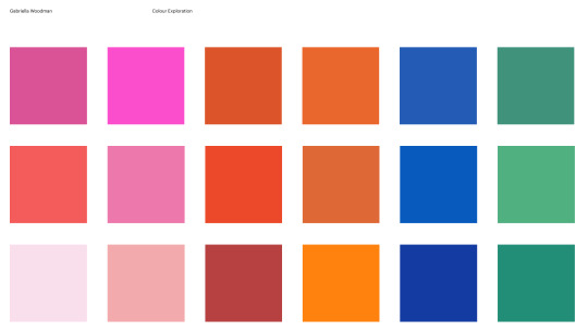
COLOUR PALLETE EXPLORING
pink and orange are such a nice colour combination as they are both warm tones yet contrasting enough to distinguish when used in a design together.
I do like the green and orange but is it giving too much of a St Patricks' vibe?? possibly but I think they would be nice to use as accents on a white background.
purple and green, where to begin. This would definitely be used as accents colours with a white background to add those details etc. I do like the colours but not sure if I want the Halloween vibes.
orange pink and teal/aqua? I love these colour combinations and I think its still neutral enough to be used to target a wider audience as it doesn’t really portray a specific kind of demographic.
last but not least we have a blue and warm toned pallete. I do like these colours but I used something similar for a project from last year but technically I could still use it if the other one doesn’t work.
0 notes
Text
Planning your home's interior can be hugely fulfilling, but it can also be stressful should you not know what to anticipate. Luckily, you will find a lot of information available that could steer you within the right course. You will discover some of the best recommendations when you continue reading the content the adheres to.
If you are intending an home design venture you should decide on all your finishes and colors before you start. Should you not plan all this outside in advance you will discover that you wind up straying out of your authentic program. This is simply not very good, as you would like a structured hunting end result.
Start with a fresh jacket of fresh paint. Fresh paint is relatively cheap and can easily make a big switch to a room within a couple of hours. Visit your neighborhood home store and get swatches. Then, go back home and visualize what every single swatch would appear like, and how it could mix using the furnishings along with other areas at your residence. Select one to see how different your living space seems!
When redecorating a master bedroom, adding a little shade might help. Color 1 feature wall structure or add some more bold pillows for the bed. Spot an accent office chair in the part or use lampshades by using a strong pop of color. This adds aesthetic curiosity for the place, and it is an affordable way to affect the place.
When redecorating hardie siding installer san antonio , keep the coloration pallet paler. A light color pallet will lighten up the place and make it appear larger sized. It is additionally very best to target 1 or 2 colors to hold the space from showing busy. Gentle blue, ocean green, white and ivory are all amazing choice for a compact home place.
Incorporate art into bedrooms in your own home, whether they are works of art, pictures or images. This could go together with the style of your home that you choose and will help to increase the overall appearance. Should you be a youthful house owner, you may frame classical art to include in the classiness of your house.
Before you begin nearly anything, have got a conversation about financial situation and expenses. It may be a nightmare to start a task you will be struggling to complete since you lack cash. A budget may help decrease pressure throughout the procedure.
A gourmet coffee table is among the more valuable factors that you will need to get at your residence, as it is both practical and aesthetically pleasing. Be sure that when you get your espresso dinner table, which it matches the fashion of your house and incorporates coasters to guard the outer lining.
Once you have guide racks inside your place, you must not worry about satisfying them totally with guides, take full advantage of your reserve rack space. You are able to set some great knickknacks or memorabilia in the racks to generate a customized focal point that can attention your guests and get you enjoying your space even more.
Piece of art surfaces is a simple and easy way to repair your home. Old paint can definitely era an area and traffic locations frequently get stained or filthy. So a wonderful way to pump within the really feel of any room is always to rid yourself of that outdated paint and apply a new vivid coat.
When thinking of what shade to paint your bedroom, keep in mind that the bed room is an area for relaxation and calmness. Bright colours, like pinks and purples, will not emit a sense of rest. Instead, you need to stick with far more neutral colors, like beiges, whites, grays and light-weight browns.
To obtain the most out of your baby's nursery layout, use components which will previous. Purchase furniture and lighting fixtures with traditional attractiveness that may effortlessly transition from babyhood right through with their teenage life. You may then emphasize with cushions, bedsheets, and knickknacks that happen to be age group-suitable and a lot more quickly and cheaply modified.
Have a look on the internet and at mags. You will find a number of publications that can present you with wonderful concepts. Before you start preparing, get inspired. Look at as numerous different alternatives that you can and weigh your options. Preserve what you like. Mix and match ideas and determine what's possible.
Possessing read the details over, you might have likely gleaned some terrific new ways to apply to your own personal layout jobs. Being familiar with the things that work and what doesn't will assist you to create the perfect interior design for your own home. Use the advice in the following paragraphs, along with your residence will quickly get the appearance that you may have always dreamed of.
1 note
·
View note
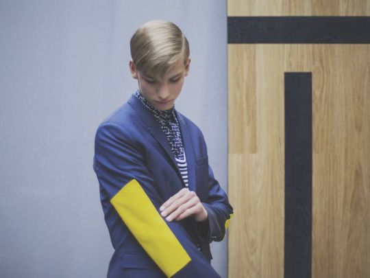
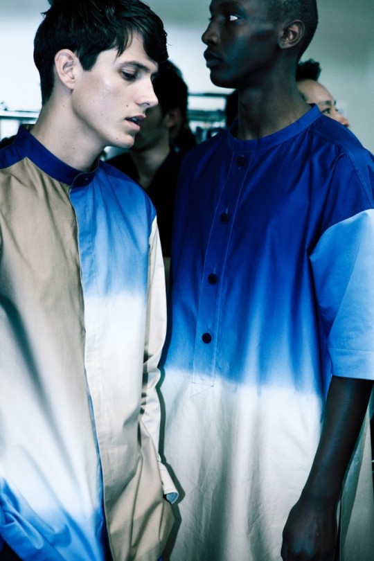
Text
Digital Wave
Another trend example is Digital Wave which has taken place in spring / summer 2017 for men, according to WGSN. Digital Wave has a transitional story of analogue nostalgia, beholding back to the digital dawn of electronic music and gaming in the early 1980s and the enchanting rawness of pre-web innovation. Sharp tailoring and graphic colour contrasts cleanse and reset the seasonal mood and palette, while urban casual wear has an active utility feel with a focus on modern materials.

Key points of Digital Wave are:
Outlines for fitting and casual wear show an unmistakable, current grimness with subtle 1980s feelings, sharp, precise lines, and a minimalist appearance supported by a high-contrast monochrome palette and extraordinary essential brights.
More youthful easygoing and streetwear looks have an rebellious urban feel, drawing on Japanese 1980s biker references and a 12 PM club air to rouse contemporary utility looks expanded by hi-tech materials.
Print and pattern designs join theoretical, mathematical illustrations with a more textural way to bring out the nostalgic warmth, physicality and surfaces of the early, flawed but still great days of the electronic age.
The colour pallete consists of:
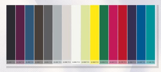
The palette is inspired by the feel and the look of the early digital wave from the 1980s. Purple has been integrated with hot pink and black plum. Classic men colours have been enlarged with dark blue, black olive and high-rise grey. Accent brights, for example, bursting yellow and Amazon green have been changed to build their flexibility as energetic features.
Materials used are cotton and leathers as well as reflective fabrics.
Some things that influenced Digital Wave are:
Bosozoku, which is a Japanese subculture. They are associated with personalised motorbikes and a utility uniform of custom overalls with long embroidered mechanic coats and wrap jackets.
Artist Margi Wolowiec hand-weaves social media images into abstract tapestries in a Navajo style. The contents look like blurred and glitched fragments of themselves, creating an interface texture.
Jim Golden’s GIF project Relics of technology showcases his fascination for archive digital equipment. He gives them a new lease of life as nostalgic prints in pastel colours.
Bonded surfaces
Ombre effects
Electric tweeds
0 notes
Text
Weddings Colours to Use in 2021
Some of the most significant details of your celebration are your wedding colours. They have the power to set the tone for the whole day, which is particularly important by today's standards, when over the past several months weddings have had to take on many different (and unexpected) forms. When it comes to affecting the mood and look of your wedding, a colour palette can go a long way, even if it's a microwedding, Zoom wedding, or elopement. Your colour scheme is one of the first things you'll want to finalise if you're in the process of planning your wedding, since it affects everything from the invitations to the decor, attire, and flower arrangements. Wondering where you should start? On the 2021 wedding colours, we asked industry experts for the inside scoop that will be trending in the months to come.
The short one: there are light and uplifting colours. Ashley Lachney, owner and lead planner of Alston Mayger Events in Kelso, Washington, says: "I think couples are taking a break from 'moderate' celebrations and seeing new life breathed into weddings with pale blues, sage greens, and (of course) classic ivory." "Colors take a more muted stance, so through photos we get that truly light and airy feeling."
And if what you had in mind is bright, unique wedding colours that make a statement, you're in luck. Jawana Onieé, owner and principal designer of Onieé's Engagements in Greensboro, North Carolina, says, "There will also be an increase in bold colours that have traditionally not been popular, such as yellow." She also expects to see the return of shimmering metallic tones, such as rose gold and copper, which for all types of pallets are versatile accent colours.
Here are the wedding colours of 2021 that you can expect to see next year everywhere (maybe even at your own wedding!).
Blue Powder
For 2021 wedding colours, pretty powder blue will come back into the mix, and the best part is that this colour is season-less and versatile for all kinds of aesthetics. It's practically impossible to go wrong with this pastel tone, from ultra-formal ballroom weddings to laid-back rustic dinners. It's saturated enough in an otherwise neutral palette to stand on its own, but if you want to pair it with another statement colour, such as pink or yellow, it won't be overpowering. With details such as bouquet ribbons, shoes, flowers (delphinium and hydrangeas, for starters), or even a pop of blue eyeshadow, incorporate powder blue into your
Lavender and lilac
Purple is another fashionable wedding colour that we expect to see refreshed in 2021. Lighter versions of this hue, specifically lilac and lavender, instead of dark plum and amethyst, are some of the most popular wedding colours in the coming months on our radar. Both are whimsical yet elaborate (and beautifully complement each other), making this pairing a stylish choice for garden weddings and springtime celebrations.
Orange Papaya
Papaya orange is one of the 2021 wedding colours we're most excited about right now. Hear us out on this one, if you're not convinced yet. Orange tones (especially dark orange and rust) have continued to grow in popularity for bohemian and rustic weddings over the past couple of years. This pastel alternative, with a slightly more playful vibe, is just as unique and eye-catching. Think of papaya orange for tropical wedding themes, beach elopements or any summer event as the new accent colour. The colour palette is an instant mood-booster when you pair it with other vibrant hues, such as fuchsia, lime, and teal.
'90's-inspired colours for weddings
Call us nostalgic, but we can't wait to see more of them in 2021 and we're so into those fun, bold wedding colours. It's not about a single colour for this trend, but rather a collection of colours that create a rainbow-style palette, maybe one inspired by your favourite Caboodles case or windbreaker colour block. Cherry red, fuchsia, cerulean, teal, and purple are some of the colours that you can use for your '90s-inspired colour scheme. For other wedding trends, such as balloon backdrops, neon signs, and ombré floral arrangements, these bright hues are a great match.
The green Matcha
When it comes to wedding colours, green is already an unsung hero (just think of how many trendy floral arrangements and bouquets depend on leafy greenery), and it will have its own moment to shine in 2021. But lighter greens will also come into play instead of the dark emerald and juniper tones, which give off a moody vibe. We've been planning more greens lately, to name a few, hunter, mint, and sage. We just love this masculine but feminine colour,' says Erica Trombetti of Newport, Rhode Island's Infinite Events. Brighter greens will give your wedding colour palette an energetic and fresh feel, but you can also use them to create a chic, bohemian look. Colors such as matcha green, olive and pistachio are directly out of the 1970s and are ideal for achieving a retro-cool effect.
Neutral Earthy wedding colours
You will be relieved to know that neutral wedding colours are still on track to be extremely popular in 2021, if bright palettes aren't your thing. For wedding decor and attire, colours such as ivory, taupe, grey, and cream will be a trend, but they will also be a huge trend for floral arrangements. It seems to be quite popular as of late to use all-white flowers in a natural, organic fashion, and we have had many customers requesting black and white colour palettes with nudes of earth tone as accents," says Brooke Avishay of Orange Blossom Special Events in Van Nuys, California." Texture becomes more important than ever when you work with a neutral wedding colour palette, since it will keep the monochromatic tones from falling flat. Emphasize these 2021 wedding colours for a minimalist chic look with details such as dried flowers, pampas grass, and bleached greenery.
Yellow of Tuscany
Last but certainly not least, this hue is in the race for 2021's boldest wedding colour. Even the smallest dose of yellow packs a punch, and since it's not the traditional colour of a wedding, it's ideal for couples who want to create a luxurious and unique palette. We call it Tuscany Yellow because the rich golden tones of this particular shade will immediately give a warm, sun-kissed feeling to your wedding aesthetic, ideal for eliciting visions of a European pastoral setting, even if you can not be there in person.
0 notes
Photo

"Also powerful in identity is the charity logo. WWF's panda, the Red Cross logo and so on are very powerful elements of the identity mix. In the case of WWF, the panda logo is probably better known than the name of the organisation and as such is extremely valuable."
Reference: Bruce, I. (2011). Charity Marketing. 4th ed. London: ICSA Publishing Ltd, p.208.
MacMillan
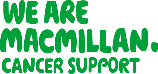
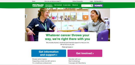
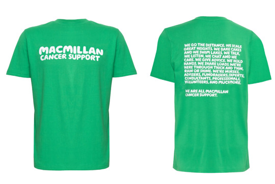
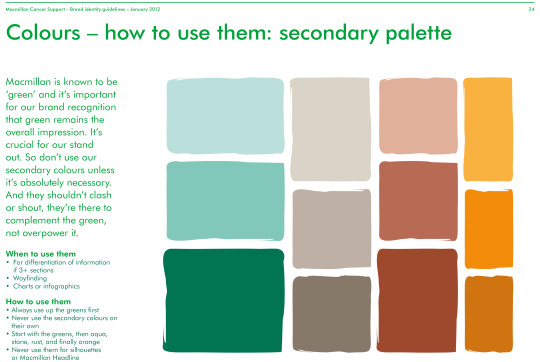
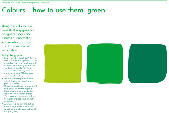
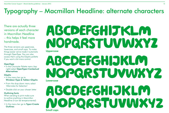
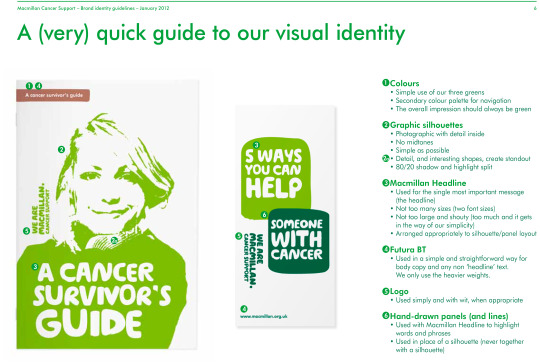
These images are taken from Macmillan's brand guidelines. Here they display that they brand themselves strongly from the use of their green colour scheme. The Macmillan green has become very well known across charities due to Macmillan’s success. Macmillan are identified through their use of typeface, also. This chunky, handwritten style typeface has since become very popular amongst charities, and has not only become an identity for Macmillan Cancer Support, but across charities as a whole.
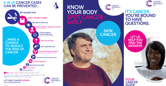
Cancer Research


These images have been taken from Cancer Research UK’s website in addition to some of the booklets and posters you are likely to see from them. Cancer Research recently updated their branding identity. They have kept key themes, which is the logical move for any established brand when redesigning. Prior to the redesign, the logo was still a type based logo, but features circles making up the shape of an arrow, to representing the charity moving forward. With the redesign, the new logo represents a variety of different forces coming together. Some of the colours seen here are recognisable across other cancer related brands, such as Race For Life, using the pink, Prostate Cancer UK use the light blue and so on. A large part of their branding is the circle shape, used across all aspects of their branding from photograph frames to shapes for text to sit inside of.
Children in Need

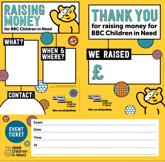
Children in Need is an established charity which is highly recognisable to society. Children in Need have designed towards their audience brilliantly. Their logo features a cuddly teddy which children are instantly drawn towards. Not only does this logo show that the recipients are children, but that children are the ones taking part in the charity acts. Using this style of branding makes charity giving something that is more talked about, and can involve the whole family. As parents are the ones that hold the money, this gives them a way of letting their child interact with charity giving, and teaches them life lessons such as empathy. All the colours used are incredibly child friendly and catch your attention straight away.
WWF
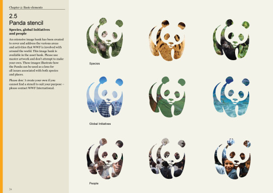
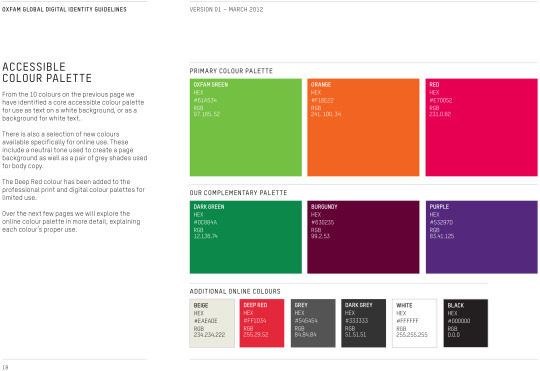
These images have been taken from WWF’s branding guidelines. WWF is most commonly known for their icon logo of the panda, and can be recognised without the WWF name underneath. WWF are usually seen to have a black and white colour pallet, although when looking at their branding guidelines, a large array of colour is seen, and how these can be used as accent colours.
Oxfam
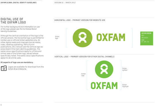


Oxfam was rebranded in 2012. Prior to this, the branding was different depending on what location it was based in. Now thanks to the rebranding, this is a worldwide visual representation of the charity. The Oxfam name in green is something that has always been recognisable, but that have since implemented this into all of their branding. In the Oxfam branding we also see the return of the chunky typeface, commonly seen throughout charities. This chunky type makes the words carry more impact, making not only the text, but the statement, bold. Colour is a key part to the ‘new’ Oxfam brand, keeping everything bright and colourful to encourage positivity.
0 notes
Text
Bibliography
Trend forecasting
http://view-publications.com/category/textile-view/
https://blog.patternbank.com
https://www.nonamedesign.co.uk/2019/07/28/colour-trends-for-fall-winter-2020-2021/
https://www.ispo.com/en/awards/textrends/ispo-textrends-color-trends-fall/winter-2020/2021
https://www.patterncurator.com/blog/rive-gauche
https://www.patterncurator.com/blog/synthetic-aesthetic
https://www.patterncurator.com/blog/plum-jam
https://www.ispo.com/en/awards/textrends/ispo-textrends-5-textile-trends-fall/winter-2020/2021
https://issuu.com/annascout.r/docs/autumn_winter_2020_trends/6
https://patternbank.com/seasons/autumn-winter-2020-21?_=1574954451305&licence=all&page=2&per_page=100
https://issuu.com/annascout.r/docs/autumn_winter_2020_trends/6
https://be2adorn.com/en/interior-design-trends-2020/
https://www.idealhome.co.uk/news/home-decor-trends-design-trends-233635
https://www.elledecor.com/design-decorate/trends/g23693937/kitchen-trends-2019/
https://www.livingetc.com/whats-news/the-biggest-interior-trends-195539
Blog reference
https://www.plazzart.com/doc/plot/images/lots/20161008_mdv_174/image1-62891_1_m.jpg
https://kasentex.com/collections/quilts/products/kasentex-premium-stone-washed-quilt-set-detailed-stitching-100-microfiber?variant=12991222710338&utm_source=Pinterest&utm_medium=Social
surya.com
https://www.rugsociety.eu/blog/2019/02/22/trends-2019-geometric-patterns/
https://www.wallpaperdirect.com/products/albany/ventura/156819
https://i2.wp.com/www.123freevectors.com/wp-content/original/131602-pink-and-white-polygon-pattern-abstract-background-vector-image.jpg?w=800&q=95\
Exotic pattern
https://patternbank.com/trend-stories/298-exotic-vegetation
https://www.pooky.com/table-lamps/rabat-table-lamp-in-brass?pp=0&epik=dj0yJnU9RHZWNGFaTmJxVnQyekxHVTVNeEp6WWxaVEVjd0U4SE4mbj1WLXhsaWhNNlhMVk1KenFoLVFtRlRBJnQ9QUFBQUFGM24xZkk#conf.10=219892
http://blog.patternbank.com/resort-2019-print-and-pattern-hightlights-part-1/
https://www.amara.com/editorial/style/neon-interior-ideas
https://society6.com/product/neon-mandala-and-flowers_wall-mural
https://www.123rf.com/visual/search/120279115
Art deco
https://www.thespruce.com/decorating-in-art-deco-style-1976535
Abstract
https://patternbank.com/trend-stories/299-new-abstracts
Neon floral
https://patternbank.com/trend-stories/300-nighttime-tropics
https://i.pinimg.com/236x/5c/9c/c7/5c9cc7a41d7cc4ed1920e8ffb48bc00e.jpg
Si-Fi
https://patternbank.com/autumn-winter-2020-2021-print-trend-future-sci-fi
https://i.pinimg.com/564x/30/62/81/306281ac1c0992b1a65ac4d64812da47.jpg
Designers
fall 2019
https://patternbank.com/haute-couture-print-pattern-highlights-fall-2019
http://www.uxalive.com Explore the Next & the New
Dorothée Meilichzon
Colour pallet
https://www.nonamedesign.co.uk/2019/07/28/colour-trends-for-fall-winter-2020-2021/
https://i.pinimg.com/564x/20/0f/6d/200f6d12b63db4b2c26ec8f1d925e503.jpg
https://i.pinimg.com/564x/19/71/1a/19711a0bb4e36395b198f9c1791d1003.jpg
https://i.pinimg.com/564x/54/e5/d8/54e5d8c9c5c75ccdc67c3fa50c4a9a65.jpg
https://flamingococktail.com/colour-trends-for-2020-sherwin-williams-forecast/
http://1.bp.blogspot.com/-h46mkqeACd0/U_aC__M_0dI/AAAAAAAAGe4/3czlPBZI-_o/s1600/AS%2Btints.jpg
https://i.pinimg.com/564x/ca/10/6c/ca106c3b921dcf7b63b60e0e881489ba.jpg
Plumb
https://wholemood.com/design/colour-trends-2020/
http://thehomestylist.org/interior-trends-2020/
http://poppybevan.com/colour/plum/
Blue colours
https://www.wgsn.com/content/board_viewer/#/85470/page/3
Green colours
https://spacecadetyarn.com/wp-content/uploads/2015/11/Understanding-Colour-Variegateds-from-Gentle-to-Wild-580x300.jpg
https://hips.hearstapps.com/hmg-prod.s3.amazonaws.com/images/hunter-green-kitchens-1540826620.jpg?crop=0.9986666666666666xw:1xh;center,top&resize=980:*
Caramel colours
https://i.pinimg.com/564x/48/01/91/48019156a3ca3e41ee23a33a86b60e6a.jpg
Teal blue
https://i.pinimg.com/564x/f1/46/45/f14645be24bb19e3b5399ebd9f888ac1.jpg
Copper
https://blog.debenhams.com/home-and-lifestyle/interiors-trend-copper-accents/
https://designerconnections.org/2019/04/23/work-out-what-your-client-really-wants-with-gym-marine-yachts-and-interiors/
https://www.gowallpaper.co.uk/fine-decor-marblesque-marble-rose-gold-metallic-wallpaper-fd42268.html
https://i.pinimg.com/564x/9d/33/75/9d33753a1c3ce01d24a79756bea7db95.jpg
https://hips.hearstapps.com/hmg-prod.s3.amazonaws.com/images/pewter-and-gunmetal-2-1546263557.jpg?crop=1xw:1xh;center,top&resize=980:*
https://www.elledecor.com/design-decorate/trends/g23693937/kitchen-trends-2019/
https://victoriaplum.com/product/accents-neptune-rose-gold-complete-bathroom-accessory-and-towel-bundle?utm_campaign=dynamicpinterest&utm_content=productpin&utm_source=pinterest&utm_medium=referral&LGWCODE=IGBNDLE02&item_group_id=PG_IGBNDLE02
https://i.pinimg.com/564x/d0/b7/68/d0b7686813e5b682cf2a45832c3abb8e.jpg
sustainability
https://www.wgsn.com/content/board_viewer/#/85586/page/7
https://www.soilassociation.org/organic-living/fashion-textiles/
https://www.chalkandmoss.com/wp-content/uploads/2014/12/Bags-Travelling-TheOrganicCompany-LOW_1000.jpg
Final Look book
https://www.livingetc.com/style/decorating-trend-candy-crush-216053
https://unsplash.com/s/photos/orange-and-pink-sunset
https://www.wayfair.co.uk/textiles-bedding/pdp/norden-home-beatrice-duvet-cover-set-bvsc1000.html?piid=40471839%2C40418115
https://www.digsdigs.com/geometric-graphic-bedding-ideas/pictures/118488/
https://www.flowerbx.com/pink-sweet-avalanche-rose?gclid=CjwKCAiA3uDwBRBFEiwA1VsajBpN7kqqCNj8TejiDZzZUqXV8vEbPSbnEB5guoMSqrUBdLOrMfFubBoCoSoQAvD_BwE#fo_c=1770&fo_k=f3de25bdf9e477a25193bdef5ffb74f3&fo_s=gplauk
https://i.etsystatic.com/11951193/r/il/e8d2ba/1932283689/il_794xN.1932283689_iygb.jpg
https://cdn.shopify.com/s/files/1/0004/4630/0222/products/diamond-HR_2000x.jpg?v=1562246874
https://secure.img1-fg.wfcdn.com/im/21358297/resize-h700-w700%5Ecompr-r85/8660/86600460/Monceau+Sahara+Cushion.jpg
https://secure.img1-fg.wfcdn.com/im/72887825/resize-h700-w700%5Ecompr-r85/6461/64619929/Lolita+Cotton+Cushion.jpg
https://secure.img1-fg.wfcdn.com/im/86478609/resize-h700-w700%5Ecompr-r85/7140/71403506/Cueto+Cushion.jpg
https://i.pinimg.com/564x/67/a2/e7/67a2e7d44a959b3ab67d133e86730377.jpg
https://i.pinimg.com/564x/fa/40/f4/fa40f47d58f021e982aefbc6dee09b6b.jpg
https://i.pinimg.com/564x/f7/3a/69/f73a697643e9d554fe9479de0f854574.jpg
https://www.ilovewallpaper.co.uk/wallpaper-c1/zara-shimmer-metallic-wallpaper-soft-pink-rose-gold-p4928
https://www.cultfurniture.com/images/sublime-marble-geometric-triangle-wallpaper-pink-and-grey-p22841-1547410_image.jpg
https://previews.123rf.com/images/eugenesergeev/eugenesergeev1603/eugenesergeev160300243/53632262-abstract-white-interior-design-with-cubic-structures-empty-architecture-background-3d-illustration.jpg
0 notes
Last Seen Blogs

sociedadpoetica2018
SociedadPoetica2018

dusty-notavaliable
Dusty Day!!!!! :)

kittiekatscostumes-blog
Custom Made Exotic Dancewear

antibromide
Schematics and Slopers
je-t-aime-melancolie
Mademoiselle Fourrure