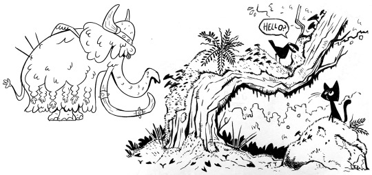
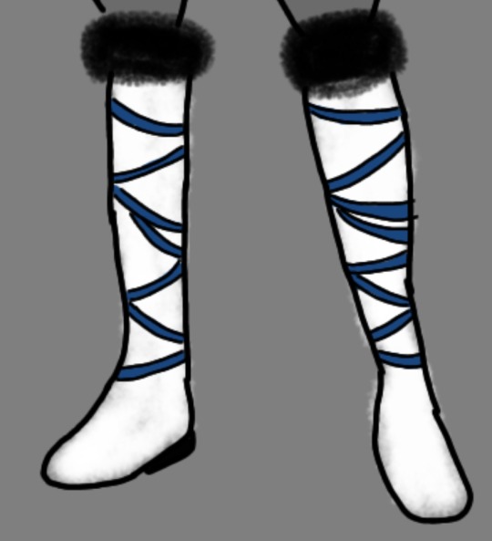
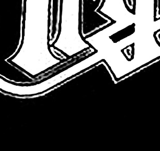
#my lineart brush also doubles as colouring
Text
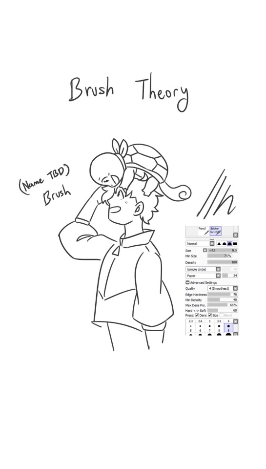
A little brush theory reel since my next oc drawing is taking a while to draw. The first three brushes (sketch & lineart) are the ones I used the most in my drawings and I'm testing out the rest.
Brushes under the cut if you want don’t want to pause the video!


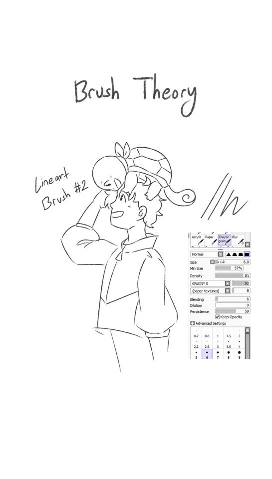

#brushes#brush theory#paint tool sai brushes#my art#lineart#sketch brush#lineart brush#digital art#original character#oc art#pokemon au#pokemon squirtle#squirtle#pokemon#rbg ren#original character ren#my lineart brush also doubles as colouring#paint tool sai
0 notes
Note
I just want to say I love how you do your lineart, it looks so good! ahhhhhhhh!!
I'm gathering a lot of advice about the topic of lineart and I just wanna know how you get it to look like that? My line weight is getting better but the drawing itself just comes out a bit.. weird.
Thank you so much! Lineart is probably the thing I've been working hardest on as I am not a lineartist (and still struggle a lot) but it's something I really need to get better at for my job.
UM there's honestly so much that could be said on the topic of lineart. Big things for me are:
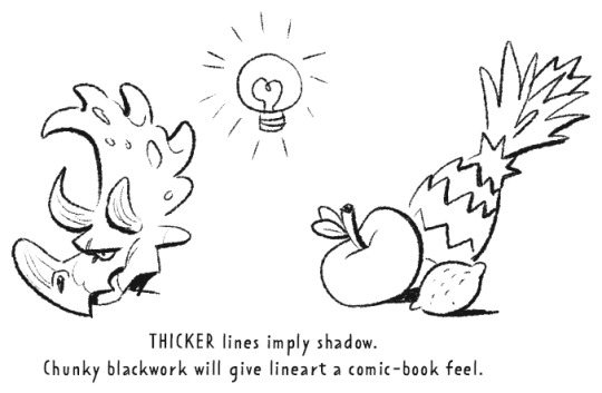
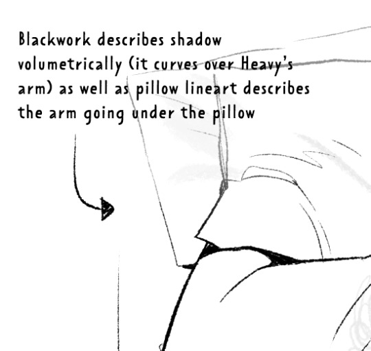
Weight -> Use line weight (aka thickness) to describe form, lighting, contact and scale. Thick lines imply shadow, contact and nearness-to-camera. Thin lines imply tension, recession and light.
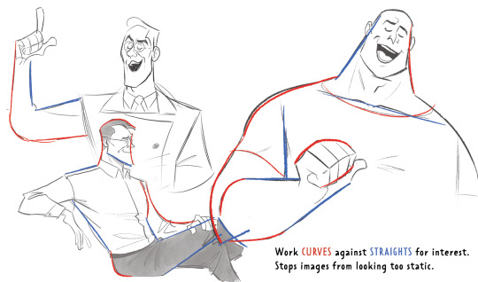
Straights vs Curves -> Use straight lines against curved ones for maximum interest. This is partly a character design thing but as we're using lines to describe our characters it's worth mentioning :)
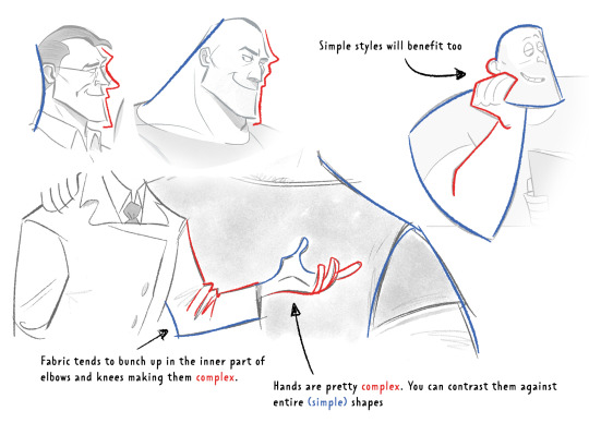
Complex vx Simple -> Use complex lines against simple. Faces are always complex so therefore the backs of heads should always be simple. Chests are quite complex so backs should be simple. Dorsal sides of the arms are complex (Delt, tricep, bicep) whilst the ventral side is more simple (tricep...mainly) etc.
'Think in Ink' -> Lower your sketch layer almost to 0% opacity so you're not getting hung up on how nice/energetic your sketch look and instead are approaching the piece from an ink mindset. BUT it's digital! So if there's something in your sketch that you like just bring it forward (copy and paste) into your ink layer. I sketch and ink with the same brush so I can use this workflow
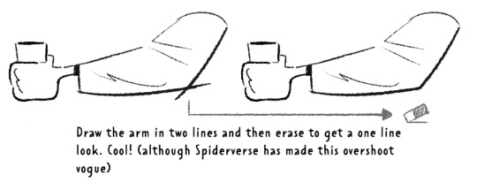
'Confidence' -> small hesitant feathery lines will look nervous compared to big swooping lines. Less is always more. I'll redraw arms/limbs until I can get the appearance that it was done in one brush stroke. Again it's digital so you can erase to cheat this look : )

MISC 01: I always hear 'draw from the shoulder'........meh............it's digital so draw from your wrist...it's fine honestly. If we were working at A1 in a life drawing class then we could get some shoulder action going but most of us are hunched over 16inch tablets. I think this advice aims to pull people away from feathery-nervous lineart honestly which you can improve on without relearning how to draw from your shoulder.
MISC 02: For a 'smoother' look do your lineart at a larger canvas size than you need. Once I'm happy with a sketch I usually double the canvas size and do my lineart then.
MISC 03: In PS (at least) anti-aliasing goes funny at any zoom level that isn't in the 5 times table. So try not to look at your canvas when you're zoomed in to 87% or 71.39% or something crazy. Just stick to 25%, 50%, 75% and 100% if possible.
UNFORTUNATE TRUTH: Lineart is incredibly based on raw draughtmanship I've discovered. When you're working with colour you can hide a lot in rendering (shadows, highlights) or post-processing (depth of field) but in lineart all your mistakes are just...there for people to see.
There's ways round this...which I use A LOT. 'Flourishes' (I use 'flourishes' to mean over-confident lineart where it veers particuarly thick or particuarly thin in contrast to your approach in the rest of the image) can sort of trick people into thinking you're more confident about an area than you actually are.

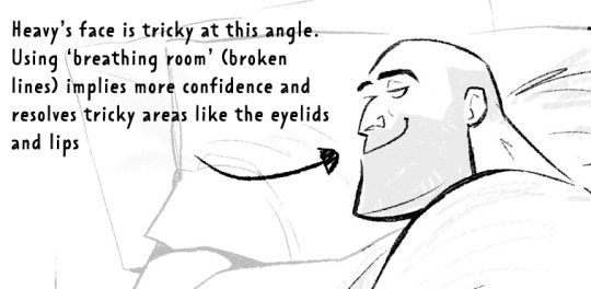
As well as leaving 'breathing room' within your lineart instead of actually...resolving the area. I do this the most around the face and hands.
Hopefully some of this helps? Honestly there's a lot of deep dives that could be done into indivudal things and there's also the massive caveat that all of these are 'guidelines' and not strict rules.
I also favour a more...concept-arty? animation-y? storyboard-y? look to my lineart which favours flourishes and breathing room for a incomplete/work-in-progress feel which would make methodical colouring (ie: for a comic or something) a pain.
Keep up pratice is the main thing and doing studies of artists who you like that have great lineart - you'll pick up draughtmanship skills along with the lineart studies. Here's some of my lineart from a year or two ago...it varies between very 'standardised' (which makes it difficult to read volumes and to be honest, it's boring) and 'TOO EXCITING' (which...also makes it difficult to read volumes and for the eye to rest).
I'd like to share my brushes at some point as I've found 3 that I really like and use for everything more or less. I discovered that a shocking low amount of people use PS on tumblr (shocking to me I guess as i'm so used to PS being the standard) and everyone seems to use Procreate or Clip Studio Pro...so I want to check that the brushes are Procreate compatible at least before I share!
672 notes
·
View notes
Note
OMG the drawing of Glen sleeping on moss is SO GOOD.
You painted the earth really well. It's got such wonderful brown colours and very much not dry, perfect ground for moss to grow <3
And the moss itself looks SO soft. I love the texture of the brush you used... Such neat fuzzyness. Glen himself looks so at peace. The sword sticking in the ground next to him is such a knight thing to do....
The linework is really interesting, because you combine both linework & shading into one. It not only lines out the character, you also give them strong black shadows....
I like the fact that it seems like Glen is taking cover under some leafs as well <3 At least it seems like it, judging by the background. I wanna put a leaf on him as a blanket while he's sleeping in secret....
awww, thank u so much for ur kind words on my piece!! :"D i'm glad u like the textures ... i never thought of my lineart doubling as shading haha... but ur right
leaf blanket made me think of sushi, here is Glen wrapped in a leaf sushi style 0v0/

22 notes
·
View notes
Note
Sorry if you've had this asked before but how do you art? what brush do you use?
I use procreate mostly! Half of my art on my page was done with my finger on an iPhone (the sketch was in a sketchbook and the inking and colouring digital). This time last year I did get an IPad and now work entirely digitally (or entirely traditionally) for the most part.


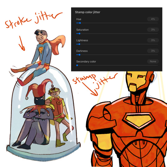
As for brushes, I use the 6B Pencil for everything (sketching, inking, colouring, you name it). It’s the most popular procreate brush for good reason. However, I have modified it. I use two variants. One is a more opaque version for line art (which you can do by double taping the grain source), and the other is the original transparency, just bigger.
Depending on the piece/use, I’ll modifying the stabilization and pressure dyanmics to fit the need. I typically have some minor level of colour stamp jitter turned on (look at the colour variation in the iron man suit). Sometimes I’ll also do some colour stroke jitter which will affect each brush stroke as a whole, rather than little variations inside it. You can see that how Superman’s arm is a slightly different colour than his chest, etc.
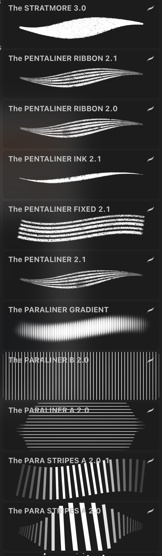

Other than that, the other brushes I find useful (although I don’t use super often) are various pattern stamps, and these following free sets:
Georgvw’s Comic Ink Set. Great for patterned lines. I used it a lot for abstract pieces, not really character arc.
What I believe is Corey Brickley’s eyebrow set? Incredible for blood smears

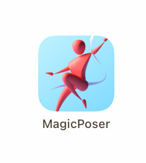
I also use Magic Poser 3D for references! (Here’s some daily Diana ones). I paid for a pro account (one time $15 purchase), but there are free tiers and more expensive ones too. As someone who avoids spending money as much as I can, it was a worthwhile purchase for me. However, the free tier is also totally usable.
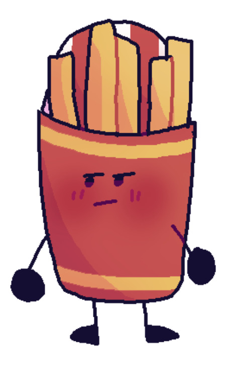
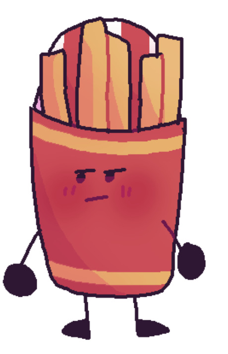
Also, my lineart is a dark blue with a “linear burn” layer setting. My shading is typically a pin light I think.
6 notes
·
View notes
Text
Summary of April:
Was away at the beginning of the month and then when I got back got really unmotivated. I joined a Discord study check-in chat two weeks ago which helped get me back on track - hoping that my extreme competitiveness will help me at least get through the DAB stuff without giving up. I was really off track for finishing stuff, but I managed to pull it together in the end, and I think I actually managed to finish more of my monthly goals than I have in a really long time!
My drawing skill is kinda all over the place atm, which I'm hoping means it's going to consolidate itself into something better soon xD
Plan from April:
3x 100 comp ✗ forgot to do two of these AGAIN
5x scared ✓ didn't technically do 5 but they were longer than 5min anyway
DAB Lesson 7 - 2 vehicles ✓ YEAHHHH
Proko - shoulder bones ✓
DrawThis - 2x 2h videos ✓
Rough sketches for all 5 FEH alt ideas ✗
1x background sketch/screencap study (1h timer) ✓ well I drew over a bunch of rooms and discovered that I can't do it in an hour
1x simple form studies (1h timer) ✗ did do some form studies though not 1h
Look at how FEH artists handle small details/trims with lineart ✓
May plan:
at least one day/week playing games (not art but important to relax with)
Draw May 4th/5th pieces
Rough (pose) sketches for all 4 FEH alt ideas and finish current one before 8th
10x scared
4x 100 comp
Proko - review notes + watch shoulder critiques
Proko - pecs and breasts I guess
4x Ges Draw Party
DAB Lesson 7 - 4 vehicles
1x master study - comic background or screencap study with perspective
notes and improvements from finished stuff:
USE PHOTO REFERENCE FOR EXPRESSIONS and try more open mouths ✗ did expressions but not referenced, do more hair studies ✗, use photo reference to figure out stylised ¾ eyes AND NOSE ✓, push unhorizontalness ✓, see how other (FEH) artists handle trims ✓
5MIN SCARED IDEAS: find good hair examples and trace ✗, find ¾ photos and trace eyes/nose ✓, trace torsos for gesture ✗, review/learn leg muscles ✗, trace thigh high boot opening contours from actual photos ✓
knoll: not detailed enough (did a drawover to add details which made a BIG difference), hand unintentionally too wide, browbone doesn't go in to lead into cheekbone
h/ux: not enough ribcage space, crop looks like his forearm is just really thin, eyes aren't in perspective (not lined up + eye area is a bit too wide and flat), hand wasn't referenced and it shows
elan: values too close, REALLY BAD HAND, antennae shouldn't be that swivelled, folds don't make any sense
t/ana: tried to do too much of a dynamic pose and made an unnatural twist between upper + lower halves, eyes aren't looking at viewer, arm holding bouquet/shoulder/underarm area is flat and too far off to the side, lighting not consistent + shading on skirt too conservative (should have pushed the back of it way further into shadow to bring out the roundness), sash thing has no texture and is placed really awkwardly because I realised during the colouring phase that the entire skirt was off-centre, value contrast too low (not engaging to look at). HOWEVER I did try to clean up my lines AND shading at the end, and also used a much smaller brush (doubled canvas size to A4 and used a 3px/1px brush) so it looks a lot neater overall
ACTIONABLES: USE PHOTO REFERENCE FOR EXPRESSIONS!!!!! JUST DO IT, do hair studies, decide whether majority of piece is going to be dark or light and base contrast around that, draw out ribcages (+ shoulder bones) for every sketch, use photo/RL reference for EVERY HAND - even doodles, do a separate detail pass the day after 'finishing' something, use photo reference for folds
5MIN SCARED IDEAS: find good hair examples and trace, trace torsos for gesture, review/learn leg muscles, draw one hand, identify fold type in clothing photos
3 notes
·
View notes
Text
We haven't heard shit about Alice's husband but I designed him anyway
let me explain myself.
I don't usually do fandesigns (god knows I'm bad at drawing) but I think too much and probably shouldn't be applying our-world genetics to Teyvat. Even so, I've had the thought for a while that by the rules of modern genetics, Klee's father would need to have very pale hair and eyes for Alice's traits to be genetic, since it's semi-canon that Klee is basically a small version of her mother. So Alice's husband would have to be an albino, or something very close to that. Then I reread Alice's speech from the original Golden Apple Archipelago event, and started thinking what if Alice's family were allegories/connected to the four seasons somehow. Klee is summer, obviously, Alice is spring since she gives life and is explosively enthusiastic, also very double-sided which if you've ever seen a spring storm develop in five seconds flat you'll know what I mean with that. Albedo is autumn because he's (a.) Born in autumn for them so I don't have a choice and (b.) Sits in between warm and cold personality-wise and can easily switch between the two, sometimes he's kind sometimes he's not but he tends to lean towards the colder side by default. So that would leave Alice's husband for winter and so guess what I did? I went full fantasy mode and made him a snow spirit of some sort. Snezhnayan dad ig. It would fit ngl a multicultural family suits them.
So I grabbed a base of Genshin's tall male model (thanks to @/moinii on Hoyolab for the base, very useful) and designed him myself. Paragraph post incoming because I must explain my every action like a criminal whenever I do these

it's very much a beta design so if there's any design suggestions I'll be happy to put them in.
For reference these are his shoes since his coat covers most of them.
My colour palette:
I explained earlier that I came up with the idea for him to be a Snezhnayan snow spirit, fitting in with the winter aspect of the family's season-based theming that I came up with out of nowhere. Because of that he doesn't need a Vision (and thank god for that I don't want to draw one.) I also referenced a previous idea I had that he'd look closer to Albedo, being a sort of visual missing link between the family- as in, when all four of them are there, you can actually kind of tell that they're family.
I decided to try and look for any Slavic or Russian snow spirit mythology to see if I couldn't find a base. Surprisingly, there weren't many (probably because they had more focus on the harvest and summer seasons like most mythologies do.) The best i could find was the Mythology Wiki page for an entity known as the Zimadevushka, which from the description is an entity that uses attraction to lure people into the snow. While I wouldn't say they're the same as a Succubus, they're fairly similar in respects to their ability to shapeshift to fit someone's tastes. While Zimadevushka are usually female, there is a male version known as Zimamalchik, so that's what I based this fandesign off of. That said, I'm being tentative with this as I can't seem to find any other resources for this particular entity.
the Cicin wings were a personal choice. I wanted his back to be more interesting, and that's what I chose- despite the fact that he wouldn't nessecary need them, per se.
I found images online of 16th century Russian mens outfits and used the heavy coats as a basis for this. Although he is a Mondstadter, I wanted this to be his true form, what he looks like without any illusions. Although the original idea was more of a snowstorm spirit, I'm kinda attached to the idea of him being a Zimamalchik, since there's something romantic about an entity using love to lure others in being lured away from home by someone they themselves have fallen for.
For the brushes, I did this on Ibispaint, and while it was mostly just regular hard pen, (sizes 2.3 and 4.1 for the lineart) I used a watercolour pen for the shoes to try and convey the fact that they're furry shoes, and for the rings at the top of his shoes and the ends of his sleeves I used a crayon brush. The snowflakes I just used one of the stamp brushes, because I'm not a coward and take what I can get. His hair was modeled off my siblings' (shoutout Leo) because I wanted him to have fluffy hair. I didn't shade except for the highlights n stuff in the eyes because I wanted this to just be his base colours. And also because it took a day just to do the draft sketch so I wasn't gonna fuck around with the lineart and colour. The glasses were... Just because. I think he's cute with glasses. He's not jacked, just wearing a thick coat 😂
But yeah, my image of Alice's husband has been shaped by years of headcanons to try and make up for the empty space he's left in canon. To me he's a really nice guy who's a mediator. He was probably good friends with Ivanovna. My #1 headcanon for him is that he has more of a connection to Albedo than Alice does, but less so to Klee (although he'd gladly die for them both anyway.) While he's still sentimental about Snezhnaya, he's happy living in Mondstadt, especially since there he can get out of being drafted into the Fatui. While Alice is more connected to humanity, he's less so, which helps since he's taken up the mantle of a literal father figure for Albedo. 🤍 I realise he's not a talked about character at all but if anyone does have heacanons (or suggestions for design edits lmao) do tell!!! I can't be the only one thinking about this man can i
#genshin#fan design#alice genshin impact#Alice's husband#Hexenfam#hexenzirkel hcs#Does it count as Hexenzirkel headcanons if he's married in#I'm going to say yes
1 note
·
View note
Text
my favourite brushes in clip studio (plus a little bit of insight in how i do lineart and colours i guess????)
yay finally lol
here are some of my favourite brushes i use! if you have clip studio these are all free to download in clip studio assets!
and if you have any questions at all i would love to answer them!
will put all of it under the cut since it'll be kind of a long post
i use clip studio paint, the tablet i use is ~3 year old a wacom intuos pro medium, and i prefer using the felt pen nibs! ^^
sketching:
soipen by SORASORA (content ID: 1778407)
Gin puck-puck pen (진퍽퍽펜) by pogomgom (content ID: 1736852)
lineart:
Muda Muda Muda by lapinbeau (content ID 1715496) (this one i also sometimes use for sketching and colouring, it's really an all purpose brush to me, i love it! fun name too lol hehehe)
Kome Pen (komeペン) by _koi (content ID 1906801)
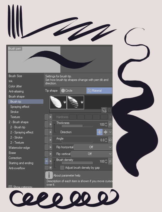
i also quite often use the regular round tip G-pen that comes with clip studio. when i use this one i play around a lot with line weight and varying pressure in my lines to make the lineart look more appealing and... organic i guess? i don't have any fancy settings on the brush itself i only use differing pressure on my hand for this lol. here's the pressure profile on my tablet sngdjkfghs idk if anyone is interested in this but!!!! here you go its nothing special

and then my current absolute favourite brush for lineart is this one called Brush Pen which i also think came with clip studio but i honestly have no idea. it's not in my assets downloads so either it came with the program or it's an older brush i transferred from photoshop, i have no clue! but i love it and i use this one for my lineart and flat shading in pretty much all my drawings rn.

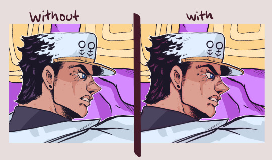
as you can probably tell i like my lineart a bit crunchy and textured. i never use plain black for my lineart, i either use a dark blue/purple or a rich pinkish red or brown. it makes the lines look less flat and muddy together with the colours. i also duplicate my lineart layer, and the duplicated layer i put underneath with a gaussain blur filter on. this one i usually shift the colour to a little more red/pink and also put the blending mode on overlay to sort of blend together nicely with the colours! :) see below what i mean, it looks way fuller and nicer with double lineart i think! but this is just personal preference (i used Brush Pen for lines here btw!)
anyway, more brushes:
Halftones, textures, effects etc:
Grunge Dot by Marredae (content ID 1777009)
Tone Brushes by seinotaph (content ID 1835931)
Glitch Brushes 2 by tsiox (content ID 1719160)
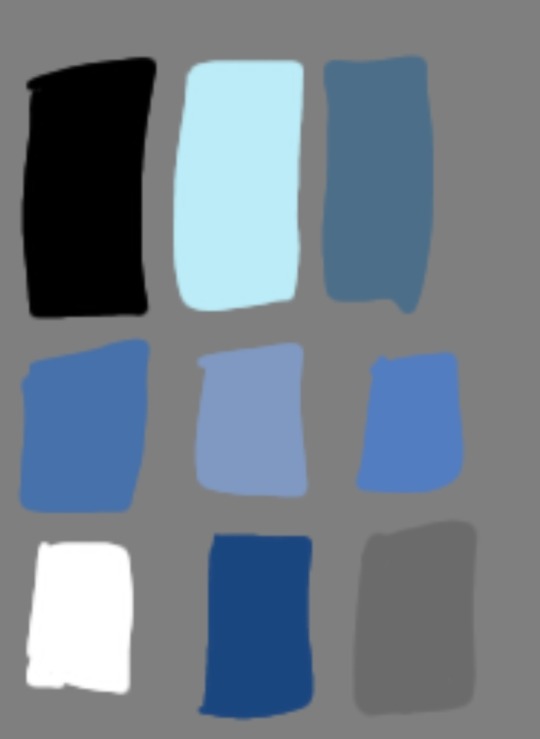
these are my current favourites! ^^ i don't like using too many brushes at once and i also always keep a balanced limited palette while colouring. here are the ones i'm using rn but i'm currently working on making it just one palette with all the colours i might need. it might take a while because i always forget to add colours i'm using and i want them all to fit nicely together

my colouring is done by using the lasso fill tool to get even flats i can easily select and shift the hues and colour balance of later if i need to. i use the Brush Pen for simple shading, after that i just go crazy with different blending mode layers (multiply and glow dodge my beloveds)
that's pretty much it i think, feel free to ask me a billion questions i love answering them!
#clip studio#clip studio paint#digital drawing#digital art#clip studio assets#brushes#csp brushes#csp#digital artist#digital illustration#corps art
19 notes
·
View notes
Photo

I don’t have any plans for more art this month (mainly because I have to work on some art for a history project), so here’s my summary of art for 2020!
I improved a lot this year, since 1) quarantine and 2) tumblr. I actually had a place where I could share my art, so it motivated me to draw more.
(Below is me talking about each drawing)
1. Octopath Traveler - Olberic Eisenberg
Now, technically it’s not just him. It was supposed to be Alex Beckham as him. I drew this having never played Octopath Traveler (although I do plan on getting it). I didn’t know how pressure sensitivity worked, I didn’t know how to shade or highlight, and it was overall a mess.
About the bow in the background: That was supposed to be another Internet Remix member as H’aanit. I also drew JoJo as Tressa on that page, if I recall correctly.
2. Let’s build a campaign setting - Tatrasiel, the fallen angel of decay
I loved her, so I drew her. I just loved how she tried to be good, but kept forgetting she was a fallen angel. I feel really bad for her. :(
This was a mess. I tried to shade/highlight, but it turned out really bad. Plus, I had no idea how to draw wings.
3. Fallen Empires - Ravanala, the elven barbarian
Session 76 of Fallen Empires was quite sad, and I wanted to draw Ravanala in battle before she was sent to the astral plane. Again, this was another shading attempt that didn’t go well. I started to learn how to use actual drawing programs that weren’t Procreate. This was made in FireAlpaca64.
4. Fallen Empires DM and PCs
I wanted to draw something cool related to FE. This was another shading attempt that wasn’t awful, but it’s too faint. I didn’t know what colours I should’ve used for shading so I ended up using dark purples for a while. The layers were not on multiply, because I didn’t know what multiply was. This was made in Medibang Paint Pro.
5. Fallen Empires - Lady Fomhar, an autumn eladrin
I drew this for Feytal, a song that I decided to add lyrics to. As you can see, the lighting is much better than the previous ones. I started to understand how lighting worked. My lineart became a bit smoother.
6. Fallen Empires - Korellian Veles/Hespera Scion/Trevlon Bluequill
Session 96(?) got really sad and Korellian ended up telling Skam about how they loved Trevlon, but felt conflicted, since their paladin oath is around reviving their wife. This ended up winning a Camp Streamix week.
7. High Hopes Low Rolls - Gwing Veloce, the half-elf rogue/ranger
I started watching HHLR, and decided to make art of one of the characters. This art of Gwing was one of the drawings that I used a soft brush for shading.
8. The Dragon Prince - Janai x Amaya (Janaya)
I love this ship so much. I also wanted to draw something gay. I didn’t put too much effort into the lighting, but I tried to draw better clothing folds on Amaya. I’d say it looks okay.
9. High Hopes Low Rolls - Paddock Whitlaw (screenshot redraw)
I basically replicated Alex’s art in the video, so I didn’t really do anything. It was mainly just me observing the original art and doing the exact thing in the redraw. However, the art did help me change things about my art style (mainly the way I draw noses). I made this in Clip Studio Paint PRO.
10. Call of Cthulhu: Masks of Nyarlathotep - Poster?
CoC started again on the IR channel, so I drew that! Comparing it to the Octopath Traveler art, you can see that my lineart, lighting, poses, and anatomy improved a lot. Lester was good for finding different brushes that I could use to shade.
11. She-ra and the Princesses of Power - Double Trouble
I love DT so much... this helped with lineart. If you can’t tell, I played around with pressure sensitivity. This was also good lighting practice.
12. Let’s build a campaign setting - Queen Psalm
I mainly did this to see if I could paint without a tutorial... and I did! This was lighting practice, and if you can’t tell, I actually used reds on some of the highlights because there’s a sunset. I don’t usually do highlights based on where the character is (even though I should). This was obviously also painting/lineless art practice.
#high hopes low rolls#she ra#the dragon prince#dungeons and dragons#art improvement#summary of art#internet remix#spop#hhlr#tdp#dnd#my art#artists on tumblr#yes i did use the loz font for my username
31 notes
·
View notes
Photo

Being Alive Sucks
08. Respite
Lineart and base colours done by @aurantia-ignis.
_ _ _ _ _ _
Caves, Gladion thought with a wince, were obviously nowhere as comfortable as a bed.
Still, they were a better choice than being caught out in the open, in the sunlight, where Moon would be vulnerable and it'd be far too easy to be surrounded. At least it offered some security. Their campfire was angled towards the entrance, where a large rock in front of it provided an adequate shield for the sunlight from leaking through- a fact that the vampire he was travelling with greatly appreciated. This deep in the forest, they'd be able to hear any attackers before they appeared, and the narrow entrance also meant that Gladion could mount a sufficient defense against potential intruders while Moon slept.
But despite their arduous trek through the night, Moon was, unsurprisingly, not exhausted at all.
"Vampiric stamina," she said when he groused about how she looked the peak of health. She grinned, her fangs showing. "Winded, Gladion?"
He grunted in response, trying not to bristle under her gaze. The fire between them shone an eerie light into her gray eyes, sharp and cold. It was the one feature that always betrayed her- despite her dainty frame and elegant clothes, there was no disguising the predatory look in her eyes.
Gladion didn't very much appreciate being prey. Not from his mother, and not from Moon. But if he had to choose one or the other, well... at least Moon wasn't out to kill him. Yet. And of course, there were other... benefits.
He flushed at the thought, but the circumstances- and the hard ground underneath him- quickly snapped him back to the present. Moon was still watching him, and with a telling smirk, she winked at him. With a huff, he glanced away, back to the barely visible cave entrance.
It was probably past midnight, maybe sometime into the early morning. After travelling for most of the night, avoiding the tell-tale signs of the assassins dotting the main road and opting for the harder journey through the forest, exhaustion was creeping up onto his muscles and limbs. Gladion was used to exertion, but continuous nights of this game of cat and mouse was starting to wear on his mind, as well as his body.
Then Moon shifted, poking at the fire. She'd been unusually docile all night, considering. No wanton advances, no horribly ill-timed dark jokes. Sure, the smile on her face never wavered, but still-
"Are you hungry?"
Her eyes shot up to him, and he caught faint surprise on her face before it quickly morphed back to her usual smirk. "Coming on to me? In this cave?" She tutted, shaking her head. "Have you no shame?"
"No, I'm- I'm not-" Gladion drew in a deep breath, scowled at the vampire that was both his bedmate and his potential-killer. "It's been a hard journey. I had dinner. You haven't. Not in days."
"And you're offering your blood out of the kindness of your heart?"
Gladion's cheeks and neck were burning now. Not just from the memory of her mouth and fangs on his skin, but also at the patronizing smile she wore. Moon was no human, wasn't capable of empathy or kindness, but she was the only reason why he was alive, so-
He unbuttoned his shirt, tugged the collar to reveal his neck. "Here," he said. "You should feed."
There was no telling what went on behind Moon's too-still smile. Still, there was a slight pause before she tilted her head. "You don't even want me to sleep with you?"
"I need you at full strength tomorrow night," he answered. "And after the difficult terrain tonight, it wouldn't be right for me to expect you-"
She laughed at him. A sharp, ringing laughter that echoed throughout the cave. Clutching at her sides, Moon doubled over, any semblance of poise gone.
And when she finally wheezed out the last chuckle, her silver eyes flicked back to him. "Ever the gentleman, aren't you, Gladion?"
Gladion scowled, tugging his collar back. "I'm just offering you food. If you're not hungry-"
She moved quicker than his eye could follow. Within a breath, her hand was on top of his, her face just a few inches away. Gladion froze, all too aware of the coy smile she was wearing, the deathly chill of her touch despite the warm fire not a few feet away. The predator's look in her eyes.
The heavy thumping of his heart and the anticipation in his veins.
"What's food without a little fun, hm?" Her voice slid across the stone floor, cold and soft and full of a tantalizing promise.
"This isn't exactly the time to have fun," he muttered. "Or, the best place."
"Ever the gentleman." She smirked. Then, without a second's hesitation, she kissed his neck. Softly, teasingly. Her tongue, wet and cold, sliding across the half-healed punctures where she fed from him last. He gasped, tensing. But instead of the quick pain of her bite, her hands slid down the parting of his shirt, onto the skin of his chest. Fingers spread wide deliberately as they teasingly made their way down his torso, nails glancing across his skin.
"Moon-" He was trembling now, his voice strangled as she pulled herself onto his lap.
She lifted her head. But instead of her coy smirk, there was a gentle smile, one that warmed the chill of her eyes.
"Gladion," she said softly, his name on her tongue sending shivers down his spine. "A deal's a deal, and if you're a gentleman, you'd honor it. At least, let me have a little fun, hm? To ease the tension of the... day. And as a reward, for protecting you. I'm sure you'd enjoy it, too."
He narrowed his eyes. Swallowed. "There could be assassins right outside, waiting to kill us."
Moon laughed- the suggestion that human assassins could sneak up on her was ludicrous, but that she would dismiss it so easily set a tight knot in his stomach.
Still, before Gladion could retort, Moon stilled him with a cold fingertip on his lips. Traced it down his jaw, along his throat. Watched him with eyes full of predatory intent.
"Then at least we'd die in the throes of pleasure."
He didn't answer, but when she kissed him again, he responded by parting his lips and pulling her close. She wrapped her legs around him and, with urgency, pushed him down to the cold, hard floor. The aches and pains of his muscles faded away as he gave in to her, let her touch stir the fire within him.
If nothing else, he had to admit- it was fun. It always was, with Moon. It was the only time when she resembled anything but the vampiric creature she so usually was, when she was warm in his arms, when her cries and desire mingled with his and he almost forgot she was a monster.
At least until she bit into him, and the sharp pain sent him over the edge in ecstasy.
She fed on him as he came down from his high. Through the dizzy fog, he was vaguely aware of her naked weight on his lap and the sounds of feeding just above his collarbone. Of the gray eyes, framed by dark hair, flicking over to him with some measure of warmth even as his blood dripped down her lips.
"That wasn't so bad, hm?"
He managed a nod, and her soft chuckle rippled through his skin. A faint brush of her lips against his, the metallic taste of blood against his tongue... and then she was gone. The strange weight and unnaturally cool body disappeared, a disorienting feeling. Gladion blinked. Faint sunbeams streamed through the crack of the cave, and with a start, he realized that it must be dawn.
"You should sleep, too," Moon murmured. She stalked some distance away, before settling down on a flat part of earth.
"So that I won't stake you?"
"You need me," Moon smirked, crossing her arms to cradle her head. "You won't stake me till then. Besides, you enjoy my company. But no- you should rest, Gladion. Nobody will attack us here."
"You don't know that-" he began, but with a roll of her eyes, she turned away from him.
"Ever the gentleman."
Gladion stilled. It wasn't until she said nothing more that he realized she had already fallen fast asleep. And with a strange pang, he knew their conversation was at its end.
Quietly, he pulled on his shirt and pants, made a mental note to take a bath at a nearby river before the night fell again. Considered whether he should take Moon's advice to rest, or to keep watch over the vampire that sometimes felt more enemy than friend.
She slept soundly by the dying embers of the fire. Despite her nakedness, she seemed unperturbed by the morning chill- yet another side-effect of vampirism, Gladion supposed. It still unnerved him to see a woman so casual with her body around him, and as much as he wanted to remind himself that Moon was a vampire, a monster, someone who was preying on him, sometimes... he wondered.
Towering over her, it was so easy to imagine how quickly he could rid the world of her. While it was true that he desired her power, it was also true that she was a monster, and during the day, when she was vulnerable, he could easily kill her.
But the look on her face wasn't arrogant or coy- just at peace. The smile she wore was... uncharacteristically gentle. Part of him wanted to tuck her hair behind her ears, just like he would Lillie's, when she was much younger. In the faint light from the embers, there was a warm hue to her skin. Perhaps almost like how she would have looked, if she was alive.
His throat tightened at the thought. And, unbidden, his hands moved.
Quietly, Gladion picked up his coat and her petticoats, and tucked them gently around her form. Hesitated, before brushing a finger across her cheek and tucking a stray strand of hair behind her ear.
She shifted at his touch, leaned into him. But she didn't wake.
Something twisted in his heart, and as he backed away, Gladion couldn't shake the notion that he'd intruded into something vulnerable and soft. Something Moon would probably not have wished for him to see.
He was her prey. She was a monster. Something he'd made a deal with in order to keep his family safe. Something he knew would kill him without hesitation, and would, once his use to her was at an end. It was something he'd come to terms with already.
But in the early dawn, in that brief moment when she was asleep, she looked... human.
And as he sat down on the stone floor, settled in for a long wait as the sunbeams warmed the cave... Gladion imagined he would have liked to know that Moon a lot more.
#being alive sucks#lonashipping#finally a fanfic for this au XD#also finally warm lighting instead of always being lit by moonlight!#... BAS art is almost entirely night lighting hahahaha weeps#also yes moon be shameless
45 notes
·
View notes
Note
i just know you just for a few days (because I was offline for months), and now you're one of my favourites blogs!! so, direct to the point,, i really like your style- could you show your tactics, what brushes do you use, what art program and how do you choose good colours? i'm sorry if that's too much, i am just very curious :))
aww thank you so much! i never showed anyone how i draw, so this might be sloppy, but bear with me
(I use Photoshop to draw. and I use a wacom tablet)
sketch
ok so the first thing is sketching, obviously. for a lot of the drawings on this blog I don’t sketch because the objects are usually easy to draw and I don’t need a sketch.
line art
then there is the lineart. so I pretty much always use the pencil tool instead of the brush tool because it makes all the other steps (coloring, shading, etc.) MUCH easier. yes, it has some cons but that’s just what I like to use. usually for the little doodles for requests I make I use a size 4. if I’m drawing humans I’ll make the size bigger (6-10). I also mostly don’t use pen pressure but lately I started kinda using it. but the problem with the pencil tool’s pen pressure is that it looks like garbage. SO I invented a way to use pen pressure with it looking kinda descent. there are probably other ways to do it but I’m dumb.
(I would suggest doing this tactic on simple drawings, like the objects)

first of all draw using the softest brush, the size doesn't rly matter (dont use 600 lol) use the pen pressure of course

merge the layer with the drawing (the drawing must be black) with a completely white layer

double tap the layer and slide the (first) little white triangle to the left until the drawing looks the way you want (the more it goes left, the thinner the lines will be)
next merge the layer with a completely blank layer (this is important)

press this little button and make ur brush big and draw black on the whole drawing.
and you’re done :D you might need to a bit of fixing tho. (also I suggest to not use black for line art but I’ll talk about it more later)

coloring
basically it’s don’t use gray... put a bit of blue in it. and don’t use eye strain-y colors (also I’m just saying this rn, there is no right or wrong way of coloring or drawing, this is just how i do it) also I use very dark purple/blue instead of black

also photoshop has this little warning when the color is really bright, so you can click on it to fix it but sometimes it’s not enough for me.
using a color palette on a character is also useful and reusing colors but sometimes I’m too lazy for that.
the filters i put on the drawing at the end also are really important to the drawing so you can skip to that if you want.
shading
pretty much put the shading the opposite of where the light source is coming.

this is what i use for shading:


the colors aren’t consistent.
more shading/highlights/coloring/whatever
after im done shading i make another layer between the color and shading layers. use the magic wand tool to pick one color from the drawing and go to the new layer, color pick the shading on the color you picked
(ps idfk how to spell its almost midnight shut up) and use the soft brush to ad a gradient under the shading with the color of the shadow

and set the opacity to 40%

color of line art
first of all don’t make the line art black, i use a dark blue/purple. it also depends on what colors I used for the drawing

then on another layer I ad color to the line art if it has the same colors on both sides of the line. (use the color of the shading of the color thats on both sides but darker and ya know play w/ it a little)
highlights
just...

small details
filtersssssss
well at this point ur pretty much done but lets make the colors looks better!
put all the layers in group. copy that group. marge all the content of the newer group (the second group should be on top of the first one). click the merged layer and press ctrl + b

play with this how you would like.
press ok and then ctrl + u
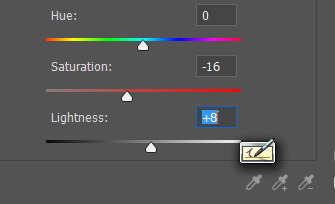
I usually make the saturation lower and the lightness higher. and lower the opacity of the layer
more filters!
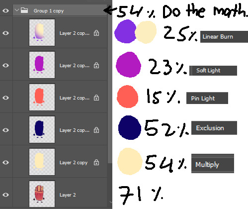
it’s not consistent. you just kinda play w/ it

AND THAT’S IT
conclusion
this post is way too long and idk how to explain shit and i prob could have drawn like 5 drawings by the time finished reading. if anyone read even.
26 notes
·
View notes
Text
Guide to Making Art with a Mouse
(under the assumption that you know basic photoshop)
too broke to buy a graphic tablet? read on, my friend
1. The Lineart
there are two ways to do this:
a. using photoshop’s pen tool
make a path using the pen tool (you can find tutorials online, look for ‘how to use the pen tool’)

now, right-click on the path and choose ‘stroke path’
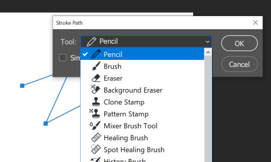
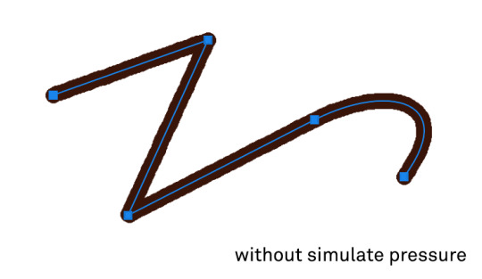
we’ll be using mostly the pencil and the brush tool. if you want to add some variation to the width, check the simulate pressure box - it makes the ends taper. i chose the pencil with a slightly large size:

(note: photoshop’s brush tools offer many options, you may want to experiment with their styles and shapes. you can also download different brushes online)
this method however takes a lot of time and effort - and although it provides a clean look, the end result may not be that satisfying. so i prefer another method:
b. drawing traditionally and then cleaning up the sketch
i draw on paper and then transfer the drawing to my laptop. i recommend you use a coloured pencil for a rough sketch, and using a graphite pencil (you can also use a pen/ink-brush, whatever works for you) only for the final lineart (you’ll see the reason why). i then take a photo in camscanner (you can do cool things with it too), and then save the image. this is what one of my sketches look:

to extract only the graphite lines, follow this video by Sycra.
i’ve made actions for them too (link)
how to use the actions:
1 - export them into photoshop
2 - run step 1
3 - in the layers panel, you’ll see an adjustment layer named ‘make adjustments here’, double click on the layers icon. now -
if you feel like your sketch has become too light - move the gray slider (marked blue) to the right until it looks good
if you feel like your sketch has become too dark - move the gray slider (marked blue) to the left until it looks good
if there’s a lot of unwanted marks around the sketch - move the white slider (marked red) to the left
basically, just play around with the sliders until the sketch looks good (that is, background completely white, with no loss in the graphite pencil lines)
you can stop here and change the lineart layer’s blending mode to multiply and start coloring underneath it, but if you want to completely remove the white background and make the lineart a custom color, continue -
this is what mine looks so far -

pretty good, right? anyways:
4 - run the step 2 action
now if you want to change the background color, just double click on the color fill icon the the respective layer
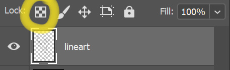
if you want to change the color of the lineart -
make another layer above it, right click on it and select ‘make clipping mask’
color it however you like :)

alternate method - lock the transparency of the lineart layer (circled yellow) and paint as you normally would
i know that this method makes the sketch seem too rough, but i haven’t found a better method to work with yet
that’s it for the lineart!
6 notes
·
View notes
Photo
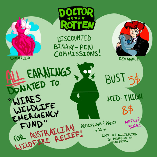


Hello hello! Currently wildfires are ravaging Australia, taking the lives of both humans and animals alike. These fires are devastating to the ecosystem. All money I make from these commissions I will donate to the following charity: www.wires.org.au/donate/emerge…Please reach out to me by email ([email protected]) or DMs on any of my social medias.
Each piece will be finished in Binary Pen (the hard, pixelated brush), flat/cell shaded, and have a single or bicolour minimalist background. Lineart may be coloured if I think it'll work well with the piece (you can opt out of this).
Busts are 5 USD, mid thigh is 8 USD. Addition of a larger prop will add 1 dollar. Total cost is multiplied by the number of subjects (so two people will double the price, three people will triple, etc...)
I reserve the right to refuse any requests I feel I can't commit to. Any pieces that (for whatever reason) do not get completed despite payment being received will be refunded. I won't donate the money until the requested piece is finished.
To purchase NSFW (Pornographic or Erotic art) you MUST be 18 years or older.
Transactions will be made through paypal.
I'm going to start by opening THREE slots. You can see the availability of these slots at this link
You can also just donate yourself if you prefer at the charity I linked, if thats more your thing. Please spread, thank you!
8 notes
·
View notes
Photo


Prepare for Trouble, and Make it Double!
[Team Rocket’s Jessie and James, Streetwear Ver.]
wasn’t sure whether or not to give james white pants or black pants hmm
also the hard part about giving him a “modern” hairstyle is making him not look like butch though he’s ended up looking kinda like cyrus
i think this was a fun experiment! a little wonky looking but that’s all my art
simple colours and shading, keeping it plain but im happy with these? i think it’s cute, more of a Generic Anime Look©
i love team rocket so much they’re So Good™™™
i used the pencil brush on photoshop this time and man it really makes lineart a lot easier huh
two backgrounds bc yall already i know im indecisive as hell with bg’s
first one might make a fun print idk (ツ) anyway please enjoy
references for jessie:
luxury ball for mimikyu
snake tattoo for ekans/arbok/seviper man she loves snek
yanmega and dustox rings
zig zag on the hem of the jacket for wobbuffet
in hindsight i wish i had given her the egg necklace kjfsgkhfjkhj
references for james:
team rocket bottlecap from training daze
classic rose™
crossbones hair clips for koffing
chimecho earring and jacket zippers (he should be fine by now give him back)
keychains with yamask, victreebel, growlie and mareanie
#pokemon#pokemon fanart#pokeart#team rocket#team rocket fanart#team rocket trio#rocket dan#jessie and james#pokemon jessie#team rocket jessie#pokemon james#team rocket james#musashi and kojiro#ポケモン#ロケット団#ムサシとコジロウ#modern au#streetwear#casual wear#street fashion#casual au
99 notes
·
View notes
Text
Post 3
I officially started work editing for Rian this week, and tried editing both colour and black and white images. Putting the techniques I’ve learned into practice was slightly nerve wracking initially, causing me to work very slowly in the beginning. The first few images I edited were black and white, and by adjusting the ‘levels’ I was able to edit out any blemishes and remove the brown paper background which most raw images had. I then attempted some colour images which weren’t too detailed, so using the fill tool with a medium tolerance was enough to retouch the image. After the first ten or so I sent the completed edits over to Rian for his feedback. He pointed out that I should use the dodge and burn tools to remove any blurry edges in the black and white edits, to make sure colour edits were set to CMYK, and that I missed a few counters (the holes in letters) when filling in block colour. With this in mind, I went back and revised the edits in line with his notes. I double-checked that they were adequate, and with Rian’s approval, carried on with the rest of the folder.
(Blurry edges from one of my earliest attempts)
As well as starting editing, I also completed my first commission. The client wanted a comic page depicting a Baz Luhrmann’s Romeo and Juliet au (shorthand for alternate universe among fandom) with members from a kpop group. While all my commissions involve kpop idols - I typically move in the kpop-sphere on twitter and it was there I advertised my services most vehemently - this commission was engaging and enjoyable. When creating a comic page there’s always the question of panels and layout - how can you depict a narrative with static images?
I decided to rewatch the specific scene the client wanted me to recreate and brainstormed how I might reinterpret it through illustration. I consulted Wally Wood’s ‘22 Panels That Always Work’ to remind myself of some effective compositions and created a rough sketch. I didn’t deviate too much from this initial plan but I refined the overall look in the inking process. Once I was happy with the lineart I then had to decide on a colour scheme. In my work I tend to avoid colours which are true to life, favouring a limited palette instead. Orange is one of my favourite colours to work with, so I created a harmonious palette around that, primarily using mustard yellow, auburn, turquoise, and accents of royal blue. With this colour palette I feel I was able to create a piece which is reminiscent of the film, yet displays my own artistic flair. I finished the commission by adding a quote from the play and using a halftone brush for some subtle background detail.


(Rough sketch and finished piece)
On the whole, I’m pleased with the outcome (though I see room for improvement as always) and the client was very appreciative, which is of course the most important thing.

(A satisfied customer!)
0 notes
Last Seen Blogs
dabruxa
𝚁 𝙴 𝚅 𝙴 𝙻 𝙰 𝚃 𝙸 𝙾 𝙽 : 𝟷𝟽
dabruxa
𝚁 𝙴 𝚅 𝙴 𝙻 𝙰 𝚃 𝙸 𝙾 𝙽 : 𝟷𝟽

exoitzy
(୨୧•͈ᴗ•͈)◞♡
lulu-services
Requests are open!

woodmafinzoi
Heather