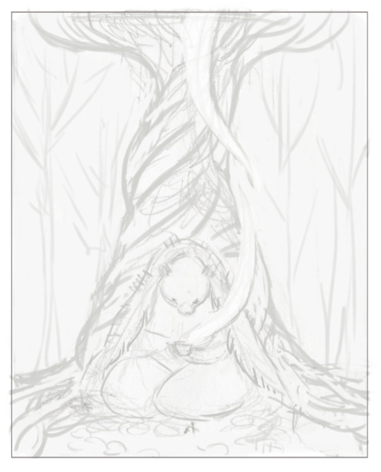
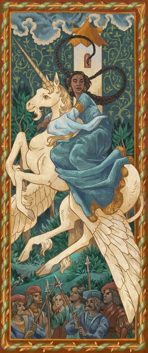
#might actually do this one into an illustration to print
Text

the wound
#digital art#christposting#jesus mention#the wound#religion#bible fandom#jesus fanart#jesus fandom#nsft#gore#might actually do this one into an illustration to print#maybe#i have so many wips#this is what happens when i sleep 3 hours in 48 hours#...no.. not rlly im always like this...
189 notes
·
View notes
Text
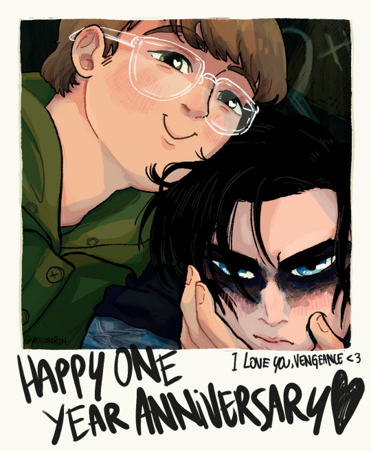
<3
#riddlebat#edward nashton#fanart#digital illustration#im kinda late to the one year anniversary of the movie but ive never been any good with dates and such#like i saw people anticipating it but i still wound up doing something very last minute haha#i might print this one to sell locally but im not really hopeful that its gonna sell#im really banking on the pr/oseka prints im gonna do to finance my riddlebat dependence#i might remove the text too and do it by hand with an actual sharpie#to add to the creepy vibes#oh idk if ive said on here already this but im pretty active on insta if you want you can check that out#its the same username so it should be easy to find#have a nice day and again happy one year to these weirdos<3
210 notes
·
View notes
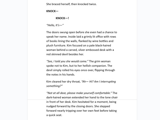
Text
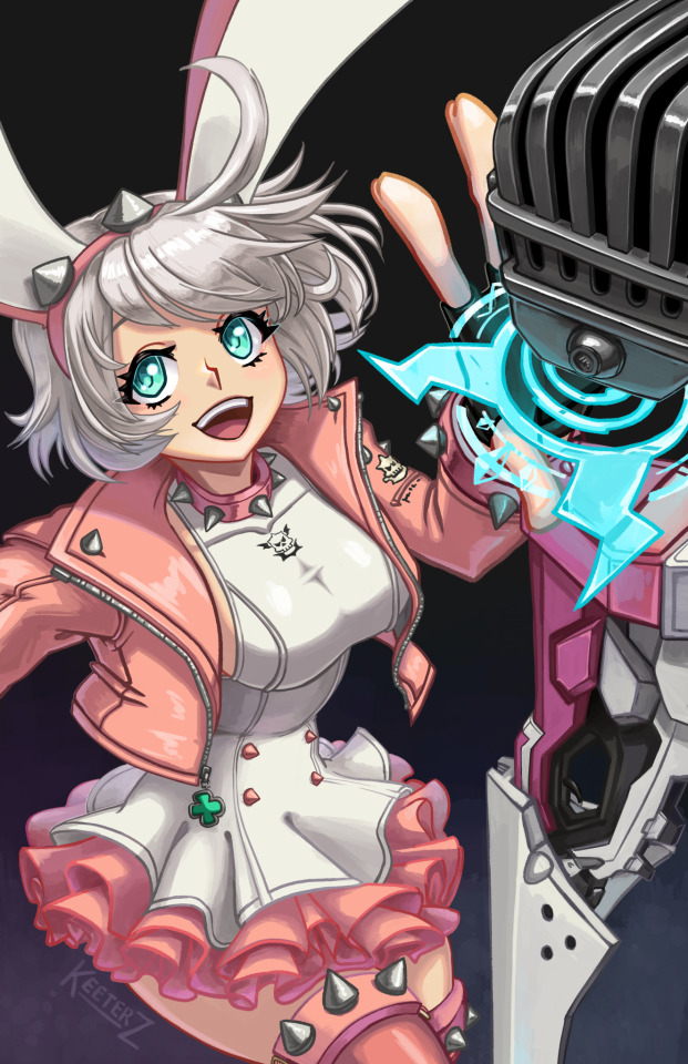
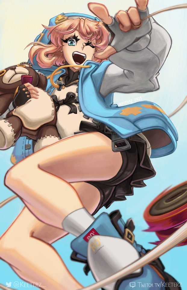
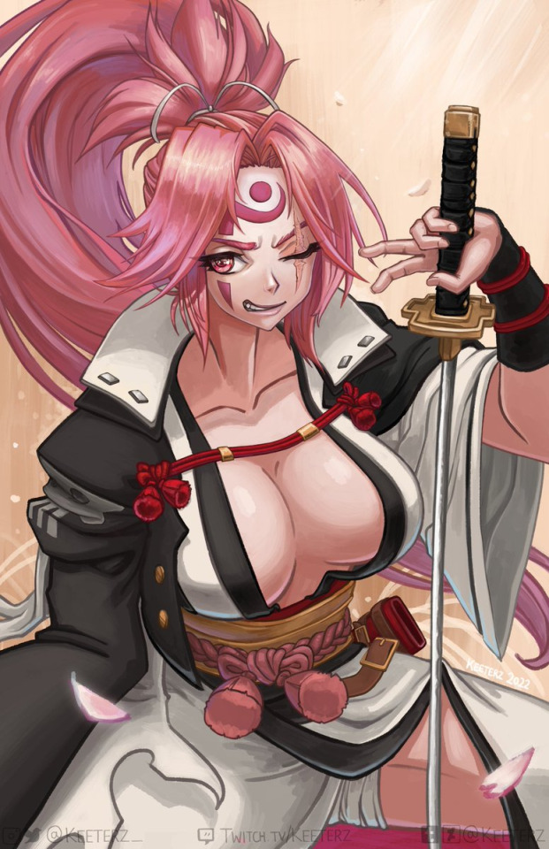
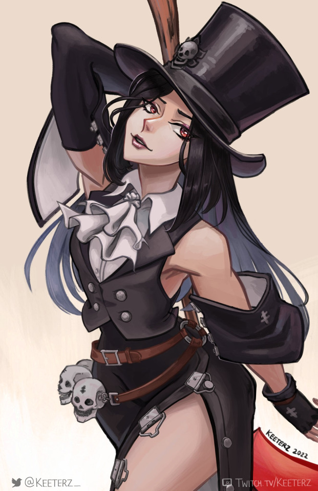

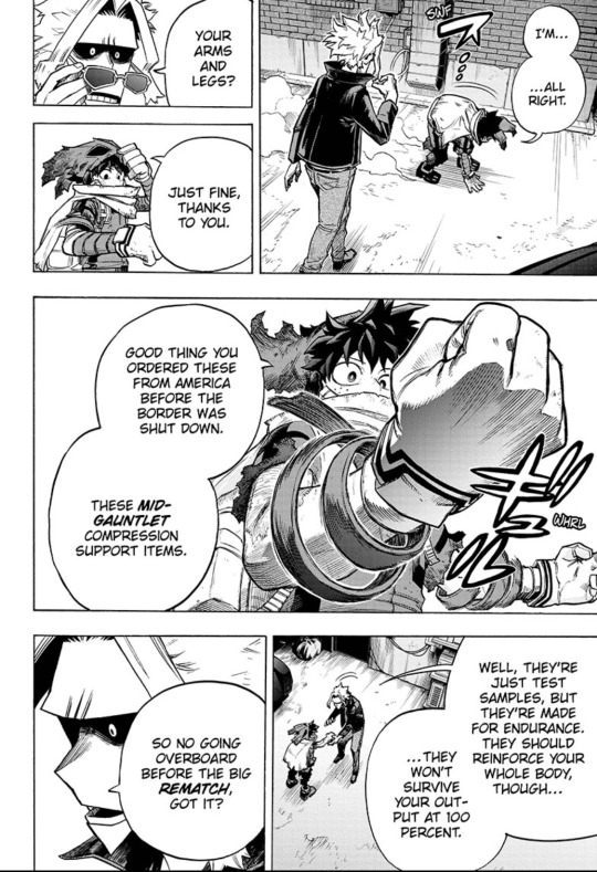
Time to make an updated post on the Guilty Gear artwork I've made up to this point!
First things, gotta include Bridget and Elphelt since these were made this year in 2023. Baiken, Testement, and Giovanna were done back in 2022. I think I'd like to do a Jack-O illustration at some point, and a friend of mine wants to help fund a Ramlethal print, so those might be coming up in the future at some point.
I've made some updates to the chibis as well to include a handful of the male cast! A few noteworthy mentions include an Axl that was inspired by an animation that my friend DoovadHohdan made, a Potemkin that works as a Pot Buster when you use it as a sticker on another sticker, as well as the husbandos in general being paired with plushies of their partners (well, missing Nago and Elphelt because that wasn't a thing at the time)

A little after the Elphelt illustration I also made an Elphelt chibi as well! This one will be double-sided once I convert it to a charm~

Finally, a sneak peak at something that isn't Strive related...well, not yet, at least (maybe). Here's a value comp for an ABA illustration I'm working on based on her Accent Core design! Hoping she makes it into Strive at some point.
I might want to explore doing some Accent Core related artwork in the future. Accent Core is a lot closer to the point of when I first got into the series in my middle school/highschool days, and there are some designs from the older games that are still hecking rad. Plus the music is awesome :D
It's kind of funny; I have to confess that I actually don't play Strive. Truth be told, the GGST movement and limited combo structure never clicked with me when the game first came out (and I was always more of a 3D fighter guy for gameplay with games like Tekken and Soul Calibur). And even though I am pretty sure I would actually thoroughly enjoy playing I-No and Elphelt with the season 3 changes, I just don't really do as much gaming these days since I'm more enamored with making art (and a few other things like biking). Plus I'm kind of just waiting for Tekken 8 at this point (dear god I hope the online is good just this one time god).
But as an artist? You bet your butt I hecking love coming back to Guilty Gear. I've been a fan of the series since the early 2000s (back when I stumbled across an abandonware PC version of Guilty Gear X and became sold on the series). The characters from this series check a lot of boxes for things I love to draw, from the way they are designed and all of their classic rock references all the way down to their zany personalities and backstories. And I feel like Guilty Gear is really special in this regard for me. Even though I'd rather play other fighting games (like Tekken or maybe even SF6), Guilty Gear is probably the one fighting game fandom I want to do art of the most.
If you are a Guilty Gear fan stumbling across this art collection post, hope you are enjoying the art! I will enjoy the series vicariously through you as I get back to working on some Tekken 8 artwork for Frosty Faustings, lmao. And if you're someone who is new to the series, give Strive a try! It's neat and the characters are great.
#guilty gear#ggst#elpheltnation#elphelt valentine#Elphelt#Bridget#Baiken#Testament#giovanna#giovanna guilty gear#elphelt ggst#elphelt guilty gear#testament guilty gear#bridget ggst#bridget guilty gear#sol badguy#ky kiske#ramlethal valentine#axl low#potemkin#i no guilty gear#i no#may guilty gear#millia rage#nagoriyuki#johnny guilty gear#goldlewis dickinson#aba guilty gear#fighting game fanart#fighting games
784 notes
·
View notes
Text
it's a story about hands (reprise)
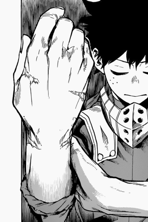
Yeah, okay, today's the day.
I gave my blog that title for a reason, you know, and it has loomed over me for years because the hand motif is absolutely everywhere and you could go on about it forever.
Maybe that's something I'll never actually attempt to do, but this chapter, we reached a breaking point.
Before I continue, I need to give a big, big disclaimer: I do not have a physical disability, so I'm not able to speak about that from the standpoint of representation as a first-hand perspective. I have at least listened to enough disabled people to know that fictional characters who become amputees only to miraculously gain their limbs back is, um, a trope. Disabled people in general being "healed" is a conception we would really prefer to avoid here. Not to call people out, but I don't think we're giving enough space to acknowledge that.
I don’t feel comfortable making the judgement call about what should happen. I’m leaving that open. I also don't want to downplay people's emotional reactions. Honestly, I don't know if I can accurately define the line between acknowledging real pain vs. ableist pity. But I’d like to talk about the possibilities of what could happen. Other characters have definitely gotten permanent disabilities as a result of their hero work, or even just the side effects of their quirk. But, for better or worse, I don't think this case is really about representation. Not that Horikoshi won't do that justice. He might. What I'm saying is that's not his purpose for having Izuku lose his arms. It's meant to be symbolic, so we can explore what it means. The other thing I’m keeping in mind here is that Horikoshi is notorious for playing with our expectations, like, alllllll the time. I mean, just take a few chapters ago for a classic example. Eri appeared at the end, and we all assumed she was about to take some sort of action to save someone with her quirk. Then, immediately following, we were given an explanation for why that wouldn’t be happening. And now it’s clear he wanted to do that “fake out” not just as a silly cliffhanger prank, but specifically so we would know not to suspect that Eri could be the miraculous solution to Izuku’s loss of his arms. Rest assured, there is no easy way out of this.
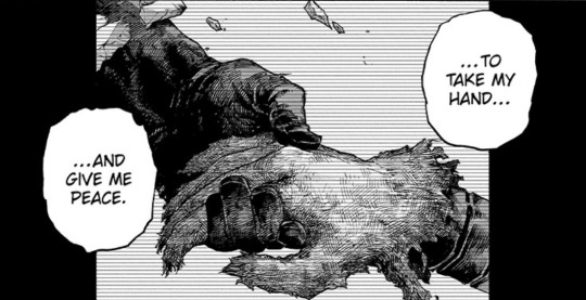
The expectation at play in this particular instance is an old one. It’s very understated, but its subtext has burned so brightly, you’d be a fool not to notice it. It sits with anticipation like one half of a call and response. Man, I was so certain. Lots of people still are. I was really looking forward to printing the panel where it happened onto a t shirt and wearing it proudly. All the hand motifs in this story radiate thematically from a single moment, the one that started it all for Izuku.
It raises all kinds of questions about the act of saving, who needs saving, why, what does it mean, what are the dynamics of power, politics, honesty, exploitation, compassion, pity, disdain, sacrifice. Katsuki has dealt with many of these since he first rejected Izuku’s hand. While Izuku was the one who was convinced Katsuki would keep on rejecting him…
…Katsuki was the one who kept that moment in his mind all these years and eventually came to regret it.
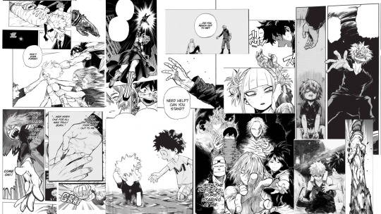
Katsuki is the one yearning for that hand-hold, the one who has imbued it with so much more weight than it ever originally had. Izuku, in contrast, does not allow himself to dwell on what he wants. To illustrate this difference, we need to look at another piece of foreshadowing:
Ugh, do y'all remember when lots of folks were complaining about how there never seemed to be actual consequences for Izuku's destructive treatment of his own body? I don't blame them, I was concerned and confused about it too. There were several "fixes" along the way. Recovery Girl healed him, but left a physical reminder. Then he started training to fight with his legs… sometimes. Then he got support items. All of these were unsatisfying non-conclusions because they didn't present Izuku with a lasting enough impression to change in a meaningful way. They didn't address his core, his origin.
Of course, that all changed this chapter. Now it looks like our frustration was inflicted intentionally. With the current context in mind, all of these moments look more sinister, like this day was always gonna come because they kept putting bandaids on a deep emotional and psychological wound.
The problem is pretty much spelled out for us here:
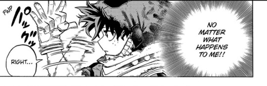
As Katsuki put it, he just doesn’t take himself into account, ya know? He doesn’t care what happens to him. And he lies about it, to keep others from worrying, to keep them safe. To keep them from returning the favor and putting themselves in harm’s way for his sake. His motivations are noble,
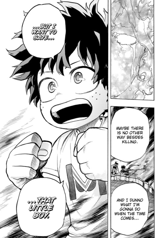
…but what about the little boy inside Izuku? Who saves him?
This is all about Izuku giving himself up to the point that he literally has no more to give. The thing is, I bet he saw this coming. He knew his limits and decided to keep going anyway, because his personal safety and wellbeing are not important. Now that way of thinking has come back to bite him because the fight isn’t over yet, and he’s already made his sacrifice. So now we know who will be more distraught over this. Not Izuku—Katsuki.
It’s not about Izuku becoming disabled, it’s about how Katsuki wanted to use the intertwining of their fingers to communicate that he would never let go. Never stop valuing him most. Never let himself make the mistake of rejecting him again. Never let Izuku be so reckless with his life. To say: “we are in this together.”…if only Katsuki believed he deserved to be able to say such things. To reach out his hand would have been the ultimate way to simply imply them and let Izuku be the one to decide. Then, to feel their hands clasped together would be more than either of them dared hope for, but so beautiful, so right. A moment they’ve waited their whole lives for.
Yeah. That’s what we were expecting. We’ve been so comfortable. Horikoshi gave us all the signs. He tempted and teased us over and over. BUT. You know he does this thing were he gives us a desirable, completely plausible and simple thing to look forward to, and then he snatches it away. And THEN he replaces it with something much better, something we were not expecting at all because it seemed too good to be true. That’s exactly what happened when Himiko snatched Izuku away, and we were robbed of the chance to see him and Katsuki fight together. In hindsight, though, I’m glad things went a different way because now there’s so much more depth and angst on display. Likewise, in the present moment, we may consider how, as one door closes, another opens.
As wonderfully meaningful as the hand-hold would have been, perhaps it is still too simple a resolution for Izuku, for his and Katsuki’s relationship. Tbh, it could have been done like 100 chapter ago. At this point, there’s so much more potential. There are a couple of ways it could go. If Izuku stays armless, Katsuki will be forced to use other methods to get his point across. He’ll have to do something else, or say what he means, or both. Yes, I’m talking about what you think I’m talking about. If I say it, I just might jinx it (lol), but I mean it. I’m being serious. Either way, if Izuku did get his arms back in the end, I’m sure that it wouldn’t be an easy fix. It would be hard-won against Izuku’s self-destructive mindset, and/or by Katsuki’s conviction. Again, I say this knowing it is not meant so much as a representation of disability, but as a representation of Izuku’s greatest character flaw taken to the extreme. I know this might sound harsh, like, hasn’t he been through enough? I get that, but… I’ve said it before and I say it again: Izuku is stubborn as hell.
I wish I had a resounding final note to end this on, but I kinda don’t. I’m not sure what’s best. Now we just have to wait and see what Horikoshi has in mind.
#lin speaks#bnha meta#bnha manga#bnha 419#mha#boku no hero academia#my hero academia#midoriya izuku#bakugou katsuki#bakudeku#bkdk#dekubaku#dkbk
353 notes
·
View notes
Note
I love your art so much!!! I've also been starting to paint with gouache, and I'd love to know a little more about your process! What kind of paints do you use, do you sketch first or start with paint, do you paint in layers over several day or all at once?
Hi and thank you! I hope you don't mind me answering this publicly and apologies for length, but:
MY ART PROCESS!
Supplies: I use winsor and newton gouache and arches cold press paper blocks, usually 140 lbs (the lime green ones) and sometimes 300 lbs (the teal green ones). Even though this paper comes pre-stretched in blocks, I actually take the sheets off and stretch them myself because I've found arches' glue isn't as strong as it used to be. This is how you get watercolor paper to lay flat! I recommend youtubing some videos on how to do it -- there's a lot of great tutorials out there. Also, I use princeton brushes, and kraft paper tape and these boards to stretch my paper. (these aren't affiliate links, I just shop at blick)
A word about art supplies: these are the exact tools I use but everyone uses supplies differently and two people with the exact same supplies might get different results! A lot of it is about what works for you and what you like, so I always suggest that gouache/watercolor beginners just buy a few tubes from a couple of different paint companies and some small pieces of paper from different manufacturers to see what you like. Just changing one ingredient in the above has created massively different results for me, but maybe that'll end up being something you'd like! The first step in learning a new medium imo is to play. Just have fun!
ALSO: gouache isn't super light permanent, check your tubes for which ones hold up to sunlight. Here is winsor and newton's color chart explaining which ones will fade when exposed to sunlight -- all manufacturers will give you this. I only use the colors rated A and AA, and I still frame my pieces with UV glass just to be safe. Not all gouache is re-wettable, but winsor and newton is. I just put it in my palettes and refill my palettes if it runs low. AND SOME PAINT IS TOXIC. A lot of paints have cadmium and cobalt in them. I don't use any of the toxic colors, but if you do, make sure you don't eat while working and wash your hands thoroughly afterwards. This information is also usually available on manufacturer's websites. As more people are rejecting cadmium paint, you'll see more tubes labeled things like cadmium-free yellow. This is why. More artists should be aware that their tools can be dangerous. You don't need that many tubes of paint to begin, just a warm and cool red, warm and cool yellow, warm and cool blue, white and black. I have around 50 colors and use 20 regularly. I always mix all my colors myself, and never use straight tube paint. Most of my colors have about 5-6 different tube colors mixed together. If you use re-wettable paint a tube of paint will last you years; even as a professional I only buy new paints every 5 years or so.
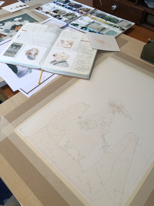
Process: I ALWAYS start with a sketch first. Not everyone has to, but because I do illustration work -- where sometimes a client gets input on a drawing -- I always do a lot of preliminary work before I even begin to paint. At this point, even my personal work usually involves the exact same process:
I start with a 3" or so thumbnail that I scan (left; I traced it quickly digtally for clarity to myself here) and then either clean up digitally or print out and clean up traditionally with tracing paper (right):

Then I scan the cleaned sketch in and color rough it digitally (left, this was for a gallery show, so no one had to approve my color roughs, so it's messy!) then I transfer my sketch to my paper (with either carbon transfer paper or a light table), stretch my paper, and paint (right):
I obviously changed my mind about the color of the ribbon in the trees, ha, and made everything a lot more vibrant. The benefit again of gallery work is no pre-approval!
You are correct, I paint in a series of washes, going from lightest to darkest, where I apply the same color beneath all shapes that are the same warmth (cools under all upcoming cools, warms under all upcoming warms). I paint a piece usually in one or two days, depending on complexity. I didn't take pictures of the above painting, but here's a different painting to show you a little bit what I mean:
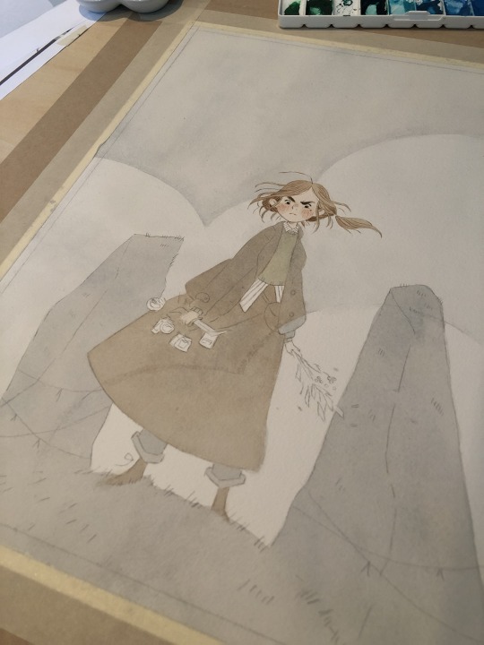
I painted the peach color under everything (and twice for skin tones), and the gray color of the sky under everything that would be grayish (the rocks, trees, her pants, her skirt, and coat). I do this to stop me from getting darker lines where two different colors butt up against each other, and also for color harmony. I have step by step photos of this in my process stories highlight on my instagram; also check my FAQ and tip highlights for more info on all this stuff. Most pieces take around 25-30 washes before I start adding in the details (sometimes I add in face details early though because if I mess those up it's not worth finishing the rest of the painting! 😅)
All this might seem like a lot of work (...it is) but I do it so that I can show clients previews of the final piece and so I don't have to repaint the finals. I also used to pre-test all of my washes on scrap paper like this:
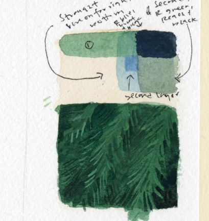
I still recommend doing this if you're just beginning! But at this point I only do it when testing techniques because I know my paints really well. (the above was my test for the pine boughs in this piece)
Painting by far is the longest part of the process, so I do more work up front to not have to do it twice. Every piece takes about 6-24 hrs of actual work time to produce. Stretching watercolor paper takes about 24 hrs to dry, and because I sell most of my originals in galleries, they need to be flawless, so planning ahead is useful and in the end saves me time.
And to conclude this novel of an explanation, don't be overwhelmed by all the information I've given you! I put it here so that people at various stages of their artistic journey can maybe find something useful in it. But seriously, the first step to learning how to paint whether it's traditionally or digitally is just to have fun. Try it out, see what's working and what isn't, and then try to solve specific issues that you're struggling with. I've been doing this for a loooooong time at this point, but here's my first watercolor piece from when I was re-teaching myself how to paint traditionally nine years ago:
Obviously, I was destined for greatness. Ha, yeah, no. If you scroll back through my tumblr archive, you can see me learning how to use these paints in real time. And keep in mind that I'd been working digitally for years before then, and years before that where I didn't post my work online at all.
So for anyone who needs to hear it: there's no such thing as talent, just hard work, patience, and trying again and again and again...and sometimes again. What I do is a skill and anyone can learn it. Sometimes, progress is slow. I'm 38. I only really feel like my art was half-way decent starting a few years ago, but I've been making art my entire life, and I went to art school at 18. 20 years later I'm kind of figuring it out.
The best advice I can give, whether it's about art or not, is find the thing you love so much that you'll keep at it even when you suck at it, because most skills you'll suck at to begin with -- and perhaps for a long time. I sucked at art for yeeeaaaaarrrrs. On top of the usual learning curve, I struggled with fine motor control and dexterity. But I loved it so much I kept trying every time I failed. If I can do it, so can all of you, no matter what stage of art you're at now, and no matter how old you are.
Anyway, thank you to those still reading this deep in. I wish you all the best on your artistic journey. Art can kick your butt sometimes, but it's also pretty dang rewarding 💛
529 notes
·
View notes
Text
I have shared versions of this on other platforms before, so I might as well make a tumblr edition: here some tips for MtG portfolios I gathered and might be interesting for some people who follow me.
1. Since this is a trading card game, here comes the obvious one first: Always keep in mind that these are card illustrations, they have to be readable in super small. Which means that strong silhouettes and value structures are a must have. If you work digital, check the zoomed out version on regular basis, or even have some jpgs to check their thumbnails in your file browser. That can give you an idea about their readability. Traditionally you can of course take some steps back, or take some photographs to look at smaller previews on your devices.
Also: print illustrations often come out darker than their screen versions, be careful with your darks! It's rather easy for things to go muddy, even if they look good on screen. In doubt, increase the brightness a bit. It's okay to have different versions for screen and print to meet their needs.

2. Be versatile about your topics and compositions. Zoom in, zoom out. Don't fall into the trap of your own comfort zone zoom level of showing things, or one way of doing things.
It can be positive to offer purposefully unusual options.

3. Be aware of the focus. If you have a magician with a staff, ask yourself if the card is about the staff(artifact), the mage (creature) or perhaps even the spell. The composition and focus of the illustration should shift accordingly! Clear action is important for readability – since that is not just visual hierarchy here, but also storytelling. Which brings me to the next point:
4. Good narrative matters, but mechanics matter even more. So, again, be very aware of your illustration's focus. You can potentially add extra elements for the story to make it more fun, but it should not get too convoluted, and even less should it distract from what the card it actually about.
If you come up with your very own ideas for a portfolio this is of course much more open than if you work from a description. But you can find a bunch of official MtG descriptions online which are super useful for training.

5. Show care. Plan the illustration, get the references in place. It's the best time to get good habits in place, and really finish the pieces. Don't make them weaker by going too fast, that is not convincing. It just lets people assume worse things for tight deadlines.
This does not mean everything needs to be rendered to death - but shape design should remain thoughtful and purposeful even where soft and lost edges are used.
6. It's potentially okay to have your specific stylistic or thematic niche. It can mean less assignments at times, but can also mean more special ones. It's cool though for your voice to be visible as long as the other needs of the product are met.
7. Never stop using those references. Get them, make them, use them - take them seriously. (at least for any of the more realistic styles). It's one of the most repeated tips for any student to actually just use more references. They do a ton to get complicated things like anatomy and lighting right, but also cultural references and versatility. Many of the best Magic artists also make the best references – it's not a coincidence. Learn from the people who have already established themselves, they have great wisdom to share.
8. Your quality has to match the current roster.
Yeah, sorry, no way around that one. You need at least to be as good as the currently "worst" artist in the roster to have a chance. And the ADs need to be sure that even on a bad day your art can meet their quality bar. Which is the reason why you likely need several art pieces at the required level, to prove it wasn't just some lucky fluke.
Though once you're really there, that also means a bit less pressure to perform, since you're likely comfortable at your skill level and can only go up from there.

184 notes
·
View notes
Text


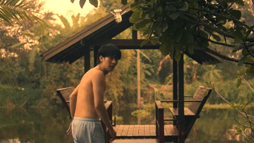
"I don't want to go to the safehouse alone. Guess I'll bring a pet to keep me company."
Are you surprised? Really, are you surprised?? This won't be a full series, I just wanted to do something for the kprewatch event and set maps are what I do best 🤷♀️ Especially because it involves watching the same episodes again and again very, very closely and going insane, which seems appropriate for all the brainrot VegasPete have caused me.
The complete design:

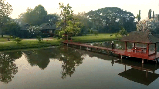
Silly little observations below the cut, but also have this diagram that illustrates where all the scenes take place relative to the aerial shot from episode 11:
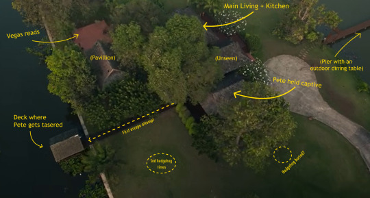
If you'd be interested in prints, let me know! I may end up having a crack at a more substantial safehouse piece. A front elevation view would be so interesting to put together.
Reblogs are encouraged, reposts are not. This piece is now crossposted to my instagram account here. Check out my cdrama set maps and other art at the links/socials below:
The Untamed (ongoing): The Jingshi | The Hanshi | Lotus Pier
Word of Honor: Four Seasons Manor (in progress)
instagram | kofi | inprnt
A small note on my design choices/silly little observations:
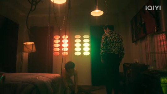
1) The room where Pete is kept appears to be smaller and squarer than it is in the aerial shot. I'm guessing it's to accommodate the mood lighting and to give the room a more claustrophobic/cage-like feel. I've attempted to depict that empty space above relative to the dimensions of the birdseye view.
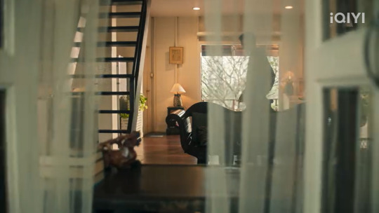
2) I'm not entirely sure there actually is a bit of a bump-out for the unseen room that makes up part of the main living space, but the apparent interior corner in the far right of this shot makes me think there might be:

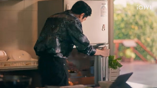
3) There's fresh herbs growing in a planter by the fridge and I think we should all think about Vegas planting them and watering them and cooking with them:
4) There is one single shot of the bedroom where there might (a big might) be an armchair next to the bed at one point and I ran with it for personal headcanon reasons:
5) What is in this mystery room at the back of this shot?? There seems to be a welcome mat or something put down? Is that the true entryway?? A bathroom? A utility room? I don't know nearly enough about vernacular Thai architecture to make an accurate guess:
Anddd that's it, that's about all I've got for this blorbo house! As always, thank you for your support 🙏Feel free to yell about this location in the tags, I'd love to hear your thoughts and maybe improve my design.
#nikkidraws#the safehouse#kpts fanart#vegaspete fanart#vegaspete#kprewatch2023#kpts ep 11#kpts ep 12#kpts ep 13#kpts set locations#my gifs#kpts meta#kp meta#kinnporsche the series#vegas theerapanyakul#pete saengtham#vegas kornwit theerapanyakul#pete phongsakorn saengtham#set locations#set design
202 notes
·
View notes
Text
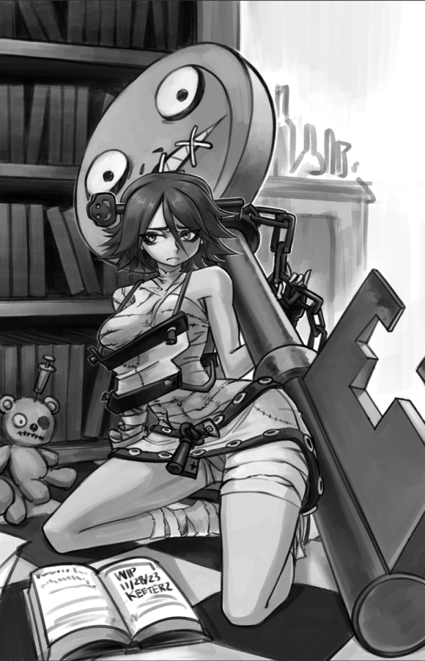
Hellven Updates | March
Hello!
I finished my personal project! It was a 500pg book I managed to get printed and shipped to me. I'm not going to be sharing the actual content since It's pretty rough as my first try at a novel fic thing, but I'll show the hardback whenever I do get it in the mail.
But this means I've been focusing all my worktime to Hellven! I'm almost done with the 20 sets, dear gods has it taken forever to get them in order. Here's some previews of the rough non-render models.


As for Hellven itself I have - 16 chapters, 300 pages with 2/16 chapters reedited. A major change to Hellven is it's not longer an extended script, but a fully illustrated novel. So there's some heavy rewrites to incorporate the dialogue into the descriptions. For reference I expect Book One to be about 20 chapters long.
Here's a WIP of the prologue.
So things are going well on that front. I don't have an exact release date atm, I work 2 jobs and it can be tough sometimes to find the time for projects like this. But progress has been going well, my work is pretty flexible. I'm confident in my ability to finish this, I mean already finished a novel whats another one!
Aside from that in between my free-time, I'll continue to doodle BG3 stuff, self-indulgent and whatever. So if you like shitty vampire, awesome- me too!
I did want to say how happy I am about Hellven. I never really considered doing novels before, only comics. But finishing a story through comics or animations seemed like a impossible task. So when I actually finished my first novel, I realized I could do this. I could tell a complete story. It's not gonna be perfect, hell, it might not even make sense. But honestly, I don't care, I just want to be able to finish something.
So thanks for embarking on this journey with me :)
56 notes
·
View notes
Text
So I’ve been tagged in six sentence sunday!
I’ve never done these before and I’m not very active on here so i wouldnt know who to tag in response (although if any of you are fine with being tagged, please write to me! Id love to hear what everyone’s doing, and make some new friends!!
Since I last posted on tumblr I’ve finished all the inktober drawings I planned to draw. They’re all posted on my instagram, but I’m severely behind on posting here😅 tumblr is great but I cannot for the life of me shake off the awkwardness that comes with posting on another media that isn’t my preferred one. But if anyone who doesnt have instagram wants to see the rest just lmk and I’ll post them!
Other than inktober I haven’t really done anything.. i wanted to draw something for valentines, and got an idea a day before which is obviously WAY too little time to finish anything. And well, then valentines day passed and I no longer had a deadline.. so I didn’t finish it. I cannot for the life of me finish anything without a deadline. (Literally realized like 4 days ago that ive basically never finished a high-effort illustration without a deadline or someone relying on me😵💫 which kinda sucks ngl)
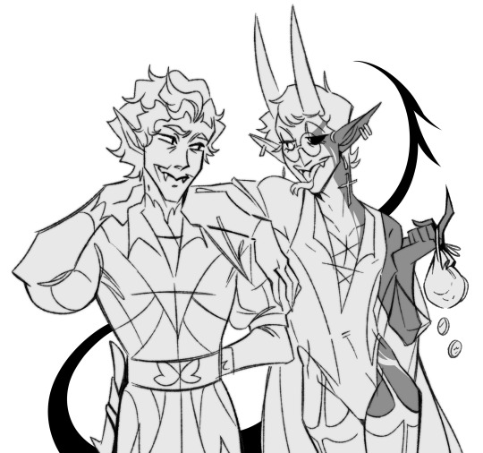
But since six sentence sundays are for wips, I guess I can show it to y’all what i drew for valentines!
So heres the concept (which is almost better than the finished result will be. I didn’t manage sultry Simon’s facial expression very well in the actual drawing😭 he just looks annoyed instead of ‘sexy’)
Aaannnd this is a wip of the actual drawing:

I really might end up redoing sultry Simon’s face, cuz it just isn’t working. I wanted the “expectation” side to like be the baz vision equivalent of some sexy male models slicked in oil and faces all squinty and lip-bitey. I didn’t want there to be a trace of an actual person, only the vision of “hot” so an annoyed simon with a bow will not do :/
Sidenote about simons shirt: eat the rich more like swallow the rich amirite?
I have this dumbass obsession with putting simon in ugly T shirts where theres printed the most ridiculous quotes on. I have a whole pinterest board on it. I tastefully called it “simons questionable taste in fashion”
(It’s all dumbass crop tops and tiny shirts with big chunky shoes. Idk I just love that on him)
But uhh I think that’s all for now! Thank you for tagging me @thewholelemon and @j-nipper-95 for tagging me a lot of previous times where i didn’t do anything bc i was shy😅
See you all next time!
Also idk if people put tags on SSS but I’m just gonna do that bc its what I’m used to
#carry on#simon snow#simon snow salisbury#baz pitch#fanart#awtwb#baz grimm pitch#the simon snow trilogy#carry on fanart#valentines day#work in progress#digital art#ok confession baz is only holding a ringbox bc my reference was holding something in their hands#and i didnt have the energy to find a new reference for his hand alone
49 notes
·
View notes
Text
Preparing for Conventions
What events are best to go to?
Whether it’s a huge celebrity-studded multi-day weekend or a small gathering at a local library, in-person events are an exciting way to reach all kinds of comic fans that may not be in any of your circles online. There’s opportunities to be had at almost every type of event, but a few things that might narrow your focus:

Events that don’t cost more than you think you can make. Convention costs can add up extremely quickly. You can expect to pay at least $100/day for an artist table at mid-sized or large conventions. If you’re just starting out, prioritize conventions that are close enough to your home (or friends/family who will host you) that you won’t have to pay for a hotel or spend a lot in transportation costs. Splitting the table with another artist is another option!
Events that other artists in your area/genre recommend. A great way to learn about events in your area is to attend one and ask others what conventions they like in the area. Some regular artists even maintain online groups to discuss application deadlines and share experiences. Depending on the genre of your art or comic, you might also find adjacent things like horror shows, anime shows, or zine fests worth exploring too!
Events that you can actually get into. Conventions can be very competitive to get into, and have very small application windows months in advance. Once you’ve identified which conventions are in your area, follow their Twitter, mailing lists or websites to catch their sign up deadlines. Juried shows may also ask for a link to your portfolio, author bio or store to get an idea of who you are and what you’d be selling, so be sure to put something together and be ready!
What kinds of products should I prepare?
Our Masterlist of Printers is a great place to start for recommendations about places to make your products and inspiration! But to cut down on costs and keep yourself flexible while you figure things out, it’s a good idea to focus on:
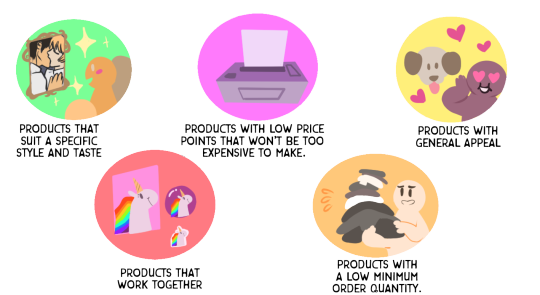
Products that suit a specific style and taste. Do you make big intricate illustrations that would look good as 11x17 printed art? Are you good with quippy one-liners that would make fun stickers? Is there a popular fandom that you like that has a similar genre to your other work? Popular products are prints, stickers, charms, pins, and comics. But don’t be afraid to handcraft figures or something else.
Products that work together. Be deliberate about the vibe you’re setting, whether that’s a genre (horror, humor, superheroes, etc.), an age range (all ages, adult), a specific type of product (mostly t-shirts, mostly prints, accessories), a theme (eg, all things coffee!). There’s a lot of approaches to making a cohesive product line and organizing your table to keep like things together, but having cute plushies AND saucy pinups AND anime figurines AND coffee mugs can be confusing to customers who are trying to figure out what your table is all about.
Products with low price points that won’t be too expensive to make. Products priced $15 or lower are generally an easy buy for new customers, and offering a range of small inexpensive things is great for folks who are on a budget but still want to support you. When you’re just starting, look for things that don’t require a high amount of money to produce for you or can print in low quantities with a printer. Printed-at-home or handcrafted things are also possibilities for a more zine-style table presence and can save you a little money.
Products with a low minimum order quantity. Try not to order more than 10 or so copies of any one thing (especially anything that a stranger wouldn’t recognize like OC) until you’re confident it will sell. You can always order more after the show if you run out. If you DO have leftover stock (and 99% of the time you will), you definitely can sell it at a future convention, a crowdfunding campaign, include it as Patreon rewards, or list it in an online store. But being stuck with a closet full of 500 postcard prints that you can’t sell is not a fun time, even if you DID get a bulk discount.
Products that have a general appeal. Even if you have a massive social media following, 99% of your customers will have never heard of your comic or your original characters. Comic enthusiasts will often be open to giving a new story from a local artist a chance if you chat them up a little and tell them about it. But also having general interest products (animals, fanart, nerd humor, mythology) on the table that don’t require as much explanation to enjoy is a very good idea.
What do I need other than merch?
A good convention setup looks clean, organized, and easy to engage with. Once you’re accepted, look carefully at the details of the convention and what’s included with your space. Many conventions will give you a table and chair, but you’ll probably also need:
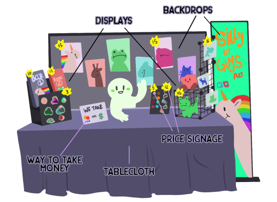
Backdrop - Backdrops display your best art and help people see it from across a crowded room, and partition your space if you’re very close to other tables. A photo backdrop stand with a bunch of 11x17/A3 prints taped together that you’re selling, a wire cube grid construction you can set on your table and stick smaller merch pieces to, or a professionally-printed banner with your name, URL/social handle, and your best art and are all solid options for this.
Where to get them: Google “photo backdrop” or look for photography supply stores. Google “wire cube grids” or look around hardware stores or Walmart/Target. For banners, you can find printers that can make retractable banners or vinyl banners to hang from a photo backdrop.
8-foot Tablecloth - Many conventions assign you a very weathered 6-foot table, so always plan on having something to cover it (optionally for multi-day shows, a second to cover your setup for security purposes when you leave your table.)
Where to get them: Fabric stores, bedsheets, party stores.
Displays - Flat items on a table are invisible to anyone who isn’t directly in front of you, so look for a way to make your stuff stand up and be seen! Easel stands to highlight featured books or art, cork boards and pins you can prop up, boxes or porfolio books to flip through, wire/wooden racks to hold lots of books are all great ideas to consider, depending on your products.
Where to get them: For heavy-duty stuff, you’ll probably want to Google around order displays online. Art supply stores will often have easels and portfolios. If you don’t want to spend a lot of money yet, dollar stores can be a gold mine of quick solutions too!
Price Signage - Having clear pricing on your table helps people decide what to buy without having to ask you about every product. Print your own signs at home, bring colorful post-its, or some stiff paper, markers, and tape. You can also use a white board or chalk board to make a “menu” style price list.
Where to get them: Office supply stores, Target/Walmart.
The ability to take money from people - A secure place that’s accessible to you to keep money for making change. Cashbox theft can unfortunately be an issue sometimes, so wearable pouches or discreet envelopes that don’t immediately look like money are better in this context. If you have a cellphone or tablet, you can also get an app where you can list your products and connect an attachment to swipe or tap credit cards for a small fee. (Note wi-fi and power are not dependable in many venues, so be sure to have a charger and a good data plan for your phone)
Where to get them: For cash, go to your bank in person and ask for $50-$100 in 1s and 5s. For credit card payments, Square, Paypal, and SumUp all have apps that you can put on a phone or tablet and have attachments to swipe or tap credit cards.
Business cards - Customers will often want to follow you on social media, read your comic, or shop online after the show, so be sure to have lots of business cards! Use your most memorable art so they’ll be able to remember where they got it from! If you’re looking to offer commissions or talk to agents/comic professionals, you might also include your email address, but otherwise leave it off.
Where to get them: Many printers offer business cards for cheap. In a pinch, you can also print your own at home or have one sign with your info and ask people to take a picture.
What to Expect
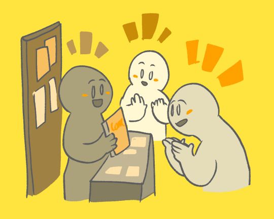
Lots of talking! You don’t have to have a carnival sideshow “step right up” persona, but be ready to give a friendly hello to folks who look interested in your work, and confidently answer questions about all of your products when asked. If you have a comic, practice a quick elevator pitch to explain it.
Not many breaks! While you can technically step away from your table whenever you want (if you’re alone, you can usually ask a neighboring table to watch your stuff for you), every hour you spend away from your table getting food or going to see cool panels are sales opportunities missed. Keep snacks and water at your table to minimize your time away, look for slow traffic times to step away and explore a bit, or bring a friend who can watch your table and sell things for you if you need longer breaks to recharge.
People who have never read a comic on the internet! For those of us who live and breathe our webcomics, this can come as a shock, but many people are still only readers of printed comics and will want to buy your physical book rather than read it free on the internet or buy a digital copy. Even if it’s just a small chapter book, having a print version is a great idea to get readers!
Fun and profit! This can also be surprising if you only have experience with online stores, but people come to convention floors with very open wallets. Things that don’t sell at all online can do gangbusters at conventions when presented right! Experiment with your setup to highlight your favorite things, take careful records of what attracts peoples’ attention and what sells, and keep notes for the next day and next convention, and have fun learning about this new market!
774 notes
·
View notes
Text
Love is in the air, Cupid Miku says Happy Valentine's Day!

Time taken: 3 Hours and 5 Minutes
I plan to edit a speedpaint of this soon, progress shots under the cut!
2 days ago I got the idea of a Cupid Miku and drew her on paper, her whole vibe is inspired by Goddess Madoka as you may or may not be able to tell, with the bow and arrow and the big trail on the dress

Then the next day I was already making progress on the full illustration, I decided to do it digitally instead of on paper because I wanted to go all out with this one
I figured out her colors really quick, just grabbed a lovecore color palette online and tweaked it around to the colors I liked
I picked her pose from this bow and arrow pose I found in Pinterest

Tbh I realized my Miku was gripping the bow wrong too late to fix it and now it's gonna keep bothering me lol, but oh well nothing I can do now :p
I might actually make a print and a big sticker of this Miku! I'm very proud of how she turned out :D
#hatsune miku#Vocaloid#lovecore#valentines day#Digital Art#Pastel Colors#Pink#Cupid#February 2024#illustration
22 notes
·
View notes
Text
Isometric dot grid stencil tool DIY
Do know when you are getting sad because you want to draw nice shapes on a blank piece of paper - but there is no helpful grid - and you have difficulties drawing straight lines - the isometric dot grid stencil tool is there to help!

Today I created an isometric dot grid stencil tool with scrap metal. And I want to write a bit about how easy it is to make. (Beware: You still need a lot of patience to punch all these damn holes into a thin slice of metal.)

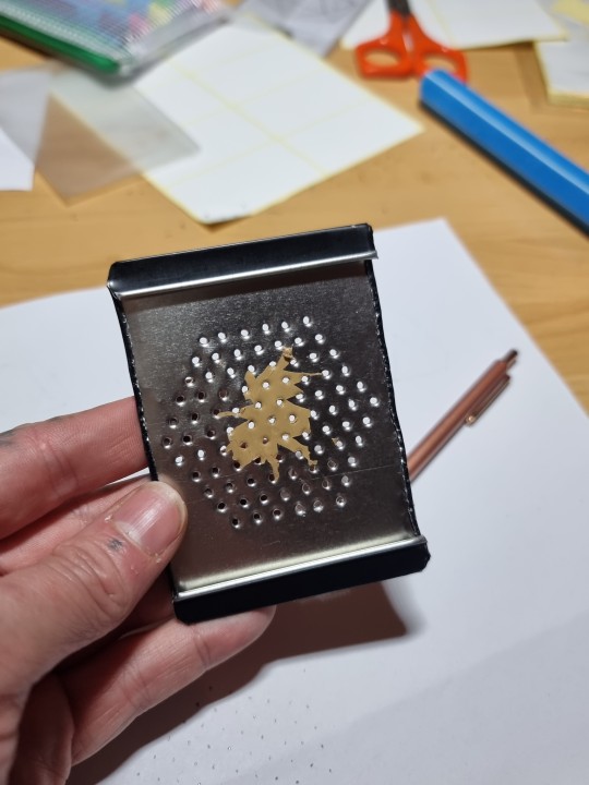
[The distance between the dots is 0.5cm btw. [yes, I'm a metric system supporter. ])
Tools I used to create that tool:
- needles (one thinner and sharp needle, and one thicker needle (to dilate the holes afterwards wlth a rotating motion)
- hammer (for making the thinner needle go thru the scrap metal like a knife thru butter (but with more force... ))
- wooden/bamboo/whatever tray with a not too large hole [~ 1-2cm will suffice] (so the needle does not go into the wood, which is annoying and makes the needle unsharp very fast) - For the wooden tray I used a simple cutting board normally used for food preparation - it has a very helpful handle (just a hole with 1.5cm diameter)
- a printed piece of isometric dot paper and sticky tape (to form a tube with the sticky tape, so you can use it as double-sided tape. Add the printed paper to the sticky tube-thingy. Then attach it on the scrap metal. [It will be removed afterwards. (Removing the sticky tape afterwards is still very annoying. Thats why I left a rest on my tool. I put a looot of thought (slight exaggeration) into considering to remove it, but in the end I was too lazy to remove that part of aesthetical annoyance - It has no effect on the practical aspect. I might remove it anytime in the future when it annoys me too much and when I have more nerve to do so. )]
- a lot of patience to make whatever number of holes you want to have in that stencil. [I find this routine work calming actually.]
For the one depicted above I made approximately ~200 holes [I am too lazy to calculate and/or count the holes rn. This approximation might suffice.]
- garden scissors (to cut the scrap metal)
- pliers (to rounden the sharp edges of the cut scrap metal) [last step]
- - -- --- -----
What could you do with the stencil tool, you migt ask:

One can use it to draw an isometric dot grid on paper (for furtherly drawing shapes in the dot grid.)
One can also draw circles with it.
And one can also attach a piece of paper or other material and make holes into it with a needle or safety pin.
In the photo depicted above I made a cube pattern (with a mistake). I could continue to sew these holes together, so the cube illustration becomes more visible - and if I use a large enough thread so one could feel the lines - it could also be a card/art a blind person could "see" - alias feel.
Also: It is calming to punch holes in paper with that stencil tool.
Maybe I might also consider doing the stitching activity afterwards... Hmmm.
#knottys crafts#practical ltems#tools#stencil#isometric#tool#scrap metal#DIY#metal#scrap#practical item#drawing tools#crafting#craft#crafts#DIY tools#isometric grid#creative solutions#creative problem solving#punk#punk math idk
27 notes
·
View notes
Note
Hey, I have ADD that only just got diagnosed. Pretty sure my 5yo daughter has the exact same style of it. I had trouble listening to people because I legitimately couldn’t focus on what they were saying, and she’s also struggling with it.
For other situations, I’ve taught her the strategies I figured out and taught myself over the years. For the listening… I don’t know how to help. I still struggle with not interrupting people, noticing people are talking to me, etc, and I’m nearly thirty years older than her!
It’s driving my partner bonkers, though. They don’t know how to get her to listen to important information and asked me for help… Do YOU have any advice? I tried googling it and got stuff about discipline that was just…awful.
Side notes: I’m autistic, she might be, too. She’s easily frightened so surprises can make her burst into tears. Not sure if you might need anything else.
Also not sure if you’re still active, but I’m desperate enough to send an ask anyway.
Thanks for your time!
Sent August 3, 2023
My 8yo also has trouble listening. I think it's a pretty normal thing regardless, but of course we ADHDers can struggle more than typical people because our attention is so variable.
What can help with this issue (everyone is different, some might help, some might make things worse):
Fidget toys--sometimes if our hands are busy, our brains can focus better.
Visual aids--use pictures to illustrate your points.
Limit distractions--if there's something that particularly affects her ability to listen, have an expectation that she stop that thing when someone is talking to her. For example, if words are in front of my face I don't hear what people are saying to me: the text shuts down my ears. So I have to ensure that I'm not looking at words if someone is talking to me.
Choose your times carefully--it's normal to struggle more when something is out of whack, and ADHDers aren't great at noticing these things. Don't try to tell her something important if she is hungry, needs to use the bathroom, is too hot or too cold, is really tired or overwhelmed, or is in a heightened emotional state.
Keep age in mind--There are things that are developmentally normal for 5yos, and I think tuning out adults is one of them. The number of interesting moments I've had with neurotypical 5yos (back in my babysitting days) is pretty high.
I would also recommend the book How to Talk so Little Kids Will Listen, by Joanna Faber and Julie King. It's apparently available in print, as an e-book, and as an audio book. I haven't read it myself (I bought it when my kid was little but he's 8 now so I guess I don't need the book anymore) but lots of parents recommend it.
Followers, have you found ways to get yourself to direct your focus to what you actually need to pay attention to?
-J
36 notes
·
View notes
Text
New Fanbinding!
Over the last week, I’ve finally gotten around to working on some fanbindings again. I wanted to try out the three piece bradle binding described in DAS_bookbinding’s video here and now was the time to do it.
I’ve made two cases in this time, actually, but the other one is for another project where I’m waiting on some ordered paper (because I didn’t have enough, dammit), so I can't proceed right now. It will be posted at a later date.
Behold the beauty I made:
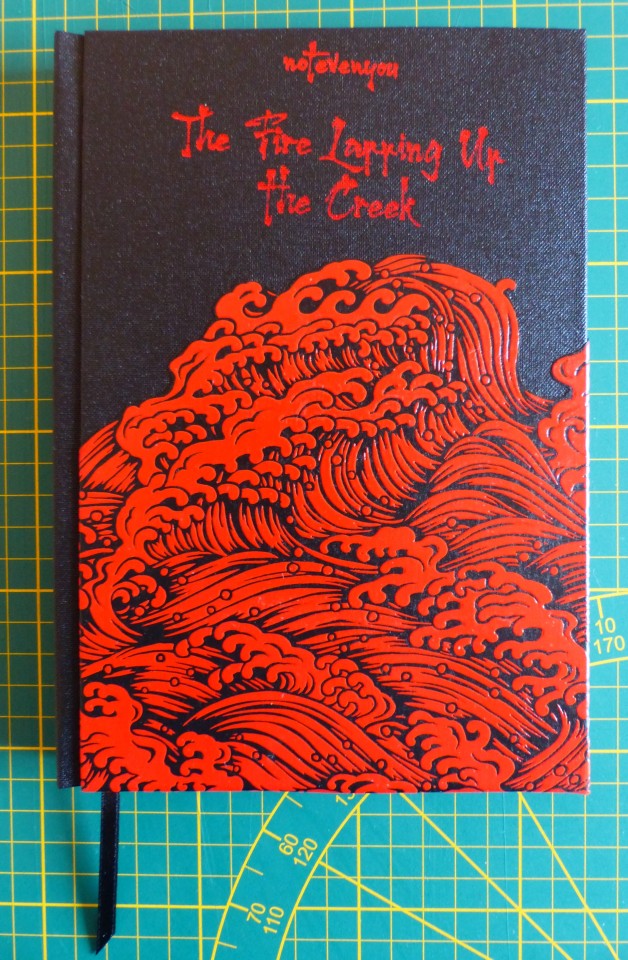
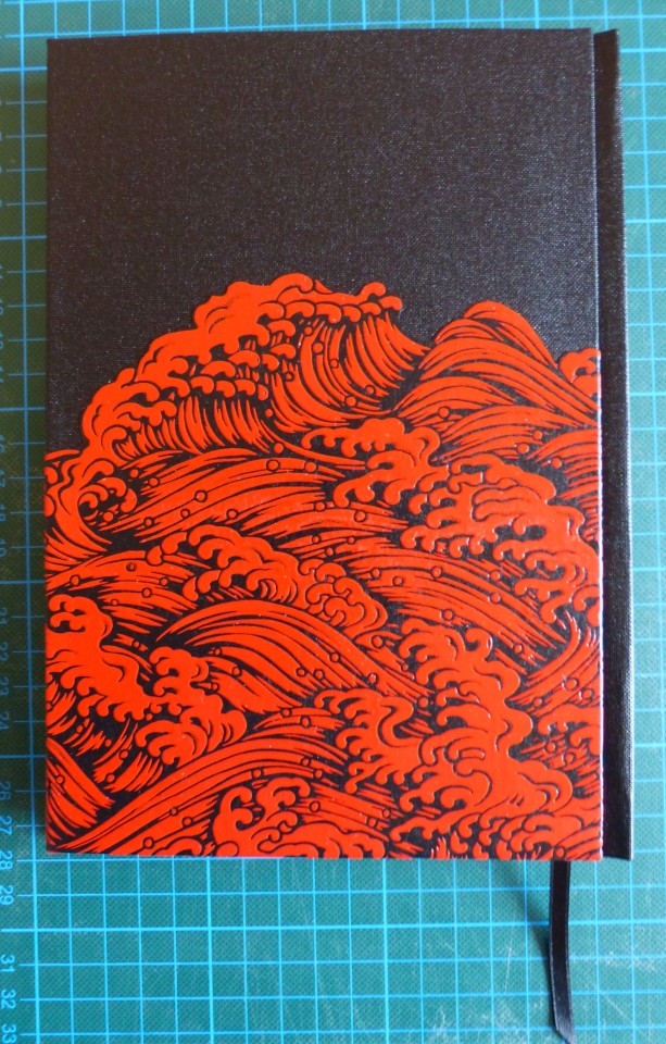
It’s “The Fire Lapping up the Creek” by notevenyou, a fic I absolutely adore! I did the typeset in 2021, printed it then, too – and that was basically it for the last two years. XD But good thing I waited because I felt adventurous now and also had some cool new paper as well as booklinen to use.


Doing the case was a bit of a learning curve, and the other case did not turn out as perfectly as this, though it must be said that that one isn’t done in linen but in paper. This linen here worked like a dream, very easy to handle.
I’m also very pleased with how the waves turned out – they’re lacquered Yuzen that I cut on the upper edge along the wave pattern. It’s pretty much how I imagined the design in my head, mostly. The endpapers also lean heavily into the theme of those “bloody” waves as the story is set in the Burial Mounds for the most part and is heavy on the angst in the first half. It just seemed to fit.
Did the titling with hot foil and a pen, which worked like a dream in this case (the other one was a different matter...).


I also added a few illustrations here and there. Nowadays, I might do more with the chapter headers, but they’re fine. Also, that particular font (Harukaze) always died on me whenever I went over a certain size, so I had to basically a) make it smaller than I wanted to, and b) not touch it at all once it was set to the size. XD
Materials used:
Printed on Clairefontaine Papago 80g (long grain, unfortunately, but it’s okay)
Case + endpapers:
- English Buckram booklinen, library certified
- lacquered Yuzen (Japanese paper) “Konami”
- Chiyogami paper 60g
- hot foil (the cheap stuff)
#fanbinding#bookbinding#my fanbinding#arts and crafts#the untamed#mo dao zu shi#wangxian#mdzs#chen qing ling#books#my posts
92 notes
·
View notes
Text

This one is from Bodleian MS 764, aka the "Bodley Bestiary". This is actually a pretty nice bestiary; it's one of the ones with a wide selection of animals and some fairly elaborate illustrations. Yes, this illustration looks silly, but it's relatively large, detailed, and technically well-executed. Also I think that background is gold leaf. According to the listing at the Bodleian Library, it was made sometime between 1226 and 1250.
I go on a bit in this post, so I'll go ahead and put a cut here.
I do actually have access to a print translation of this one, so I can tell you that the description reads:
The scorpion is a land worm: it belongs with worms rather than serpents; it is armed with a sting; and it gets its name from Greek, because it stings with its tail and spreads its poison in a gaping wound. The scorpion has this property, that it stings the palm of the hand.
And then there's like three times as much text describing the scorpion's religious symbolism.
So let's look at this critter. At base, this is a pretty regular quadruped, apparently about the size of a cat if the hand is meant to be proportional. The perspective is odd; I'm not sure if this is just a highly-stylized top-down view or if it's actually meant to be hanging off that plant like some sort of demented flag.
There are a couple unusual things to point out. First, that's a weird quasi-human face, which I'd like to credit to the whole "scorpions have faces like virgins" thing, but I'm pretty sure it's actually just the artistic style. To support that claim, gaze upon the face of the Bodley Bestiary lion:
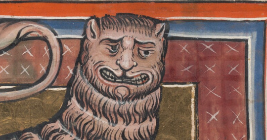
Second, I think this is the only scorpion so far I've seen drawn actually in the process of stinging someone, which is great, but the artist has decided to show this as a rigid spine going clear through a person's hand. Wild.
Third, and probably most important, what is that body shape? Where did that come from? I kind of wonder if the artist somehow had a concept of the scorpion as being low to the ground with a body wider than it is tall but knew virtually nothing else about them. It's kind of hard to interpret what's going on -- like, the silhouette is reminiscent of a horseshoe crab, but it can't possibly be a shell, because the legs are on the wrong side. If we interpret it as a shell, or as just like a weirdly bulky ventral portion, we have to ask how the hell this animal is meant to walk, because it clearly is wide enough to impede its legs. Look at that picture... here, I'll put it in again so you don't have to scroll up.
The legs are posed sticking out perpendicular to the spine here. Imagine this critter putting them down to walk. If that's a solid mass of any kind, it means that in order to move, it would have to keep its... knees? ankles? leg joints bent at a ninety-degree angle the entire time so its own body wouldn't get in the way. Like a turtle whose legs stuck out the top of its shell for some reason. I just don't think it works. The only way I can make sense of it is the one I jokingly suggested in the original post, where those are skin flaps like a flying squirrel. (This is complicated by the fact that the artist is unlikely to have ever seen a flying squirrel any more than they would have seen a scorpion, since the only species in Europe doesn't seem to reach even close to England... but look, I don't know what they were thinking. Bats, maybe.)
anyway. Points!
Small Scuttling Beaſtie? not that small, and whatever method of locomotion is happening here, i hesitate to call it a "scuttle", ✘
Pincers? ✘
Exoskeleton or Shell? friggin... maybe? my official position is no, but benefit of the doubt, ½
Visible Stinger? visible and actively stinging, ✔
Limbs? 4
And I have to say something here. This is a quadruped. And the way it's colored makes it look like it might be furry. I was considering this. And then... let's zoom in.
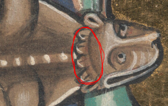
Those little details on the head there... okay, the two on either end are clearly the ears, but the stuff between the ears? You tell me there's a more plausible explanation than tufts of hair. Which... you know what that means?
🎉🎉🎉
That's a mammal!
🎉🎉🎉
Sorry, buddy, it's probably in bad taste to celebrate you getting a penalty, but I genuinely thought I was never going to use that one.
I'm not penalizing the resemblance to a flying squirrel, though, because like. I think it's unlikely that's what the author was basing this on. Case of convergent evolution.
Anyhow, -1. I think this is our first penalty for a reason other than wings. (By which I mean it definitely is, but I'm leaving the possibility open that something else shows up in the period between when I'm writing this and when I'm scheduling it to post.)
As for the vibes of this week's critter, I think it's charming in a way, but unsettling in enough ways that I want to keep my distance even for non-stabbing-related reasons. I'll give it a 4/5, on the assumption that those are skin flaps and not something else. Because if this is doing the reverse-turtle thing, that's bad vibes and the score would go down.
Total:
4.4 / 10
Whoever is being stabbed on the left there seems real nonchalant about it.
23 notes
·
View notes
Text
The Many Illustrators of
A Tale of Two Cities
3: Enos Benjamin Comstock
...& the importance of a good signature...
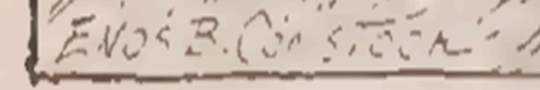
We're taking an entirely different turn this week to examine the work of — well, evidently, Enos Benjamin Comstock!
I interrupt myself because I had actually originally written "an unnamed artist," as up until the creation of this post I had not actually noticed the very clear signatures at the bottom of this week's set of illustrations.
For the entirety of the many months I'd had these illustrations saved on my computer, I had never known the artist's name and had resigned myself to the idea that I had no way to find it — because nowhere in the text of the 1906 edition of A Tale of Two Cities from which these illustrations are sourced did it actually credit the artist!
Here are those illustrations (sadly crunched a bit by the PDF format):
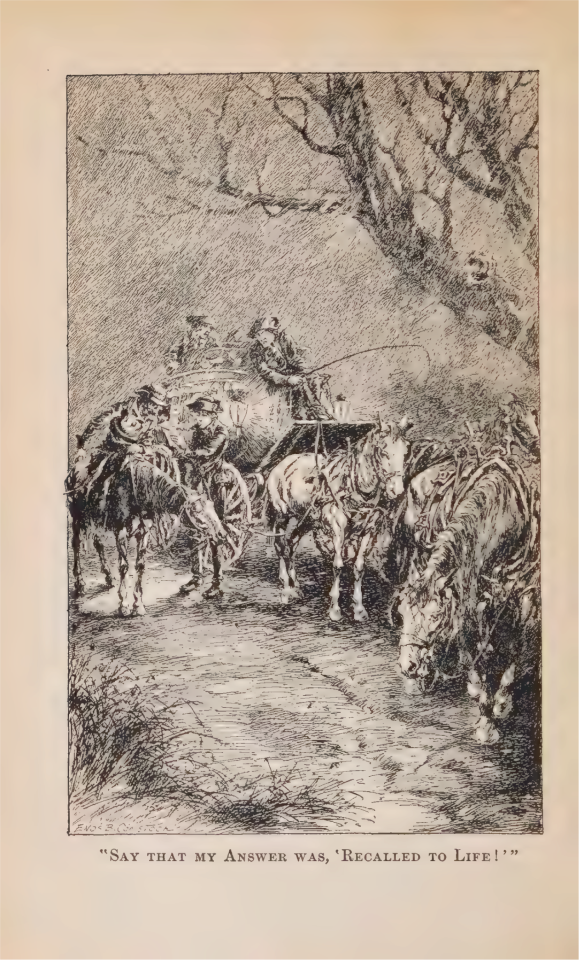

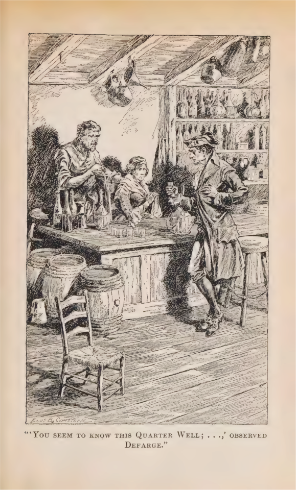

This is one of the more glaring examples I've seen so far of this phenomenon of not crediting the illustrator, but I've also seen in my research many, many frontispieces used in old editions of A Tale of Two Cities without credit to the artist who created them (more on that later, in fact)! It pains my soul.
That isn't the end of the mystery of these poor neglected drawings, though:

This list gets the number of illustrations right, but otherwise, it's almost all incorrect. By my research, it should read more like this*:
Portrait of Dickens . . . . Frontispiece
"Say that my Answer was, 'Recalled...'" . 1
"How was this? - Was it you?" . . . . 52
"'You seem to know this Quarter…'" . . 214
"Here and there … Cries are raised…" . 442
*(I skipped "Facing page" solely for formatting purposes)
Pretty significant difference in subject and page number! And that's because four of the five illustrations listed to be in this edition are actually from a different, near-identical edition!
They are, naturally, Phiz's — except for that first one, which does serve as the frontispiece of both of these doppelgänger (lol, on theme) editions.
Being in a completely different style, it's likely by neither Comstock nor Phiz...and, of course, neither edition chose to credit this artist either.
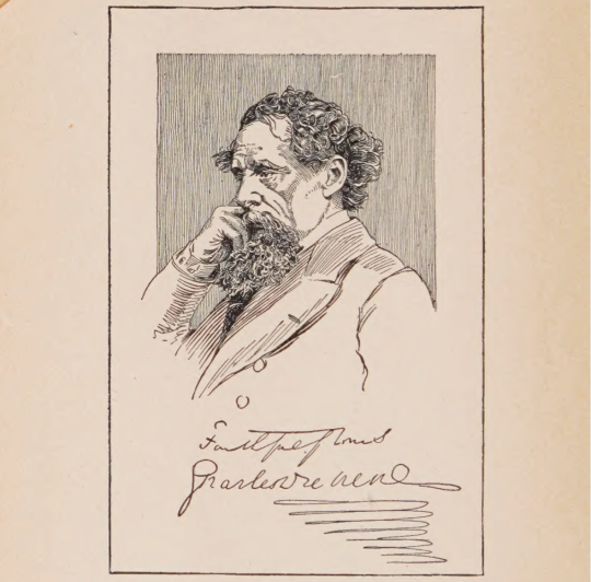
I sure wish I could read that signature.
In summary, the lesson here is:
If you reading this are an artist, always legibly sign (and/or watermark) your work — because the culture of callousness with which the concept of crediting artists is treated is evidently much, much older than the Internet.
After all, if Enos B. Comstock hadn't legibly signed his name on the illustrations printed in this book over one hundred years ago, we of today very well might not know that he was the one to create them!
& the standard endnote for all posts in this series:
This post is intended to act as the start of a forum on the given illustrator, so if anyone has anything to add - requests to see certain drawings in higher definition (since Tumblr compresses images), corrections to factual errors, sources for better-quality versions of the illustrations, further reading, fun facts, any questions, or just general commentary - simply do so on this post, be it in a comment/tags or the replies!💫
#A Tale of Two Cities#AToTC#classic literature#victorian literature#dickens#charles dickens#illustration#illustrators#Enos Benjamin Comstock#Enos B. Comstock#1900s#by which I mean the decade not the century lol. the 19aughts...#seriously everybody sign your work and sign it clearly#and value the time and work of any and all artists and media-makers out there!#if a work takes you a lot longer than *you* think it's going to (as...very often happens to me)#you can be sure that people who don't habitually make art#are on average gonna underestimate that necessary time and energy even more!#also I got his middle name from just looking up his name with the b initial. super straightforward. he was an american artist
12 notes
·
View notes
Last Seen Blogs

altunizadekarotcu
Altunizade Karot, 0537 920 40 25

steddielicious
Just A Steddie Fan
jaggedjackals-blog
leave me

will-lamerton-blog
Will Lamerton
sasusakufanficrec
サスサク