#i really want to get better at drawing and colouring then redo this in the future
Note
Hi, i hope this question doesn't bothers you, do you have any videos of your process?, im currently starting to learn how to do digital art and have trouble knowing where to start and what to do (im always like, should i start drawing this part first?, is it better to do clean lineart or just paint over the sketch?, do i work on the lights first or the shadows?, etc)
I can probs make you a video on this at some point based on something I'm currently working on, although I have a few on my tiktok already (@ xephia) if that helps!
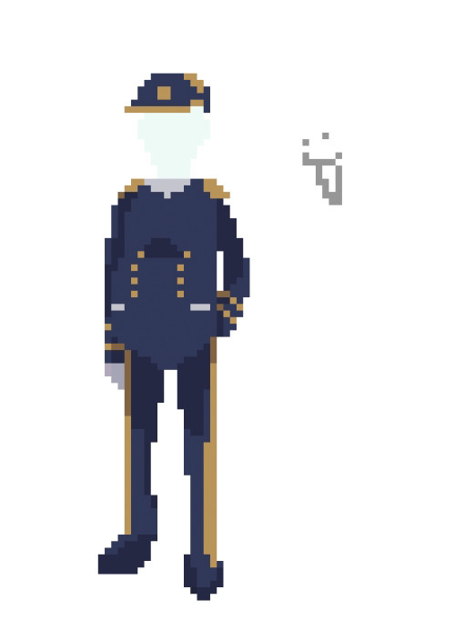
My process is a bit messier than many other artists - I alternate between stages of sketch and colour before I even think about ‘final colour’. I’ll start with a sketch like the ones below, then slap some rough colour on. This is because IMO colour is an important part of the composition so I want to see what works before I line. They’re not meant to be pretty or social media ready. This stage can look super messy or tidy depending on how I feel or how complicated it is. And they can look wildly different; here’s some examples:
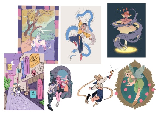
That stage also helps me decide if I want to finish the piece or if I should abandon it (I abandon a lot). Sometimes this stage takes 15min, sometimes 2 hours, it really depends on the piece. But for me personally, it’s crucial because otherwise I find it very hard to envision how it will look later, or forget what I was planning.
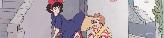
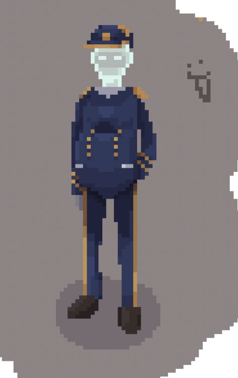
Then, I do at least one more layer of ‘sketch line art’, which is basically a first layer of line art to see what works and what needs changing. I colour the important bits relatively cleanly (usually character/s) and add might some subtle shadows/gradients and/or lighting to get a feel of what it will look like finished. Sometimes I repeat this process a couple of times if I’m not happy with how the first iteration looked. This stage usually looks a little like this character sheet I’m working on, and this slice from a Kiki delivery service sketch:
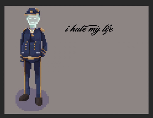
It’s usually not until I’ve done all that, that I go over and do the final lineart, making it thicker, colouring the lines, redoing the flat colours, tidying it up, and adjusting where needed. Essentially I don’t start ‘finishing’ a piece until I’m happy with where everything sits and what colours I’ve picked. It’s only at this point I feel like the sketch is ready to line, and lining and final colouring can actually take less time for me than all those layers of planning somehow haha.
At this point I keep tidying, cleaning, lining, colouring, until the piece feels complete. Sometimes complete for one piece is tidier than complete for another, it really depends.
I’ll also use Procreate’s push tool to adjust things as I go in all steps - it saves a lot of time and isn’t cheating.
Although as you can probably tell from my examples, I do change this procress up a lot depending on the piece! Sometimes I’ll even paint over parts of my final piece like I did in this magical girl street. I think find whatever works for you, everyone will work differently and things like mood, energy levels, how patient you feel, how stressed you are, if you have any hand pain or shaking, and how much free time you have that day to draw can all affect your process day to day, week to week.
Some days it will be easier and more comfortable to sketch messily, other days tidier. Some days you will draw well, other days not well at all. At least for me, I find consistency almost impossible.
So I think there's no right or wrong order to do things and it's great to switch it up and keep things interesting for yourself, and different processes work for different people. Hope this helps!
#faq#art process#art advice#art tips#drawing guide#sketch progress#digital art#procreate#human artist
21 notes
·
View notes
Text
Practicing Molluck

Last night, I had an urge to draw Molluck with traditional art supplies since I have felt like drawing some traditional art for some days. This is basically a sketch practice thing again. I felt like drawing him from an 'unusual' perspective for practice reasons.
Last time I drew a pencil portrait of Molluck like this was about 2½ years ago:
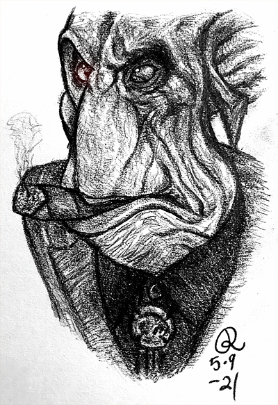
I'm kinda just getting tired of drawing with a computer mouse and I feel like I enjoy doing traditional art the most, even I have done it rarely during the recent years. The main reason why I haven't done more traditional art is my self-hatred since I have felt like I'm just gonna waste those art supplies for drawing/painting some trash.
Man, I got so many art supplies to try out and it would be nice to have a challenge where I draw the same thing with different art supplies; I did such a thing in high school with five different supplies for the art course. Oh, and I really wanna do a Molluck statue to myself, like a lil golden bust, like the one on his blimp!

This is just such a nice little detail we can barely even see. I mean, I would love to take a much closer look at that bust!
But yeah, my point was that after all, I feel like I don't enjoy doing digital art so much. I used to like drawing with the mouse and that's the main reason why I have kept drawing with it but over the time I have just seen better and better how it restricts me and that's why I feel like I do draw better traditionally than digitally even I have drawn mainly digital stuff for a decade. Maybe one day I try out some proper digital art supplies but I don't know if it's truly my thing. I just feel like I can also draw more precisely when I do traditional stuff.
But yes, both medias have their own pros and cons but I do enjoy doing traditional art more. Man, sometimes I think about painting a huge portrait about Molluck... I bet that Molluck would love it too! I just kinda love it that Gluks love their own faces so much. And I also just would find it fun to paint a portrait and frame it like it was something that Molluck would have hanging on his wall. I just agree with him that he is such a beautiful Gluk and I just cannot get enough of him...
I have started yet another digital practice thing but not sure if I finish it, or I more like might redo it. It's quite a WIP to me but I can show an edited one:
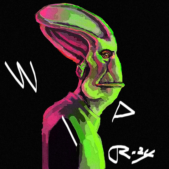
I guess that you can get it why I chose those colours (It's the logo!). I know that some spots don't look right but it feels like it would be easier to draw this traditionally, so this is what I mean with redoing this. I also haven't used reference to this one like to the those pencil sketches since I kinda wanted to practice building 'a mental 3D model' of Molluck. Yeah, practicing drawing Molluck over and over again feels like precising my mental image of him. Drawing him both without and with a reference is a part of that.
Oh, and I remember loving drawing on a black paper with colour pencils, so I would like to draw something like this traditionally. I'm still not stopping digital stuff and I got some digital WIPs to finish but I would just like to focus more on traditional art. Just screw this self-hatred; I'm gonna use those art supplies!
I do hope that this 'art year' is gonna be better than the previous one. I really need to draw more to improve and get these ideas out of my head... Yeah, even I have been drawing mainly Molluck for 2½ years, I feel like I still have a lot to learn about drawing him.
18 notes
·
View notes
Note
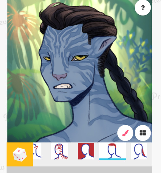
I wanted to let you know that I am super SUPER excited for your recom picrew 😩 it looks beautiful already!! I've got two questions. I wanted to ask how difficult the process is for creating one, I've thought of trying to make a na'vi one myself. Is it complicated with all the layers and all of that? And wanted to also ask if you have any more avatar-related picrew projects planned for the future!
Ahaha, thank you Anon!! I'm excited for it to be over as well tbh. I wanna play with it and more importantly move on with my life lmao. I truly believed it'd be 3 days work... And I was wrong.
Yeah, gotta be honest, it's a massive bitch.
Mostly the issue that is costing me a ton of time is the stripes. Picrew does not surpport blending modes. You only upload normal PNG files. Because of that, I can't have a single stripe pattern for every skin colour.
No : I must export as many stripe colours as I have skin colours. And the stripes MUST match the colour of the ears for better transition... AND there are 3 types of faces in what I've done, that means that for EACH design of stripe, I need to export 3 shapes x 4 colours.
Another issue has been the noses. Entirely my fault mind you... But hiding part of the eye with broad noses, like here :
Meant I needed to have painting INSIDE some of the noses. Which I did on a single file. And uploaded. And matched to skin colour so you don't see my ugly patching up job.
But the nose needs to be on top of the eyes... The stripes must be under the eyes and on top of the nose... Which can't happen... So I have two options, and I've opted for redoing all my stripes better... And then realised fixing the noses instead would be so much easier.
I do wanna cry a little sometimes lol
But they look better now. I have 3 styles of stripes and I want to do 3 or 4 more, because I really love striping and it makes characters really unique. Next up is potentially eye colour (if y'all suck my metaphorical dick hard enough because what A PAIN).
Sanhi/Tanhi whichever spelling it is, is giving me grief and I'm looking for a CSP brush that would sort of automate it for me.
It's a LOT of tedium. Drawing is easy and has been very fun! I was dreading making the hairstyles and get ups for Na'vi, but I think I'll revisit the picrew itself later and add them as new options rather than making a separate one.
File uploading on the website is such a bitch. Here's the tutorial I use btw. I also use a firefox add on to auto translate the page.
Will I do more? Definitely. In time. I lost the one job that pays for my food, so was thinking of opening a few comms and focus on that rather than just faffing about, but I'll definitely be returning to picrew, either for more Na'vi stuff or simply to try my hand at some other style. I'd love to see more people do their own Na'vi picrews!!
I made this one simply because the options are so limited!! There's two and one is full bodied and chibi. That's nice but doesn't scratch my pfp or OC needs. Feel free to make more, I'd love to play with it!!
17 notes
·
View notes
Text
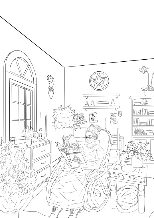
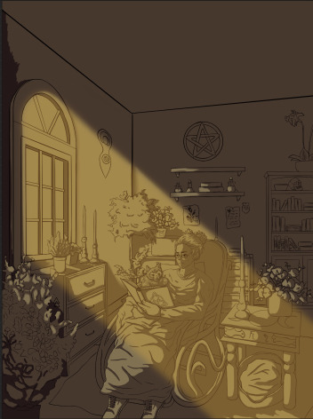
Poster
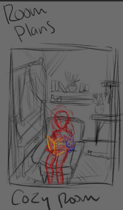
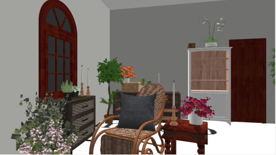
I had a vision of what I wanted the poster to look like. I wanted to have a small scene, with the witch and the cat in a cosy area with a large window to let light in - so I could play around with the lighting of the drawing. I used an online room planner to make up this room design.
I wanted to make it a bit easier on myself to draw, so I used that room plan I made up to go over for all the furniture. This helped me achieve the perspective I wanted as well as have the scene as close to how I pictured as I could. I know this method isn't the best and I should've tried to draw it myself, however because I knew I didn't have much time and that this piece is going to be displayed I wanted it to look how I had envisioned (I did think it made it a bit better that I had composed the room myself, rather than finding a random picture to use).
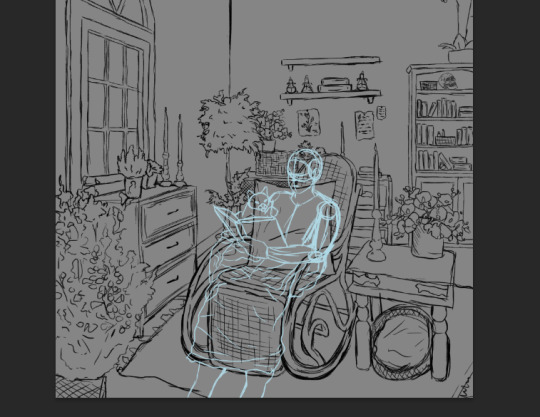
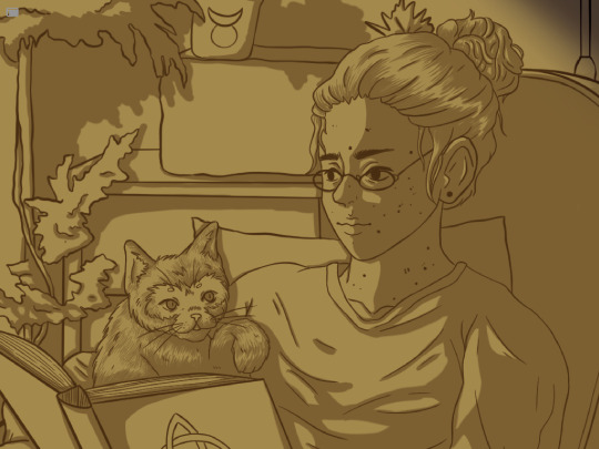
I then found a few pictures of people both with cats on their laps and sitting/with blankets and mashed them together to get a base to work with for my witch. I was a little nervous about drawing the witch, as I hadn't really been able to picture how she could look before this, before I got to working on drawing her I did some more to the room.
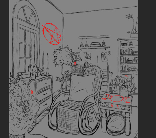
I found some Wicca symbols and decided to add them around the room to hint at the witchcraft - and also to the misconception around witches, as I think most of them could've just been Pagan/Wiccan or anything other than Christian and got labelled as witches because they were different.

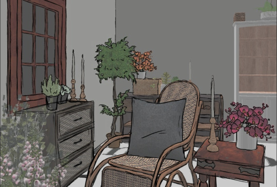
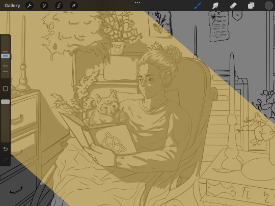
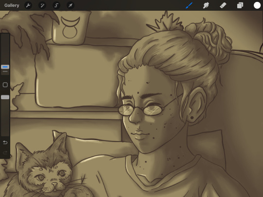
I got myself out of my procrastination and finally worked on drawing out the features of the witch and the cat. I quite like how this turned out, although it's not perfect, I still like it.
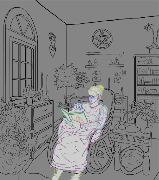
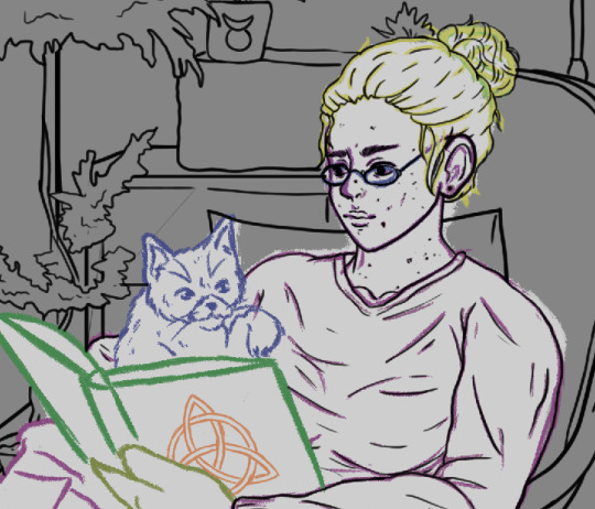
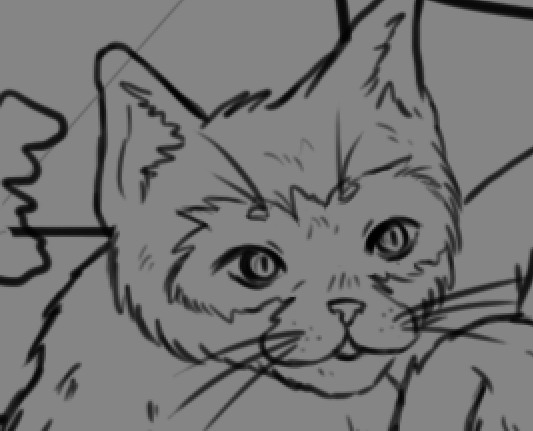
I swapped out some of the symbols and then started the linework. I wasn't too happy with how some of the furniture looked as some of the lines came out a bit thicker than I wanted. Once I got to the linework of the characters, I grew fonder of them. I made the markings on the cat match the hairless patches on my model, so that it reads as the same being. I fell in love with this version of my cat creature, it made me feel a bit bad for them and I think that's a good thing because that's how I want it to make people feel (in the best way possible, I don't just want to make people sad). This character was so happy and content, only to have everything ripped away from them and become a creature of vengeance and hurt.
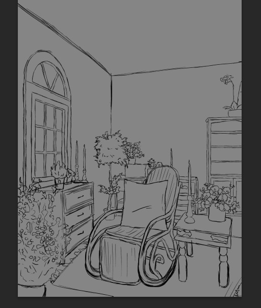
I made a bit of a silly mistake - I forgot to save my poster document to a place I would be able to access it at college. I had to redo the linework on Procreate when I got my iPad back from my partner (who had been using it to do his own project work). This was a bit of an inconvenience, of course, but it was only a minor setback and it actually allowed me to get more done on it.
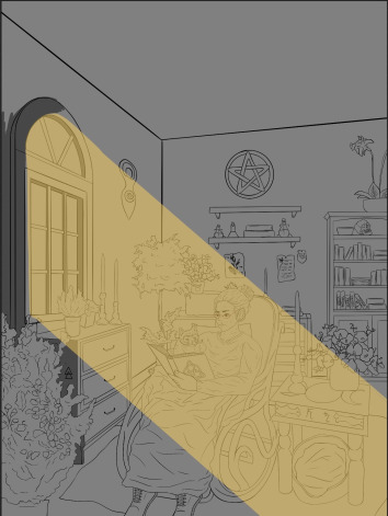
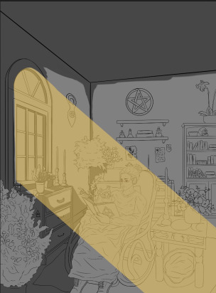
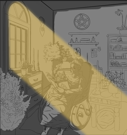
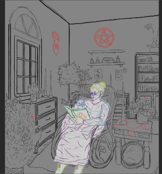
I did something a little different for this. I just wanted it to be linework and shading, so I decided to block in shadows with different shades of grey as well as blocking in the light coming in through the window. In some places the shadows were a bit hard to figure out, but I tried my best with it. I blurred the light coming through, just to make it less harsh and a little more natural.
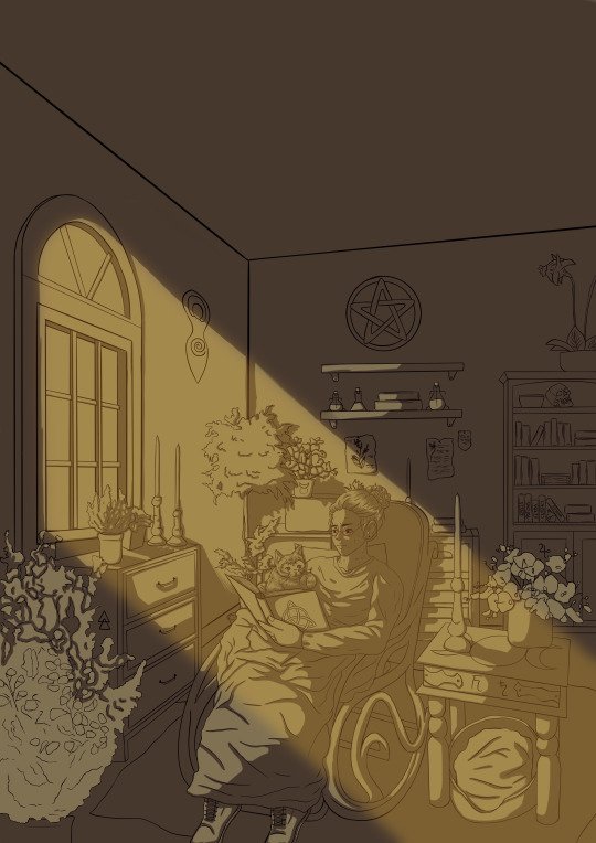
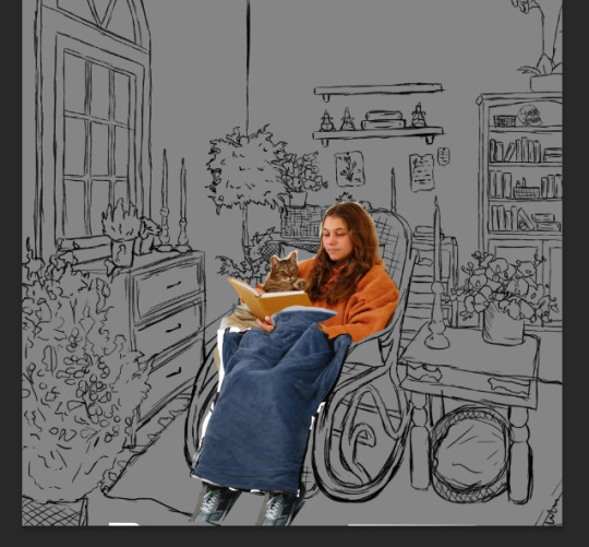
I thought the grey was a bit dull and cold, so I put a yellowy overlay over the whole thing and it gave it so much more life and a much cosier feel. It made the shadows more of a brown colour, and I preferred this over how it looked before.
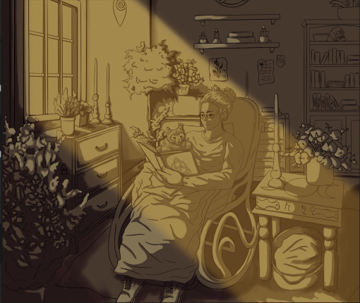
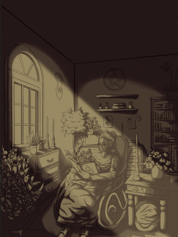
I went over with an even darker colour to deepen the shadows and make the lighting a bit more of a bam! and a little dramatic in a way. I also decided to make the light beam white instead of yellow, to make the slight monochrome vibe come through better. I think it also makes everything in the light a bit more visible.
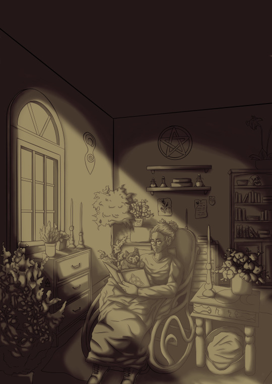
I went around and used the smudge tool to blend all the shadows out a bit, to make them a little less harsh and hard-finished. I think this makes it look a little more natural too. I also added some highlights to some of the bits, just to add a bit more light and a little bit of difference to it.
0 notes
Text
some makeup advice for new girls, women, and fems, from someone who started out a girl but still had to realise she was one after all:
YOUTUBE MAKEUP ARTISTS ARE (generally) FULL OF IT. There is no set "correct" method for doing makeup! How you apply literally every aspect of it depends on your face shape, individual features, skin tone, and personal style. YouTube MUAs who make tutorials will give fantastic advice if you share their exact face shape and features. Otherwise, take it all with a grain of salt. They're not a useless resource, but their words are NOT gospel.
Wash your face before applying makeup! A gentle cleanser (I typically use Cetaphil Gentle Cleanser and Happy Skin by Lush) and a rinse goes a long way. Removing the sweat and sebum/oil buildup will help massively, both in ease of application and overall final result. No cleanser? No prob, find some gentle facial wipes in the makeup section of the grocery store. It'll make a world of difference!
Also: use Q-tips to neaten up lipstick! You can get angled/pointed beauty q-tips at most makeup stores or stores with makeup sections. People rarely get their lipstick absolutely perfect first try, no matter how experienced they are. You can always adjust, tidy, redo, or start over.
When wearing lipstick, you do not need to line your whole mouth to the edge. Most people actually have uneven lips! It's usually not noticeable until you apply makeup to the whole shape and cry because it looks lopsided and messy. It's okay. You can change the shape of your lips and take creative liberties with it. No foundation or coverup necessary; just play with it, figure out what looks good and even and which shapes flatter your face. You can also overline a little on the top lip; try giving yourself a small cupid's bow! If you've already got one, try enhancing its shape :)
Similarly to Point 3; with liquid eyeliner, the way you may need to give yourself wings will differ depending on your eye shape. For example, I have hooded eyelids, so in order to get an angled wing, I actually have to draw straight up from the middle of my eyelid, then out, rather than following the corner of the eye. Finding out what eye shape you have and then looking at "how to do eyeliner for x eye type" will help much more than a standard tutorial.
This is less of a beginner tip, but primer really makes a difference. It helps with ease of application, blending, and makes the colours really stand out. Foundation can work as primer in a pinch for contour and blush, but I'd recommend saving up and investing in the real thing. Just remember there's different kinds of primer for face and eye makeup!
You don't need to apply foundation to your whole entire face. You don't actually need foundation at all; it can clog up your pores really badly, and using it as concealer runs the risk of worsening acne and rosacea. But if you want to use it, a little bit goes a long way! Sponge applicators work the best, in ny experience. Also, when in doubt, go for the lighter shade; not because lighter skin "looks better", but because too-dark foundation will make you orange.
If your foundation looks shiny or feels sticky or heavy, gently dab away the excess, and try following up with some powdered foundation. This sets and seals the layer and helps it look more natural!
Mascara is your friend, but apply her last or she will be your enemy. Also, if you've got blonde or red eyelashes-- try brown mascara first! You may find it enhances your eyes more than stark black, but it depends on your style. There's tonnes of different brush types and mascara types to experiment with, too.
Applying mascara is much less intimidating than it seems. Firstly, wipe the excess on the edge of the tube, like with lip stain. Be gentle, you don't always have to "blink" down on the brush. If your lashes naturally sit curved up or out, tilt your head up and back slightly, meeting your eyes in the mirror so your eyelashes sit away from the skin. If your eyelashes naturally sit downwards, tilt your head forward Kubrick-style and look up at your reflection. Gently comb the brush once or twice through your top lashes. Experiment with adjusting the angle you brush at or the ways you tilt your head, depending on your eye shape and size. For hard-to-reach eye corners, try using the very end of your brush with minimal product, or find an angled mascara brush designed for hooded/folded eyelids. For lower lashes, if they sit curved out or down, it can help to tilt your head forward slightly. If they sit on a short angle, tilting your head up and back can help you reach them. Using less product (wiping away more excess), lightly glide the brush down your lower lashes once or twice, until you're happy with the result.
Don't worry if mascara gets on your skin or eyebrows, it happens to everyone ♡
Most importantly, find what works for you. Makeup can seem really overwhelming; there's cream eyeshadow, powdered eyeshadow, liquid lip stain, tube lipstick, pen eyeliner, pencil eyeliner, liquid eyeliner, cream primer, liquid primer, pencil primer, liquid foundation, powdered foundation, concealer, rouge, blush, contour, bronzer, highlighter, mascara, mascara brush types, lip liner... You'll be okay. We're all scared of it at first. ♡
0 notes
Text


i used this as a starting point, for me it’s easier to work from a regular reference and build pixels ontop of of a sketch. this also helped me get used to drawing this character and getting his build and general design correct. i find it easier to use this as a visual guide and work from it.
here, i was blocking out the silhouette of my character. I wanted to give each shape it’s own layer, so that i could easily work out his design and add details ontop. i used different opacities on each layer so that i could tell each one apart. i used it as a base to separate each body part which would make it easier to work with shadows later. despite the character having thicker legs in my sketch, it didn’t translate over well into this style. i was inspired by Octavi Navarro’s style when making this, the characters are very simplistic, and their features aren’t defined. it’s also noticeable that they all have distinctly long, noodle legs. i really liked this style, so i decided to try to take inspiration from it for this character sheet.
here i started blocking in base colours on a lower opacity layer. this was so i could see the silhouette below.
next, on a multiply layer, i added shading using a warm purple. i used shadows to show roundness in the stomach, shoes, and on the hat. also, i coloured the “skin” on a layer below everything with a lower opacity to make it see through.
i’m not sure what happened here, but i pressed the wrong shortcut keys, and i wasn’t able to recover the base colours or silhouette i had just done, and i had to redo everything other than the shading. this was purely my fault for not properly understanding photoshop and pressing the wrong shortcut keys too fast.
after redoing the base colours, i added more depth to the shadows by adding another multiply layer and using the same purple colour i put more darkness in darker areas, ex under the stomach on the legs and on the arms. i also added highlights on an add layer with a slightly warmer version of the blue base colour on a low opacity. this gives a better sense of shape, as it shows how and what catches the light. also, i put a grey background behind everything to show the see through skin.
next, i added some details on a new layer ontop of everything. using colour picker, i would use a darker version of the darkest shadow to add dark details such as the middle line to show the coat (?? i don’t know what it’s called) and to add a little more darkness to some of the darkest areas. also, i added some more obvious highlights to the rim of the hat and the shoulder pads to make them stand out more and show that they are shiny. i also finally added the key, i put off doing it because i wasn’t sure how to draw it properly in this format/character pose. but, using a bright blue i made it stand out against everything else using contrast against the dark blue. and, i added a mouth once again to make him more human looking. this is less detailed than even the 32 bit character art, but i wasn’t looking to make him very detailed as i was somewhat inspired by Michael Myers’ X-Men Adult Swim ad artwork. https://drawsgood.com/x-men-apocalypse-adult-swim-ad-spot-pixel-art , i like that his artwork here doesn’t have lines, i think it would’ve made it too harsh. i also like that the colours are quite muted, as it adds to the aesthetic i’m going for with this character.
i chose a front from dafont. com, i went with picturama founder. i think it would look similar to how the character’s handwriting would look in the 19th century, i like that it was like cursive written with a fountain pen, it looks very old fashioned in my opinion and fits the aesthetic.
i think that the font though was a little hard to read because of the exaggerated lines on the letter “t”, it interfered with every word that came after it and it made it sometimes illegible. although, i still think this fits the aesthetic as old handwriting styles that were written in cursive are known for being somewhat illegible. i think that it also fits his character that his handwriting would be a bit unreadable because he is a careless character. also, the font didn’t allow numbers, which was annoying since i had to type out every number.
0 notes
Text
This exercise was to help us get into the process of digital character illustration. The particular element we focussed on was our line structure, we downloaded a character design off of moodle which we then had to trace over. While tracing we used the smoothing tool to help us get perfect lines. The picture we traced over acted as our point guide, as drawing perfect lines on photoshop is quite a repetitive and frustrating task. When drawing lines in photoshop for character design, a common technique to follow is simply creating the line in one go which can take many redos.
I did find this quite arduous and I quickly became impatient due to my inexperience with this method. A result of this was that didn't exactly follow the appropriate practice in drawing these lines. I was unsuccessful in linking my lines up and there were many gaps in my work (so I just filled in the gaps as best I could to make everything look smooth and uniform). After this, it became clear to me that I really must practice with my line work.
Next we got to experiment with a process called 'gray-scaling'. Gray-scaling is something which is very important to the colour composition of a character. It helps designers figure out the shading values between separated groupings within a character. Generally one would configure a variety of different gray-scaling combinations on their character. This enables them to line them all up against each other and decide which combination works best visually. After which they select a suitable colour scheme to match the tonal value of the gray scaled version.
I ran out of time to make multiple gray scales of the duck so I couldn't really follow through with the proper gray-scaling procedure. Due to this, the process was very boring :(
Moving onto colour, I already had a pretty clear vision of how I wanted the character to look, the only debate I with myself was colour to do for the eyes. After many different colour changes I finally settled on a bright yellow. I also included some shading in my design to make the colours pop, and also used it to create a more expressive face on my duck. The brows really add personality and emotion to him making him look quite different from the rest.
As a result of my general dissatisfaction with my line work, I tried to cover up the imperfections in my work by thickening the lines. It looks okay but I can do better and I am determined to get better at this. I plan to practice my lines on other characters of my choosing so I can apply my improved skills to the poster project!
0 notes
Text
Character Illustration: Class 1
I started this class by opening up some of the palettes which Toby said we would be using today. These palettes were the layers palette, colour palette (colour wheel) and the brush palette. I then saved the layout as a workspace by selecting new workspace in window.
Today we talked about line work for illustrations. We were all given a Wacom tablet to plug into our computer and then I played around with it for a bit. It's very different to drawing on paper or an iPad as what you're drawing appears on the screen rather than the tablet.
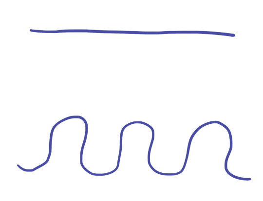
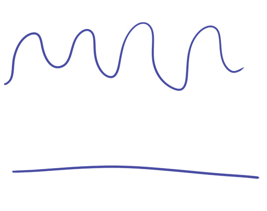
I tried drawing a straight line and a curvy line. As you can see, the lines aren't very clean and are really bumpy.
To fix this, I needed to increase the smoothing of the brush. Originally it was at 0% so I tried it at 50% and 100%. This allowed me to understand how the tool works and which percentage I should have it on when drawing.
This was the 50%.
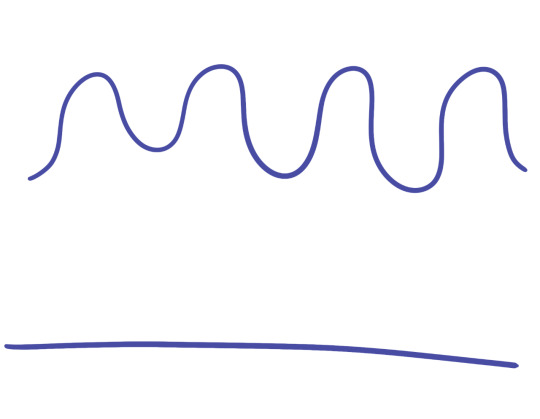
This is the 100%.
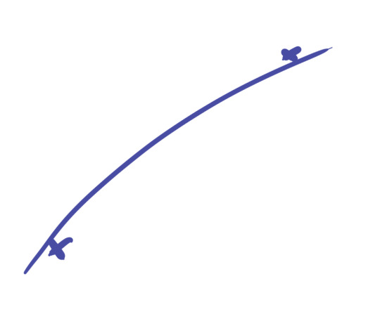
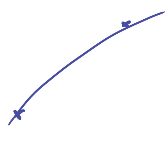
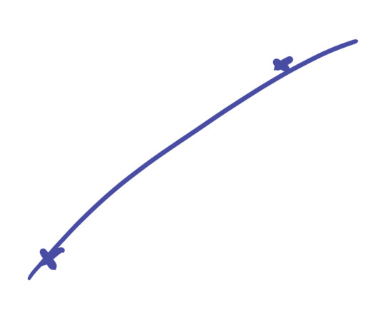
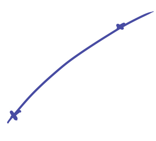
Since I am use to drawing on paper or onto a screen, it was difficult at first getting the line to go in the right direction. To refine this skill I drew two Xs and practiced drawing a smooth curved or straight line that went from one to another. It became easier time and I found zoning in helped at times. I think this is something would definitely take time to get really good at so I'll just have to be patient.
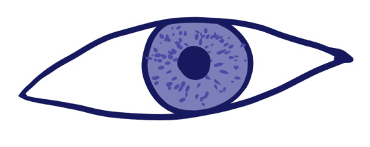
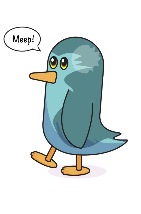
Using these curving lines we then tried to draw an eye. It was just a quick rough exercise to adjust to the tablet. I added another layer underneath and gave the eye an iris colour. I played around which the sensitivity of the tablet and pen when I made the specks in the eye.
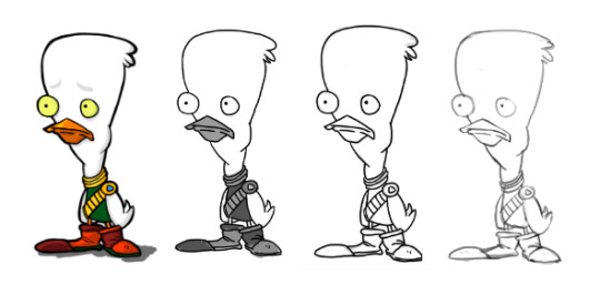
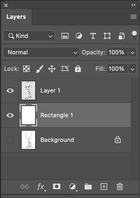
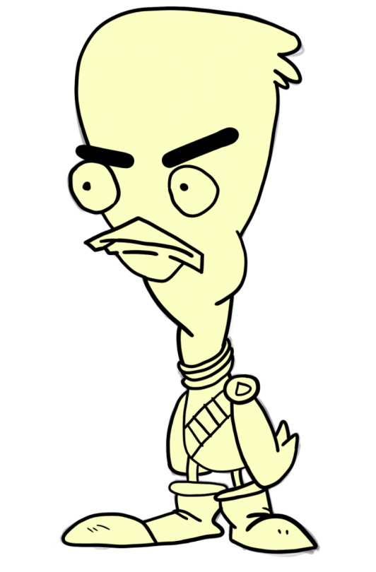
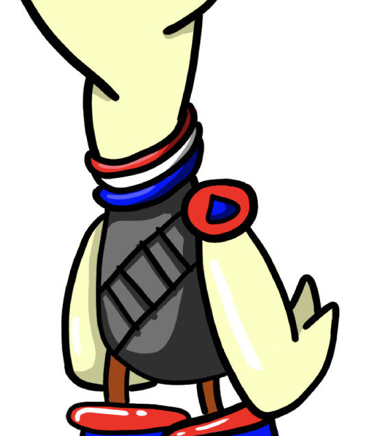
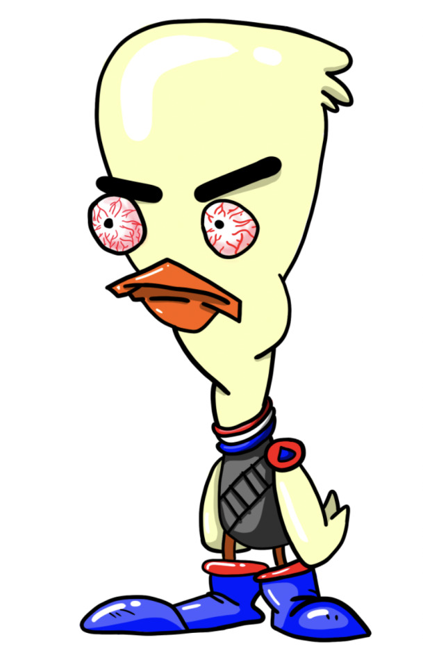
We then moved on to tracing a shape from a template. The first template we were given was this duck. It has a large variety of line lengths and curves so it will be a really good drawing to use to adjust to the tablet. I brought the image into PhotoShop and then added a layer. I placed a white rectangle over the drawing and then lowered the opacity to make the sketch less visible.
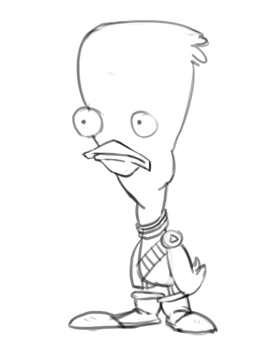
I then added another layer and started to draw the outline of the duck. This took we a bit of time as I was trying to make the lines as smooth and clean as possible. For a few sections, I had to redo the line about 10 times until I produced one I was happy with.
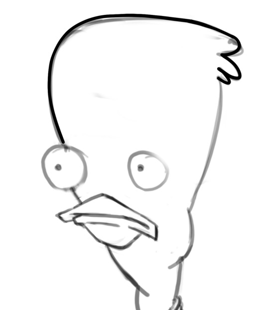
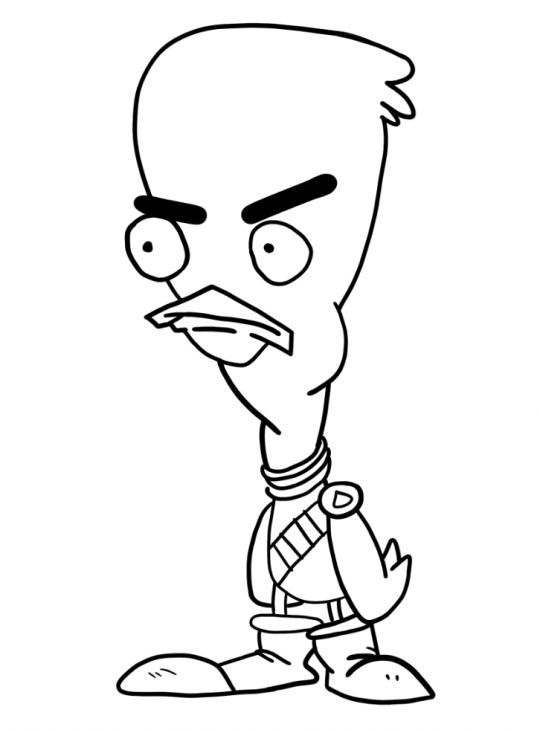
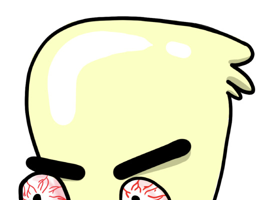
This was the final outline I had for the duck. I'm pretty happy with how it turned out. I think the curves are mostly all really smooth. The eyes are a bit rough but it's the best I was able to do. I decided to go for more of an angry duck so I gave him some big tilted eyebrows.
I then moved on to colouring the duck. I decided for this drawing I wanted to try and get use to the tablet more so I coloured the entire illustration in by hand rather than using shortcuts like fill. I'll use these better techniques in my second drawing.
I started by adding base colours on a layer behind the outline. I coloured the entire duck in a pale yellow colour for a start. This gave me a simple base colour to build off.
I then went and added all of my other base colours using the brush tool again. I frequently went over a line so I used the option key and mouse to select the other colour and quickly fixed it.
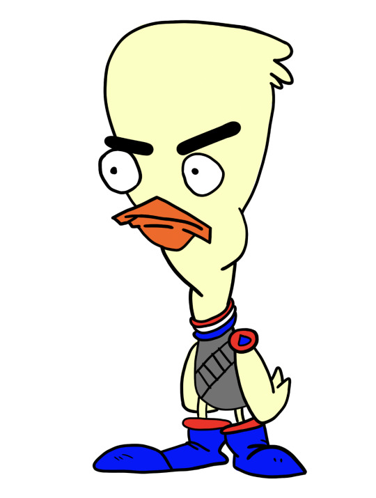
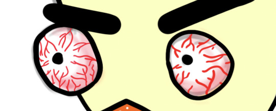
The next step was to add some details. I started by adding some detail to the eyes. Since he was angry I wanted to give him some red bloodshot eyes to match his fury. I made my brush a lot smaller and changed the colour to red. I then made a collection of squiggly, branching lines. I then wanted to add a redness around the edge of the eye. I started made my brush a lot bigger so it would blend evenly. I lowered the opacity of the brush to about 10% and started to build up the redness.
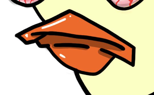
I then added some shadows and highlights to the beak. I used the colour wheel so select a slightly darker shade of orange. Shadows typically are under raised points so I added them under lines on the beak as shown in the image. I added a highlight on the top of the beak and a small one on the bottom.
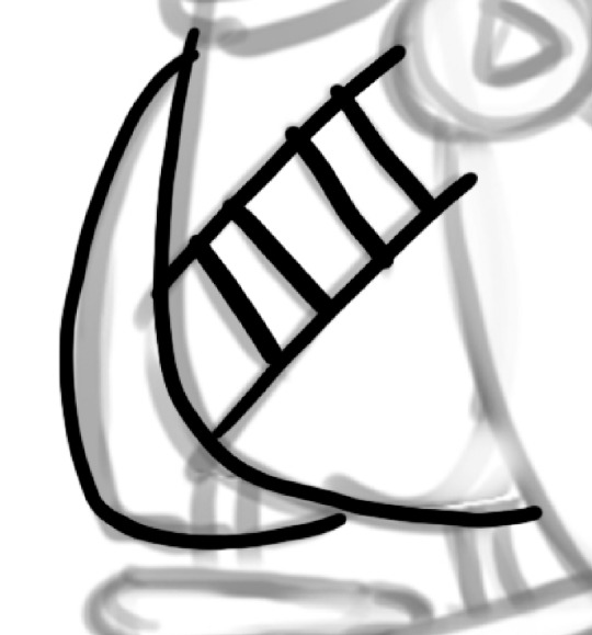
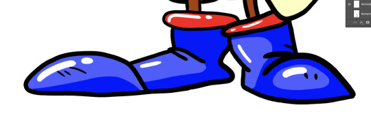
I then moved on to his outfit. I decided to make it so it looks like he was wearing a vest with some sort of shell (bullet) belt. I started by adding the darker grey shadow to vest. I just played around with the shape of the shadow as there wasn't any guide in the template. I then added some shadows on to the neck of the vest. I also changed the colours of the legs to match the darker orange from the beak. I think the yellow was a bit too light.
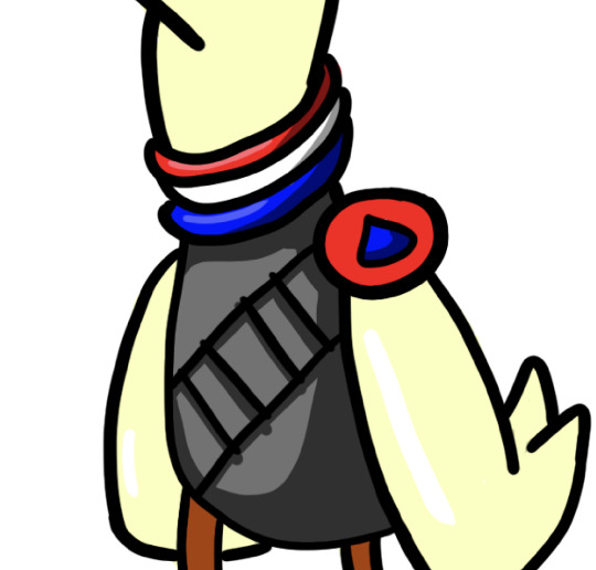
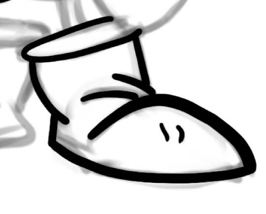
I then moved on to adding highlights and shadows onto the boots. I made the boots have a massive lip rather than a really thin one. I added a lighter shade of blue so that the darker one became the shadow. It took me quite a while to get the shape of the shadow right as I was trying to make it fit with the rest of the boot.
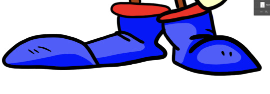
I then added some highlights to it to make them seems shiny and new.
I then added some shadows and highlights onto the duck itself. I added some shadows on the underside of some feathers and under his eyebrows to help express the anger. I added some highlights on the top of his head and on his wings.
This was first final drawing. I'm really pleased with the outcome as I've never drawn anything on PhotoShop or using a wacom tablet so I think this was a really successful first attempt. Next time I'd really like to try and add some more shading using brushes with lower opacities. I think this would really elevate the illustration. I think tomorrow I'll move on to the Rooster cop template and try colouring in using the proper way shown in the tutorial.
0 notes
Text
Week 3 Design Fundamentals Penguins!! 10th March
Hello, and welcome to my class 3 of design fundamentals post! to start of with I just wanted to say that I really liked this class and I enjoyed exploring new tool in Illustrator, and being creative with design choices.
Before I start talking about this class I am going to share my project work from last class. firstly here are the two images that I gave my partner to Illustrate.


I thought these two would be fairly simple, but have their challenges with having to use broken and hybrid points in some areas. And down below are the drawings I made from the images I was given. I found the goldfish one to be more difficult due to not fully remembering steps, and having to go back to my notes to check how todo things. But when I did the rooster I had got the hang of it better and found it easier. A challenge I did face while Illustrating them both, was not knowing that I could lock layers, So I kept on accidentally working on the wrong layers and having to redo steps. But now I know how.


So now we get to what we did in our week 3 class, which was make Penguins!! Below will be images of my progress and notes.
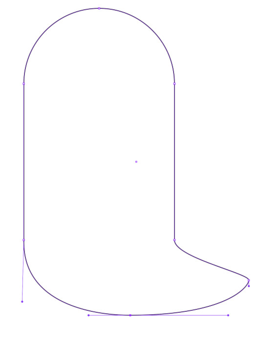
Here is the first thing we had todo, which was make this sort of ghost shape. We started by creating a circle then, splitting it in half by selecting half of it, then using the cutting command to remove it then copy it elsewhere, so we had now to seperate elements. The I had to join the two half together with lines, by selecting the anchor points and shift, then using command J to join them. And lastly we added new points and adjusted the curves to create the ghost tail. (also I will have an image of all the notes I took at the end of the post)

Now we are at the stage of not having a ghost blob and now having a more penguin looking shape that I think looks like Pingu. Mostly everything we did here, by adding and adjusting new shapes, was very similar to all the other steps we had done so far, so It was pretty easy. (We also made sure to save our projects after each step.) But the eyes were a bit different to make. We had to change the colour of the eyes and fill them in, and then add a radial gradient effect to the eyes to get the yellow around the black iris. Then copy one eye to now have two. while we were working on the eyes I learnt a lot about the stroke and fill sections and how to swap between the two and more about what they do. learning the radial gradient tool has been really helpful to me recently as I was able to use it for my graphic design poster assignment.
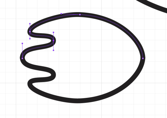
here is an image of the start of creating a penguin foot. This was one of the more complicated parts of making the penguin as we had to add dimension to them with different layers, stroke and fill options and colours. But here I had just flipped the top half of my foot to make a whole foot for my penguin. Before skewing it to add more dimension to it. I also put the background grid on to help me keep my handles on likes and shapes more proportionate.

This is an image of some of the option windows I had open for different tasks like the stroke and where it would be compared to the initial line, the pathfinder and the swatch section.

Here we were creating different layers before locking them etc for colouring in the penguins. I enjoyed learning about layers on Illustrator as I have only ever learnt about photoshop layers which are different.
And tada here we have my final penguin! Here it is fully coloured a shaded, using layers of layers to layer on the shadows and highlight. And using the pen tool to make the shapes of shading like the light blue around the pengiun's face. Also the opacity tool lower the opacity of different shadows. was used to The the I really enjoyed this and being wild with my shaping and Im really happy with how it turned out! Overall a really fun lesson and I learnt a lot. and I'm excited to use my new found skills in other classes.

0 notes
Text
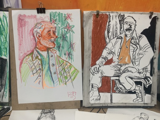
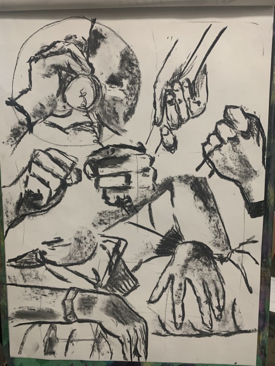
Tuesday 25th October 2022 - Part 2
other artworks I liked - in general I like all of these for their styles and the layout of the drawings. Despite this, there was not anything that stood out to me enough for me wanting to replicate it in my own drawings.
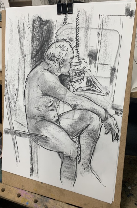
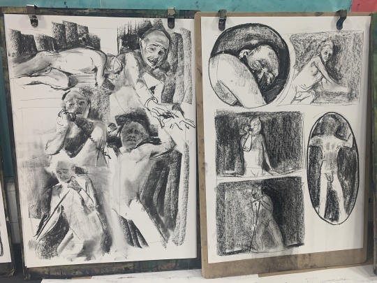
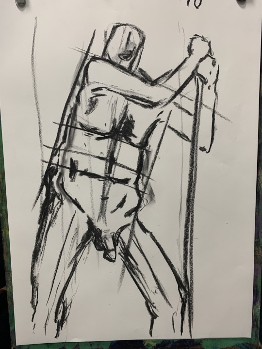
using the plum line - I used the plum line again to get better placement and proportions. Unlike last week, I found that using the measuring stick was more useful for this.
main focus - repeating an exercise from last week, I wanted to focus on hands again as I still struggle with them. I am really impressed with myself with how well these hands came out. It is a vast improved from last week, and is definitely the best set of hands I have drawn so far!
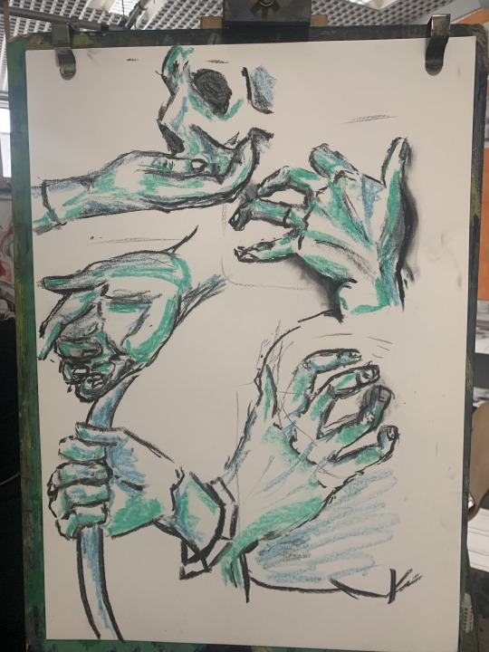
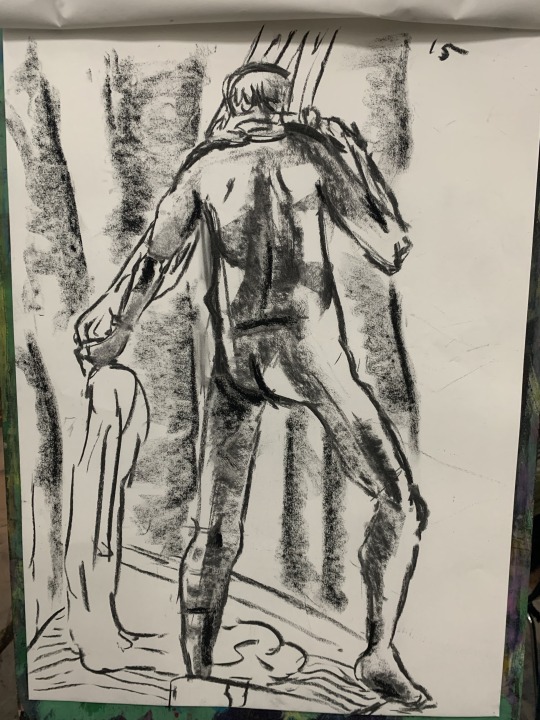
Full body drawing - following the second set of hand drawings, I continued using charcoal and coloured chalk for this piece. I wanted to use the colour on something that would stand out the most, therefore I used in on the flannel shirt to convey the different lines.

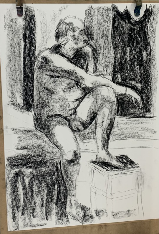
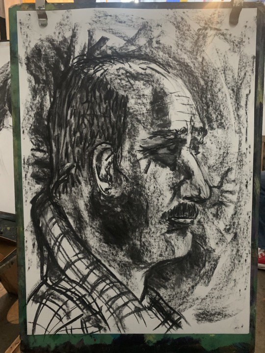
portrait - I quite liked focusing on the face rather than the body for a change. Portraiture was something that first got me into art, so it was a bit nostalgic for me to do this. I have never done a portrait with charcoal, so it was a challenge for me. It is not bad for a first attempt, but the head needs to be wider and rounder. Furthermore, I needed to redo the eye as it is too big and too toned to what I wanted it to be.
0 notes
Text
i've been thinking of ending my life since i was 13. the thoughts have been on and off, sometimes worse sometimes manageable. i've survived when it was at its worst when i was 15. i survived it when i was 21, 22. but now i'm 23, the thoughts can't seem to go away. what's even terrible is that right now feels worse back then.
did find someone to listen but they were handling their own problems too and they ended up feeling manipulated, i hurt them because of it. been trying to talk to other people, they don't really let me talk they just send me sad faces and virtual hugs. those could have helped but they're not working anymore. when i bring it up to my brother, he'd just go and talk about his own issues. my parents? i've mentioned it again and again through the years and they'd always dismiss it. i'd hide going to the therapist but there's nothing that can be kept for so long in this house and they'll absolutely call it bullshit then everything's going to get heavier. i've been screaming for help, now i don't even know how to talk about it without hurting anyone.
feels suffocating that i can't talk about it to anyone. i want to get out of here. i want it to end. been trying to reach out to people, been trying to work it out by myself but things are just getting too exhausted for me. i just really want to die already so that i wouldn't feel anything anymore. even simple things have become bad in my mind. that game fall guys? it has caused me so much emotional distress that i don't want to see it. i've always loved eating and i was a big eater but i can no longer eat more than a single serving of rice. i can't function well, i can't draw, i can't colour. i used to find colouring as my most favourite thing in the world. joining voice calls have been stressing me out so much but back then i'd find comfort in them. every little thing makes me want to cry. even showering is hard now because i'd be alone there with my thoughts. now i have to redo my thesis and i'm just so afraid it'll make everything worse again as it did at the start of the year. i can't even listen to music properly now because it'll just make me imagine things then i'll eventually imagine dying. now, i always need to watch something to distract myself but i'm scared that soon, it'll also become hard.
i need someone to listen but i'm scared i'll end up hurting them again. i don't know what to do anymore. wouldn't it be better if i just do it?
0 notes
Text
Warm 'n' Soft
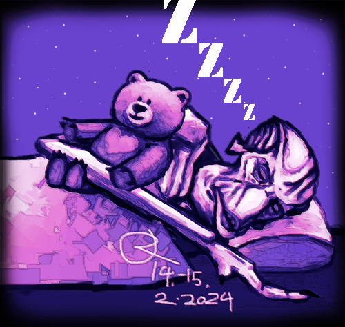
Man, this took more than it can look like... I have been working on this for like 10 hour straight... I just couldn't stop working on this... I struggled a lot with this and I had to redo his head after colouring and shading it for hours because it had way too many flaws... So yeah, this had originally colours, pretty experimental stuff since I tried some colour theory stuff, but I removed them because it was much easier to fix his head in grayscale. I didn't wanna colour this again since man, digital stuff feels much harder than traditional stuff... The original reason why I wanted to draw this digitally was to make it easier to try out colours but I was wrong... And I was wrong again actually, because when I did first that digital sketch of Molluck's anatomy, I thought that it would be easier so, but it was actually easier to draw the same thing on paper... I gotta do something to my digital art stuff since making it feels like painting with fingers compared to doing traditional art... And yes, the reason is that I draw with the mouse.
But yeah, it was such a fight to get this done, somehow. I felt so frustrated again but I feel better now when I could make this look better with my editing skills. And the reason why I basically just drew this was because I felt too tired and depressed to do anything else... Man, it just feels like I'm too tired for anything... Getting out from my bed feels like forced... But I'm trying my best, for whatever reason.
But yeah, what's this? Molluck sleeping with a teddy bear? Why? Well, I just felt like drawing him sleeping and that teddy bear symbolizes me, so this is kinda a self-insert thing without being obviously it. It has been just told me that I do look like a teddy bear, so that's the thing. I do not wanna show my self-insert stuff but stuff like this is fine. Well, kinda related to this, sometimes I just wonder how Glukkons would see humans... I don't know much about how they see the other species' appearances but the Sligs being ugly without the mask... I just like to wonder all kinds of trivial stuff related to Molluck... And no, I don't really wish humans to be in Oddworld but I always imagine myself just like I am with him.
Oh, and yeah, this ain't a Valentine's Day thing, didn't 'celebrate' it (it's actually a 'Friend's Day' here), but well, it can be something like that too. I'm sorry that I had to vent... I'm just starting to feel worse, again... But I'm trying to think about what I drew, that maybe I could truly keep Molluck feeling warm and soft... I'm alone with my doubts about myself but like I said, I'm trying my best...
9 notes
·
View notes
Photo

Sorta recent thing I did a while back but didn’t post. I’ll probably fix the sleeves someday in the future
It’s from Fairy Tail, Chapter 357
Please do not repost!
#the sleeves really do suck#i was so confused because i had to try to make the existing crease exist but i had to add to it and it was just one big mess#i really want to get better at drawing and colouring then redo this in the future#fairy tail#freed justine#yajima#tartaros arc#manga#colouring#also now that i really look at it i feel like freeds hairs lineart might be too vibrant a green compared to everything else
45 notes
·
View notes
Note
Hey :) I've been looking at your blog and first off, wow. Second, you're really good at digital drawing and I'm trying to get better at digital drawing but I can never seem to get the lines straight or the colours even and in the lines. So if it's not too much trouble, could you maybe tell me what app you use or what brushes you prefer? I'm currently using ibisPaint X and I'm drawing with a sketchpad :) it would really help if you gave me some tips too! Thank you!! Also, you're really talented hehe
Hi there, I'm glad you like my art thank you so much! ; u ; <3
And sorry for the late reply, I wanted to write up a full response with some examples!
So for my artwork, I use almost exclusively Paint Tool SAI. I specifically use the original SAI atm, though I want to try using SAI 2 more (the brushes just feel... different. I've been using SAI for a decade now, so it's where I'm most comfortable.)
SAI does cost money, but there are also free alternatives online as always. I'm not familiar with IbisPaint X, but I know that FireAlpaca and Krita are two good free options. I don't use a smart tablet or apps to draw, though, so I'm not sure what are the best options outside of PC.
As for brushes, I use three brushes for my lineart-- though 2 of them much more than the third.
The first brush I use is my Marker brush. I've been using this brush to line my work for a very long time. It's thin and somewhat transparent (sometimes I copy-paste my lineart a couple of times to bulk out the transparency).

The second brush I named TEST when I made it and I just never changed it, so it's my very permanent TEST brush. It's sort of similar to my marker brush (it even uses the SAI marker brush base), but it's thicker and a little more ragged. I tend to change up my style when I use this brush.

The third brush I use for lines is not one of my "lining" brushes. It's a painting brush named GREGORY and I Mostly use it to paint backgrounds and details in fur. I change up the "blending" setting on it as needed. I usually only use this brush to line if I'm having artblock or am sketching around.
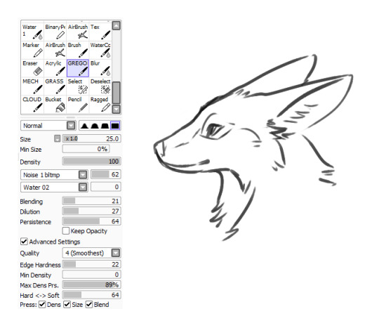
As for keeping lines straight, I honestly just gotta say-- there's tricks to cheat the system! The first, easiest thing is you can find the "stabilizer" setting on your art program, slide that bad boy up, and have some assistance with keeping your strokes smoother.
The second thing you can do is... not really "line" your artwork.
I tend to fight with lineart a lot. Sometimes it's not so bad (especially with my TEST brush), but a lot of the time I just line something and hate the end result, if I can even push myself to finish it.
So, instead of "lining" over my sketch layer, I just... make the sketch my lines.
My sketches are usually pretty detailed so I think that helps, but I basically just erase and go over the lines meticulously in small increments until I'm left with linework. And if I'm having trouble with a spot, I'll just make a new layer, "properly" line that spot, erase the section of the sketch under it, and then merge the layers and move onto the next section. (I also keep my fingers over my undo and redo hotkeys, since a lot of lining can be just undoing a mistake and redoing it until you like it.)
For example, here's this dragon I've been working on, in its original sketch:

And here it is halfway through the cleanup process, where you can see an amalgamation of clean lines amid the remaining sketch:

And here's how it looks now:
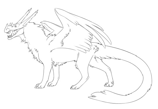
Lines won't cooperate? Make friends with the sketch! I often feel like it's easier to keep the personality of the original sketch when I do this also, though that's just personal preference.
Now as for keeping colour inside your lines, Layers and layer settings are your friends-- that and the magic wand tool (which is a selection tool).
When I use the magic wand tool, I tend to select the area Outside of my drawing first
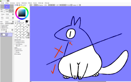
If there's a hole in my lines and I'm having trouble finding it, I cut a line across the drawing and use the magic wand tool again so I can see which section of the drawing the linebreak is in and fix it.
Once the lines are sealed, I invert my selection so it's inside the lines rather than outside! I prefer to start outside since I find it easier than individually selecting the inner parts of the drawing. It's worth mentioning that the magic wand tool is not perfect (especially if you have sketchy, ragged lines like I often do), so you might have to clean up the edges.

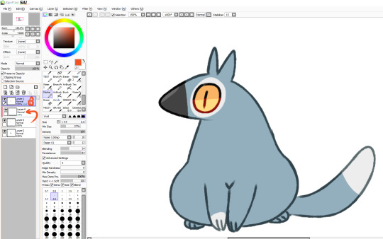
You can make layers under your linework that you can freely draw on without disturbing your lines, and they will conform to your magic wand selection as well. What more, though, you can also make clipping layers/groups which are layers that affect only the pixels below them.
So like in this example here there are four layers. There's the lineart layer, the layer for the base fur colour, a layer for the details (beak, eyes, white spots), and then there's a clipping layer that is on top of the details layer.
Anything I draw on that clipping layer can only appear on pixels directly below it. This is useful for a lot of things like detailing and shading. It also means you can safely exit out of your magic wand selection and still remain in your perimeters.
You can also lock layers which is like using a clipping layer, only you're affecting that actual layer instead of going over it. Whichever one you want to use is pretty much just personal preference or situational.
You can also use these layer settings to colour in your lines, if that's something you want to do!
I hope some of this helps! I also hope that you're having fun with doing digital art! :D <3
#also I love your username#so-once-i-was-a-chicken#digital art#replies#art tips#art programs#art brushes#brushes#paint tool sai#maybe I should put some of this under a readmore but naw#long post#not art
223 notes
·
View notes
Text
Art Advice #4 - A Beginner’s Guide to Digital Art
Hi all!
This weeks entry into my Art Advice tag, where I offer various advice for artists of any skill level, is about digital art! Now, I am by no means an expert at digital (I’ve been doing it for nearly 8 years at this point and that is almost entirely self taught), but I have picked up a few pointers in that time which will hopefully help anyone just starting out!
(this blogpost is a little over 2000 words long btw)
A Beginner’s Guide to Digital Art
I know that the world of digital art has changed drastically in the 8 odd years since I started, but I’d still say that some of the options I started out with will be just as good for anyone who’s starting out now!
As always, I’ll be splitting this into sections to make it easier for you to navigate this post!
Part 1 - Equipment/Hardware
There are a lot of drawing tablet options on the market at the moment, and I’m not going to pretend that I know anything about half of them lol. But I think for a beginner, don’t worry about going for the most expensive option, even if the reviews are really good or your favourite artist uses it, especially if it is way above your budget!
An important thing to know is that there are two types of tablet. One is the plug-in kind. These are essentially a pad which you plug into your laptop or computer and draw on that whilst looking at the screen (they basically work the same way as a plug in mouse works). The other kind is the screen variety, which is a lot more like what most of us know as ‘tablets’ nowadays. And you draw directly onto the screen.
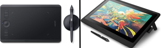
(a plug-in vs on screen tablet, both from Wacom)
Now, as for choosing between these, it is honestly a personal choice. But I’d say if you’re just wanting to try digital and you’re on a budget, a plug-in tablet can be really useful since it gets you used to the mechanics of what digital is like, and they are often significantly cheaper than the screen alternatives. I would say that plug-in tablets are a big learning curve, especially if you’re used to doing traditional stuff, but I do know a lot of professional artists who still use this kind of tablet when doing their work, so if it’s something you can get used to I would definitely consider it! Also, they’re often a lot more portable than some screen tablets! The first one I had was a Huion (a model so old that I can’t even find a link to it now lol), and I also know that Wacom are a well known brand that do some decent plug-in tablet. I’d recommend you do your own research on other brands and options, though!
Screen tablets are often a lot more expensive, but if you’re used to traditional art, they are a lot easier to get a handle of! But I know if you already have something like an iPad, or other general use tablets, then they offer apps that you can use to draw on (as well as things like the Apple pen, or other stylus’). The big difference between using these general tablets and ones specifically designed for drawing is pretty much purely a personal choice. I personally prefer the bigger screen of my XP-Pen tablet, along with a special screen protector that removes the shininess of the tablet screen and makes it feel more like ‘paper’ over when I used a general use tablet it draw. But if you already have an iPad, or something similar, then it’s honestly a really great starting point!
I think it’s important for me to mention that you don’t need fancy equipment to be an artist. The incredible Elicia Donze has revealed countless times how she has very basic equipment but still manages to produce the most stunning artworks! All you really need is some kind of drawing apparatus and a lot of patience lol! Getting good at any kind of art takes a lot of time and effort, but I would definitely say it’s worth it when you’re able to look back at your progress!
Part 2 - Software/Drawing Programs
Much like with the hardware discussion, choosing which program to use is entirely down to personal preference. I personally have never really liked Photoshop purely because it’s really complicated, but I know so many artists swear by it.
I think the main aspect to consider when you’re starting out is whether you want to pay for a program. Software like Photoshop, Clip Studio Paint and Procreate are some of the popular ones I hear about a lot of people using, but all require you to purchase or subscribe to them. So if you’re young or on a very tight budget, I’d honestly recommend the free alternative versions of these, such as Krita (Krita is quite a large program, but it has a lot of really awesome features and is very similar to Photoshop!), Gimp (this one is similar to Krita, but has slightly less options, I’d honestly recommend Gimp for anyone who does photo editing though!) or FireAlpaca (this is the one I use, by the way and it’s a pretty simple program, but has a lot of fantastic features and is perfect for how I work!). These don’t have as many features as some of the paid alternatives, but I honestly think all you really need to start digital art is some kind of ‘canvas’ and set of brushes!
Another great free program for beginners I’d recommend is MyPaint, which is great for doodling and just getting used to how digital art feels in comparison to traditional! It also has a bunch of ‘traditional style’ brushes, to make it look like charcoal or watercolour (which I’m sure the paid alternatives have too, but it’s always better when it’s free, I find lol...)

(this is an example of a drawing I did on MyPaint using the ‘charcoal’ effect brush!)
Most of the sites are pretty self explanatory, with sections dedicated to different brushes (I’ll go into the types of brushes later on in this post btw!), adjusting brush size, shape and opacity, a colour wheel, etc. You also have a section dedicated to ‘layers’ (another thing I’ll go into more detail later), and various ‘filters’ and editing options and effects you can add to your work to make it more interesting!
I’d really just recommend playing around with programs until you find your one!
Part 3 - The Pros of Digital Art!
I realise this section should probably earlier in this blog post lol, but I kinda wanted to go into what digital art can achieve in comparison to traditional art, and how beginner artists can utilise this!
I definitely didn’t take advantage of certain aspects of digital art when I first got into it, and they’re things that would have definitely made my life a whole lot easier lol!
Digital art allows you to tweak drawings as you do them. So if you accidentally drew the eye too far to the right, then you can easily move it to the right place. (I usually do this by selecting whichever area is wrong, cutting it out and then pasting it into a new area... And yes, there is probably a better and quick way of doing this but...I haven’t found that way yet lol...). And I honestly think that this has allowed me to look a lot more at a reference image in order to figure out where I’ve gone wrong with a drawing! Whereas with traditional art, I usually spend so long trying to get an eye right, that even if it’s slightly in the wrong place, I don’t want to completely redo that section. Digital allows you to completely rub out sections without leaving indents, which is honestly such a saving grace!
Another pro of digital is the Undo/Ctrl Z function! This means you can easily go back to before you made a major mistake with just a click of Ctrl Z... Though I have to say that this function has honestly ruined traditional art for me... Oh what wouldn’t I give for a real life Ctrl Z... But yeah, this is a great part of digital art and definitely something you will grow to love lol!
Another great thing about digital is that it allows you to flip and turn a canvas as you’re drawing on it. I spent a lot of time trying to turn my tablet around in order to draw certain parts of a piece before I realised you can turn the canvas itself without having to move yourself or your tablet!
Layers are another part of digital that can be super useful, and I have to be honest but I don’t really use them a lot. I know a lot of artists create layers for every section of their artworks (so, one for the linework, one for colouring, a separate one for the background, etc etc...). And there’s something really great about being able to paint without worrying about smudging into a previous section of the painting. This works well for my work since I do a lot of bright backgrounds. I also often create a lot of ‘versions’ of my works, so it’s useful to be able to change the background without affecting the main figure of the piece! (I have to say that I often work in one big layer when I’m doing paintings, just because I like how it feels more like ‘traditional’ art that way, but layers are such a brilliant tool, and definitely something you should play around with!)
The eyedropper tool is another one that is really useful! Although I never colour pick from my reference photos, I know some artists find this useful when they were just starting out (especially if you’re not sure what colour to make shadows or how to mix skin tones, etc etc). The eyedropper basically means you don’t need to mix your colours every time
Part 4 - Just some other things I wish I had known about when I was starting out lol...
This last section is just dedicated to a few things that I would have liked to have known when I was just starting out all those years ago.
First one is fluffy/textured brushes!
I spent most of my art life from 2013 until 2016 using ‘round’ brushes which are notoriously hard to blend with, so I’d recommend either downloading some fluffy/textured brushes (DeviantArt was where I got mine from a few years back, but there are probably other places you can get them for free too!) to your program of choice, since most of the programs I’ve used haven’t had fluffy/textured brushes as pre-set.
I may make another post about how I blend in my artworks if that’s something people would be interested in?
(this is an example of textured brush blending vs round brush blending... I usually opt for round brushes for rougher blending styles and the textured brushes for more smooth and ‘realistic’ blending... for a lot of pieces, though, I use both brushes (the round brushes are good for details!) in the same way that you use different sized brushes for real paintings!)
The next thing I wish I’d discovered earlier is the Brush Stabiliser option. Some programs may do this automatically, but the one I use (FireAlpaca) requires you to manually change the amount of stabilising you have on your brush. This is particularly useful if you want to draw neat lines or straight lines (the stabiliser essentially slows down the ‘ink’ as you’re drawing). I only recently started using the stabiliser, and although I still like having it mostly turned ‘off’ for doing sketchy work, it does make doing line work a lot easier, and also gives pieces a more polished look!
Next advice is to explore all the options you can in whatever program you use!
I feel like with certain programs, you can get overwhelmed by choice and you end up just using a few of the functions. But I’d really recommend just playing around with these programs, trying all the filters and editing options to get used to how the program works. You can often find interesting ways to adjust your artworks this way! In a way I’d recommend this way of working more than finding tutorials made by other people... Unless there’s a specific function you want to learn how to do, just having fun with digital art is a major part of it’s appeal to me!
~
There are probably a lot of other options I could go into, but this is already over 2000 words long, so I’ll leave it here for now lol! (I may do a part 2 though so... keep a look out for that!)
As always, if you have any questions to things I’ve said here, or are just looking for more advice, don’t hesitate to message me!
And if you like my work on here (art & blog posts) feel free to support me on my Ko-Fi! <3
#art advice#digital art#art advice for beginners#digital art for beginners#artist advice#digital art tips#artists on tumblr#just want to say again that i am not an expert at this at ALL lol#i just want to offer some really basic advice to anyone interested in starting out with digital!
92 notes
·
View notes
Text
what other people want added to Minecraft: g u n s
what I want added to Minecraft
•Birds
-For multiple biomes, but mainly for the forests.
-Songbirds would add SO MUCH life to the otherwise quiet areas of the game
-Ravens and crows would be awesome and could use some of the parrot mimicking AI
-Cardinals in the snow biomes would bring a GORGEOUS pop of colour into the white atmosphere
-Seriously we need something to populate the sky, parrots do NOT fly like they should
-nests in trees, can find eggs in them
-doesn't really add a use but fun new feather types would be cool
•Owls
-technically still a bird but would go really well in covered rooftop forests and snow biomes
-we're already getting larger avians added in the form of vultures so why not more large birds?
•Mice and / or rats
-absolute precious babies
-sadly would go well with owls :(
-with cave update coming we need adorable rodents scurrying around
-lil bastards could make mouseholes inside of blocks
-will they be tameable? idk.
-adds the necessity for cheese
•Deer
-MOJANG this is a MUST, this is a NEED
-You literally have pigs, chickens, cows, and sheep spawning in forests what the fuck
-Deer with spotty baby fawns??? Yes
-Young bucks with different stages of antler growth? Yes
-Fawns frolicking in flower forests bc they feel safe
-Stripped wood appearing on trees where bucks scrape velvet off their antlers
-Being able to collect sets of antlers when they fall off periodically (would NOT be attainable by killing the deer, you have to wait for them to shed)
•Elk and Moose
-Same vein as deer
-Bigger, much bigger, neutral instead of passive, less shy
-Snowy biomes
-Better additions than fucking llamas tyvm
-Sidenote but savannahs could also really use some endangered deer-like species to help raise awareness for their status
•Squirrels
-Mojang plz
-Adds nuts to Minecraft ;)
-Black, grey, red, and mixed colour squirrels and breeding
-Brings life to forests like songbirds and deer
•Bears
-Mojang bby you literally already have a neutral bear in Minecraft why have you not reskinned it for grizzly/brown/black bears?
-Bear caves
-Hibernating mobs
-Brings more use to the beehives and bees, bears could be attracted to any area that has more than one bee hive with honey
•WOLVES AND DOGS
-They NEED the ocelots and cats update
-More wolf types (red, timber, snow, black, etc)
-Actual wolf packs (the AI would be difficult to program but the doges are worth it)
-Please let the howl at the moon, if foxes get to say ringdingding all night long wolves deserve to be allowed to howl
-More dog breeds (I know that there's no reason for domesticated dog breeds in Minecraft but ACTUALLY THERE IS)
-Hunting dogs like springers that can jump and run faster
-Foxhounds :D
-Most Important Goodest Boy: Herding dogs like collies and sheepdogs
-Herding dogs could be found in plains where cows and sheep spawn and create herds
-LET DOGS LAY DOWN FOR FUCKS SAKE
•Herding
-Instead of having to pen up and enclose your livestock you could form herds of cows and sheep
-Your Goodest Boi herding dog would protect them and move around with them when they graze
-Just soft peaceful minecraft tingz
•Salt licks
-Something SO SMALL but would make SO MUCH HAPPINESS
-Drawing new cows into your herd by putting up a salt lick
-I'm soft
-I guess salt would be a new ore???
•Bird feeders
-idk I think it would be cool
-excess seeds used for SOMETHING
•Raccoons
-The coolness of wolves, the chaos of foxes, the cunning of cats
-thumbs
-be gay do crimes
-can open chests (trigger trap chests to catch them?)
-Fantastic little shits
-Not tameable but will trust players like foxes do
•Snakes
-I know it's a lot to ask and it would be hard to make them look good
-But??? Imagine a tiny lil garter snake in your garden
-unlikely but would be so fantastic
•Rope
-climeable
-please Mojang we need this so badly
-imagine the ships? The bridges? The bell towers and everything?
-super easy to add, just reskin vines and add a string crafting recipie
•Butterflies and Moths
-Bflies could be a unique mob to flower forests and friends with bees
-if moobloom is added they would all be BEST BUDS
-get it "buds" ahahaha
-help with flower polination but just gives a TON of life to flower forests
-We literally have lanterns in minecraft why do we NOT have moths? Such a cool aesthetic addition.
-helps fill both the daytime and nighttime sky
•Hummingbirds
-fourth member of BEST BUDS
-just soft baby
-i love birbs okay
-the only avian who does not work for the bourgeoisie
•Fireflies
-10 million of them please
-they give great hugs
-adds so much atmosphere to the night world
•Cheese
-We have milk
-We have, presumably, goat milk
-Quit being cowards and add butter and cheese
-Butter churn job block for villagers
-V funny bc they have no arms to churn with?? Oh well
•Seashells
-Something decorative and beautiful that could 1) liven up beaches and 2) have snails and crabs inside!
-Mojang plz do not add sand dollars to the game people already don't know how to tell if they're still alive before trying to take them home
•Whales
-WHALES.
-Imagine something as massive as the ender dragon but peaceful. Allows you to stand on them (idk how but make it happen Jeb)
-WHALE SONGS.
-Being so deep and far out into the ocean, and when the moon is high in the sky and you're sitting in your boat, you just hear the beautiful melancholy sounds of the whales in the distance
•Jellyfish
-Idk if y'all know this but the glow squid is a bad idea
-Dream buddy you fucked up, please use your influence to get in contact with Mojang and have them redo the vote. People would have so much regained respect for you if you tried to fix your mistake.
-Also why does a speedrunner get to tell millions of people what mob would bring more life to Minecraft? He's only playing the game for 5 minutes smh
-aNYWAYS
-Jellyfish could literally do everything the glow squid is going to and look better for it AND possibly be neutral instead of peaceful
•Orcas
-Not much to say but it would liven up the frozen water biomes a bit
•Penguins
-You already know why
-Imagine giving a new home to all the Club Penguin players? Legendary.
-Gender doesn't exist in Minecraft but we all know penguins would be hella gay
•Lobsters
-I think they would be cute
-You would NOT BE ABLE TO BOIL THEM ALIVE THANK YOU VERY MUCH
•Mermaids
-Never going to happen since passive mobs are generally real life animals but it would be so cool
•Otters
-they can hold hands
-brings life to the rivers
-super cute
•Frogs and possibly toads
-Swamp gods
-Absolute mad lads
-maybe grow from tadpoles
-wouldn't do much but needed
•Fairy Forests
-NOT Twilight Forests. Not a new dimension.
-Just gentle hidden groves in forests
-ADD FAIRY RING GENERATION TO MINECRAFT.
•Big cats
-Tigers, lions, bobcats, panthers
-Literally anything that could finally add a strong predator possibility to savannahs and jungles
•Zebras and Giraffes
-Shy and skittish
-cannot ride (their skeletal structure is NOT MADE FOR CARRYING HUMANS)
-Super cute tho, brings much needed life to savannahs
•Camels
-The better llama
-Can honestly just be a reskin
-brings much needed life to the desert
-spits and wears carpet and forms caravans like llamas
•Lemurs
-Easier to add to "jungles" than monkeys
-it would be really cool if we could just get a Rainforest biome
-King Julian stans awaken
•Red pandas
-we need them
-cuter than normal pandas and you can @ me
-better idea than sloths or koalas
•More Eldritch Horror Hostile Mobs
-Fun fact time
-The enchanting table language already has Lovecraftian references
-"phnglui mglwnafh cthulhu rlyeh wgahnagl fhtagn" is literally a quote from the enchanting table
-translates to "In his house at R'lyeh, dead Cthulhu waits dreaming."
-Bet you didn't know that fun fact
-aNYWAYS add the Kraken to Minecraft instead of the shitty guardians. Thanks.
-imagine how cool it would be to see lights slowly extinguish as something terrifying and dangerous slowly moves in for the kill
-torches get extinguished and can get relit
-if not relit fast enough Something will be waiting
•Ice statues
-We have giant fossils and ship wrecks and cool stuff like that but please imagine finding a GIANT humanoid ice sculpture in an ice spikes biome
-maybe bones inside to show you that... That wasn't carved or naturally generated.
•Skeletons
-Not a mob but a decoration block
-Found in temples, mineshafts, and caves
-implied to be the remains of miners and explorers
-rare
-also implies that every skeleton you kill has some backstory since they look the same
•Constellations
-Not real world star maps but completely unique to Minecraft
-chance for LOTS of fun references
-The stars are your only companions in an apocalyptic world where you are the last of your kind
-Space is gay minecraft is gay thus minecraft space is gay
•Corn
-we have butter in this list
-we have salt in this list
-popcorn. That is all.
And finally
•Leeks
-mostly a joke but would be a cool crop
-100% a reference to Hatsune Miku the creator of Minecraft
DISCLAIMER: I recognize that mobs are added to Minecraft to serve a purpose within the game and that many of these mobs would be better in mods and such, but I also feel like many of these suggestions would really bring so much more life to parts of the game that really need it. Even if they don't serve a huge purpose, they would still be really amazing additions imo.
I would love to see the ideas and suggestions that other people have for what they want added to Minecraft, please TAG ME if you make a post like this, I wanna hear and read it!
#minecraft#cave update#caves and cliffs#mojang#minecraft update#minecraft ideas#video games#mcpe#mc#minecon#minecraft earth#minecraft dungeons#minecraft live#minecraft design#game design#mineblr
230 notes
·
View notes
Last Seen Blogs
starrrbitz
So... ☆ chunks huh?

perfectfeelings
Life Quotes

newsissygirl065
Untitled
apply-single-particularly-box
Untitled

desirefound
desirefound - a multimuse!