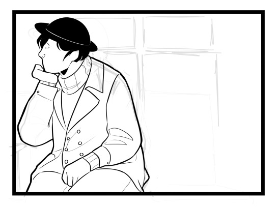
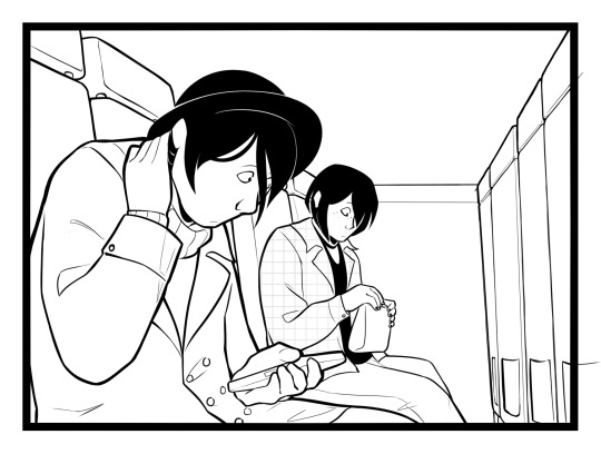
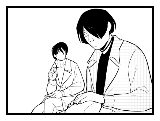
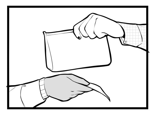
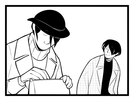
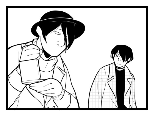
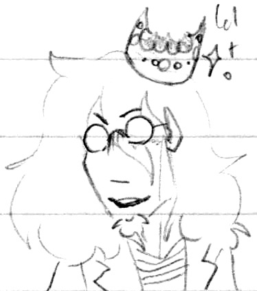
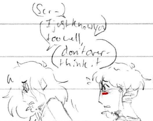
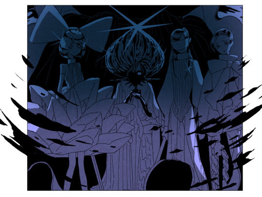
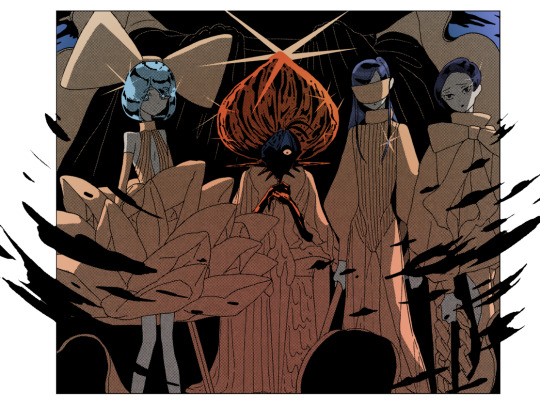
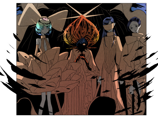
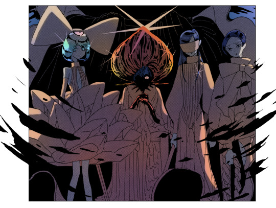
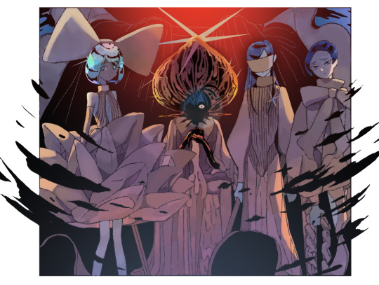
#i love panel redraws they are such a good way to experiment. also if the lighting looks weird dont tell me peace and love on theplanet earth
Text
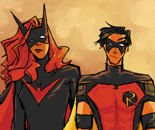
surprisingly loved td:r 8. idk whats going on there but it looked cool
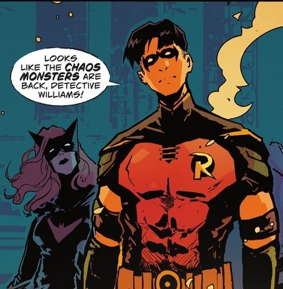
kinda based on this panel
#i love panel redraws they are such a good way to experiment. also if the lighting looks weird dont tell me peace and love on theplanet earth#tim drake#robin#kate kane#batwoman#red robin#tim drake: robin#batfam#dc#comics#art tag
2K notes
·
View notes
Text
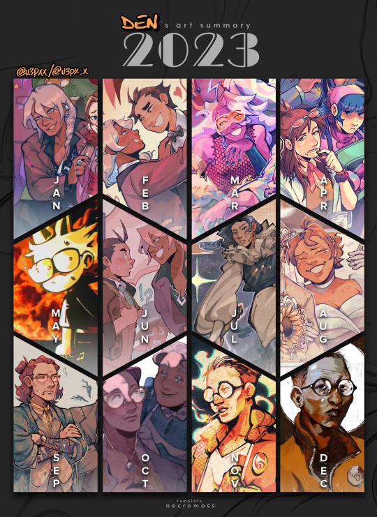
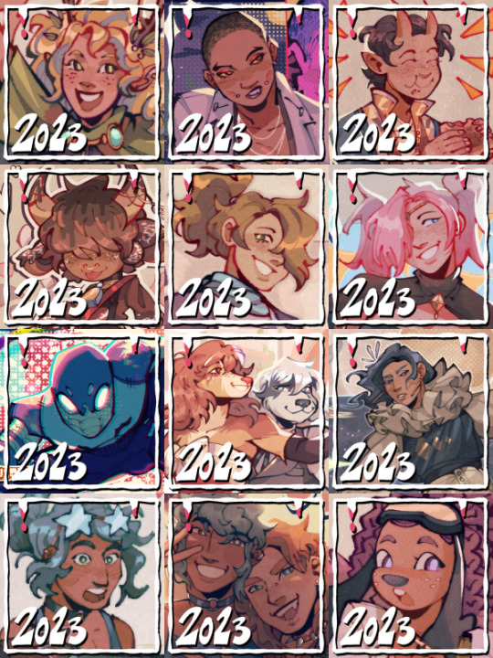
WHAT DO YOU MEAN IT'S 2024?!?!
next, you're gonna tell me it's gonna be some made-up year like "2025" next. tch, imagine that.
anyways, whoo! 2023! compared to both 2022 and 2021, i gotta say, my art style took a hard swerve in some direction this year. i mean, look at that klavier from january and that butch kim from just this december! (granted, i heavily referenced the portrait of butch kim but still, i didn't use to paint! mama mia!)
---
the way i drew faces has definitely changed, that's what i get for getting into something that's live-action and into smth that has realistically proportioned art lol
OH! OH! HOW COULD I FORGET!!! IT WAS (and still will be) THE YEAR OF THE OLD MAN!! i really learned how to draw aged faces this year! ach fraulein, i have not stopped drawing people in their 40's-50's! i would say "send help" but i'm actually having a lot of fun ASKSKS
---
i think a funny thing about these art summaries i've done is that they're mostly ace attorney but then there's just a month where i become a different type of ill LMAO this year it was four months for the price of two new interests!
cheers! here's to 2024!!! hope y'all have a fun art year!!!!
---
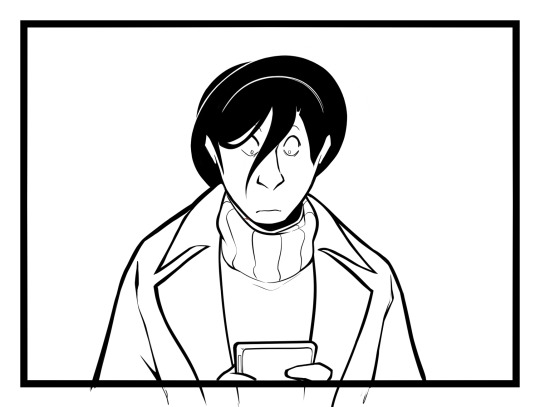
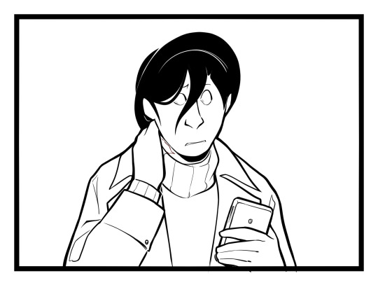
i'm gonna ramble more below about like, other art things i did this year but i'm gonna put it under 'keep reading' bc this baby is getting way too wordy now WHEEZES
1. FAVORITE THINGS I'VE DRAWN THIS YEAR (IN NO PARTICULAR ORDER)
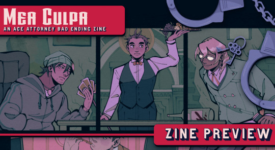
⚖️ mea culpa comic [x]
drawing this one was so time-consuming and ambitious but boy, do i love the end result! i had fun doing the inks for this one but was it a lot! i usually color in lineart and render everything but i had to stop myself from doing it for this one bc man, i'll die asksks
this also has some of my favorite apollos i've drawn, definitely
also! the part about the lineart not being colored and no rendering ended up being a deliberate stylistic choice for this one bc i had like more freedom to do just shadows with inks without it looking too out of place.
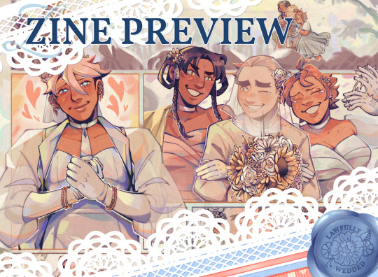
💐 my lawfully wedded zine spread [x]
now this one isn't out yet but take my word for when i say that this is one of the most craxy things i've ever drawn for this year, on account of drawing a comic AND group shot all in one!
also literally one of the prettiest things i've rendered this year, lookit that klav...
🎉 aa4 redraw - 2022 anniversary [x]
kind of like my wedding zine piece, group photos are insane, and rendering like uhhh [looks at drawing] 11 CHARACTERS IS ALSO INSANE if i try and draw a group photo again you have to stop me DFGHDJ
🎨 my art fight stuff [x] [x]
was possessed in the month of july or smth bc i pumped out like how many drawings so quickly (before i got burnt out that is pftt)
pace yourselves and don't be like me pls ajshgdghhjk
💥 people park day [x]
my friend told me that it was very obvious i watched across the spiderverse when they saw this FDFGHJD
but yea! this is when i started getting really into like, thought bubbles or just like, panels or drawings within a drawing when coming up with layouts
i still love the colors on this one...
🪩 fem disco portraits
ok so i haven't uploaded these yet but you have to trust me when i say that something was in the water DFGHDJ
who knew that all it took for me to learn how to paint was butches
2. ALSO DID YOU KNOW THAT I SOLD STICKERS THIS YEAR IN OUR UNI'S ART MART?
THE ONLY GOOD THING ABOUT THAT SCHOOL I SWEAR PFTTT this experience has also awaken the merch beast in me and i need to make more physical things for my brain to be happy, that's just how it be pfttt
hopefully next year i can actually start like a shopee shop or whatever lmao
3. ART FIGHT
i'm actually quite happy i got to participate in art fight this year! very delighted for all the art i've gotten and very fun to have drawn for others too!!
4. ZINES
i got invited and joined so many zines from 2022 continuing to 2023 that i kind of got burnt out from participating for now ngl ASKSKSKS not gonna be joining much this year oopsiessss! (unless i lose self-control [very likely])
5. SCHOOL
i don't actually like a lot of the stuff i draw for art school bc i tend to cram and not have fun pftt <- adhd moment, tragic! but here are some that i actually kind of like lol
6. THAT'S IT!
i think that's it! thanks for reading all the way down here!! o(* ̄▽ ̄*)ブ
183 notes
·
View notes
Note
I love the comic and I miss it, and I hope you're doing well
What happened to Patton-sanders-killed-a-man?
Well the short version is:
⦁ trauma
⦁ school
⦁ I had set up an unrealistic precedent for myself
And now you can skip to the Read-More to see the ask-blogs originally planned plotline alongside the panels of the unfinished last update, but if you want the long version:
Patton-sanders-killed-a-man was the first of my creative ventures that ever garnered a notable amount, with me making comics since I was 13, though all of my previous projects got little to no attention. So obviously when the ask-blog blew up, 16-year-old me was ecstatic, but very much not ready to handle it. Not only was this my first project to receive this amount of attention, but I also lacked experience as a writer, and with a medium of storytelling as fickle as an ask-blog in which the plot can change drastically depending on the asker's actions, it was not a good combination.
I mostly wrote the story on the fly, with an outline (which you can read under the Read-More) composed of cool ideas I had and various dark themes I was fascinated with but didn't have the emotional maturity to discuss. But the worst writing decision I made was making the inciting incident, the thing that led Patton to kill "Johnny", based on a personal trauma of mine, one I was in denial about. However by the last update, something happened that forced me to acknowledge it, and after that, I was no longer comfortable with the story I had set up.
That combined with the fact that School Was Kicking My Ass (which to be fair was mostly due to my own overambition) forcing me to shift my focus away from the ask-blog. I had also set up an unrealistic precedent for myself, with updates getting longer and longer. It was unsustainable, but with the pressure I placed on myself I didn't know how to go back from that and make the process easier for myself.
(this isn't even to mention all the different ways I made the art process itself horribly time inefficient, like the way I obsessed over perfect line art, choosing a semi-realistic art style rather than something less time-consuming, not creating character design sheets to help me stay on model, obsessing over wrinkles in the clothing, spending ages taking my own reference photos, redrawing panels over and over because I'm unsatisfied with them. If you're thinking of making an askblog/a comic, if you can't make a single-character panel in 10-20 minutes with your current art process you gotta figure out a style that does allow you to do that. There is a reason why 90% of Homestuck looks like crap til shit gets serious, ok. Please don't do what I did)
I had been running purely on fumes, and the second those ran out, I fell out of love with the story I created.
…
Well, that was a bit of a bummer, huh?
But as mentioned I still have been making stuff, even if it isn't ask-blog related, for example, I just recently finished my first animated short which you can watch here:
youtube
(with its completion being mostly due to my teacher, who forced me to learn to take on more manageable projects, which I must thank her for)
I also have made a new art blog, that being @anonymous-utility and have been posting things on my youtube alongside it. I don't post often since I need to focus on IRL stuff, but it's where I post updates to all the projects I take on alongside just various other art.
Even if ended far too soon, I'm still proud of this ask-blog, as it has taught me a lot.
Thank you all for participating and if you choose to follow my art blog I will be seeing you soon.
Rough outline and unfinished update under the Read-More:


From what I remember, because I never actually wrote it down, as the majority of the storyline relied on the actions of the audience, but it was intended to go something like this:
⦁ Everything that has already happened
⦁ On the bus Dee would meet Virgil's younger sibling Andy (who is anxiety from the shorts), though Dee won't understand the significance of that, not knowing who Virgil is. We'd also be shown Dee's scar on his neck, all shown in the unfinished update above.
⦁ We'd later meet Dee's coworkers, Dee would log in at his desk as the interview isn't scheduled for an hour or so, and he notices that his email is full, this is the first hint that it isn't just his phone the askers can send messages to, but through technology in general- Dee is not stoked about this.
⦁ He then would meet "Johnny"'s mom and older brother (Daniel, aka the critic or Dice as referred by the fandom) They'd be using "Johnny's" real name, Renard, and we don't catch on that it's Remy, until Daniel calls him that. Overall the attitude of the two would be like this; the mother would act upset, but in a manner that makes it all about her, and Daniel would be rather cold and matter-of-fact. Daniel's attitude would frustrate his mother, leading to an argument breaking out, during which Daniel points out that she only cares because Remy is the only one of her children to never go against her, mentioning a certain Remus getting kicked out (to which the mother reacts negatively to daniel calling Remus by his chosen name). The interview ends poorly and Dee leaves the entire situation wondering how this family has ended up being so dysfunctional.
⦁ From then the askers could direct Dee toward Remus or Andy.
⦁ If directed towards Remus Dee would find him working at a library, and with a bit of time, they'd realize they recognized each other, mostly via each other's chosen names, as they were online friends but lost contact when Remus got kicked out and lost access to the internet. Remus is delighted to see Dee again after all these years but confused about why he's in the States, since Dee's Canadian, to which Dee explains that he moved to the States, moving in with Logan, their third online friend, as soon as he could to get away from his own family.
⦁ Once Remy's fate Remus is generally uncaring since his family is dead to him, "So golden boy kicked it, with how many people he pissed off it was only a matter of time, now come back to me when Roman commits manslaughter, oh wait" to which we are told that Roman is serving time for having killed someone in a car accident (something that Remus finds hilarious since he was often labeled the troublemaker out of the two).
⦁ Remus would also be somewhat weirded out by the concept of Patton being the killer, since Remus knew him via association and always thought him a bit of a wet rag, then again even 50's housewives snap eventually. They exchange contact information and go their separate ways.
⦁ After this Remus becomes available to the askers, taking the form of a strange figure that only Remus can see that hangs in the corners that can stare at Remus and make various gestures, though that takes coordination as they would be controlled by various people. Remus would at first try to ignore this strange figure, having experienced hallucinations in the past, but if the askers become more aggressive in trying to get Remus to pay attention to them Remus may become more desperate to get rid of them.
⦁ If the askers direct Dee towards Andy we learn that Virgil went missing three years ago
⦁ At this point, the plot becomes more vague as I hadn't planned that far ahead aside from the major plot points.
⦁ After having spent so much time with Dee, we'd cut back to Logan. Any asks directed to him will not go through the phone, unless Dee is present. Instead, askers' messages would get scratched into Logan's skin, specifically on his arms, and if the askers become particularly aggressive, especially with Logan refusing to acknowledge them due to the absurdity of this situation, the messages would begin to cut into Logan's skin rather than just scratch. This is an issue due to Logan being a high school Comp Sci teacher and really needing to not bleed in front of his student if he wants to keep his job. Logan got his priorities in order.
⦁ This will be the first time the askers would have the option to directly hurt someone
⦁ Logan will not tell Dee about this, due to the absurdity of it and due to his history with depression, he worries that Dee would think he did it to himself.
⦁ Either way, the deadline for Dee's article is closing in and he must make a decision on how to frame the narrative.
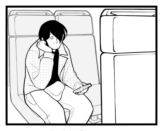
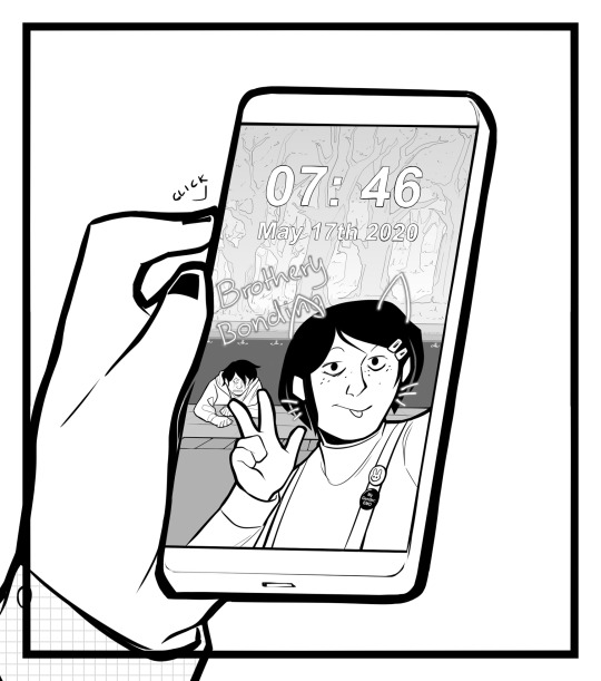
⦁ But first, we cut back to Patton. It's the 12th of May, 2020, and he has gotten as far away as he could and is currently in the woods. He is not doing well, and he hasn't heard the askers in the past two days, with him being certain he has imagined them. Once they flood back in it startles him, and he reacts loudly, loud enough to attract a passerby.
⦁ That passerby is Virgil. Patton does not react well, thinking that he started seeing things as well. But once Virgil confirms that he is in fact realm that only replaces the problem of potential visions with the problem of meeting his estranged friend who he hasn't talked to in three years. Virgil quickly forgives him, however, especially after Patton awkwardly states that he is homeless, to which Virgil assumes Remy to be the cause, stating "he took your shit and ran, I told you he wasn't to be trusted", offering a place to stay.
⦁ I didn't have much planned for Virgil, and at the time I was unsure if I just wanted him to be a paranoid guy who decided to live off the grid or… a genuine serial killer who sold people's organs. Needless to say, the second option was certainly a thing my 16-year-old self came up with and it's not a concept current me stands by.
⦁ Either way after this interaction Virgil would become open to asks, with the askers becoming able to slightly move things to garner his attention, though this ability would be limited to asks directed to Virgil only.
⦁ These interactions between the askers and Virgil will spark an obsession in him, as he always feared and was fascinated by the other-worldly since childhood.
⦁ Through the course of the story, Virgil and Patton would grow closer, with Patton eventually confessing to what he did and the circumstances that lead him to do it. Virgil stays on his side, and this leads Patton to grow comfortable, enough that with the help of Virgil he grows to accept his identity.
⦁ Cutting back to Dee, no matter the tone of the article the askers stay, and now it's not just his phone that the messages are being directed towards him through, but all the technology around him, and no one seems to be aware of this aside from him and Logan, eventually becoming convinced the only way to get the askers off his back is to get Patton done in since he appears to be the source of all this, resulting in Dee tracking Patton down and getting him arrested - this solves nothing.
⦁ After a breakdown from Dee, Remus, Logan, and Dee realize they have the same problem, and Remus gets in contact with a coworker and friend of his who is into the Otherworldly.
⦁ That's when it's revealed the askers are an interdimensional entity called The Audience, a creature with uncountable eyes and mouths, and the more people it gets in contact with the closer it gets to gaining physical form, with the sixth person contacted being its gateway.
⦁ The Audience's motive? To take control of the "story" and mold it in its own image.
⦁ Going back to Patton, he meets Roman, who's doing time for manslaughter. Their meeting goes as well as the one between a killer and the younger brother of the victim since Roman was closer to Remy than Remus was. But their meeting also results in Roman becoming open for the askers, this manifesting in them getting control of his left hand, eventually climbing all the way up to his shoulder.
⦁ All the while the askers can manipulate Virgil into breaking into prison, as the prison contains what they both want. With Virgil, he not only wants Patton back but has also become convinced that The Audience/the askers are his dark patron god and serving them is the only way to regain control over his life and be able to do something other than live at the edge of society in terror, while the askers want Roman not only because he's the gateway but also The Audience gains physical form they'll gain full control of the story, perhaps even allowing them to rewind back to prevent the inciting incident from occurring.
⦁ Of course, askers not aligned with this goal can warn the Intruloceit crew (Dee, Remus, and Logan) about what's happening but it will be pretty difficult to make them trust you after all that has happened.
⦁ The rest goes as one would expect from a cosmic horror climax, Virgil tries to get The Audience into their dimension, and Patton probably goes through with it with promises of having his crimes erased and being able to feel safe again after all that happened, but the Intruloceit gang show up armed with knowledge from Remus's friend and seal the gateway, Remus makes fun of Roman for being the cult sacrifice rather the dashing hero and then therapy.
⦁ The very last scene of the ask-blog is Picany alone in his office as suddenly an ask gets sent through his email, asking whether he will be involved in the plot.
⦁ The End
All in all a big part of the story would be my own fascination with the potential of ask-blogs serving as a vehicle for cosmic horror, especially with the audience being the source of said horror. Other than that the ask-blog's themes would center around identity and various forms of violence and how one can find themselves the victim of said violence, and other sensitive subjects 16-year-old me was not prepared to handle (nor had the time to with how long this story would have been, comics take a long as while to through their plots yall).
But I have grown since then and have actually finished one of my projects for once (cough please watch 'She gets eaten by the end *cough) and I'm a better writer for it, as well as just better at managing my time. While I won't give any guarantees, with IRL stuff taking the majority of my time, in my free time I have been working on an illustrated horror novel that I plan to release for free once it's finished, so if you enjoy my younger self's writing, you may want to be on the lookout for that on my art blog ;]
83 notes
·
View notes
Text
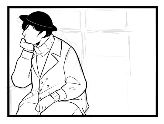
Detective Comics #27
Where it all began
Cover:
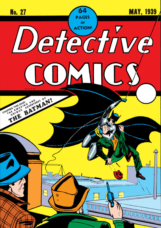
This is a great cover to start things out! It's iconic!! I always love seeing the redraws of this!
I got this screenshot of the cover from the Batman: The Golden Age Vol. 1 which you can tell from the fact that the words "THE BATMAN!" on the cover are black and not red like the original cover from 1939. For the rest of this post I will be using screenshots from an old digitization of the comic except for a few which I got from The Golden Age Vol 1. which I use at the end.
Even though it says "64 pages of action" on the cover, The "Bat-Man" story is only 9 pages long and I will only be focusing on that. (Sorry Slam Bradley fans!)
Now to get into the issue.

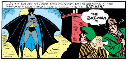
It starts off with this title page where they introduce the "Bat-Man" to the reader. It's very nice!
It's very strange to see him labeled at the "Bat-Man". I'm just not used to it but anyways they drop it fully Detective Comics #30. (Also note that I read it like "Bat Dash Man")
It's also very sad to see The Batman only credited to Bob Kane. Bill Finger did mostly everything and didn't get recognition for it until 2015.
Anyway, Back to the comic-
Bruce Wayne and Commissioner Gordon are chilling out at Gordon's place when suddenly Gordon gets a call about a recent murder. They need him there right away and in the most laid-back way, he's like, "Hey, Bruce, buddy, pal, chum, they need me at a murder scene... Wanna come with?"
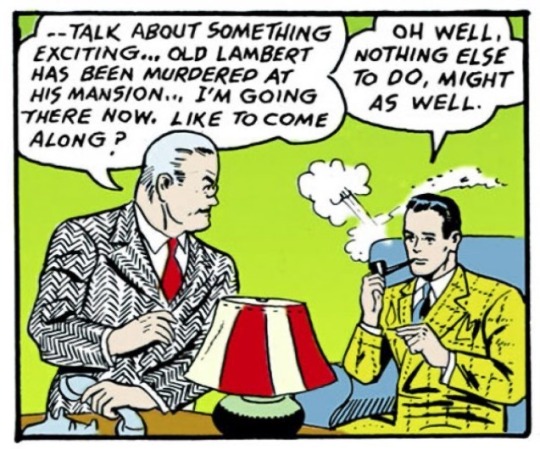
and Bruce is deadass like "Eh sure. Why not"
Everything was so casual in the 30s god damn.
Anyway, They rush over to the scene of the crime
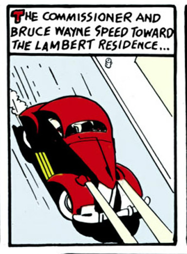
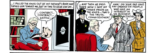
and after "a thorough examination of the scene of the crime" they decide to talk to the victims son, who is the current murder suspect.
He's like, "I didn't do it, I only grabbed the knife when I pulled it out of my dad's chest!" And, weirdly, Gordon doesn't press any further on it. He's just like "Yep okay."
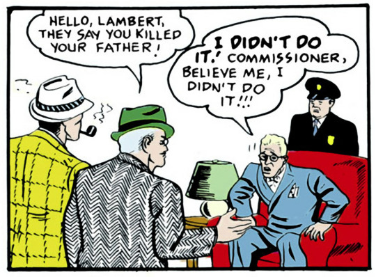
Also, he could've stayed alive if you didn't pull the knife out dummy. But I digress
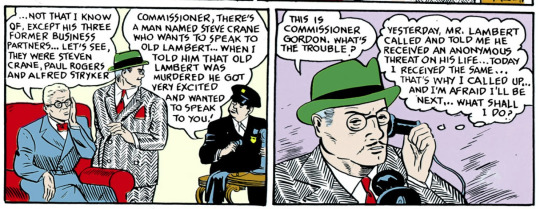
He then responds to Gordon's question like "Dunno, Except these 3 guys"
Also the comedic timing of that-
I made a joke to my friend when I first read this comic that the reason why Steve Crane was excited was because he bet Lambert a hundred bucks in 1939 dollars that the threat on his life was real-
I know excited back then meant having excessive emotions but I just thought it was funny.
You sus mf. I SEE you Bruce. If that even is your real name.
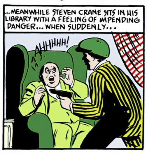
I also love this panel.
After Crane gets shot the murderer/robber escapes with a piece of paper.
When Suddenly...
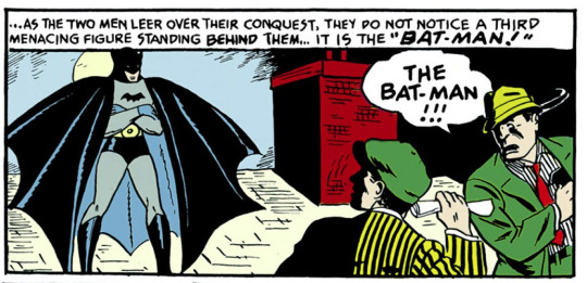
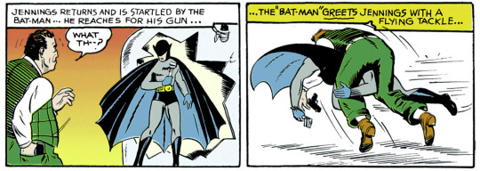
The Bat-Man shows up and beats the hell out of them and takes the paper.
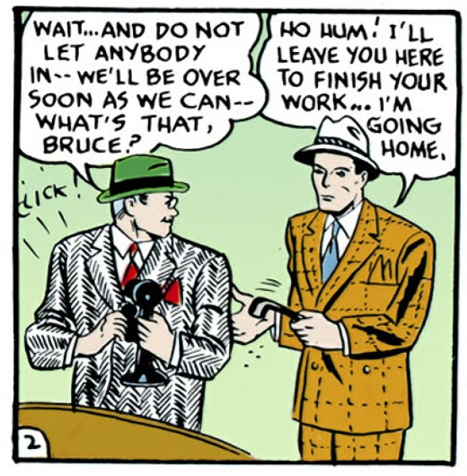
Then Gordon and the police arrive to Steven Crane's house as the Bat-Man runs away. Gordon then finds out Crane has been killed and decides to go to Paul Rogers house
Also look at my little man
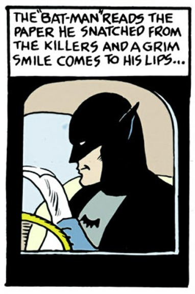
He's so proud of himself.
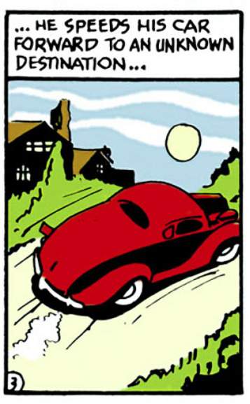
I also love the fact that he drives off in Bruce Wayne's car from earlier in the issue. He's so silly
Meanwhile, Rogers goes to his friend's, Alfred Stryker's, neighboring Laboratory where he encounters Strykers assistant, Jennings, and gets smacked and trapped by him.
I thought this panel was hilarious.
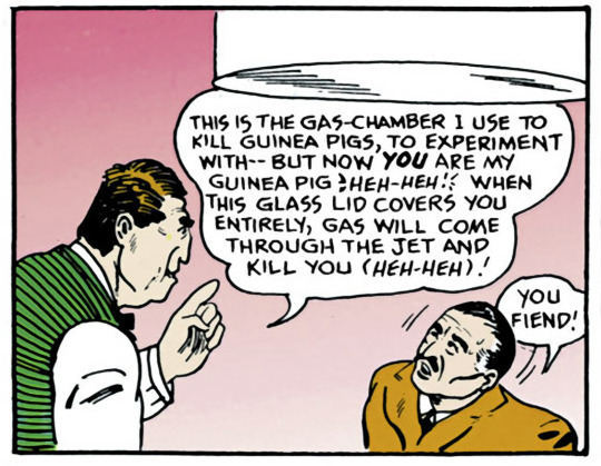
Like Boi! What kind of guinea pigs are you experimenting with that you need to a jar that can fit a human inside and also why are you gassing guinea pigs???
He then seals the chamber but not before the "Bat-Man" enters, plugs the gas-jet and breaks Rogers out.
Speaks for itself really.
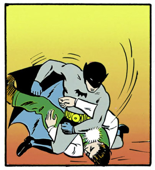
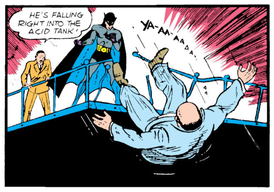
Styker then finds out his assistant failed at killing Rogers and tries to kill him himself but the Bat-Man, who had hidden, jumps out and prevents the Stryker from killing Roger.
The Bat-Man explains why Stryker like Velma at the end of an episode and then Stryker breaks out of The Bat-Mans hold and then
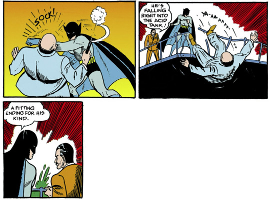
The Bat-Man straight up kills him and is like "Good."

Bro is so sus. No one acts this way.
And then what's more is that Gordon is like "Man. bro is so bored all the time."

Look at my silly dressing up in his bat fursuit!!

Can't wait for next month!!
------------------------------------------------------------------------------
Sorry I basically recapped the whole story. It was very short but every panel had something interesting happening!! I definitely recommend it!!
Things I liked and found interesting!!
I found it interesting how they have text explaining the situation instead of just letting the photos do the talking.
Thought It's probably like that because they only had 9 pages to tell the story.
I liked Commissioner Gordon's fit in this issue.
It's a very nice Zebra-like suit that would allow him to fit in with the the weirdo 248 issues from now. It's just so snazzy!
I also like how Gordon takes things at face value and doesn't do some deeper thinking like how I'd assume a police commissioner would.
"Well obviously he didn't kill his father. He literally just said he didn't". "I just told Bruce something amazing and he looks like he had heard it before. He must lead a boring life"
I also love The Bat-Man costume in this issue
Purple glove Batman... My beloved <3
The art in this issue is great too!! I'll pick out a few of my favourite panels to show.

Thank you all for reading my first blog post!!
Come back whenever! Rarely the same Bat-Time but always the same Bat-Blog
4 notes
·
View notes
Text
Half a dozen in one (1 | 2 | 3 | 4 | 5)

Oh no the Apotheosis is back and it wants to play, that’s never a good thing

Scriabin is not into it
I wanted to draw King Scriabin but I goofed up the crown so bad lol, at least his face is cute ✨
Pokemon Vargases! From that time that I forgot how to draw their Pokemon versions lol. You have to approach Espeon!Edgar gently, he’s easily spooked
Sylveon!Scriabin is such an attention hog, poor Edgar haha

*puts my feelers around you condescendingly*
Sleeping on each other, always ♥ Even sleeping, they’re still intertwined lightly, Edgar’s hand on Scriabin’s shoulder and Scriabin’s on Edgar’s arm ♪

I had an idea about Scriabin “reading” Edgar’s mind by guessing how he feels about something, but I unfortunately forgot the specifics just as I was writing it down, so frustrating

I do remember that it was something a lot closer to how Scriabin felt about that thing and he was describing how he felt, not just Edgar, but he realized too late
Made him feel isolated :(
Apology hugs 💕

Who wrote this eviction notice, this is a cave?? I just think they turned out really cute here haha ♪
Stop being naked >:0
Don’t wanna get used to it >:(

After all the Father and Daddy puns, I had to lol. Lady!Edgar with her hair down is just so prettyyyyyy
Two mops, makin’ out

For whatever reason, I started a teeny tiny little ScriAnimal series - first up is Scriabat with hand-wings because lol
I was watching a video of someone with their bird who was munching on the inside of their glasses stem haha

Scriabird is here to scream and knock things off the counters

And cutely chew on things

We are stopping this sketchdump for a Jake appreciation minute ♥ Thank you for appreciating Jake, now back to our regularly scheduled programming

A quick and silly digital doodle - waxing via tape is not recommended

Got the urge to draw dragons again, Scriabin needs to settle and Edgar is in protecc mode. His hugs are even harder to escape than normal!

The original sketch for sleepy Edgar - I couldn’t decide whether to use “World’s #1 Dad” or “World’s Best Dad”, so I just used both for the final version lol. Did Todd give it to him? Did Scriabin? Did they both get him nearly-matching mugs??

One of the early drafts for the ‘17 redraw; this was actually all drawn on one layer (on purpose! lol), which was a really fun experiment with some brushes I rarely use. I liked the angle of Edgar’s face too, he looks so smug haha ♪

Tiny Edgar doodle for a quick reference, he’s so cute ♥
I wasn’t kidding when I said it took a while to get Alone Together right, I was this close to giving up and just doing it the easy way several times before finally getting the trick down - I’m glad I didn’t but sheesh!

I started a pretty long mini idea that I managed to get like 90% of the way through before deciding I didn’t like it lol, but there were still some really fun poses and expressions

“What is it?” Light concern Edgar ♥

Probably the most complex panel of the set, as much as I like the leg poses I’m also frustrated by them lol - didn’t help that my page smudged >:P

A little bit of expression practice, the cute thing is Scriabin

I heard it, we all heard it, everybody saw!

Couple’a Scriabins to practice hair differences. I’ve gotten used to making him simultaneously fluffy and sleek like on the left, but I really love a True Floof look too, with many more starts and stops, it’s really fun ♪

Uppies!

Oscillates between “Why” and “You can’t tell me what to do”

Brain baby
Weirdly enough, this was actually inspired by a skin-horror idea I had but decided was a little too body-horror-y and so I repurposed it lol
Some goofy matryoshka dolls haha. They remind me of Near’s finger puppets from Death Note somehow hmm

More hair differences, using opposing methods of line directionality while shading and texturing Scriabin’s hair. Pushing up from under gives this really nice line weight; it’s harder to do consistently because I keep wanting to sweep down, but when it works, the shadows fall exactly where they should and it’s lovely ✨ And like I said, pulling down is a lot easier, and because of that I can get these really uniform lines - I prefer the tapered effect, but pulling definitely has its uses and-
Hey wait a minute-
Golden floof ✨ This is actually really hard to see IRL lol
Edgar Warmup to see if my tablet was working properly, didn’t have time to pull up refs so from memory it is!
And that’s February through May again! Lots of silly little things, and a surprising number of scrapped larger ideas hmmm
#💟#Doodles#Sketchdump#Art#Edgar#Scriabin#Jake#A short and sweet one this time around#Also wow Nny didn't get any placement this time around - I guess he did show up a big more frequently in normal sets lol#Kind of anyway#Got a few of the classics running around - Apotheosized!Edgar - Lady!Edgar - Snake Charmer#Mostly all regular Vargas stuff tho ♪#And no blood! Wow!#That I Definitely got out of my system in the meantime lol#I think the only ones I didn't talk about as much as I wanted to were the Scriabirds - I actually love drawing birds I just don't very much#They're simultaneously so sleek and fluffy and poofy and goofy! Love birds!#And Scriabin's coat was really fun to draw over wings haha ♪#I really should draw the Vargeons again - ironically the birds turned out way more how they're supposed look lol#I still have a few more longer ideas that I'd like to finish up that didn't quite make the cut for May#I started them in May but it's looking increasingly like they'll be a June+ thing lol#Guess it's yet to be seen on whether or not they'll make the next sketchdump! Since I've jinxed it every time so far haha ♪
76 notes
·
View notes
Text
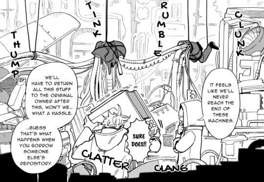
Chapter 18 Released!
I'm in a bit of a weird state with all of this because I'm so far ahead (I just pretty much finished chapter 20 the other day)... it's almost like I've forgotten about these chapters. Like, "wow wasn't this plot point a really long time ago???" but it just hadn't been typeset yet.
Anyways, chapter 18. There's a lot of fun stuff in there! For one, I think my two friendos on the cleaning/redrawing went absolutely HAM on everything here. The sfx are great! I don't know if it's immediately obvious, but we've also started using a ton of new fonts. Hopefully the variety is nice.
Page 48 is a really good example of this-
Wow! How nice! Both in the font variety and in the typesetting.
Speaking of, I think the new font we found for Fuka (as he is a different font in Japanese in much the way Grey is) is really good. It conveys how loud he is without being harder to read/too out of place.
Another side note- I think the typesetting on this panel looks REALLY good. Like, it's so subtle but...

That sort of... y'know, variation? It looks SO NICE! I love making some words bigger (I specifically asked for it here, you see).
Also, if you think the word "humane" is a weird choice... it's all I had! Plus it's a 1:1 translation from Japanese (far as I can tell, there's no differing context between English/Japanese there), so... it's fine. It's supposed to be weird (I believe the strangeness/ill-defined nature of it is mentioned in ch 19?).
Gosh, looking back on it... this chapter has some really nice landscape-ish spreads. Like, just that sense of cluttered-ness is so great.
Shinozaki sure is cute, isn't he?


Look at my beautiful boy here (side note, just learned that you can panel images on Tumblr, as shown above). Yuuyake's so cute, too. What a big dork she is. I love her earnestness too. Gosh, I can't wait to get to volume 6... there's so much GOOD STUFF THERE! SO many good faces, so much good paneling... but I must hold off a bit. Have to revise 19+20 still (I'm sure I made a bunch of mistakes).
Eh, whatever! I'll worry about that when we come to it. Speaking of worrying about things, we've been thinking of redoing a lot of the earlier chapters. Not to be too harsh, but... they kinda suck. Like, not badly, just... they're okay. Not to mention how I'm sure I mistranslated a bunch of stuff. It's okay since it was a learning experience. Getting through all that was necessary!
But that doesn't mean we shouldn't try to improve what we did. Might do that after finals.
I've said a good amount here, not that it means much of anything in the end... I just need this outlet so I don't endlessly gush about Shinozaki-kun to literally everyone I know. What a little creature I am, huh?
5 notes
·
View notes
Text
2021 Creator Self-Love Extravaganza!
Rules: It’s time to love yourselves! Choose your 5 favorite works (fics, art, edits, etc.) you’ve created this year and link them below to reflect on the amazing things you’ve brought into the world in 2021. If you don’t have five published works, that’s fine! Include ideas/drafts/whatever you like that you’ve worked on/thought about, and talk a little about them instead! Remember, this is all about self-love and positive enthusiasm, so fuck the rules if you need to. Have fun, and tag as many fellow creators as you like so they can share the love! <3
Tagged by @bubblesthemonsterartist
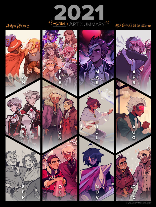
Weirdly enough I am less reflected over this year than I was the one previous. In 2020, I had goals. In 2021, I just DRUMMED ON as long as my inspiration would let me! I indulged, I think, for the most part. 😂 However, looking back, I daresay I am proud. I have experimented more than I realized, and my pieces look rather good for it~
Year total: 184 artworks, 1 gif
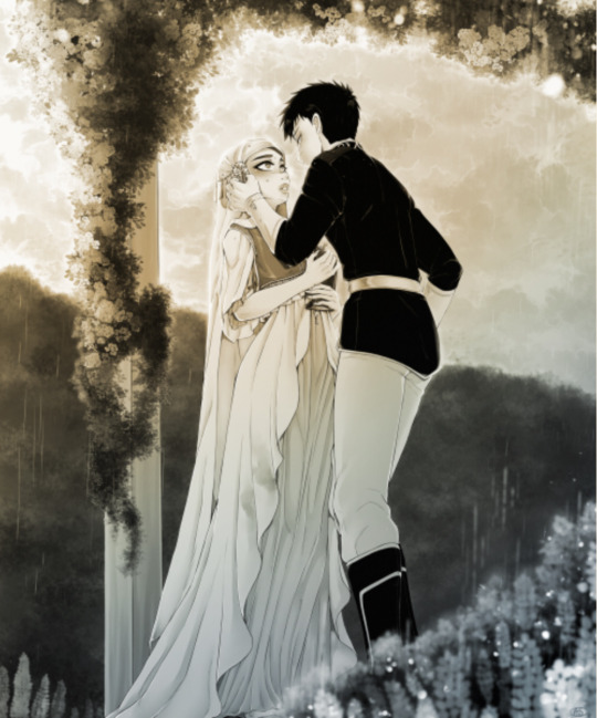
1. Obiyuki Almost Kiss This would be one of many artworks I would scream into Joanna’s dms about; one of those THIS HAS TO BE GOOD OKAY-type artwork. The Concubine!AU means a lot to me, and the fic she and Jen wrote even moreso. This artwork was the first time where I applied 3D models during the sketching stage, and a perspective grid for… well, that’s rather self-explanatory yes?
2. “When doth mine husband return to me?” The first in what would be a series of “Annie says she’s gonna sketch, then 30 hours later has to admit she lied”. LOL. One of many redraws this year, I tested new ways of both coloring and shading with this one - not to mention the lineless background that I was mighty proud of, for being entirely made up on the spot. I feel like this artwork marked the spot where I got more into harmonizing colors, while also playing with stronger contrasts.
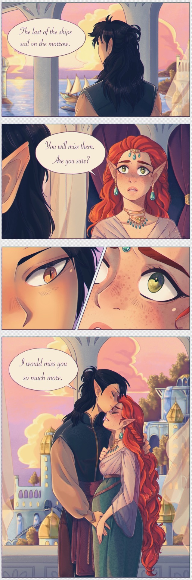
3. Miss me when the ships sail West Omigosh this one. I made a couple comics this year and this is my fave. Again, lots of focus on vibrant colors - I find my style benefits from sacrificing some realism in favor of impressionistic, striking scenery. Comics are also challenging, bc you know that in order to tell the story well, you have to choose the right panels, and I have never been good at minimalism. This was also my first venture into chromatic aberration! Which has quickly become a favorite!
4. Now and then, forever the same While this artwork isn’t really impressive in its own right - it was a quick sketch, where color setting and atmosphere was the most important, to instantly tell a story. But. BUT. I made a gif! For the first time in ten whole years, I went back to try and animate something. It was a lot of work, ngl, but it really paid off in the end, wow.

5. Wheel of Fortune Ngl, that whole week went by in a flurry. I made seven pieces from scratch in exactly 7x24 days. THAT is a record in its own right. This one was perhaps my favorite of the lot, for it came to me so naturally. And it felt like I applied all the news tricks I’d learned this year into a single piece, and best of all, I got to try one of my favorite palettes!
BONUS: Ladies of the Witcher AU Just because I can, and because I wouldn’t forgive myself if I didn’t! These aren’t even about quality or detailwork, but the fact that I still remain so proud of these designs. Eleven actually badass-looking girls and women, none who can be mistaken for one another, and whose energy is entirely her own.
If I can preserve even half of the subconscious energy I’ve channeled towards art this year, for next year, I will be overjoyed! Here’s to hoping~
Tagging: hmmmm, my darling @jaqdaw-art, @nokaru, @qob-vrisk and @ccprovolomies if any of you feel ever so inclined 😘
#tag meme#2021 wrap-up#myart#akagami no shirayukihime#snow white with the red hair#ans#obiyuki#i am proud and happy and also rather confused#185 works??#where?? how?? did i have the time for all this#i’m not conscious enough half the time to realize ahahaha
50 notes
·
View notes
Note
I didn't realize how often I thought about this fandom until I started churning out asks on a daily basis.
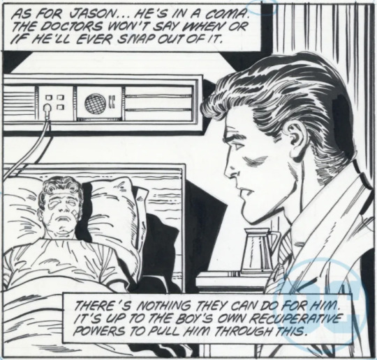
Knowing DC's creative trends/talent in 1988/89, what do you think would have happened if fans voted for Jason's survival? From released alternative comic pages, Jason still gets blown up but survives.
Do you think they had a plan for him to become Hush (like the Death in the Family interactive "movie" implies)? Would he get a personality change through amnesia? Or would the comics have retired him to fade into obscurity?
WHAT IF…? BUT JASON TODD SURVIVES.
Hi friend! Thank you for the ask! This should be interesting.
But before I give my answer, let’s take a look at those pages where Jason had actually survived Joker’s attack.
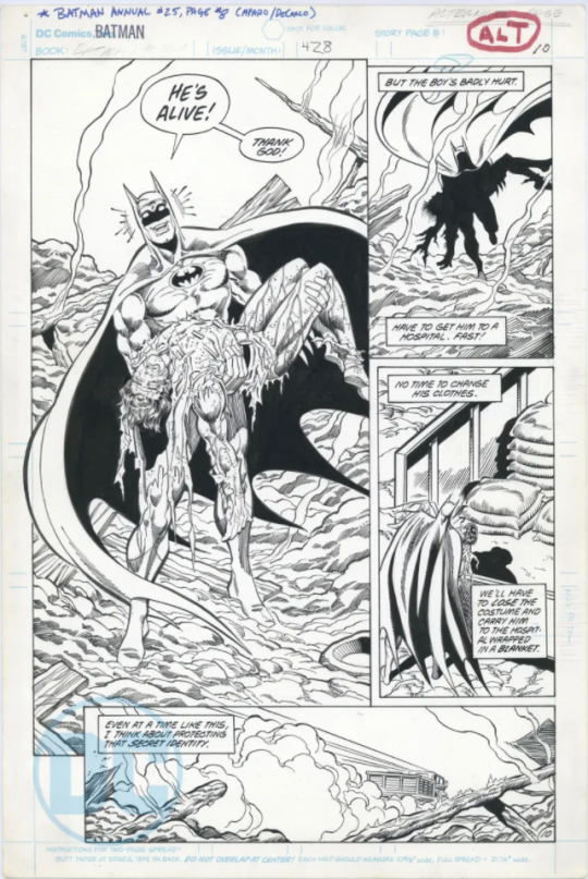
From the second page we only can see one panel but some who have seen the entire, unreleased, page have said this about it:
“The full page reveals more, including the arrival of Dick Grayson to Jason’s hospital room, although a pencilled note in the margins says to strike him, and redraw the panels in favour of having Alfred in the scene instead. Dick rushed over as soon as he heard, and offered Bruce his help in tracking down the Joker.
In the published version of Batman #428, the same page depicts Jason’s funeral, where Alfred asks Bruce if he should get in touch with Dick Grayson. In both pages, Batman says roughly the same thing: “I’ll handle this by myself. No help from now on... that’s the way I want it.””
This makes me feel like Jason having survived or not the Joker’s attack would have resulted in the same outcome within Bruce. Dick shows up at the hospital to check on Jason and offers his help in tracking Joker to Bruce but Bruce doesn’t want his help because from that moment on “he works alone”.
That would lead to the same exact actions that happened with Jason dead. Bruce goes after Joker on his own and leaves up to fate if he dies or not (although he said that his issues with Joker never truly end, Batman (1940) #429),
And if Bruce pushes Dick away then we could also be having a scene like the one from The New Titans (1988) #55, where Bruce implies that Jason getting hurt was Dick’s fault for having moved on from Robin himself. If that happens then Dick would blame Bruce for putting Jason in danger way too soon and their fight will end up with Bruce kicking Dick out of the manor.
-
So, to answer your question, what would have happened if fans voted for Jason’s survival?
I think that DC would have turned Jason into another reason why Bruce thinks that all he could ever be is Batman. It would have made Bruce dark, moody and sad just like DC wanted, all darkness and no light.
Jason wouldn’t be dead but he wouldn’t be truly alive and they would use that to fuel the angst that surrounds Batman.
It is a very sad thing, but I actually think that Jason surviving the attack wouldn’t have had any impact on his own story, Jason’s suffering/death were set up to make Batman want to work alone again. I just don’t see DC back in the day working on Jason’s recovery (physical and mental), I see them leaving Jason comatose and as a reminder of one of Batman’s “failures”. Maybe in a distant future Jason could have woken up with amnesia and they could have done something with him then but I really don’t know how they could make that story work or if Jason would end up working as an ally or enemy of Batman.
Much like you said in the ask, I think that DC would have let the character of Jason Todd fade away,
-
Because that is a really sad answer, I decided to come up with other scenarios where I would give ideas of what I would have liked to see DC do, and what I would have done if I had existed back in the day!
What I would have liked to see DC do:
After setting the fact that Jason was left in a coma at the hospital after Joker’s attack, I think DC should have had Bruce making some extreme decisions. With Jason alive but not really there I think that DC could have made work a plot point that they tried to pull off with Jason dead.
In a comic event called ‘Underworld Unleashed’ the demon Neron offered bringing Jason back to life if Bruce gave him his soul in exchange. But with Jason alive I think that Bruce would have actually been even more tempted to take the offer if it meant that by giving his soul away, he could wake Jason up from the coma he was in. Then there could have been an event with magic users that made it possible so Bruce got his soul back or something. DC could have also had Jason have amnesia after Neron wakes him up so we would have a soulless Batman and amnesiac Jason trying to make their father/son relationship work (or not).
Another idea is Bruce making a different extreme decision where he asks Talia to help him find a Lazarus Pit to try his luck with Jason. Because Jason was in a coma and not dead the Pit would have actually worked (the Lazarus Pit cannot bring people back from the dead!). I imagine that if it worked then Bruce would owe Talia or Ra’s a favour, and that could make an interesting story, mostly if Jason Todd ends up mad at Bruce because he didn’t kill the Joker after he tried to kill him. (I do love chaos).
Maybe Jason could even join the LoA to make Bruce’s life difficult. He wouldn’t become the Red Hood but Jason becoming an assassin after all that could have been the perfect recipe for complete chaos and I love that. I think DC could make it work, this last part of the idea is kinda inspired by Young Justice's Jason Todd.
What I would have done if I wrote for DC at the time:
I would have taken Jason away from Bruce! I would have Dick appear out of nowhere and I would have him take Jason with him back to the Titans Tower so they can both be far away from Bruce (at least for a little while).
If this idea sounds familiar it might be because you read another “What if…?” post that I made about what I thought would happen if Jason hadn’t been found by Batman that night when Jason was stealing the Batmobile’s tires. I will link that post here!
This time Dick would obviously be taking Jason with him at a different time and he would actually try to train Jason a little bit more but Dick would also have Jason work on his trauma and then Jason would decide to leave the vigilante/hero life behind. But not completely because I still believe that Jason would still want to save people. He would also be very protective of his brother/best friend Dick Grayson, also known as Nightwing.
I just think that Dick could have handled the situation a lot better than Bruce, he would have made sure that Jason felt like him not being Robin anymore wasn’t because he was a failure but because he can help people in other ways. He would have made him go to therapy and would have been more willing to share his own experiences with him.
I would have Jason studying to become a paramedic again (a different kind of hero) and this time he could also practice on the Titans when they got hurt in battle, if he did that then he could end up being an excellent medic for all superheroes!
I mean, in the Titans there are humans, aliens, metas, amazons and atlanteans. Jason could actually become DC’s very own version of Marvel’s ‘Night Nurse’. I don’t know, I love that idea and I think @hood-ex would like it too!
I just love the idea of Jason and Dick becoming each other's family. The Titans would also become Jason's family but he would be very protective of Dick. I just feel like Jason would have seen the whole thing (of Dick taking him to live together) as a fresh start after such a horrible experience.
I love Red Hood but I also love the idea of Jason becoming something completely different from that and this is one of my favourite ideas!
-
Oh! Before I forget, I think that the idea of Jason becoming Hush in the ‘Death in the Family’ movie comes directly from the fact that Jason “was” Hush for a second in the Batman: Hush comic. That was revealed to us in UtRH, Jason gave the real Hush all the information that he needed to get under Batman’s skin. And then when “Hush” captured Tim and he showed his face that was actually Jason who then changed places with Clayface to confuse Bruce more.
So, yeah, I don’t think DC had planned on making Jason become Hush.
Thank you so much for the ask! I hope the answer was good and that you have a fantastic week!
#jason todd#robin jason todd#dick grayson#nightwing#titans#tati thinks out loud#dc comics#tati loves aus#asksss
47 notes
·
View notes
Note
any trivia about untitled you would like to get out there
Here’s all the stuff that immediately comes to mind:
- Red and Blue use he/him pronouns just like me
- they’re kissing in that last panel
- by stick figure beauty standards, Red has a massive ass in the last panel. I was treading a fine line between invisible and comically large, either of which would have ruined my artistic vision
- the Creator is an optimal tumblr sexyman because he’s me and I’m a white twink and we all know how tumblr rolls
- the title of the comic is Untitled because I’m pretentious like that. Also because originally it was never meant to have a plot so I saw no reason to come up with a title
- they’re in stasis, or perhaps a time loop, only existing while being read and incapable of changing their course
- there will almost certainly be no sequel, as any further strips break the aforementioned stasis/timeloop, plus I can’t come up with a better plot. That doesn’t mean there won’t be a sequel but it’s VERY unlikely
- while I love the fanart y’all make and am fine with you going off of canon, quite literally none of it (that doesn’t quote the canon directly) is canon-compliant seeing as the characters’ existences are restricted entirely to the original strips and do not exist between or outside of those strips (see time loop/stasis)
- despite that, canon is to be taken or left as you will and don’t let my interpretation get in the way of yours. We’re all at least a little right. Also I really love fanart.
- i’m a slightly better artist than just squares and stick figures (tho not by much), but (a) i’m lazy and (b) the plot/Creator’s arc revolves around how bad the art is, which is why any offers to “redraw” the strips will be rejected instantly and forcefully
- I read almost every single reblog, comment, or tag that gets left on the comic. I see your sins
- that multiverse thing in that one panel has no bearing on the story and was just a cool visual i came up with before i had the whole plot nailed down.
- the plot could have gone even darker maybe but it felt icky being quite that much of a bastard. A lil villainy I’m capable of, but I’m too attached to my psudoreal colored squares to abuse them too much
- I’m vaguely contemplating doing a print run but y’all are broke which doesn’t lend itself to buying silly lil comic books by local internet funnymen
- it fills me with rage when people compare it to Homestuck or Supernatural I have no experience with either and my opinions on them are forged from weapons-grade idontgiveashitium
- I’m very proud of it and very happy it’s my biggest post
- I considered putting some Read More buttons in there but then I realized I could piss people off by making a Do You Like the Color of the Sky and I AM the villain of this story after all.
- I have no shame or decency and encourage anyone who read and enjoyed Untitled to read more of my writing in the form of my original story The Thief and the Gun (there’s a link in my pinned post right near the Untitled link). It isn’t a comic but it’s a fantasy Western with demons and magic and capitalists getting shot. People say it’s good but obviously it gets less than 1% of the attention Untitled gets because it isn’t an easy-to-absorb comic
- I have really toned biceps and nice hair (unrelated but important)
108 notes
·
View notes
Note
hi! i've always loved your hnk panel redraws and recently i've been so inspired by them that i've tried my hand at coloring some panels too! if you don't mind me asking, do you have any tips?
oh i certainly do! some of these are a bit generic/art related but they’re definitely useful in this case too. I’m adding a read more because unfortunately it got a bit long but here you go:
1) Get to know your tools!
Since you weren’t very specific, I’ll assume you aren’t too familiar with art softwares (and if you are, you can just skip that part it’s not That deep). I’ll start with the basics; I know this is obvious, but please bear with me, because understanding how your program works WILL make you a lot more efficient.Here are quick descriptions of some features I think are very useful - I use Clip Studio Paint, but I believe most programs have equivalents. If you don’t know them, please experiment with them, they’ll come in handy!
- Locking transparency :
Locking the transparency of a layer means only the parts where something is already drawn can be modified. Basically, you can recolour something that already exists in a rather precise way.
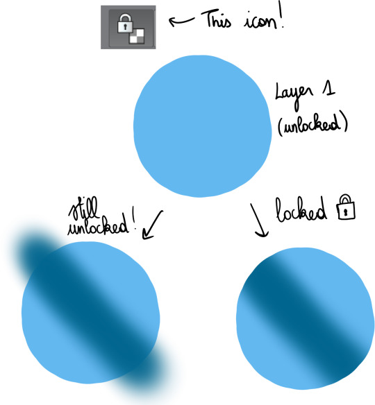
This is very useful for gradients, which I’ll talk about a bit later.
- Clipping layers :
This gives the same result as locking a layer then drawing over it, but the difference is that you use more than 1 layer ; one as the bottom layer, defining the part of the canvas you can draw on, and the others, clipped on top, where you’ll draw. This can be more practical than locking transparency, because if you have a lot of details to add, doing everything on a single layer may make things more difficult.

I use this a lot when I shade, but just like gradients, I’ll bring that up later.
- Layer settings :
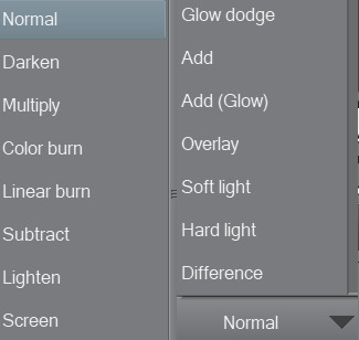
These options change the way the colours on a layer blend with the colours below. As an example, addglow is pretty good for colouring very bright light sources or for adding highlights on gems :

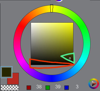
Basically, using those isn’t a necessity, but they’re still pretty useful so I’d recommend experimenting with them whenever you feel like it!
- Magic Wand :
Not the most complicated to use, but damn it’s really useful. It allows you to make selections based on the colours you’re targeting, so basically, if you need to colour an entire area a certain colour, you can just select it from the original panel, go on the layer where you’re colouring, and colour nothing but the part you selected. That’s about it!
There are lots of others, but these are the main ones you need to know about when you’re getting started.
2) Colouring stuff
This is where it gets interesting! I guess! I’m not too good at just coming up with these kind of tips, so I’ll illustrate with some colouring, hopefully it’ll help you out?
I usually colour in 5 parts : 1) Preparing the panel(s), 2) Applying flat colours, 3) Adding gradients, 4) Adding shading, 5) Finalising with details.
I always prepare pages in the same way: first, I use the magic wand to select everything i do NOT want to colour ; the frames around the panels, the speech bubbles, the sfx, etc. Once they’re selected, I copy them, and paste them on a new layer. Then, I select the original layer, and turn it transparent so I can colour below while still keeping the lines. To do that, I go in Menu > Edit > Change brightness to opacity (in CSP at least, it depends on your program tho but most of them support this, I think!).
I end up with something like this :
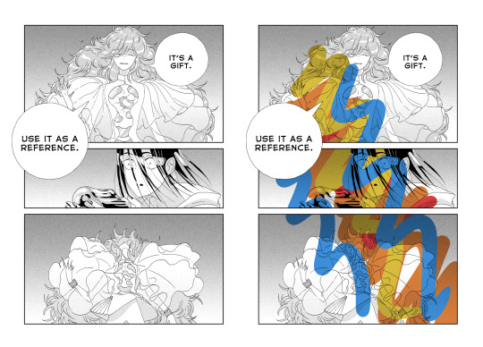
Two layers, one on the bottom with the semi-transparent page, and another on top, with everything that I don’t plan on touching. On the page on the right, you can get an idea of what it looks like when you add a layer below these 2 and draw on it.
Now that I’m done with the panel, I can start adding some (flat) colours.
I think it’s a good idea to start with the background, because it’ll help you figure out the feeling you want to give the panel.
The airbrush is a pretty good tool for gradients btw, just make sure you use a brush that is big enough so the transition in colours looks natural.
Next, I add a new layer, and colour the shape of the characters (and here the vessel as well), so it stands out from the background. It’ll make colouring less complicated, since the lines will be clearer.

As you can see, I was kind of confident, so I directly added a gradient. The bottom of the panel is a bit “darker”, because I wanted the main light source to be the reflect on Phos’….. head thing?
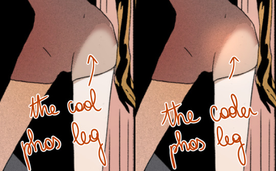
Here’s something kind of important about your choice of colours : if you’re colouring an area that is already shaded in the original panel, I would recommend taking a colour that is more saturated than it should, or else the colour may end up looking dull because the original shading will make it darker.
Next, I do more flat colours. Nothing too fancy, and pretty much everything is on different layers. The clothes are left uncoloured because the background colour already fits, so it’s okay honestly
Then, I added some gradients using clip layers :
As a reference, I used some overlay layers for Dia’s hair, and some addglow layers for Phos’ alloy.
I mean it when I say gradients are important! They make your colouring feel more complete even when they’re barely visible. quickly coloured bortz for reference, assuming tumblr won’t compress the colours too much:
the bastard on the left has nothing but flat colours. They’re nice, but when you’ll have shaded everything, chances are it’ll look kind of …. i dunno, like something is missing? So yeah, gradients : good, though i would recommend you keep them in the same tone as the base colour. I’ll talk about this a bit more later if i don’t forget.
Ok! next:
I felt like golden colours weren’t quite fitting the mood, so i added a layer with blue on top of it to make it colder. It’s at 40% transparency, so you can still see the colours behind well enough. Some parts were slightly erased because i liked the idea of these parts being lighter (you can see it a little bit around phos’ neck, or above dia’s knees : these parts are yellower than the rest of the pic)
I added some shading! Nothing too fancy. also not to sound like some gradient-freak but you can add some of those in shading as well, it’s usually a nice touch.

After than, I added some lightings, which are on a layer clipped on the original manga panel (so basically only the black parts of the original image changed colours, and the colouring work I did on the layers below wasn’t really affected, if that makes sense?)
The red lighting is the obvious one (it’s an airbrush, and i used an eraser to clear the part near Phos’ head so it looks like it’s coming from above/behind them and not from themself).
There is another lighting at the bottom, which is grey/blueish, to contrast with the warm colours on the top of the pic. it also kind of looks like smoke but yeah
Now the panel is mostly done, and I’m starting the “details” part.
Something I find really bothersome in the manga is the *original* shading : while it’s always really good, colouring under it will leave some grid of pixels on top of your colours, so to counter that i just colour on top of the grid by colour picking and painting on a layer above the manga layer.
It’s a bit tedious but it has a texture that makes it look like a painting. The downside is that the colours can be altered since you’re colourpicking from something with an irregular pattern, but it can end up making your panel look less boring, honestly, it just depends on what you’re aiming for!
I end up with something like that :
And then it’s just. Whatever man. I added a black border and some highlights, sparkles, etc, it’s the kind of things you do when you’re basically done.
For the technical aspect, I’m not sure I have a lot more to add. If you want some advices for picking colours, tho…
3) General colour stuff :
These are just recommendations! Licherally these are mental notes i came up with ever since i’ve started colouring, so they’re kind of personal and if you don’t follow them you’ll be fine, i suppose. But so far they’ve been useful to me so consider them whenever you’ll be colouring something:
- Do not use pure white! Unless it’s for something CLEARLY meant to stand out, such as the frame of your pages, a speech bubble, sparkles, or a light source/something very shiny. If you’re just colouring something that is not meant to draw attention, use some other shade of white, but not the #ffffff one if you see what i mean?
- Same about pure black, to be honest.
The shades circled in red tend to look “emptier” than the ones circled in green (here the hue of the colour is yellow but it works with most colours). It doesn’t mean you can’t use it, just, use it sparingly or it may make things look dull I think? I would recommend trying a few shades before taking a decision.
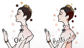
- Sometimes adding highlights where the shading starts can make the transition look smoother:
- Even if a panel is already shaded in the original page, I would recommend shading it again, because the manga shading is a black shading and shading a coloured drawing with black usually doesn’t look that good. (hence why i said something about using saturated colours in shading earlier).
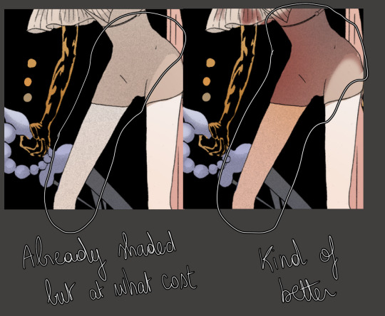
- Even if a panel isn’t shaded in the original page, consider shading it anyways, even if it’s just a very light shading. It’s worth it :o)
I’m running out of things to say oh well
#i didnt mean to write so much. it just happened i hope it's not a pain to read#also i hope it was clear but if it wasnt. (points @ my inbox)#whenever people tell me theyre getting into panel colouring i go... [powercry emoji]... its really fun and honestly i dont see that many#ppl into it so i get really enthusiastic ? thats it#personal#asks
116 notes
·
View notes
Photo
Was sich liebt, das neckt sich.
(Translation: Where there is love, so is teasing.)
My contribution for Sokai Day 2019. I just can’t help how cute those two are together!
Unfortunately, I managed to twist my wrist some days ago (though it only got really bad yesterday because I was clumsy and twisted it YET AGAIN), which rendered me unable to finish the shading in time because I can’t hold my pen for long. In situations like this I really wish healing magic would exist for real... Unfortunately the best magic I am able to work are cold bandages :(
Anyways, I will definetly finish it once it is healed up though. I still wanted to post it for Sokai Day though, so... Here it is.
Honest feedback on drawing and storytelling is always appreciated :) I am still starting out at art (especially digital art) and constructive feedback really helps me to improve.
Please do not repost anywhere without giving credit (reblogs are awesome)! Thank you :x
If you want more rambling and / or read the acknowledgements (because I got quite a few to make for this one), click on “Keep Reading” :)
This was my first try ever on a comic. I am quite pleased with how it turned out, even though there are certainly still things to improve (like my speechbubbles. I wanted them to be soft, but they turned out kinda weird... Guess I’m going to try out a different way to do them the next time).
I tried out some new techniques, most significantly the paint-over technique, with this comic and I think that it really is a huge stretch from my last digital fanart. Also, this is actually the first time I made a digital sketch as well.
Unfortunately, Kairi’s hair suffered a little from this experiments: you can clearly see I drew it in two different ways. By the time I was done with the lineart, there wasn’t enough time left to redraw one version, which is why Kairi unfortunately looks a little different in her close-up panel. Sorry for that.
Also, this wouldn’t have been possible without the help of many others.
First of all, thanks to the awesome @davidrevoy for his awesome almost-2-hour-tutorial on how to make a comic page as well as the comic page template. It really helped me a lot creating this! You can find the tutorial as well as all the free content related to it here.
Mr Revoy, if you’re reading this, I hope you like the little Easter Egg I included into this.
(For everyone else: the cat on Sora’s t-shirt is Carrot, one of the titular characters from Mr Revoy’s comic Pepper & Carrot, which happens to be my favorite webcomic. I do not own this design and / or character)
Also, a huge thanks to my friends and helpers, who spent a longer or shorter portion of the road giving me reviews on the drawings, the script and just the storytelling in general. I couldn’t have done it without all of you - you are awesome!
bombastictiming from Discord, for his very, very honest art reviews and his help on fixing mistakes I made - and for providing a lot of ideas on how to improve the artwork! Your art reviews always help me a lot!
Silva, also from Discord, for pointing out some mistakes, especially with Kairi’s head (which was a pain) when I didn’t know any further advice on it (yeah... It really DID look strange).
@theeeveetamer for beta-reading the script and reviewing the art from sketch to final sketch and for all the interesting conversations we had when I just wasn’t in drawing mood
@phoenix-downer for reviewing the final sketch / beta version of the comic and all the encouraging during the lineart phase (because I am always convinced my lineart is awful).
And finally, huge special thanks to my very good friend Gammy, who did not only discuss the idea with me and gave feedback on nearly everything from script to final version, but also took loads of ingame screenshots of the Paopu Fruit Tree. Thank you a lot, you’re awesome!!
It was really a lot of fun to create this and I don’t think I’m going to step away from comics too soon. In fact, I already have a few ideas for the next ones... But first of all, I will get my wrist some rest (thanks buddy for still trying everything you could, you really deserve it!) and then finish this thingy. I can’t wait to see what it looks like fully shaded!
#Kingdom Hearts#KH#Comics#Kingdom Hearts Comic#Fancomic#Sokai#Sokai Day 2019#SokaiDay#SokaiDay2019#Sora#Kairi#Carrot#Boop!#Unfinished#Long Post#My Content#My Comics#My Fancomics#Fanwork#Fandom#SeaSi draws
46 notes
·
View notes
Note
I was wondering if u can do a bunch of random facts/headcannons for the main cast?
Oh man, I mean, I’m happy to try, but I’m not sure where to start for the entire cast of 10… well, now 11 gods. I know have some that are scattered around the blog’s tags, and also in places other than tumblr, but It’ll take me a bit to find them or think of new ones without revealing spoilers, hmm…
So here’s what I’ll try that’s similar to the 1 Like 1 Fact meme I did on twitter a while ago: for every note this post receives, I’ll add a DEITIES-related headcanon or fact about the main cast. The main cast includes Set, Horus, Anubis, Osiris, Isis, Nephthys, Bastet, Sekhmet, Thoth, Ra, and nowwwww Sobek – and maybe the Set Spawn and the big bad serpent too, if relevant. You can add a note by +liking this post, and if you’re interested in learning about a particular deity, you can mention their name in a comment (and it’s not necessary to reblog this, unless you want to!).
This should help give me a bit more focus and time to think of some decent non-spoiler headcanons/facts to share. I’ll come back to this post in a few hours and add any many as I can, depending on the amount of notes it receives, and I’ll bump and place them under the cut for easy access. So yeah, go for it /o/!!
[1] Been playing with a headcanon where Horus’s Eye can see an object’s or person’s weak spots – though only for like, a moment once it’s activated, cuz I’ve wanted to avoid him being OP (but then again… he’s a literal god… so >>)
Also a related-headcanon where he can see a person’s past injuries thru his Eye too, including the hidden ones that have long-ago healed and left no visible scar. I’d like to draw the ones he “sees” on others one day if I keep it…
[2] Set is the only one of his siblings that doesn’t have an avian sacred animal, and for a while I wanted to keep it that way and literally keep him “grounded” compared to his family (sans Anubis). But I found that he’s sometimes also associated with crows (and falcons??? interestingly enough), and even though I haven’t found solid evidence of this yet, I also like the idea of him being associated with bats even before I read about it in Kane Chronicles I swear– So those 2-3 animals are probably some alternate animal form that he has but just rarely takes.
[3] Actually while I’m at it– aside from the Sha Animal, here’s a list of 30-ish animals that I keep as Set’s canon forms in DEITIES verse (based on a combination of historical speculation, recorded myths, and personal headcanons), and would love to eventually draw him as one day:
Aardvark, African Wild Ass (and Donkey), Giant Anteater, Baboon, Bat, Boar/Pig, Bull, Camel, Crocodile, Crow/Raven, Dog (some sort of sighthound?), Fennec Fox, Fish (Eel?), Gazelle/Antelope, Giraffe, Goat, Goose, Hare/Rabbit, Hippopotamus, [Spotted] Hyena, Jackal, Jerboa, Okapi, Oryx, Panther, Rat, Scorpion, Shark, Snake (Viper), and Zebra/Quagga.
[4] RELATEDLY… I REALLY REALLY like the idea of Set somehow acquiring a Thylacine form even tho it’s in no realistic way in the current timeline because thylacines weren’t native to Africa let alone Egypt. BUT… I JUST… THEY REMIND ME OF SHA ANIMALS SO MUCH o)——–
[5] When I was considering the color schemes for the main cast, I once briefly envisioned a purple/violet scheme for Nephthys, but decided to scrap it because (1) I wanted her colors to contrast with her sister’s and match a bit more with her husband’s and son’s and (2) I found that purple was nigh impossible to find in AE wall art and admittedly worried “maybe it won’t look authentic if I use those colors;;;”
Even though I’m happy with her orange/black/red scheme now, I’ve recently found that purple is a common association / kemetic UPG (or doxa?) with her?? SO THAT WAS INTERESTING… I don’t think I’ll change her color scheme for DEITIES, but maybe I’ll draw her in an alternate purple outfit one day to see how it looks on her >>
[6] One of the reasons why I like Horus, Anubis, and Bastet as their own casual friend group in DEITIES verse is that, because they’re all relatively young gods, they all share the experience/pressure of being measured up against their older royal relatives – Horus being seen as both his father and mother’s legacy and feeling the pressure to restore his family’s throne; Anubis being know for his infamous father, and even having his paternity questioned (via rumors and “myths”); and Bastet being the youngest of Ra’s daughter, sometimes being compared to her sister’s roles and achievements.
They’re all really good at masking any pressure they feel, but they also probably confide in each other about it more than with others, cuz they’ve all “been there.”
[7] Relatedly, one of the earliest version of DEITIES Project, before it was known as “Deities Project,” had Horus, Anubis, and Bastet as the main trio. That’s been changed “for reasons” since then, and their characters were quite different back then, but it might be fun to explore a story that focused on the 3 of them someday.
[8] Okay ya’ll know the part during The Contendings where Horus and Set are racing in stone boats and Horus “wins” by painting his wooden boat to look like stone? I have ideas for how that entire race happens in DEITIES verse that would be fun to explore as a side story, but in order for me to give Horus a “legit” way to win without outright cheating, he covers his boat with stone casing/accents, and after he wins and is confronted about it… well…
HORUS: “The rules we agreed on were to sail a boat made with stone. They said nothing about it needing to be made entirely out of stone.”SET: “…”HORUS: “ :)c ”SET: “…” *Internally raging*
[9] I’ve headcanon’d that Nephthys has her own set of ~7 Shabti who act as her personal assistants while she’s conducting her nightly duties, or working around her home, but I haven’t decided much more past that (still debating on how she acquired them, and if she more-than-likely named them…).
The concept and number were loosely based on how many of the other goddesses had their own sets of 7 as extensions of their power and/or control (7 Ribbons of Hathor, 7 Arrows of Sekhmet, Isis’s 7 Scorpions), and I thought it’d be neat if the Goddess of Service had her own Shabti that exemplified that part of her domain.
[10] Thoth is an avid lover of puzzles, trivia, and strategy games, and he’s also exceptionally skilled at games of chance. He doesn’t gamble or make bets often because he understands the risks, but when he does he tries to be calculative about it… and also has a natural knack for luck going his way (EX: That one game of senet that he won to help assist Nut with having her children… which is another story for another day)
[11] Ummmmm Isis is the only one of the main cast who I haven’t drawn a ref of her sacred animal form yet… or at least, not digitally. Her animal is the kite, but I’ve been debating on a while for what species to base her design on. I like the idea of her kite form looking like the Black-winged Kite, although those species aren’t native to Egypt… but some are native to Africa… and they’re so fricken pretty and they fit her colors so well so I might cave on this ffffffffffff–
[12] While we’re on the subject of sacred animals (and to help me get somewhat closer to the note count lmao I’m trying guys–), Horus’s falcon form is based on both the Peregrine falcon and the Lanner falcon, with more simplified markings for my own sanity when I draw him in dozens of panels.
At one point, I considered making his falcon form leucistic to contrast more with Anubis and Set, buuuuuut I also liked the brown colors on the falcons’ normal coloration, so I kept it. (That and more leucistic birds of prey are hawks, so… maybe for Khonsu tho if I don’t change him to an owl, hmmmm…)
[13] Okay continuing thoughts on animal forms, Bastet is able to shift her cat form into nearly any coloration or breed she desires (aside from her eyes, which remain green), but for the purposes of DEITIES I draw her as a brown cat with light gradation markings. I knew of the Egyptian Mau but also realized the spots would take a lot of effort to redraw in the panels where she appears as a cat (much like the spots on falcons for Horus). I also personally really like solid-colored coats on cats, and in particular I liked the coloration of the Havana Brown, so it may be a little less authentic but it did factor into her colors as well.
[14] I'm still debating on Sekhmet's main hairstyle and want to play with it a bit more -- not the arrangement per se but whether to keep it as locks or to make them more obvious twists -- or perhaps a combination -- since I can see her with both style at certain points in time. Either way, at full length Sekhmet's hair is very long: if she were to loosen her tie and let it fall, her longest locks would reach past her hips.
[15] I initially gave Set yellow eyes because even though he's often depicted with red eyes, I didn't want to over saturate his design with just... well, red -- especially in his animal form where his entire body is covered in red fur (red eyes + red sclera would have been, a lot). I like how his yellow eyes provide some contrast, and I've since found some story-related reasons where his eyes might play some role in the plot… but anything further might be spoilery 8')c
[16] It took me a while to settle on Osiris's "resurrected" skin tone because there were a lot of sources that describe his skin as being green, or blue, or black in coloration. I even tried them out in an earlier color test that I shared on patreon, but I eventually went with black since the color has had various meanings in Ancient Egypt that include both life and death. (It also gave me some opportunity to give green skin to Ptah and blue skin to Hapi to help vary the designs for each of those gods).
[17] Relatedly, Osiris's mortal form is a naturally dark skin tone, but following this death he can no longer appear in that form. He is also unable to travel to the overworld / realm of the living, though I'm still debating on how restrictive this is (if it's limited to his physical body or if he can split his soul under special circumstances, or with assistance). Regardless, most of his correspondence with other deities have to be arranged within Duat for this reason.
[18] I haven't made any plans to designate a spouse or romantic partner for Ra. I understand that there were a number of goddesses that were associated with him in the myths and often said to be his wife, but for that reason it was hard to settle on choosing one -- or multiple, and I realized that for the purpose of the main story it might not be necessary. I also kinda like exploring the idea of this high king and powerful creator deity who's also a happily single father, and where it's not for tragic reasons like the separation from or death of his spouse (not to knock that trope at all tho sdjfdsf). I'm not opposed to him being shipped with anyone though, I just don't think I've been inclined to do it myself lmAO;;
[19] RELATEDLY, while Ra's daughters (Sekhmet, Mafdet, Hathor, Serqet, Bastet) don't have a biological mother, I like to think that they were raised in an environment with a lot of parental figures and mentors to go around, aside from just their father. I haven't quite settled on how it was organized though, but I know that the daughters regard Thoth as something of an uncle/secondary dad (tho their dynamic with Thoth is can vary a lot from the one the have with Ra), as well as their teacher and mentor. I can also see where other gods like Khnum, Khepri, and Bes, and goddesses like Neith, Seshat, Taweret, Ma'at, and Mut, might also have played some direct mentor role in the daughters' upbringing and sense of self.
[20] (squick + implied nsfw) I uh… have this minor gag headcanon where Horus, Isis, and Osiris just don't eat fish. They just… don't. And it's entirely based on that one part of the myths after Osiris's death, where a certain part of Osiris's desecrated body ended up in the river and was swallowed by a fish 8')c (should be noted that I'm not saying that event did happened in DEITIES canon, but I'm also not disputing it either >>).
Apparently that was considered a bad omen, and I still find conflicting information on whether consumption of fish was taboo for some or all in Ancient Egypt (I think "for some" makes better sense, cuz why would an entire society that resides near the Nile river pass up on a perfectly available food source?? But I digress, I might need to review this again so take my thoughts with a grain of salt--). I also admit that I've seen it mentioned that fish are not ideal food offerings for Isis and Osiris?? and I can imagine that maybe Horus adopts the distaste for them as well. Either way, I go with the DEITIES canon that while most people and deities happily consume fish, Horus and his parents will not, and they don't enjoy it as offerings either.
I’MMMMMM gonna end it here for now cuz my headcanons have run dry for the time being, thank you guys!!
#// I'M SRSLY JUST blanking on new facts right now o)-----< but I wanna give this a try later after I make dinner in a bit#// I will… also see if I can make a tag for the headcanon-type replies since it seems that people are interested in them!#DEITIES asks#general asks#meme#Horus#Set#Anubis#Bastet#Nephthys#Ra#Thoth#Isis#Osiris#Sekhmet#headcanons
38 notes
·
View notes
Note
Do you have any coloring tips for beginner digital artists?
asdhjf I forgot to post this earlier smh I’m not sure if this will be covering everything you want to know, but here are a few tips I learned as I was starting out + habits I picked up along the way, hopefully they help! ^^
Colour PalettesThese are a great way to find colours that work together, and keep everything looking consistent. Some good resources that are easy to use for finding nice colour palettes are colorhunt and coolors. Overall most important thing is to use colours that you enjoy! Don’t be afraid to experiment!
Neutral BackgroundsSomething I do a lot, which is working on backgrounds that have a tint to them, so that they aren’t pure white. Working on a tinted background makes it easier to see how dark your colours actually are, and overall make the colouring process go smoother. This also applies to putting down your background colours first, so that you can coordinate what darks and lights to use for the rest of your drawing. A light, warm grey background is usually my go-to!
Using Off-WhiteThis is just a matter of preference, but I usually tend to stay away from using “pure white” in my art, unless its in very small quantities, like a tiny highlight in the eye. I go for a cream colour, a very light pink, or very light orange (I love warm tones ahaha). Using an off-white can make colouring seem more natural, while using pure white give a more “cartoon-y” look (again, a matter of preference).
Use of ColourOne of the most common pieces of advice I would always hear is to “avoid using black and gray to shade” since it will make your art look more dull. which I somewhat agree with, however, don’t feel like you have to follow these rules! If you feel more comfortable making art that way, more power to you! (I dabble with using grays to shade sometimes as well - gives a different look).
On the other hand, focusing more on using colour to shade can make your art look more lively and dynamic! You can give your art more dimension by using shades of multiple colours and moving around the colour wheel, instead of staying with the same colour. I tend to use oranges, pinks, purples, and blues when I shade. For highlights I do the same thing, going for colours instead of pure white. For example, highlighting something red with a light yellow/orange, or green with a light blue/purple, etc. (I tend to keep warm colours together, and vice versa).
This also applies to using black and gray; by using a slightly more tinted black or grey, it helps tone down the harshness of pure black or gray, and makes your colours look softer/ more muted.
Gradients!!A great way to add dimension to your art, I use gradients all the time (they’re my life tbh). The key to using gradients is to use them in moderation, and adjusting their opacity (applying layer styles as well which I’ll talk about later*). I like putting down gradients on a separate clipping layer above my flat colours before I start shading; it helps make your art look less flat (even after shading) and really makes it pop! I like using pink, purple, and orange for my gradients with a large airbrush tool; I usually focus on the top of the head, the chin & up the face, and from the bottom of the canvas going up. I then play with different layer styles like linear burn or multiply to make the colour darker, and colour dodge or pin light to make it lighter (these are different from piece to piece, I don’t stick with one set; experiment!)
*Layer styles are basically like filters that you can apply to the layer you’re on and change the overall look, so multiply will darken everything on the layer, while colour dodge will lighten everything, etc. You can find them in a little drop down menu that usually says “normal”. (This is how it is in SAI, Clip Studio Paint, and Photoshop, not sure about other programs).
OverlaysSimilar to gradients, using an overlay on top of your art can make all the colours look more cohesive. The way I use this is adding a colour layer on top of everything (ex. I’ll make an entirely pink layer), and applying a layer style to it so that it overlays on top of the image below it; this can make the colours you used look drastically different, and easily add some cool effects that would’ve been difficult to do manually.
Locking transparency/ Clipping LayersKinda hard to understand at first, but really useful once you get the hang of it! Locking transparency is when you have something down on the canvas, and you want to change the colour of it without having to redraw it, or painstakingly go over it. This is really useful for things like changing the colour of something, or, how I like to use it, is for adjusting the colour of my lineart. I always draw my lines using a darker version of colours that I’ll be using in the piece, and later recolour the lines to help them blend in more (ex. the folds of a shirt). To lock the transparency of a layer, you need to click a little symbol above the layers panel that will say “lock transparent pixel” or “preserve opacity” if you hover over it.
Clipping layers allow you to draw on another layer, while being restricted to the content of the layer that is below it. So if I have my flat colour layer all done, I’ll make a new layer, apply a clipping mask to said layer, and it’ll let me shade on top of my colour layer without going outside the lines (so its restricted to only the parts that are coloured on the layer below - super useful!). On SAI there is a little box above the layer panel that says “clipping group”, while for Clip Studio Paint you need to right click your layer, go to “layer settings”, and choose “clip at layer below” (p sure its the same for photoshop).
Man that was a wall of text haha;; but yeah, hopefully I helped answer any questions you might’ve had, or anything you didn’t understand! Let me know if there’s anything else you want me to give advice on/talk about; I’m happy to answer any questions! ^u^ (to the best of my ability lol)
85 notes
·
View notes
Text
therefore you and me post-production notes
(or: murphy’s law as a project that has been two years in the making)
ive had this idea for ‘therefore you and me’ and Fritz ever since i first played CindPhenon. nothing ever fell into place until i played Evermore though, so here we are!
drafting this project was pretty easy tbh (see: hubris). the parallel imagery and everything about the lyrics was right up my alley aha.
fun thing with the lyrics: TadanoCo uses ‘要る (iru)’ in the line ‘Which do you want (iru)? Or do you want neither (iranai; aka negative form of ‘iru’)?’
‘ 要る ‘ as a verb can mean ‘to be wanted’ or ‘to be needed’.
hence, the line can also be read: ‘Which do you need? Or do you need neither?” or any other variation of the verb’s usage.
it’s halfway through drawing the lineart that murphy’s law began. 1) i drew ~15 panels on the wrong dimensions, and had to redraw them all (lol), re-grey tone (LOL), and re-ink (LOLOL). it was not a fun three days.
then i lost momentum because of lunar new year (happy late lunar new year btw! happy year of the ox :”) )
anyway: the moment i regained momentum for the project again, i hit a roadblock in the form of overconfident, sloppy drafting (see: hubris is my downfall).
because of the lack of clear drafting for certain panels (and changes to previous panels), i had to redraft two different sections of the PV while keeping in mind that there was the bridge still to be drafted. fun !
i decided to simplify the bridge. can you believe it was supposed to be another animation. i can’t. so i scrapped it.
(slight tangent. Evermore’s release honestly cleared up a lot of uncertainty regarding the direction of the PV and whether or not to include Fritz’s mother (who I still fondly call Beatrice). im really happy the PV never came to fruition before Evermore’s release, as im not sure i would have done half as good a job without Evermore’s content.)
back to the hubris of proceeding with a messy draft - there was a lot of push and pull internally for me as to how much i should keep to the original PV and how much i should just put my spin on things. i ended up doing a bit of half-and-half, i think.
but really, it only delayed things as i ended up redrafting and having multiple drafts of certain panels haha//
the last two choruses were honestly my favourite parts to draw. the shift from Varg’s clothes and colours to Fritz, Fritz’s acceptance of Varg and the soft way Varg looks at Fritz (and no one else). there’s something cathartic about acceptance and acknowledgement. i think that’s what i aimed to really capture.
also: in between drawing all the panels, murphy’s law 2) my Evermore itchio game file ? got deleted off my computer ?
it’s a very old, barely functional brick so im lowkey unsurprised but at the same time it was a crazy experience and setback when i needed to reference certain scenes. oh, and Steam decided to not download Evermore too. i still haven’t fixed that one. haha. ha.
i have screenshot posters to thank for uploads of certain CGs, although im still pretty sure its best not to post a ton of those publicly at one shot?
also, i had to scrap the recreation of the famous ‘did you love Varg’ scene because of this aha. looking back now, i think it worked out.
(another tangent: using referencing as an excuse, i actually took the opportunity to replay Fritz’s route for the third time. i ended up checking nothing at all and falling in love with the masquerade scene again.)
up till the very end, im still not sure if everyone got that the line “You are love itself.” was meant to be said by Lucette to Fritz. i colour-coded Lucette with her own unique blue for the PV, which was the same hue as the line. i hope that it got across, aha.
with that said, video production was a whole entanglement in and of itself. i think murphy’s law really took up a hammer and swung hard at this stage.
timing was actual hell. im usually not this bad at it, but this project in particular was tricky bc TadanoCo uses a lot of background beats that aren’t overt, which his PV also matches - i think? or maybe im just not good at recognising beats from lack of video/music production haha//
hence there were certain scenes i was stuck at and kept revising because i wasnt clear where the beat was meant to be, what transitions i should use, and when the transitions should be.
subtitling was actually really fun! until i rendered my first version and realised all the subtitles were completely off and blurry.
turns out my project properties were different from my video properties, hence the off-alignment. huh. didnt know those were Actual Things(tm).
also, quick tip to all vid-making amateurs like me out there: you may have to double the dimensions of the font’s media properties if you dont want them to come out fuzzy. another thing i didnt know lol.
anyway all this lead to: me needing to spend another evening to redo subtitles. haha. it was not a fun two back-to-back 3am nights + extra evening afterward.
in between all this was countless rendering tests to guess-and-check what’s causing numerous errors in the video btw.
and with those rendering tests came: glaring mistakes in the panel art that i only now spotted and had to fix, and refix, and refix again. then reimport into sony vegas, put it into the video, render and double check if it’s alright. rinse and repeat countless times ! haha ! PV making is fun !
i think i nearly redid a certain scene with the exact same panels once. like i said: not a fun two 3am nights.
that said: i dont know how all this technical issues (and more) popped up and were resolved over two 3am nights and one evening. im not about to question it either.
at this point: panel art - fixed ! subtitling all redone ! render works fine, everything checks out.
i make the mistake of uploading it directly to yt instead of leaving it unlisted first.
murphy’s law 3) when im watching the vid on yt, the yellow parts in the second verse were completely unable to be seen.
panic put it on unlisted. people are already watching it and leaving (very sweet) comments. panic delete it.
btw if you’re one of the first three commenters reading this: thank you for the quick response !! it means a lot and made me really flustered in a good way :”))
cue me re-colouring those scenes, redo-ing the section and oops, is that a panel in the masquerade scene where Fritz literally is missing his mask ???
i think i lost my mind entirely at this point. from then on i was fueled by spite to complete this cursed project.
at thereforeFINAL.mp4, (version five of the full PV, version maybe 10-11 of all the rendered videos, including tests) finally. finally it is done.
i upload it.
the end !
(except, not really. because here you are at post-production notes detailing the worst luck i’ve ever had with PV making.
i learnt a lot from this though, and honestly on hindsight i should have learnt all these from my first PV but nothing went wrong at this magnitude so i kinda just...shelved it aha//
but really, im relieved it turned out well, and that i took the time to redo scenes until i was satisfied. for a PV that’s been waiting in the background for two years now, i think this is the least it deserves.
if the comic about Fritz and Varg (which i referenced in one of the last choruses, i wonder if anyone caught that?) was meant to be a love letter to Fritz’s route, i think this PV ought to be a tribute to the character himself.
although - hm, this isn’t quite as good a tribute to Fritz as it is to his route, maybe? i don’t know, haha ! maybe it’s just myself wanting to make excuses to create more for him//
i was thinking of continuing on about the PV and it’s significance to Fritz and Varg, but hm. maybe not on this post. maybe some other one, some other time.
but at it’s core, at it’s simplest, most raw - i think i just wanted to explore what it means to Fritz to ‘want’ and to ‘need’ with this PV.
thank you for watching the PV, and thank you for reading this.
- blu.)
0 notes
Note
Hey, so I'm confused. So it seems Hide has his own human/CCG group against Furuta. They possibly want coexistence, like Goat. There's the battery day, Hide's Ace of Spades, the magician being the bridge between heaven and earth and the Scarecrow etc as symbolism about them collaborating. But then Hide's the witch servant, the Prince's enemy, and the witch probably being Eto or maybe Itori. But Eto is backing up Kaneki, and Hide probably helped her and Arima in their OEK plan to save Ken's [1]
life. Plus Hide’s getup in the play really resembles the Clowns’, but also has Eto’s hat. And then we have lots of Dragon symbolism for Hide, with the Dragon being Furuta’s ally and possibly a revived Shirazu. That would maybe tie the Qs to Furuta, because Scarecrow is apparently depicted as Saiko’s enemy despite the fact he just asked Urie to join him, and Saiko seems to want to collaborate with Urie.
Dragons controlled by Magicians who flew the sky and ended the war between an empire and a rebellious army (CCG/V and Goat?) If it’s Hide’s third faction, it’s curious that he’d control the Dragon, Furuta’s ally. And then there’s the old OEK stuff. Hide’s name possibly refers to the Naaga, and Chika to the underground and maybe the Washuu through Yoshitoki. He sometimes displays special physical abilities, now also as Scarecrow and we’re given weird hints in the redraw. Ishida’s new art may hint we’ll be seeing V, Furuta’s ally, soon. I don’t know what to think about all of this.
Right, so you’ve brought up quite a lot in your ask and I’ll try to address everything, because even though it might seem all over the place, I think it can still all be connected.
It seems to me that Hide appears to have similar goals to Kaneki; to be honest, I never pinned him as caring all that much for working towards coexistence, though. I thought he was more of a character who was concerned simply with himself and his person sphere since he treated ghouls as equals. I didn’t think he cared much for coexistence but he didn’t seem to see ghouls any differently from humans. I’m realising now that the way I perceived Kaneki and Hide may have been switched.
It seems to me as though Kaneki is the one who appears to be fighting for the good of everyone, when he really just admits to fighting for those close to him. Hide on the other hand, appears to be concerned with himself (and Kaneki), but maybe he’s seen now that the way things are can’t go on. He’s now been forced to see that the system they’re living under has fucked up his and Kaneki’s lives. The person he loves most is in constant danger thanks to the current system, and maybe that’s helped Hide to realise that he can’t just sit back and let things continue the way they are. Hide isn’t one to sit back and wait for something to happen, and that’s why I think he’s taking it into his own hands now.
Hide’s card, the Ace of Spades, it’s known to be the most powerful card in the deck, and I think that’s because what Hide is doing now is a game changer. He’s now introduced another opposition to Furuta, one that no one suspected to be of any significance before now, but they’re taking back the CCG and that changes EVERYTHING.
Like you said, the battery day page, Hide and Kaneki’s birthdays as well as their tarot symbolism all seem to be heavy indicators that they’ll join together to work towards a common goal. I think that this will still be the case. Now that Hide has taken the CCG, technically, he is on the opposing side to ghouls. This makes me think that perhaps this is the betrayal against Kaneki? This is the stage where Hide is in opposition to Kaneki, but Goat’s goal has been to make negotiations with the CCG, so I can see them joining forces against their mutual opposition which would most likely continue to be Furuta since he’s at a pretty high position of power in multiple organisations.
As for Eto, I still think there’s space for her to fit into all of this. Hide was heavily injured in the sewers, and of course he must have escaped somehow. I’m doubtful that he managed to get himself out of there alone, and Aogiri were already there snatching up fallen investigators for Kanou to experiment on. Eto seemed to already have shown interest in Hide from the time Hide went to Takatsuki Sen’s book signing. I am almost certain that Hide and Eto HAVE to be involved somehow. It would seem pointless to me to include that scene between them if they’re not. It’s possible that during the time between TG and :re, Hide was with Eto. This would make sense if Eto saw potential for him to be an OEK candidate (there’s me going off about the 2nd OEK theory again lmao).
I feel as though the part of the play which has the witch’s servant receiving forgiveness from the prince and joining him by his side will be when the CCG and Goat join together inevitably.
Additionally, although Saiko has been linked to Scarecrow, I’m thinking that it doesn’t necessarily mean they’ll be enemies. Some speculate that Scarecrow was Saiko’s online friend she mentioned at the beginning or :re, and really, I see no reason as to why Hide would be against Saiko. They don’t appear to be working in opposing directions, so it would make far more sense to me that she should join him, and that the art of the Quinx simply drew connections between them and the ghouls rather than pitting them against each other.
As for this panel, I want to give my interpretation on it since it ties in with what you said about the dragon being Furuta’s ally but Hide being linked to it.

“A battle between an empire where dragons controlled by magicians soar through the sky and a rebel army that stirred the heart.”
So, the Empire would obviously refer to the current system which Furuta is at the head of. The rebel army would, of course, be Goat, but the dragons don’t have a side specified to them. I think the dragons and magicians actually refer to multiple people on different sides. Of course, Hide being associated with the magician makes me think that his group are being referenced, but I’ve seen a couple theories claiming that Furuta has also adopted magician status, which makes sense since he refers to his secret weapon as “dragon”. In light of this, I think the dragons which are referenced in this panel could be alluding to magicians on both sides using “dragons” against eachother. If this is the case, that means that Hide’s ties with the supposed Naagaraji would still make sense, however it seems to me that Furuta’s kagune we saw in 138 seems to bare quite close resemblance to the Naagaraji we were shown underground.
Hide being a Washuu is definitely still on the table, and if he is one, it would make even more sense for him to take up the position of Chairman at the CCG (though I would personally prefer this position to go to either Matsuri or Marude).
As for that art of the hand with a V on the wrist reaching out to Kaneki, I can’t say I’m entirely sure of what that means. Many have been speculating about who that hand belongs to, but I think that it could just be a metaphor. Perhaps the hand just represents V as a whole? Though I’m not entirely sure why it’s caressing Kaneki’s face so gently.
All I can really say I’m almost sure of is that V will be making a significant reappearance, especially since they will be more vital to Furuta now than ever, now that he’s lost his position of power within the CCG which was his main tool.
39 notes
·
View notes
Note
you art style is beautiful I love how defined your characters features are what properties do you most draw inspiration from and what continues to inspire you
laskghalsghsdlgh oh my gosh what a lovely ask!!! bless you anon. thank you so much for your kind words ;v;
Since you said properties, I think kind of like... fictional properties?? like stuff that I like that’s inspired me and like I’d have to say my major art inspirations are kinda as follows:
Disney -- which I’m sure isn’t a surprise aT ALL, because it does a pretty good job at that cartoony realism that I always strived for.
Naruto -- because I spent all of high school emulating the style and redrawing manga panels, so it’s definitely had an impact on my art.
A bunch of early 2000′s cartoons -- because they definitely impacted my art when I was younger. Namely stuff like Teen Titans, Powerpuff girls, Kim Possible, and Winx Club.
Kingdom Hearts -- was definitely a more recent inspiration, considering that it *definitely* has that cartoony realism on lock down, and I fucking ADORE IT. The character designs are very aesthetically pleasing to me, and they’re all so *pretty*......
Steven Universe -- probably the most recent one? They have very good shapes, and watching it helped me a lot with how I do legs and stuff in particular.
Phantom of the Opera -- which ISN’T really a drawing media or anything??? But like I was really into it for several months in high school, and it got me to try drawing way more realistically for a little while.
Homestuck -- b/c uhhhh that kind of influenced me a lot to experiment with character design and junk. (Also it has some cool shots in it from what I remember)
Prague Race -- because the aesthetic of that web comic is pretty pleasing, and I really enjoy the character designs
I mean, beyond that there were definitely fanartists who probably influenced me, but trying to list all those people out would probably be another list all on its own lmao.
As for what inspires me now... uh.... I mean, I don’t feel like I have any inspos outside of fandom right now. I just?? I guess I haven’t been as inspired as much in the past few years, but that’s probably because I haven’t been involved in a lot of stuff beyond anime as of late??
So I mean, the plus side to anime is that it gives me a chance to really experiment with character designs, b/c a lot of the faces are very abstract and the bodies kinda samey, but I also haven’t like... been reading comics as much as I used to and getting a good feel for poses and composition and perspective which is... b a d, but I guess I’m still trying to make sure my character design skills are up to par ha ha
(what no that’s totally not an excuse to avoid drawing backgrounds what are you talking about alksghlsdkghas;lk)
#shut up jelli#thank u lovely anon#i've been wanting to do that influence map thing on deviantart#but i haven't gotten around to it.......#Anonymous
3 notes
·
View notes
Last Seen Blogs

parallellovegi
-- Parallel Love --A Gladnis AU Zine

ax63ng956-blog
바카라꽁머니1만게임// KON20。COM

downtownriley
book reviews

yuvajobsind
Untitled

babibang-blog
rap no sangue