#he can do many things with that mouth
Note
Hi! would you by any chance have tips on how to get a binder when your parents refuse to buy you one? ☹️
That's definitely a sensitive and complex answer, and while I might not know of the best option for your unique situation, there are some ways you can go about this.
If it's a foregone conclusion that you cannot convince them of this, what I used to do is DIY my binder. The ways I primarily did this were:
Option One: Wearing a camisole that was one size smaller than I actually was (so, wearing a small instead of a medium, for instance), then folding it up over my chest. As a disclaimer, this may only work well if you are smaller in the chest
Option Two: Layering two sports bras in my size over each other. Some of the DIY tips I found before I got a traditional binder advised to wear one sports bra in your size, then wear another sports bra backwards in a size smaller. I would advise against this for potential safety reasons, but also because (at least personally), it can be ineffective and a waste of resources.
Some people have also had friends or other family members order their binder for them, but this can be risky, depending on your situation. While I don't know the ins and outs of your specific circumstances, risk management is important to me, so I would recommend this if it is a risk that is acceptable to make.
I understand what it's like to not have access to this resource, so what I will do is advise you against:
Binding with ace bandages (I did this before (multiple times, in fact, because of dysphoria), and believe me, not only did it hurt like hell, but it constricted my body so heavily that I may have done long-term harm)
Wearing a DIY binder (or any kind, for that matter) for longer than your body can handle
Doing DIY in such a way that even mimics binding with ace bandages. This means that your binder shouldn't constrict your ribs, breathing, or range of movement
Here are some general good practices that you should use to guide you for any type of binding, whether traditional or DIY:
When you start binding, only do so in very short sessions to begin with. While binding shouldn't outright hurt, it can be a weird transition while your body is getting used to that new sensation
Minimize heavy lifting or exercise while binding. If it is unavoidable, drink plenty of water and take plenty of breaks
Stretch after binding
Don't bind while sick or have inflammation in your lungs or chest
If you DIY, treat your binder like it is a traditional binder. Don't make the mistake of assuming you don't need to listen to your body because you aren't using a "traditional" binding method
Ultimately, listen to your body. If it is telling you that it needs a break, honour that. Your body isn't punishing you, it is trying to keep you (and it) safe, even if it doesn't feel like it
In the end, this isn't perfect. Sometimes, parents do come around, even in their own ways, even if little by little, they come around. When I first came out officially around 2016, I was convinced that my transition would be completely forbade by my family; I concealed a lot of it in the worst instances of this. However, now, I think most of my family has come through their own journey with the understanding of the reality of what and who I am. I tell you this, anon, because I want you to know that this, too , shall pass. You can make it. I know this might be devastating to you, and believe me, I know what that's like. But it won't be forever. These bridges aren't burnt forever, and I hope you can find your happiness and contentment wherever it may be.
#ask#anon#trans#transgender#lgbt#lgbtq#ftm#nonbinary#long post#if anybody has other tips or ideas then feel free to speak up#this is what i did before officially binding and what i have seen other trans people do in lieu of getting a 'real' binder#it did suck when i was coming out because i don't think my family had any idea how *their* hang-ups with... me as a person... affected me#and i think a lot of people get their preconceived notions or headcanons of you stuck in their head to the point that it is Reality#i think part of why my dad started actually *trying* to accept me was him realizing that i was actively hiding things from him...#...like he loves me and our relationship is fine now but i'm not going to pretend like he didn't massively blunder after i came out#and if it turns out that your parents don't ever come around (gd forbid) then you aren't obligated to keep them#you don't choose your parents but you can choose your family i think#i always always hope that parents come around to their child/ren and the reality of who they are but i recognize how messy it all is#anon i wouldn't blame you one bit if you feel many complex or 'negative' emotions toward them#i have many complex feelings about this and that's my own baggage. i hope i haven't put words into your mouth or assumed anything too much#i am sending you best wishes and care. this too shall pass💛
55 notes
·
View notes
Note
if you think shen jiu is “a rancid, horrible, radioactive level toxic of a man” fine, whatever, but please use an “anti” or “negativity” tag and not his primary tag. thank you!
As per suggestion I have removed it solely bc it might make people uncomfortable.
But also WHAT. DID YOU NOT READ THE DAMN POST HE IS CANONICALLY THAT.
#speechless.jpeg???????#anon he IS horrible. bc he abuse bingge what#and i EXPLICITLY said that i will fight poeple who woobify him.#bc of this i will need to clarify the deepest secret ive ever had in my stupid life:#yes. i am a shen jiu liker. his horrible aura and shitty demeanor captured me like a scientist to an interesting radioactive rock#HE HAS LAYERS AND IT WASN'T EXPLORED ENOUGH IN CANON#I wanna bite him so bad i wanna shake him like bones in my mouth#we could do so many things with his backstory and pidw canon!!!!! like fuck?? his view of himself is so so skewed#if i could ever write anything i wanna put him in therapy. lets go babygirl im dragging u to therapy#dont you DARE accuse me of being his anti or negativity or whatever when i was busy thinking about how can i make him and yqy in character#like actually thats so hard? both has different level of frequency and it hurtssssss#am i a shen jiu liker? yes. is he an asshole? yes.#he needs to stay that way even after slef discovery bc cang qiong need one sharp tongued full of suspicion and quick witted peak lord and#its not gonna be yqy#[borealis.mail]
7 notes
·
View notes
Text
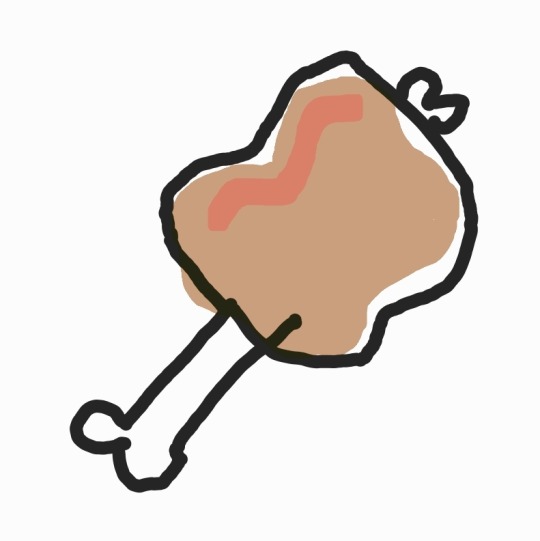
Nothing in my life has ever tasted as good as how I imagine cartoon meat that looks like this tastes
#talking tag#orv groundrat meat and yanaspleta stem#literally the only type of meat they eat in one piece#it's funny how in orv when kdj makes bbq skewers they all look like this but when yjh makes skeweres they look like normal ass skewers with#vegetables and everything#it's yjh the only person who has any culinary sense? the real answer is no. kdj is actually capable in the kitchen. the funnier answer is#that yjh was so fed up with being the only person in the universe to have taste buds and maybe a normal sized mouth that he spent an entire#regression turn learning how to perfect his cooking [this part at least is canon] just so he could convince at least one of his companions#to raise their standards and stop eating barely-chopped‚ unseasoned‚ straight off the bone monster meat#i think yjh would refuse to eat an apple unless it was peeled and sliced into cubes with little toothpicks#he wouldnt touch a sandwich until you passed it through a panini press#maybe it has something to do with diligence and intentionally putting effort into something often overlooked#its a lot of effort to cook delicious meals when the world is quite literally falling apart and reshaping itself but in a situation where#he doesnt even have control over his own death‚ he can only treat what he does have control over with the utmost diligence#cooking and eating good‚ healthy‚ SAFE food is something that is entirely his‚ i think#he doesnt need it to survive like fighting. its not a relic of his past that has lost its application like gaming. its a routine‚ a ritual#repeated daily#something that you do every day and by continuing to do it you create things that are more and more enjoyable. something that makes people#smile and feel satiated. something that gets everyone to sit close and share the joy of a single moment. a single meal#is it possible to get tired of that after repeating it so many times? every day? every day every month every year every turn#why doesnt he eat food made by other people?#because its not delicious#and the dumplings?#those were made by someone he loved. someone he loved put their time into mizing the filling and shaping the dough#someone he loves wants him to be safe and fed. and offered him dumplings that they made#was it delicious?
27 notes
·
View notes
Text
Ok... I swore to myself I wasn't gonna make another negative MAWS post, that I was just gonna leave it at the Twink Slade disappointment post.
But apparently there's this trend that's been happening on Twitter, where people are trying to bring up the 2004 "The Batman" designs to try and defend the designs of the MAWS rogue gallery. And that was the territory I CANNOT let go, as someone who is a fan of Jeff Matsuda and his character designs.
SO FIRST, LET ME CLARIFY: I'm simply making ONE post about ONE factor of MAWS that irritates me. I'm not here to just sit and constantly bash on the show. I wouldn't do that, I have a personal close friend of mine who enjoys the show and I'm happy for her and I want her to enjoy the show. I have SO many gripes and reservations but I recognize those are personal.
I'll be putting this under a Read More and tagging it as Anti-MAWS so MAWS fans don't have to read/deal with this post. Probably just don't read my tags as well.
So if there's one thing that has irked me the most about MAWS, it's the redesigns and rewrites of Supes' rogue galleries. Mostly the redesigns though. MAWS took a bunch of colorful, diverse, and fantastical designs and made them monotonous, bland, and simply not fun at all. And yes, while the in-universe explanation (Being that they're all mechanically enhanced rather than freak accidents or born that way) makes sense, it still makes the villains incredibly un-appealing. EVERYONE is in boring black, white, and gray armor (aside from Parasite and while I think his physical design is neat I have issues with his character rewrite too, I'm just not here to discuss that). Everyone who had incredibly fun or creative designs was horribly washed out. Silver Banshee went from being a literal ghostly wraith to a boring motorcycle-looking chick. Livewire went from a vibrant blue lightning motif (that SHE herself created) to boring merc armor. And yes, I have issues with Slade's armor, the head was promising but the overall design has color-balancing issues.
Now let's look at the redesigns of the rogue gallery for the 2004 "The Batman" show. These are mostly drastically different from their original design counterparts, just like MAWS. But the massive difference is that most of these designs are still colorful (where it applies, obviously not to Penguin), recognizable, and push the borders of imagination; They're so ludicrous and exaggerated in their design and their physical features. Even if I was disappointed in some of the character rewrites (Like Mr. Freeze having only a small cameo to Nora in the flashback, but mainly being another selfish thug), the designs are still great. You can look at The Batman villain designs and easily recognize them because they follow the basic structure of their original designs.
Joker:
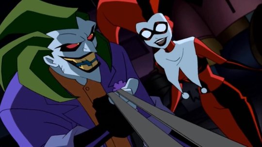
Is still in his green, purple, and orange color palette, with his trademark freakish grin. The design takes creative liberties with the spiked hair, the more athletic physique, and the actual clothing style of his outfit, but this is clearly meant to be Joker.
Mr. Freeze:
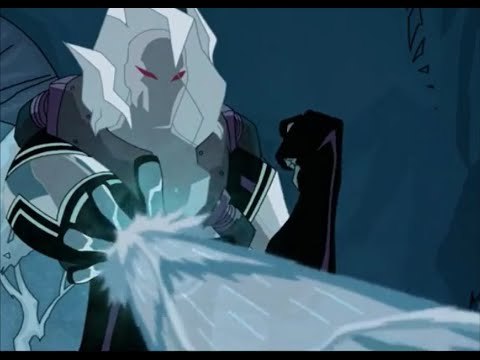
Is now essentially a cryomancer thanks to his mutation, but this is still obviously Mr. Freeze. Some kind of helmet (in this case encased in his own ice) wearing a thermal freeze suit, and his red eyes invoking the red goggles he wore in his original iteration.
Catwoman:
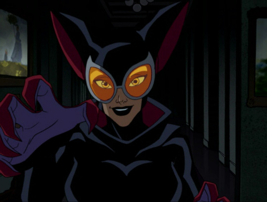
The design exaggerates a lot of features of the OG outfit, like the ears and the goggles (though the OG design really just has eye spaces), and uses shades of crimson and purple, but you look at the black bodysuit and the whip around her waist and she can clearly be identified.
The main argument I'm making with the 2004 Batman designs is that they're A) recognizable to their original counterparts by invoking the same color scheme and basic design points, B) Colorful and pushing the lunacy of a world full of supervillains, and C) Completely stand out from each other, no two villains look as though they're of similar origins (besides obvious pairs like Joker/Harley Quinn and the two Clayfaces, the latter which was a guy who took concentrated serum made from Ethan Bennett's Clayface DNA). The Batman designs are good because while they ARE drastically different from their original counterparts, they honor the original designs.
Whereas in the MAWS redesigns, none of the redesigns are reminiscent of their original counterparts (besides the obvious Brain and Monsieur Mallah, kind of hard to fuck that up), and lack the fantastical element that The Batman redesigns (And the original Superman show, where it applies) had.
Livewire:
Looks nothing like her original counterpart. The armored clothes, the lack of lightning motif, lack of color to her outfit (I'm not here to talk about the race-swapping), none of it is supposed to tip you off to being Livewire, especially when her character is written so drastically different. You should be able to tell who Livewire is BEFORE you see her powers.
When OG Livewire looks like this:

Silver Banshee:
Is just a regular human in drab clothing. There's some kind of attempt to give her the hint of a ghost motif with the bone legs, but then that disappears in her later costume design. Same later costume that tries to half-ass a skull motif on the helmet but it doesn't work with the helmet's angles.
When this is Silver Banshee's original design (going with a still from Batman Unlimited)

And if they wanted to stray from the whole "supernatural" aspect, they could have compromised like they did in Suicide Squad: Hell to Pay:
Which I mean I still don't like that redesign as much as Silver Banshee's OG design, but it's still recognizable and it's still cool.
The bottom line is basically this: You don't have to justify liking this new Superman show and its take on new characters. But to try and say the character designs on MAWS are like the 2004 "The Batman" cartoon redesigns is such an unequal and imbalanced comparison. The thought process for the character designs in these shows are so drastically different from each other, and the execution of said character designs aren't comparable.
#discourse#Anti MAWS#Anti My Adventures with Superman#Listen I'm not saying any other gripes publicly about the show; Again I have an irl friend who watches it#and I'm absolutely not about to drag her down or just rag on the show; so I get it#But if there is one thing that can really make or break something for me it's character design#And the one thing I'll openly criticize MAWS for is how basic their character design process seems to be#The showrunners FROM THEIR OWN MOUTHS said that they purposely made Lois look like Luz from Owl House#So there is NOT a lot of creative thought process going into these redesigns#And to compare that to Jeff Matsuda who is an industry veteran and who's worked on MANY shows with incredibly kick-ass designs#Well that is a stick in my craw that I can't let slide#'BUT AURA DON'T YOU LIKE THE 3D HE-MAN SHOW AND THEIR DESIGNS?!'#Yes I do but A) I'm not out here claiming that they're faithful designs to the original characters (Because Duncan and Teela clearly aren't#B) Nor are they badly designed characters that I'm trying to compare to a whole different level of character design#The Batman 2004 show was an incredibly fun show that captured the dark and melancholy nature of Batman; and the villain designs were fun#MAWS isn't on the same level as The Batman
11 notes
·
View notes
Text
any other systems / collectives / etc have alters / facets / headmates / etc who come out literally Just to do a bit. like the commitment to the bit is what they're here for
#i put real ramble in tags like always but#i was in the car and listening to music and yknow. much like any singlet i know you get the music videos! in the brain.#but. the thing is they're a group project now. you understand.#its different than *me* (s) just imagining a music video like playing with dolls. of the mind. this... its participatory. you get it.#anyway t is pretty much a frequent flyer only because he's constantly deciding he's the star of brain music videos#also. ok. if u havent like stalked this blog u may not know but our basement in headspace is a karaoke bar bc i heard another system had on#and we were like “you can do that???” so we built one#and now. much of the time. it is a Performance for many a song#this isnt just t btw. every fictive. and two npcs(?) all from the same source (of course.) are like. it's my time to shine#and again it is very much different than when like i choose to imagine a music video cause i do that often too. but im never Surprised#by the music video im making. bc im making it! im making conscious artistic choices#but when t or n or m just Appear to make the song about them. im surprised. i oft laugh at their sudden choreography. yknow?#also t will sometimes just steal the mouth for one second to blurt out a bad joke and then run away leaving me to deal with the consequence#if ur gonna badly flirt w our irl partner you have to at least stick around. take responsibility!! you dick!! /lh#anyways#system stuff#s post
3 notes
·
View notes
Text
I don't even think of David Copperfield as a Victorian novel. I think of it like it's the Peanuts or the Simpsons
#text post#dickens#david copperfield#last week i was talking to some friends abt how i had reread david copperfield and it was the best thing that ever happened to me#and i was telling them that dickens is so good at physicalizing and characterizing ppl that i never had trouble remembering names#there are what over 100 named characters in that book? the cast is huge#the only one who never leaves the page for any interval is david himself#so many diverse settings and characters. and as soon as one opens their mouth#youre like oh i remember when i last saw you it was at yarmouth#it's so good!!! and most importantly it is SO FUNNY#every era in his life feels so significant and you can feel how much he cares abt his ties to ppl and places#as much as those ppl and places are constantly changing.#ned @sneez and i have been catching up and part of the message he sent me was#'im reading david copperfield right now. i believe that is a book that you really like?'#BOY DO YOU REMEMBER CORRECTLY!!! i havent even told him about my reread yet#i was too busy talking abt shakespeare. but oh i was gonna get to dickens
4 notes
·
View notes
Text
i love watching youtube analyses of movies and shows and i love when the person explaining something is totally wrong about the thing theyre talking about
#myposts#right now this is about someone talking about midnight mass with the pre-existing assumption that its basically only a show about critiquin#christianity and not about a really interesting and sincere discussion of faith and personal accountability within faith#which is WAY more interesting than that person claiming that the scene of the people walking to easter mass with candles is supposed to be#reminiscent of the charlottesville unite the right rally which makes literally no sense as a comparison whatsoever#and like. saying stuff like that monsignor pruitt is completely self-serving and only bad-intentioned and manipulative#and missing so many sides to his character and his actual internal struggle alltogether because the person just assumes he has to be a liar#like pruitt is SUCH a good character BECAUSE he deep down means well#like he GENUINELY thinks that he is doing the will of god and he struggles to contextualize what he percieves as gods will#with what he is suddenly forced to do (eating humans) and like. he doesnt realize that he should be questioning if hes really ACTING for go#and thats the main THING you know. people who are held in a frame of belief might try to rationalize EVERYTHING through that frame#even if it starts to oppose their actual beliefs. like. its a prettttyyy significant thing for pruitt that he starts questioning why#god suddenly 'allows' him to kill people and instead of reflecting on it he holds a SERMON saying that GOD CHANGED HIS MIND ABOUT MURDER#like I LOVE pruitt because he's that realistic and like all this person can see is a very shallow critique of christianity#which this show isnt honestly ALL that interested in (at least not from the side this person is talking about it lmao)#and jessie gender (who doesnt know about it but whom i have beef with) commented 'excellent analysis' under the video#dare i say. it was not. it was really mid anaysis and like half the plot just FLEW over this person's head apparently#like. theyre not wrong but they are kinda analyzing a side-plot (the social ostracization of people non-christian from the community over#the run of the show) like it's the main plot and only plot going on lmao#but this post is also about every man who ever opened his mouth to speak about shiv roy
5 notes
·
View notes
Text
i will simply by virtue of who i am read aromanticism into things, but mash really does make it astonishingly easy for me
#MASH#if we're looking at the romantic relationships id say klinger and soon-lee#have most everyone else beat#if not everyone -- klinger himself is also just (imo) the most romantic character both in terms of how he views romance#and how the narrative offers him to embody romance-as-theme#potter and mildred is very sweet and has that *we've been together for so long we simply know the beats of one another* thing#but is also a relationship in which one of the parties spent several years going to different wars and practising army medicine#(this is subjective but the *I cheated on mildred confession* -- I choose to ignore it... I simply don't think it works/does anything)#(and without that there's already so much to unpack in their relationship to one another)#next in line id say bj and peg and that is... interesting........ he cheats on her once and considers leaving her another time#this could be read many ways but i choose to believe that those situations wouldnt have happened if he hadn't been drafted#but they did happen + the jealousy plots + some of the overbearing ways he treated hawkeye#(again last of those can choose to relate or not to relate to his marriage i choose to relate them) + general lashing out#but i do currently fall in the place of reading that relationship as coming out of love and them trying their best#then we've got henry and trapper who I think like their wives (but to varying degrees also bad-mouth them + cheat on them)#and will also say there that apart from the one scene with flagg there don't seem to be indications that they cheated outside the war either#(i say this -- i could be misremembering -- it seemed like the three-night-stand with trapper lady was before his marriage?)#(anyway we're newish fans here there could be things ive forgotten)#then we've got frank burns and... *i happen to believe in the sanctity of marriage no matter how ugly or disgusting it gets*#(paraphrased but you get the picture)#now for the ones who don't end the narrative with romantic partners: mulcahy charles hawkeye margaret radar#mulcahy is never given a *what if romance were to make you doubt yourself as a priest* narrative and am pretty glad of that#his tension gets to be more complicated without that imo#charles has a couple of romance-ish arcs that are snuffed out (the un-wedding is... very interesting very aromantic vibes)#+ him and his Responsibilities which is about the most unromantic way of looking at it as you can get (also strong ace vibes)#radar is slightly trickier in that he's in that odd space of being considered adolescent but then also not and loses his virginity 100 times#he seems to want a partner but although the conversation with the nurse in his last outing is sweet he's noticeably on that front#not fully *allowed* to just... grow up -- recognises that as a problematic phrasing on purpose because i feel like with radar#sex and romance is often tied to the idea of adulthood... i like seeing him as aroace and the space is there for it for sure!#(redefining adulthood for himself?)
19 notes
·
View notes
Text

do y’all ever just think about the most random shit about your muses and go absolutely feral —
#✯ — нorѕeѕ ιn тнe вacĸ × [ ooc ]#i'm talkin' like — the smallest fuckin' things too#like...your muse in casual wear.#i imagined jesse in a basic ass t-shirt and went absolutely bananas.#or like — how he licks the cake batter bowl CLEAN.#how he starts brushing his teeth right — five seconds later he's roaming the entire fuckin' house#with his toothbrush hanging out of his mouth — AND HE'LL WALK AROUND LIKE THAT FOR 20 MINUTES.#how he can only sleep with socks on ??#he hums a lot when he's at ease — if he's just strolling around base you'll hear the tune of one of his favorite songs at the moment.#did you know he's physically unable to cross his legs — like...#he can't sit cross legged on the floor...he also can't touch his toes without bending his knees.#he's supposed to wear reading glasses but doesn't ! because he's hardheaded !!#he's REALLY good at tying knots and knows a very wide variety...........do with that information as you will.#THERE'S JUST SO MANY LITTLE THINGS I LOVE HIM —#tbd
12 notes
·
View notes
Text
it is fun when u comment on a post on reddit and someones like "ummmm look what sub youre in" like no i know. i just think what you said is dumb enough that i'm willing to get downvoted to tell you that
#EVEN IN A SELF PIERCING GROUP DOING YOUR OWN SMILEY IS NEEDLESSLY DUMB!!!#like im of the opinion that self piercing for sure has risks and isn't something that should be encouraged but also that#people have the right to assess that and decide if theyre good with that#like i pierced my own ears bc thats about the lowest risk one you can do (see: claires)#obviously its not NO risk so again i dont think people should be encouraged to. but also people are going to do it#you're never gonna stop ppl from self piercing‚ even if you took all the needles and guns off of amazon and wish n whatnot#people would (and do) just Find Other Pointy Things#so with that i believe while it shouldnt be encouraged‚ there are ways to minimize the risks that should be like#publicly available information. cause if ur never gonna be able to stop it you might as well make it as safe as you can#but your SMILEY??? YOUR FUCKING SMILEY?????#like anything in the mouth really is just. stupid dangerous to do yourself no matter how many precautions you take#ex did you know it is not difficult to fuck up a tongue piercing so bad you bleed out#like you dont even have to do anything wrong either‚ you can do it perfectly and just Happen to have a vein right where you stab#and because its so close to your heart it has a Lot of blood flow#like theres a guy i follow on youtube who's been told by multiple piercers he can never get a tongue piercing#specifically because he would straight up die#absolutely not. never ever in 1000 years. straight up it would be more responsible to do your own dermals with no training#than to pierce shit in ur own mouth with no training and i will die on this hill fuck my fake internet points
2 notes
·
View notes
Text
.
#personal#my brother has been writing online for a couple of years now and recently he started doing commissions#one of the commission has a gay story to it and it always made me go ??? like you someone who is openly homophobic writing for a woman who#specifically asked to include lesbian text as the moving reason for what's happening? and ofc bc I can never keep my mouth shut#today I was like (how are you writing this? for someone who says he doesn't believe /gay/ ppl have a right but not minding their money?)#his answer was (it's not im writing anything explicit...) then he back tracked and was like (ill tell you what dad always says two women#together can't be gay) and when I told him ok but as a homophobe (there is no such thing as homophobia don't fall me that to say homophobia#is like saying you are backwards and an idiot I am neither are you also not []) I feel dumb lmao#what else did I expect? why would I go and ask him that? isn't the answer clear enough? what's even more fucked imo is the commission comes#from one of his online friends? she is paying him 100+ dollars to write this and ok his writing is good but like he must not show her that#side of him and he has been writing so many chapters already it's cheap it's disgusting I shouldn't have said anything#at least from his words he must have forgot me stupidly kind of coming out at some point or is electing to ignore it fuck
3 notes
·
View notes
Text
i realize that I do not know how to interact with other people? Like I forgot that I am perceived by others and now I don’t want to talk to anyone ??
#i was talking to a person who i'm going to work with#and i asked if this one dude who i worked with last year moved in already#me and him were like a chaotic duo?#i thought we were chill#he was nice to me#like we chilled last year#but when i was talking to the the person they said the from their perspective it looked like i had a problem with him?#so now i just *static noises*#people are so hard tbh#like i either don't know how to talk to others#they don't like me?#or i'm stuck with people who act childish and play around like their middle schoolers in university....#like people are hard ?#now i'm nervous cause next week is training week for the camp job and there's so many people......#like i'm def going to be the odd one out#i mean i shouldn't care cause once my shift is done i can do whatever i want#but idk some part of me does care?? like idk wanna be the odd one out?#like ahh last year i almost quit in training week cause i felt like everyone was close and i was the odd one out and i kept on saying#the wrong things everytime I opened my mouth#so yeah i just give up with interacting with others ig?#like i just won't talk and see how that goes?#cause yeah i don't want to make a bad impression cause my school is so small i'll see everyone everywhere#idk is this a vent post ?#i should start labeling it tbh#vent post
3 notes
·
View notes
Text
i do love that vash is the Definition of high int, low wis. he puts on the goofiness to get ppl to not pay attention to how absolutely Bonkers skilled he is so ppl just assume he's a dumbass. and like. he IS. in some ways. he is SUCH a dumbass. but he's an incredibly intelligent dumbass. he has layers.
#speculation nation#focusing on the wiki page's bit that says his IQ is higher than most humans#like YES he's a rabid little guy (big guy tbh) all bark no bite least intimidating motherfucker around (until he Gets Serious)#but he's also like. legit super sharp. like Geeze it takes me by surprise anytime i see it#if any1 thinks he's genuinely stupid. Pls. pls. pay attention. he is VERY smart.#he also is the kind of stupid where he would shoot a hole in a jelly donut#listen you can be highly intelligent and highly stupid at the same time. believe me. that is my entire existence.#me projecting onto vash in yet another way re: high int low wis#im a total dumbass & make all sorts of stupid decisions. many just for the fun of it#like how yesterday i sampled the hazelnut extract. despite knowing FULL WELL that sampling the rose and vanilla extracts#made my tongue numb. guess what happened when i tried the hazelnut extract?#if u guessed that it made my tongue numb. ur right!!! i had to go to the sink to rinse out my mouth just like i did with the rose n vanilla#did i know that was going to happen? yes! did i sample it anyways? YES! this is the kind of chaotic dumbass im talking about here#sometimes life is boring and you gotta do what u gotta do to get ur kicks ok.#vash is an immortal guy living his life trying to be underestimated so he doesnt have to get into fights#but pulling out the Big Guns (heh) if it comes down to it. and STILL manages to be skilled enough to keep it non-lethal#the fucking Precision he needs in order to shoot nonlethally with his pinpoint accuracy is Insane#ok im a wolfwood girlie first and foremost but the more i think about Vash the more im drawing hearts around him in my mind#i think. im more in love with trimax vash than tristamp vash is the thing. i love them both but FUCK dude#trimax vash is just. hooooooooooooo boy#just like wolfwood. i prefer trimax wolfwood over tristamp wolfwood. that's just the facts#idk where im going with this. im just drawing hearts in my mind's eye around them Both now. there is no downside
5 notes
·
View notes
Text
[talk of real-life and in-narrative anti-foster/adopted child sentiments, violent ableism, and child abuse/neglect/homicide cw, as well as mentions of racism.]
i think probably the biggest reason ivan's narrative makes me so goddamn angry is that not only was it hateful toward foster/adopted kids and disabled ND kids; it tries to take the intersection of those two, which gets children neglected, violently abused, and Straight Up Fucking Murdered at sky-high rates even compared to NT foster/adopted kids, and spin it as privilege. a novelty adoption by an explicitly abusive parent, no less.
and to make it even worse, they repeatedly and explicitly try to use his body type to go 'well i mean technically he's a kid but he LOOKS like an adult because he's Big and Threatening, so we're just gonna ignore that and judge him by adult standards.' which, for one thing, hi that is an extremely racist idea to perpetuate, even when you try to trojan horse it by applying it to white kid characters. fuck outta here with that. but it's also vile because 'big scary brutish violent neurodivergent boy who can't be meaningfully controlled through anything but more violence' is--surprise!--a piece of rhetoric that results in violence toward neurodivergent kids, autistic ones in particular. guess the fuck what ivan is coded as. 🙃
like. i cannot overstate that kids like ivan are at enormously high risk for severe abuse and outright murder. they do not get privilege handed to them on a silver platter, and they certainly don't get to lord it over the '''real''' children in the family. and it's fucking sinister that the authors try to make you sympathize and side with the '''real''' child in this scenario, who is constantly spouting off exactly the ideas that get foster/adopted kids killed, by making him the Good Nice One and ivan the Evil Mean One, and contriving a situation where there's on any level a power imbalance in ivan's favor.
fuck these books, man. how are these writers' arms even long enough to punch down that far.
#lorien legacies#ivanick shu-ra#adamus sutekh#cws in post#LL tag#LL crit tag#like we get it you were jealous of your stepbrother growing up.#how about you don't take it out on one of the actual most vulnerable demographics on the earth#amazed they had the restraint to not find an excuse to make him a POC lmao#this kind of shit is just. why i have been so increasingly soured on adam over the years#even his Kind Benevolent Heroic Qualities are a vehicle for so many absolutely horrific and frighteningly violent rhetoric and ideas#and when the narrative /does/ do anything like acknowledge his more negative qualities it either just gets brushed off#or it's an excuse to strawman things like him going 'hey so uh we are fucked and the entity's made of nothingburgers. it's not gonna help'#by throwing in him being a callous piece of shit about the loric genocide so six and marina can call him on it#it really really sucks because adam has been a favorite of mine for over a decade and he got me through some rough shit#but i've increasingly come to realize over time that his role in the narrative is so poisonous it leaves an awful taste in my mouth#and not in a way i feel like rehabilitating#this does not begin to scratch the surface#just. yeah.#anyway. fuck these writers lmao#dyn: so glad you're awake#fuck off adam
5 notes
·
View notes
Text
yall know that scene in spongebob when hes trying to be an Adult at his grandma’s house but he snaps and starts crying cause he wants COOKIES and WARM MILKIES and wants to ride on his ROCKING HORSE and wants kisses on his boo bOOS LIKE A LITTLE KID. cause thats 100% chase just saying
#having so many feelings and thoughts about chase enjoying things for children/babies even when hes not age regressed completely mentally#like cant a bro drink his monster energy drink out of a bottle#cant he watch his blues clues while he edits videos#he used to be so embarrased by age regressing now chase will straight up chill in his room with a paci in his mouth lol#like being baby-ish is such a comfort for him#he can do adult stuff and sometimes its nice to be a big scary adult#but like also. he likes bein small#ego posting
12 notes
·
View notes
Text
.
#...rant post incoming....#WHY THE ACTUAL FCK IS THE HEALTHCARE SYSTEM IN THE US SO FCKED UP HELL#WHY IS DENTAL NEVER COVERED BY MEDICAL INSURANCE YOUR MOUTH IS FREAKING PART OF YOUR BODY WTFFFFFF#I CANNOT I JUST I CANNOT EVERY TIME WE GET ON A ROLL AND GET AHEAD MAKE PROGRESS WE GET HIT#WITH LIKE 84 THINGS AT ONCE OMFG I CANNOT DEAL I'M IN SO MUCH PAIN WHICH HEALTH CARE ALSO WON'T DEAL WITH AND I DUCKING#I HAVE CARTS I NEED TO CHECK OUT FROM TARGET AND AMAZON FOR THINGS WE NEED PET AND HUMAN FOOD AND MEDICAL STUFF THAT OH BC IT'S OTC YOYOK#FCKING I'M SO FRUSTRATED I HAD A $34 SOMETHING CART OF MERCH I WANTED BUT NO BYE AND#BUTTERS MY CHINCHILLA HE TURNED 14!!! TODAY! !! AND I'VE HAD AN ETSY CART JUST SITTING THERE WITH THINGS HE NEEDS FOR HIS CAGE AND#AND THERE'S THINGS I CAN'T EVEN TALK ABOUT YET ONLINE BUT LIKE FAM I AM SO STRESSED#I'M WE'RE TRYING SO FREAKING HARD TO GET BACK ON OUR FEET ON OUR OWN IT'S A LOT BUT WE CAN DO IT EXCEPT WHEN STUPID SHIT HAPPENS#AND TBH I'M A LIL BIT TERRIFIED ABOUT THE OUTCOME OF THE MIDTERMS WORST CASE IT'S CIVIL WAR AND I'M SORRY BUT NO? !#BUT LIKE IF SOCIAL SECURITY AND OTHER THINGS ARE ON THE CHOPPING BLOCK? !?!?!'&#IDK WHAT TO DO I DON'T WANT TO HAVE TO ASK ANYWHERE FOR HELP AND FRANKLY THERE ISN'T MUCH BC SO MANY PPL STRUGGLING NOW#FOOD BANKS ARE LOOKING THE WAY THE GROCERY STORES EMPTY SHELVES LOOK#MY FREAKING DIGESTIVE SYSTEM IS ALL FCKED FROM ANTIBIOTICS I HAD TO TAKE BC TOOTH INFECTION SPREAD INTO MY WHOLE CHEEK FREAKING HALF MY FACE#AND WE FOUND WHAT PROBIOTICS ARE SUPPOSED TO HELP BUT A BOTTLE IS $60 I'VE HAD IT BEFORE IT DOES HELP BUT FCKNVDZYDYDYDYDHDH#LIKE I'M OUT OF DISH SOAP AND CHEESE AND GOTTA WAIT A BIT OR FIND THINGS TO SELL#THIS IS I'M SO TIRED OF STRUGGLING I'M SO TIRED OF BEING STUCK IN A BODY THAT WON'T FUNCTION TO ALLOW ME TO GO BACK OUT THERE AND WORK#I'M JUST UGH I'M SO FRUSTRATED#I'M TRYING TO THINK OF THINGS TO SELL OR TRADE OR SMTH FOR GIFT CARDS OR SMTH BUT I JUST IDK???? I DON'T RLY HAVE DIGITAL SKILLS TO DO I#AND I'M WORRIED ABOUT MY COUSINS IN THE MILITARY SHIT IS GETTING REAL OUT THERE BTW AND ALL YOU FAM IN EUROPE I'M THINKING OF YOU#EVEN JUST HOW BAD THE WINTER IS GONNA BE AND SHIY LIKE I NEED TO GET A SPACE HEATER AND BLANKETS AND#A TENT IF IT COMES TO THAT LIKE WHAT THEY HAD TO DO IN TEXAS AND LIKE ETC IN CASE BUT NOPE PUT OFF BC OF MY FCKIN TEETH#I FEEL LIKE A FAILURE OF A WIFE OF AN ADULT OF EVERYTHING DUCK MY STUPID ILLNESSES THIS IS SUCH BS#I WANT TO HELP PEOPLE NOT BE STUCK IN THIS RUT GSD DAMMIT#I'M LIKE LITERALLY LIKE GOD OF WE COULD SOMEHOW JUST LIKE WIN OR SELL SOMETHING FOR LIKE $5000 IT WOULD CHANGE SO MUCH#10 WOULD LITERALLY CHANGE OUR LIVES OUR CARS BROKEN DOWN WE COULD GET A SAFER ONE ETC ETC GET OVER THIS STUPID HURDLE IN THE WAY OF US#FINALLY NOT ONLY STABILIZED BUT CAN GET BACK TO HELPING#IT'S FCKED THAT MOST AMERICANS ARE THAT MUCH THAT LITTLE RATHER AWAY FROM THINGS LIKE EVEN 500 CAN MAKE THE DIFFERENCE BETWEEN GETTING BY#ANOTHER MONTH OR FALLING INTO POVERTY AND HOMELESSNESS
2 notes
·
View notes
Last Seen Blogs

minnesota-fats
COMMISSIONS OPEN!

reesesxxpieces-blog
Detective Spencer Reese James

ashleyisodd
Moody Cat With A Keyboard

rosetterer
Rosetterer

buyfakedriverlicensesonline
Buy fake driver's licenses online