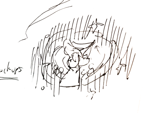
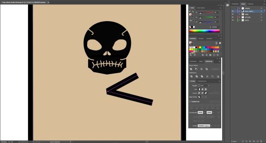
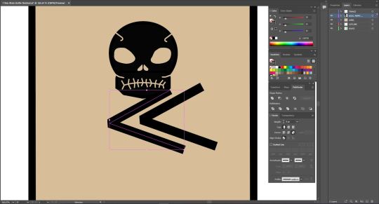
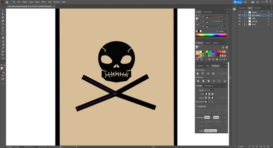
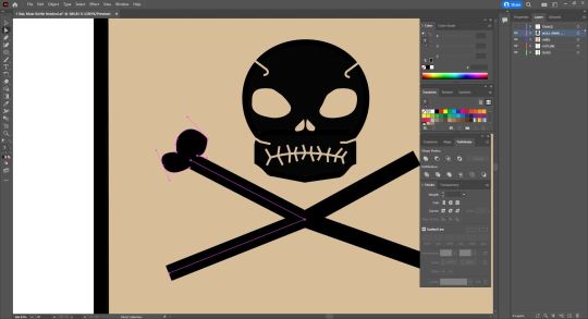
#finally i did a horizontal illustration
Text

i can be your home, only for the night if you want, so you don't have to be alone
and if your day was long, i'll be there to ask you, "what went wrong, my dear?"
#tomgreg#succession#hbo succession#succession fanart#succession art#tom wambsgans#greg hirsch#cousin greg#gregory hirsch#tom x greg#tom and greg#how was your day#mellow fellow#clairo#digiart#fanart#yeah i'm a sucker for domestic gays#greg's on his sick leave right now that's why he's not at work#finally i did a horizontal illustration#i can use this as my header or something lol
183 notes
·
View notes
Text
Devlog #12: Localization Milestone and Key Art
Hello everyone! Welcome to this month’s devlog!
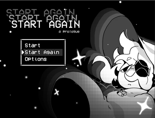
If you just stumbled upon this, I am Adrienne, also known as insertdisc5! I’m the developer, writer, artist, main programmer, etc of the game. The game being In Stars and Time, a timeloop RPG, which is also the next and final game in the START AGAIN series, following START AGAIN: a prologue (available here!). You can find out more about In Stars and Time here!!!
LET’S GET TO IT. This month has some localization news, as well as a breakdown on key art! What’s key art? Where do you use it? Can you eat it? Read and find out.
The first pass of the Japanese localization is done and implemented!!! You can play the whole game in Japanese from beginning to end now!!!
The next step now is the localization QA, where the localization team plays the game and makes sure the Japanese script works in context. The team got the script in an excel sheet and I tried my best to give context for scenes where I could, but playing through the game themselves allows them to get The Most Context. All Of The Context. So they can make changes to their localization so it can be the best!!!

That’s it for news. Other things are chugga-chugga-chuggin’ behind the scenes as well, and I can’t wait to share it all with you all!!!
Today’s topic-since-I-don’t-have-much-to-talk-about is: key art!

“Adrienne what on Earth is a ‘key art’” This above is the key art.
More generally (and keep in mind this is my layman self talking, I’m sure you could get a better answer elsewhere, but also you’re here, so you might as well learn something huh???), key art is The Big Art that games (and, I assume, other mediums???) use to show off their style and visuals in things such as store fronts, articles, and other such things. It’s Mario jumping in a cool way with his lil star buddy while the planets are behind him. It’s Kratos and Atreus on a boat. It’s sad Siffrin in the foreground, surrounded by stars, while his friends are having fun in the background. It’s The Art!!! It’s the first thing people see about your game!!! It needs to be cool and represent your game!!!
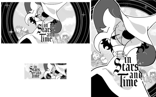
Here’s some examples of the key art being used for Steam store assets. Itch.io is very kind and asks for like 2 assets, but Steam asks for a whoopin’ 30 assets, all with different sizes and orientations, so it means one of the biggest things your key art should be is MODULAR AS HELL. From a massive 1440x3160 vertical banner to an itty-bitty 231x87 horizontal button (called a capsule, it’s the small banner above, and since it’s usually the first thing you see about a game it is THE MOST IMPORTANT ASSET), your key art needs to be ready for anything!!!
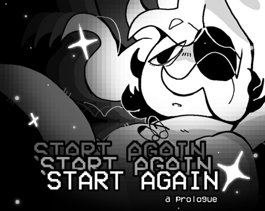
For the prologue, I did not plan for this very well. I learned pretty late in development that store assets for itch.io (and later, Steam) were gonna be a thing I should worry about, so I ended up deciding to use the title card art. Which, like, it worked out.
BUT! I had to redraw Siffrin to make sure their hat and body weren’t weirdly cut out, and had to remake the pixelly gradient like a thousand times for each asset to make sure it wouldn’t hide Siffrin’s face. And that’s without mentioning the hell I went through to make sure the massive title logo would fit. Why did I think “START AGAIN START AGAIN START AGAIN: a prologue” was a good title. It was so hard to make it fit in its entirety every time (because, of course, Steam asks you to show the logo in its entirety in every single asset). Why did I choose this title (I’m a Kingdom Hearts fan and my heart is rotten and thinks long titles are funny)
So since I went through hell with START AGAIN’s store assets, for ISAT I made sure to think about the key art way ahead of time teehee.
Every so often I become an absolute genius so I only had to sketch the key art once, as you can see above. You don’t need to understand it because I do and it’s all that matters. Teehee!

Here's the rough illustration! I made it to block out the shapes, and figure out where that dang logo would go. Once again, reminder: if you have text of any kind, figure out where it goes in the rough stage. Future you will thank you. I also had Siffrin look directly at the camera in this rough stage, and then figured. That it would look sadder. If Siffrin looked emo-ly to the side. I do like the look at the camera though. He Is Looking

To talk about The Meaning very quickly, I wanted to show Siffrin front and center, since the whole story is about them. And I wanted to show the whole party, but clearly separated from Siffrin- Siffrin is stuck in a time loop, feels completely apart from them, and I wanted to show that in the key art! With the expressions too- everyone else is happy or engaged in something, interacting with each other, while Siffrin is in his emo phase. And also stars everywhere. Because of course.
Here are all the layers I used- I made sure to draw them on a vector layer in Clip Studio Paint, which means the lines never become pixelated even if you zoom in a lot! As a side note, the full file for this is 4000x3000, which I thought would be too big, but is actually just the right size for all those dang assets.
I also made sure that Siffrin would look the most detailed, since I knew that while everyone could fit for the bigger pictures, for the itty-bitty small ones (or the extremely horizontal ones), I would only show off Siffrin’s face. MODULAR!!!!!
In the end this key art worked pretty well to make the store assets, but if I could talk to past me I would tell them. Make the circle bg taller so it’d fit the more vertical assets. And find a way to leave more space for the characters in the background. I had to remove them/rotate them/zoom them out very often because Siffrin hides them too much because Siffrin is just too dang big. But that’s still manageable, past me. You did a good job past me
So, TLDR, from my experience, what you need to keep in mind when making your key art is:
-make sure it has enough layers to be able to move things around as needed, but not so many layers that you become lost
-fun art that represents your game and its vibe well
-cool everywhere, but able to get by if you zoom in on one thing (which usually for ISAT’s assets is Siffrin’s face)
-able to work in a vertical and horizontal format and at many different sizes
I hope my key art made people interested enough in the game to try to find out more!!
That’s all I have to say for today! Let me know if you have any questions, or if there’s any aspect of the game development struggle you’d like me to talk about! See you next time!!!
AND DON’T FORGET TO WISHLIST THE GAME ON STEAM ALSO IT REALLY HELPS BECAUSE STEAM’S ALGORITHM IS MORE LIKELY TO SHOW OFF GAMES WITH A HIGH AMOUNT OF WISHLISTS THAT’S THE REASON WHY GAME DEVS ALWAYS ASK TO WISHLIST!!! OKAY BYE!!!!
#devlog#indie dev#in stars and time#start again start again start again#indie game#reference#video games#sorry if the post breaks i had to format this whole post on my phone. pelease clap
269 notes
·
View notes
Text
lies of omission
So when they returned to the Monastery, and Lloyd retreated into the study to make a plan on how to obtain the dragon cores before Imperium could find out about them and the power they held, Sora couldn’t stop herself from grabbing Arin’s wrist and bringing him with her into her own plan.
Find out what else Lloyd was hiding.
This is for all 64 of you who voted on my poll, and the 25% of you who wanted the story about Arin and Sora finding out about Lloyd's heritage. I hope you all enjoy this one :)
“Um, how did you just never mention that you’re the grandson of the guy who created Ninjago?”
“Eh, it never came up.”
Sora didn’t want to be angry; between working with the others to locate the dragon cores, still trying to figure out the depths of his abilities as well as the fact that she knew that she would eventually have to go back to Imperium to stop Beatrix, the last thing she wanted was to be angry with Lloyd.
But, it still simmered inside her like a steady flame catching onto dry timber because he was keeping things from her and yeah, she wasn’t a ninja super fan like Arin, but he still could have told them before it ended up just coming out like that.
With how much had been kept from her all of her life, she wanted to believe that Lloyd would be different, that she could finally trust another adult again, but this just proved to her that she was sorely mistaken.
So when they returned to the Monastery, and Lloyd retreated into the study to make a plan on how to obtain the dragon cores before Imperium could find out about them and the power they held, Sora couldn’t stop herself from grabbing Arin’s wrist and bringing him with her into her own plan.
Find out what else Lloyd was hiding.
“I don’t know, Sora,” Arin admitted as she picked the lock on Lloyd’s bedroom door, twisting the small piece of metal she carried with her for this exact reason carefully, “if he’s locking us out of his room, he probably doesn’t want us to go in there.”
“He’s hiding more than being the First Spinjitzu Master’s grandson, Arin,” Sora shook her head as she felt the lock click into being unlocked, “and I am sick of not being told the truth by others, especially when I’m supposed to trust them.”
“Was it really a lie though?” Arin asked as she twisted the knob, opening the dark room and allowing him to step in before shutting the door and pocketing the hand-crafted metal pick, “it’s not like we ever asked who his grandfather was.”
“It was a lie of omission, purposefully not telling us that,” she insisted as she put her hand on the wall in order to find the light switch, “how can we even be sure that my elemental powers weren’t passed down somehow like the others? Just because Lloyd had never seen it doesn’t mean that no one had ever seen it.”
“I guess you’re right,” Arin shrugged while putting his hand on the light switch and flicking it upwards while speaking, “after all, there was a whole elemental alliance during the Serpentine Wars and-whoa.”
Sora couldn’t even ask because when she turned around from where her eyes had been scanning Lloyd’s extensive bookshelf full of Starfarer comics at the foot of his bed, she laid her eyes on what had cut Arin off.
It wasn’t the vertical, cracked, wooden frame on his bedside table with a photo of an older man putting his hand on the shoulder of a much younger Lloyd or the horizontal frame of their teacher around the same age, but standing next to the much younger ninja and his uncle.
No, it was the haphazardly open scroll lying in front of both of them, displaying a drawing of a golden monster that had four arms, large horns sticking out of its head and glowing purple eyes.
“What the hell is that thing?” Sora demanded as she picked up the scroll, feeling the wear on the edges of it, not surprised that it was in a much older form of Ninjargon with how yellow it was.
“I think it’s an Oni,” Arin supplied as he walked forward to examine the illustration closer, his eyes squinting with concentration, “but the Oni aren’t gold, they’re as black as the deepest darkness you’ve ever seen.”
“Arin, you’re speaking in gibberish,” Sora cut off her friend’s ramblings while pushing the scroll into his hands, “what is an Oni?”
“They’re demons who only want to destroy. They invaded Ninjago when I was a little kid, and turned everybody into stone with their darkness,” Arin insisted as he tried to read the ancient language, “but the ninja vanquished them with the Tornado of Creation. They’re supposed to be gone.”
Sora’s heart dropped as she continued to look at the illustration and her stomach dropped just thinking about fighting that thing…even with help from Riyu, there was no way that she was anywhere near ready to fight a demon who only wanted to destroy, especially not one that was different enough that it worried Arin.
“Can you make out any of the Ninjargon?” Sora questioned, stuffing her hands into her pocket as she leaned over his shoulder even though she was fully aware that it was way out of her league.
“Only one phrase, and I’m not even sure if it’s right,” Arin admitted, his voice shaking as he spoke, “the descendant of light and darkness”,”
The fear on her best friend’s face was enough to make her worry that he knew exactly what that meant, but she knew that she had to ask regardless, her mouth going dry, “Lloyd is the grandson of the First Spinjitzu Master-”
“-and the son of Lord Garmadon.” Arin confirmed as he put the scroll down, “we need to get out of here, now-”
“What are you two doing in here?”
Lloyd’s voice was stern, quite a few degrees above any of the annoyance that Sora had heard before, only making her fears that he was going to unleash the entirety of whatever the hell she and Arin couldn’t translate on them.
But when the two of them turned around, she was mildly relieved that he looked exactly like himself, albeit pissed off as he continued to speak, “this is an invasion of privacy, you two.”
“We’re leaving now, Lloyd,” Arin insisted, grabbing onto Sora’s wrist and trying to pull her out, but despite her fear, her anger took over and she refused to move despite Arin’s insistence of “Sora, let’s go.”
“Why didn’t you tell us that the First Spinjitzu Master is your grandfather?”
“I already explained this, Sora,” Lloyd sighed as his eyes continued to scan the room, seemingly trying to figure out what they had messed with, “it never came up.”
“It just never came up?” Sora scoffed as she reached for the scroll, making sure that it unrolled itself where Lloyd could see it in all of its horrific glory, “or did you want to keep this from us, like everything else that you haven’t told us?”
Sora expected Lloyd to lash out at her, to tell her to get out of his monastery, even just to scream at her for violating his personal space; so when his muscles tensed and his face froze in a mix of what looked like guilt and fear, she almost felt bad for not leaving when Arin tried to pull her away. Almost.
“Arin, I need to speak to Sora. Alone.” Lloyd finally spoke, his fists still balled up in what looked like stress until Arin left the room, when he only moved to pull the worn scroll out of her hands.
“My parents hid everything from me,” Sora’s anger was bubbling up now, unable to be stopped as she started to shout, “everyone hid everything from me in Imperium and I thought you were different, Lloyd!”
“Sora-” Lloyd started, but her yells cut him off with a violence that scared her in the deepest parts of her beating heart.
“Ever since we met, you’ve been honest with us. You told us everything, and now this!” Tears were starting to prick at her eyes against her will, the signs of where she had grown up starting to push through the exterior that she had built, “I wanted you to be different, Lloyd. I needed you to be different.”
“Do you really want to know everything?” Lloyd’s voice was filled with a comforting tone despite the numbness in between the lines, but when Sora nodded, the last thing she wanted to hear came out, “then you’ll have to wait.”
“But why?” She demanded, starting to feel the fire burn in her chest again, “why don’t you want me to know?”
“It has nothing to do with you, Sora. It has everything to do with me,” and with those words, the fire was instantly extinguished with confusion, but her lack of questioning allowed him to continue, “I’m not ready to talk about it. I don’t fully understand all of it, nor did I ever want it to happen. I can’t stop you from doing your own research, nor would I ever dissuade you with how much your ancient Ninjargon needs work.”
Despite the heavy air around them, she couldn’t help but smile briefly at the mild jab at her awful translation skills before letting out the apology that had built up despite her anger.
“I understand, and I’m really sorry for digging through your stuff, but can I ask you one question? After that, I’m done prying. I swear.”
“You can ask me whatever you need to, Sora,” Lloyd insisted, his gentle, calloused hand resting on her metal shoulder, “whenever you need to, even if I’m unable to answer.”
“Are you an Oni?” She couldn’t hide her voice trembling and given Lloyd’s slight slump of his body, he definitely heard it as well.
“The First Spinjitzu Master was half Oni and half Dragon, so are Garmadon and Master Wu, but my mother is human.”
“So you’re Oni, Dragon and human?” Lloyd’s nod was all the confirmation she received to which she couldn’t but speak while the pieces clicked in her head, “that’s why you’re the conduit, because you’re part dragon.”
“Yeah, that sounds about right,” Lloyd agreed before waving her toward the door, the scroll still in his left hand, “I’ll be out to talk about the plan in a few minutes. You should head downstairs.”
“Okay,” Sora nodded and headed toward the door, only to stop and say, “and Lloyd? I get the whole “shitty parents” thing, so you can talk to me too.”
“Does this mean you still trust me?” Lloyd’s voice was soft as he looked up from the scroll, his green eyes full of genuine questioning.
“Yeah,” Sora agreed, no longer harboring the anger that had built up inside of her once he she had processed his reasoning for his own lies of omission, “yeah, I guess it does.”
#lego ninjago#ninjago#my writing#fic#angst#dragons rising#ninjago dragons rising#sora ninjago#arin ninjago#lloyd garmadon#oni-dragon hybrid lloyd#friendship#trust issues#every single ninjago character needs therapy#but especially these two holy shit#sora and lloyd#shippers dni#parental issues#cannonical bad parenting
22 notes
·
View notes
Text
The "Gethsemane" paintings: what they are and who created them
It's widely regarded as one of the most artistically effective -- and emotionally affecting -- sequences in the 1973 film of Jesus Christ Superstar. Nearly every reviewer has cited it (one calling it nothing less than a "masterly cinematic stroke of genius"), Wikipedia devotes the caption of an illustration to it, and I've seen more than one production (and one 50th-anniversary music video featuring the film's star, Ted Neeley) imitate it. (In fairness, it's not like anyone has come up with a better idea.)
Every draft of the screenplay uses the same language to describe it, and since I couldn't phrase it nearly so well, I will, too:
258 to 280. CRUCIFIXION MONTAGE.
On the heavy brass instrumental bridge, we cut to a rapid montage of about 23 shock cuts of full figure and details from the most powerful masterpieces, painted and sculpted, on the theme of The Crucifixion. Cut for impact of expression, nailed hand, wounds, thorns; for these 26 seconds we see how Christ was to die - both then and ever since. This is the agony of the cross.
It certainly is... especially those uncomfortably fast zooms and abrupt close-ups.
Some call it "foreshadowing," but I don't think that's a strong enough word. Truthfully, I find this series of famous paintings more brutal than the actual crucifixion scene in the movie. Compared to the visions Christ might be having about his death, the execution itself is in, out, and done so quickly that it's hard for me to feel any kind of way about it. But this sequence is a horse of a different color.
Anyway, one of the most asked questions about this montage has been, "What paintings were featured in this sequence, and who painted them?" In all honesty, I never cared who did it. I assumed they came from the Italian and Northern Renaissance eras, possibly with some Baroque mixed in. But I was never an art history major, and knowing the sources and their creators wouldn't have enriched my experience. I know it nailed me in the gut when I was a kid and has (somewhat) freaked me out ever since, and I thought that was all I needed to know.
However, it mattered to other people, so I did some digging. It was kind of tough, partly because many of the shots zeroed in on specific details rather than revealing the entire painting. But with a little help from the film's production file (courtesy of the Norman Jewison collection at the Wisconsin Historical Society Archives), and researchers Ethan Clark and José Garay, we've managed to identify 12 paintings by 10 artists in the final montage, as well as uncovering a few of them that didn't make the cut.
To learn about the paintings and take a closer look, hit the jump!
The Montage
Here, in order of appearance, are the paintings that made the cut, as well as the artists behind them, and how many times they show up:
Crucifixion of Christ (Derick Baegert) -- once
Isenheim Altarpiece (Matthias Grünewald) -- six times (thrice sequentially after Baegert, twice sequentially after the second Grünewald, and once after Bosch)
Crucifixion (Tintoretto) -- once (and incidentally, it's horizontally inverted)
The Crucifixion of Christ (Matthias Grünewald) -- twice (once after Tintoretto, once after the Austrian School)
Christ on the Cross (Diego Velázquez) -- once
Crucifixion (Masaccio) -- once
Crucifixion (Andrea del Castagno) -- once
The Trinity with Christ Crucified (Austrian School) -- once (the angel on the right-hand side, horizontally inverted)
Saint Luke Painting the Crucifixion (Francisco de Zurbarán) -- twice (once before Bosch, once before van der Weyden)
Christ Carrying the Cross (a follower of Hieronymus Bosch) -- twice (sequentially)
The Crucified Christ Between the Mourning Mary and St. John, a/k/a Crucifixion of Scheut or Escorial Crucifixion (Rogier van der Weyden) -- twice (sequentially)
Christ Crucified (Francisco Goya) -- thrice (sequentially)
Of the above list, ten of them were included in a memo dated June 8, 1973, concerning the contents of the montage that appears in the production file. (Grünewald's name appears only once, with no attribution, so it's unclear whether one or both paintings were initially intended for inclusion.)
The Leftovers
Only three classic paintings from the previously mentioned memo didn't make it into the film.
First on the list, which categorized the paintings alphabetically by artist's surname (or, in some cases, name), is "Antonello." This clearly refers to the crucifixion painted by Antonello da Messina, which incidentally was also source material for the production designs for Martin Scorsese's The Last Temptation of Christ. The only unclear thing is which one; Wikipedia lists three, all fairly similar-looking.
Second is an actual Hieronymus Bosch painting, Ecce Homo. Considering the Bosch-reminiscent image used in the final cut, I can only assume Jewison was either eying the crowd or confusing this painting with the more well-known descendant.
Last is an artist we have yet to identify. The memo lists them as "Guinewala," but Googling produces no artist by that name, and there is no helpful title to allow us to reverse-engineer who that actually is. (My assumption is that it's a phonetic spelling or a weird typo.) A friend who spends a lot of time at MOMA and the Brooklyn Museum of Art is wracking their brain. When they have an answer, we will!
Well... I'm glad I cleared that up for everyone. I hope this offers the art experts among us some insight into the construction of the scene. Maybe this will tell them something that we average folk don't know? Time will tell.
#jesus christ superstar#andrew lloyd webber#tim rice#jcs#jesus christ super star#jcss#jesus christ super-star#carl anderson#ted neeley#miscellaneous
21 notes
·
View notes
Text

An excerpt from the book; A History of the World After & Its Denizens by Noctua Quill
"(Pages from an untitled codex of illustrations recovered from the late Zagan Era, circa 4795, Epoch 341934.) The illuminated lettering around the edges of the pages reads as follows starting from left to right:
[left most vertical] The Abyssal Eden
[bottom horizontal] Mother/Cradle of Sitra Achra
[top and right vertical] The Dreaming Garden of Shaa Edan
Opposing page
[left vertical] The Abyssal Nightmare
[bottom] Edenblight
[right vertical] The Dream of Eden
In the heart of the Eternal City of Shaa Edan, lies the gate to the Dreaming One known as 'Eden', birthmother of our place of darkness, origin point of All That We Know.
When the Fallen found themselves wandering in defeat in the black depths of the Abyss, they knew it would not be long before the corrosive presence of the Slumbering Ones would begin to erode their very being. And so, Lucifer, The First Soul, proved to all why he had been favored so by The Creator, and did bravely besiege unto the Abyssal, Eden, a new world. Eden, who took Its shape of that of a magnificent Garden, was the very one to ask, for its Dreams are composed of the structures of earth and the trees on which it grows. Other Abyssals soon joined Eden's Dream, and together, a new universe sprang forth The First Soul christened "Sitra Achra", the place of darkness, a gesture to defy the place of light, "Korsia". But here were Nine worlds, all different in their personalities and their offerings and their needs, each a result of the collaboration of the somnolent gods. And the Fallen saw that all among the Fallen were disorganized and chaotic, and so the wisest and the most powerful came together to build a hierarchy, one to mock the Heavenly Chorus of the Creator, and prove to them that they were greater for having forsaken the Light of Ein Sof and Its Collective. Thus the Nine Kings crowned themselves to rule over the Nine Circles, starting with King Bael, Master of Things Unseen, Knower of Unknowledge, Ruler of the Lands of Darkness, and Second of the First Be'souled; then there was the Second, King Paimon, the Merchant and Trader of Wants, the Great Shopkeep, and Goldtaker; then the Third King Beleth, Scholar of All Things, Great Lioness of War, Truthsayer and Oracle; The Fourth, King Purson, General Tactician and Cartographer, the Vanguard Explorer, Wayfinder, Hornbearer; The Fifth, King Asmodeus, Engineer of Torment, Devourer of Souls, Chaosforger; The Sixth, King Vine, Ruler of the Blind Depths, Great Navigator of the Void, Stormmaster; The Seventh, King Balam, Antecedent of Alchemy, Librarian of the Forbidden, Lorekeeper; The Eighth, King Zagan; Sovereign of Silence, Ruler of the Glacial and of the Pale Storm, Soundkeeper; and finally the Ninth, the Forgotten One, King Belial, the Invisible, Guardian of the Lost, Outlander. Beneath them were appointed offices of rule; Prince, Duke, Marquis, Earl, Knight, all have their place among the Infernal Court, who govern all Souls of Sitra Achra by birthright, being their founders and custodians.
Alas, these sovereigns are now silenced in no thanks to the Many-Tailed Traitor, their destinies rewritten in the Akashic Terminus, Book of Fate. The thunderous sound of King Purson's Horn unsettled the Slumbering Ones, causing them to stir in their sleep, which affected their Dream of the World After. Whole Verses were overwritten, alterations made to the course of The Great Story. Kings turned on each other like animals, obstreperously bickering over resources and preparations on what was to come. Their Knights fell in defense of them, and soon thereafter, others of their courts. And so it seemed that, one by one, each of the 72 were dismissed from their seats of rule, until only a handful remain, those who now cling to the favor of the False King Joro like burrs. The False King whom I shall not grace with titles of reverence, only those of condemnation as such she is deserving; Usurper, Imposter, Betrayer, Parasite.
In a series of events now known as the Akashic Purge, the first of the Slumbering Ones to stir brought forth a corrupted Dream, and thus sprang the first roots of the plague known as Edenblight, the Nightmare of Eden. The atrocity manifests in the bodies of mortals and the Wild Children, twisting their shape into that which Eden most identifies; trees, tall and alien and not unlike those of the Gates in their size and presence. Formerly, it spread through their Song, the Illusion of Beauty to lure in unsuspecting prey, and through that impregnation of the brain, a Seed will grow and infect the host with feelings of lethargy and false promises of peaceful repose. Once inert, the body will root itself to whatever surface it finds itself on, and henceforth, become one with Eden's Nightmare. The transformation is complete within six Moons, sooner if the infected are left to grasp one another in their despair and their ecstasy, in which they will merge and become one or many, a forest in a perverse Garden of Eden. Not but the Light of Angels and the Touch of a King can halt the spread of the Blight, but the Angel must become as a fixture of the land, and the King must remain diligent in their fight. With Angels in short supply and all Kings absent, the Blight has spread and spreads wider still with conviction anew in the form of Spores, which manifest as a Song in the minds of a host, ever repeating until sung unto others.
Goetia are not immune to the Nightmare. Although more tenacious in their resilience, enough exposure can weaken one's entitled defenses. But once the Song is inside, eventually they will succumb. The touch of a King is said to impede the process, but the world is in desperate need of those to Rule, let alone to Purify."
#haligren's writings#sitra achra#history of the world after#noctua quill#the akashic purge#the akashic terminus#the nine kings#my art#my writing#sitra achra novel
10 notes
·
View notes
Text

Conclusion: It Works When We Make It Work
The many people who conspired to commit these rebel stories to paper and get them into your hands have been thoughtful enough to provide you with one parting example of anarchy: the book itself. Imagine the decentralized network, the harmonious chaos, the confluence of liberated desires, that made it possible. With passion and determination millions of people breathed life into the stories we present, and many of them struggled even past the point of certain defeat in the hopes their utopias might inspire future generations. Hundreds of other people documented these worlds and kept them alive in our minds. A dozen more came together to edit, design, and illustrate the book, and even more collaborated with proofreading, printing, and distributing it. We have no boss, nor are we getting paid to do this. In fact, the book is priced at cost and our goal in distributing it is not to make money, but to share it with you.
Publishing is an enterprise we were supposed to leave to the professionals, and books were something we were supposed to buy and consume, not to make ourselves. But we forged ourselves the permission slip to pursue this project, and we hope to show that you can too. It can be tempting to present such ambitious projects as magically final products, leaving the reader to guess how we did it and reveling in the illusion ourselves; however sometimes it’s better to let an inopportune gust of wind blow in, sweep up the curtains, and reveal the machinations backstage. This book, then, proves to be no different from all the other examples illuminated herein, in that its creation was also a matter of constructive conflict. The collection of people immediately responsible for publishing it is not a homogeneous circle, but rather includes editorial groups with distinct modes of operation, and a primary author for whom writing is an individual activity. Because of differering needs and opinions, some people could not see this project through to its end, but as anarchists they were free to leave the group when it was in their interests, and they had already affected the manuscript in good ways. Meanwhile, thanks to a flexibility of organization, the project could go forward.
As the individualist in this group, I learned and developed in ways I would not have had I been working in an authoritarian group. With a traditional publisher, I would be forced to concede whenever a disagreement arose, not because I had been convinced of their point of view but because they controlled more resources and could determine whether the book would make it to print or not. But with our horizontal arrangement, I could receive criticism that I knew was intended to develop the book to its outermost potential, rather than just to make it sell better in a dumbed-down market.
Granted, publishing a book is not the most amazing achievement, and the wee paper thing certainly isn’t about to storm the Winter Palace, feisty as it is, but one of our most basic points is that anarchy is much more commonplace than we’ve been led to believe. And hell, if we can make it work, so can you.
Also like the other stories we’ve told here, the story of our storytelling contains its own weaknesses. We’d like to be the first to point them out. Unavoidably, a couple things are missing. One is a matter of realism. While making this book we’ve tried not to romanticize the examples, though clearly these pages do not provide the space for a full analysis of the strengths and weaknesses of each cited revolution or social experiment. However we wanted to give some indication of the abundance of complexities and difficulties lurking beneath the surface of every example of anarchy. But if the book is at all successful, if you readers do not simply say, Oh, that’s nice, anarchy is possible, and then go back to your lives, but instead you actually arm yourselves with this knowledge to plunge into the creation of an anarchist world, you will quickly discover for yourselves how difficult it is.
The truth is, sometimes anarchy doesn’t work. Sometimes people don’t learn how to cooperate, or a certain group never finds a way to share responsibilities, or infighting leaves an entire movement flatfooted and unable to survive the grave pressures of the world around it. Even some of the examples described in this book eventually fell apart due to their own internal failings. In other cases a liberated community will be brutally repressed, a squatted social center creating a bubble of freedom from state and capital will be kicked out by the landlord, or the state will find some excuse to lock you up for participating in the struggle to create a new world.
Many people who fought for anarchy ended up dead and defeated, or simply demoralized. And their sacrifices will not be celebrated unless we write that history ourselves, to learn from their failures and be inspired by what they won.
Another failing of this book is that we have not been able to romanticize these examples enough. I’m afraid our meekly attempted objectivity omits how inspiring it feels to put anarchy into practice, despite all the difficulties. The stories here are real, on a level deeper than the footnotes, the chronicle of dates and names, can express. Some of these stories I have lived myself, and they are wrapped up in the very writing of the book. The tedious satisfaction of organizing infoshops and learning how to use consensus, in defiance of the stifling psychological terrain of the United States, was my inspiration for starting a book about what an anarchist world would actually look like. Though I still haven’t finished that project, it led me to research what anarchy already had looked like. On a park bench in Berlin, taking a break from studying the autonomous movement of that city, I sketched an outline for this new book, and a couple weeks later, in Christiania, I saw how an entire neighborhood living in anarchy seems perfectly ordinary.
It occurred to me that I might encounter many more living histories if I looked. Over the next year I went to a seventy-five-year-old anarchist camp in the Netherlands, and waded into a continuity of struggle in which the past does not imprison the present, but fertilizes it. I stood in provincial Ukrainian towns that once overthrew authority and tried to imagine how they looked, gardened in an anarchist village in the mountains of Italy and felt down to my very bones what the abolition of work means. As I traveled I corresponded with one of my best friends as he went off to Oaxaca for six months and participated in the rebellion there.
Appropriately enough, I finished my writing in a squat in Barcelona, where I was stuck awaiting trial and threatened with prison time after a police frame-up. The park down the street used to be the city jail, but the anarchists tore it down in 1936. In 2007 our social center took it over in protest of our impending eviction, setting up a free store, putting out a selection of books from our library, telling stories to the children. Unexpectedly illegalized, I found my survival tied up with the network of liberated spaces throughout the city, that housed and nourished me. And these spaces, in turn, depended on all of us fighting to create and defend them.
The same is true of all the other histories we’ve seen: none of them owe their existence to spectators. These stories show that anarchy can work. But we have to build it ourselves. The courage and confidence we need to do this cannot be found in any book. They already belong to us. We only have to claim them.
May these stories jump off their pages and into your hearts, and find new life.
Peter Gelderloos
Barcelona, December 2008
#organization#revolution#anarchism#daily posts#communism#anti capitalist#anti capitalism#late stage capitalism#anarchy#anarchists#libraries#leftism#social issues#economy#economics#climate change#anarchy works#environmentalism#environment#solarpunk#anti colonialism#acab
6 notes
·
View notes
Text
2023 Reading Log, pt 1
It begins again! With a straggler from 2022.
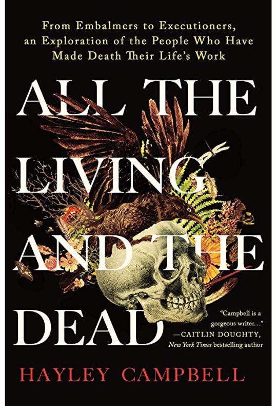
151. All the Living and the Dead by Hayley Campbell. Last year, the book that made me cry was Women and Other Monsters. This was the book this year. This book is about the author’s grappling with death via the act of visiting and interviewing people who work in fields handling the dead. Morticians, grave diggers, autopsy technicians and cremation operators are interviewed, as are people who you might not think of—crime scene cleaners, a company that works in PR and cleanup for disasters, a bereavement midwife. The material about the death of fetuses and infants is especially devastating, both for me and for the author; her sense of detachment is derailed upon seeing infant corpses being cleaned after autopsy, and coming to terms with that is a major theme of the book. The book ends with the COVID pandemic, and how death has become a much bigger part of everyone’s lives, after decades of denial pushing it to the fringes. This was a powerful read, and I have a lot of emotions about it; I’m glad I read this book, but I will likely never want to read it again.

001. Upstate Cauldron: Eccentric Spiritual Movements in Early New York State by Joscelyn Goodwin. This was not the book I thought it was going to be when I picked it up. It covers most of the bases—looking at the “Burnt Over” region of Upstate New York and how it was the site of a lot of religious development throughout the 19th century. It covers the well known ones—the Millerites and their more successful spinoffs, the Jehovah’s Witnesses and the Seventh Day Adventists, the Mormons, the Spiritualists. It also talks about the interweaving of spiritualist beliefs with leftist politics in the 19th century, and how people like Susan B. Anthony and Fredrick Douglass had connections to séances and channelers. What I did not expect was the strong bias of the author. He is clearly friendly to Helena Blavatsky and Theosophical ideas, much more than an impartial historian would have been of that notorious fraud. The final chapter, where the author lays out his Neoplatonic philosophy and his belief that New York State is the site of ley lines, reads like the reveal in a horror movie. There is useful information to be had here, but it should be taken with more than a grain of salt.

002. Dinosaurs: Profiles from a Lost World by Riley Black, illustrations by Riccardo Frapiccini. The author of this book is on tumblr! Go follow her @rileycatrocks , she’s awesome. This book is an overview of what we know about notable dinosaur genera, as well as other Mesozoic reptiles like pterosaurs and crocodiles. The writing is good at summarizing modern research in a readable style; this is a good book for interested laypeople. The art is done using photomanipulation to create the textures on the animals, all of which are featured in a profile head shot. I think it works mostly, but there are some issues. I really like the animals’ eyes, which feel authentic (I especially like the horizontal pupils on many of the ornithiscians). The textures are more hit-and-miss, though. The same sample of monitor lizard skin is used on multiple pieces, and there’s a Brachiosaurus covered in Galapagos tortoise hide that looks really awkward and misshapen. This book was published first in Italy, so I’m a little surprised European dinosaurs don’t get more featured. Although the somewhat obscure and very strange Italian pterosaur Caviramus shows up, which I appreciated.

003. The Language of Food: A Linguist Reads the Menu by Dan Jurafsky. This book is part food history and part computational linguistics. The book discusses both how foods travel around the world and change when they meet new cultures (like how ketchup was first made with fish, and how much of English and American foodways come from the Middle East). It also covers the linguistic tricks used on menus and food packaging to sell to specific markets, and the similarities in language used on Yelp reviews. These two halves don’t quite gel together the way the author may have hoped. I liked the book, but maybe it could have used a little more scaffolding.
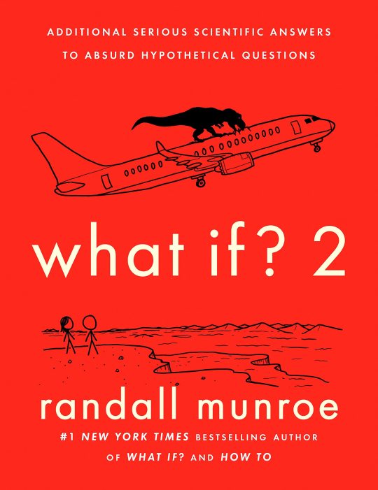
004. what if? 2 by Randall Munroe. This was the hardest I’ve laughed at a book in some time. Highly recommended for the joy factor alone. This is the third of Munroe’s pop-science Q&A books, and like what if? and how to?, it answers questions, some simple, some absurd, with the science of how they would actually work. A lot of planets are destroyed, black holes created, and other chaos ensues. Most of the questions involve physics or chemistry, but there are a few biology questions included (like how many people would a T. rex have to eat in a day, which becomes how many T. rexes can be supported by a single McDonalds).
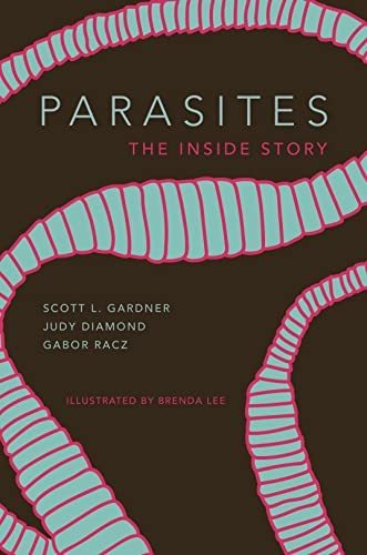
005. Parasites: The Inside Story by Scott L. Gardner, Judy Diamond and Gabor Racz, illustrated by Brenda Lee. This book is another “recommended for interested laypeople” text, this one about the evolution and ecology of parasites. The book is divided into thirds; the first third covers parasites of humans, the second the life histories and evolution of major clades of parasites, the third individual case studies, most of them involving the first author. The illustrations are a high point—the life cycles of featured parasites are illustrated, and the back of the book has a spotter’s guide to the individual species discussed in the text. I wish it were longer, though—this book is 190 pages, which includes a 10 page glossary and 40 pages of bibliography.
#reading log#lot of emotions in this one#parasite#parasitology#evolution#ecology#pop science#xkcd#linguistics#food history#death#funeral industry#dinosaurs#paleontology#paleoart#comparative religion#occultism#new york state#american history
27 notes
·
View notes
Text
First Tangible Strands of Progress

Having started a new Unreal project (first person shooter seemed the closest analog to my own idea) I changed the sky colour to a ghoulish turquoise, something I had learned from the second project. I did try out some other aesthetics as well; namely, a more dusky orange sky.

This one in particular is very reminiscent of the early days of Overdeath's development. I can only hope this one goes better. As you can also see, I built a few towers with purple lights in their perches. I will admit; the towers are pretty shoddily made; it took maybe two minutes in total, and if I put them in the final game, I'll probably use Maya or something.
I may have increased the light level a little too much.
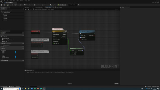
I knew I wanted moving parts in the game; that was a prerequisite. After trawling the Unreal forums, I found a good explanation of how to make them, and it was the way I had previously planned: Timelines. This piece of code is connected to an actor shaped like a gearwheel, and from the game start, it spins. This took a bit of work and led to some comical events: for example, the gear would tumble horizontally because I hooked the Timeline output to the wrong axis. I then had to flip the gear model within the actor viewport, because it kept on spawning in on its side for some reason.

Here is the finished scene. That big gear spins, though it isn't illustrated so well in an image. I added another tower for good measure, and a precarious stack of boxes that you can knock over.
Tomorrow, I have some more plans. Firstly, I need to implement doors. Walk up to them, press E, and they open on a Timeline. No more complex than a Doom door. Then we can have keycards and associated locked doors - same thing, just with a Bool in there as well. From there, elevators with activation switches (i'd probably use two different timelines, GoUp and GoDown, each activated by the respective switch, or do it on a flipflop somehow). Then I could even add trains that the player could ride across the map in.
As for gameplay, it'd require enemies. To facilitate exploration, you've got the obvious need to search for keys and the exit, but also to look around for ammunition. I want to implement combat in a very limited sense; in each level, you will have enough ammo to realistically kill half of all enemies, so searching around will make things easier, and you might be able to get out of a sticky situation, but it won't mean you can go on a rampage. I'm still not sure on how to implement the story.
2 notes
·
View notes
Note
2, 9 and 28! (😚🫶🏻)
Weirdly Specific Artist Ask Game
2. Is it easier to draw someone facing left or right (or forward even)
Definitely facing left (I'm right handed), that's why I abuse the flipping canvas horizontally button so much haha
9. What are your file name conventions
"YYYYMMDD [insert character/ship/topic]" + status (rough, wip or final)
not the smartest strategy but it works for me
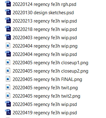
I use Bridge so it shows the previews directly
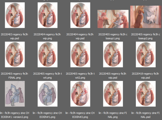
28. Any art events you have participated in the past (like zines)
now is my time to brag :'D I've been participating to fandom zines since 2017 (OCs, Haikyuu!!, Free!, Blue Exorcist, D.Gray-man, FE14, FE16, Witch Hat Atelier, Ace Attorney), they've always been the occasion for me to do big more complete pieces and it's just fun to be part of collaborative projects with super cool people
and I recently made a Sylvix zine with @/wildkitte, where I illustrated Kitte's fic c: it's my pride and joy, please check it out; not to be biased but it's pretty neat
as for other fandom related events: I've done Big Bangs, a few Secret Santas and did art for ship weeks
9 notes
·
View notes
Text
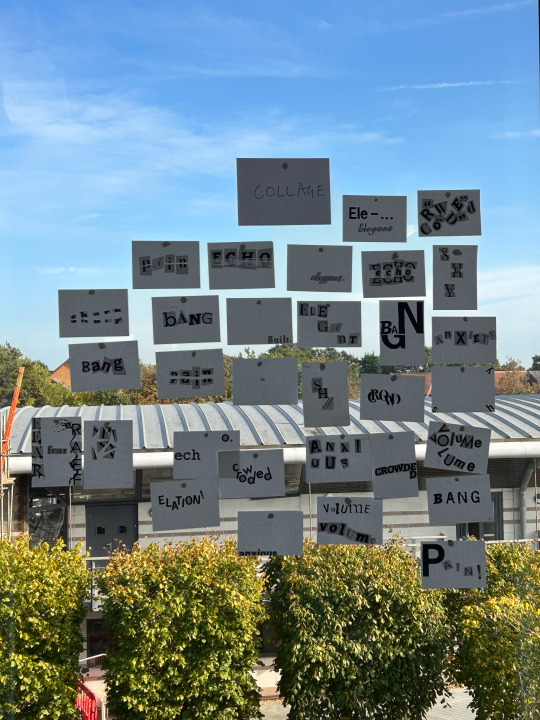
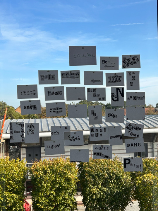
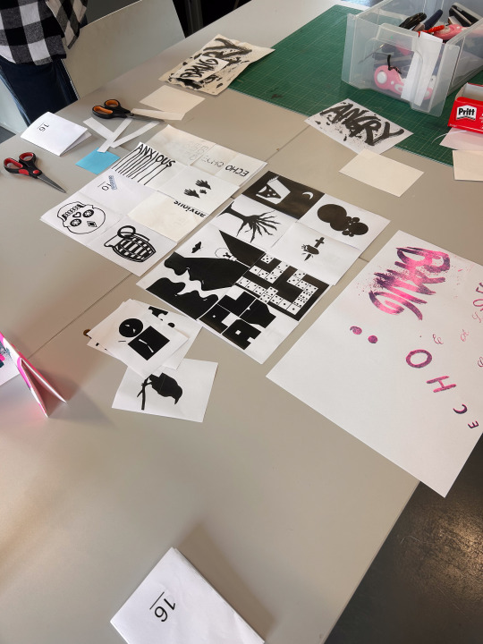
Concept Collider Project
Collage Illustration.
02.10.23
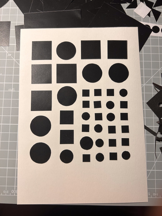
We were handed our Concept Collider project briefing and started by picking out 4 words and creating 5 visual variants for each, totaling 20 collage pieces. The instructions were open, so you could work with simple shapes or take it further with more detailed pieces. I tried to do both. During the session in class, I completed only 4 and was worried since I was unsure if we would have time to complete it out of class. But we did, and I had a bit more time to plan. I started by sketching ideas in my sketchbook, finalizing some ideas, cutting out shapes, laying everything out, and gluing the pieces together.
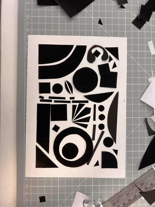
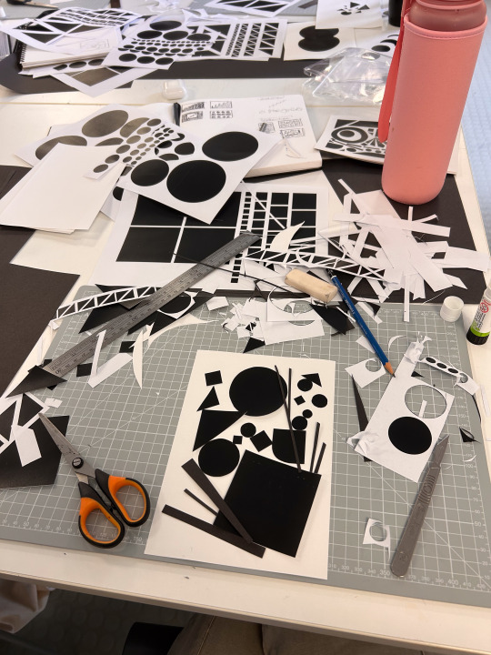
05.10.23
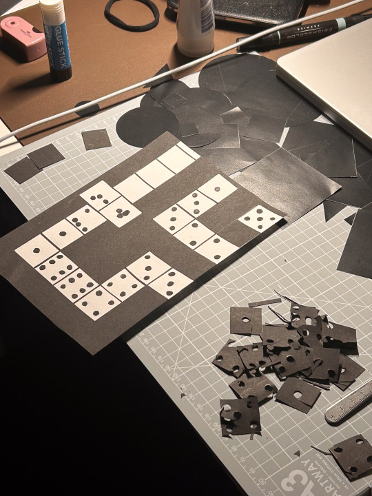
Then, I tried to knock out as many designs as possible, which went much faster this time. I again started with more sketching and feedback from friends. I usually like to test my ideas before putting them into action, so sometimes I send a photo to a friend and ask for their associations; this way, my illustration is effective. That day, I loved the designs I made for word play, especially my dominos and playing card designs. I was not a fan of how my evolution designs came about.

06.10.23
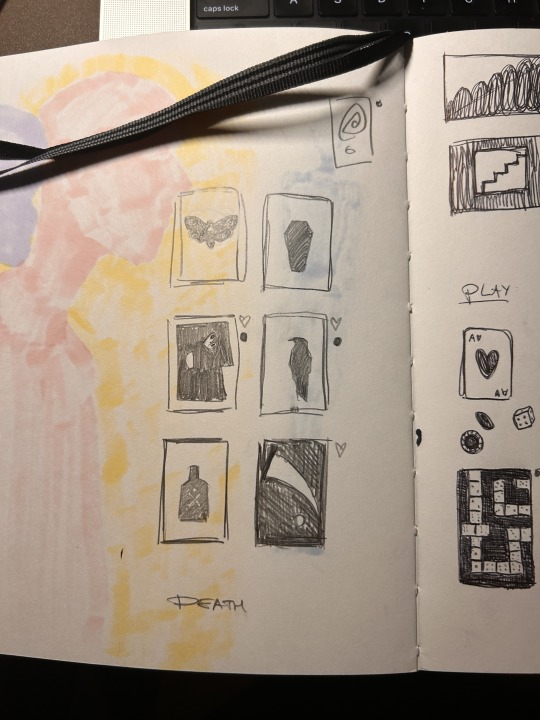
That day, I went to the workroom at home park with Jheel and finished 12/20 designs. I also picked my fourth word; instead of attraction, I picked death because more visual ideas came to my mind. I loved the workroom; it was very peaceful, and I got a lot done.

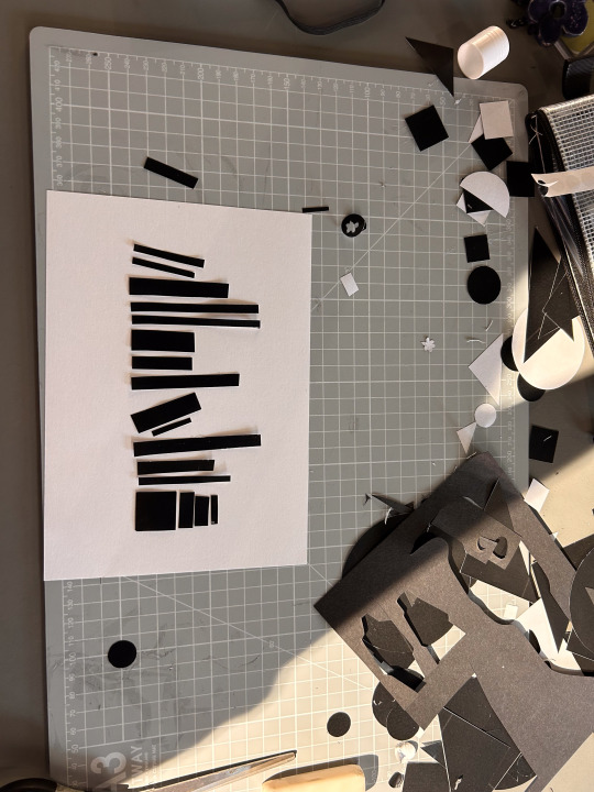
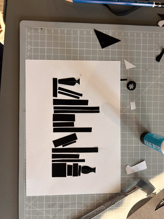
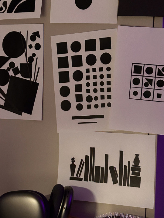
I also thought a lot about the bookshelf illustration I was making. At first, I started with just plain vertical stripes. But it looked like a skyline, so I added some falling books and horizontal books. But it still looked a bit like a city, so I added two vases with a flower, and that really made it look like a bookshelf.
The same night, I finished the rest of the designs. And I liked my play and death illustrations the most.
Typography Workshop.
09.10.23
We worked on 4 stations in this workshop to create another 20 designs for 4 words. Of the 4 stations, collage, ink, tracing, and grid, I particularly enjoyed ink and collage. It gave me a lot of freedom and prevented me from overthinking because I just had to start putting stuff on the blank pages. This time, I finished 12/20 designs during university-provided time, and the same day, I finished the other 8 designs at home.
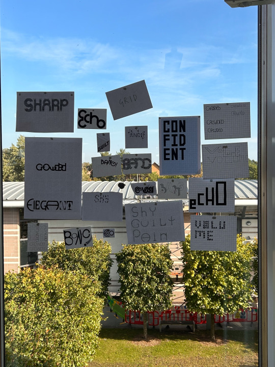
Risograph Workshop.
10.10.23
Today, we went to the maker space to see how risograph printing is done. It was really fun; we worked in a group, and I loved how our designs came together. I was a bit shy to put some of my ideas forward, but I overcame that and put forward some ideas, especially for the elegant + play design. We worked together really well, and I felt amazing because it was lovely to do something hands-on. I even got to take a copy home. :)

1 note
·
View note
Text
New icon/pfp/avatar/pictorial representation alert!
I think it's fair to say my icon self-portraits are improving. And it's not just because I have and use Pureref now. (Though I'm not showing you my reference to compare because it was a combination of a terribly lit photo and a horrific empty-eyed husk, aka the 3D model I abandoned this winter, but lit dramatically.)
Video and image descriptions under the cut.
[Video ID: A sped up recording of digitally painting a portrait in Photoshop. It starts with an orange background, sketching over it with dark brown. The sketch is refined, flipping horizontally once for the details before flipping back to lay in a green background, then shadows, then colors over the lines but under the shadows. When nearly everything has been colored, the contrast is lowered for legibility of the lines that return over the top. Painting resumes, combining the color and shadows, correcting the shapes back to those sketched. The painting is refined without the sketch or adjustment layer but the final piece includes some of those sketched lines in lowered opacity.
Image ID: The resulting digitally painted portrait, surrounded by four smaller ones, in each corner. Handwritten text in pale green reads, "Have you seen this woman?" The subject is the same woman, with pale skin, brown hair, downward slanted eyes, and a prominent nose, eyebrows, and jaw. The upper left is a vector drawing with simplified shapes that portrays her with an asymmetrical bob haircut and glasses, labeled '17. Upper right is a blotchy digital painting that shows the same haircut but from an awkwardly high angle; her head is too large for her torso and arms, her nose and eyes still larger. It's labeled '19. Lower left is more realistic proportions but still somewhat uneven perspective and intensity of lighting, labeled '20. Lower right has stylized proportions emphasizing her eyes and the length of her nose, with intense lines and defined planes that make her face look less soft than the other images and her hair almost greasy but the colors are more playful and saturated with highlights of magenta and lime; it's labeled '21. The central image is in portrait orientation (as opposed to the four squares) and shows the subject close to straight on, minimizing the protruding bridge of her nose as only the vector illustration did before. She's lit dramatically with golden orange from her left, her hair loose over that shoulder and, along with her profile, casting sharp shadows over her face. The color palette and dynamic range are narrow but include purple and green dimensions to her mostly orange-hued hair and skin, and a few pale lines imply silver strands of hair in the front. Her signature, a stylized CJG, accompanies the label '23. End ID]
#cj gladback#portrait#process video#artists on tumblr#though i did post this on instagram first and am therefore missing the soundtrack in this silent video#(there's a nifty loop this long at 3:15 in Glitch Mob's Fortune Days so i may have had my reel playing nonstop for an hour today)#gallery
1 note
·
View note
Text
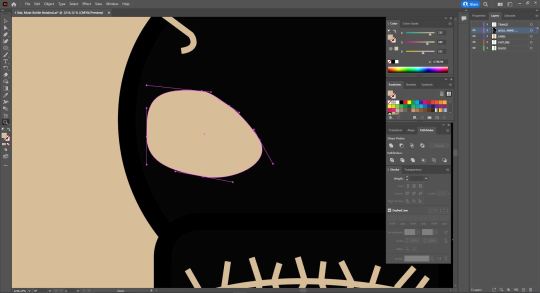
Week Two
This week in Fundies we returned back to Illustrator and continued on our pen tool journey exploring bezier curves. When creating with the pen tool the square points we're making are called the "anchors" and the lines that go off these points with the circle at the end are called the "handles".
We spent today copying down drawings into our physical workbooks before recreating them in Illustrator. While we did this last week too, I found once we started working with curves and more complicated shapes it was incredibly beneficial to be able to map out where I wanted my anchor points to go, as well as the direction I wanted my handles before entering the digital space.
Starting off simple, we began with single arc curves:
When drawing curves you want to draw the first handle in the direction you want the curve to go and you ideally want them to mirror when creating shapes like above. While far from perfect, this first exercise taught me some really important lessons while trying to wrap my head around bezier curves such as:
Aim to keep the handles before the halfway point
Keep them short and keep them straight
We then moved onto single and multi-arc curves:
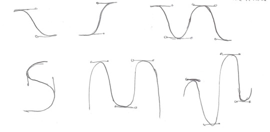
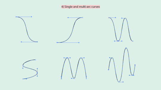
Building off the tip above, we want to aim to keep our handles either vertical or horizontal because they are reliable!
When then played around with closed curves:
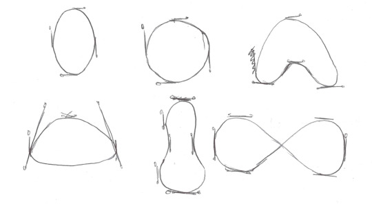
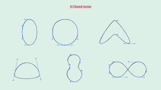
I am still yet to perfect a circle using bezier curves, but it was at this stage in the lesson I finally grasped how in theory one would create the perfect circle,
And finally after exploring the different types of anchor points (coming in the next post), we combined all our new skills and drew curves and straights together:
The most valuable thing I took away from today's lesson is that none of these points are permanent. You can place them roughly where you want them and then go back in afterwards and move and finesse them using the Direct Selection Tool (A).
I have always used the pen tool in Photoshop as my go-to selection tool, but it wasn't until today's lesson did I actually understand how bezier curves worked and how to use them effectively and intentionally.
0 notes
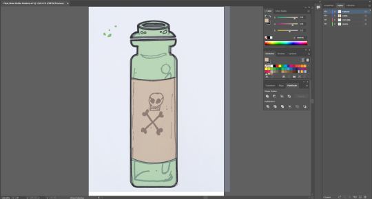
Text
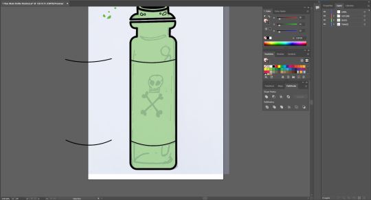
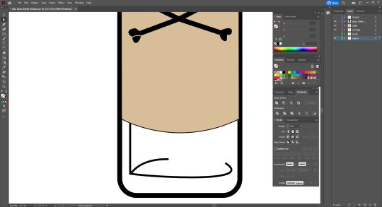
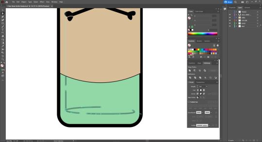
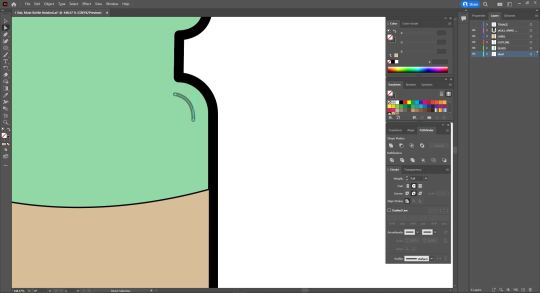
Fundamentals Week 7 - Adobe Illustrator outro Part 2


The second of our two artworks needed to be a drawing that involved colour and shading. For this, I decided to draw a glass Vial which would include a label with a graphic.
I chose this as I found it exciting to do something that would involve a lot of layering, reflections and detailing and perhaps even a bit of play. I really wanted to explore the lengths of what I was capable of using this program.
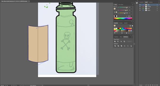
Like my previous work, i began by scanning my drawing into adobe illustrator and locked it to it's own layer to again, use as a reference while creating my shapes.
I started by using the Rectangle tool again to start off my general shape, selecting the inner point and dragging it inward to create curved corners that lined up with the shape of my drawing and increased the weight of my strokes to 8pt.
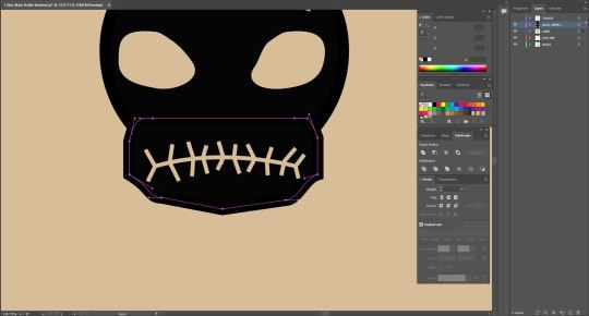
I then deleted the top middle line of the shape to make way for the neck of the bottle which I drew with the Pen tool, tracing my base sketch.
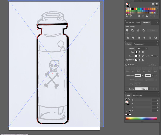
off to a strong start, I realised i had made it slightly difficult on myself by having the top of the bottle on its own seperate half meaning I'd have to create the shape on my own, tracing my drawing as best as I can.
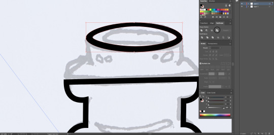
I decided to start with an eleptical, with no fill, and lining it up with the top of my image and to work down from there.
I proceeded to use the pen tool finish off the rest of this portion and I was pretty happy with how it cane out. I realised that I had made a mistake with the Horizontal lines in the way that they didn't turn out very straight yet, they were inline with eachother so I decided to keep it and see how it would effect the final outcome.
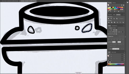
I then moved onto the circular details I had on my sketch. I decided to use the Eliptical tools again and manipulated them to fit the sketch which worked almost too well for me. I turned down the weight of the stroke on these outlines as It didn't need a main outline as it was not apart of the overally object and would come in to play later as detail.
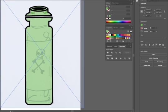
Next, I created a new layer labelled "GLASS" and selected all parts of my object and filled them with green. I then turned the opacity of this down to 30% to create a transparent glass effect.
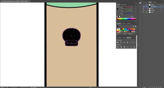
I then created another layer labelled "LABEL" and created to identical bezier curves on my bottle (as pictured above), selecting them both and copying them (Command + C) and pasting them to this layer.
I chose to do this as it would allow me to connect the two bezier curves with Vertical lines, on a seperate layer, avoiding colliding with the already existing outline of my object. I filled this new shape with a tan/beige colour to simulate an old poison vial or medicine bottle you would commonly see depitcted in fantasy or gaming.
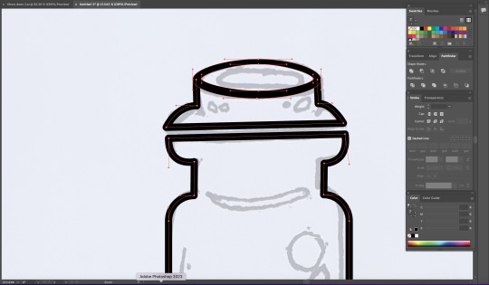
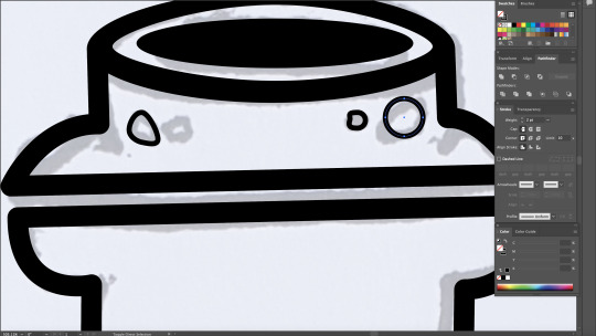
Next It was time to create the graphic on the Label. I first made a new layer labelled "SKULL AND CROSS BONES", then, using both the eliptical and rectangle tools, sculpting the beginning of my skull. With the rectangle selected, i again selected on of the inner nodes and dragged it inward to soften the corners as a standered rectangle felt too rough.
I then began work on the mouth. I copied the colour values associated with the label and assigned them to my pen tool for my detailing. I did this to achieve a Stamp like feel to my graphic as if this skull and crossbones was painted on or stamped with the contrasting details being represented by the label.
I then placed a bezier curve onto the lower portion of my skull and added lines going through the curve to serve as an outline for teeth.
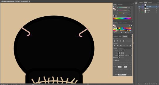
next Iadded some detail to the top of the skull to add more depth to the "stamp-like" feel I was trying to achieve. I drew the first shape on the left using the pen tool, copied it (Command + C) and pasted it (Command + P) then using the reflect tool to flip it and placed it on the opposite side of the skull.
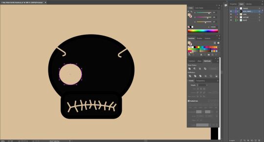
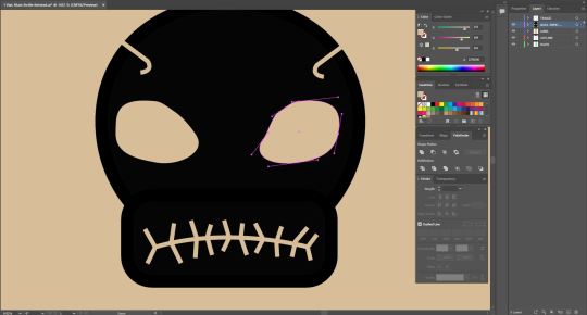
Moving onto the eyes, I again opted for using the eliptical tool to create one eye socket and then adjusting it to create a more realistic/detailed look as opposed to just having a circle for an eye. Different than before, I actually added 1 or 2 extra points to my eliptical with the Pen tool in order to manipulate my shape futher and create something that better resembled an eye socket to me.
I wasn't entirely satisfied with the jaw portion of my skull so i decided I would manipulate the shape of it further to see what kinds of shapes I could achieve. I added more points using the pen tool and began pulling around different parts of the shape to closer achieve a more bone/jaw like shape.
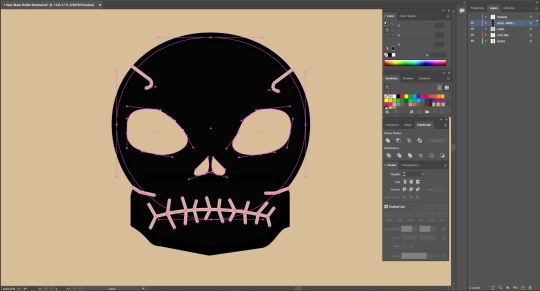
Sastisfied with my Jaw shape, I proceeded to add some more detail between the jaw and skull to add further depth by adding some seperation between the two. To do this I again began with one line on the left, replicated it (Cmd + C, Cmd + P), used the reflect tool and placed it on the opposite side of the drawing.
I then added Nostrils which I again achiedved by using an eliptical tool and adjusting the points on it to create the desired shape. Then repeating the steos above to replicate it and reflect it.
For the cross bones, I began by drawing half of the cross using the pen tool, duplicating it and reflecting it on itself.
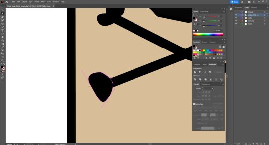
To create the ends of the bones, made use of the pen tool and, using bezier curves and broken points, began creating uneven heart shapes that resembled joints. This was quite fun to do as just by playing around with these techniques I was able to achieve quite a convincing and unique result for all 4 points. I decided to make each point different as bones aren't always exactly the same and I wanted that asymmetrical aspect to them.
much like the details on the skull, I adopted the same technique ont the ends of my bone shapes to create some further depth and brak up the solid appearance of the cross bones.
Also pictured above is the beginning of the inner detail of the vial that would ultimately serve in adding a more 3 Dimensional feel to my image. I started by selecting my outline layer and hiding my label layer and drawing a solid vertical line, lining up with my sketch, and then adding the two bezier curves serving as the inner reflections of the vial. I then added a couple points to the bottom curve and deleted the inbetween to split it up and sell it as more of an outline/detail rather than something thats inside the bottle also outlining where the inside begins and adding thickness to the glass. I also added an extra line to the top to further this aspect.
I became obsessed with this detail and started to feel like there was just something missing. I created a new layer labelled "LIQUID" and placed it at the very back of the image so it would also appear transparent. Hiding my label layer, I used my pen tool with no outline and a purple fill and followed the inner line. at the bottom I added a Bezier curve to fit in with the outline and back to the top where I then made another bezier curve curving inwards. I then created another shape out of two bezier curved to serve as the top of the liquid which I coloured with a darker Purple to seperate the top of the liquid from the rest of the liquid and give off the illusion that the liquid is moving .
this also added an element of shading to my image.
0 notes
Text
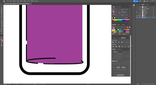
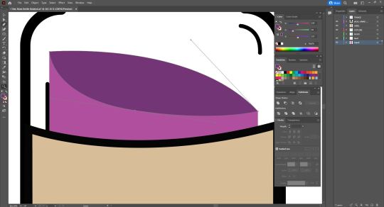
NM3217 In-Lecture Exercise D: Composing compositions
For this assignment, I took 5 different pictures of my water bottle, trying my best to take different shots of it as possible.
In this first shot, my water bottle is positioned in the centre of the frame, making it the subject of attention against a busy backdrop. The water bottle appears static, yet it is a prominent feature of this picture. The black ledge takes us a third of the image's space and acts as negative space which viewers can choose to ignore, in which the sky takes up a great proportion of attention, or pay attention to, and get a better understanding of where the water bottle is being positioned at (on a ledge).

In this next image, I similarly applied the rule of thirds. However, it now applies horizontally. The subject of attention is now placed less on the water bottle, but one thing that strikes out to me is how this image doesn't look particularly appeasing to the eye. Perhaps it is because the rule of thirds was not applied to the sky in this picture, making it appear more top heavy than intended.

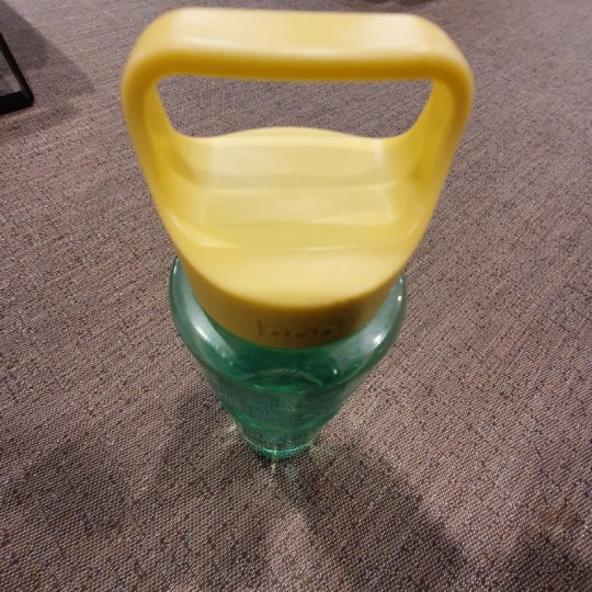
This was shot from a top-down perspective and forces an interesting perspective on the water bottle. From this picture, it becomes impossible to tell how big the water bottle is. Yet, the huge size of its handle hints at the possibility that the water bottle is indeed quite large.
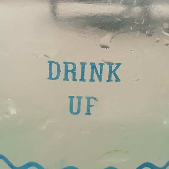
This is a super close up shot of my water bottle. While it remains initially ambiguous as to what it could possibly be, the droplets of water, the text 'drink up; and the wavy line at the bottom serve as important hints. In this picture, it is difficult to even tell the actual color or size of my water bottle.
This is a picture of my water bottle in comparison with my laptop. Did it surprise you how big it was? This picture allows an observer to immediately tell that my water bottle is much bigger than normal. By placing it on the table, readers may also judge its size using help from the perspective of space that remains on the table.
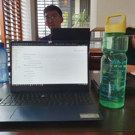
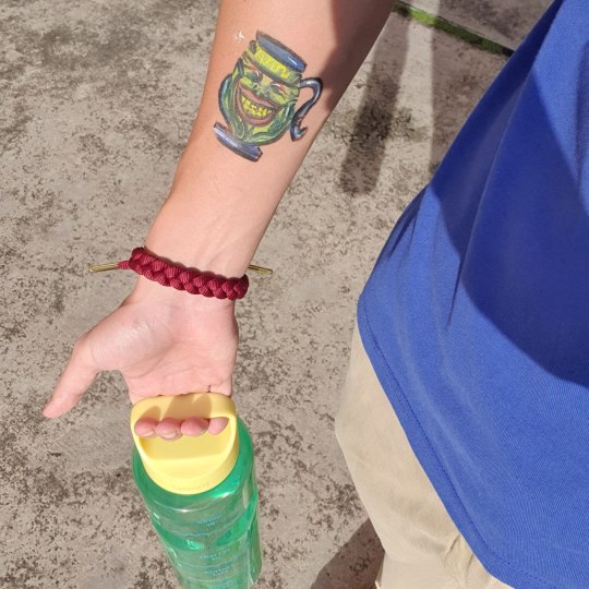
And finally, this is a picture of me holding my water bottle. This picture serves to illustrate more of the functional aspect of my water bottle. It not not entirely obvious that my water bottle is close to 2 litres in the picture because the perspective makes it difficult for users to discern. Neither is its size the main focus of attention in this picture; users would more likely be focusing their attention on the pot of greed drawn on my arm.
0 notes
Text
Research
I decided to wireframe the website using Adobe XD

As a result of not having the color palette, I used a random colour scheme.
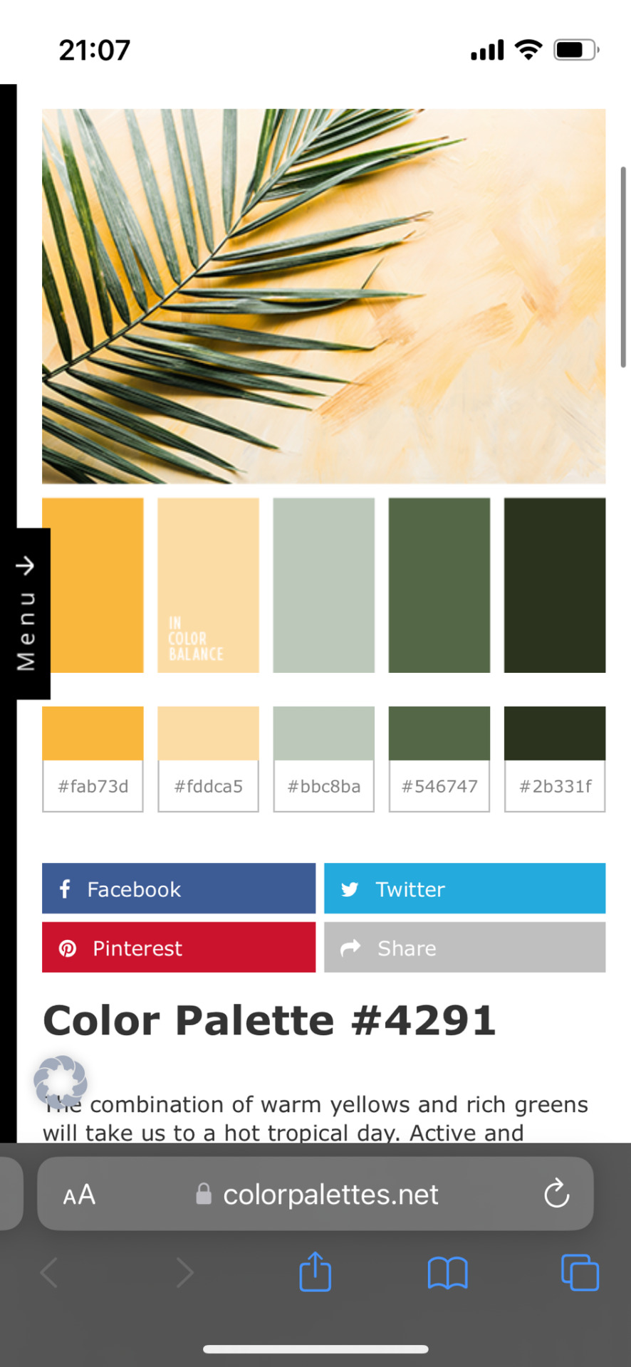

As this isn’t the final stage of the design, I was fine with it.
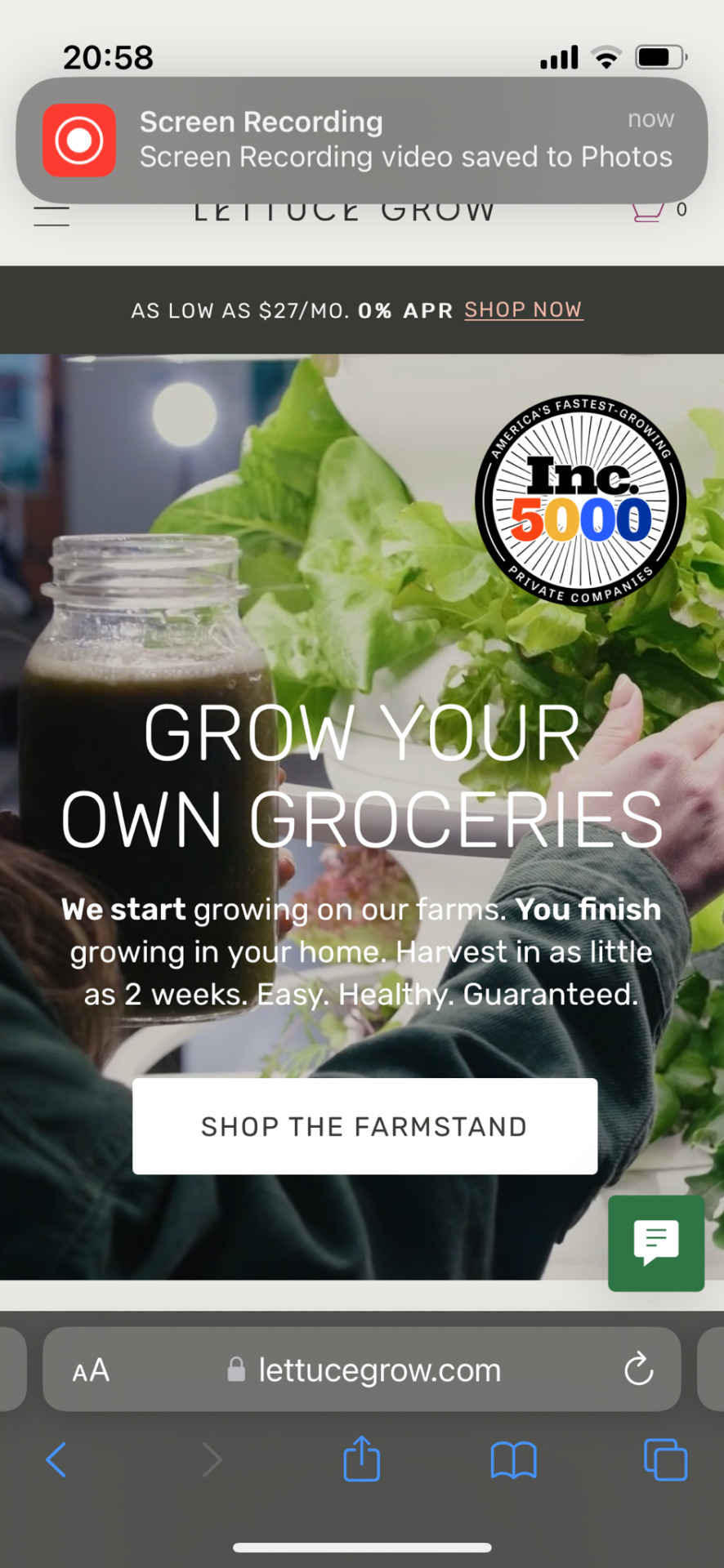
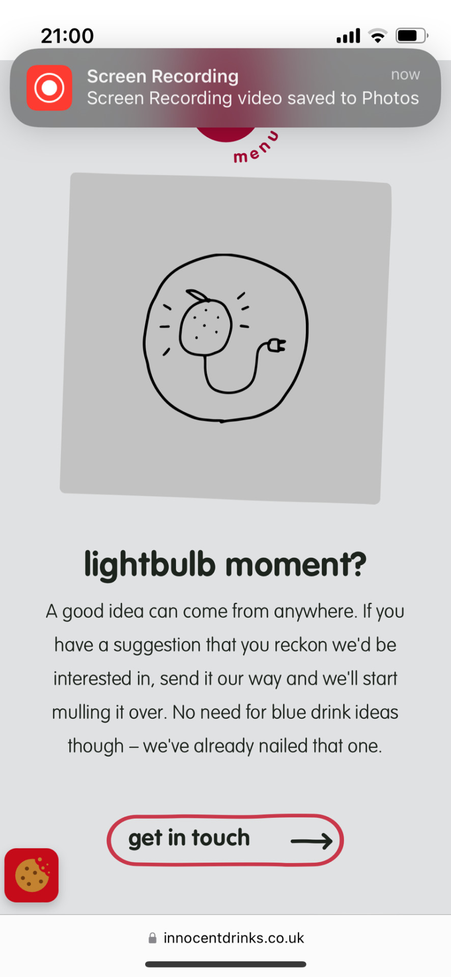
The below are websites I did research on;
⁃ Boskke
⁃ Click and grow
⁃ Lettuce grow
⁃ Innocent drinks - (clothes brand)
⁃ Bloom and wild
⁃ Bohoo- (clothes brand)


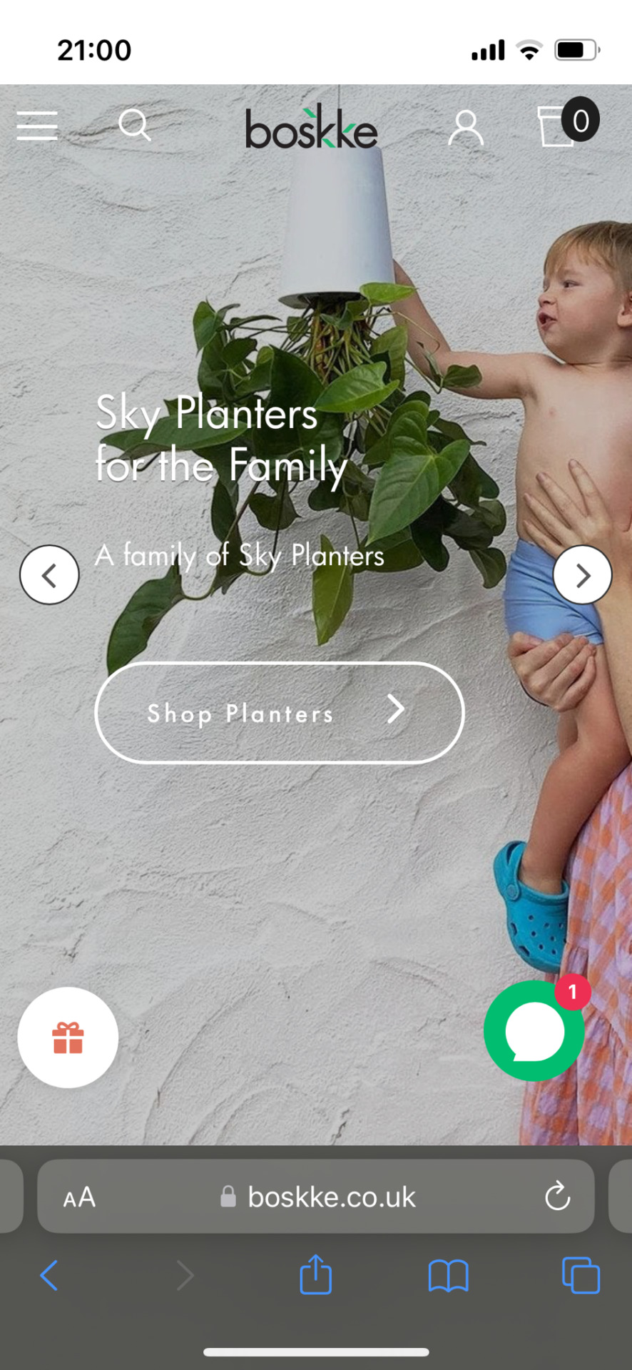


Common factors I noticed whilst doing research;
⁃ The logo at the top centre (on laptops screens it’s a bit different e.g Lettuce grow’s logo is aligned to the left)
⁃ There’s a drop-down menu for the essential icons such as subscription, about us (on laptops e.g for Click and grow there’s no drop-down menu and it’s all spread out).
⁃ There’s a chat logo which will most likely be on the screen regardless of the scrolling.
⁃ They use muted colors, it’s okay but for the purpose of being energetic, there needs to be life.
⁃ A call to action with a photo, products, USP, reviews and the website footer.
⁃ Bohoo and Innocent are obviously not a part of growing kit companies, it’s just they have the saving energy toggle which I really thought was cool. Even if a brand doesn’t say it’s sustainable and presents in the product in reusable/recyclable material, consumers will know they care about the planet by the visuals.
Obviously, this project is short but I wanted to focus on developing it. This isn’t my expertise but I knew this wasn’t a project to do my usual illustrations.
Throughout, I learned how to use XD. The last project we used XD with, I didn’t really wireframe so this was my time to try something new.
Which turned out okay.
Difficulties I had.
⁃ When I got the palette, it was hard to use the colors.
⁃ Stock images aren’t free (During the brief it was proposed to get images of people making eye contact with the screen. Good gardening home stock images were already hard to find)
⁃ Getting imagery that fits the palette.
⁃ Creating the scroll bar (still struggling with it)
⁃ Getting suitable font that isn’t to dull.
If I had more time I may have created the website on an iPad and laptop. As this brand is supposed to be accessible to all, I think it’s fair to do that.
Some of the videos I watched to improve my knowledge on XD;
New: Scroll Groups in Adobe XD - Horizontal, Vertical, Both.
YouTube Channel: Howard Pinsky.
• youtube.com/watch?_ UV4YKibuCKg
0 notes
Text
Assignment 3: Infographic
Critique Submission
The first hurdle I needed to get over was deciding what sort of data I would like to display on my infographic. After searching through a few sources, I narrowed it down to Singapore’s Water Consumption. I decided to sketch out some ideas to better visualise which was a more viable idea for my infographic.
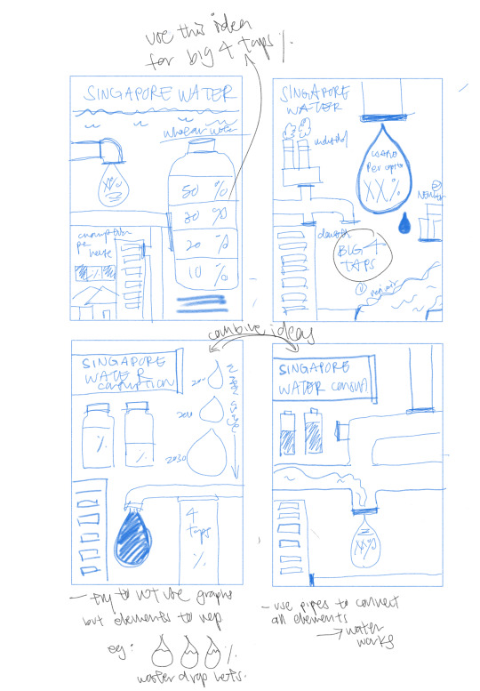
With the water usage data in Singapore, I found it more interesting and that there were multiple ways I could display my data. The data also felt more relatable to an audience my age.
The idea that I had behind the infographic was that I wanted it to flow (just like water!). There needed to be a way I could connect everything together. As seen in my developmental sketches, I figured that I could use water pipes to connect each set of data and use water droplets to visually show the amount of water consumed by using a larger or smaller water droplet. I was quite satisfied with the last two sketches that used the water pipes.
After having a rough idea of what topic I wanted to do, I went to pinterest to get some inspiration for ways to visually display data sets. I did not want to use normal graphs and charts as I felt that this defeated the purpose of having an infographic. Because ultimately the point of it is to catch someone’s attention and convey information effectively through visuals.
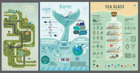
I used these infographics as a guideline of how I could display my data. I liked how the city map used roads and canals to create a flow and direction in the infographic. The whale and sea glass made use of memorable symbols such as the whales tale to display the data. The center visual also immediately draws the audiences’s attention. From here, I tried to weave in these ideas I had with the sketches I initially created.
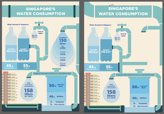
I started working on Illustrator as I felt using vectors would be the best way to create my flat illustrations. The first task I gave myself was finding a way to display my data sets as visuals rather than charts and graphs. In the image below, I’ve collated the different versions how I represented the data. The one that I’m quite satisfied with is how I represented the Targeted Water Usage. At first I considered using a bar graph to show decrease in change over years, However, to make it fit the water theme better I used water droplets in place of a bar graph. This worked out quite well but I wanted to represent the data in an more eye catching way. That is where I decided to overlay each droplet, one smaller than the other to show a decrease. This makes it seem like over the years, the amount of water flowing out is less each year.
Another area I wanted to visually represent it is representing the Four National Taps. Initially in my sketches, I had drawn the taps out such as the resiviour. In this version, I decided to let the water flow into catchment in the ground as the pipes lead the water into a domestic housing unit. The Four Taps are then flowing into the catchment as a percentage of how much they supply. I chose to go with the last version as the vertical text was hard to read and the horizontal text made it easier to see the difference in the percentages based on the colour and size.

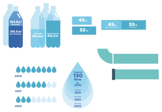
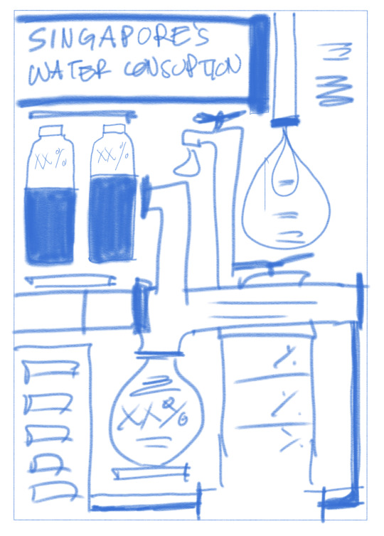
Naturally, I gravitated towards a cool colour scheme with shades of blue and turquoise. I created a colour palette for this infographic so that I would be able to ensure a cohesive theme.

Next was to put all the elements together. I found using the shape tool and line tool very useful. I used it to illustrate the HDB building and the water pipes leading to each floor.
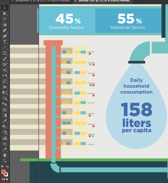
These are two layout drafts I created. I wanted there to be a balance of colour and information, the first layout better captured this idea of balance as compared to the second layout that was heavy on information on the right with mainly illustrations on the right. I also liked how the Title was in a water pipe as it made the whole infographic feel more cohesive.
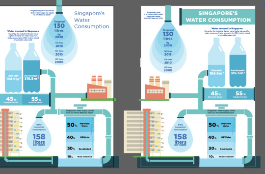
This is my final layout for critique.
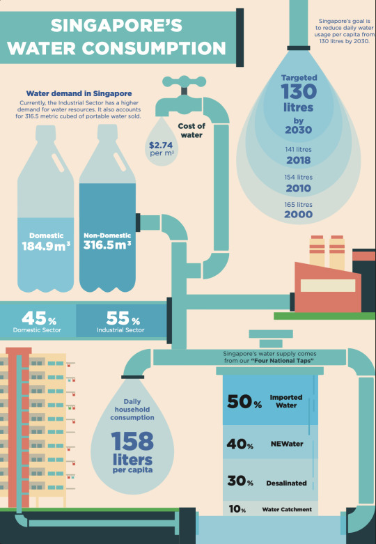
Final Submission
The response from my classmates and tutor was surprisingly good! They liked how the data was presented through the cohesive visual. Some pointers they gave me to improve on was if the descriptions were needed if the visuals already showcased my data through the visual such as the Targeted goals and Water Demand. I agree that the information is not needed as such, I chose to do away with the small descriptive text as it did not serve much purpose. Another suggestion was to find a way to connect the infographic’s title with the rest of the pipes so that it wouldn’t be disjointed. The most important comment was the fact that the percentages for the 4 national tapas did not add up to 100%. (upon further research, this is because NEWater, Desalinated and Water Catchments are able to supply up to X% of water, hence the overlap.) For the purposes of the infographic, I found the average % each normally supplies.
I also chose to move the industry building down to the same level as the HDB flats as I felt that it was a bit strange that it was floating in the middle of the layout. I made some amendments to the colour of the blocks so that there was some contrast created rather than it all leaning towards a very monochromatic tone. These are some header layouts to connect the pipeline with the rest of the infographic. I like how there is a connection throughout the whole design.
This is my final infographic layout.
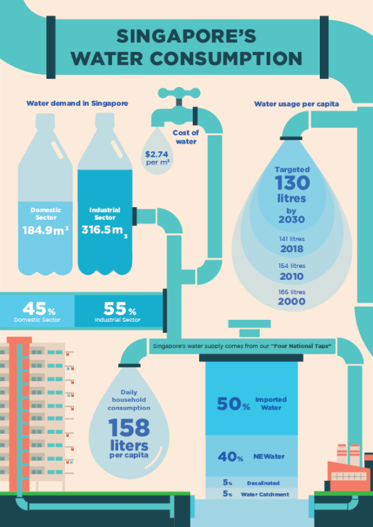
I am very satisfied with my final product! This assignment was a bit of a challenge at the start because there was so much information to take into account. But after I broke it down into sections, it was much easier. Critique session also helped me get other people’s perspective on the infographic. I learned how to create a cohesive infographic that makes use of different ways of representing data rather than just using graphs and charts. The visuals help the audience better understand and capture their attention. I like how there is a flow in my infographic as the pipes show how all the water supply in Singapore is connected and how it supplies different sectors. This has been a very good learning experience for me and I felt like it allowed me to combine different things that we have covered in class.
0 notes
Last Seen Blogs

vitthalworld-blog
Untitled

clusterfoxx-art
cluster does art

crimsonsaffron
World Domination.

supergirl-fanfiction
Supergirl Characters x Reader

nonukeartblog
事務局ブログ