#art composition
Text

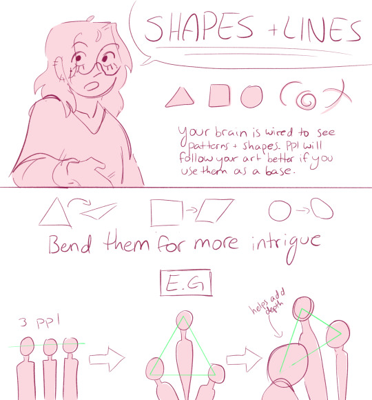

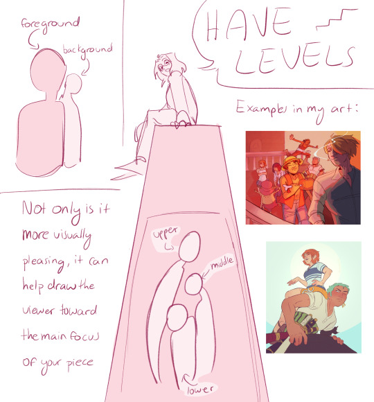

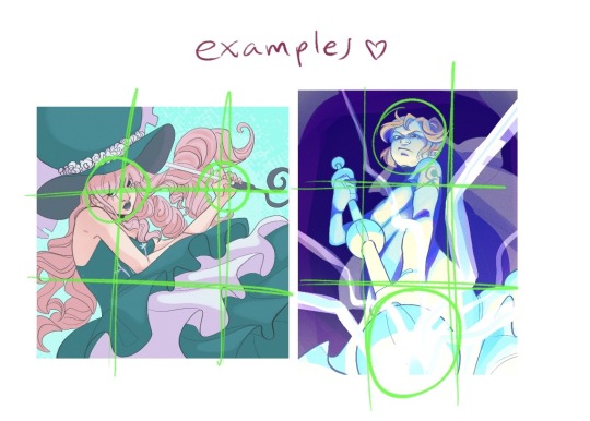
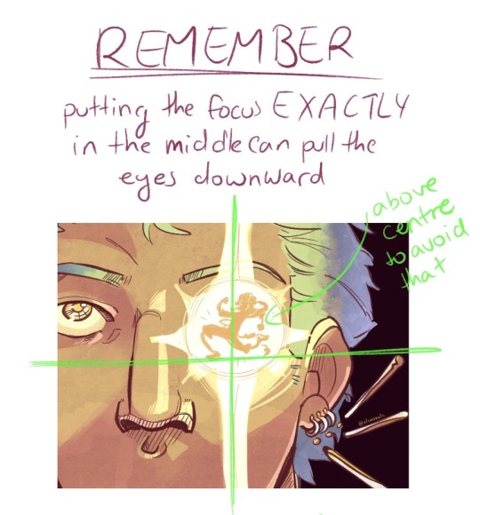
and i’m not GREAT at colour but general rules of thumb:
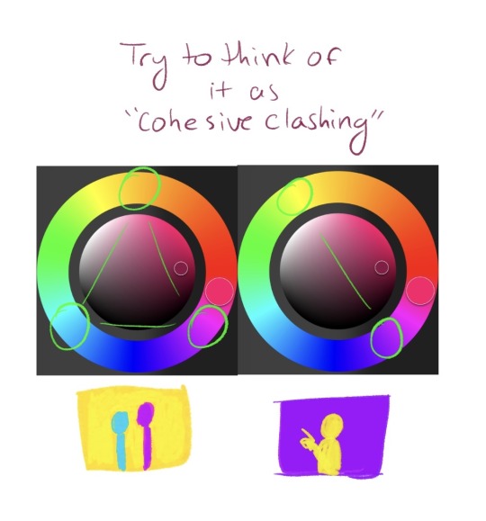
i got kinda lazy at the end there but i hope this helps a couple people!
331 notes
·
View notes
Text

Acryla gouache on 12" x 18" watercolor painting
#cat meme#bat-hoax#art#artists on tumblr#painting#cat#cat painting#illustration#portrait#acryla gouache#art tag#traditional art#art composition#pattern
26 notes
·
View notes
Text
Casual analysis of graphic design and composition (ft. a bit of colour theory) since I’m a bit rusty and haven’t thought about them in a while
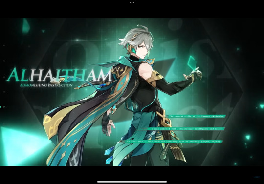
Hm? Some shots in Al-Haitham’s and Kaveh’s demos share a similar composition…
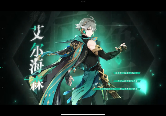
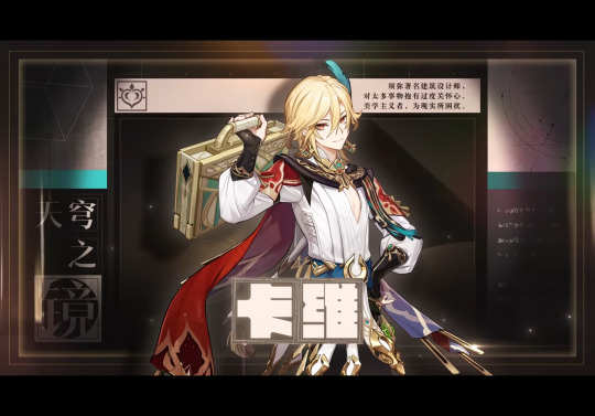
But it’s interesting that the more logical one uses informal symmetry in his character title card and the more emotional one uses formal symmetry… So many rectangles in Kaveh’s card (‘course it helps that hanzi characters are in squares)… It’s kinda surprising, but still it brings out the flow of the illustration well. (Of course, Chinese hanzi can be read horizontally or vertically, so they’ve more freedom in typography, but I bet they changed the graphic layout a bit for the English demo…)
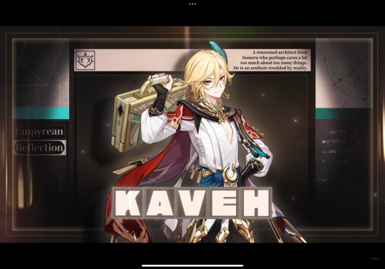
hah, yeah, I thought so. See how Kaveh’s cape can’t frame the center boxes anymore, and how there’s no space to the right of the synopsis in the upper right, and most of all how the two squares on the bottom left is now a quarter of the original size, leaving an empty space there (though if they rotated the words vertically it could fit into the rectangular space well).
Al-Haitham’s English title card isn’t bad, per se, but they could’ve put some shadow on the left side of the illustration so the text could stand out, and move the three green lines to the right side a bit more, so not everything is slightly to the left side when there’s no reason to. (The negative space on the two sides in the Chinese version is roughly the same size.)


These two shots are both long shots that show the character’s full body, but Al-Haitham is in a slightly low angle, and Kaveh is eye-level with the “camera”
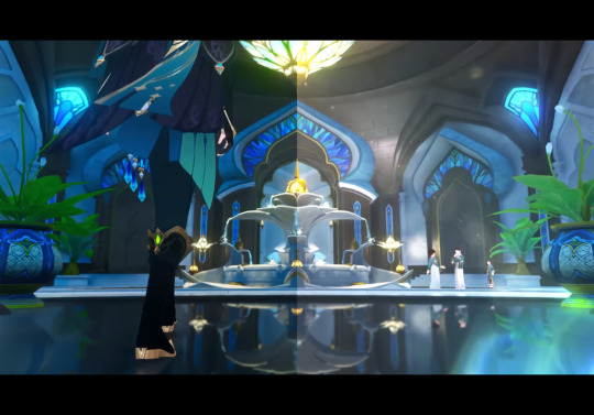
This one’s another low angle full shot with Al-Haitham’s lower body, with a bunch of analogous colours. Also this one’s background uses formal symmetry again (even reflecting off the ground) while the placement of the characters are in informal symmetry (the large image of Al-Haitham balances out the small figures near the fountain)
#procrastinating… on syntax assignment#Al-Haitham would probably tell me to go finish it#but. if their models have dark skin#to reflect their inspirations#of the Arab mathematician and physicist al-Haytham#and Iranian mythological figure Kaveh the Blacksmith#then their title cards have to use different colours since the official colour scheme#(the value contrast) in the demos ride on the fact that the characters are pale-skinned#in other words#the illusts stand out against the dark background because the characters are pale-skinned#dusk analysis#Genshin impact#kaveh#genshin kaveh#composition#art composition#graphic design#al haitham#al-haitham#alhaitham#genshin alhaitham#genshin analysis#long post
38 notes
·
View notes
Text
14 notes
·
View notes
Text
If anyone has any advice for making composition look better in art, please lemme know 😅
I suffer so strongly with just making things dynamic or interesting, and poses themselves are just so hard for me
Any and all advice/tutorial is totally welcomed because I am desperate
4 notes
·
View notes
Text
Being able to see and understand the composition of an art piece always makes me super excited.
Like, it's so good! So smart! So satisfying to look at when it just naturally loops your eye back to the beginning!
#art#art composition#this is about the dan mora cover with jason n tim i just reblogged#cause its delish
2 notes
·
View notes
Text
for all the artists out there, here are my favorite resources i use to learn!
Files
The Complete Famous Artist Course
Art Books and Resources
Art, Anatomy, and Color Books
PDF Files of Art Books
Internet Archive
YouTube
My YouTube Playlist of Tutorials
How to Draw Facial Features
Drawing and Art Advice
Drawing Lessons
Art Fundamentals
Anatomy of the Human Body
2D Animation
Perspective Drawing
Acland's Atlas ( GRAPHIC but very good for understanding anatomy! )
Websites
Pinterest Board for Poses
Another Pinterest Board for Poses
Pinterest Boards for References
Reference Angle
Figurosity
Sketch Daily
Line of Action
Human Anatomy
Animal Photo References
Humanae - Angélica Dass
Fine Art - Jimmy Nelson
Character Design References
CDR's Twitter Account
iamagco's Twitter Account
taco1704's Twitter Account
takuya_kakikata's Twitter Account
EtheringtonBro's Twitter Account
Drawabox
Color Wheel
Color Palette Cinema
Free Images and Pictures
Free Stock Photos
FILMGRAB
Screen Musings
William Nguyen Light Reference Tool
Animation References - sakugabooru
Animation References - Bodies in Motion
#art#art resources#art books#anatomy#composition#painting#art tips#art help#art tutorial#perspective#color theory#art reference
15K notes
·
View notes
Text
Never liked you anyway
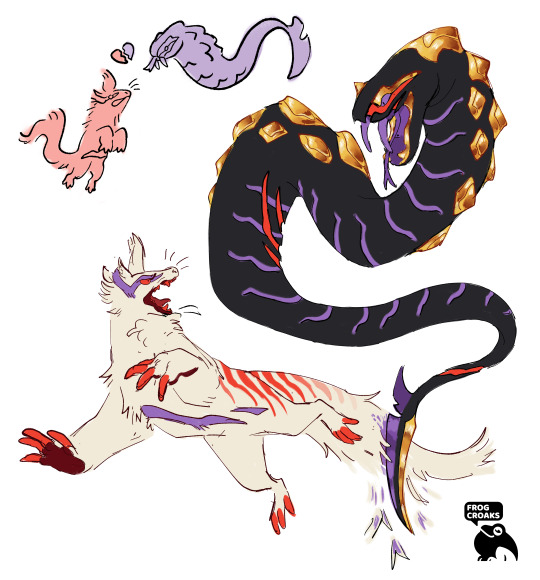
#pokemon#pokemon art#zangoose#seviper#my art#this was supposed to be just a doodle page but i wanted to draw zangoose with the seviper and it spiraled#but thats also why the composition is kinda dookie. my bad
9K notes
·
View notes
Text
#trigun#trimax#trigun maximum#trigun stampede#vash the stampede#vash showing fangs and claws when provoked and angered has something of a strong grip on me#mishmashed the plant design from trimax and tristamp#still not quite what i want so i might work on a better design#for the sake of the composition i kept it simple#vash and the plants designs are by far my favourite in the manga but tristamp does have some elements i really like too#my art#raepliica_art
12K notes
·
View notes
Text

mfw i stayed up past 12am into my birthday just to colour this
#hermitcraft#smallishbeans#joel#bdoubleo100#bdubs#ghh.. tagging joel art with hermitcraft is really beautiful#lockbox#lockbox: but coloured#i definitely could have done better with the composition#but its 2am and i just wnna get ot sleep lmfao
5K notes
·
View notes
Text
messy gomen

#Uuww school is next week#im enjoying my freedon while i still can#illustration#these 2 are my muses for doing diff style art everyday#good omens#aziracrow#my posts#aziraphale#crowley#drawing#sketch#artists on tumblr#composition#art#digital art#character art#artwork#good omens 2#procrate
14K notes
·
View notes
Text
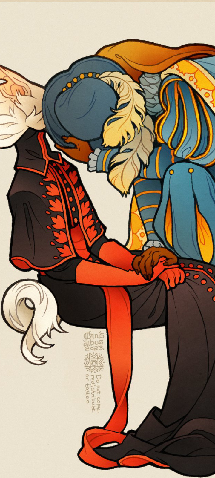
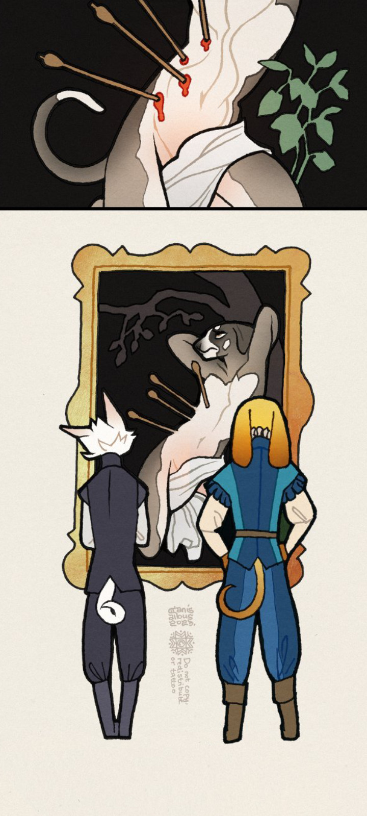
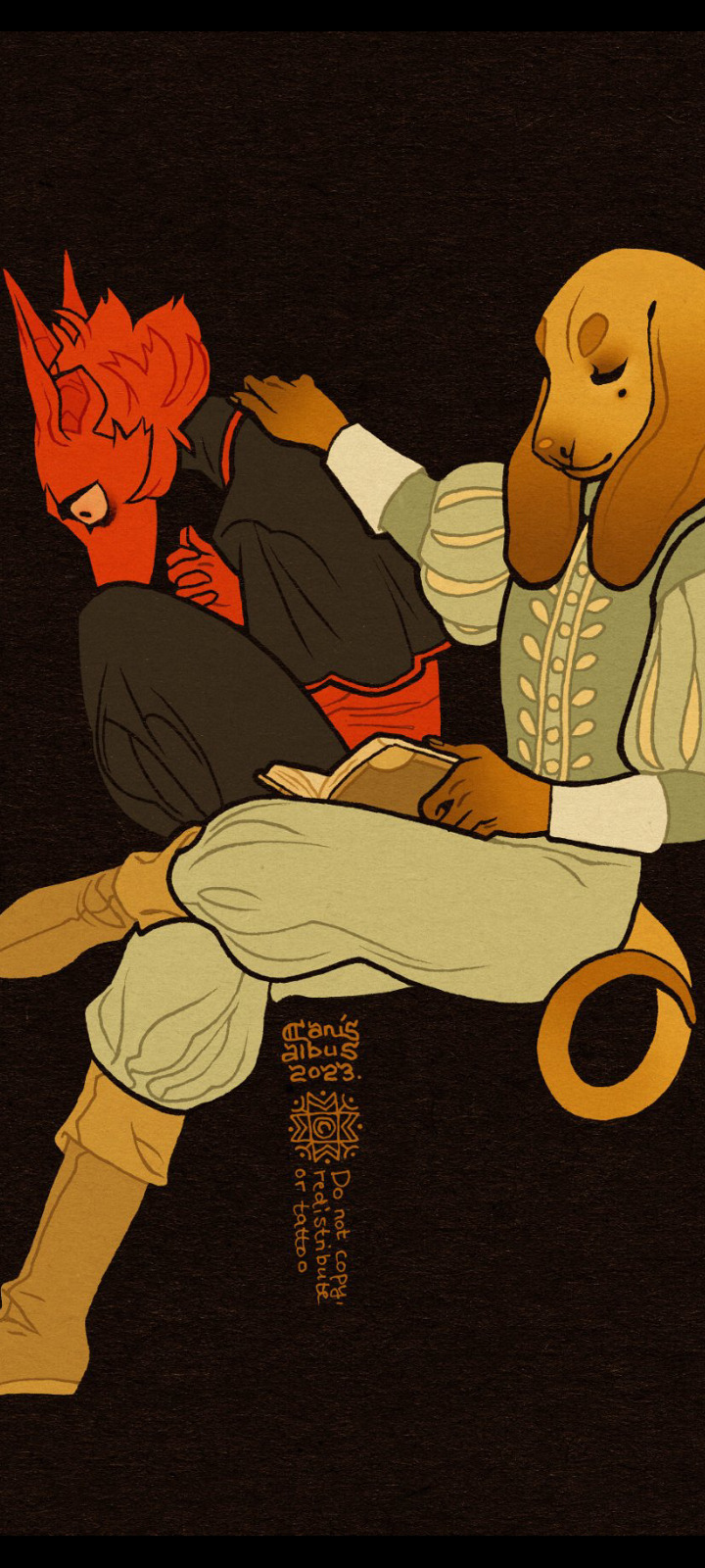
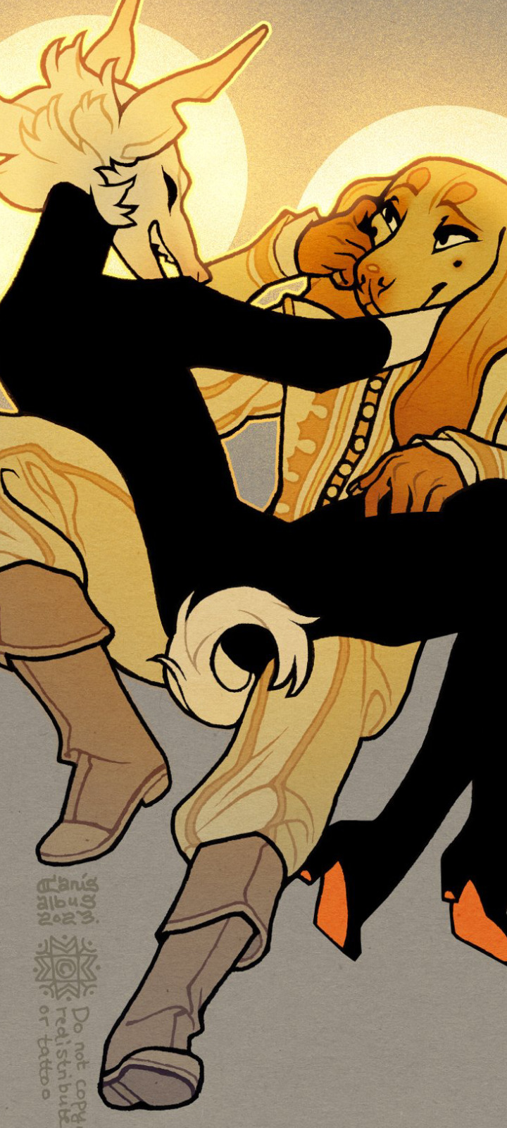
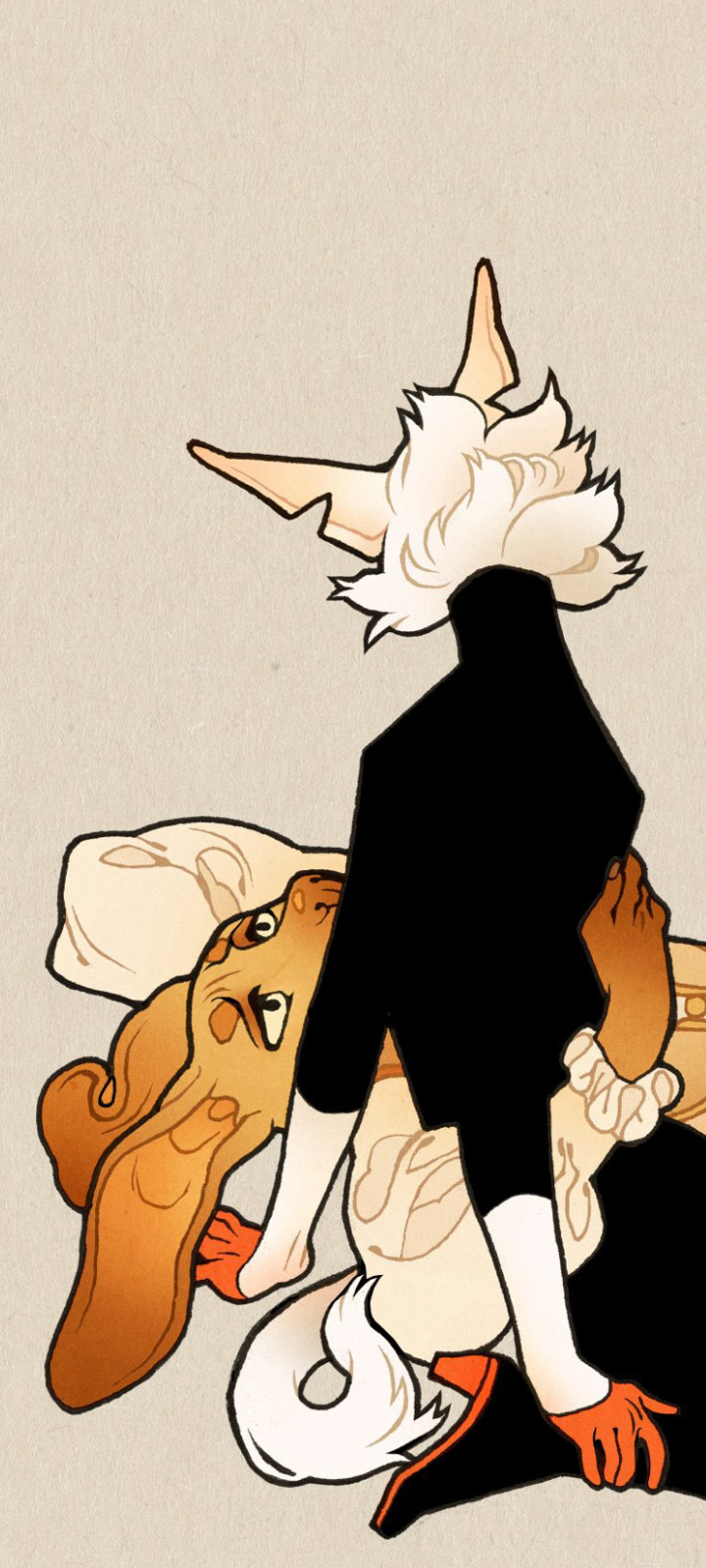

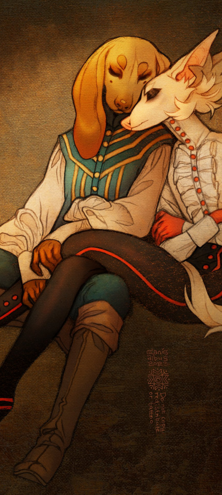
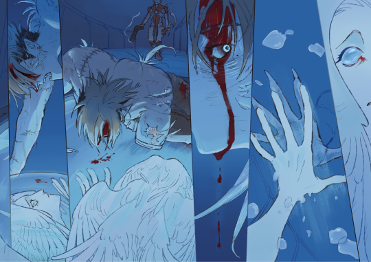
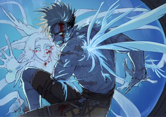
✦ Milk and Honey ✦
#I've been going through some of the pieces from the past few months#the oldest of these are from... late may early july I think? felt like making a little compilation to get a better overall picture#fixation has been strong this is just a fraction of them all#gay catholic dog era#own art#own characters#CanisAlbus#art#artists on tumblr#Vasco#Machete#anthro#sighthound#dogs#canine#animals#I think my personal favorites this far are the body heat piece and the bathtub scene#but their composition didn't work with this format so I left them out
9K notes
·
View notes
Text
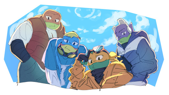
all together now
#moved raph nd don for better composition#rottmnt#rise of the teenage mutant ninja turtles#rise of the tmnt#rottmnt raph#rottmnt leo#rottmnt mikey#rottmnt donnie#fanart#my art
3K notes
·
View notes
Text

they are having a samuraiverse dicussion
#maya fey#miles edgeworth#ace attorney#their friendship means sm to me#also i want to say yes the layout of the office is nonsensical lmao#charley does not ever sit on the windowsil#its fine we can pretend they rearranged the furniture (i winged the composition)#fanart#art
3K notes
·
View notes
Text


Gem and the scotts vs the Mounders + scar finale
#secret life smp#slsmp#goodtimeswithscar#pearlescentmoon#smajor1995#bdoubleo100#impulsesv#smallishbeans#geminitay#gem and the scotts#the mounders#i hate the composition actually#but it was too late#and i wanted to get it done#anyways great ending#loved both teams#my art
6K notes
·
View notes
Text

Sure would be nice if either of these actually led to my art tag
#mercury.txt#art#<- sorry to people who are about to see this in the general art tag#portrait art#landscape art#character art#fanart#poster art#fine art#stylized art#composition#art composition
1 note
·
View note
Last Seen Blogs

genshin-pride-flags
gay-shin impact

usefisamad-blog
Untitled
porcelain-babe
.Reliquia.

bts-purple-you-4-ever
BTS PURPLE YOU