#i hate the composition actually
Text

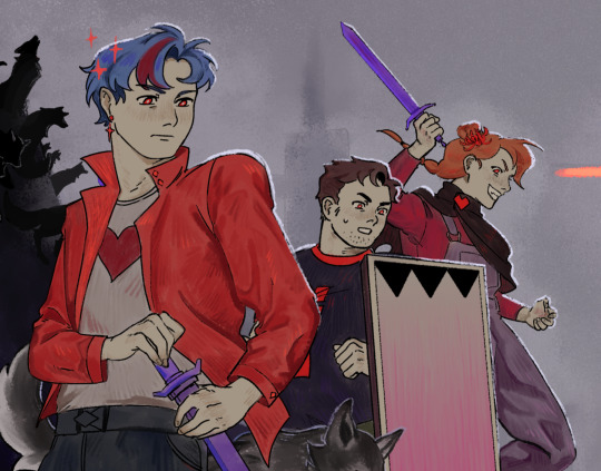

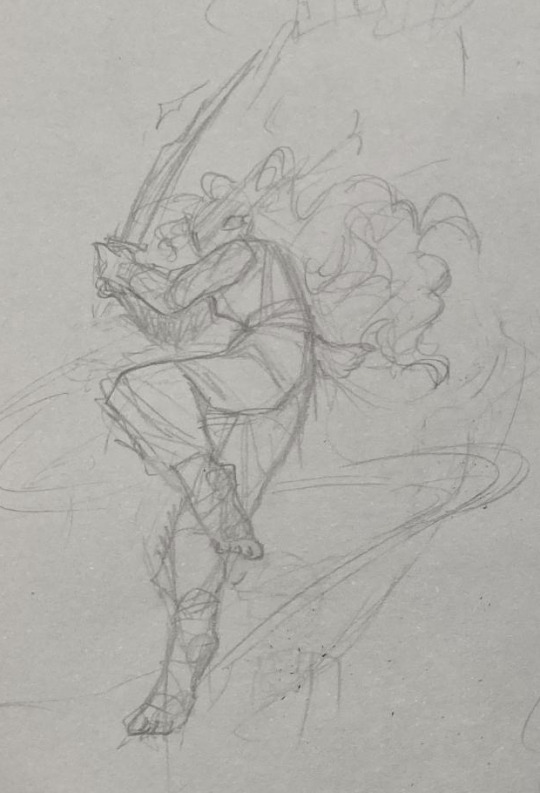
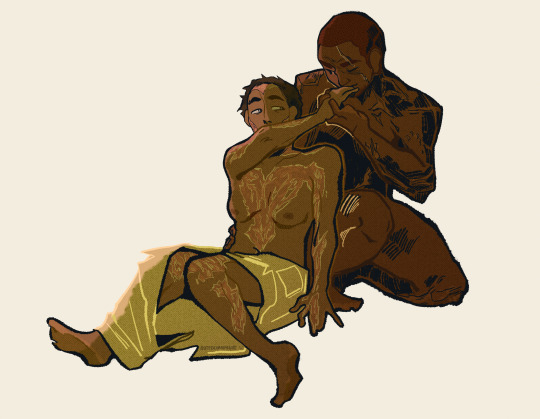
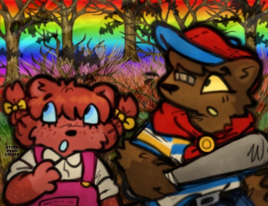
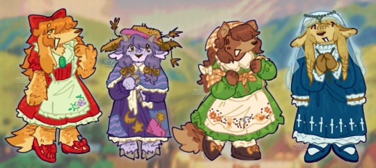
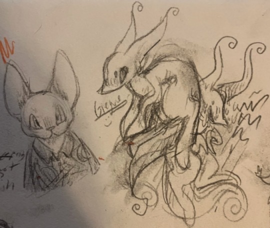
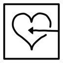
Gem and the scotts vs the Mounders + scar finale
#secret life smp#slsmp#goodtimeswithscar#pearlescentmoon#smajor1995#bdoubleo100#impulsesv#smallishbeans#geminitay#gem and the scotts#the mounders#i hate the composition actually#but it was too late#and i wanted to get it done#anyways great ending#loved both teams#my art
6K notes
·
View notes
Text
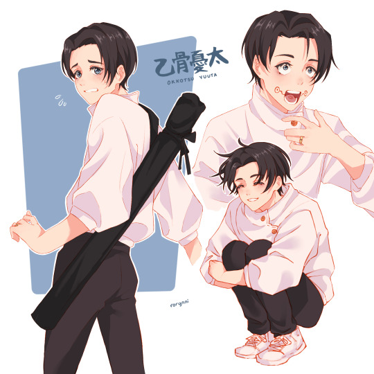
i am still very new to the jjk fandom but i am obsessed with this guy and whatever undiagnosed anxiety disorder he has
322 notes
·
View notes
Text
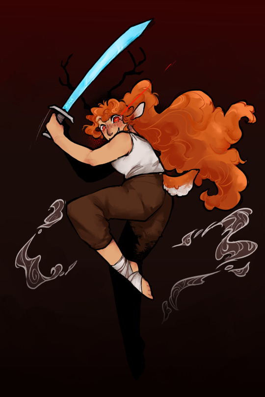
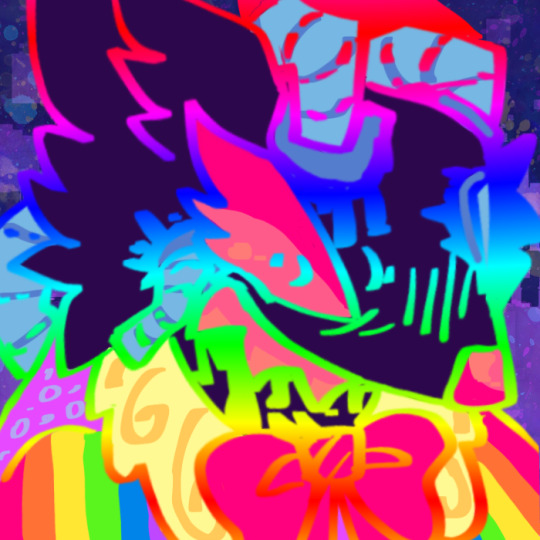
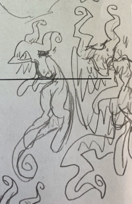
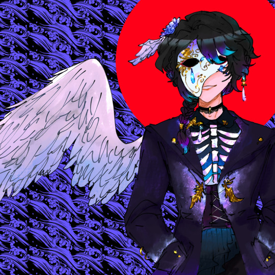
Geminislay!!
for week 1 of @shepscapades hermit character design event :]
(^ style practice and concept sketch ??)
hoping for cleo gem team up...
lineart because im proud of it:
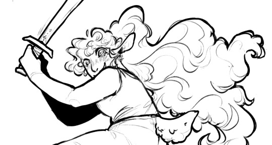
#this might be the most i've ever done on a piece for a long while now#my art#really happy with this actually the linearting was so fun#i hate composition something still feels incomplete but i think ive spent enough time on this#hermitcraft fanart#hermitcraft#life series#trafficblr#geminitay#shepshermitdesign23
949 notes
·
View notes
Text
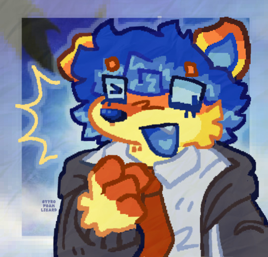
THIS thing ^ says hewwo. UNIRONICALLY.
#my art#fanart#wiggly#wiggog y'wrath#nerdy prudes must die#npmd#npmd fanart#starkid#team starkid#jon matteson#the way the lighting on this one is so weird because they lit him from both sides. why does team starkid hate me personally#actually i had a rlly hard time finding a screenshot i wanted to reference of wiggly#like tink and nibs i was like oh yeah theres one specific pose that i know i want to do#but tbh most of the time we see wiggly in the proshot is full body shots instead of closeups#and what closeups he did get hes moving a lot or just dont have a pose that makes for a fun portrait composition#gr. whatever#willing to struggle and grind for my perfect special boy#i recorded a timelapse of this that i will be posting.. tomorrow probably#a couple people have expressed interest about my process for these painted portraits#and i loveeee talking about process#<- art major moments
310 notes
·
View notes
Text
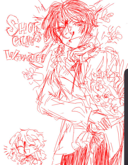
The train will go to the next station without fail!
@battle-couple-battle
#I thought of it on rwby fight but genuinely did not have ability to do it. I like its versatility - even upon poll loss it still fits.#The way I did tones is far more fitting for colors but I am simply would not have been able to choose them wisely.#GG hope it was fun and thanks to the organiser!#risuyu#вышедшее из под моего пера#Also doing it made me understand that hikaren is actually balanced tone-wise against eachother#I don't know... I hate compositions that break the way things are to highlight whatt you intend to show but you gotta do what you gotta do.#I just hope that someday I'd be able to choose angles of perception rather than conveniently break reality#shoujo kageki revue starlight
361 notes
·
View notes
Text

posting this right before i sleep so that i can forget my embarrassments
mortifying nakeder version
#''SAM i think youre overreacting'' im purging the demons that resided in me since catholic school. leave me be#anyway recently ive been getting compositions beamed into my head but not a reason WHY.#so ive been working to try and finish at least one a day but this is actually kind of insane ridiculous now that i think about it#but this doesnt matter because i hate having too many WIPS im finishing them all anyway#a lot of them are half naked. again this is a cry for help#pyrrha dve#paul the sixth#paul tlt#pyrpaul#paulha#the locked tomb#nona the ninth#partial nudity#nudity#dudele
183 notes
·
View notes
Text
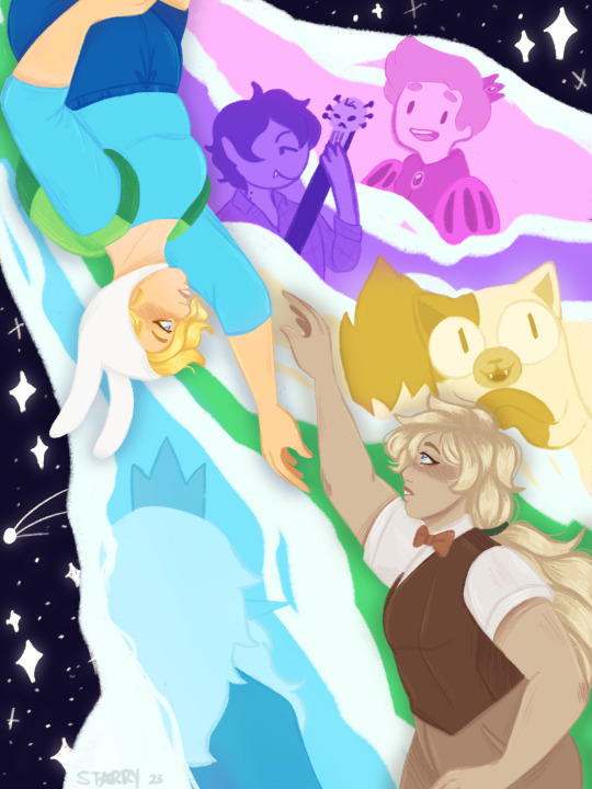
im not really feelin' like myself today
#fionna and cake#fionna campbell#adventure time#marshall lee#prince gumball#ice king#gary prince#simon petrikov#starry draws#i spent so long on this and i HATE ITTT . UGHHH#the values r off the compositions ok but the faces r weird and. ugh#me and the drop shadow bc i didnt calculate values right#also i havent actually seen the show yet im not mentally stable enough rn L#also i drew simon down in the left corner but he didnt fit in the comp so i had to delete him 😭#fionna represents the green btw thats why shes in the. yeah
175 notes
·
View notes
Text
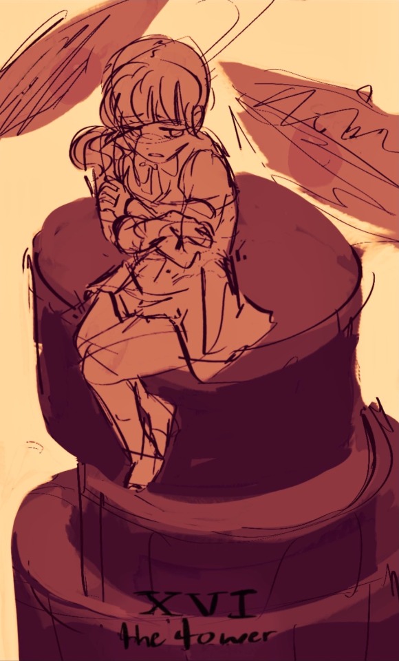
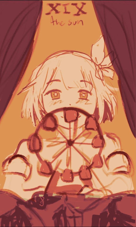
still chipping away at that pjsk major arcana
#proseka tarot#<- so i can find them because god knows this will take a bajillion years#project sekai#pjsk#prsk#emu otori#honami mochizuki#tarot#IGNORE the way the ferris wheel looks like i know. fucking trust me i know#i realized i colored over all of the lines indicating that honami is sitting on drums and that those are eye things are alsoncymbals. oops.#i have composition ideas for most of the cards now and sketches for all of leoneed and wxs.. my bias shines through#but i hate figuring out values. always. sorry.#actually i have a weirdly clean sketch for kanade and i like the concept of it for her card but somethin about it lookd off to me#like it's boring or the anatomy is wrong or something. maybe if i drew it in with more perspective like i did with honamis#sniffle. anyways thank u revsta relive arcana arcadia for hope charity and faith card ideas and infortmwtion because jesus its hard 2 find#ANYTHING on those 3 cards from the visconti deck. willvisit the library so i can draw gacha game tarot mockups with lore accuracy. gn.#staying up to draw is not noble. take the melatonin.#pry this stupid shade of dark pinkish red out of my cold dead hands btw
183 notes
·
View notes
Text
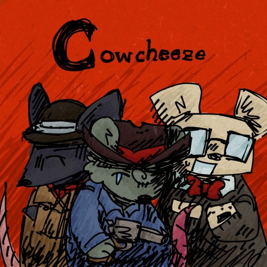
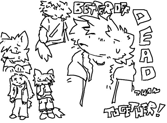
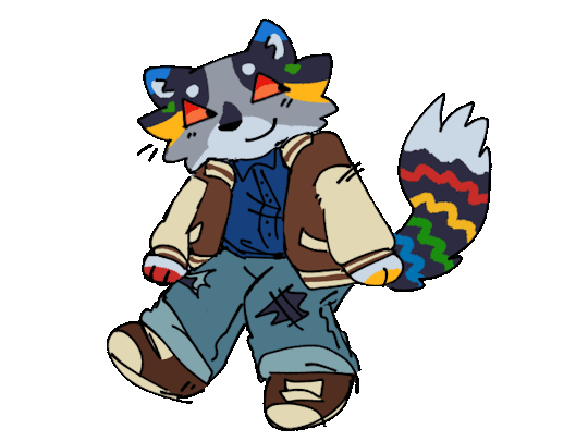
random assortment of drawings i might as well post
#scribbles#ocposting#furry tag#gif#eyestrain#bright colors#the gifs showing up kinda weird i think thats just a thing on my end though#have noticed it happens a lot for me w transparent gifs on here. idk#gif was for a dta thingy btw uhhh#‘cowcheese’ thing is for my sisters weezer parody where theyre rats nd instead called cheezer#words on the one on its right are lyrics frm heres to you by zebrahead cuz it was stuck in my head..#oh also the middle drawing on the first row of three was color picked frm the cover of phoenix also by zebrahead#first drawing i just made cuz i was messing w preset brushes nd thought itd be funny#long one w the four characters is.. little goody two shoes characters But Furries . lol#oh the one left of the cheezer thing was smthn i drew in class w my friends prisma colors instead of working on my actual art project#actually started that now its driving me crazy cuz i made like a million versions of the sketch messinf w the composition#and im still not sure entirely what i do and dont wanna include and also the actual paper im doing my final on isnt like. wide enough to fi#things in nicely 💔💔💔 also i never planned out colors like an idiot so im making that up as i go and avoiding it a lot aghhghh#giegue drawings are honestly just here cuz i think hes funny#sorry for the paragraph of tags i love talking abt things#uhhhmhmmh i kinda hate postint stuff most places online now ngl#i have so much more art i COULD post but it just feels weird idk#no one really interacts w my stuff much anymore anyways like idk <- this is jot me fishing for pity or disregarding anyone who does leave#nice comments i appreciate that stuff SO mucu it means the world to me. i just dont feel super strongly abt posting shit anymore i feel lik#i have much better peace of mind just leaving things to myself sometimes#as much as i like sharing things it just hasnt been convenient lately and also ive just been getting like.. very paranoid abt a lot of#things over these past years and the constant posting everything o. tumblr thing didnt help much#🙃 okay ill stop rambling now have a nice day
21 notes
·
View notes
Note
You said don't get you started on Ice's helmet or you'll be mean... please be mean. Please be mean to him. What is so disastrous about his helmet design?
my time has come. i will be mean to him. (thank you for getting me started on this. it bothers me every time I watch top gun.) this is also gonna be so long. yippee!
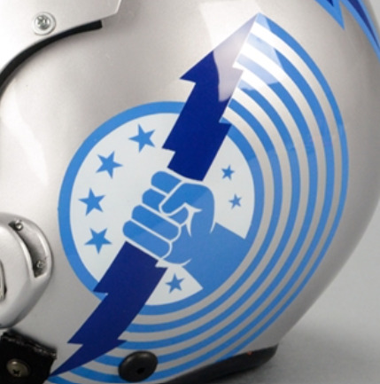
stopthatfool's issues with Tom "Iceman" Kazansky's helmet! aka this bad boy right below. (I'm sorry if anyone loves Ice's helmet, it's just not for me)
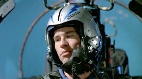
The placement of his name. WHY is it on the side? Both him and Slider have their names on the side. That makes me think it's a squadron thing? (the VF-213s) but regardless i don't care cuz i think it's stupid. (again sorry if someone thinks its genius. ok i'll stop apologizing)
My biggest issue with the fact it's on the side is that it creates this uneven weight distribution. The side with his name feels considerably "heavier" than the side without.
And the thing i don't understand is that Ice's name is evenly numbered!! He could fit 3 letters on either side of the line that comes down the helmet! the letters wouldn't be unevenly distributed, so I don't know why he felt the need to put it there!!
Here, I have "annotated" his helmet and provided other viewpoints of his helmet!

The font/typeface! Ice.. is that ARIAL?? and it's not even bolded??? so not only is his name to one side and weirdly small... it's skinny and unbolded. (like you're THE Iceman. Don't you want your name big and bolded? I shouldn't be searching for your name when you're Mr. Iceman!)
Looking at his helmet head-on, part of his name isn't even visible.. like ok ICEM!
And then! There's this weird switch up in the shapes and line types that he used-- the angular and sharp points of the lightning bolts and the half circles surrounding the squadron logo (is it a logo?? idk im gonna call it a logo)
What i think Ice is trying to do here is create a "connection" between the circular part of the logo and the lightning bolts as the bolts go all the way to the back of the helmet... but in my opinion... it's not working. like at all.
The comparison between the harsh lines of the bolts and then the curves is just kind of hard on the eyes (for me anyway). I just don't know where to look. Should i be following the leading lines of the lightning bolts? Or the curves of the half-circle things? Or should I be following the line of the lightning bolt in the logo?
And all throughout that... i barely end up seeing the name on the helmet.
Continuing off the logo... for Top Gun 1986, Ice and Slider are in the VF-213 squadron, but the movie switched the logo to the VFA-25s that looks like this on their flight suits-
(yes that is the best quality image i could find from the movie my bad) So why does the logo on his helmet look like this???
WHY do the fingers look like that. they look like hotdogs im so sorry. (logistically it was probably easier for the decals to be printed and then applied like this. but. we're not talking about technicalities here. right now i'm tearing apart the entire composition of Ice's helmet.)
I like version of the logo on their flight suits soooo much better! It's got more "rhythm" and flow to it that the lightning bolts lack! Plus no hotdog fingers.
Ok ok, now on the colour scheme. The harsh and bright blues I don't mind. Like yeah, you're The Iceman, punch me in the face with blue. I can forgive that. The thing that really bothers me.. is the silver/grey base of the helmet.
It's this really harsh grey that really doesn't help with the already harsh blues. I think he should've continued with the blue he has going. cuz this grey ain't working, king.
Ok, anyway. Since I should be studying, I'm obviously doing anything but studying. So i redesigned ice's helmet. ya idk.

it's kind of wonky.. but whatevs (ignore how the lightning bolt on the side view doesn't line up with the front view) (and ignore the inconsistences in the lettering. i was lazy and did it by hand)
I also didn't want to completely change/get rid of the aspects of Ice's helmet. So the changes aren't huge (except for maybe the name placement/"font")
ok I changed the background colour (finally, it's less all up in your face now) I continued with the blues and lessened the intensity just a little bit. I really wanted his name to be front and center!
Now the colour scheme is also consistent. No random black lettering (again, in arial???) there's now black in both his name, the outline of the lightning bolts and the logo!
Now his name is evenly distributed! See how it fits on either side of the line that comes down the center of the helmets from '86? See how you can actually see his whole name? See how it's heavier and fits the whole "iceman" theme better? (at least in my opinion)
Come on, Ice! You should've used the leading lines provided by the lightning bolts to guide people to your name! There's now a fun little overlapping moment!
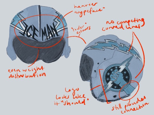
(ignore how i forgot to dot one of the i's in distribution whoops)
No more weird half circle things! No more conflicting leading lines! But! I decided to extend the arm of the squadron logo to continue the line of the lightning bolt as it moves backward. I think this makes the circle of the logo fit better, while simultaneously creating that "connection" he was trying to get in his actual design.
The lack of half-circle things also allow for the logo and lightning bolts to just "be." There's no distraction. it's not overly "busy" anymore (like maverick's helmet). It's simple, but he's The Iceman! He doesn't need it to say/have more!
And the use of the "actual" logo seen on Slider and Ice's flight suits creates that sense of movement that was absent before! Plus no hotdog hands!
Is this new proposed design perfect? Absolutely not! The logo and the lightning bolts still create a weird point of almost intersection that still bothers me. But I think fundamentally, there's always going to be issues with these two components: the circle will never quite fit in, and the lightning bolt the hand is holding will always "cut" the whole thing in half, creating a weird separation in the helmet, that will always bother me.
Anyway, this was a lot of fun! (I love being mean to these guys. they need their egos brought down a couple pegs!)
#now if only i put this much effort into my actual assignments regarding composition breakdowns....#looking at it now. i think i just spelt distribution wrong. blegh. whatever.#ICEMAN! big bold letters! like oh yeah! that guy!#long story short! i hate his helmet!#i hate hate HATE your hair and makeup today#like that clip from rupauls drag race u know?#top gun#top gun 1986#iceman#tom iceman kazansky#stopthatfool goes crazy and explodes#stopthatfool draws
59 notes
·
View notes
Text
dear diary. today I developed a visceral loathing for mirrors
#kotlc#biana vacker#<- i was drawing her#doing a silly little piece#and was like oh haha biana! mirrors! symbolism! composition! everything life so cool!#but then I started actually drawing it#and i hope shannon personally stubs her toe twice a week for three years for making biana so mirror#because AUGH#they are SO annoying to draw#HATE it#hatred and loathing!#GRAAAAHHHH
17 notes
·
View notes
Text
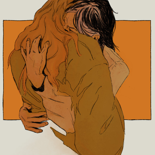
drawing your oc's hugging surprisingly therapeutic
#also when you don't hate what you're drawing! feels great <3#zows draws#thesis project#< once i have an actual title for the story i might change this. if i ever get there :)#artists on tumblr#spent quite long colouring it just to slap a lighten layer on top lmao. it was ugly anyway <3#but i like the composition and linework
61 notes
·
View notes
Text
WOULD YOU GUYS LIKE TO SEE MY FUGLY UGLY ASS ALLEGORY OF THE CAVE X FAHRENHEIT 451 CROSSOVER DRAWING THAT I WAS FORCED TO DO FOR SCHOOL….. ITS SO UGLY AND MONTAG IS
WHITE.
AND THE HOUNDS ARE DISGUSTING THE COLORING IS SO SHITTY AND MILDRED …. Well ok she looks alright kindof but the COLORING ….. SKETCH WAS BETTER but do you guys. Do you still want to see it…….,,,,,,
ALSO NO OFFENSE TO WHITE PEOPLE PLEASE I LOVE YOU GUYS 🫶😁👍 within reason
#like ok maybe it isn’t. THAT bad#NO NO I TAKE THAT BACK I JUST LOOKED AT IT RIGHT NOW AND THE COMPOSITION IS ALL FUCKING VOER THE PLACE#IT. IT IS. THAT BAD#IF YOU GUYS SAY YESS YOULL SEE#ok but nasty bad art aside I know some of you will be asking why white Montag is such a bad thing and#there isn’t anything wrong with it!!! it’s just that for me personally#after I did a bit more thinking I was. physically incapable of perceiving Montag as anything other than POC/nonwhite#so when I look back at my old f451 art and stare into the eyes of a pale skittish twink it just#it doesn’t click. like that isn’t MY Montag if ykwim#now trembling BROWN skittish twink. that’s a different story#AGAIN I DONT have any issues with ppl making their own versions white I just think that . for me specifically. he looked a bit funny#a little off. a bit too crackerish for my liking#where is bros melanin 😭#I’m complaining right now but if I wanted to I could just… go in and try and make the skin tone darker#I might do that depending on how tired I feel after doomscrolling#also if it matters even though I have read the book over at least 8 times now not once have I touched either of the movies.#and it will STAY THAT WAY. until I completely log my notes for the book#then I can move on to the movies 🥰#but I will admit 2018 did sort of lead me to having a change of heart w my design. just a little. just a teensy bit. kinda. sort of?#actually not really now that I think about it#I have my own reasons.#TOO MANY WHITE PEOPLE MY EYES THEY BURN AAAYHHHHH MY EYES OW OW OW OWIEEEE#my Beatty design was so white that my eyes developed stage 4 cataracts#I needed a palate cleanser that WASNT Millie… oh god my Millie design…#she was white there too. terrible#it’s okay… 💔 I’ve since learned and moved on#ARGH GUYS I DONT HATE WHITE PEOPLE I JUST THINK THAT MORE SKIN COLOR VARIATIONS WOULD E NICE
5 notes
·
View notes
Text

old art i need to redraw (posting these now bc the first redraw is almost done cackles)
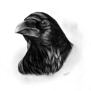
#🌗 art tag#im actually very very proud of the first one#the only problem is i drew that when i was in love w a friend who obvs didnt like me back#so. im gonna need to figure out smt for that one#the second one is just... bad. honestly. i hate the linework and anatomy and the composition could use some work#but the design and concept is sooo good im planning on putting it into writing even#last one i love the concept. execution? um... no thanks#i guess in general im pretty proud of my art but like#urgh. soooo much to fix#my ocs#my oc#my characters#my original character#my original characters#first one is#yinhai#i think? in his casual design before i completely punted him into pol#second was#crows#im pretty sure anyway#last one was deff yin#so i wont tag again lolz
9 notes
·
View notes
Text
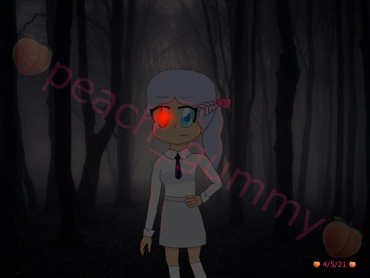
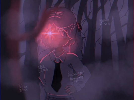
May 2021 vs November 2023
#my art#digital art#artists on tumblr#art improvement#i hate the old one so much but also it's what motivated me to actually do digital art so ehhh#i have mixed feelings about it ig#i love the new one though#cause i can see the improvement with literally everything#improved anatomy - check#improved composition - check#improved background skills (aka not getting the background off google) - check#improved clothing folds - check#improved drawing hair - check#improved using layer modes - check#maybe i should redraw this in another 2 years to see how much i've improved by then 👀#side note ignore how inconsistent my watermark is I havent done digital art for a while bc of exams n stuff
3 notes
·
View notes
Text
flip flopping between pafl and fac is so. ohh im in stasis idk what to draw
#actually i havent done anything for the betty tag in a good bit. maybe if im not as sick tomorrow ill doodle smthn..#wanna renderrr wanna painttt i dontt wanna sketchh#i hate having to come up with 'interesting ideas' . boom 20th betty staring soullessly into the camera in a row#MY COLORS R THE ONLY THING CARRYING ME IM SO SHIT AT EVERYTHING ELSE 😭😭😭😭😭😭😭😭😭😭😭#ok nooo we are not doing this again. i have GOOD anatomy i CAN come up with interesting ideas when i put my mind to it#i just. dont want to :3#auugh i have. interesting compositions w symbolism already doodled in my sketchbook but..#i really fucking hate redrawing stuff in digital.. its so painful.. i hate redrawing stuff in general thats why i cant do lineart like.#I already fucking drew all that youre telling me i have to draw it AGAIN? fuck off.#siigh#maybe i only have to redraw the parts that are bad.. if im doing a lineless painting.. hm#much to think about#schizobabble
2 notes
·
View notes
Last Seen Blogs
tearsofrefugees
Tears of Refugees & Migrants
runwithmerosalee-blog
Underground is ruining my life
valzluv
Priz✨
rahvenns
Prydain Lost
kekeondemand-blog
Let Me Tell You A Story