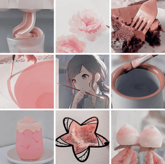
#composition tips
Text

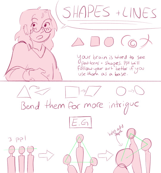

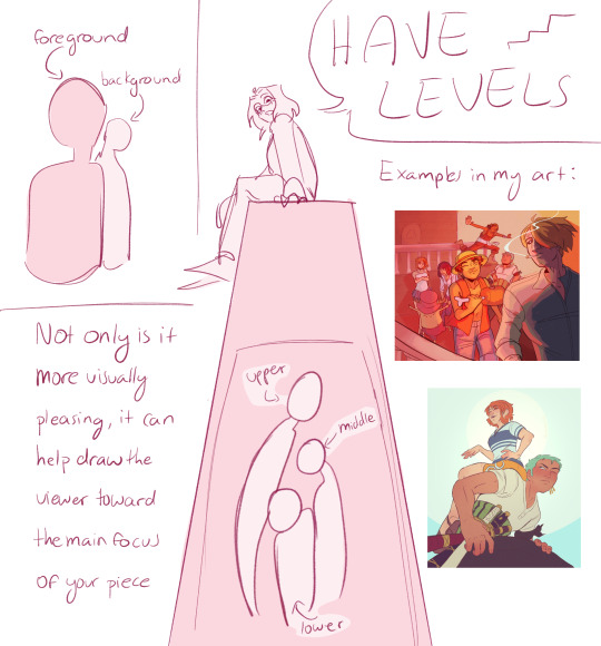

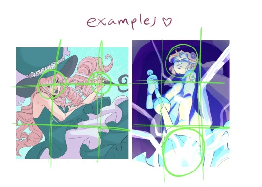
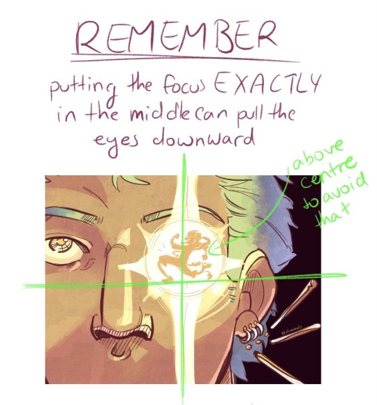
and i’m not GREAT at colour but general rules of thumb:
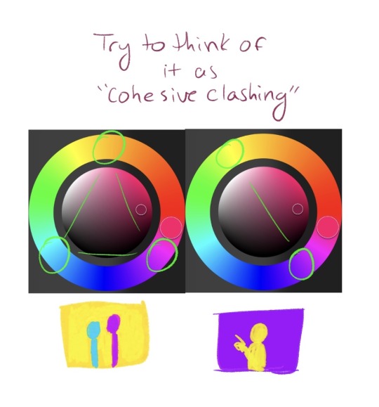
i got kinda lazy at the end there but i hope this helps a couple people!
331 notes
·
View notes
Text

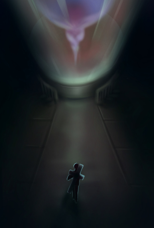
Today is @thatgamecompany 's game Journey's 11th anniversary. Like every year, the community will be out in the sands and I made a poster which was chosen to be the face of it. I am proud of that.
I have also collaborated with SanchoPanda to make this Journey themed parody cover of Styx's Come Sail Away. The whole instrumentation and mixing was me, plus half the singing. That is another thing of which I am proud.
youtube
One last thing, here's one of the composition guides I used to make this image. There are a few more but.... I am proud of that one :)

#journey#thatgamecompany#fanart#clip studio paint#song cover#composition tips#video games#gaming#Youtube
30 notes
·
View notes
Text
Rule of Thirds: A Powerful Tool for Dynamic Photography Composition
Are you looking to improve your photography with new techniques?Learning the rule of thirds is an essential compositional technique for creating captivating photos.
You’ve probably wondered how professional photographers capture such stunning and visually appealing images, with simple compositional techniques. One of the fundamental concepts in photography is the rule of thirds and it can truly elevate the quality of your photographs.
What is the rule of thirds?
In short it means dividing the frame into a grid of nine equal sections; two horizontal and two…
View On WordPress
#composition technique#composition tips#photography composition#photography tips#rule of thirds#rule of thirds technique
7 notes
·
View notes
Text
for all the artists out there, here are my favorite resources i use to learn!
Files
The Complete Famous Artist Course
Art Books and Resources
Art, Anatomy, and Color Books
PDF Files of Art Books
Internet Archive
YouTube
My YouTube Playlist of Tutorials
How to Draw Facial Features
Drawing and Art Advice
Drawing Lessons
Art Fundamentals
Anatomy of the Human Body
2D Animation
Perspective Drawing
Acland's Atlas ( GRAPHIC but very good for understanding anatomy! )
Websites
Pinterest Board for Poses
Another Pinterest Board for Poses
Pinterest Boards for References
Reference Angle
Figurosity
Sketch Daily
Line of Action
Human Anatomy
Animal Photo References
Humanae - Angélica Dass
Fine Art - Jimmy Nelson
Character Design References
CDR's Twitter Account
iamagco's Twitter Account
taco1704's Twitter Account
takuya_kakikata's Twitter Account
EtheringtonBro's Twitter Account
Drawabox
Color Wheel
Color Palette Cinema
Free Images and Pictures
Free Stock Photos
FILMGRAB
Screen Musings
William Nguyen Light Reference Tool
Animation References - sakugabooru
Animation References - Bodies in Motion
#art#art resources#art books#anatomy#composition#painting#art tips#art help#art tutorial#perspective#color theory#art reference
15K notes
·
View notes
Text

Traveller
#hot tip for young artists if you don't know what you do with half your composition you can just write some shit there#sci fi art#illustration#acrylic paint#ink#posca pens#artists on tumblr#my art#my writing
153 notes
·
View notes
Text
my three pieces for the @vashwoodbigbang to go along with causticwrites fic, The Unbearable Weight of Tenderness, which can be read here
if you love a good time loop trope with a bit of vashwood angst on the side, please give it a look!
#trigun#vashwood#vash the stampede#nicholas d. wolfwood#meryl stryfe#roberto de niro#vashwood big bang#art#a little sad because I learned some good composition tips a little too late for these pieces#but man I learned a lot with these so I can't complain
129 notes
·
View notes
Text
I wrote this on twitter but I thought I'd put it here too, since I occasionally get asks on how I draw/any tips I might have. On twitter I also made the caveat that I don't feel I'm qualified to give anyone tips, LOL, but I was drawing today for an assignment and felt like this is worth noting to any beginner artists who have a tendency of clinging onto sketches that they feel like they finally got right! (A.K.A, a habit I still have years later HA!) This isn't so much of a tutorial as expressing my thought process in this discovery of how to draw more dynamic pieces. I found it to be satisfying on my end, seeing it unravel, so hopefully it can help someone who may be struggling with the same thing I am.
MAKING MORE DYNAMIC PIECES, A PERSONAL STUDY!:
I wasn't upset by this drawing, but I could tell there was something stagnant about it so I ended up pushing it and redrawing it a million times to see if I could somehow make it look more dynamic.

Here's one part of the timelapse - I'm clearly adamant on trying to make this pose/composition work but while the sketch itself may look better, the stagnation hasn't changed. Perhaps this works for some people, but anyone seeking a dynamic visual will be able to spot that this simply isn't working as anything more than a semi-decent anatomy study attempting to be applied.
I changed the position of both arms, I tried to play around with the angle of the head, I tried to just the hips forward more so that the spine had increased curvature, but the main issue, really, was that the initial composition lacked the dynamism in general. It prioritised dramaticism over dynamism. Both can exist in the same piece - it did not, in this one.
This was the new sketch I started with. Less rigid base to go off of. Just getting down the general shape I wanted to score - make the spine and tail take a sort of mid-whip path, shoulders hunched, hips cant forwards, as if he's curling in on himself. I think for a dynamic piece, it's more helpful that your initial sketch uses the body as a general marker as opposed to something to do lineart over (granted, I don't really do lineart anyway, my sketch is usually the extent of my "lineart", but since this is just looking at creating a more dynamic composition, I think it still applies!)
Here it's the same principle. For the left image (the legs) I've established where the knee of the right leg goes, and where the hip that precedes the left leg will sit. These are just base anatomical structures that help me figure out 1. Whether or not the mere idea of this composition will work, and 2. where I have to stop once I start drawing. For me, having some sort of limitation for the body helps me stay within range of proportionate anatomy (not that I particularly care for the anatomy to be realistic, just proportionate to the style I'm drawing in)
On the right image is also the same principle. Establishing the movement of the arm, the elbow/arm bend, and the hand. (If you see the full sketch before the two above, I established the hand in that one too - it really is helpful figuring out the placement of the hand ahead of time.) If it looks atrocious afterwards I always have the lasso tool/eraser to save me.
The new attempt brings me to this. While preference in art is subjective, I do think I'd be staying in SOME realm of objectivity when I say this is more dynamic than my initial sketch, LOL. Of course, lighting/rendering choices help push the composition a little more, but this achieves what I couldn't do with that first sketch. I had a general idea, but it's important to know when to let go of something that clearly isn't working.
Would love for anyone to add their own tips or ideas to this post - I'm not particularly known for dynamic pieces so I'm always looking to learn. This was a really valuable study for me so I wanted to share it, but everyone has their own method and what works for me may not work for the next person!
There's a few other asks that asked me for tips on general anatomy, and more specifically legs (oh dear god, I'M going to need to study for that before writing out any sort of resource guide for that, lol) that I hope to get around to doing in the near future. Thank you for your guys' vote of confidence, haha! ❤️
#nc111 tutorials and studies#sketch#art tips#art help#study#I had a lot of fun with this piece so while part of this was definitely to passively respond to my inbox requests#a big part was also just me wanting to talk about my brain expanding as I realised how to Push A Composition#I can't wait to try more things in the future to try and get more dynamic compositions#let me know if this was helpful let me know if it was utterly useless#I'm not a great teacher but I used to tutor my neighbours 7 year old daughter and she found my methods boring but hey she got better
65 notes
·
View notes
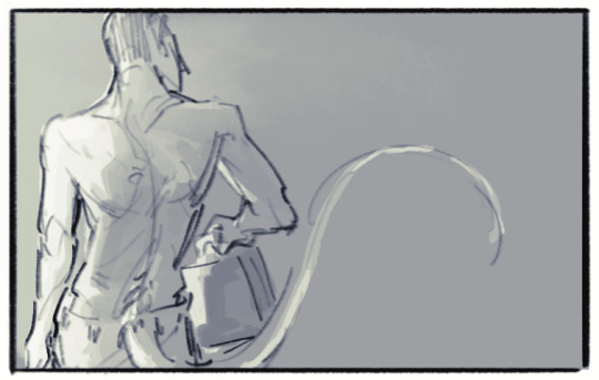
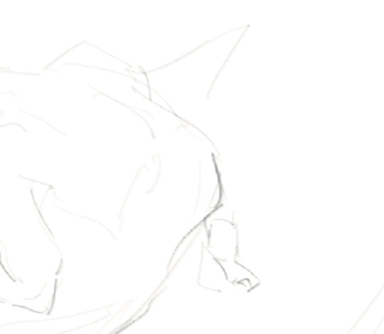
Text
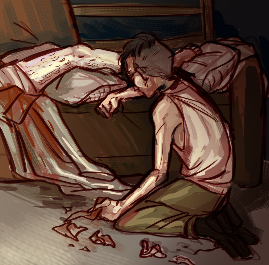
[id: a digital drawing, roughly rendered, of kim kitsuragi and harry du bois from disco elysium. scene is post-tribunal, with just harry's legs elevated on the bed, bleeding through his bandages and sheets. kim, back towards the viewer, is slouched and kneeling in place, one arm braced against the futon, the other limply clutching a soiled hankchief, with several other balled up tissues scattered to his side/]
started as a warmup that i think im gonna completely redo but its getting there
#disco elysium#kim kitsuragi#harry du bois#accessible fanart#image description#casetrippy does art#composition is almost there. thinking about the tip i got from last year that its fine to make leading lines super obvious
228 notes
·
View notes
Text
youtube
30 notes
·
View notes
Photo

idk if this is helpful but I made a thing✨
#leafie draws#art advice? artvice? hhhghng#composition is just the power of suggestion babyyy#I like sharing art tips I'm just bad at explaining things LOL#about art#art tips#tutorials
205 notes
·
View notes
Note
""After years of doing synastry and composite charts, I've learned that the easiest way to see if the relationship SERIOUSLY won't work is by looking at the composite chart and seeing if the Ascendant is square/opposite Pluto or Saturn or Uranus. I've learned that for severely negative relationships, the composite chart's ASC was either square Saturn by 0 degrees or square Pluto. would say to avoid relationships like these by all costs =P. The pluto aspect changes your life forever.""
So this is something I found on an astro website. I don't know if you read composite charts but if you do what do you think about this? Is it really that accurate? And is that aspect THAT bad?
I don't disagree completely with the thoughts of the astrologer who wrote the above words but I disagree strongly with their mindset and way of delivery.
Remember, this is my OWN personal opinion and I know that many other astrologers may disagree with me but my beliefs and methods are different and sometimes unorthodox.
It is destructive and unnecessary to demonize one specific aspect of a category of aspects. Yes, there are certain aspects who are harsh but it all depends on the individuals and the whole composite chart, as it happens with all astrological maps, even with personal ones.
1. "...the easiest way to see to see if the relationship SERIOUSLY won't work...", "...avoid relationships like these by all costs...", "...severely negative relationships..."
Relationships don't fail because of astrology, they fail because of choices. People choose to overlook the weaknesses and harsh elements in the relationship and they let it build up until the only thing they can do is to let it burn to ashes.
I've seen couples with "great" synastry and "amazing" composite charts fail and others with more "challenging" and "negatively" charged astrological environment thrive.
This comes down to the individuals making up the relationship.
Astrology is not bad or good.
It is evolving and transforming. Sometimes that means challenge and not easiness. Actually I would argue that challenges help us advance more in life and relationships than easiness.
2. Squares & Oppositions : The good, the bad and the ugly.
It's no secret that squares and oppositions are challenging. This is not a walk in the park. Trust me, I know. Pluto and Mars directly square my Sun. Neptune/Uranus/Neptune square my ASC. That does not stop me, it sculptured me. Oppositions also add to the relationship. They are the pepper and spice.
The leader is created in the storm and that's also when the true leaders emerge from the shadows.
Remember, the stars want you to evolve, they don't want to shutter you and destroy you. You are capable to counter attack and manage the harshness. As much as you are cursed, you are also blessed.
3. One bad aspect can not be blamed for the destruction of the entire relationship.
Self explanatory. Fragments make a whole. Astrology is statistics and we can pinpoint patterns but we can not know if that aspect will break every single relationship. An astrologer would have to look in depth at the composite chart and the charts of both individuals. What breaks someone makes stronger someone else.
4. Pluto, Saturn & Uranus are not evil.
These planets get blamed for almost everything. Their story is similar to the one of the "bad aspects".
5. "...the Pluto aspect changes your life forever..."
Is that so bad? Change is not always bad. This is the gist of it. If you want to keep just one thing from my writings about astrology let it be this: the stars want you to evolve, life is a series of waves of change.
#composite chart#synastry aspects#synastry#astrology#tarot reading#astrology tumblr#astrology tips#astrologer#astro notes
55 notes
·
View notes
Text
Inking Tip: Line Weight
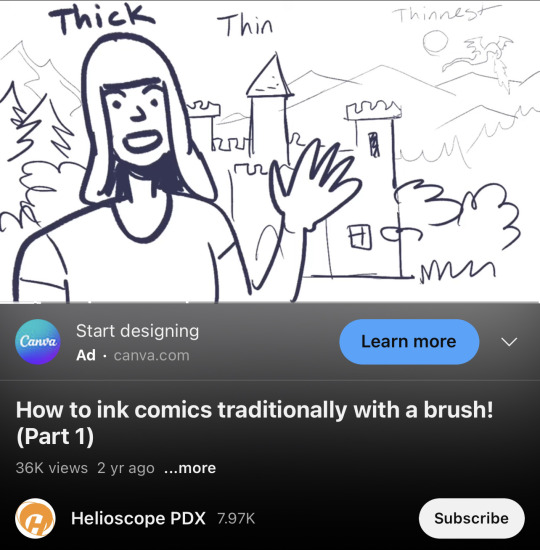
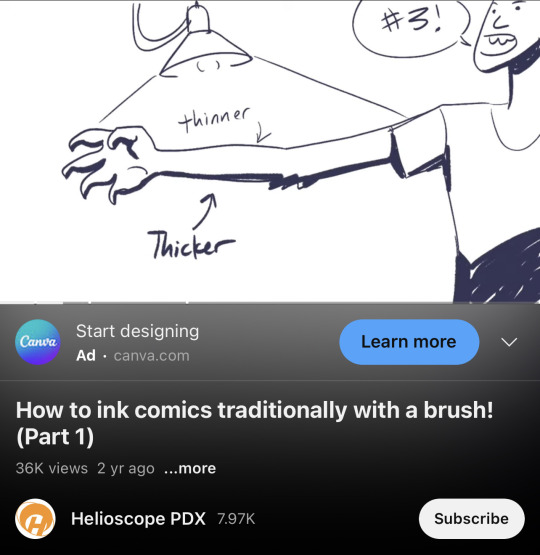
In contact with light = Thinner lines
Further into the background = Thinner lines
Credit: Helioscope PDX
#random tip#random tips#inking#line#lines#linework#line weight#pen#ink#composition#drawing#art tips#art tutorial#art tip#art tutorials#drawing tip#drawing tips#drawing tutorial#drawing tutorials#art#tip
119 notes
·
View notes
Note
hi... don't know if you're the person to ask but do you have any tips for like. edit composition. (????) thar makes no sense . i apologize

i’m probably not the right person but fear not i’ll say some bullshit anyway. obligatory preface but i have never taken a graphic design class in my life so take everything i say with a grain of salt, or several, because idk what the fuck i’m doing
a good thing to keep in mind when editing is your focal point—that is to say, whatever it is you wanted people to be focused on. in most cases it’s probably going to be a character, but you might also have text or something else as your focal point. after you’ve picked your focal point, find ways to emphasize it—people usually do this with stroke (outlines) or with things behind the character like splatters, laces, etc. it should be relatively easy to spot a focal point in most people’s edits, even if they didn’t knowingly pick one. if your edits look janky, you probably ended up with too many things your brain is trying to focus on at once—try simplifying it or making one part pop out more than the other! this also comes into play with text. using my pinned as an example:


(still frames so they’re easier to see) you can see that len and rin are the focal points of this image because they’re outlined and because they’re in front of the text. the text is in the back because i deemed it less important than the characters—i mean, you can read my url without the image anyway.
also, sizing is a pretty big thing in composition. your brain looks at the biggest part of an image first—this is the concept behind newspaper headlines! your brain looks at the big text first, then at the smaller. you can see this reflected in my current header (displayed below, in case i change it at a later date) where “canarysage” is bigger than “resources for editors” because I wanted you to see “canarysage” first

how you align your elements is important to. generally speaking, you’ll want to keep everything pretty centered, but, as with anything, you can break this rule for the sake of creativity. when you’re making things like this directory graphic:
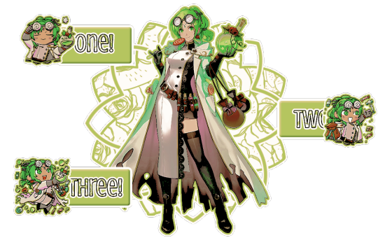
it’s cool to do a zig-zag sort of pattern. when making something like this, it’s probably better to do from left to right—that’s the way english-speakers (and speakers of several other languages) read things so that’s how your brain automatically goes. you should also position whatever you want to be read first near the top—in this case, the part that says “one” is in the top left, because that’s where most people’s eyes will go automatically. you can also see the central art is the focal point because of the outlines and the shapes behind it. the buttons are kept separate because they’re a solid color instead of the pattern used on the background shape—and the text stands out because it’s outlined in black, unlike the rest, and it has a pattern. if you use patterned text, outline it so it’s clearly seen and read.
you can also avoid centering things to make your edit more ‘dynamic’ (idk if that’s the right word) like i did with this header:
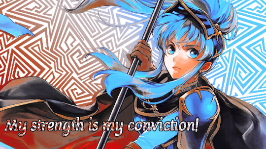
both eirika and the text are off center, which makes it look more interesting. also, they’re aligned differently—eirika is aligned to the right while the text is aligned to the left. this helps it seem less empty and is more fun visually
if you’re doing an edit with an even number of characters (like a ship edit) you’ll want to keep any one character out of the center, as this makes them the focal point and can kind of shunt the other off to the side. unless you’re doing matching graphics, in which case you should keep one centered, so it’s clear which is the “main” one in each piece of the set.
sizing is also important in terms of literally how small or big your edit is. headers tend to be pretty large (tumblr uses a 16:9 ratio, and twitter uses a 3:1) but things like icons or stamps are pretty small. especially with stamps, you’ll want to make your character pretty large in the stamp so they’re more easily seen. tumblr icons show up on your dashboard as 128x128, which is pretty small, so you’ll want to make sure your icon is easily discernible from that size.
also, i dont think this is necessarily a hard and fast rule, but when you’re making icons and you have to crop out a portion of the character’s head—crop out the top of the head, not the chin. i can’t tell you WHY i think this is a rule or even if anyone agrees with me, but it’s something to keep in mind. here’s an example of the two different kinds of cropping:


cropping the chin out just looks goofy, idk
since rentry graphics are just sort of dependent on the user, there’s no real hard and fast rules to composing them. just keep in mind whatever your focal point is and try to keep people’s attention on it, whether by adding random shit or outlining or whatever.
same thing with replycons, really. i like to keep my replycons semi-simple, but if you’re doing a collage-type of replycon, it’s better to keep the collage in the background for the most part, except for one or two focal pieces:

you can see that most of the collage pieces are behind rin except for the flower stickers, which are off to the corner so they don’t detract from her. the stripey-line things help a lot, too, as they lead your eye to the main part of the reply icon even without being centered—the main part being the character, of course
with moodboards or stimboards, it’s best to keep your character in the exact center—unless you have two, in which case keep them both in the middle so they’re easier to see. there’s no hard and fast rules with moodboards, but i like to keep images with similar composition near but not directly beside each other
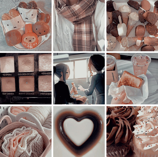
the top middle and bottom middle of this one are both pretty minimalistic, so i kept them adjacent from but not beside each other. as for the rest of it… well i just kind of did whatever
if you’re doing a moodboard or stimboard with two kinds of themes then it’s best to do a checkerboard type of pattern
you can see that here. the pattern is food-art-food-art-ena-art-food-art-food. like a checkerboard, except ena’s in the middle
i’m being so for real i don’t understand composition at all. it’s really best to just do whatever looks best to you personally and see what happens. i hope this is helpful-ish!
yours truly, canarysage
#world’s least helpful editor tries to run a resource blog: canarysage in a nutshell#you can find a lot of resources on composition if you look it up where smarter people explain things better#but i just sort of. do whatever#ʚɞ — tips.
21 notes
·
View notes
Text
i am just now beginning to (actively) learn thumbnailing. and composition. Its weird to think about how many things and possibly useful tools i simply do not discover by myself..
#my art journey#whoaa i guess this is why being in communication with other artist is fun and cool#i shall not refuse any concept artist or illustrator sharing#art resources#artists on tumblr#art tips#thumbnailing#in fact#by all means#please do share#anything on#composition#art
19 notes
·
View notes
Text
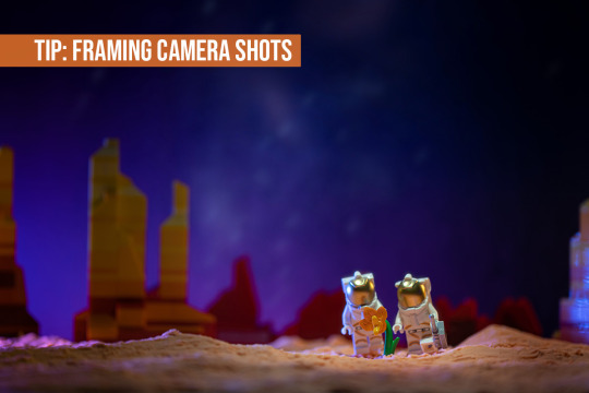
📖TIPS: Framing Camera Shots - Overview
When it comes to photography, there are a variety of shots a photographer can take that help you tell a story for your viewer. Many of the terms I’ll be using this month originate in film-making, which I learned in various courses in art school like storyboarding and film history, and are equally relevant to toy photography.
A CAMERA SHOT size refers to what elements are included in your photo within the outside edge (called the FRAME) of your photo. It can also refer to the purpose of the photo.
Some of the most common framing camera shots are:
Extreme Wide Shot
Wide Shot
Full Shot
Medium Wide Shot
Medium Shot
Medium Close Up
Close Up
Extreme Close Up
Some camera shots that refer to the purpose used:
Establishing Shot
Detail Shot
Reaction shot
POV Shot
…And many more!
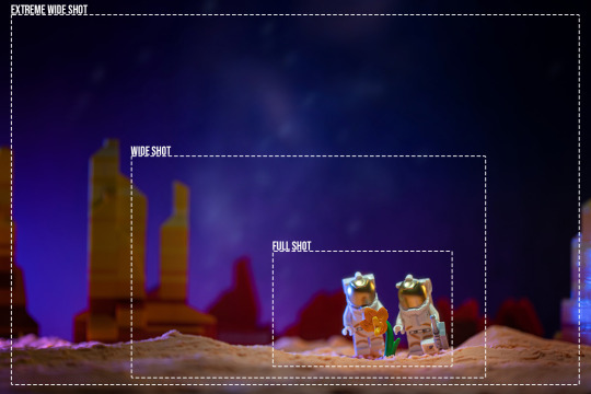
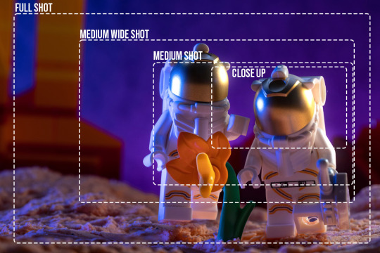
The use of multiple of these different shots for your photography will create variety and interest between photos. It's also great for maximizing the photography you can create with one set/build. Personally, I find that by shooting both wider and up close, I save time by setting up a scene once and getting multiple shots out of it.
This month’s tips will touch on subjects from previous Tips. In 2020, foolishbricks (IG) did a brief overview of some of the different camera shots in his 📖TIPS: Anatomy of an Image, and nocturnelle9 (IG) had tips on camera lenses and focal lengths in her 📖TIPS: Wide angle vs Telephoto. In 2022 @minifiglifescenes wrote a series on camera angles in 📖TIPS: Using Camera Angles.
I’ll return next week to go over Wide Shots. Thanks for reading!
~@glowingbrickette, Moderator
>Overview
Wide Shot
Full and Medium Shots
Close Up Shot
88 notes
·
View notes
Photo
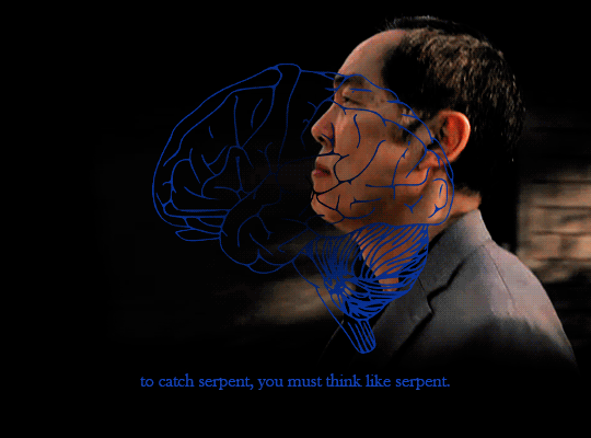


this is what we have that cobra kai does not. their movement mile wide, but only inch deep. but, our movement, inch wide, but mile deep.
#cobra kai#cobrakaiedit#daniel larusso#johnny lawrence#chozen toguchi#s.gif#gifsets that kicked my ass. physically.#coloring took foreverrrr composition took foreverrrrr everything took foreverrrrrr#but head/heart/hands dynamics drive me insane.#its about being part of a whole its about being better together#HHHHHHHHHHHHHHH johnny as the hands the shield the fist. not much upstairs but boy can he take a punch. the tip of the spear.#chozen as the brains. not discounting his brawn but he's quick he's clever he doesn't attack in any way you expect.#daniel as the heart and soul. the corazon. if we're going to have a revolution we need him to lead it.#its not about being the best or strongest its about not giving up its about letting yourself lean on others when you need to#making me. lose it.
253 notes
·
View notes
Last Seen Blogs

chaoticdelinqueerwithglitter
Chaos & Glitter
ashromedaera
Ashromeda_V4🍉

colours-of-feelings
Colours Of Feelings

edenville
wish, wish !
anaharae-s
Anaharae