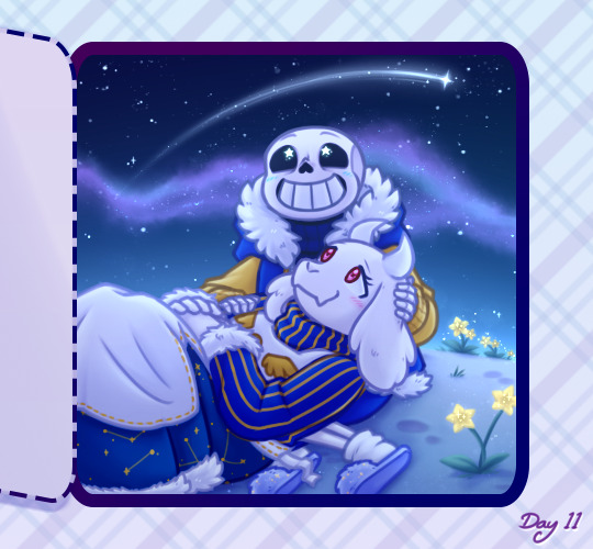
#and yes that is the default photoshop text but you know what i liked it
Text


LONG LIVE | TAYLOR SWIFT
Mike Wheeler & Will Byers
#only my third gifset ever#and yes that is the default photoshop text but you know what i liked it#didnt even try the other fonts this was good enough for me#byler#stranger things#mike wheeler#will byers#taylor swift#my gifs#strangerthingsedit#st#st byler
401 notes
·
View notes
Note
hi bibs this is such a lovely set. can i please know how you did the curve style on the happy birthday text on the first gif? thank you! /694162421189869568
hi anon!!! first of all, thank you so much!
and yes, of course!! fyi, i use photoshop 2020, so i’m sorry if other version are different hehe (also my photoshop is in portuguese, but the orders are always the same if i can’t find the appropriate english term). i’m gonna put this all under the cut for it be easier to access!! if you don’t understand something, please let me know and i’ll try to explain again (i have never done something like this before so asdkjasda)
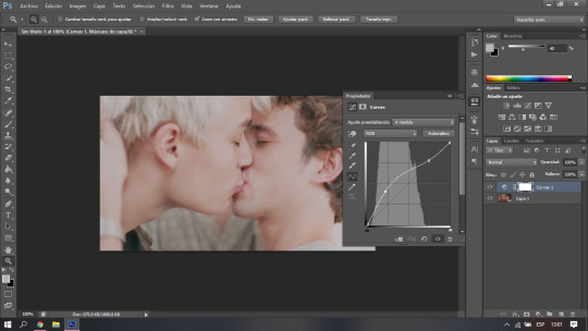
for the curve style on the text what i did was select the text box and wrote what i wanted, was you would normally and then after i did that i clicked this one little box in the upper right corner, with a T and a curved line under it, the one in the image below:

you have to have your text layer selected for that to show up (like, you can selected all your text or just double click on the “T” that shows in the layers, as if you’re still writing, i don’t know if i made it clear hehe)
when you click on this icon, this will open up (wrap text window):
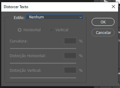
when you do that, styles is gonna be “None” as default, but then you click there and the other options will show up:
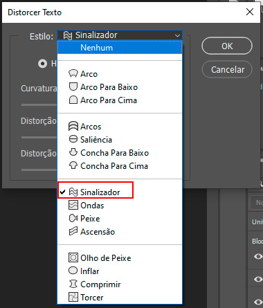
(in english the order is: arc / arc lower, arc upper / arch / bulge / shell lower / shell upper / flag / wave / fish / rise / fisheye / inflate / squeeze / twist). I used for the gif in question the Flag option, the one in red in the picture (you can go by the little icon hehe).
and once you do select your option between these, it will open this window:

i chose to use the defaut option because it was what suited best for this particular gif, but you can play around with curves (first option), and horizontal and vertical distortion and see how they fit you best! then just click ok and it’s all done!!
0 notes
Text
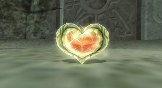
So, as some of you might know, one of my GIFs was recently featured on the Tumblr Radar - which is pretty cool! I was fairly happy with how that one turned out, especially considering that I made it rather last-minute on a whim to acknowledge Valentine’s Day. It understandably received a lot of attention as a result of this, and I’ve loved reading through all the comments and tags (especially all the ones about how people want to eat the heart containers from TP); however, I wanted to clear up a bit of a misunderstanding surrounding the creation of that GIF, as there were additionally a lot of tags along the lines of #3d art or #artists on tumblr in that influx of reblogs. I don’t want to take credit for something I didn’t do, even accidentally, and so allow me to be perfectly clear: the heart container GIF is not something I modeled and rendered myself! It is the original in-game model, recorded in-game using the Dolphin GCN/Wii emulator, with very little done in the way of post-processing in Photoshop. If that sounds impossible or confusing (which is perfectly understandable, for those of you unaware of what Dolphin is capable of), I’d like to take this opportunity to give you guys a bit of a “peek behind the curtain,” as it were, to show you guys exactly how I made that particular GIF, as well as similar ones I’ve made (such as those in my #items tag).
I didn’t take screenshots of my initial process (nor did I save the edited textures I used), so I’ll be recreating it from the ground up for the sake of demonstration, but that shouldn’t be a problem.
First thing’s first: finding a heart container! For this particular GIF, I wound up using the one that spawns after the Morpheel fight at the end of Lakebed Temple. I’m sure many others would work just as well (I think, at the time, this one just happened to be the most accessible to me), but let’s use the same one for the sake of it.
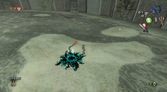
Morpheel: defeated. And I didn’t even need Zora Armor! (Seriously, we do that in the speedrun. But I’m getting off-topic.) Of course, we’re going to need clean, close-up footage of the heart container rotating in order to do what we want to do, so let’s shift into first-person mode and and get a bit closer to the thing.
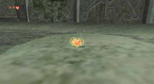
Now, because the only UI-element in this shot is Link’s health (and it’s in the corner and relatively non-obtrusive), removing it isn’t strictly necessary - but I’ve already made a texture pack that removes UI elements as part of my Text Free TP project from a while back, so let’s load it anyway, for the sake of being thorough. This shot is also still a bit too far away, so next we’ll be utilizing Dolphin’s free cam feature (which can be accessed by going to Graphics > Advanced > Free Look and checking “Enable” in Dolphin) in order to get the heart container in a more central position. Now we’re left with this:
And we’re already looking well on our way to making a nice, solid color background GIF. But how do we get the solid color? Well, that’s where more texture editing comes into play - and here I have to give credit where credit is due, as this is a trick I picked up from 186px, after wondering how they were able to make this GIFset of Link fighting Ganondorf in The Wind Waker in a great, black void. (Seriously, shoutouts to them, their stuff was and still is amazing.)
But, very basically, we’ll be using Dolphin’s texture dump feature in order to find the textures that need to be edited so we can replace them with pure black ones. Texture dumping can be enabled by going to Graphics > Advanced > Utility and checking “Dump Textures,” and the file path for these dumped textures by default is Documents > Dolphin Emulator > Dump > Textures > [Game ID]. (In the case of Twilight Princess, the Game ID is GZ2E01). After dumping the textures in the Morpheel arena, my GZ2E01 folder looks like this:
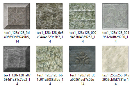
When editing textures, sometimes you’ll have to endure a bit of trial and error until you find the correct ones. Luckily, in this scene, the textures making up the sand floor and the stone walls are rather large, so let’s isolate the ones we’re pretty sure are responsible (plus a few others that are obviously environmental, just to be safe).
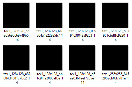
Now, when loading custom textures, it’s important that the file name you’re trying to load matches up exactly with the original texture that you’re trying to replace. I have a plain, black, square PNG that I keep on my desktop specifically for this purpose; I copy the file names of the textures I’ve isolated, then rename and drag and drop the black PNG into the folder where custom textures are loaded (Documents > Dolphin Emulator > Load > Textures > [Game ID]). Like so:
And now, to refresh our custom textures by disabling and reenabling them in Dolphin’s graphics settings:
And voilà! We have something that very nearly resembles the GIF I made (well, a still of it, at least). I skipped over a few details, such as the fact that TP has a pretty significant amount of bloom surrounding just about everything, which I’m fairly certain I disabled using cheat codes when I made the original GIF in order to give it an overall cleaner look. It’s hard to tell from this still, but TP’s heart containers also sparkle considerably in a way that’s random and not loopable; I found the texture responsible for this sparkle and replaced it with a transparent 1x1 PNG, in order to remove it entirely (as well as the texture behind the “glow” of the thing). After that, it was as simple as recording the game with OBS, dumping the MP4 into Photoshop, cropping and cutting it to make it loop, and adding some adjustment layers for contrast and color. So...yeah!
I hope this has served to clear up any confusion about some of the things that I’ve made in the past. I’m not a 3D artist - just a person with an emulator and way too much free time on their hands. This stuff is really, super simple, and also lots of fun, so I would highly encourage anyone with the means to mess around with emulation on their own some time to see what they can do! (Even if you don’t have Photoshop and can’t make GIFs, there are always edits, such as this one I made of Midna.) For Twilight Princess in particular, I also highly recommend checking out TPGZ; it’s a patch you can apply to a clean ISO of the original game, designed with the purposes of helping folks learn and practice the speedruns (yes, I had to bring up speedrunning one last time, kill me), but it’s got nifty features like built-in savestates, cheat codes, and HUD removal, as well as the ability to freeze actors while maintaining the ability to move the camera freely, among other things (all things that are very useful as far as making unique graphics go). Sorry this post got as long as it did, but I at the very least hope that some of you found it educational and/or interesting. Cheers!
#uhhhhh i don't even know how to tag this#not like it will show up in the tags anyway because i've linked five billion things#twilight princess#long post#tutorials#i guess????#resources#myposts*#i didn't intend for this to be a tutorial i just wanted to explain that i'm not a 3d artist lmfao#OTL
72 notes
·
View notes
Text
Patch Notes
PC: 1.73.48.1030 / Mac: 1.73.48.1230
Console: Version 1.40
Heya Simmers!
Today we bring you a small but neat update, we hope you all enjoy it!
We also hope you are all well wherever you are in the World, and thanks again for all your continued support and feedback.
Chaucitos - Dag Dag!
-SimGuruRusskii
What’s New?
In Create A Sim, we have updated two hairstyles and have converted them to be used with Children and Toddler Sims as well.
First, we have the beautiful pfHair_EF30TightCurls, cfHair_EF30TightCurls, and yfHair_EF30TightCurls as pictured below, including how it would look like if worn on a Male Frame pictured as ymHair_EF30TightCurls.


Then we have pictured below, including how it would look like if worn on a Female Frame pictured as yfHair_ShortTextured.

This author would like to apologize for her terrible photoshop skills in putting these together side by side. Very sorry… much photoshop! Getting better!
Now onto the fixes...
Bug Fixes
Sims 4
Fixed an issue in which in the Gallery Preview pop-ups, Build Mode objects will now appear properly under the “Show Used Items” panel. Accuracy is the best policy… in this case.
We made some edits to some Career and School-related tooltips so they are consistent and clearer for Simmers.
The book cradleObject_GENBook is no longer visible to Simmers, it wasn't meant to be... it wasn't a pretty book. We didn't like doing it!
Some DEBUG pie menu options including some from Discover University and Snowy Escape were translated. We didn’t translate these, well since ever… as they were DEBUG and only accessible with a specific cheat, but we are working on them as we go now. Thanks for your reports and patience!
We discovered that Sims were becoming uncomfortable when Gathering Water… we didn’t really understand why, so we decided to have them not be uncomfortable. Let them feel how they want to feel, I say.
Ghost Sims will now appear as Ghosts in CAS. There were moments that they made us take a second look there, but nope, they are Ghosts and Ghosts they shall display as. I think I saw this as a plot for a movie… Ghosts… a machine, a dance… ANYWAY.
As always this editor and the Localization team made some adjustments and perfected some of the text in-game across all packs and previous updates. #getit
Get Together
Social Panel will no longer default to the incorrect tab. What tab was I on? Now I will always know.
City Living
Vegetarian Sims will no longer mistakenly eat non-vegetarian leftovers from the refrigerator. Not funny guys!
Fixed an issue that didn’t let the DigiRAD Keyboard make a sound when choosing Keyboard Auto Play.
Cats and Dogs
Listen, I think every species - well everyone, has the right to find love. But we did have to fix an issue with Female Cats going into Heat despite being Spayed. Even so, I hope my lovely Spayed Female Felines will still find love out there.
Seasons
Oh the rain, such a poetic moment from nature. Sitting cozied up with a blanket and a cup of coffee watching the world go by with the melodious sound of the raindrops falling lightly on the ground… wait… is that a Sim showering outside? Yes indeed! Showering in the Rain is possible in Light Rain conditions.
Fish Dinner will now be counted for completing Grand Meal Holiday Events.
Similarly, Shower in the Rain has been fixed for Simmers who have installed Eco Lifestyle, making the most of every resource available!
All soaps used are biodegradable - we promise!
Snowy Escape
Create A Sim asset yfBody_EP10CoatDenim will no longer create an issue with all knee-high boots. Though those boots were made for walking, the dress needs to look fabulous too. My opinion, allegedly.
Child Sims will no longer get the Unblessed sentiment after getting Blessed at the Youth Festival. Children should only get the Unblessed sentiment if they ask Yamachan about a Voidcritter Hunt and also avoid getting the Blessing of Youth from an Adult Sim as well. #Blessed
Extreme Sports enthusiasts will now be able to complete High-Intensity Skiing or Snowboarding on Intermediate or Expert Slopes. Good luck!
Recipes from this pack will now appear when unlocking Gourmet Cooking Skill Levels. Particularly Levels 3 and 5. Yum.
Sims will no longer freeze when performing interactions from a computer in Mt. Komorebi, specifically 2-4-2 Wakabamori. I think I saw this in a movie once… but… had a less “happy ending.
Discover University
Fixed an issue in which the icon for the trait Mental Magister appeared to be a Placeholder icon. Or was it?
Progressing in the Law Career will now unlock Promotions appropriately. Keep up the good work!
Eco Lifestyle
Fixed an issue in which the icon for the Making with a Mentor Moodlet was not showing the correct icon.
Eco Lifestyle-specific Traits are now added to the Clubs choices if Simmers have Get Together installed.
Collecting Beetle Nuggets will now be possible when Beetles are ready. Bon Appetit.
Outdoor Retreat
Veggie Dogs and Hot Dogs will be able to be roasted in Campfires once again. Iconic.
Vampires
Is your Vampire Sim tired of drinking the same old regular Plasma? Are they drinking it to the point that they can no longer tell if it is Plasma anymore? Ugh, such a hard diet, right? I can relate…ahem... Vampire Sims will now enjoy a more varied diet of Fish, Frog, and yes… Regular Plasma when left to their own devices.
Tiny Living
Tiny Homes will no longer magically get clean and have Dust Bunnies disappear (if Simmers own Bust the Dust) when Sims travel or Simmers reload the game. Man, I wish my apartment would magically get clean like that though.
Nifty Knitting
Fixed an issue in which the expiration timer for items listed on Plopsy was not appearing.
Paranormal
Haunted House Residential Lots will now enjoy the presence of Dust Bunnies and Fiends if Simmers also have Bust the Dust. Dust Bunny goes Boooooo.
Bust the Dust
Your Sims had a lot of things to do today, but you know what they did instead? They Vacuumed the Lot. It was a really good clean. Cooking? Vacuumed the Lot. That Gig? Vacuumed the Lot. What about those push ups? Vacuumed the Lot. Reading? Vacuumed the Lot. Looking at this bug? We made time for that. The end of this bug? Released with this Patch. Sims will no longer randomly drop their queued tasks for Vacuuming.
177 notes
·
View notes
Photo


The Sims 4: New Game Patch (April 27th, 2021)
There’s a new Sims 4 update available for PC/Mac and Consoles.

PC: 1.73.48.1030 / Mac: 1.73.48.1230 / Console: Version: Console: Version 1.40.
Remove all MODS and Custom Content before updating your game
Heya Simmers!
Today we bring you a small but neat update, we hope you all enjoy it!
We also hope you are all well wherever you are in the World, and thanks again for all your continued support and feedback.
Chaucitos – Dag Dag!
-SimGuruRusskii
What’s New?
In Create A Sim, we have updated two hairstyles and have converted them to be used with Children and Toddler Sims as well.
First, we have the beautiful pfHair_EF30TightCurls, cfHair_EF30TightCurls, and yfHair_EF30TightCurls as pictured below, including how it would look like if worn on a Male Frame pictured as ymHair_EF30TightCurls.
Then we have pictured below, including how it would look like if worn on a Female Frame pictured as yfHair_ShortTextured.
This author would like to apologize for her terrible photoshop skills in putting these together side by side. Very sorry… much photoshop! Getting better!
Now onto the fixes…
Bug Fixes
Sims 4
Fixed an issue in which in the Gallery Preview pop-ups, Build Mode objects will now appear properly under the “Show Used Items” panel. Accuracy is the best policy… in this case.
We made some edits to some Career and School-related tooltips so they are consistent and clearer for Simmers.
The book cradleObject_GENBook is no longer visible to Simmers, it wasn’t meant to be… it wasn’t a pretty book. We didn’t like doing it!
Some DEBUG pie menu options including some from Discover University and Snowy Escape were translated. We didn’t translate these, well since ever… as they were DEBUG and only accessible with a specific cheat, but we are working on them as we go now. Thanks for your reports and patience!
We discovered that Sims were becoming uncomfortable when Gathering Water… we didn’t really understand why, so we decided to have them not be uncomfortable. Let them feel how they want to feel, I say.
Ghost Sims will now appear as Ghosts in CAS. There were moments that they made us take a second look there, but nope, they are Ghosts and Ghosts they shall display as. I think I saw this as a plot for a movie… Ghosts… a machine, a dance… ANYWAY.
As always this editor and the Localization team made some adjustments and perfected some of the text in-game across all packs and previous updates. #getit
Get Together
Social Panel will no longer default to the incorrect tab. What tab was I on? Now I will always know.
City Living
Vegetarian Sims will no longer mistakenly eat non-vegetarian leftovers from the refrigerator. Not funny guys!
Fixed an issue that didn’t let the DigiRAD Keyboard make a sound when choosing Keyboard Auto Play.
Cats and Dogs
Listen, I think every species – well everyone, has the right to find love. But we did have to fix an issue with Female Cats going into Heat despite being Spayed. Even so, I hope my lovely Spayed Female Felines will still find love out there.
Seasons
Oh the rain, such a poetic moment from nature. Sitting cozied up with a blanket and a cup of coffee watching the world go by with the melodious sound of the raindrops falling lightly on the ground… wait… is that a Sim showering outside? Yes indeed! Showering in the Rain is possible in Light Rain conditions.
Fish Dinner will now be counted for completing Grand Meal Holiday Events.
Similarly, Shower in the Rain has been fixed for Simmers who have installed Eco Lifestyle, making the most of every resource available!
All soaps used are biodegradable – we promise!
Snowy Escape
Create A Sim asset yfBody_EP10CoatDenim will no longer create an issue with all knee-high boots. Though those boots were made for walking, the dress needs to look fabulous too. My opinion, allegedly.
Child Sims will no longer get the Unblessed sentiment after getting Blessed at the Youth Festival. Children should only get the Unblessed sentiment if they ask Yamachan about a Voidcritter Hunt and also avoid getting the Blessing of Youth from an Adult Sim as well. #Blessed
Extreme Sports enthusiasts will now be able to complete High-Intensity Skiing or Snowboarding on Intermediate or Expert Slopes. Good luck!
Recipes from this pack will now appear when unlocking Gourmet Cooking Skill Levels. Particularly Levels 3 and 5. Yum.
Sims will no longer freeze when performing interactions from a computer in Mt. Komorebi, specifically 2-4-2 Wakabamori. I think I saw this in a movie once… but… had a less “happy ending.
Discover University
Fixed an issue in which the icon for the trait Mental Magister appeared to be a Placeholder icon. Or was it?
Progressing in the Law Career will now unlock Promotions appropriately. Keep up the good work!
Eco Lifestyle
Fixed an issue in which the icon for the Making with a Mentor Moodlet was not showing the correct icon.
Eco Lifestyle-specific Traits are now added to the Clubs choices if Simmers have Get Together installed.
Collecting Beetle Nuggets will now be possible when Beetles are ready. Bon Appetit.
Outdoor Retreat
Veggie Dogs and Hot Dogs will be able to be roasted in Campfires once again. Iconic.
Vampires
Is your Vampire Sim tired of drinking the same old regular Plasma? Are they drinking it to the point that they can no longer tell if it is Plasma anymore? Ugh, such a hard diet, right? I can relate…ahem… Vampire Sims will now enjoy a more varied diet of Fish, Frog, and yes… Regular Plasma when left to their own devices.
Tiny Living
Tiny Homes will no longer magically get clean and have Dust Bunnies disappear (if Simmers own Bust the Dust) when Sims travel or Simmers reload the game. Man, I wish my apartment would magically get clean like that though.
Nifty Knitting
Fixed an issue in which the expiration timer for items listed on Plopsy was not appearing.
Paranormal
Haunted House Residential Lots will now enjoy the presence of Dust Bunnies and Fiends if Simmers also have Bust the Dust. Dust Bunny goes Boooooo.
Bust the Dust
Your Sims had a lot of things to do today, but you know what they did instead? They Vacuumed the Lot. It was a really good clean. Cooking? Vacuumed the Lot. That Gig? Vacuumed the Lot. What about those push ups? Vacuumed the Lot. Reading? Vacuumed the Lot. Looking at this bug? We made time for that. The end of this bug? Released with this Patch. Sims will no longer randomly drop their queued tasks for Vacuuming.
21 notes
·
View notes
Text
TS2 Tattoo Tutorial!
I thought I’d make a tutorial on creating a tattooed skin! I believe you can use any editing program for this since it’s fairly simple. I’ve never done a tutorial so please bear with me! It’s text & picture heavy so under the cut it all goes! I learned the basics years ago from this video and another one my friend had made but has since been deleted. I had to learn about tricky placement of tattoos on my own and hopefully I’ll be able to show a teeny bit more of that as well soon if you’d like! I know my writing is not the best and it can come off confusing, if there’s something that‘s difficult to get please send me an ask or message!
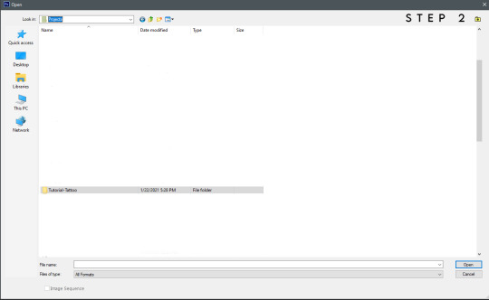
Step One: Open body-shop and create a new project. Select the skin you'll be using. Pick a name that will make it easy to find. I named mine "Tutorial-Tattoo".
Step Two: Open your editing program (I’m using Photoshop), find your projects folder within the EA folder, and open the folder of your skin.
Step Three/Guide: You'll find all the skin's textures in that folder. It might be a little confusing but it isn't once you know the names! In the case you're new to body-shop, I'll break down what these files are (if I'm mistaken or anyone has a link to a better explanation, please lmk).
Teen through elder have three body textures, "cut" is when your sim is fit, "normal" is their default body, and "soft" is when your sim is fat. (I'll show how to give the different body-types the same tattoo later on!) For adding a tattoo we won't be focusing on the face or hair textures. (You can create face tattoo's though, maybe I'll get to that in the future!)
I've boxed out the groups, the red is adult female (AF), the blue is adult male (AM), the gray is infant (BFM), the black is child (CFM), the yellow is elder female (EF), the pink is elder male (EM), the orange is toddler (PFM), the purple is teen female (TF), and the green is teen male (TM).
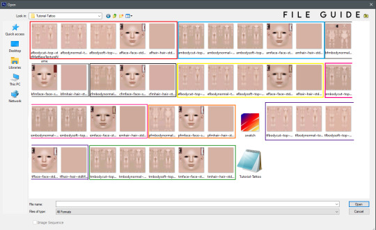
Now you can pick whichever you'd like! I'll be using the adult male skin, so open it up in your editor.
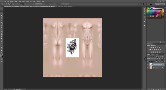
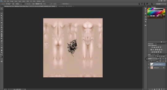
Step Four: Place the image you'd like as your tattoo onto your opened skin texture. Find the blending mode option and change it to multiply instead of normal. This will remove your white background.
Tip: The easiest images to use have white or transparent backgrounds. If there's texture (like it's straight from paper) you can edit the image to erase some of it or make the background brighter, then the multiply option will remove most/all of the background for you.
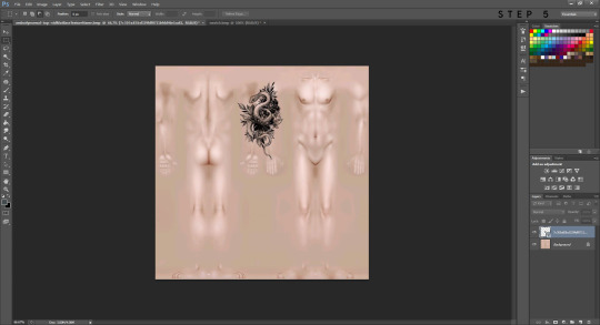
Step Five: Now you can mess around with the tattoo image and find a place you'd like it. Have fun with it, resize it, warp it, etc. do whatever suits your fancy!
Placement can be tricky and you may need to try multiple times until you're happy with it. If you want a tattoo to wrap around their arm or leg it will take a little bit more effort. For this tutorial I placed the tattoo over both sides of his right arm and this will make it wrap around it! If you want more tips on how to do tricky placements like this let me know! You can message me or I could try to make another tutorial. I’m not super great at them but I can do my best to help!
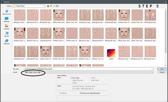
Now you can save it in order to see it in body-shop. This part is crucial, you need to save as a bmp file, or it will not work. It should ask if you'd like to replace the current file so click yes (all this is doing is overwriting the blank texture it was before). Go back to body-shop and refresh, your new skin should show up! If you aren't happy with how it looks, you can go back to your editor and mess around with it until you are! Once you're satisfied move on to the next step, or step seven.
Step Six (Optional): If you want your tattoo to be on another age, gender, or body type this is what you'll do. I chose to add it onto the elder male, so you'll open a new file and choose that texture. Switch back to your adult male texture, right click the tattoo and copy that layer. You'll then want to right click the copied image and duplicate it to send to your elder male texture. It may need a slight tweak depending on the placement if the body is smaller/bigger, but nothing major! This way it will appear in the same exact place for the different ages, genders, and body types and you'll only have to save it instead of start from scratch.
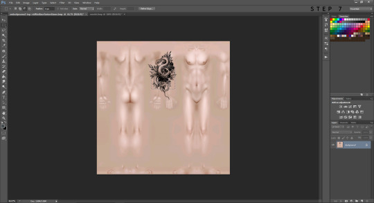
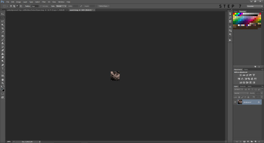
Step Seven: If your skin is ready to go then you can give it a custom swatch. Open a new file and choose the swatch texture. Flatten your tattoo with the skin layer, select a portion you'd like to see as the thumbnail, and make a copy of it. Duplicate that copied selection and send it to your swatch texture. You can move it around until it fills up the space, save it as a bmp and done! Refresh your body-shop once more and your custom thumbnail should appear. You can give your skin a name and import it into your game. All done!

I hope this was helpful and not the most confusing thing on Earth! Thank you for reading!
#ts2 tutorial#ts2 tattoo#ts2 tattoo tutorial#ts2 skin#the sims 2#ts2#simblr#sims 2 tutorial#the sims 2 tutorial
50 notes
·
View notes
Note
How do you layer gifs? Or am I just dumb?
Hey there. It’s not dumb, lovely anon, it is a bit tricky and I only learned it last year myself. I guess the method for layering gifs really depends on the general gif making method you are using. I’m gonna try to explain the way I’m doing it and I hope it makes sense to you.
Unfortunately I can’t find an earlier ask where I explained my general gif making method anymore but here it is very quickly:
Step 1: screen record scene I want to gif
Step 2: use KMPlayer to extract frames
Step 3: load frames into Image Ready where they will be automatically animated (then “reduce frames to layers”)
Step 4: import frames from Image Ready to Photoshop CS2 (yes, that’s an ancient PS version but it’s freeware and I’m used to it so I’m fine making gifs like a medieval peasant.)
Step 5: crop, sharpen, colour, add text
Step 6: “save for web”
So with this as a basic explanation of my gif making process, I can get into how I layer them. [Disclaimer: My Photoshop is set to German and I don’t always know how the functions are called in English but it should be something similar and at least in the same place, regardless of the language your Photoshop is set to. Also I think this should work similarly for newer PS versions as well.]
prep work: I have two gifs with the exact same number of frames readily imported to Photoshop, they are already sharpened and maybe cropped but that’s it (so basically steps 1-4 and some of 5)
Step A: choose the gif that you want to put on top ➞ select frame 1 and layer 1 ➞ click that little triangle in the animation window ➞ click “select all frames” (in my case I want to put Liz on top of Red because that’s just the kind of person that I am, you know?)
Step B: select “copy all frames”
here is a screenshot of where to find that:

and a close up:
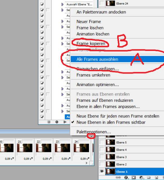
Step C: go to the bottom gif (=Red) and repeat step A (frame 1, layer 1 ➞ little triangle ➞ select all frames) ➞ click on what’s called “Frames einfügen” in German (should be ”paste frames” or “add frames” or something like that in English)
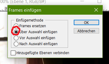
Step D: a little window should pop up ➞ select... well... whatever the second option is called in your Photoshop’s language. It means to paste the frames over/above the selected ones (as opposed to adding them before or after).
If you’ve done that correctly you should now have the same number of frames as before (29 in my case) in the animation window but twice as many layers (so 58 for me) in your layers window - note that this process gives you two sets of layers that are called “layer 1″, “layer 2″,...., “layer 29″. One set would be all of the bottom gif’s (Red’s) layers, the other one all of the top gif’s (Liz’s) layers. It is important for the next steps that you do not get these confused so make sure your layers window shows you the little preview images.
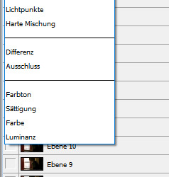
In order to make Liz semi-transparent I have unfortunately not found a more effective method than to go manually through every single layer and frame and change the layer style to “reverse multiply” or something else that makes the bottom gif “shine through”. I do this as follows.
Step E: Select frame 1 and layer 1 (of the top gif/Liz’s frames!!!) ➞ click on the “layer style” drop-down-menu (it should be set to “normal” as default ➞ choose a layer style you like. And here comes the tedious part: Repeat for every layer/frame of the top gif (= select frame 2, layer 2, change style / select frame 3, layer 3, change style / ....). I circled the styles that I usually find work best. “Umgekehrt multiplizieren”/”reverse multiply” is my fav but sometimes one of the other three in that category look better depending on the specific colours so just try it out for one frame and then settle for the one you like best.
After doing that for all frames the gif I made looks like this:

if you like you could leave it at that. but I want to move Liz a little further to the left so here comes...
Step F: I select all frames (see step A) and all of the top gif layers and then use the moving arrow tool (or the arrow keys if you prefer those) in order to drag all layers over to make it look like that:

but now I don’t like that sharp line across Red’s face sooooo
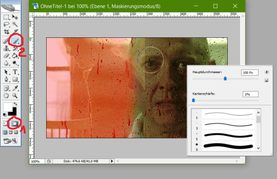
Step G: now I go in and delete some pixels in the Liz gif with a soft edge so it blends better. I do this using the masked mode (no. 1 below) first to select the pixels I want to delete (no. 2 below), then leaving the masked mode and deleting manually, again going like this: frame 1, layer 1, delete / frame 2, layer 2, delete /... [alternatively you can do this step BEFORE step A (and be clever and write an Action for that to save you from getting carpal tunnel syndrome from all the damn mouse-clicking) but then you really gotta be sure which parts you want to delete beforehand or else you’re fucked]
After doing that the gif looks like this:
see? Much softer edge! All that’s left to do now is colouring the hell out of it and you’re good to go! I hope this makes sense for you and works with your gif making method. Again, it is a bit tricky and you have to use your brain a little more than for usual gif-making to make sure you get the order of steps right and also kinda have to plan the placement of the two gifs beforehand. Also, not every scenes work together. Sometimes it just looks weird or the vibes and colours don’t go together. But when it does work out it looks damn amazing and you’ll feel very accomplished!
#Photoshop CS2#gif making#gif tutorial#gif making tutorial#Photoshop tutorial#about me#hey there gif making tags#may I offer you some James Spader in these trying times?#Anonymous#long post
50 notes
·
View notes
Text
Fandom Snowflake Challenge #12

Introduction Post* Meet the Mods Post * Master Post * Challenge #1 * Challenge #2 * Challenge #3 * Challenge #4 * Challenge #5 * Challenge #6 * Challenge #7 * Challenge #8 * Challenge #9 * Challenge #10 * Challenge #11
Remember that there is no official deadline, so feel free to join in at any time, or go back and do challenges you've missed.
Remember the early oughts? Remember Web 1.0? And Geocities and blinkies? What about Flash games? It was only last month that Adobe Flash finally died its ignoble death.
In the spirit of those times, let resurrect some old LJ memes! (Think Buzzfeed quizzes but with less data mining (not to say that didn't happen)).
When I looked at my tags page, there were 159 entries tagged ‘meme’ which I guess is because memes were what I used to say when I didn’t know what to say. In the early oughts, I wasn’t new to the internet, but I was new to the interactive version of it presented by LJ and its clones. In order to seem interesting, I did a *lot* of memes.
As I explored back in my journal, I found a lot of memes that are now defunct, but I wish were still functioning. Like the Friends Icons collage, which seemed to be a bit of code that gathered all your friends’ default icons into one picture. And Quizilla seems to be a Teen Nick site now. Other links looked extremely sketchy.
Challenge #12
In your own space, resurrect an old meme. Leave a comment in today’s post at The Fandom Snowflake Challenge on DW saying you did it. Include a link to your post if you feel comfortable doing so.
The challenge: look at the list of old memes below (I’ve checked all the links to be sure the ones below are still functioning). Pick out one that appeals to you, follow the instructions, post in your journal, and then come back here and share! Make sure to tell us which one you did.
Here Are Some Choices:
Desktop/Wallpaper screen shot - take a screen shot of the background (desktop for computers or wallpaper for mobile devices) on whatever device you are using. This one was originally just desktops, since it predates tablets and phones becoming so ubiquitous. Post the pic in your journal.
I Write Like . . . - Paste a few paragraphs of your writing into the box and see which famous author has a style most similar to you. It doesn’t have to be actual fic writing; you can post your latest blog post, but the longer, the better the tool works. Although don’t go too long; it will just cut it off. It will generate a little bit of code with a banner, which you can post in your journal.
Music shuffle - go to your favorite source of music that can be shuffled. Your main Spotify playlist, iTunes, your YouTube music playlist. Hit shuffle. Write down the first line of the first twenty songs that come up. When people visit your journal, they have to guess what the songs are. Strike through the ones that have been guessed with the guessers name at the end of the line.
What Number Are You? - click on the phrases that describe you, and then post the text that you get along with your number in your journal.
What Kind of Shoe Personality Do You Have? Anyone who knows me knows there’s no way I would pass this one up. I should get my shoe mood theme back on my journal.
Fail Cat - If you have a PC: Open paint, close your eyes, draw a cat. Post the results. If you have a phone or tablet: Open the notes app, close your eyes, draw a cat. Post the results. (I do not know what program you would use if you have a Mac without something else installed like Gimp or Photoshop, Macs do not seem to come with a default drawing program).
First Line - Post the first line of the first entry of each month for the past year in your journal.
The Dewey Decimal System - find out which category in the Dewey Decimal System you are.
Nearest Book - 1. Grab the nearest book; 2. Open the book to page 123; 3. Find the fifth sentence; 4. Post the text of the next 3 sentences on your LJ along with these instructions; 5. Don’t you dare dig for that "cool" or "intellectual" book in your closet! I know you were thinking about it! Just pick up whatever is closest.
Spell Your Name - pick a category: movies, books, TV shows, musicians, songs, etc. Spell your name with the first letter of each. Your real name, your username, you choose!
Kleenex Moment - Pick the top five movies that make you cry, and tell us what the Kleenex Moment is (when do you reliably reach for the hankies).
Which Historical Lunatic Where You? A series of yes or no questions, which will give you a block of text to copy/paste into your journal!
Which SciFi/Fantasy Character Are You? Gives you a pic to post in your journal.
If you have a fav meme from back in the day, by all means, post it in the comments with instructions and links so we can all participate!
Check out the comments for all the awesome participants of the challenge and visit their journals/challenge responses to comment on their posts and cheer them on.
And just as a reminder: this is a low pressure, fun challenge. If you aren't comfortable doing a particular challenge, then don't. We aren't keeping track of who does what.
(If you want us to reblog your response here at our Tumblr, we’re tracking: snowflakechallenge2021.)
2 notes
·
View notes
Note
Have you ever considered making a YouTube channel? I would love to see the process of making your art!
I do think it’d be nice to make speedpaints but I currently don’t have any kind of video recording or editing programs with which to make them, ahah… also I can’t imagine anyone wanting to watch a speedpaint without some music on said video, and there is the small issue of youtube and copyright and all the songs I like presumably being Very Copyrighted
so it’s not a possibility I’d write off forever, but I don’t know how I’d make it happen right now :’>
but if it’s my art process you’re interested in, I can at least go through that step-by-step with some screenshots!
step 1: draft! usually either a very tiny chibi or barely more than a stick figure, my art always starts like this so I can figure out the pose without spending like an hour on a full-sized sketch that doesn’t even work in the end

this then gets resized to whatever size I want the final picture to be:
drawing at that size usually means the anatomy is pretty wonky though, and the lines are too thick and blurry to be much help for the actual lineart. if a background is vital to the whole piece it’ll get drafted here too, but with space backgrounds like in this I can just fit it in around the characters. (that’s generally terrible art advice though, please do not do as I do :’D)
step 2: sketch! still very rough, but a lot easier to work with later. I do anatomy sketches as I go but there’s rarely any need to keep those layers
I don’t usually “colour” sketches like this but knowing I’d be sharing this I wanted to make it more readable, since this is still what I would consider an unpresentable mess not worth posting uvu;;
(also if I’m doodling, this part sorta gets skipped in favour of just letting the lines be a bit sketchier and rougher than usual)
step 3: lineart! literally the worst part always.
it’s worth it in the end, but… yeah this isn’t ever the point where I’m like “yes this is a Good Picture that I Will Be Happy With :)”
(I do lineart with SAI’s default pencil brush at a size of 3 to 5, opacity around 75%, if that’s of any interest)
step 4: flat colours! I have probably the slowest possible way of doing this, but after how tiring lineart is I find it pretty relaxing taking my time filling each colour in under the lines. every individual colour gets its own layer so they can all be shaded individually too
if I’ve drawn the same character in that same outfit before this is also where I’ll do the line colours, but those rely on being darker than the shading of each colour, so for a character or outfit I’ve not drawn before that can’t be done until after the shading. fortunately not the case here!
generally shading would be next, but there also comes a point where I have deal with the background now or I’ll be even more frustrated by it later, so - step ???: background! whether I do it lined or lineless pretty much just depends on if there’s any straight lines involved


…backgrounds are kinda too individual to explain in general, but for this specific one all the starry details are luminosity layers. stars are done with this brush but I do quite a bit of erasing and hand-drawing stars too, and I use SAI’s default brush set to spread for galaxies
step 5: shading! aka the best part, the point where I go “oh hey this looks decent actually. when did that happen”
my usual shading style is every colour gets 2 darker shades and 1 lighter shade, each shade getting its own clipping layer attached to each colour. this was more obvious when I used to cel shade but soft shading makes my art look so much better ahah
step 6: layer effects! multiply and luminosity layers have been my go-to for the past 4 years, but I can’t believe I only realised how good overlay layers are in the last year and a half. they’re so good
here’s the specific effects being used here:
aaand step 7: final touches! usually consists of any glowy outlines, text or things that need blurring in photoshop, a final luminosity layer at around 10 to 20% opacity for extra highlights (especially needed for dark scenes like this, those darker layer effects tend to make the regular highlights from the shading less vibrant), slap a watermark on there and call it done
and then you’re ready for step 8: spend an hour staring at every pixel for mistakes, before spending another hour fighting the anxiety about posting it
bonus: even though I can’t make a speedpaint I can throw all those screenshots into a poor quality gif for you to watch, at least!

one final thing I can mention: not including the draft and sketch layers or all the parts of the advent calendar windows, just the finished art itself - this is made up of 102 layers. and that’s with me merging a lot of layers because SAI has a layer limit and takes an eternity to save if there are too many. people who can draw a whole piece on a single layer confuse and frighten me
#anonymous#holoskart asks#holoskart rambles#honestly my art process is just a bunch of weird habits I wouldn't recommend imitating :'D but I hope this is interesting enough??#also sorry for taking a while to answer this! I probably could've used a piece I'd already finished to explain all this#but it seemed better to work on something with the intention of showing each part of it#long post //#wip
32 notes
·
View notes
Text
how to make a simple & fancy header and trick people into believing you have photoshop skills
aka photoshop for dummies
warning: this is so fucking long idek
a lot of people have been coming into my inbox and dms asking me about my headers-- and while i always take requests! (and still do!) i wanted to offer a tutorial because it’s SUPER easy to make. it legitimately only takes 10 minutes.
now take in mind, to any pro or expert reading this tutorial: my experience with photoshop is basically me fucking around with it since i’m 13. so please don’t be mad if i commit any photoshop crime.
i’m going to explain step by step and as basic as possible, i’m assuming whoever is planning to use this tutorial does not really know how to use photoshop; and in my opinion, in these things, the devil is in the details! very minor easy things that become an habit quite fast make the difference between a shitty header and a good one.
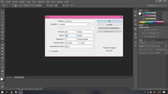
1. first of all, the version i use is photoshop cs6. i wouldn’t know to tell you if some particular things in this tutorial can be done in another versions: i’d say probably yes, definitely in latest versions, and older versions have most of this settings anyway. now what we’re going to do is open our photoshop and directly open a new project. there are other ways to do this but this is the easiest for me. we’re going to change the size of the canvas to 640 x 360, since it’s the recommended size tumblr gives us for mobile headers.
2. now most people would directly open the picture file and resize the canvas, i personally just think this is easier. what i do next is to go get my picture, and simply copy and paste it in photoshop. in this case, i’m going to use robbe and sander from wtfock. you’re going to notice that naturally your picture is wayyy bigger than the canvas, but don’t worry, the whole picture is still there. you’re just going to click the arrow button, the first one in the left toolbar. make sure the layer of the picture you just pasted is selected, and then you’re going to press ctrl + t. after that, you just have to resize it, make sure to hold down shift while making it smaller or bigger, that way it wont lose the aspect ratio. after you have the picture where and how you want it, just press enter. (the canvas is very zoomed out because the og picture was really big, but dont pay attention to that)

3. now this is where you just get to play until it looks fancy and you trick people into thinking you’re like a top notch tumblr edits blog. the first thing i’d tell you to take in mind is the placement of your icon in the actual header. make sure to position your picture so it doesn’t cover any important part of it (like, you know, their mouths in this case.) it’s something that you can just tell by eye so don’t go too far to test it either. you can add effects, filters, color it like a real photoshop expert would, whatever you want, but what i do here is simply to play with the ‘curves’ which change the lighting and make the picture look a lot better. (i told you, i’m a scammer) here’s where the tool is and there’s no secret to it. just move it around until you like how it looks. ctrl + z is your best friend. i personally like to go brighter to make it look softer, dreamy-like.
4. here it gets a LITTLE bit trickier if you don’t know how to use photoshop at all. you’re going to need to download torn paper brushes, you can find the ones i use here. you’re also gonna need a tutorial on how to install brushes, which you can easily find on google... there’s like, a thousand, i promise. you’re going to create a new layer by clicking the small little button in the bottom, next to the trash one. after you finally have your brushes ready to use and you have the tool already active, just choose the color you want for the header, take in mind this is the color you’re going to use as your background on tumblr, as well. here i’m going to go with plain white, but i’ll add an extra explanation for this later in case you don’t want white, because as you have seen so far, i love talking. the brush is going to look super big compared to your picture; don’t worry. you can either resize your brush, or simply resize the layer the same way we did with the picture earlier. it’s a lot of trial and error until it looks how you want. i personally like the paper to take as little space as possible, some people like it to have enough space to add text, it’s all about your personal preference.
in case instead of white you wanted, let’s say, pastel yellow, all you need to do is copy and paste the hex color later when choosing your background while customizing. for some reason, when you first do it, it doesn’t look the same, but i promise you when you save it does. if you actually do know a bit of photoshop and you’re asking yourself, “isn’t it easier to just make it a transparency?” the answer is yes, it is, but for some reason it doesn’t work. at least for me.
5. and finally, we get to the text. this again involves a lot of trial and error, and personal taste, playing around with the tools. there’s no right or wrong, but i’m going to tell you how i do it. i like to do a minimalistic / caligraphy font sort of contrast, which is pretty basic but it makes things look HELLA fancy for some reason that is unknown to me. so that’s all you do! click the text tool, and write what you want. i recommend you use separate text layers for the different fonts, so you can play around with the placement instead of being set to the default spacing between lines. the fonts i’m using here are signatrust and telegraphic. i’m pretty sure the later is a default one, but you can find signatrust or any font you want on dafont. finally i just added a shadow, you can also add outline, glow, play around with any effects by right clicking the layer and choosing the first option in the menu. use the arrow tool to find where you want your text to go... i’m sure you got the gist at this point.
last but not least, don’t forget to save it as “png” when go to “save as”!
here’s our final result, which i beg of you to not use, since it was a request from my dear @driesen-demaury! i trust you can make your own now, or you can ask me to make one for you!

graphic design is my passion
( @asksander, here’s what i promised! )
#tumblr headers#headers#header tutorial#this is like the most pointless tutorial ever im sure but if it somehow helps#i feel like its like a tutorial on how to reset your computer like not to offend anyone i just feel like im making a big deal over nothing#djkhdhdkd
24 notes
·
View notes
Text
How I Make Story Mood Boards
Written by request!
First, here are some mood boards that I have made. I’m linking them so I can refer to them and give specific examples--I would advise having them open while you read.
Loud the Waves Roar | Winter Song | Yellow Rose | Tirsa
Before You Start
As soon as I start developing a story, I come up with a tag for it on tumblr. Sometimes it’s the name of the story, but if I don’t have a name, I call it “project—keyword.” That way I can save anything that might be relevant until I have enough of an idea about the story to start an aesthetic. Sometimes by the time I’m ready, there are some real gems there.
Finding images
This is really difficult and usually takes me a couple hours. I start by simply searching for anything that might be vaguely relevant to the story. For Yellow Rose, some of the terms I googled included: woman, 1930s film star, witch, witchcraft, dustbowl, storm, 1930s, cabin, gardening, farmer, field, vintage car, wolf, werewolf, guitar, musician, folk music, Bonnie & Clyde. Be creative with your terms, and scroll through a few pages of results.
Google tends to return a lot of stock photos, so I also use tumblr a lot, and should use pinterest more, but sometimes google image is good enough
Find actors who resemble your characters. Bonus points if the actors have been in movies set in a similar time period.
Remember that images can be cropped and filtered. If you only need a hands, try looking with terms like “gentleman” or “teacup” or “praying” or “shirt cuffs” or something that might have a hand doing something interesting in it.
Sometimes, finding the right image is a lot of work. The guitar image in Yellow Rose is one I found, cropped, and then put through like 6 Photoshop filters before I thought it looked sufficiently vintage (and I still don’t love it.)
Save everything you might use in a folder. You’ll be surprised what you end up keeping at the end. Each of the mood boards I linked has 25-30 images saved in the desktop folder.
Words (optional)
I like to put words on my aesthetics! For Yellow Rose, I took lyrics from a Laura Marling song. The album Semper Femina is basically the soundtrack for that story. I think for the Winter Song words, I searched “relationship” or “romance” on tumblr and scrolled until I found something I liked. I pick out words fairly early in the process because I need to know how much space they’ll take up.
While doing the layout, I also decide if the words should go over an existing image or on a solid colored background, which can take up space if you don’t have a lot of images, or put emphasis on the words if that’s what you want. That’s what I did in Tirsa’s mood board, since those words are so indicative of her journey.
Layout
I look at the images and pick out a couple that I know I have to have. That helps me decide how to arrange the other pieces, and then the other images usually get picked to fill in the gaps. You can see from my linked boards that I like playing with shapes.
There is nothing wrong with a standard set up! It’s non-distracting and lets you focus on the images instead.
Some classics are a 3x3 grid of square images or a 2x4 table of images that are wider than they are tall. Both are going to be automatically balanced and easy to read.
On tumblr, images placed side by side get automatically cropped into the same dimensions. This keeps things balanced along a vertical symmetry line (the same on the left and right). If you’re working in Canva, photoshop, or another photo processing app, you’ll have more options
Yellow Rose: For this I started with the concept of a 3x3 grid. The wolf and the herb pictures were square, and the photo of the girl was nearly square, so it made sense to crop everything else that way. Instead of doing a perfect grid, I decided to put the wide image in the middle because it really captured the feeling of the wide sky being swallowed up by dust clouds. It went in the middle to keep the top and bottom balanced. The top row is Florence, and the bottom row is Rosa, so each of the girls get the same amount of images.
Winter Song: Winter Song is primarily a romance, set against a political backdrop. I knew that Irina, as the POV character, had to be more prominent than Viktor in the layout, so I put her up top. I loved that image of Emmy Rossum and knew I had to have it, so I found two images with similar proportions to go on either side of it. This mood board also tells a story as it goes down. The top row is Irina as she arrives in St. Karlsburg. The words show the change in her life that catalyzes the story—meeting Viktor. Then there are two images to show the political unrest in the city. One is a riot of peasants and one is a marching army, but both show crowds in mirror images of each other. (It’s possible I flipped one of the images to create this effect). The bottom row shows her personal life—her writing, her lover, and the long conversations they have together over tea.
Cohesion
Now for all the fiddly bits that really make the post come together. To make it look like a single art piece and not some images pulled together from google, they need to look like they came from the same source. The first thing I do is crop the images super carefully. I do the cropping first because sometimes it turns out an image won’t fit in with the others once it is cropped.
I build my aesthetic posts directly in tumblr, which is kind of janky so I have to be careful. You don’t have to do this, but I like being able to click on each image and look at it separately.
Next is color. I think it’s important that every image have a similar color feel, or that certain images are intentionally bright for emphasis. I do this by playing with saturation sliders and filters in the default photo editing software on my PC.
Part of color cohesion should be in your mind from the beginning, so you pick images with lots of blues and greens (as in the case of Loud the Waves Roar) or something like that. It makes your life easier later.
Yellow Rose: Sometimes a color choice is genre motivated. Yellow Rose is entirely sepia toned because (1) it’s set during the dustbowl and (2) it’s a metaphor for Florence’s state of mind.
LTWR: Sometimes color is setting motivated. Loud the Waves Roar is much brighter than my usual mood boards, but medieval courts were just Like That, and also it is set in a country that is tied to the sea, and blues and greens help emphasize that.
Winter Song: Sometimes color is more symbolic. All of Winter Song is slightly desaturated because it’s set in a fantasy world based on the 1910s, but there is more variety. I desaturated the city street to make it sit right with the other two images in the top row—if it was too bright, it would draw the eye and look like the most important image. The pictures of the crowds are intentionally sepia toned to look like vintage photographs or newspaper clippings (Irina is a journalist). The bottom row, Viktor’s row, is more brightly colored both the draw the eye and to show that that is the main focus of the story.
Tirsa: Tirsa’s mood board is mostly reds (her hair/blood) and green (gives a botanical/medical feeling), so I desaturated the blue sky so as not to unbalance the rest of it.
I love mood boards that are mostly desaturated except for two images in similar color that create a balance and draw the eye. Not every image should be equally important, because that exhausts the eye. Pops of color, or text to break up the images, keeps the eye interested. There’s also some color theory that goes into this, as too many different colors can look garish or cluttered, so picking a couple complementary ones and desaturating the rest can be helpful. Go with what looks right.
Once everything is laid out, I try to walk away for a little bit and come back to it with fresh eyes. Do the pieces still fit together? Do the right images draw my eye? Do I understand the essence of the story? Do I like it?
If the answers to all these questions are yes, it’s time to post.
OH AND PLEASE CITE YOUR SOURCES!!!!
12 notes
·
View notes
Text
i’ve been seeing a lot of CC posts (especially HAIR) where it’s just ONE really nice, very edited preview of the CC.... but nothing of any other angles. Like... you should ALWAYS show the back of the hair, not just a zoomed in face preview. What’s going on back there? How long is it?? these are things people need to know before downloading. A+ effort for those who have 360 gif previews of their CC. this is over the top but you could at least show front/back and swatches
I also don’t like overedited CC previews because I want to know how it’s going to look in my game not after an hour in photoshop. i am going to be seeing your cc in the game without any visual modifications.
while i’m on the top of cc faux pas... please stop using custom thumbnails that are super busy, zoomed out, or have any sort of background. Let me see the damn cc in CAS or BB. I already have my UI scaling up higher than default, don’t make me pull out a magnifying glass to see your cc thumbnail. good thumbnails mimic how it is in game. no background, item in the middle of the frame, visible, no filters, etc. you can slap your url/logo on it on the bottom or corner in an unobtrusive but still visible way.
please understand that those with vision issues are begging for inclusivity every day. try to make things readable, easy to digest, and screen reader friendly (yes there are people who can see to play a game/images but have trouble reading text. no one owes you any explanation ever)
0 notes
Text
Default Image Editing Software Mac

Editing your photos on your iPhone is one thing, but editing your photos on your Mac can take your photography skills to a whole 'nother level.
Photography Editing Software For Mac
Pdf Editing Software For Mac
Default Image Editing Software Mac Reviews
Music Editing Software For Mac
Default Image Editing Software Mac Pro
Adobe Photoshop Photo, image, and design editing software 12-month Subscription with auto-renewal, billed monthly, PC/Mac by Adobe Platform: Mac OS Sierra 10.12, Windows 7. The downside of PhotoScape X is a lack of selection tools, so all changes are applied to the whole image rather than to a selected part. Gimp (Free) Gimp is a free open-source photo editing app that has been on the market for over 22 years and is available for Windows, Mac, and even Linux. Cinepaint is a good image editing software for MAC with a very simple interface. It provides a number of options to edit image on MAC. Different selection options are available, like: rectangular select, elliptical select, hand drawn region select, continuous regions, select using Bezier curves, and select shapes from image.
Wd my cloud for mac software. My Cloud; My Book; Internal Drives / SSDs; WD Elements / WD easystore; Embedded & Removable Flash. Western Digital SSD Dashboard. Software for Mac GoodSync for WD. Install WD Discovery for Mac. WD Drive Utilities for Mac. WD Security for Mac.
Many of us still keep our main libraries on our Macs because of its faster processors, larger storage, and all-around bigger computing power. The Mac is still the best device for serious photo editing, so you need some serious photo editing apps to make an impact.
The built-in Photos app on Mac offers several useful photo editing tools. You can crop, adjust lighting and color, set the white balance, add filters, remove unwanted blemishes, and a few more things. However, in all honesty? It's not really meant to be a robust editing app, so If you are looking for something to really finish your photos right, we've got a list of the best photo editors for Mac right here. Let's go!
Affinity Photo
If you're looking for a photo editing app that goes above and beyond for the pricetag, while still allowing you complete creative control over your images, then it might be worth it to take a peek at Affinity Photo.
Affinity Photo supports unlimited layers, groups, layer adjustments, filters, masking, and more: you also have access to tools like dodge, red-eye fix, burn, blemish, clone, and patch (so pretty much Photoshop without all the convoluted bells and whistles). Nondestructive auto-saving makes undoing everything you've done easy, so if you need to start from the beginning, the option is there.
Play, manipulate, edit, and get hella creative with Affinity Photo whether you're a serious graphic designer or someone who's just looking to do some basic editing. Your photography will seriously thank you.
$49.99 - Download now
Fotor Photo Editor
Searching for a super simple, straight-forward photo editing app that's there to help you edit and not confuse you to the point of ripping out your hair? Then check out Fotor Photo Editor!
Logitech unifying software mac os. May 17, 2019 Logitech Unifying Software will allow you to add additional compatible mice, keyboards, and number pads to your Unifying receiver. What's new in Logitech Unifying Software Version 1.3.375. Logitech Unifying Software. Check our Logitech Warranty here. Make the Most of your warranty. Product Specific Phone Numbers. Main Phone Numbers. Was this article helpful? 0 out of 0 found this helpful. Return to top. STILL NEED HELP? Want to ask other users with the same product a question? Join the conversation.
With this photo editor, you can easily adjust contrast and color of more washed-out photos, add borders, tilt and shift your images, add different text, slap on a few filters, and so much more, all from the easy-to-find toolbox on the right side of the app. You can even create collages of your photography masterpieces!
The BBC once called Fotor Photo Editor 'light Photoshop', and they're kind of right! You can go above and beyond editing your images with Fotor Photo Editor without getting bogged down by more complicated editing buttons and tools.
Free - Download now
Lightroom
When you look into photo editing software, one of the first things that'll pop up is Adobe's Lightroom, and for good reason! It's essentially a staple in the photo editing community.
Lightroom is great for photographers who need to manage a large image library, and who are prepared to commit to (and pay for) Adobe's cloud storage space. But it is purely a photography tool that's a little outside the regular Adobe design ecosystem. (Creative Bloq)
Pretty much anything you want to do with your photo, you can accomplish with Lightroom. You can blend and merge shadows and highlights, sharpen dull, blurry images so they look crisp and clear, add details and tint colors to make a photo stand out, and so, so much more.
Calendar app free. Jun 30, 2020 Similar ransomware was found in other pirated apps, and Mac users can avoid it by staying away from pirated apps and untrustworthy websites. Mar 31, 2018 Question: Q: Siri Found in Apps - Calendar On my calendar, I've noticed there is an appointment that I am not aware of it. Further check, realised it was created by 'Siri Found in Apps' (click on the 'Calendars' on the bottom of the screen). In the Calendar app on your Mac, choose Calendar Preferences, click Advanced, then select “Turn on time zone support.” See Use different time zones. If you want to change events on a published calendar, but you deleted the calendar, re-create the calendar with all. Oct 07, 2018 Apple’s Calendar. Of all the calendar apps on macOS, Apple’s built-in calendar is probably the most widely used. It’s built into every Mac, and it syncs with iCloud, Google Calendar, Yahoo. In the Calendar app on your Mac, click the calendar’s name in the calendar list. If you don’t see the calendar list on the left, choose View Show Calendar List. Choose Edit Delete. Some calendars can’t be deleted. You can’t delete delegated calendars, but you can stop showing them in the main Calendar window. See Share calendar.
While it is a bit more on the complicated side, people who use the program and know how to navigate it are hooked. Keep in mind, there are two versions of the app — there's the Classic version, which is more preferred, and the 2018 CC version.
If you're hesitant about the program and paying for it, you can download Lightroom free for 30 days as part of a trial period. After that, you can add it to your Photoshop CC subscription for $9.99 per month.
Free trial - Download now
Pixelmator
Amp up your photo editing skills with a little bit of help from Pixelmator!
This particular photo editing app allows you to combine two different photos into one (while still allowing you to edit over each layer), add shapes, gradients, filters, tints, and more, and completely change and edit your photography to make it fit perfectly to your aesthetic. You can even mask and cut off certain areas of the photo, giving you more creative control over your final image.
Similar to other photo editing apps, you can also adjust contrast, color, saturation level, definition, and so much more.
It's another great alternative to Photoshop, at least according to our managing editor Lory Gil.
$29.99 - Download now
GIMP
Love Photoshop (or the idea of Photoshop..) but don't want all the complicated components and nonsense that comes along with it? Then it might be worth it to take a peek at GIMP.
Similar to Photoshop, GIMP allows you full control over editing your photos: it's an advanced image manipulation program with detailed customization for color reproduction.
You can add layers to your photos, edit and tweak colors, adjust contrast, crop, adjust saturation, and so much more. If you're someone who admires Photoshop but is terrified of the price (or just thinks it's not worth it) then GIMP might be the perfect pal for you.
Free - Download now
Snapheal
Say 'bye-bye' to nasty photobombs, zits, perky distractions, and so much more in your photos thanks to Snapheal!
Snapheal is a little bit unique in the sense that it's more of a 'delete now, ask questions later' app. It's more about cleaning up a photo than it is editing it and adding a whole bunch of layers. The tools can either remove large objects or smaller imperfections depending on the mode. You can even adjust the masking tool, use a magic rope, or clone stamp your way to a new photo.
If you're someone who's a perfectionist when it comes to your photography and you just can't stand that one stupid, distracting blur in the background, then Snapheal is the guy for you.
$7.99 - Download now
Photography Editing Software For Mac
Preview
I know what you're thinking: 'Preview? Really, Cella?'
To which I respond: 'Uh, yeah. Duh, my dude. You use it every day!'
Sure, you can't do a bunch of fancy things with Preview like add filters, adjust contrast, and fix saturation, but you can quickly crop a photo, adjust the color, rotate it, add shapes, texts, and a signature, export as a different format, and more.
Yes, Preview isn't perfect, but it is easy to use and fantastic for making small, fast changes to your photography.
It's already on your Mac.
How do you edit your photography?
What is your favorite photo editing app for the Mac? Why does it work the best for you? Let us know what your top picks are in the comments down below!
Updated August 2018: All the choices on this list are still the best of the best!
iPhone photography
Main
We may earn a commission for purchases using our links. Learn more.
power balance
New EU regulations target App Store, empowering developers
The EU has introduced new regulations and measures to help protect developers and publishers who deal with storefronts like the App Store.
Everyone knows that MacOS is the best platform for image editing, but finding the right software isn’t so clear. Photoshop is the default choice, but the insane pricing can put it outside the budget for a huge number of people.
There are quite a few free or low cost options, but it can be tough to narrow down between them. After all, some online tools (like Pixlr) are just as effective as the lower-end editing applications available through the App Store.
These tools are our picks for the best free and low cost photo editors for Mac.
GIMP (Download)
GIMP is the closest free tool to Photoshop, but comes with a steep learning curve that can be tough to master. Despite its age, GIMP is still updated regularly and serves as the go-to tool for a huge number of people.
Pdf Editing Software For Mac
The default suite of tools is powerful, but if you don’t find what you’re looking for, GIMP works with a huge number of third-party plugins. You can expand its utility and functionality to near-infinite levels with a bit of Google searching.
The great thing about GIMP is that if you’re already skilled with Photoshop, you can get the hang of GIMP relatively quickly. You’ll need to learn the names for the different tools, but it has almost as much power as Photoshop for none of the cost.
Pixelmator (Download)
Pixelmator is a paid tool available for download on the App Store for $29.99, but it comes with a 30-day free trial if you want to give it a whirl and see if the app works for you.
Pixelmator has a lot of powerful painting and retouching tools that let users change images in any way they can imagine, as well as compatibility with a wide array of different file formats including Photoshop. This means you can open a Photoshop file with various layers and manipulate it just like you would in its original format.
Default Image Editing Software Mac Reviews
Pixelmator takes advantage of macOS features to provide users with a full-featured suite of image editing software that competes with the best of them.
Fotor Photo Editor (Download)
Fotor is a popular free photo editor for Mac that many of you might have used before. It’s available as an online tool, but if you find that you prefer it for quick and easy edits as opposed to something with more features, you can also download it from the App Store.
Fotor lacks many of the more advanced tools you’ll find with GIMP or Pixelmator, but it does offer a lot of powerful features that less-skilled users will appreciate. Fotor can automatically touch up images and process dozens of images at a time with its batch tool. You can also create collages and set your own borders.
Music Editing Software For Mac
Instagram has nothing on Fotor. Best of all, it’s free – but if you want access to its Pro features, a subscription is $4.99 per month or $19.99 per year.
Photoscape X (Download)
Photoscape X is another free photo editor for Mac that appeals to a niche audience. That said, it has tools that some of the others do not, including the ability to create animated GIFS.
Default Image Editing Software Mac Pro
Its primary function is to fix and enhance photos, with all of the tools you associate with image editing. You can merge photos together to create HDR effects, rename multiple photos at once, and add up to 26 different textures.
Photoscape X is free to use, but it does have in-app purchases that you can invest in to expand its function.
0 notes
Photo
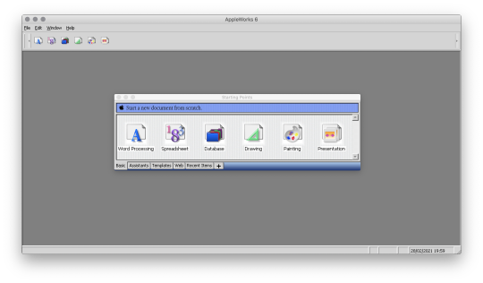
Back to childhood with AppleWorks
Hi everyone!
Today I'm going to tell you about a very old software that kept me busy for many, many hours during my teenage years and that I've had the pleasure of rediscovering these days.
Apple fans will have glitter of nostalgia in their eyes, others will have the opportunity to discover a beautiful tool that has not forgotten to be compatible with Windows.
It is AppleWorks!
AppleWorks was an office suite, installed on all Apple computers of the time, which, in addition to the classic word processor, spreadsheet and Power Point presentation, also offered a vector drawing tool and a bitmap drawing tool. It was my first experience in digital drawing and photo manipulation and with a bit of inventiveness, I was able to get some amazing things out of it.
Behind its apparent simplicity, this little soft hides an unsuspected power.
Let's go for a little trip back in time!
Small overview
The painting module
Gallery of illustrations
Install AppleWorks (Yes! It still works! )
Small overview
AppleWorks is 6 softwares grouped into one.
When you launch it, it offers you the possibility to create 6 types of documents: word processor, spreadsheet, database, presentation, bitmap drawing, vector drawing.
I quickly talk about Spreadsheet, Database and Presentation because I never used these modules.
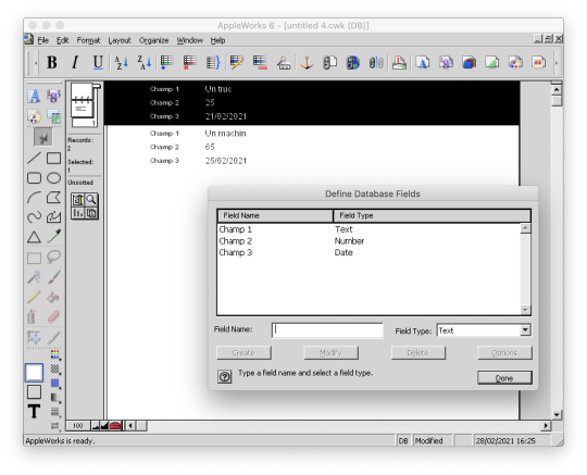
Anyway, know that with Spreadsheet you could make like with Excel, with Database, create databases and with Presentation, make like with Power Point.
(You can click on the images to enlarge them to full size.)
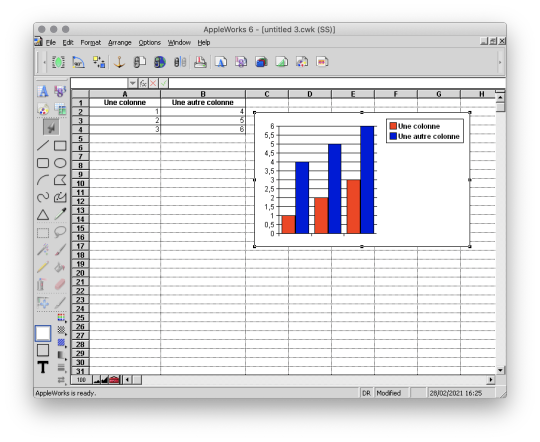

And here are, then, the 3 modules that I really used!
The word processor

I wrote all my comics scripts, presentations and internship reports there when I was at school, until my dad bought Microsoft Office. Hard to compete with the Word arts. 8D
Except that Microsoft Office did not offer vector drawing software, nor bitmap drawing software. So it was not about to dethrone AppleWorks.
The vector drawing module

This module helped me a lot to make diagrams to integrate in the word processor, draw dungeon plans for our Donjons and Dragons sessions, make some logos or paste editable text on images like my comics pages.
I particularly liked its ability to generate gradients that roughly matched the shape in which they were applied, and there are recent vector drawing technologies that still can't do that and that's a little bit annoying to me.
And finally, here is the module where I really spent the most time!
The bitmap drawing module
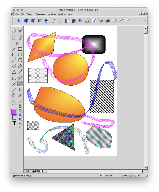
Well...
Some geometrical shapes, a pencil, a brush, a filling tool, an eraser...
So far it doesn't look much different from Paint.
Wait until you see what it is capable of. :p
The painting module (bitmap drawing)
To begin, AppleWorks 6 is not the first version of AppleWorks that I worked with and already at that time, I had my little habits and what a disappointment for me when I didn't find my favorite features !!
Looking for a little bit it turned out that they were just a little hidden and just needed to be tidied up a bit.
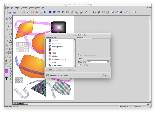
Because yes! This small software already had a customizable interface by drag and drop as on a modern Photoshop!
Now all is clear, we can get to the heart of the matter: drawing! :p
I've already mentioned the toolbar on the side earlyer, which is already familiar to you if you've ever used Paint.
Now, let's move on to the area just below: the palettes.
AppleWorks offers a limited palette of colors.

You can combine the selected color with a pattern to apply. Some of them look like manga screentones.

Some fun colorful patterns are also available.

And finally a small palette of gradients is also available.
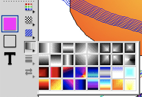
Well... A few funny patterns, some gradients. It's enough to have fun for 5 minutes, but nothing special. We will going not very far.
That's where the real work begins. :p
Do you remember? A few moments ago I added buttons in the horizontal bar at the top, including this one.

And this is what it opens!

A customization window! :D
Not enough colors in the default palette?
Never mind! You can create as many color palettes as you want.

Not enough patterns either in black and white or in color?
You can create as many pattern palettes as you want!


The default gradients palettes is too poor?
No problem! You can create as many gradient palettes as you want! And for the moment, I spent a lot, a lot, a lot of time on this section!
You can make circular gradients.

Linear gradients.

And gradients that fit the shape in which you apply them. Well, it's far from perfect with concave shapes, but it already allows for interesting things.

And to give the coup de grace to Paint, with AppleWorks you could even create your own brushes! :p

There are even some effects available such as blurring.
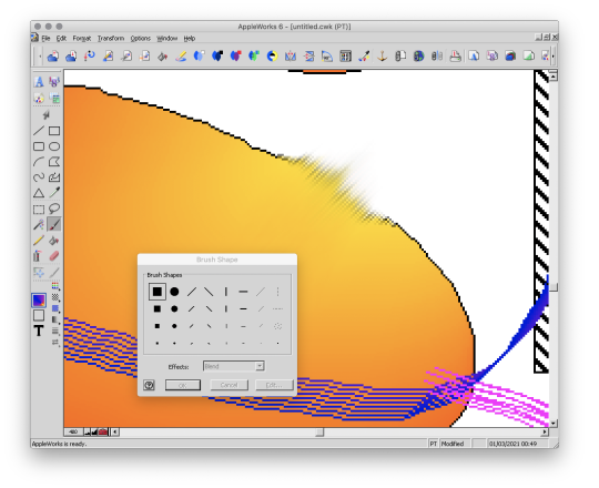
This AppleWorks is a piece of cake in the belly! :D
Now that we know about its possibilities, I propose to show you a small gallery of what I was able to do with this software from end of nineties to middle of 2000s. :D
Gallery of illustrations
Let's start with the very first drawing I made with AppleWorks in 1998.
We didn't have a scanner at the time, so I had to do it entirely with the mouse.
It was also a time when I didn't have much notion of saving the original files and I considered that as soon as I had printed the drawing, it was no longer worth keeping it on the computer to save space (the hard drive was 4 GB).
So this is a scan of the printed version you see here. x)
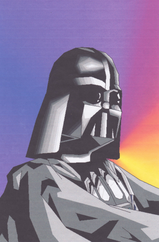
A good old Darth Vader! (1998)
Well, making a drawing from A to Z entirely with the mouse was laborious, so I also used AppleWorks to create backgrounds and print them. Then I would do my drawing by hand and cut it out and paste it onto the printed background.
I was able to make interesting effects by understanding the limitations of the software and exploiting them. By understanding that gradients were composed of a series of solid color bands, I could make focus line effects by filling them with the filling tool with a different patterns or gradients.
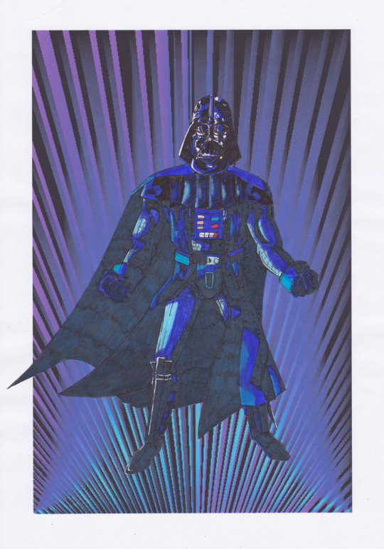
This posing remind some Dragon Ball character (Between 1998 and 2000)
It is also with AppleWorks that I made my first attempts at photo manipulation. I used photos from an encyclopedia we had on CD-ROM and manipulate them by tinkering them and copying and pasting small pieces here and there.
Then I printed my montages and paste them onto the comics pages.
My montages were mainly used for space scenery. (1999 - 2000 in collaboration with my sister)
This software really pushed me to be creative to get what I wanted out of it. I had even managed the tour de force of pasting a white lineart over a photo.
(2000 - 2001)
In the absence of layers, I had to work on 2 files in parallel and with the lasso select tool.
And then one day, our first scanner finally arrived home!
There the serious things could begin!
I was able to stop trying to make drawings with the mouse and use AppleWorks to put in color drawings made with the traditional way. So I was able to go further from the end of nineties.
It obviously started with Saint Seiya. x)
(You can always click on the images to enlarge them to full size.)
I loved the Aquarius saint. He was my favorite character from Saint Seiya. ^^ (2000 - 2001, this way)
At the beginning I was just doing solid colors, but as I experimented with the features and learned how to combine them, I ended up getting more and more advanced renderings.
Aoshi Shinomori from Kenshin and Ashram from Record of Lodoss War. These two were also my favorites characters at one time. (Between 2004 and 2006)
If you have enlarged the images you must have noticed that the line is particularly crenellated. There was no antialiasing, no layer system with opacity levels, no tolerance threshold for the filling tool. So it had to be black, or white, but not in between.
As a result, AppleWorks was not really adapted to work on drawings with small details, hatching or heavily detailled backgrounds...
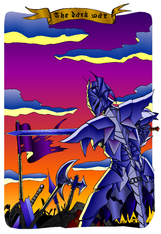
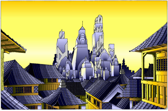
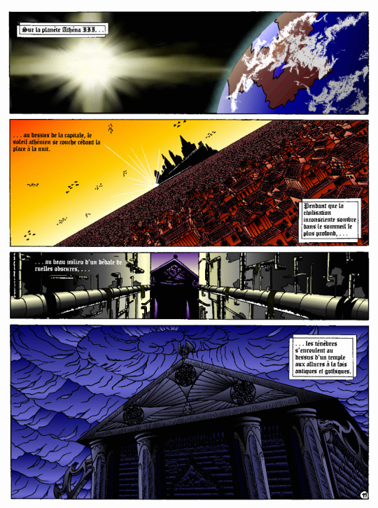
I tried anyway. :p
These last 4 examples I think I made them between 2004 and 2006.
The comics pages come from the first version of the Nécrotech project which is currently in a dormant state (but which I intend to resume one day). You'll notice on the first image of the last page some effects whose style stands out a bit from the rest. It's normal, I made them in another old painting software, Art Dabbler, but this is another story. :p
In 2007, I got tired of suffering, I started to use The Gimp, in 2008 I bought my first graphics tablet, in 2009 I embarked on the Photoshop adventure and you know the rest: I sold my soul to Promarkers and Clip Studio Paint.
And then there are days like that, we fall back into childhood.
(Click on the image to see it at full size and distinguish the pixel patterns. I know, I repeat myself, but the devil is in the details. :p )

Last week, I decided to make a theme of the Drink'N'Draw from A to Z with AppleWorks to see what I could get out of it with 15 more years of experience in drawing and illustration. 8D
With some tips you can get a pretty amazing result!
I am happy with the result, especially the colors.
It wasn't done without pain. The feature I wanted to take full advantage of (customizing color patterns) is buggy on the Windows version of the software, so I had to set up a Mac OS X Snow Leopard virtual machine to be able to do the finishing touches. What an adventure!
In any case, AppleWorks is always well adapted to make pixel art and this experience has allowed me to learn new things applicable in recent and professional softwares.
I had never really tried pixel art, which I love, by apprehension of the execution time. I think I found the trigger to get serious about it. I will explore it further. :D
Well, well, well! But in fact, calculating gradient patterns for pixel art with shaders shouldn't be complicated. I think I will add such an effect in Péguy ! :D
Install AppleWorks
You've read it right! You can still install and use AppleWorks in 2021! :D
Windows
I did the test with Windows 8.1 on my Cintiq Companion tablet from Wacom, and in the comments it seems that it also works very well on Windows 10.
To do this you will first install the latest version of QuickTime 7 which you can find on this page. You double click on the installer and you do next, next, next... Even when you are asked if you have a product key. It is not mandatory and useless for our needs.
Then you go to this page and download the first file. You unzip the file and double click on the installer, then same procedure as before: next, next, next...
You can do retro digital painting now! :D
Mac OS X
Apple computers have changed so much in 20 years that it is now impossible or at least very complicated to run the original programs on today's machines. The manipulation therefore consists in using the Windows version with the Wine emulator.
If I had no problem with the procedure, it may seem a bit complicated for non-technical profiles so I simply propose you to download the final application I created myself via this link on Google Drive. You just have to download it, unzip it (with a double click) and launch it.
If you're a computer geek and want to get a version of AppleWorks without the color pattern bug, you can get the .dmg here and install it in a Snow Leopard virtual machine.
Be reasonable about the size of your files. This is an old software that will have trouble supporting surfaces exceeding 2000px by 2000px. There is a way to cheat a bit, it is by creating a vector drawing file and creating a bitmap drawing surface inside.
That's all for that nostalgic moment. I think I will come back with some illustrations made with AppleWorks in the future. :D
Have a nice day and see you soon!
Suisei
P.S. If you want miss no news and if you haven't already done so, you can subscribe to the newsletter here : https://www.suiseipark.com/User/SubscribeNewsletter/language/english/
Source : https://www.suiseipark.com/News/Entry/id/308/
0 notes
Text
Intuos And Intuos Pro
How to Make Writing a Breeze with the
Wacom Intuos
No, not handwriting, although it’s useful for that too.
This will be a guide to how to set up the Intuos — or any Wacom tablet with four buttons — as a powerful productivity aid for noveling, freelancing, coding, teaching online, or just general office work.
http://india-iws.in/Back before working for Wacom was even on my radar, I used a 2013 Intuos Pen & Touch as a full-time mouse replacement for four years. I now use a Cintiq 16 HD for art and a Logitech gaming mouse for everything else. The Cintiq is the best art tool I’ve ever used, but I recently realized I miss using the flat tablet for work. Partially because the interface was more efficient, but I think a lot of it was also psychological: What do we associate more with writing than pens? Just using it, even for ordinary articles, seemed to put me in creative mode.
Yes, holding a pen for several hours on end takes some getting used to. Your hand might be sore for the first few days. And you’ll want to practice tucking it into your thumb crease while you type to make the switch between navigating and writing faster. But once you’re fluid with it, it’s more efficient, ergonomic, and fun than a mouse. It’s very satisfying to scroll by hovering and flicking your pen, highlight text the way you would in a book, physically drag paragraphs down the page to reorder them, and cut and paste with one tap of a button.
If you’re an artist as well, it also helps you keep in practice holding and making fine movements with a tablet pen even when you’re not drawing.
I don’t have the Pen & Touch anymore; I gave it to a friend whose tablet was stolen. But I currently have a new Intuos Small, so in this article, I’ll unbox it and recreate my old setup.
In the interest of monetary honesty, this one was given to me by a manager a year ago and has been sitting in the closet neglected since then, so using one I got for free is less daunting than the idea of buying one for the purpose. But this model, a Small, retails for $95, half the price of a Medium, so if you’re interested in trying a tablet, it’s not a huge investment for both a mouse alternative and a capable drawing tool. Figuring out what size tablet you need can be tough, but the small is perfect for this purpose. It’s the size of a mouse pad but more precise than a mouse, so you have more room to move in the same area. Even with a dual-1080p-monitor setup like mine, it feels fine.
Anyway, inside the box are the tablet, the pen, a Micro USB cord, and a very thin manual.* Don’t worry, you won’t need it until you change the nib: Once you install the universal driver from our website, It’s plug-and-play, and automatically detects whatever Wacom tablet you use.
—
Note
If you look up any guide to setting up a tablet for drawing, they’ll tell you to put it in front of your keyboard so it’s also directly in front of the monitor, not to the side like a mouse pad. But for writing, feel free to do the opposite.
—
Setting preferences
I’ll walk you through the configuration process as if you’ve never used a tablet before, because maybe some people reading this won’t have. If you’re experienced with them, some of this will seem redundantly basic. But some of the other tips and shortcuts, you might not know as well. So bear with me.
Once you’ve installed the driver, open Wacom Tablet Properties. For anyone who hasn’t used it, there’s a lot more than meets the eye here.
When you install it, it automatically creates profiles for your installed image editing programs — or the big ones, at least — and everything else is covered under All Other. Any programs you add will copy this profile by default, so let’s punch in some foundational settings, starting with Mapping:
We’ll leave it on Pen Mode despite using it as a mouse. You want to get used to mentally mapping your tablet to the elements on your screen, and Pen Mode is far more precise anyway. Not to mention you’ll never lose your cursor again.
If you’re using one monitor, turn on Force Proportions to match your tablet’s aspect ratio to your screen’s. You’ll need this for drawing, anyway. If you’re using two monitors, leave it off or it’ll reduce your tablet’s active area to a tiny sliver. You’ll need it for one type of program, but we’ll get to that later.
Set the lower button to middle-click instead of its default scroll. When it’s on scroll mode, you have to drag the pen across the tablet to scroll up and down. If you set it to middle-click, you can simply click once and navigate by hovering. Middle click also lets you quickly open and close Chrome tabs, and everything else clicking the scroll wheel does in other programs.
Writing program settings
Now, Tablet: For this step, we’ll be adding a writing program and a browser. Clicking the + brings up a list of a list of all the programs you currently have open, so you can create a separate mapping profile and shortcuts for each one.
I do my fiction writing in Scrivener and my article writing in a Google Docs desktop app, with different settings for each, but for simplicity’s sake, I’ll demonstrate with MS Word.
Those four buttons, FYI, are called ExpressKeys, and any number of program or navigation functions can be assigned to them. For writing, we’ll do keyboard shortcuts. For the top left one, go to Keyboard > Keystroke, and in the popup window, hit Ctrl-X in the top field and name it Cut in the bottom one.
Keep adding basic shortcuts until you have this, or whatever alternative suits you:
Note that one key’s still on default: Since cut, copy, and paste cover my basic editing needs, I’m left with a free space. I’ll use it to create a shortcut menu for my common formatting functions. So, let’s pop over to On-Screen Controls.
As you’ll see, this lets you create infinite toolbars. They’re program-independent, so you can create one general “writing” one to use the same shortcuts across different programs.
There are two types of menu: Grids and Radials, and grids come in horizontal, vertical, or square. I’ll make a new single-column vertical grid for all my common shortcuts in order of use — Ctrl-I, Ctrl-E, Ctrl-K, Ctrl-B — and creatively call it “Writing.”
And I’ll assign it to the final ExpressKey. Menus normally disappear after you select an option, but you can use the pin icon to make it a permanent toolbar. From now on, I’ll stick mine to the margin of whatever I’m working on.
—
Important
If you’re using Windows 10, uncheck “Use Windows Ink” in the Mapping panel for all your writing programs, or else you’ll get that infuriating Handwriting popup every time you place your cursor.
If that still doesn’t work, you can turn the box alone off through Windows by searching for “Pen & Windows Ink” settings in the taskbar, and changing this one from “When the keyboard isn’t attached” to “Only in tablet mode.”
—
Browser settings
We’re going to do one thing different here. There’s one capability that’s still missing: zoom. The normal Intuos doesn’t have any equivalent to a mouse’s scroll wheel. Some other Wacom products have a touch ring that can be programmed to serve that function — The Intuos Pro, Cintiq 13HD, ExpressKey remote, and various older models — but not this one.
But don’t worry, the Intuos has a workaround. An inelegant one, I’ll admit, but it’s better than switching back to the mouse every time you need a closer look at something.
Besides image editing programs, Chrome is probably where I need to zoom in the most for things like Google Maps. Since I don’t often cut when browsing the web, and I can just use Ctrl-X when I do, I’ll set the first key to Navigation > Pan/Zoom.
While the button is held down, hovering the pen will scroll, and dragging it up or down on the tablet will zoom. You could simplify things and just program this function to the lower pen button, but then you’d lose middle click functionality for things like opening browser links in a new tab. It’s a good idea for any program where middle click doesn’t do anything, though.
—
Also important
You’ll need to turn off Windows Ink for Chrome and any other Google apps, too. It causes a pen tracking glitch. Same with Discord, for some reason. In fact, you really only need to leave it on for Photoshop.
—
Image editing settings
Of course, I’ll still use the Cintiq for any serious work, but for simple cropping and color correction, it’s sometimes more convenient to just bang it out on the flat tablet. Any artists present will already know to do this, but for Photoshop and any other drawing or image editing programs, set the active area to one monitor and turn on Force Proportions.
If you’re using two monitors, don’t worry, all you have to do is click your Windows taskbar to navigate back to the non-photoshop monitor.
Services & Saving
If you’re on Windows, occasionally your computer will fail to detect your tablet, in which case you’ll have to reset the Wacom driver through the Services window. This is something everyone should know how to do. Every problem I’ve ever had with a Wacom device has been fixable this
You can also use the stop and start icons at the top of the window. You can pin services to your taskbar once it’s open, too.
But once in a blue moon — every few months, perhaps — this might wipe your preferences. So once you’ve set them, make sure to save them through the Backup Settings panel in Wacom Desktop Center. You can either save them as a .pref file to your hard drive, or upload them to the free Wacom Cloud, then restore them with the very next button.
Impressions of the
Intuos
Zoom hitch aside, this is an even better mouse replacement than the 2013 Pen & Touch was. The P&T had a smooth plastic surface that constantly reminded you that you were using a computer peripheral. The current gens have a rubbery textured surface that genuinely make it feel like you’re somehow using a ballpoint on a notebook to control your computer. And the pen helps with that too: It’s lighter and thinner than either the P&T or the Cintiq, just 5½ inches long by 1/3 inch thick, smaller than a Bic.
But my favorite feature is the Bluetooth. Once the tablet’s charged via cable, you can connect it wirelessly and regain the use of your USB port. I didn’t see the point of this before I tried it — who uses a tablet further than a cord’s distance from the screen? — but now that I have, I never want to go back. It allows a lot more freedom of movement: I can slide it across the desk from one monitor to the other if I want to switch to another project on a different screen, without messing with the cable, or when I need the mouse for a game, I can simply turn the tablet off and set it aside. And once we can do these things again, it’ll be easy to slip into a backpack to use outside at a coffee shop, bookstore, or while traveling. It can be charged with any Micro-USB cable, so if you run it off Bluetooth, you can use a wall charger. It takes a few hours from empty to full, but it has a battery life of fifteen, meaning it’s good for two workdays or one brutal one.
Finally, in an interesting last-minute twist, I was surprised to find it compatible with the Cintiq — I could even draw into Clip Studio Paint with both at once — meaning I won’t need to switch them out. I don’t think an overabundance of Wacom tablets is a problem the average reader is likely to run into, but for example, if you ever find yourself graduating from a flat tablet to a drawing monitor, but aren’t quite ready to sell your old one, you can repurpose it as a mouse.
As for me, I’m going back to dailying the Intuos for my writing.
—
Finally
If you teach or tutor online, we’ve been putting out a lot of articles for educators lately — in fact, this article was originally intended as a guide to set up a tablet as a teaching tool, I just realized halfway through that the setup would be the same for any job that works with words. If you’d like to know more about teaching with Wacom products specifically, check out All You Need to Know to Teach with a Wacom Tablet, Recreating the Physical Classroom in a Virtual World, or the entire section of our website on using tablets for education.
Advertisements
Occasionally, some of your visitors may see an advertisement here,
as well as a Privacy & Cookies banner at the bottom of the page.
You can hide ads completely by upgrading to one of our paid plans.
0 notes
Note
omg wait how do you get a ringtone onto an iphone with the new itunes update? i tried to set it as this mashup of something and it didnt work :(
Hi Lovely!
Okay, so in the old iTunes, I used to have a folder synced on my computer so that when I added a new ringtone, I just plopped it in there and it updated whenever I plugged in my phone. For some asinine reason, Apple decided that was too easy and decided to hide how to put on a new ringtone.
When I did mine recently, I found this website here very helpful; I’ll simplify it for you, so that I also have the instructions and I can add my own again without googling how to do it LOL.
Okay, so I’ll go from start to finish, since I always make my own ringtones. For this tutorial, you will need Audacity, which you can download for free here (always support open source programs! . Audacity also requires a plug-in to convert audio files to MP3; it’s also free and instructions on how to install it are here.
NOTE: You CAN also make ringtones in iTunes, I just prefer to do it in Audacity because you can be a lot more precise on the length and the Start-Stop positions and play with the audio; in iTunes you need to know EXACTLY the start stop times. The initial tutorial website shows you step by step how to make a ringtone using iTunes, so you can do that if installing and prepping programs is a bit daunting for you! I always have the most difficult way possible to do anything, but if you’re willing to put the time in, it’s also the most fun :D
Either way, remember that the most IDEAL RINGTONES are between 20 and 30 seconds; the longest you can make one for iPhone is I THINK 45 seconds.
If you want to just make the ringtone, skip to Section B: Adding the Ringtone in iTunes.
NOTE YOU NEED TO HAVE AN UPDATED iOS FOR THIS TO WORK. I am running iOS 11.0.3 on my iPhone 6S Plus.
Okay so here we go!
A. Making Your Ringtone Using Audacity
1. Choose your song; it can be any song, as long as it’s a format supported by Audacity (FLAC, WAV, AAC, and MP3 I know for sure. I believe it supports all kinds of audio files). Right click, and choose “Open With > Audacity”.
2. So now you’ll see a waveform in Audacity. If you’re not familiar with audio editing, it can look very scary!:

BUT it’s useful for finding the part you want to make a ringtone, and is a lot more precise, because you can see where all the downbeats are in your song! As well, Audacity’s save function works like Photoshop PSD files: it saves all the layers you make of your clip, so if you want to make a mashup of a bunch of songs, you can totally do that too! Clip out the section you want to be your tone. It will require you to play with the audio sample. Remember: try to keep your clipping under 30 seconds! Audacity has a lot of fun features like tone shifting, fades and speed adjustment, so if you want a really unique ringtone, you can adjust the octave of the song or you can have fade-outs. If you’re really ambitious play with it so it makes a perfect loop!
ANYWAY. So clip out your chunk and make sure it’s what you think you want for a ringtone and that it’s clipped and edited the way you want it, and it’s under 30 seconds.

Now go to FILE > EXPORT AUDIO (Shift-CMD-E). If you’ve loaded the LAME encoder correctly, you should see MP3 as an option:
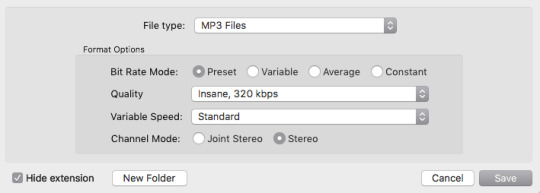
These are the settings I use for all my MP3 output. Save your MP3 in a temporary spot; you won’t need it again and can delete it after you make your Tone.
3. Now we will open up the MP3 in iTunes. Double click on the file to open it and then find it in your playlist. What we’re going to do now is Import the song from iTunes into an AAC file. To do this, you need to change the Import Options in iTunes. It took me a bit to find them since they got moved around a bit. Go to iTunes > Preferences (CMD-Comma), and you will be shown the “General Tab”; at the bottom, you will see a button for “Import Settings”; click on it.

And on the dropdown menu, make sure that “AAC Encoder” is selected. I think it’s the default, but double check. As an aside, if you rip CD’s, this is where you change it so they save as MP3′s, not M4A’s (which is what AAC’s will make).
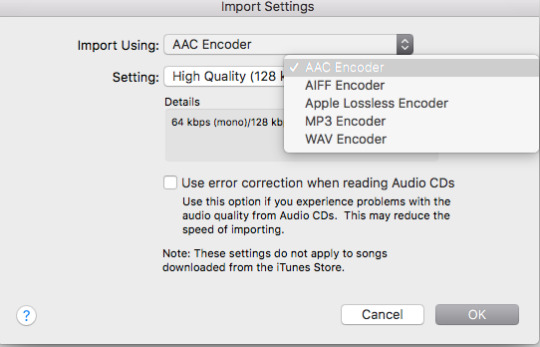
4. So now that we’ve ensured that it is the proper format, we’re going to Convert the MP3.
Go to FILE > CONVERT > CREATE AAC Version. This will make a duplicate version underneath the one you have.

Right-click on the second file, and “Show in Finder” (or the Windows equivalent to showing you the file location). This will bring up the file’s location on your computer. For ease, pull it out of the folder, and put it onto your desktop, then delete any folders it created. Go back to iTunes and delete from your library both the MP3 and the duplicate file, as you won’t need them anymore.
5. Now we’re going to Change the File’s extension. For this step, you need to make sure your computer is set to show file extensions. In Windows, this setting is under “Appearance and Preferences” I think, and on Mac it’s shown by default for files on the desktop, I believe (if not, it’s under FINDER > Preferences > Advanced > Show Extensions).
Change the file extension to *.m4r. Click on “change to *.m4r” when prompted.
B. Adding the Ringtone in iTunes
Now, the next part is the frustrating bit, because ALL the tutorials I found wasn’t clear on the syncing aspect of this. A lot of them essentially told me to turn off all my syncing, which, uh, NO because I have a tonne of music and if you de-sync your playlists, it deletes them from the device. So NO. So I’m going to show you MY sync settings, and show you that as long as you have certain boxes unchecked, you can still add your ringtone.
1. First make sure your iPhone / Pod / Pad / Whatever is hooked up somehow to your computer. BLUETOOTH SYNCING DOES WORK FOR THIS; mine does Bluetooth Syncing (which is the greatest thing ever). You’ll know iTunes found it if it shows up as a little icon on the top and it shows up under “Devices”
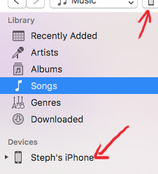
2. Set your sync settings. This is is done by clicking on the little iPhone Icon at the top there. You will see this:
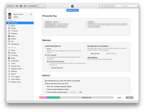
Under options, make sure that the “Sync only checked songs and videos” box is UNCHECKED. This will NOT affect your music syncing, as far as I know, because my music stayed synced.
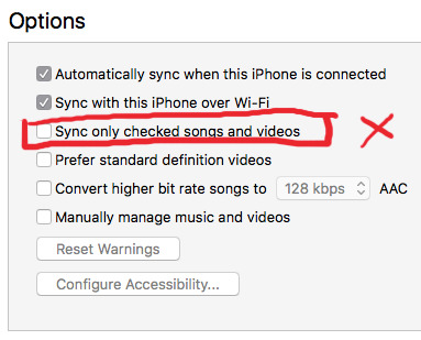
Other tutorials tell you that “Manually manage music and videos” also needs to be checked. IT DOESN’T. Clicking it will eff with your music sync settings, and I was perfectly able to add a tone with it unchecked.
3. Go back to the main sidebar by clicking on the arrow at the top. iTunes will prompt you if you want to Apply changes; hit yes if you did any changes, otherwise cancel.

Click on the drop down arrow next to your Device, so it brings up several options.

If you click on Tones, you can see all of the manual ringtones you have on your phone. In my case, because I have “manually manage your music and videos” deselected, mine are greyed out, so I can’t delete them unless I turn on that checkbox.
4. Drag and Drop your ringtone onto the device. THE BLUE HIGHLIGHTING MUST SHOW UP ON THE DEVICE FOR IT TO WORK, like so:
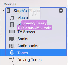
Even if you have your syncing on, you will see it add itself to your Tones folder. It will take a few seconds, since this is being added DIRECTLY onto the device! A checkmark will show up next to it when it’s completely synced and on the device.
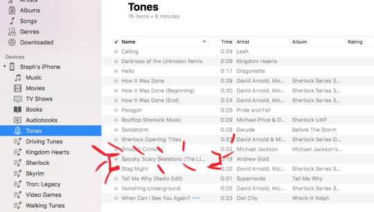
5. Change your tone! Now that we see it has been confirmed to have been moved onto the device, let’s load it up! On your phone, go to your Settings App. Scroll down to “Sounds”, then tap on “Ringtone”. On the Ringtone page, select your newly-added tone; Tapping on it will activate it and you can listen to it in its entirety!


To set it, all you need is that checkmark next to it, and click on the “ text at the top-left. The text in the Ringtone section of the Sounds should now say the name of your new ringtone!

Et voila!
I hope that helped you out, Nonny! And to everyone else, I exclusively use a Mac, so I don’t know if this is interchangeable at all with a PC. I don’t have a PC so I can’t help you out beyond my limited knowledge of it. The tutorial I linked to WAY up top goes to one that has Windows OS, so that should help you out a bit.
Cheers all!
#steph replies#ringtones#itunes 12#tutorials#mac tutorials#audacity#my tutorials#Anonymous#long post
84 notes
·
View notes
Last Seen Blogs
toby-35
*bubba in da void*

generosir
g.s.R
relatablepicsofblueby
Mind if I join the fight?

is-hinata-good-today
shsl best boy

wade-winston-wilson
karma is the guy on the chiefs