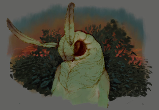
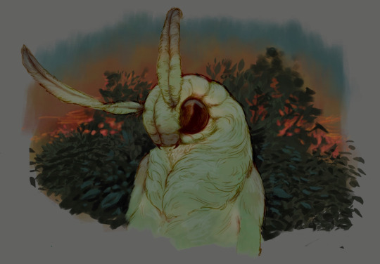
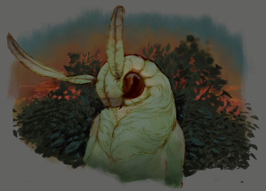
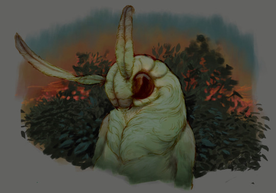
#add a background and some shading and texture
Text

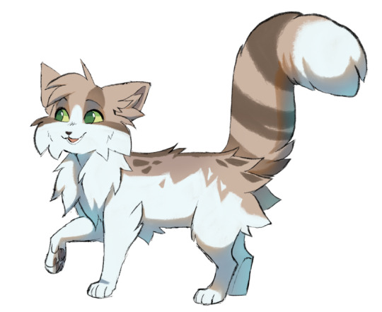
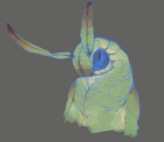
sleepy babies
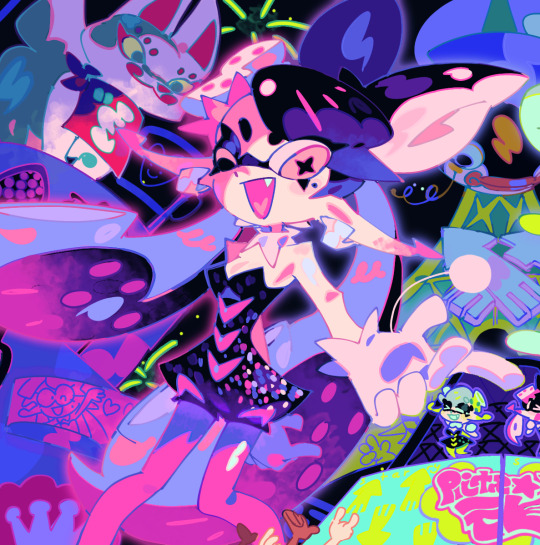
#flat fuck friday#turtle tots#rottmnt turtle tots#rottmnt#rise of the tmnt#rise of the teenage mutant ninja turtles#disaster twins rottmnt#disaster twins#rise donnie#rottmnt donnie#rottmnt donatello#hamato donatello#rise leo#rottmnt leo#rottmnt leonardo#hamato leonardo#disaster twins cuddling#look at them theyre so cute#i might come back to this#add a background and some shading and texture#but for today im making do with a quick drawing of cuteness#and trying to embody the sleepy vibes#<3
216 notes
·
View notes
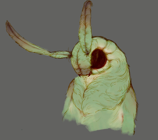
Text
Me to myself, repeated for retention: Switching back to SAI does not automatically make it pop back up in OBS which works on a separate layer system, SAI2 will always take precedence unless it is minimized, SAI being open doesn’t make it the topmost layer-
#So I done goofed#Luckily it was before working on today's Actual Art but I am still sad to have lost the footage#But at least this one's cleanly on my own silly shoulders lol#I really should give SAI higher precedence over SAI 2 it's an easy thing to change#I only lost about ehh 20 minutes of footage? And nothing huge luckily just some colour and texture work nothing like sketch or lineart#The background will just suddenly pop into being! Suprise!#Considering I've sunk like eight collective hours into this project I don't think it's really that big of a deal#Wonder if I should shade this hmmmm#That'd probably add a solid couple more hours but it might look nice.....
4 notes
·
View notes
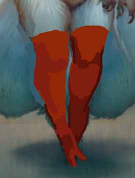
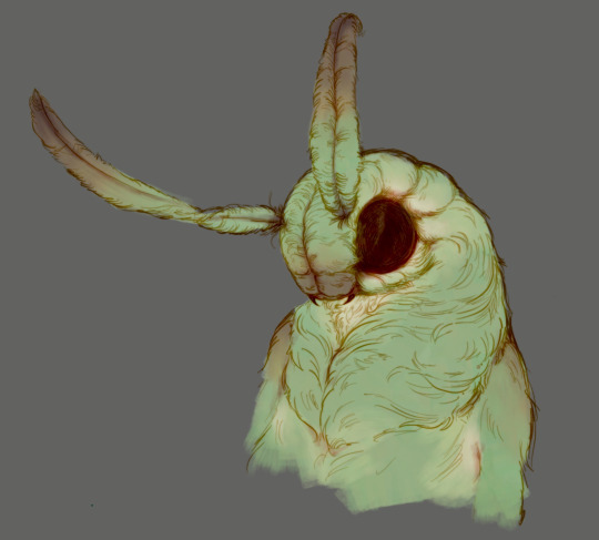
Text
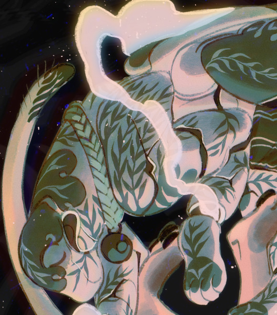
Helping Neuroslug help me
Admittedly it took me an embarrassing amount of time to figure out and start using inpainting, but now that I've had a taste of it my head is spinning with possibilities. And so I'm making this post to show the process and maybe encourage more artists to try their hand at generating stuff. It really can can be an amazing teammate when you know how to apply it.
For those who didn't see my first post on this, I've trained an AI on my artworks, because base Stable Diffusion doesn't understand what anthropomorphic insects are.
That out of the way, here we go:

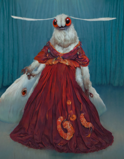
I noticed that a primarily character focused LoRA often botches backgrounds (probably because few images of the dataset have them) so I went with generating a background separately and roughly blocking out a character over it in Procreate. Since it was a first experiment I got really generous with proper shading and even textures. Unsurprisingly, SD did it's job quite well without much struggle.
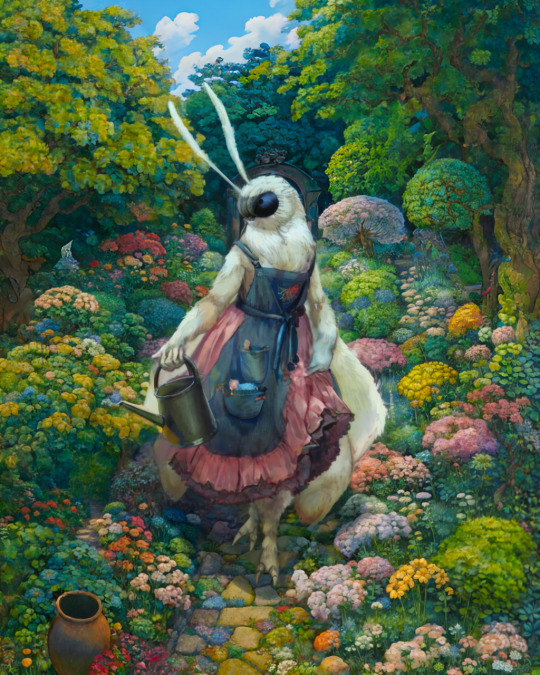
Basically masked out separate parts such as fluff, skirt, watering can, etc. and changed the prompt to focus on that specific object to add detail.
There were some bloopers too. She's projecting her inner spider.

Of course it ate the hands. Not inpainting those, it's the one thing I'll render correctly faster than the AI does. Some manual touchups to finish it off and voila:
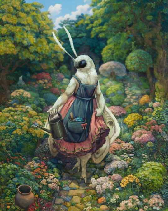
The detail that would have taken me hours is done in 10-20 minutes of iterating through various generations. And nothing significant got lost in translation from the block out, much recommend.
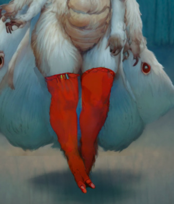
But that was easy mode, my rough sketch could be passed off as finished on one of my lazier days, not hard to complete something like that. Lets' try rough rough.
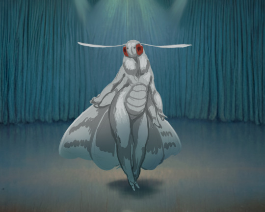
I got way fewer chuckles out of this than I expected, it took only 4-5 iterations for the bot to offer me something close to the sketch.
>:C
It ate the belly. I demand the belly back.
Scribble it in...
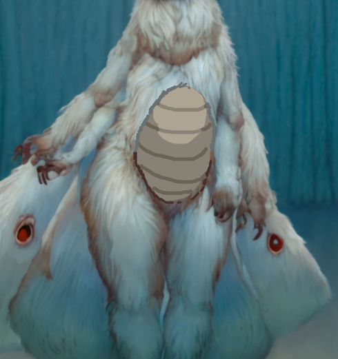

Much better.
Can do that with any bit actually, very nice for iterating a character design.
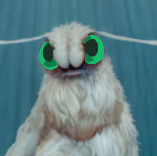
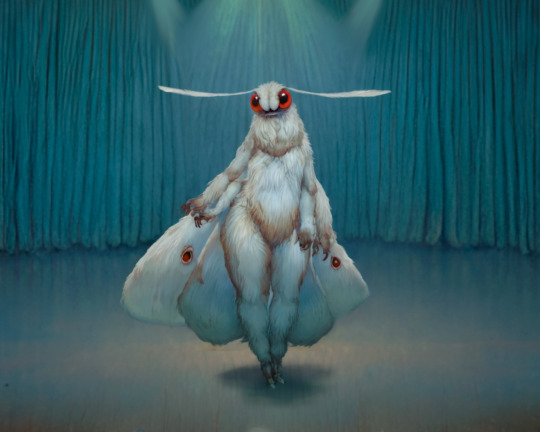
Opal eyes maybe?

Lol

Okay, no, it's kind of unsettling. Back to red ones.
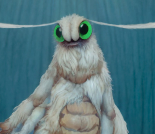
Now, let's give her thigh highs because why not?
It should be fancier. Give me a lace trim.
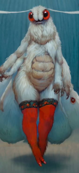
Now we're talking. Since we've started playing dress-up anyway, why not try a dress too. Please don't render my scribble like a trash bag. I know you want to.

Phew
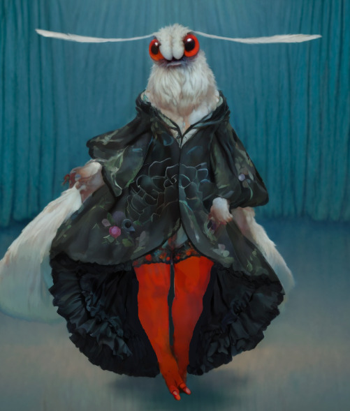
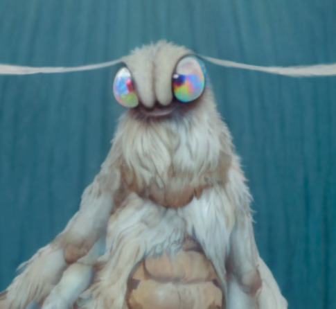
I crave more details.
Cute. Perhaps I'll clean it up later.
...
..
.
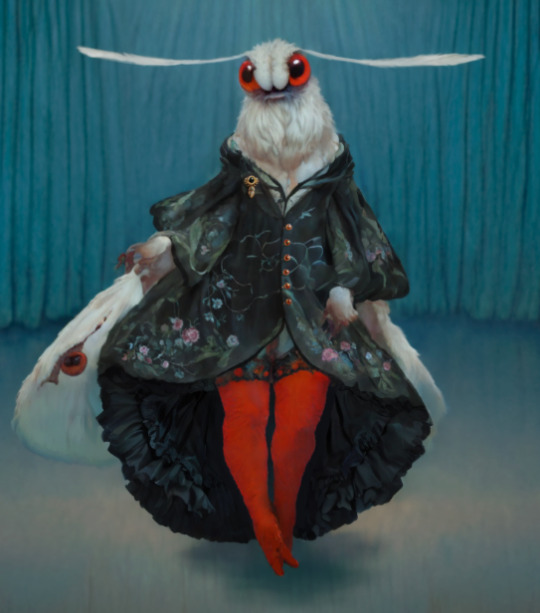
SHRIMP DRESS
#neuroslug#slug's experiments#ai assisted art#moth#I need to retrain neuroslug on a more artsy checkpoint#base model leans more to realism and it affects the style a lot#not complaining but i want it to mimic my usual style better
443 notes
·
View notes
Text
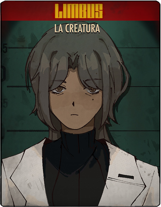
A (Somewhat Incomplete) Guide on How to Fake Sinner Profiles

LIMBUSIFY YOUR ARTSTYLE (optional)
The core components of limbus companies artstyle are as follows:
Textured, ink pen like lineart
Desaturated colours leaning towards the outermost area of the colour square
Cell shading with some texture
lots and lots of visual effects. God have mercy
Keep references around while drawing, as there are often lots of small details and these will be your guide for not going too crazy with your noise effects.
2. BACKGROUNDS
In the interest of saving time, here’s a free template for you to use. Feel free to change up the background colour however
Key notes:
The background colour loosely matches to the sinner’s eye colour, however usually slightly more saturated.
the outer border is lined thinly by black. This also covers the limbus logo section.
3. TEXT
The font for the light yellow text for your sinners weapon is Futura Condensed Medium. There’s a slight black backdrop to it you can get from duplicating the text and lowering it slightly.

4. EFFECTS
Sharpen, noise and blur will be your best friends here. Too high quality of a character sprite can make it not mesh with the background, and look odd when matched with canon portraits. Here’s a step by step process:
Add wear to the portrait with textured brushes, low opacity and blending modes. I’d generally suggest using gouache or watercolour brushes very lightly to establish texture, then going back in more strongly to indicate dirt and grime. Always use a coloured shadow.
using a blur filter, blur your character on the lowest setting possible, to the point it’s almost unnoticeable.
If your program has a layer texture filter, switch to the noise option and lightly cover the portrait with a thin layer of noise texture. If not, use your pen’s texture settings OR download a png of noise texture and set the layer it’s on to multiply, then lowering the opacity to around %5-10.
Apply a sharpening filter very lightly, only to the point where when zoomed in light colour separation and grain from the lineart can be seen.
aside from that, I’d always recommend playing around with colours, light and textures to make the portrait fit closer.
In the end, it can look something like this!
To conclude this, have fun, go crazy, and suggestions on how to improve this guide are very much encouraged.
#limbus company#lcb#limbus fanart#limbus company oc#project moon#project moon oc#please reblog this took me forever jesus
660 notes
·
View notes
Text
OK heres zeno coloring tutorial 2.0 !!!! i'm gonna do it kind of in chapters i guess?
chapter 1: choosing base colors
when i'm choosing base colors i always pick everything based on a specific off-white! my 'default' off-white is this kind of very light cyan color but i change it regularly based on character designs/environment/lighting whatever,, examples here!
for callie in this piece, i based everything off of this pinkish color! her skin tone, tentacles, outfit etc are all chosen to harmonise/contrast with the pink color

and with this piece, i used a slightly darker blueish color as they're in space but there's still a lot of light... and the lighter colors in the background (the explosion) make a sense of depth i guess? i used that blue color and chose similar cool colors to harmonise with it!
so i more or less base the tone of the colors in the piece off the off-white! warm off-white = warmer colors (like the nova valentine's day art) and cold off white = cooler colors (like the explosion nova and paro art). but i switch up this formula often !!
chapter 2: coloring specific things
here i'll go over some specific textures and stuff like skin and hair ... skin first !!
for skin, i like to use a variety of tones! there are different ways to draw cooler and warmer skintones that other people have gone over way better than i have but basically for skin i use this part of the color wheel and pick the darker tones of oranges/reds/pinks etc. (for darker skintones, i go to the middle of the color square thingy, and for lighter tones, i usually slide down the upper-right side)

when it comes to shading skintones, it's pretty straightforward, just a darkish-purple and a pinkish color on 100% multiply, and i always add a little shadow on the nose and blush becuz i think it's cute
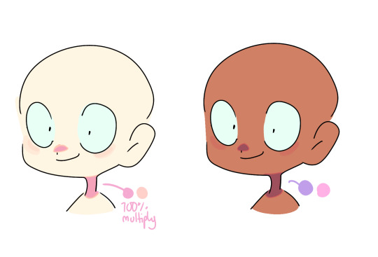
(also i like to add reflective spots on darker skin tones sometimes because 1. darker skin tones reflect in real life and 2. it's fun)

next up is hair... this is very specific to my artstyle but i like to add 3-6 long oval line thingies to the hair to mimic reflection ! it looks cool, it's a good way to show off different colors in the design and i like to switch it up sometimes based on a character's personality!! (like how the frye pic above has a lighting bolt shaped hair thing, or how my teto design has a wing shaped hair thing to mimic her wings in her chimera form!) (note: it doesn't always need to be lighter than the actually hair color and it usually isn't)

for other materials like metal, screens, etc etc... i just add random X marks lol... and reflections!!!

(also, just a general thing, but adding little saturated lines to shading really adds depth and color imo!!)
i would put more tips with refs but tumbles only allows 10 images per post ;w; so i will simply close off by saying don't be afraid to add overlays and filters to your art!! overlays can really help harmonise colors and filters like brightness and contrast can help colors pop... try not to completely rely on them for color choice tho!!
and that's basically it !!! this is not a definitive 'how to draw/color' post... i am not a color theorist... i just wanted to show people how i choose colors cuz a lot of people say they like my color choices! honestly i don't know much myself but i hope that this and the philosophy of 'do what looks good' will help you all o_ob thank you and goodbye
#long post#ah its so freeing to have zero character limit on this site#i did want to add more pics tho 😭#i would make a part two but i dont have much else to say#hope this helps people maybe#also idk how to add a cut/'continue reading' thingy on mobile so if someone could tell me how id appreciate it 😭😭😭
936 notes
·
View notes
Note
Hi, I'm sure you get this often but I really love your recent genshin artwork, do you think you could explain your painting process? I love the colouring effect in that piece especially. Thank you.
Thank you so much! I got a few messages like this from my previous piece (thank you guys for the staff pick & blaze btw, I really didn't expect all the support😭) so I thought I'd share a bit of my process below as thanks.
I always do my lineart first because it feels less daunting to me when applying colours. I will do some rough colours first so I can easily adjust it to my liking.

Next, I make sure to separate each character into different layers when I clean it up. I like to work one character or object at a time, it's less overwhelming for me that way, and I can use clipping masks for ease of rendering.

I'll usually apply some adjustment layers on top of the base layer for shadows and highlights. When I say base layer, I just mean a layer of the colour without any effects.
I like using 'hard light' for shadows, and 'screen' for highlights, but you can really use whatever clicks with you.
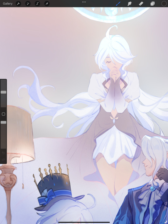
Rinse & repeat this process for every character in the illustration. Note that I make Furina the focus so everything behind her will be less rendered than the elements in front of them (Neuvillette is a lot less rendered compared to Furina, and the painting in the back barely has much shading).
Once I render out each asset in the illustration and add shadows & highlights to my liking, I then to merge foreground/ midground/ background elements so I can make the overall illustration clearer to read. I don't want it to feel messy or overcrowded, and I think it's easy to get tunnel-visioned in small details and lose the clarity of the entire illustration.
Make sure to zoom out constantly and make your illustration B&W to check the values to see if the drawing is clear.

I created a simple S curve with the values for readability, and have the foreground elements have darker values & contrasts.
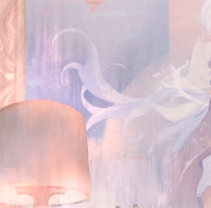
As for the BG, I wanted to add more textures into the drawing, particularly the painting in the back. Here's an image of it when I only added in the base colours.
I use the smudge tool to create more texture once I fill in the base colours. Since I don't really 'paint' anything with the textures in, I just put in the base colours and take a textured brush to smudge it. However, over-smudging can lose the painterly texture I want, so I usually smudge vertically or horizontally in a single stroke to create a sense of movement.
Another thing to note is that I only textured the BG, I thought it would help it blend into the background a bit better. I usually wouldn't do this for the foreground because I want those elements to be clearer.
At the very end, I tend to spend a fair bit of time just fiddling with more adjustment layers, various filters (such as blur, or noise), or liquify small details to really finalize the piece. Just vibes...basically this is me

Anyway, I hope that was helpful & it made sense!! Feel free to message me if you have any other questions & I'll try my best to answer! I might've glazed over a lot since I didn't wanna make this too long.
202 notes
·
View notes
Note
to add to that last ask about highlights, can you explain how you think the colors don't work now? bc as far as I can tell the colors for the background and characters are still the same as they were in s1, but they for some reaosn don't work now. is because of the lack of values? the lack of shading and highlights? no use of textures? you can explain it better than me
A lot of it comes down to color theory and lack of proper rendering.
Concerning the colors, they definitely aren't the exact same as they were back in S1. Someone on reddit actually did a far better visual breakdown of it than I have time to put together, so full credit goes to /u/LowPHvinegar for the following images!
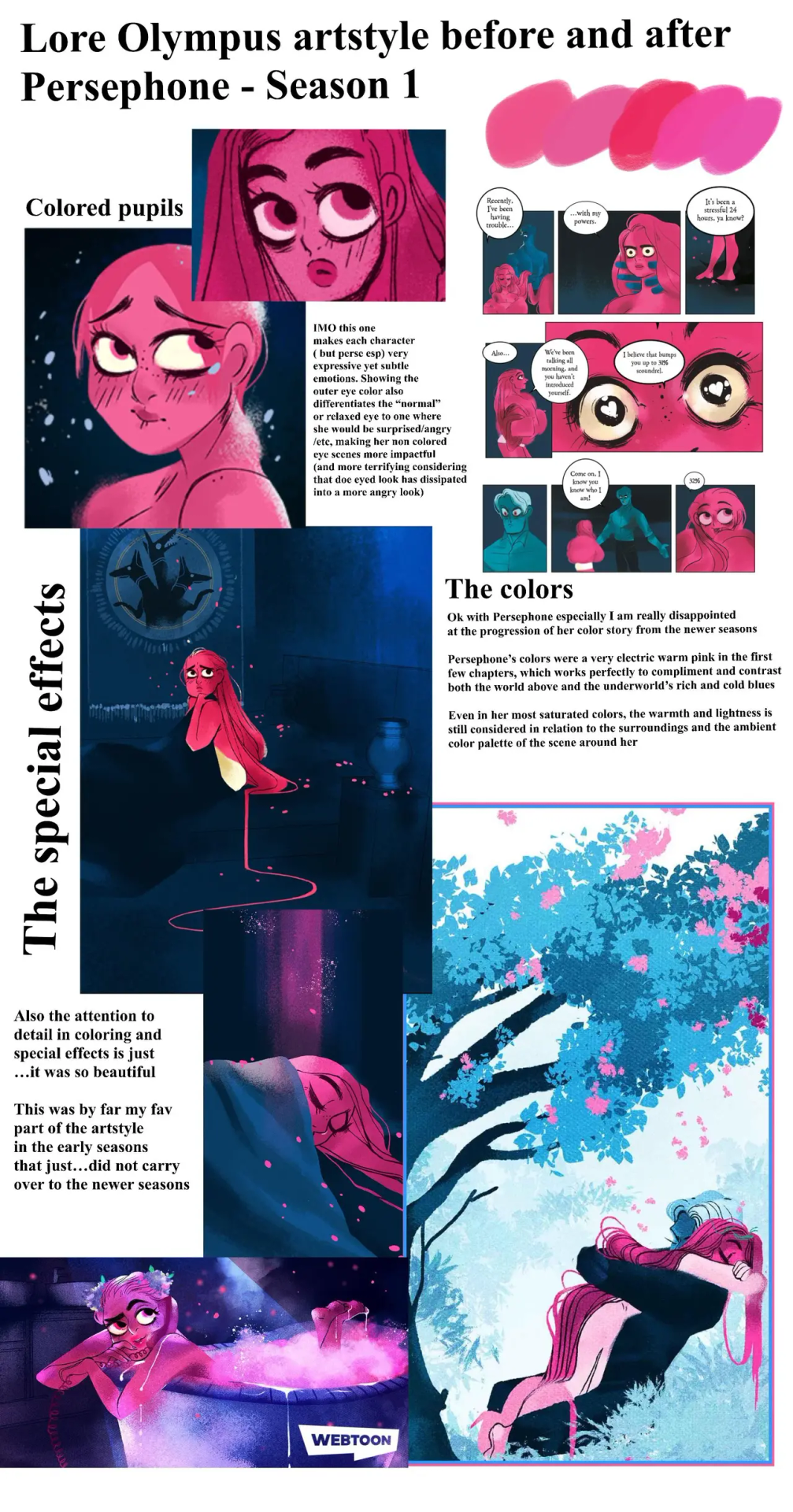

There's this problem with the undertones and shading used now that makes the characters look very 'plastic'. Before they looked ethereal, now they look rubbery and artificial. And there are a few reasons for this, one of which includes how Rachel shades the comic now compared to S1.
There's also the backgrounds themselves. LO's always been minimal in its backgrounds, but they used to have loads of texture, lighting effects, and glow.
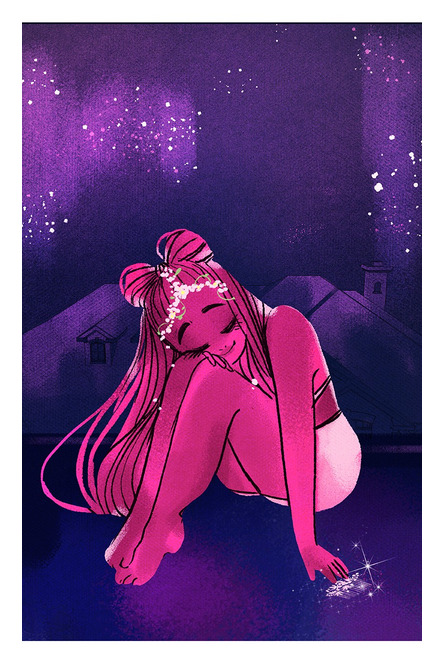
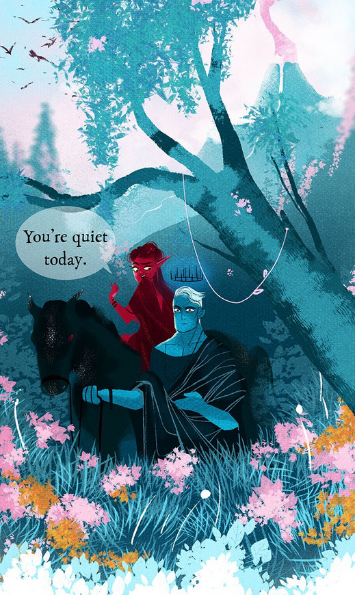

(seriously, when was the last time we got an iconic panel like this? So many of the panels in S3, even the ones that TRY to feel 'iconic', don't come anywhere near the level of the S1 art that was truly memorable).
Rachel's also clearly uh... checked out of the comic in a way that shows through her lineart specifically. Rachel's old art is known for having very thick, varying, distinct lines, and there's been a lot less of that lately.
Rachel's lineart:

Who the fuck:
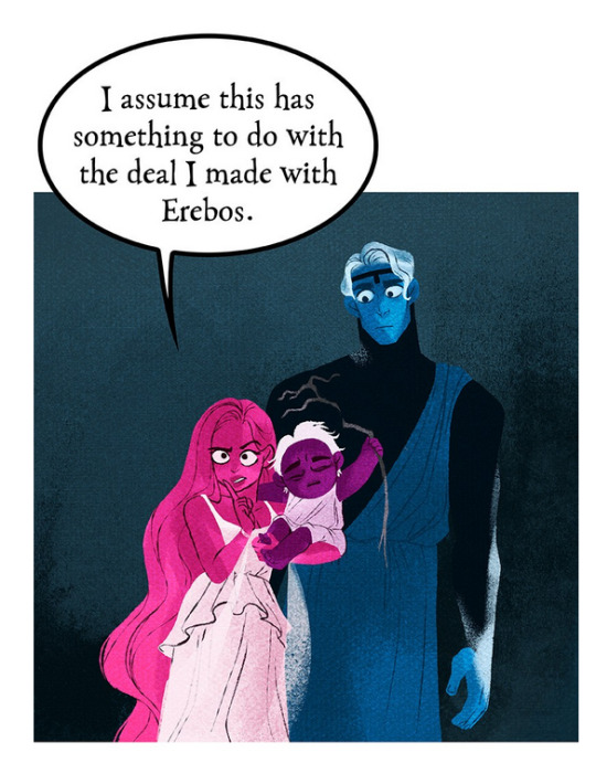
And what happens when the backgrounds stop pulling their weight? The colors look even worse.

The void backgrounds, unlike in S1, have been VERY muddy and dry. So it makes those hyper-saturated colors look even MORE saturated and ugly.
Now, to Rachel's credit, there have been more backgrounds as of late:
But see how the characters still look whack? It feels like Rachel's making attempts to address the criticism while still avoiding the massive elephant in the room - she's not putting in the same efforts anymore and any efforts she does make feel performative and hollow, and it shows. And this happens a lot with Rachel attempting to address criticism, she's trying to address a specific point that isn't taking into account the larger picture where the grander point is coming from. It feels very "SEE! SEE!" while turning a blind eye to everything else.
And yeah, it means even using some of the same colors from S1 can't and won't save the comic from looking like cheap reproduced garbage. Because just using those colors on their own is missing the forest for the trees, the old colors were only part of a much larger thing. Lore Olympus used to be the sum of its parts - now all those parts have been smashed up with a hammer and left in a mess on the floor, and Rachel is simply trying to pick up those individual parts and call it "fixed".
Frankly, until she understands this and is willing to play a more active part in creating the comic genuinely and with real effort that isn't purely performative or meant to "get back" at her critics, then what LO used to have will forever remain a mess on the floor.
#lore olympus critical#lo critical#anti lore olympus#ask me anything#ama#anon ama#anon ask me anything
182 notes
·
View notes
Note
I was wondering how achieve such a wonderful textured finish on your pieces? They are wonderful and I love their resemblance to aged photographs and the speckles of colors in the backgrounds. Your art is mesmerizing :)
you can see some of the texture brush sets i use in my #info_asks tag but i have some more (procreate) tips aside from just brushes
also hi i made this whole thing and then stupidly hit ctrl z to erase ONE word and i lost the entire bottom half of the post and all my image descriptions so fuck you tumblr i had to make this twice
to get a faded photo or old digital screen look, consider duplicating the canvas (once all the layers are merged) and using a gaussian blur tool on the new duplicated layer. then set that to low opacity to add a misty sort of look. looks nice in combination with some chromatic abberation and a small bloom effect. then a subtle noise filter on top:
for faded print effects, it's really worthwhile to learn how to use layer masks. you can use a layer mask to non-destructively 'weather' blocks of colour or lineart, without erasing the layer itself. the weathered ink/block print effect here was made using layer masks which means that if i just hide the mask, the lineart becomes solid black again and easy to alter or colour in:

for old paper effects you can just set a paper texture on multiply over the art sure, but you can also combine it with the blur & bloom thing, a really subtle drop shadow and canvas tilt, and highlights to make it look like an aged photograph of a card. this originally had a transparent bg but i'll post it here with a white bg so that the drop shadow is more obvious. the scuffed edges of the card (left) were hand drawn, simple white stucco brush. the bigger patch of scuffed ink (top right) was a texture stamp.

for block print looks you can move the colour layer out of alignment by a few pixels - but only after you're absolutely sure you're done with it, otherwise you'll get something like this -

i forgot to erase out her eye before i moved the red layer so now her eye defeats the 'look' of a misaligned print. the black lineart and red layer were also given the same layer mask treatment as described above to make them look faded or like the ink didn't stick down right to the paper
you can do this with multiple colour layers too. if the colour layers are separated and set to multiply (as in this cmyk example), it'll leave halos and edges around each shape which mimic old comic book print
just to show what you can do WITHOUT any special brushes, here's a piece of one of my mez tarot cards from before i got any extra brushsets at all. for this one, i added a green tint over everything to mimic a sun-bleached or faded print (my actual goal wasn't 'medieval illustration' but actually 'trading card from the 60s that got left on someone's windowsill for decades'). the background texture is the procreate noise brush. the texture under the green lion drawing is the procreate concrete brush (to make it look painted onto a wall). the lettering and lineart is procreate's 6B pencil. but to properly aim for The Look of it being a printed physical object, i also used a perspective blur so that the edges are out of focus, and metallic gold highlights which don't match the lighting of the actual illustration and appear to be catching some other external light. that texture was made from the procreate noise brush
it's pretty simple compared to my later stuff but i still really like the effect
in terms of colours, you need to keep them unified so that they all appear to be acting under the same external light source, like if someone is holding up a torch to a painting then the painting colours will be glazed with firelight even if there's no painted fire. a really easy way to do this is to slap a multiply layer over everything in one shade - grey-yellow for a weathered paper look, or greenish blue for sunbleached photos. this unifies all the colours of the drawing. or you can apply a gradient map at a low opacity so that there's only a subtle change. or just do it by hand - if you want everything to be slightly tinted yellow, just pick the colours you normally would, but move the colour wheel towards yellow to get a yellowfied version of the base colour. easy
it's really important to consider how fading and weathering can affect printed colour. white paper yellows, black fades. you will rarely see pure black or pure white. which means you can use pure black or pure white to add external effects like the white scuff marks on the hierophant card. if the whole drawing is yellowed from age but there's some white somewhere, it's an easy shorthand to show that the scuff mark or whatever was not originally part of the drawing (great way to add some nasty stains lol)
#info asks#i don't have like a specific set of steps i follow i kind of freestyle it every time#obviously i have favourites i like to use but like that sphinx drawing? don't ask me how i did it because i don't remember#i just played with it until it looked nice. the blue dots are ... some sort of effect layer i don't remember which
637 notes
·
View notes
Note
Hello! I've been following your Creekclan videos and watching you draw is really inspiring for me! I was wondering, if you're comfortable with sharing, if you could make a tutorial of sorts on how you shade your drawings in those videos? It's a very pretty way to shade and I'm curious about what your process is. No worries if you wouldn't like to share that, and thank you for your time :3
Hi ! Thank you so much for following my series !!! :) I will try to post the tutorial here :
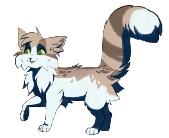
STEP 1 : Paint your character ! Here we will take Toadjump as our test subject !

STEP 2 : Add the shadows based on your light source ! (I generally use a high sun) For the colors of the shadow, if your character is directly under the sky, I would use blue, and if under trees or vegetation, a more green shadow, but it's really up to you and the colors you wish to have ! I would also recommend using a textured brush for this step !
STEP 3 : Now, lock your shadow on its layer so you can paint only within it ! With an "airbrush" brush, add some orangy/brown ! The orange should be lighter than the blue, but don't make it too light !

STEP 4 : This one is optional ! Add lighter and more vibrant / satured blue opposed to the orange ! This blue is mainly on the exterior of the body or on the limbs that are "behind" the body ! This color is used as a reflexion from the environment's colors. If you use a white background, this lighter blue is alright ! If your character is in a forest, maybe use a more greenish blue, and etc depending of the colors of the environment (I hope this is understandable !)
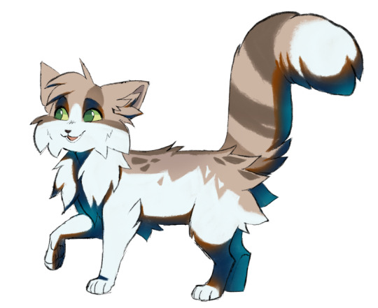
STEP 5 : Simply reduce the shadow layer's opacity ! I usually put it around 45% so the shadow isn't too harsh, but depending on your environment, ambiance and lighting, you can vary this setting !
I mainly use this shading technique for my sketches as it is really quick and easy to do ! I hope this tutorial is clear enough, I hope it helps you !! :)
272 notes
·
View notes
Text
Here are some process shots for this one of Raphael from BG3! That magnificent bastard...

So I started out with a sketch of Raphael. He's got such a charismatic swagger doing the whole "What's better than the Devil you don't know? The devil you do" scene. I just wanted to do a caricature study and have a bit of fun.
Moving from rough sketch to clean line art is always challenging for me as I often get bored or what was originally loose and fun can become stiff.
I had to redo the linework twice because I didn't like how the first one turned out! Second time is always the charm.
I initially only planned to draw the character but I love the design of House of Hope too much, so I went back into the game and took a bunch of screen shots and sketched out the rough bg.
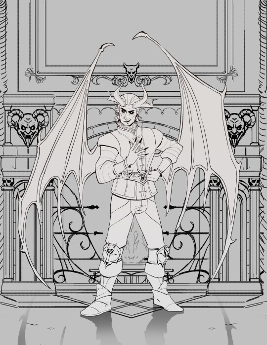
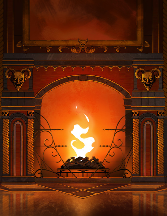
Then I went ahead and cleaned up the bg. At this point is when I group the layers properly, so there is a clear separation between foreground, and background as well setting up the layers for animation. (Making sure the fireplace guards overlaps the walls behind it.)
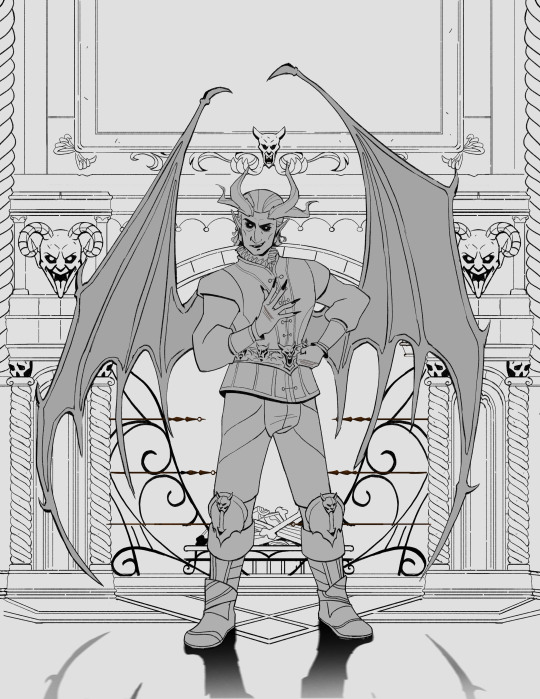
At the next stage I adding in the flat colors. I wanted to keep the style treatment of this piece more on the cell shaded/cartoony instead of super painterly. So I keep the color treatment fairly flat with a small amount of texture with the intention to add lighting as a fx overlapping treatment instead of painted in.
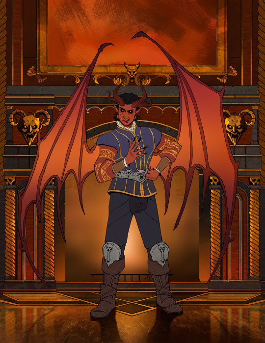
I work on the characters and the bgs at the same time to keep the values and color temp consistant, constantly adjusting as I go. From habit from work, I always paint the entire BG JUST incase I need to make changes or make adjustments to subject in from. Here is the bg all done, with fire painted in as a place holder.
And finally, adding the final lighting layers added on Raphael. I keep it simple here, just a redish/purple multiply player with the areas in the light masked out, and inverse mask on an orange/red overlay layer of the areas in the light.
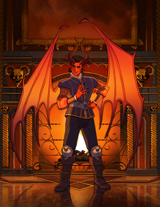
Animating the fire took ironically the longest, the animation tools in photoshop is clunky and I haven't animated since school days. I looked up a lot of references and tutorials! It's not perfect but good enough for me!
#raphael bg3#raphael baldur's gate 3#bg3 animation#bg3#badlurs gate 3#bg3 fanart#artists on tumblr#sketches#drawing#art#artprocesses#art tutorial#bg3 art#art process#art style#animation#bg3 spoilers
131 notes
·
View notes
Note
i adore your paintings so muchhh
would you happen to have any other tips or tutorials for your process? anything from thumbnailing all the way to final render
Thank you 😭♥ I appreciate that a lot!!
To start with I've got my advice tag (both new and veeery old stuff lol), & my youtube has a couple of speedpaints on it, one with commentary including process, brushes etc
In terms of general stuff about how I approach painting, I tend to tailor the method to the desired outcome. I talk about it more in depth on this post here, I also link to some references & tutorials that I really enjoy/recommend!
Besides that though, I guess I can do a little walkthrough of the Whisper & Tangle painting I uploaded a few months ago, since I tried something new with it that I pseudo integrated into my workflow & could be fun to talk about? 🤔

SO yes, I do always thumbnail when I'm doing a bigger painting, and they're definitely not pretty LOL. I usually use the colour fill lasso just to block in basic shapes and values with a gradient map slapped on the top -- I ended up swapping the values around in the end because it let me use the fireflies as the sole light source, making it more character focused! Then it's the usual process of resketching it all & flatting in the base colours (I also added Whisper's wisps hehe), then adding shading:
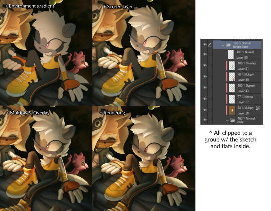
This is how I usually approach it, w/ all the shading layers clipped to the original flats to preserve editing. Multiply, screen & overlay are the most common layer modes I use while doing this, and if I'm ever struggling I'll sometimes add a gradient map too in order to unify awkward colours etc. The new thing I tried for this painting was doing what's often nicknamed as a 'clown pass' -- which is using hard edged shapes to create an easily-accessible selection mask for each part:
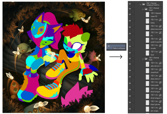
It looks Super funny but I actually found it very helpful, and I ended up using it to select & cut out all of their body parts onto seperate layers, which were then alpha locked. It meant I could go ham w/ large or textured brushes, smudges etc without worrying about losing those edges, or accidentally over-rendering and screwing up the anatomy in the process!!
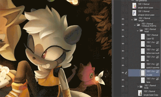
I've kept doing something similar since, though it's a bit more dialed back; mainly using the lasso select to chop it up directly and preserve specific/necessary edges, grouping up similar body parts on a single layer etc.
After doing all that, I sat down and started rendering. The background was all blocked in & detailed with a hard round brush and these amazing brushes from Devin Elle Kurtz. There isn't anything super insightful that I think I could type on how I render, but I do have that speedpaint I mentioned earlier that'll probably shed more light. It's just a lot of eyedropping & painting, rinse and repeat
When rendering is done I usually add a concoction of adjustment layers, as well as an overlay w/ a noise texture on it. I also sharpen it all after doing so! These are the ones that I ended up adding for this painting:

The dupe & blur is a fun thing that doesn't always work, but it looks super neat when the painting itself calls for it, especially when paired w/ that noise texture. It can make stuff look like an old/low quality photograph or recording -- here's another example w/ a shadow and amy doodle I posted a few months ago:

That's about it for this painting, the majority of the time spent on it was honestly me rendering those damn leaves 🥲 Very tedious but worth it & it was a really good learning experience. I'm not sure if any of this will prove useful but thank you so much for sending in the ask, & if you (or anyone else reading this) wants a similar breakdown for a different painting of mine, please do let me know and I'll try my best to do one!! 🥺💞
#tutorial#kinda. i'm counting this as one... i should really start a new tag for these sorts of posts because theyre super fun#art breakdown#maybe??#either way thank you so much ♥
125 notes
·
View notes
Note
I love the texture of your art? Like the illustration vibes straight out of a story, they're so elegant. I can't stop staring at your skins!! Wait. That's weird. But true!! I love how you do shading and flushes, but it looks so...smooth? I just love your art so much <3
oh, hah! well, thank you :)
I blame it on pencils and gradients, I'm not good at digital lineart so it's all mostly pencil baybeeeeee. The paper and pencil add some faint textures, which is nice.
Also gradients make everything look better, whether that's for backgrounds, clothing, and skin!
#ask#curlzformetal#i have tried paintily artowkrs but ultimately it isnt for me#i like my flat colour methods#and i can trick folks into thinkling its intentional and not lazy XD#im joking im joking#i do like flat colour art#so its all self indulgent
81 notes
·
View notes
Text
Coloring tutorial I guess
That's my most default shading style, a hybrid of line drawing and painted shadows, and I'll tell you exactly how to get this look.
But before we start, you need a weapon
This is my main brush for basically anything, including line art on days when I don't feel like switching to something actually intended for inking. It's a lightly textured square brush with color variation on every stamp. Intended for Procreate but you can always just rip the alpha texture out of the file and use it for a brush in any drawing program.
That out of the way, let's go. I'll use the same line art as the one in fluff tutorial.
Set the line layer to ~60 or so opacity and get to blocking in the base colors of your character. The jitter brush will introduce some color variation on it's own, but changing the color occasionally will add more visual interest.
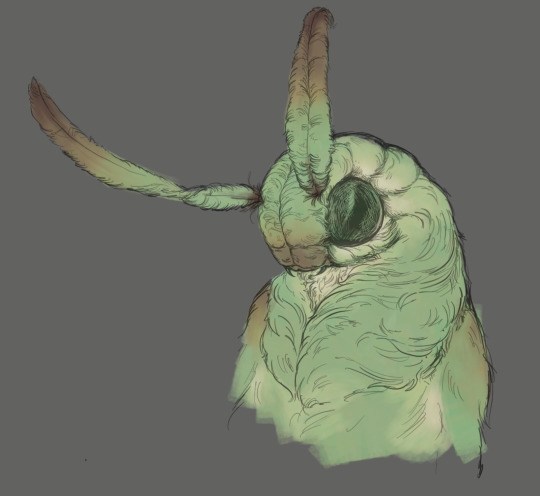
After this I add a multiply layer on top and dab orange or red in places where we might be able to see the base of the hairs or peek at the carapace underneath.
It's places where hair parts and where it's shorter. This accent color works great on joints as well. Example of the thing I'm going for in real life:
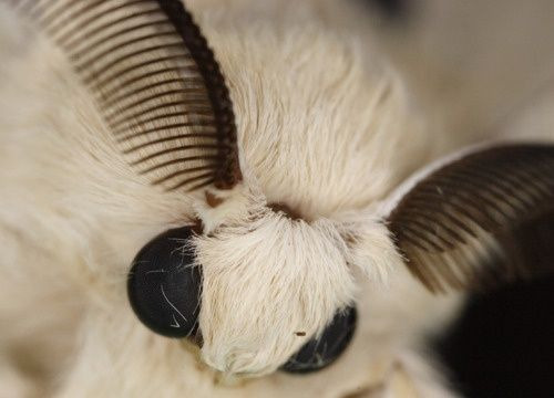
Especially visible behind the head. It's not present on every moth to be fair, but I like to add these accents even where it wouldn't make sense, just because it looks nice. Even on insects without hair.
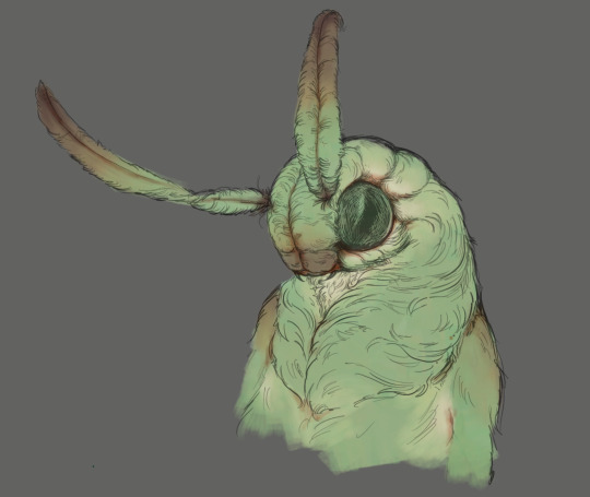
Block in the eyes and mandibles now, best if it's on separate layer.
Now, the actual funny tricks begin. If you're one of the people who only use multiply or add blend modes, stop it, get some help
Understanding the math behind blend modes is gonna get you a long way.
My lineart is set to subtract more often than not. I find it produces juicier and more colorful results than multiply. I want to give this picture a warm orange feeling, so the color of my lines should be the opposite - blue.
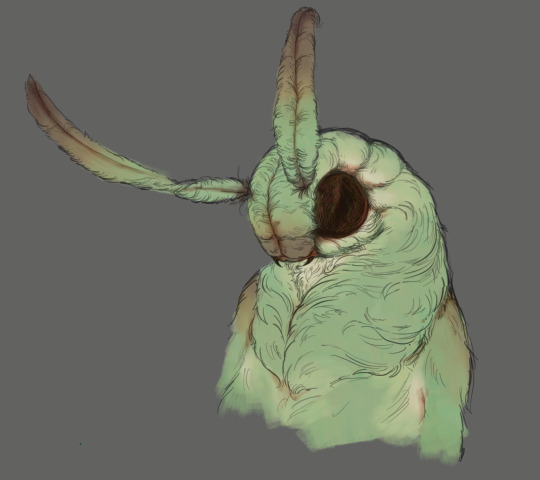
And, subtract.
Perfect, but not quite. We can push the lines to an even softer feeling. Take the line layer, copy it, invert the color and set to multiply. I then throw gaussian blur on the resulting copy and reduce opacity until the lines bleed into the surroundings just a little bit.
On to actual shading. People who shade without getting in some background first scare me, so let me throw something together real quick.
A simple gradient will also suffice for this use. We just need some information on which colors are present in the surroundings.
Copy your background, bring it on top of your character layers and gaussian blur it real hard. Set it to multiply, remove all parts of the layer that go beyond the pixels of the base color layer. Adjust opacity until the character fits in the background.
Let's identify the light sources. In this case it's only the sky, but it produces two distinct colors - soft blue lighting comes from the top, slightly stronger red comes from behind.
The blue light I set to exclusion blend mode because it felt most appropriate in this case. Both add and screen looked too strong to be the light coming from such dark sky.
In this lighting context the lower part of the body will receive less light that the upper part. I use the green of the bushes set to multiply to darken the bottom.
The character is surrounded by all kinds of soft light, but it can't get everywhere. It's time to add ambient occlusion, or contact shadows, for those without a 3d background. Anywhere where there is a crevice or surfaces almost touch, a soft shadow will form.
I do it on a multiply layer with a neutral gray-green color. Gray because any color light isn't really getting in there and green because the fluff is somewhat transparent and whatever light does pass through it gains a greenish hue.
Last step, red rim light from the fading sunset behind the character.
Since it's rim light I just work with normal blending mode. Setting it to add or something of the sort would make the rim light brighter than the source of the light. And it'd be odd.
And that's it. I usually throw on some post processing in Snapseed. Pull some curves, throw on a bit of grain, etc. But it's a topic for another time.
In conclusion, try to think about the environment more when shading. What route does light go through to reach where you're coloring? Did it reflect off of any colored surface? Did it pass through something transparent to gain a different hue? What color shadow would this ambient lighting produce?
Go have fun with your colors now.
211 notes
·
View notes
Text
Art Tutorial (aliased brush, oil painting look)
I've been using Pikmin Echo as a springboard for myself to practice new art techniques!
I had a few people ask me how I draw backgrounds in paint dot net, so I quickly drew this image you see below!
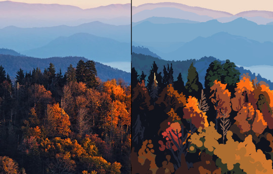
Now, there isn't one process I use, I mostly freehand it straight from the noggin to the paper. I barely use references, and I really should use them more often!!
But this should show an outline of generally what's going on in my mind when I'm doodling a doodle :)
Step 1: Choose sky color
I personally like to use either a light blue or a light orange!
This reference uses a light orange so I'll steal it.

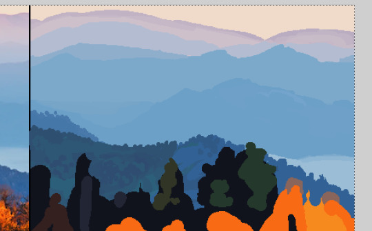
Step 2: block the main contrast out with a big brush
There is a foreground and a background to this scene, a clear light and dark.
It's much easier to work with a blocked out pattern! It's like the sketching equivalent in this technique.

By the way, I'm using an aliased brush because I'm a pixelart nerd (so retro 🤓☝️) and also because it makes selecting blocks of color much less messy! But trust me, it will look soft in the end :)
Step 3: Look for blocks of common color
I see big patches of blue and orange when I squint my eyes, so I plot those in!
Look at how the light comes from the top right, it illuminates the trees on one side!

Step 4: Look for hue variations in the lights
Natural colors are never going to be flat or homogeneous--theres variations everywhere!
Add in greenish, reddish, bluish and yellowish patches, and even if at first it's a little scary to stray from such bold colors, I promise, gray is essential to making a truly vivid image!

Step 5: move on to the darks
The tree trunks in the left shade looked blue to me! So I toss in some blue splotches.
Don't worry if it looks messy. You can always clean up your messes later <3

Step 6: Fine detail in the very back
Going just like a traditional painter, painting the back first is perfect because you will later paint over the back layers with the front ones, creating realistic layers of texture!
It is much easier to go back to front than the reverse.
Think about the shape design and the flow of all of the elements.
The mountains curl up and down in very specific ways, and the trees look like circles from very far away, with leafless outliers few and far between.
Step 7: let's take a break from the canvas and do homework
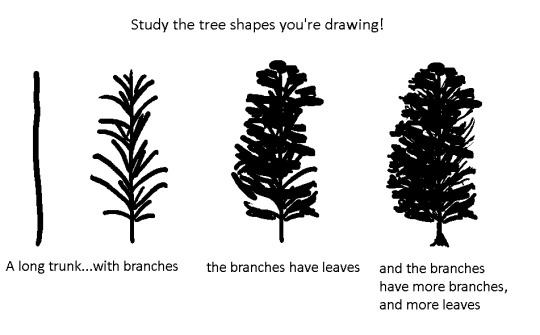
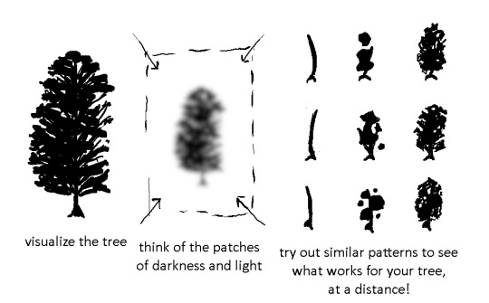
learning how to simplify incredibly complicated shapes is crucial!
Trees, grass, rocks, everything in nature has very complicated structure, but you can simplify them very much!
With newfound respect for the complexity of nature, start noting down the elements of your scene in more detail.
You can move your reference around and crop it so that it's easier to perfectly replicate what you wish to draw....but....

personally, I like to use the reference more for vibes and just ad lib the rest!
Study the general shapes of your reference, and apply them in new, unique ways!
I hope this tutorial was helpful for you!
Please feel free to rb this post with any art you make with this! I'll be excited to see what you create :)
Thanks for reading!
109 notes
·
View notes
Note
I’m not sure if you’ve answered this before, but how do you do you pages? Do you use one program or several? I wanna use the format but I’m baffled XD
It’s so good! Also Pinemorant FTW!!🏳️🌈
I've briefly discussed my process in making issues, but I can go through the whole thing for anyone who is interested in making a comic like this. It's not complicated at all - I only use one program (technically two, if you count Google Docs), Medibang Paint Pro. It's free to download and I've used it for years, it's a medium-level digital art program.
I'll take a page from the last issue, 26, to demonstrate. So if you haven't read it yet, do that before reading this.
My first step, which is already completed for every issue, is to write a basic summary of the things I want to happen. If I have a specific dialogue I want to use I'll include, but normally it's just descriptions.
I don't always use everything from my summary, or I'll add things in the final written draft. You may notice a line about "he knew of some cat in Fire", which was about Cormorantpaw knowing of Rainhaze but not actually who he was. I took it out because I couldn't seamlessly work it into the conversation.
2. The stories themselves are written in Google Docs, in the format of any short fiction. My process is pretty short - I'll write out a rough draft, leave it alone for a day, then come back and clean it up. Here's the section from the page I'm showing.
If I use speech bubbles on a page, like this one, sometimes there will be descriptive language in the story that's not in the page, like "I said, relenting and leaping up next to him."
3. My first compositing step is to lay down the text and sketches, so I know where everything goes and ensures the page flows nicely. Medibang has a feature called the "Text Tool", which is what I use to lay down text. I can't say my fonts exactly since they're mostly Korean characters, but they're part of the default Medibang font set.
4. After this, I add lines and colors. It's pretty simple.
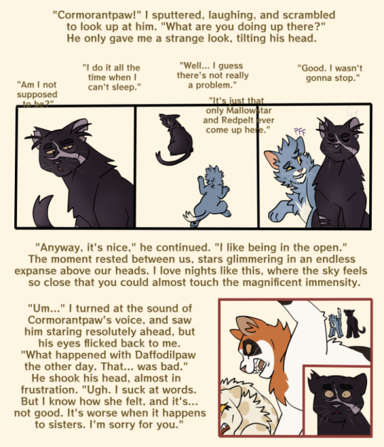
I have a specific color scheme for borderlines; black is normal, present drawings, reddish-pink is flashback, blue is fantasy/imagination.
5. After color, I draw the backgrounds. All of my backgrounds are painted using the Pen brush and the Watercolor (Wet) brush, sometimes with Acrylic or Chalk for texture.

6. My final step is to add a gradient multiply and overlay layer, since I don't cell shade or paint shade the characters. It saves a lot of time! I also add final cleanup like sound effects, whiskers, and speech bubbles, if they're needed.
And that's a page done!
116 notes
·
View notes
Note
Hola. Me gusta como dibujas y quería preguntarte, ¿qué pinceles usas? Y porque los elegiste.
Quiero publicar mi propio arte, pero no me decido si usar pinceles muy definidos o con textura.
Tuve que usar un traductor para leer este mensaje, ¡lo siento mucho si entendí mal algo! Lamentablemente no hablo español, así que mi respuesta necesitaría pasar por un traductor de cualquier manera ^^" Mantendré el resto de la publicación en inglés para que sea más accesible para blogs internacionales, ¡espero que te parezca bien!
----
I mainly use the Clip Studio Paint standard brushes, though I technically have a bunch of custom ones too haha
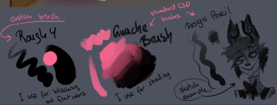
These are the 3 brushes I use most!
the Design Pencil tool from CSP for sketches and outlines (reason: the softer texture feels nice to sketch with, since mistakes fade easier into the background - important for my lineart since I just adapt and clean up my sketches for that - and I like the way it layers, I can block out some monochromatic colors or simple shading with it very easily, which I tend to do a lot when I'm going for more of a composition concept sketch!)
A rough, round custom brush for blocking out flat colors (reason: the slight texturing makes it blend into the more transparent edges of my textured lineart better)
The Guache Brush tool from CSP for shading (reason: I mostly do my shading using layers on multiply mode using a darker and a lighter color - this brush blends them using pen pressure very smoothly and I like the subtle texture it adds to my drawings! I also sometimes use this brush to block out rough shapes in the background because it blends with other colors easily, keeping the shapes more vague)
overall whether or not you use textured or simpler brushes depends a lot on what feels the most comfortable for you, so experimenting is important!
There's many many artists who work best with the standard, untextured round brush you can find in every art program, others (like me) prefer to play around with textures for their workflow :D
I hope this bit of insight helped even just a little, thank you for the ask!!!
47 notes
·
View notes
Last Seen Blogs
gifcolsstuff
Gifs
learn-jazz-g
Divide of sumec firman generator
gifcolsstuff
Gifs
adi-soul-094
_Adi_soul 😔

yessergeyme
Без названия