#limbus company oc
Text
i love my little puppy!1!!11 my pet dog!!!!
he's nice u just need to let him sniff your hand :333 (he is severely traumatized)
anyways i got this sad little man from a limbus shindanmaker. take buck from the hit book call of the wild!!! he's. massive asf. oh my god why is he so big and scary
tnmn fans dw the tnmn posting will come back soon 🥹

22 notes
·
View notes
Text
A (Somewhat Incomplete) Guide on How to Fake Sinner Profiles

LIMBUSIFY YOUR ARTSTYLE (optional)
The core components of limbus companies artstyle are as follows:
Textured, ink pen like lineart
Desaturated colours leaning towards the outermost area of the colour square
Cell shading with some texture
lots and lots of visual effects. God have mercy
Keep references around while drawing, as there are often lots of small details and these will be your guide for not going too crazy with your noise effects.
2. BACKGROUNDS
In the interest of saving time, here’s a free template for you to use. Feel free to change up the background colour however
Key notes:
The background colour loosely matches to the sinner’s eye colour, however usually slightly more saturated.
the outer border is lined thinly by black. This also covers the limbus logo section.
3. TEXT
The font for the light yellow text for your sinners weapon is Futura Condensed Medium. There’s a slight black backdrop to it you can get from duplicating the text and lowering it slightly.

4. EFFECTS
Sharpen, noise and blur will be your best friends here. Too high quality of a character sprite can make it not mesh with the background, and look odd when matched with canon portraits. Here’s a step by step process:
Add wear to the portrait with textured brushes, low opacity and blending modes. I’d generally suggest using gouache or watercolour brushes very lightly to establish texture, then going back in more strongly to indicate dirt and grime. Always use a coloured shadow.
using a blur filter, blur your character on the lowest setting possible, to the point it’s almost unnoticeable.
If your program has a layer texture filter, switch to the noise option and lightly cover the portrait with a thin layer of noise texture. If not, use your pen’s texture settings OR download a png of noise texture and set the layer it’s on to multiply, then lowering the opacity to around %5-10.
Apply a sharpening filter very lightly, only to the point where when zoomed in light colour separation and grain from the lineart can be seen.
aside from that, I’d always recommend playing around with colours, light and textures to make the portrait fit closer.
In the end, it can look something like this!
To conclude this, have fun, go crazy, and suggestions on how to improve this guide are very much encouraged.
#limbus company#lcb#limbus fanart#limbus company oc#project moon#project moon oc#please reblog this took me forever jesus
651 notes
·
View notes
Text

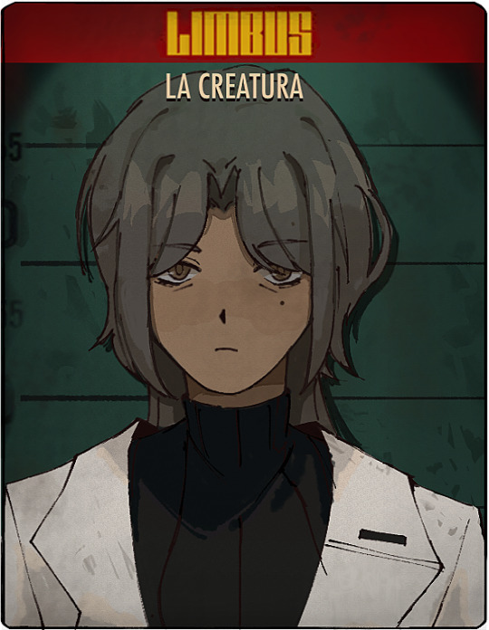
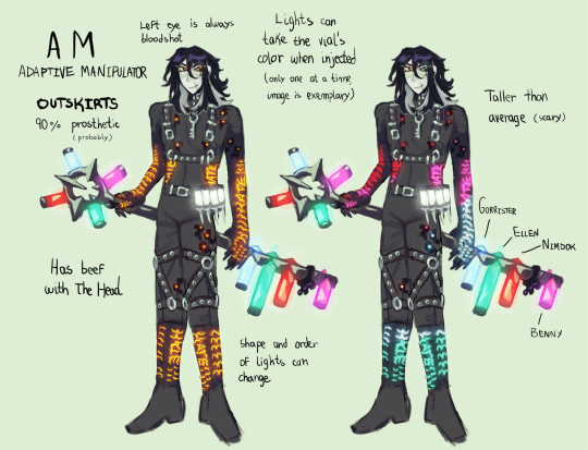
Limbus Company OC time! Say hi to AM, an ex military scientist, ex researcher, currently a pathetic wet cat of a man.
Extremely disgruntled that he’s human and desperately wants to change that.
#my art#digital art#oc tag#my ocs#limbus company#limbus company oc#AM#ihnmaims#new and improved version of my sinner AM he is no longer a spoiled young man but an experienced older dude#clip studio paint#csp
219 notes
·
View notes
Text

Gatsby with the flower honse ego
135 notes
·
View notes
Text


Ryoshu and Meilin... RyoLin.... 🥹💕
70 notes
·
View notes
Text

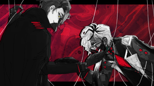
You carved open my heart can’t just leave me to bleed
#ihnmaims#i have no mouth but i must scream#i have no mouth and i must scream#ihnmaims am#am ihnmaims#allied mastercomputer#limbus company oc#limbus fanart#limbus company#limbus oc#project moon#proj moon#the carnival#library of ruina#lor
104 notes
·
View notes
Text
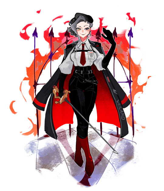
"Manuscripts don't burn!"
im very fond of the limbus character design model so i wanted to make some lil sinnies. here's Woland from "master and margarita"
#limbus company#limbus fanart#limbus company oc#master and margarita#lcb#мастер и маргарита#воланд#woland#artists on tumblr#my art#art#digital art#oc#original character
271 notes
·
View notes
Text
the greatest living show
#sometimes i try to art#hermann lcb#vediovis lcb#oc/canon#limbus company oc#limbus company#sighing... something wrong with them#i shan't even begin to say more about this specifically
69 notes
·
View notes
Text

62 notes
·
View notes
Text


warrior cats firestar... as an lcb sinner!
#me and my friends are making limbus ocs#and somethign happened.#firegray backstreets yuri#you think rusty/firestar grew up in the nest#and moved to the backstreets#im so down with it man#personal#limbus company#lcb#warrior cats#warrior cats au#limbus company au#limbus company oc#limbus oc#lcb au
82 notes
·
View notes
Text

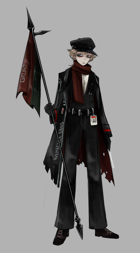
Ernő Nemecsek
Age: 20
Gender: Male
Nationality: Hungarian
EGO: Grund
(Based on the novel titeled The Boys of Paul Street )
#digital art#character design#oc#original character#limbus company#limbus company oc#limbus company fanart#limbus#project moon#project moon fanart#project moon oc#lobotomy corporation#library of ruina#oc art#fan character#lcb#lcb fanart#lcb oc
235 notes
·
View notes
Text
Project Moon tabletop rpg interest check
hey gang!! my friend and i got the idea to make an entire ttrpg system for the universe of project moon for funsies!! and i decided that this could be a lot more fun if we had even more people involved. so i just made an interest form to see if anybody else would be interested in helping develop this!! (oh and for those that dont know, a tabletop rpg is what dungeons and dragons is :) )
#limbus company#limbus#project moon#limbus company oc#library of ruina#lobotomy corporation#game development#ttrpg
71 notes
·
View notes
Text
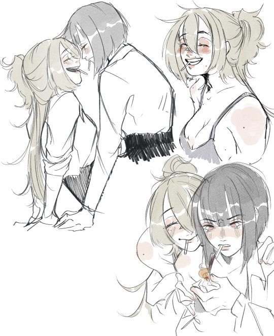
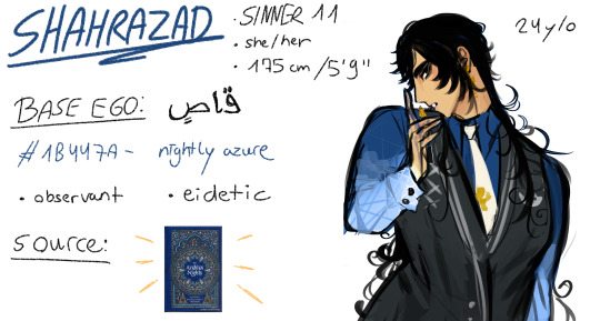
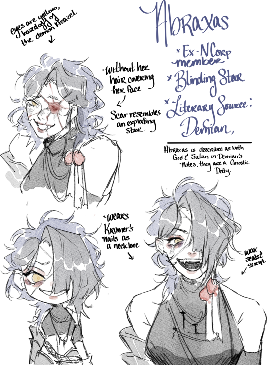
Posting abt my limbus ocs again hii

They have full designs now...

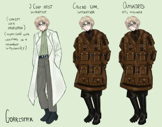
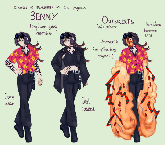


And alt sprites
Can you tell that I am so ill about them.
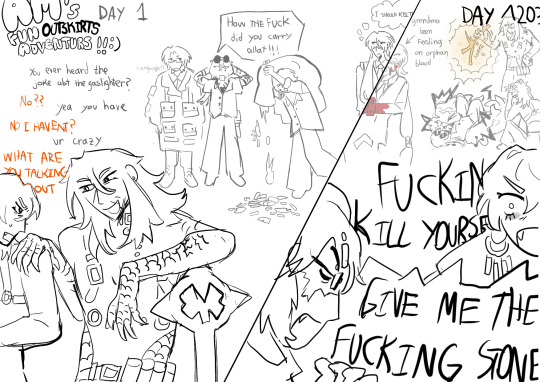
Bonus image!!!!!!!
They have proper lore and shi in my head but I got too lazy to write it down ill probably do that soon thoug but feel free to ask anything or whateber (i love talkihg aboiut them:❤
69 notes
·
View notes
Text


today i blanked out and when i woke up its 12 am and realized i made all of these in one sitting
#first of all i apologize but at the same time im not sorry#Ibong Adarna is the book i used for Juan btw#because i had so much filipino literature book reports in the past few years that i might as well channel it into something#if you told me im going to use and turn this absurd piece of writing into a limbus company oc years ago while i was cramming my book report#i would have laughed and walked away#now look at booboo the fucking fool#limbus company#limbus company oc#lcb#meteo art#lcb heathcliff#<- forgot to tag this dude HAHA
279 notes
·
View notes
Text


some limbus ocs - in a double decker bus with my girlfriends limbus cast
93 notes
·
View notes
Text
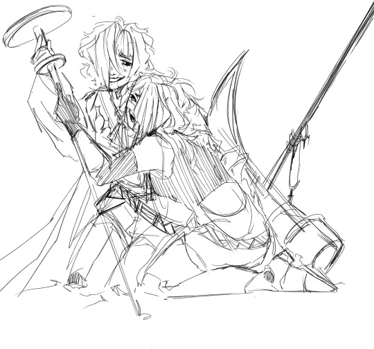
I made uhm... an oc to ship with Kromer... El oh el.

Also self indulgent Cowboy! Kromer because the wife requested it.
#limbus company#lcb#my art#project moon#kromer limbus#limbus company oc#yeehaw#save a horse ride a cowboy#/hj
101 notes
·
View notes
Last Seen Blogs

ambivalentmarvel
bider-man, bider-man

flowerbloom-arts
Moomin Comic Aficionado

nastymagazine
nasty diary

conspiracy-marin
Marin de Águila

lovemarketingie
Love Marketing