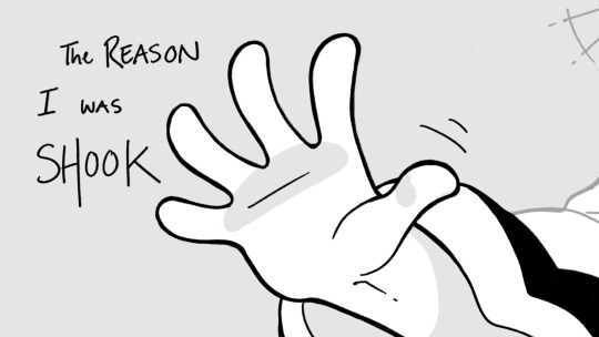
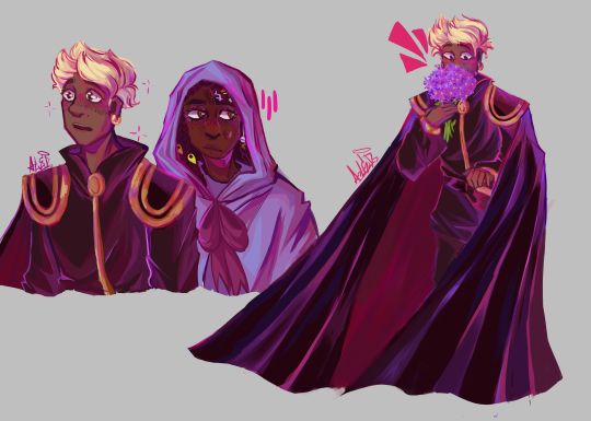
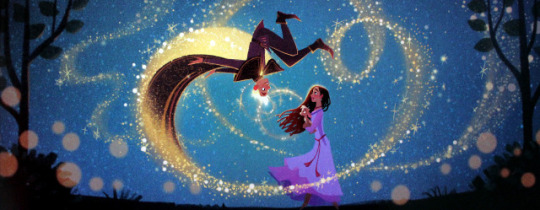
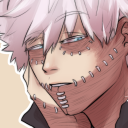
#I think part of it is because the characters are simpler to draw and the original art style already has so much flexibility haha
Text
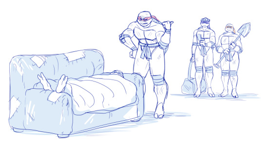
Wip ;P
Song is “Time Machine” by Autoheart!
#In Stars and Time#isat fanart#isat#isat siffrin#isat isabeau#work in progress#wip#autoheart#I’ve been chugging through this one way faster than my Tales of Arise project#I think part of it is because the characters are simpler to draw and the original art style already has so much flexibility haha#and also in stars and time has had a serious iron grip on my mind ever since I finished it#it’s such a good game#go play it#pls#mewnia's pawprints
1K notes
·
View notes
Text
pain and agony of having so much to learn to make more things but I need a job/further schooling to learn but I have to have made the things first
#.txt#Painful cycle unable to find value in my art but I already gave up and I'm already trying again some one needs to make this easier#And I think my life would be simpler if I just focused on drawing over 3D and tech anim but the time it would take#To function at a professional level as some sort of concept artist.#Also fine artist and concept artist community is well. Unfortunately unbearable.#Lacking so much animation experience in 2D and 3D I'm having trouble focusing on it to move forward.#The most experience I have is in 3D character art at this point probably but inability to finish things which also plagues#Every other concentration. As well.#I am sitting alone in the room trying to find something of value to express and it will never reach anyone. Existential dread like.#I think it's the searching for storytelling skills limiting me because I do not have the competitive nature#To be that into raw technical skills. Which is killing my ability to make a portfolio.#If I had more time to just keep on keeping on at my part time job I think I would just make the graphic novel I want to make.#To have something expressed and in the world. And then I could actually focus on technical things.#But this thinking has just become a roadblock it is not feasible but I do have several paths planned I just have to.#Recognize what is useful to me. But not just giving up anytime I have a new idea.#My interest goes between implementing animation within a greater scene and also the technical minutia I think is whats killing me.#Making multiple portfolios at once. Which isn't so bad bc ideally I'd be doing generalist work. But generalist means more time limitations.#My brain is convinced it can just work past time as a factor. Which is how we reach the problem I am having now (need money).#I think something I need to recognize is I've always thought my perspective and understanding of stories held some value.#But that only stands from my own perspective and it does not have value outside of that.#Even if it does reach other people it does not retain interest. And while it benefits me internally. I'm not making a career of it.#Which is fine.#I think the things I valued from story can still be found in technical skills. And anyone can develop a technical skill with some time.#If I keep my focus.#I think that's something close to a resolution I've been looking for. Been needing some profound change in my life and I think the desire#And constant failure of communication has been what's preventing me from moving forward.#I want to go out and do things. That is possible. Focus on skill and ability. Maybe the other stuff will come later.#Digesting this and hopefully not spending my days sleeping anymore.
1 note
·
View note
Text
Character/Show information found on Gooseworx's tumblr (part 1)
I went into Gooseworx's tumblr and made a list of all the info found on there so far.
Note: This will update as more and more posts are made.
Caine named himself before deciding that it's an acronym that stands for Creative Artificial Intelligence Networking Entity (he thinks it makes him sound professional)
Caine does not have an age. He is an AI.
Apparently, Caine is likely the best singer out of everyone in the circus.
Caine would own a circus peanut shotgun.
Caine can't grasp the concept of irony.
Caine is not affected by "this statement is false"
If Caine could remove his clothes, he'd have nothing underneath.
Caine would only bite his eyes or tongue if he thought it's funny. Otherwise, they clip through his teeth
Caine is short.
Caine does not understand verbal pranks (example: 'Joe Mama', 'Updog' etc). Even after having them explained, he'd still take them literally.
Bubble speaks in reverse once in episode 3.
Bubble is a much simpler AI created by Caine
Apparently, Bubble is the biggest slut.
Bubble is Caine's little hype man
Bubble likes being popped.
Bubble is a boy
Out of everyone, Bubble is the most likely to wear drag.
The moon is an AI "like Bubble".
The sun can talk too.
Pomni's hat is a part of her body
Pomni does not like being touched
Pomni's first design looked liked a frog
Pomni's reaction to herself in the mirror isn't a positive reaction
Apparently, Pomni's hair is black.
Pomni is good at accounting.
Ragatha gives the best hugs
Ragatha has been in the circus the second longest.
Ragatha is older than Pomni.
Ragatha likes horses.
Ragatha can play the Cello.
Ragatha can see through her button eye.
There's a particular character who hasn't been revealed yet who's practically a Gooseworx self-insert. (He's the mean one...Jax?)
Nobody likes Jax
Jax doesn't have a tail.
Jax's colour is periwinkle.
Jax deserves to be trapped in the circus the most
There's nothing heroic about Jax.
Jax is morally the worst character in the show.
Jax is the youngest member in the circus.
Jax didn't enter the circus at the age of 14.
Jax mistreats Gangle the most because shew the easiest to mistreat.
Jax is afraid of corn because it reminds him of something called 'the farm'.
Jax is a troubled individual.
If you gave Jax an unholy amount of praise, he'd be confused and frightened.
Jax mainly bullies the girls because he has issues he hasn't worked out with himself yet.
Jax most likely went through an emo phase
Gangle like to draw, specifically anime.
Gangle only has comedy and tragedy masks.
Gangle's favourite animal is Azumanga Daioh.
Gangle has a body pillow with a character on it.
Gangle watched One Piece, and her favourite character was Chopper.
Kinger is not British.
Kinger is the tallest and oldest
There is an episode that heavily features Kinger.
Kinger and Zooble eat like a chao
Kinger saw the gastral giveaway in a vision after eating two spoons of gravel.
Kinger knows how to play chess.
Zooble almost gets no screen time in the first two episodes
Zooble's appearance is based on ZoLo blocks
Zooble has a 'zooble box' of parts in their room.
Zooble does not like hugs
Zooble has been in the circus the second shortest.
Zooble is very grouchy and irritable.
Zooble is half a year older than Jax.
Zooble is alright with any pronouns
Zooble would smoke weed if possible.
Zooble is the worst at giving hugs
Zooble is constantly trying out different parts.
Zooble is the most likely to punt Jax into the abyss at any given moment
Zooble can play the drums.
Zooble most likely went through an emo phase.
Zooble was a tattoo artist at one point.
Zooble was a stoner
Zooble most likely dyed their hair in the real world.
How each member of the cast would react if you called them 'adorable'.
Nobody in the circus is truly sane
Heres the casts ages.
Pomni - 25
Jax - 22
Ragatha - 30
Zooble - 22
Gangle - 26
Kinger - 48
The performers can feel pain
Every character has a reason for the way they act.
The cast doesn't have bones, but they do have a visible skeleton when they're being electrocuted.
The black queen chess pieces name is Queenie
Queenie being a black chess piece and Kinger being a white chess piece has no relevancy to their relationship. It's only a design choice.
Queenie and Kinger aren't siblings.
The abstracted and lost eyes only look similar due to limited creativity in creature design.
Abstraction can't be undone.
The abstracted all look the same
A gloink king exists. It looks exactly like a normal gloink and dies immediately after mating.
There's "technically" a worm in episode 2.
There are "many" characters in the show that we don't know of.
The typical episode length will be 21-25 minutes.
There won't be any romance on the show. Stop asking.
Some episodes are a '1' on the horror scale, some are a '6'.
Apparently, a character we haven't met yet is getting the next episode for them.
As of november 6th, Gooseworx says, "The plan is eight episodes total, one season"
Note that some of this info may have changed since posting (or may have been revealed in the pilot), some may change during the course of the show, and some may be joke answers. Please let me know if there's anything I missed!
#I DIDNT SLEEP TO MAKE THIS. :-)#the amazing digital circus#tadc#digital circus#TADC Caine#Caine#TADC Kinger#Kinger#TADC Pomni#Pomni#TADC Gangle#Gangle#TADC Jax#Jax#TADC Ragatha#Ragatha#TADC Zooble#Zooble#TADC Bubble#text#amazing digital circus#seasalt speaks#long post
2K notes
·
View notes
Text
What if I made my first comic one of my stories that none of y'all give a shit abt. What then.
#rat rambles#oc posting#I wont probably (mainly since idk how well their story would fit in a comic format) but Im tempted to start scripting things#butttt also not a single damn drawing of any of the main cast hasnt flopped gkgmfkfbfh#well except for brady I think? but shes not technically part of the main cast so like#obviously that doesnt rly mean anything I just think its kinda funny that its the one that feels the most realistic for me to actually make#mainly because the story is much MUCH simpler plot wise than most of my others#with that being largely because it doesnt intertwine with many of the other stories in that world#in fact the only overlap is with the ocean story which comes from a secondary character from both#aaand technically miko but like. he appears in this story for like half a second so he doesnt rly count#anyways I dont like need ppl to rb all of my art to hell and back (tho it is apprectaited) but I do wish this cast got more attention#mainly because I actually rly love most of their designs? especially courtney Im so happy with how his design came out#and hes one of the ones I actually fully designed myself so its sad that literally everytginh with him flopped HARD fmfkfjdy#again its not that big a deal Im just rambling abt rabdom bullshit now since Im tired#anyways tine for bed I tgink! gn
0 notes
Text
THE MOMENT WE WERE ALL WAITING FOR, FINALLY FINISHED THE DESIGN OF ASTER YESSSSSS ✨✨✨✨✨✨❤❤
This design belongs to the Wish rewrite called "The kingdom of wishes" (Written by @annymation and soon illustrated by @emillyverse and me)
Sorry for the delay, but this guy had so many things to draw and I also had a thousand ideas that it took me a while to capture them all (4 drawings wow, even I'm surprised lol)
Now after this introduction I will tell you the procedure of its design :]
2D MODEL:
-Maybe some don't notice it, but for the 2D drawing of Aster I didn't add many shadows, because in the classic Disney movies the animation doesn't have many shadows if we look closely, this is for several reasons (at that time they had to inking FRAME BY FRAME, can you imagine how much longer it would have taken to add detailed shadows? I really have respect for the animators)

(Here are some examples of what I'm trying to explain)
-As I said before, I didn't detach myself much from the concept art of the movie, I just added some other details that occurred to me, Anny and Emy.
-We decided that his cape would have the constellations of the signs of the zodiac (It was Emy's idea), which in the final result are on the cape, the constellations are noticeable more or less depending on Aster's mood.
-In the Wish rewrite it is mentioned that Aster's hair is like a candle (Reference to Hades) so I decided not to add the lineart in that part
His hair changes depending on his emotions, but not only that, but also his lineart, the calmer he is, the cleaner his animation will be, however with strong emotions (anger, sadness, nervousness) his details will be more neglected, especially when He is REALLY angry, by the way I made his hair look like a flame to give more drama to his design and also make a reference to Ember from Elemental
And as a final detail, the star-shaped gem that she has as a brooch changes color, just like her earrings.
3D MODEL:
-When Aster disguises himself as a human, his details on his clothes would disappear and the shape of his accessories would change to ones without a star shape, also the tone of yellow would look duller, you know so as not to draw attention (although he is dressed like a prince with a giant cape, the boy doesn't know how to hide the truth very well lmao)
-In general, it's just that the design becomes simpler, the only thing that changes is her hair that is no longer a flame, her freckles that are no longer little stars, her clothes no longer have so many details and her mark on her eye disappears( ̄▽ ̄) .
By the way, I wanted to thank @the-autistic-idiot for giving us the great idea of Aster having a star-shaped mark on his eye :D.
-Also, I think that those who have seen my other Wish redesigns are wondering why it seems like I had spit a rainbow at Aster's 3D drawings, what happened is that when I was painting my neurons said ✨Change your coloring✨ and well, The drawing in the end came out like this, although I honestly like it better, it better represents how I draw in a traditional way
Yes, basically the coloring of my drawings is as if a unicorn had spit on them lol
FINAL COMMENTS:
-It was very fun to draw Aster! The boy really has a lot of changes, but thanks to him I already discovered my digital drawing style so I am satisfied.
-Again sorry for the delay, I know that for many Aster must be their favorite character so I hope your wait was worth it :]
See you next time!✨✨
#disney wish#wish 2023#disney#wish movie#sketch#wish#art#artists on tumblr#artwork#drawing#star wish#starboy#human star#wish star#starsha#star redesing#the kingdom of wishes#the kingdom of wishes fandom#the kingdom of wishes au#starboy wish#starboy x asha#asha and starboy#wish concept art#asha x star#wish asha#wish disney#disney fanart#disney movies#disney animation#walt disney animation studios
353 notes
·
View notes
Text
First Date
Requested: No
Warnings: None that I can think of
Ghost - Dinner
Ghost is very much a man who enjoys the simpler things like a nice hot meal. So of course a first date with him would be that exact thing. I’d say that he doesn’t like fancy restaurants but also that he wouldn’t be comfortable bringing you home for a first date. He’d meet somewhere in the middle with a middling reasutaunt. Not something as casual as IHop but not fancy fancy. He’ll dress nice but not too nice. A good pair of jeans, a clean t-shirt, though he only owns the one pair of muddied and scruffed up military boots.
He’s so nervous throughout it too, but it comes off as him anti-social or uninterested in you. Speaking only in quiet grunts and keeping his eyes away from you. If you’re the more sensitive type then your feelings are bound to get a bit hurt, but he’ll try to show you just how much he enjoyed your company afterwards. Brushing his fingers against yours as you both head out, quietly mumbling, asking you “same time next week?” with a little blush at the tips of his ears.

Soap - Movie
Soap immediately goes for the very sweet and simple approach of asking you on a date to the movies. He’d prefer an indoor theater but he’s definitely not opposed to a drive in. If you let him pick the movie then he’ll go for something cute, probably a cartoon or something. He seems like he’d like ones like Puss in Boots and Luca. But if you’d like to pick then he’s down to watch almost everything, though he draws the line at war movies. A war documentary might be fine. He dresses completely casual, prioritizing his own comfort over looking nice. Old jeans, old shirt, old boots. Completely honest to who he is, letting you get to know him.
He’s not too nervous throughout the whole time. Maybe a hint of it here and there when you get too quiet or you glance at him between scenes in the movie, your eyes catching his quietly before looking away. He might be a bit bold in asking to hold your hand on the way out, talking to you about your favorite parts of the movie or your favorite characters, his thumb rubbing circles on the back of your hand the whole time he listens to your voice.
Alejandro - Home Date
A first date with Alejandro will be at a home, either his or yours, doesn’t matter to him. He’d prefer his place just because he plans on cooking for you, and even buys ice cream as a dessert. Between dinner and sweets he’ll set up games for you both to play while getting to know each other better by asking small and simple questions. It’s cozy and he doesn’t even mind if you start accidentally falling asleep, just setting you up in the guest room with a warm and cozy blanket, waking you up the next morning with the smell of a delicious breakfast.
He’s less shy than some of the others, and probably has already existed whether or not he’d like to keep pursuing you. He’ll probably suggest lunch next, that same day of course! You’re already staying for breakfast, what’s one more meal? But of course, now you’ve stayed over half the day with him, why not just have dinner with him again? It’s a vicious cycle, one that will be almost impossible to break, especially when he starts to sweet talk you, already pressing hot and heavy kisses to your cheeks and throat, holding you close between him and a wall when you tell him you have to leave. Come on, just stay five more minutes? You won’t regret it!
König - Picnic
A picnic in a nice open field is the perfect first date for König. No crowds to overwhelm him and he’s not expected to be paying too much attention to anything but you and the food. He’ll dress nicely for the occasion, a nice shirt and boots but his jeans will be a bit old and worn because he didn’t want to ruin a nice pair since you’d both be sitting on the ground, granted with a nice blanket under you and the food that he packed. He’d probably focused more on the main course over the snack parts, things like sandwiches and side dishes. Maybe a bag of crisps he thought you might like.
Afterwards he’ll be so shy, asking you if you’d like to go on a second date while he holds the blanket and basket close to his chest as he waits for your answer, his face completely red when you agree, a small and cute smile stretching his cheeks for the rest of the week, accompanied by a dreamy look in his eyes.
#cod#call of duty#mwii#mw2#call of duty mwii#cod mwii#call of duty mw2#cod mw2#simon riley#simon riley x reader#simon ghost riley#simon ghost riley x reader#john mactavish#john mactavish x reader#john soap mactavish#john soap mactavish x reader#Alejandro Vargas#alejandro vargas x reader#König#König x reader
548 notes
·
View notes
Text
fwiw if you want to introduce more variety to how you draw faces I strongly suggest thinking really hard about noses
noses give you so much information about someone! they're usually one of the first things which define how we think of someone's face (after all - they're by far the feature that takes up most of it).
They change as we age - they take up more of our faces and move away from our mouths. babies almost all have round little tips of noses with no definable bridges, while depending on the type of nose an adult has they may get bonier and sharper or softer and flatter with age. nostrils widen, skin creases, eyes drop back from the bridge. I think often people try to age faces by putting wrinkles around an unchanged nose and it throws stuff off.
They're also a really racialised feature. like there is no one Black Nose or East Asian Nose or Desi Nose or White Nose, obviously, there's huge variation within and across ethnic groups, but there's a lot of overlapping trends in nose shape for different ethnicities and it's often a big contributing factor to people drawing characters of colour that kind of look like palette-swapped white people? like there are so many nose shapes that are super common but because they're relatively uncommon for white people, they're just not the noses people often learn to draw as standard.
but also a diversity of noses says so much about a character, the same way that their build or eye shape or face shape does. like. a long sharp narrow nose in a bony face? a round, slightly flat nose on a face full of smile lines? an upturned, softly rounded nose with freckles and no bridge? a long hooked nose with a curved tip? a crooked, broken nose? a bulbous, reddened nose? noses can imply strength, weakness, innocence, experience, childishness, wisdom, suffering, whatever you want to get out of a character design. don't neglect the nose!!!!
and like. obviously depending on how stylised the art is there's going to be information lost, but that's the thing - there's a real upper limit on how much variation you can put in eyes or mouths or face shape in simpler styles without making it overly realistic, but you can go really nuts on nose shapes! even with just one or two lines or one simple shape you can imply so many different noses by changing little things!
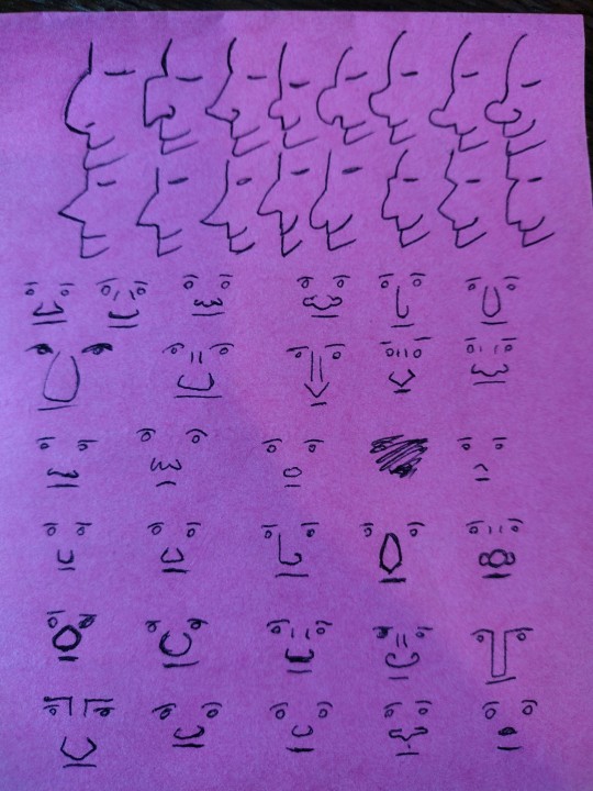
and yet really often I look at people who are trying to broaden variety on faces and they mix up everything except the noses, which stay like a circle or a triangle or a line or whatever their standard noise is, and as a result there's still this sameness to all the faces.
bc eyes and mouths and jawlines are all very well but noses are, in my opinion, the most varied part of the face. I can't think of any two people I know who have the same shape of nose except maybe me and my identical twin.
(and I'm not talking big Vs small, or hooked vs snub vs straight vs flat. really look at people's noses in real life cause there are so many variables)
(some leading questions under the cut)
how big is it? how long from the front? how far away from the face does it sit in profile?
does it have a rounded tip? how round? some people's noses have a profile that's basically a triangle point, some people's are basically a round tip with no visible cartilage above it, and everything in between.
What's going on at the bridge? in profile, is there a clear dip in between the brow and the bridge of the nose, or does the brow come straight down to meet it (or, if you have a kind of striking profile like Hangman Adam Page who looks like an early 2000s DreamWorks character, is your profile one line from brow to the top of your nose)? from the front, is there a clearly defined edge to the bridge of your nose or does it curve out? how much of the space between your eye sockets is nose, on a range from 100% to 0%?
What shape is the top of the nose in profile? Is it a straight line from bridge to tip? does it curve down? does it curve up like a ski slope? does it come to a sharp stop and angle out into a round tip?
does it have sharp edges? does it look bony, with a pronounced ridge? or is it all soft lines? Does it meet the cheek at an angle or at a curve?
does the tip come to a sharp point, or to a curve? does it angle up (so you can see the nostrils from the front), or down (so you can only see the line of the nose)?
how big is the base of the nose compared to the bridge? from the front, does it flare wide across the face at the bottom, or is it almost a straight line down? is it broader higher up the nose?
what are the nostrils doing? how big are they? are they round, or slit-shaped? do they sit behind the tip, with the noise all contained in a single pyramid shape, or do they sit to the sides? do they sit along the face, point forward towards the tip, or point up higher than the tip?
how does the nose interact with the other features? does it dominate the face? is it a tiny wee thing? does it sit over a very long upper lip with a pronounced philtrum, or is it almost touching the mouth? How much of the space between the eyes is taken up by the bridge of the nose? do the eyebrows curve towards the nose, or meet them at a hard angle? if they wear glasses, where on the nose do they sit?
colouration - is it all the same colour, or pinker at the tip or over the bridge? are the insides of the nostrils visible, and are they pale or dark pink? does the top of the nose get more sun - is it darker?
surface details - are there creases at the bridge or around the nostrils and cheeks? are they from scowling (vertical) or laughing (horizontal)? does their nose scrunch up when they smile, or flare when they're angry? is there hair? freckles? piercings? scars or breaks?
like the nose, jaw and brow are the structure around which the rest of the face is built. if you get to a place in your art style where you're comfortable playing around with that then you immediately add so much more diversity and life and verisimilitude to your characters!
also noses are just great. like they're so fun to draw and there are so many different gorgeous noses! I'm so into noses that usually the way I find how I want a character to look is to draw the eyes, draw the nose, then redraw the eyes and build the whole face around the nose.
(this advice is coming from the fact that the most common compliment I get on my art is the diversity and believability of characters and I would say that's like 50-60% in the nose/brow)
292 notes
·
View notes
Text
“You can’t rush art”
I think everybody can recall the quote from Toy Story 2. From the most satisfying part of the movie where we see a montage of Woody getting restored by a toy maker. It’s one of my favourites too, I absolutely loved looking at the different procedures used to fix a single toy. The toymaker’s precision and care were found mesmerizing by everyone. As a multi-hatted artist, one that can draw, sculpt, animate, and write, I can say that it’s spot on that there’s so much to do for a single piece of work. HOOO boy, you should see how me and Beefy are organizing Cursed to Charm, there’s so much.
For the upcoming webcomic, we design characters, give each and every one of them their stand-alone story, design different clothes, create the map, draw renders and posters, polish scripts for the episodes, plan to program the comic’s own website, make the backgrounds eventually, etc. To people who aren’t artists or take art for granted, to them, art is stroking a paper using a pen and BAM instant masterpiece. No no, it’s more than that.
Another thing I’d like to say about the comic is that the progress is very slow yet very fruitful because of the time taken. Me and my co-author came up with the idea at late November, which makes the comic four months old now. However, with all that time passed, we have already finalized the list of nine episodes of season one. We have also written seven out of nine summaries from that season before actually writing the dialogue in detail. We have a rough four seasons worth of story progression in the span of four months. Nyeh, excuse the little ramble about CtC, I’m just giving insight of how much should be done for the production of anything which leads us to the next point.
Art production in general.
Movies, animation, shows, video games, books, comics etc etc
All of these are part of art, some people would deny because it isn’t sophisticated like they’re lead to believe art is supposed to be. Art is literally just creation man, can’t get any simpler than that 😩 if you made something, then you made something woohoo! Congratulations you made art, cooking included. It came free with your fucking humanity.
Anyway, just like the webcomic, every single one of these listed also have a set of different procedures that will piece together the final output.
Let’s take Disney movies as a specific example, I want to talk about something real quick.
So one time, I was watching Tarzan with my parents and we stuck around for the end credits. My mom pointed out the animators are divided into sections and there’s so much names on them. There are different teams of animators for each character and these teams are divided in two for the storyboarders and the clean up artists. When the credits rolled a bit more, it showed that the background artists and colorists also have their own sections too. There’s so much people working on different body parts of a movie. I got the habit of reading end credits of every movie I watch, animated or live action, then I would compare the credits of old and new movies. Boy, let me tell you that the work space on old movies are FILLED compared to newer movies. One thing I noticed about Disney movies although, is that the old movies have more sections compared to new ones. The major difference of old Disney and new Disney are the length of the credits and the time gap of the movies. I’m really not trusting the way new movies have way shorter end credits while the publish time of new movies are getting narrower and narrower. Before the 2000s, movies usually come out twice a year and sometimes there’s a two-year hiatus before the next batch of movies are published. Now there’s at least two or three movies that publish yearly while also releasing a bunch of shows in the middle of it. I really don’t understand business talk with the way it sacrifices quality over quantity. Like I get having money is great and all but what’s the use of hoarding it? Especially when there’s so much news of people about to be in poverty and mass layoffs. Why should companies earn money if they’re not going to redistribute it back to the economy at all? This is a little off topic but I want to point it out that people in the 80s used to buy whole houses by being a janitor but nowadays people could barely afford a one room apartment even with three jobs. The Simpsons is an example of this because it was set in the 90s and the family is constantly reminded of how “poor” they are. They even created an episode that talks about the same job that supported people’s fathers will no longer support you nowadays (Poorhouse Rock ep22 s33). It’s fishy and I’m salty about it especially because I hear so much people complaining about how they’re not being given a chance to work. Anywho! Let’s go back to art.
I’m just spitballing my thoughts here but somehow they’re connecting either way. All I’m trying to say is that for the people who care so much about the quality of art, it’s noticeable that they get downgraded, not just by the look but by the way they’re written.
Example.
Clone High.
Jesus Christ, the new show is a nightmare and an insult to the original Clone High. The difference is clear with this one. The original Clone High was heavy satire of every single high school trope used in shows and movies. Every single character was meant to have one personality and that personality is the butt of the joke. The original did not care about making the characters appealing because the appeal is found in the way they interact, they clash so much and a lot of them are idiots. The writing is funny because the dialogue flows so easily unlike the renewal. The renewed Clone High takes itself too seriously and it tries too hard to be relevant. It’s funny to me that fans can draw the original’s art style more accurately than the animators hired. What’s even more frustrating is that concept art was released from the art head and the concept art looked way better than what they decided on the final designs. Other than the art style that tries to be marketable, the writing is insufferable with the way they try to be “relatable” without understanding why the original jokes were funny to begin with.
Now we’re all familiar with this cheap tactic of using the title of successful franchises to grab clicks and views. It’s every live action Disney film, it happened to Scooby Doo, Marvel shows, FNAF, some Cartoon Network shows, Megamind, and now even Kung Fu Panda. Basically MILKING. It would have been better if the productions TRIED to understand the original’s intentions which they forgot about. They ended up being disappointing at best and soulless at worst. I won’t be explaining much cuz I’ve already reached the minimum word count lmao. I’m just rambling here, I better not see anyone interrogate me in asks or replies. ANYWAY, I’m gonna get to the point real quick.
Back to the quote at the start of the post, people tend to forget that. Art is a skill, not a button people press and it gives you pretty pictures or videos. Art is a job and an effort. While art is subjective and it differs from person to person, one thing for certain is that art that is made ingenuinely will never be better than art that is made because the artist loves art. This is why the Tom & Jerry reboots with the lineless art style even if they had a storyboard artist who understood the cartoon wackiness (which were discarded for a “cleaner” and faster style). This is why it’s so frustrating to see concept art of movies which have more appeal than the final 3d models. This is why FNAF Security Breach was nearly unplayable.
Because they all rushed art.
They rushed in favour of what is marketable, no matter how unappealing it is. Everything could have been better, some final products are good, but all of them could have been better. As good as what were released pre 2010s when production had a passion. You can’t spell heart without art.
I’m just really passionate about art in any form since it’s everything that created me too. I will not be here at this point in time if it weren’t for me learning that there’s so much beauty in the world if you could just squint and appreciate why that’s so. I’m defined by my works and it only hurts and infuriates me that people who have the ability and accessibility to create better art than I do waste it for their personal gain or selfish intentions. Everyone could be a better person because of art just as it did to me. Again, it came to us the moment we’re born, art isn’t just a pretty picture, it’s everything we create out of love, passion, time, and effort.
But really, to the wise words of Chef Saltbaker, “like any good bake, heart and soul is the secret ingredient”
You can’t rush art.
98 notes
·
View notes
Text


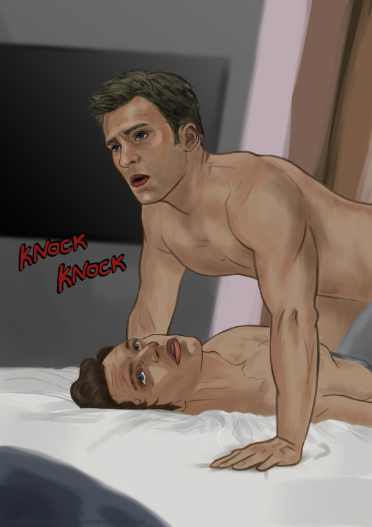
Stucky Comic Snippet Pt 3
Don't even bother, Steve! Hi I'm back, and as you can see I'm not immune to the cliché of someone knocking on the door at just the right time. Sorry to keep you waiting, but here's the disappointing part: this snippet actually just ends here. I started making it as an exercise, to start getting comfortable with drawing digitally, so I just thought of a cool scene in my head that I wanted to see, and made it. I do plan on making some more snippets and comics regarding these two (and also other original characters) that I have a storyline for, only this snippet isn't part if it, or at least I wasn't able to fit it in yet. Thing is, like I mentioned in a previous post, I'm thinking if I should make my style simpler so I can pop more of these out, because it takes me a really long time to make "just 3" of this pages, or if I should just keep it like it is. I know I'm only one person and not a team, but alas, I guess this blog will end up being a series of snippets that I'll do my best to put in chronological order. I even thought of uploading somewhere else for that, but anyway, that's for another time. On the meantime, thank you so much for every single one of you who liked my posts, but especially those who commented or reblogged with their thoughts! I really really appreciate each and every single one of you, and it motivates me to keep doing what I'm doing. If you have any questions, feel free to send me an ask or comment and I'll be happy to answer! Or, you can comment who you think is knocking on the door and why :D Anyway hope you're doing well! 💖
#marvel art#stucky#bucky barnes#bucky#digital art#character art#stucky fanart#marvel#comics#webcomic#fan comic#steve rogers#captain america#steve and bucky#stevebucky#steve rogers x bucky barnes#web comics#slightlynsft#lgbt nsft#gay
152 notes
·
View notes
Note
Well I really love your art, may I ask how do u color? I struggle with coloring turtles and I wasn't to know how do u do that?
Hi anon! That's a very broad question, so you've given me a great excuse to ramble anything I want about my coloring, eehehehee~!
This will be in two parts and I'll start with talking about my simpler coloring style.
As in, when I color characters on a white background, with a limited or light palette.
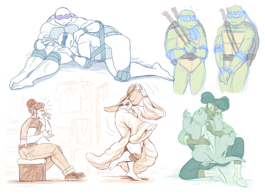
The driving force behind this style is me being lazy. My time, energy, and attention span are pretty limited, so if I want to finish anything, I gotta do it fast. And with fanart, I'm usually just doing it for fun and relaxation, so there's no need to push myself to polish it too much.
Despite that, I rarely post just black and white sketches or line arts. I always try to add at least a little bit of toning or shading, because that makes the image easier to read. The characters and their shapes pop out and catch the eye of the viewer better.
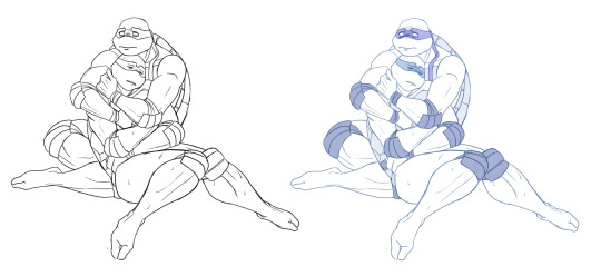
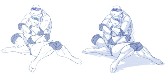
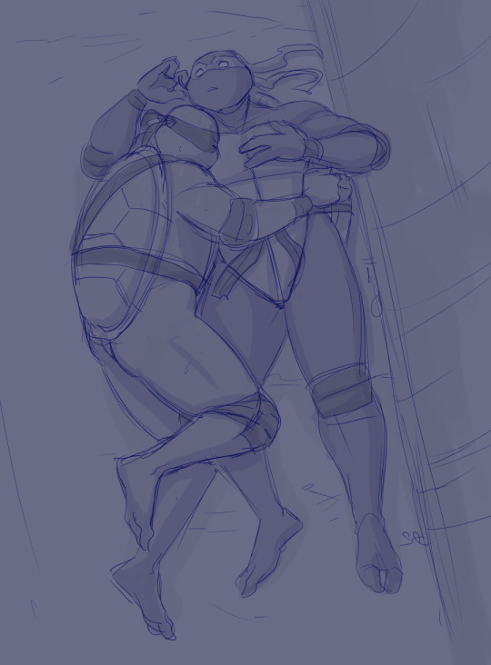
However, in this particular example, just the couple toning colors don't quite do the job. The way Don and Leo are entangled makes the center area of this illustration very busy and hard to read.
As a comparison; this pic has only one tone + mask colors, and it works. This is because all the characters are standing separately and their poses are very stationary and simple.
So for the Don + Leo pic, adding some shadows helps in bringing out shapes and depths. Also in general, if you don't feel like drawing BGs, it's good to at least add a shadow below the characters. It grounds them and makes them feel like they exist within a space.
Sometimes if the posing looks too complex and busy, it might just be best to color in the characters fully.
However, even if I do full flat colors, I tend to use a lighter palette. Putting characters in their neutral/default color on a white BG can look a bit jarring as if they're floating in a void. It feels less immersive and like the picture is unfinished.
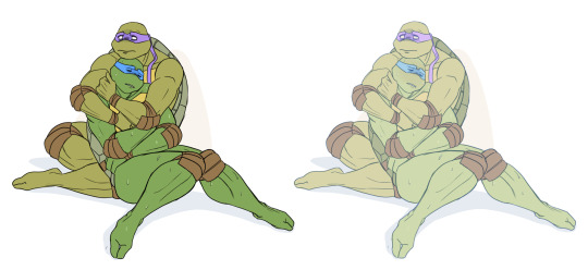
Using lighter colors makes the image more cohesive, and fits the characters into the white environment a bit more naturally.
If I'm too lazy to draw a BG, I prefer using stylized and limited colors. It feels deliberate and that the whiteness is just part of the palette, whereas the character-accurate colors on white don't match as well, even if they're more pastel.
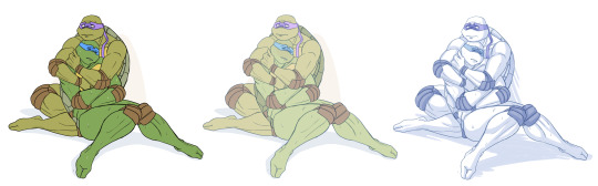
That being said, there's nothing wrong with just slapping the flat-colored characters on a white background. As you know, I do it too. I'm just exposing my 'fancy coloring style' for what it is; me being lazy, hah!
Limited and monochromatic palettes are a nice shortcut even when you do actual backgrounds. It's faster and you don't have to worry about clashing colors. And you can still convey atmosphere and mood.
Also, on the topic of conserving your time and efforts; I think it's very common among younger/less experienced artists to think that the amount of time you spend on your art piece = how good and well received that piece will be.
Which has some merit to it of course, but it can lead to putting too much effort into areas where it's not necessary. E.g. filling the piece with tons of details and clutter that don't serve an actual purpose, but rather make the image hard to read. Or doing really complicated shading for a meme/comic, where simplicity would deliver the joke better.
So whenever I'm drawing something I intend to publish, whether it's a quick doodle or a more polished piece, I try to follow these two principles:
Make it easily readable and do the bare minimum that needs to be done to convey what I want to convey.
Putting time into practice is important, but if you draw for work, it's also crucial that you know how to prioritize and use your time efficiently!
Anyway, thanks for reading! In the next part I'll go into how I do my fully colored pieces, so stay tuned for that!
143 notes
·
View notes
Text
Favorite Games of 2023 Part 4: Pseudoregalia
I knew Pseudoregalia was going to be good the minute I started the game and did the input for the Mario 64 side flip jump and the game’s main character Sybil did her own version of that satisfying jump. One of my all time favorite things to do in a Mario game (or any game) is that side flip, a jump that is as practical as it is just simply satisfying to do. Sybil being able to do that jump without needing any of the power ups found in the game told me that the developers of this game knew the importance to making character feel good jumping around in a 3D world. Her movement only gets better from there with a bunch of new platforming abilities that makes her capable of getting what feels like anywhere in that game world if desired. The pure control you have over Sybil's platforming capabilities gave me so many great moments of pure curiosity to experiment with what could work. What's better is watching friends and others play the game and figure out their own solutions to the game's open ended platforming design. There are no wrong answers in the world of Pseudoregalia, just results.
This game was a complete surprise in just about every way, just the best feeling platformer I’ve played in a long while in this small, cleaned up former game jam game. I’ve followed the main dev rittzler on twitter for a few years because the gameplay clips of their work have all looked fun and impressive and they always shared other really cool indie dev work as well. So, I was excited to finally play Pseudoregalia when it was announced to be released. It's super low price (6 dollars USD) and being something I was able to finish in the span of one day alone was a huge breath of fresh air in this current gaming environment. It’s something I’ve been personally thinking a lot about recently is the appeal of a simpler, lower priced game. It’s appeal to me coming from playing something that never needs to be some sort of omnipresent, super game. Instead, Pseudoregalia presents itself in a humble statement of, ‘here, enjoy a few hours jumping around this wacky maze like castle as a goat bunny lady!’.
I'm not a person who typically ever has a desire to replay a game right after finishing it, I usually prefer to immediately move on to another game that I've been wishing to play for for a while. Pseudoregalia is a game I've played four or so times now from start to finish, I even started another playthrough in preparation for this drawing/writing and found myself wanting to play it all the way through again. Its the first time I found myself actually physically seeing the appeal of speedrunning, a hobby I always just enjoyed as a spectator. Pseudoregalia just lends itself so neatly to that part of me that loves routing out a path for stuff. How quickly can you find all the vital movement abilities for Sybil? What's unnecessary, what can be improved, what can be gathered while on the path of gathering something else. From at least my perspective of not actually investigating the proper speedrunner's routing, the options feel immense. From these handful of times replaying the game I've gotten a good handle of finding my way around the map and a good idea of how to get a lot of the really important movement abilities almost immediately. It also made the game feel quite different from how it felt to me with my first playthrough, what was once mysterious and labyrinthine was now a familiar playground.
That is one thing I will miss when doing those repeat playthroughs is that sense of discovery that occurred with that initial run. Soon before Pseudoregalia came out, I watched a lot of Videochess and spaghoner's exploration and documentation of the incredible Mario 64 hack, B3313 ( https://youtu.be/pLKB0SG0i8c ). I found that hack incredible at creating a sense of uneasiness and wonder from simply keeping you constantly guessing what was next behind each door something even those two expressed while streaming. During my first playthrough of Pseudoregalia, I was completely lost in that castle and was constantly finding paths that led to new zones or ones circled me back to old ones from hours ago. It was a pretty incredible feeling of discovery that only wore out it's welcome at the end when I just needed one more big key necessary for progression. What helped make exploration in both of these games engaging the whole time is that aspect of having a really fun character to move around as while being lost. It was okay with being completely lost because I could still just keep doing these long jumps into wall kicks that just make Sybil go fuckin' fast in an immensely satisfying way.
I think in the time it's taken me to think about this game again, and briefly revisit it in preparation for this art/writing I've come to decide that this is probably my favorite new game of 2023. In a year full of fantastic platformers to pick from, this one was just a class above in terms of movement design and movement application.
111 notes
·
View notes
Text
My very old sketch with little Morgott and Godfrey (or rather, Godfrey's hand?) leading him away.
This was supposed to be part of the comic, but events have changed completely since then, mostly because I found more canonical facts and my initial ideas were too contrary to them. However, I like what is happening now more, especially considering the fact that the original plot would not have allowed Morgott's relationship with his twin to develop as it turned out in the end.
Despite the fact that the sketch is over a year old, I like the way Morgott looks here. I think the Omen children could well be so rude in appearance.
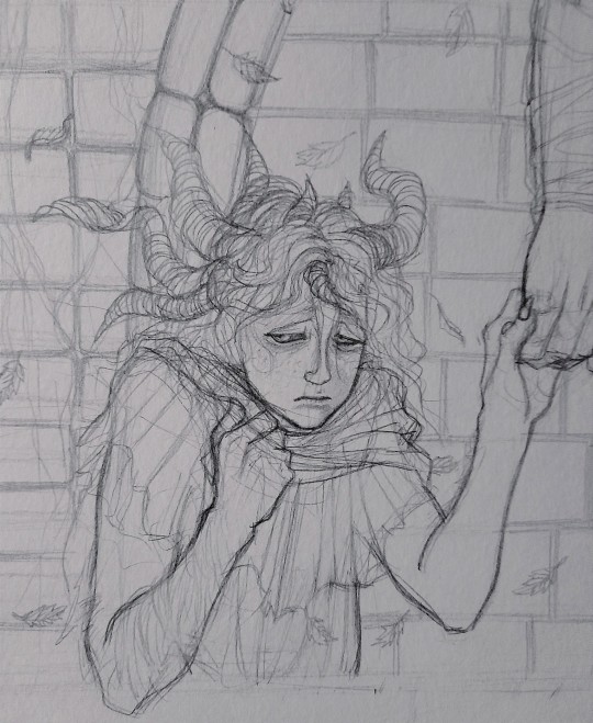
Of the new works, I started with a portrait of Morgott, but I think the drawing with Jannike will appear earlier, because it is simpler. Plus, I'd like to pay more attention to her. Now her story has become overgrown with details, and in general it is important to me that she is perceived as a character with her own story, and not "just an addition to Morgott." And it doesn't matter how big or small the interest in it is.
Morgott will be there too, of course
52 notes
·
View notes
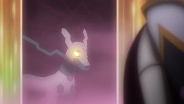
Text


With the recent reveal of Gibeon owning a Shiny (White) Zygarde, many people have been trying to use this to insinuate that Horizons may take place in a separate continuity/timeline/universe from Ash's story.
However, I disagree, and I think that not only does Liko's show still take place in the same continuity as Ash's story, but that such sentiment is frankly something that goes without saying. If they truly wanted to create a new, separate continuity, why wouldn't they just use a new version of Ash to establish that? And in such a case, I believe they would be much more liberal about using legacy characters because such characters would be new versions of them, not the ones we know: the fact that they're largely avoiding acknowledging legacy characters for the most part implies they're still out there in the world Liko and Roy are travelling. It would also needlessly complicate things like potential meetings which have immense marketing value like an Ash and Liko meeting down the line. The world Anipoke has taken place in is so large and has gone through so much worldbuilding with still more potential for even more, that Ash and Liko can viably exist in the same world without crossing paths. There's no business or storytelling benefit to making Horizons a new continuity, as Liko and Roy are fundamentally different characters with a different space in the world from Ash to begin with, and it would be a total waste if they just dropped all the worldbuilding they had done over the past 26 years. Thus, it is most certainly in the same continuity as before.
---
Now on to my main point, I think there is a much simpler explanation to the existence of Gibeon's Shiny Zygarde that can justify why it exists even with the existence of Squishy and Z2, and in that same world. And one that I think may raise very interesting implications for this story and where we may be headed. Also one that mirrors the games, particularly SV and its deal with Terapagos and the Paradoxes.
I believe that Gibeon's Zygarde, alongside the Black Rayquaza and the rest of the Six Heroes who were believed to be Lucius's companions, are honorary Paradox Pokemon who were magically willed into existence by the power of Terapagos.
It is easy to miss, especially if you don't stop to think about it, but Terapagos's power, aside from being the harbinger of the Terastal phenomenon, is the power to create paradoxical things. It can "create" things using its power, things that originate from human imagination to those who believe certain things about them, but when you stop to think about those things, it makes no logical sense for them to exist in the way they are explained.
This is especially evident in the actual Paradox Pokemon from the games. Sada and Turo willed them into existence using their "time machine" and believe them to be Pokemon from the ancient past and distant future, or the one we "see" in the Crystal Pool being from alternate timelines. But as their names imply, their existence is a paradox: their whole deal is that they're not supposed to actually exist, and yet somehow, they got willed into reality and given life and physical existence. The dubiousness of their existence is enforced by their drawings in the Scarlet/Violet books, created 200 years prior to the game's events by Heath and his expedition team, contradicting the fact that Sada/Turo only created the time machine 10 years prior to the game's story. The dubiousness of how they came to be is also reinforced by their only other mention being in the Occult magazines, which are questionably trustworthy at best. We know that their existence started in Area Zero, a place filled with Terastal energy thanks to Terapagos, thus the latter is the creator of them.
The paradoxical nature of Terapagos's power is also reflected in the Crystal Pool event at the end of Indigo Disk, a place where you can seemingly talk to the dead, and Terapagos summons a Sada or Turo who was alive, supposedly before they created the time machine. And you give them Briar's book in exchange for the Scarlet/Violet book. But the more you think about this event, the less it actually makes sense, and the only conclusion you can make is that if it were our own Sada/Turo, the entire game's timeline would implode upon itself.
Now on to the anime, Gibeon is now known to have been a companion of Lucius. Lucius and his friends have the stories of their adventures chronicled in books and legends. This incidentally also parallels how the Paradox Pokemon are chronicled in Scarlet and Violet the games. But when you stop to look at everything, aside from Terapagos, the nature of the Six Heroes' existence is incredibly dubious at best, to the point where it's questionable if those six ever actually existed, or if they did, how they came to be. The same would likely apply to Gibeon's Shiny Zygarde. The Black Rayquaza is the biggest example: aside from being a Rayquaza, it is always shown glowing and crystallized, likely surrounded by Terastal energy. It may have even been created by and willed into reality by Terapagos itself, literally formed by Terastal energy. This is sort of hinted at very early on, when Liko's pendant, which was Terapagos, and Roy's special Poke Ball, which unleashed the Black Rayquaza, resonated with one another, and the Black Rayquaza didn't emerge until it resonated with Terapagos, which may imply that it wasn't actually in there and Terapagos used its power to will it into existence, alongside the other five heroes. The other Heroes seem to have abnormal traits as well, such as a giant Arboliva and two of the heroes being legendaries, and they only "awakened" once the Black Rayquaza did. This may imply they weren't real, and the only one of Lucius's Pokemon who wasn't willed into existence was Terapagos itself, who used its power to "create" companions for Lucius and its friends.
The same may apply to Gibeon's White Zygarde as well, who may have been willed into existence by Terapagos. This Zygarde, along with Rayquaza, are the biggest anomalies not just in their different coloration, but that they were literally owned by someone, which in the anime world should not be possible as major legendaries like them are largely above being owned by Trainers. Them being Paradoxes willed into reality by Terapagos would explain this.
This is most certainly an interesting turning point, and may raise a lot of questions to the true tale of Lucius and his friends, and what Rakua truly is. One thing is certain though: Terapagos and its special powers surrounding Terastal energy and the creation of paradoxical things seem to be playing a major role here.
#pokemon#anipoke#pokemon horizons#pokemon 2023#pokeani#analysis#white zygarde#shiny zygarde#gibeon#gibeon's zygarde#lucius#lucius pokemon#terapagos#black rayquaza#rayquaza#six heroes#rakua#pokemon scarlet and violet dlc#pokemon sv dlc#pokemon scarlet and violet#the indigo disk#paradox pokemon#the hidden treasure of area zero#pokemon anime#pokemon sv
22 notes
·
View notes
Note
Love your art! I was super inspired by your Gillion design specially. He's so squishable (positive).
Do you have a specific process for designing characters? Be it original or reimagining canon designs of fandom
thank you!! :D
hmm, well, i don't remember the last time i properly designed an original character, so nothing on that front. for reimagining designs... i don't have a step by step way i do it, it varies from character to character, but i can point out some of the things i do that might be helpful?
i largely base my designs on the vibes the character gives me: their manner of speech, their actions, their story and personality. and also the world and environment around them if it affects the character. it sounds pretty obvious but like, duh.
im gonna try and explain on gillion's example since its the one you mentioned. he's a himbo, a swimmer and a paladin, so he's gonna be buff or at least a little thicker. he's a triton, so he's short. he's also short for the reason that he is in an unfamiliar for him world and he might feel small in it. he's also short because it makes him look almost child like, connecting it to his trauma and lack of childhood that manifests in his behavior now. gillion is kind or at least trying to be, so his features will be softer and rounder. but sometimes he's chaotic or harsh, so he has some sharp features too. though they're secondary, the softness is still the main focus.
i also really like to think and overthink the designs while drawing. i try to keep everything simpler and less detailed, showing personality with shapes rather than uhh presence(?), but that means that details i do include have a lot of thought behind them.
one of my favorite things is practically. i love to think about what a character would realistically wear in the climate they're in, which clothing would be comfortable for their anatomy and field of work. would certain things get in the way or would they be helpful? how would they style their hair, do they need it tied back or do they not care? would they wear make up, why yes or why not? etc etc etc. i like asking myself questions and answering them in the design.
continuing with the gillion example. he's constantly wet because he's a triton (again, yes), so it would be more comfortable for him to wear a wetsuit. other clothes may stick to him and be uncomfortable, or get stuck on his fins, etc. he doesn't have any piercings, there's no way he would've gotten them in the undersea, and on the surface i don't think there was anything meaningful enough to promt him to get it. plus fin ears. he doesn't have his hair styled in a complicated way because of the coral on his head. doesn't wear a lot of jewelry because he jumps in the water a lot and it'll easily get lost. no belts or flowy bits because they constrict the movement and might get in the way.
and then like. all the personal headcanons and preferences and little bits and things. there's a lot of elements that i draw just because i like how they look. or because that's a comfortable thing for me, or because it's cute or hot or sad or whatever. or because i saw it while looking for inspiration and i really liked it. just bullshitting with the design and making it my own, yknow?
for gillion. gave him a cool long tail and lots of fins everywhere because i like it when inhuman characters are openly and visibly inhuman and have distinct features. and gillion is VERY much not human, part of his personality is being confused about humans. big ol yellow eyes with slits — look cool, also doubles as an inhuman feature, also makes him look curious about the world. small black stripes all over his body — make him look more fishy, plus because there's a lot of them and they're all the same they form a pattern that looks more like a natural anatomical feature and draw less attention. coral that goes around his head and not only the front like a tiara— makes it feel more three dimensional and looks cool in perspective (also i kinda just drew it wrong and never fixed it). coral and fins are pink — adds some much needed color variation and contrast, plus pink is one of the more natural colors which again make him look animalistic and not magical, plus ties in with pretzel. his skin is closer to green than blue — removes blue from the color pallet (especially with his eyes being yellow instead of blue), making the design more coherent and pleasing, allows me to properly introduce reds and purples without it looking like a mess of colors (although it still does sometimes). sharp teeth — fish, cute. yellowish underbelly — supports the yellow for the eyes and makes it stand out less, plus again, animalistic feature. little to no details on the clothing — creates good negative space that lets the eyes rest and focus the attention on everything else. his fringe and hair are floating around and don't follow the laws of physics — personal headcanon that it always looks like he's under water, plus adds roundness to the design because of the waves and curls.
ookay haha sorry didn't mean to write down literally every design decision here-- kind of derailed the post again.
basically yeah, for me designing is like a dialog with myself where i ask and answer questions. also something that wasn't mentioned are references and inspiration. if i don't have a good idea when i start, i usually scroll through my gallery or pinterest for some time to get ideas and figure out the general direction i want to take the design, maybe also find some fun stuff to include, etc.
hopefully this long ramble was at least somewhat helpful or gave you insight on my progress. i wanted to draw some things to also visually explain the design decisions for gill, but i think I'll do it later and in a separate post, and maybe include chip and jay too...
umm good luck 👍👍
81 notes
·
View notes
Text
Rest In Peace Toriyama 🕊️💫🐉

DragonBall has always had a place in my heart for the way it was ever-present in my childhood. I grew up loathing weekend mornings because my brother would always drag me out of bed to watch it with him. I suppose that’s why it’s extra special for me, it was a simpler time when me and my brother could just sit and watch what came next in the current arc. The days always felt warmer then, but now I’m grown.
I’m glad Toriyama made this series and ignited something in me, though his passing was harsh and unimaginable for most of us, I hope he has found peace in knowing how many people he’s inspired to be better, and the many that he will continue to inspire. I wish his family healing and condolences for their sudden loss.

.^An extra illustrating what those Saturday mornings felt like. Dragon Soul was my alarm clock for the better part of my childhood. (It’s also my fav op)
I remember we even had a vhs tape of two specific episodes in which the bunny boss ended up on the moon. I always had bulma’s personality embedded into my head whenever I thought of her in that bunny suit.
I never appreciated that time then as much as I do now. Maybe it’s Goku’s loving nature and fatherly care that left an imprint on me and kept me from forgetting him, or maybe it was the way my brother was obsessed with the series, either way he was somehow always in the back burner of my mind. I even remember having to play with my brother when he got Budokai Tenkaichi 3 for his PlayStation. He even bugged me to wake up when Super came out (though we had already graduated and i would be resting on my days off from work, he was also only visiting for the month) and tried to get me to watch it with him, but Super never really had the same appeal to me as the og series.
Perhaps the connection it has to my brother is what draws me to it time and time again, I feel as though I can’t understand him as well anymore after we’ve graduated and he’s moved on with his life and out of the house. I never thought this random shounen series my brother forced me to watch every Saturday morning of our childhood would have the effect it has on me now. It was last year that I decided to rewatch the entire series since I figured I didn’t actually know what was ever going on, I was just always intrigued by the action and the characters. Surprisingly my child brain remembered the arcs pretty well and I could just have it playing the background and know what was going on for the most part.
Did I mention that my brother also collected the dvd series? Lmao. I was so hype when the Broly Movie came out and when we watched it it felt like I regained that connection to my brother momentarily.
It also inspired me to draw when I was in elementary school, though I thought of it as something I could show off rather than take it seriously like I do now. I never thought I’d draw again after middle school until I got to high school and got back into it. It wasn’t until last year that I first drew something dragon ball related since elementary school, and it felt so surreal to look at how far I’ve come in my art journey.
It was never intentional for me to start drawing dragonball, it was just stuck in the back of my head and it wouldn’t leave me alone until I brought my ideas to life by sketching them out. I literally have two drafts DB related as I’m typing this.😅 oddly enough there’s many things I think about when I think about dragon ball, but they are too many to list. There’s just so much I love about it and so many characters I love. The thoughts never leave me alone when I come up with an idea or headcanon for them and it’s actually so hard for me to try and forget them that I always give in and do something with the idea. It will always be a part of me.
I wasn’t planning on making a painting of Goku ever, yet here I am. I don’t really paint either, which makes the time it took me to make this that much more surprising. I wanted to portray an ease in his expression, something peaceful. I hope it comes across that way, he somehow looks like he’s sleeping and it’s funny because I don’t think I’ve ever really seen Goku relax like this at any point.
#illustration#anime#digital art#drawing#sketch#painting#digital painting#dragon ball goku#goku#son goku#dragon ball#dragon ball art#akira toriyama#fly high#rest in peace#art#dragon ball z#dragon ball z kai#kakarot
23 notes
·
View notes
Note
will you write that essay about the symbolism of eddie holding buck's hand while he was trapped under the ladder truck? Pretty please?
okay well i can't promise this will be coherent but. let me try.
there are two aspects to this. i've talked about the first one a bit before, but i'll mention it again because i'm kinda obsessed with it—because. look. i always maintain that while writing a romantic dynamic, it's important that both characters involved have a significant, undeniable impact on each other (whether it's positive or negative). and this is a pretty good example of buck's impact on eddie—or rather, the impact of their relationship with each other on eddie. because, eddie has been established from the start as a character who manages to keep calm under pressure, who always manages to follow protocol and respect the chain of command, who keeps cool and does the rational, logical thing in an emergency at all times. this is, as we find over the course of the show, due in part to his upbringing and military training.
it's with buck we see this extremely fundamental aspect of his character fly out of the window, though. eddie defaults to holding buck's hand instead of helping lift the truck with the others, even though he's probably one of the physically strongest on the scene. he trusted chris, his son, his heart and soul, unconditionally with buck within a year of knowing him. he put buck in his will as christopher's legal guardian despite buck facing the same amount of danger that he does—eddie's actions here especially make no logical sense, adding in the fact that he doesn't even tell buck about this for an entire year. and when the lightning strike happens—whew. eddie ran up that ladder in the pouring rain, after being struck and knocked to the ground himself, without a harness, tried to pull buck towards him even though he had to know it was physically impossible and screamed himself hoarse trying to reach buck. and all of this is the culmination of the small, blink-and-you'll-miss-it act in s2—eddie holding onto buck's hand instead of helping lift the truck. in these instances, he doesn't default to logic and protocol like he's been trained to. he just follows his heart—which is a big fucking deal for a character like eddie. and all of this just keeps escalating with each new development in their relationship.
the other aspect is a lot simpler—i draw upon their more recent arcs to explain it. maybe the logical thing was for eddie to join the others in lifting the truck. but he didn't, and he prioritized giving buck comfort instead. and i think this small moment is so symbolic of their future obstacles? in season 5, buck can't fix or magically hand-wave eddie's struggle with his mental health. he can't fix it even though it's his first instinct to try. but he can be there for him every step of the way, and make the journey a little easier. similarly, in season 6, eddie gets right in 6B what everyone else got wrong—he couldn't fix things for buck and ensure he had a super-smooth recovery, like everyone else tried to. but he could be a shelter for buck when the outside world was too overwhelming, to recognize his struggle and offer him comfort in the face of it. idk. again, it boils down to the whole maybe you don't know her the way he does of it all. so, yeah. that little moment in 2x18 is just. the comfort and the security of it all. the way tenderness is prioritized over trying to fix everything. idk. i hope this all makes as much sense as it did in my head sjdjdkd
76 notes
·
View notes
Last Seen Blogs

fakasahowu
Untitled
tartaufraiz
Tartaufraiz
lectio-divina
Love and read Books
tokodekuu
bnha sideblog!!
gauravsonu02
Gaurav Singh Rajput