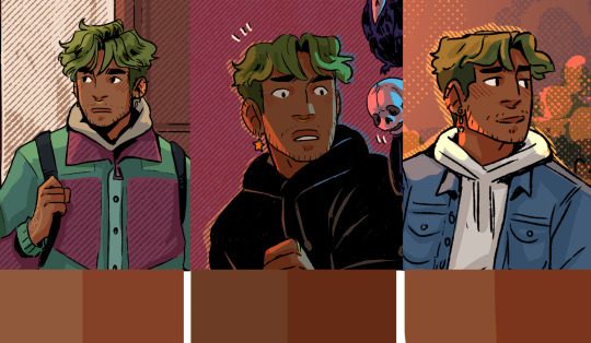
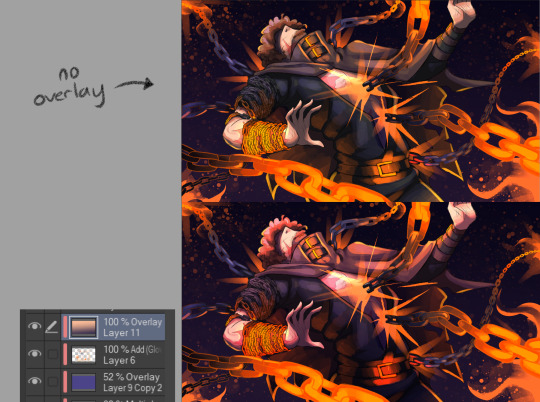
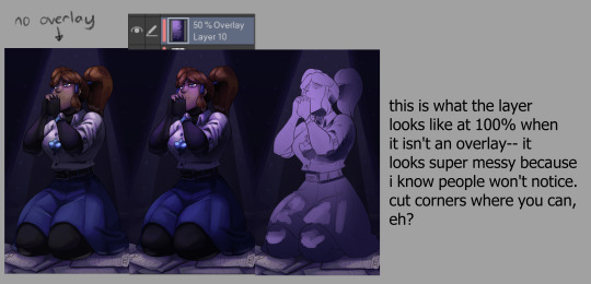
#was practicing colour overlays
Text
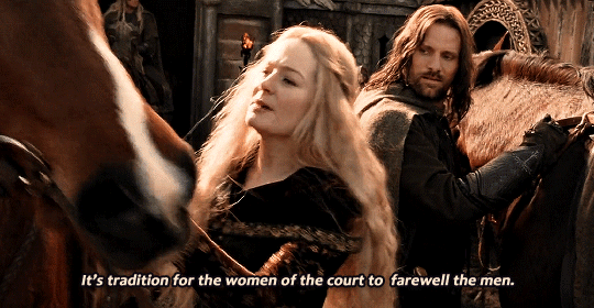
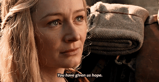
Eowyn in Return of the King (2003)
↳ for @bae-owyn <3
#random eowyn gif dump#was practicing colour overlays#had them larger but they looked better smaller#lotredit#rotk#tolkienedit#tlotrgifs#oneringnet#tolkienheroines#eowyn#lord of the rings#tolkien#lotr#sourcetolkien#filmedit#fantasyedit#usersansa#usersthea#thcrin#southfarthing#userfrodosam#userhaleths#tusereliza#baeowyn#ellrond#*#*mine#mine#*lotr#*lotr: gifs
770 notes
·
View notes
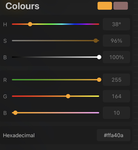
Text

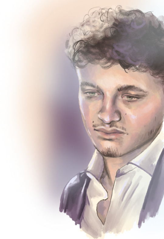
Colour Test
Grey base with a secondary overlay layer that adds the colour.
#digital art#colour practice#colour test#digital practice#art practice#digital colouring#grey to colour#grey base#colour overlay#0-ink-zinc
5 notes
·
View notes
Text
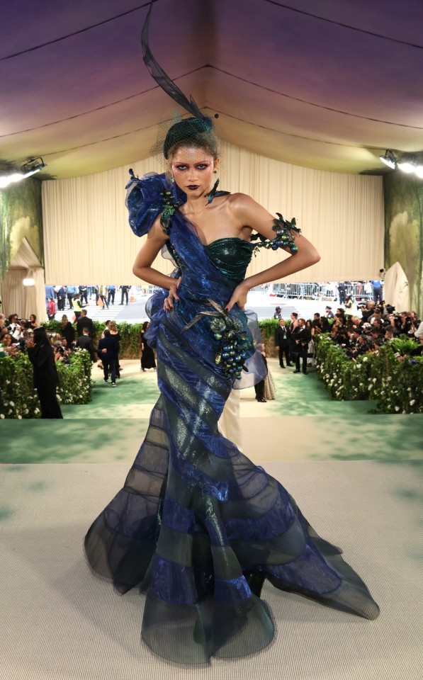
Zendaya at the Met Gala 2024, wearing custom Maison Margiela Artisanal by John Galliano, and hat by Stephen Jones.
The fruit, flowers, insects and birds on the gown fit the dress code of the night, 'The Garden of Time', inspired by J.G. Ballard's 1962 short story (explained here by the BBC).
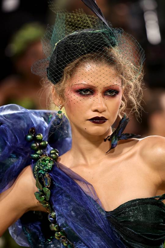
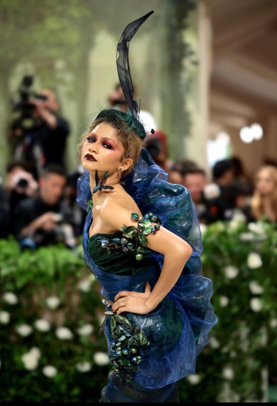
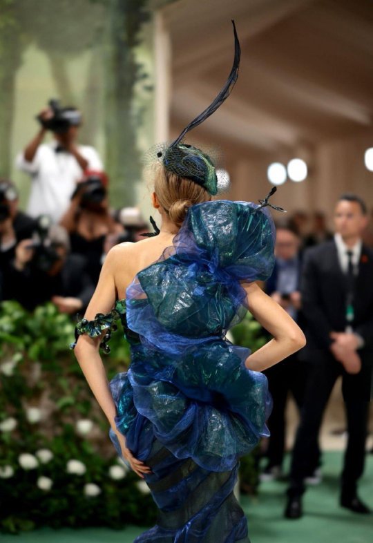
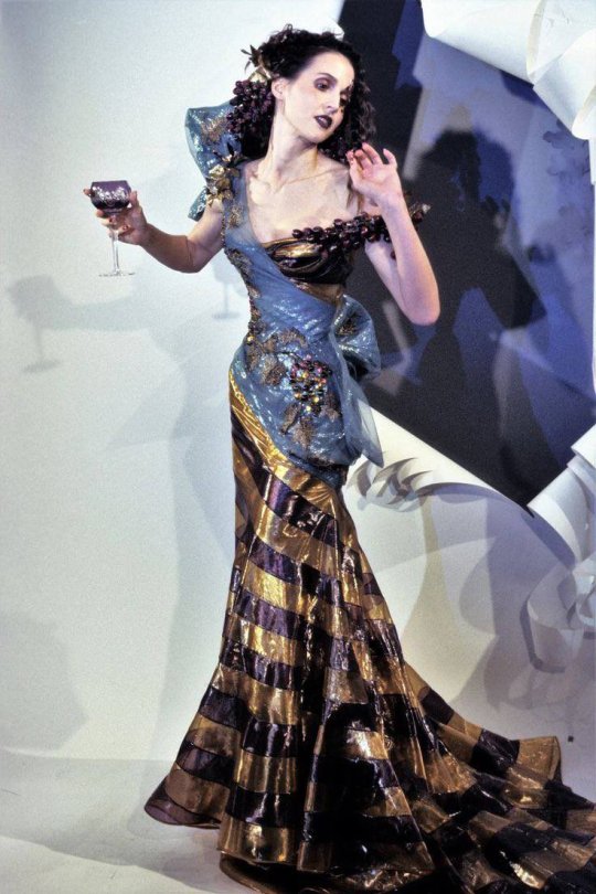
The gown also references John Galliano’s Spring 1999 couture collection for Dior, in particular the gown below, decorated with grapes.
Maison Margiela said:
'A sage lamé bias-cut ‘siren dress’ overlaid with iridescent electric blue organza with ‘retrograding’ in undulating bands of hand-painted metallic crin, swathed in an aluminium material and iridescent organza drape and bow, with a corsage hand-embroidered in a bacchanal of hand-painted impasto in the grammar of the electric blues and emerald greens of scarab amulets, with formations of birds, flowers, vines, grapes and nuts, worn over a boudoir-coloured duchess satin corset. A silver metal-wire ‘reverse swatching’ hat and a black hand-painted voile crafted in the memory of plume and enveloped in matching coloured stockings by Stephen Jones for Maison Margiela, and Eau de Nil velour and faux lizard Tabi interlaced ankle-strap pumps by Christian Louboutin for Maison Margiela.
Created for Zendaya by John Galliano for Maison Margiela, the haute couture silhouette was inspired by the 1930s mythological works of the photographer Madame Yevonde and imbued with the memory of the orgiastic sceneries of the bacchanals of Ancient Greece. In a dance between painterly cutting and draping techniques – unique to each layer of the construction – and the superposition of fabric textures such as tin foil with transparent iridescent organza overlay, the composition conjures the staccato brushstrokes of Giovanni Boldini. The bias-cut ‘siren dress’ is a key expression in the creative practice of John Galliano, which first appeared at Maison Margiela in the Spring-Summer 2020 Artisanal Collection. Infused with a certain ‘snobisme’, the look is given the epithet of ‘86 and Lexington’, a nod to the subway station near The Met.
The dress was crafted with ‘retrograding’, a technique through which variations of thread-work, appliqué or encrustation degrade from the bottom to the top of a garment like the linear base drawing of a painting that hasn’t yet been finished. The ‘reverse swatching’ technique employed in the hat exchanges the fabrics traditionally used for certain parts of dressmaking with materials of a contrasting value.' X
#zendaya#met gala 2024#met gala#red carpet#john galliano#maison margiela#maison margiela artisanal#gothic#jg ballard#the garden of time#sleeping beauties#dior#fashion#fashion history#stephen jones#surface pattern#textile design#textiles#madame yevonde#millinery#scarab#beetle#insects#grapes#vines#nuts#flowers#floral#bacchanal#retrograding
152 notes
·
View notes
Text
☆some practice doodles☆

Tried blending colours in a more paintish style! The difference between the two pics is that one has an overlay+ noise layer of lighting.
679 notes
·
View notes
Text
Astrology observations 🤍🤍🤍
Credit goes to my Tumblr blog @astroismypassion
It’s astrology tea time again! 😁

🤍🤍 Aquarius Moon women can end up being labelled as “too weird to date” by their partner. Their partner can view them as following odd, weird practices that they don’t resonate with.
🤍🤍 If you have Venus in the 10th house synastry overlay with a romantic partner, your or their parents highly encouraged this relationship, because you seem like you have similar values and believe in similar things. They might even help you two come together in a romantic union, like set you up, even try to arrange marriage.
🤍🤍 Aries Moon women can often end up being a part of a love triangle unknowingly or put through that by their favourite person. Like Selena Gomez (Aries Moon) with Justin Bieber and Hailey Baldwin Bieber. Or if you are familiar with Youtube/TikTok stars Eva Gutowski (Aries Moon) with Brent Riviera and Pierson. Or even Angelina Jolie (Aries Moon) with Brad Pitt and Jennifer Aniston.
🤍🤍 You can get bullied for things connected with your Sun sign and house. If you are a Gemini Sun, people who try to tear you down, might try to say you have fat fingers or hands that are too long, that you voice is annoying etc. If you have Sun in the 10th house (bones and teeth) people can see you have weird teeth when they are trying to insult you.
🤍🤍 Pluto in the 3rd house people often try to justify their opinion, view by stating where or what they studied/where they went to school. 😂 It’s like “no trust me bro, I studied law” with everything they say and try to justify.
🤍🤍 In Ascendant in the 8th house synastry overlay, you as the Ascendant person you will notice every little change in this person’s appearance, like a new haircut, but even little details, like they changed the colour of their leather watch belt etc. You will be perceiving all the little details about their appearance A LOT.
🤍🤍 Gemini Chiron and Gemini/Virgo Lilith are people who are most likely to falsify a family member’s signature at any point in life (not just as children), even as adults.
🤍🤍 Speaking of Gemini Chiron, these people get often “shamed” if they don’t own a car and use public transportation. If they do own a car, they are fans of car sharing as well.
🤍🤍 Sagittarius Part of Fortune people understand themselves better while teach a sibling/a friend/a parent/ a child something. Finally, they understand better how their mind works.
🤍🤍 8th house synastry leads to a lot of self-censoring. Like “I’m not gonna say this about myself or reveal this, because this person might think I’m weird”.
🤍🤍 6th house shows transition to adulthood. So how you were as a young adult. For example if you have Venus in the 6th house: you were patient and kind young adult.
🤍🤍 Taurus Venus wants a romantic partner that has similar personality, values and also lifestyle, so habits. And someone who works actively and hard to maintain a loving relationship. Because they are so stubborn to change, so they will not change for anyone’s sake.
🤍🤍 Gemini Moon or Moon in the 3rd house either doesn’t text with emojis at all or tries to tell a story with emojis only like: 🚴♂️🏔☀️😁
🤍🤍 Sagittarius Chiron and Chiron in the 9th house are all over the place. 😅 They lack direction, because of constantly doing a lot of things at once. Chiron in the 11th house also needs to learn to be alone. You guys learn independence and not relying on groups of people to fuel your confidence.
🤍🤍 Scorpio Vertex or Vertex in the 8th house people can be accused as being “too sexual” or “hypersexual” by their committed partner.
🤍🤍 I wouldn’t really say that your marriage partner will match your Juno sign with their Sun sign. Juno sign will represent their qualities and traits. I noticed often you can respond better to Vertex sign. So the sign of your Vertex can be the Sun sign of your person that you end up marrying.
🤍🤍 Juno sign though points to best trait of your partner. If you have a Gemini Juno, it’s best you pick the most talkative, communicative or intelligent person out of those you are considering. If you have Libra Juno: the one that is the prettiest out of the friend group. Capricorn Juno: the one that’s the most successful, has the best reputation or others admire them or look up to them the most. Cancer Juno: the one your mother would like the best or the one that resembles your mother the most or the one you see is the best family person.
🤍🤍 Aries Part of Fortune or Part of Fortune in the 1st house people have very unique personality, one of a kind type. That’s why they get new opportunities by just being themselves, because of a very distinctive personality. They also look to other people as though they have a solid sense of self and people make them a leader, because of that.
🤍🤍 Sun at 14 degrees (Taurus degree) people “transmute” or “transfer” a lot of their own self-loving, self-care energy onto their partner. So their partner becomes more confident and has better self-worth, because of trust and bond they have with the Sun person.
🤍🤍 Pisces Juno or Juno in the 12th house can dream of their future partner just before meeting them.
🤍🤍 Libra Juno or Juno in the 7th house on the other hand, will each time they might a significant partner, feel like their meeting is straight out of a movie scene.
🤍🤍 Capricorn Juno or Juno in the 10th house on the other hands will meet their partner in a group setting, usually when surrounded with friends too.
🤍🤍 Taurus Venus people often feel entitled to their partner, even when ending the relationship. There is this sense of “I made you”. They usually give status, attention, money, better style or confidence to pursue things to their partner, so they end up being “entitled” to them.
🤍🤍 17 degrees of any personal planet means profitable fame. You will be able to monetise being well-known in the community.
🤍🤍 Where you have Aquarius in your chart, there is where you too easily feel excluded from group gatherings. Aquarius in the 3rd house: might have not been invited to many group gatherings in high school etc.
Credit goes to my Tumblr blog @astroismypassion
#astro notes#astrology#astroismypassion#astrology observation#astro observations#astrology observations#aquarius moon#synastry#venus in the 10th house#aries moon#pluto in the 3rd house#ascendant in the 8th house#scorpio#8th house synastry#taurus venus#aries part of fortune#part of fortune in the 1st house#scorpio vertex#vertex in the 8th house#aries pof#libra juno#juno in the 7th house#juno in the 10th house#aquarius over the 3rd house#astrology blog#astrology blogs#astrology note#astrology notes#venus in taurus#moon in aquarius
2K notes
·
View notes
Text
got annoyed with the painting of oscar i’ve been working on for a million years and did a speed painting of lando to practice colour instead. just under 2hrs in procreate, all one layer apart from the colour blur overlays ✨
131 notes
·
View notes
Note
I'm an artist who has difficulty colouring work, so if you're ever comfortable sharing i would love to see what the process of someone else to who colouring does not come natural look like! I love how your colours turn out, so warm and cohesive without being washed out. When I look at the process of other artists I admire they often seem to hit on their colours quickly, so it would be very helpful to see the process of someone who struggles more, like I do.
hi !!! i posted process vids for these three drawings which u might find helpful but they go pretty quick so i will try and explain more!
-my big number one advice is doing underpainting, this is all the yellow u see me use in the process vids. this is partly so i can alpha lock them for easy colouring but also, i use semi-opaque brushes when doing my main colouring which lets the yellow peek through every part of the drawing, giving everything a uniform undertone! very very helpful i recommend it a lot :3 things like overlay / multiply layers can help bring all your colours together as well and make a big difference. i also like to use soft light / subtract layer modes. just play around!! i do however think its good practice for your drawing to work without those modes as well, you dont want to rely on them to make the drawing work, just enhance it! heres a drawing of mine with and without the various layer modes - a big difference and more impactful with, but the drawing on the left still looks fine without!
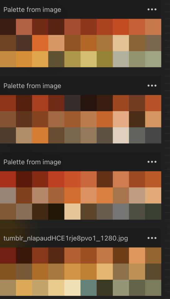
-as for how i go about choosing colours i hve two ways. mainly nowadays i just eyeball it but i also sometimes use colour pallets like these! how i make these palettes is by auto generating palettes from images in procreate which is so so helpful. if u see artwork u rlly like the colours its a great way of trying those colours for yourself without having to do as much thinking. when u get a sense for it u can start coming up with your own palettes!
-i cant talk abt this without talking about colour theory. i am not an expert but its really worth familiarising yourself with what colours work / contrast each other. if u want to, for example make a warm toned drawing u simply just stay away from cool toned colours! u can still have them in, but there still needs to be a warm undertone that can be done with the underpainting or just eyeballing! i hvent used palettes for a long while now and ive always found it easier to choose cohesive palettes with these than using the like big wheel or smth.
i prefer picking colours like this bc i feel like i can more easily control the undertone, than if i was picking off a colour wheel etc.
a lot of my success just comes from practice and experience! but smtimes colours r just stinky n are hard to get th vibes for . i usually just walk away and take a break and smtimes have an epiphany and other times if ur rlly struggling just throw the whole colouring out and start again !! and if ur rlly rlly rlly struggling take a look at ur actual drawing again. smtimes if ur composition/ shading etc is weird it makes the colours go on wack bc u dont have a good foundation!!!!!
anyway i dont think i explained this well. go forth and colour ur brain is big etc
60 notes
·
View notes
Note
I have a general art-related question, if that's okay. I admire how _quickly_ you seem to be able to produce art -- whenever someone sends you a character-based ask, you seem to always answer it with a nice little picture (not just a scribble or something) with lineart and often colouring too! Do you have any advice for acquiring art stamina like that? I used to enjoy drawing, but got burnt out on it because every piece felt like so much WORK and it drained the enjoyment for me. I absolutely could not match the output you do!
Thanks for the compliment, lensman! Your drawings are equally cool too! I'm engrossed in the textures especially. And yes, sometimes I’m even amazed by the many asks I’m able to answer in a single week. Usually, I answer them within 3 days, in rare occasions, it may take me 2 weeks or so to answer them.
As for insights, there you go.
#1: Practice is the key. To not get art block, you need to be constantly practicing, like doing scribbles on your sketchbook when you have time. It can be anything, from basic shapes to “whatever you can spy with your little eye”. Also, improve your speed while doing it, and limit your time to finish an acceptable rough draft, so you won’t lose the motivation to finish the entire drawing.
#2: Mastery. READ THE MANUAL AND INSTRUCTION of whatever platform you are using to make art, and master the tools, so you won’t drag on too long on a single project. Personally, I use a mixture of Procreate and ibisPaint X to make art and comics. And the skills don’t come for free, you need to constantly learn new features in order to keep up the pace and limit the time you spend on each project. Honestly, I think I spend more time on Youtube, Pinterest, and Instagram scavenging art tips and resources than doing other things with them. The result is rather rewarding, the knowledge I gained about the color wheel, anatomy, and platform features like multiply and overlay are really helpful.
#3: Reference. I always have available anatomy or art references on my side, usually from Pinterest, so I don’t need to waste time speculating what the result would look like. I also collect references I’m interested in whenever I have time, so I’m well prepared whenever I want to start a new project.
If you want to check it out, this is the cover I made for Foley’s playlist, which I finished within 3 hours.
#4: Motivation. You need to truly enjoy the process of producing art in order to not get an art block. I think I never get a single art block period so far. Why? It’s the only way I get to relieve my anxiety. College can be really harsh sometimes, I have a really small social circle, and on top of that I need to deal with stress which most of my peers don’t even need to worry about, like managing an apartment, doing accounting on my own, taking care of electric bills, and more. What’s worse is that people can be massive suckers sometimes, and I just turned 18 a few months ago. I know I can’t just throw a tantrum or jump off a building whenever I feel stressed, so I just move on and focus my attention on doing better in art. If people want to insult me, I just insult them back with my talent.
Also, I mentioned this in my reblog to your Skibidi Toilet anniversary post. My parents don’t approve of me doing art like this, because it’s “unrealistic” and basically “useless”, I just want some space where I can express my creativity. Ironically, defiance can be a motivation sometimes.
Plus, I just purely enjoy the feeling of sitting in my room, listening to my favorite playlist, and sipping on a cup of hazelnut matcha, while doing art. And I always, ALWAYS appreciate people putting comments in their reblogs, it’s like an accomplishment, and it shows that people really check out my content and READ IT, instead of “wow, cool art”.
If I don't feel like doing art, I'll just go for a 5 miles run instead. Physical health is still important : }
22 notes
·
View notes
Note
OMG YOU'RE SEVENTEEN?? (I've been following you for months and I didn't once read the pinned message beyond the line about no AI and NFTs lmao) YOUR ART IS SO CRISPY I THOUGHT YOU WERE A PRO ARTIST AROUND 30 WTF
(sorry for the yelling via text)
HOW DID YOU GET SO GOOD!! (Tips on lineart please?) WE'RE THE SAME AGE, BUT HALF OF MY ART IS SHIT AND THE OTHER HALF IS FART
ALL HAIL LITTLE RED FOOL, BESTOW THY GREATNESS UPON THOU MERE MORTAL SERVANTS
But in all seriousness, any tips on, like I said, lineart or just digital art in general? (I just started digital, and... Ten hours of work and I'm just on base colors 😎🕶️🤏🥲) I love, LOVE your style and especially COLOR! How do you tie it all together? Like, I'm 17 too, but I'm not even close to your stuff?? I'm scared as fuck from ever trying color traditionally because I spend SO MUCH TIME ON A SKETCH, so I just picked up digital and HOURS LATER IT'S STILL AWFUL
Sorry for the rambling and repeating, man, it's been a long day and it's late in the Balkans... Don't let the rambling force you into answering tho
Have a good one. ->excited fellow artist
(tip of the day: did you know that in Romanian, moon and month are the same word, with the same pronunciation, spelling and plural? It's called: lună [loonuh] and I think it comes from latin, since Romanian is a heavily latin language, with bits of french and turkish (HEAVY bits), dacian, slavic, italian)
OUAHFSHD THANK YOU SO MUCH I’M REALLY HAPPY YOU LIKE MY ART!! Also I’m sure your art is better than you think it is (we generally tend to view our own creations as worse than others because we’re the ones that made them, don’t worry I’m the same as well ajdbsjd) but yeah I’ll be happy to give you some tips and stuff! (and yeah I never colour traditionally either I just leave everything in plain biro because I don’t want to mess it up lol)
(I haven’t seen your art so these will probably be more general tips but hopefully they’ll help a bit, also keep in mind that I’m not a professional so this will be more about what has worked for me but I hope it might help you a bit)
So for stuff like lineart, avoid using chicken-scratches—it might seem easier or less daunting to do shorter overlapping lines like that but it will give your sketches and drawings that overall fuzzy look, the trick is to have longer confident strokes. It might seem a bit tricky at first if you haven’t done it before so don’t worry it happens but if you keep practicing they’ll eventually look smoother and less shaky. For the longer lines it better to draw from either your elbow or shoulder, and by that I mean keeping your wrist still and letting the larger parts of your arm do most of the work—this will also help your wrist in the long run. For things like shorter lines and smaller details then absolutely use your hand to move the pen, but generally try to use your elbow and shoulder as it will help you get those longer smoother lines. Also this is just a personal preference of mine but I generally use brushes that have a bit of pressure sensitivity which helps add some line weight. If you don’t have pressure sensitivity another way you can get line weight is by taking an eraser to some of the edges and narrowing some parts.
For colours it mainly depends on the lighting—lighting is everything and will affect how the rest of the colours will look, so it’s important to have an idea of the brightness and colour of your lighting. The background also plays an important role in picking colours for me as well as it helps provide colour context and makes it easier to pick colours by eye if you want a certain mood. If you want a more dependable way on getting colours to match up then I’d recommend having a layer that’s just colour on top of the rest of your piece—you can play around with the blending modes and opacity, I mainly use either an overlay layer with a medium colour that’s slightly desaturated or a colour burn layer with a light saturated colour; most of the time I use colour burn because if you put it over your lineart then it will also tint the parts of your lineart or sketch that’s at a lower opacity too. But with figuring out colours I’d highly recommend researching some stuff about colour theory, there are a lot of good and easy to understand explanations and art tutorials on YouTube so I would recommend starting there (unfortunately I can’t link recommend specific videos because my playlists are a mess ajdbsjdbsj but some good channels to learn from are Sinix Design, Marc Brunet and Marco Bucci).
In terms of general digital art tips, ALWAYS FLIP YOUR CANVAS. You will not believe the amount of times I’ve looked at a drawing and thought it looked pretty good, flipped the canvas and found that everything’s wonky. In cases like these the liquify tool is your best friend, as well as the lasso tool and transform tools, as well as just manually fixing them by redrawing some parts. Also use as many layers as you need, and by this I mean if you’re working on your sketch, lineart or colouring or whatever and you want to do something you’re not sure you’ll like, duplicate the layers so you have a backup in case it goes wrong and you want to go back. When I say use as many layers as you need I mean use as many as you need, these are some of mine and they’re all from just one sketch because I get really anxious about messing stuff up lol, also don’t be afraid of drawing separate parts on separate layers and merging them afterwards if you want.
Also take your time, unless you have a deadline don’t feel like you have to complete a drawing within a certain timeframe, if you want to get faster at drawing then that’s great but don’t feel like you need to push yourself, especially if you’re just starting. Practice takes time and patience is your best friend, and you probably hear lots of other artists saying this but trust the process. You might get to a bit you’re struggling with and not like it and want to abandon the drawing, but I found that rather than saying “this is bad” or “this is wrong” start asking “how can I make this work” because a change in mindset can help you a lot with art. Also don’t feel like you have to reach certain milestones with your art by certain points either, like with the age thing and comparing your progress with other artists of either the same or different ages, because it can make you feel worse about your art. Trust me there are some artists younger than me who are like 14 or 15 who’s art I envy and—again with the mindset thing—instead of getting down that your art isn’t similar to their’s or worrying that you’re “behind” in your artistic development (there is no such thing btw everyone learns at different ages and speeds so don’t feel bad if you haven’t progressed as much as you would have liked to) it helps to ask what you like about their art and what you would like to incorporate into your own—this has helped me learn and improve a lot faster.
I don’t know if I have any more tips at the moment, but I hope that answered some of your questions! (also sorry it’s a bit long or some bits don’t make a lot of sense I like to ramble a bit lol) (also also thank you for the little fact as well!)
Have a nice day anon 🧡
19 notes
·
View notes
Text
aid’s collection of neat art tricks
aka I wanted to compile all the neat things I’ve learned and picked up over the years across various sources; I wish I knew some of these, but they’re scattered across a variety of social medias and some from conversations.
of course, these are not a must and just have helped me! I just wanted to put them all in one place in hopes that maybe it’ll click something in someone like it has for me. c: I’m not the best at explaining, but I hope it makes sense!
some may use Clip Studio assets but can be replicated through other methods (or done by hand in the case of how I do my lineart colouring), but do keep in mind all of these are written with CSP in mind.
this is pretty heavy in images and gifs, and is quite long.
how to quickly fill your outlines (CSP tool)
this is a CSP specific method, but this tool has been my absolute saviour for making colouring so much easier for me (even if sometimes it still does require me to manually fill in some holes or erase sections). the bulk of how it works is explained in the tool as well, but I’m going to show a gif example for myself!

you have to make sure your lineart is set as the reference layer to ensure this tool does work; with messy outlines (like my own) you may need to manually fill in holes as can be seen in the gif above; with cleaner outlines, you don’t need to worry as much, but you may have some bleeding out of the lines for places that are a bit too close together (as you can see below, those areas would need to be erased).
the tool can also help to close ‘gaps’ between colours!

I usually tend to have a ‘base’ colour that I just clip a folder of flat colours to, so it doesn’t bleed outside of it, but I’m also a nested folder freak to make sure everything is cleanly separated and doesn’t get ‘destroyed’ while I work on it. this tool just makes it so much easier to get that base down and just jump right into adding flats.
adding a little pop of depth
this one is thanks to a clip studio article itself where I saw it from, and I’ve been using it in practically all my drawings so far; all it is, is a simple blue-ish overlay layer with some muted yellow/red shading to give it a bit of a “3D” effect, for me I enjoy more that it adds a bit more colour variation underneath (usually lowered to 20-50% opacity, depends on the drawing)
the article definitely explains it a bit more nicely, but this is an example of having it at 50% opacity over one of my drawings
making your lineart feel less ... boring?
of course, boring is subjective from person to person, but I’ve always found my lineart to be too boring by itself

like this is fine, but it’s missing some kind of oomph. there are two tricks I use when it comes to sprucing up my lineart: using the watercolour edge effect in CSP, and a combo of coloured outlines + black outlines
first things first, the watercolour edge option: by default it’s a bit too strong, so I usually find the sweet spot to be at 1 range and with an opacity of ~20


this can be replicated through duplicating your lineart, and if the option is available, using gaussian blur on the duplicated lineart to achieve around a similar effect.
coloured outlines!
when it comes to colouring my lineart, truth be told I do use a wonderful auto action for it which can be found here, and there is this alternative one as well (which i’ll be trying now!!!).

it is a little different since it uses the flats, vs the one i use which just requires you to have the lineart selected, but as you can see it is a very quick way to colour your lineart ... this isn’t perfect by itself and will require you to have your flats finished.
this is my process: outlines done, autoaction, cleaning up by adding black outlines where they’re required and fixing up sections where the colours don’t quite make sense (like the sleeve area).

as you can see with the last drawing, I also tend to add a black outline around the outside of the piece, I personally found I really enjoy the contrast of the dark outside and coloured interior lines, as you can see in this little sample; it just adds a bit more visual interest for me!

unfortunately, outside of manually doing it, I cannot think of alternatives for this specific action (perhaps duplicating + flattening all your colours and placing it on top of the lineart may be a start)
crunchy textures and pretty colours ...
the texture i use on top of my drawings can be found in this CSP asset pack (though the marker brushes themselves are very lovely, and I’ve used them myself). this can be replicated through adding perlin noise, but I just find this texture to tickle the good spots in my brain, and it’s why I use it on pretty much all my drawings for some additional visual goodies.
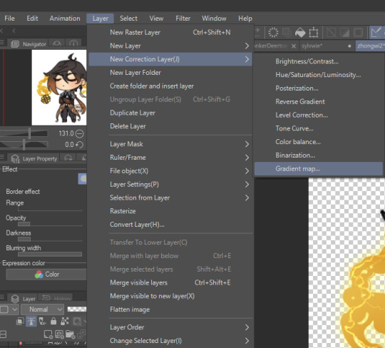
yes, i am also a person who uses gradient maps. I usually tend to use them as finishers and more subtle ways to add more colours and variations to keep my shading from looking too flat, but they do have to be handled with care lest they become overwhelming. vampbyte does a wonderful introductory thread on gradient maps, how they function, and how they can be used.
they can be found through layer > new correction layer > gradient map -- or at least that’s how i usually access mine!
i often place mine at 20% opacity on the colour mode, though soft light and overlay also do their own fancy things! really depends on which you like most and works with your piece.
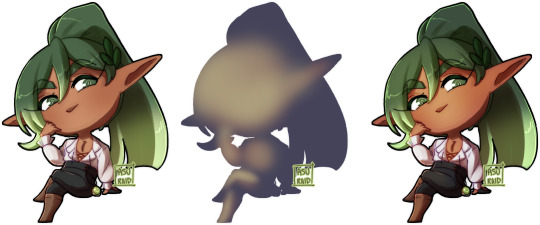
an example of my chibi w/o texture and colour gradients vs the texture + colour gradient ... as you can see it does change the colours quite a bit, so usually it does take me a bit of playing around to find a colour gradient I like (I’m a gremlin who has downloaded a lot of them) and to play with opacity values.
and to top it off, here’s the combination of all of these vs one with them all off.

how i personally shade (multiply layers)
i usually tend to either go for multiply shading over the whole drawing using one colour (and a few lil tricks to add more depth) for smaller pieces, or hard light shading for bigger and more complex pieces since it has more value depth.
my multiply layers are usually just one or two layers using around the same off-purple shade (though i shuffle it around pending on how it looks on the drawing

the second layer is a duplicate of the first, and i usually use an airbrush to either erase or expand areas to give it a softer shade (as you can see in the gif, the second layer is definitely missing chunks), or to add a different colour to the shading that isn’t the off-purple
how i personally shade (hard light mode)
this one’s a bit more of a mouthful, and thanks to a friend who introduced me to it! my second method is hard light shading, which, at its simplest, is greyscale shading and feels like it leans more into ‘painting’ your shades (as it works best with a brush that blends colours).

although I’m obliterating my own art here, it’s to show that most of your work will be in the greyscale/muted colours! it is inherently a non-destructive method of shading, so any changes to the colours underneath will maintain the shading regardless. normally I do have to duplicate the layer a second time since I don’t go too close to black shades, and it gives me a bit more control over how ‘hard’ I want my shading to be.

the middle is your ‘neutral’ shade, aka what you want to fill your entire hard light layer with, then your lighter greys will be your highlights, and darker greys your shading!
alternatively, you’re looking for this when you want to find your ‘neutral’ shade.
once you got your hard light layer filled with your base/neutral shade, grab your favourite painting/blending brush and go ham!
as a heads up: when it comes to skin or warm colours in general, you may need to get out of the greyscale range otherwise it will look too desaturated and grey, as you can see below. for any other tones, the greys usually work well.

as of the moment, I think that’s all the little tricks I use when doing art, I hope it helps you guys!
(unless I somehow remember something else, but these are usually my default tricks I use for everything)
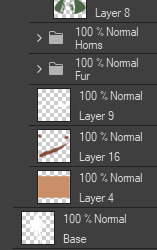
#art tutorial#clip studio paint tutorial#digital art tutorial#clip studio paint#tutorial#art tricks#mine.txt#10#20#50#100#200
221 notes
·
View notes
Note
If you dont mind my asking- what colour pallet do you use for colouring/shading? Your art is so pretty omg aaaaaaaa
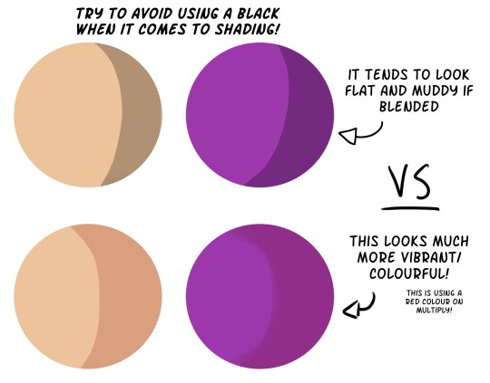
Thank you! And I don't really know how to answer this because I'm always using different colours in different pieces.
But for shading I can say I never shade with black/grey unless the base colour itself is already grey. But even then I tend to go for warmer grey tones. Most of the time I shade with a warmer tone. I think it makes especially characters skin look more alive!
Also when you have recurring characters like in a comic never just copy paste the colours as is! I always slightly adjust it to the background. (not just in case of day/night scenes but also just using red instead of blue as a background you'll see colours change it's all relative!)
Here's an example of Sébastien's skin colours slightly changing across episodes depending on the setting!
If you find it hard to pick a shading colour try using a new layer and setting it to overlay but use a warm colour instead, like a very light beige. Light layers I use colour dodge layers for! Those are a bit more tricky as sometimes it looks nicer if you use more "dull" tones as it otherwise over saturates the base colour.
And in general if you find it hard to colour and shade try playing with the hue and saturation adjustment layers after you coloured everything to get to a finished result you like more. Over time you'll get a better sense for what you like and you can even colour pick your own art! Also there's nothing wrong with colour picking photos and other people's art to practice/get the colour that you want imo! (It goes without saying to not copy someones whole piece but it's just colours!)
I'm sorry I couldn't be more specific but I hope this helped!
41 notes
·
View notes
Note
How do you render your colored pieces? They look gorgeous!
thank you so much!! i'm not very good at explaining my process, but i'll try my best aha
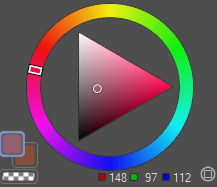
a while ago i made this tutorial (...of sorts) explaining the general idea of the colours i pick, shown below
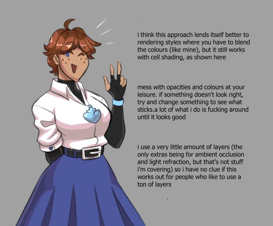
i only talked about it in terms of what exactly everything is and not why i do it... i took the idea of the way strong light shows on people with light skin (subsurface scattering, it's what makes the skin on the edge between light and shadow look reddish or why light shown through fingers or ears looks red) and apply it to pretty much everything. it's not realistic, but it sure makes things look a lot more vibrant
i also made an image about the brushes i use, which are actually default clip studio paint brushes, here
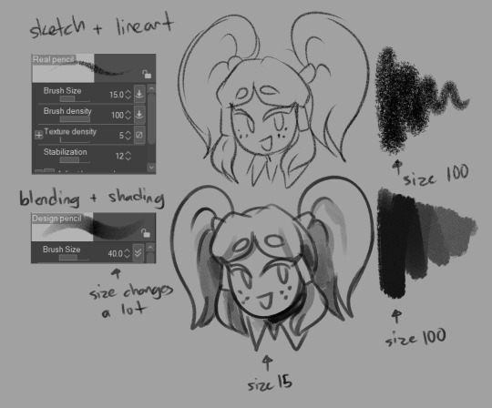
with my rendering style, i usually draw the darker colour with a flat ink pen, then blend the edges with the design pencil, swapping between the lighter and darker colour until i'm satisfied
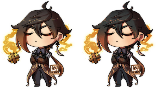
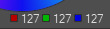
usually i just use the base colours that the characters usually have in every piece, so for a lot of pieces that feature more dynamic lighting, i have to use an overlay layer for colour correction (maybe one day i'll get good at picking out colours myself...) to make them fit into the piece a little bit more, as shown below
honestly, i don't really have strict and hard rules on myself when it comes to choosing the opacities and the colours for the shading (other that that mentioned in the first image i suppose). a lot of it is just talking to myself and saying stuff like "does it look like it has enough colour here? maybe i'll use a more saturated colour in these shadows here to make it look less bland" "i think the light here is too bright maybe, i'll adjust the opacity on this a bit" "hm, i don't really like the way this spot looks. maybe i'll use a different filter?"
there's more i could say about how to make everything come together, but that would involve talking about stuff like ambient occlusion, light bouncing, etc. etc., and i'm not sure i can succinctly explain how that works aha... that sort of stuff you kind of need to practice a bit to get a proper feel for it-- i've gotten through art by glancing at tutorials and eyeballing my art until it looks good
i will say, a lot of the things i do i picked up from watching Marco Bucci's painting tutorials on youtube! i don't really employ every technique properly, but i did pick up a few things, including the way light bounces. he explains it in a way that actually makes me properly understand how it works, most artist tutorials just tell you to put the colours there because it looks good
18 notes
·
View notes
Text
I am back from more Adventuring into Digital Art! I have today prepared a doodle I practiced making line art and some styles of colouring (? I am still learning the terminology)
Flat colours + line art:


And two tyles of rendering. First with painting style and second has a flat colour base with a mix of overlay layer and some tiny scribbles onto of the overlay layer:

(why is line art so hard...)
#welcome home#wally darling#art.txt#syncrovoid.txt#the pose is off and theres things that i'd change looking at it like this BUT it is what it is#my respect for digital artist has increased greatly for the sheer unfiltered Mass of Options makes it a lot more difficult#and not easier like i once thought#i am best at pencil and paper. shading only in tones of grey and not colour like this#BUT that shall not stop me @:P#it is a learning process (do people have tips? i watched some videos and played around with it but i feellike i am doing some things wrong)#anywho i have rambled enough!! and procrastinated much as i am fallen into a deep hyperfixation with my drawing tablet#<- is also very sleep deprived haha#have a lovely day/night !!#@:o)#syncrovoid.art
24 notes
·
View notes
Note
Hello! I've been a fan of your drawing for quite some time and I really find your drawings literally so amazing. I inspire to be an artist like you someday and I wish I could be the same as you ^^ If I may ask any tips to draw better in terms of digital art? I'm actually still starting out to draw digitally.
Sincerely,
boop anon
thank you so much, thats very sweet!! and im glad you enjoy all the stuff i draw :))
im not the greatest at giving advice, but, i can give a few tips that might be able to help!
first:
another shading tip is that the shadow will be the opposite undertone that whatever the light is! (i.e sunlight is very warm toned, obviously, but all the shadow it will cast will be a cool tone! and if the light is cool toned, then the shadow will be warm toned)
colour theory may be annoying to learn to a lot, but its very useful to get to know and will greatly help with shading n whatnot
mess around with the layer options on your program! they’re very helpful (like multiply, overlay, etc layers)
second:

brushes can greatly change your art style when it comes to digital art, but the most important thing when doing lineart is to be using a brush with pressure sensitivity so you can have that very nice Line Variation!
it just makes things look nicer, and it can be very helpful in adding depth (i.e making certain lines darker to show that theyre in shadow!)
programs also give you an option to add more stabilization to your brushes, which is very useful. it makes your lines look very smooth and nice (if you dont know how to adjust your brush stabilization, look it up for whatever program youre using and you’re set)
These are all quite simple tips, but theyre useful to know when starting out. I also greatly recommend looking up tutorials for whatever art program you plan on using, so you can find even more tips to help with your process!
but honestly the best way to improve is to just mess around and practice on the program - digital art can be difficult to get used to at first, but once you get the hang of it, its a great time! :)
#you can also find a bunch more tutorials and tips online by people who are way better at putting things to words than i am :)#i wish u luck on youre digital art journey and i hope this helped a bit! <3#kr talks#ask#anon#boop anon
24 notes
·
View notes
Note
Hiii, just gotta say, I LOVED your Wendy gifset and I was wondering how you got them to look that pretty?? They looks soft and detailed and like, real? Hehe I hope you can help me out, idk what I've been doing wrong with mine that are looking like shit so, help me out please
henlo anon!
when i first started gif-making, my gifs weren't the bestest either! it's a process and i think you'll get better at it w practice and trying new things !! <3 i'll throw in a bunch of pointers a lot of CCs gave me when i first started giffing and some of my opinions under the cut!
also this is definitely Not a link to download photoshop 2022 for free that i definitely didn't use as an upgrade two weeks ago
what you'll need to know before going through this long long rant of mine:
basic photoshop giffing skills
knowledge of smart filters and blending options
some patience (to hear my nonsense)
interest in maybe picking up new software
disclaimer: image heavy!

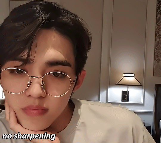
1. always use videos in their highest quality!
hq videos = hq gifs! i do not recommend using videos below 720p! also if you use photoshop, the number of colours in the gif is limited 268, meaning that sometimes your gifs can lose quality in export, and that could make lower quality videos look worse! (for eg. the video i sourced the wendy set from was 4k that i downloaded from 4kvideodownloader)
here's links to download:
4kvideodownloader
sophistagram (for vlives)
weverse lives download tutorial
twitter video downloader
a smol opinion: i've seen a lot of users use tumblr mobile, and noticed that gifs on tumblr mobile are always a little blurred out? this kind of makes the gifs look less clear </3 so using higher quality videos always helps!
2. vapoursynth / avisynth / km player!
these are softwares to sharpen and denoise your videos! they're completely optional (i used to gif with photoshop alone for the longest time) but they do make quite a lot of difference!
i highly recommend you to check the tutorials below!
gif-making with vapoursynth tutorial by @wonublr
gif-making with avisynth tutorial by @soonhoonsol
gif-making with km player (and vapoursynth!) tutorial by @woozi
a smol opinion: i've never used km player, so i don't have much to say about it. as for avisynth, it's pretty easy to work with, the only down side is that there are no denoise options. vapoursynth has both and is very user-friendly, but i found the shift from avisynth to vapoursynth slightly confusing!
these are my usual settings for vapoursynth:
3. gif sizes!
a very big (and maybe bullshit) opinion:
now, tumblr recommends you size your gifs this way:
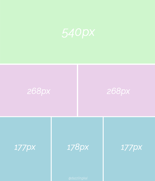
(img src)
but it,, doesn't necessarily have to be that way 👁
i really like to fuck around and use whatever size i want for my 268px and my 177px gifs, and the wendy set was no exception! the size of each gif in the set was 400px X 580px!! this, in my opinion, makes it easier to view them (a lot more clear, you could say) :o
as for my 540px gifs, they remain the same size!

4. sharpening on photoshop!
i would always recommend you to sharpen your gifs again on photoshop. tumblr LOVES reducing gif quality, so i resharpen to give my gifs some 'depth'
this is how i usually sharpen my gifs:
(the gif above was sharpened and denoised on vs w the settings mentioned above!)
step 01:
after you're done converting your gif into a smart object on photoshop, we'll add a layer of smart sharpen. these are my settings:
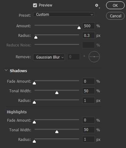
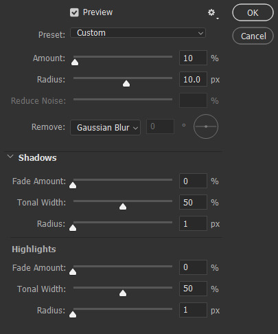
step 02: more... smart sharpen :eye: :
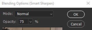
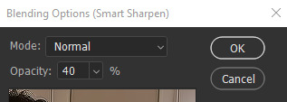
step 03: high pass (optional tbh)
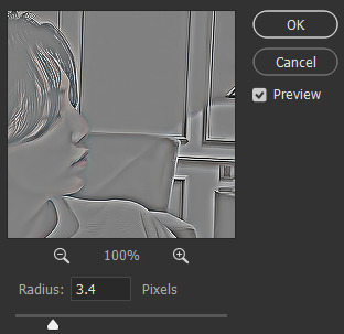
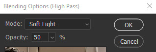
imp: don't forget to change the blending to soft light / overlay (i prefer the former)
now the gif looks like this:
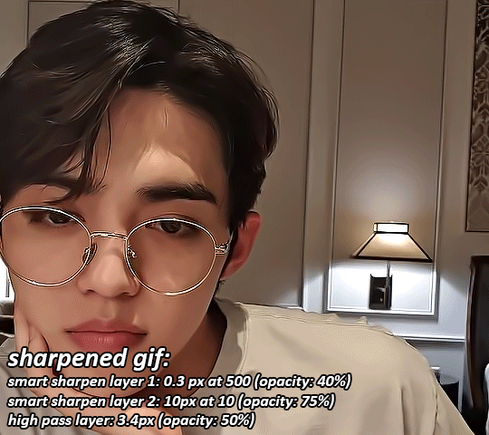
something to note: i like switching up my opacity levels on these settings, and usually only ever change the radius and strength of the sharpening!
here's a few more sharpening tutorials:
sharpening tutorial by @/woozi
tutorial by @/hellboys
tutorial by @yutaslaugh
5. colouring!
colouring plays a huge role in making your gifs look sharper and cleaner! this is your playground, and this is the area you have the most freedom to change, and zuzsh up things the way you like them!
generally, i like to draw the attention to the person i'm giffing, so i make sure to set the contrasts right! i also extremely like making the colours cooler, so that it seems more natural!
the layers i use most are:
curves (on auto)
more cuves (using the eyedroppers to set my black, grey and white points)
selective colour (to change contrasts, to recolour skin)
colour balance (to balance my shadows and highlights)
levels (for brightness, contrast and depth!)
i'm not extremely good at colouring either, so here are some more in depth colouring tutorials (i'm terrible at explaining i'm so sorry sksjkd):
colouring tutorial by @/jihan
south-east asian celeb colouring tutorial by @/blueshelp
and here's some pre-made psd packs!:
psd pack by @/kpopco
psd pack by @shuatonin
psd pack by @coupsnim
psd pack by @/wonublr
closing ments:
if you've made it this far, thank you! i'm not extremely great at explaining things, but i hope you found this 'tutorial' useful! (extremely confused what this is tbh it feels like i'm rambling sgkfjsh)
here's a few more tutorials (kinda unrelated) that i found useful and fun!:
tutorial to fix grainy gifs
tutorial to remove panning from gifs
animated text tutorial
gif + more effects tutorial
112 notes
·
View notes
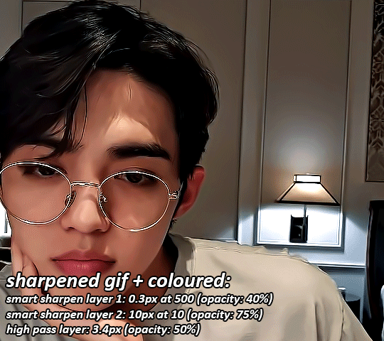
Text
Artist Process Post

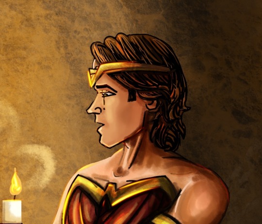
Some process pics and behind the scenes for my Sam and Dean Costume artwork 😄:
My usual style for digital artwork is free-hand painting. I usually either build a reference scene in a 3D modeller or I draw a messy concept sketch from reference photos to get my basic shapes. Next I do a neater sketch on a new layer in Procreate and turn off my old concept sketch layer. After that I draw block colours on a layer underneath my sketch layer, before finally painting the shading and detailed features on a new layer over the top of it all. I use this process because I am a self-taught digital artist coming from a traditional art background. Plus I just really like painting 😄 - laying down colour in freehand brush strokes to build up my picture - it lets me adjust and change my ideas as I go (pre-planning is not my forte! 😅). However a lot of digital art originated in animation and anime styles, so it uses line art and colour fills in closed shapes to produce a much cleaner style. I thought I’d change up my regular process and give that style a go here and I’m really proud of my novice achievements 😄
I still started with a sketch of the boys. I drew the poses and body shapes in blue, using classic superhero poses and musculature. Then on a new layer I added the costume details in red. (I had loads of fun with this stage, it took me back to teenage me who used to draw comic book heroes instead of doing my homework 😂)

Next I lowered the opacity of my sketch and did some line work on a new layer. The trick here is to try and draw clean smooth lines in a single stroke and to make sure that the lines meet so that shapes are closed. (Later on you select individual closed shapes and fill them with colour, but if you have left gaps in your lines the colour floods out into other areas or fills up the whole page.) My lines aren’t the smoothest (I messy sketch for a reason! I have very shaky hands!!😂) and they also don’t have much nuance to them (lines should vary in thickness to add emphasis and flow to the design) but I was just pleased my work was neat-ish and still looking like my concept! 😄
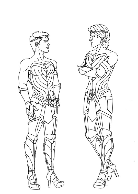
The next stage is flat colour. This is a straightforward stage if you have taken time on the line work. I selected the areas that I wanted and used the fill tool to add my chosen colours inside the lines. (I also painted a freehand background to add atmosphere before I started on my shading.)
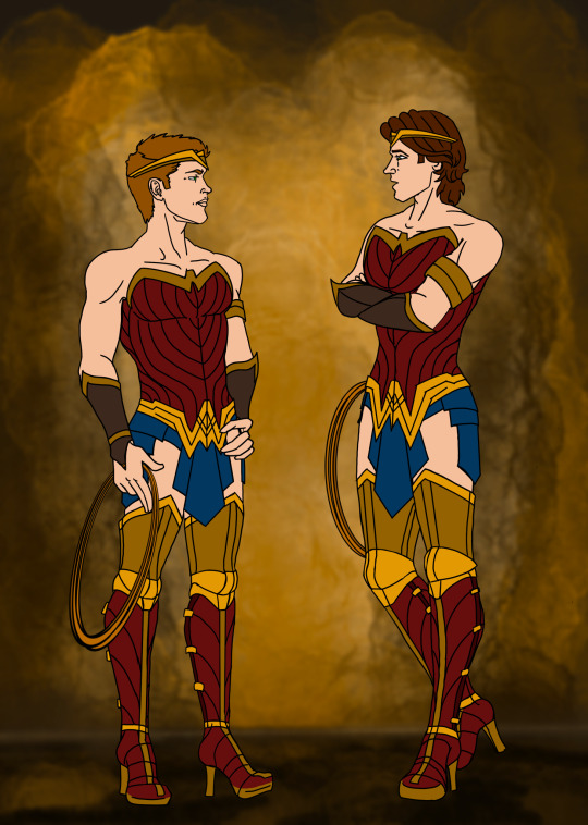
The final stages I did were shading and lighting. I drifted back towards my traditional painting style with the shading. Anime styles often use single colour shadows in block shapes, or gradient overlays to add depth, but instead I clipped my shading layer over the top of my flat colour (clipping a layer prevents you from accidentally going outside the edges of the layer below) and hand painted shadows, tone variations and highlights with freehand strokes and a blender brush. The final layer on top of that I used the hard light setting to paint on glows and shine.
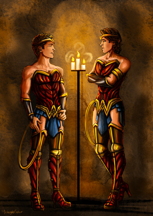
And that’s everything. 😄 All in all this took me about 8 hours but that’s because I’m incredibly slow at line work 😭 (I spent soooo much time erasing and undoing crappy lines) and because freehand painting my shading layer is much slower than using block shape shadows - but I would need a lot more practice at that to make it look good, freehand painting is slower but it let’s me cover more of my errors as I go 😁. So while this art style for this pic is still not as clean or as efficient as typical anime/animation style digital artwork, I’m really pleased with the look of it compared to my usual loose style.
P.s. if you hadn’t noticed, I’m not an expert! This is not a tutorial, this is just an explanation of how I did this this time - and I’m learning more every day. If you wanna learn more about digital drawing from people who know what they are doing you can check out amazing artists like @kirathehyrulian and many others. 🤗
Stay awesome and happy Arting my friends
- Midnight
Art post on its own without the behind the scenes 😄
#supernatural#spn fanart#MidnightSilver#my artwork#artists process#digital drawing#sam winchester#dean winchester#wonder woman#superheroes
8 notes
·
View notes
Last Seen Blogs
bornofchalk
the spotless soil

caba1a
C-STATION
bobdillpickle
simple twist of fate

mikenaylorrealtor
Mike Naylor, Realtor