#art tricks
Text
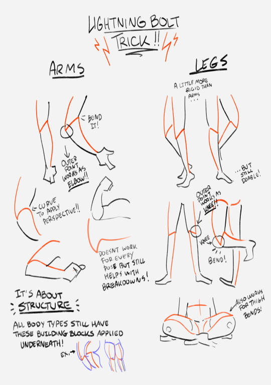
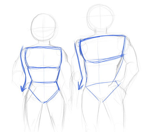
this showed up in my FB memories, the lightning bolt trick! I don't sketch out the lightning bolt much nowadays but it's still super helpful when I need to lay out tricky arms and leg poses. And I still apply the logic of it, especially with how I draw arms :' ) Biggest thing it helps with is shape breakdown and visualization, we gotta use whatever works to break down shapes into simpler concepts for our brains 👏💓
10K notes
·
View notes
Photo
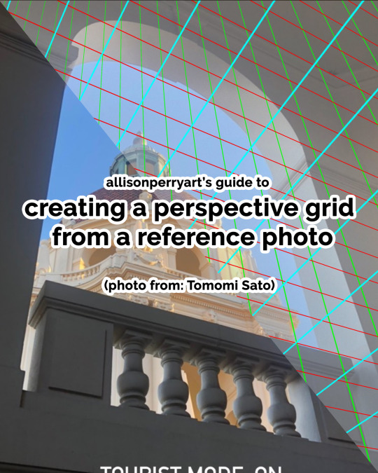
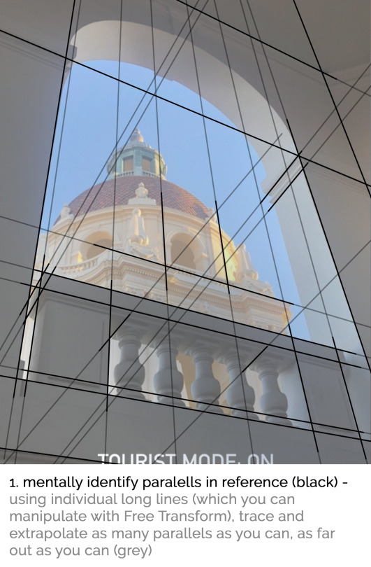
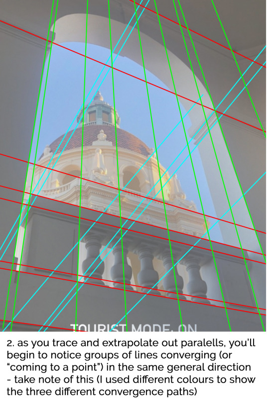
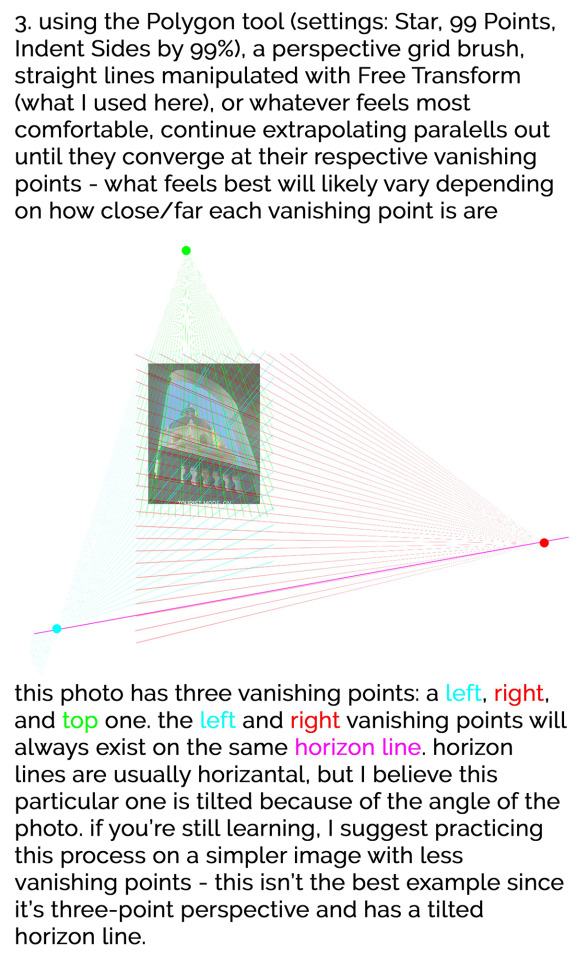
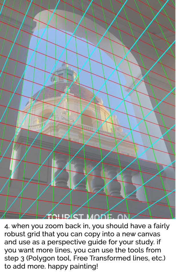
In case you missed it, here's a #TutorialTuesday someone requested on Twitter to go with last week's process video on how to create a perspective grid from a photo (from Tomomi Sato) which you can use for studies, drawings, paintings, etc. Hope this helps with drawing/painting in perspective!!
#tutorial#art tutorial#art help#artistsupport#art tricks#arttrick#art tips#arttip#howto#digital#digital art#concept art#concept#perspective#grid#vanishing point#horizon line#guide#underlay#overlay#visual development#visdev#illustration#allison perry#allisonperryart
8K notes
·
View notes
Text
ARTISTS
IF YOURE LOOKING FOR THE PERFECT MANNEQUIN BOY DO I HAVE NEWS FOR YOU!
INTRODUCING
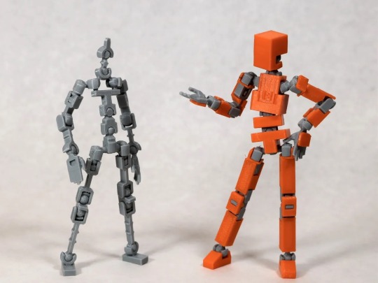
LUCKY 13 BY SOOZAFONE
Lucky 13 is a completely FREE 3d print file available on Printables by Soozafone! If you have access to a 3d printer or can get someone ro print it for you, I 1000% recommend it!
Lucky has the same amount if not more articulation than most artist mannequins and is SO MUCH CHEAPER. While filament is expensive, I was able to print mine at my university’s print lab for 13$. 13!$!!!
This figure is comparable to the Armature 9 models, and in my opinion, BETTER just because of the customizability and free print use! Im currently working on making dragon wings for mine.
Lucky comes with the armature, skin, a stand, 8 different hand poses, and several accessories, but the community has HUNDREDS of remixes and new additions custom made for this little guy.
And the best part is, is that the creator, Soozafone, is ALREADY working on a version 2!! Check him out on reddit at r/Soozafone!
I am so in love with my own figure and am so excited to see all the new updates. If you’re looking for pose reference but dont want to fork over hundreds on a figure, PLEASE! Check out Lucky 13!
Here’s the link to the Printables page:
I literally cant recommend this figure enough, Im already planning on printing a few more because I love it so much.
I hope this gives all the other artists a fun little project, because I certainly had a blast putting mine together!
Happy printing!!
#3d printing#artistsupport#artists tips#art tips#art tricks#art hacks#poseable figure#pose reference#sketch#painting#digital art#3d print#Lucky-13#printables#art reference#drawing reference#drawing tips#drawing hacks#drawing tricks#reference#animation reference
3K notes
·
View notes
Text
tumblr ate another ask, of course, but someone asked what tools I use for sgraffito. I made a 3.5 minute video covering the tools I use
#no sound as per usual#hopefully this is helpful#pottery#ceramics#sgraffito#ceramic#carving#before and after#timelapse#ceramic art#art video#art tips#art tricks#video#ask#asks
305 notes
·
View notes
Note
Hey, indie, how do you draw female characters? Do you have any how to draw or steps on how to do them?
Okay, so drawing girls is a bit different than drawing guys.

Here’s a really rough sketch of a man and a women. You can tell which is which, but why?
Reason 1! Women are ~curvy~ which put simply means they got boobs and butt. Though not all women are as curvy as underpants models, curve is still an identifying feature of women.
Reason 2! Women are (on average) smaller than men in most ways. Women are generally speaking shorter than guys, and also have slimmer shoulders. Now this is not to say that you can’t have a tall, built women, but there’s a reason that that has an appeal of power and authority, it’s masculine.

Alright, now the face. Which is arguably more important than the body. Once again you can very obviously tell which is which. But why?

Reason 1! Women have soft brow lines they flow into soft cheeks. Even if you’re character has sharp eyes, short hair and caterpillars for eyebrows, if they have a soft brow line, they will look feminine.
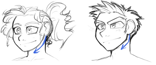
Reason 2! Women have a soft jawline. I learned this important difference when I was learning how to do cosplay makeup. Men have a much more accentuated jawline, chin, nose and (as previously mentioned) brow, so by making your character have softer facial features, you can make them look more feminine.
More obviously feminine things are long hair, thick eyelashes, thin eyebrows, dress more feminine, etc. but none of that can really make up for these visual rules that’ll really decide whether or not your character looks like a girl or a guy.
I hope this helpful! I’ve considered starting a YouTube channel with some of these asks you guys give me. Not sure if that’d be something of interest, but I’m willing to give it a try if that’s something you guy’s like :]
177 notes
·
View notes
Text
Maybe I'm late to this(being I've been drawing consistently for about two years now)
But
To any new artists who may come across this-
Let yourself have those shit drawings
Just doodle things with no intent of showing anyone, worst case scenario you can still show them if you think they're funny/still look good enough
Let yourself have those doodle sheets filled with half-assed ideas that make no sense and are just cool to you
Not every piece you create has to be posted or shown off to anyone other than yourself and MAYBE some friends if YOU are comfortable with doing so
The best way to improve after all is to just fuck up and observe so you can think of what to try fix to improve
Practice makes Progress after all
#just throwing this out there since I recently came to terms wih it myself#i stopped acting like everything I make must be posted in full or at all and its helped my anxiety so much#art tips#art tricks#art#drawing tips#art advice#drawing advice
168 notes
·
View notes
Text
aid’s collection of neat art tricks
aka I wanted to compile all the neat things I’ve learned and picked up over the years across various sources; I wish I knew some of these, but they’re scattered across a variety of social medias and some from conversations.
of course, these are not a must and just have helped me! I just wanted to put them all in one place in hopes that maybe it’ll click something in someone like it has for me. c: I’m not the best at explaining, but I hope it makes sense!
some may use Clip Studio assets but can be replicated through other methods (or done by hand in the case of how I do my lineart colouring), but do keep in mind all of these are written with CSP in mind.
this is pretty heavy in images and gifs, and is quite long.
how to quickly fill your outlines (CSP tool)
this is a CSP specific method, but this tool has been my absolute saviour for making colouring so much easier for me (even if sometimes it still does require me to manually fill in some holes or erase sections). the bulk of how it works is explained in the tool as well, but I’m going to show a gif example for myself!

you have to make sure your lineart is set as the reference layer to ensure this tool does work; with messy outlines (like my own) you may need to manually fill in holes as can be seen in the gif above; with cleaner outlines, you don’t need to worry as much, but you may have some bleeding out of the lines for places that are a bit too close together (as you can see below, those areas would need to be erased).
the tool can also help to close ‘gaps’ between colours!

I usually tend to have a ‘base’ colour that I just clip a folder of flat colours to, so it doesn’t bleed outside of it, but I’m also a nested folder freak to make sure everything is cleanly separated and doesn’t get ‘destroyed’ while I work on it. this tool just makes it so much easier to get that base down and just jump right into adding flats.
adding a little pop of depth
this one is thanks to a clip studio article itself where I saw it from, and I’ve been using it in practically all my drawings so far; all it is, is a simple blue-ish overlay layer with some muted yellow/red shading to give it a bit of a “3D” effect, for me I enjoy more that it adds a bit more colour variation underneath (usually lowered to 20-50% opacity, depends on the drawing)
the article definitely explains it a bit more nicely, but this is an example of having it at 50% opacity over one of my drawings
making your lineart feel less ... boring?
of course, boring is subjective from person to person, but I’ve always found my lineart to be too boring by itself

like this is fine, but it’s missing some kind of oomph. there are two tricks I use when it comes to sprucing up my lineart: using the watercolour edge effect in CSP, and a combo of coloured outlines + black outlines
first things first, the watercolour edge option: by default it’s a bit too strong, so I usually find the sweet spot to be at 1 range and with an opacity of ~20


this can be replicated through duplicating your lineart, and if the option is available, using gaussian blur on the duplicated lineart to achieve around a similar effect.
coloured outlines!
when it comes to colouring my lineart, truth be told I do use a wonderful auto action for it which can be found here, and there is this alternative one as well (which i’ll be trying now!!!).

it is a little different since it uses the flats, vs the one i use which just requires you to have the lineart selected, but as you can see it is a very quick way to colour your lineart ... this isn’t perfect by itself and will require you to have your flats finished.
this is my process: outlines done, autoaction, cleaning up by adding black outlines where they’re required and fixing up sections where the colours don’t quite make sense (like the sleeve area).

as you can see with the last drawing, I also tend to add a black outline around the outside of the piece, I personally found I really enjoy the contrast of the dark outside and coloured interior lines, as you can see in this little sample; it just adds a bit more visual interest for me!

unfortunately, outside of manually doing it, I cannot think of alternatives for this specific action (perhaps duplicating + flattening all your colours and placing it on top of the lineart may be a start)
crunchy textures and pretty colours ...
the texture i use on top of my drawings can be found in this CSP asset pack (though the marker brushes themselves are very lovely, and I’ve used them myself). this can be replicated through adding perlin noise, but I just find this texture to tickle the good spots in my brain, and it’s why I use it on pretty much all my drawings for some additional visual goodies.
yes, i am also a person who uses gradient maps. I usually tend to use them as finishers and more subtle ways to add more colours and variations to keep my shading from looking too flat, but they do have to be handled with care lest they become overwhelming. vampbyte does a wonderful introductory thread on gradient maps, how they function, and how they can be used.
they can be found through layer > new correction layer > gradient map -- or at least that’s how i usually access mine!
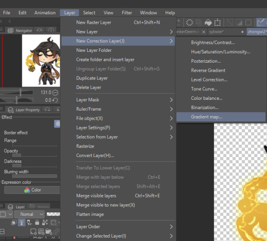
i often place mine at 20% opacity on the colour mode, though soft light and overlay also do their own fancy things! really depends on which you like most and works with your piece.
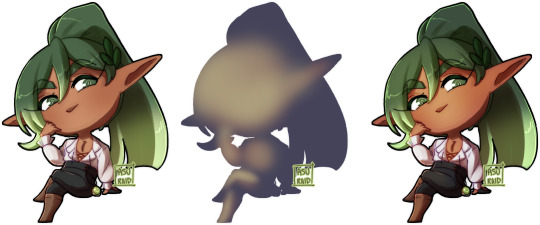
an example of my chibi w/o texture and colour gradients vs the texture + colour gradient ... as you can see it does change the colours quite a bit, so usually it does take me a bit of playing around to find a colour gradient I like (I’m a gremlin who has downloaded a lot of them) and to play with opacity values.
and to top it off, here’s the combination of all of these vs one with them all off.

how i personally shade (multiply layers)
i usually tend to either go for multiply shading over the whole drawing using one colour (and a few lil tricks to add more depth) for smaller pieces, or hard light shading for bigger and more complex pieces since it has more value depth.
my multiply layers are usually just one or two layers using around the same off-purple shade (though i shuffle it around pending on how it looks on the drawing

the second layer is a duplicate of the first, and i usually use an airbrush to either erase or expand areas to give it a softer shade (as you can see in the gif, the second layer is definitely missing chunks), or to add a different colour to the shading that isn’t the off-purple
how i personally shade (hard light mode)
this one’s a bit more of a mouthful, and thanks to a friend who introduced me to it! my second method is hard light shading, which, at its simplest, is greyscale shading and feels like it leans more into ‘painting’ your shades (as it works best with a brush that blends colours).

although I’m obliterating my own art here, it’s to show that most of your work will be in the greyscale/muted colours! it is inherently a non-destructive method of shading, so any changes to the colours underneath will maintain the shading regardless. normally I do have to duplicate the layer a second time since I don’t go too close to black shades, and it gives me a bit more control over how ‘hard’ I want my shading to be.

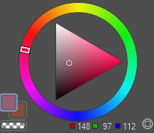
the middle is your ‘neutral’ shade, aka what you want to fill your entire hard light layer with, then your lighter greys will be your highlights, and darker greys your shading!
alternatively, you’re looking for this when you want to find your ‘neutral’ shade.
once you got your hard light layer filled with your base/neutral shade, grab your favourite painting/blending brush and go ham!
as a heads up: when it comes to skin or warm colours in general, you may need to get out of the greyscale range otherwise it will look too desaturated and grey, as you can see below. for any other tones, the greys usually work well.

as of the moment, I think that’s all the little tricks I use when doing art, I hope it helps you guys!
(unless I somehow remember something else, but these are usually my default tricks I use for everything)
#art tutorial#clip studio paint tutorial#digital art tutorial#clip studio paint#tutorial#art tricks#mine.txt#10#20#50#100
221 notes
·
View notes
Text
I have figured out the best trick to help me make sure arms are the same length while drawing

#wip#fnaf security breach#security breach#fnaf#my art#fnaf daycare attendant#sundrop#moondrop#fnafsb#dca community#dca fanart#art tricks
14 notes
·
View notes
Text
Making a pair of slippers for a young friend of mine.... It's amazing how much of a difference a little bit of white in the eyes can make!

11 notes
·
View notes
Text
youtube
im starting a new series on my youtube channel for basic guides/tutorials/tips/tricks on how to draw and color cats! my first video is on tabby markings if thats something that interests you! my next planned videos will be over white spotting/markings and easy calico/tortoiseshell markings!
#mac speaks#warrior cats#warrior cats art#art tutorial#art guide#art tips#art tricks#art tips and tricks#macs doodles: cat art tutorials#Youtube
9 notes
·
View notes
Text

Here's some poses y'all
Hopefully the annotations are helpful, these are just some tips~
#art tutorial#art reference#drawing reference#reference#pose practice#dynamic poses#drawing poses#digital art#y'all I tried#i can't draw hands#art study#art tricks#poses
23 notes
·
View notes
Text
In case you missed it, check out this video from BaM Animation about BG painting that I helped consult on and drop them a follow for more industry tips if you're not already! Thanks for watching!!
youtube
#bam animation#bam#animation#background paint#background painting#color theory#color#youtube#youtuber#youtubers#video#videos#tutorial#tutorials#art tutorial#art help#artist support#art tricks#art tip#art tips#how to#digital#digital art#background#allisonperryart#allison perry
88 notes
·
View notes
Text
Ok! Attention! I wanna help my starter artists !
So, if you want to have a style that is close to mine or practice in art, here is what you need to know!
I draw on IbisPaint! It’s an easy starter app and it’s free!
I inspired my style from mostly drawing wiff waffles! You can check her out on YouTube!
I use this pen!
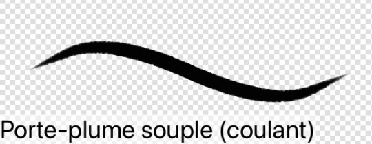
Yeah.. im French lol. I think in English it’s (flowing soft nib holder.) but im not sure…
Now for the art stuff!
4. An exemple of how I draw a woman and a man!
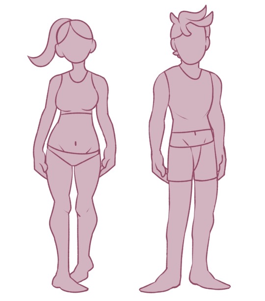
If that can help! It’s important to have shapes and forms for your characters! Cause here look.
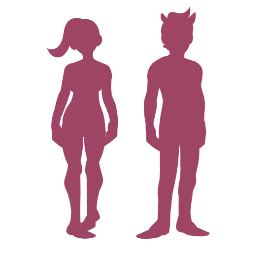
Even with the full opacity of the colour, you can still see what’s going on! And what pose they are doing!
5. I try to keep my profiles entertaining! Like so!


6. What I also do is that I colour the line art at some parts of the drawing!
7. I used a lot of references to get anatomy and stuff for a while , it’s alright to do so! That’s called learning!
8. If you’re in an art block here is what you need to do, don’t draw! Don’t force you to a burnout! If you want challenge yourself then go for it but it should be because you feel bad for not drawing!
9. Personally, I don’t do backgrounds for now.. I’m learning to do so in my free time but, honestly.. 🤷♀️ they don’t look that good! And it perfectly fine! That’s what’s fun about art!
10 …. Hmm… let me see… oh yeah ok! Here it is! Draw at your own speed! Don’t force to go fast, trust, I’m talking from experience..it doesn’t work. It’s ok if your slow! It’s ok if your art doesn’t look as good as your friends or classmates! That’s how art should be! A personal challenge! Not a social battle!
I think that’s what I have for the moment! If I have anything else, I’ll let you know!
Bye!✨
#art#art tricks#myself#things to know about my style!#drawing#enjoy#if you have questions don’t be shy to ask!#starting art#starter artist
4 notes
·
View notes
Text
7 notes
·
View notes
Text
Art tips and tricks that I've learned
- Use your recourses. Erasers, references, round things (cups, coins, costars, etc..). no matter what others say, do what you like to do.
- Don't be afraid to draw what you want, no one HAS to see it
- there are pencil caps for pencils so they don't get dull while traveling, you can find them on amazon for cheap.
2 notes
·
View notes
Note
I have a question regarding using the same frames? I don't know how to put it into words.
In Meowdrey posts or any other really, do you just make a copy of a file then use the other copy to change the characters expression? Because its the same image just the facial expression changed? I'm curious, because my stupid brain was like "What if you just screenshot the file you're on then after that change something and then put the screenshot in your art files?" I'm very dumb 😅
Short Answer: Yeah, kinda!
Long Answer: First off, I'll put all of a characters layers into one folder (same for the background, in its own folder). Next, I'll typically plan ahead a bit, drawing the face on its own layers separate from the body (Though sometimes i straight up forget and have to erase what I did and redraw the new expression!), but if I do it right and keep it on separate layers, I can "Toggle" the faces and save them as separate images.
However, if I'm changing more than faces I'll often save a copy and do the aforementioned edits on the new save copy instead of the old one, giving me two versions. I hope that makes sense!
So long story short, I put everything on separate layers and "toggle" the active layer to the ones I want for any specific shot.
5 notes
·
View notes
Last Seen Blogs
kyalinappreciationacct
KyaLinAppreciation

docwebindia
Untitled
cavities-in-reality
cavities in reality

d0ct0rr0bert
d0ct0rr0bert
wellerish
Weller