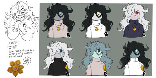
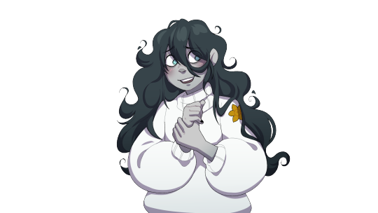
#this is my first drawing but i think i want to iterate on this concept more
Text
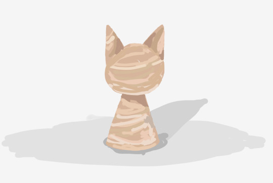
[ID: a digital drawing of an abstracted creature with a featureless cone-shaped body and a round head with pointed ears that has been carved out of wood. end ID]
"wood grain animal"
#wood grain#original#carving#this is my first drawing but i think i want to iterate on this concept more#i want them to feel organic in shape but still made of wood. Like a living creature that happens to be made of wood#this one turned out to look like an actual carving
11 notes
·
View notes
Text
Found old pitch scripts for my batim comic w/ my self insert character. Genuinely good stuff, I can't believe I scrapped this?
#gale chatter#50/50 i either actually draw it or try & lose steam#i like... hardly remember writing this. since then a lot of shit has happened. im straight up not the emerald who wrote this.#& i never finished bc i ran out of ideas after chapter 2 but what's there is good#i remember being embarrassed that my self insert was there & so i was gonna switch them out for bendy#but when i went to rewrite it & take my character out i lost steam. I didn't want to do it i just didn't want to seem cringe.#thinking of like. not rewriting anything noy changing the panel concepts i have#just trying to make as much of it as possible without erasing anything#maybe I'll slightly redesign the characters but that's it#also this is from so long ago i know this character is supposed to be dottie but she isn't named that yet#bc i hadn't come up with a name for her or thought too hard abt her. this is like the earliest iteration of dottie#bc this was the first time i did anything with her#& so as a placeholder i just put my name#should i... change that?#there's like a section i would have to rewrite if i did. hm.#yeah no that can stay#time 2 be... cringe......
2 notes
·
View notes
Text
I’m going to assume that at this point you’ve all seen Critical Role’s new show Candela Obscura and at least skimmed through the Quickstart Guide (you have done all that riiiight??) So I wanted to compile all the things I’ve done that have been shown so far. Its long so read below the line!
I’m going to try to avoid spoilers. So feel free to read without worry. I’m also going to try and avoid breaking any NDA like a good professional. So I will not be doing some deep dive behind the scenes thing. Only visuals that have already been publicly shared are going to be on here
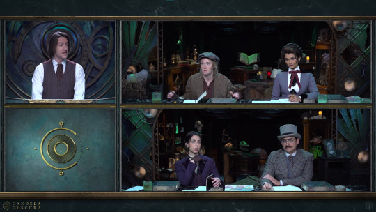
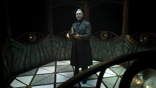
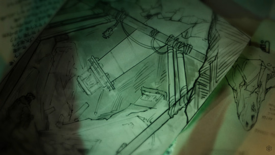
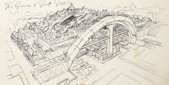
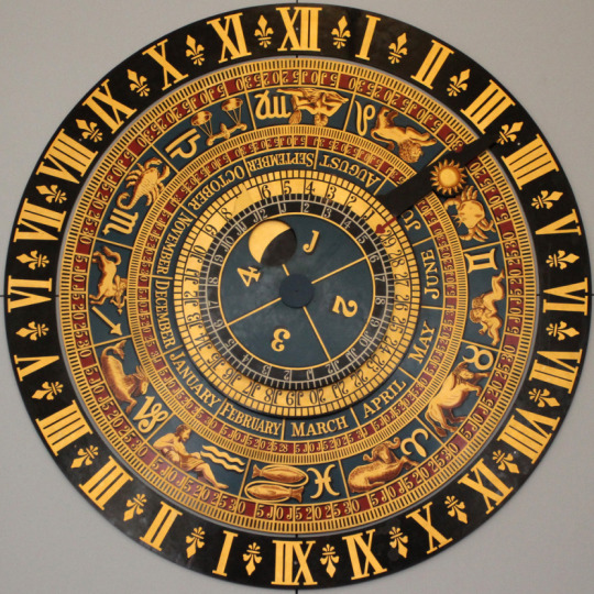
The very first thing I did on this show was the concepts for the main set. Everything is practical. Nothing is green screen or cg or whatever. Some people think it’s just good cg but nope that's all real. You could touch it! (don’t touch it, there are ghosts)

There were multiple iterations on the design, each with their own vibe and statement piece. CR narrowed it down to what you see in the show: a sort of storage hall with an odd clock contraption behind the GM. I think I called this design version the “Abyssal Hall” or something like that (I gave the different versions names to better keep track of which design was being discussed)
The company Flip This Bitch built the physical set. They turned my silly little art into a real thing. So they did all the actual magic of making this set come together in the end! They deserve a lot of the credit for it looking so good in the end.
Also that little piece of art in the bottom left of the preshow is a section from the final concept art of the set.


That contraption behind Matt is based on astrolabes and clocks. This isn’t really meant to be a literal astrolabe or a clock as we would use them in our world. Narratively this isn’t a device that measures either of the things that a traditional astrolabe or clock does. This is a special magickal tool that does a secret third thing.

Also I did concepts for the GM screen. You don't really see it besides in the fancy-shmancy preshow. There were a number of more intricate designs for it but CR went with the simpler option since the only part that would be visible on stream is the top, so that's where I put the most detail.
I should also note that I did not design the logo! It’s pretty prominent on the GM screen but I was supplied an already existing logo for this.
NEXT is the Taliesin enclosure set that you see in the trailer. This is actually meant to be like the lantern room on the top of a lighthouse, minus the big light beacon (You could say Taliesin is the beacon).
Also in the trailer you see a couple brief sketches I did for some world building concepts:
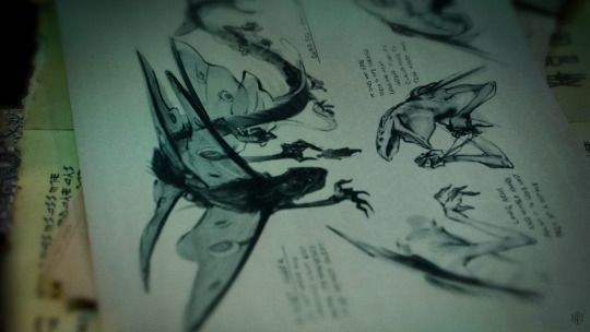
Speaking of sketches there are a number of art pieces of mine in the Quickstart guide
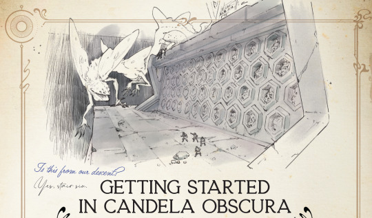


A lot of my art is sketches. They’re all meant to be like notes and drawings from members of Candela as they travel and notate their findings. Most of the notes on these sketches are my actually my notes when I was doing world building concepts, but they replaced my handwriting with a font because my handwriting sucks lmao (also likely for ease of future localization).
Also the cover of the Quickstart guide uses line art of a part of that astrolabe clock set piece. This line art was part of the deliverables that was sent over to Flip This Bitch for construction. They’re just using pieces of those set concepts everywhere!

As you can see I’ve done a lot of art for this project. I was part of this project when it was still early in development. It’s changed quite a bit from where we started.
I wasn’t the only one that made all this art happen though. Other artists, writers, and designers got to add their own vision to this. It was very much a collaborative effort that took a long time to happen. It’s very exciting to see everyone’s hard work come to fruition and there is a lot more to come!
#candela obscura#critical role#my art#ttrpg#illustration#art#cr#candela spoilers#I could say a lot about what went into each thing#but that would be too long#this is already too long#more art is coming#you’ll see it in the final release of the rules/setting book#also it’s very likely a significant amount of art won’t ever be show to the public#such is the life of a concept artist
1K notes
·
View notes
Photo
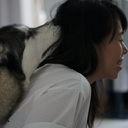
Red Angel's got a new partner to Prevent Harm with.
I’ve been working on this thing since the start of September and I am SO GLAD it is finally finished! I want to see this team up on screen SO BAD. SENDING ALL MY WISHES TO THE WIND.
(Art process timeline thing under the cut!)
At some point I want to make a gif out of all the process pics I took because there are quite a lot. Below is the condensed version, with all the major steps. The render stage took the most time to do because I really wanted to capture certain aspects of the show’s art direction that I really liked (and it took a lot of experimenting because coloring isn’t usually my favorite step).
concept > sketch > lineart > flats > render
(bigger image here)
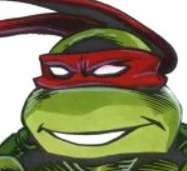
This thing started off as a mindless procreate sketch (far left) and the thought: “Raph would be so much bigger than Casey in this iteration, huh. That’s cute.”
And yeah, snowballed from there.
I think I’ve drawn Raph several times since, but this is probably the first time I’ve ever tried Cass. I love her. I should (and will) draw her more.

Screenshots I spent a lot of time staring at, especially Raph down there as I was trying to get the “manifesting mystic gauntlets” look right (accidentally lost a bunch of progress on it the other day. it was pain but i powered through :’) ).
I believe the backgrounds are from Hot Soup: The Game, which I had playing in the background at around the time I decided to think about the background for this illo. The Cass screenshot is from Rise, of course, and Raph is from the movie, juuust before he attempts to punch a krang in the face.
If you’ve read this far, thanks for reading and I hope it was... informative? Interesting? Here are my Rise-Raph-and-Casey feelings all wrapped up in a piece of art that I put my soul into. Thanks Rise crew, your work continues to inspire.
#risetober#rottmnt#rise raph#rise casey#cassandra jones#casey jones#rise of the tmnt#raphael#red angel of preventing harm#tmnt#fanart#art process#to all the fanfic writers who have written about these two#i see you and i appreciate you
3K notes
·
View notes
Text
Void Worms as the Demiurge and Iterator Inverses (And also clearing up some things about the Qualia post)
So, I'm going to be going a bit more in depth on the Yaldaboath-Void Worm comparison I brought up in my previous post. Here's the post for anyone who didn't see it already:
I also just wanted to expand upon some things and maybe clear up some confusing parts that I didn't cover in the original post.
But first I'll give a quick explanation on what Yaldaboath (who I'll just be calling the Demiurge from now on) is before drawing the comparisons. The Demiurge is a being in Gnostic belief that created the material world. He is often identified as the god of the Old Testament, and is malicious and inferior to the True God called the Monad, who is above all else.
Of course this is very simplified and I'm leaving a lot out, but what you should take out of this is that he created the material world.
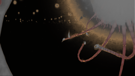
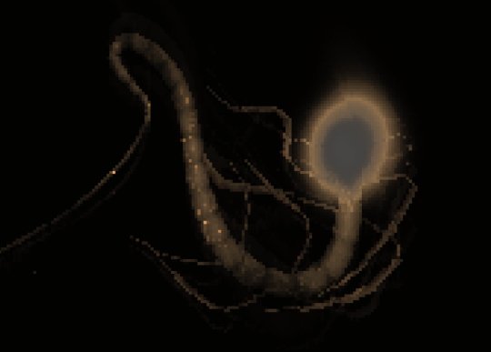
So back to void worms, they heavily resemble the Demiurge in a few ways. Visually, they both share a long, serpent-like body, and glowing "halos".
But beyond that, they indirectly share a few celestial motifs. The Demiurge gave birth to Archons who ruled over different, "celestial spheres." Celestial spheres are a concept in Rain World cosmology, as it's mentioned in the Deep Pink pearl.
"On regards of the (by spiritual splendor eternally graced) people of the Congregation of Never Dwindling Righteousness, we Wish to congratulate (o so thankfully) this Facility on its Loyal and Relished services, and to Offer our Hopes and Aspirations that the Fruitful and Mutually Satisfactory Cooperation may continue, for as long as the Stars stay fixed on their Celestial Spheres and/or the Cooperation continues to be Fruitful and Mutually Satisfactory."
But, even beyond that, they straight up appear visually in the depths through Guardian Halos.

And then Gnostic celestial spheres for comparison.
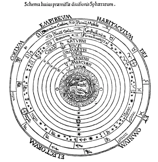
Void Worms are also described as "stars" within ancient dreams and our own.
Now, this is only a tangential relation to the Guardians who also reside in the Depths, but there is one more thing that I believe cement the Void Worm Demiurge theory that is much, much bigger in the context of Rain Worlds narrative.
Void Worms have a lot of iterator parallels, which lead me and others to believe that they act as a direct inverse to Iterators. Iterators usher beings to ascend past their mortal confines, and Void Worms trap beings in the material world like the Demiurge.
The first of which are just some design similarities between the two. They both have round heads with bug-like eyes, and they both have halos.
Next, the scenes in which we see iterators and the void sea are very reminiscent of each other. There are thousands of iterators above, and thousands of void worms below.
Void worms have 8 arms/tentacles, iterators cans have 8 legs.
But probably the most striking piece of evidence for this parallel is the music that plays atop the Wall and in the Void Sea. They share the same musical motif.
youtube
youtube
And, as a quick fun side note:
It's pretty common knowledge at this point that Void Worm skin is corn, but whats less common knowledge is that it's also made of fractal patterns and neurons.
Basically I think all this points to Void Worms being iterator inverses and working like the Demiurge, manifesting the material world and trapping beings within it.
Now, just to clear up some things about my previous post. I don't think the rot itself is made from the ancients' mutated brain matter, but rather the method in which both cabinet beasts and the rot are made are similar. They're both made by taking neural matter, (Five Pebbles's brain in the case of the rot and the Ancients' in the case of cabinet beasts) and mutating it into something else. Its more just a conceptual comparison than evidence the two are related.
Second is more about personal interpretation, but I don't really think that each Void Worm we see is manifesting it's own world. All together they act as the concept of the Demiurge, manifesting one universe. Perhaps they're not even conscious about it, and experience a divine realm similar to us while they swim around aimlessly in the Void Sea.
And finally, adding onto my last point, that's why I don't think the parallels give a lot of insight into how the cycles work, other than that by entrapping creatures in the physical world those creatures are also subjected to the cycle. I have my own cycle theory that I believe works a bit better that I might post later. But yeah I just wanted to clear that stuff up.
190 notes
·
View notes
Note
Hello 👋
Swallowing my nerves at last to send you an ask! I was just wondering, what inspires your designs? Are their inspirations in stuff like movies or games? Or just things you come up with yourself?
i .. honestly its kinda hard to tell, sometimes i just randomly think of something, like some detail, or color combination and try to incorporate that into a design somehow; it can come from anywhere, like the color scheme of a pithaya/dragonfruit is something i have been wanting to make a design with for ages but havent come up with anything good in all those years ;O;
im a very easily fascinated by color, espeically in nature, like sometimes i just stop and stare at something like i froze in time bc i just woooooooooooooah color! i probably look like a weirdo doing that though
its really hard to pinpoint anything specifically, the most is probably .. other artists? i guess? which always makes me nervous bc my memory is shit in most areas of life and i worry myself to pieces whether i unintentionally "stole" an idea and just dont remember and think it was my own, it goes further that sometimes i see something that makes me want to draw a similar concept but dont bc i dont want to 'steal' even if that couldnt be further from my intention (have been accused of that before ..)
that said for my ocs specifically .. most are rather old and have just kinda evolved out of their awkward first iterations (shargons first iteration was a hauro-howl- copy that was really just some human covered in feathers .. another oc was once a hellboy copy but in green- havent drawn nor redeisgn them in ages lol), the biggest inspirations for them is a mix of animals, bonus if you dont see them often- im a big shark, whale and sea creatures in general nerd so i tend to take from them as a priority but always trying to be less directly animal and mostly just .. features that work together
Eadrya is one of the newer OCs- i started to write but then looked at my folders and oh they are from 2017 .., i even made a design timeline for them how much they, and my art, have changed back in 2020, so thats also way outdated now lol (they apparently started as a whale .. thing? its like a pokemon evolution lol)
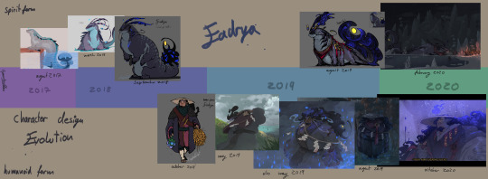
this is them now (i like this sketch still, though shargons design is now also outdated lmao)
this ones from early 2023 so also outdated now but you get the point
for demons i try to be a bit more wild on shapes and colors while still adhering to the rules of how they work (humanoid form, demon form, animalistic, one element each and more or less made to fit that, 4 arms is very common, look to be bost scary and wild but also something that would make you stop in tracks and stare in awe and fear if you crossed paths)
often times designs just kinda .. happen, i have maybe the idea ok i wanna make something with a white and red pattern also moose or those big horned cows are cool and kinda scary so maybe sth akin to that (though this one is technically a redesign too- its also pretty much entirely different)
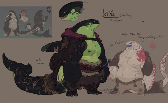
for non demons but still non human i go for a much more restrained design, mainly inspired directly by an animal and giving the color scheme a good spin, plus adding unconventional body shapes, like ki'ita is also a good example, her old idea was just orca anthro pirate and just by making the white green instead in her most recent redesign already adds that little spin to it
that can have its pitfalls though, as i often fall into the big arm small head small legs scheme over and over xD
alot of it is trial and error, deciding on the colors can take me hours bc im always searching for my little rule of having one contrast color that shows up in very few places to draw attention to it (like with Eadrya its those bright yellow eyes and thingy at their tail)
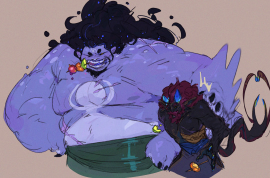
and that is all about myy own ocs, when its fandom stuff it works kinda similar though, either in the connections i wanna draw or just thinking it further- like how deities in destiny work also just kinda .. happened like an ever derailing train
like for demise i was at first really just im gonna give him horns bc horns are cool and he got those on the starting mural in the game- so how his hair work? well maybe it isnt hair actually and just unbound energy, im making him a deity too and fit hylias design to his so, yeah, then so how does it work, ok he gotta have a skeleton still, but what if his entire actual body is made up of pure magical energy with its core in the ribcage? with the core in the ribcage >:3c
and the scales you see are just like cooled down lava as an armor bc his thing is fire and earth !! the normal blood? is a thin layer of skin imiated from mortals to keep the scales together and flexible so if he ACTUALLY gets hurt hed bleed magic that looks more like lava and any normal blood you see is just the armor- so why does he have a skeleton still instead of being just energy? maybe its gotta be bound to something OH and what if all of the deities started as mortals like a mirror to the trio later on and the gods cannot have direct influence to the worlds so they needed a right hand that is neither god nor mortal but both by killing a mortal by whatever their element will be (demise burned, hylia drowned etc) and their skeleton and spirit is kept but put into a body of magic- OH what if their spirit core is like almost piloting their bodies like a mech in a way bc if youd look close youd see that every strand of magic is actual a hand of their spirit so it makes it more weird and other bc hed be able to reach out with thousands of burning claws of all shapes and sizes like the beheaded forest god at the end of mononoke- SO if hed lose and arm or something all those strands would untangle and rearrange his bones back together-OH MY GOD the whole armor idea works so well for ghirahims dark armor so what if demise had two swords once and lost one and since has forged an armor similar to his own for ghirahim out fo fear of losing him t---
and that all is a process that happens over several weeks and months not rarely while i am drawing something mindlessly and suddendly *have a thought* and omg that makes so much sense-
so "what" inspires my designs? an ever derailing train of thought about making cool thick monsters that arent the evil thing to get rid of for once? cool color schemes? idk it just kinda happens??
#ganondoodles answers#dont think this was the point of the ask#maybe i shouldnt actually try to answer any questions bc im inherently bad at ... having an answer#i havent even gotten into the anatomy of demons in my oc stuff#yes they ... they got organs#i dont know why id need to think about how and what and their arrangmeent#but i ssure did#I DIDNT EVEN GET INTO HOW DEMONS WORK-#wasnt the ask#my brain is an unstoppable train that never lets me rest#writing soem stuff out like that really makes me realize just how MUCH THERE IS#no wonder i got not space left for any actually important information#like i couldnt tell you my phone number i have had for years but i sure could draw an anatomical study of a demon oc lol#this took me an hour to write.#why am i like this
62 notes
·
View notes
Text

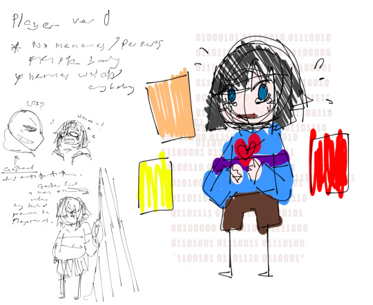
[NOTICE]
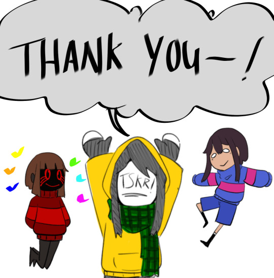
Thank you for the 300+ followers.
To celebrate, bits of PLAYER!Tale AU concept( regarding Player) is shared
Reposting because Tumblr decided to post instead of saving it in drafts when I'm not even finished. Love you tumblr! (╯ᐛ)╯︵ ┻━┻
◇◇◇◇◇
A/N:
Oh, wow! We actually reach 300+ (as of now 310) followers!
⸜(。˃ ᵕ ˂ )⸝♡
Thank you very much from the bottom of my heart, I’m glad all of you enjoyed the story despite my art not being that good. I actually wanted to draw for 250 followers but I didn’t realised we passed that milestone.
Anyways! To celebrate, I wanted to share some concepts regarding the Player based on my memories, though sorry if there is like a black blotched in the drawing as that is considered as spoilers.
To start off, I began creating this AU maybe 5/6 years ago, on and off, (re-writing or removing some stuff along the way) I had loads of concept art and drawings back in 2019 but sadly those old arts were, ummm, forcedly deleted after a disagreement with someone I trusted, haha. The pain for a FT user in ibis paint. 。゚(TヮT)゚
Then 2023, I wanted to move forward. So I decided to give it a shot and start drawing again. I wanted to share my AU (better late than ever),\\\(۶•̀ᴗ•́)۶//// and also I thought it will help overcome my fear of drawing and start liking to draw again.
Anyway, here we have Player’s design concept (+ explanation):

Version 1:
Player actually does not inhibit Frisk’s body, as they are not trap in the game, instead, they have their own “Avatar” basing on the data and sprites of Frisk and Chara. (The situation is more towards VR? AR? I’m not sure what to call it) The Player has their memories intact.
The story is just Player goofing around in Undertale, until plot happens, but I didn’t really like the idea as I have no clue how to progress the story forward, so the whole story was re-written.
Player mostly hack codes, while Frisk has the Reset/Reload button.
Initially, their eyes didn’t change colour when using abilities. But I wanted to distinguish what and when the abilities are used.
Version 2:
This is where, I decided that the Player actually inhibits Frisk body, though they are not amnesiac. Frisk is like a ghost (narrator?) here. The image above is post-skip version to maybe 1 year trapped in Undertale. This idea was scrap and rewritten due “Chara” ‘s story and I wanted to involved Gaster in the story. (Also, because I didn’t want to draw this version hairstyle anymore, hahaha ( ≧ᗜ≦))
Player has both the hacking and reset/reload abilities.
This version of Player is more uptight and serious.
Version 3:
I think this is like 2nd or 3rd version of the finalise concept.
Our current Player. I made the hairstyle simpler.
This Player inhibits Frisk body and is amnesiac. The personality shifted so it’s easier for the player to act consistent. This version is more carefree than ver 2, they are similar to ver 1.
First design of the Player (ver 3).
Despite being ver 3, I wanted to keep a bit of the ver 1 and 2 hairstyle but decided not to. Again, I wanted a simpler hairstyle.
This personality is just them being stress and filled with anxiety. A nervous wreck and a crybaby. Cries a lot at the first arc until they pull themselves together. But I didn’t wanna make them cry all throughout the story, if I continued to write them like that, I might ended up smacking Player myself hahaha. I ended up toning down the personality.
Gaster would have replace Frisk as the ghost (narrator?). But I decided not doing it, because it conflict with the plot. That, and the story would be over much quicker with him around.
Side note: I had to change the relationship between Sans and the Player(hate, confuse, no interaction, chill, idk? etc), a lot of times, but in the end I decided to make him not trust the Player.
Previously in most iteration, he just hates Player. I planned to have him to kill the Player the first time they exited the ruins, but decided to go against it as it doesn’t really fit his style. Also, the story would go very differently if he did commit to it. Maybe one day I can make him kill them. In an alternate timeline maybe. ꉂ (´∀`)ʱªʱªʱª
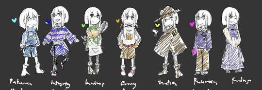
Extras: Player in different outfits (loosely)based on the other fallen humans in this AU. (+ ruin outfit)
There is a reason, why the Player had worn some of these outfits in chapter 3 and 4.
Don’t worry, it’s not originally the clothes worn by the other children, Toriel made them. She has spares. (Sorry, to the one that find it creepy, when it was first shown, hahahaha)
And, that’s all for now I am able to share, I wanted to show more, but I’m afraid, that’s already in the spoiler territory.
Anyways-! Thank you again for the follow, each and every one of you are the best! And I hope you enjoyed the upcoming story!
45 notes
·
View notes
Note
How do you organise the process of creating a character? like, to me its too confusing, i dont know what i do first because there are TOO MANY THINGS TO DO, like backstory, personality, looks, what they like, so what would be the “steps” to make them?
(Since @isabellaswork asked the same thing recently I'm tagging you here, hope that's okay!) Omg I'm flattered I'm the person you'd wanna ask such a big question ;v;!!? Honestly the process is different for everyone, but I'll give it a go <3 This is how my process usually goes:
Personality first, backstory later. Flesh out the concept of the character before deciding their origin story if that makes sense.
Build a moodboard for your character! The more ideas the better!
Time for visuals! Sketch out multiple iterations, looking at the moodboard for inspiration. Colors go last.
Finalize! Once you've got your final sketch + colors, draw a proper illustration and see if you vibe with the design. Repeat previous steps if necessary <3
Extra: Since you've got the design and story down, add some fun facts. This is where interests, likes and dislikes go!
I'll use my VN characters as examples below in case someone wants it in more detail! Mychael (Mushroom Oasis) and Alma (Lift Your Spirits spoilers!! + horror imagery) process ideation under cut:
Usually I start with personality first. Because for me, when you first meet someone, you see what they're like in the present; their past doesn't matter as much until you get to know them. I can decide the backstory later so it doesn't limit the personalities I'm playing around with. Of course I must have gotten the idea from somewhere so these two things work in tandem most of the time.
Then it's just a matter of how they look!
After deciding on personality traits, I start by collecting references from everywhere, even the smallest of things. I think of how I want them to look plus how they would dress. Anything goes at this stage, so just go buck-wild gathering ideas!
Here's a moodboard for Mychael:

This one was for Alma, from their normal self to their monstrous self:

Then it's time for drawing and doodles. As I sketch, I look back at the moodboard I've made and pick out things I like, while drawing things really loose. Copy paste if I need to!
I've shared the ones for Mychael here, here and here! Here's some sketches for Alma from last year:
This part takes the longest but is always the most fun! Don't feel limited by what you had initially, just test out ideas! Here are the final designs!
Mychael(s):


Alma(s):
Then once I'm happy with the design I can flesh out the backstory as much as I like!!! so long as it fits the presentation of the character in current time. Of course this process can differ when you already have a story in mind and need characters to carry out the plot, but I'm definitely not big-brain enough to make an all-out story like that </3 I just enjoy designing characters visually haha
Oh and just for fun, I like to sprinkle in some extra (but kinda unnecessary) background info. It can be the most mundane thing but it gives them more life (to me at least!) Maybe they drink flat orange soda, or enjoy riding trains at night, or hate the smell of french fries, or think apples are disgusting etcetcetc.
Of course there's like, tips for professional character designing like silhouette, shapes, proportions but I assume this ask was for a more casual approach <3 That's all I could think of if I were to describe my process,,, I hope that answers your question!
To recap:
Start with personality traits and decide backstory later. Or work them together as one. It's more concept than visuals at this stage.
Assemble a moodboard for inspiration. The more ideas the better! Look up anything that might relate to your character if it helps.
Sketch, sketch and sketch again! Keep things loose and free. I usually start from the face, to clothes to accessories. Colors go last.
Finalize! Put everything together in one rendered drawing, and see if you vibe with it. You can always go back to previous steps if you're still not happy with it.
And you're done! :-)
#mushroom oasis vn#lift your spirits vn#bts#cheea chatter#i rambled so much so i hope the TLDR helps fhjds#q
160 notes
·
View notes
Text
Root of Evil symbol
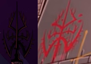
Watched Helluva Boss recently and decide to look into the symbol of the "Root of Evil" a bit. It appears in episode 1 and episode 3 ("Murder Family" and "Spring Broken" respectively). Was just wanting to draw it at first but then I started wondering about the symbolism. So I've broken it down a bit below:
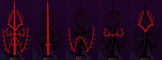
The whole symbol kind of resembles trees or antlers but some parts seem mildly different than others stylistically, which can be hard to see when the symbol is combined (or doodled over like I did lol).
The centre of the symbol seems to resembles an upside-down cross or sword. Knowing this as an evil symbol I want to say it's supposed to be the cross, but both iterations of this symbol show a clear gradient in the thickness of the line so the sword imagery cannot be entirely dismissed. Or maybe it's a dagger? Backstabbing/betrayal is definitely a theme that goes well with evil in general.
The lowest tier of 'branches' on the symbol is different from the other because the 'tines' of the antler-like structure are very rectangular. It's like they've been filed down, or perhaps they aren't meant to resemble spiky horns/branches at all. The more I look at it the more I wonder if they're supposed to represent feathers or something. Upside-down angel wings would certainly be thematic with the upside-down cross/sword imagery from earlier.
The middle tier of 'antlers' is the smallest, but also most central. It perhaps represents hands pushing outwards, but personally it looks a lot more like deer horns to me, though the one line that goes out both sides is oddly notable since all other spiky bits on this symbol are only on one side of their respective 'branches'. Honestly kind of reminds me of a radio antennae mixed with antlers. (I may be obsessed with Alastor of course, so I am definitely biased lol)
At first glance the top 'branch' also looks like antlers, but the curve of the base, combined with the curve of the spikes, makes me think of bug legs more than anything. You ever seen a grasshopper leg? Or seen too much Hollow Knight art? You probably know what I mean.
I know Helluva Boss and Hazbin Hotel take place in the same universe, so as a chiefly Hazbin fan I can't help but make connections here that might not actually exist. But that's probably just me making wild, whacky, unfounded theories. After all, it's not like we know of a group where at least one of them has something to do with bugs, another has wings, and the central character has both antlers, a radio theme, and/or an upside-down cross in their outfit somewhere...
Wait. Oh. Yeah we do.

So I'm pretty convinced that these guys have something to do with the "Root of Evil" that the one crazy family in Helluva Boss episode 1 intended to honour. Even if Alastor is the only one who really knows what is going on, and is dragging the others along for the ride...
On that note, there sure is a lot of red eye symbolism in both Helluva Boss and Hazbin Hotel when this subject comes up. Helluva boss correlates these two concepts with a decent amount of certainty too imho. Have a couple images to prove my point. Need I say more?
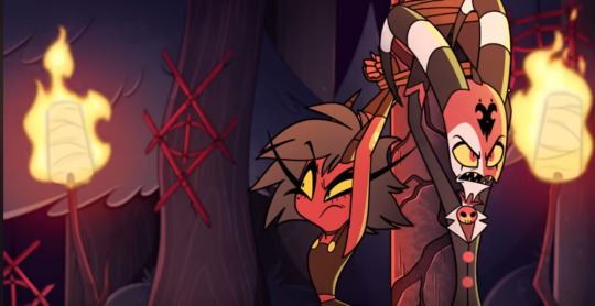


Actually I'm not saying more because I'm just lazy. lol. Anyways, I hope you all had fun with this concept. Build on it as you will...
#hazbin hotel#helluva boss#alastor#husk#nifty#theory#only one thing kind of bugs me#the eyes are supposed to represent evil#but mostly you only see them in the pride ring#do these eyes only care about the sinners?#have I just missed seeing them in Helluva Boss?#Or is the being associated with these eyes lurking in the Pride ring?#your guess is as good as mine#HH theory#roo#root of evil
29 notes
·
View notes
Text
My tmnt iteration!!
(name is undecided so far)
The humans!!
These are mainly based on 2012, with mixed elements of the rottmnt!
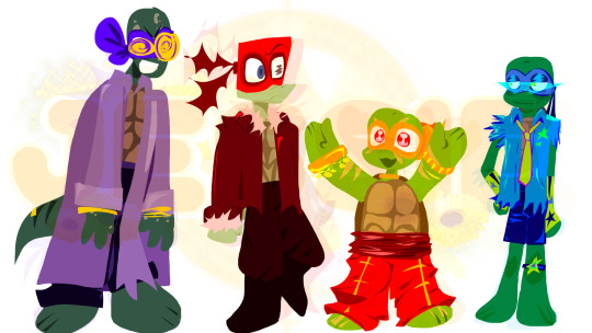

Here's the list of them from oldest to youngest, I with a short description of their personalities
🍕
- Donnie / 14 / He/it / The Leader not by choice
- Mad scientist, all the way, not in an evil way, but in a silly Frankenstein way. Sort of forgets it has siblings due to how obsessed he gets with things, means well though, he makes them things as a way of affection. It's the oldest brother, but a bad influence. Raph is the only one who keeps the gang alive whenever Donnie tries to lead anything. Donnie never wanted to be a leader, but it was because it was the oldest.
🍕
- Raph / 13 / He/him / The medic
- He's sort of like that grumpy dad that says he doesn't want a dog, but like two days later he spoils that dog and carries it like a baby. Raph puts himself in a bit of a care giving role, still mostly serious, but it slips through when worried about his brothers or really excited about something. His relationship with Mikey is not like 2012, where it's bickering and annoyance, it's more like "what are you doing on the fridge mikey get down-". He wants to be the leader, since he thinks it would make his brothers listen to him more, but he's been reluctant to ask for it since he's not sure if he'd be an actual good leader on missions and such.
🍕
- Leo / 12 / He/they / the entertainment
- Basically if rottmnt Leo gave way less of a shit about literally anything. If the world was burning, Leo would want to look amazing while laying in a hammock sipping a sprite. He literally only does anything for the sake of their brothers. Kinda goes all out on the bedazzle, has the most knowledgeable about humans and the one who April met first. Leo is obsessed with music and wants to become a famous singer, but the whole mutant thing makes it difficult. They had thought about it a lot though. ALOT. Also a FNAF lore kid. He's somehow exhausted and hyper at the same time, they couldn't explain to you how that works.
🍕
Mikey / 11 / Any / The
- the littlest prick you'll ever meet (But it's cute so it's okay/j). The most excited about Ninja related stuff and the most excited about missions splinter sends them on. Tries really hard for splinter to think he's good enough. (Even though splinter is already incredibly proud of all of his sons). He's rejection sensitive and hasn't told anyone about it yet. Mikey is really good at acrobatics and uses it a lot when fighting. It's sort of like a special interest almost. Met Casey first when he was delivering pizza.
I will probably re work their designs slightly as I continue to draw them,
but these are the scrapped concepts I had for Donnie and Mikey if you wanted to know (Donnie went too much "Miku the world is mine" and Mikey went the sonic character cartoons route)
#rottmnt#tmnt#2012 tmnt#teenage mutant ninja turtles 2012#tmnt iteration#tmnt mutant mayhem#rise of the teenage mutant ninja turtles#tmnt fanart#tmnt fandom#tmnt art#tmnt au#my tmnt au#tmnt april#tmnt casey jones#tmnt leonardo#tmnt donnie#tmnt mikey#JESSIE'S🐢TMNTAU
46 notes
·
View notes
Note
Two questions -
What’s the age order of the turtles in your iteration?
and are you continuing the dee-evolution thing?
Thank you so much for the ask!!
For the Children of the Sky turtles age order… honestly that’s something they’d like to know as well! They were a group of turtles mutated almost entirely at random, and none of them really know how old they were when they mutated so they all kind of just assume they’re the same age. However, they all have reason to argue that they’re the oldest…
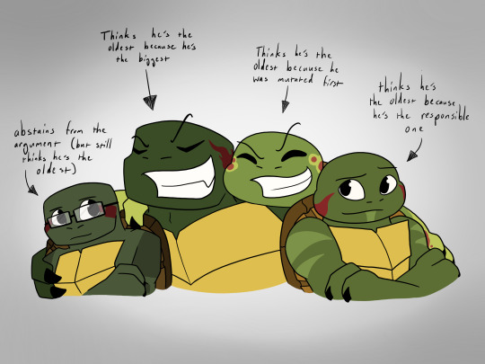
Raph thinks he’s the oldest because he’s the biggest, strongest, and toughest of them all. He’s the protector of the family — of course he’d be the oldest!
Mikey thinks he’s the oldest because Yoshi said that he was mutated first. Mikey also has the most memories from the night they were mutated… though his brothers don’t know that. Mikey keeps those memories to himself, but they certainly reinforce his certainty of his place — of course he’d be the oldest!
Leo has never doubted that he’s the oldest. He’s the one that started looking out for his brothers as they got older, and he’s the one that Yoshi usually puts in charge if he has to leave them alone for any reason. Leo is responsible, mature, and trustworthy even while his brothers goof off — of course he’d be the oldest!
While the other three tend to bring this argument up on a weekly basis, Don usually stays out of it; partially because he’s not a fan of yelling, partially because his brothers always bring up his height and call the argument done. Plus, Don knows that the four of them probably aren’t even related. They were four random turtles sitting in a pond that just happened to get a splash of mutagen; they probably aren’t even technically brothers, so why does it matter who the oldest is? He brought that up once and it made Mikey cry, so he just chooses to abstain from the argument instead… though he secretly thinks he’s the oldest because half the time he’s the only bonehead with a brain in the whole family.
As for Master Yoshi, he has no idea. He sees them all as quadruplets, all of which have their own set of skills that make them more mature in specific situations. He does smile at the playful arguments though.
So to answer your ask… it entirely depends on the day. Sometimes they’ll elect someone as the oldest, sometimes they’ll fight over it, but in general they’re quadruplets!
As for Dee-Evolution, YES!! I am still going to do stuff with that AU! The problem with Dee-Evolution is that I had a really strong concept for that AU, but no real story. I’m not sure where it should go plot-wise, so I haven’t had many idea of what to draw for it. I also got super burnt out from it after the preliminary round of the TMNT AU Comp that I was able to be in, so after that I wanted to take a break and now here we are with CotS taking over my mind… just fluxating motivation.
So yes, I’m still doing Dee-Evolution, but I’m still trying to figure out a bit more of a PLOT for that AU.
Thank you so much for the ask, feel free to send more if you have more!!
#tmnt#tmnt iteration#tmnt children of the sky#tmnt cots#tmnt donatello#tmnt raph#tmnt leonardo#dee evolution au#tmnt au#tmnt 2012
12 notes
·
View notes
Note
So here’s a question for you from a random admirer…
Which of your iterations of the cryptid bois is your favorite to draw? Horns-and-frills? Ferrofluid? Just spiky? (I haven’t seen the spiky one for a while.) Which was favorite to design? Are there any fun tidbits about any of them you want to share? I wish to hear as much as you want to share!
This is such a sweet ask aaaa!! ❤️
I feel very differently for all of them. But they're all my sweet little babies!
---
I enjoy drawing horns-and-frills the most, they're so beasty~ I also really like their anatomy. Designing them was so fun! Making them into a mer was sooo much fun too hehe
Their jaws and tongue anatomy WAS SO FUN TO MAKE, YOU HAVE NO IDEA!!! I love how on board everyone was with it too pdjddjfh. And of course their big claws on their feet and their tail are very dear to me.
I love that I've been able to so seamlessly combine my love for creature design/anatomy with the dca! I have to give a big shout-out and thanks to @naffeclipse for making such beautiful stories with such wonderful beasts in them. Her writing is the reason why these designs exist in the first place ❤️
---
I think I'm the most proud of the ferrofluid boys. I feel it's a solid design and concept. Also it's very fun to explore the possibilities that present themselves when you have a semi-liquid based character. You can shape them however you want! They're liquid, like a cat!
Some fun little things about the ferrofluid boys: (it gets a little gory btw, so light gore warning for that!)
Their skin/surface looks a lot like oil spill, deep black with swirls of colors, mainly red and blue (and yes the colors actually swirl around, the patterns move and shift). The colors are mostly concentratet around their rays, claws and back spikes.
I imagine them being fully "liquid" except for a skeleton holding them up, so their organs and muscles are all the same substance. The skeleton is very thin and jagged. When they're very weak or very hurt you can see their sharp vertebrae sticking out of their back and the goop in their chest drips over and out of their ribs. Also their spikes shrink as they grow weaker, they need energy to hold their shape.
Sorry it got kinda dark there,, :'p
---
And my spiky boys! I haven't drawn them in a while, I would like to try again, and maybe redo their design a little. I like them a lot for being my first attempt at a design, I'm also very proud of some of my early pieces I made of them.
---
I got two or three more designs that I've only drawn once. I like them but I don't have that much to say about them, I just felt like mentioning that they exist. :p
---
Thank you again for this ask! It was so fun to write a little about these designs! I hope you can find my rambling entertaining X3
#aaaa thank you for letting me talk about these guys!!#i could go on for longer but aaaa i don't wanna make this too long#thank you again! how many thanks are that? 3? maybe. anyway thank you!!#cryptid sightings#cryptid!eclipse#ferrofluid cryptid!eclipse#asks#creature design
53 notes
·
View notes
Note
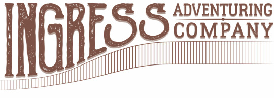
This is a pretty random one, but how did you design the logo for Ingress?
Little did you know, I love to answer questions about ~design~.
The Ingress logo has gone through about 3 different official versions, but at least 50 different conceptual iterations. I'm a graphic designer by trade and profession, so I approached it any other way I would approach making a logo.
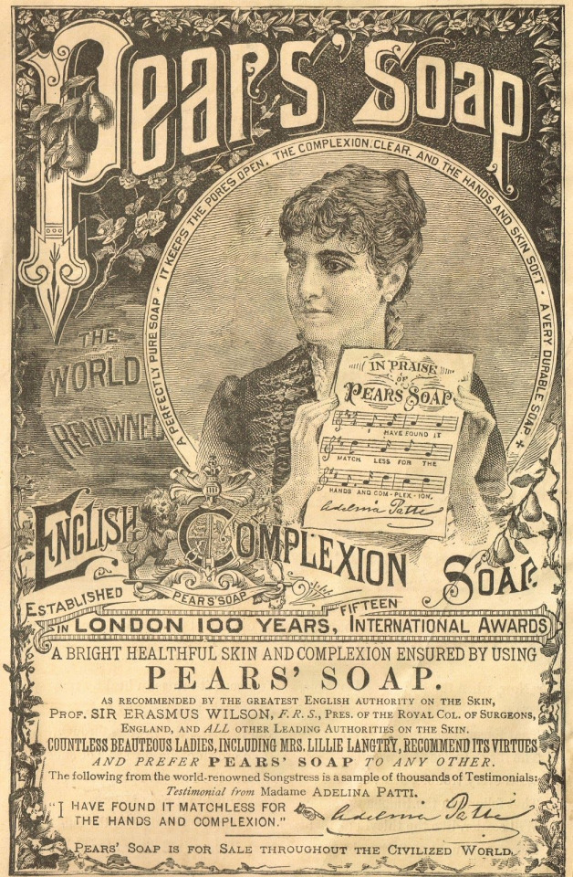
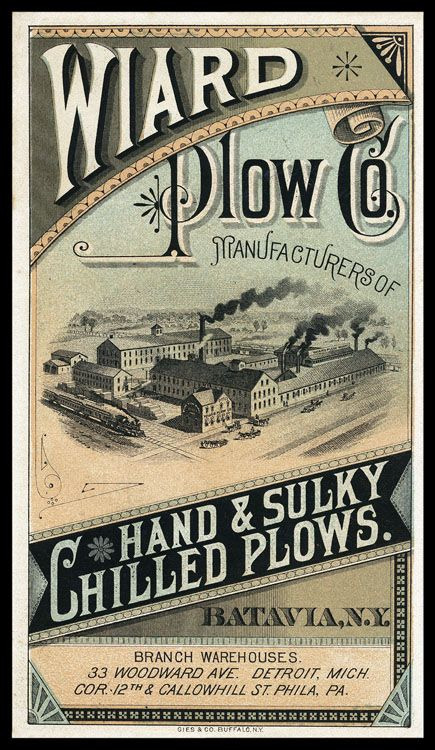
The first iteration of the logo I have less information on the development of, but I was looking at a lot of advertising from the late 1800s to early 1900s. For example, these advertisements have a lot flourishes on the text and warping letters, as was common in that era.
I took that concept and made the first iteration of the ingress logo at the comic's inception in 2017. My graphic design skills weren't as strong then, and I mostly just took a font I thought fit and slapped it around a little bit to try and get the look I wanted.
I wasn't particularly happy with how this one turned out, and it only ended up being used for a few months on the first version of the website and on a single printing of the first chapter of the comic, but I also didn't put a ton of time and energy into making this one. So, I went back to the drawing board soon after I made this first one.
The second iteration of the logo took a lot of inspiration from the same sources, but I first took a lot of time drawing out concepts in my sketchbook to try and get the right visual look for how the logo should be.
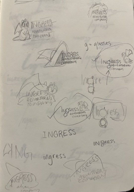
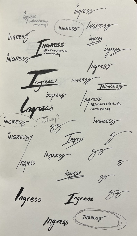
At first I played with the idea of including a little picture along with the logo. I thought maybe Toivo's glasses would be a good thing to try to include in the 'g' in Ingress, or that Rocky or Toivo's hat should appear in the logo. These were all discarded for cluttering up the logo, because the words themselves are all pretty long. Eventually, I started playing with the shape of the word itself, which very quickly lead to the last S becoming the signature swirl.
Next was iterating on this concept with fonts.
That lead to the second iteration of the logo, and the longest running version of it.
I chose a textured font to give it that "worn" feeling that was so popular in the design world in 2018. There were a ton of brands doing textured stuff to give their brand an edgy feel, but I did it to make it feel old and like it was from the late 1800s.
This would still be the logo today, but I ran into a problem: the font I used, Goldsmith Vintage, had a limitation on how long you could use their font for free and for printing. Fonts aren't particularly expensive, but if you want to use a font for publishing, you need a special license and those fees can rack up in price pretty quickly. It was unlikely that the people who made the font would come after me for using it, but I decided to not take that chance and instead refresh the logo one more time, this time putting more of my own hand in it.
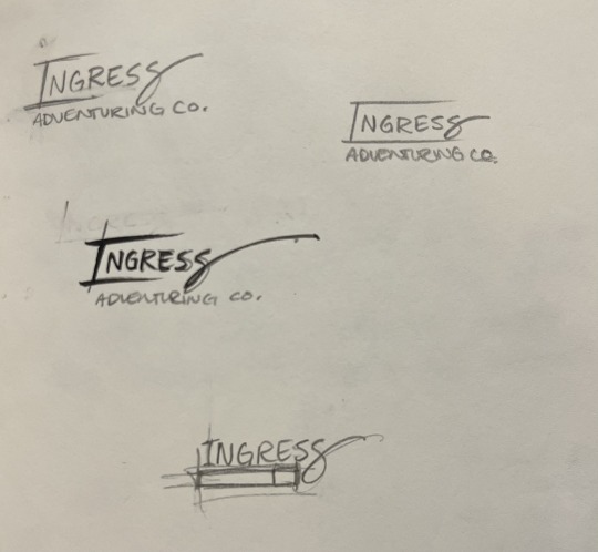
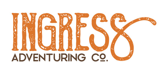
This time, I took a different approach. I liked the old logo, but I was having a hard time finding a font that I really liked and would get the same feeling as the old logo... So instead, I decided to use calligraphy to draw it myself.
I rewrote the word Ingress Over and Over and Over, and specifically I rewrote the S's to try and get the perfect shape of it. Then, I picked out specific letters that I liked.
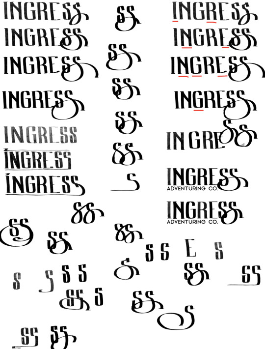
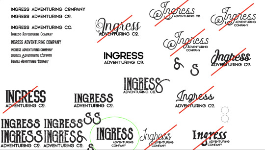
From those letters, I picked the ones I thought looked best, and smashed them together into one rough version of the logo that I liked.
And then from here, I made a digital version of the logo in Adobe Illustrator so I could get a nice crisp vector version. Also, I made rough versions of it, so I could keep doing the same 'old' look.
And... that's about it!
Ultimately, I think the new one is really fun, and I really like the fact that the latest one was made with my hand directly. Those aren't letters you can find in any font, they're my letters.
Maybe you can tell but, I have a lot of opinions on letter shapes.
Anyway, thanks for asking, and I hope this was as entertaining for you to read as it was for me to blather on about.
17 notes
·
View notes
Text


I don't really draw but I drew some of my Viego skin concepts and for once I had fun and I'm proud of myself, so I wanted to post them 👉👈
Its:
Cafe Cuties Viego (1st iteration), because he was mentioned as a part of the universe in SG VN :D, he is strawberry-kiwi tart and his little guy's name is Kiwin ^-^. 2nd version is there because I wanted to give him more of his uncles drip also :3
Pool Party doesn't have much lore, he's just a menace, he stabs people with pool noodle, his W is a water balloon, his E is him walking at the bottom of a pool (wraith form has snorkel :3) and R is just a BIG water splash <3
PROJECT: is my saddest Viego concept because his lore is that he is a failed Mordekaiser's prototype, he has a malfunction that causes machines around stop working/act weird but he can't control it and it happens randomly, so he was thrown out. He doesn't remember anything except that Isolde was one of people who created him, so he searches for her for answers, like why does he even exist <3
PROJECT: Viego also exists so you can do a "I can fix you. Literally." joke coz he's a machine guy you know ;u;
I think his E and R VFX would be pretty, E would have rain falling down and R would have city image on impact 🥰
Withered Roseeee, I think he has better concept than mine obviously!! But I wanted to attempt one too ;u; I'd like him to reference his early base concept with rose motifs + thorn crown + Withered Rose uses lingerie in design sometimes, so I think his chest harness could change with chromas 👉👈 I was considering giving him a braid/half-mask but I think it would overdesign his top side uwu
And Dunkmaster exists because I saw a "imagine he's playing basketball, point as you and says "this ones for you!!", throws a ball and completely misses" ❤. i think he would have squeaky shoes that you hear when he enters E and he's just throwing ball on W and dunks on R and his sword is also a whole basketball hoop, he's just hurting you with pointy side, not like Darius ;w;
I knowwww these drawings arent very good, but I dont draw usually >.< it was almost the first time to me 👉👈 I want to draw all of my Keviego skin concepts, so Im missing Battle Bunny (carrot sword!!), Porcelain, Star Guardian (that everyone thinks is a Star Nemesis but he's just awkward) anddd Beego because I don't think I can handle Eclipse Knight or Ashen King armor haha
#viego#league of legends#viego lol#viego the ruined king#kevin <3#kevin viego#uwu#skin concept???#cafe cuties viego#project viego#pool party viego#dunkmaster viego#withered rose viego
32 notes
·
View notes
Text
Redesigning Jester
I've been working on trying to pull my story about Kings Court into something coherent and presentable, and as I've been going through that process I've been realising that I need to redesign some of the characters!
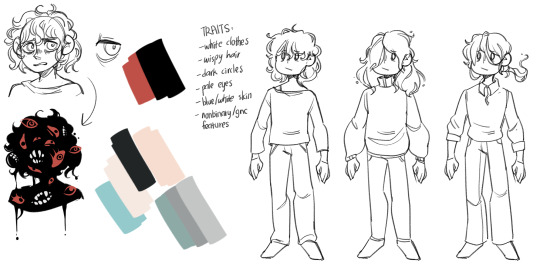
The first character I've been reworking is my beloved Jester! Here is their original design:
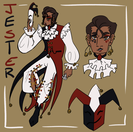
I did really enjoy this design! But as time has gone on there have become certain pain points, and as the story has developed there are things I want to incorporate more strongly into the design. You can see a detailed breakdown of the re-design goals and process below the cut!
The mask - it needs to be a feature, not an afterthought.
As much skin as possible should be hidden, I want to play into the Jester as an anonymous and mysterious entity.
Simplify - the four tail coats are far too unweildy, and the pants proved annoyingly intricate with repeated drawing.
Ensure that the design is fun and exciting to draw in motion! Jester flops around a lot.
Incorporate an additional motif to reflect role in the court.
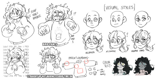
I began the process by looking for inspiration and reference material, particularly for the mask. I collected a variety of reference images onto a pinterest board to use for inspiration and then got to sketching! Here are some of the initial exploratory sketches.
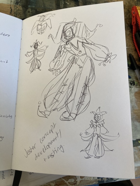
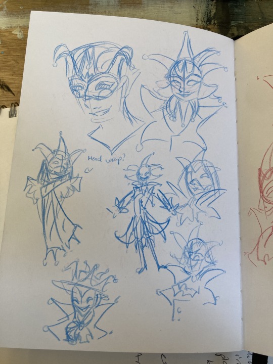

After the sketching process, I started working on some more finalised concepts taking what I had explored in the sketches, exploring the ways to combine shape and colour, and also getting feedback from friends.

I then did a set of concepts all next to each other taking some of the ideas I had liked from these concepts as well as trying to add in some new things.
Silhouette was a major consideration throughout these concepts - as well as experimenting with the mask design. The first and second designs proved the most popular, and also worked as my favourites. And so moving forward I decided to combine elements from them both. Namely:
Collar shape from design 1 - it's dynamic, fun, and interesting!
Hood based design from 2 - I like the framing of the hood.
Two pronged vs Three Pronged design from 1 - Easier to draw repeatedly and manipulate in dynamic ways, I think it gives a more dynamic flow to the design as opposed to the triple prong potentially being a bit more static.
Thigh high boots from 2 - my friends like them and I like the way they make the legs look long.
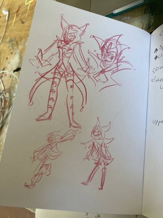
I also knew that I wanted to make sure that the design I came up with fit with the design of another character - Jack, and also play with poses to see it in motion, so for the next tests, I decided to work on them both simultaneously and have some fun drawing them interacting!
As you can see, I had settles fairly well on the overall shape of the design, but still made some minor tweaks between images - mostly to do with the placement of the colour blocking. I also changed the mask design here from the previous iterations as they felt too cluttered and overpowered, and I also really enjoyed the design from the makeup Jester had in his original design, and realised it could transfer effectively to the mask design! Another thing that changed is I removed the crown motif I had started to develop, and tried to focus more strongly on incorporating an eye motif. This was a change made as I sat and considered the lore and symbolic implications, and I ultimately decided it worked best if Jester had the eyes and Jack had the crowns. King and Queen will likely have both when I get around to redesigning them!
I still have some more playing around to do to settle into the final design before I make a proper reference sheet, as I'm definitley finding drawing the design in context helpful to get a sense of how it operates in practice and streamlining. I'm currently working on a mini PMV project featuring Jester which will hopefully help me solidify the design! But I'm feeling pretty happy with it so far.
I want to do more discussions of my design/redesign process in future as I find it really helpful and interesting to organise my thoughts like this. It's also exciting to see the progression all laid out, I'll probably do a similar thing for Jack soon!
#oc art#art#character design#character design rambles#redesign#pandemonium#jester#a long extended exploration of my process in redesigning my beloved jester#i just wanted to ramble about all the things going through my brain i hope someone finds it interesting#i like reading about peoples processes and considering my own its interesting!!#creative process
10 notes
·
View notes
Note
This might be a hard question to answer, but have you thought about what TMNT 2036 would look like in terms of art style? Would you want it to be 2D animated or use 3D models? Would it be more "grungy" and geometric like 2012 and Mutant Mayhem, or more wild and expressive like Rise, or more grounded like 03? Is the style somehow completely new that it's hard to compare to the prior incarnations? Do you have any specific design notes for the specific characters that you didn't mention in your big post on the heroes? How "weird" do the turtles look, pretty standard or would they push the bar even further than Rise did in making them stand out? Splinter's always changes a lot, what's he supposed to look like?
Sorry if this is a tough thing to ask, I know it's hard to describe something like a visual style without any kind of existing reference. But I also wanna come as close as I can to getting the same mental image of this iteration that's in your hand, and... MAYBE no promises at all Whatsoever don't count on it, try to give it some manner of actual visual interpretation? I'd do it completely out of my own reading of what you've said already without me asking directly, but I felt the end result would be more accurate if I did.
Regardless, I'm excited to see what else you have in mind in general for this! For as fun as a franchise like TMNT is with how it reiterates old concepts in new ways, it's a little shocking to me I haven't seen more people suggest their own iterations. I'll be honest and say I'm a little baffled I haven't had any ideas for my own Turtles (though I DO have part of an Avengers incarnation I had some scattered ideas for, might get back to that eventually), so I'm very glad you're picking up the slack in that sense. I might chip in with potential ideas as I get them but for now I definitely wanna wait and hear what you have in mind for the basics first. Excited to hear more when you have it!
This IS a hard question to answer, but I don't mind at all (Thank you for the ask!). I don't have too much of a consistent style in my mind, but I do have a few stray thoughts.
In terms of design desire, I'd say it's most similar to TMNT 2012 (for obvious reasons) with the turtles being blatantly different, without it being exaggerated like Rise or arguably even Mutant Mayhem. They're rather bulky (TMNT 2012 levels of bulky with defined muscles). I don't know what exactly grungy looks like, but if it's anything like 2012/Mutant Mayhem then I suppose they are(?). I definitely can see the argument for a geometric art style (more in a bit). I would want them to look more standard. Yet my imagination has other plans.
I have no idea if it would be 2D or 3D animated.
I'll start with Mikey and Donnie for they share an interesting similarity: I can't stop seeing their Mutant Mayhem heads. Granted it's not exactly their Mutant Mayhem versions. My Mikey has a much bigger forehead, and has a skin tone much more similar to 2012. I really think it's his gangly/lanky body that remind me of the Mutant Mayhem version. Though I can also see my Mikey having his eyes more spaced apart. I'm actually kinda inspired by the original comics by having Mikey's forehead just be a lump on top of his head. Mikey is the tallest of the 4. Not sure how tall exactly. But his brother typically have to look UP at him. (Though if this gets changed to make their heights more consistent it's fine with me.)
(Just have his mask lower (like where this one's nose would be), and I'd think we'd be close to what's in my head.)
Also, despite me kinda picturing Mutant Mayhem Donnie, my Donnie DOES NOT HAVE GLASSES. I'm one of those people who don't like it when they add the classes to convey "nerd". Maybe a more circular head? I also want my Donnie to be kinda pathetic. He and Leo are about the same height. (Donnie may be slightly taller. Who knows.)
For Raph I have two main sources: @/nerves-nebula's drawings (warning: it heavily discusses and alludes to topics such as abuse/SA/incest, so proceed with your own caution). And Bowser Jr. In fact, whenever I imagine Raph, he's the only who doesn't have proper eyes. He just has two dots. Though for consistency sake its best if he does I imagine. To expand more on the Bowser Jr inspiration, he's also comically short. As big as Rise Raph is, 2036 Raph is small. He's like half the other turtle's height. I have mixed feelings about this. On the one hand, I much prefer it when the turtles are about the same height (akin to 2012). On the other hand, this is so much funnier. It makes the moments when he FNAF jumpscares a Foot soldier or other enemy much funnier. It also allows him to bite onto some poor enemy's arm and force them to shake him off. Raph is the main reason why I kinda want to make the turtles different species of turtles, as he's so inconsistent from the others.
Raph's head kinda reminds me of Trappinch. The visible mouth/teeth outline is ESSENTIAL. HE CHOMPS!!!!!
Though ultimately it's for the best if Raph loses being the most cartoony for being more consistent with his brothers.
I have no clue for Leo. Mutant Mayhem kinda fits. But it's not perfect. I really only have vibes to go off of. He's a unique blend of 2003, 2012, and Mutant Mayhem. He takes everything as seriously as 2003, but doesn't have the authority to actually do anything about it. This results in him being kinda whiny.
The shell size for the turtles is the same as 2012. Gives them normalish body proportions. But still allows them to full retract. I'd also like the shells to look rather tough (maybe 2003 tough?), because, just like (of all inspirations) the Micheal Bay movies, the turtles are bullet proof. BUT ONLY WHEN RETRACTED IN THEIR SHELLS. Fun fact: Being bulletproof is what forces most of the villains to use laser guns and stuff because that's the only thing that could theoretical pierce their shells. Bullets don't work on Splinter either because he just Matrix-dodges them all.
Speaking of Splinter, he's heavily inspired by his 2012 version proportions wise. Very tall (though Mikey is as tall as he is). His fur is a light brown, akin to early incarnations. Most of his height is in his tall, thin legs. I don't know why I keep coming back to this design feature, but I think it's funny. Chicken legs Splinter. His most vital design element is his mouth (nose/snout?) being super long as well. This mostly so when he puts on his "human" disguise (just a bunch of human clothing hiding his features), his face mask is stretched out to the point in looks like a cone.
My April is heavily inspired by Mutant Mayhem April. She may be a bit more bottom-heavy than MM April. I'm also don't see 2036 wearing glasses, but if it completes the look then I don't mind. Now, the most important part is her hair. It is specifically the 2003 April's shade of red. She dyes it that way. Her hairstyle is inconsistent in my mind, but it often looks similar to 2003 April's due to color association. Though I imagine one of her bangs(?) being much much much longer on one side of her head than the other.
My Casey has the muscle mass of 1987, the hair of 2003, and the iconic gap tooth of 2012. I can see her head often being more oblong. She's often seen in gray/light-blue tank top, pridefully showing off her arms. As stated before, her hockey mask is painted with a skull featuring a large crack.
Now, as a bonus, I'll go over two villains I ever so briefly mentioned in the heroes post.
Baxter Stockman mostly resembles his 2003 design, although he has 2012's mustache.
Oroku Saki is also heavily inspired by his 2003 design. Though he also has a bit of 2003 Hamato Yoshi in him too. Given that's he's Splinter's owner and all that. I really want Saki to just look like a normal guy. His Shredder armor is also heavily inspired by 2003. Unlike 2012, there is not an inch of skin visible. The most important part of the 2003 inspiration is the fact that you can only see his glowing eyes in the mask, though they're pure white in this incarnation (like the fortnite skin).

I also really like this helmet design in general.
The most important part of 2036 Saki is that he has 2012's vambraces. Those are the coolest shit in media. I'll be damned if my Shredder doesn't have those exact ones. INCLUDE THEM!!!!.

Oh, and by the way, here's a visual teaser for another iconic TMNT villain in my incarnation:
Well that's about everything I can think of. Once again, thank you so much for the ask! It feels great to get all these clashing and conflicting design elements off my chest. It means so much to me that people are interested in my ideas. And don't worry, I already got three 2036 posts in the works. And I welcome any of your ideas.
6 notes
·
View notes
Last Seen Blogs

yurievinstitute
真紅眼の黒竜
misskippieee
kippie
shigayokagayama
its not a typo its a pun
sunsetwanders
heart skipped a beat.
greaterduck
Goblin time