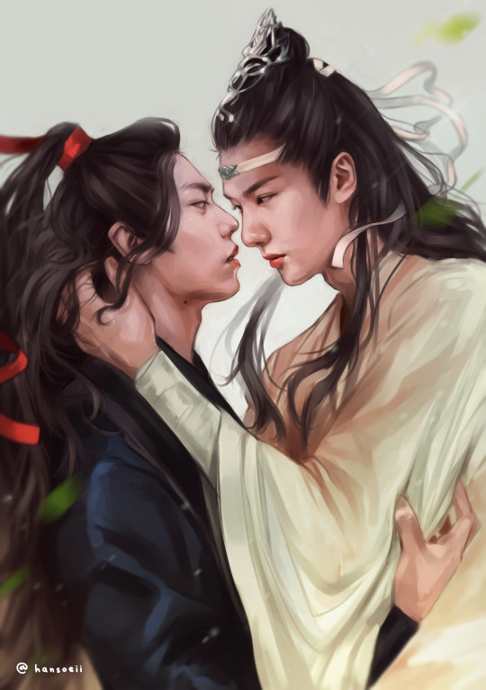
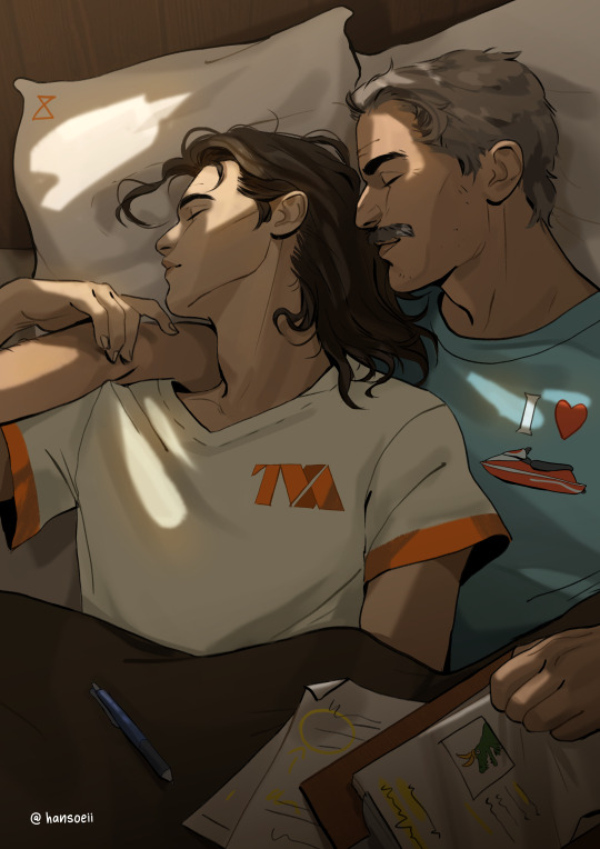
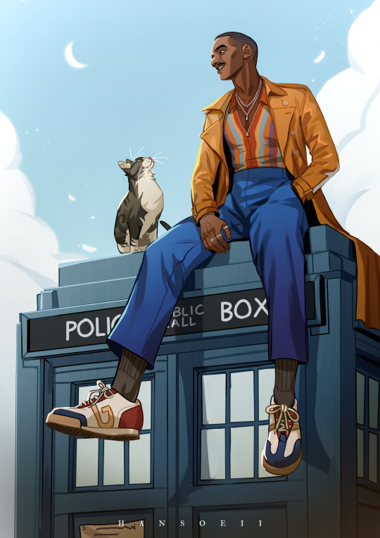
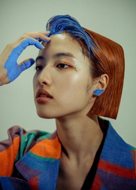
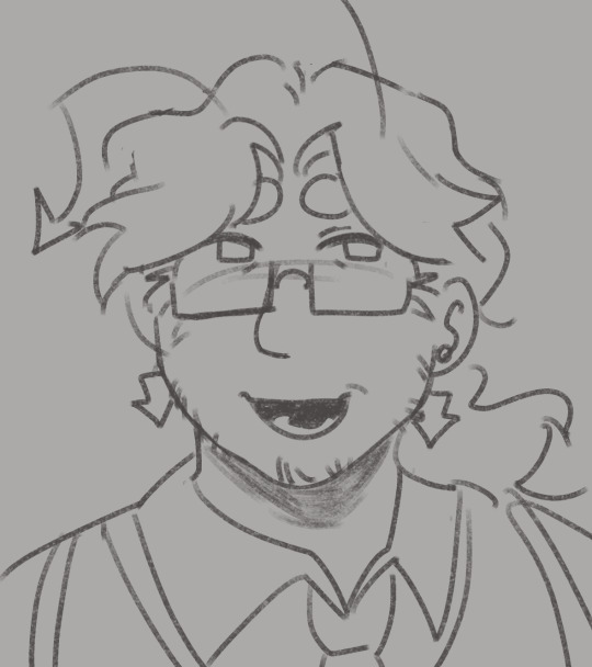
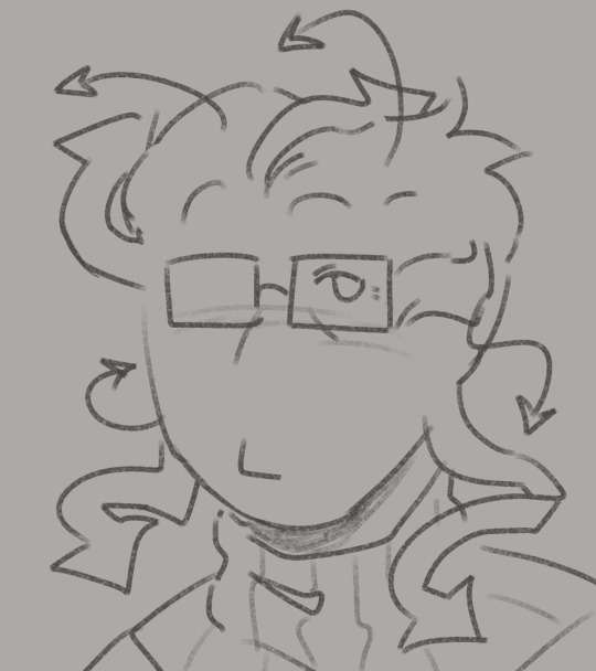
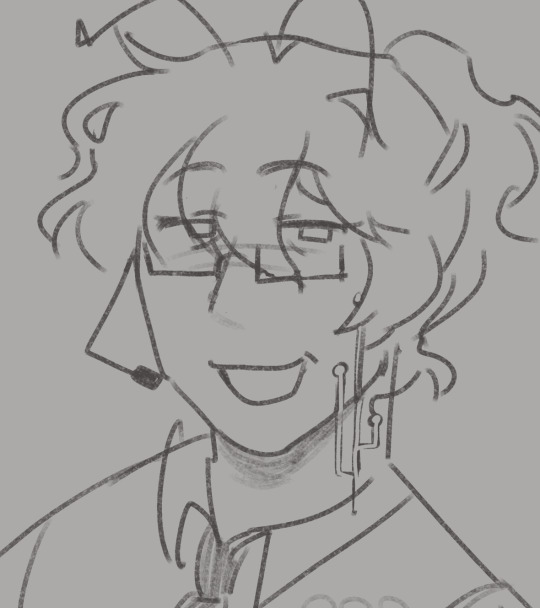
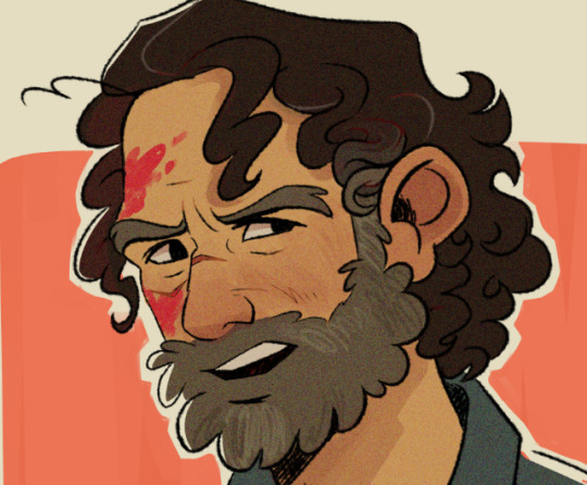
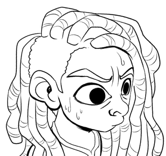
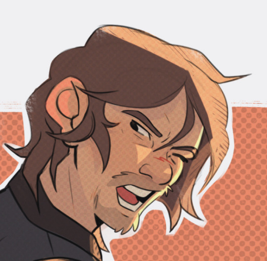
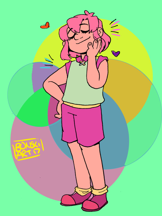
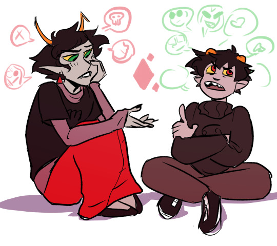
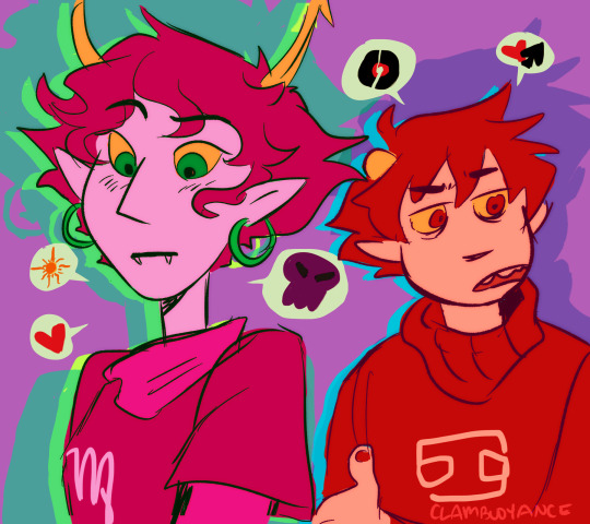
#they look more unique and stylized now i think :)))
Text


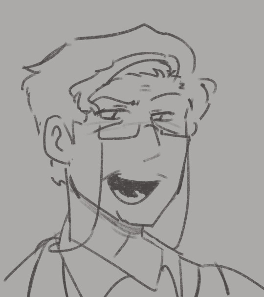
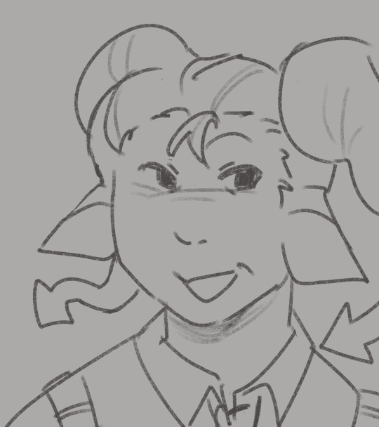
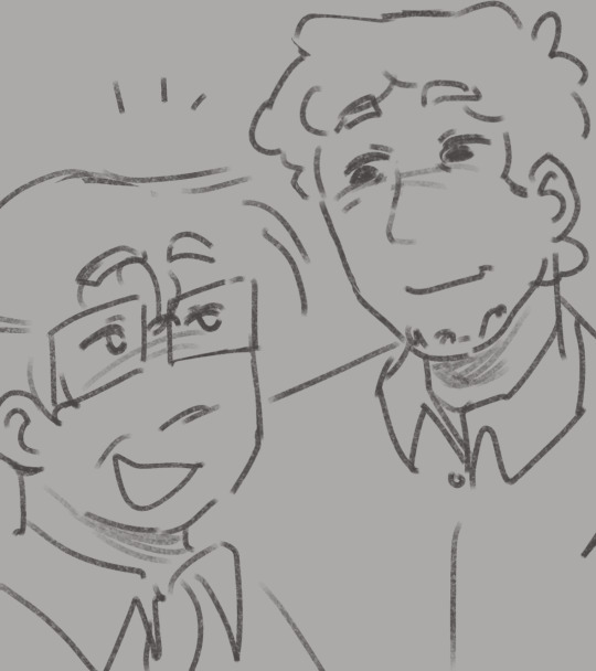
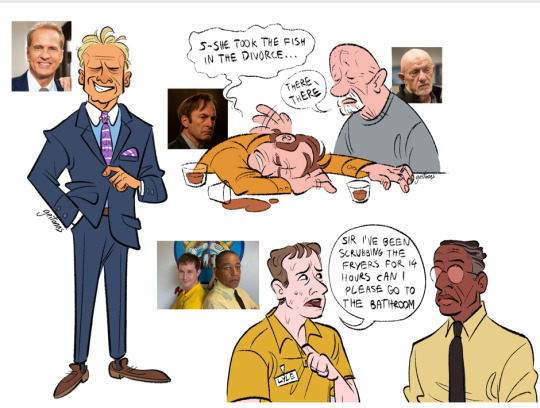
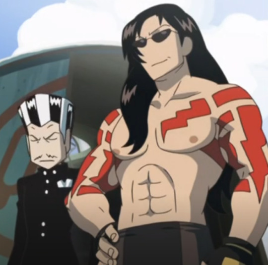
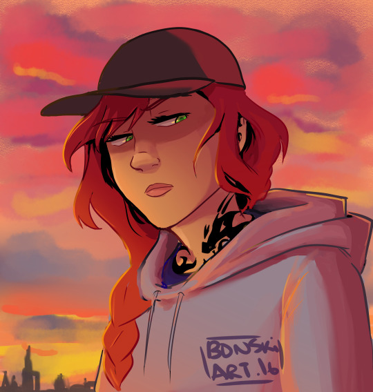
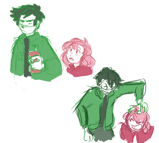
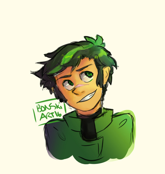
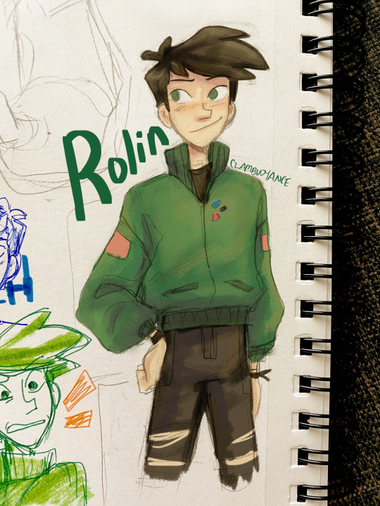
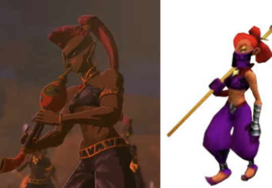
finally drawing (and redesigning!!!!) my babies (i havent drawn them in over a year) (ive been drawing ruikasa daily for over a year) (no correlation)
also ignore that theyre just floating heads it makes sense for And but i just wanted to be able to see their hair
#and tag#are tag#my art#they look more unique and stylized now i think :)))#like Are is meant to be a kinda copy of And but. ill be real they looked too damn similar in their old designs i think these look better#AND FOR THE RECORD: ARE IS NOT MY SELF INSERT‼️‼️‼️‼️ I JUST LIKED THEIR NAME SO MUCH I STOLE IT‼️‼️‼️‼️#self inserts arent cringe or anything but i just want to make that clear mk?#ill be drawing the rest of my freaks later hopefully
10 notes
·
View notes
Text
N i Know actiblizz isn't technically blizzard and it's not Technically the overwatch team, n while I do think actiblizz sucks (OBV), my beef has always been w blizzard and the overwatch team specifically, like to be fair i Don't have experience w other fps communities (so maybe i am wronggg) but im still p confident in saying that ow is one of the Most Toxic, which sounds crazy right, u have this insane cast of characters, half of which are clearly gay iykyk, n u can't even like. Acknowledge how shitty your community is, u can't even openly make a statement that yes, we love and support our lgbt playerbase. U refuse to say it!!! The audacity to make your mascot a LESBIAN n u can't even openly support gay ppl, christ forbid u risk pissing off the homophobes their feelings matter too right :'(
#talk#n their dollars matter MORE right???#AND TO BE FAIR i kno they just did smth re: pride in ow2 n also tbf i dont kno that much abt it#maybe they r being more open MAYBE they are not i dont rly kno how to go abt fact checking#n i am mostly talking abt my last interraction w ow in general#bc while the actiblizz lawsuit Was the catalyst for me finally putting the game down#i was p unhappy w ow for Years n it was specifically bc of the ow team#n tbh i think theyre still p shitty like just look at the pve news like they r constantly fuckin up n then immediately being like#oh but look over here we're adding this r u happy now?#but like. can u rly do this every time n expect ppl to believe ur word means anything??#it sucks i believe ow is still super unique n fun as a concept (a brightly colored stylized fps w a wide cast n fun abilities)#like who else is rly doing it#but ur dev team sucks SOOOO BAD GOD#like ffs apex legends was doing the pride stuff YEARS AGO#blizzard is consistently years late n a few promises short how exhausting
1 note
·
View note
Note
I know it would probably bring a lot of hate comments but I am begging you to roast the hazbin character designs because I'd love to have someone properly articulate why they don't work so I could send it to people who won't believe me when I tell them. 🫠 Understandable if you don't want to get into it though.
I don't think there's that much there to roast, honestly?
Those designs are clearly an extremely specific stylistic choice, and because that style is consistent throughout the show, it ultimately feels coherent with itself.
There are trade-offs being made. Because Hazbin's design style is SO stylized and so heavy on decoration and detailing, because it puts a lot of emphasis on costuming, it isn't as good at communicating specific character storytelling as a more grounded style could be (it's kind of the same tradeoff that stuff like Genshin Impact makes).
Like, why does Sir Pentious' hat have an eye and a mouth on it that makes its own expressions? Apparently not for very much reason at all, except that Pentious has a bit of an eyes-motif going on in his design and it was one more place to put an extra eye. And that's a valid criticism of his design, but also the entire show is designed like that, so frankly it would be weirder and more out of place if his design alone didn't have that kind of overelaborate decoration going on.
It does create a situation where I have a hard time "reading" the character designs sometimes. For example, Vox, Alastor and Pentious all wear a similar style of suit with upwards-turned shoulders, butterflies and pinstripes. Now, am I meant to read that as Vox imitating Alastor due to his crippling need to replace and outdo him, and Pentious imitating the style of powerful Overlords because he thinks that possessing their level of power will finally give him relief from his paranoia and self-loathing?
Or is it just a design fixation of the creator who keeps putting their characters in suits because that's just what they like? I can't really be sure, because sometimes design elements are used to intentionally tell stories about how characters relate to themselves, their world and one another, but plenty of other times designs look the way they do Because Of Vibes.
But again, that lack of clarity is clearly an intentional trade-off - and the benefit of that trade-off is a design style that is extremely varied, wild, expressive and memorable. Hazbin Hotel seems like a very easy show to draw fanart of, and a very fun show to draw fanart of. Those designs (especially the hyper-expressive faces) are begging to be the subjects of traumatic headcanons, unbearably cotton-candy soft fluff fantasies and weird, taboo, homoerotic power dynamics. Slaps roof of character design, this bad boy can express so much vicarious emotional intensity.
It's very exuberant, very excited about itself and very self-indulgent, it's a style that prioritizes visual impact and visual interest over readability (something which the animators of the show navigate with real skill, props to them) and individual aesthetics over worldbuilding.
And I don't blame anyone for being turned off by that (I certainly was the first time I started seeing those designs going around), but I would struggle to call the show's designs "bad" when they are clearly achieving exactly what they want to achieve.
I have some criticisms, especially re: how the show treats skinny bodies as an unquestioned, desirable default, and employs fatness as a means of alienating and abjecting the audience. That sucks very badly, and is a serious disappointment, and one of the few places where the show feels like it is being cowardly in its design philosophy. But I don't have it in me to do some kind of Hazbin Hotel Sucks And Here's Why takedown, its problems are not unique or extreme enough to warrant it, at least not as I currently understand them.
584 notes
·
View notes
Note
Hi!!!!!!
I really love your art and I was wondering if you had any art tips?
I'm pretty good at drawing realistically, but I struggle with more stylized or cartoon-y stuff...
Here I’m going to talk about the two, in my opinion, the most important aspects of stylization is: ‘Simplification’ and ‘Exaggeration’
First, simplification,
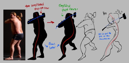
I took this picture of a man holding a hammer, if you just look the silhouette, it is very complicated the pose is stiff
Try summarize the pose with only two simple lines, one representing the head, torso and the leg, the other representing the arms. This is the line of action. Now you got the two lines, play around with it try make it flow better. (Google ‘line of action’ you can find a lot more better examples)
The next step is to simplify the previous drawing throw away all the bumps and little details, take what you think is the most important and draw it based off the line of action you just acquired. this step might take a lot of practices so look at tutorials and draw a lot you’ll get there (Go on YouTube and search ‘life drawing tutorial’ they teach this step really well)
This is how you simplify a complicated pose! I’ll talk about how to simplify character after the next point
Second is exaggeration
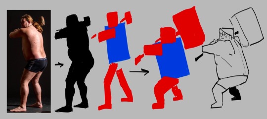
I’m using the same photo here again blocking the person black so we can see the silhouette clear. This time we’re not finding the line of action, we’re reducing this person into a simple shape, to me, he looks like a rectangle.
great, now we try drawing this man with only rectangles
After blocking out the simple rectangles, exaggerate them, make the big ones even bigger, the small ones even tinnier.
Make the main focus of the drawing clear and easy to see, the audience needs to be immediately on that thing the moment this drawing shows up! What’s the focus point of the drawing? The hammer, it’s too small for one to find so let’s exaggerate it make it huge.
Tada, now you have a clear and cartoony silhouette, the rest you can fill in however you like
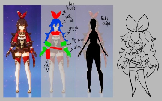
To cartoonify a character is easy, similar to how you cartoonify poses, you take out the little details and leave what you think is the most important, the things that makes the character unique, and exaggerate them
((Here I’m using a genshin character because their character designs are known for being a hell to animate (genshin fans don’t come for my ass this is only for educational purposes))))
I’m… not the best at explaining things so if you can’t understand any of these please let me know!!!!!!!!!!
689 notes
·
View notes
Note
Hello! Hope you're having a great day/night! I absolutely adore your art, you are one of my favourite artists. I love the way you shade and do backrounds. Also everytime I get into a new show I immediately see your art for it??
I was wondering if you had any advice on drawing more realistically (backrounds, anatomy etc) but still keeping a style?
Hey hey!
Thank you so much!
I have a pretty good understanding of facial structures, because before I got into drawing more semi-realisticly, I heavily focused on realistic portraits. Here are some example, these are from around 2019!
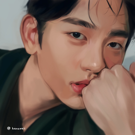
(yes, I was really into danmei and kpop back then, haha)
I just always loved drawing/painting faces and it was all I did. But at some point I realized that I wanted to do more than that because just portraits felt super restricting. So it took me around 2-3 years to somewhat find my style. Thought it would be fun to show a little timeline! Advice will follow afterwards :)
2020
I began working on my OCs in 2020 and since I didn't have an exact reference to work off of, I struggled a lot. My art from this year is super wonky.
2021
Still wonky, but the Lokius obsession was the jumpstart into finding my style! My work from this year is all over the place haha, I was experimenting a lot.
2022
This first ofmd piece is pretty much the first drawing where you can see where my style is gonna go, which I think is pretty cool! This is the year I made the biggest progress cos I was drawing SO much. These two pieces are only six months apart. The one on the right was the first time I gave drawing a background a proper go, too! It was a good year.
2023
And this is where I am now! I'm still constantly learning and improving, but I'd say I have a style you can recognize now!
Now here comes some actual advice, haha:
What I highly recommend you to do is to study your favorite artists as much as you can! I have like 5 A4 sketchbooks all from 2020 that I filled with sooooo many studies, where basically all I did was look at artists I like and copy how they draw stuff, to try and figure out how to stylize certain things. Some of my favorite artists are Ami Thompson, Velinxi and TB Choi. But I also liked to just scroll through pinterest and study all the art I came across that I liked! For example, if I saw a really great drawing of a pair of pants I would copy it many times in my sketchbook and try to learn how they stylized the folds. Doing this for a prolongued period of time will naturally improve your own work! It'll be difficult at first, but you gotta push through, it's gonna be worth it!
I also highly recommend studying unique faces to try and avoid the same-face syndrome. Find some cool looking people and try to draw them as simple as you can! Maybe even draw a little timeline where you first draw them as cartoon-y as you can, and keep going until you end up with a more detailed, realistic drawing. Maybe in the middle of it you find a step that feels the most fun to you, so you can try to build on that! It's a great way to figure out what kind of style might be the best for you.
Here are some cool faces I found on pinterest!
I have a pinterest board with many more!
One REALLY important part of learning how to draw all kinds of things is to understand forms and shapes and how to manipulate them. I have so many pages in my sketchbook filled with just shapes that I drew from all kinds of angles without any references.
This is a great video on it:
6 Ways to Draw Anything by Proko
Learning how to do this is so crucial! Young artists often think they first have to learn all kinds of detailed anatomy before doing anything else, but all that's gonna do is make you tired and hate drawing. Shapes are where it's at! Once you understand how shapes work and which ones to use for certain parts of bodies or objects, drawing is gonna get so much easier! Once you understand them, you can get into details such as muscles and bones!
And honestly the most important point is to just absolutely love what you're doing! I wouldn't be doing this if it wasn't for the fact that I get extreme hyperfixations on certain media that turn me into some kind of beast where I can suddenly draw 10 detailed illustrations a week, haha. Just be passionate about what you do, find something you REALLY love and go crazy!
I really hope this was somewhat helpful! My inbox is always open if there's any more questions :)
#responding to these has made me realize how much I love helping you guys out#it's genuinely really fun and I just hope it's actually helpful haha#my art#art advice#art resources#ask#anon
298 notes
·
View notes
Text
Here’s the first batch of drawings I have done!
@robygoonn I love him so much you have no idea omg…. He’s a pathetic wet cat in the best way possible and needs SO much more love I swear. One of my favorite interpretations of the narrator I might even say
@bugenthusiast0 (from discord) I’ve already drawn this guy quite a few times FOR GOOD REASON I might be in love. I love love love him so much please tell him to not eat me 🥺🙏 /silly i do NOT taste good we should cuddle instead
@an-theduckin these guys were actually so much fun to draw and idk why,, I love how tired Stanley looks btw hehej z
@unorchido your narrator is so unique and silly I LOVE how stylized he is!! The arrows were really fun to draw, I had a really good time making this guy <3
@genericusername422 (from discord!) I actually tried drawing him a while back but I totally forgot to finish it,, agh. His HAIRR and I love his robotic markings those are SO cool. Anyways throws him at a wall really hard
@employee052 YOU KNOW HIM YOU LOVE HIM. VIRGIL MY BABY (old man)…. I’ve definitely been familiar with this guy for a long while, I’m really surprised I didn’t draw him sooner but honestly it was a good thing since I can really do him justice now… though I may need to draw him again in the future..
@machathecat another really pretty design! I love seeing more animal like designs in characters. I just think his horns are really neat……… 🥰
@dirtylittlemuffin THEY ARE SO IN LOVE. AAGH I love your Stanley and the little arrow goatee it actually drives me crazy bro.. and this narrator design is really neat to me <3 I love them
@sketchygoober MY BABYYY I’ve always loved your narrators, they’re so iconic to me.. drawing your characters is always so fun and I LOVE drawing wings!!! Ahhfjriehwkakdkf he is so pretty..
@bookshopsandtea last not DEFINITELY not least! Your coloring is so soft with them and it’s so so so soooo <€{£{£\¥\ ♥️♥️♥️ interpreting your characters into my style was definitely really cool!
and that’s it for now, but there’s still a lot more to go so don’t worry we’re not done yet ahah. Drawing everyone’s different face shapes and nose shapes and body types and hair styles is really helping my art skills <3 so thank you for the submissions!
100 notes
·
View notes
Note
Hello! Do you have any tips on stylizing/drawing real people?? recently ive been trying to draw from my favorite shows but they either look too realistic or just not like the person at all. I love all your twd art and its really inspiring!
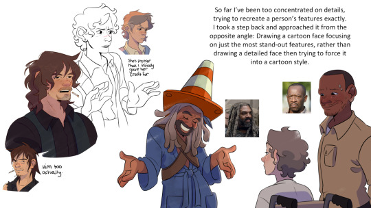
Omg thank you so much, it’s actually so funny you should ask this because this is exactly what I’ve been struggling with/researching for like 6 months. In fact I had an independent research project at uni that I told my prof was gonna be all about learning how to make background art for my final film project. But I got SO into learning how to stylize real people that I forgot to do the project at all and just submitted all of my walking dead fanart and stylization research and somehow got a B+
So strap in, you are about to get blasted with a hyperfixation that was so strong it almost lost me my bachelors degree but instead (somehow!!) got me one of the highest grades this prof gave out this semester
I’m still learning and trying to get better, this hyperfixation isn’t over it just has to be on pause because I WILL fail my final year of university if I let it take me lmao
First of all, here are my project slides (PLEASE ignore my cringe-ass writing, most of that shit was done in a panic at 5am)

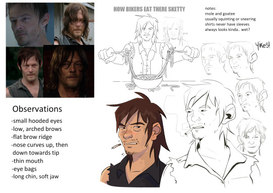
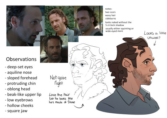
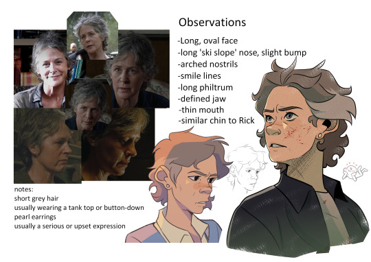
this was a good leaping off point and now I know their features like the back of my hand, but they're missing a lot of character imo
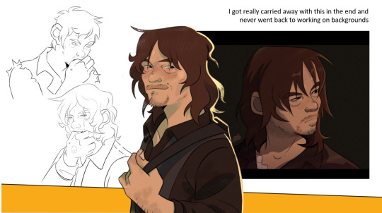
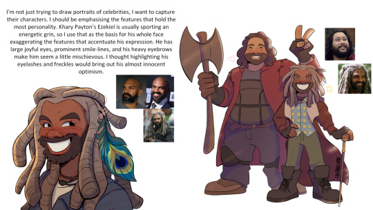
"I thought highlighting his eyelashes and freckles would bring out-" blahblabla, truth is I just think he is very Eyes and his freckles are cute but I can't just be saying ''it's about the VIBES sir''
I highly recommend looking at an artist called @geitonas. They were actually my biggest inspiration in this project because personally I think they’ve mastered stylizing real people and their art is how I want my walking dead fanart to be. They know exactly which features to push and which to downplay, so if you’re familiar with the subjects you can recognize them immediately.
But the biggest thing to note is that their features aren’t replicated exactly, they just have the right energy.
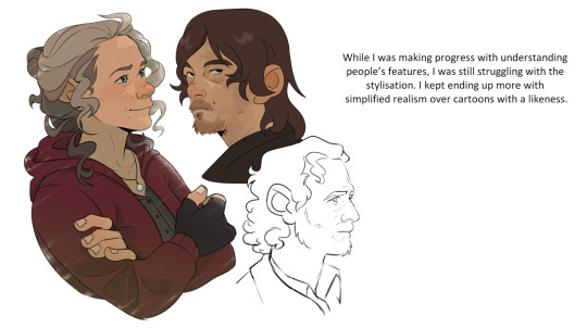
I guess my biggest advice is pick a focus feature. For Carol I think her most defining feature is her nose. It's an odd thing to say but she has very distinctive nostrils. So no matter how stylized I draw her I try to keep this feature in mind, even if everything else goes out the window
Keeping an eye on someone's unique mannerisms and facial expressions can go a long way too. Rick's squint, Michonne's stare, Daryl's scrunch...
This turned into a ramble. My thoughts were more coherent but too many of them wanted to come out all at once. Hope this was helpful anyway!
#asks#twd#the walking dead#scribbles#edit: these images were aranged better but I guess the ask format forces them into one long line sorry
64 notes
·
View notes
Note
Hello hello!!
I would like to place a request for the traffic light tiro!!
This is pre relationship. Like pining from the trio, and I mean hard pinning. So s/o is someone who (preferably has long hair) normally has their hair up all the time. It’s more convenient that way. But one day they needed to go to a party a friend invited them too. So they let their hair down too look good for the party. But they left something at each respective tiro’s place. So they run by to go get it still dolled up so they can run straight to the party after getting what they left. Mei/Mk/Red son see s/o with their hair down and more pretty compared to their normal appearance for the first time and they get shot with more then one of Cupid’s arrows. They just got promoted from simp to hardcore simp
Do what you will
Thank you :D!!
Hi! Hi! Sorry it took me a while, I was busy with school and such! And aside from that I have a lack of motivation:')

Mk
He was.. wow amazed, your hair looks beautiful before and it's even more beautiful now.
He can't help himself! He just can't! He'll fall deeper for you and your beauty's.
He's not one to look at someone's base of looks and prefer their personalities. But when he looks at you he can't help himself.
He'll be all over you! Always around you and such.
When you come to his work with your hair tied up, he'll ask you to let your hair down cuz he thinks it's more beautiful that way.
Mei
Oh my gosh, you're so cute! She loves your hair! She adores it.
She asks if she can stylize it. At one point she definitely makes your hair match like her's.
She adores you with your hair bun now she adores you more!
I like to think she loves someone with long hair preferably because she plays with it and helps style it.
From then she sometimes asks you to let your hair down cuz she likes it that way more. And you sometimes catch her playing with your hair
She can't help herself ok! It looks soft! She'll definitely play with it at times.
Red son
He has long hair himself, and often has it in pony tail. He likes yours too, a unique one he must say.
The first time he saw your hair down amazed him, not only did your hair look super soft and fluffy it did suit you well.
He's falling hard for you, he's kind of a tsundere to me.
He denied himself to fall further for you but he can't when you look very beautiful and appealing.
He'll definitely help you style your hair, even both of you having matching hair style.
Sometimes you would copy his hair style, he thinks it's funny but doesn't express it much.
#lego monkie kid#lmk#lmk x reader#mei#mk#red son#lemon writes#mei x reader#red son x reader#lmk mk#lmk mei#lmk red son#x reader
153 notes
·
View notes
Note
LR is really, really good but I just wanted to say something- this is probably more about the readers than LR itself, but when it's said that LR is so much better than LO artistically (which it is!!), like say in terms of writing, pacing, and art - I think it's also not an apples to apples comparison, since LR has LO to draw inspiration from and a lot of external reactions to LO to learn from for what to do and not to, while LO is both time-constrained and (when it started out), didn't have much basis to compare to.
(The SA plotline is one example.. many criticize RS and say she shouldn't have written it in the first place but that's the thing - she actually didn't know. While I agree it's really shitty and RS has definitely ignored a lot of criticism she should take into consideration, the conclusion that she shouldn't have written it in the first place wasn't something that she knew about until after fans pointed it out. She definitely is mishandling it now, but I think writing that in at the start was born out of actual ignorance - different from her problems now, since she's now actively ignoring and shutting down the feedback she does need to get better. This blowing up educated a lot of people- probably not you specifically- and opened up a lot of dialogue for things that Rachel likely didn't have access to at the start of LO. and has no excuse for now.)
Anyway, yeah - Love Lore Rekindled, thank you for creating it! Genuinely, I do - this ask isn't meant to be a bad thing against you at all, nor do you need to reply to it.
Not a bad thing in the slightest, I honestly agree with you! The reality is that LR wouldn't exist without LO, so to try and compare them feels kind of like... it defeats the point?
Like obviously Rekindled was made with similar intentions, I'm not gonna sit here and pretend like Rekindled wasn't made out of spite over what could have been, but at the heart of it all, it doesn't exist to 'flex' on LO, really it's just to help recapture that joy and beauty that the original comic had that I fell in love with in the first place. It's only because I loved the original concept and foundation of LO so much that it exists. That's also why I call it an "AU" of sorts, as a sort of "alternate reality where LO didn't turn out the way it did" experiment lmao Mostly by maintaining the consistency in the original art style and paying off those earlier plot threads that didn't payoff the way we were anticipating or were dropped entirely. Sure, it's trying (and in some ways succeeding) to be "better" than LO, but that definition of "better" and how it's applied was what we were hoping to get out of LO in the first place.
So yeah, when people say "the art/writing is so much better than LO's!" part of me tries to take it as the compliment it's undoubtedly intended to be, but also I'm like "ack, that's not the point!! the art still doesn't look exactly like LO, I'm failing!!" LMAO I suppose that's part of the magic, but it doesn't fully align with my original goals or intentions. That's the struggle of art stylization, you can try and mimic another person's work as much as you want, but you can never mimic the them that's in their work, just like how you can't remove the you that's in yours. I want to be at peace with my own work and what I put into it, so I try not to compare them too much and just treat them as their own unique separate things (even if one of them is directly trying to resemble the other). It's okay that Rekindled doesn't look or read exactly the same as LO, but in saying that it's 'better' defeats the point of why Rekindled exists in the first place and diminishes LO's part in the process. LO has to exist - all of its best and worst parts - for Rekindled to exist, so putting LO down just to raise LR up... isn't that kind of what we criticize all the time within the comic, how it can't seem to hold up its best parts without putting down others? Why can't they both have their own things worth appreciating on their own exclusive of one another?
This is also why I generally ask people to not share Rekindled with the general Lore Olympus hashtags or post about it in the fan groups (and why I don't mirror it on Webtoons) because I just like... don't want it to come across as some "booo you like LO??? go read this instead!" type deal. I want people to be able to enjoy Rekindled as its own standalone story as an extension of LO, in the form of what could have been. There's a very thin line in the sand between Rekindled being just what it is and it being used against the fans as if it's a crime for them to still genuinely enjoy LO. I can't enjoy LO in good faith anymore, but that doesn't mean I make Rekindled for the sake of ruining that good faith in others. I was a fan too, once upon a time, so Rekindled is just as much for the fans as it is for the people like me who started off loving this comic just to be disappointed in the end and yearning for the "what if" that could have been.
And yeah, it's absolutely an advantage that I have in my court that I have the knowledge of knowing what LO started as and where it went wrong to work off of, an advantage that Rachel didn't have. It's like when I look back on my original pages in Time Gate: Reaper and think "man, I wish I had known xyz when I made these so they could be better!" but if I hadn't made them like that the first time, I wouldn't be able to reflect on them now knowing I've improved. In that same regard, Lore Olympus had to run so that Lore Rekindled could crawl. And I'm forever thankful to LO - and Rachel - for giving us something we could all connect over to such an extensive degree that Rekindled could exist at all.
#ama#ask me anything#anon ama#anon ask me anything#lore olympus critical#lo critical#anti lore olympus#lore rekindled#lore rekindled ama#lore rekindled comic
69 notes
·
View notes
Text
Oban Star Racers review

Yesterday I decided to watch Oban Star Racers, since it was a series I slept on when I was a kid and I heard a lot of good for it. So I binged the 26 episodes yesterday and today.
Overall verdict: FUCKING DOPE. 9/10
Very good series overall. It has a pretty unique art style (most notable on the humanoid characters) but it makes it work and uses it well to have pretty dynamic and expressive characters and gorgeous environments. And it's a very neatly written story, that finds the right balance between a sport fiction (racing), the overarching space opera/space fantasy narrative, and the interpersonal drama.
And the OP is pretty good and sells the color.
youtube
The plot :
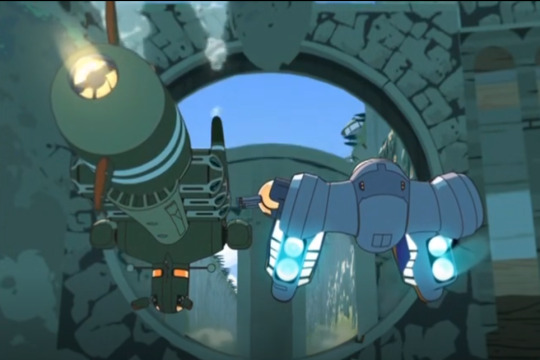
(two ships preparing for the preliminary of the Oban Star Race)
In the future, humanity is set to participate in a racing competition between civilizations of the galaxy, where the winner will receive the "ultimate prize" from a sort of "god" of the galaxy. Eva, a young girl who wishes to be recognized by her father (both literally and figuratively), gets involved in this race when said father becomes the manager of the earth team... And it soon turns out the competition has way higher stakes than everyone believed.
The plot reminded me bit of Red Lines, albeit with far looser vehicle rules than it (one competitor rides a giant beetle... ONE COMPETITOR JUST FLY HIMSELF), although I don't think a more in-depth comparison is worthwhile. Ultimately they provide different experiences despite the similarities.
A more in-depth rating would be :
Story:
very well written with good dialogue. None of the 3 main storylines (racing, drama, mystery) feel underdeveloped compared to the other, and they all manage to fit right into place as the plot progresses. The only downside is some plot points could have been introduced earlier and in more detail, but this only concerns a few.
9/10
Characters:
The characters are colorful and interesting. The secondary cast have a lot of personality, with unique ship design that sometime really push the definition of "racing ship".

(one of the secondary cat... I mean cast, Para-dice)
And the recurring cast isn't left behind. They are complex and nuanced, flawed people who sometimes make bad decisions, but always act in an understandable way. Sometimes their reasoning is more implied than explained, but it's not easy to miss it.
(The short guy with black and white hair is Don Wei, the protagonist's father. The tall dude with his tits out and sunglasses is Rick Thunderbolt, a pilot for the earth team)
The only issues are that one character is developed and leaves the story way too quickly and that some are a bit too simple/one not. But it's a minority and it's probably to balance give more time to the interpersonal drama.
8/10
Art :
The art style surprises a bit, but you get used to it quickly. It makes for expressive characters, and it's stylization make the humans not feel boring compared to the many aliens.
(you may have noticed they don't have noses)
There's also some clever use of 3D here and there, but it's well integrated so it doesn't feel too jarring. And the environment are fun to look at.

(This isn't what you expect to see when you're told you're going for an interplanetary racing competition. But I really like this planet, Alwas)
8/10
Music:
The music is good guys. I put the OP above, but the ost is also great, both for actions and non-action scenes. I really like the preliminary planet's theme... it really sells the confusion of humans reaching a new world they've never seen before with a pre-fire spacefaring civilization (that uses caterpillar-powered engines).
youtube
And Prince Aikka's theme is also cool.
youtube
Anyway, for the music, I was gonna give it a 8/10, but now that I listened to them again for this review, I realize they do carry a lot of making this experience pleasant. So
9/10
Worldbuilding:
That's a very important factor if you make Sci-fan, so I thought it was good to make it a category. Oban's setting succeed in the two key point I look for in a fictional universe: It makes its own sauce, and it looks alive.
Not everything in the setting is unique, but it offers some fresh concepts or visual identity make the inspiration turn. Like, I really enjoyed Ceres' ship being an amalgam of tubes that shouldn't fly, and that he rode standing on it rather than in a cockpit.

or spirit weird anatomy that looks like an unraveled humanoid
Or hell, Oban (the planet) itself functions in a way I haven't seen yet in sci-fi. that's what I mean by "make its own sauce". I can look at some elements of it and say "Wow, you don't see that every day" and get a rush of inspiration from the new flavor.
As for the "looks alive" part, by that I meant that the series gives the impression if I put the camera away from the main plot, there still would be interesting things to see. We know a lot is going on offscreen. We only see one of the 3 preliminaries... that's a lot of teams we haven't met... And even with the one we met, there's political intrigue in their homeworld, tragedies they wish to repair, etc... It's a universe where you feel you could always find something new to look at.
10/10
So, once again
OVERALL RATING: 9/10
#oban star racers#anime review#french animation#japanese animation#it's a collaboration#science fiction#Youtube
32 notes
·
View notes
Text
no pokemon game will ever come close to beating pokemon colosseum
set in the deserts of pokemon-arizona
playable character, Wes, is a criminal who opens the game by stealing valuable tech, and then riding off into the sunset on his mad max motorbike while the bombs he left in an occupied building destroy it to rubble
you don't catch wild pokemon. instead, with the help of a kidnapped psychic, you steal pokemon from other people. you just throw pokeballs at other peoples pokemon during battle and then leave with their pokemon. how are they going to stop you? with what pokemon? your city now, bitch
the villains in this game have been torturing pokemon to insanity. you have to therapy these pokemon back to health by... forcing them to fight for you.
the music. look up pyrite town theme right fucking now.
miror b........
there's an entire underground bladerunner-esque city hidden from almost everyone. it contains a gang of independent child criminal hackers who do far more to help you than the cops.
i just love the wild west/high tech mashup vibe. its sUCH a choice aesthetic.
DOUBLE BATTLES ONLY
wes the hardened badass edgy criminal and his two main pokemon, espeon and umbreon, a pair of cute dogs who love him so so so so much
the battle system in this game is choice.
because there aren't wild pokemon or random battles, and you can only steal certain pokemon, you actually have really limited options for battles. you'd think this would be annoying, but i really enjoyed it - its a very good foil to the other pokemon games where you have infinite possibilities. it forces a casual player to strategize a lot harder.
especially if you're trying to heal all the shadow pokemon - you have to use pokemon in battle you never normally would have.
this is such an old game, iirc one of the first 3D pokemon games ever? and the graphics are understandably clunky, but even then there is so much heart and care put into it that it doesnt feel outdated, just heavily stylized.
EVERY POKEMON has unique animations that are just so much fun and really shine in the battles. especially their K.O. animations. its just so much fun. modern pokemon, take notes
41 notes
·
View notes
Text
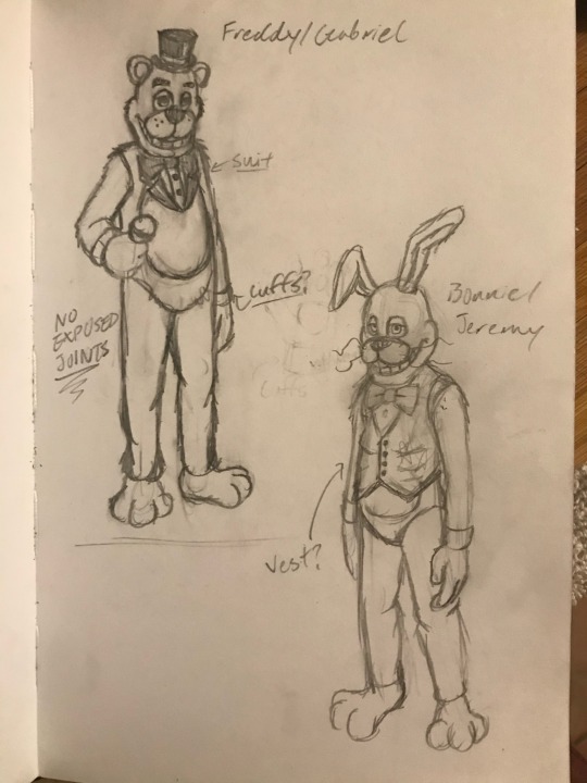
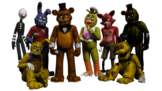
The band’s all here! (WIP)


I still haven’t finished their new endoskeletons yet, but I think I have their suits mostly down!
Feel free to ask any questions you may have in the inbox!
EXTRA INFO AND SCREENSHOTS UNDER THE CUT!!!
At first glance, these are obviously inspired by the traditional Chuck E. Cheese x Rockafire Explosion suits, designing them more like sports mascot costumes and having very little of the endoskeleton showing at all times (say for Foxy, of course). This was not only for more realistic world-building, but also to optimize animation, as we now have less moving parts that are actually showing, and therefore, less to render.
You might be wondering “if you wanted a more realistic approach to the suits, why not take a more realistic approach to the masks, like a more ShowBiz Pizza style?” And to that I say: everyone does that.
Okay, that isn’t entirely the reason. I like the idea of basing the designs more off of the canon models than something that already exists, because I like the idea of FazEnt having their own style of making animatronics. The ShowBiz style isn’t the only way to do animatronic masks, and these masks are how FazEnt would go about making them. Even when FazEnt does use the trademark ShowBiz rubber-face masks on the Junior models, they don’t do it the same way that ShowBiz does it.
Something interesting I want to do with Freddy & Friends is to set narrative moments apart from the moments meant to be passed off as real footage. The designs shown above are for the latter, meanwhile the narrative will use more artistically stylized suits textured to more so resemble a comic book, sort of like Into The Spider-Verse (except instead of going for a generalized comic book feel, the Freddy & Friends style is gonna be more reminiscent of the Batman: Year One comic). The designs will be more reminiscent of how I draw them on paper, as opposed to being faithful to the canon.
Here’s some extra info as to how I came up with the designs, as well as some extra renders and concept art!:
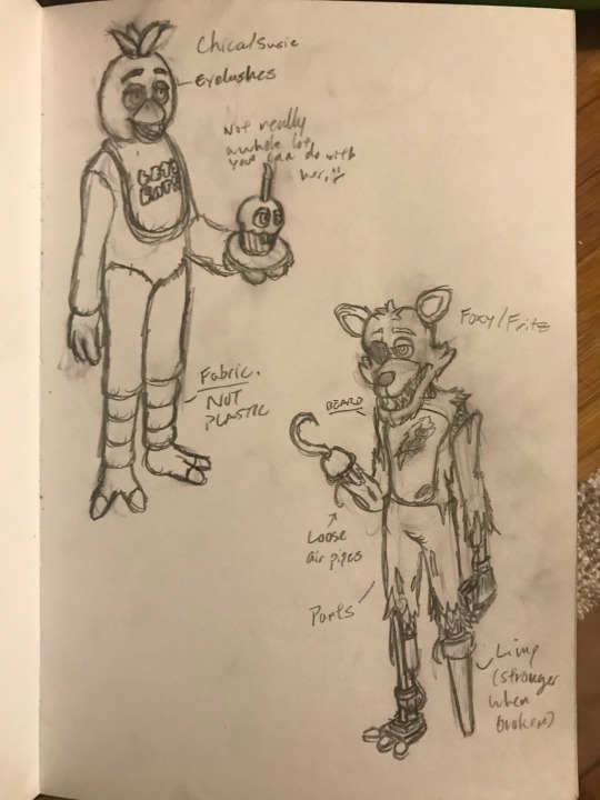
Original concept art from September 30, 2020.
Freddy was a little obvious to design, probably because everyone seems to design him like this when making more cartoonish versions of him. A more defined tuxedo complete with a collar and cuffs with a red stripe around his hat. It just seemed like the right direction to go in.
Bonnie was initially intended to wear a vest, though I was holding out for something else so that he could be differentiated from the evil rabbit (the evil rabbit wears a vest). I asked my friends what I could change it to, and one of them said “Try a cardigan”. Honestly, that fits Bonnie’s personality so much better, both in terms of spirit and cartoon.
You might also notice that Bonnie was supposed to have buck teeth, as well as more squared off teeth. That was originally part of his V1 model, but when I tried applying that to the new models, literally any way I tried to arrange it made Bonnie look like so much like an insufferable asshole that I wanted to punch him in the face. Ultimately, I ended up ditching the buck teeth and just gave him his classic teeth.
Chica was a little hard to do something unique with at first. I initially wasn’t really sure what I wanted to do with her, but when I modeled her V1, her little chef’s hat was a last minute addition to her design. I’m also thinking about changing her bib into an apron, per the toon designs that Henry posted a while back.
Foxy was probably the most fun to design. Obviously, his final model has a lot of details inspired by the FNAF movie, but when I was designing him 4 years ago, I really just wanted to go crazy with his design. I wanted him to have a beard, I wanted him to have a peg leg (I really liked the idea of animating him with a limp). Unfortunately, I don’t know if I’ll keep the peg leg, because it might be a little too hard for Henry to animate with the tech that he has.
As a cheeky little reference to the roots of the FNAF fandom, I wanted Foxy’s hook to resemble the hook seen on the Splinks Foxy model. ;)

Endo01 - Version 4 WIP
I’ve done a few different versions of the endoskeleton. What I’m trying to do for this new one is to assemble him modularly, allowing me to make each component a recognizable component (they’re also actually modeled after real components).
I’m not gonna go into detail about the functionality of this guy, because I eventually plan to make a Freddy & Friends Instructional VHS series centered around being a mechanic for FazEnt. However, what I will say is that these designs are intended to have plausible functionality, especially using the technology of the 1980’s (which is not restricted to pneumatic technology, because making an animatronic walk with pneumatic actuators while maintaining the traditional complexity of animatronic endoskeletons is simply impossible).
EXTRAS:
The original Version 1 designs

My failed attempt at giving Bonnie buck teeth (I wanna punch him so bad…)

Fixed Foxy
???
#freddy & friends#freddy and friends#freddy & friends AU#f&f#five nights at freddy's#fnaf#fnaf au#freddy fazbear#bonnie the bunny#chica the chicken#foxy the pirate#work in progress#wip#endo 01#endoskeleton#animatronic#fnaf ask blog#fnaf fanart#fnaf movie#worldbuilding#webcomic#writers on tumblr#writing
24 notes
·
View notes
Note
I really like your style. Was it intentionally designed, or did you just sort of fall into it over time?
I wouldnt say I intentionally designed it, as in I haven't sat down and Engineered a specific style, and instead it was more of me finding what I liked and wanted to incorporate into my style.
You could probably trace my style back to its influences. I used to draw really round shapes (I still do but like they were just ovals and circles...I guess i just like that shape) until I started watching How to Draw Anime tutorials in middleschool T-T (shoutout to Mark Crilley lol)
But when I first joined social media back in 2016, I found all these crazy artists with really unique styles that really influenced me. I was drawn towards artists like star_bite/prince_canary and rawrgyle/grassflu who have very dynamic expressions and character poses :0 (also they ended up working on a Batman and Superman project respectively and how wild is it that my icons from forever ago now work on projects aligned with my current interests!!!) And as you get exposed to different artists you get exposed to the many ways you can Draw things and along with your natural affinities towards certain things (such as me being attracted to Bright and Bold colors and Shaped styles) you kind of naturally build a style.
And part of that is also just having fun Trying things out? Sometimes I wouldnt even try to emulate their style as much as I tried to just...do what they were doing? As in making my ocs and putting them in fun poses, and doing color palette trends and such etc.
I hope that helped! If you're curious I can break down some of my style checkpoints over the years. As you can see there was still some major anime influence in my style back then when I first joined social media around 2015/2016
Around that time, I also discovered the fandom around the Cartoons popular at the time, so I drifted away from anime and drew things like gravity falls/steven universe/otgw etc etc so it got Rounder I guess. I really liked how stylized characters looked and got obsessed with Shape Language and assigning characters distinct Shapes (box vs triangle vs circle etc). I also read a lot of webcomics and stuff like that so those played a part I guess


And then around 2019 I saw more artists drawing anime fanart with really sharp angles, which was completely different but so cool to look at so I tried to incorporate more angles into my art. I still had that very cartoony style but tried to push the Sharpness a tad bit more if you can tell. (I think the name of the artist I liked was jeluto?)


I think around this time I also focused a lot more on color as well and did a lot of paintings then and whenever I did more Painterly stuff I tended to switch Styles into something Less Cartoony T-T

Then by 2020, I revamped my ocs, actually tried to break down and study my own style and how I would draw them, and my style kinda fell into a mix of round vs sharp edges I guess. I tried to give myself Rules which I would follow when stylizing a character to keep it more consistent and intentional.


Then in 2021 some of that Fun Part of stylizing characters into something more Cartoony kind of took a backseat as I focused more on Pose Work and Body Expression instead which I think helped a lot :0

And here's some recent stuff from the past year! Still very cartoony, but less so than 2016 I'd say, and still using really bold colors!! Still love my Soft Vs Hard angles B]
And overall have stronger pose work :) I'm sure my style will evolve as I learn more and experiment more, because one thing I want to focus on is backgrounds and environments :0


60 notes
·
View notes
Text
I think a huge part of the failure of Starfield, besides the fact of its lack of design documents (And Pagliarulo in general as outlined by PatricianTV on Youtube) is the complete and utter failure of aesthetic. The Elder Scrolls has very clear aesthetics unique to every culture, and fallout has a very prominent casette futurism and retro sci fi aesthetic, but I think in an effort to avoid comparisons to fallout they completely scraped all the aesthetic personality out of the game.
Like think about it. They say "nasapunk" but what does that mean? And it can't just be the fact that they're still using no.2 pencils. The ships, though they have subtle elements of outdated nasa technology, look absolutely nothing like anything NASA would have made. It's so bad that people don't even realize it's going for an aesthetic at all beyond Red Dead Redemption and Cyberpunk 2077.
They just like, have absolutely none of the recognizable nasa iconography. They have no rovers or unmanned craft, they have no separating pieces of a ship in space. I know it would have limited the ship building but the least you could do is attach the ship to a vertical rocket a la space shuttle. They could have a separating bit of the ship you can use to land like the moon lander, and it wouldn't be hard to implement, just make every cockpit double as a moon lander.
And the suits. The outfits. Good god they are all awful. Like I get that adding "punk" to the aesthetic means it becomes more stylized but it shouldn't be so much so that it's unrecognizable as the "nasa" part of that term.
I know this might tickle some feathers, but in past content Destiny 2 did an incredible job with that aesthetic already. In the now removed location "Titan" there used to be a "golden age" research base that kind of looks like a space oil rig, and EVERYTHING from that location just screams nasa, from the armor you can get there to the design of the habs, how buildings are connected by airlocks with that cool crinkly foil looking stuff on them, it's amazing. Even Bungie was able to beat Starfield at its own game when they tried ONCE like five years ago or something
24 notes
·
View notes
Text
Changes in Gerudo culture(Old)
(PLEASE READ: okay so this is a really old post that just stayed in my drafts for a long time. I thought I would just go ahead and post it because why not? I realized and found new things so take this post with a grain of salt)
I’ve been thinking about this for a while now, and I’m surprised to not see anyone else discussing this. In Memory #6 “The Gerudo Assault,” I pick up a couple things about the Gerudo soldiers in the background.
Also I won't be talking about Riju's, Ganondorfs or Kotake and koume's clothing sense their style is more unique to them, I'll only referring to npc's
Gerudo Fashion

I’ll start with the hair sense that’s the biggest distinction. Modern day Gerudo usually sports long hair tied up. If their hair is short it’s stylized in a feminine way, likely to attract potential husbands. On the contrary, in the past Gerudo didn't seem to style their hair to appease men. The hairstyles I spotted were a Mohawk, buzzed, and one where the top of the crown of the head was shaved and the ponytail remained.
Clothing
The clothing style hasn’t really changed, it’s primarily keeping the same form: pants, heels, hooped earring's, a small top and a necklace. The most significant change has to be the patterns. Present day, the patterns are bright and eye-catching. The tops also are typically a different color from the pants, still in the same color scheme though. Shop keepers, elderly women and middle aged women have the same colored tops. Some of the jewelry -while still being gold- is studded with gems.
The elderly women maintain their traditional style while incorporating additional accessories. Their hair is put into a bun and is decorated with striking chains. Furthermore, they sport a vest and a belt with more gold chains.
Past Clothing
Hyrules founding Gerudo Appear to prioritize functionality for battle rather than fashion. I say this because there is a lack of color or flashy patterns. Their choices are guided by what appears appealing and practical in combat. I wasn’t able to discern any noticeable patterns on the gerudos pants but, there was a white pattern on the top. What was the pattern? I couldn’t tell, likely a homage to another game. Pants and tops are a dark purple, their jewelry is less bold, the only noticeable thing being a ruby pendant. The reasoning for the style is a reference to ocarina of times Gerudo guard.
It’s worth noting that the thunder sage dresses more like modern day Gerudo, perhaps that style is a sign of rebellion to Ganondorf?
Makeup
former Gerudo seem to be wearing war makeup, I don't think the green lipstick is war makeup though. Likely they thought it looked pretty and that's why they wear it.
Now there is a little bit more variety in the colors, the colors I found were green, blue and white. I'm sure I'm missing a few, but those where the most common colors I found.
Controlling Molduga
#legend of zelda#tears of the kingdom#loz#zelda#Geurdo#I'm sorry if I didn't name some of jewelry correctly#I tried to find out the names for some jewelry but I came out empty handed#totk
23 notes
·
View notes
Note
This might be a bit of a weird question but I'm curious, your rab design looks so cool and you seem good at character design and stuff, I'm curious why every time you draw vanny it seems to be the canon design, is there a reason you don't have a unique design for her? Not trying to sound rude or anything (I really hope I'm not coming across in any negative way) I'm just curious cause I feel like you could make a really cool vanny design if you wanted to and I'm curious if you just prefer the canon design or just haven't thought much of the idea.
I know it doesnt really seem like it from my Gregory art, but at least now I rlly like drawing the fnaf characters how they look in canon! I just enjoy the canon designs a lot and want to get good at drawing them how they are instead of an original design. obviously there's nothing wrong with doing that I just prefer like. stylizing canon instead of making something unique to me. my Gregory and Evan designs are pretty old so this was before I decided I preferred that, so I obviously haven't changed them much or they wouldn't feel like MY versions of them, but I've slowly made Gregory more and more canon looking than I did before, and Evans already free reign skfje
thank you for thinking my rab design is cool :) it's awesome hearing u think I'm good at character design!! its not exactly a passion or anything but I think it's fun and I'm proud of the designs I've come up with like rab!!
maybe I'll try and take a crack at a vanny redesign after this ask! somebody needs to fix that egghead
#i have wanted to dabble in different outfits for the glamrocks tho so#once im able to actually draw again ill try and draw mr Fazbear!!#also maybe a few gregory evan tony cassie etc outfits#my pinterest boards for them are waiting#pandas.txt#pandas asks
15 notes
·
View notes
Last Seen Blogs

o-to-mi-ru
ムーア ムーア
alchewonderworld
AlcheWonder's World

xsaususcat
FATCAT

sweet31christoffersen
Sans titre

seuguara
Garimpaguara