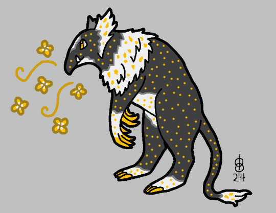
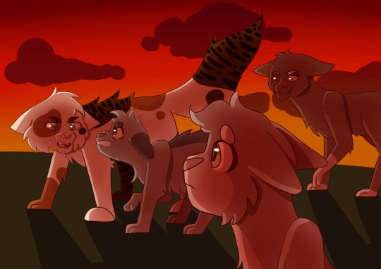
#the fur was so nice to stylize also
Text

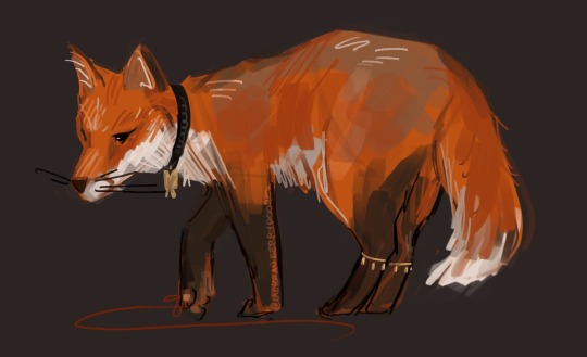
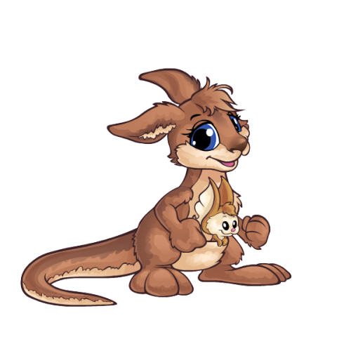
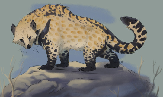
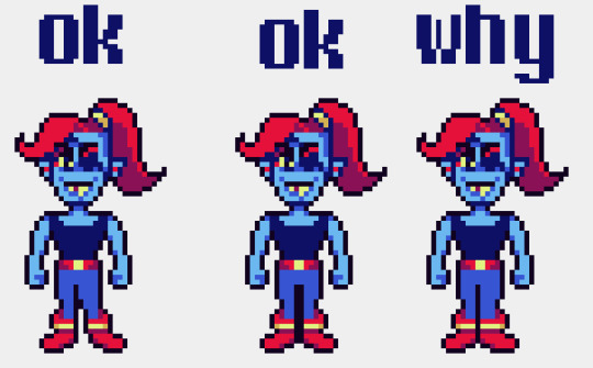
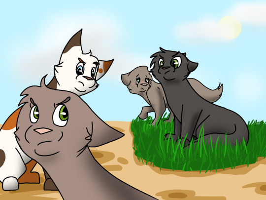
fuck it!!! mxtxtober day 1: chibi/animal
follow for more art <3
#re: the poll where i asked if hua cheng was kicked puppy pathetic or wet cat pathetic. its difficult to tell because he is a fox :^)#AHHHHHH XIE LIAN TURNED OUT SO CUTE I LOVE HIM#yeah . :)#the fur was so nice to stylize also#overall 10/10 experience#tgcf#mxtx#art#my art#hualian#xie lian#hua cheng#tian guan ci fu#hob#heaven official’s blessing#mxtxtober2023#mxtxtober#what do you call their official fursonas.#reverse gajinka.#im sure theres a word what the fuck is it
694 notes
·
View notes
Text
My thoughts on drawing wings (an unofficial tutorial)
Do you want to get better at drawing your favorite winged character? Do you have winged OCs? Just want to learn something new? I can't promise this post will help, but maybe it'll give you some helpful tips.
I know, I knowww, wing tutorials have been done to death. I don't care. This was initially inspired by a conversation on twitter, but actually I've wanted to write down my notes on the topic for a long time lol. Basically wings are one of my special interests so it's very important, for me, to draw them both nicely and also realistically.
On that note, let me first show you my resume *distant sound of floodgates opening*
Like what you see? Read on!
(Oh, and I will only be covering feathered/avian wings bc those are the type I know best.)
Now, I'm not here to give you a step-by-step guide on wing anatomy and aerodynamics, because there are plenty of other resources that cover this already, and I'll list my faves at the end of the post. Right now, I'm going to give you some easy guidelines and tricks that I wish more artists knew.
1: Wings do, in fact, have bones (crazy, I know) and are actually very rigid because they have to support the weight of a living creature. There are some positions you cannot physically force a wing into irl.
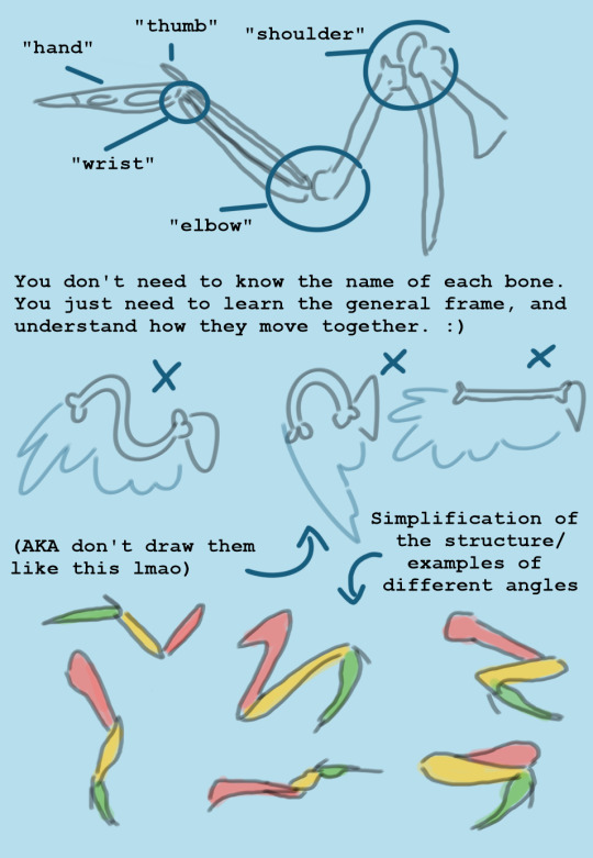
2: Flight feathers are not placed willy-nilly on the wing, because then they wouldn't catch the air properly. Again, like the bones, they are rigid and strong, so don't draw them like fur or ribbons. All wings have the same pattern of feather placement, with slight variation depending on species. If you learn the feather sections, it will automatically improve your drawings a lot.
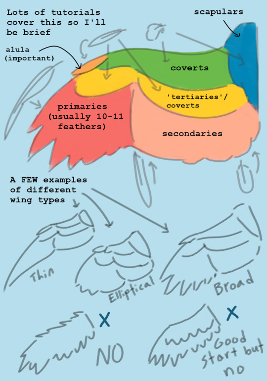
2.5: Feathers overlap each other like a handful of playing cards, and this looks different depending on which side of the wing you're drawing. They always do this unless they're extremely untidy.

3: The size of the wingspan is important if you're going for a more realistic design. There is no "scientifically accurate" measurement when it comes to fictional creatures, but my general rule is when in doubt, you probably need to make them bigger. Personally, for my original winged human species, I give them wings that can be up to 12 feet long each (the artistic sacrifice is that it's really hard to fit the wings on the dang page lmao, so make your own call).
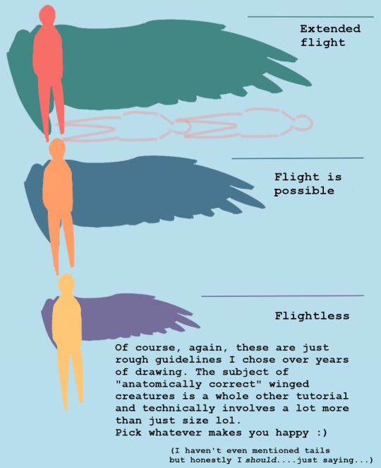
4: Get used to drawing folded wings. Most of the time, birds keep their wings folded because it prevents them from getting damaged and it conserves energy. The trick is to get good at visualizing how the joints bend and overlap (look at plenty of photos!) In general, they can fold much tighter than you think.

5: Wings and feathers take a lot of patience to draw, but the results are worth it. I've seen so so many incredibly beautiful and skillful artworks that are---well, maybe not ruined, but still negatively affected by a pair of wings that look like an afterthought, or not even like wings at all. You have no idea how much a little extra time and practice will add to your work until you see for yourself.
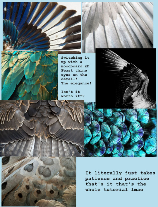
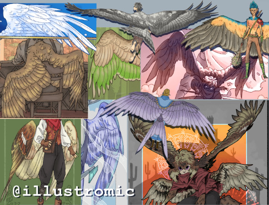
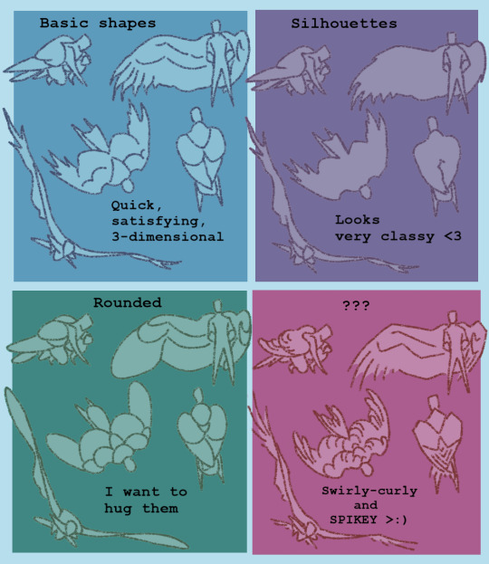
Finally, some notes on "stylized" wings: Of course it's perfectly ok to draw more simplified/cartoony wings if that's your preference!! BUT there is a difference between a stylistic choice and a lack of effort/poor understanding of the subject matter. Even cartoonists have to learn the fundamentals of realism so they know how to make their designs logical and appealing. Here are some examples of more stylized wings that I feel retain the core principles of anatomy/aesthetics:
And last but not least: A list of helpful links I use personally for reference and inspiration!
I made this pinterest board for general artsy inspo, and this board to curate my very favorite tutorials/refs/information, focusing on the scientific aspect of wings and flight in general. Feel free to use both! (I also suggest pinterest in general for pose refs and such, but try to only practice using photos at first and not other drawings.)
I highly recommend this blog and this blog if you want examples of artists who draw more realism-based winged creatures!! They are both huge inspirations for me and I think you should totally follow them even if you don't plan to draw wings lol <3
If you're REALLY serious about it, my favorite ref books are: Winged Fantasy, a lovely drawing book by Brenda Lyons; Proctor & Lynch's Manual of Ornithology; and Angelus vincens by R. Spano, which is essentially an artbook by someone who (I believe) designed biologically plausible "angels" for their senior thesis.
Ok, idk how to end this lol but I hope it helped! I know it's not my normal kind of post but I'm super busy with college stuff rn and this was all I had time for. If you guys have any questions or feedback, please let me know!!!
-Aloe <3
#my art#wings#drawing#tutorial#the way I could've talked for so much longer haha#but it's 3 am for me and I am fading fast so GOODNIGHT
2K notes
·
View notes
Note
Got curious bc of the ask about horses! What are your, like, top 5 fav animals to draw? And what are the top 5 fav dog breeds?
Uh, mm, well
Fav animals to draw:
domestic dogs (sighthounds to be specific, surprise surprise)
wild canids (coyotes are my favorite of these, wolves a close second. I've never gotten into drawing foxes much despite their obvious photogenic-ness)
goats and sheep (horns! wool and shaggy fur! potentially ominous!)
deer (reindeer/caribou in particular, I love those, so majestic, big crazy antlers)
felines (mostly domestic cats, but tigers sometimes, they're such an iconic and visually distinct species)
Fav dog breeds to draw:
Greyhound (lithe, muscular, flexible, simple silhouette, the quiessential sighthound)
Doberman (childhood favorite, also good shapes, high contrast colors, particularly good heads and teeth)
Borzoi (noodley horse dog, elegant, fur texture provides interesting stylization opportunities, roman noses and rounded backs look very nice in profile)
Ibizan hound (a bit like a greyhound in a different font, sharper and more angular, less curves and more straight lines, very expressive pointy ears, visually tends to get close to the traditional anubis look which is neat)
Afghan hound (the ultimate fur dog, the mucha hair option, challenging, can look very noble and striking if the piece turns out alright but is a nightmare to deal with if stuff isn't aligninig like it should)
229 notes
·
View notes
Note
could you review some of the neopets as animals outfits, like the fennec kacheek, red panda vandagyre, and cockatiel pteri? (those are examples, choose whichever you like!) thank you <3
(Note: I included a random selection of outfits in this post, but feel free to send in asks if anyone wants to see a specific outfit I didn't cover.)
I'll be honest, I'm personally not super big on the "outfit that resembles a real-world animal" trend. First, I play Neopets for the cool fantasy creatures; even the most true-to-life Neopets species have some pretty fantastical colors. I feel like making pets just look exactly like actual animals kind of defeats the purpose of them being Neopets. I get why people would like it and I'm not saying it's bad; it's just not my thing.


Also, the other reason I'm not always big on these outfits is that a lot of Neopets have colours that already resemble real animal patterns. Not only do the outfits blur the colour/customization line quite a bit, but usually I like the colour ones much more, as they keep the actual design of the Neopets in place and just change the patterns and colors, rather than covering up the fun fantasy elements. This also helps them avoid the uncanny valley effect, which I talk about more below.
Also I might be over thinking this but who is making these outfits. None of these animals seem to exist in-universe as far as we're aware. what are the shopkeepers basing these off of. the colours at least have a magic as an excuse
Examples that I think are okay:

Feathery Pteri Outfit: This one's nice! I like the layered patterning on the wings and the high-contrast colors. Most, though, I like that this sticks fairly close to the actual pet, mostly just changing up the tail shape. This almost could've been a paintbrush colour, but then again what colour is up in the air.
(Side note: the eye clipping over the beak is a rendering issue? I think?)
Bouncing Zafara: This one definitely strays farther from the actual pet than the Pteri, but it's a fitting animal choice and it doesn't fall into the uncanny valley, which is all I care about. The body is still somewhat recognizable as a Zafara in terms of shape, and the Miamouse as the joey is super cute.
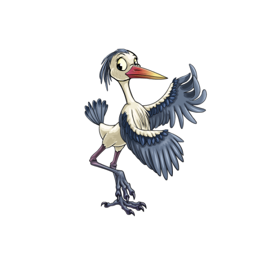
Freshwater Lenny: Kind of the same case as the Zafara; not super one-to-one with the actual pet, but it's still recognizable as a Lenny and isn't too uncanny. The legs are a particularly nice touch, actually changing the pose to look more heron-like (though they are also the part that strays dangerously into being too detailed).
Please don't:

Adorable Kacheek: Sorry to the fans of this one, but this outfit just resides deep within the uncanny valley to me—like it's a mascot suit instead of just a normal pet. The artstyle is way off from Neopets, looking much more Subeta-ish (except Subeta's art usually isn't so off putting). It's not a bad artstyle, mind you, it's just not very Neopets-ish. I also feel like a fennec fox was also a bad pick for this one, as it's basically unrecognizable as a Kacheek at all.
Feathered Eyrie: Speaking of the uncanny valley, this is another pet that lands squarely there due to having entirely too much detail in the shading and weirdly realistic fur textures. It also just doesn't look very good aesthetically—the beak doesn't fit the face, and the wings are an absolute trainwreck (not only is the perspective wrong, but the left wing is coming from the middle of its back!). On the plus side, you'd be hard pressed to not recognize this as an Eyrie, and it's a fantasy creature instead of a regular animal, so I guess that's something?

Furry Meerca: Hmm... no. This one also suffers from an overly-detailed artstyle and way too much realism, which is especially jarring when placed on top of the Meerca's heavily stylized body shape, resulting in a perfectly round animal with hyper-realistic animal eyes. It's also particularly bothersome because we already had a chipmunk Meerca design in the form of the striped Meerca colour, which is just this but less soul-haunting:
Which is what I meant at the beginning when I was talking about colours vs outfits. The colour is a Meerca that looks like a chipmunk; the outfit is a chipmunk that looks like a Meerca. Big difference.
38 notes
·
View notes
Text
Bestiaryposting Results -- Narngreg
All right, time to look at this week's critters. (Sorry it's a few hours later than normal, it's been a busy few days and I'm behind on everything.) This one is not only breaking the bird streak, but it's also one of the handful of animals that gets a color scheme. The entry our artists are working from is here, if anyone wants to check:
As per usual, the art is under the cut in roughly chronological order.
@silverhart-makes-art (link to post here) has again demonstrated their ability to create these with an impressive turnaround time: this went up the same evening I posted the entry. I like the design -- the high, muscular back there gives it a good silhouette and a threatening appearance, and the way the black fur is patterned looks really cool -- but what really caught my attention was something in the linked post's description of their design rationale. Apparently binturongs smell like buttered popcorn?? Learn something new every day.
@sweetlyfez (link to post here) has given her Narngreg an interesting low-slung design, like if you built a hippopotamus on a crocodile frame. (She's also provided her own alt text, thank you.) We can see the characteristic claws, and also the fun decision to give the creature an extra-large mouth for its scented breath.
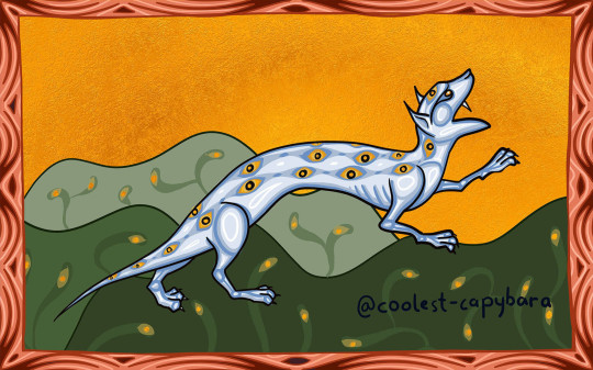
@coolest-capybara (link to post here) has again done some fantastic medieval stylization. I really like the decision to go literal with the "eye-shaped circles" description -- makes me wonder if this fur pattern just coincidentally looks like eyes, or if it's meant to ward off predators. Which raises the question of what this friend-to-all-other-animals, dragons-are-scared-of-it beast is trying to ward off. Also, if you check out the linked post, in addition to discussing design decisions, coolest-capybara has another version of this art where a number of the other beasts they've drawn for this project are indeed gathered to follow the Narngreg's scent -- except for the Choglaem, which is hidden in a cave in the earth.
@karthara (link to post here) notes that big cats are probably the sort of beast that can hold their own against dragons, and they fit the physical elements of the description, so here's a big cat species for you. I really like how the coat pattern turned out; the stripes on the end of the tail are a nice touch. Excellent cats all around.

@cheapsweets (link to post here) has taken an interesting (and very cool-looking) direction here. (And has also provided alt text, thank you.) In their explanation of their design decisions, which is quite detailed and worth checking out in the linked post, they explain that a lot of the influence on the design came from trying to reconcile "gentle animal" with "dangerous claws". What kinds of animals have large claws but aren't predators? Well, there are a few, but the ones they are primarily drawing on are the extinct chalicotheres and ground sloths -- large herbivores that nevertheless possess sharp claws. I think it's a clever direction to take. Additionally, I appreciate the stylized eye spots. And the mane-plus-goatee situation. They've also included some previous Beaſts following the Narngreg's sweet breath, and the Choglaem hiding from it in the upper right there. And, of course, Stylized Plants that they made sure to point out to me. :)
@pomrania (link to post here) had a similar thought to cheapsweets: what creature is gentle but has large claws? a sloth! And since there's no mention of it being arboreal, it can be a ground sloth. (Ground sloths are cool and I like that they came up more than once here.) This little guy is frankly adorable; I love the ear tufts and mane. I can see why other animals would be friendly to it -- it just looks like it would be pleasant to be around. There are a number of non-sloth influences happening here, which pomrania lays out in detail in their post, so go see that.
(P.S. Pomrania: I have no idea what, if any, pattern there is to whether the bestiary authors cite sources for a specific fact. I kind of suspect that the difference is "whether they know where that information came from" and possibly "whether they think a particular source is prestigious enough to be an impressive citation".)

@strixcattus (link to post) is also of the opinion that the Narngreg is clearly a feline, or at least similar to a feline -- they also note the "sleeping in caves" thing as inspiration for the "feline equivalent of bears" approach they took, so we might be drifting back to the binturongs again. Anyway, let's all take a moment to enjoy the incredibly cute scene here. Now, go read the linked post. Strixcattus's practice of turning the bestiary entry into a realistic modern naturalist's description of the animal is on point as always, and you owe it to yourself to read this and the other entries they have written. They're fascinating, especially in the context of the Bestiary Telephone situation.
They also express a suspicion that the cave thing is a Biblical allegory, and... ding ding ding!
On the third day the [Narngreg] rises from its sleep and gives a great cry, emitting a sweet odour, just like our Lord Jesus Christ, rising again from the dead...
Granted, bestiary authors turn pretty much everything into a Biblical allegory. You may also be interested to know that dragons retreat from it because the dragon represents the devil.
Anyway, the Aberdeen Bestiary version, which I have to say is particularly nice this time around:

Yep, this artist had the same idea as coolest-capybara and cheapsweets: the drawing should show other animals following it and a dragon... um... hm. Let's just assume that dragon is supposed to be hiding in a cave.
(I assume the critter is blue in this image because painting it black would make all that shading more difficult, so we're using a dark blue to indicate "black".)
And everyone who thought "feline" was indeed correct, because this is the panther.
Some of you may be thinking, "hey, I don't remember learning any of these facts about panthers."
Some others of you, who are up on your taxonomy, may also be thinking, "hang on, panther isn't a species. what animal did the medieval bestiaries think they were talking about?"
I am delighted to inform you that the answer to that question boils down to Bestiary Telephone! See, classical authors wrote about leopards, as you might expect from people who were kicking around northern Africa and southwestern Asia back when there were still leopards there. But Latin had two different words for "leopard", and as a result people from Europe assumed those were two different animals and panthera must be a separate, non-leopard thing. (How would they know, after all? It's not like they have any Leopard Experience.) The confusion created by this simple mistake continues to reign even to this day: the existence of a "panther" as a distinct species of big cat remains a common misconception, and I bet at least one person reading this was in today's lucky 10,000.
(This is not the only etymological absurdity that comes out of medieval Europeans dealing with What Is Big Cats, but we'll get to that when we get to it.)
46 notes
·
View notes
Note
OH GREAT ONE! Please. . . Can you please give us a tutorial on how to make Pixel Character sprites on Asepeite? You do them so beautifully. . . *Sheds a tear*
please don't call me "oh great one" even as a joke; don't put me on a pedestal. I'm just Some Guy.
anyway there are plenty of cool tutorials on youtube, just search stuff like "pixel art tutorial" or "pixel grass" or "pixel trees" for specifics
but what i'd recommend as my top rule: experiment! make more art! Have fun! just make things and you'll naturally improve
but past that, for some more tangible advice:
look into stylization. pixel art NEEDS clarity and simple shapes to work. you can achieve this by thinking of the shapes (thus the importance of stylization) and by doing simple math or consistent "scales" of going down or up in number. see how the second line goes from looong to long to short shorter then a dot vs. how the left one just does things randomly, there's no scale here. it shows purpose and confidence when you use more math-based art. see how the circle uses the scale/ math vs. this blob where i purposefully didn't?
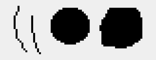
keep the linework clean:

aesprite has a feature called "pixel perfect" which prevents jaggies, which are these clumps of pixels as you can see on the right.
keep the art consitant. don't use blur effects or gradients, i'd say that's more so for VERY rare circumstances and should only be approached from a more experienced hand. (ie, bigger background pieces and used sparingly)
how you draw the shapes/angles matters a lot as well.
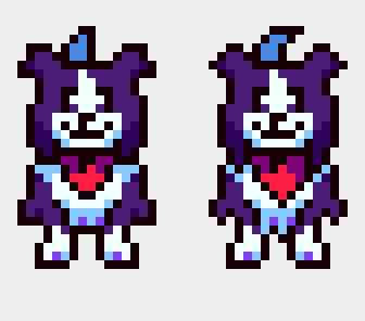
left, i kept things more "blocky" and less "sharp" I also simplified the shape (note the fur on the side of the legs) is more clumped together while the other has a larger emphasis on separating them and making them sharper. overall, the right one is a lot more complex which I don't want for a character who is moving a lot, and seen from a smaller size. its a SMALL cartoon! i want it to be clear to the viewer without any details to muddy things.
note how by making the sideburn fluff more jagged removes some of the room for the white fur. you only see ONE shaded white/blue pixel on the left, which adds more contrast and emphasizes that spot. there's less of a clear distinction between he had and the body.
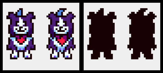
here's the silhouettes, you cans see how the body on the left is more clear in what part is what. Tail, ear, head, body and legs. the other one, sure, i know what those are, but its less distinct.

add "weight" to the shapes. have one side of the shape be bigger in proportion. note how the head has a wider bottom than the top, even from the jaw to the tip of the head. the overall body is bigger than the head as well.
symmetry is important and your life savior in pixel art. but not EVERYTHING should be symmetrical. look at the head stripe, mouth, chest fluff, and handkerchief. have one side favored or the other and not a perfect head-on position creates this asymmetry as well a more "organic" view of the character. (typically you want to avoid direct head-on looks unless it's for 3d modeling or character reference sheets, otherwise your character won't feel as "alive." it's not natural to stand perfectly 1-1 facing the camera perfectly)
note on legs and bodies: you can't always get an accurate symmetry based on the head size. depending on if it's an odd or even number of pixels wide, it'll affect how the body becomes symmetrical to it. in this case, there's a pixel difference that prevents a gap. note how the middle looks like a SUPER thick line because there's no room for a single pixel line. my solution was to have her favor one leg over the other, which works nicely as it adds a more weighted interest to the right leg while her bangs favor the left, creating balance. toby's solution to this problem was to give the humans one wider leg and it haunts me.
another example of this is toriel

toriel's side mouth would be fine if it was a consistent choice and other characters did it (sonic is famous for this stylistic choice) but because she doesn't even match her family regarding this, it stands out and confuses people. i originally, and many people I've met have thought this was her nose. EVEN THO you can see her mouth open when speaking in-game.
btw even tho this also haunts me, i don't mind it as much cause i know this is a result of early game development inconstancies born from inexperience. its a cute quirk honestly, even if it was an easy fix. i actually ADMIRE that toby doesn't go and retroactively fix things, and instead prioritizes making new things with the information of how to do better now. its very easy and exhausting to go back and fix things rather than move on. mad respect for that.
34 notes
·
View notes
Text

Look at these meow meows. I’ve gotten so much better at art.
P.S. if you wanna see my middle school art it’s under the break
Ok so this is from 2015. I was in middle school and this was my first creative scene that wasn’t a character standing looking straight at the fourth wall.
Look at those cutie patooties.
Next is 2016, with a significant improvement already. While I never drew seriously wanting to improve my style before the first drawing, I spent a year developing how I drew and this was the result of that. Do they all have the same face? Yes. Is it impossible to tell at a glance which character is which? Definitely. Still better than the first one tho
Now we’re onto 2017. I did this in one night for inktober. Some of the proportions are a little wonky, and I knew that at the time, but I kinda rushed to get it done. Though, my Facebook friends thought it was pretty cool.
Up next is 2018, the first digital piece. I did this on my phone with my finger. Also, the characters finally have different fur patterns! Even if three are solid color cats, it’s more detail than before.

Now here’s 2019. I upgraded once again to a drawing tablet and Paint Tool Sai. Nowadays it’s not my preferred software, but it was a really nice one to start off with. I also played around with lighting, trying to make sure that the light source was consistent with the background and to make the shading more than an airbrushed black.
2020 had a dramatic change! Still on Paint Tool Sai, you can tell that I am more comfortable with drawing on the computer. My favorite bits have always been the cat in the foreground and the angry spiky one

I went in a more stylized direction in 2021. Though the background is a little strange, you can really tell I was trying, especially compared to the empty plane of green from the last year.
And again, here is this 2023’s version! This took me like 8 hours of solid drawing. I also only used the lasso for all the coloring and shading. I’ve been a big fan of cell shading recently, I will admit.
#warrior cats#warriors#warrior cats fanart#oc#oc art#ocs#my ocs#warriors oc#redraw#draw this again#self improvement#art improvement#im proud of myself#flowerheart#october redraw
10 notes
·
View notes
Text
Mmm some feral angst, because I was listening to Penelope Scott music, so the lyrics are in there, very good music, very nice, good ear drum vibrations, oh and a lil bit of will wood lyrics in there

Now time to info dump on all of this fluffy goop rabbits trauma for fun.
-First things first, the goop is his true form, kinda, he has so many "forms" because he's literally just a pile of dark smokey purple amalgamated rabbit soul goop that can change into whatever shape it wants, as long as it's in theme, so there's not that many options really
-This wasn't true in the earlier drawings but I've decided that feral shall exist after the good ending.. So everyone but him is dead basically and he's all alone, and may I remind you of daves abandonment issues, bunni man is lonely, also why he's living in the clubhouse dumpster now, it's close to many versions of the person he loves
-but also, he doesn't really know how to not define himself by the people he's close to, so being close to the many jacks may be a one step forward (for accepting that his jack isn't coming back) two steps back (the whole, wanting to be close to the person who killed him twice thing) situation
-notice how he called himself an experiment, but not a failed experiment, because if I recall correctly from the Henry tapes, Henry wanted him to leave his body for good, which he has, and see if heaven or hell exists and return back to him to tell him what he saw, and he has. He is very much a successful experiment. Luckily henry's been killed in the good ending so that won't happen... [imagine a slow panning shot to the legacy jacks in the clubhouse, for comedic effect]
-because of the whole dying over and over and coming back to life through shear stubbornness and perseverance, his soul is rotting and tearing apart, the rot being responsible for the goopy appearance that holds him down from floating like the other ghosts, and the tearing apart resulting in his more amalgamated appearance, his fur in the goop mode also looks a bit like cartoon/stylized smoke because of the whole burning alive part
-Feral tries his best to just, not think to detract himself from all the bad stuff in his mind that typically boils up to the surface when he's alone for too long, whether that distraction comes in the form of alcohol, whacky hijinks, begging for affection or drugs depends on how he's feeling
Alright I think I've met my daily quota of pointless rambling now, goodbye
Lil edit:... I forgot his crown and whiskers... And I'm way too tired to fix it... [SWEAR WORDS]
10 notes
·
View notes
Note
what's it like wearing a fursuit? is there some kind of standard that the person who creates it is expected to hold up to? i remember as a kid watching a yt video of someone in a quad Epona costume walk around a convention on all fours/stilts and always wondered how it was possible.
Fursuits have an absolutely fantastic history! The first fursuits were acts of absolute love towards the characters they represented - made of really whatever ppl could get easily. Faux fur, upholstery foam, mascot suit materials. Over the decades fursuit makers have been making HUGE advancements, and these days fursuits come in a variety of materials and styles. It's wild.
One of the oldest fursuit resources on the internet is Matrices.net and Matrices has been in the Fandom since 1998ish. There's tutorials on the site that show various methods of making fursuits. I'm talking about this bc it's important since you're asking what it's like.
There are some basics to making the suits. Faux fur, of course, and you want better quality fur. Minky or fleece for pawpads and claws and tongues etc. For the head, bases can be made from plastic canvas mesh (though the plastic eventually becomes brittle), upholstery foam (pretty standard), or a resin base (these started popping up a decade? Maybe a little more ago and are pricier). There are also various styles, such as realistic, cartoons, stylized (like my suit, Asher, the suitmaker has a unique style), kemono (Japanese inspired, animated huge eyes with small cute muzzles) and oftentimes how comfortable a suit is is a combination of material and style.
A resin based, toony style head is going to be more breathable than one that is made of foam most of the time, because often the resin form allows for more room in the head for a person's head. Realistic style heads can be stuffer and slightly less comfortable, resin or foam, because the only air holes in the head are the tear duct viewing holes and the mouth. Kemono heads are notoriously stuffy because they often have little air flow (they have huge eyes, but the eyes often have plastic coverings to make them shiny).
Are fursuit makers held to a certain standard? Yes, I mean not like legally I suppose? But the furry Fandom does hold makers to a standard. If your suits are uncomfortable, you'll hear about it. If your service is bad, you'll get bad reviews. If you use poor materials or half ass the construction of your suits, you WILL be called out on it. There are, of course, popular makers that have avoided being dragged for things they should have been, but in general if you're doing a bad job and your suits are shoddy, people will not buy them and will also tell others about it. Sites like FursuitReview allow ppl to submit reviews for makers in one place making it easier to see if the maker you're thinking of is a good choice or not.
Now, sorry this is very long winded, for my suit Asher, it's decently comfy though stuffy. I did a bad job measuring my head before ordering and the fit is very snug. Not uncomfortable but stuffy. The eyes are a decent enough size to see through, and the mouth is open enough to breathe ok, so overall it's a nice time. The only thing is that, since the head is foam with a faux fur covering, it gets WARM. And there is SWEATING. So Much Sweating. That's par the course for a fursuit, so taking frequent breaks and drinking plenty of fluids is a must. I wore Asher for almost three hours today, took a few breaks and drank water on them.
I'm sorry this was so long. D:
16 notes
·
View notes
Text
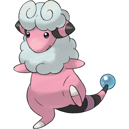
The Mareep Family
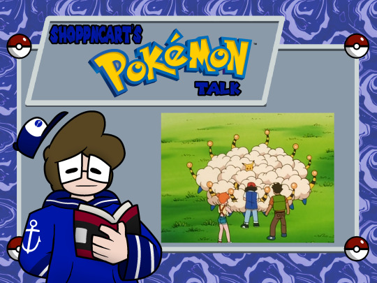
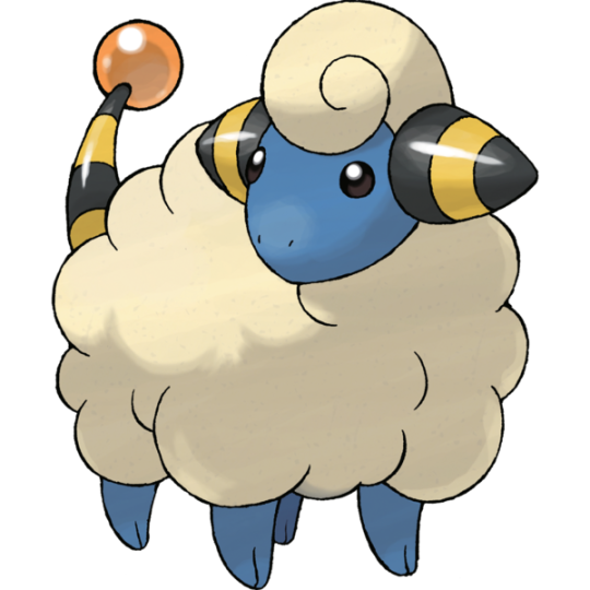
Mareep is this generation’s premier Electric type, because while Chinchou came first in the Pokedex, Mareep is available to players much earlier on in a similar manner to Pikachu in the first generation games. It’s a clever idea for a design, being a little lamb whose fur is so staticy that it can produce electrical jolts to attack. The name is an anagram for ampere, a unit of electrical measurement, which is clever as well. Mareep also serves as an indirect reference to the novel title Do Androids Dream of Electric Sheep? which was actually the book the movie Blade Runner was based on. Huh. I didn’t know that before getting the book title, actually.
Mareep itself though is a very cute design, being a good combination between a little lamb while still having electrical monster traits to it, given the bee-striped horns and tail, and the little bauble at the end of its tail. The blue skin is a good touch too. Along with Chinchou, it starts Pokemon’s trend of using blue to visualize electricity along with yellow. Mareep’s Shiny color also makes its wool solid pink, which is just lovely if I might add.
Mareep’s first evolution is Flaaffy, who becomes bipedal and fully pink to boot. It loses some of its wool as well, but at least still has a bit surrounding its head like a hood at least. Still very cute.

Mareep’s evolution culminates in Ampharos, and it is pretty weird to put this thing side by side with the little lamb we started with and claim they’re a part of the same family. Ampharos is kind of implied to be a sheared sheep at this point, but has evolved to take a more unique overall body shape. It at least retain’s Mareep’s cool yellow and black striped appearance, with red baubles to accent it. Ampharos is one of those more stylized original designs similar to Nidoking and Electabuzz of Gen 1, so I appreciate that much about it.
Ampharos also seems to be partially based on a lighthouse, as evidenced by the fact that it even operates one in the Johto region. It uses the baubles on its head and tail to act as beacons to assist people, which is a neat idea.
When looking at Ampharos with a more critical eye, I do see the stranger qualities of it, and how little it feels like Mareep and even Flaaffy in design. However, it’s still pretty charming in its simplicity and works well as another nondescript electrical creature, and the little altruistic side to it is a pleasant addition to Ampharos’s overall design. It being so useful during gameplay in the Johto region as an easily accessible Electric type also makes me enjoy it quite a bit.

Ampharos would also be the first Gen 2 Pokemon to receive a Mega Evolution, where it inexplicably gained the Dragon type. I can only assume this is purely due to wordplay, considering its Japanese name is Denryu.
Mega Ampharos succeeds in being a sheep in that it’s regrown some of its wool, with the bunch on its head looking like a luscious flowing mane, constantly being blown in the wind. How majestic. The additional baubles on its tail are neat too, adding some nice dots of color to it. Mega Ampharos honestly deviates so little from its normal design I could see this working just as well as being retconned into Ampharos’s standard appearance, and it’d help it resemble its sheep origins better anyways. This likely won’t happen, so I’ll still accept normal Ampharos. The Mega is a good improvement on its design in the meantime, though.
Score: 4/5

A good combination of element and animal, with a more unique evolutionary path.
[Gen 2 Archive]
16 notes
·
View notes
Note
Personally I think Whisperwillow's/Kiwi-rot's designs are gorgeous but they've 100% become afflicted by the cs and popufur mindset. Mod, would you be wiling to do a breakdown on their design style?
hell yeah let's gooo

So immediately we have a theme of light pastels with low contrast, black and white with small color pops (usually red) and webcore. We also have bodies that are largely triangular, with a small torso and wide set lower legs. This is pretty common in popfurs but I will say that diversifying the bodies you draw will vastly improve your work. Same with hairstyles and texture. Introducing curls and more unique styles beyond default long and short would really help this artist's work shine.

fine design overall, not the most unique but the anatomy is stylized nicely and the design is balanced well with the yellow star accents leading to the face and the smaller accessories clustering around the face as well.
As a personal note I would have dropped the chevron on the leg just because the clouds are enough detail already and you risk leading the eye astray with weird patterns that don't contribute to the theme.

I understand the aim of cyberpunk aesthetics is to be very colorful and eye-catching, but the markings are placed rather thoughtlessly and it feels cluttered. dropping either the leg chevrons or the stomach and thigh markings would help greatly with this issue. The arcade carpet pattern on the arms is cute, but it feels weird to have a design in a style as simple as this one have so many colors. I think that keeping to one rainbow pallette rather than having two of each color in varying intensities would really do you a favor.
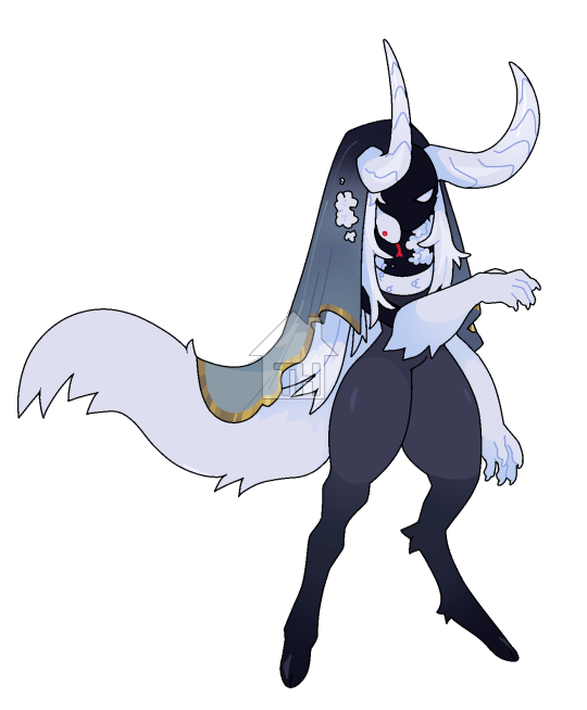
This one is really nice tbh! It reads to me as early game concepting and the balance of the large curved horns, small frame, and the veil leading into the tail creates a really pleasing visual track to follow. The colors are cohesive and the yellow leading into the main color pop, the red, is really lovely and minimizes clutter while keeping the design impactful.
If there's one big thing I would criticize, it's the sizing and placement of the fur texturing. I talked about big medium small principles in another crit post, but essentially, all the tail fur spikes are about the same length and size, same with the hair chunks. It leads to a more static design and I think this artist could really be a great designer if they pushed harder for stronger and more conscious use of design principles.
Overall I like the designer and I'll be using some of what I found in their style in my own. I hope they keep drawing and improving in the direction that benefits them best without the stagnation that tends to come with adoptables.
13 notes
·
View notes
Text
That new character...... I think they're definitely like a mobian wearing some kind of robot armor. Like you can see a tail sticking out and from what little we see of them their movements are very organic-looking
Also the tail looks spiky? It could be stylized fur but it could also be like a scaly lizard tail. The spikes on their headpiece give me like. Cartoon dino vibes. So I'm betting on some kind of lizard
We don't have many reptile characters in sonic so it'd be nice to get a new one. The only ones I can think of are vector and that one snake from archie that I forgot the name of lol
4 notes
·
View notes
Text


Commaclaw! Did y’all know that a comma is a type of butterfly? I didn’t before I started drawing her! The more you know 🌈
Not a fan of Lilystar, and loudly so. Actively wishes that her mother, Gingerclaw, would be leader so she could be made deputy. Also doesn’t trust Ravenfur, and wants to make Spiderflower medicine cat instead.
An incredibly skilled fighter who’s oftentimes too brash for her own good. She’s quick to anger and quicker to strike.
Daughter of Gingerclaw, sister of Spiderflower from an older litter. Mother of Rowanpaw.
Dislikes several cats within SunClan (Goldennose, Duskblaze, Bramblingberry, etc), but puts on a nice face solely for the popularity. After all, you can’t really get anywhere in this Clan unless you’re well-liked.
Heteroromantic-Bisexual, cis female, she/they.
[Image ID: Two images- The upper image is of a simple white box with the black text of “SUNFLOWERCLAN - The Warmhearted and Bold” written across it. The lower image is a digital drawing set against a translucent background, of a large, somewhat thin, short-furred, somewhat spiky-furred, mostly red-orange mackerel tabby cat with black patches and cream fur at her paws, forelegs, belly, chest, and muzzle; her tail is thin and curled upwards, and her ears are tall and tufted; her eyes are pale yellow and narrowed, with a scar running across her right eye; there is an x-shaped scar at her left shoulder, and another scar at her right leg. Across her hindquarters is the stylized artist signature of “spottyissleepwalking” written in faded lavender. Above her is a white box with the black text of “COMMACLAW - a black and red, mackerel tortoiseshell-tabby she-cat, with short fur, and yellow eyes”. /. End ID.]
13 notes
·
View notes
Text
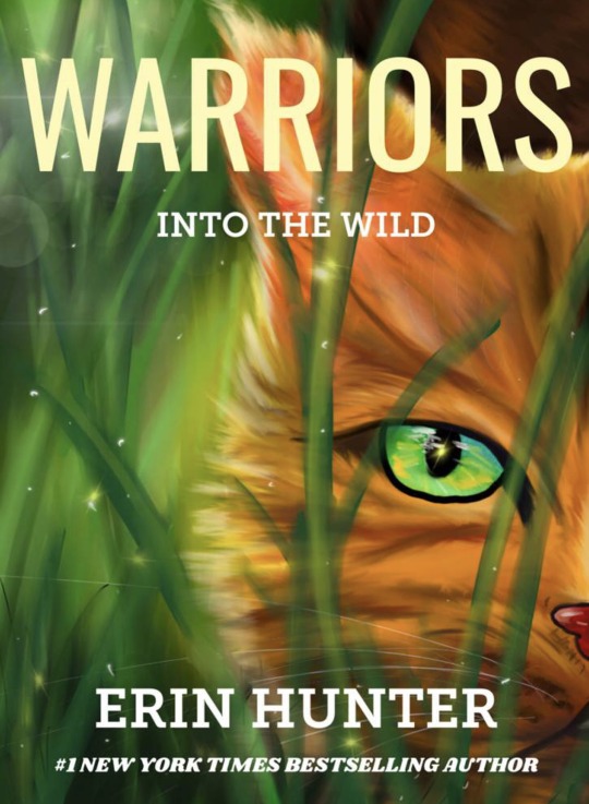

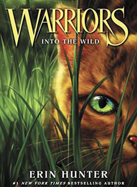

A debate that has been going around the Warriors fandom for some time now is which covers the fandom prefers. Here we have an artist’s interpretation of the newer Into the Wild that they actually redrew. I think the redraw looks excellent! But going back to the topic at hand, there have been several artists responsible for different Warriors media. The ‘manga’ or comics are mostly done by James L Barry who has a very cartoony and stylized style. The covers have always stayed true to the more ‘realistic’ art style with slight stylization in certain places. There was also a change in medium from the older covers to the newer ones. The newer ones are done with some digital program, mostly likely Photoshop or the like while the older ones were traditionally painted using oil or a similar kind of paint. The original artist behind the original covers was Wayne McLoughlin who was also know for the iconic center portrait with an important character. He usually painted a less detailed scene for the background which added super nice contrast. Wayne’s covers were super unique and eye-catching even though some of the character designs were wrong. After Wayne’s unfortunate death, Owen Richardson took over the covers. He usually does super hyper realistic cats on the front, either one or two but recently (during the Broken Code) there were almost Wayne inspired covers with a large cat portrait at the center with a less detailed background. There are tons of debates on which are better and ultimately it comes down to personal preference and who’s style you prefer. Art is subjective and we can’t label one as bad and one as good. I personally think both Wayne & Owen are extremely talented artists who deserved their position. I personally prefer Wayne’s style as I feel his covers are more unique and I LOVE the traditional look. His character designs are also super fun and even though he draws realistic there is so much character added to these cats. But I don’t hate Richardson’s covers. I think he is super talented with how he paints the fur, it looks like a photograph! But I want to know what YOU think. Do you prefer Wayne or Owen’s style? Which covers did you end up owning? Or would you want another artist to take a spin at it? Leave all your thoughts, opinions and feedback in the comments below. While you are at it, consider leaving a like on the original post on Amino. Supporting the artist directly benefits this account as it motivates more people to allow us to post their work. Do you want to see more like this? Join the Warriors Amino where we have daily posts all about these battle cats.
Original Post linked here.
Original Artist linked here.
~ 🍵🥔
#warrior cat#warrior cats#art#cat#warriors amino#warriors#warriorcats#digital art#amino#warriorsamino#digitalart#warriors into the wild#into the wild#book cover#redraw
2 notes
·
View notes
Text
★-Painting Textures on a rat-
-Using substance painter-
I started off with adding the skin smart material as it had a really nice ombre and I really liked the colour, as I wanted the rat to look stylized I got rid of all the texture detail and made sure it was only the Ombre and colour that was left.
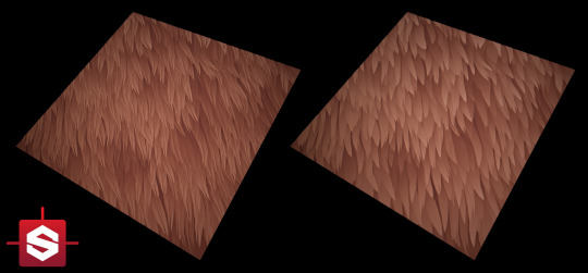


Here are some examples of the texturing techniques I looked at.
I started painting on details like the fur around the feet and tail to give it a bit more detail before moving onto the ears and eyes, I added a bit of shading to the feet and fur.
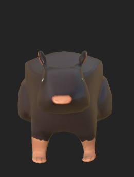
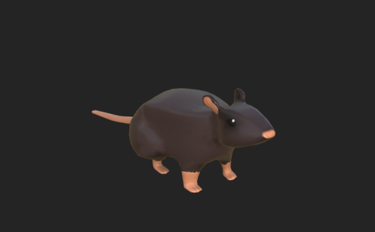
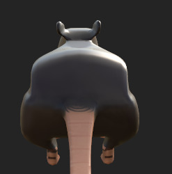

My teacher Chris helped me by adding a fur pattern that just added to the stylized look, I really liked it so I wanted to keep it however the shading was incredibly messed up due to me not shading correctly.
I decided to redo the base colour layer and redraw the fur in the same style in a colour that worked.
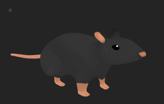
I chose some areas to put lines on the 3D model, these being more specifically where they would be on an actual drawing like for example the line on the back leg and up the front legs. I ended up adding depth to the ears and neck by shading them a darker colour, whilst also shading the eyes to add depth.
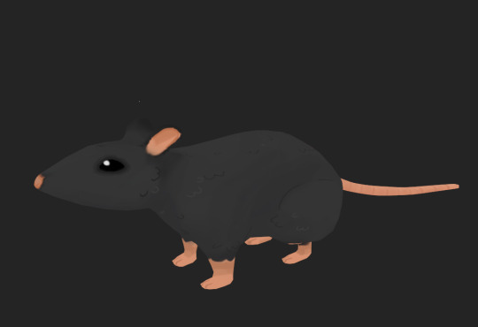

My Overall Thoughts
After making the model at first I wasn't proud of it, I felt like it looked wrong and I couldn't figure out how make it look more professional as a stylized model. However after taking a step back and looking at it again, I do really like it and it was pretty much what I was aiming for, I was just being overly critical.
0 notes
Note
What would your ideal outfit for a ball at Lost Hope be?
Ooh that's a good question! In the book they all wore very up to date fashionable clothing there, but 1810's is later than my favourite eras of fashion, so I'll assume I can dress more like they did in the mini-series where everyone's in fashions of various different eras.
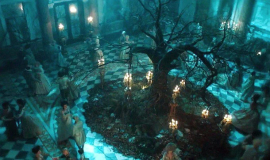
(Not the most accurate, but hey, they're mostly extras and it's a fantasy scene so I don't mind, especially since the main characters have such good costumes.)
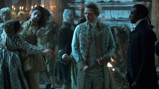
With the lighting it's hard to tell what the colours are, but it looks to be a lot of pale greenish greyish colours, which I quite like. I am very fond of lichen-y greens.
My first instinct would be to say a 1740's or 50's suit with frogging on the coat, kind of like this one, but in foresty colours to give it a mossy appearance.
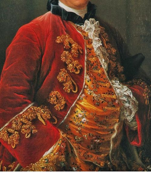
(Georges-Louis Leclerc, Comte de Buffon, by François-Hubert Drouais, 1753.)
I'm not sure if that would be appropriate for a ball though. I don't know for sure, but I get the impression that these frogged coats tend to be more informal? And quite a large portion of them are fur lined ones which I think are more for at-home wear.
It would be so much fun to make frogging that looked like little clusters of lichen and mushrooms, on a fabric that's.. hmm, maybe light brownish grey silk brocade that's woven to look like stylized tree bark texture. And I'd have a contrasting waistcoat in lichen green, with a lichen and mushroomy pattern either embroidered or woven to shape.
And of course the usual accessories - shoes with pretty buckles, white stockings, queue bag, plain white neck stock. I'd have my hair nicely styled like this (or Maybe a wig, since my hair is getting quite thin and harder to style):
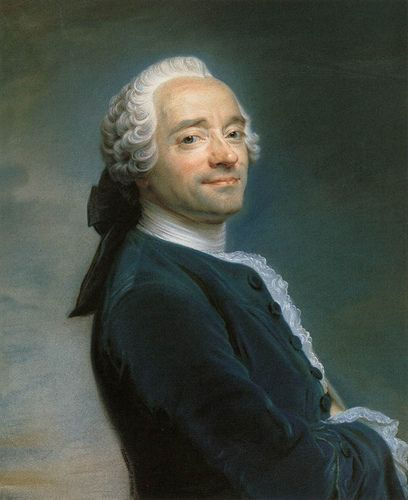
(Maurice Quentin De La Tour, Self portrait, 1751)
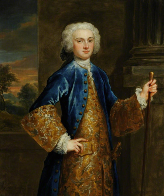
But if propriety forbids my possibly informal frogged coat then I think I'd have go 1730's.
I do love love love the fashions of 1785-95, but I'm honestly not so keen on the court dress from that era. That particularly popular style of polychrome floral embroidery on dark velvet with little woven geometric patterns just doesn't do it for me. Late 80's-early 90's is my long time favourite, but more for the fun mix and match stuff, and all the wacky patterns and embroideries. I'm also not quite as fond of the cuts of late 18th-early 19th century court suits as I am of everything else.
But the 30's! No weird mixing of dark geometric velvet and bright florals! And the fuller coat skirts would look nicer while dancing.
(I don't know how to dance at all, but I'm assuming I'd learn pretty quickly if I was kidnapped by fairies and sent to dance at a ball all night every night.)
I'd want a suit that's cut basically the same as this 1730's one I finished last year.
youtube
But with the breeches and the coat in plain velvet in either green or brown, and the coat cuffs and waistcoat in a contrasting brocade in mostly pale greens and greys. I like it when the coat has contrasting cuffs made of the same fabric as the waistcoat, and it continues well into the 18th century in some capacity, but was much more popular earlier. Which makes sense, since it works so much better with those bigger styles of coat cuff!
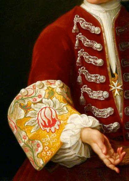
(John Vanderbank - John Bourchier, 1732)
Yeah I could just use a plain contrasting silk and embroider it instead, but I'd prefer to do that thing where you've got a gorgeous brocade with an absolutely enormous asymmetrical pattern and the repeat is so big that you can't see the whole design on your waistcoat, and certainly not on your coat cuffs, so you've got unique and varied little chunks of the design.
(Young Knight of the Order of St John by Antonio David, c. 1730, detail)
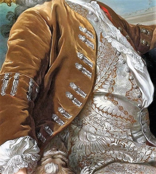
(Portrait of a Gentleman, Louis-Michel Van Loo, 1734, detail.)
So a big brocade like that, but in a more whimsical pattern depicting twisty old trees and mushrooms and lichen and such.
It's a good thing the fabric I'm describing doesn't exist to tempt me, so I can't add this to my already horribly long "to sew" list.
And with the buttons and buttonholes all done in silver thread, like the ones above. Not this layout though, I'd want mine evenly spaced and I wouldn't put those extra buttons on the buttonhole side.
The shirt would be pretty much like the one in the above portrait, just a normal fancy shirt for the 30's with some nice lace. And as long as I'm describing fantasy textiles for a fairy ball, I also want a pattern of little mushrooms woven into the lace itself.
Ohhh now I'm sad that I can't have some nice cotton or linen lace with a pattern of little mushrooms in it :( Maybe I could do some whitework embroidered ruffles like that someday...
Ok, yes, that is what I'd wear! 1730's suit in muted brown or green velvet with a waistcoat and coat cuffs in pale green/grey brocade with a huge woven pattern of forest-y things, and with silver buttons & buttonholes.
Same accessories as I said for the one with the frogging, because stocks and queue bags and buckle shoes are in fashion for quite a long period of time.
Normally the shoes and queue bag are black, but for this maybe I'd soften them down to a nice grey. Early 18th century men's shoes aren't nearly as cute as late 18th century men's shoes, but oh well! I'd still feel darn cute in such an outfit, with my big swishy coat and my hair in nice little poofy curled sections at the sides.
That was really fun to think about, thank you for asking!
103 notes
·
View notes
Last Seen Blogs

starlit-spookie
Pump/Spooks
conjectureand-gloom
alex
iamshatricerenee
Its Just My Opinion
jeruwritingsins
JERU🦋

morningtou
Whatever I'm Thinking About