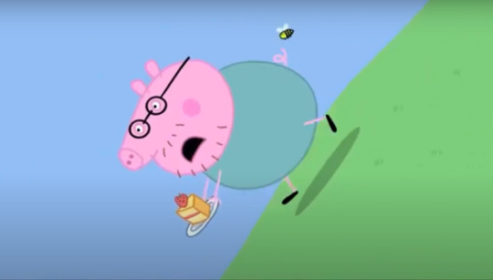
#literally me though
Text
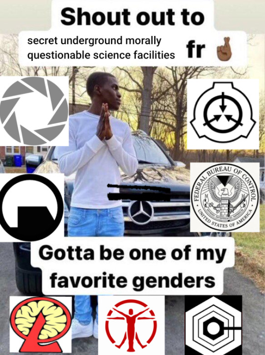
#Updated!! Cause sooo many people asked for lobcorp and a bunch of others#lobotomy corporation#fallout 4#inside job#scp#portal#half life#control 2019#literally me though
9K notes
·
View notes
Text
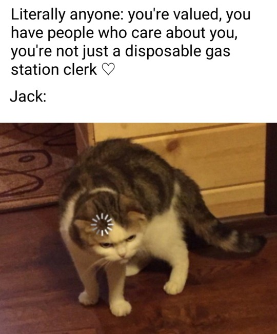
#tales from the gas station#tftgs#tales from the gas station memes#tftgs memes#jack townsend#gasstationjack#memes#literally me though#me n jack are starting a low self esteem squad who wants in
82 notes
·
View notes

Note
You have no idea how much I both live and fear all versions of Tails
Mange is so funny to me.... he hisses and growls and says one (1) word!!! He's so silly! The silly!!!
#sonic prime spoilers#sth#answered asks#literally me though#i want to growl and hiss and bite people :(
9 notes
·
View notes
Text
if I had to summarise my current read in one image
#the book I am reading#currently reading#shadows of the apt#empire in black and gold#wasps#forget winter is coming#wasps are coming#literally me though
3 notes
·
View notes
Text
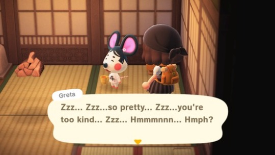
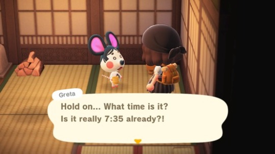


glad to see my ACNH villagers also have adhd
#literally me though#ACNH#animal crossing#new horizons#acnh screenshots#acnh island#acnh villager houses#acnh interior#acnh blog#animal crossing blog#new horizons blog#acnh blogging#animal crossing villagers#ACNH villagers#acnh greta#acnh community#animal crossing community#gaming
4 notes
·
View notes
Text
Sometimes being an artist is feeling like a baker seeing a chemist making the deadliest liquid in the world and wishing you could make the deadliest liquid as well but you're a baker, not a chemist, and then you feel like your bread is worthless
#my stupid thoughts#this doesn't make any sense and that's the whole point#sometimes you see cool art and you love it and wish you could do something as cools as that#but it's simply *not* your style at all#and you end up thinking what you make is bad though it's not#it's literally just different#anyway that's me I'm the baker
27K notes
·
View notes
Text
friend wanted to see my tumblr, and when i told him i can’t show it to him bc it’s basically my personal diary he went “oh so I can’t see it but a bunch of strangers on tumblr can??” he literally does not get me. no one will get me like the people in my phone get me
#It’s just so different#even though it’s public it still feels secret and safe. i feel comfy sharing a lot more on here than I do in my actual day to day life lol#in my head I’m also just speaking to myself 90% of the time which helps#if a friend off tumblr saw my thoughts I’d feel so weird ab it#esp bc they might get the vagueposting about certain situations and tell mutual friends#no thank u. this is for me. I’m not about to start censoring my thoughts bc someone I know knows my tumblr#u guys literally saw me have LIVE BREAKDOWNS#meanwhile I’ll have the worst fucking day in history and tell no one about it. I’m already cripplingly private but way more so in real life#this is basically a low stress journaling outlet for me. it’s so important for me to maintain the separation#like this is actually my diary & has been so handy for letting out emotions / articulating thoughts / staying on track !!#& I’ve met so many kind people on here who actually get me. which is so hard to find irl bc I’m surrounded by pre-med gunners/overachievers#who are by standard not very good w emotion & can be competitive/judgmental. or at least it’s hard for me to be vulnerable in front of them#and I’m part of that crowd so I reserve my emotions only to a handful of very close friends#it’s nice to hop on here and express negative emotions!! or positive emotions!! just whatever I want and it’s low stress and people get me#I don’t have to worry about judgment or competitiveness etc etc#like everyone on here is so kind & nice & understanding. & just a breath of fresh air from the types I run w. it’s just nice to have this#so idk that’s why I think I’ll always be strict about keeping the worlds separate. it just works#p
6K notes
·
View notes
Text
spock , roughly two seconds before doing something so unhinged no one else has even thought of it : good thing i’m a vulcan and i would never do something irrational or illogical lmaoo
#y’all remember the entirety of the galelio 7 when his solution to everythjng was just to Fuck Around and Find Out#in the amoeba episode where he was like no guys don’t rescue me it’s for Science#the man trap when he was slapping the monster in the form of bones’ former lover to snap bones out of it#um the one where got infected with those fake throw up thingies and BLINDED HIMSELF ??#the one where his father was Dying and even though there were plenty of other people who could command the ship He Needed To Do It#several other instances i am forgetting#i literally love him#star trek#spock#s'chn t'gai spock#mr spock#captain kirk#doctor mccoy#dr mccoy#incorrect star trek#jim kirk#leonard mccoy#mccoy#star trek tos
3K notes
·
View notes
Text
Another year of a wonderful partnership (Happy birthday Ink!)
#ink sans#undertale au#des art#ITS INK'S BIRTHDAY WOOHOOOOOO#seriously though i am very happy he exists#he is literally such an inspiration to me even though fictional#thank u comyet
2K notes
·
View notes
Text
i now understand how certain people felt when harpy eda was revealed 😳
prints here
#toh#the owl house#toh fanart#lilith clawthorne#hooty#toh finale#watching and dreaming#captioned#WOW. WOOO OW. GOODNESS. MA'AM. QPR PLEASE??? PLEASE??? WOW#i both literally am her and i want to kiss her. Wow!#she is the ideal woman. her particularly early 20th century fashion sense. she's a big nerd. she appreciates history. she's aroace. she's a#bird lady who can fly. she has curly hair. Oh Jeez It Does Not Get Better Than That#sorry anyway i cant believe i won twice in a row with ladies (queen and lilith) who are specifically tailored to me and no one else /j#digital art#illustration#a small victory against my art block even though this took like 4 or 5 days to chip through. but i did it#there are some parts i feel a little clueless about so#critiques welcome#lilith please pick me up and fly my gay ass off into the sunset please im beg
8K notes
·
View notes
Text
Thinking about how Victor Hugo wrote one of the most famous portrayals of prostitution that is sympathetic to the prostituted woman (Fantine from Les Miserables) and shows how she is forced by poverty to sell her body, how it clearly is a traumatic experience, and how much disrespect the pimps have for her in reality... And yet he continued constantly visiting brothels and using the women's bodies - so much so that a very famous rumor was created that all the brothels in Paris closed down to mourn him after his death... Kill all men?
#not to pretend Fantine's character is the epitome of sympathy though (lolz) but it makes me feel insane#like he literally KNEW they were only there because of being forced (sexually or economically or socially) but he DID NOT CARE#like........#mine#history#radblr#victor hugo#les mis#anti prostitution#🐝#hall of fame
2K notes
·
View notes
Text
saw the event announcement and had to immediately drop everything and get back to my favorite pasttime (drawing Lilia). sure don't want me saving up my keys, huh, do you Twst?
#art#twisted wonderland#twisted wonderland spoilers#lost in the book with stitch#just literal actual stitch is showing up now huh#not that i'm complaining mind you#that choice of ssrs though. i'm a little scared of what the story is there#stitch and lilia makes me go 'ha ha whoa okay everyone batten down the hatches it's about to get weird!'#stitch and floyd makes me go 'we have to leave. take nothing with us. we have to get out of here nOW'#sure it looks like charming ukelele duets and sunshine#but what happens AFTER that huh#(probably a nice refreshing beverage and some shuffleboard)#(but i'm not going to count on that)
5K notes
·
View notes
Text
I think 90% of my gripes with how modern anime looks comes down to flat color design/palettes.
Non-cohesive, washed-out color palettes can destroy lineart quality. I see this all the time when comparing an anime's lineart/layout to its colored/post-processed final product and it's heartbreaking. Compare this pre-color vs. final frame from Dungeon Meshi's OP.


So much sharpness and detail and weight gets washed out and flattened by 'meh' color design. I LOVE the flow and thickness and shadows in the fabrics on the left. The white against pastel really brings it out. Check out all the detail in their hair, the highlights in Rin's, the different hues to denote hair color, the blue tint in the clothes' shadows, and how all of that just gets... lost. It works, but it's not particularly good and does a disservice to the line-artist.
I'm using Dungeon Meshi as an example not because it's bad, I'm just especially disappointed because this is Studio Trigger we're talking about. The character animation is fantastic, but the color design is usually much more exciting. We're not seeing Trigger at their full potential, so I'm focusing on them.
Here's a very quick and messy color correct. Not meant to be taken seriously, just to provide comparison to see why colors can feel "washed out." Top is edit, bottom is original.
You can really see how desaturated and "white fluorescent lighting" the original color palettes are.
[Remember: the easiest way to make your colors more lively is to choose a warm or cool tint. From there, you can play around with bringing out complementary colors for a cohesive palette (I warmed Marcille's skintone and hair but made sure to bring out her deep blue clothes). Avoid using too many blend mode layers; hand-picking colors will really help you build your innate color sense and find a color style. Try using saturated colors in unexpected places! If you're coloring a night scene, try using deep blues or greens or magentas. You see these deep colors used all the time in older anime because they couldn't rely on a lightness scale to make colors darker, they had to use darker paints with specific hues. Don't overthink it, simpler is better!]
#not art#dungeon meshi#rant#i'm someone who can get obsessive over colors in my own art#will stare at the screen adjusting hues/saturation for hours#luckily i've gotten faster at color picking#but yeah modern anime's color design is saddening to me. the general trend leans towards white/grey desaturated palettes#simply because they're easier to pick digitally#this is not the colorists fault mind you. the anime industry's problems are also labor problems. artists are severely underpaid#and overworked. colorists literally aren't paid enough to do their best#there isn't a “creative drought” in the anime industry. this trend is widespread across studios purely BECAUSE it's not up to individuals#until work conditions improve anime will unfortunately continue to miss its fullest potential visually#don't even GET ME STARTED ON THE USE OF POST-PROCESSING FILTERS AND LIGHTING IN ANIME THOUGH#SOMEONE HOLD ME BACK. I HATE LENS FLARES I HATE GRADIENT SHADING I HATE CHROMATIC ABBERATION AND BLUR
2K notes
·
View notes
Last Seen Blogs
n3rdy-draws
n3rdy-draws
skamkollektivet
SKAMkollektivet
jszx
Jszx

rkcouple
Untitled
krokir
⭐SCAN ARCHIVE 💫