#its like. one of those things where i love to add detail and shapes to the way i color things but it doesnt mesh well with my style.
Note
I'M FUCKING SCREAMING THE SCREENSHOT REDRAWS?!?!? RAAAHFHGHFHGHHDG

THEY ARE JUST SO.
WUAGH TY,,,, i had so much fun doing them
its something id always wanted to do and it was so much fun hehe

#it makes me want to do more but i dont have very many good screenshots wha <3 maybe ill open requests for them one day idk#once the all stars movie comes out ill totally do it with supreme lol#its like. one of those things where i love to add detail and shapes to the way i color things but it doesnt mesh well with my style.#so being able to just use in show screen shots i felt like i could just go wild lol#idk. maybe its too jumbled but. i had fun and learned a lot <3#still gotta work on my faces tho lol shading them is so hard the shapes are so strange
5 notes
·
View notes
Text
Tips on Pacing
We, as creators, seek that hook that gets the readers invested and keeps them that way. Nothing does that better than tension. There are all kinds, but it often occurs between characters. The "do they like me" of romance, the interruptions of erotica, the intense adversary from an unknown opponent, or the whodunits of mystery; Tension comes in all shapes and sizes, but it boils down to one thing, leaving the readers holding their breath in anticipation of the next page.
A large part of the creative process is figuring out how to create that tension without leaving the readers wanting to quit out of frustration or confusion. I would like to say there is a correct way to pace things, but it depends entirely on the story and situation.
Action scenes, for example, move very quickly, whereas a scene with a lot of dialogue will move at a snail’s pace. A spicy scene will emulate real life, moving slowly at first and increase its pace. A dramatic scene can be either fast or slow, depending on what it contains.
There are the peaceful scenes that do not move the same as any other kind of scene, showing the contentment of characters, the sun setting, or moving from one place to another. In writing or showing these scenes in a comic, it will go very quickly but the reader will perceive them as slow.
Showing a car ride, or a cooking scene allows characters to reflect on what has been happening and offers character development, but it does not have that tension at all. Still, adding those scenes is like adding bread to your butter. Now, everyone has their own tastes, but I would find it very odd to find someone who would consume just butter, especially if it was unsalted. Adding those peaceful scenes makes the ones that aren’t, all the more impactful, to both your readers and your characters.
The calm before the storm does wonders in storytelling, but the one thing you want to avoid is spending too much time in that calm. An example of this would be The Hobbit. Now, I love The Hobbit. It’s a classic hero’s journey, with a deep world build and rich characters, but parts of it are unnecessarily wordy. There is a page that describes the moss on the trees in such detail that you can taste it, which shows Tolkien’s skills as a wordsmith, but it was ultimately padding.
waits for the rage.
Padding; words that don’t move your plot forward and only add to your word/panel count. Padding or filler should not be confused with peaceful scenes. Peaceful scenes will add to your story, padding will not. The literary world has changed a lot since Tolkien wrote The Hobbit, and we can see that evident in modern literature by the fact that there would hardly be a mention of trees at all, let alone the moss that grows upon them.
The next subject of pacing is sentence variation and flow. Now, flow is a tricky subject, and is not often resolved during the initial draft. When I am editing, things will sometimes be in the wrong order and disrupt flow. When flow is off, tension wanes, and when tension wanes, readers will lose interest. There may be entire scenes that I think don’t work where they are, but rather than delete those scenes, I find a place where they fit better. Perhaps that place is earlier, perhaps it is later. If you thought that scene was necessary when you wrote it, perhaps there is a proper place for it.
In A Galactic Star, a part of the chapter titled Repercussions, was supposed to happen right before the climax. I moved it up to allow the reader to understand Chrome’s hesitations between him and Neon.
Even in comics, you aren’t going to necessarily catch things after you just completed them. Many indie creators will recommend a space between writing the initial draft and editing it. The amount of time varies per person, but it is suggested to at least give it a day. The reason is because of the completion high; You just created this thing and in your mind it is amazing and awesome, not seeing the mistakes that are there. I feel as though editing is like polishing a stone; Every stone, no matter how grey or plain in appearance, can be polished into a stunning masterpiece if given enough time.
The editing process has multiple phases, the first is checking for spelling and grammar mistakes, and the second is checking the sentence structure for flow and repeating these steps as necessary. Example: The loud dog barked. Vs. The dog barked loudly. The first is grammatically correct but makes you pause to process, whereas the second will allow you to move on to the next sentence without that stop.
Flow is a key component in pacing, which is a key component in tension, which keeps your readers engaged. As a potential reader of your story, I hope this will help you to bring it to life.
#writing#creative#writers#writers on tumblr#fiction#writeblr#novel writing#comic writer#writerslife#writer problems#writerblr#writing tips#writing advice#writer tips#pacing#storytelling#comics#comic tips#story writing
724 notes
·
View notes
Text
killing your darlings and all of that
I saw a post on here about what the writing advice 'kill your darlings' means. it made me really think about the book I'm working on currently and how that phrase relates to this project. (the reason my fic/all my fics are on hiatus) And also kind of like how I think about revising a manuscript in general and all the things I've learned since I started writing books. (and yes this is why my fic is on hiatus, gotta grind!)
I've always been a novelist first, I guess, like I came up through traditional publishing and creating my own works/worlds. Which, this all taught me a lot about writing and rejection and how to just keep going. I am still a novelist, obviously, writing fanfic was something I came to much later (with Rose and Rot) and I know even after I'm with fanfic I'll always be a novelist. I don't think I can stop the itch for writing books, making my own worlds and characters from the ground up even if I tried. I love the way a book is like a puzzle and painting at the same time.
Back to the point at hand, which is the idea of kill your darlings, and how sometimes in order for you to make a book be what it's supposed to you have to literally kill so many things. I'm working on this massive overhaul of my current manuscript right now and by massive I mean I have literally rewritten 98% of this book. And it's not only rewriting all of the scenes to adjust language or fix character motivation, it's a full scale pulling everything out and putting it back together, in a way I haven't done since maybe my first queried book. And even that book didn't go far enough, I should have changed more.
I had already thought I'd removed enough from this book. Earlier feedback had the first act feeling overstuffed and the world underbuilt. I killed two characters and two plotlines. And I thought I built out the world, but it was being made in the wrong direction. And even that didn't go far enough.
So here I am at draft 6. And if this is a house, I've removed the walls and plumbing, because just rearranging the furniture hasn't done enough.
With this one draft it's been really fascinating to me because the SHAPE of the book has remained the same. The story I want to tell about my main character remains that story, and her internal journey remains the same, but a lot of how I get there has completely changed. I don't want to get into details, but it's like I've taken my camera and decided to focus its lens on parts of the story that were only mentioned in passing, blow them up, make them bigger parts of the whole, while removing almost everything that had been in earlier drafts.
I didn't do this on my own, to be clear. I sent this book to a trusted person in publishing, believing that it was literally done and ready to go out. Their feedback was 'this feels like a first draft' even though it was literally my fifth draft. And the feedback I got and what resonated with them was really surprising. What I learned about this book was that it is literally impossible to have both a cozy cottagecore fantasy AND a dark and creepy story where your main character eventually learns to accept her necromancy. It doesn't work, and if it does I am the wrong writer to make it work. I was told to play into my strengths, and those strengths are dark and sad.
Which is why I had to remove so much and change so much. I can't even lie some of those changes HURT. I lost a character (her little fox familiar) that I loved because he didn't add to the story at all. And including him just made the pacing lag. The character added nothing and worse detracted from what I was trying to do. A key scene at the end, I swear my favorite scene in this entire project, had to go because it simply didn't fit. The pacing, the world, the events leading up to this scene no longer supported it being included. And yeah, it sucks. I haven't even gotten to the ending which will also need to be streamlined, but the book is stronger for all of these changes. I really believe it. I love this project and everything it's become even more on the 6th draft than I did on the 5th or the 2nd or the 1st.
Gonna wrap this up! Because it's already too long! I was never this wordy until I started writing on here. Moral of the story! Sometimes you really need to be brave and commit to just letting go of what you thought your story was in order to make it what it needs to be. Which for me is legit terrifying, because I'm such a hoarder, but it's the right thing to do!
#writing#i guess#process#my process#revising things#not fanfic related but not not fanfic related#i love writing books 🤪#actually I really do love my books#the god of my own little world
37 notes
·
View notes
Note
Hi!! Love your artwork and your Charlastor AU with Dawn!!
I was wondering if you think Alastor would make any dawn-themed dad jokes and puns in your AU, and if he does, what would Dawn and Charlie think of them? I can’t really think of any off the top of my head right now, but I know ‘a brand new dawn’ is a phrase he could maybe use!
Again, love your art!!! If you don’t mind answering questions about it, do you have any advice for artists who want to improve their drawing or any practices that have helped you develop your skills? And are there any particular artists that really inspire you?
You’re one of my favorite artists and I don’t know how to explain it but your drawings have so much life in them!! 🌟
sdlksdflkj thank you so much omg!!!
I'm so glad you're enjoying them ;W;
And he would be insufferable with them lmfaoo, especially because I'm sure Charlie would hop in on a few of them and add to the pile as well xD
One more I can think of rn is "Oh, I was wondering where the sun went!" whenever Dawn enters a room, because the implied punchline is "but then it Dawned on me" or something? XD idk I'm not good with puns sadly
Now regarding the art advice!! This one got HELLA long so I'll hide it under a cut for everyone's comfort lmao
I know it sounds shallow and like worthless advice, but a huge huuuuge part of getting better at art is to just... make art! Practice makes perfect - it develops your motor skills, gives you somewhat of a muscle memory for certain basic shapes that are a necessity to have a good feel of for good foundation sketching.
Practice also develops your eye for compositing and for how color theory actually applies in practice, it basically helps you develop a more consistent grasp on art as a whole :D
There are some things I've learned over time that definitely helped speed things up though xD
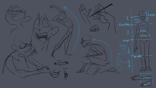
here's some rough sketches I did just to demonstrate what my rougher drawings can look like - also a little diagram (on the right side of the image) of things I keep in mind for the average proportions of a human body!
I tend to sketch very loosely and try to capture the overall vibe and silhouette/rough shapes first before I even think about adding details - there's a certain flow, squish and stretch to everything that's just much easier for me to get a good feel for when I use quick, loose brush strokes and as few lines as possible to convey a concept.
Repeatedly sketching humanoid characters of various shapes, builds and sizes for years genuinely helped enormously in getting not only faster but also more consistent with it!
I'm fairly well practiced with hands and expressions especially at this point since I like to focus on those in my art often, so those come fairly easily to me as well now!
Something I learned along the way about keeping a certain liveliness to my artworks is that sometimes you have to forego anatomical correctness a bit if you want to fully express specific emotions - if you try too hard to keep everything perfectly proportional and realistic, it can make the outcome look stiffer than you might've aimed for - this is something I actually struggle with in my cleaner artworks :'D The ones I do proper lineart for, since a lot of the flow of the original sketch gets lost in the process haha
As for artists/artstyles that inspire me...
There's @/southpauz for example!

Her artstyle is unbelievably expressive and her eye for compositing and her use of shapes is SUBLIME - it inspired me to let loose more with my expressions, exaggerate features a bit more and to push the way I try to vary facial features :D
Then, back when I had that massive Rise of the TMNT phase, the artstyle of it has actually greatly influenced how I draw today!
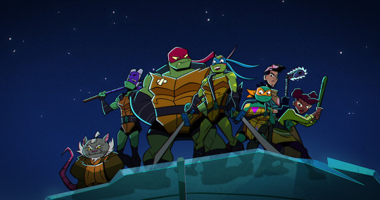
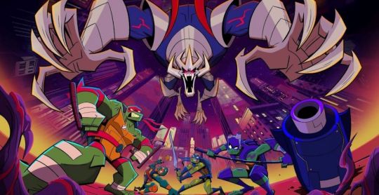
It manages to be detailed and highly recognizable despite its deceivingly simple style - it exaggerates shapes and uses it to communicate personalities, emotions and action super effectively and taught me a lot about utilizing those more efficiently myself :D
And last but not least Ishida Sui - the mangaka behind Tokyo Ghoul (which used to be a highschool obsession of mine)
His striking use of colors, textures in abstract, yet symbolically heavy ways and his courage to be rough and expressive rather than looking polished, yet also having such a solid understanding of realism blew me the fuck away as a teen and still does now!!!
His art may have less of an influence on my style today than it used to back then, but I think in my more exagerrated, more horror-esque drawings you can kind of see it still :'D Either way I greatly admire him as both a writer and artist.
-----
I'm genuinely so so flattered that you enjoy what I do enough to give me such high praise, thank you so much for writing me such a wonderful ask <3 I'm glad I got to gush about some of my favorite artists/artstyles for a bit haha
If you have any more specific (digital) art related questions don't hesitate to reach out!! I love giving pointers about a subject I'm so passionate about, we don't gatekeep helpful information in this house!!! <3<3<3
41 notes
·
View notes
Text

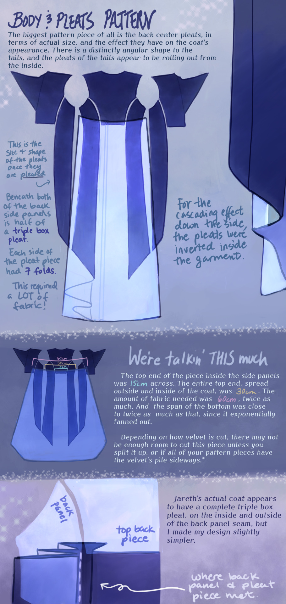


Cheers, loveys!
Here is post 1 of 3 about Pattern Construction. I’ll make a diagram post like this and then also take photos of my actual coat and with me in it.
I don’t remember how I started off doing the pattern, but I will guess that I took a tailcoat that I already possess and used it as a base, which in general seems to be a helpful way to start making clothes that fit if you’re not a master pattern maker (which I’m not, and I made plenty of mistakes which we’ll get into.)
There are two people I want to thank, and the first is Aria Couture [X] and their quality photos and observations, vocabulary and groundwork. They are the shoulders I stand on. Their photos were how I made all of the notes discussed in these diagrams, and how I discerned what kind of pattern needed to be made.
So the main changes that needed to happen to my base pattern was 1.) jacking up the shoulders to high heavens, 2.) elongating the side pieces (which I’ve come to call panels so go with me), 3.) adding pleats in that squared off spot in the back between them, 4.) adding a custom collar and cuffs, 5.) designing my own lining.
THE PLEATS were a nightmare. There was a lot of math involved, and math that was not necessary, but the most important thing was creating a shape that would fold together into a straight line on top, look cascading on the sides, and marry the rest of the coat in a reasonable place. After a lot of trial and error, I ended up with this rounded wedge that spreads out on the inside of the coat, but also folds backwards onto itself (like half of a box pleat), to reattach to the back side panels. This is what gives the coat its look of all this shiny velvet blossoming from beneath the back buttons and gushing out the sides.
As to why the pleat piece is rounded, all of the pleat lines were diagonal, so that the coat would flare out. Cutting this piece as a completely straight line on top meant it ran out of fabric in the top corners, and more of it needed to be pulled in, more and more sideways. Adding a sloped height to its corners helped it do what it was supposed to and become a mostly straight line when folded together.
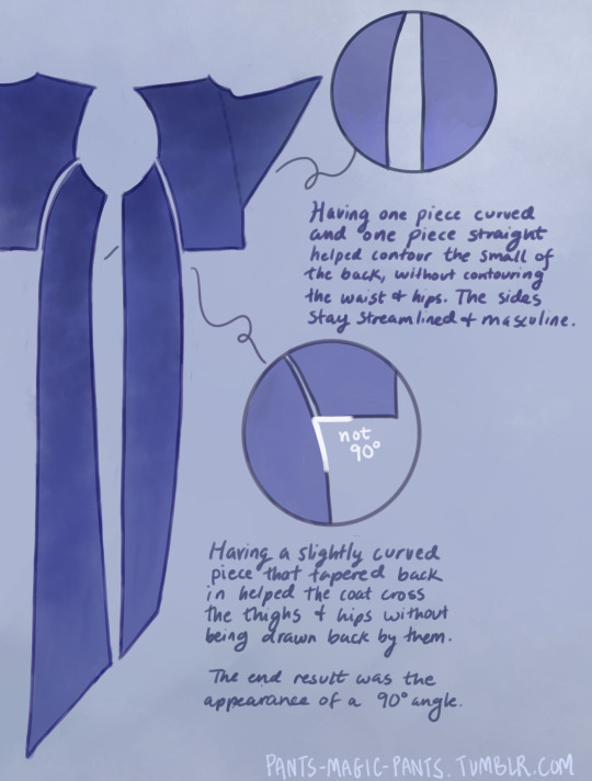
THE PANELS (second image), there are just a few notes about those which I think are important. As I am female cosplaying a male and wish to keep the masculine shape of the garment, some tricks needed to be pulled to hide my waist and hips, so this is what I came up with.
PROPORTIONS MATH. It’s a thing I started doing a couple cosplays ago, to get accurate shapes and lengths of garments, to give me the same silhouette as characters. It’s worked out really well for me. It’s been a real life application of algebra that I wasn’t expecting, as a former student who hated math. Now, I love math! Armed with a ruler and a protractor, I have taken down a lot of notes about such silly things as: what degrees the angles of the lapels are, and how wide are the shoulders compared to the head? (In Jareth’s coat’s case, the ratio of head:shoulders is 1:4.) With that knowledge, I took a photo of myself in the bathroom, measured my own head and shoulders in pixels, wearing a mock-up, and corrected shoulder span measurements to fit this ratio. It was a whooole thing, but I think it was worth it.
And I used proportions math for everything. How much of the arm do the cuffs take up? Where along the legs did the dramatic slope of Jareth’s “fishtail” start? Those things aren’t listed here, but hopefully this post gives you enough tools to figure it out on your own for your specific garment, or any garment you ever want to make.
THE COLLAR. Not much to say about it, but there’s how it looks.
SLEEVES. Dear God. I was stuck on sleeves for months because go ahead and look around online for detailed information about how to add basically football gear sized padding to your shoulders, and all of the intertwined modifications that needs. It isn’t out there.
One thing I can at least say is that it helps to start off with a great base, and the other person I have to thank is a tailor on YT called Chris Sartorial [X]. This guy hasn’t been active for years, but when he was, he was no nonsense, such a professional who knew what he was doing that he couldn’t even take the time to properly light his videos. Such a king. His channel helped me with my dress shirt, and also with making the base sleeves for this coat, which were of the “2 piece” variety. This kind of sleeve is used for blazers and coats so that it appears to fall in a nice boxy shape off the arm, usually from a shoulder pad, and then slightly turn at the elbow. While he doesn’t go into shoulder pads, this still halfway set me up for success, and knowing the relationship between shoulder and sleeve.
However, there are a few things I learned about shoulder+sleeve modification as shown above, and hopefully it’s a good “bouncing off” observation.
THE CUFFS. Again, not much to say, but this is how my pattern came out, to create that nice tear-drop shaped gap, with that sort of blooming and expanding height that his cuffs have, like a vase. The lace trim will be in another post. One thing I should mention is that the lace trim is tall enough that the bottom of the cuff won’t end on your wrist if you want to be able to see your own hands. The cuff needs to be measured so that it will end 2-3 inches up from your wrist.
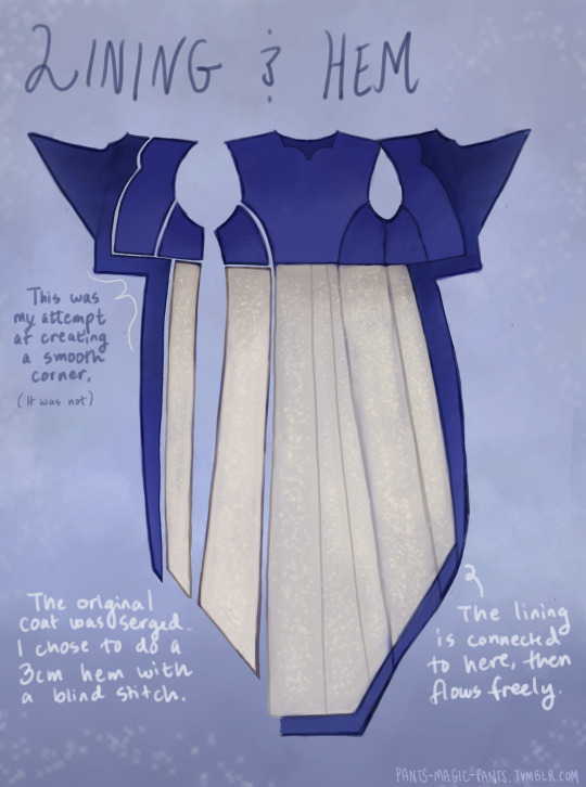
THE LINING
Dear God, she’s still writing. I am a huge fan of lining even though I’m not good at it, and my actual lining didn’t turn out looking as smooth as my drawings, but this is what I came up with, which in theory should look good. haha Any deviations from the norm that you see are just stylistic choices. I wanted the area in the top back to look sort of dripping like the back lace piece.
Was this interesting? I sure hope so. Please ask me questions if I’ve glossed over something.
53 notes
·
View notes
Text
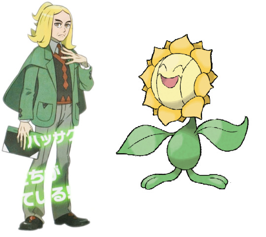
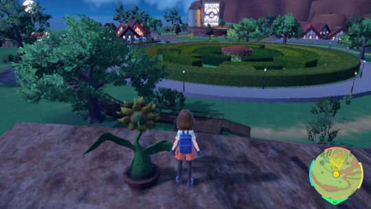
Surrendering fucking Sunflora.
Oh Brassius. Brassius, Brassius, Brassius. I'm going to have to murder you with my bare hands for this one. Don't even need to wake up the Armarouge - you take an extended nap, king, keep those cannons fresh.
Did you know guys that there are thirty-three Surrendering Sunflora in and around Artazon? I do, because I've just spent forty-five minutes of the only life I will ever have working it out. And then another twenty ensuring I'm not wrong, which I possibly still am because this bitch has hidden these things everywhere! Arceus has placed me on this earth only to suffer.
But in spending over an hour on this, finally my soul can rest, because I have confirmation. Confirmation of what, exactly?
... Well, every single Surrendering Sunflora location is representative of what Hassel means to Brassius, in one way or another.
Might want to get your popcorn for this one, friends, maybe grab a blanket...
First though, before I attempt the frankly ridiculous task of explaining all these locations and their meanings, corporate needs you to find the difference between these two pictures:
They're the same picture.
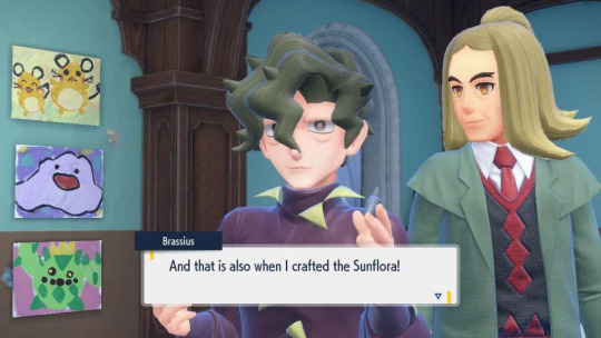
Hassel is Sunflora in human form and with more dragons, right down to his mostly-green-and-yellow colour scheme and sunshine personality. And we know from this little extract that he is the direct inspiration for Surrendering Sunflora, because after Brassius tells you Hassel saved his life, he adds:
Much like The Harvest is part-Arboliva, part-Brass and part-Hass, as seen here in respective shape, spikiness and dragon colour...
... Surrendering Sunflora is part-Sunflora, part-Hass and part-Brass, in form, representation, and mood at the time of its creation.
Anyway, with that established, a map that took me another forty minutes to put together:
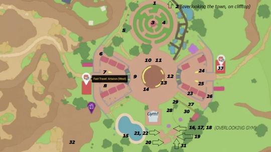
This is the location of every Surrendering Sunflora in and around this goddamn hellscape of a town. (/j, it's very pretty, but I am a salty girl.)
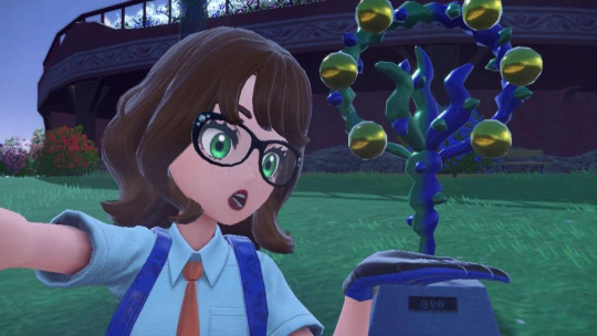
Now, some of these are notably easier to figure out than others, but just for clarity's sake... one to thirty-three, a breakdown. (Of the numbers, not me. Although you pull any more of this shit Brassie, it will be my personal breakdown.) I would screenshot every one, but Tumblr's 10-pic limit is having none of it, so I'll show off the more interesting ones at points and note the rest in text. I will also be looking at them from the perspective of being the Sunflora - the direction the sculpture itself faces.
Now, bear in mind... these are allegorical. I've had to surmise what they mean in most cases, but... that's what an artist does. Art asks you to consider the artist's intent, to interpret what they meant by location, form, colour... whatever the piece entails. It's why we have art critics, why we have museums and art galleries - and all of these point to one singular conclusion: Brassius? Super fucking gay. If you've ever made a fic or a piece of art that hides small details or leaves things just a little to one's imagination, you've been Brassius with these sculptures.
... And frankly, why the hell else are they where they are? These are chosen spots. Most of them aren't even central, or helpful where they are, without an alternate dialogue to them.
So, let's begin!
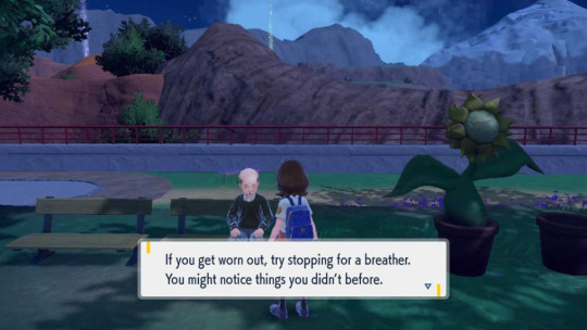
One: just across and to the left of Two, and directly facing Glaseado Mountain. Hass leading him upwards, to literal higher heights. Doesn't get any grander or higher than Glaseado.
Two: atop a cliff face, and it's already pic time!
This one has a few things to say. First, it's overlooking the gym, second it's pointing directly south if you look at my mini-map. This is one of several that faces south, which is valid - most of Sunflora's dex entries tell us that it loves facing the sun, and in terms of planetary orbit, south is the direction in the day where the sun is at its height... which is telling, when Hassel led Brass out of depression, being his literal sunshine.
Three: right beneath the centre of the maze. Hass guiding him to the heart, his 'core' - helping him find meaning in life.
Four: also in the maze, but near the entrance. A guiding hand when one is lost, at a genuine 'dead end'. A little girl in another dead end of this maze comments how lost she is.
Five: is actually hilarious.
Sir are you fucking kidding me I will fight you in an Every Wich Way parking lot right now
Six: facing local small cliffs. Climbing the smaller hills first is a notable method of depression recovery, and given that Brass' health issues also seem physical, this is a small, easy-to-climb hill - a step to feeling healthier.
Seven and Eight: greeting you as you walk into town for the first time from the direction of Mesagoza. A feeling of comfort and homeliness, which two men with such a connection clearly have.
Nine: has a similar vibe - straight ahead of Seven and Eight, the first thing to greet you in the central plaza. The kind of welcome feeling Brass gets from Hass.
Ten and Eleven: are very obvious. These two directly face the maze, and are facing one another on opposite sides. Trust, warmth, familiarity. Interestingly, one faces east, and one west - where the sun rises and the sun sets. Hassel's always there for him.
Twelve: faces the way out to Levincia beyond, because welcoming works from either side of town.
Thirteen and Fourteen: are both either underneath the gym arena, or very nearly underneath, and Fourteen looks straight at the gym. What did I say about these two taking one another into battle?
Fifteen: is facing the pool... for a man who cries a lot. No further explanation required, but this is one of my favourites for how adorable and accepting it is on Brass' part.
Sixteen, Seventeen and Eighteen: the first of the climbing frame Sunfloras, and all of them are in a line, facing the gym. See Thirteen and Fourteen, but... these ones are also elevated, as though Hassel is watching over him during battle. Another gesture of support. They also happen to overlook a Heterarchical Loop, which we'll revisit in a mo...
Nineteen: is on the side of the climbing frame, staring at the Sunflora field used during the gym challenge. Given that it's also staring at said field's house, this is one of two things - emotional vigilance, or home comforts. It's also beside a version of The Harvest, which we know is part-Hass too.
Twenty: climbing frame, above Sixteen, Seventeen and Eighteen - an even higher guardian, and also one that can see the arena. This is also directly across from the Paradoxical Popper, and coupled with what I just mentioned about the Heterarchical Loop... well, this brilliant piece of meta that you've probably already read (top job, fellow theorist <3) shows us that yeah, these old pieces by an unnamed artist are probably also Brassie's, which makes this completely adorable - we know from Art (4) that Brass considers his old pieces 'shallow trash'. By his masterpieces overlooking them, they act as a reminder - that Hassel believes in him, that he can do brilliant things - that his new work has a purpose. Even if they aren't his old works, the fact that he places them literally higher up shows that he has more respect for something inspired by Hassel than any other works.
Twenty-One and Twenty-Two: the last of the climbing frame ones, and again, at height, and directly facing the gym. Just behind these is a climbing wall, which heads up towards a dragon-coloured Harvest. Considering that we can infer that Hassel influenced Surrendering Sunflora first, as Brass tells us that he created it directly after Hass saved him, having to head up to a Harvest coloured with Hass' type is really quite sweet as it was likely a result of their connection later down the line. But regardless of order, these two are again indicative of Hass' care for him.
Twenty-Three: is... well, at the back of someone's house. What's fun about this one is that A. there is literally no reason for this to be here if it's simply about showing off an art piece, and B. even in the daytime, as you can see, this spot? Perpetually in the shade. Even when Brassius feels dark, there's Hassel - his permanent sunshine, making sure he never feels too alone, or abandoned in a place no one would look for him.
Another of my favourites - the symbolism here is gorgeous.
Twenty-Four and Twenty-Five: greet you if you walk into town from the Levincia side, which is very much along the same lines as Seven and Eight - a warm, sunshine welcome, a peacefulness of spirit.
Twenty-Six: stares directly at the side of the Go-for-Broke Grill... which just so happens to be where one finds Encounter Power: Dragon food. Goddamn gay people and their apples...
Twenty-Seven: is behind the Grill, and looking straight at the Sunflora field. The Sunflora field is not only a core part of the gym test, but the specific direction of this one points at the house attached to the field. So not only is this field full of sunshine, it's overlooked by it, too. Anything directed towards a house also speaks of hearth and home - a comfort, a feeling of literally being 'at home' in someone's presence.
Twenty-Eight and Twenty-Nine: stand as guardians to the Sunflora field, right on either side of its gate. Now, for this one, I would like to draw your attention to a piece of dialogue Hass gives you during the League:
"I am Hassel, the dragon guarding the final fortress of the Elite test."
Whilst this field is no fortress, these ones nevertheless stand taller than any other Surrendering Sunflora in the town - the 'protectors' of the field of sunshine, the warmth and the light Brass has experienced beneath Hass. Now, given that Hass also tells you in the League that his job as a teacher is to guide students and watch them grow... well, here we are. He's helped Brassius grow, prosper, and find his inner light, and he'll protect him at all costs from that darkness. And size matters, here - these are big, they stand out, therefore they are deliberately important. This is Brassius' greatest impression of his love - as a protector, and a guide to the light.
Thirty: stands in the Sunflora field itself. This one is notably smaller than the gatekeepers, the usual size of those around town, and is just across from a dragon Harvest in the same field. Again, why not put your emotional sunshine in a field of your actual ones? (And why not do it twice, y'know, because you're massively dramatic...)
Thirty-One: sees our final return to the climbing frame - this is one of the ones I missed originally, because it's directly beneath it. There's another one down here too, right beneath the Popper, but as they mean the same thing as Twenty-Three, we'll count them together - a location always dark and in shade, illuminated. They're also hemmed in by the wooden walls of the climbing frame - they are, quite literally, trapped - like one might be in their own mind, during depression, without a source of light.
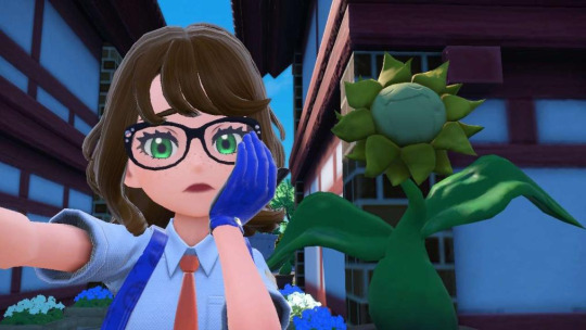
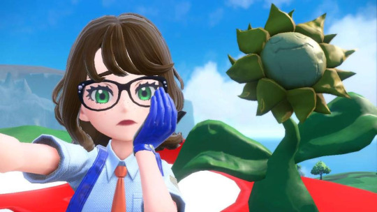
Thirty-Two: is probably my favourite of them all. This harks back to number One, overlooking Glaseado, except...
Well, this looks at another mountain, and it's literally not in Artazon - it's the one I showed you in the very first photo of this post. The location box for Artazon doesn't even crop up. It is, however, facing direct south, but... what's it doing here?
In facing the sun's peak, this one exists to show us that there isn't a mountain Hassel can't help Brassius overcome, however high. Look at where you end up, if you follow this cliff directly from this Sunflora:

The highest peak you can see all of Artazon clearly from, considerably overlooking every other Sunflora that already overlooks core parts of the town important to Brassie. You know what they call that level of symbolism? Fucking love.
And finally, we end on Thirty-Three, which... well. I think we all know what a Pokemon Center does. It heals, it brings your Pokemon back from the brink of death - and who do we know, who's done that for Brassius?
... Pokemon Centers are free, and in this generation, even feature a kindly Nurse Joy who will offer you guidance and assistance through the big, wide, open world of Paldea from the goodness of her own heart.

... This whole town is a love letter. At every turn, you run into a new page of narrative through these Sunfloras: you slot together another meaning, you see the hearts of two men woven into every little stitch. And whether or not this was Brassius' intention, it was almost certainly the intention of those who made him. This is what art directors do, this is what devs hide for you to find. This is Pokemon's ultimate Easter egg, and it is fucking beautiful.
I don't know any more than you lovely people do if they're ever going to officially confirm Hassius as a romantic duo - in love, married, whatever. And I'd love to see it as much as you all would, but... well, I already have. Here it is, right in front of us, if only we're willing to look. Of all the meta I've posted on these two so far, this... yeah, this is the most gay and glorious of them all. And I've still got more to say, just... not on this. We're good here.
... Now, if you'll excuse me, I'm going to do that killing thing I mentioned earlier, though maybe after a nap... sir you must die by my own hand for CRIMES AGAINST MY FREE TIME. (jk, king. Love you, keep doing what you're doing. I am but an average poster without your delicious homosexuality. xoxo)
#ephemeralartshipping#hassius#brassel x hassius#brassius#hassel#pokemon scarlet and violet#I have sunk about five hours of the ONE LIFE I have into this and I regret absolutely nothing if I'm honest lmao#it's the most goddamn beautiful thing I've ever seen#I'm literally that one meme guy who's like 'I've looked at this for five hours now'#... fuck. Just... fuck.#meta#gay gay homosexual GAY.#how are you going to give me the most wholesome love story in the canon and not even officially TELL ME it's the most wholesome love story
335 notes
·
View notes
Note
I discovered you recently and was scrolling through your stuff when I fell in love with your Joker redesign. It’s just so Good! Not only is your art style perfect (for all your art, really) but the thought you put into it was just wonderful. My favorite part were the horns, they just fit so well! I’d love to see any other ideas you have, but really I just wanted to gush about how much I loved it. Thank you!
Aw, that makes me so incredibly happy!!!! As much as I rag on P5's story execution, I do adore all the potential there is to the characters and the potential in redesigns that better fit the character's personalities. I'll repost all the ones I've finished for funsies, but I think now is actually a good time to mention that I'm going to be compiling all my p5 redesigns into a little zine (a re-de-zine haha) with more detailed thought process behind what I was thinking when redesigning them (there wasnt enough blank space for all my notes, or my sketches)! I'll add some blurbs from the document I have in [these] brackets! I actually focused heavily on his mask, so I'm super relieved and excited that it's what you liked most about it!
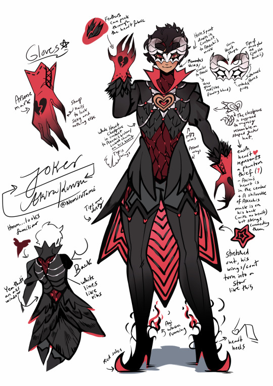
JOKER
[[Aside from Akechi’s prince outfit (which I think was flawlessly executed), I knew that I couldn’t allow myself to butcher Joker’s design- especially since I intended to remake his mask, despite his mask being perfect as it is (and was also my base for the Black Mask design before I decided to remake everyone else).
//
My main concern was to make the outfit represent all of PT’s, not just Joker, but I also wanted to highlight Akechi’s part in playing as his foil. As such, where Akira has a heart shape connecting all phantom thieves together by a silver string of fate, Akechi has a distorted red glow that extends chains to weigh him down as well as wings to show his ability to choose his own path.]]

AKECHI [[I wanted to keep his face obscured, but add an option to show himself if he wished. So, a hood helped cover him up for me. It helped me make it feel as though it’s a “lost” part of Robin Hood that still clings on to his Black Mask design- a desire (though weak and decaying) to be a good person underneath it all for someone he once cared about.
//
Akechi's chains (from his heart) symbolize his outlook on bonds, and how they tie you down, whereas Jokers symbolize the strength he has with his teammates. I felt like this was a little too sad to write on the concept page. Reading “Goro Akechi has no friends and it manifests in his Black Mask outfit” isn’t the most uplifting sentence you want to stumble across.]]
ANN
[[Ann was often forced to hold her tongue around Kamoshida in order to protect Shiho, and Shiho in turn tried to do the same to protect Ann. The whip I created for her is a play on the phrase “hold your tongue” showing a lion with it’s mouth open and its tongue hanging out- filled with thorns and ready to be used as a weapon to protect those that she values. One of her biggest weaknesses now becomes her force for change and success, and she ultimately uses her power as a thief to open the maw of the man that told her to be quiet- revealing all his ugly secrets with his own words.]]


FUTABA [[This one doesn't have any notes I can share yet, but she took ages to design, so that's why, lmfao!]]

MORGANA
[[ I wanted to make him blend in more with a classic SMT demon such as Jack Frost, but still distinct enough to stand out as “more than a demon”.
//
Since Morgana is the collective human hope, I think he can take any shape or form. I only retained his cat persona because I wanted to stay true to the original design concept of it being an animal. If I was allowed complete creative form over a “guiding light” however, I think I would base Morgana’s design on Anubis or psychopomps- guides of souls (souls of human hope). The interesting thing about psychopomps is that while Anubis is also an example of one, commonly, so are crows. Meaning, I would have to design Morgana to fit a canine in order to imply Akechi himself could have perhaps had a guide similar to Mona if he was not used to bring about ruin. However, Morgana’s cat aesthetic is tied into Joker’s own traits (sometimes down to mannerisms), so getting rid of the cat persona was not something I really wanted. That, and the fact the last protagonist was based on a loyal dog made it hard for me to choose canine. I would have liked to pull something out of zoroastrianism if possible, but I was not sure how far I could take it before his design became entirely unrecognisable. And the point of a redesign was not to entirely change them to become different characters, but just to play around with different themes to better fit the character and their backstory/feelings/traits.
]]
I really hope this content was fun to read!!!! The next design I have in my WIPS is Yusuke. Honestly, I find Ryuji and Yusuke are going to be super challenging, since I ADORE their designs and I genuinely do not want to just touch them up randomly without purpose and happen to downgrade them. Morgana and Ann were my easiest targets haha.
194 notes
·
View notes
Note
Hi!! I was wondering if its okay to ask what brushes u normally use in krita? I love your art!!
Thank you so much!!! I only use the ones available in Krita by default and I tend to jump around based on what I think will work best for each piece, but I can give a little rundown on which ones I use the most and what I use them for :)
Here's an image guide with each of the brushes I've used and that I recommend checking out:
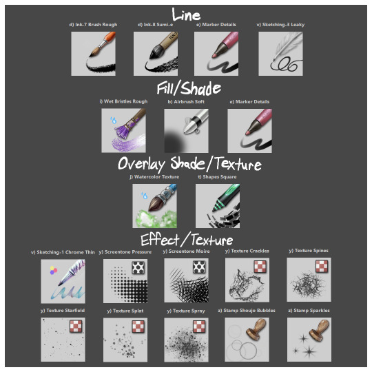
I'll highlight my favorites as well with some examples where they were predominantly used! (though in some cases multiple or even all of these brushes were used)
Marker Details:


Varying opacity and size makes this one my favorites for sketching, especially since it can easily be nearly transparent or fully opaque which helps with value range.
I also like using it for silhouette sketches!
It can also be used for final linework, but it takes more work to get to a full opaque and its lack of texture makes it a little less interesting than Ink-7 Brush Rough imo.
Ink-7 Brush Rough:
Really good for linework, especially for comic styled drawings with it's slight texture, varying weight, and opaqueness.
Also good for just filling in entire areas with a single color as well as non-smoothed shading!
Wet Bristles Rough:
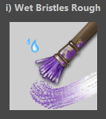
Actually just an amazing brush, its pressure sensitivity is crazy.
Blends strokes like paint and can vary in size and opacity.
Also has a nice subtle texture!
Amazing for smoother coloring and shading, especially if you want a more painterly style.
Watercolor Texture:

(hard to show examples of this, just assume that I've used it in any piece that has smooth shading lol)
Not the best for painting/drawing on its own, however I've found it to be really useful when set to white or black on an overlay layer for adding extra shading and/or highlighting on top of the shading I've already done.
I usually shade individual figures, objects, and parts separately, but using an overlay layer with Watercolor Texture (or even Shapes Square) on top of everything helps make the entire piece feel more cohesive.
Also adds a hint more texture!
Another thing to note is the importance of layer modes!
I know that you asked about brushes specifically, but many of these brushes (particularly those to do with effects and textures) work best when experimenting with different layer modes other than Normal. Overlay is generally a safe bet and most of the best for, well, overlaying multiple layers for interesting effects. But please try out all of them at any given opportunity, sometimes things like Burn, Color Dodge, Soft Light, etc can have more interesting effects!
In addition, mess with filter masks! You can even edit where they apply by drawing on the mask directly! HSV/HSL Adjustment (also accessible with ctrl+u) in particular is INSANELY useful for fiddling with the colors and balance of a piece, from individual layers to whole groups and drawings. I also really like blur filters, often times I'll duplicate a layer and make the bottom one blurred to add a glow affect to something without losing its definition.


While this latter stuff isn't about brushes specifically, its generally very important to how I use and experiment with all these different brushes!
Anyways I hope this helps!! I kinda went overboard with this post, but I had a lot of fun writing it! Thank you again for the wonderful ask!! :)
#krita#krita art#warframe fanart#art#artists on tumblr#my art#UpsideDownSmore's art#art tips#art guide#art reference#long post#ask#didn't mean to spend so much time on this but ngl i'm actually so thrilled to talk about my art processes#like man i'm so grateful to be in the position where i can make an art guide like the ones made by people i look up to#sorry if this response is a bit long winded i just had to get a bunch out there lol#love asks like this :)#scheduling this 9 hours from now cause it is currently almost 1am lmao
15 notes
·
View notes
Note
hear me out, that last dr stone angst but write a continuation where everybody learns that y/n was dead and senku’s reaction to discovering that it was his fault <3
"Amongst that crowd, Senku was one of those who stared at you in horror. "
hooooly this is finally finished! the long awaited epilogue to the hanahaki story! this was pretty difficult to write- i wanted to cover as much as i could without making it too lengthy while being realistic, which wasn't easy. im a bit iffy about some of the characterization, but nevertheless, i hope it was worth the wait! thank you for your patience!
warnings: detailed descriptions of death, blood, sickness, grief, intrusive thoughts, burning of a body (sorry its a lot but considering the theme...). if i should add any warnings, PLEASE let me know. some manga spoilers but nothing too major!
words: 3,374
Constructive feedback is always welcome! I’m always looking to improve!
Requests are open! (checked my pinned post!)

The concept of the Hanahaki disease was first introduced to Ishigami Village through the one hundred tales. It was mentioned briefly- a woman, in love with a man who didn’t love her back, had suffocated on yellow tulip petals that she couldn’t stop throwing up. There had been no record of anyone in the village ever experiencing such a sickness, and many assumed the story was a metaphor or a lesson like the other tales. Simply a fictional disease.
“What a silly way to die.” You had thought to yourself when you first heard of the illness as a young child. If only you knew you’d be in the same position as the woman in the story, suffocating on yellow tulip petals because the man you were in love with didn’t love you back.
In your final moments, you saw your life flash before your eyes, internally laughing at the cliché. You saw yourself with your best friends, Kohaku, Ruri, Chrome, Kinro and Ginro, little Suika and old man Kaseki. You saw yourself with the man you had fallen in love with, acquainting him, working with him, becoming friends.
Senku Ishigami. The brilliant scientist who Kohaku one day brought home and helped heal her sick older sister. A man of the future who told you all sorts of stories, created all sorts of things from his time and shaped your world into something magical. Senku Ishigami is quite a guy.
Which is why in the end, you didn’t regret loving him. Though you wish you could’ve lived long enough to start a new chapter with him after defeating Tsukasa, you passed on to the next world happy that you were able to indulge in everything he was.
You did feel guilty leaving your friends--your family--behind though. You didn’t want to, but you couldn’t find a cure to heal you of your sickness. Keeping your condition hidden (with the exception of your mentalist friend finding out) made it difficult to focus on finding a cure, covering for yourself and helping the Kingdom of Science in their war against the Tsukasa Empire. And so one day during your final stages of hanahaki, Gen Asagiri had found you dead in your tent, covered in yellow tulips and stained with blood, and rushed off crying for help.
Ukyo, with his super sharp hearing, was the first to hear Gen’s distant cries. He called for everyone’s attention and they all turned toward the sound of Gen’s panting and shouting. When he finally reached everyone, he stared at the citizens wide eyed. Though the war against the Tsukasa Empire had ended, the Kingdom of Science had a new mission: to establish cities all over the globe. To do that, they needed to make a ship and prepare for the journey. Senku and some others had returned only minutes ago from retrieving a ship captain- he could tell by the unfamiliar stranger standing next to them. Gen didn’t have time to think about it. “It’s Y/N.”
Something wasn’t right. Gen had a wild look in his eyes as if he’d seen a dead man, was visibly shaking, and Senku deduced he had just returned from visiting your tent as you weren’t present when the group left. Kohaku too could tell that something was off and made the same deduction Senku did. In her hard-headed nature, she rushed past Gen and toward your tent in a panic. Some people tried stopping her, but gave up quickly upon realizing their efforts were futile.
“Gonna need you to be a bit more specific, Gen.” Senku's tone was airy, but he was trying not to make his desperation to know what happened to you evident.
“Y/N…”
“C’mon mentalist, spit it out.”
“...is...dead.”
-
When Kohaku barged into your tent, she was appalled at the horrifying sight. She collapsed at your side, crying out at you and cradling you in her arms. Pools of blood, flowers, flowers drenched in blood, all of it surrounded your body. “Y/N? Y/N, say something. Please, Y/N, please say something.” She pleaded at your body as she pressed her forehead against yours, tears rapidly falling from her eyes and onto your blood stained face. You couldn’t hear any of it.
A crowd shortly formed at the entrance of your tent where gasps and mutters were exchanged. Some stared at the sight in shock and horror, some looked away in disgust and anguish.
Amongst that crowd, Senku was one of those who stared at you in horror.
Hanahaki wasn’t an unheard of disease in the modern world. Of course it existed, but little was known about proper treatment. In the age of advanced medicines, there were only two sure cures: one was surgery, the other was requited love.
Kohaku turned toward the crowd with a heavy flow of tears rolling down her face. She held you close to her chest in a protective manner, as if attempting to shield you from the damage you had inflicted onto yourself. “We’ve got to be able to do something! Senku! We have to help them!”
For the first time ever, Senku’s senses dulled for what seemed like an eternity. His mind couldn’t process the sight of his friend covered in their own blood, unconscious and completely unmoving. His mind rejected the fact that your body had been completely drained of life as his fingers brushed yours while checking your pulse. When did he force himself through the crowd and crouch down beside you?
“Senku! We have to act now!”
Everyone dies at some point, Senku knows and accepts this, but he’s never felt more distressed than he does right now looking at your lifeless, sickly frame. He’s had to cope with a lot of hardships in a short amount of time- the loss of his dad, his life, his departure from his two best friends, and though he could argue that the worst has come to shove, he felt physically sick as he continued to stare at you, head spinning, his chest blazing.
“Senku! Say something!”
“T-They’re beyond saving. Too much blood loss…” Snap out of it, Senku, he told himself firmly. Squeezing his eyes shut, he shook his head and let out a deep exhale, frustration and grief slowly overwhelming both his mind and body. “They lost too much blood overnight, and even if we were to find them sooner, blood transfusions can have their own complications. There’s-,” Senku swallows. What he said next pained him from the very depths of his soul. He’s the calm and collected type who works well even under extreme pressure and always keeps his wits, always finding solutions despite having terrible luck on his side, and so the crack in his voice betrays his attempt at remaining composed when he utters “there’s…not much we could have done.”
Senku slowly turned toward the crowd and fixed his gaze on Gen, who was staring at you with sheer terror in his face. He seemed to be two seconds away from a complete breakdown. “Gen, did you know?”
The mentalist’s eyes snapped toward the scientist’s, hard to detect emotion in his crimson ones. Gen gulped; he knew Senku was referring to the disease. “Yes. It was important to Y/N for their condition to be kept secret. I…connected the dots on my own.”
“Hang on, condition? What condition?” Chrome’s uneasy and slightly angry voice suddenly rang out as he pushed past the crowd toward the front to stand beside Gen. Kohaku’s teary eyed darted from you to her friends. She thought hard. Condition. Flowers. Death.
“Could it be…”
“Gen.” Senku yet again directed a question to the magician, cutting off Kohaku. “Why don’t you explain to all of us what happened to Y/N?”
-
It was important that the entirety of the Kingdom of Science was informed of your death and the events leading up to it. The crowd that had formed at your tent, mostly your friends and those from Ishigami Village, rounded up the elders, newcomers, and former members of the Tsukasa Empire to the middle of the base, where Gen began his explanation.
He explained what the Hanahaki disease was, the coughing of flowers and petals, the two known cures, and how either were unavailable to you. He recalled first noticing your symptoms, his confrontation on the eve of delivering the cellphone and your desperation to keep the disease a secret, afraid of burdening others during a critical period in the waging war between the Tsukasa Empire and the Kingdom of Science. He admitted to covering on behalf of you and even explained how he tried curing you with the sulfa-drug.
Senku had cut in to explain to the angry villagers why the so-called “panacea” didn’t work on you. “The sulfa-drug is meant to cure bacterial infections such as Ruri’s pneumonia. Hanahaki, however, doesn’t work like most sicknesses and normal means of treatment aren’t successful. Considering the nature of the disease, no ordinary medicine would be able to fully cure it.”
“Someone could’ve saved Y/N though, right?” Someone in the crowd called out. “Someone had to return their feelings!”
“...Yes.” Senku turned toward Gen, but kept his gaze fixed to the ground. “So Gen, who was Y/N’s sweetheart?”
Gen smiled as he regrettably told the scientist, “It was you, dear Senku.”
Senku’s convinced that this is the worst of his bad luck.
-
The Kingdom of Science’s first loss was a heavy burden on everyone, especially those from Ishigami Village who considered you family.
Kohaku’s face was grim the first couple of days with you gone. Being known as the strongest out of everyone in her village, she felt angry for being so powerless. Feelings of regret only fueled her anger and grief as she reflected on times when she would catch you coughing or sneaking off and not persist with questions or investigating. She dropped her guard and wasn’t able to help her loved one, and she felt disgusted with herself. Ruri did her best to comfort her younger sister, but even she felt a tremendous guilt. As someone who suffered with an illness her entire life and had an important role to play in the village, she regrets not being more concerned with your symptoms and shared Kohaku’s regret in not persisting enough with questions.
All Suika ever wanted was to be helpful, and she failed in assisting you with your sickness. The seemingly never ending energy she always had was drained for a long while. She looked up to you as an older sibling, perhaps even a parental figure, and now you were gone. You had always done so much for her, constantly making sure she was safe, teaching her things you learned from Senku and the other villagers, and comforting her when she felt scared or sad, yet Suika wasn’t able to repay you. You saved her so many times, but she couldn’t save you. Nobody let Suika go anywhere near your body, but she managed to catch a glimpse of you being carried out of your tent with a white cloth over you, and as the reality of it all settled in, she panicked so bad she passed out.
Kinro and Ginro had a duty to protect their village and everyone in it, yet they couldn’t protect you. Admittedly, they don’t understand much about science and medicine, but they trained hard and stood guard day and night so the villagers of Ishigami Village could go about themselves without having to fear any doom. Ginro, in his anxious nature, was horrified by your death, scared for his life and set into a panic. He was afraid that the hanahaki disease would claim his life next, and Senku had to explain that the disease isn’t contagious when Gen addressed everyone. While Ginro was making a fuss, Kinro hit him over his head with his spear and told him to can it. Kinro wished the disease was a physical foe he was able to defeat or at least had known about. He, like Kohaku, felt angry for being so powerless. He did his best to appear strong, though his teary eyes betrayed him.
Chrome had millions of thoughts and feelings rushing over him at once almost 24/7, all of them suffocating. You had been best friends ever since the two of you were young, and instead of figuring out you were ill, he had to witness you bathe in a pool of your own blood. He felt sick, hell, he even got sick multiple times, the sight and situation heavy on his mind and heart. Chrome was angry at you, but most especially angry at himself, and the questions he had for you were meters of mental parchment long. Why didn’t you feel like you could confide in him? How could he not notice the pain you were in? Couldn’t you trust him to help you? What troubled him the most was the recurring and realistic thought that, even if you did bring your situation to his awareness, he couldn’t have done anything about it.
Kaseki didn’t disguise his sadness and openly cried over your death, which only made those who tried to appear strong, like Kinro, more emotional. He spoke about how your life was taken so tragically and far too soon, sorrowful that an old man like him outlived a spunky young person such as yourself. He cursed out the disease and how something so beautiful such as flowers could be so deadly and lead to your demise.
Those who didn’t know you very well were still shocked that someone had passed. Ukyo, who had joined the Kingdom of Science under the condition that not a single life is lost, felt very conflicted about the circumstances of your death. He knew that nobody was responsible for your death, and it was the disease that had claimed your life, but he couldn’t help feeling a little resentful. He kept a close eye on Senku ever since Gen revealed that it was he who could’ve saved you.
Like Ukyo, Taiju and Yuzuriha couldn’t believe that someone had actually died. They too kept close eyes on Senku and did their best to give him the space they knew he needed to reflect. Neither of them knew you very well, but from the short time they did, you seemed like an amazing individual and could tell you were special to many, including their best friend, from the impact your death had on them all.
Gen was scared and felt largely responsible for your death. Intrusive thoughts and dreams about you plagued him day and night, your strained voice echoing in the back of his mind feeding into his guilt. You killed me, choked out your voice. I don’t wanna die, you cried out, and nothing Gen did could drown out your voice. He felt hopeless, weak and a coward. Before, he didn’t mind being all these things, but now with you gone, with the slight chance that he could’ve been able to save you, he regretted demonstrating these qualities in such a serious situation. He’d shrink into himself, hiding his face behind his face while thinking “why trust me, Y/N? Why me?”
-
“Why me, Y/N?” was a frequent thought Senku was plagued with. While everyone was taking time off their tasks to cope with your passing, Senku spent a lot of his time holed up in the lab back at Ishigami Village.
He was frustrated, like many others. He was conflicted on how to feel about your death and didn’t know how to react. You were a close friend of his that he cared very deeply about, a friend that he cared about in the same way he cared about Kohaku or Chrome. You didn’t do anything wrong, his friends have told him, and though he knows himself, he’s glad because admittedly, he finds himself needing the reminder.
To think that it was because he didn’t return your romantic feelings for him that led to your death was a heavy burden that he knows you did your best to avoid shouldering onto him. He knew how you were; selfless and courageous to the very end. It was one of the things that he liked so much about you, but in this instance, he wished you were a little bit selfish. Senku knew that you kept your illness a secret to avoid weighing down the others, and he regrettably admitted to himself that if you were to come forward with your disease, it may have slowed down productivity. Along with the burden of war would come the burden of sickness, and that was an obstacle that everyone had already celebrated in overcoming. For it to be revealed that there was a new sickness to be concerned about would’ve lowered morale significantly.
But it was your life on the line. You could’ve at least come to him. He’s a scientist, but most importantly, he’s Senku. He isn’t the type to walk away from trouble or to back down from a tricky problem. He sticks with something till the very end; until he’s found a loophole, concocted a seemingly impossible plan, or has gone through every single step of a painstaking project. He would’ve been by your side, he would’ve helped you.
He’s ten billion percent sure of it.
And he has to stabilize himself by putting his hand on the table as the thought of being too much for your friend to handle brought tears to his eyes. He constantly puts his trust in those around him, sometimes because he needs to, but mostly because he chooses to, and from the very first day he’s met you, he chose to trust you.
So why couldn’t you trust him?
He’s let you down. He’s done so much for others, and yet he’s let his friend down.
-
Eventually, everyone had to proceed with their travel plans. There was still a lot that had to be done before a crew could set off establishing cities around the world.
Ryusui had suggested that you were set out to sea as a symbolic gesture to represent where you grew up and where you were headed off to. A small boat was created for your body to lay in, along with your possessions and flowers. It felt ironic to some to send you off with the very same thing that killed you. When you drifted far enough, Ukyo drew a fire arrow and shot it onto your boat. The flames devoured everything on board, and many couldn’t bear to watch as your body became engulfed in the scorching fire. A gravestone was marked in Ishigami Village’s cemetery with your name, date of birth and death. Below, “beloved friend and family” was carved by Kaseki.
Many people visited your grave regularly while preparations were made, vowing to continue doing their best and to create the future you dreamt of being a part of. They paid their respects and said their goodbyes before departing for the long journey ahead of them, and once they returned, they sat around your grave and talked to it about all of their adventures and achievements, laughing and feeling comforted by the presence of your spirit.
-
Though Senku had said his goodbyes with the rest of the group, he returned to the cemetery in the early morning of the crew's departure. He kneeled and bowed his head, placing one hand on the stone with your name carved in front of him. Tears trickled down his face and onto the soil that you were raised on, on the same Earth that you trekked on and explored with Senku.
Senku thinks he’ll always be angry over your death. He’s lost a lot, and the grief will always be with him, but he swears to you as his grip on the stone tightens that he’ll bring the future you were so enamored with to fruition. He got up and headed for the docks with the promise of restoring humanity for the sake of you and all those who never were able to live to see it. He’ll keep you in his thoughts throughout every step.
And that proves true years later as Senku works on his newest science project with his unwavering determination and resolution that was fuelled by the idea of being able to see you again.
#dr stone x reader#dr stone oneshot#dr stone headcanons#dr stone fanfiction#dr stone hcs#drst x reader#dr stone senku#dr stone drabbles#dr stone angst#senku ishigami x reader#senku x reader#senku headcanons#senku x you#senku ishigami oneshot#senku ishigami headcanons#senku ishigami angst
464 notes
·
View notes
Text
Anonym hat gefragt:
that map you made is stunning! do you have any tips/programs on how to properly make one? i really love looking at these but i never know how to make them myself
Hello there, happy to help! :)
So if you’re interested in making a map, you have several ways of doing that. Ask yourself some questions first:
What is the purpose of the map? Do you want/need a scientific representation of a region or planet (example: Satellite map of the Earth), or is it a highly stylized storytelling tool (example: Map of Middle Earth)? Something in between? Think about what you want to communicate with your map and decide on its setup. As you asked about the map I uploaded, I’ll talk about my approach to satellite/physical maps :)
My personal approach to those maps is pretty scientific because I like hard worldbuilding with a lot of logical thought behind it. The satellite map from yesterday functions both as a physical map for the setup of the planet, but it’s also a base for other maps. For example, the climate chart I worked out uses the physical map as its foundation.
There are some pitfalls when it comes to map projections because we’re dealing with the problem of unwrapping a 3D globe onto a flat, 2D surface. With the standard maps we’re seeing today, areas closer to the poles get increasingly distorted. Just look at how huge Greenland appears on world maps - in real life, it’s pretty small. This is important to consider and I didn’t catch my own mistake until yesterday. If you want to be 100% sure, the best way to do it is to use a 3D program and paint your map directly onto the globe. Unwrapping the texture later gives you the correct distortions. If this is a concern for you, I’m happy to elaborate more, but I’ll stick to the visual side for now :) It’s all done in Photoshop, nothing else required. Screenshots are in German, but I added explanations.
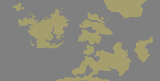
The start of it all is a rough sketch of land and sea areas. It doesn’t need to be perfect or final at this point, just draw shapes you like. You can also add a bit of thought to it - maybe a landmass broke in several parts not too long ago and you still see the puzzle-piece shapes, but that’s another story entirely :) If it’s just about making a nice-looking map, go with what pleases you.
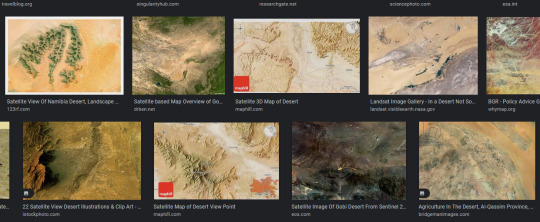
For surface details, I used satellite images and photobashed them onto my surfaces. I had worked out plate tectonics to have an explanation for the location of mountains and plains, but that’s also another story. If you want a mountain range somewhere just because, then put it there :) Collect aerial images which fit what you have in mind. Leave vegetation out for now, it’s just about highs and lows.
Then, roughly lay them over your landmass. I recommend keeping the landmasses on their own layer, separate from the sea, because you can “clip” the satellite image to the landmass layer by hovering your cursor between the layers and pressing alt:
Do this with plains and mountains (no vegation just yet), mix and match and blend until you get a setup you like. Also take a look at satellite images of coastlines so you can use them as a reference for your own. Give your landmass layer a mask on which you can draw to refine your coastline. To add a mask to your layer, select it and then press the button which has a rectangle with a circle on it. Drawing with black subtracts from your image, drawing with white adds to your image. You don’t destroy your base layer by using masks, and if you want to deactivate or delete that mask, right-click it for its context menu.
So now we landed on something similar to this. If you’re having trouble with coastlines, also search for aerial images and use them as references for your own. Where are flat beaches, rugged coastlines, fjords, islands? You can go with science (example: Fjords are valleys of former glaciers, so they’re unlikely to form in warm climates. Rugged coasts in warm areas probably have a different origin) or just do your thing.
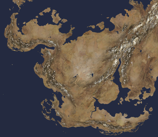
I added the seafloor, basically the borders of continental plates, and a soft edge glow to the continents to simulate shallow water around them.
Now, placing vegetation can be a nightmare or ridiculously easy. For a first pass which you can modify later on by using layer masks again, do the following: Duplicate your landmass layer and switch off the layer style if you have one. Now, go to Image > Corrections > Replace color. Use the picker to select a color you want to replace with green. In my case here, I want to have vegetation closer to the mountains, so I pick a slightly darkened brown from my map.
It’s time for the magic :) Now use the three sliders at the bottom of the window to change the picked color to your target color, green in my example. Ho-lee sheeet! :D Use the tolerance slider at the top to narrow or widen the picker’s range, and just go with what you like.
Now you can play around with your vegetation layer as you wish. Add or substract from your layer and/or overlay it with some color variance. Do a second vegetation layer and pick a different color base, maybe the lighter deserts or the darker mountains. Set a different tolerance and color to it... and that’s basically it! Play around with those methods and have fun making maps! :)
171 notes
·
View notes
Note
ok im silly and obsessed with your art so i wanted to ask you about it!
i really love your shading on art, the layering and different colors is very well done! do you have any feedback on how to do rendering and shading? cause i know nothing about it
im also curious about your anatomy, its accurate but also very unique between characters! do you mind doodling like... how your format it? u know what i mean???
NEXT I WANT TO ASK! ABOUT YOUR OUTFIT IDEAS!! where do you get your inspiration for those beautiful fucking designs?
on the drawing you made of shrimp mariana being held by charlie, im curious about how you did the filtering to make it like. fuzzy but still clear???
last but not least, what application do you use for drawing, and which pens do you use?
sorry for all the questions but your art is a very big inspiration for me and i want to be as talented as u ^^💦
this got really fucking long and i don’t even know if it’s particularly helpful but LETS GO
—
OKAY SO. shading, thing i am apparently accidentally really good at. it’s probably the thing i’ve gotten compliments on the most over the years which is funny because it’s probably the thing i’m Least confident that i can do well. therefore i can’t really give a tutorial but i can give a bunch of disjointed notes

(shown above is my Default Shading, further examples of different lighting below)
everything else under the cut or this is gonna be a mile long
i like using blue for shading, yellow/orange for lighting but generally you can just make them opposite/complimentary colours to each other and that’ll work. cool shadows, warm light or warm shadows, cool light. you get it. that’s a general rule there’s probably exceptions. i will say i hate using purple for shadows but that’s a personal preference (as is every colour i use being so saturated lol)
the orange around the edges is supposed to be subsurface scattering on skin but i put it on all the edges because i like how it looks 👍
yes there’s two different bounce lights. idk why i do this. i also just think it looks nice. i guess the one on the shading layer is more for form and the one on the lighting layer is more for the yk. lighting? anyways the first one is just a lighter version of the shading colour the second one is darker and slightly hue shifted (depending on the lighting scenario — it can be brighter if the situation calls for it)
the reason i don’t just shade around the edges is because it can make things look very flat which is the opposite of what you want when shading. sometimes it can just go on the edges in some specific scenarios but i like my shadows Chunky. basically having it go over the form instead of just along it can help show that form more
top left - night time | top right - bisexual? | bottom left - spotlight i guess? | bottom right - default/daylight again, just wanted to show a shape example
something i’ll also do a lot is have a separate multiply layer that’s just one colour and i’ll throw that over the whole thing to get the base colours correct for the lighting scenario. some people do it by eye but i am lazy so i cheat 👍 often it’ll be the same as the more detailed shadow colour but as with the top right example sometimes it’s different
shadows are either on multiply or linear burn, lights are either on add (glow) or glow dodge. depends on what looks best. same with opacity, i don’t have any real rules there
i also LOVE harsh lighting but that’s just a me thing. UMMM i can’t think of anything else to say
—
so next is ANATOMY okay this is also something i’m not super confident with lol but i can give some more disjointed notes by just redlining my own sketches lol

the uuuh “bottom of boobs is 2/3 down the ribs” isn’t technically correct? if ur drawing someone with big boobs and no bra on they’re probably gonna go lower but that’s kinda. where they come out from i guess. i also don’t think the “ribs” i draw are technically accurate but it works for a reference point
arms are a diamond (the shoulder.. muscle.. thing… idk what it’s called) and then some Tapered Tubes idk they’re not super complicated. if you wanna get more into it go google buff people and trace/redline their arms that’s how i learnt orz and uuuh i kinda also have the taking up 2/3 of the ribs but a bit Above. the way i’ve worded that makes no goddamn sense i’m bad at explaining this
ANYWAYS yeah bodies are just shapes if you want ppl to look unique just squash or stretch out the shapes 👍 and also learn actual anatomy stuff that always helps. my final message: learn to draw fat people it is no more difficult than drawing thin people
—
OUTFITS i love outfits. i have a pinterest board where a lot of my inspo comes from and it’s a section within a bigger board so ig i’m just giving you my whole inspo board. here (it’s the one called character fashion) (i do not condone art being reposted on pinterest without artists permission just ignore how much i have saved)
pinterest in general is good for outfit design stuff as long as you know where/how to look. u could also try fashion blogs and stuff
ummm a lot of stuff does just come from my own head tho, like based on clothes i like or vaguely inspired by stuff i’ve seen before. if you look through the board you can also see that like i rarely ever copy stuff directly i kinda just use whatever stuff i find as a base to work from. just find stuff you like and go from there i guess, i sometimes like picking a specific subculture or fashion style for a character and seeing what i can make from that (like missa is emo/scene, slime is like some kinda ravecore thing?? idk)
—
OKAY i’m assuming you mean like the glowy effect? makes everything look Soft?
(idk if u can even see the difference here orz also ignore how many fuckin layers i use i’m a mess) (the top layer is that catboy missa doodle i did ignore that too)
this is something i do on Most drawings to the point i have an auto action set up for it. duplicate the entire drawing (on csp the easiest way is to just merge visible to new layer), gaussian blur to like ? idk i think it’s 40% or something? i don’t remember, set that layer to soft light and lower the opacity
if that’s NOT what you meant feel free to send a follow up question LOL
OH actually if u mean the colour jitter stuff on the . colours. that’s not a filter i was just using a brush with slight hue jitter on i was Experimenting
—
AND FINALLY i use clip studio paint on my ipad and most of the brushes i use on the reg can be found here
favourites are the ones i made (i actually have more of those i need to upload—) and the raz sketch ones 👍 namely raz sketch (thick) with the density turned up a bit from the default, been using that a lot for lineart
#.qna#.jpg#art tips#idk how to tag this#i really hope this is any kind of coherent LOL#where’s that post like ‘don’t ask self taught artists SHIT they don’t know how they did that either’
43 notes
·
View notes
Note
Have you reviewed Krabby an co.?
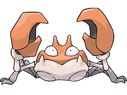
Krabby is a crab, which I'm sure is a very shock revelation to everyone reading this. While it's not the most unique crab Pokemon's ever come up with, it's at least got a nice aesthetic to it; there's something inherently appealing about the shape of those angular claws and the way the face is stylized. The simple counter shading, with a cream underside and red top and claws, also makes it read clearly despite the relatively complex design.
The only thing that bugs me about it are the random circles on the bottom carapace. They're less noticeable on the in-game models where there's not literally lines separating them, but they're just an odd detail that doesn't quite fit with the otherwise angular look.
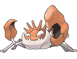
Kingler does that Gen 1 thing where the 'mon is two stages and it just gets Bigger instead of really changing things up in a noticeable way (other examples include Muk, Rapidash, Electrode, etc.). With that said, it does look quite nice; the eyes are delightful and I love the jagged, toothy bottom jaw and multiple head spikes. The larger right claw also references fiddler crabs, and while I think Clawitzer did a more interesting take on them, they still work well here. I personally wouldn't have minded a more drastic design change than just "Krabby But Butter", but this is suitable if you like that kind of evolution.
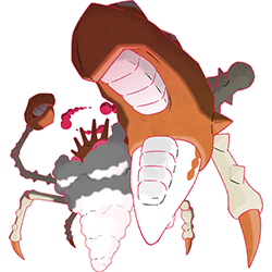
If Krabby is fine and Kingler is pretty good, then g-max Kingler knocks it out of the park. I honestly think this is one of the best g-max designs, as it works both conceptually and visually. (I wouldn't have even minded it as a third evo, though the proportions might've needed tweaked.)
First, the mere fact that its based off of Japanese Spider Crabs; they have, quoting Wikipedia, "the largest known leg-span of any arthropod", making this an absolutely ideal pick for a g-max design.
And secondly, I love how it looks visually. The exaggerated limbs and the sheer spikiness of it pushes it much further into "monster" territory than the original design, as do details like the "teeth" in the claws (accurate to IRL crab claws). It's terrifying in a good way.
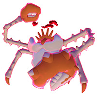
Some other nice details include spikes only on the larger claw to draw attention to it, the red eyes, the deeper orange color for higher contrast, and the extra joints in the limbs, which, once again, are accurate to IRL crabs.
The only thing I hesitate a little on is the beard. Crabs do produce bubbly foam through their mouths, something referenced in Krabby's original 'dex:

It also makes sense as a sort of visual pun; it's a "king crab", which is the name given to a genus of very large crabs. Plus, it adds something fun and unique Kingler's otherwise very straightforward inspiration.
However, it does feel just a bit too rounded compared to the spikes and angles of the rest of the design (the official art negates this a bit by giving it a similar shape to the inside claw teeth), and something about it just feels too jokey and forced compared to the otherwise very cool and creepy body. I think it might just be the mustache that does it; if it were just the beard, it would be more believable as crab foam and much more naturalistic.
Also, there's a bit of orange on the bottom half of the large right claw that adds nothing, though that's a very minor nitpick.
As a whole, Krabby is fine, albeit plain; Kingler, while still straightforward, is slightly more fleshed-out and is an overall improvement. The g-max is fantastic and the best design overall, with a more interesting "monster-y" design and a great concept.
71 notes
·
View notes
Note
dont let me touch you kitten~~ meow!!!!!!! omg k so i love voldemort if you didnt know like seriously why is he so fine !!!!!! he’s so sexy i just want to pin him down and kiss him 🥹🥹 sam dont touch me please only voldemort can 🙄🙄🫶ok stop being gay!!! but anyways,, have you seen his features? i love how detailed his face is, tbh they could've added something more sexy but its ok hes still fine 👏👏
Lord Voldemort, oh my goodness, where do I start? He's seriously fascinating! Okay, so picture this: he's this super powerful wizard, right? And his appearance, oh boy, it's just captivating! He's got this, like, totally unique look that's all his own.
First off, his head is, like, super smooth and shiny! Seriously, it's almost like he's got this magical baldness going on. But it's not just any bald head – it's like, perfectly smooth, like polished marble or something. And his skin? Pale as a ghost, but in a totally striking way! It's like he's glowing with this eerie light, you know?
Then there are his eyes. Oh my gosh, his eyes! They're these intense, glowing red orbs that just pierce right through you. And the shape? Yeah, they're all slitted and snake-like, which just adds to his whole mysterious vibe. Seriously, you can't help but get lost in those eyes!
Now, let's talk about his nose. It's… well, it's not exactly your typical nose. It's more like a little snout, kinda like a snake's! But somehow, it totally works for him. It gives him this extra touch of, I don't know, reptilian charm? Yeah, let's go with that!
And his face, oh man, don't even get me started! It's all angular and sharp, with these high cheekbones that just scream power and authority. And his lips? Thin and pale, but strangely alluring. Like, you can't help but be drawn to them, even though you know you probably shouldn't.
But here's the thing – despite his kinda scary appearance, there's something undeniably intriguing about Voldemort. Like, you can't help but be curious about him, you know? Maybe it's his confidence, or his unwavering determination to achieve his goals. Or maybe it's just the way he carries himself, like he's the most important person in the room (which, let's be honest, he usually is).
And then there's his presence. When Voldemort walks into a room, you can feel it. It's like this electric energy that just crackles in the air, sending shivers down your spine. He commands attention without even trying, and you can't help but be drawn to him, even if you're terrified at the same time.
In short, Voldemort is like, the epitome of enigmatic charm. He's powerful, mysterious, and totally captivating, with a look that's all his own. Love him or hate him, you can't deny that he's one of the most fascinating characters in the wizarding world – or any world, for that matter!
sorry for the rant i just love my man so much
Ummmm okay…
4 notes
·
View notes
Text
It's now time to talk about the tumultuous 40s


Now fashion may not be the first thing that comes to mind when we think of the 1940s. Considering this was the decade where the second world war took place, and a horrific genocide that slaughtered millions, fashion isnt at the forefront of our minds. Oddly enough though, it is during this time that many fashion designers that we know today (namely Hugo Boss, Coco Chanel) were known Nazis, and produced the SS uniforms. Obviously I think that's horrific and want to keep that in mind as we go through this decade.

With that said, the 40s are known for its simplicity. As we know, I really do prefer this. I think simplicity is under appreciated and we tend to get lost in the vast variety of clothing available to us. It’s always good to get back to the basics when in doubt. Because of the war, the priority of fashion was practicality and the materials available were limited. This created a simple, practical style, and I honestly really like the idea of this. As much as I love fashion, for an everyday sort of thing, you have to be practical. It’s for this reason that I opt for my 1460s docs as my shoes most days for example.
Above, you can see two outfits that to me really encompass the 1940s. Women started really wearing pants all the time during this decade (popularized by Katherine Hepburn, among others), because of the practicality, which of course I like. I think nicely fitted dress pants or plain cotton pants (like the ones seen above) can really go a long way. The simple cotton fabrics look elegant. It’s simple, casual, but chic and tasteful. To me, it is the perfect effortless look, the first image especially. It's why I love linen pants and tops, especially in the warmer seasons. Those white, plain cotton button down blouses (seen on the left) are a key component of this decade (which I love!!!). Belts (second image) and other accessories are also seen, which as we’ve established I am a big fan of. These looks are really what dominated the 40s. Underrated in my opinion, not everything has to be crazy and flashy to be fashionable.

The next look I want to talk about is the more “feminine” and dressier side of the decade. This would be the less practical side (which I still love), the more fashionable side if you will. As you can see, long hemlines were popular during this era. On the left is a dress, with the fitted waist that was common. I personally love this dress. It's modest, as to be expected for war times, but also feminine. It’s of course simple, but the little details are really what I love. The buttons match perfectly, the belt is exactly what’s needed (in my opinion) to add shape without losing elegance. I love the belted-waist, and it is something I even do with my own dresses and such (that are looser or cut similarly to the one in the photo). The gloves are also a nice addition, which was also popular during this time. As I've previously mentioned, I really do prefer simpler, more sophisticated, elegant, and classically feminine looks. This is really what the first look means to me.
Similarly, the second image is simple but fitted enough. It’s a two piece, a long hem lined skirt with a matching blouse/top, which recurs throughout the decade. Once again, the little detail of the buttons add a nice touch. Maybe that’s a strange thing to notice, but I really do love buttons, especially on sets like this. They add a nice little flair, and have to coordinate with the rest of the outfit. That may just be because I'm the type of person that focuses on small things. But it's because of people like this that we have to make sure everything is coordinated. The collar in both outfits is also high and very specific to the decade of the 1940s (and a bit before, as well as after), which matches the modest elegance I talked about.

That brings us to the end of this era. Thanks for reading and following around yall, and stay tuned for the next decade as we are approaching my favourites xx.
10 notes
·
View notes
Text
This post is part of a series in which I help my friend upgrade her copy of the board game "Scythe" by painting some of the game pieces. It's all being tagged #KP2023SCY to make it easy to find!
Base Coat
After playing around with the paint a bit, we decided to work on the yellow faction first. These guys look a bit like tractors, so we found a few reference photos. We settled on this one for its ability to give us most of the colors we wanted in one shot.

Here we have yellow paint in an outdoor setting, and the machine has even been courteous enough to rust up so that we can see where and how that happens.
Now, yellow is the weakest color you can get paint in. I'm not sure why that is, but you usually need to add lots of yellow paint to a mix before you come close to the same coloring power you get from most other colors. "One wierd trick" to get more vibrant yellows is to underpaint - paint a helper layer below the color you want to see - with magenta.
Why magenta? I ask myself that every time. But it works, and I haven't taken the time to sort through all the "I know what underpainting is" posts to look up if anybody's figured it out. If you find a good reason, by all means let me know.
Anyway, with the magenta underpainting and a coat of yellow, we achieved a lovely saturated dark yellow more commonly called "orange", which is a great mid tone for yellow objects.
Next we focused on the legs and wheels, adding a thin coat of gray to unify the existing lighting cues. Finally, we used a reddish buddy brown on the base and added some splotches of green to suggest plant life.
Highlighting and Shading
With the mid tones established, we added a couple highlighting steps to the model - first with another layer of pure yellow, then by adding progressively more of a yellowish off-white to the mix. On the legs, we added the off-white to the gray for the brighter areas. Finally, we added a tiny bit of blue and black to the yellow for the shadowed underside.

The shading does appear somewhat green because bluey yellow does that. This is fine, and it doesn't even register at arms length on the table because shadows really are blue like that. It would also be valid to darken with chromatic gray, or to glaze black over the orange base coat. Leaving the shadows more saturated like this allows the eye to see more details in the final paint job.
The location of highlights and shadows was chosen simply by shining a bright light on the mini and noting the bright and dark spots. That technique doesn't always work, but it's an easy way to begin to learn how shadows and highlights work.
After we had the top bright and the bottom dark, we painted an additional strong highlight on the sharp edges with the off-white. This is called "edge highlighting", and it helps the eye to understand the shapes even from across the table. You can also take your shadow color and run it into any deep recesses for even more definition.
Rimming
Somehow, people have very strong feelings about what color the edge of the base - the rim - should be. Paint that rim whatever color makes sense to you and don't let anybody tell you otherwise!
For display or competition painting, a very dark color or black would look most "professional" (if you want that vibe). For board games, I find it useful to try to match the original color of the plastic, especially if I didn't stick too closely to that color with the rest of the piece.
We rimmed the tractors with a coat of magenta followed by two coats of yellow and got close enough to the original color that there won't be any ambiguity.
We let the paint get good and dry for about two weeks before sealing with a clear coat to make the paint job much more durable. You don't have to wait that long - it was cold and raining, and spray paint is an outdoor activity for me. This is one of those things where you could probably get away with sealing in a couple hours, overnight would be better, and a week is probably overcautious. You just want all the existing paint to be fully dry.
Once the clear coat is fully dry (read: doesn't have a smell anymore) you can add some matte varnish or buff with some 000 steel wool to knock the shine back if you like.
Once again, every step is optional! Do the things you want to do, that you feel are worth your time. And then enjoy playing your game, or put those beautiful upgraded minis on display for everybody in your game room to admire!
#Scythe game#board games#minis#miniatures#mini painting#painting minis#miniatures painting#painting miniatures#art#step by step#KP2023SCY#how to#board game customization#customizing board games
7 notes
·
View notes
Text

Notes on Kafka's trailer, "A Dramatic Irony", this'll include the obvious and the less so noticeable details. I'll be elaborating on and making use of these in the future, but for now— a little list for myself (and you?) on things I want to talk about. Oof, my dear girl, there is a lot to unpack about you and I still won't be done in a year from now:
Edit: It ended up being long, but who's surprised, really?
— Background music. Entirely based on Vivaldi's Four Seasons. Most very accurately pick out 'Winter' as that's what it starts with and it's also immediately recognizable, but it actually transitions into 'Summer' just after about halfway through and beautifully ends in it. The inclusion of them both is one of HoYoverse's finest decisions musically.
— The usage of rose petals instead of blood. This one thrills me, because they add such an inherent romanticism to the concept of death, which is an ages old tale and concept (hey, do we want to tie in the beauty of how Blade craves its peace so desperately yet cannot obtain it and she cannot grant him it? I do), and it plays in beautifully to the concept of what 'fear' is usually most tied to, and how she doesn't feel it. Now what exactly are these petals of? If it's your regular red rose, then yes— it is likely referencing the intrinsic romanticism of death. I initially wondered if it could be the China rose, which would indicate longevity which could be hugely interesting but no. However, with the impending goal of 'seeking fear' and tying it directly into 'the value of life', I find the more traditional take of the red rose, a sign of intense passion/love, or a potential for the hope of passionate love, incredibly intriguing (my stance on the potentially implied ship with the MC is still where I stand, but another is creeping in through a lot of rationality and logic; because I do think that's how they plan on doing it— it's what makes most sense with implications made in her dialogue).
— Inspiration: Rorschach inkblot test. "What do you see?" It says at 0:15, and it threw me for a moment, until I looked around the text. The ink blot. Leave it paused for a second. What do you see? It's the Rorschach inkblot test. It hit me with the ferocity of a ton of bricks. For those not sure what I'm talking about, do a little search and you might have seen it used in television by some psychologists, it is a test to examine a person's personality characteristics and their emotional functioning, everyone may see something different in specific ink blots. When you leave it paused at 0:15 seconds in, that's the first card and it's called The Fear Card; intrinsically fitting, considering: "Elio said that I'm good at creating "fear", even though I don't know what it is." I didn't actually recognize the ink blot until I started typing this up and analyzed it again for the umpteenth time. I'm losing my mind, no, I've actually already lost it, because on further analyzing, I think the spider on the back of her coat also looks like it's been designed after the ink blot/card in question because it grows into a similar shape, though more so when it grows into the lines/threads of her Spirit Whisper that you see around the 1:13 mark. The entire sequence of ink blots at that timestamp give us an insight into what the guard sees that she's talking to, he sees his own death. /breathes very casually. God, I'm losing my mind, this might actually play so much more into her character. What do you see, she asks— Kafka, what do you see?
— She's so incredibly cultured. There are a lot of very classical but also archaic elements that play into the design of her character across the board. Classical music is so rarely used anymore, but it adds such a different level of sophistication to her character. Kafka stands out amidst most of the other characters, not because she's classier in general, but because they tie very old-fashioned and less used concepts into a very modern design and mold them into a perfect whole. The classical music and how she never foregoes this intense connection she has to it, the insane archaic katana versus the very modern uzis (ode to Devil May Cry, anyone? A pair of guns, one black and one white, and a katana? Along with having once worked as a 'demon hunter'? Capcom deserves the nods) and grenades, her attire especially between the coat, the high waist, the glasses and the dress shirt— but it's all beautifully put together in an incredibly modern outfit. She's so cultured, there's an intense class to her and I will not stop falling more in love with it with each passing day.
— Storytelling. 'Intermission', 'oneiric structure', 'MacGuffin', 'non- linear structure', 'fin', these are all firmly tied into the art of storytelling in film (and literature as well). Intermission is a pause in the midst of a performance. Oneiric structure refers to a structure of a tale that replicates something non-linear, so something relating to the dreamlike (oneiric comes from the Greek 'oeneiros', which means 'a dream'), think of... something surreal or distorted in reality, something that simply can't be real. MGuffin in a plot device that takes form of an a goal (an object, for instance) that is an important element in a story due to it being firmly tied to the story's characters, a driving force if you will (so for Kafka, you could see her pursuit of feeling fear). Non-lineaur simply means that a story does not follow an order of events that's necessarily chronological in terms of timeline. And 'fin' marks the end of a performance. I cannot stop being feral as to how consistent HoYoverse is with this. It isn't just referencing her trailer, or the overarching narrative of the game of Honkai: Star Rail, but also her character directly, terminology commonly used in film are in her trailer, she herself seems to be rather passionate about film (you receive a text from her regarding being alone in a movie theatre during the play of one, and she laments that there aren't more people there to watch), her eidolons being after musical terms tied to music that she thoroughly enjoys and is used time and time again to represent her. God. God.
— What some may note as being a clock counting down, is not a clock at all, but an elevator that represents a life counter. With each kill, the elevator descended one more level until it reached the ground floor. I've seen some make references to Inception and upon further glance, the reference can be intended. The 'floors' can be seen as being representative of the different levels or layers of a person's subconsciousness as she delves deeper and deeper, as she is inherently able to control and manipulate minds. God, Kafka, surely this isn't a power all from New Babylon have.
— Threads of silk; a Moirai reference tied in with the arachnid? "The silk is too fragile to be a threat, unless you're more fragile than the silk." We know she isn't fate itself, but we know, in essence, a puppeteer that ensures all sort of unfolds as Elio has foreseen, particularly with the Trailblazer, even if she trusts him/her to make the right decision. We know arachnids are far and wide associated with manipulation, which we know she's abundantly capable of and responsible for, but it goes infinitely further than that. Spiders spin webs of silk, threads of silk, threads of fate, destiny, this is an incredibly thorough and intricate character design that they settled on. Everything is so perfectly interconnected, it's absolutely unreal.
#[ ooc. ] don't try to make it logical or edit your soul according to the fashion. rather; follow your most intense obsessions mercilessly.#[ post-it. ] in a way; you are poetry material. you are full of cloudy subtleties i am willing to spend a lifetime figuring out.#[ did i make a tag to use for myself to store references and to-dos? yes. yes i did. ]#[ franz kafka; you are a minefield of wonders. ]#[ ... there's more things swirling around in my head; like the reference to no country for old men. ]#[ the continuation of the arachnid motif-- granted you know this'll be a huge topic that i'll keep coming back to... ]#[ considering my url for her means '/her/ spider web'. i'll be touching on it but as i'm learning-- ]#[ it's tied into so much more than just the obvious. god. ]#[ just. god. ]#[ alright-- let's add... ]#[ mini study. ] she must have sought something extraordinary. everything she does comes at a great cost.#[ meta. ] the mara's tether is firmly in her grasp. she will not pull upon it before the designated time; nor shall she relinquish it.
18 notes
·
View notes
Last Seen Blogs

earth-and-stars
Backup Blog
magicalmusicalmoth
weird. like life should be.

dailyjtvcast
jane the virgin cast

dustytomestudios
Dusty Tome

topbestbrand5464
สลายไขมันด้วยความเย็น