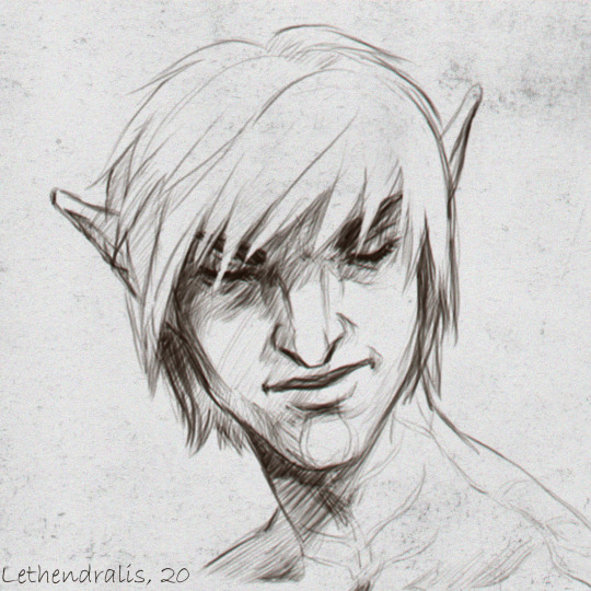
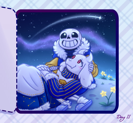
#i do not have any colouring pencils so its just a lineart
Text
Shanaya Wiseman !! 🥰
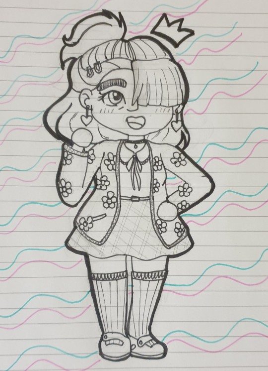
#mind blind#button wiseman#oc: shanaya wiseman#i do not have any colouring pencils so its just a lineart#she has stubs cause i cant hands
6 notes
·
View notes
Note
How do you texture your art?
(I’m sorry if you’ve answered this before, but every time I see it, it blows me away. It always looks so pretty! <33)
it' just comes down to brush choice and then slapping on an texture set layer effect to "overlay" then hoping it looks good when you look away
I use CSP and i get my paper texutres from default materials here, i dont have a particualr default one i use i jsut search up any paper textures

these just default in there so you can go stupid go crazy, what i do sometimes is that i put one texture clipped to the main foreground character and one texture for background, it jsut helsp make it feel popped out yknow
another thing is jsut brushes, i use SU cream pencil for litterally anything from lineart to shading, i make it really big and it works so well

this are the base underpainting i did with jsut SU Cream pencil and its great, when doing light strokes its litterally so fuckign good. other brushes i use is litterally just the default CSP goache, the main thing is jsut using light pressure and making the brush as big as you need it to make sure the textures are seen, you really want to minimise making blurry blending and more grainy blending
just use whatever grainy brushes you can find, and even some grainy blenders too, just find something that has a lot of grainyness in it when you make the brush big

another weird texture thing i do and i only learned to do this recently, if you want some vibrancy, litterally get any brush (i use the csp goache brush) and if you have the option; set the brush to randomize colour per stroke and set hue to like big (or however you see fit it jsut depends on what you wanna do)
jsut start doing strokes of random colours and blend a litte bit and set the layer effect to anyhting liek any dodge effect or even overlay
it gets you weird splothes of colour that makes it more vibrant in a sense i feel it lends to the texture:

thats all i really got, its a whole lot of experimentation and finding preferences, you really have to train yourself sometimes to stop making blurry blends and jsut maintaint he texture
36 notes
·
View notes
Note
Your art style to me has a main identifier of like, feeling sketchy while fully coloured. It's like the lines. Sorry this is a bit late it took me a bit fully analyze.
don't apologise theres no such thing as late!! i love getting asks u could send me asks for ask games from like eight months ago and i'd still answer probs lol (honestly just send me asks for any reason at any time it's like enrichment to me)
thanku!! *whispers* its cus i hate lineart. which is also a problem cus i like how it looks 😔😔
for a long time i struggled w/ whether i wanted to do super clean animation-style stuff or full-on paintings which u can see here. i think i talked abt this a bit on my spam blog but basically i had an eureka moment where i realised i was sacrificing my enjoyment in the drawing process for an imaginary ideal goal and was kinda making myself miserable while drawing which meant i spent less time on each drawing which meant they always turned out subpar to my standards. so i kinda explored for awhile and i think ive landed on something that customizes my process to something my brain and eyes both approve of.
i think im slowly inching towards getting a bit more cleaner but a mate and i were talking the other day abt how drawings that uh.. look like drawings have a certain appeal yanno? like when u watch old cartoons and can see the pencil sketch lines. there's something charming abt it.
uh yeah idk where i was going w/ this lol. colouring sketches makes me happy 👍 brain go brr brr pretty colours 👍👍 no line weight club represent
#asks#i wrote a whole thing abt ai nowadays and individual artists motifs but it got too rambly lmao#but ye remember kids happy artists make gooder art!!
4 notes
·
View notes
Text
Tagged by: @thevoiceofthanatos
Favorite color: warm bright yellow, mustard yellow & old gold, and just yellow in general. its a good colour. it makes me happy
Currently reading: idk, probably star trek fanfic my friend @rubbertplant was writing to give my opinion on it. i often read through my own stuff too lol, like whoah i wrote that??? ADHD has taken everything from me including my capability to read though, for real. ive been thinking of trying to listen to some audiobooks recently though, this cannot continue... its just that i also have no ears disease so idk how well that would go. determined to try though
Last song you listened to: havent been listening to music so much bc ive been playing videos instead but my last.fm has all my spotify listens so itll stay up to date on whatever i listened to last. currently seems to be “please play-bite” by pinocchioP. i often just let spotify play me whatever it recommends anyhow so theres variance. and i only started this account like a few months ago max so its not really a full picture of my music-listening
Last movie (in theaters): its not really a movie, but if it counts, the first ginga nagareboshi gin stageplay (recorded and released in finland in theaters with subs)

ginga was always huge in finland for some reason. idk. the anime is so violent though that i got really afraid of bears for some reason. theres so much blood... i never read the manga either i just knew of the anime and partook in my share of wolf roleplays (dogs were uncool! so i didnt do dog roleplays. iirc that really was my reason).
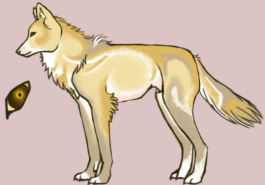
heres some funny wolves from my wolf rp days
2010. one of the first things i coloured digitally... i painstakingly cleaned the scanned pencil lineart with a mouse
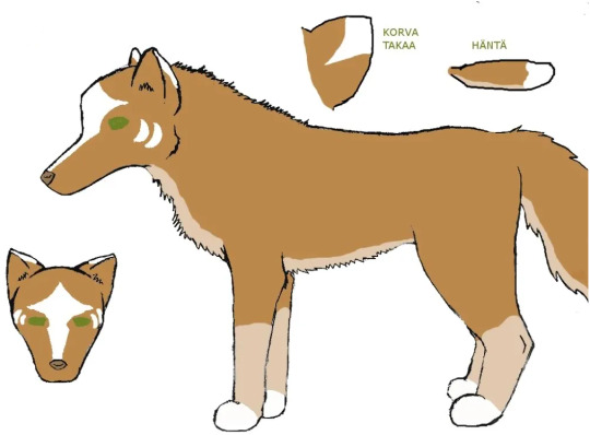
2011. i had gotten my first drawing tablet as a birthday/xmas gift and practiced a ton around this time (more than just wolves lol)
Last series I watched: trigun stampede. even changed my phone bg into vash... but millions knives is probably my favourite. he just does everything wrong and makes his life worse. and everyone elses life too bc he sucks. but hes multifaceted so hes also my meow meow and whatever. i hope a ford explorer drives over him

if it counts though, ive seen some star trek TOS episodes and movies because my friends have been watching them. im not super into it but its always fun to hang. i also dont watch a lot of stuff. i dont even know what i do. guy who doesnt read or watch things but listens to jerma videos on youtube without actually looking at them while i “draw” and “write”
Craving: food honestly. i should cook something lmfao. i also want soda so bad but i dont have any. id make some tea but its disgustingly warm in my house so i only want cool drinks. could kill for a nice milkshake or a smoothie rn i think
Tea or coffee: tea... im the only finnish person who doesnt drink coffee for real. also got really into loose leaf tea bc i befriended a chinese lady who is really into tea and has a tea shop in the city near where i live
Currently working on: drawing this and trying to think how i want to do it. somehow want to incorporate flat colours and maybe shade his body naturally, and make the blood look realistic instead of flat colours... hmm not sure yet what i want to do

other than that im trying to proofread the chapter of my ryanyuri fanfic i already published because theres a lot of typos and strange sentences in there but its been a chore bc my body breaks down when it gets too warm smfh... not looking forward to when my apt goes over 30 degrees celsius it is unlivable. im also trying to complete a “lookbook” of my tnb sims. but i always start huge projects that take three million years to complete and im really slow lmfao
Tag people you’d like to get to know better: i could just ask these questions from everyone i talk on discord with. fuck my friends i know irl or otherwise, only asking people who r my friends through tumblr. no need to do this though. also this isnt probably meant to be answered so long-windedly... thats just me. i cant answer with one word i gotta write an essay. heres three tags though @basslinegrave @vita-divata
(record scratch before 3rd tag) and @rubbertplant bc they were streaming a game in discord when i started typing this and i was like hey wanna do it and they were like yeah
i expect replies on my desk by 5pm TOMORROW!!!!get to work!!!! no i jest, do it or dont, i dont mind either way, just if you feel like doing this. if you see this and want to do it feel free to consider yourself tagged. godspeed
5 notes
·
View notes
Note
hi! do you have any tips with digital art? & if I may ask do you use procreate, please & thank you
hellooo yes so this answer might be super boring but oh well!!
oh and i use clip studio paint and a wacom intuos pro medium 🎤🦍
my best tip for digital art and art in general is to keep practicing and trying out new things as often as you can. practice shape and form and change the way you think about art. instead of drawing something the way you KNOW it looks, draw it the way you SEE it. this is like one of the basic boring first lessons you will have when you study art, it challenges you to use your eyes more than the knowledge you already have about the world while drawing. try keeping a sketchbook or something where you just draw objects without looking at the paper. draw things without the pressure of them having to look "good", draw to just draw you know! its really good practice and the only way to get better at drawing is to practice like crazy and try out new things and letting go of that fear of stuff not looking perfect.
i try out new brushes with different textures and shapes all the time because i always grow bored of the ones i use regularly, and so to get the creativity flowing again i always change things up a little. plus, a differently shaped brush will add interesting textures and shape to your art. one of my favourite brushes i use for both lineart and colouring because its so versatile since it adds just the right texture for me, i think its called SU cream pencil or something like that in clip studio assets
and when it comes to colours i always work with a limited palette because i find it helps bring the piece together?? if you stare at my art for long enough youll see i use the same colours over and over again in both the same pieces but also in different drawings and thats because i have a limited palette in clip studio, with colours ive picked before and just saved because i like them! i really like warm purples and dark muted reds because i really like how they feel warm and kinda autumny sjdjjdjsja
and use references! whether it be a photo from a fashion magazine or a video where you pause to get a good pose or a photo or real life, use references!! take photos of yourself and trace them, i promise its actually good practice!
pick up a book about drawing at the library or watch videos of professional artists breaking down how they work! theres a lot of really good artists online who are way better at teaching than i am HAJFHSJDJD
a book i would really recommend any artist is called art fundamentals! its about colour theory and perspective and shape and form and you name it, its really good and inspiring. filled with lots of cool art 🐙
i have a lot of things to say about practicing art but the question is kinda vague so sorry if this is all over the place hjsjdhakfjfj but yeah at the end of the day my only tip is practice and dont be afraid to try out new things and play around 🪱
#oh and also. the thing with posing a figure with sticks and balls for joints? sucks. dont do it#use soft round shapes and action lines instead and LOOK AT REFERENCES#the sticks and balls method seriously only makes a figure look stiff and unnatural#im literally baffled that people still teach that lmao in my opinion it doesnt help any artist getting better!!#theres way better methods to drawing a pose#figure drawing classes will seriously help SO MUCH i know it can be expensive though but you know#sometimes theres cheaper ones or free workshops at some schools and whatnot#hope this rambling mess offers some insight and help though fjwnfjwkwkd#ask
16 notes
·
View notes
Note
YOU DRAW W PROCREATE …. i am so so sorry but do you have any recommendations when it comes to brushes for sketching/doodling your lines are always so nice
i actually use csp for most of my artworks! procreate is usually for sketching/thumbnailing, i rarely do full illustrations on it 😭
for procreate my go to sketch brush is maxpacks' mechanical pencil (which is part of his comics pack), its about 15 bucks for the whole pack! his brushes are of excellent quality and very worth the price imo
for csp i use this one for clean lineart, and for regular sketching and colouring i actually just use the g-pen provided in the software with some adjustments for preference lol
hope this helps!
12 notes
·
View notes
Text
This Week In "Time & Again" #2: Gettin' Technical Here! 😁
Now, since all the vector prep is done, it's finally time for me to start actually drawing every single frame for Chapter 5!.. Just like that! 👇😁

Oddly, as I started drawing the frames for Chapter 5, I feel extra hyper but also very relaxed and blissful at the same time. Maybe it's nostalgia, for as far as I remember, in winter days I liked to enjoy drawing at home, in the warmth, watching the snow outside. Seems like the work on the artworks is going exceptionally well - much better than when I worked on Chapter 4. I'm excited to go forward with my crazy undertaking; but on the side, I have a lot of non-"Time & Again" ideas, and I revisit my old writings, hoping to find extra spark for the other universes and timelines I have in mind, and all of that powers me up. I feel very active and positive.
Aaaah, dis is the season, innit?.. Here, on this side of the globe, winter is halfway on. In the end of the last week it snowed in neatly and almost evenly, and the birds on our balcony look all fluffed up and fidgety, waddling from one little foot to another to keep themselves warm while trying to unbury the birdy omnomnommies from under the not-so-giant-yet heaps of snow. The snow has melted a bit by now; I watch them through the balcony window, sipping on my Earl Grey tea every morning and throughout the day, and it makes me feel at peace, and yet a little sad at the same time. For if I had knitting skills, I would've supplied all those cute little sparrows and the peanut-hungry blue jay family with some nice sets of hand-made sweaters, hats, scarves, and socks. But alas, I can only do that in the form of artworks for now.
But I digress. Back to my graphic novel now.
For those who don't know how I usually work on "Time & Again" - and I presume, that's what I'll keep doing for the rest of my comic-type projects, that is, if there's ever gonna be any more - I do everything consecutively, starting from the lineart (including the backgrounds, especially if the frame requires very specific placement of the character on the background, or they interact with it in any way), then I do the flat colouring, and then I go for the shading.
And by that, I mean that I do all the lineart for all the pages first, then, once that is done, I switch to colouring of all the pages, and then, once that is done as well, I finally get to do the shading on all the pages. Told you, there's definitely a certain system in the way I work on my stories.
This is also a reason why I never ever post updates page by page: because there's simply nothing to post, since they're all incomplete. Deal with it 😎
It seems that this manner of work suits me best. I'm not certain why, but I've never been keen on sharing the works that are half-done or something - although lately I'm going through a certain metamorphosis in this respect.
Moreover, it is important to me to keep the same steady, precise, and classy art style throughout the chapter. Consistency is what I highly value in my creations. People, who also draw, have probably noticed that, at times, their art style might wiggle and be, let's say, all over the place - and sometimes this just happens on its own. I can't really explain this. This must be some sort of hidden mysterious consciousness of our pen/pencil that simply does things on its own 🤪. Sometimes our mood contributes to how the art style changes in tiny little details - at times to better, at times to worse comparing to what we strive to achieve.
Through executing everything consecutively and finishing up the "chunks" of different types of work one after another, my goal is to avoid unnecessary and unwanted art style inconsistencies that might occur otherwise.
But enough of this lengthy preamble! Let's finally get technical, just as the post title announced it! I see you're getting bored... (no, wait, what do you mean it's just my neighbours snoring?.. I don't know what you're talking about)
This time, since I decided on making a regular page-by-page PDF version of the chapter as well as its scrollable webcomic doppelgänger, I needed to figure out how exactly to simplify my work in order to avoid accidental complications (here, almost a quote from a character's line from the current chapter, lol!). Of course there's no way I want to do the same amount of work twice just because I didn't anticipate the outcome correctly.
Not to brag about it, but I must admit, as far as I remember myself - I've always been good at this. There's always a place for being extra technical when it comes down to the artworks. It's not as simple as it might seem to you. Deciding on the technical aspects of creating artworks is kind of a puzzle, in a sense. It's almost mathematical 😁
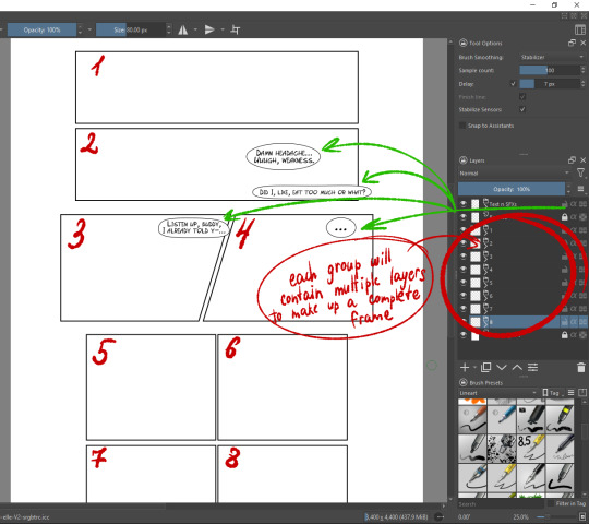
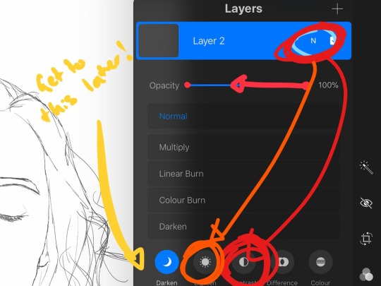
So, as you can see on the screenshot just a little above, that's a layout of a comic page (in the regular format for now). To make everything work out in a simple way in the end, I decided to create layer groups for every each separate frame (red markings) that will include everything I need for the frame: the lineart, the colouring, and the background. That will help me to just copy-paste a certain frame on the new canvas optimized for the webcomic format - and that is all! All done in a few clicks. Automation 100% 😁 (having Minecraft flashbacks now for some reason...)
All the text-related material (speech bubbles, the text lines themselves, and all the possible written sound effects such as "Swoosh!", etc.; the green markings on the screenshot) is currently included into one group above everything else. I've been importing these layers straight from Inkscape in PNG. But I started to think now that I need to separate those elements in the end, too, for further convenience and simplicity of arrangement on the webcomic format canvas. But that will be work for another day in the future.
In terms of memory usage, I'm not certain yet how it will go for me, for sometimes Krita would randomly crash on me without anything in the error log, and every additional layer adds to the memory usage even if it's near empty - finally, considering fairly large size of the artworks pixelwise, it all adds up pretty quickly. But I'm not exactly running Krita on a potato either (mmm, potaties 🥔🤤), so I think I should be fine.
Previously, perhaps counterintuitively - but again, it worked just fine for me back in the day - I used to create a giant layer with all the lineart for the current page, and then the flat colours for the entire page were stored on a separate "flats" layer, and all the shading for the entirety of the page was stored on its own separate "shading" layer, too. The same went for the backgrounds: depending on the pictures overlapping or not, I would've drawn all the backgrounds on a single layer called "BGs".
This approach would've not worked this time though.
In the lineart work, I'm currently finishing up page 9 already. ALREADY! 🥳🥳🥳 Which indeed sounds pretty awesome, because it just goes ahead steadily. That is, however, keeping in mind that there are frames that I just left out and skipped for now, for they require extra consideration. You see... Chapter 5 is going to have a peculiar scene - something that I've never ever tried drawing before just yet, and it's gonna be pretty long. It's fairly stretched out across a few pages and it's almost represented in a slower-than-real-life pace (surprise, surprise, isn't it what I usually do anyway tho?..). As I work on it, I wonder if it's going to be too boring for the readers. But I think the time will tell, for, once everything is done properly and in colour, it's gonna be much more of an eye-candy than it is now. I sometimes have difficulties approximating the end result in my head. But often it just turns out a little nicer than expected, which is a bonus.
Because screw perfectionism; that's in the past for me 🤣 (true story! did NOT enjoy it! got out with minimal losses!)
... Since this post seems to be stretching out in time and space as well, just as the certain scenes I'm working on, I think it might be time to wrap it up for today.
Happy Halloween everybody! And I foresee significantly more sketches and screenshots in the upcoming posts! Take care! See ya sometime next week! 👋
P.S. And, of course, for a nice holiday treat, I made a Halloween artwork, again. And this time it's not that simple (and for a spoiler: this year it's not gonna have Cacodemons as pumpkins, nope): it also serves as the first teaser for Chapter 5 and the second half of "Time & Again"! So don't miss out on it 😉 You won't though, because it will soon appear in my blog!
0 notes
Note
So I love how you draw everything traditionally then colour digitally! Would you ever do a tutorial on how you colour digitally? I always find my colours get shifted(?) when I try to colour traditional line art by putting it on like a multiply layer or something
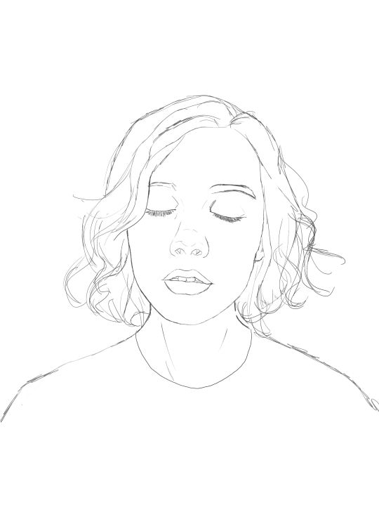
Sure why not lets do it. Meg can be our guinea pig for this demonstration
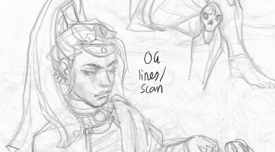

So here are my original lines, scanned in at greyscale (or b/w). Vs the end result
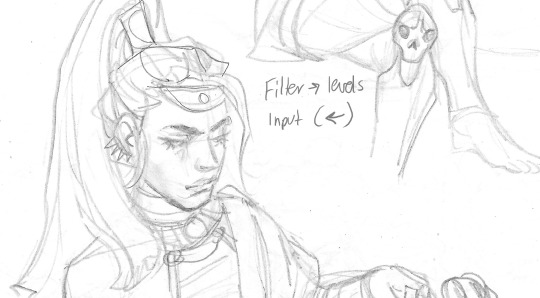
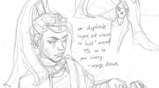
The key is to get the white to be as white as possible without losing the lines. So i do the left technique on firealpaca, but you can also duplicate the og layer, setting the above lqyer to a low % of 'add' filter, and then merge down. And get a similar result. There a bunch of different ways to even out greys and increase contrast, these are just two options (dw about the lines being light, we can make em darker later).

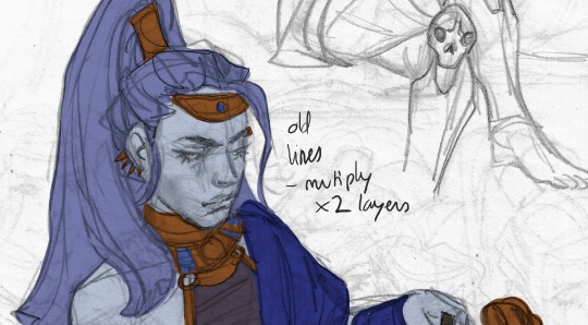
I then edit the lines, changing any mistakes or messes done in the traditional sketch. Heres a side by side of the new lines vs the old lines. Its mostly fixing the face. Make sure the lines are completely devoid of colour- so set the saturation to low/ greyscale.
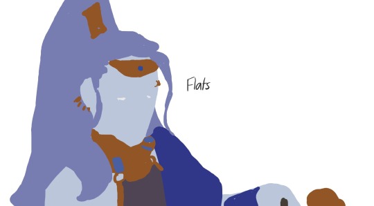

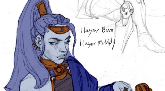
Here is the flats vs the flats with og lineart and the new lineart in the bottom two. The colours are all done in seperate layers that are under the linesrt layers (sometimes i have 1 layer set to multiply and 1 layer set to burn, or 2 layers to multiply and 1 to burn- depends on how dark or light my original pencil lines are and what effect i want).
This isnt the be all and end all. Just how i do my lines and then begin the colouring process. Good luck!
600 notes
·
View notes
Text
From planning to posting, share your process for making creative content!
To continue supporting content makers, this tag game is meant to show the entire process of making creative content: this can be for any creation.
RULES: When your work is tagged, show the process of its creation from planning to posting, then tag 5 people with a specific link to one of their creative works you’d like to see the process of. Use the tag #showyourprocess so we can find yours!
Thanks for tagging me @candicewright
I’m tagging @aikakuu and this piece
@italiansoda and this piece
I don’t have anyone else to tag on tumblr orz....
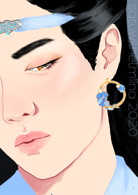
You can reblog the original Lan Zhan piece here
So the process for this started when I saw an instagram ad for these earrings. My brainrot went “oh. lan zhan” and I just decided to draw him with them.

I didn’t really have a pose in mind yet, so I just set out to search for images of Yibo I could use to kind of inspire me in that way and came across this one:
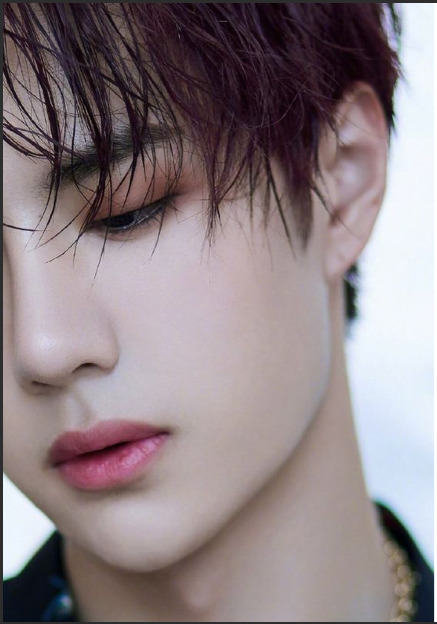
I thought this was perfect. It’s such a good closeup that will allow me to really just work on some of my favourite things in close-up portraits, and it will allow me to also showcase the earring. It’s obviously from a photoshoot for something, and the idea of earring model Lan Zhan was really delicious.
So with this image I started sketching in clip studio paint.

I like to use the default design pencil brush for sketching, just in case anyone wants to know haha. After the sketch I set about making a colour palette. I usually colour pick from images and then adjust them so that the colour is a bit more vibrant.

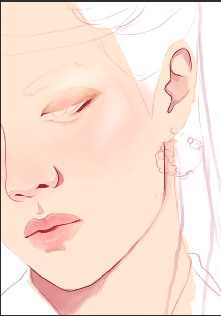
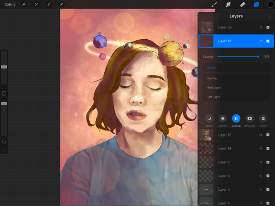
Usually when I start colouring I start with the skin. I tend to render most of it. I use the following brushes usually:

Every brush apart from the last one is a default brush in the software. I use the last one when I do “lineart”, so usually anything with a harder, non-blended edge in the image.
Obviously the skin here is after I’ve already fully rendered it. The shimmery eyeshadow and the shimmer on the lips was added last, after everything else had been finished. Other than that it was fully rendered before I moved onto other things.
The next step for me is always the eyes. When I’m drawing close-up portraits I use like 5000 layers for the eyes. The first one is the sclera and the colour of the pupil
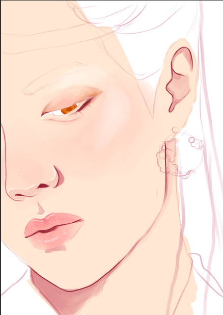
After that I usually draw the lashes. In this case the upper and lower lashes are on separate layers.
Up next is the pupil and the effects. The pupil is on a separate layer between the upper and lower lashes.

Above the pupil layer, below the upper lashes is the effects layer, it is set to Add (glow)
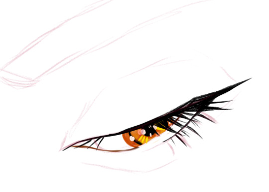
Usually for these effects I pick colours that match other bits in the drawing. In this case it is golden because of the golden earrings and the fact that lan zhan as amber eyes.
After this I add a layer of white lineart below the layer of upper lashes and on top of the pupil
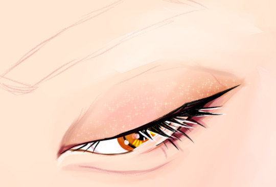
(You can see the “eyeshadow” look below in these layers as well. This was mostly done using the emphasise texture brush and I think the default oil paint brush. )
After that come the eyebrows and hair. For eyebrows I usually draw a black caterpillar that loosely follows the shape of the eyebrow and then blend it until the colour is a translucent grey. After that I use the brush I use for lineart to draw some individual hairs

For hair I usually do flat colours first and then add some variation with either the flat marker brush or an effects brush I got when I downloaded a massive pack of hair texture brushes. For this one I think I used the flat marker and strangely enough the fingertip blender.

After this I drew the headband and the earrings. The process for all of them is simple: flat colour first with the turnip brush and then shading with the emphasising texture brush and maybe some lines with the random brush that has a korean name (see the brushes I regularly use).

There is also a separate add (glow) layer on top of these that I’ve used to add some sparkles!


There’s also a layer of white lineart that I used to make sure the earring pops out of the background a bit

After all this I went and added the sparkle on the eyelids and lips.

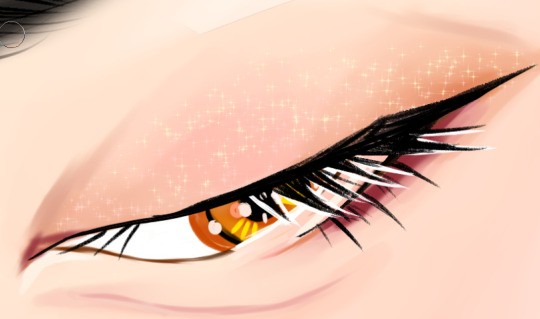
I think the brush I use for this is a default brush but I’m not quite sure anymore.
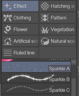
In any case, I use a combination of the sparkle a, b, and c brushes.
The last step is the background and the clothes. For this piece they were super simple, basically just flat colour.
And that’s it!!
67 notes
·
View notes
Text
New mspaint tutorial

You wanna make art like this? Course ya do here’s how ya make some fuckin pixels in mspaint look good

Step one; Dont use the brushes - The default brush icon is ‘fuzzy’, and when you magnify the brush strokes you can see that it has pixels of grays and blacks around the edges. This means that the fill tool will leave gaps in the lines you make. Gross!
Instead use the pencil icon.

Why the pencil is superior - It’s a pixel brush! It doesn’t have wierd fuzz attached, you can get super detailed and precise, & its just so much better in every form.
As a bonus note; keep zoom at 100% or higher (200, 300, ect ) when you are doing lineart - The further the zoom out ( 50% 25% ) the more fucked your lines are going to be. This is good for sketching on a large canvas, but not good for making clean lines.

ACTUALLY DRAWING THE ART. Sketch in a colour that is not your lineart colour. This is important; as the way clean-up is done means that if the lineart and sketch are the same colour, they will both be erased. For this i would reccomend red or the light gray to sketch in, and lineart in black. This makes it easier to see what is where.
Once you have your sketch in red, blue, gray or whatever; line that sucker - I use the size 4 pixel brush because i like chunky lines; any size works for this.
When you are done with your lines; grab the fill tool - You’ll want to select the same colour as the sketch. This is so you can flood-fill the canvas and remove the sketch - Alternate between two colours to clean up.

Once the sketch colour is gone; you can colour! Be mindful of gaps - It’s pretty straightforward from there me thinks. Bonus! You can use the eraser tool to replace colours or erase certain colours. By holding right click with the eraser tool; Colour one will be replaced with colour two. In the example i made black into a grayed out purple. The eraser will only replace colour one, so you can go out the lines and be okay! It will not colour over anything else while holding right click down.
Actual colour-picking and shading is a whole different thing and i dont want to get into it just yet - if you find this helpful feel free to share it around or repost it i dont care. If you have questions you can always leave a reblog or reply; or message me directly o—O hope it helps the 3 people who sees it lmao
12 notes
·
View notes
Text
Artist Meme
Was tagged to answer this set of interesting questions by @kourvo
(original post is here: https://kourvo.tumblr.com/post/621355098110640128/artist-meme
Thank you so much for that!
Let’s see....
1) What is the character you've drawn the most (Can be original or fanart)
This precious boy. I can never get enough of him. One of the most compelling characters I have ever come across. Love everything about Fenris and can relate to him on so many levels!
2. What colour do you often use?
Gray and brown are my faves. And all other colours have the same chance of appearing in my artwork :D
3. Any colour you are bad at using?
I don’t think so...I love them all, even the pinks and yellows people usually find hard to incorporate into a colour palette. Tell me in the comments if I’m wrong :)
4. When drawing people, where do you start?
Funnily enough - either with the front of the hairline or with the left eyebrow. Don’t ask me, why - I don’t know myself.
5. What is a character only your eraser will love?
Hmmmm...any sort of villainous character. I can’t draw evil people convincingly. I’m a huge softy at heart.
6. Which of your works took the longest time?
Big scale commission I did for @pikapeppa, featuring all the Inquisition companions, along with Fenris, Rynne and Carver Hawke. That one took almost 3 weeks, due to its sheer scope and my relative lack of experience in such large works. Pika was extremely patient with me though, for that I am eternally thankful!
7. What techniques do you use when you want to improve in drawing?
Classical art studies. Varying my technique, themes I choose and software I use. I try to experiment and go outside my comfort zone often.
8. What do you think of the art of the person who gave you this ask meme?
I adore Lillymon’s technical skill, refined style and limited colours! She is a huge inspiration for me!
9. What art tools/media are you good with?
DrawPile, Photoshop, graphite pencils and liners. That’s about it :)
10. Art tools/media you are bad at?
Traditional paints. I have no formal artistic education and my lack of knowledge comes to the forefront whenever I have to paint on a real canvas. It’s so much trial and error, you can’t even imagine....
11. What do you think about your own art?
Lately it’s one of the last few things that were bringing me joy. I hope I won’t lose the passion for it. Because at this point I’m not sure I’ll be able to find some occupation I will be genuinely interested in and good at it. I don’t know if me gravitating towards moody fantasy art speaks about my fear of facing reality. If so, idk what to do with that. I do hope to develop my skills and being able to support myself financially as an artist.
12. Do you consult references for your drawings?
Yes. A lot of them. Anatomical atlases, schemes for both academic and manga art, photographs found online and taken on my own, copying colour palettes from classical art - anything goes. I think it’s essential to develop your technical skill.
13. What do you like about your art?
Lately - consistency, both in terms of produced results and in sticking to the timelines I set to myself. I hope this lasts. I would also like to branch out to other themes and not confine myself to quirky fantasy characters, so I’m working on developing my own story behind the scenes (spoilers) :P
14. What habits do you have while drawing?
Only the bad ones, lol. Hunching forward in front of the screen, forgetting to eat, drink and letting my eyes rest. Tilting my head to the side instead of rotating the canvas....I’m an idiot XD
15. Are you good at drawing faces facing right?
I think that’s the thing I’m good at!
16. How frequently do you draw?
For the last 1,5 years - almost every day without fail, for good or ill.
17. What do you do when you have artist's block?
Change occupation and work myself into a depressed state. I changed work places in the last few years a lot, working as an interior designer, draftsman, textile designer, a cook, a bartender to name a few.
18. What must you have when you draw?
No commotion around me and a cup of some hot beverage.
19. Do you have a lot of stray lines (messy lineart)?
In the starting stage of my work process - yes, like you wouldn’t believe! If it’s a personal doodle, I sometimes just leave in as am under layer and draw clean lines on top of that mess. It looks cool in a way.
20. What is drawing to you?
An essential part of what helped me to retain my sanity in the last year and a half. Hopefully a lasting profession that will help me pay bills and survive on my own, if my life falls apart entirely later.
21. Your art goal from now on?
Broaden the themes I depict, improve my technical skill, work on personal creative project and not only fan arts. And most of all - not giving up on it this time.
22. Artists you've had influence from?
To name a few: @kallielef @kourvo @shayafury @fairsparrow who I met here on Tumblr, and many others who I follow and zealously study their works for clues on how to improve my own work.
23. Artists you like?
I am following them all either here or on Instagram, I also do my best to share their works on my side blog!
24. Which is easier to draw, humans or animals?
It was animals earlier. But now that I started to diligently study human anatomy, I would say it evened out! I’m quite confident drawing humans/humanoids now!
25. Show us an old drawing
My first digital drawing from 2010 when I first bought my tablet!
26. What is the charm-point of your art?
I ummm....I don’t really get the question? Is that like the the strongest suit of me as an artist? Intense expressions maybe? Idk. Let me know in the comments :D
27. What is the first thing you would draw if we're talking about fantasy?
Broody warriors, he-he
28. Please draw your most beloved character:
Here’s a sneak-peek of me drawing him right now! :D
29. When thinking of characters is it mostly female? male? or androgynous/no sex?
I usually gravitate towards depicting strong-willed, caring, passionate, brave, honest men and women.
30. What did you draw yesterday?
Started cleaning up that sketch from the last question, actually!
31. What is the funnest part to draw?
A circle. Mostly because you’d die laughing seeing my struggle to draw a believable one XD
32. What part of other people's drawings do you notice first?
colours, mood, eyes, hands.
33. Regarding backgrounds, what is your method of making it easier to draw?
pick your favourite textured brush, find a good reference for mood and colour scheme, zoom out, squint your eyes and start slapping colours like mad. You’d be amazed at how much you’ll be able to achieve in 30 minutes with this approach. Bare white background is the enemy - destroy it! >:)
34. What colour coordinations do you like?
Gray or brown as a main colour and then deep, earthy, saturated colours to complement the main one. Pink and orange is the combination I strangely enjoy using lately too.
35. What character did you last draw?
Fenris and Eris :)
36. Does your style change easily?
I don’t think so. More like it’s evolving slowly into something more serious and deliberate.
37. What part of drawing do you pay most attention to?
Facial expression, body movement, mood and light effects. Not so much the composition and framing, he he.
38. How do you feel about drawing adult art?
Tbh, I don’t consider straight up porn to be ‘adult’ exactly. To me adult art means aiming towards serious topics, exploring complex emotions and ideas, being honest with your viewer. I did doodle a few more steamy sketches of my OTP just to see if I could, but it was definitely a tongue-in-cheek kind of a artwork that I don’t take seriously.
39. Do you like criticism from others?
If it’s friendly and in done in private - I welcome it always.
40. How many people do you normally draw per artwork?
1 or 2. Rarely more. Crowded battle scenes are definitely not my thing :D
This was fun! Tagging forward to @shayafury @schoute @stella-minerva @nug-juggler @kallielef and anyone else wishing to go through such a long questionnaire!
50 notes
·
View notes
Text
Flowers for Yikes!
Steve stands outside of…Atomic Midnight Tattoos…preparing for his demise. He breathes in, then out, and opens the door of the parlour. As he walks inside, he is greeted with a smile by a lady that looks suspiciously like Connie Marble. “Hi, welcome in! Do you have an appointment with one of our artists?” Steve reaches the counter and says “I-I don’t, sorry.” He’s never been to a tattoo parlour before. He doesn’t know the procedures; he’s only aware of the pain factor from stories his friends have shared. “No need to apologise, it’s alright. I’ll ask and see if any of our artists have free time for a flash tattoo appointment. Be right back.”
Steve waits for a second, looking around the parlour with it’s red on (darker) red damask wallpaper, and the wooden baseboards and door frames painted black. He admires the chrome chandelier above him and especially loves the exotic plants decorating some corners of the shop. When “Connie” returns, Steve stops his prying and gives her a hopeful look.
“Hurricane Bill isn’t busy at the moment. Would you like to see examples of his work? Or just book now..?”
Hurricane Bill? What kind of fucking name is that? “No, it’s alright. We can just book now. It’s…it’s not a big deal of a tattoo, so I’m sure Bill’s skills will do.” He hates that the last part rhymed a little.
The lady in red chuckles behind her hand and tells Steve to fill out a release form while his tattoo artist prepares and sets up his work station.
As Steve returns the release form, he hears the sound of rubber soles approaching on his left.
“Harrington?”
Steve turns quickly to see the owner of the boots, and time suddenly stops.
“Billy?!”
A chuckle.
“Yeah, it’s me…don’t cream your pants.” Billy winks at Steve.
“Oh god…” Steve’s face flushes and he covers it with his pale hands.
“What are you doing here?” (‘Connie’ leaves to the back, giving these two idiots some space.)
“Well…what do you think?” One hand remains on Steve’s face.
“I never expected to meet you here…”
“What? I can’t get a tattoo?”
“No, I mean I never expected to see you in CALIFORNIA.” Billy holds his arms across his chest.
“Oh…well Robin and I just opened business here and-”
“Woah! Wait, wait…come into my room and you can tell me all about it while I sketch, yeah?”
And so Billy leads Steve into his “studio” and closes the door behind them. Billy gestures for Steve to sit on the dentist-looking chair, and Billy takes a seat on a rolling chair next to him, quickly fetching for his sketchbook. The room is small, but looks efficient and organised. There’s many drawers; hygienic products and ink on some shelves; a sink; a few photos framed over the eggplant painted walls; and some potted succulents scattered here and there. There’s also a small bookcase that catches Steve’s eye, and a fancy lamp on one of the corners.
“So, what are you looking to get tattooed today?” Billy grabs a pencil from his desk.
“Well…” Steve starts nervously. “I kind of lost a bet and-”
“Oh no.” Billy lowers the sketchpad to his lap.
A beat.
“I have to get ‘DINGUS’ tattooed and…” Steve trails off, a shade redder than he was before.
“Like…the word DINGUS…on your dingus?” Billy teases with a smirk plastered on his face as he ties his hair back into a bun.
“What? No! That would be…inappropriate.” And there Steve goes placing his hands to his face again.
Billy doesn’t say anything and just waits for Steve to tell him more about this horror-piece of a tattoo idea.
“It…it has to be a tramp stamp.” he says in a very wonky, very unsure tone and looks down the whole time, obviously embarrassed.
“Oh…ok, no. I’m not doing that. That makes me uncomfortable.” Billy gets up and puts his sketchpad away. He seems tormented by the situation and Steve just “What? What do you mean? It’s just-”
“Steve, I don’t care if you lost a bet.” He looks back at Steve. “Hell, is your friend…Robin?” Steve nods once. “Is Robin at least paying for the tattoo?”
“Well, no, I lost the bet so I-”
“No, fuck that shit. I’m not fucking up your beautiful body that way.” He begins to remove his jacket. “Do you trust me?”
“What? N-not really …I haven’t seen you in years its-”
“Wow…ouch.” Another beat. “No here-” Billy takes Steve’s left arm and places it over Steve’s head. “Just trust me. Keep your arm here for me. I’m going to lower the upper part of the chair…just sit still.” Billy fiddles with the bottom of the chair and Steve would be lying if he said he wasn’t panicking a little. Suddenly Billy grabs at his shoulders and gently brings Steve’s head down on the chair. He gives him a pillow to lay his pretty head on and Steve is still nervous…but also, Billy just fucking called him beautiful. He doesn’t know what to expect anymore, but he also doesn’t want to get up and leave. As scared as Steve feels in the moment…he’s also immensely curious to see what Billy is up to.
Billy gets some sharpies and a disposable razor from one of his many drawers. He presses play on his boombox and Kashmir by Led Zeppelin begins to play from the speakers just audible enough to be comfortable. Billy then shaves the back of Steve’s forearm, and then starts free-handing some design on his arm. Steve can see nothing; he’s not allowed to. He only feels the smooth tip of the markers making delicate lines on his skin, and it almost feels…seductive.
“So tell me about this business of yours. I’m intrigued.” Billy asks while he continues to mark Steve’s arm.
Steve actually smiles at that…Billy’s interest makes him feel more at ease. “It’s a flower business! It’s actually right across the street from this shop.”
“Oh, no way! That’s you guys? We saw the establishment come to life little by little. It looks like a very homey shop. Congrats.”
“Thank you! We’re very proud of it. Robin and I just opened last week and so far everyone’s been so nice and supportive.”
“Is Robin your girlfriend?” Billy asks nonchalantly, but with a hint of worry at the VERY back of his voice.
“Noooo.” Steve says with an almost brooding tone. “Robin is my best friend and nothing more than that…”
Billy scoffs at that statement and tries to lighten the mood after Steve’s tone. “Hmm…yeah sure…because friends can’t be real best friends unless they make you get tramp stamps across the street. Is she cackling over there, or how come she didn’t come witness the glory of her suggestions?”
“Well she went out of her way to restock some flowers today…she’s expecting the tramp stamp when she arrives and now…I don’t know what to tell her.”
“That’s alright. I can talk to her if you’d like…” Billy scribbles at the bottom of Steve’s forearm. “I won’t miss adding DINGUS on this fucker anyways.” He continues sketching.“So why flowers?”
“Well, I’ve always been very attracted to flowers…they’re just so pretty, and plants are SO interesting! Robin has also told me I have an eye for detail. Flower arrangements are a great way to combine my skill and passion.”
“That’s admirable. Say…do you think I can swing by your shop, and request a special bouquet for my girlfriend after our session?” Billy smiles, even if Steve can’t see it.
“Sure!”Steve tries to sound enthusiastic, but waits a little before adding with another brooding tone“…you have a girlfriend?”
Billy chuckles. “Nah! Mag is my best friend. She has a girlfriend though! And I’m pretty sure they’d love to have some flowers in the apartment. It’s been a while…”
“Huh…funny how both of our best friends are lesbians.” Steve makes a remark, and Billy rolls his eyes but manages to crack a laugh anyways.
“Hmm…yeah, a little weird. Alright, I’m done sketching and-NO! No no…you can’t look!” And Steve pouts a little when Billy grabs and keeps his arm over his head.
Billy then starts to prep the tattoo machine. He grabs some black latex gloves and brings his small table with ink caps closer. “Alright Stevie, I’m coming in. Are you ready?”
But Steve is still stuck at the fact that Billy just called him Stevie. “Umm…” and then he catches on. “Ready…yeah, sure. Let’s do this.”
“Alright. Remember to just keep breathing, and if it gets too uncomfortable…count to 10, focus on your breathing, or talk to me! I want to make this a comfortable experience for you. Wait…is this your first tattoo?” Comfortably Numb by Pink Floyd washes over the sudden silence.
“It…it is.” Steve’s eyes narrow a little at the corners.
“Oh wow…a virgin amongst us. Well, it’s a pleasure to be your first.” Billy winks at Steve as he cuts some paper towels from the roll. “Okay here we go.” And Billy’s needle starts buzzing and comes in contact with Steve’s arm. He drags the machine across, and Steve feels a ticklish kind of pain. He’d heard people compare the pain to cat scratches, but Steve’s never been scratched by a cat…He begins to think it might not be as painful as people make it out to be?
“Why don’t you tell me more…I want to catch up with your life. What have you even been up to?” And Steve is touched by Billy’s generous gesture to learn about his life. So they talk through the session, learning what things have changed and what has remained the same since high school; and it almost feels surreal that they’re able to talk as if they’d just seen each other yesterday. Getting the lineart done was a breeze, and the random moments of silence were brief. Somewhere down the line though, Billy feels a ragged breath coming from Steve the third time he comes in to apply colour.
“C’mon, Steve…deep breaths now.” The room tenses a little, and in the air you only hear Steve’s panting, followed by Billy’s constant “I’m sorry” mumbles and “breathe, breathe” or “You’re doing great!” but Steve still seems in discomfort. “Would you like a break? I can give you 5 minutes if you need them.”
Steve seems in a bit of a daze, and he doesn’t give Billy a reply, so he gets worried. He places his machine down and removes his latex gloves to fetch Steve a cup of water.
“Can I trust that you won’t peek at your tattoo?” Billy asks in a delicate voice, and gets nothing but a soft nod from Steve. Billy takes this opportunity to flip his mixtape over, and goes outside the room for the water. When he returns, Steve has kept his left arm over his head like a good boy. He also has placed his right arm over his soft tummy and brought his legs up, dirtying up the chair with his sneakers. Steve looks comfortable and so inviting with that pair of forest green shorts, making Billy’s heart skip a beat.
“Is the water for me? Hellooo…”
Steve’s sudden preppier tone brings Billy back to, and he apologises nervously. “Sorry, you…you’re too distracting with your handsome face and… your… everything.”
Steve isn’t taken aback by the comments anymore. He’s getting more and more comfortable around Billy, and so he puts his right arm out to take the water from him. Steve takes a few gulps and Billy presses play on his mixtape before getting a fresh pair of latex gloves. “We’re about halfway through…do you think you can take some more pokes for me?” Steve holds the paper cup between his teeth, no hand required.
“Okaaaay” he mumbles through the cup in a childish tone that makes Billy smile.
“Hey…I know what will take your mind off the pain. Why don’t you tell me about your favourite flowers?”
And so Steve lightens up and starts to tell Billy about Cyclamens, Hydrangeas, and Gazanias. Of how much he adores Daffodils, Gardenias and Lilies the best. He doesn’t miss mentioning how much he loves the colour of Lilacs and Caucasian pincushions, as well as his current obsession with adding Baby’s-Breath to every arrangement he makes.
Billy doesn’t fail to chime in about his love of Delphiniums, Irises and Penny Blacks…
“I also like those, ummm…what do they call them? Ace of Spades?”
“Oh! The ones with all the tiny buds in deep red?” Steve still holds the empty paper cup in his right hand. “That’s a good pick! You probably would also like Passifloras.”
“What are those?”
“The crazy purple ones with-…geez, I don’t know how to describe them. Maybe I should just show you?”
“I would like that very much!” It almost felt like Steve was no longer in pain! So they continue talking and they both comment on the amazingness of succulents; they agree that water lilies are great and that magnolias are precious flowers that should definitely be in the flower arrangement for Billy’s best friends back in his apartment. At some point Steve sheds a few tears because apparently flowers make him very happy…and Billy thinks he might be mixing his emotions with the pain of his pokes…but he can’t help to find Steve crying over flowers to be extremely endearing, and it makes him smirk like crazy.
When Billy is done, he sprays water on Steve’s arm and wipes away with a paper towel, like…twice too many times, Steve thinks, because honestly…that shit stings!
“Okay champ, you can have a look now!” Billy says enthusiastically as Veterans of the Psychic War by Blue Öyster Cult nears its end.
He helps Steve get up from the chair, and guides him to the mirror on the wall. Steve is extremely nervous; what if Billy just did some crazy, but very meticulous lettering work for the word DINGUS all across the back of his forearm? He did say the word dingus would be there…he just didn’t want to make it into a tramp stamp…apparently. But throughout this journey Steve realised that he’d gained an immense trust in Billy.
Billy, who had once beat the living daylights out of his face, now made him feel so safe and comfortable throughout the pain of this tattoo…he couldn’t possibly have fucked-
Oh.
Steve stands in front of the mirror, gasping into his right hand. He has no words…he’s frozen. Billy stares at Steve, then at the tattoo, and back to Steve.
Steve brings his left arm across his chest and glides his eyes over the neo-traditional dagger that decorates his arm. He traces his gaze from the tip of the blade to the handle…and marvels at the sight of the flowers wrapped on the handle, gracing near his elbow. Billy notices Steve looking at the flowers; their deep purple shade making a lovely contrast on Steve’s skin tone, and says,
“I wanted to make a homage to your new flower business, and Orchids are my favourite flowers so I…” he drops his comment at the sight of tears in Steve’s eyes.
“Oh, Steve please don’t cry. You’re being a baby, just-” Steve has now enveloped Billy in a tight hug, and he doesn’t know what to say. Billy just eases into the hug and pats Steve’s back. He’s very glad to see Steve is content with the outcome of his work. Above all, he’s also secretly VERY glad to see Steve again.
Back at the front counter, Steve complains that Robin will punch him because the word DINGUS is only a shade darker than the stems of the Orchid; and SOOOO TINY.
“Just send her over to punch me. Guess I’m to blame for not respecting the bet.” They both giggle nervously and stand timidly around. Parting is such sweet sorrow…and neither one of them knows how to break that ice.
“So…” Steve finally begins again. “How much do I owe you?”
Billy chuckles a little. “Oh, right. Well, how about you pay for my dinner? I half-assed your original tattoo design anyways.”
“Oh…no, I insist. What you did is so beautiful…I must pay full price.”
“Right…” Billy says assertively. “Pay for my very expensive dinner at the fanciest, most overpriced restaurant we can find, and we can call it even Steven” And they both just burst out laughing.
“Alright, it’s a date then.” Steve smiles, and Billy flutters his eyelashes at him, leaning forward and placing his arms on the counter.
“Can I get my private tour of your flower shop now, pretty boy?” Billy winks at Steve and that makes him blush like crazy. In his flushed panic, he looks down and catches a glimpse of Billy’s arms on the counter. He notices a dagger tattoo on the back of his right forearm, and Steve melts for a second.
The next time he sees Billy inside his flower shop again, there’s a pair of white lilies adorning the handle of his dagger, making Steve melt twofold. Lilies are Steve’s favourite flower.
20 notes
·
View notes
Note
Have you ever considered making a YouTube channel? I would love to see the process of making your art!
I do think it’d be nice to make speedpaints but I currently don’t have any kind of video recording or editing programs with which to make them, ahah… also I can’t imagine anyone wanting to watch a speedpaint without some music on said video, and there is the small issue of youtube and copyright and all the songs I like presumably being Very Copyrighted
so it’s not a possibility I’d write off forever, but I don’t know how I’d make it happen right now :’>
but if it’s my art process you’re interested in, I can at least go through that step-by-step with some screenshots!
step 1: draft! usually either a very tiny chibi or barely more than a stick figure, my art always starts like this so I can figure out the pose without spending like an hour on a full-sized sketch that doesn’t even work in the end

this then gets resized to whatever size I want the final picture to be:
drawing at that size usually means the anatomy is pretty wonky though, and the lines are too thick and blurry to be much help for the actual lineart. if a background is vital to the whole piece it’ll get drafted here too, but with space backgrounds like in this I can just fit it in around the characters. (that’s generally terrible art advice though, please do not do as I do :’D)
step 2: sketch! still very rough, but a lot easier to work with later. I do anatomy sketches as I go but there’s rarely any need to keep those layers
I don’t usually “colour” sketches like this but knowing I’d be sharing this I wanted to make it more readable, since this is still what I would consider an unpresentable mess not worth posting uvu;;
(also if I’m doodling, this part sorta gets skipped in favour of just letting the lines be a bit sketchier and rougher than usual)
step 3: lineart! literally the worst part always.
it’s worth it in the end, but… yeah this isn’t ever the point where I’m like “yes this is a Good Picture that I Will Be Happy With :)”
(I do lineart with SAI’s default pencil brush at a size of 3 to 5, opacity around 75%, if that’s of any interest)
step 4: flat colours! I have probably the slowest possible way of doing this, but after how tiring lineart is I find it pretty relaxing taking my time filling each colour in under the lines. every individual colour gets its own layer so they can all be shaded individually too
if I’ve drawn the same character in that same outfit before this is also where I’ll do the line colours, but those rely on being darker than the shading of each colour, so for a character or outfit I’ve not drawn before that can’t be done until after the shading. fortunately not the case here!
generally shading would be next, but there also comes a point where I have deal with the background now or I’ll be even more frustrated by it later, so - step ???: background! whether I do it lined or lineless pretty much just depends on if there’s any straight lines involved


…backgrounds are kinda too individual to explain in general, but for this specific one all the starry details are luminosity layers. stars are done with this brush but I do quite a bit of erasing and hand-drawing stars too, and I use SAI’s default brush set to spread for galaxies
step 5: shading! aka the best part, the point where I go “oh hey this looks decent actually. when did that happen”
my usual shading style is every colour gets 2 darker shades and 1 lighter shade, each shade getting its own clipping layer attached to each colour. this was more obvious when I used to cel shade but soft shading makes my art look so much better ahah
step 6: layer effects! multiply and luminosity layers have been my go-to for the past 4 years, but I can’t believe I only realised how good overlay layers are in the last year and a half. they’re so good
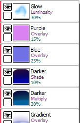
here’s the specific effects being used here:
aaand step 7: final touches! usually consists of any glowy outlines, text or things that need blurring in photoshop, a final luminosity layer at around 10 to 20% opacity for extra highlights (especially needed for dark scenes like this, those darker layer effects tend to make the regular highlights from the shading less vibrant), slap a watermark on there and call it done
and then you’re ready for step 8: spend an hour staring at every pixel for mistakes, before spending another hour fighting the anxiety about posting it
bonus: even though I can’t make a speedpaint I can throw all those screenshots into a poor quality gif for you to watch, at least!

one final thing I can mention: not including the draft and sketch layers or all the parts of the advent calendar windows, just the finished art itself - this is made up of 102 layers. and that’s with me merging a lot of layers because SAI has a layer limit and takes an eternity to save if there are too many. people who can draw a whole piece on a single layer confuse and frighten me
#anonymous#holoskart asks#holoskart rambles#honestly my art process is just a bunch of weird habits I wouldn't recommend imitating :'D but I hope this is interesting enough??#also sorry for taking a while to answer this! I probably could've used a piece I'd already finished to explain all this#but it seemed better to work on something with the intention of showing each part of it#long post //#wip
32 notes
·
View notes
Text
A BASIC GUIDE TO DIGITAL ART ON PROCREATE
okay so i joined the digital art scene about a year or so ago and it has been a total whirl! there’s so much stuff that’s so confusing and hard to understand at first. And that’s okay! A stupid amount of what constitutes as “good” or “complex” art is to do with layers, patience and experience.
and because literally every tutorial on here is for Paint Tool Sai i thought it might be useful for those of us using Procreate! because i don’t have sai and i have a relatively shit laptop by comparison to my Ipad.
so without further ado - here is how to make a KICKASS piece of art on procreate
1. REFERENCE + SKETCH
the first thing you're gonna wanna do is collect any references you need for thing youre tryna make. you can collect references by finding stock images, using other artists work (i use these mostly for colour refs cause i SUCK at finding good colours). however when i make art nowdays i usually just snap a selfie and use that. for this work i did the last option (see below)
after grabbing my reference i decide on the style i wanna use. for beginer artists what i suggest doing is just pasting the image onto your canvas, opening layers and adjust the opacity to around 20% by clicking on the little N on your layer with the photo. then once thats done add a new layer by clicking the + and work over that
for more experienced artists experimenting with style just stick that bad bitch reference in the corner, then open a new layer and sketch in your own style.
when it comes to sketching i usually do little flicky lines. i do this with a mid grey (like 50% white 50% black) i recommend the “Narinder pencil” which you can find by clicking the little brush at the top, selecting sketching and then selecting that bad boy. you can adjust size and opacity using the sliders to the side of the screen.
when sketching you just wanna get a rough idea of where you’re gonna do your eventual lines - don’t worry about it being smooth or anything just get down where everything goes
once you’re done you might have something like this:
this brings us too...
2. LINE ART
for beginners - lineart is just a sexy word that means a clean drawing with hard lines so you can colour it easier and it looks prettier. you want to do this on a new layer so you can delete the sketch one later.
your goal with lineart is to make it three things:
1) its gotta be seamless so you can select the insides, don’t leave little gaps between lines
2) its gotta be smooth! jagged lineart isn’t NEARLY as sexy as smooth curvy lines
3) this one is more of a tip - but lineart generally looks better if you do thinner lines inside your shape with a slightly thicker border line. again this isn’t essential but i find it looks cuter
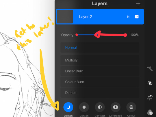
the way i get my lineart all cute is by using the monoline brush (found in calligraphy). sometimes i use my own modified version of the Technical Pen (found in Inking) but mostly monoline is pretty neat. You can use whatever brush you want but mostly you just wanna ensure that its nice and smoooooth. you can do this by selecting the brush and then clicking it again. this will bring up a popup menu like this:
most of these brush settings are complicated and stupid and i’ll do a big post about it later. the only one that really matters here is streamline. if you wanna use a different brush for lineart just wack that slider up between 80-100% and you’re set.
once your lineart is finished on a seperate layer go to your layer menu and unselect the little tick on your sketch layer. you should be left with something like this.

3. ADDITIONAL DETAIL LINEART + MONOCHROME BASES.
once your focus lineart is done you can add detailed lineart by repeating the same process with sketching and lineart i described above. i like to do details separate because if i dont like it i can just delete the whole layer without destroying my focus.
what i find important in these now is using my favourite fuckin tool in this whole program. you can find it here:
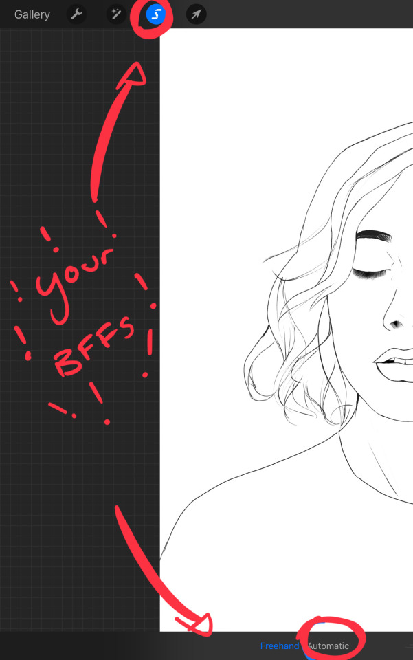
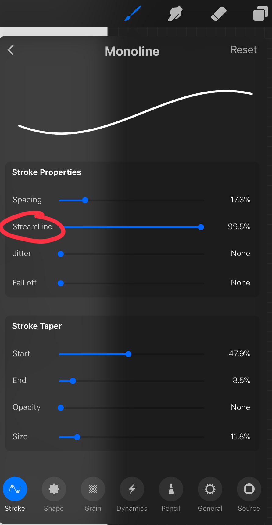
Only start using this once youre 100% done with your lineart. once thats done - make sure youre on the lineart layer and click that weird little s at the top of the screen. go to the bottom and click automatic. then select somewhere INSIDE your lineart. it should do something like this:
don’t freak out! what that blue stuff means is that you've just selected the inside bit of your lineart. continue selecting until your subject is 100% coloured in.
MAKE SURE THE BACKGROUND/STUFF OUTSIDE YOUR LINEART ISN’T SELECTED.
ALSO MAKE SURE YOU’VE SELECTED THE LINES THEMSELVES. THEY WILL TURN WHITE ONCE THEYRE SELECTED.
if u fuck up and select something by accident that’s all g, theres a little undo button on the bottom. if you click on the paint brush or another tool and you cant add stuff to your selection you can reload the mask by holding down on the weird s and the selection will reload. If there are certain bits of your work that you’re struggling to select with automatic selection that’s also not an issue. just click the “freehand” setting next to the automatic setting on the bottom and you can now use your stylus to draw around what you want to select.
once you’ve selected your foreground in its entirety - THEN click the layer button. insert a new layer underneath your lineart layer. Using literally any brush (works best if you get one from the painting section) colour EVERYTHING white. just get round brush and colour all of it. you wanna keep your line art layer separate over the top.
once all of it is coloured hold down on the weird s tool until it reloads the selection. then look along the bottom of the screen and click the little button that looks like 2 arrows pointing at each other.
THIS INVERTS YOUR SELECTION.
Open a new layer and make this entire thing a grey. THIS IS WHOLE STEP IS OPTIONAL BUT ITS SUPER USEFUL AND THE SELECTION TOOL IS SUPER HELPFUL FOR GOOD ART. DOING THIS WILL BE SUPER USEFUL WHEN YOU COLOUR STUFF LATER.
once you’re done it should look something like this:
4. BASE COLOURS
okay so this is where shit starts to get real. The goal of putting down base colours is to make is easier to add eventual shading to your piece and decide your colour scheme. This is where the white layer you just used is gonna become your BITCH.
you wanna start by duplicating your white layer you just made. You do that by opening your layer menu and swiping that thot to the left. this is what should happen:
click duplicate. Select the top duplicate you just made and select our favourite weird s tool. click inside your shape and the whole white shape should go blue (become selected). next, open a new layer on top of the white layer. colour in your base colours and now none of it can go outside the lines. you didn’t even have to do a billion selections. you just select inside the white blob on the layer we made the step before, opened a new layer and started colouring. fucking superb. so much time saved. DO YOU KNOW HOW MUCH I USED TO SUFFER BEFORE I THOUGHT OF THIS. HOW LONG I SPENT SELECTING AND RESELECTING I CANNOT
A TIP FOR PEEPS NEW TO THIS PROGRAM - if you use your finger and hold down on a colour you’ve just used it acts like an eyedropper tool so you can pick up any colour you want. like this:

once you got your base colours done you can either:
1) go to your grey layer you made in the last step and select the tick next to it. once you’ve done that scroll to the bottom of your layers and select background. it will open a colour wheel. pick your background colour.
2) you can use my second favourite tool from this program! go to your grey layer you made in the previous step. click on it, then click on it again. (not the little n just click the whole layer) this menu should pop up:

oh MAN okay so.
“alpha lock” pretty much means that it locks whatever is on the layer. when you get another brush and go over a layer with alpha lock turned on you can only paint over what you have previously put on the layer before turning on alpha lock. Its like automatically selecting everything on the layer. its fucking brilliant.
anyway.
scribble over your grey layer (once alpha lock is on) and boom you have a base for your background.
NOW YOU KNOW ABOUT ALPHA LOCK YOU GO BACK TO YOUR LINEART LAYER. SELECT ALPHA LOCK. COLOUR IN YOUR LINES ROUGHLY 2 OR SO ISH SHADES DEEPER THEN YOUR BASE COLOURS
(minus eyes i like to keep the lines around them black.) this will make your art like 100000000 times nicer (majority of the time)
once you’re done you should get something like this:
this brings up to...
5. SHADING!!!!!!!
this is my favourite step tbh.
what you wanna do is chuck on a new layer over the top of your base colours. and go into your brushes. pick up your basic bitch “round brush.” this is (in my opinion) the best painting brush in the program. Its the thing you can do the most with. so what you wanna do it get a slightly deeper colour from your colour wheel by yeeting your colour selection slightly more saturated and slightly more dark. dont just make it blacker move your colour selector on a diagonal to get a nicer colour. (i’ll eventually do a colour theory ref but today is NOT that day.)
i like to do colouring in short, light strokes. DON’T PRESS TOO HARD. you wanna get that cute little gradient.
A THING FOR BABY ARTISTS: on every art program i have ever used, the blending tool SUCKS. it makes paintings UGLY AF. (wow another tutorial i have to do at some point.
i HATE the blending tool.
SO HERE IS HOW I COLOUR MY ART TO MAKE IT LOOK, YKNOW, GOOD:
Unless you’re drawing something SUPER freaking smooth like a bubble or some shit. when you wanna blend colours what you gotta do is:
1) put in your darker colour.
2) use your finger to bring up the eyedropper tool to select a mid colour of the colours your blending together - a mix between your lighter and darker colour. (remember that tool? it looks like this)

3) Paint the colour you just made in the middle of your lighter and darker shades. REPEAT THIS PROCESS ON EITHER SIDE OF THE COLOUR YOU JUST PUT DOWN TILL IT LOOKS GOOD. The result is an WAY sexier piece of art.
once you’ve put in all your shadows repeat the same process with highlights.
FUN TIP:
if you decide you dislike a colour or want to change the colour you already did all the shading for you can change the colour without any major drama. You can do this by select ing the colour on your colour wheel you would like to change your already shaded work too. (make sure you’re on the right layer.) then hold down on the colour dot on the top bar (next to your layer settings) and drag it to whatever you want recoloured. let go of the dot and it should recolour your work (including all the shading you’ve done granted that its on the same layer) like this:
once you’ve got all your shading done it should look something like this:

6. background and pretty bits
so! youve got this kickass work but nothing surrounding it. lets fix that.
In procreate there is SO MUCH you can use to spice up a work. a SCARY amount even. this is when layer settings are gonna start to come in handy.
ill do a masterpost on procreate brushes for backgrounds later, but for this piece what im gonna do it head over to the Luminescence section and pick up a “nebula brush”. this makes a complex galaxy kinda design in a randomised stamping pattern that is frankly SEXY AS ALL HELL. Select a layer below your base colours but above your background colour.
IMPORTANT NOTE: this brush’s blend mode is autimatically set to “add” (ILL DO ANOTHER POST ON THAT LATER)which means if you go over the same spot heaps of times it will eventually go a bright white. This can be nice, but its not really what i want cause its kinda intense. to make this thing go glowy but not ~too~ glowy im gonna lower the brush opacity (the bottom slider) to around half way. i set my colour to a light yellow and a darkish pink and put in some nebulas!!!!
once that was done I wantd to add some more colour variation so i popped open a new layer - selected the lightleak tool and lowered the brush opacity using the slider to around 20% just to spice some shit up
you can kinda do whatever you want for your background. sometimes its nicer just to go into artistic, select a random brush and draw a square underneath what you were doing. backgrounds can be super detailed or super easy it doesn’t really matter to be 100% honest.
THE PART 2 OF THIS STEP WILL ADD HEAPS OF DIMENSION TO YOUR WORK AND MAKE IT SUPER PRETTY:
adding light effects over the TOP of your main subject often creates a more realistic sense of depth. In simple terms it just makes the thing look more 3D and nice. to do this, get a random brush with a nice (preferably light) colour. i picked up a “bokeh brush” from the Luminescence section. make this pretty big. sprinkle your brush across the page on a NEW LAYER above all of your work so far, including line art! Then open your layer menu and click that little n in the corner again. Remember this one:
click the little n. then go down to the bottom and select a layer setting from either of the 2 groups circled (i normally like overlay for this type of thing) you can mess around with layer settings and opacity till you find something that looks super nice. My piece now looks like this:

pretty cool right. now we’re gonna make it EVEN COOLER.
7. LIGHT FILTERS
this is something i picked up from artists like softmushie and cryptidw00rm. (not gonna @ them here cause they probs dont wanna get tagged in my shitty tutorial thing but yeah i owe so much to those two especially)
for those unsure of what im talking about: light filters are layers you add over work to make the lighting on it seem more natural and pretty. you do this by colouring over your natural highlights and shadows with different colours and then messing with the layer settings to make it seem like its being hit by sunlight. these layers go BELOW your foreground stuff (the bokeh lights from step 6) but ABOVE your lineart.
start by opening a new layer. select a colour similar to where the green outlines are here:
now on this layer paint over anywhere where the sun or other light source would be normally hitting (like cheekbones hair etc.) this can be kind of like shading. dont worry if it looks shit at first we’re gonna change it.
open a new layer beneath the one you just made. Using a colour similar to one circled in purple above colour over all the shadows in a piece. it should now look like this:
now open your layer settings on the purple/darker layer by selecting the N like we did with the foreground layer before. you can play around from here by setting the layer mode to anything from the “darken” or “contrast” menu. For this work i chose overlay. I then lowered the opacity until it looked nice.
Repeat the step above with the lighter highlight layer. when adjusting this one make sure you set the layer mode to anything from the “lighten” or “contrast” menu. For this work i did hard light.
your peice should now look kind of like this:

AND YOU’RE DONE!!!!!!!!
look at that sexy thing you just did. Congrats on creating an awesome peice of art!!!!!!
if you guys are interested in more tutorials like these or have any reqs for similar stuff send me a question or a dm to my blog @plasticbattleaxe
if you create anything by following tutorial that you want me to see don’t hesitate to tag me or submit it to my blog!!! i love seeing y’all make art
also - i know it’s annoying - but reblogs > likes. thanks for your support
i hope someone finds this useful!!!!!
#reference sheet#art reference#reference#art ref#procreate#procreate ref#zoeyeets#plasticbattleaxe#plasticbattleart#layer ref#art tutorial#art studyblr#art tips#ref artist#tutorial
1K notes
·
View notes
Note
Hi there, I hope you've had a great day! I was wondering, do you have any tips for digital sketching? Your sketches seem so nice and formulated so I figured I'd ask
Lovely day, thank you!It really is a process that depends on how you prefer to draw, but I can tell you what I do. My tablet is kept on a tilted surface for comfort, and the brush I use for sketching tends to have pen pressure on + a slightly lower than maximum opacity, but can at times just go straight up 100. Its size and colour varies depending on what I plan to do, or what I’m feeling for really - usually, thinner lines let me squeeze in more action and detail, but a thick brush is good for thumbnailing and drawing shapes!A fake pencil-pattern to the brush makes it look just that little bit extra nice.I try to do quick, long brush strokes (find that line of action!) and not focus too much on being precise when I’m in the sketch phase; that comes when I clean it all up and use it as the lazy man’s lineart. :–)
#ask#anonymous#how kott does things#nevermind that I am really impatient when it comes to actually adding small details later on#such as patterns on clothing or armour#teehee
14 notes
·
View notes
Photo
Hi, I’m Berwin, a queer artist and I have no solid income so I’m opening up commission slots!
I currently have 6 open spaces.
What I’ll Draw:
-Your characters (‘sonas; Oc’s; RPG characters; etc)
-IRL things (You, people you know; animals, pets, etc)
-Fanart
-anything as long as it’s not part of the “I Won’t Draw” list :)
I Won’t Draw:
-Anything overtly sexual or NSFW
-Anything offensive towards specific groups or individuals
-Anything you’ll be profiting from without my permission*
Pricing!
*❄!holidays!❄*
the holiday season is here, and I’m offering three offers!
offer one: if you want two pieces done I’ll offer one of them, the lower detail one if you want different price ranges, at 50% of its price
offer two: discounts! two levels are discounted! all sketches (apart from postcards) will be £7 and all simple drawings will be £10 flat price so no variation
*❄!holidays!❄*
I can do either digital or traditional art (please specify and if traditional specify medium**)
£8 - £12 (10.3 - 15.5 USD)
Quick doodles/sketches
(for people in the UK I’ll also offer postcards (which I’ll send to you fixed at £12)
£15+ (19.3+ USD)
Simple drawings e.g. Uncoloured lineart
(any extra characters/subjects have no extra charge here)
£20+ (25.8+ USD)
Basic illustrations, either with full shadows but no colour or full but flat colour
£30+ (38.7+ USD)
Detailed illustrations, full, shaded colour
(a highly realistic piece will cost extra and take longer)
Any extras like detailed backgrounds (more than just a colour one) or additional subjects/characters will add to the overall price
Extra Details!
- get in touch with me through messaging or DM’s
- if you live in the UK I can send you the original work for an extra £7 -❄- I’ll not ship anything but postcards until 2018 do keep in mind
- online mutuals (+friends) get a discount just let me know if you want that when you message me
Thank you! *- if you talk to me about it when you contact me I’ll happily come to an arrangement! just don’t say sneakily commission book illustrations without letting me know beforehand what it is
** - medium is what it’s done in so acrylic/watercolour paint or ink or pencils
#commissions#art commissions#artist#traditional art#digital art#commissions open#commission post#not art
9 notes
·
View notes
Last Seen Blogs

which-actually
Untitled
barrelgunx
barrel

nashusglasses
remember that...
unicornsoft
Tyrant, The Unicorn Lannister.
