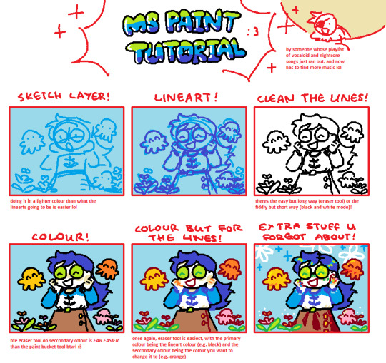
#mspaint tutorial
Text

ms paint. you know her. u used her age 8 to make loads of rainbow ovals all over the canvas and then scramble it with selection tool. now u will know her true powers with my handyrandy tips under the readmore. some will be pretty basic and others are very special.
this post has 8 cool trix to learn for you. enjoy and i may do another in the future if i remember/learn more stuff
some of it might be common knowledge. but its got some deep cuts. all tips have gifs to show process easily.
🙂 enjoy and i hope this encourages you to fuck around in mspaint more
soundtrack for this post (loop it while you learn for advanced learning experience)
TIP 1) the right click trick
left and right mouse click correspond to col1 and col2 respectively, which u can see in the top bar. this applies to all brushes and the fill tool like above. when using shapes col2 will be the fill colour (if you have solid fill selected). right clicking with shape maker will reverse the colours use on the shape.
TIP 2) right click eraser
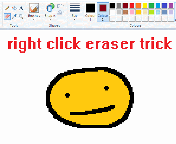
this one is extremely helpful for lineart or add shading. the eraser always uses col2. so your eraser can technically be any colour. but here's where you get powers: right clicking with eraser will only erase onto col1, with col2.
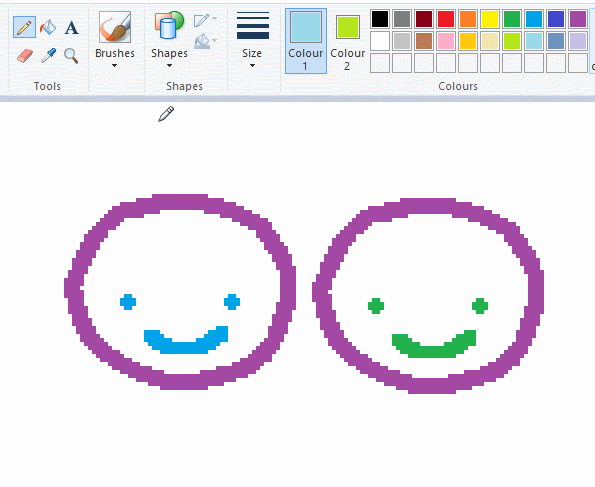
TIP 3) transparent selection change a guy destination
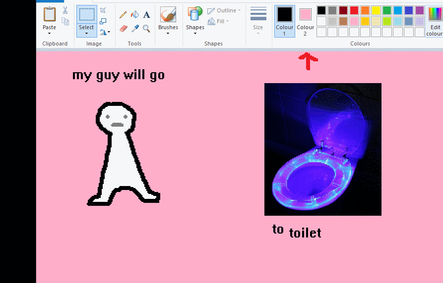
the beloved transparent selection tool works based on what is selected as col2. so long as you have the correct colour as col2 you can make any image transparent and put it on top of anything else. and yes this works with photo bg as you can see.
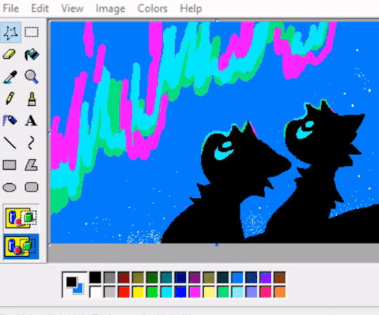
TIP 4) the gradience
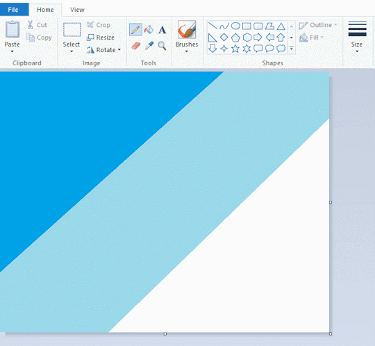
this one is a little more complex. you want to start off with any canvas size, and make as many diagonal coloured bands as you want. (protip: holding down shift makes a perfectly diagonal line with line tool)
then you need to resize the canvas to a width of 1px (make sure you resize by pixels, and do not maintain aspect ratio). then resize again back to its original width (or a different width i cant stop you). you will have your lovely gradience.
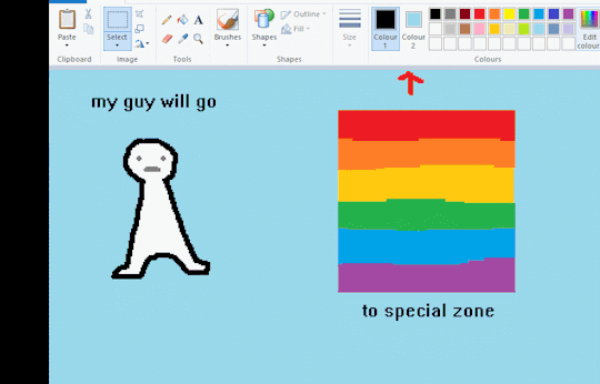
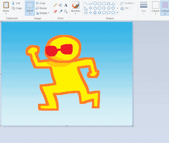
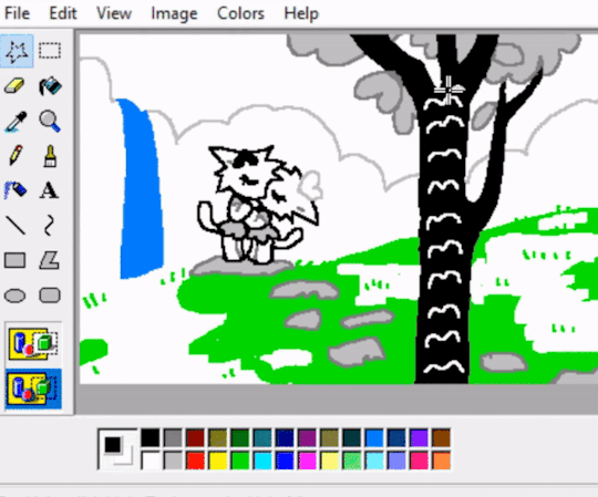
TIP 5) superimposter

so. you got a cool gradient and wanna put a guy on it. heres what i do:
i open a 2nd mspaint with same canvas size and draw whatever i want on there. i then pick a completely unrelated colour to my entire piece, and set that as the bg. you could use white, pink, geen, whatever you want as long as it doesnt appear somewhere else in ur drawing. copy the guy.
go back to your gradient tab. ensure that col2 is set as that bg colour you picked (lilac for me). have "transparent selection" enabled. paste your guy in. cue fanfare
TIP 6) advanced superimposter
the great thing about this method is u can put multiple gradients in multiple areas of the image. this is where it gets all japanese printmaking type of shit. ukiyo-esque
all you need to do is make another canvas with a new gradient, ensure col2 is set as the colour you want to replace, then paste your original piece onto the new gradient. now my guy has a soft fade. you can do this as much as you want. (you could even make a canvas with a texture or photo and paste your drawing onto there)
TIP 7) "sketch layer"
so as you now know, col2 is what is removed when you click "transparent selection". which means you can also remove any instance of a colour from ur drawing. which means you can have a unique colour for sketch layer and remove it from the drawing later. i admittedly dont do this but it is a great trick to have.
now combine this with lowering your dpi for smoother lines. may seem obvious but it helps. its like a free stabiliser whenever u want.
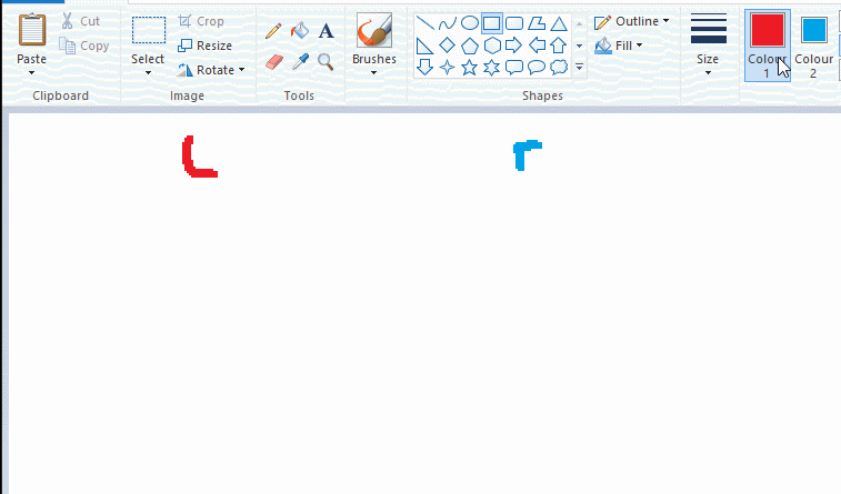
TIP 8) rainbow art
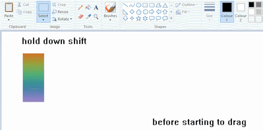
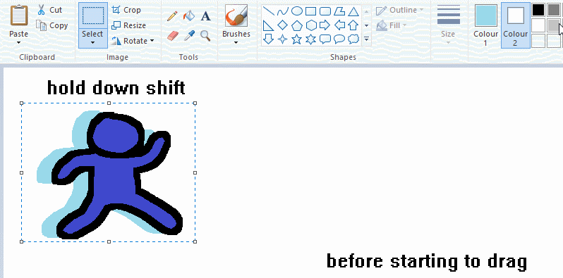
now this is where you can get dizzee rascal "bonkers". check out my small and shitty rainbow trick. you can select anything and hold down shift, then drag with left mouse, to turn that selection into its own brush. i even did it with a guy. and you can of course do this with a photo as well.
🙂well that it for now. hope you liked it thanks for reading now back to your regularly scheduled tgcg programming
2K notes
·
View notes
Text

Welcome to Wren's how to MSPaint! These are just some basics, but hopefully they'll be useful!
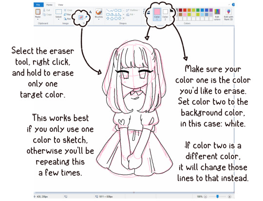
Erasing a sketch underneath your lineart: Be sure to sketch with a different color than your lineart, or this won't work.
Clean up your lineart: Sure this part can be a little tedious and nitpicky, but I promise you'll be much happier with it if you take the time!
Much more under the read more!
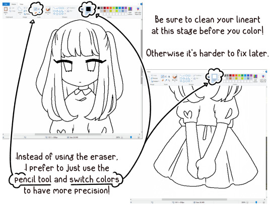
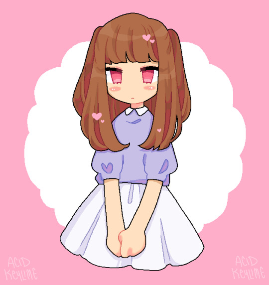
Recoloring lines and shading: Make sure you use the pencil tool for your lineart or your bucket fill won't go cleanly to the edges.

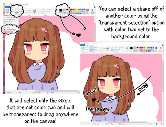
Transparent Selections: Incredibly useful for making elements of a drawing separate before you move them into place! This works no matter how many colors the selection has, as long as the bg is a completely different color from anything else in the selection.
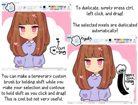
Transparent Selections Continued: Make sure you have an object selected to duplicate.
You can only use a "custom" brush as long as you shift click the original selected object. Yes, this is mostly useless.
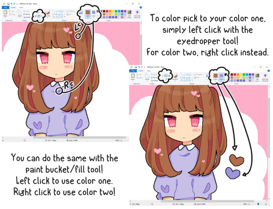
Eyedropper and Bucket Fill: Being able to color pick and bucket fill spaces with either color slot is super useful and saves a LOT of time.
Happy MSPainting!
#ms paint#mspaint#microsoft paint#paint#my art#my oc#digital#digital art#tutorial#tips#tricks#tips and tricks#art tips#art tutorial
605 notes
·
View notes
Text


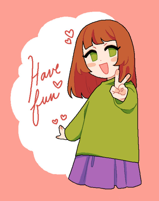
bring back paint 2023 lol x3
#jade harley#homestuck#idk i wanted to do this lol#cause the mspaint tutorial post is kinda out of date for modern versions of paint#and i like making stuff like this lol
211 notes
·
View notes
Note
Do you have any tips on drawing in ms paint
There are a billion other artists who kill it in mspaint that could make a better tutorial, but heres a fun hack that's easy to use

154 notes
·
View notes
Text


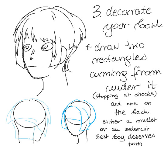

#a shitty akechi hair tutorial made in mspaint that no one asked for you are so welcome~#akechi touma#this is /j#saiki kusuo no ψ nan#tdlosk#saiki k#doodle#tutorial (not rlly)
165 notes
·
View notes
Text
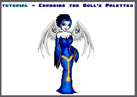


download Gimp here.
this doll was made on Dollzmania Gothmaker.
#tutorial#gimp#editing tutorial#tips#dollmaker#dollz#art tips#art tutorial#gimp tutorial#dollzmania#goth#pagedoll#edit#mspaint#paint#colorful#colors#rainbow
5 notes
·
View notes
Text


Paint 3D is an accursed app, I say we should burn it
#il cottore#il dottore#mspaint dottore#dottore#screw you people telling me to just download presets when i watched hecking paint 3d tutorials!#my goal is to make dottore not a dinosaur!#i am going to sceam this took 12 hours
18 notes
·
View notes
Note
🧡
When is your next big event stream?
The next big one is going to be in December for my birthday! I'm not sure exactly when just yet 'cause my birthday falls on one of my normal days off this year (Dec 19th, it's a Monday), but it'll either be the weekend prior or later the same week.
I'll also be having a collab at 8pm EST today with @solarioandsally and @lucibubz! Not a big event, but should be great fun 🖤
#vtuber uprising#envtuber#ask the demon#we're gonna do a bob ross tutorial#in mspaint#it's gonna be great
2 notes
·
View notes
Photo
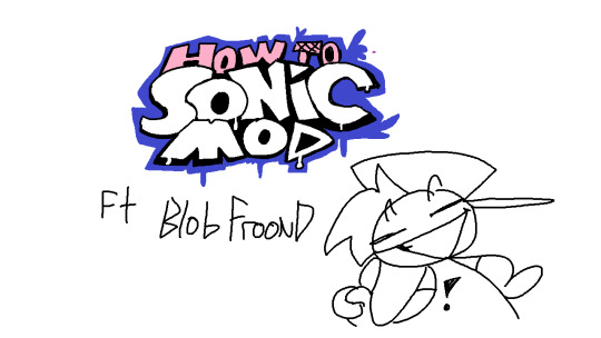


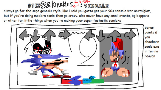

HOW 2 MAKE YOUR VERY OWN FRIDAY NIGHT FUNKIN SONIC MOD ft Blob Froond
#mspaint#art#digital art#drawing#tutorial#fnf tutorial#sonic mod#friday night funkin#FNF#fnf mod#fnf sonic mod#Blob#blob comic
7 notes
·
View notes
Text
youtube
I was asked to make this a few times and finally got around to it so here ya go- Basic tutorial on how I make my MSpaint stuff using only a mouse. (might have to crank the volume up) Thank you for watching :)
0 notes
Text
python a simple tkinter gui paint program that uses a line as a paint brush with a colorpicker
# a tkinter paint program using lines as paintbrushes. # colorpicker, brush size, clear are all implemented. import tkinter as tk from tkinter import colorchooser # https://pythonprogrammingsnippets.tumblr.com class PaintApp: def __init__(self, root): self.root = root self.root.title("Line Painter Simple Paint Program") # Create a canvas self.canvas = tk.Canvas(self.root, bg="white", width=500, height=500) # Create a toolbar self.toolbar = tk.Frame(self.root, bg="gray") self.color_button = tk.Button( self.toolbar, text="Color", command=self.choose_color, width=20, height=4) self.brush_size_slider = tk.Scale(self.toolbar, from_=1, to=50, orient=tk.HORIZONTAL, label="Brush Size", command=self.change_brush_size, length=200, width=20, sliderlength=20, showvalue=1) self.clear_button = tk.Button( self.toolbar, text="Clear", command=self.clear_canvas, width=20, height=4) # Pack the toolbar widgets self.color_button.pack(side=tk.LEFT, padx=5, pady=5) self.brush_size_slider.pack(side=tk.LEFT, padx=5, pady=5) self.clear_button.pack(side=tk.LEFT, padx=5, pady=5) # Pack the canvas and toolbar self.canvas.pack(fill=tk.BOTH, expand=1) self.toolbar.pack(side=tk.BOTTOM, fill=tk.X) # Bind mouse events to canvas self.canvas.bind("", self.on_mouse_down) self.canvas.bind("", self.on_mouse_up) self.canvas.bind("", self.on_mouse_move) # Initialize variables self.current_color = "black" self.current_brush_size = 5 self.drawn_items = [] self.previous_canvas = None def choose_color(self): self.current_color = colorchooser.askcolor(title="Choose Color")[1] def change_brush_size(self, value): self.current_brush_size = int(value) def clear_canvas(self): self.canvas.delete("all") self.drawn_items = [] def on_mouse_down(self, event): # store snapshot of previous canvas self.previous_canvas = self.canvas.postscript(colormode='color') # draw a line self.drawn_items.append(self.canvas.create_line( event.x, event.y, event.x, event.y, fill=self.current_color, width=self.current_brush_size)) def on_mouse_up(self, event): pass def on_mouse_move(self, event): self.canvas.coords(self.drawn_items[-1], self.canvas.coords(self.drawn_items[-1])[ 0], self.canvas.coords(self.drawn_items[-1])[1], event.x, event.y) # Initialize the root window root = tk.Tk() app = PaintApp(root) root.mainloop()
#python#paint program#mspaint#macpaint#painter#painting#paint app#entertainment#tutorial#fun#example#snippet#snippets#programming#programmer#learn python#python programming#python programmer#python is serious i swear#python is numba one#tkinter#tk#gui#ui#buttons#button#window#windows#brush#paint
1 note
·
View note
Video
youtube
How to Make 3D Art in MS Paint step by step | MS Paint tutorial 3d Drawi...
#youtube#MSPaint 3DArt Tutorial StepByStep Drawing ComputerPaint 3DDrawing Simple3DArt BeginnersGuide Creative DIY Artistic Design DigitalArt Windows
1 note
·
View note
Text
curious. lol
#i personally despise 1 and 4 the most. hoooly shit#like yes you can make good art on mspaint and a notes app and aggie.io and whiteboard etc etc omg. please. its fine.#and please dont say youre going to give up because of me that makes me so sad forever#rb bait#polls#txt
5K notes
·
View notes
Note
your mspaint stories are so so amazing i love them so much i would love a tutorial for them if you would want to make them <3
Okay here are some things I like to do with the polygon select tool it only works if the transparency box is selected in the tool bar and the the secondary color that you choose is the color that will be transparent... the compositions have to work with the idea so keeping everything reallly really simple is good! the last trick I didnt use for my stories yet but that is pretty much how I play with it until I get ideas
434 notes
·
View notes
Text
should've made one of these ages ago but anyway—
🧈Butter Masterpost🧈
aka a collection of most of the stuff I've done on here so far. Figured it was time to make one 'o these with the kickstart of my latest project. So here—
*:・゚✧*:・゚✧all my shit in one place✧・゚: *✧・゚:*
Fuck It We Barn (fic) (all the shit from my fic)

FIWB Comic (based on one of the scenes)(complete)-> beginning
ArtWork-> Night Light Scene (sirwolficus) - scene from chapter 3 - April and Leo Argument
The Sillies-> mini comic - mini animation - Duck It We Barn - the turtle was close but the turtle also had a gun
Bad End Ninja Turtle (B.E.N.T)
(tmnt AU/crossover) (comic and shenanigans)
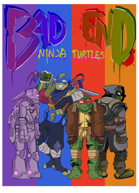
Doodles-> shitty mspaint doodle
Comic (Ongoing)-> Part 1 - Part 2 - Part 3 - Part 4 - Part 5 - Part 6- Part 7- Part 8 -Part 9 - part 10 - part 11 (sometime somewhen)
Asks and Rambles-> B.E.N.T Asks
Name that Spaceship Poll (FINISHED)-> Spaceship Poll
References-> (please do add any you have to this post :D) - more references!!! (mutant apocalypse and same as it never was)- mutant apocalypse and don bot
Night Watch Comic-> Part 1
Ask Butter
Asks and replies-> #ask butter
Ask Button-> click her to send ask or jsut scream randomly if you want
More art-> #butters-art-tag
Ggifts go on the fridge-> #butter fridge collection
IRL Kraang key
Photos-> photodump (of the final sculpture)
Tutorial-> how to make kraang key
Casey Jr Cosplay (in progress)
Casey Jr's Cloak-> photos (pre embroidery) --- pattern (sorta)
Mask-> (waiting for materials to be shipped)
Hockeystick-> (waiting for materials)
Armour-> (waiting for will to go on)
#butter masterpost#its finally done!#do not let this post fool you#I have no idea what I am doing :D
829 notes
·
View notes
Text
Pulp Covers And How To Paint Them
With the rise of cheap printing in the early twentieth century, mass-marked paperbacks swept the world, each offering lurid thrills for obscenely low prices. Sex, sadism, and incredible violence for as little as ten cents. An easy purchase to slot in between fifty cigarettes a day and enough bourbon slugs to kill a small garden.
Pulp fiction is where some of the greats of American literature cut their teeth, including the big three, Raymond Chandler, Ross MacDonald and Dashiell Hammett. The contents of these stories, both the dizzyingly good and astoundingly terrible, have been absorbed and digested and remixed and regurgitated in nearly every permutation imaginable, fuelling pop culture some one hundred years on. This isn't an essay on that. Nobody likes to open a tutorial and be greeted with a wall of text. The history is for another time.
But it is about how to paint it.
Don't let the pre-amble intimidate you, it's not as hard as it sounds. You will need:
Painting software with some image editing capabilities. You don't need all the bells and whistles of Photoshop, but I wouldn't recommend something like MSPaint, at least not to start with. I'm using Clip Studio Paint.
A really beat-up paper texture. The grungier, the better.
A lightly-textured brush. Here are the specific brushes I use, 99% of which is the well-named rough brush. Try and avoid anything with any impasto elements.
Go to your colour-picking tool and use the 'select from layer' option. Doing all the painting on a single layer is going to make your life easier.
A complete willingness to make mistakes and, instead of erasing, painting over them. It generates much more colour variation and interest! Keep your finger off the E key.
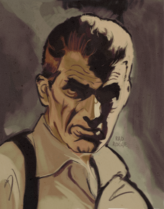
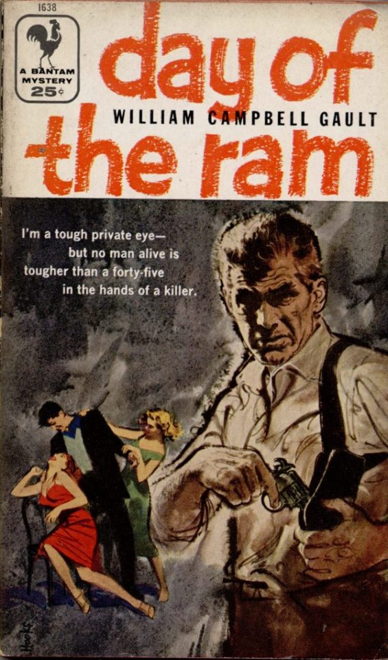
Good reference! That painting is a master copy of Mitchel Hooks' art for Day of the Ram. Find a style you really love and want to learn? Have no clue where to begin? Do direct studies!
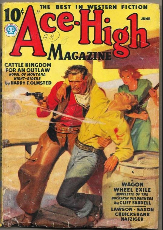
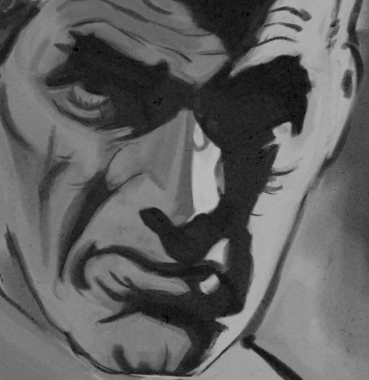
Let's not worry about whatever is happening in the background. It's probably fine. Let's get started! Pulp magazine art is a lot more varied than you might first think, so don't agonize over having a style that 'fits' or not. I'm also specifically aiming for something you'd see on the cover after printing, not the initial painting they would use for printing. The stuff I'll show here is a pretty narrow band of it, but here are some general commonalities. This is a painting by Tom Lovell.
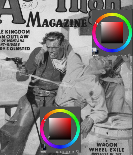
Let's dig into this.

The colours are very bright and saturated, but the actual values, the relative lightness and darkness of them, are actually grouped very simply! You can check this by filling a layer full of black, putting it on top and setting its mode to colour. If the value of a painting looks good, you actually get a lot of leeway with colour. But here's what I think is the most important thing to keep in mind.
The darks aren't that dark, and the lights aren't all that light! Covers are paintings reproduced on cheap paper. Anything you wouldn't want to happen in the printing process, you lean into. Value wash-outs, lower contrast, colours getting a weird wash to them, really gritty texturing. So let's get painting! Here's my typical setup.
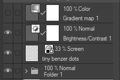
That bottom folder is the painting itself. The screen layer is the grungy paper texture. To get the effect you want, put it down, invert its colour, then set it to screen. That washes out your painting far, far too much, so to compensate, I put a contrast layer up on top. Fiddle around with the settings, but this is where mine ended up sitting.
Note I'm saying this before even starting the painting: you want to do this as early as possible. This is where the 'select from layer' colour picker comes in handy. You can paint without worrying about the screen or contrast layer. Something not looking right? Enable your value check layer and keep painting. When you turn it off, it'll still be in colour. Here's a timelapse so you can see what that looks like.
And when you check the values...
They're pretty simple! This isn't a be all and end all, but I hope it serves as a decent primer. I want thirty dames on my desk by Monday!
#rochedotpng#art tutorial#art resources#couldn't find a thing online about this style so here's how i do it#pulp#it's how i did the death shroud one more or less
161 notes
·
View notes
Last Seen Blogs

new-movie-blood
Untitled
kadkadduwa
SANTA MONICA BLOOD BANK
hn-nico
hn★nico
i-am-dominika-blog
I'm Dominika

alcideboaretto
Alcide Boaretto Photographer